ATTRACTION / DISTRACTION
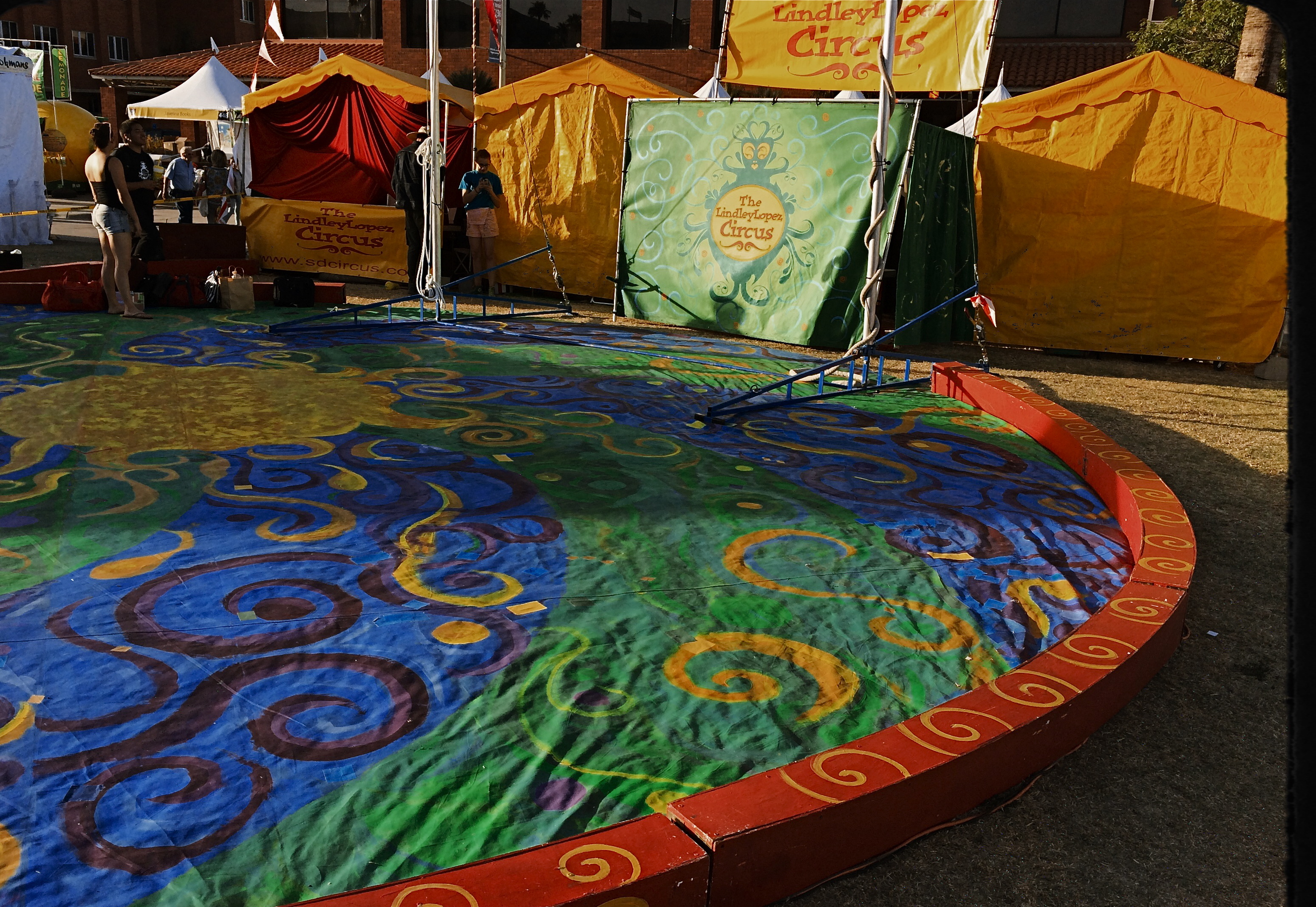
No performers, but the colors say circus time. 1/800 sec., f/2.2, ISO 32, 18mm.
By MICHAEL PERKINS
PHOTOGRAPHERS ARE ADDICTED TO “INVISIBLE” STORYTELLING, to hinting at a context beyond what is actually shown in a given image. Sometimes our eyes arrive at a scene just seconds after something important has happened. Sometimes it’s just moments before. Sometimes we have to use emptiness to suggest how full something just was. And, most importantly, we need to determine if color will be a warm accompaniment to something magical, or an unwanted intruder in a scene where less is more.
Wonderfully, this choice has never been easier. Digital photography affords us the luxury of changing our strategy on the color of a shot from frame to frame in a way that film never could. It also allows us to delay the final choice of what works and what doesn’t, to live with an image for a while, and decide, further down the road, whether something needs to be re-ordered or altered, rendered either neutral or vivid. It is a great time to be a photographer. For those picking up a camera today, it must seem absurd that it was ever any other way. For those of us with a few more rings around the trunk, it can seem like a long promised miracle.
Color can be either addition or distraction to a shot, and usually you know, in an instant, whether to welcome or banish it for best effect. Two recent walk-bys afforded me the chance to see two extreme examples of this process. In the first, seen above, I am minutes too early to take in a small street circus, giving me nothing but the garish tones of the tents and staging areas to suggest the marvels that are to come. I need something beyond the props of people to say “circus” in a big way. Color must carry the message, maybe shouting at the top of its lungs. See what I mean? Easy call.
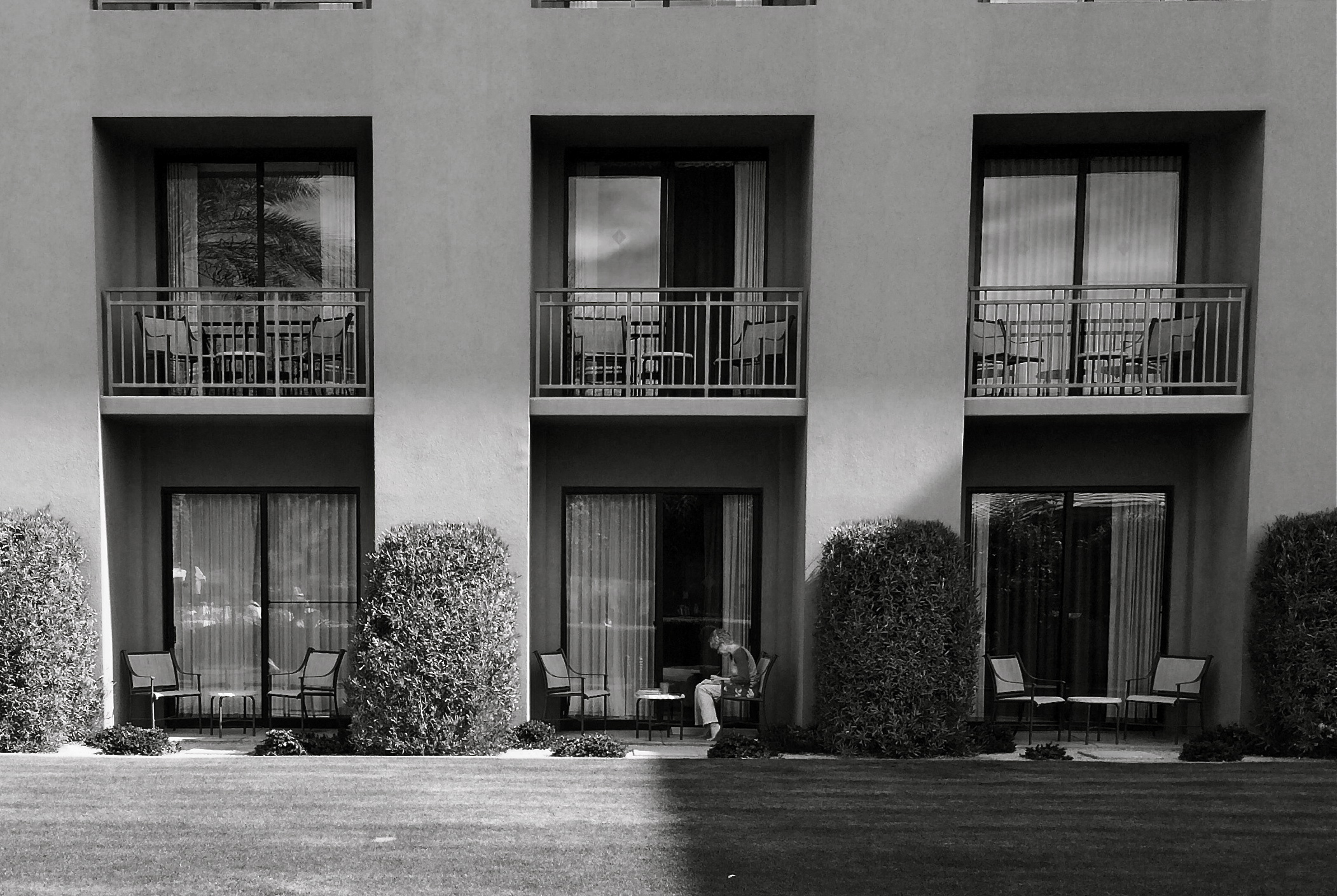
The isolation of the woman in the frame argues against the use of garish color. 1/700 sec., f/2.2, ISO 32, 18mm.
In the second image, which features a lone woman reading against a backdrop of largely featureless, uniform apartment cubes, I am off on an opposite errand. Here, I seem to be wondering why she is alone, who is waiting (or not waiting) for her, what her being in the picture means. The starkness of her isolation will never be served with anything “pretty” in the scene. The original frame, done in color, actually had the drama drained out of it by hues that were too warm. On a whim, I converted it to the look of an old red-sensitive black and white film. It gave me a sharp detailed edge on materials, enhanced contrast on shadows, and a coldness that I thought matched the feel of the image. In audio terms, I might compare it to preferring a punchy mono mix on a rock record to the open, more “airy” quality of stereo.
Dealer’s choice, but I think our photography gains a lot by weighing the color/no color choice a lot more frequently than we did in our film days. The choices are there.The technology could not be easier. Relative to earlier eras, we really do have wings now.
We just need to get used to flapping them more often.
ART VS. ARTIFACT
By MICHAEL PERKINS
PHOTOGRAPHY HAS NOW ARRIVED AT A TRULY STRANGE PLACE. It’s no big bulletin that modern processing and phone apps now allow us to simulate the various visual defects and flaws we used to summarily reject from our images, deliberately including them in our pictures as design elements. Things to be desired.
Features to make the picture better.
????? Let’s take this out of the realm of photography for a moment to see how truly insane it is.
One of the more ridiculous gimmicks of the digital age in audio (which is, let’s face it, free of the scratch and hiss of analog recordings) was to put both these sources of annoyance and noise back into CDs. Hip-hop has been particularly egregious in the inclusion of crackle and scratches into tracks, as if these effects conferred some kind of authenticity on the results. It’s like a guy who gets a chin scar in a woodshop accident, then tells women at bars that he got it in a knife fight. Fake life, fake cred.
Back to photos, where downloadable apps let you slather on filters that simulate photos which appear damaged, ravaged by time, poorly exposed, marred by light leaks, or ruined as the result of faulty film processing. Now, think about this: we have become the first generation of photographers who think it is creative/profound/cute to make our pictures look bad on purpose, to make images that our predecessors would have (rightly) rejected as marred, imperfect, wrong.
Is this photo anything, or did I just keep dress it up in a funny party hat?
I took this image on a cel phone, then processed it through the app Alt Photo to simulate a daguerreotype. I did it mostly as an experiment, but then, in a moment of weakness, I posted it on image sharing sites where, so far, it has garnered over 5,000+ hits. Here is the problem: I can no longer determine whether my essential image has any merit, or whether its popularity is solely due to the effect. That bothers me. I feel that any attention or approval this photo has achieved has happened, well, dishonestly. I get the fun aspect: I enjoyed it, as a novelty, a lark, but the thought of anyone taking it seriously disturbs me. And I am angry at myself for giving into the temptation to put it out there.
Gimmicks aside, photography means something. Making a picture means something. And technical crutches that draw attention from that process are just cheap card tricks. Distractions. What an interesting problem: as a consequence of our technical cleverness, we are now locked in an eternal struggle between art and artifact.
JUST ENOUGH
1/250 sec., f/5.6, ISO 100, 35mm.
By MICHAEL PERKINS
I’VE PROBABLY SCRIBBLED MORE WORDS, IN THESE PAGES, ABOUT OVERCROWDED SHOTS than about any other single photographic topic, so if I sound like I’m testifyin’ in the Church-Of-I-Have-Seen-The-Light, bear with me. If any single thing has been a common theme in the last five years of my photography (or a factor in my negligible growth), it’s been the quest to take pictures that tell just enough, then back off before they become cluttered with excess visual junk.
Composing a photograph, when we start out as young budding photogs, seems to be about getting everything possible into the frame. All your friends. All the mountains and trees. Oh, and that cute dog that walked by. And, hey, those clouds, aren’t they something? Then, as we grow grayer of beard and thinner of scalp, the dead opposite seems to be true. We begin looking for things to throw away in the picture. Extra visual detours and distractions that we can pare away and, not only still have a picture, but, ironically, have more of a picture, the less we include. It’s very Zen. Or Buddhist. Or Zen Buddhist. Or something. Hey, I ain’t Depak Chopra. I just get a smidge better, as I age, at not making every image into a Where’s Waldo tapestry.
Especially in an age of visual overload, it’s too easy to make photographs that make your eye wander like a nomad all over the frame, unsure of where to land, of what to fix upon. Unable to detect the central story of the shot. Professionals learn this before any of the rest of us, since they often have to submit their work to editors or other unfeeling strangers outside their family who will tell them where their photos track on the Suck-O-Meter. There’s nothing like having someone that you have to listen to crumple up about 90% of your “masterpieces” and bounce them off your nose. Humility the hard way, and then some. But, even without a cruel dictator screaming in your ear that you ought to abandon photography and take up sewer repair, you can train yourself to take the scissors to a lot of your photos, and thereby improve them.
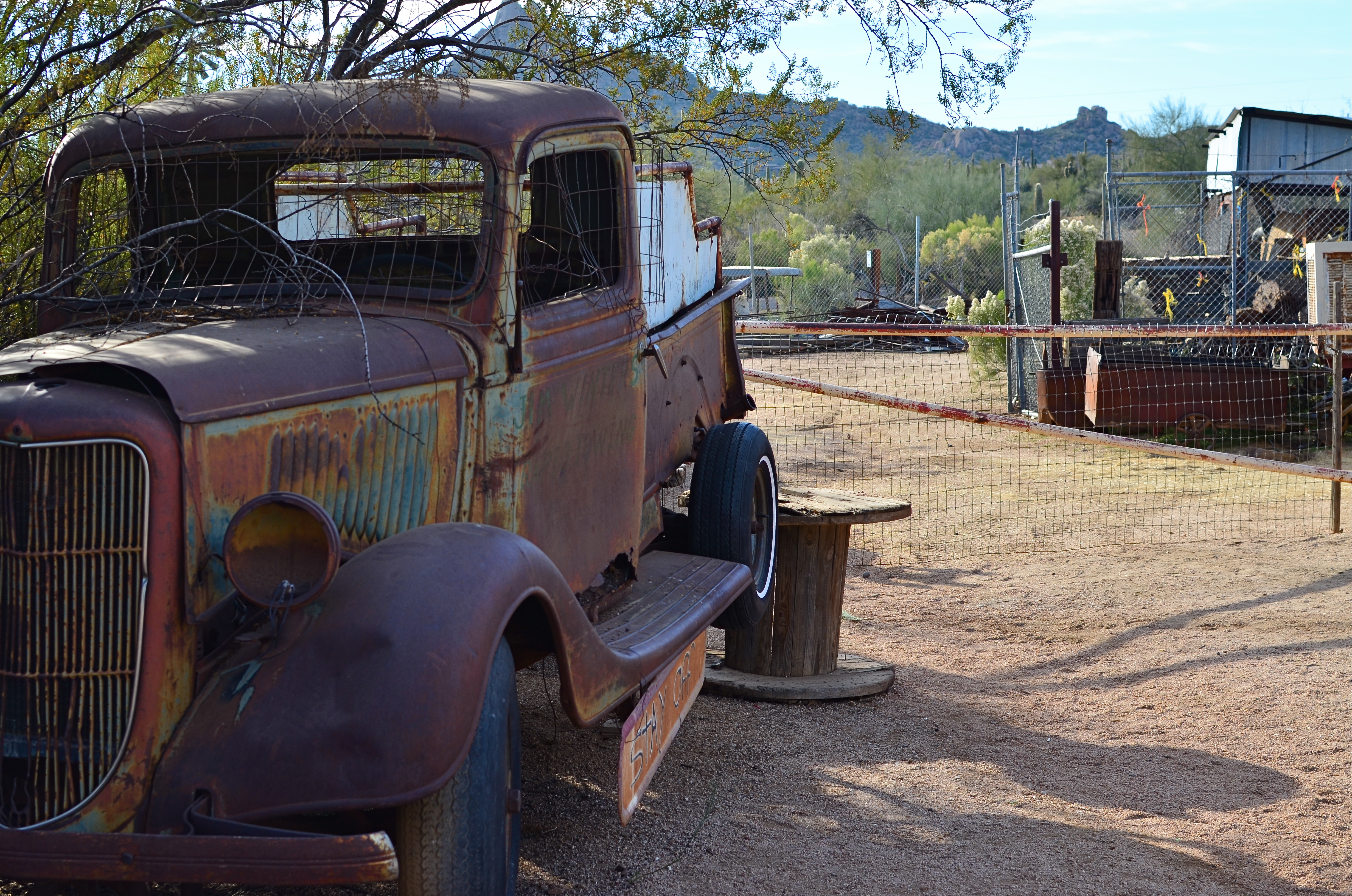
The original shot. Cool truck, but what’s all that lame junk off to the side?
The image up top began with the truck occupying just part of what I hoped would be a balanced composition, showing it in the context of a western desert scene. Only the truck is far more interesting a subject than anything else in the image, so I cropped until the it filled the entire frame. Even then, the grille of the truck was worthy of more attention than the complete vehicle, so I cut the image in half a second time, squaring off the final result and shoving the best part of the subject right up front.
The picture uses its space better now, and, strong subject or weak, at least there is no ambiguity on where you’re supposed to look. Sometimes that’s enough. That’s Zen, too.
I think.
RE-FIXING THE FIX
Think this picture’s bad now? Hey, wait til I start messing with it. 1/40 sec., f/8, ISO 320, 55mm.
By MICHAEL PERKINS
I CAN HEAR MY MOTHER NOW: “Don’t pick at it, you’ll get it infected”.
Okay, she usually was referring to a scab on a skinned knee. But often, when I can’t stop interfering needlessly with an image, I could swear she’s talking about photographs.
You know the ones I mean. The near misses that you would swear could be transformed into masterpieces with just one….more…tweak. Or maybe two. Or thirty. They are often the pictures we love most, like bad kids, simply because they had such potential, at least until we snapped the shutter. Then we stick them, flaws and all, on life support and start playing with things. Contrast. Color. Exotic filters. A spoonful of sugar. A pound and a half of good intentions.
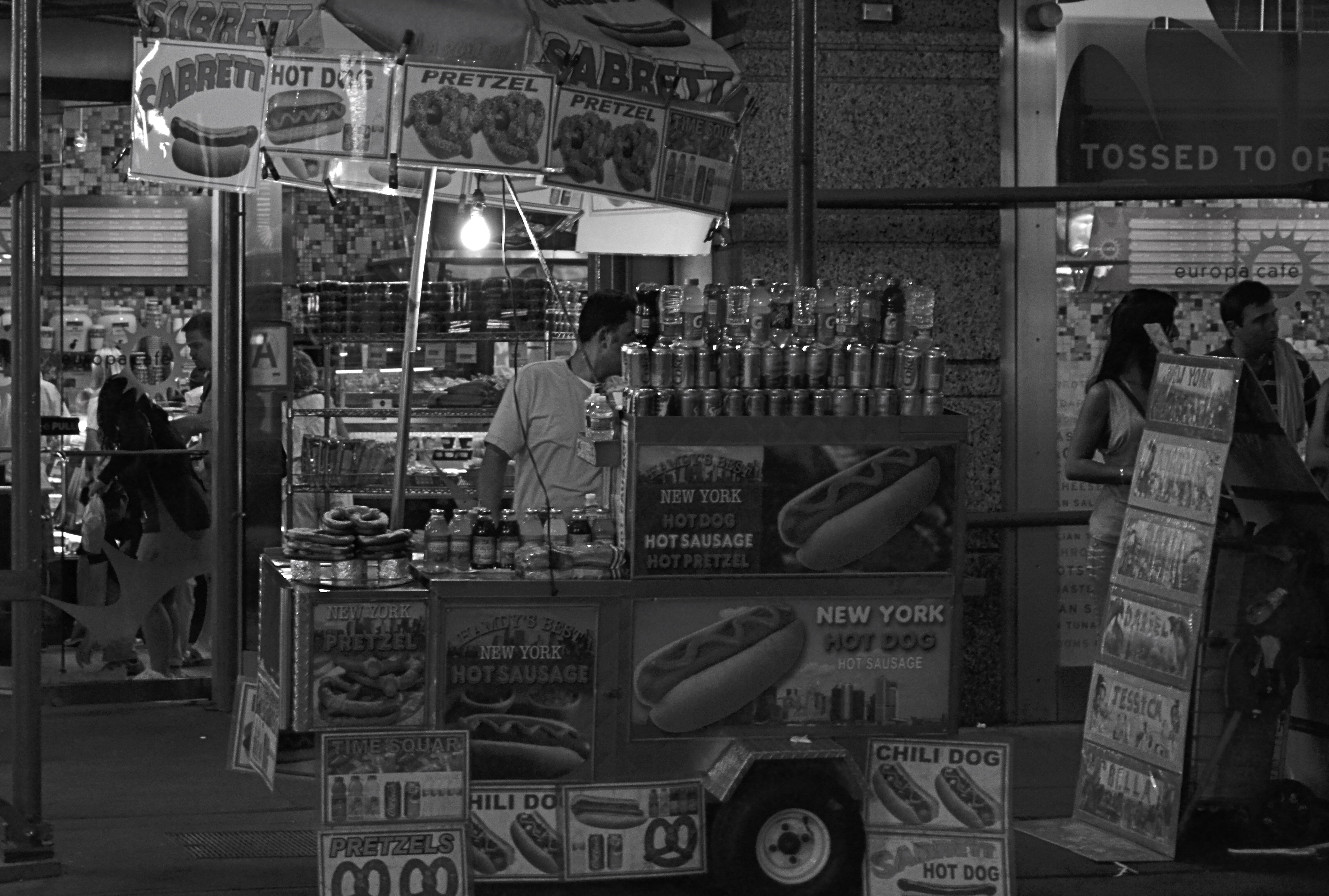
The same shot in monochrome. Yeah, less is sometimes just less.
And, sometimes, by getting our tweak on in a heavy-handed fashion, we make things worse. We render them garish, or glowing, or gooey, and still not what we intended. It’s like tutoring a kid that will never ever make the honor roll. It seems like we ought to be able to do something.
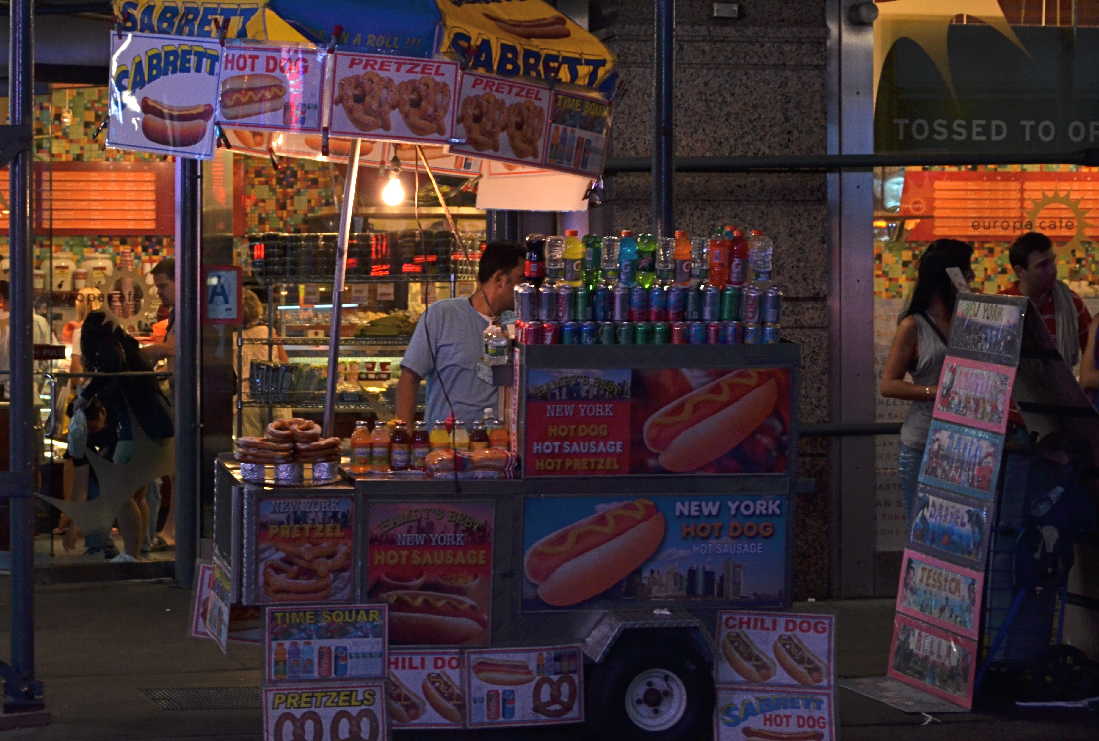
That’s the story of the above color street shot, taken just after sundown in Times Square. All the elements of a good picture are there, but the thing is just all right, nothing more, nothing less. At some point before I first posted it on Flickr, I got the brilliant notion that it would look more “authentic” if desaturated to black and white. Re-examining it more than a year later, I realized “authentic” was code for maybe I can distract people from the fact that I didn’t really bring it home in this shot. Once it was monochromed, the image was actually robbed of whatever minimal punch it might have originally had. All the zippy color of the signage and soda cans was banished, to replaced by….a really dull and narrow range of half-tones. All the depth and presence went out the same exit door as the color, but I went ahead and posted it anyway, trying to convince myself that I had made it much more “street”, when all I had really done was strip out the carnival hues that really said “Broadway”. I had worked against myself, and, worse, I had wasted time on a shot which should have gone in the reject pile from day one.
It’s not a miserable photo, and maybe that’s what really hard to accept. It might have been something. What I should have done, while I was there, was keep trying about ten more frames of this guy and maybe saving the concept. You know, try to get the photo right in the first place. Yeah, I know, how quaint. Thing is, once it was a mediocre picture inside the camera, all I could do was pick the scab.
And then it got infected.
Sorry, Mom.
BRIGHT SMILING LIES
By MICHAEL PERKINS
PHOTOGRAPHY HAS PRETTY MUCH INHERITED ITS CONCEPTION OF PORTRAITURE FROM THE TRADITIONS OF PAINTING. A portrait, to us, is something done on purpose, with purpose, deliberation, a plan. There is at least an attempt on the part of the photographer to strip away the studied facades of the modern world and reveal something of the real person within. And there is ample evidence that you can come compellingly close to doing just that.
Turn the camera around toward ourselves, however, and we all become liars. Bright, smiling liars.
This is not a burn per se on the current pandemic of “selfies” that litter the internet like crushed beer cans along the highway, although many of them deserve to be burned because they are banal or technically inept. No, the self-portrait process itself, cool camera or cheapie, invites deception, the creation of a mask designed only for public consumption. It is a license to hide.
Can anyone be so self-aware or confident that they are able (or willing) to present something raw and unvarnished for a camera lens in the same way we would seek that authenticity from another subject? Or will we come to the camera as if to the edge of a stage, our makeup and “serious” aspect pasted on for a performance?
Back for a moment to the tselfie tsunami of our current era, it’s easy to see this torrent of poses as play-acting, images that actually prevent us from understanding or knowing each other. You have to ask, at some point, is this how this person sees himself? Far from inviting the viewer deeper inside, selfies act as digital “Do Not Disturb” signs that, in fact, discourage discovery. And yet, let’s not let our brethren with tripods, studio lighting and stern demeanours escape blame, either, as their work can be just as riddled with artifice as any quickie-in-the-mirror Instagram. It’s said that people who act as their own lawyers have fools for clients, and the same holds for anyone who takes his own picture.
This is not necessarily cause for despair. All of photography is, after all, an interpretation of reality, not a representation of it. We don’t discount black & white simply because it doesn’t show the world “as it is”, nor do we rule out the “truth” of pictures made from a host of other techniques that are all, certainly interpretive in nature. So the self-portrait will always be a tough nut to crack.
There is nothing more penetrating than the idea of a camera. But, in the carapace we construct around our all-too-secret souls, it may have met its match.
HIGH DYNAMIC RAGE
HDR, used here to recover a few dark details in this somewhat contrasty ladnscape. Far from perfect, but I can live with this.
By MICHAEL PERKINS
THE INTERNET HAS A UNIQUE WAY OF TURNING AN IFFY LOOKING MOLE INTO TERMINAL SKIN CANCER, that is, fanning small sparks into raging infernos by squaring and cubing people’s discontents until they appear monumental. In photographic circles, this phenomenon has made the process known as High Dynamic Range, or HDR a hot potato. Whereas just a few years ago this technique sparked input from people who found it “kind of helpful” or “just not for me”, the current intensity of dialogue on the subject now characterizes HDR as either the greatest tragedy since Ben Affleck got cast as Batman or the miraculous equivalent of mother’s milk.
What has made the average shooter feel like they he has to side with either Mommy or Daddy in a custody battle for the soul of picture-taking? Jeez H. Loueeze. HDR, which is actually just a tool, and thus good or bad depending on how it’s used, has become an enormous bone of contention, with both sides of the debate hurling burning tar balls at each other, safe within the knowledge that they alone possess Real Truth.
Uh….okay, fine.
How’s this for Real Truth: processing in the digital age is no different from the burning, dodging, manipulation and filtering of the analog era, and, somehow, photography has survived both the modest and excessive uses of these and countless others for over two centuries. HDR’s original stated purpose was to modulate the tones of extremely contrasty subject matter, rendering a smoother transition between really light and really dark values to produce a picture that seemed to more accurately reflect how the human eye compensates for contrast. It was concocted as a workaround for one of the optical barriers that cameras are always striving to overcome.
This may have been taken inside a chapel, but not even Jesus could save this one. Gooey and creepy.
So what do you expect humans, always the “X” factor in any art, to do with any new tool? Answer: Anything they damn well please. Of course some people are going to produce beauty while others produce sludge. Of course some will use it to mask or slap a band-aid on badly conceived images. And, of course decent HDR processing platforms will be imitated by cheap apps created in Hacky McHackmore’s Dad’s garage and selling for $1.99.
I have had my own uneasy romance with HDR going back several years. I have found it to be a nice way to tweak color, an intensifier for detail and grain in things like stone and wood, and, yes, a way to dramatize contrasts in superkeen ways. I have also been guilty of slathering it on in the desperate hope that I can “rescue” a shot with it, and have been horrified at the way it makes human skin look like it was hosed down in molten Crayolas. Sometimes I have used it to make things more natural, while, at other times, I have taken advantage of its special talent for making things unearthly. And even when I have made the most inane use of HDR, the planets have, amazingly, continued on their daily orbits. In the words of the not-too-great Bobby Brown, it’s my prerogative.
The intense hater-ama currently being mounted against HDR might better be aimed at what makes its misuse all too predictable: the fact that human judgement is variable, unpredictable, and sometimes, twisted. If there’s a photo process that can eliminate that from the pitcher-taking mix, I’d love to see it. In the meantime, HDR is no more harmful (or salvational) than any other processing platform. If there’s a flaw, it’s inside the skull of the guy pressing the button.
Always has been, always will be.
QUICK STUDY
Don’t think you’re paying me a compliment to say that this “looks like a painting”. Or a cabbage. Or a hammer. It’s a picture.
By MICHAEL PERKINS
THE INCREASINGLY COMMON USE OF THE WORD “PAINTERLY” AS A GENERIC COMMENT ON CERTAIN KINDS OF PHOTOGRAPHIC IMAGES has got me grinding my teeth, as it perpetuates the use of a term that is absolutely meaningless. Almost as meaningless as noting, or caring, at this late date, whether elements of painting are present in photos. This argument goes back so far that I feel compelled to provide the following “Cliff’s Notes” in order to compress 150 years of bickering into a compact format. Presenting:
A COMPLETE CHRONOLOGY OF PHOTOGRAPHIC “TRUTH”
a) We are just as good as painting.
b) No seriously, we are.
c) Who said that? We are so not like painting, which is old and tired.
d) Well, we’re a little bit like it, but we kinda feel weird about it.
e) Wow, I’d love to photograph that painting.
f) Man, I’d love to layer paint on that photograph.
g) Hey, I found a way to make my photographs look like paintings!
Enough already. We never praise a painting by saying it looks “Photo-ish”, so why make the opposite comment? What visual flavor makes any image fall on either side of an arbitrary line, and who the $%#&! cares? The only comment that could possibly matter is to remark that something is “a great picture”, but even that is superfluous. Does it speak? Did it work? Is there something there? Was anything amplified, simplified, defined, revealed in said picture?
This kind of semantic drift persists because, amazingly, some people don’t think photography is miraculous enough without being laden with little linguistic Christmas ornaments that display their acumen and intellect. These are the same people who fret that processing is “cheating” and that expensive cameras make better pictures than cheap ones, and it’s a disservice to any authentic discussion, like the fact that those who wield brushes and those who wield Nikons can both exalt, or denigrate, the human experience.
You don’t have to paint me a picture. You just have to tell me a story.
Related articles
- Blending painterly elements with photography (flickr.net)
THE GREAT RIDDLE
By MICHAEL PERKINS
IT’S FORTUNATE THAT NONE OF US HAS ANY IDEA WHAT APPEALS TO OUR VIEWERS, or else everything we do would revert to a dull formula. If it was possible to predict which of our creations would establish a connection with other hearts and minds, wouldn’t our human nature tempt us to churn out clumsy duplicates of that creation again and again? You see this at craft shows where “artists” hawk dozens of copies of the same image to anyone who passes by, customizing only the frames and enlargement sizes. The first version of the idea was “art”; the cannily repackaged remakes are merely marketing.
With this in mind, the act of putting photographs on the web via various sharing sites is often a puzzling process, since I have no way of knowing whether anything I regard as “successful” will total even one view, and since the pictures I regard as merely “all right” may resonate in a fashion that I never foresaw. Again, I have no control over any of this, which makes it both gratifying and, well, stupefying.
Dream Gardens, Los Angeles (2013). 1/250 sec., f/5.6, ISO 100, 35mm.
You’re looking at the runaway champ photo for total views in my entire Flickr photostream. To me, it’s a bit of whimsy at best, and, if I am totally truthful, an attempt at a partial “save” on what started out to be a rejected image. Backstory: the massive and visually busy central gardens at Los Angeles’ Getty art campus are wonderful to walk through, irresistible to shoot, and a nightmare to capture. If you do the cliché overhead “master shot” of the entire area from, say, two stories in the air, you get something which generally work. However, trying to get a sense of the densely landscaped details at ground level is a fool’s errand. This shot represents a kind of surrender, as it was an attempt to create a quiet composition along one of the more sparse sections of one footpath. Even so, what you’re seeing here is a paring-away of more than half the original frame. There was just too much visual information to work with.
The psychedelic rework on the color is yet another sign that I am not truly comfortable with what I am doing, but it at least represents an attempt to create an “otherness” with the image, to take it out of the normal world. This strategy gave me a picture I could live with, but hardly one I would point to with pride. The verdict from every one else? 5,000 % more eye traffic than the next most popular picture I’ve ever posted on the web, and no sign of slowing. And yet, I know that if I intentionally take another picture like this, it won’t become part of a “series” or a “school of thought”, merely me trying to cash in on a great riddle.
We use our photography to make a case for our various visions to an unknown jury, but, in most cases, we sort of “get” what worked about a picture. But when mysteries like these occur, we can merely
a) be grateful
b) say goodnight, Gracie.
I am reminded about an old bit where Billy Crystal “imitated” famous people by cutting out the mouths of big posters of various icons, then sticking his own lips where theirs should be and “speaking” for them. I fell on the floor as he took his place behind a huge image of Albert Einstein, and in his best Catskills accent, kept repeating, “WHO KNEW? WHAT DID WE KNOW??”
What, indeed.
Follow Michael Perkins on Twitter @MPnormaleye.
HOLLYWOOD NIGHTS
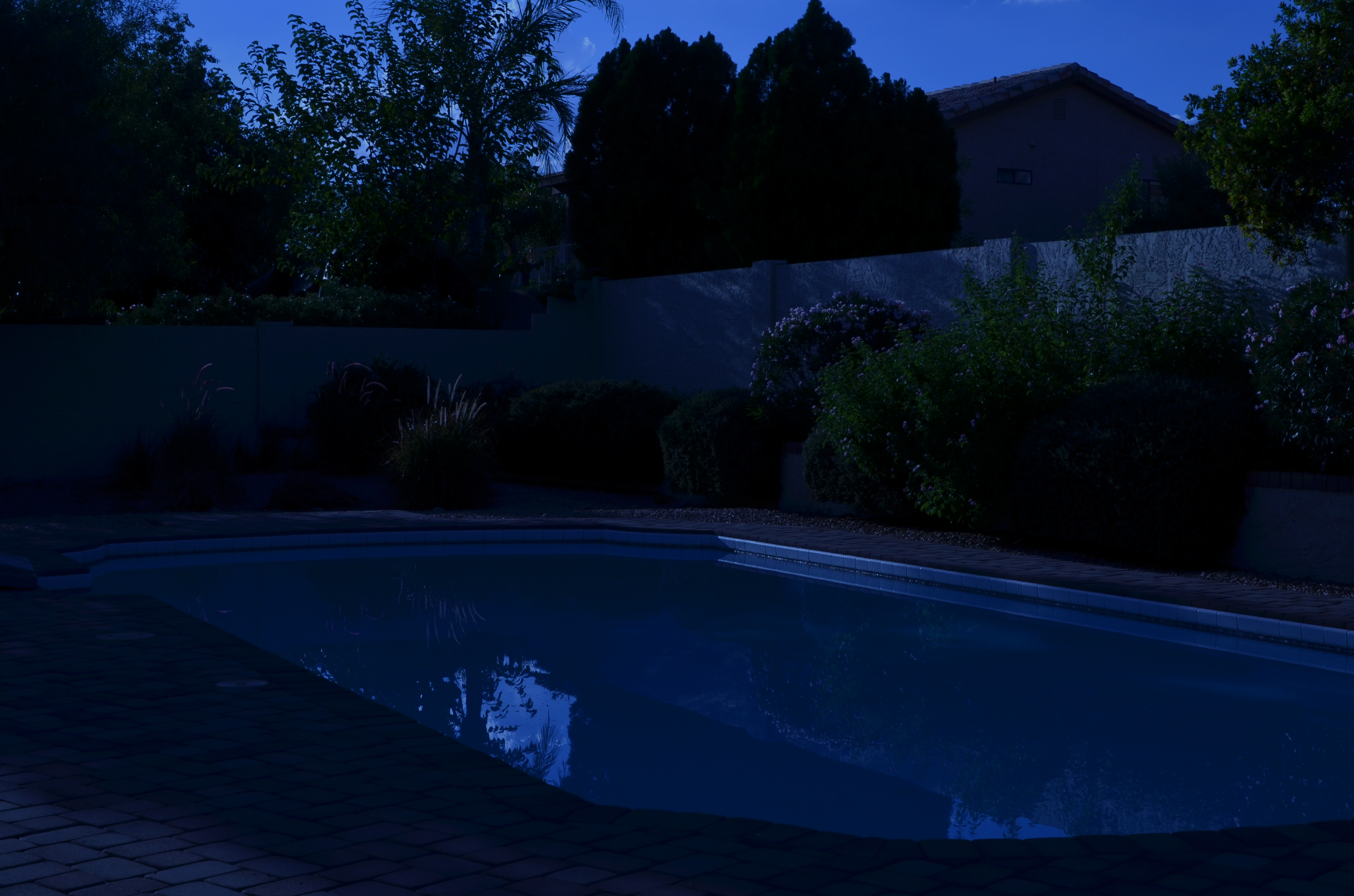
Moonlight night around the poolside, only not really: a “day-for-night” shot taken at 5:17pm. 1/400 sec., f/18, ISO 100, 35mm, using a tungsten white balance.
By MICHAEL PERKINS
TIME LIMITS US IN EVERY PHOTOGRAPHIC SITUATION: LIGHT HEMS US IN EVEN FURTHER. Of course, the history of photography is rife with people who refuse to just accept what time and nature feel like giving them. In fact, that refusal to settle is source of all the artistry. Too bright? Too bland? Wrong time of day? Hey, there’s an app for that. Or, more precisely, a work-around. Recently, I re-acquainted myself with one of the easiest, oldest, and more satisfying of these “cheats”, a solid, simple way to enhance the mood of any exterior image.
And to bend time… a little.

Same scene as above taken just seconds later, but with normal white balancing and settings of 1/250 sec., f/5.6, ISO 100, 35mm.
It’s based on one of Hollywood’s long-standing budget-savers, a technique called day-for-night. For nearly a century, cinematographers have simulated nightfall while shooting in the daytime, simply by manipulating exposure or processing. Many of the movie sequences you see represented as “night” are, in fact, better lit than any “normal” night, unless you’re under a bright, full moon. Day-for-night allows objects to be more discernible than in “real” night because their illumination is actually coming from sunlight, albeit sunlight that’s been processed differently. Shadows are starker and it’s easier to highlight what you want to call attention to. It’s also a romantically warm blue instead of, well, black. It’s not a replication of reality. Like most cinematic effects, it’s a little bit better than real.
If you’re forced to approach your subject hours before sunset, or if you simply want to go for a different “feel” on a shot, this is a great shortcut. Even better, in the digital era, it’s embarrassingly easy to achieve: simple dial up a white balance that you’d normally use indoors to balance incandescent light. Use the popular “light bulb” icon or a tungsten setting. Indoors this actually helps compensate for cold, bluish tones, but, outside, it amps up the blue to a beautiful, warm degree, especially for the sky. Colors like reds and yellows remain, but under an azure hue.
The only other thing to play with is exposure. Shutter-speed wise, head for the high country
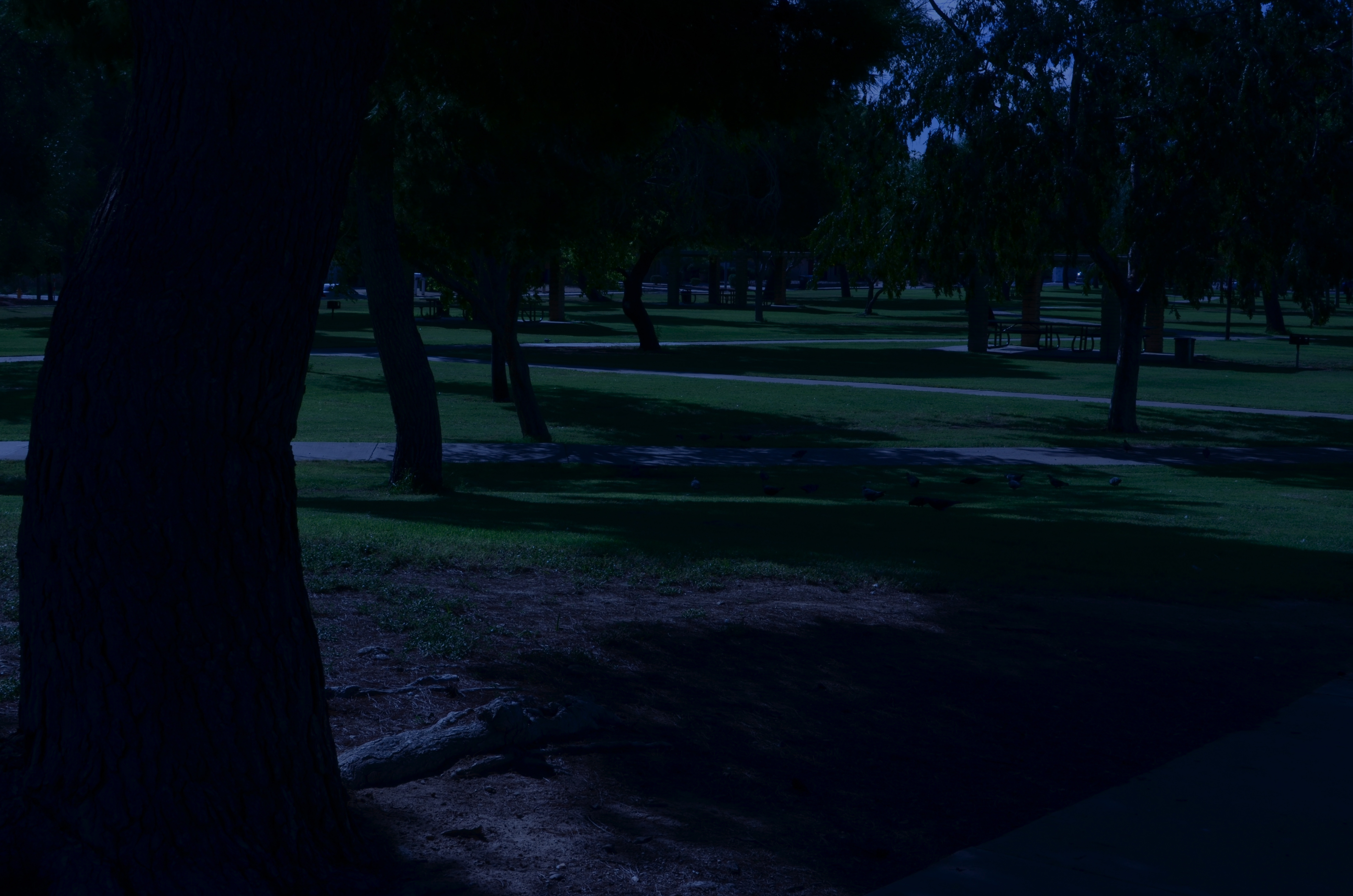
A faux “night” at the park. 1/320 sec., f/20, ISO 100, 35mm.
at anywhere from f/18 to 22, and shorten your exposure time to at least 1/250th of a second or shorter. Here again, digital is your friend, because you can do a lot of trial and error until you get the right mix of shadow and illumination. Hey, you’re Mickey Mouse with the wizard hat on here. Get the look you want. And don’t worry about it being “real”. You checked that coat at the door already, remember?
Added treats: you stay anchored at 100 ISO, so no noise. And, once you get your shot, the magic is almost completely in-camera. Little or no post-tweaking to do. What’s not to like?
I’m not saying that you’ll get a Pulitzer-winning, faux-night shot of the Eiffel Tower, but, if your tour bus is only giving you a quick hop-off to snap said tower at 2 in the afternoon, it might give you a fantasy look that makes up in mood what it lacks in truth.
It ain’t the entire quiver, just one more arrow.
Follow Michael Perkins at Twitter @MPnormaleye.
GRAND BALLET
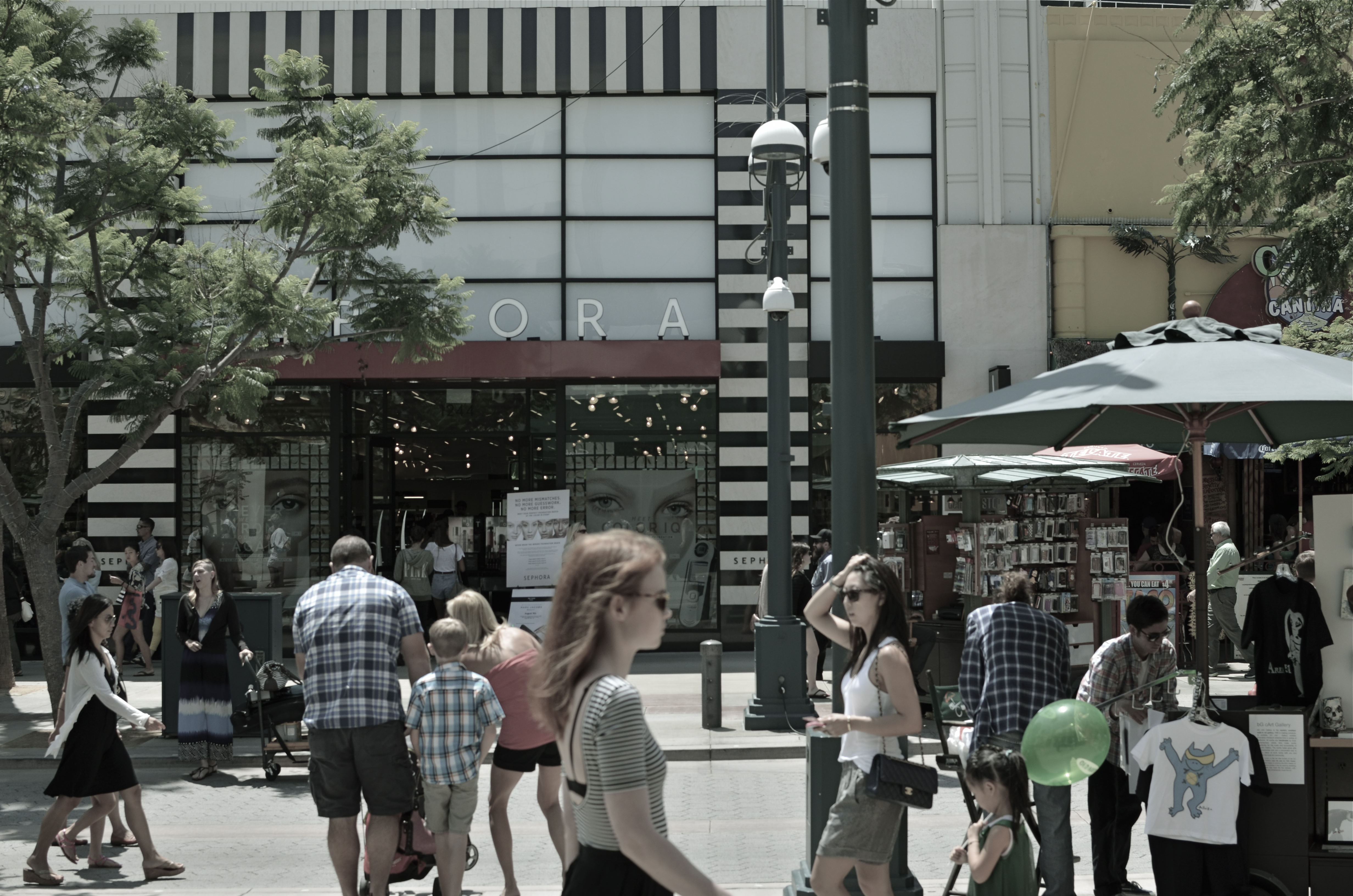
Third Street Promenade, Santa Monica, 2013.
By MICHAEL PERKINS
SOMETIMES THROWING EVERYTHING INTO THE POT MAKES FOR BETTER STEW. Yeah, of course a simple bowl of tomato soup can be elegant, understated. But so can pitching every stray ingredient into the mix and hoping the carrots play nice with the asparagus. Matter of taste depending on one’s mood.
Henri Cartier-Bresson placed his camera at the intersection of “now” and “next”.
So it goes with street photography. Some insist that isolating a single story, a singular face, a tightly framed little drama is the way to go. And that is certainly true much of the time. But so can casting a wide net, framing a grand, interactive ballet of conflicting lives and destinations. It’s like the concentrated, two-man drama of Waiting For Godot versus the teeming crowd scenes of The Ten Commandments. Both vibes come from the street. Just depends on what story we’re telling today.
From the work of Henri Cartier-Bresson, the great street photog of the mid-20th century, I learned to love the seeming randomness of crowds and their competing destinies. HCB was a genius at showing that something wonderful was about to happen, and I love to see him capturing the moment before there even is a moment. His still images fairly beg to be set into motion: you are dying to see how this all comes out. If HCB is new to your eye, I beg you, seek him out. His work is a revelation, a quiet classroom of seeing sense.
I have posted both quiet stories and big loud parades to these pages. Both have their appeal, and both demand a discipline and a selective eye, which means I have a few light years’ worth of learning before me in both areas. That’s the great thing about art. You can’t get done. You can be on the way, but you will not get there. Not if you’re honest with yourself.
For the viewer, myself included, you have to go beyond “snap looking” which is the audience’s equivalent of “snapshooting”. Some images require that you linger, just as some wines are to be sipped instead of guzzled. Slowing down when viewing a frame is the best tribute to whatever pauses the photographer took in creating it in the first place. This picture business is truly a shared project between creator and user.
Gosh, I feel all brotherly and warm-hearted today.
Sort of an urge to be part of the crowd.
Follow Michael Perkins on Twitter @MPnormaleye.
Related articles
- Henri Cartier-Bresson (estone6.wordpress.com)
- The decisive moment (photovide.com)
A CHANGE IN PRESCRIPTION
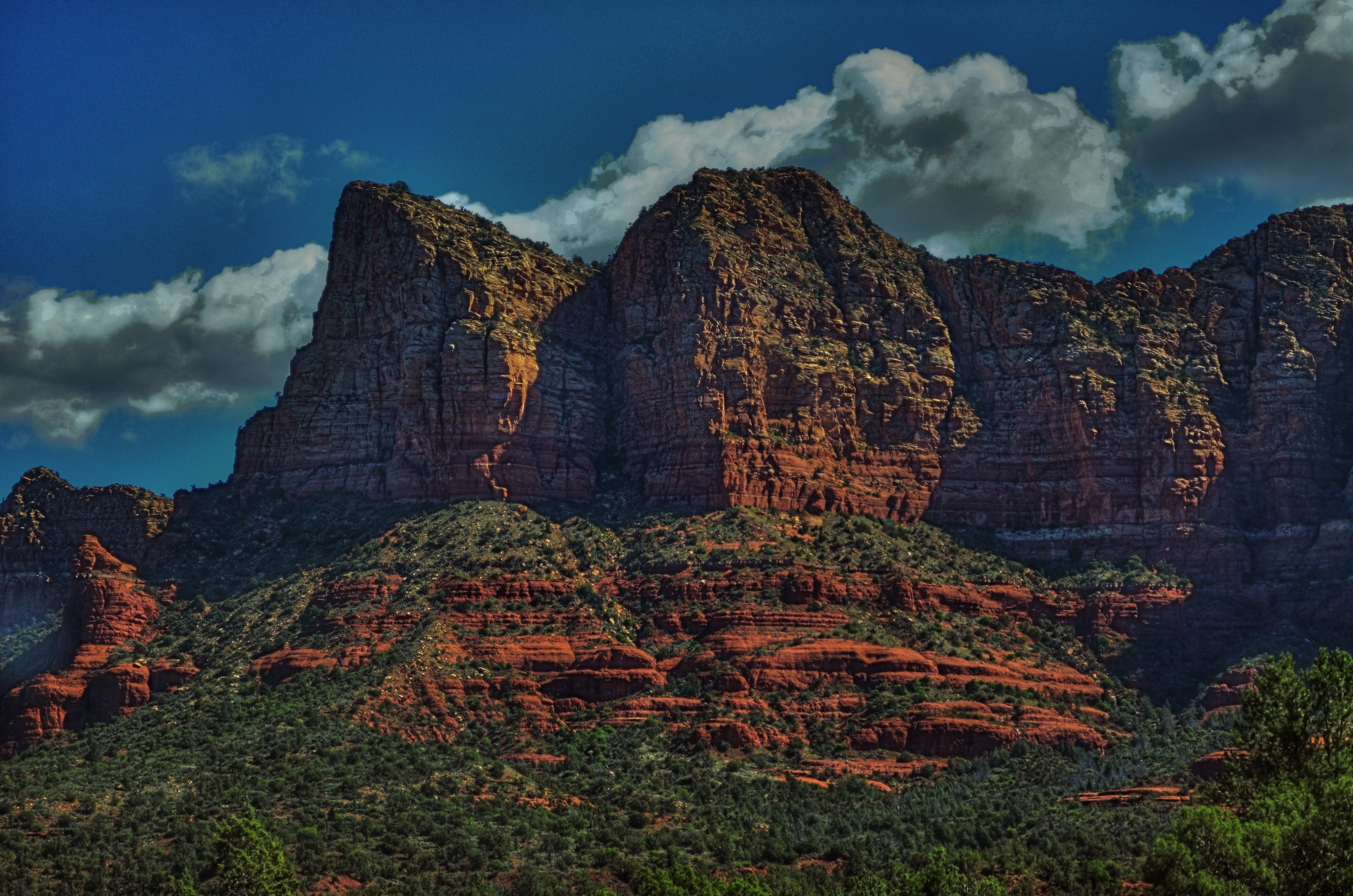
Sedona Bluffs, 2013. HDR can be your best friend when rescuing detail and shadow on subjects like this. But it will make your Aunt Hilda look like the Portrait of Dorian Gray.
By MICHAEL PERKINS
THERE IS AN OLD STORY ABOUT AN IRISHMAN WHO FINDS AND RUBS A MAGIC LAMP. Upon emerging from said lamp, the genie tells the boyo that he can have three wishes. For his first, he asks for an everlasting pint, a beer glass that will endlessly refill every time he drains it, forever. “Try it out”, says the genie, whereupon the lad gulps down several draughts, each one replenished in an instant. “This is grand!” he shouts. “All right, now”, reminds the genie, “what about your other wishes?” “Oh, that’s easy”, says the Irishman, “just give me two more of these.”
High Dynamic Range, or HDR processing is a little like those two unused wishes. You can fall in love with the effect of using it without pausing to see if it makes sense to use it, or see what else is out there on the horizon.
HDR can be the photographic equivalent of a crack habit, especially when you first test-drive it. Rescuing information from shadows, accenting detail to ever-crisper levels, tweaking colors to Peter Max-imums…..it’s all pretty stunning, and, like the 98-pound weakling in the Charles Atlas ads, the drama is best seen in “before and after” comparisons. And then there follows The Great Period Of Overcompensation, that heady phase in which you turn everything you shoot into a psychedelic fever dream. It’s garish, sometimes cartoonish, but eventually you get to a point where you want to throttle back and just use HDR as a tool instead of a magic paint box. It can’t be a style all by itself, but it can amplify your own style, extend your reach. Ground Control To Major Tom….
This blog has always been a discussion of why we do things rather than a tutorial on how to do them. It’s the decisions that we make with technology that matter, more than the technology itself, so we talk about judgements, motivations, intentions. In that vein, I’ve updated the HDR gallery tab of the blog with all new images, in an attempt to chronicle where I am with this process today. I originally intended the galleries to do this….to be a visual track on what I thought important to try in a given period. We are,literally, different photographers every day we wake up, so it’s absurd to think that any technique, approach, or magic wish will work for us equally well forever. The patient still has needs, but he requires a periodic change in prescription.
So settle back with an endless pint and give us a look.
The pictures may not work for you, but, hey, if the beer’s cold, it’s not a total loss.
Follow Michael Perkins on Twitter @Mpnormaleye.
Related articles
- HDR Photography: craze or crazy? (homesandlandofmontreal.wordpress.com)
THE COLORS OF DREAMS
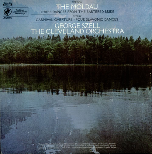
I will never know the name of the stock photographer at Columbia Records who shaped me with this image. But I know his genius.
By MICHAEL PERKINS
ONE OF THE TRICKIER PARTS OF BEING MY AGE is that I have been carrying around certain creative influences inside my skull for so many consecutive decades that their origins often blur. Who said it? Where did I brush up against that angle, that idea? Where did I see it? Book? Movie? Conversation? Who brought me into contact with this treasure? Inspiring mentor? Loving teacher? Teaching lover?
Of course, it can be argued that what you walked through the door to discover matters more than the door itself.
Maybe. But for me, the door and the room it leads to are two halves of one whole.
For most of my life, I have been fascinated by the intentional “un-realing” of color, the hypnotic spell of hues that weren’t “that way in nature”, but, through interpretation, could add drama and impact, even magic to the final version of an image. About a week ago, I was reminded of one important reason why I feel that way.
Researching composer Bedrich Smetana’s gorgeous musical love poem to his homeland, The Moldau, I set eyes on an image that I had not seen for over forty years; the cover photograph for a recording of Moldau by George Szell and the Cleveland Orchestra that I purchased in the 1970’s. My own copy of the original LP is long gone, but I still own a reissue of the performance, music that afforded my teenage self a serenity, a dream quality, a magic that travels within me to this day. In true “multi-media” fashion, I never listened to the original album without its cover within clear sight, its blue-green image of a soft-focus lake and forest quieting my nerves, inducing the music’s spell again and again.
One one level I knew that the colors in the photograph were not “natural” in the strictest sense, but they were nonetheless hypnotic. Through them, I saw Smetana’s homeland, its villagers, its folks rituals, and the beautiful river Vlatava. For me, the picture was the music, and the music was the picture. Energy flowed seamlessly from one conception of beauty to the other.
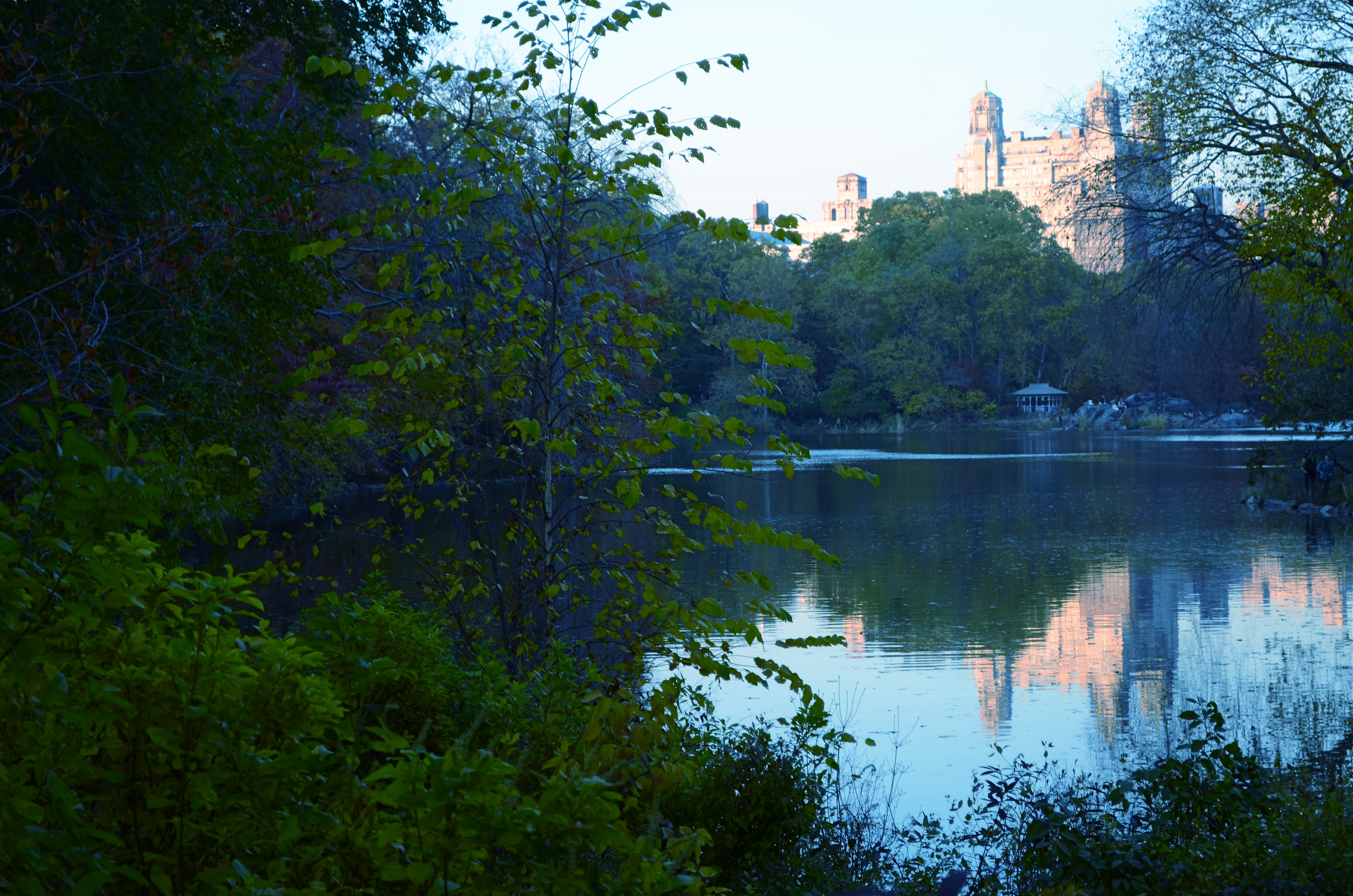
The Lake, Central Park West, NYC., 2011. 1/80 sec., f/5.6, ISO 160, 50mm.
Some of my own work, naturally, strives for this quality, the ability of a photograph to unchain the mind, to allow feelings to flow, to allow color to be abstracted, just like language or music. Some will call it influence, others imitation. I prefer to think of it as respect. And while I will never know the name of the stock photographer whose image was probably slapped onto The Moldau’s album cover as a clerical afterthought, I love it when I see his work leak through my fingers, if only a little.
Shade your dreams however you like.
And let the music surrender its colors.
Follow Michael Perkins on Twitter @MPnormaleye.
THREE STRIKES AND YOU’RE…IN?
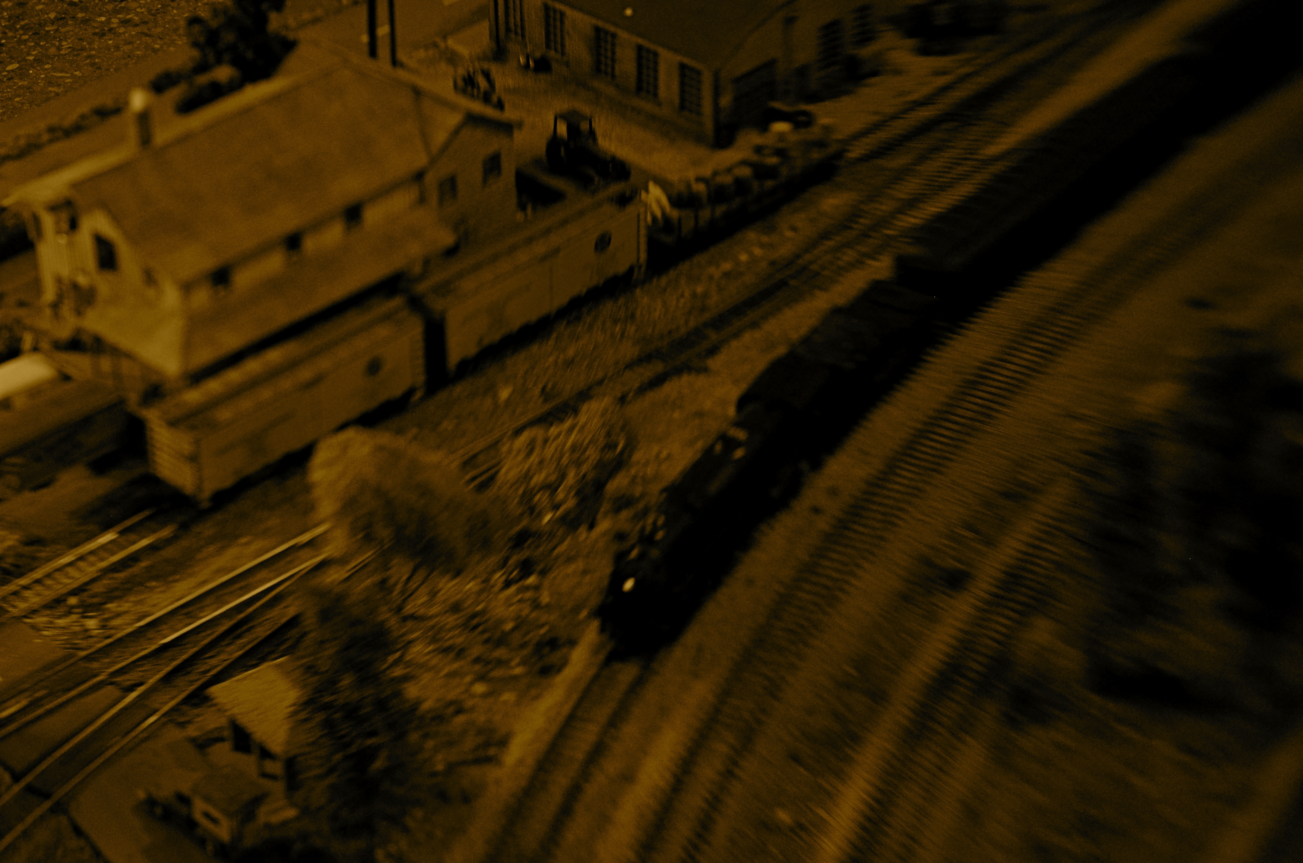
“Wreck Of The Old ’87”. Wreck is right. 1/80 sec., variable depth of field created with a Lensbaby attachment, ISO jacked to 640, 35mm.
By MICHAEL PERKINS
WHEN SORTING MY IMAGES INTO KEEPERS AND CLUNKERS, I ALWAYS SUFFER THE SAME BIAS. Whereas some people might be too eager to find reasons why a picture should be inducted into the former group, I nearly always search for reasons to toss them into the latter one. I always know right away what I’ve failed to achieve in a given frame, and its flaws glow like safety orange in my brain to the point where I not only can’t credit myself for the photo’s stronger elements, I can no longer even see them. I therefore consign many pictures to the rubbish heap, a few of them prematurely.
Usually, however my first call is the right one. I very seldom revisit a picture I initially disliked and find something to redeem it. So it was kind of headline news when I recently “saved” a photo I had originally (and wisely) savaged. Hell, I’m still ambivalent, at best, about it, but I can’t truly classify it as an outright Lost Child anymore.
It came from a random day of practice I had undertaken with a Lensbaby, one of those effects lenses designed to give you the ability to manually throw parts of your image out of sharp focus, in fact to rotate around and create various “sweet spots” of sharpness wherever you want to. I don’t use the thing a lot, since it seems, on some level, damned silly to put defects into your pictures on purpose just to convince yourself you are, ahem, an artiste. But, all work and no play, etc. etc., so I was clicking away inside a dimly lit building at a railway museum in which a huge layout of miniature train dioramas is a regular attraction. I seemed to be going out of my way to create a picture that would normally be “three strikes and you’re out”…..that is:
poorly lit, and loving it
poorly focused, otherwise known as, sure, I meant to do that, and
a half-baked attempt to make something fake appear real.
Only one of the shots sparked my interest at all, purely because it seemed to contain a sort of… mystery. So many dark corners. So many unexplained details. A very disorienting, dreamlike quality that had to have jumped into the camera without any help from me. It looked both hyper-real and utterly false, simultaneously fearsome and fascinating. Again, this all happened in spite of, not because of, any action on my part. I added no post-processing to the shot, except to desaturate it and slather on a layer of sepia. Other than that, I left it in its original sloppy, random state.
And then I decided it was still junk and forgot about it for a few months.
Just why I have, in recent days, tried to rehabilitate my thinking about it is anyone’s guess. Like I sad at the top, I look for reasons to reject my work, not excuse it. This has little to do with modesty. It’s just an admission that control is so much a part of my make-up that I recoil from images where I seem to have absolutely relinquished that control. They scare me a little.
But they thrill me a little too. And, as Vonnegut says, so it goes.
Perhaps the best thing is to maintain the Keepers and Clunkers piles, but add a third, labeled “Not Really Sure”.
Follow Michael Perkins on Twitter @mpnormaleye.
Related articles
- Peering Through a Shaft of Light (johnbee.ca)
FEWER TOYS, MORE TOOLS
This is Nikon’s “High-Key” effects mode. It’s a cheap gimmick, and you paid for it, even though (a) it is not High Key and (b) you can easily make this shot yourself. 1/30 sec., f/2.8, ISO 1250, 35mm.
By MICHAEL PERKINS
MANY OF THE “ENHANCEMENTS” OFFERED BY TODAY’S MAJOR PHOTO GEAR MANUFACTURERS ARE, IN FACT, OBSTACLES to learning how to take responsibility for making pictures. The automatic bells and whistles that are being engineered into today’s cameras seems to send the message: you don’t have to think too hard. Push the button and we will provide (and predict) the results.
It may be fabulous for convenience, but it’s lousy news for the experimentation and personal risk which are required for great photography to occur.
We live in a time of short cuts, of single-button solutions for every creative problem. We have modes for that. Low light, too much light, a day at the beach, a day in the snow, a closeup, a landscape? Guaranteed results at the dial-up of an automode. Hey, you’re an artist. No need to obsess about all that techno-whatsis. Your camera will determine the results. Just dial up what you want: it’s all automatic. You need hardly be there.
Does anyone really believe that anything of artistic value can evolve from machines being in charge? When’s the last time a computer created a novel of staggering impact? Who is taking the picture here…..you or your camera?
Fully automatic, aperture priority and shutter priority are all good basic tools, and wonderful work is done in all three modes as well as full manual. But there is a huge leap between these settings and the gaudy, gimmicky “effects” modes that are increasingly larding up cameras with novelty and diversion.
Let’s take a look at some of the prime offenders. Are these toys necessary?
NIGHT VISION: If you want a picture to look like you took it while on combat recon in a forward area of Afghanistan, go for this option. Boosts your ISO up to 25,600 so you can get some image on the sensor, even in utter blackness, loaded with grain and visual muck. And why? Useless.
COLOR SKETCH: Concerts your original image into an “arty” rendering, minus the shadows, attenuating tones, or subtlety. Looks just like a classy artist knocked out a masterpiece with his box of charcoals! Fools no one except perhaps extremely learning-challenged chimps. If you want to be a painter, fine, then do it, but let’s stop calling this an enhancement.
MINIATURE EFFECT. Okay, so you can’t afford a real tilt-shift lens to create the illusion that your aerial shot of Paris is really a toy-sized tabletop model, so let’s take your photo and throw selective parts of it out of focus. That should be good enough. We’ll now allow a five-minute pause here for the exactly two times you’ll ever care about making a picture like this.
SELECTIVE COLOR. De-saturate portions of your original for dramatic effect. This is the opposite of the images of a century ago, when people, before color film, added selective hues to monochrome images…for dramatic effect. Only thing is, drama should already be in the picture before you apply this gimmick, hmm? Like many effects modes, this one tempts you to use it to fix a photo that didn’t tell its story properly in the first place. And yes, I have sinned in this area, sadly.
SILHOUETTE. The camera makes sure your foreground subjects are dark and have no detail. In other words, it takes pictures exactly the way your Aunt Sadie did with her Instamatic in 1963. Oh, but it’s so artistic! Yes, cameras always make great art. All by themselves.
HIGH KEY or LOW KEY. This used to mean lightening or darkening of selected items done by meticulous lighting. Now, in Camera Toyland, it means deliberately under-or-overexposing everything in the frame. See earlier reference to your Aunt Sadie.
As far as what should be built into cameras, I’m sure that you could compose your own wish list of helpful tools that could be available as quick-dial aids. My own list would, for example, include the moving of white balance choices from the screen menus to the mode dial. Point is, for every ready-made effect that you delegate to the camera, you are further delaying the education that can only come from doing things yourself. If you want a happy picture, make one, rather than taking a middling one and then dialing up the insertion of a magical birthday cake in the middle of the shot after the fact.
As point-and-shoots are eventually replaced by smartphones and DSLRs position themselves to remain competitive as least on the high-end portion of the market, there seems to be a real opportunity for a revolution in camera design….away from toys and in favor of tools.
follow Michael Perkins on Twitter @mpnormaleye.
NO CLEAR “BLACK AND WHITE” ANSWER
Hey, He’s just not that into you: In-camera monochrome, on a Nikon d5100: 1/200 sec., f/5.6, ISO 100, 35mm. Street photography sometimes benefits from a limited tonal range.
By MICHAEL PERKINS
SHOOTING IN BLACK AND WHITE, BEFORE THE DIGITAL ERA, WAS AN ACTIVE, RATHER THAN A PASSIVE CHOICE. You had to decide, before loading your camera, what an entire roll of film would be able to capture in terms of color/no color. There was no way to change your mind until that roll was completed and replaced. As you pre-chose film speed, light sensitivity, or special processing considerations, you also committed, before Frame One, to a single tonal option.
If you are really getting long in the tooth, you can remember when monochrome was the default choice for most of your film shoots. Economy was one factor, and, for certain shooters, including many of the pros, there was a lack of confidence that color films could render nature reliably. Giants like Adams, Edward Weston and others eschewed color throughout most of their careers, since they feared that either garish emulsions or the limits of extant printing processes would betray them in a way that black and white would not. And of course, in a world in which post-processing meant the skillful manipulation of a negative and the mastery of print-making, monochrome was simply an easier beast to tame.
Wow, are we ever in a different place.
Today, we can change our “film speed”, light sensitivity, and every kind of color emphasis frame-by-frame, and for many of us, color is our first choice, with many monochrome images post-processed from shots that were originally multi-hued. Photoshop and countless other programs allow us to have it all, with endless nuanced permutations from a single capture. Black and white is now often an “effect”, an after-thought derived later rather than sooner in our thought process. Oh, look what happens when I push this button. Cool.
Shot in color, de-saturated in post. A boring shot in color becomes super-bland when rendered in monochrome. Blame the shooter, not the mode.
Most users’ manuals for today’s cameras, especially DSLRs, actually advise converting color images to b&w in “post” rather than enabling the camera’s picture controls to shoot monochrome in the first place. The prevailing opinion seems to be that results will be better this way, since processing offers finer-tuned controls and choices, but I take issue with that, since I believe that color/no color as a choice is best made ahead of the shutter click, no less than choices about aperture or DOF. You need to be thinking about what black & white can bring to your shot (if anything) as part of your pre-shoot visualization. The tonal story in a picture is simply too important for you not to be planning it beforehand.
The quality of in-camera monochrome modes for both Nikon and Canon are both perfectly adequate to give you a workable image versus converting the shot later with software, and that’s good, because getting the shot right in the moment is better for the result than infinite knob-twiddling after the fact. Monochrome is a tool for telling a story or setting a mood. It makes sense that its use be tied to what you are trying to achieve as you are planning it….not slathering it on later as an oh-this’ll-be-keen novelty. That’s Instagram technique, not photographic technique.
One great habit to retain from the days of film: anticipate your need, and shoot according to that need. Plan ahead. “Fix it in the lab” only works for shots with slight imperfections, frames in which the concept was sound enough to warrant painting away a few flaws. Going to black and white to save an iffy shot is a Hail Mary pass at best.
As as we all know, you don’t always get what you pray for.
That’s the truth. In black and white.
Follow Michael Perkins on Twitter @MPnormaleye.
Related articles
- Capturing Texture in Black & White Photography (jdgilchristphotography.wordpress.com)
- Black and White used like Color (atmtxphoto.com)
COMMANDER-IN-GRIEF
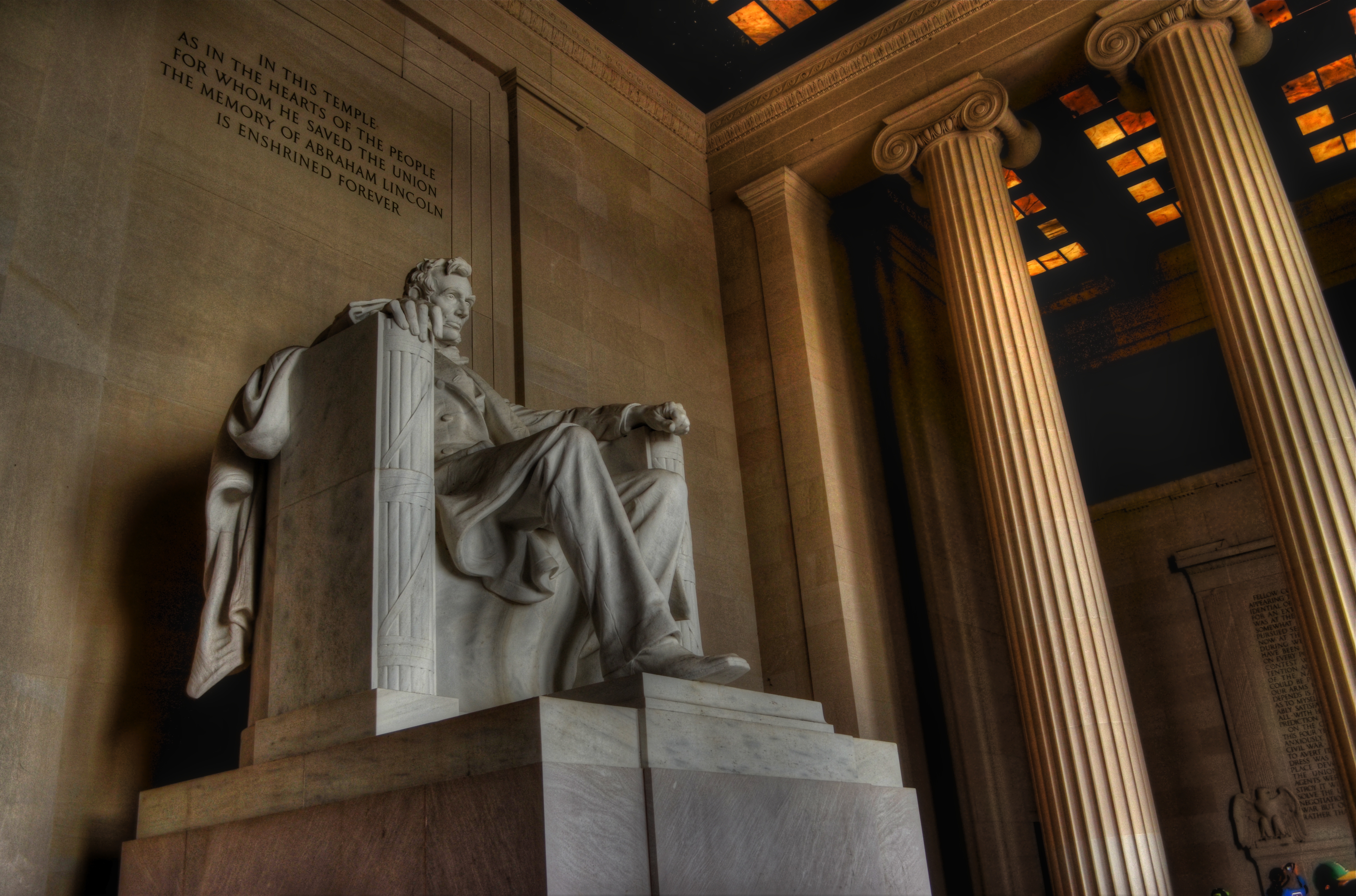
Mr. Lincoln’s vigil continues. See below for details on the making of this image.
By MICHAEL PERKINS
MANY OF THOSE WHO TRAVEL TO WASHINGTON, D.C.’s VARIOUS MONUMENTS each year generally strike me as visitors, while those who throng to the memorial honoring Abraham Lincoln seem more like pilgrims. Scanning the faces of the children and adults who ascend the slow steps to the simple rectangular chamber that contains Daniel Chester French‘s statue of the 16th president, I see that this part of the trip is somehow more important to many, more fraught with a sense of moment, than the other places one may have occasion to view along the National Mall. This is, of course, simply my subjective opinion. However, it seems that this ought to be true, that, even more than Jefferson, Washington or any other single person attendant to the creation of the republic, Lincoln, and the extraordinary nature of his service, should require an extra few seconds of silent awe, and, if you’re a person of faith, maybe a prayer.
This week, one hundred and fifty years ago, the gruesome and horrific savagery of the Civil War filled three whole days with blood, blunder, sacrifice, tragedy, and finally, a glimmer of hope, as the battle of Gettysburg incised a scar across every heart in America. Lincoln’s remarks at the subsequent dedication of the battlefield placed him in the position of official pallbearer for all our sorrows, truly our Commander-In-Grief. Perhaps it’s our awareness of the weight, the loneliness, the dark desolation of that role that makes visitors to the Lincoln Memorial a little more humble, a little quieter and deeper of spirit. Moreover, for photographers, you want more of that statue than a quick snap of visiting school children. You want to get something as right as you can. You want to capture that quiet, that isolation, Lincoln’s ability to act as a national blotter of sadness. And then there is the quiet resolve, the emergence from grief, the way he led us up out of the grave and toward the re-purposing of America.
The statue is a simple object, and making something more eloquent than it is by itself is daunting.
The interior of the monument is actually lit better at night than in the daytime, when there is a sharp fall-off of light from the statue to the pillars and colored glass skylights to its right and left. You can crank up the ISO to retrieve additional detail in these darker areas, but you risk the addition of grainy noise. In turn, you can smooth out the noise later, but, in so doing, you’ll also smear away the beautiful grain in the statue itself.
In my own case, I decided to take three bracketed exposures, all f/5.6, , nice and wide at 20mm, low noise at ISO 100, with shutter speeds of 1/50, 1/100, and 1/200. In blending the three later in Photomatix’ Detail Enhancement mode, I found that the 1/200 exposure had too little information in it, so a composite of the three shots would have rendered the darkest areas as a kind of black mayonnaise, so I did the blend with only two exposures. Stone being the main materials in the subject, I could jack up the HDR intensity fairly high to accentuate textures, and, for a more uniform look across the frame, I gently nudged the color temperature toward the brown/amber end, although the statue itself is typically a gleaming white. The overall look is somewhat more subdued than “reality”, but a little warmer and quieter.
Abraham Lincoln was charged with maintaining a grim and faithful vigil at America’s bedside, in a way that no president before or since has had to do. Given events of the time, it was in no way certain that the patient would pull through. That we are here to celebrate his victory is a modern miracle, and the space his spirit occupies at the Lincoln Memorial is something photographers hunger to snatch away for their own.
What we try to capture is as elusive as a shadow, but we need to own something of it. The commander-in-grief’s legacy demands it.
Follow Michael Perkins on Twitter @mpnormaleye.
Related articles
- Other Proposed Designs for the Lincoln Memorial (ghostsofdc.org)
- Lincoln Memorial Under Construction (ghostsofdc.org)
LIPSTICK ON A PIG
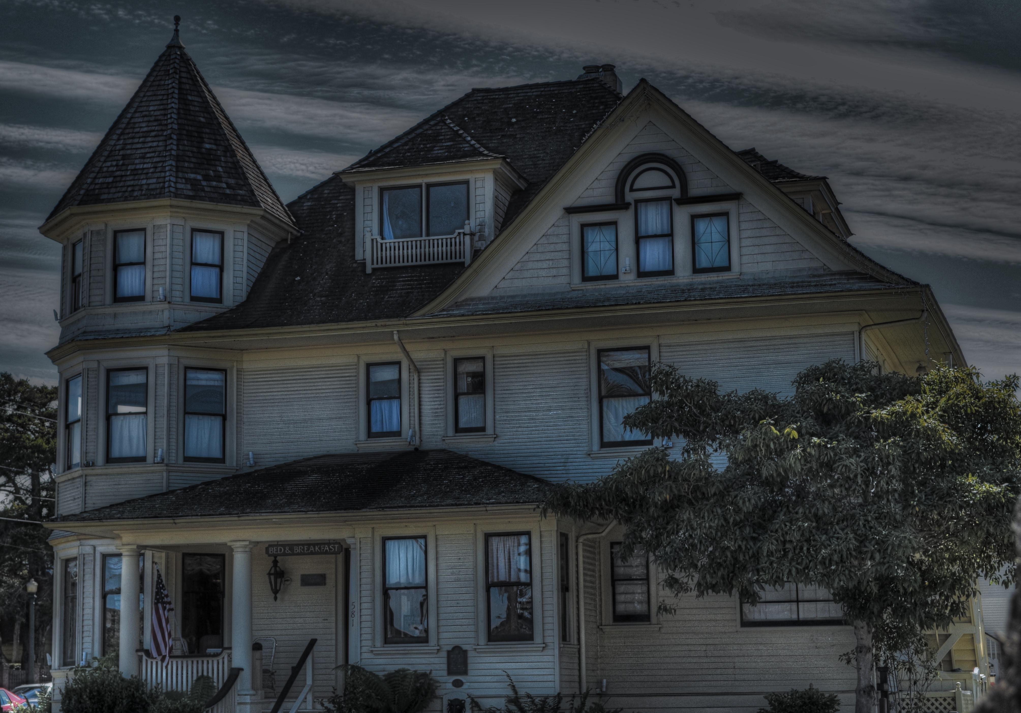
Bad day at the office: having failed at making this house charming, I then went on to also fail at making it sinister and forbidding. I did, however, succeed in making it an unholy mess.
By MICHAEL PERKINS
IT’S TV-DOCTOR SHOW CLICHE NUMBER ONE. The frantic ER crew valiantly works upon a patient who is coding, pulling out every tool in a desperate search for a discernible pulse. Then the close-up on the earnest nurse: “He’s gone.” and the final pronouncement by the exhausted resident: “Okay, anyone have the time? I’m calling it….”
That’s pretty much what it’s like to try to rescue a lousy photograph by extraordinary means…tweaking, sweetening, processing, whatever you call the ultimately futile emergency measures. Sometime the unthinkable is obvious: the picture’s a goner…no pulse, no soul, no life.
Cue Bones McCoy: It’s dead, Jim.
I have made my share of ill-advised interventions in the name of “saving” photos that I was unwilling to admit were lifeless, pointless, just a plain waste of time. You’ve done it too, I’m sure. Trying to give some kind of artistic mouth-to-mouth to an image that just wasn’t a contender to begin with. It was a bunch of recorded light patterns, okay, but it damn sure wasn’t a photograph. Smear as much lipstick on a pig as you want….it’s still a pig.
The unremarkable original image.
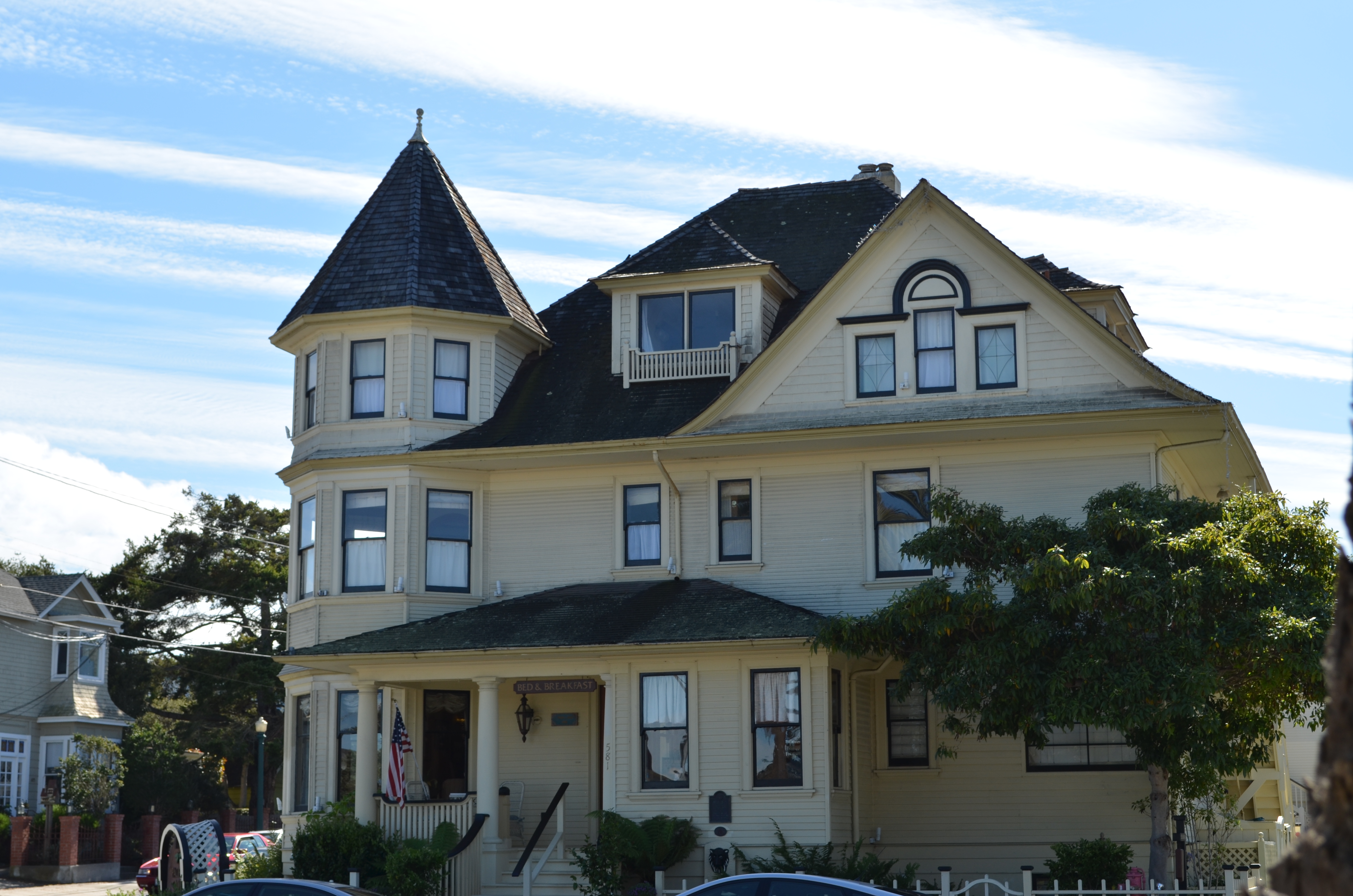
The above image shows the worst of this pathology. I wanted to show the charm of an old bed-and-breakfast in the gloriously beautiful little town of Pacific Grove, located just up the peninsula from Monterey in California (see image at left). But everything that could have made the image memorable, or even usable, was absent. The color, a cool buttercup yellow, is common to many town dwellings. In the warm glow of dawn or the late waning, dappled light of late afternoon, it can be charming, even warm. In the mid-day light, weak, withered. Then there was the total lack of a composition. The picture was taken in a second, and looked it.
So, angry at having failed at the “charming” look I had gone for, and unable to make the backlighting on the house work for me, I went into Photomatix (usually a very solid HDR tool) and started, almost angrily, to take revenge on the damned thing. If I can’t make you pretty, I’ll make you magnificently ugly, hahaha…. Seriously, I was pretty far into the journey from “happy little house” to “creepy little twilight creep castle” before realizing there was nothing to be extracted from this picture. No amount of over-glop, taffy-pulling or prayer would magically compensate for a central core concept that just wasn’t there. Like it or not, the pig was always going to show through the lipstick.
Sometimes you just gotta declare the unlucky patient in front of you dead, and try to save the kid on the next gurney over.
This blog was always supposed to be about choices, both good and bad, and how we learn from each. I have shared my failures before, and firmly believe that the only honest conversation comes from admitting that sometimes we make colossal errors in judgement, and that a fair examination of even our “misses” is more important than an endless parade of our “hits”.
Photography is not about consistent genius. It’s about extracting something vital from something flawed.
Being able to identify when we have fallen short is the most important skill, the most essential tool.
MUTATION
Okay, this has a LOT of processing. Love me or hate me based on whether it worked. 1/500 sec., f/1.8, ISO 100, 35mm.
BY MICHAEL PERKINS
NOT CONTENT TO BE AN ART ON ITS OWN TERMS, PHOTOGRAPHY IS ALSO CONSTANTLY RE-INTERPRETING ALL THE OTHER ARTS AS WELL. Ever since imaging fell out of the cradle in the early 1800’s, several of us have always been looking at the works of others and saying, “eh, I can probably do something with that.”
Yeah, not too presumptuous, right? And the trend has continued (some say worsened) to the present day. Half the time we are creating something. The other half of the time we are tweaking, mocking, honoring, loving, hating, shredding, re-combining, or ragging on somebody else’s work. Are these mashups also art? Are we co-creators or just cheesy thieves?
And does it matter?
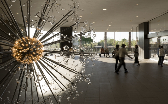
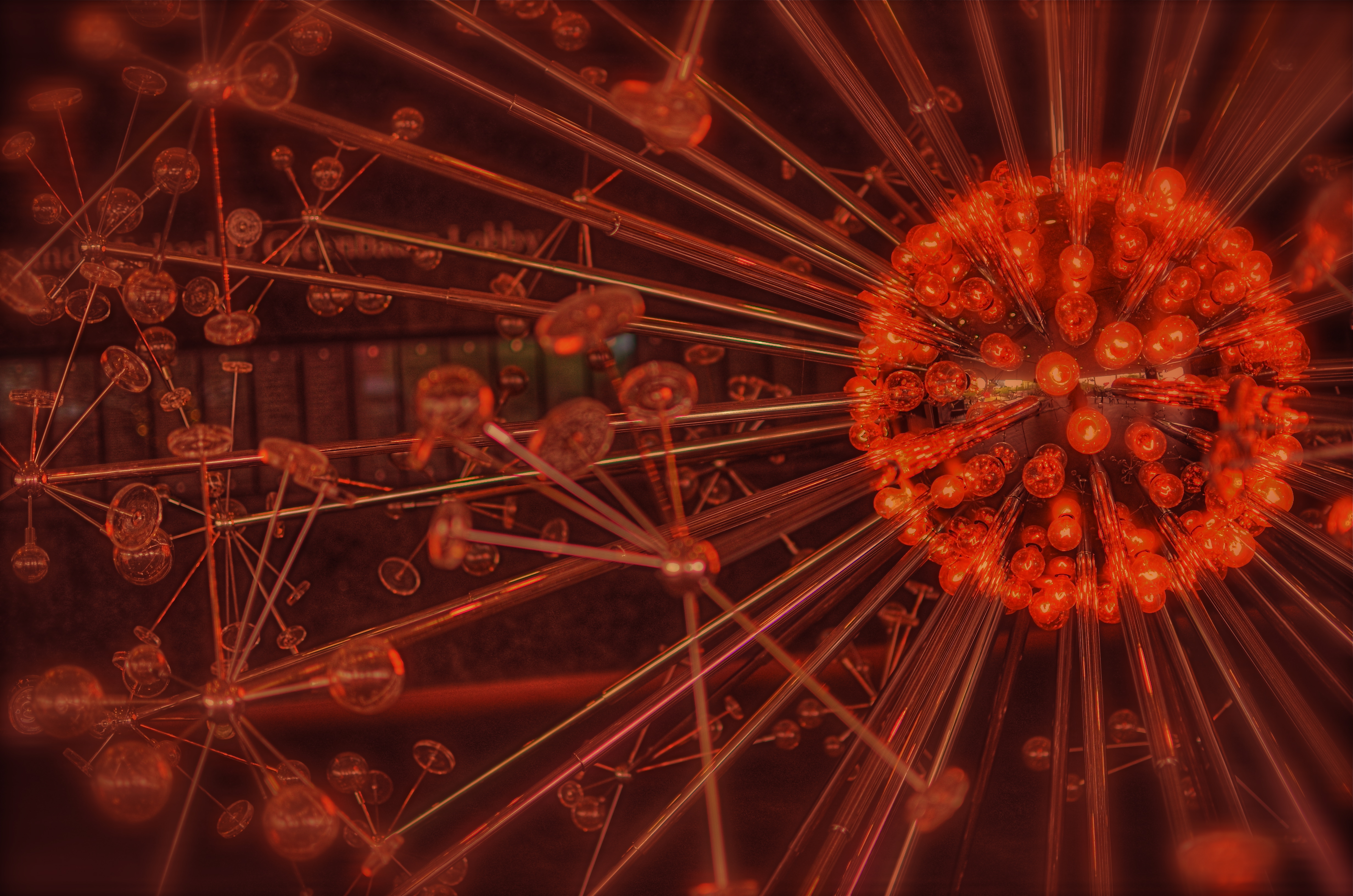
The Last Scattering Surface as it appears in the lobby of the Phoenix Art Museum.
The Phoenix Art Museum greets customers with a stunning original sculpture in glass and plexi right at the entrance to its ticket lobby. A huge installation of light bulbs, mirrored surfaces and reflective discs, Josiah McIlheny’s The Last Scattering Surface resembles a brightly burning orb (planet? asteroid? dwarf star?) surrounded by jutting rods that carry the central sphere’s light along “rays” to a series of circular satellites (moons? craft? debris?) Like many examples of pure design it is both everything and nothing, that is, it is mutative based on your observation. So, in a way, as in the manner of a photographer, you are already a participant in the co-creation of this object just by looking at it. Does this mean that it’s less theif-ish to go ahead and mutate the man’s work?
Well, there’s probably a lively back-and-forth on that.
For my own “take”, I wanted to remove the background walls, visitors, ambient blurry light from other junk, to isolate this nova-like work in “space”. I only had one frame that I liked from my short blast of shots, so I duped it, slammed the contrast real light/real dark on the pair, and did an exposure fusion in Photomatix. Adding a little edge blur and a re-tinting to the composite gave me the look of an interstellar explosion.
I freely advertise that I am making a semi-original re-mix on a completely original work. It’s not much more radical than shooting with a filter on the lens, or choosing black and white for a color subject, and yet, it always feels funny to try and make something beautiful that was beautiful in the first place.
But art is supposed to be about starting conversation, so consider this mine.
I just did my talking with a box instead of a mouth.
follow Michael Perkins on Twitter @ mpnormaleye.com
BLUE ON THIRD AVENUE

The cyanotype option in Nikon’s monochrome posting menu makes this in-camera conversion from color easy. 1/80 sec., f/5.6, ISO 160, 18mm.
By MICHAEL PERKINS
COLOR IS LIKE ANY OTHER COMPONENT IN LIGHT COLLECTION AND ARRANGEMENT, which is, really, what we are doing. Seen as a tool instead of an absolute, it’s easy to see that it’s only appropriate for some photographs. Since the explosion of color imaging for the masses seen in the coming of Kodachrome and other early consumer films in the 1930’s, the average snapper has hardly looked back. Family shots, landscapes, still life arrangements….full color or go home, right?
Well….
Oddly, professional shooters of the early 20th century were reluctant to commit to the new multi-hued media, fearing that, for some novelty-oriented photographers, the message would be the color, instead of the color aiding in the conveying of the message. Even old Ansel Adams once said of magazine editors, that, when in doubt, they “just make it red”, indicating that he thought color could become a gimmick, the same way we often regard 3-d.
In the digital age, by comparison, the color/no color decision is almost always an afterthought. There are no special chemicals, films or paper to invest in before the shutter clicks, and plenty of ways to render a color shot colorless after the fact. And now, even the post-processing steps involved in creating a monochrome image need not include an investment in Photoshop or other software. For the average shooter, monochrome post-processing is in-camera, at the touch of a button. Straight B/W and sepia and even what I call the “third avenue”, the blue duotone or cyanotype, as I’ve used above.Do such quickie options worsen the risk of gimmick-for-gimmick’s sake more than ever? As Governor Palin would say, “you betcha”. Google “over-indulgence”, or just about half of every Instagram ever taken, as evidence.
Hundreds of technical breakthroughs later, it still comes down to the original image itself. If it was conceived properly, color won’t lessen it. If it was a bad idea to start with, monochrome won’t deliver the mood or the tone changes needed to redeem it. Imagine the right image, then select the best way to deliver the message. Having quick fixes in-camera aren’t, initially, a guarantee of anything but the convenient ability to view alternatives. In the photo above, my subject was just too warm, too pretty in natural color. I thought the building itself evoked a certain starkness, a cold, sterile kind of architecture, that cyanotype could deliver far better. The shadows are also a bit more mysteriously rendered.
At bottom, the shot is just a study, since I will be using it to take far more crucial pictures of far more intriguing subjects. But the in-camera fix allows you to analyze on the fly. And, since I got into this racket to shoot pictures, and not to be a chemist, I occasionally like a fast thumbs-up, thumbs-down verdict on something I’ve decided to try in the moment.
Giving yourself the blues can be a good thing.
(follow Michael Perkins on Twitter @ mpnormaleye)
Related articles
- Toning my Cyanotype with Haritaki (altlab2011.wordpress.com)
- Beyond Color (piaffephotos.wordpress.com)
IT TAKES A THIEF

In this composition, people become mere design elements, or props. To get this look, a single exposure was duped, the two images were re-contrasted, and then blended in the HDR program Photomatix for a wider tonal range than in “nature”.
By MICHAEL PERKINS
THE GREAT STREET PHOTOGRAPHERS OF OLD WERE ALL WILY, SLY THIEVES, capturing their prey in emulsion. Yes, I know that the old superstition isn’t literally true. You can’t, in fact, imprison someone’s soul inside that little black box. And yet, in a sense that is very personally felt by many of our subjects today, we are committing an “invasion” of sorts, a kind of artsy assault on the self. Oddly, the same technique that gets you admired when you successfully capture a precious quality of someone else’s face makes you despised when you’re sneaking around to get my picture. Whether street shoots are inspired or reviled is largely a matter of who is being “violated”.
We’ve all heard about Henri Cartier-Bresson, covering the bright chrome trim of his Leica with black electrical tape, the better to keep his camera “invisible” to more of his subjects, as well as the through-the-overcoat candids shot on the New York subway by Walker Evans. And then there is the real risk to personal safety, (including being arrested, jailed, and physically threatened) undertaken by Robert Frank when taking the small-town shots for his legendary street collection, The Americans in the 1950’s. And while most of us aren’t risking incarceration or a punch in the snoot when framing up a stranger, sensitivity has accelerated, as cameras have proliferated into the millions, and personal privacy has, in the digital era, been rendered moot.
Every street shooter must therefore constantly re-negotiate the rules of engagement between himself and the world at large. Is the whole of society his canvas, or is he some kind of media criminal, seeking to advance his own vision at the expense of others’ personhood? I must admit that, at times, I tire of the endless calculation, of the games involved in playing “I’m-here-I’m-not-really-here” with individuals. When my fatigue reaches critical mass, I pull back…..way back, in fact, no longer seeking the stories in individual faces, but framing compositions of largely faceless crowds, basically reducing them to design elements within a larger whole. Malls, streets, festivals…the original context of the crowds’ activities becomes irrelevant, just as the relationship of glass bits in a kaleidoscope is meaningless. In such compositions, the people are rendered into bits, puzzle pieces…things.
And while it’s true that one’s eye can roam around within the frame of such images to “witness” individual stories and dramas, the overall photo can just be light and shapes, arranged agreeably. Using color and tonal modification from processing programs like Photomatix (normally used for HDR tonemapping) renders the people in the shot even more “object-like”, less “subject-like”(see the link below on the “Exposure Fusion” function of Photomatix as well). The resulting look is not unlike studying an ant farm under a magnifying glass, thus a trifle inhuman, but it allows me to distance myself from the process of photostalking individuals, getting some much-needed detachment.
Or maybe I’m kidding myself.
Maybe I just lose my nerve sometimes, needing to avoid one more frosty stare, another challenge from a mall cop, another instance of feeling like a predator rather than an artist. I don’t relish confrontations, and I hate being the source of people’s discomfiture. And, with no eager editors awaiting my next ambush pic of Lindsey Lohan, there isn’t even a profit motive to excuse my intrusions. So what is driving me?
As Yul Brynner says in The King & I, “is a puzzlement.”
(follow Michael Perkins on Twitter @mpnormaleye and on Flickr at http://www.flickr.com/photos/mpnormaleye)
