THE OTHER TMI
Technical execution here is almost what’s needed, but the concept still needs work. Write the shot off to practice.
By MICHAEL PERKINS
THE WORST SOCIAL FAUX PAS OF OUR TIME may be the dreaded “TMI”, or the sin of sharing Too Much Information, creating awkward moments by regaling our friends with intimate details of our recent colostomies or carnal conquests. Funny thing is, much as we hate having this badge of uncoolness pinned to our chest, we commit its photographic equivalent all the time, and without a trace of shame.
I’m talking about the other TMI, or Too Many Images.
Let’s face it. Social media has encouraged too many of us to use the Web as a surplus warehouse dump for our photographs, many of them as ill-considered as a teenage girl’s hair flip. We’ve entered an endless loop of shoot-upload-repeat which seldom contains a step labeled “edit”. Worse, the vast storage space in our online photo vaults encourage us to share everything we shoot without so much as a backwards glance.
I’m suggesting that we take steps to stop treating the internet like an EPA Superfund site for images. I have tried to maintain a regular schedule of viewing the rearmost pages of my online archives, stuff from five years ago or longer, learning to ruthlessly rip out the shots that time has proven do not work. The goal is to force myself to re-think my original intentions and make every single photograph earn its slot in my overall profile. There are, by my calculation, three main sub-headings that these duds fall under:
The original idea for this shot is fairly strong, but my execution of it left something to be desired. Like execution.
A bad idea, well executed. Okay, you nailed the exposure and worked the gear to a “T”, but the picture has no story. There’s nothing being communicated or shared. Just because it’s sharp and well-lit doesn’t mean it deserves to stand alongside your stronger work.
A good idea, poorly executed. Hey, if you believe so strongly in the concept, go back and do it right. Don’t give yourself a pass on bad technique because it was a noble effort.
An incomplete idea, which means it wasn’t even time to take the picture at all. Maybe you didn’t know how to get your message across, for whatever reason. Or maybe if you got the conception 100% right, it still wasn’t strong enough to jump off the page. The litmus test is, if you wouldn’t want someone’s random search of your stuff to land on this shot instead of your best one, lose it.
Online stats make some of these tortured choices a bit easier, since, when you are looking at low figures on shots that have been available forever, it’s pretty clear that they aren’t lighting up anyone’s world. And as lame as view and fave counts can be, they are at least an initial signal pointer toward sick cows that need to be thinned from the herd. The cure for photographic “TMI” is actually as easy as shooting for long enough to get better. With a wider body of work viewed over time, the strong stuff stands out in bolder contrast to the weaker stuff. And that shows you where to wield the scissors.
SIGNATURES

Signs of the times.
By MICHAEL PERKINS
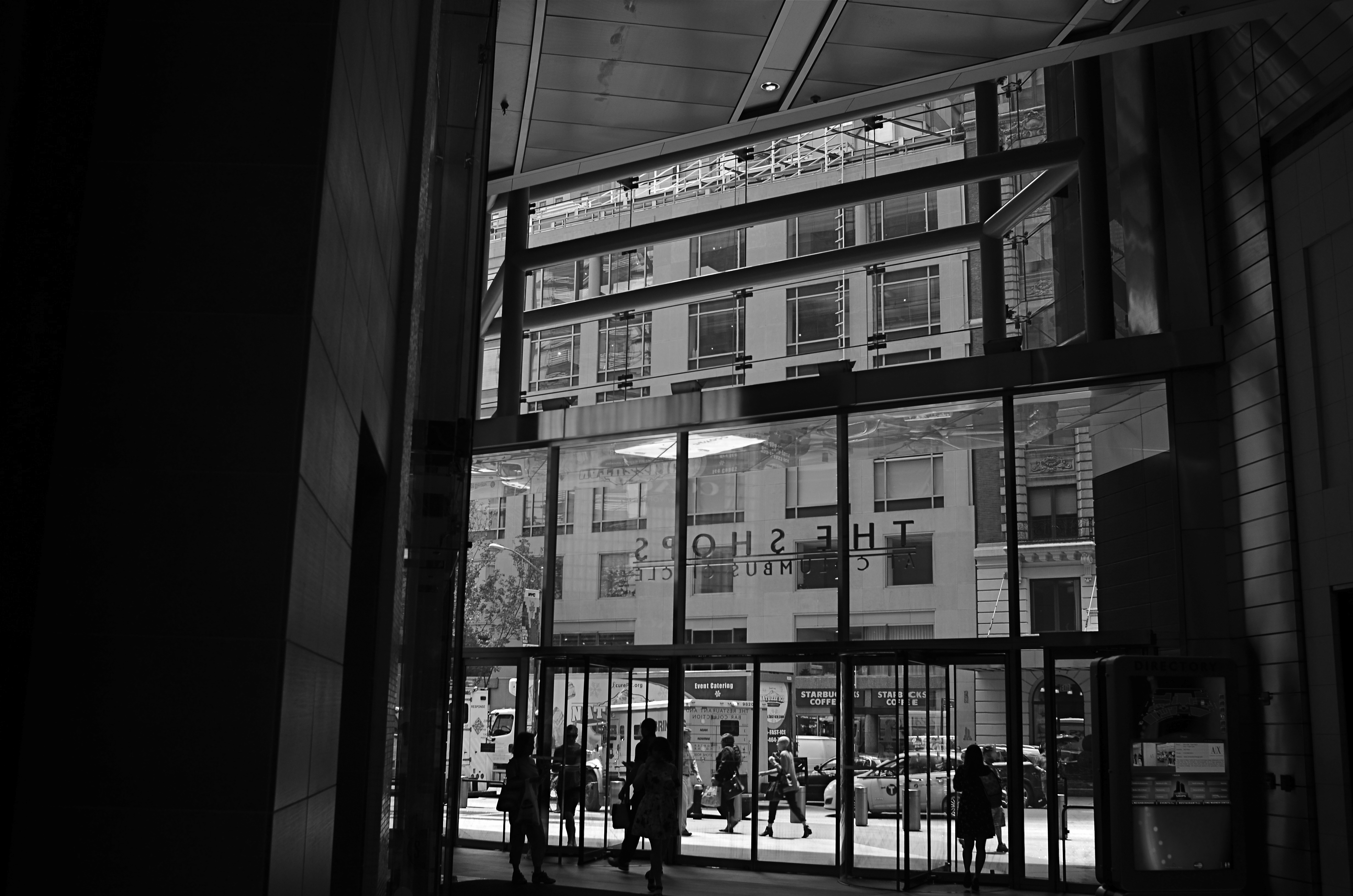
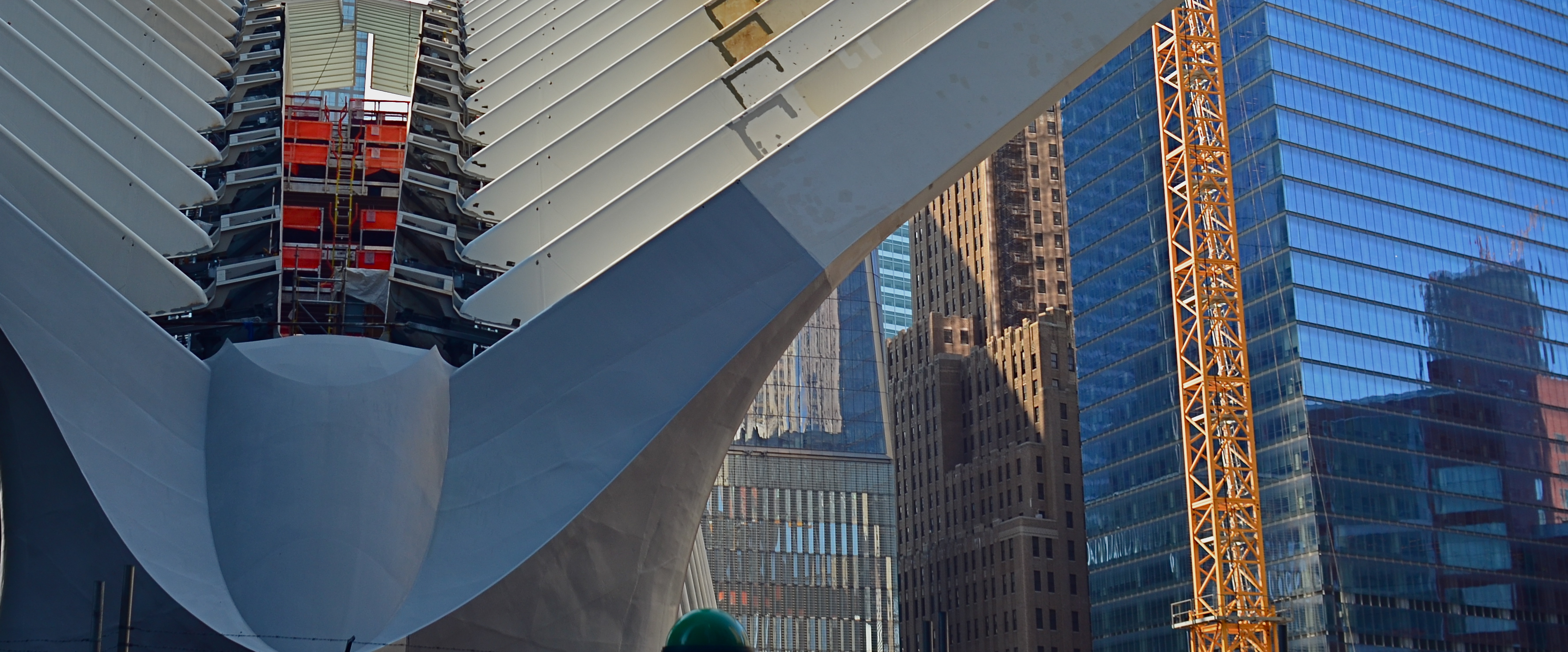
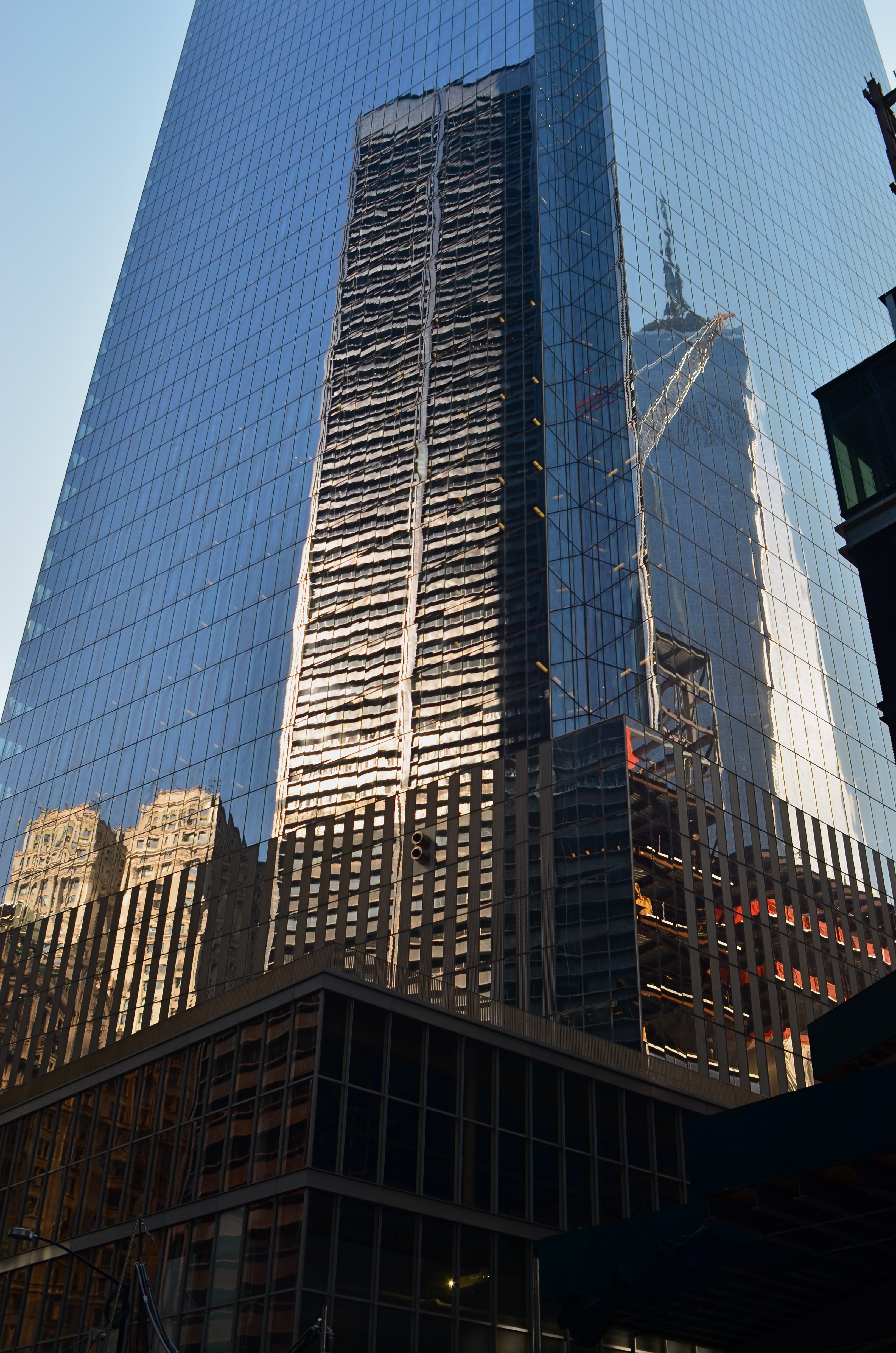
SOME OF THE MOST UNIQUE CASUALTIES OF SO-CALLED URBAN PROGRESS, key parts of a city’s visual signature, are the everyday signs associated with local businesses, from the red neon over your local bar to the hand-painted address on your favorite eatery. Naturally, photographers have a big stake in the obliteration of any feature of the changing urban landscape, and there is a growing movement to treasure signage as symbols of identity in neighborhoods that are increasingly in danger of being genericized by fast-food and mega-retail chains.
Graphic designer Molly Woodward deserves a lot of credit for the attention now being paid to urban signage, and her website on what she calls vernacular typography contains essays and samples that illustrate what is being lost in town after town. Cities like New York that experience a faster-than-average turnover in area retail see signs for locally owned businesses vanish more frequently. And while it’s normal for mom-and-pop ventures to wink in and out of existence all the time, the chance for entire blocks to be graphically drenched in a candy coating of Starbucks logos is greater in major metropolitan areas.
Woodward’s web archive is rich in photographs of these disappearing urban signatures, and there is certainly a rich vein of source material for any enterprising city photographer. Signs help anchor neighborhoods, acting as mile markers, landmarks, and a more human scale of commerce. They remind us where we are, what our streets are all about. They mark where we grew up, what we wanted to be. The boundaries of our bailiwick. They are personal transactions. Meet me under the clock near the Chinese laundry. See you at 5 near the giant neon cheeseburger.
Shooting signs is an act of reportage; it’s correspondent work. And it’s no less important than photographing the ruins of an ancient cathedral or a portal on the Great Wall, since it’s a kind of archaeology. Many thanks to the Molly Woodwards of the world as they hold back the tide against a mindless homogenization of our streets. And thanks in turn to those who pick up her vibe and click away at the Acmes and Ajaxes in their own towns, often just steps ahead of the wrecking ball.
RAZOR’S EDGE
Sharpness should be achieved in your intial shot by use of contrast and color, not “dialed up” in post-editing. 1/160 sec., f/8, ISO 100, 22mm.
By MICHAEL PERKINS
THE AVAILABILITY OF PHOTO PROCESSING TOOLS, TO ARTIST AND BEGINNER ALIKE, in the digital era, has created a kind of unfortunate slingshot effect, as all suddenly achieved freedoms tend to. Once it became possible for Everyman to tweak images in a way that was once exclusively the province of the professional, there followed a trend toward twisting every dial in the tool box to, let’s be honest, rescue a lot of marginal shots. Raise your hand if you’ve ever tried to glam up a dud. Now raise your hand if you inadvertently made a bad picture worse by slathering on the tech goo.
Welcome to the phenomenon known as over-correction.
It’s human nature, really. Look at Hollywood. Suddenly freed from the confines of the old motion picture production code in the 1960’s, directors, understandably, took a few years to make up for decades of artistic construction by pumping out a nude scene and/or a gore fest in everything from romantic comedies to Pink Panther cartoons. Several seasons of adolescent X-rated frolics later, movies settled down to a new normal. The over-correction gave way to a more mature, even restrained style of film making.
Am I joining the ranks of anti-Photoshop trolls? Not exactly, but I am noting that, as we grow as photographers, we will put more energy into planning the best picture (all energy centered before the snap of the shutter), and less energy into “fixing it in post”. If you shoot long enough and work hard enough, that shift will just happen. More correctly designed in-camera images equals fewer pix that need to be dredged from Dudland.
Look at the simple idea of sharpening. That slithery slider is available to everyone, and we all race after it like a kid chasing the Good Humor truck. And yet, it is a wider range of color and contrast, which we can totally control in the picture-taking process, which will result in more natural sharpness than the Slider Of Joy can even dream of. As a matter of fact, test my argument with your own shots. Increase your control of contrast or color and see if it doesn’t help wean you off the sharpen tool. Or expose your shots more carefully in-camera rather than removing shadows and rolling off highlights later. Or any other experiment. Your goals, your homework.
The point being that more mindful picture-making will eliminate the need for many crutch-like editing tweaks after the fact. And if that also makes you a better shooter overall, isn’t that pretty much the quest?
PARAMETERS
By MICHAEL PERKINS
A PHOTOGRAPHER’S IMPACT IS ONLY PARTIALLY CREATED BY WHAT HE CHOOSES TO RECORD. That is, whatever his subject, be it banal or magnificent, his choice of what to shoot is only, at best, half of what makes or breaks his picture.
The other half of the miracle comes not from mastery of light, aperture, gear or conditions. It is in the frame, and what he includes or excludes from it. Landscape mode, portrait mode, big crop or little crop, the frame is the final determinant of how well the image argues for itself. The legendary director of photography for the New York Museum Of Modern Art, John Szarkowksi, expresses this idea for all time in his wonderful book The Photographer’s Eye:
To quote out of context is the essence of the photographer’s craft. The photograph’s edge defines content. The photographer edits the meanings and patterns of the world through an imaginary frame. This frame is the beginning of his picture’s geometry.
Consider, for a moment, the most vital, most inspiring images you’ve ever seen. Now imagine them cropped two inches wider, four inches to the left, five inches higher. The visual terms of engagement would be completely re-ordered. And what would be the result? Would you draw different conclusions, make different assumptions, experience a diminished ( or enhanced) sense of mystery?
The frame, and the choices the photographer makes in its design, is more decisive in the success of a picture than any other single factor. Technically imperfect photos become world-beaters every day simply because the frame is eloquent. And it also follows that a well-crafted bit of exposure can be dulled or blunted by a frame that is carelessly drawn.
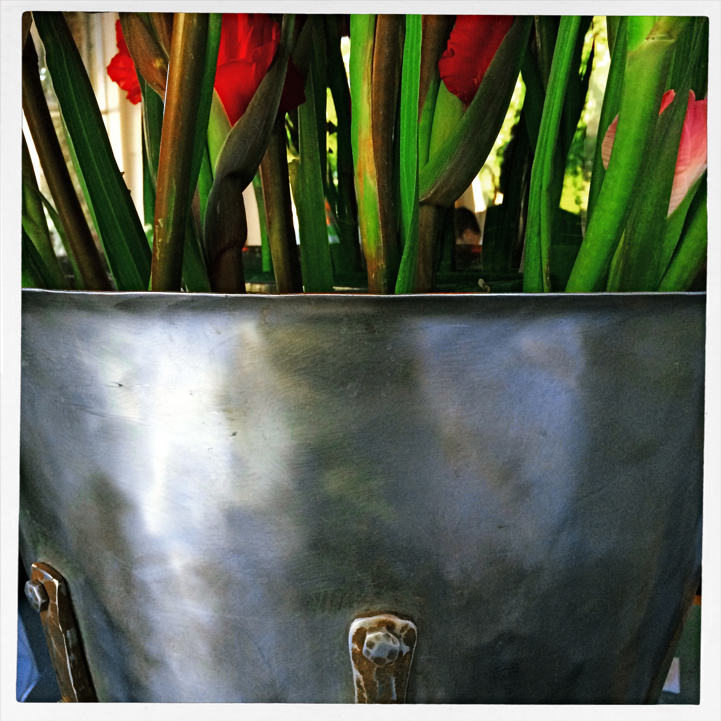
The above image represents a choice, the drawing of a visual boundary. The top of the flowers and the objects surrounding the bucket aren’t missing because I shot too close, they’re deliberately excised because I made a deliberate decision that they didn’t add anything to the story I was trying to tell. You can disagree about whether I made the correct choice, but the making of that choice was as important (actually more important) than the subject itself.
Photographs have visual parameters, since we can’t make images big enough to include all of our experience. There are limits on the dimensions of what we show, and intelligent use of those boundaries can transform our work in marvelous ways.
VIRTUAL SHOPLIFTING
Thrift shop still-life: a mobile phone close-up of an antique camera flash pan, negatized in post-editing.
By MICHAEL PERKINS
ONE OF THE EMERGING OPPORTUNITIES FOR PHOTOGRAPHERS is the newly accepted way not to look like a photographer, a kind of invisibility based on strange public perceptions. This has only become possible with the arrival of the smartphone, and, although insane logically, it affords a new freedom to street photographers.
It’s simple, if crazy: carry an actual camera inside a phone, just as many millions of others do, and you’re somehow “safe” or trustworthy, not one of predatory, intrusive “professionals” with obvious cameras who are out to trick you, track you, capture your soul in their satanic box. Now, how we explain away the fact that the phone camera is far more stealthy, far more insidious and far more omnipresent than, say, a Canon or Nikon is anybody’s guess. But, dopey or not, this new code is now hard-wired into people’s brains as it regards street work. So little camera=harmless. Big camera=end of the world as we (or over-zealous mall cops)know it. You figure it out.
So, when it comes to grabbing quick snaps in stolen moments, it’s becoming harder not to embrace the crazy and just use a smartphone as your default street tool. I’m not completely there yet, but when I’m surrounded by things that I will either never see again, or have never seen before, it’s tempting to play spy shooter with the little clicker.
Some of the greatest sources of still life material, for example, are the dense shelves of flea markets, antique shops and thrift stores. You don’t want to buy this stuff, since (a) you can’t afford it and (b) the Mrs. will send both it and you to Goodwill, but the occasional odd item might just make a decent abstract bit of design. Camera gear from yesteryear is always an easy sell, and I was ecstatic to do a virtual shoplift on the ancient flash attachment you see above as a fun way of re-purposing an object through selective framing and processing.
It’s frustrating to find more and more places where it’s easier to negotiate a nuclear treaty than get an okay for regular photography, so it’s no shock that more and more inroads are being made for mobile cameras and the access that no one feels like denying them. And they say I’m nuts.
WITH THESE HANDS
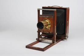
The Gundlach-Korona View Camera (1879-1930), about as opposite from “portable” or “convenient” as you get.
By MICHAEL PERKINS
EVERY ONCE IN A WHILE, AS A PHOTOGRAPHER, I NEED TO RENEW MY SENSES OF GRATITUDE AND HUMILITY, and I refresh both by leafing through a hefty tome called View Camera Technique, a 300-plus page collection of graphs, diagrams and tables on what still stands as the most technically immersive photographic instrument of all time. I use the word immersive because all of the view’s operations must be mastered through personal, direct calculation of a horde of formulae. Nothing is automatic. Results can only be wrung out of the device by the most exacting calculations. The guaranteed given of the view camera: there will be math on the final.
The aforementioned gratitude and humility come from the fact that I am free of the Pythagorean calculus that it took for earlier shooters to master their medium, and the knowledge that I will never apprehend even half of the raw science needed to summon images forth from these simply built, but technically unforgiving cameras. However, along with a hugh whew of relief comes just a slight pang of regret, since the camera has gone the way of many other tools that used to be in a direct, cause-and-effect relationship with the human hand.
Once, all of life was hands-on.
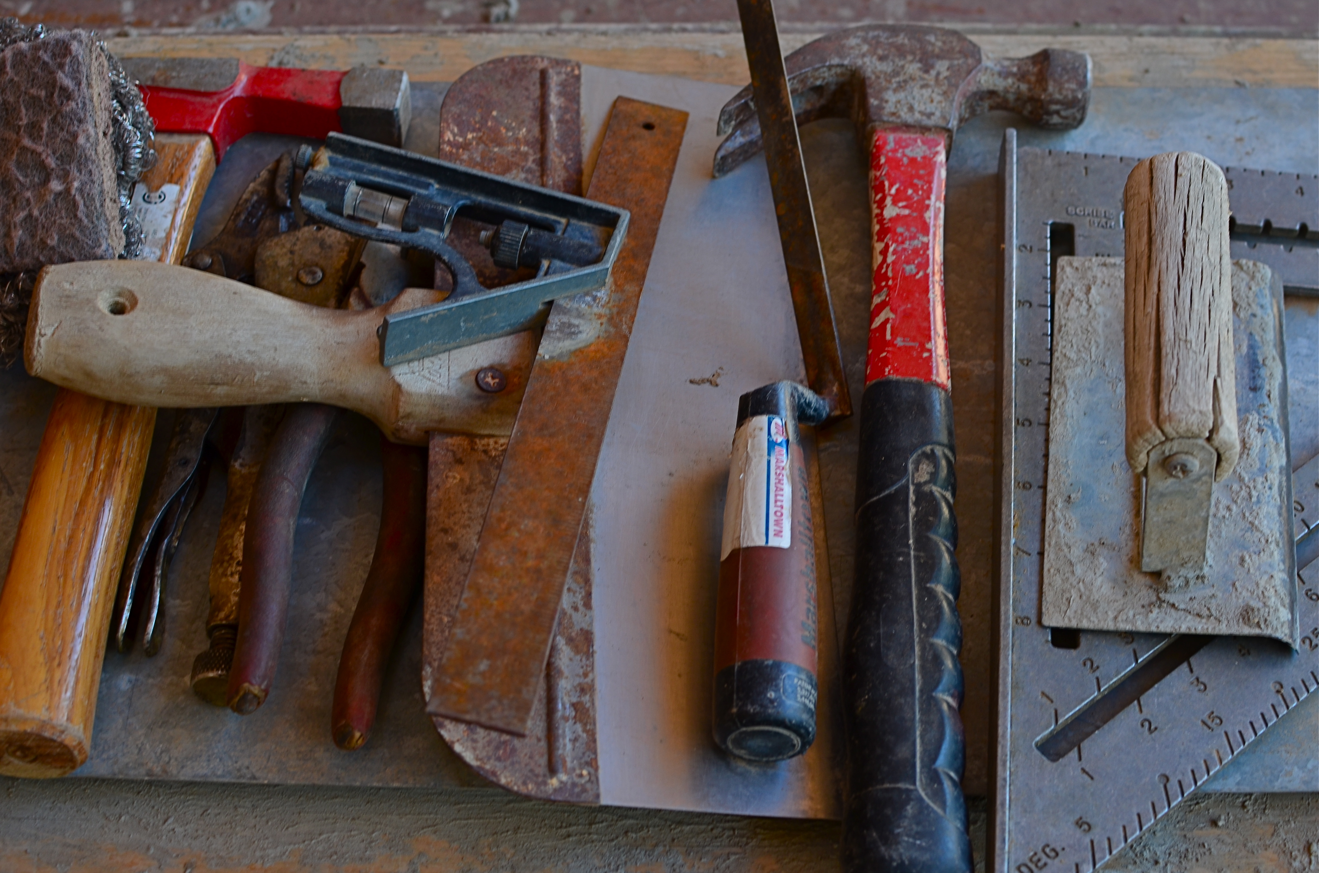
As a kind of strangely timed stream-of-consciousness, my most recent review of View Camera Technique was followed, just a day later, by a visit to a local art foundry, a unique marriage of state-of-the-art kilns and caveman-simple hand tools, many of which were arranged on work benches near the visitors’ center, looking very much as if the past 500 years had not occurred. The marvel of hand tools is that, visually, they put us right back into an age when the world only yielded a working life to the direct, simple transmission of human force and will to a physical object. The use of a hammer is an unambiguous and impeccably clear transaction. You either drove the nail or you don’t. As Yoda said, there is no try.
Cameras no longer require us to wrestle directly with them to extract a photograph by real exertion, and that should give us, as shooters, an appreciation for those remaining implements which still do convey simple, A-B energy from hand to tool. Such objects remain powerful symbols for action, for creation, and for our urge to personally shape our world. And there must still be a great many pictures that we can summon forth to celebrate that relationship.
UNREAL, MAN
Not a “real” or natural exposure, to be sure, but the look is intentionally idealized, in effect a fantasy. HDR is great for this. But not for everything.
By MICHAEL PERKINS
ONE OF THE MOST POPULAR IMAGING PROCESSES OF RECENT YEARS, and one which has produced either moderation or mutilation in millions of photographs, is HDR, or High Dynamic Range processing. Conceived as a way around the problem of how to evenly illuminate a scene tracking from very light to very dark, HDR initially seemed a godsend. Too big a range from the brightly lit windows of the cathedrals to the shadows behind its altar? Take three or more shots with a variety of exposures, and use the HDR software to level out the highs and bring up detail in the lows. Blend into a final composite, and, presto, you can see everything (and here’s the big pitch) just like your eye does.
Now, it’s true that your eye reacts almost instantly to changes in light, adjusting on the fly to render both dark and light areas “read-able” at it moves through a scene. So, it seems logical to make images where all that tonal adjustment is frozen in a single frame. Thing is, though, your physical eye is not the only thing that “sees” a photograph. Your brain, with its vast archive of information on how things look “real”, may not interpret a tone-mapped image, with its even range of light, as a natural one.
Another thang: not all of the images in a composition have the same visual weight as story elements. The man in the foreground of a portrait is more important than the wooden bureau ten feet behind him, so why should they receive the same amount of illumination? Additionally, even if I can rescue the detail of the bureau’s fine wood grain, should our eye be drawn to it as much as we want it to be drawn to the man’s weathered face? HDR can create a fantasy re-balancing of tones as they are seen in life, and some of us have used it like neon Play-doh, creating images that are closer to black-light posters in a hippie’s bedroom than an approximation of reality.
One of the gallery tabs on this blog was originally named HDR to act as a kind of disclaimer, as if to say, yes, I know this is not reality. I chose to interpret my subject in this way on purpose. Recently, that tab has also been renamed Idealizations, since that word even more accurately describes that the images within are deliberate manipulations. I may be more restrained in their use than a few years ago (and in fact, I rarely use them at all, these days), but they should be labeled as genetically modified super-grapes, not fresh produce. In the meantime, the gallery content itself is also completely new, so, even if you have visited them before, I’d appreciate your opinion on how I presently apply the process, or indeed, if I even should.
INSIDE OUT
Almost among them: views that selectively depict the life of the street can present unique contexts.
By MICHAEL PERKINS
CITIES ARE A CONTINUOUS POST-GRADUATE COURSE IN THE MILLIONS OF DIFFERENT WAYS TO SEE. They not only afford an endless array of things to visualize, but offer up just as many vantage points or angles to frame, select, show, or conceal them. It’s just as much about how you shoot something as what you selected to shoot.
My favorite images in urban environments are essentially stolen glances. Brief shards of light arrowing past a subway car window. Slanted slashes of sun crawling up an alley wall. And, more recently, views of the street that hide as much as they reveal, teasing winks of the city in all its rhythm as viewed from the inside out.
It might be the tension, or the anticipation of a scene that is not, but is just about to be, cracked fully open. People pass by framed by windows, distorted by warps and reflections, amputated and edited by panels, shadows, partially eclipsed by walls. It’s a visual striptease. Now you see life, now you don’t, now, here it comes again. Sometimes standing just inside the entrance of a building can feel like viewing life at a distance, as anonymously as you might watch surveillance video on a giant screen or a movie in a dark theater.
Photography is one part content and one part context. We have all been surprised when someone standing right next to us points a camera in the same general direction that we do and comes away with a completely different kind of image. That surprise is the shock-reminder of our very individual way of framing and selecting information, and cities offer a remarkable laboratory for sampling all of those variances.
Inside looking out or outside looking in, the view is the thing.
YOU’RE IN MY SHOT
The Brooklyn Museum, 2015. Framing around tourists at attractions means compromising what you want to capture in a given frame. Sometimes it works, and sometimes……
By MICHAEL PERKINS
THE MOST CONSISTENT CRITICISM I’VE CAUGHT ABOUT MY URBAN PHOTOGRAPHY over a lifetime is that it’s a little, well, clinical. Now, it’s true that I like to feature urban spaces in their purest form, or, as near the architect or planner’s original vision as possible. Certainly, the urban dwellings I shoot were designed to serve people, but I can’t resist occasionally showing these spaces as absolute designs, minus the visitors. I realize that, for some, this can render things a little antiseptic, but I don’t mean anything personal (impersonal?) by it.
Comparing notes with other shooters, I find that they, too, occasionally like to just show things that were designed for humans, only without…the humans. And I believe that parks, libraries, and museums can actually increase their profit by accommodating photographers in the same way that they might for their own marketing efforts.
Universally, when it’s time to do a photo feature on an historic site, the first thing that curators do is chase all the peasants off the property and give a photographer exclusive access to the place. You’ll see this to a lesser degree when people shoot real estate listings, and it makes perfect sense. The shooter has time to plan and experiment, without working around an endless supply of kids with Slurpees and moms with strollers. It’s not anti-human, it’s pro-photo.
So here’s the idea: why not dedicate a set amount of an attraction’s weekly tour schedule solely to solo photography tours? Calculate your place’s slow earning days and book those times in, say, half-hour increments, chunks in which the only persons inside the joint would be one employee and one photographer. I know many shooters who would gladly pay a bump of up to 100% of the going tour rate just to ensure privacy, and be allowed to effectively prepare shots.
Parks like Yellowstone, along with a growing list of museums and monuments have already crafted private tour options for photographers. It’s all found money,since all attractions have their dead seasons, weeks or months out of the year when they could throw a bowling ball across the place without hitting anything. Why not use those off-days as moneymakers? I love people, but if I’m visiting a place to have my one shot at capturing a magnificent structure, I hate settling for what I can frame around, versus what I could do if I just had the same access as National Geographic. Just once.
THROUGH A FUZZY CRYSTAL
Naysayers about the future of smartphone cameras are due for a major news flash.
By MICHAEL PERKINS
I GENERALLY STAY OUT OF THE PREDICTION BUSINESS, and with good reason. Anyone who sets himself up in the prophecy business had better keep his day job, a truth which has been demonstrated time and again by any number of junior league wizards who believe they know how to read the tea leaves in Tomorrowland. That’s why I have always kept the pages of The Normal Eye pretty free of excess doses of prognostication on what’s next or what’s inevitable regarding photography.
However, even though it’s foolish to cite specific equipment or inventions as “proof” that a new day has arrived, it’s often obvious when something of a tipping point is coming that will transform the entire process of making pictures. And I feel confident that we are now at one of those points as the latest smartphone cameras begin the blurring, if not the erasure, of difference between photography in mobile devices and photography from traditional gear, especially, for the first time, DSLRs.
The main gist of this tipping point is the ability of mobiles, finally, to allow for manual override of many camera functions that were, in earlier years, completely automated. Phone cameras in their original iteration were an all-or-nothing proposition, in that you clicked and hoped that the device’s auto settings would serve up an acceptable image. As for any kind of artistic control, you had to try to intervene after the shutter snap, via apps. It was the opposite of the personal control that was baked into DLSRs, and many photographers rightly balked at abandoning their Nikons and Canons for what was essentially a compact point-and-shoot.
But we are suddenly in very different territory now. The newest models by a variety of smartphone manufacturers will not only offer shooting apertures as wide as f/1.8, drastically increasing the flow of light to the camera’s sensors, but will also give shooters the option to either tap-customize a variety of shooting settings on-screen, or merely leave the device on full auto. The ability to override factory defaults is what separates the camera men from the camera boys, so this, in the words of Joe Biden, is a big &%$#ing deal. It means that many photographers who never even considered doing their “serious” shooting on a smartphone might at least mull over the option of leaving their full-function DSLRs at home, at least occasionally.
It would be foolish to predict the wholesale desertion of capital “C” Cameras by the shooting public, since such changes never come about for everyone at one time. Plenty of people continued to ride horses after the first flivvers rattled out of the factory. But there is certainly a major debate on the horizon about how much, and what kind of camera allows you to get the shot, easier and more of the time.
And getting the shot, as we know, is all that has ever mattered. All the rest is cheek music.
SHOOT (AND THINK) BIG
The Nexus Of Resurrection, 2015. Image cropped from 4928 x 3264 pixels to 3550 x 1477, leaving enough density for a printable enlargement.
By MICHAEL PERKINS
BY NOW MOST OF US PROBABLY REALIZE THAT THERE IS NO REAL ADVANTAGE to “budgeting” shots in digital media the way we used to do in film. Harking back to the time of 24-exposure limits on one’s photographic fun, shooters maintained a running total in their heads of shots taken versus shots remaining, a cautious way of allocating frames on the fly, the idea being to finish the film roll and your tour stops at about the same time. Some kept notebooks; some doled out shots on a priority basis (one image of the waterfall, three of the ruins, four of the kids on the rides), and some, I suppose, were tempted to count on their fingers and/or toes. You had to be careful not to run out of frames.
Jump to the digital now, where we realize that, in all but the rarest cases, our shutter finger will crack and fall off before we “run out” of shots on even the most meager memory card. However, I still run into people who believe they are being prudent and providential by taking images at lower resolutions to “save space”, a false economy that is not only needless, but actually limits your options in the later process of editing.
Big files mean image density (lots o’ pixels) and therefore higher resolution. High resolution, in turn, means that you can crop substantial parts of a photo as needed and still have enough density for the image to hang together, even when printed out. Now, if you look at your work solely on a computer screen, protecting the integrity of a cropped image is less crucial, but if you’re lucky enough to create something you want to enlarge and frame, then you should begin with the fattest file you can get.
Review a few of your images that were, let’s say, less than compositionally sublime coming right out of the camera. Look at the pixel count on the same images after they were cropped to your liking. You’ll arrive at your own preference on what minimum resolution you’ll accept from the cropped versions. Thing is, the bigger you start, the more wiggle room you’ll have in editing.
As I say, most people already shoot at the largest file size possible. I merely send along this note to remind us all that we do it because it makes sense, and affords us real flexibility. It’s one of the amazing by-products of digital; we can, generally, shoot as much as we want for as long as we want.
REVERSAL OF FORTUNE
The bell of an engraved sousaphone, converted into a negative and color-boosted to resemble a faux vortex.
By MICHAEL PERKINS
FOR THOSE OF US WHO SWEATED IN LITERAL DARKROOMS (as opposed to digital ones), there has always been a fascination with the print photographer’s equivalent for “RAW” files, the celluloid negative. Manipulated properly, one neg could yield an almost endless variety of print results, as the sciences of burning, dodging and pure imagination were applied to coax subtle tonal changes and modulations out of either color or monochrome images. Ansel Adams’ frequently quoted remark that the negative was the score and the print was the performance was born out in his own visual “symphonies” along with those of millions of others.
But the negative need not merely be the understudy for the “final” version of a picture, but the final itself. And as we’re freed to experiment via new digital apps, we are more frequently re-imagining shots with reversed tones, often creating dramatically more effective results than the “positive” originals. Again, apps are speeding the time of practice and development in a way that chemically-based, film-based manipulation never could. Tap and you’re done. Tap, tap, and the result is either sent to the keeper pile or re-done in an instant. It’s pretty irresistible.
There have always been amazing examples of artists who made their negatives the “official” version of their pictures, although the neg is traditionally thought of as a step in a process, not an art form it itself. I remember being thrilled when, as a teen, I first saw F.W. Murnau’s silent masterpiece Nosferatu, which includes a thrilling, eerie scene with a ghostly, horse-drawn carriage on its way to Count Orlok’s castle, deliberately printed in negative to boost the creepy drama of the sequence. And with new phone-based apps, it’s easy and fast to get a basic version of this effect, albeit with some limits.
The app I use, called Negative Me, is a very basic (and free) tap-on layer. Choose a file photo, apply the effect, and you’re done. It’s also possible to shoot new pictures directly through the app. Yes, it’s frustrating that you can’t attenuate the tone or the intensity in any way, but, you can always take the extra step of feeding the first negative image into additional apps or editing suites where more precise processing can be added. It’s still easier than any process that was available in the film era, and, while it merely adds strangeness to many photographs, it allows some to be reborn as abstractions that are unearthly and dramatic.
Producing a negative variation on certain shots is just another way to re-interpret a shot, no less useful than any other color filter or post-processing tool. Like anything else, it’s the impact of the result, not the effect itself, that makes the shot.
THE PUSH AND THE PULL
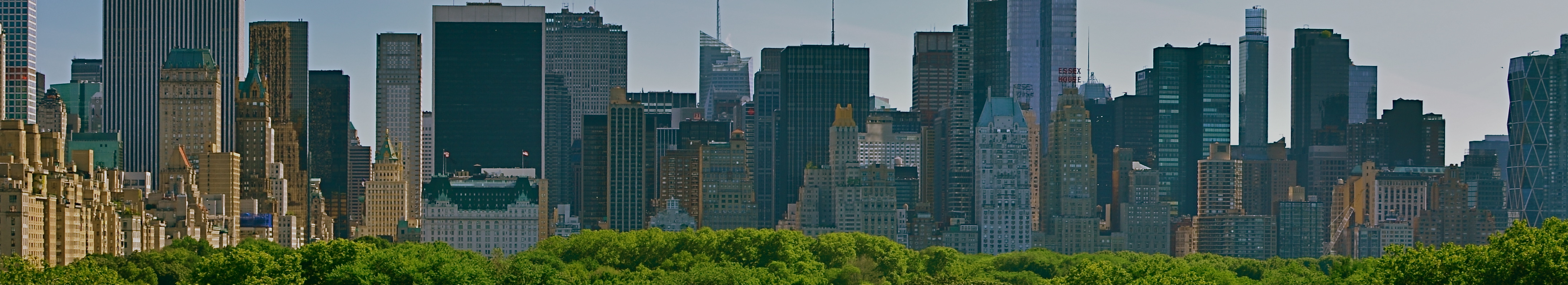
NYC: pictures of impressions of visions of dreams.
By MICHAEL PERKINS
NEW YORK CITY IS A VERY IRONIC CANVAS. Artists who set brush upon that canvas may think they are attempting to depict something outside themselves, but what they show actually reveals very personal things. There are more stories than all the storytellers in the world can ever hope to render…in paint, in print, or through the lens of a camera, and while some of us entertain the notion that we are adding this commentary objectively, that, plainly, is impossible.
From handheld luggage to emotional baggage, everyone brings something to New York, layering their own dreams and dreads onto the multi-story sandwich of human experience that makes it the world’s most unique social laboratory. Hard as it is on the artistic ego, one can’t make the statement that defines the city. Wiser minds from Walt Whitman to Langston Hughes to Bob Dylan have tried, and they have all contributed their versions….wonderful versions. But the story can never be completed. New York won’t be contained by mere words and images. It is, like the song says, a state of mind.
Still, trying to scale the mountain can be fun. So, with this post, The Normal Eye has added a new gallery tab at the top of the page to share a few recent takes on my own ongoing love affair with the Apple. The title, I’ll Take Manhattan, is hardly original, but it is easy to remember. I have done essays on NYC before, but, this time out, I strove to focus as much on the rhythm of people as on the staggering scope of the skyline. New York is, finally, its people, that perpetually fresh infusion of rigor, rage, talent and terror that adds ever-new coats of paint to the neighborhoods, and this batch of pictures tries, in 2015, to show the town as it is used, by its daily caretakers. The push. The pull. The gamut of sensations from sky to gutter.
So have a look if you will and weigh these impressions against those you’ve discovered through others or developed within yourself. Taking on a photographic task that can never be finished is either frustrating or freeing, depending on your artistic viewpoint. In the meantime, what a ride.
RETURN OF THE POD PEOPLE
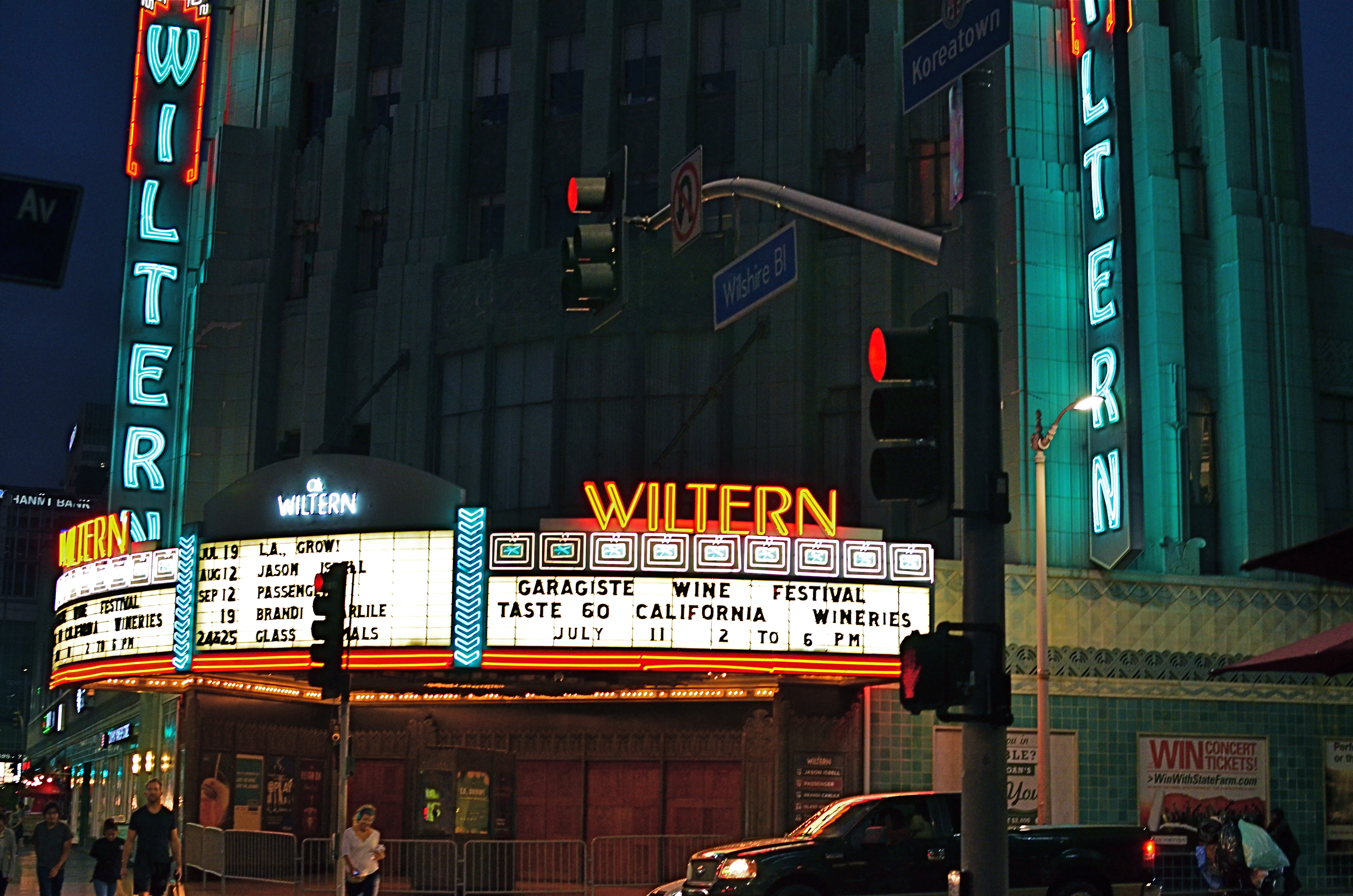
Wiltern On Wilshire, 2015. At f/3.5 and an ISO of 1000, this is an acceptably sharp hand-held exposure. Want the lights to be sharper? Might have to go tripod.
By MICHAEL PERKINS
I HAVE OCCASIONALLY SOUNDED WHAT, I ADMIT, IS A PREMATURE FUNERAL DIRGE for the lowly tripod, that balky, bulky, creaky throwback to the 19th century that continues to linger as an occasional, if fading, tool of the 21st. Part of this stems from the pure aggravation involved in trucking the things around, getting them locked and level, and praying that nothing from a stiff wind to an enraged gopher to a power-tripping mall cop will intervene to undo the entire rickety works. Hey, I’m not a hater, just a very reluctant fan.
One of the reasons I’ve mostly weaned myself from the pod is the ever-evolving speed of lenses and sensors in the digital era. This means scenes with less and less light can be captured with greater sharpness in short, hand-held exposures, albeit with a little more visual noise or grain. You can now shoot on a dark street at night, if your lens opens wide enough to keep your ISO as low as possible and if you can maintain a rock-steady grip on your camera at shutter speeds around 1/20 or so. And, for many cases, the results from this setup will be quite satisfactory.
However, we ain’t just about being satisfied, are we, mmmm?
Problem with a wide exposure and bright highlights (like the theatre marquee in the above shot) is that those elements will burn in and become diffuse, even in fast exposures, especially since your ISO setting is instructing your sensor to suck light like a maniac. As a result, instead of being sharp pinpoints of light, they will often turn soft and globby. If you can live with that, then go in peace and sin no more, my son.
However, if you really need to get those lights as sharp as you see them with your own eye, you might try doing a longer exposure at a smaller aperture, and that can mean dragging the pod down from the attic and doing it old-school. Good news is that you can now crank your ISO back down to minimum, so, yay, no noise atall, atall. You also might pick up some more contrast and detail within bright objects, like the horizontal lines on the above marquee. Bad news is, duh, you’re using a tripod. Hey, is that a mall cop I see running over here?
7/4/15: OH, SAY, CAN YOU SEE?
Honor Guard, 2015. 1/50 sec., f/5.6, ISO 100, 24mm.
By MICHAEL PERKINS
FOR AS LONG AS THERE HAS BEEN PHOTOGRAPHY, the United States of America has flown some version of the Stars and Stripes, a banner that has symbolized, in cloth and thread, what we profess and hope for ourselves as one of the world’s experiments in self-government. That argues for the flag being one of the most photographed objects in history, and, therefore, one of the most artistically problematic. Those things that are visualized most, by most of us, endure the widest extremes in interpretation, as all symbols must, and observing that phenomenon as it applies to the flag is both fascinating and frustrating.
Fascinating, because the flag can embody or evoke any emotion, any association, any memory, providing a gold mine for photographers who always must look beyond the mere recording of things to their underlying essences. Frustrating, because that task can never be complete, in that there can be no definitive or final statement about a thing that resonates so intensely, so personally with a diverse nation. Photographing the flag is always new, or, more precisely, it can always be made new.
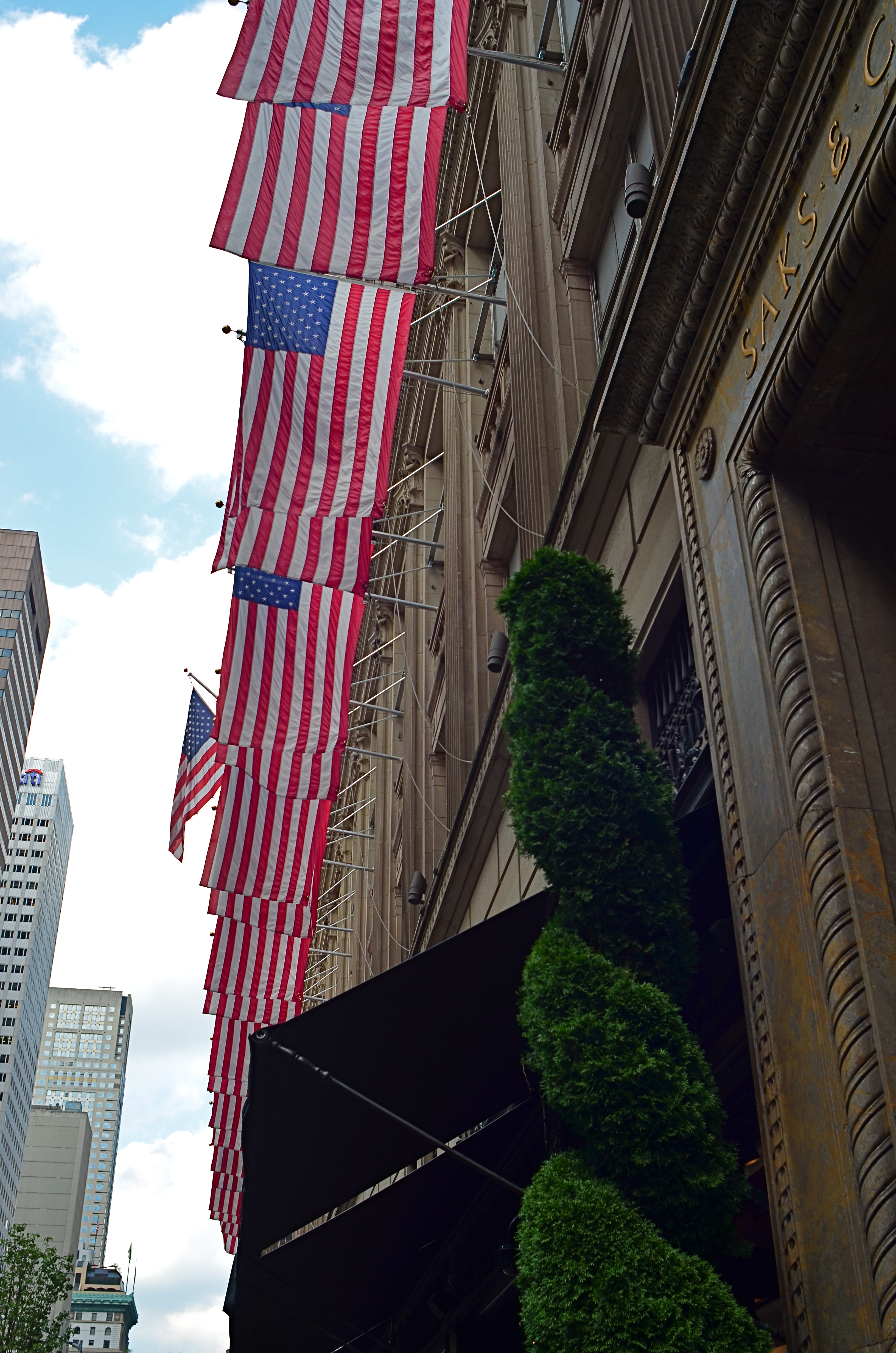
The problem with fresh photographic approaches to the flag is really within ourselves. The banner is so constantly present, on public buildings, in pop culture, even as commentary, that it can become subliminal, nearly invisible to our eye. Case in point: the image at left of the front facade to Saks’ in Manhattan. The building is festooned in flags across its entire Fifth Avenue side, which is, being across the street from Rockefeller, a fairly well-trafficked local. And yet, in showing this photo to several people from the city, I have heard variations on “where did you take that?” or “I never noticed that before” even though the display is now several years old.
And that’s the point. Saks’ flags have now become as essential a part of the building as its brick and mortar, so that, at this point, the only way the building would look “wrong” or “different” is if the flags were suddenly removed. Training one’s eye to see afresh what’s just been a given in their world is the hardest kind of visual re-training, and the American flag, visually inexhaustible as a source of artistic interpretation, can only be blunted by how much we’ve forgotten to see it.
Photography has found a cure for sharpness, clarity, exposure, even time itself. But it can’t compensate for blindness. That one’s on us.
UNKNOWN KNOWNS
1/15 sec., f/1.8, ISO 1000, 35mm.
By MICHAEL PERKINS
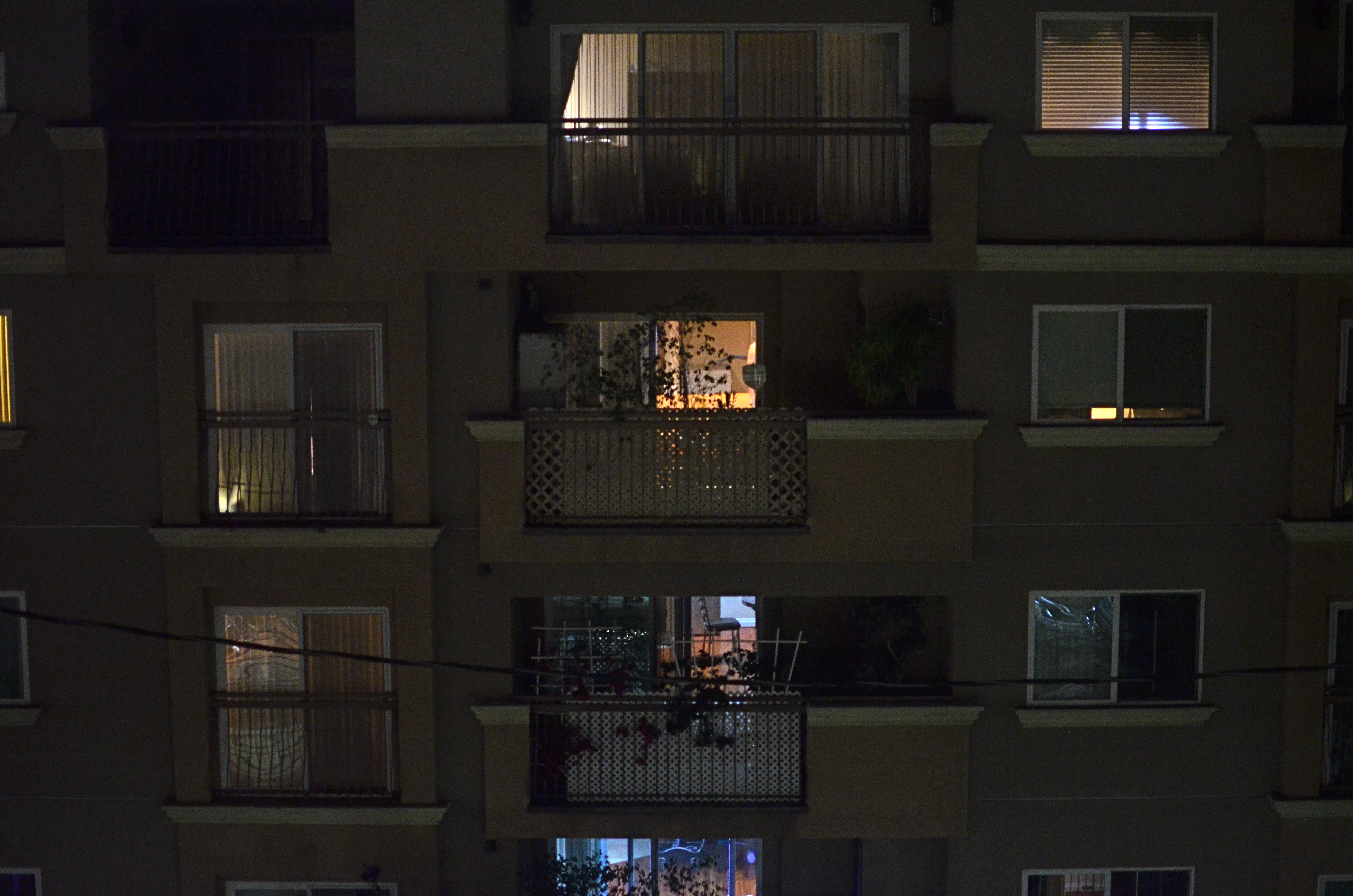
ALFRED HITCHCOCK’S CLASSIC REAR WINDOW IS THE ULTIMATE GUILTY PLEASURE, and not just because the Master of Suspense is at the peak of his edge-of-your-seat powers in the telling of its thrilling murder story. No, the massive, full-sized set of James Stewart’s Manhattan neighborhood, with all its apartment-dwellers’ secrets open to the most casual snoop, is the creepy, giddy candy at the center of this cinematic confection. In making it temporarily okay to be, in effect, peeping toms, Hitchcock is making us complicit in his hero’s unsavory curiosity. All these dramas. All these secrets that we have no right in knowing. And, of course, we can’t look away.
Photographing the intersection of living spaces in city settings is far often more subtle than Hitch’s feat of shaving the back wall off an entire community, and that makes for a lot more mystery, most of us beyond solution. Look too little, and a slab of brick is more like a beehive than a collection of stories. Look too deeply, and the truths you unearth can feel stolen, like an invasion done purely for prurient entertainment. What’s most interesting is to imply much but reveal little, and hitting that balance is tough.
I recently killed off the last fifteen minutes of a generally unproductive night of street shooting by gazing out the window of my nondescript hotel at an equally nondescript apartment building across the way. The last vestiges of dusk offered scant details on the outside wall, and the warm yellow hum of electrical light had already begun to flicker on in the various cubicles. I thought of Rear Window and how you could look at the fully visible doings of people, yet still know virtually nothing of their lives. Here the lighting was random, undefined, with little real information on the life throbbing within the individual spaces….the dead opposite of Hitchcock’s deliberate staging.
I couldn’t see a face, a hand, an activity. All I had was the mere suggestion of human presence. What were they reading, watching, wishing, enduring, enjoying, hating? I couldn’t know and I couldn’t show it, but I could show the mystery itself. I could share, if you will, the sensation of not being able to know. And so I made a photograph of that lack of information.
Some photographs are about things, obvious things that you’re able to freeze in time. Other images are about the idea of something, a kind of unsatisfied anticipation. Both kinds of pictures have their own narrative code, and learning how to manage these special languages is great practice for the idea, and the mind back of it.
