LOOKING FOR AN OPENING
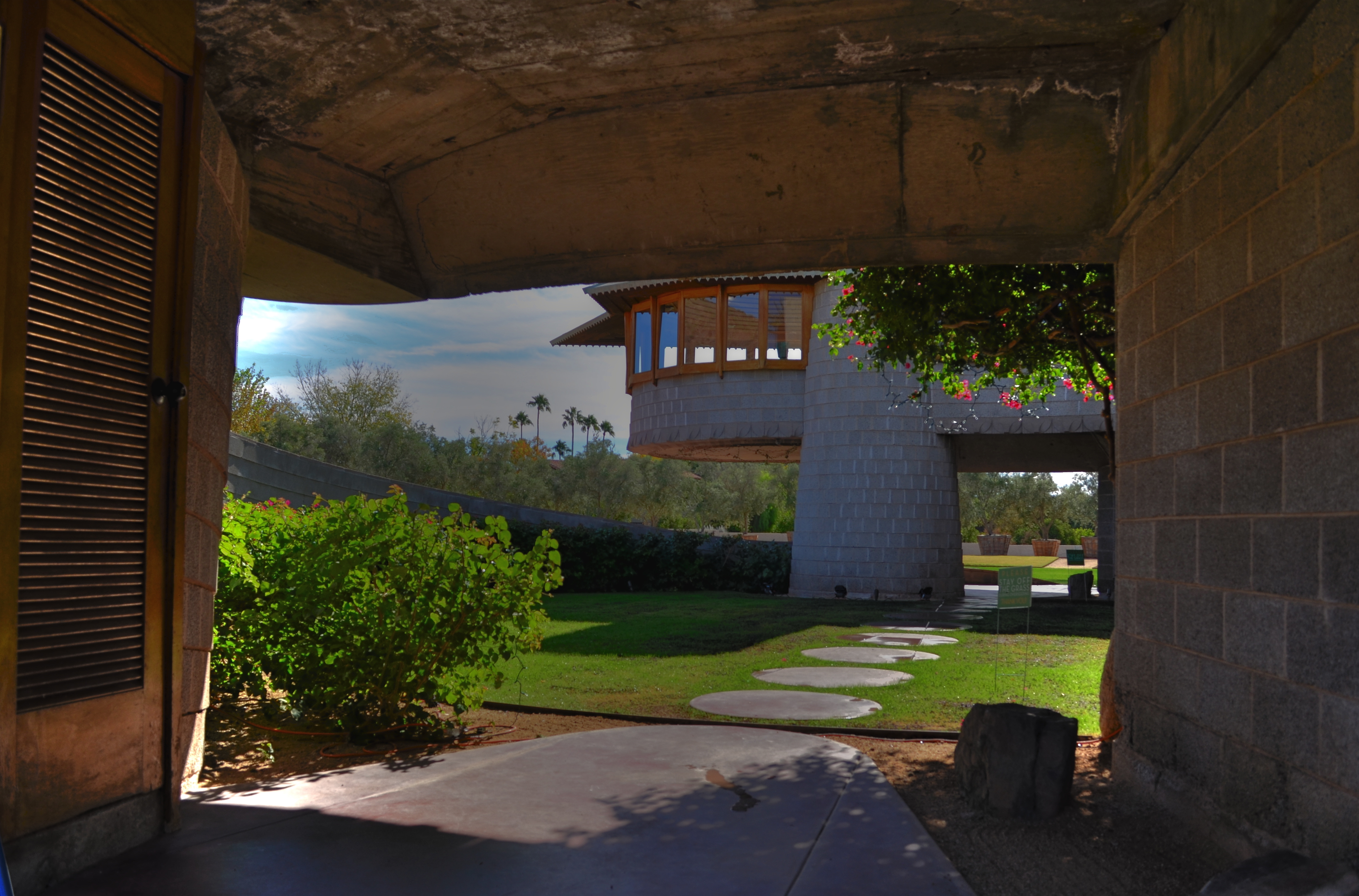
Entering a Frank Lloyd Wright home is like unwrapping a birthday present. The concrete walk ends in a circular ramp that rises to the left and around the David Wright house to create this wonderful open space.
By MICHAEL PERKINS
IF A HOME CAN BE SAID TO BE AN EVENT, then a door is the engraved invitation that bids you to witness that event. When you think about it, a door is the most crucial part of a house’s design, certainly its most deliberately provocative. It advertises and defines what lies within. It’s a grand tease to a mystery, the last barrier before you invade someone’s most personal space. It’s no wonder that entrances to places are among the most photographed objects on the planet. The subject is as inexhaustibly varied as the people who construct these lovely masks.
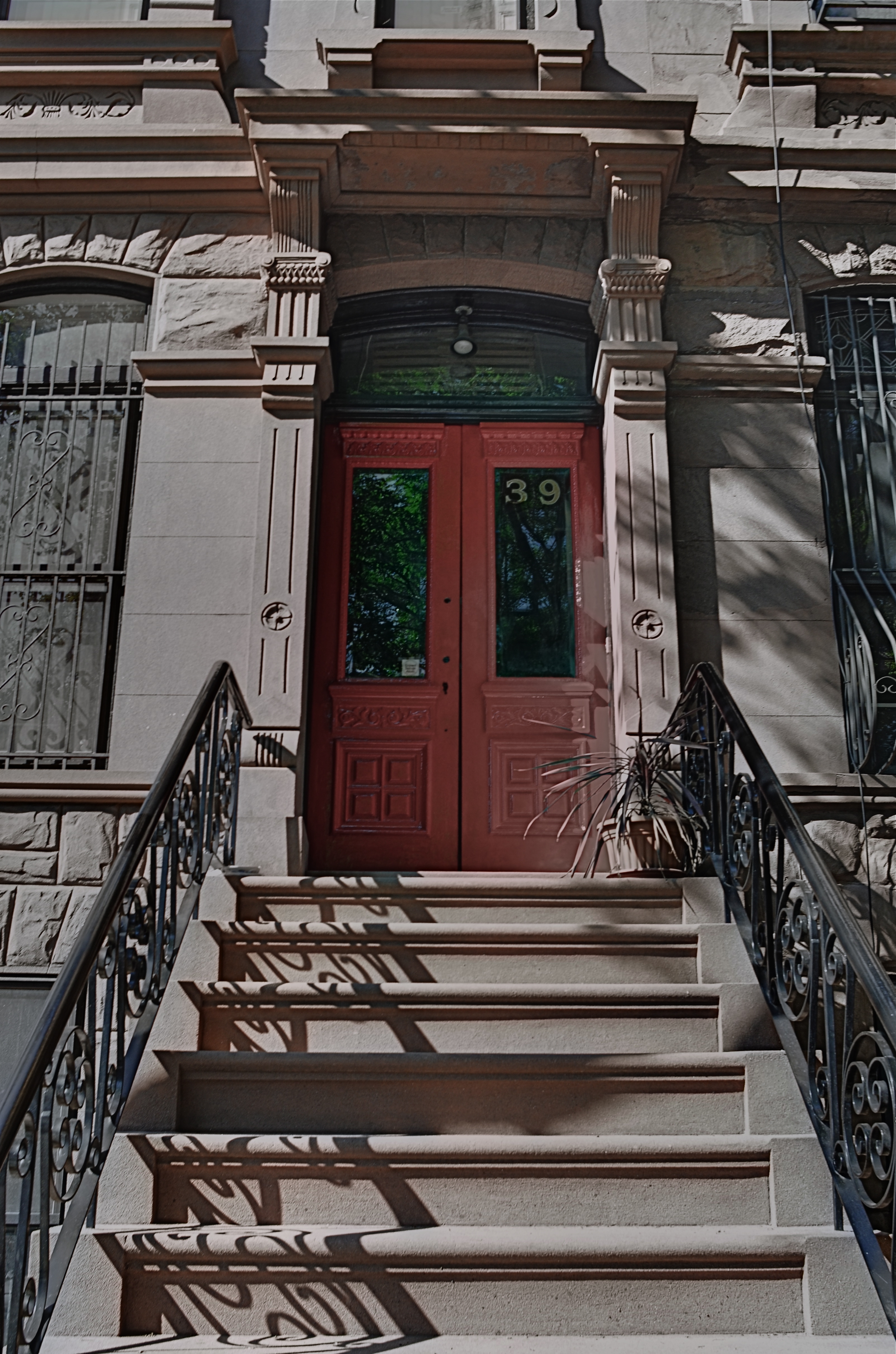
Doors are the first story tellers in a house.
Frank Lloyd Wright did more than create drama as you entered one of his houses; he actually enlisted you in generating your own wonder. Often the great man made you a little squirmy as you prepared to come inside, compressing door heights and widths to slightly uncomfortable dimensions. Pausing for a moment, you could almost feel like Alice after she ate the wrong cake, as if you might never be able to wriggle through the door frame.
Shortly after this ordeal, however, Wright would let the full dimensions of the inner house open suddenly and dramatically, as he does in the image above, taken at the home that he designed for his son David in Phoenix, Arizona. After ducking your head, you step into a court that has…no ceiling…since it ends in a ramp that both climbs around and supports a house that encircles you, creating an intimate courtyard that is both confined and limitless.
Doors make statements, almost boasts, about the wonder that lies just inches beyond them, and, like all generators of mystery, they are often most interesting when the question is never answered. Doors we never see beyond are often the most intriguing, like a woman behind a veil. When I invade a new neighborhood, my camera’s eye goes to doors before anything else. Sometimes the spaces they conceal don’t live up to the hype, but doors, these stage productions at the front of grand and humble abodes alike, offer something tantalizing to the eye.
EYE ON THE BALL
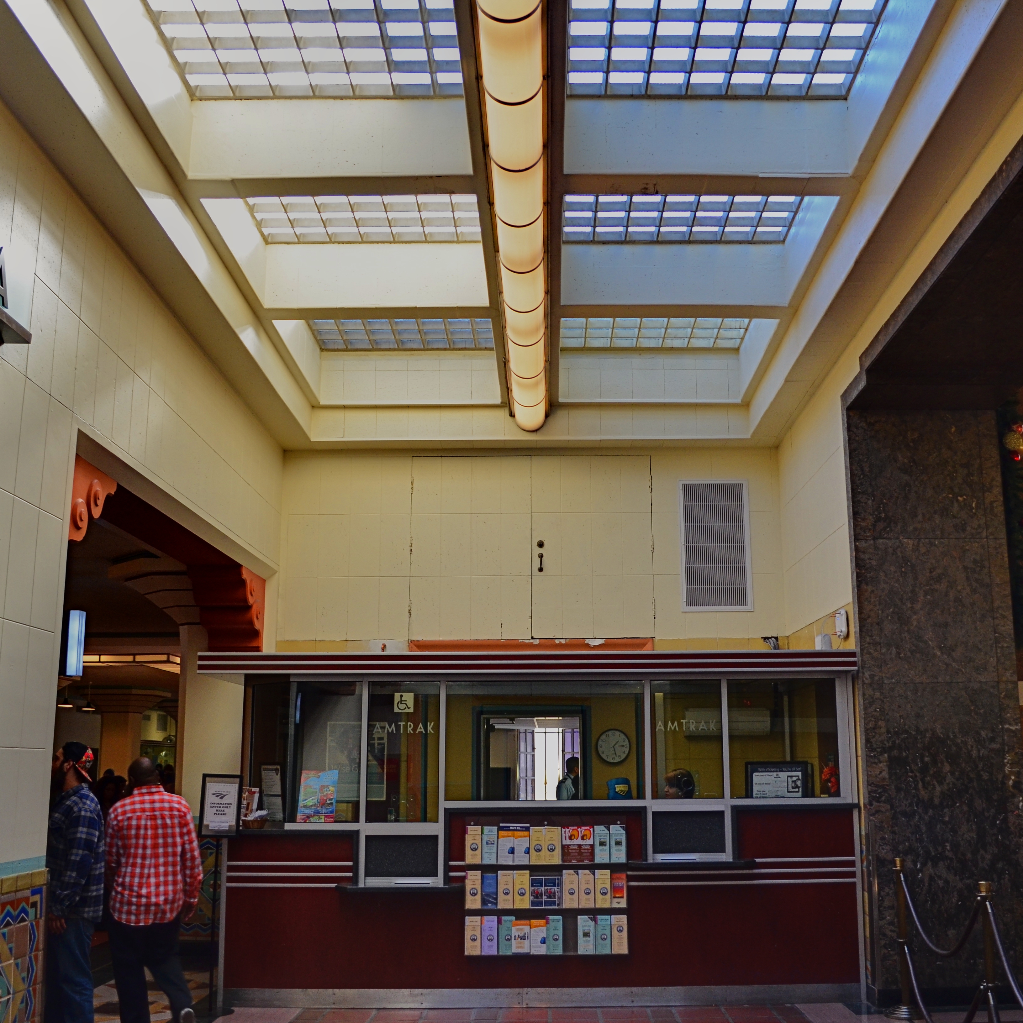
The two passersby mar what might have been an ideal composition. If I’d just reshot without them…
By MICHAEL PERKINS
I CAN STILL HEAR MY LITTLE LEAGUE COACH’S VOICE, cured into a coarse hum by too many years of Lucky Strikes, hitting me in the back of my skull as I stood shakily in the batter’s box. If he had told me once, he had told me a thousand times: don’t try to hit every ball that comes across the plate. You swing like a rusty gate, he would tease me, or don’t eat their garbage. The main message, and one that I only intermittently received: wait for your pitch.
On those rare occasions when I didn’t fish wildly in the air for every single thing that sailed in from the mound, I took great encouragement from his voice saying, good eye. Strangely, I had earned praise for essentially doing nothing, but, hey, I’d take it.
Coach sometimes comes to mind when I view the results of some of my hastier photographic decisions.
There is, for photogs, a very real translation of “wait for your pitch”, and it’s more important in the digital era because it’s such an easy rule to adhere to. Simply, you must keep shooting long enough to get the frame you saw in your mind. There can be no, “I’ve already taken a lot of frames”, or “they’re waiting for me to finish up” or “maybe today’s not my day for this shot.” First of all, it’s your picture. If you want it, take it. Secondly, there is no such thing as “a lot of frames”. There is only enough frames. If clicking one more, hell, ten more, will get you your shot, then do it. There is no phantom film counter warning you that you only have four more Kodachrome exposures left.
I am preaching this particular commandment all too loudly today because I am kicking myself for not living up to it recently. In the top frame, I got every element of a quaint old Amtrak ticket window that appealed to me, including the patterned skylight, the bored agent, the square arrangement of the Deco-ish counter space, and the left and right details of an old archway and a marble wall. Everything except the intrusive passersby on the left. They are sadly out-of-sync with the time-feel of the rest of the shot, and, had I not felt that I had nailed the general exposure and feel of the image, I might have waited for them to move out of frame, and gotten everything I wanted.
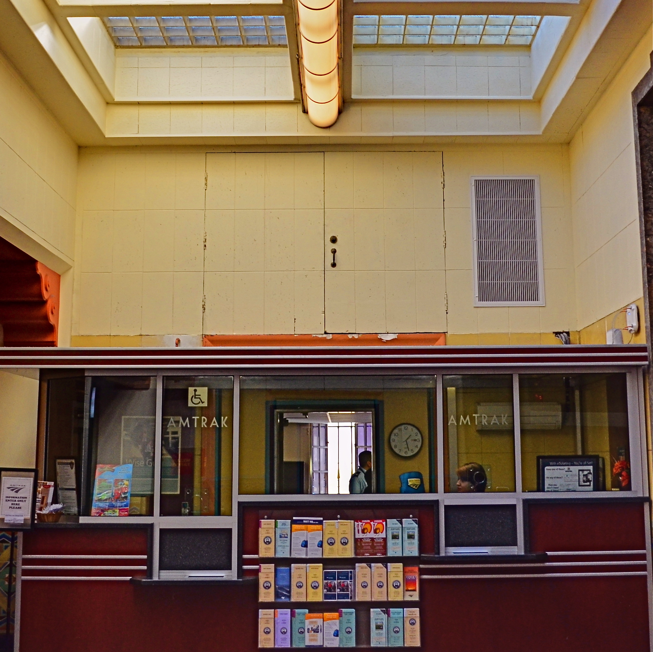
The price of impatience: the “salvaged” version of the above shot.
But I didn’t. I settled for “close enough”, and moved on to the next subject. Later, in post-production, I could certainly crop my squatters out, but at the cost of the overall composition. I now had to make do with what was left. I managed to reframe for another square shot that included nearly all the same elements. But it was “nearly”, not “all”. And “all” is what I could have had if I hadn’t tried to swing at the wrong ball. You can’t make a good shot out of a bad shot, and when an opportunity is gone, there isn’t a piece of software in the world that can make a miracle out of what’s not in your camera.
Wait for your pitch.
THE BEST KIND OF SECOND-GUESSING

You don’t need a dedicated macro lens to shoot this image. Just maximize the average glass that you have. 1/100 sec., f/2.8, ISO 100, 35mm.
By MICHAEL PERKINS
I TRY MY BEST TO ANTICIPATE EXACTLY WHAT KINDS OF SHOTS I will be taking in a given photo situation. This helps minimize the delay and hassle of changing gear in the field by heading out with a single lens that will do most of what I want. It saves me lugging along every hunk of glass I own on a project (trying vainly to be ready for anything), and makes me far more familiar with the real limits of whatever lens I decide will be my primary go-to for the day. Not a perfect plan…still, a loose plan is better than totally trusting to instinct or luck.
You can, of course, plan too generally and accidentally limit yourself. For example, on a day in which you’re to shoot a ton of landscapes, it’s easy to assume you’ll want an ultra-wide lens to capture those vast vistas. However, if something amazing appears on a far horizon and you can’t zoom any closer than, say, 55mm, you’ve suddenly got the wrong lens. Moreover, if your day takes you inside a dark cave, and your ultra-wide can’t shoot any faster than f/3.5, you’re likewise hamstrung to some degree.
In the above image, I decided, as I often do, to spend the entire day with a 35mm prime, a lens which affords me more latitude in more situations than any other glass I own. Of course, I can’t zoom with that lens, so I have to be reasonably sure that anything I want to shoot with it can be framed by simply walking closer or farther away. The 35 can open up to f/1.8, so it’s great in the shade, or where I want a shallow depth of field, and that can make it a viable, if modest, close-up lens…not true macro, but a good tool for selective subjects just a short distance away (in this case, about five feet). Also, shooting with the biggest image file setting available allowed me to crop away up to 75% of my original, as I did here, and still maintain good resolution. However, is the 35 of any value if I suddenly spy a bald eagle on the wing 300 yards away? Not so much.
But it’s not about finding a universal, one-lens-fits-all solution. It is about anticipating. The most valuable habit you can develop before every sustained shoot is to mentally rehearse (a) what kind of situations you’re likely to encounter and (b) what you want to be able to do about it. That sounds absurdly simple, but it really is about taking as many obstacles out of your own path before they even appear as obstacles. In other words, practice getting out of your own way.
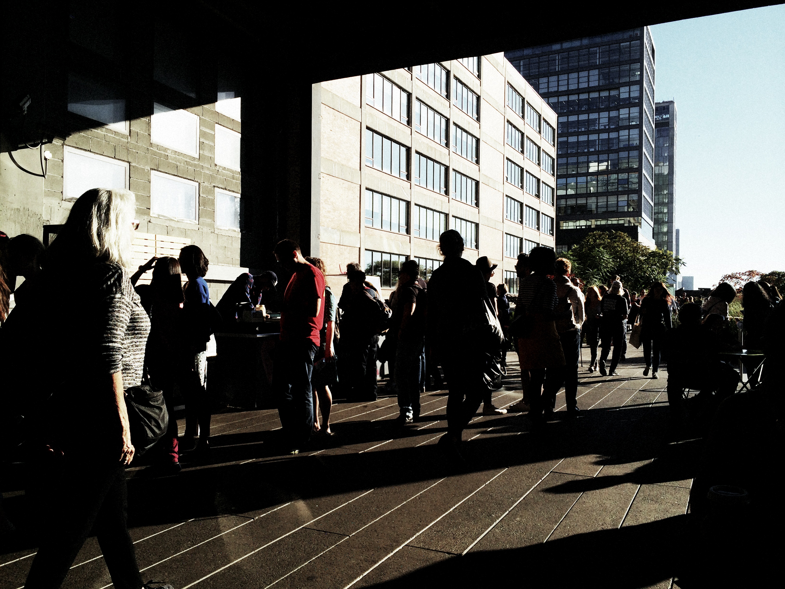
THOSE WHO STAND AND WAIT

Please Listen For Announcements, 2015. The iconic waiting room at Los Angeles’ Union Station terminal.
By MICHAEL PERKINS
SHOW ME A HOLIDAY SEASON AND I’LL SHOW YOU PEOPLE WAITING FOR SOMETHING TO HAPPEN. They form lines for special orders, last-minute items, a kid’s brief audience with Santa. They hope to bump someone on a flight, beat someone out of a bargain, talk someone into a discount, refund or exchange. But mostly, they wait.
For as many festive holiday subjects that dance before the photographer’s eye, there are many more scenarios in which nothing much happens but..the waiting. And, while this seemingly endless hanging-out never offers images that define joy or wonder, they are fodder to the street shooter within us, the guy looking for stories. Stories of tired feet. Tales of people who can’t get a connecting flight ’til tomorrow at the earliest. Sagas of mislaid plans and misbegotten presents. Folklore of folks who are lost, lonely, disappointed, and down. In short, all of us, at various times.
Transit points are often among the most poignant during the season, with legions of faces that plead, what’ll I get for her? How will I get all the way down this list? How soon can I get home? Your best bet? Hang at the train stations, the port authorities, the airports, and hear the plaintive strains of I’ll Be Home For Christmas sung in the key of ‘as if’. Seek out those aches, that weariness, the many false starts and stumbling finishes of the holidays. And keep your camera ready, hungry for whatever visions dance in your head.
JUST OUT OF SIGHT
By MICHAEL PERKINS
PART OF THE EVOLUTION OF A PHOTOGRAPHER’S EYE is the imparting of new importance to things we have forgotten to see, those everyday objects that line or border our rituals and our daily to-and-froms, but which gradually are rendered invisible because our gaze is focused elsewhere. We fix upon the subway train that we have to catch, but miss the miniature tales buried in brick, steel, rust, entrances and exits. We’ve been down this street a million times, and always pause to peer in the window of, in order, the bakery, the newsstand, the Chinese take-out joint. Across the same street are a dry cleaner, a watch repair shop, and a storefront cathedral. We have never seen them.
Photography involves extracting stories where others see a blank slate, but that means first training ourselves to constantly re-see the things we believe we “know”, only to find that there are stunning revelations mere inches away from those known things. It’s the hardest habit to cultivate, this revealing of new layers in what we assume is the familiar. And yet it’s really the fresh blood that rejuvenates our art when it’s gone anemic.
One trick I try more often than I used to is to pause, after entering a building, to look back at the other side of that entrance…in other words, the view I would see facing me if I were using that entrance as an exit. It’s a very simply thing, but frequently there’s something fresh that presents itself, in something I believed I knew all about.

Flights of fancy, right under our wing….ah, nose.
The above image comes from such an exercise. It’s taken just inside the main entrance to the Brooklyn Public Library, which, as you can see, has a great Art Deco grille of storybook characters over the door. But that’s just as you walk in. Pay equal attention when you’re walking out, and you see a strange bird looming over the entrance (now your exit). But not just any bird. It is, in fact, a rescued statue which once graced the main lobby of the long-departed Brooklyn Eagle newspaper, out of its old context as a symbol of high-flying journalism, but now a reminder of one of the city’s best voices. Best of all, the late afternoon sun projects the silhouettes of the storybook grille onto the eagle and the adjacent wall in an unearthly display of shadow. It’s worth looking back at. Or I could say I am always looking forward to looking back at it.
When looking for something new to photograph, seek out the places in which you’ve seen it all. You’ll never be happier to be proven wrong.
A WONDROUS MESS

Too busy? Well, when it comes to seasonal shots, it’s a lot harder to say.
By MICHAEL PERKINS
Consulting the rules of composition before taking a photograph is like consulting the laws of gravity before going for a walk.
Edward Weston
PHOTOGRAPHERS LOVE TO COMPILE LISTS OF LAWS that must be obeyed to ensure the capture of great images. Bookshelves are jammed to fracturing with the collected works of wizards large and small who contend that all of this art stuff is really about craft, or adherence to techniques that are the equivalent of Einstein’s law. And, of course, with every fresh generation, a new slew of shooters come sneering along to deride this starched and stuffy discipline. All that matters, these young turks snigger, is my grand vision.
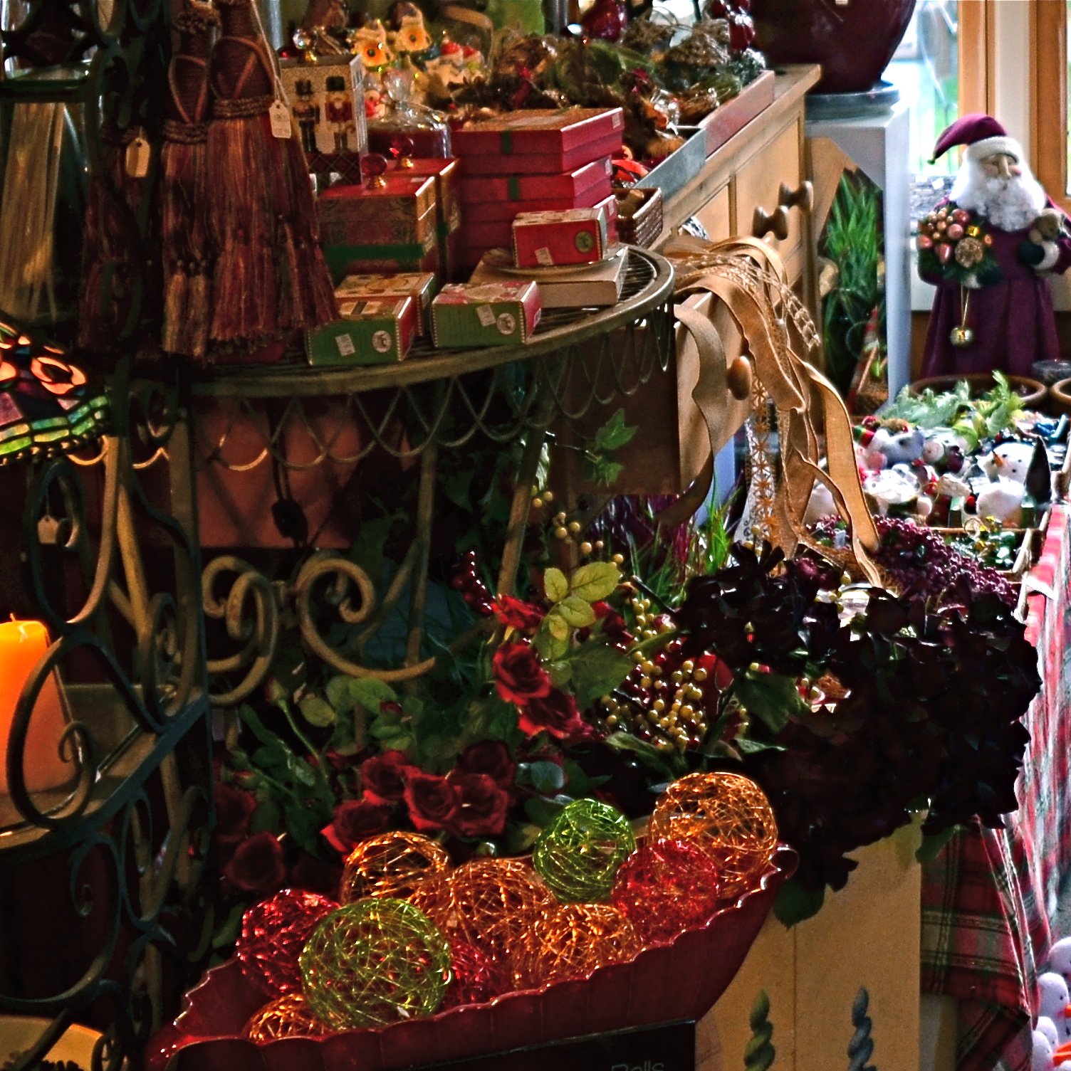
Worlds within worlds: many vast holiday scenes can be “subdivided with cropping.
Let me again re-state the obvious, which is that both viewpoints are correct and/or totally wrong. And since Mr. Weston has introduced the subject of composition, let us consider the special task of seasonal photos, specifically, arrangements of yuletide objects. The classic rule on still-life shots is that less is more, that it’s better to perfectly light and expose three pieces of fruit than whole baskets of the stuff. Meanwhile the festive, instinctual artist concedes that many holiday scenes are mad with detail and crammed with more, more, more…..and that’s okay.
The unique thing about Christmas decor is that in many cases, you not creating the compositions, but merely reacting to someone else’s creations…in nativity scenes, churches, and especially in retail environments. Obviously your local department store doesn’t adhere to the admonition “keep it simple”; quite the opposite. Seasonal trim in most stores is served up not by the spoonful but by the truckload. Anything less than overkill seems skimpy to many yuletide decorators, and so, if you favor basic subject matter, you’re either going to have to mount your own arrangements or selectively zoom and crop the more congested scenes. If, however, you already subscribe to the idea that more is better, then life gets easy fast.
Holidays come layered in much that is intensely personal, and that makes clean compositional judgements about “how much” or “how little” tricky at best. Just get the feelings right and let your regular rules relax into guidelines.
A RACE OF INCHES
By MICHAEL PERKINS
YOU CAN VIEW THE MAIN FUNCTION OF PHOTOGRAPHY AS TWOFOLD, with the deliberate creation of a vision as one path, and the arresting of time in its motion as the other. In the first case, we plan, conceive and execute at our leisure until the image that is behind our eye emerges on the page. In the second, we are hastening to capture and cage something that is in the act of disappearing. In one instance we compose. In the other, we preserve.
Sometimes the two purposes come together in one picture, although you seldom know it until after the image is made. Take the example below. In the moment, I was struck by the light patterns that bounced across the empty space of an event room at the visitor center for the Brooklyn Botanical Gardens. I wanted to do everything I could, exposure-wise, to dramatize the play of light in this special space. In addition to trying to create an image, however, I was also scurrying to keep a special number of factors from vanishing. I was both creating and preserving.
Carpe diem: when the light’s right, be ready to shoot. 1/160 sec., f/5.6, ISO 100, 24mm.
Obviously, the light you see would have had a dramatically different effect had the room been packed with, say, bodies or furniture, so its unobstructed path was one temporary condition. Another fleeting factor was the late afternoon light, which was, in addition to being extremely changeable, also one of the rare moments of pure sun the area had seen during a severely overcast day. It was as if the heavens opened up and angels were singing a song called, “Take The Picture, Already, Dummy”(perhaps you have heard this song yourself). Everything pointed to immediacy.
Full disclosure: getting this shot was not something that stretched me, or demanded exceptional skill. There was not one technically difficult factor in the making of this picture. You yourself have taken pictures like this. They are there and then they’re gone. But, they don’t get collected unless you see how fragile they are, and act in time. It’s not wizardry. It’s just acting on an instinct which, hopefully, gets sharper the longer you are in the game.
I often state one of my only primary commandments for photography as, Always Be Shooting. An important corollary to that rule might be, Always Be Ready To Shoot. Spot the potential in your surroundings quickly. Get used to the fact that many pictures will only dance before you for seconds at a time, flashing like heat lightning, then fading to oblivion. Picture-making is sometimes about casual and careful crafting of an image. And sometimes it’s a race of inches.
And sometimes it’s both.
DON’T EVER ALWAYS DO ANYTHING
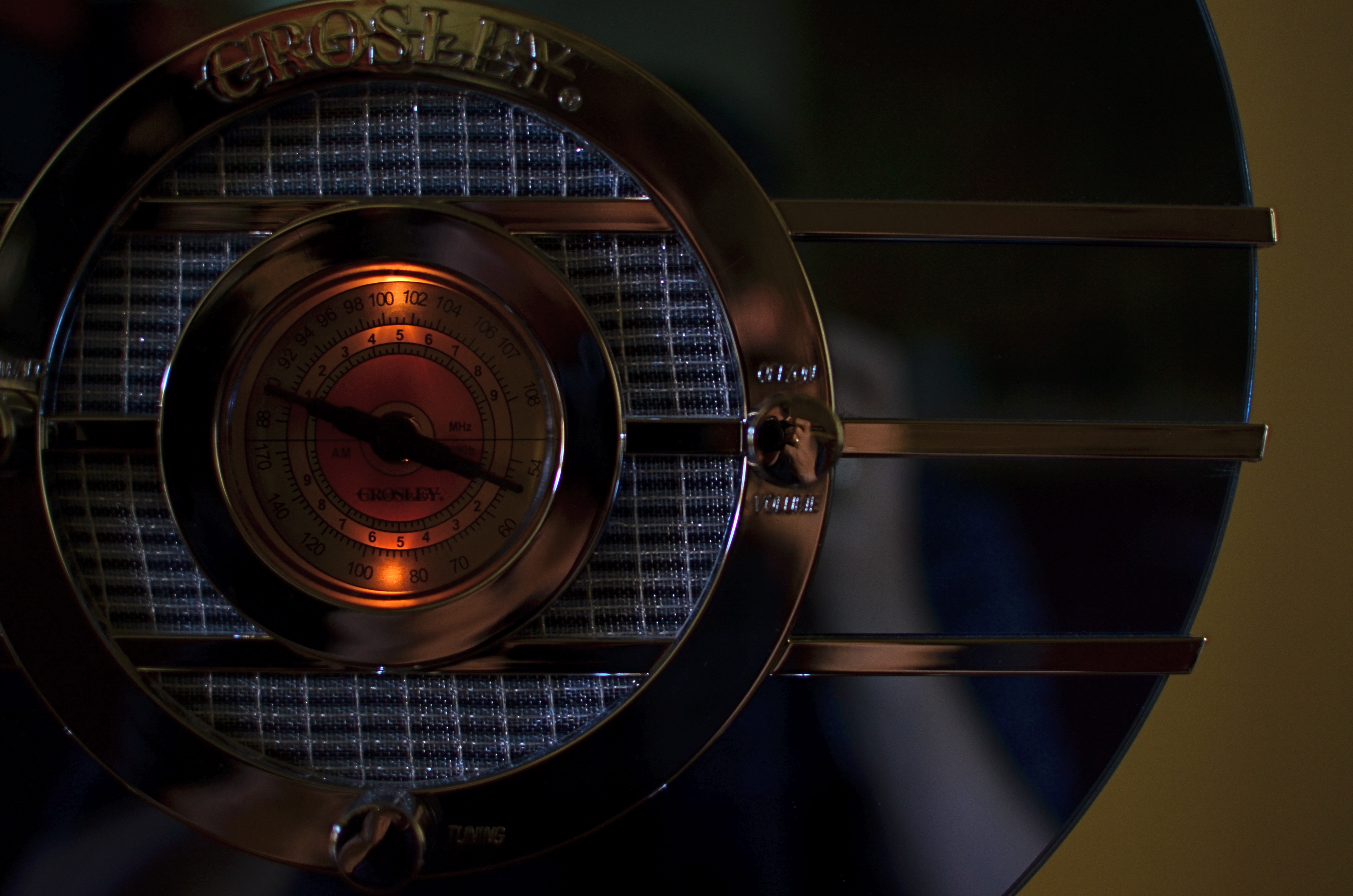
This shot, as the one below, is taken at 1/60 sec,, f/2.2, ISO 250, 35mm. The difference between the two images is the white balance setting.
By MICHAEL PERKINS
IF YOU’VE EVER GLANCED AT THE NORMAL EYE’S HOME PAGE MISSION STATEMENT, you might come away with the impression that I am unilaterally opposed to automodes, those dandy little pre-sets that do their best to predict your needs when making a photo. The truth is that I am against doing anything “all the time”, and thus caution against the universal use of automodes as a way of idiot-proofing your shoots. They can be amazing time-savers, sometimes. They are reliable shortcuts, sometimes. Just like I sometimes like bacon on a burger. There are no universal fixes.
I meet many people who, like myself, prefer to shoot on manual most of the time, eschewing the Auto, Program, Aperture Priority and Shutter Priority modes completely. Oddly, many of these same people almost never take their white balance off its default auto setting, which strikes me as a little odd, since the key to color photography is getting the colors to register as naturally as possible. Auto WB is remarkably good at guessing what whites (and in turn, other hues) ought to look like in a pretty wide variety of situations, but it does make some bad guesses, many of them hard to predict.
A gross-oversimplification of white balance is that it reads the temperature of light from cold to warm. Colder temp light runs bluer. Warmer temp light reads more orange. Auto WB tries to render things as naturally as it can, but your camera also has other customizable WB settings for specific situations, and it’s worth clicking through them to see how easy it is to produce subtle variations.
In the picture in the upper left corner, I’m taking a picture indoors, in deep shade, of a reproduction 1930’s Bluebird Sparton radio, a wondrous Art Deco beauty featuring a blue-tinted mirror trimmed in bands of chrome. To emphasize: blue is the dominant color of this item, especially in shade. Shade, being “colder” light, should, in Auto White Balance mode, have registered all that blue just fine, but, in this case, the chrome trim is completely (and unnaturally) painted in the same orange glow. As for the blue values, they’re well, kind of popsicle-y . That’s because, when it’s all said and done, Auto White Balance is your camera’s educated guess, and it sometimes guesses wrong. If you always use it, you will occasionally have to eat a bad picture, unless you take action.
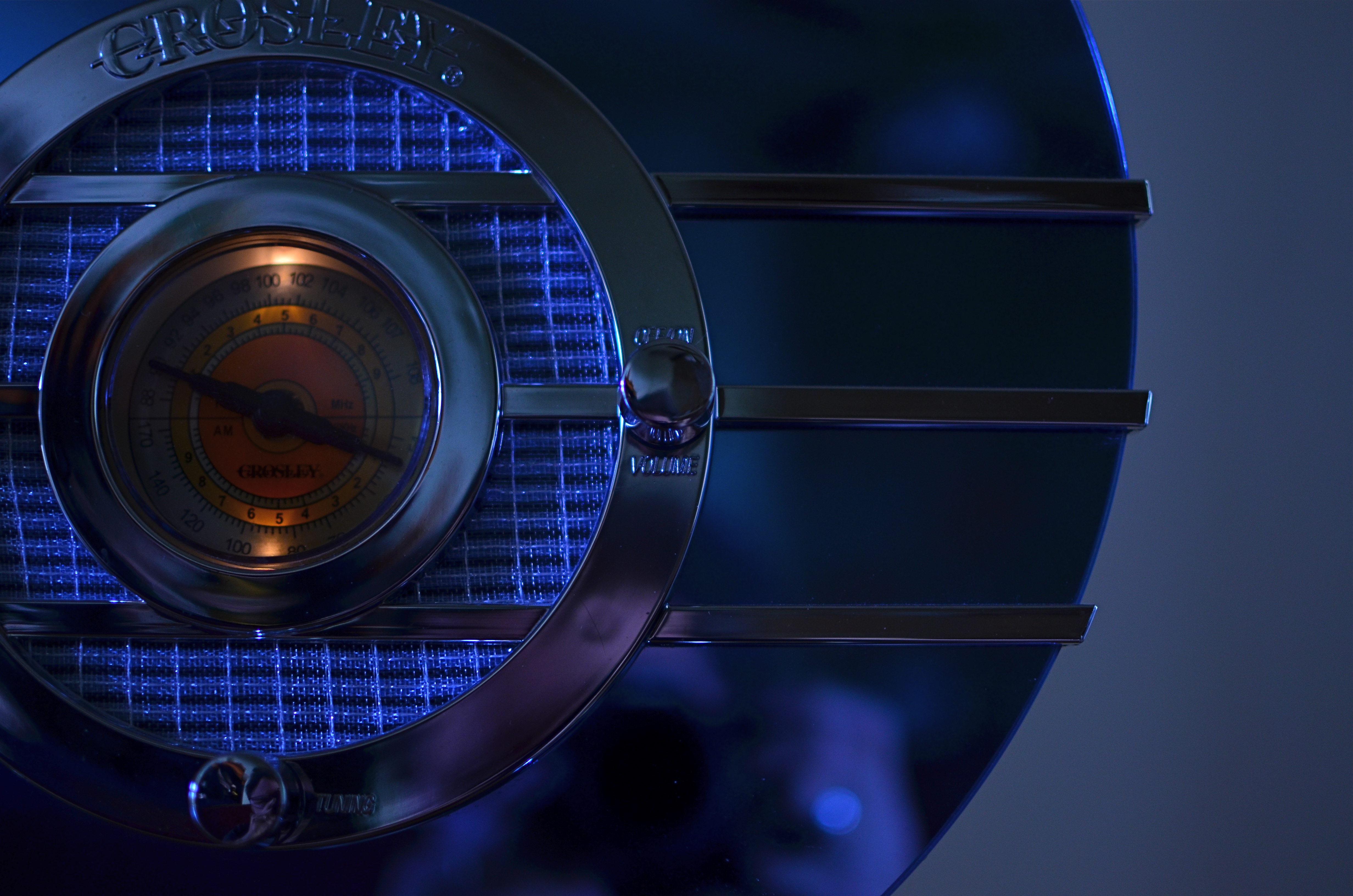
I get blue when I listen to the radio, or when I dial up the appropriate white balance.
For the above image, I want the dial to be nice and orange, but just the dial. To try to get the blues back to normal on the rest of the radio, I switch to the Tungsten white balance setting (symbolized by a light bulb, since they burn, yes, tungsten filaments), something I normally wouldn’t do in either daylight or shade, but hey, this is an experiment anyway, right? To make it even weirder, Tungsten might read neutrally in some kinds of indoor night settings…but it also doesn’t behave the same way in all cases. In this case, I caught a break: the orange in the radio dial registers pretty true and all the metals are back to shades of silver or blue.
Notice how both white balance settings, in this strange case, both performed counter to the way they are supposed to. One misbehaviour created my problem and another misbehaviour solved it. Hey, that’s show business.
Hence the strange but appropriate title of this post. Don’t ever “always” do…anything. If you want the shot you want (huh?) then pull an intervention and make the camera give it to you. Automode in white balance is just as fraught with risk as any other automatic setting. It works great until it doesn’t. Then you have to step in.
CASTING
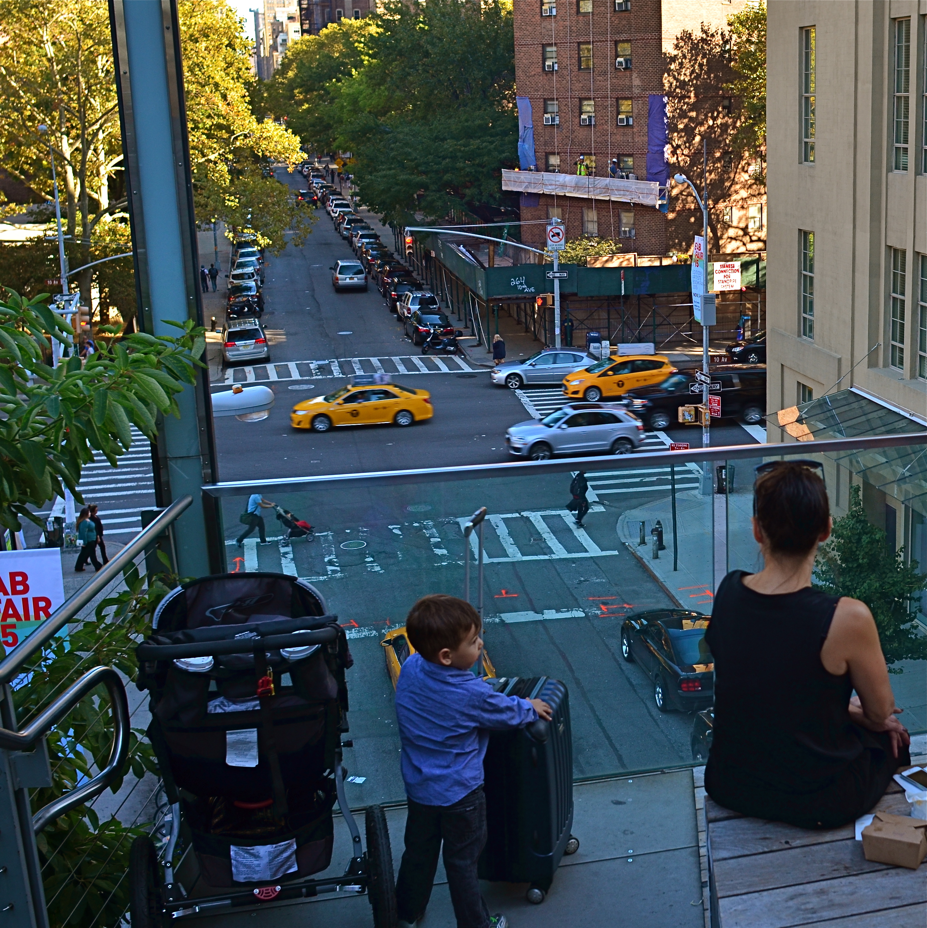
Do the woman and the child constitute a “family” in the narrative of this image?
By MICHAEL PERKINS
MORE COMPOSITIONS IN PHOTOGRAPHY ARE CRAFTED AFTER THE SNAP than naturally spring forward, fully formed, out of the camera. Frame as carefully as you may, you often find that something needs to change to help your image’s story fully emerge. This usually means taking something away, cleaning things up…and that means cropping. I think it’s fair to say that, more often than not, we start with pictures that contain too much and carve out the core picture that deserves to survive, to be pushed to the front.
Sometimes a proportionate tightening is all that a picture needs, so that a large, busy rectangle becomes a streamlined, smaller rectangle. This can clear away extraneous objects like phone poles, wires, extra buildings, any distracting junk that pulls the eye away from the important stuff. But it isn’t always things: it can also be people, surplus bodies which, like extraneous elements of any kind, change the narrative, or keep it from connecting. Think of the picture as a theatrical production and yourself as the casting director. Anyone on the set who doesn’t move the story forward is not playing a part that we need. See the girl at the office for your check, so long.
Does the removal of the extra people compromise or complete the photo’s story?
In the picture above, the cropping seems to create the story of a mother and her children taking in the view from New York’s Highline Park onto a city street below. In the original shot, seen at left, she seems less like a mother and more like just another bystander. The crop has suggested a relationship or a role for her. The woman to her right (in the original), unlike the “mother” figure, is not acting as our surrogate, seemingly looking with us at the scene. She is on her cel phone, and therefore registers as more detached than her neighbor, whose face, since it’s invisible to us, could contain anything we want it to. To the right of the cel user, we see additional people who don’t subtract from the picture, but also don’t add anything. They are extras that we, the director, have decided we don’t need to cast.
Also, structurally speaking, the “mother” is arranged so that the diagonal line from the foreground building to her right seems to proceed into the picture from around the area of her right shoulder, so that she sort of anchors the leading line and sends your eye along it to the street below. None of this, mind you, was obvious in the shooting of the original shot, which is not terrible as a composition, only compromised by the inclusion of information that simply doesn’t advance the logic of the picture. I only use it as an example of how I was able to question the “casting” of the original frame and make a conscious decision to cut away things that slowed everything down.
If you can tell a story with two people better than you can with four or five, ask yourself if you really need them. Cropping isn’t an admission that you made a bad photograph. It’s confirmation that your first draft is worth taking to a second one.
ROUNDING TO THE NEXT BEST YOU
Knowledge in any area of art can only feed your photography.
By MICHAEL PERKINS
YOU MAY FIND, AS I HAVE, THAT MANY OF THE BEST PHOTOGRAPHERS ARE ALSO, ARTISTICALLY, SPEAKING, “SOMETHING ELSE“. That is, their creative energies emerge in more than just one medium, even if images are their preferred language. This has always been thus. During the camera’s infancy, many photogs were former painters. Writers were also among the first to explore the new art of picture-making, and the amateur photo work of scribes like Emile Zola and Lewis Carroll remain worthy of note today.
In the 20th century, some painters-turned-photographers like Henri Cartier-Bresson turned back to the brush late in life, while other artists like Man Ray stayed firmly anchored in both camps. And even the great theologian and poet Thomas Merton spent his last years as a Trappist monk dabbling in a kind of zen expressionism through the viewfinder of his Canon 35mm.
This doesn’t exactly prove that everyone who is adept in one kind of art will also be effective as a photographer, but it does demonstrate that some people who are curious in all ways of expression will sometimes also choose the camera as an instrument. I personally believe that this can only improve your way of seeing, since “vision” isn’t achieved merely through the eyes, but through the accumulation of all one’s life experience.
I would even go one step farther and claim that just studying photography may be bad for one’s development as a photographer. Rather, it is the total weight of one’s life which shapes one’s seeing, just as a worldlier view can inform one’s writing, cooking, singing, or strumming. No one art is so complete that it can operate in a vacuum, sealed away from all the other arts.
We readily accept that composers need to occasionally be historians, that writers should sometimes be philosophers, and that both painters and chefs should master a little science, so how can we believe that photographers can comment on the whole of life without at least dabbling in the world beyond their computers or darkrooms? You cannot be willfully blind as a person and visionary as a photographer at the same time. The more there is of you, the more of you there is that makes it into your pictures.
IMPRECISE BUT TRUE
What makes an image work for you? Could it be explained in words? Or isn’t that what the image is for? 1/60 sec., f/4, ISO 400, 35mm.
By MICHAEL PERKINS
AN ELOQUENTLY DETAILED ANALYSIS OF A POWERFUL PHOTOGRAPH, which I read in a recent edition of the New York Times, convinced me anew that, apart from a few compositional basics, no one really knows what makes an image “work”. Beginners love to sing the praises of the Rule Of Thirds as a guideline for composition, and, likewise, critics rhapsodize about Golden Ratios as a way to dissect how powerful elements occupy space in great photos. But the dirty little secret about composition is that there is no dirty little secret, no Laws of Gravity or Relativity that, if consistently obeyed, will yield consistent excellence.
This doesn’t mean that we can’t emotionally identify which pictures have power, as well as those that merely lie there. It merely means that there may never be adequate verbal artillery to reduce those feelings to a law, a handbook, or a credo. We arrive with our cameras at places where there may, or may not be, a picture. Our eye tells us that something important can be extracted, isolated, amplified, re-contextualized. Beyond that, it’s a matter of fate and luck.
Of course, the more we experience what works, the better we are at seeing it in the raw and extracting better and better examples of it. However, every ride of the bucking bronco is distinctly different from all the others. Photography has certain mechanical techniques that can be mastered, certainly, but we can’t learn emotional impact in a class. We can only pour something out into the camera from what is already inside us.
Try to imagine walking up to a chalkboard and reducing your favorite photograph to a series of shorthand symbols reminiscent of a mathematician’s equation. Could anything be more bloodless, more clinical? Critics and analysts sometimes come from the ranks of doers, but many of the very best doers resist the temptation to dissect their art as if it were a lab frog. Henri Cartier-Bresson, the acknowledged Moses of street photography, once recalled that it was seeing another shooter’s best work that made him say, “Damn It!”, grab his camera, and head outside, obsessed with making something of his own that could incite such a reaction.
Photographers seize instinct and emotion in the raw and forge them into a kind of sense-fired steel. Frame a picture with that steel and it will speak a thousand times louder than any mere dissertation.
A DIFFERENT BRAND OF DARK
A texturally rich subject, but its natural color is too Disney.
By MICHAEL PERKINS
ONE PHOTOGRAPHER’S LAB ACCIDENT IS, OCCASIONALLY, ANOTHER PHOTOGRAPHER’S EUREKA MOMENT. Take the case of a visual effect that, in the film era, may have originated with an error in darkroom technique, and which is now being sought after by movie directors and amateurs alike as a look that they actively desire. Recent use of this effect ranges from the gritty, muted color and high-contrast of films like Steven Spielberg’s Saving Private Ryan, to lab-less shortcuts in Photoshop and even shorter shortcuts in ready-to-eat iPhone apps. The look is called Bleach Bypass and it’s worth a look for certain moods and subjects.
The term derives its name from one of the steps used in film processing color film in which bleach is used to rinse away silver nitrate. By skipping this step, the silver is retained in the emulsion along with the color dyes. The result is a black-and-white image over a color image…kind of a photo sandwich. The resulting composite is lighter in hue but packs more extreme contrast and graininess in the monochrome values…an intense, “dirty” look.
The same shot with a simulated bleach bypass effect, done in Photomatix.
Now, for those of you that don’t have a traditional darkroom handy, creating a bleach bypass “look” is easy in nearly any basic editing software suite. Check out the basic steps for Photoshop here. In most cases, you duplicate your original shot, desaturate it slightly, and convert the dupe shot to complete monochrome. The mono copy must also be manipulated for ultimate contrast, and the two shots must be layered in software to give you the desired blend. I tend to use Photomatix more often than Photoshop, since I work a lot with various kinds of tone-mapping for HDR, so I processed the “after” shot you see here in that program’s “exposure fusion” tab. However, as I say, lots of programs can do this with virtually no sweat.
Another path: an iPhone image with the AltPhoto app’s Bleach Bypass filter applied.
The third image in this article (at left) was produced with a click and some swipes with the Bleach Bypass simulator in the AltPhoto app, which also mimics the look of antique film stocks from Kodachrome to Tri-X. As with many phone apps, it doesn’t offer much in the way of fine control, but if you do all your shooting and/or retouching in your mobile, it’s a pretty good quickie fix.
Once again, in the digital era, what was once (a) messy and troublesome becomes (b) no fuss, no muss, and therefore, (c) something that will be adopted and used by many, many more shooters. Democracy in technology does not, of course, guarantee equality of results. You just have more tools to serve you when the ideas come.
INTERACTIONS
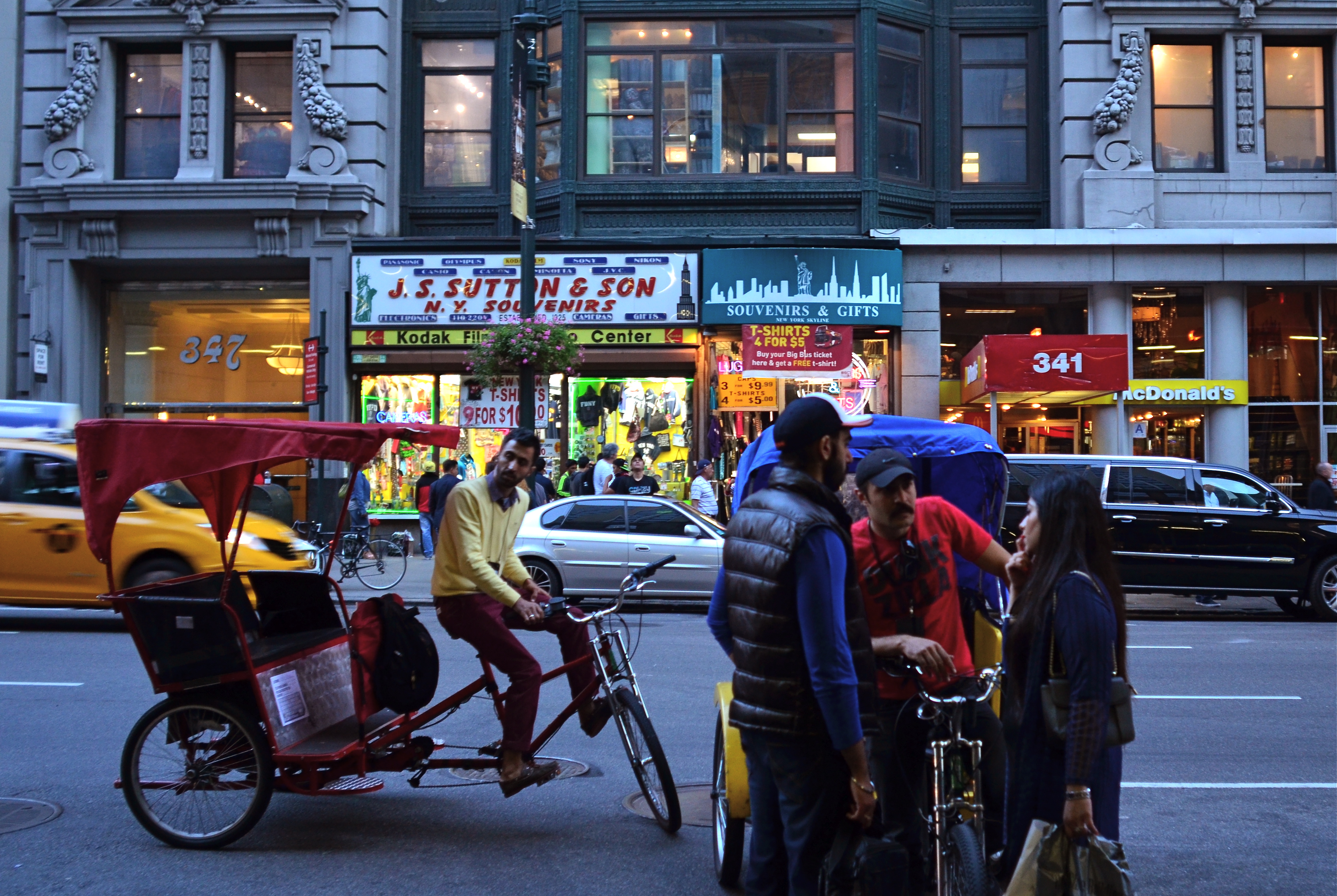
All Around The Town, 2015. 1/50 sec., f/5.6, ISO 320, 24mm.
By MICHAEL PERKINS
IT’S FAIRLY EASY TO FIGURE OUT WHERE TO TAKE YOUR CAMERA if you are trying to visually depict a vibe of peace and quiet. Landscapes often project their serenity onto images with little translation loss, and you can extract that feeling from just about any mountain or pond. For the street photographer, however, mining the most in terms of human stories is more particularly about locations, and not all of them are created equal.
Street work provides the most fodder for storytelling images in places where dramatically concentrated interactions occur between people. One hundred years ago, it might have been the risk and ravage of Ellis Island. On any given sports Sunday, the opposing dreams that surround the local team’s home stadium might provide a rich locale. But whatever the site, social contention, or at least the possibility of it, generates a special energy that feeds the camera.
In New York City, the stretch of Fifth Avenue that faces the eastern side of the Empire State Building is one such rich petri dish, as the street-savvy natives and the greener-than-grass tourists collide in endless negotiation. Joe Visitor needs a postcard, a tee-shirt, a coffee mug, or a discounted pass to the ESB observation deck, and Joe Hometown is there to move the goods. Terms are hashed over. Information slithers in and out a dozen languages, commingling with the verbal jazz of Manhattan-speak. Deals are both struck and walked away from. And as a result, stories flow quickly past nearly every part of the street in regular tidal surges. You just pick a spot and the pictures literally come to you.
At Their Posts, 2015. 1/50 sec ., f/5.6, ISO 500, 24mm.
In these images, two very different tales unfold in nearly an identical part of the block. In the first, bike rickshaw drivers negotiate a tourist fare. How long, how far, how much? In the second, two regulars demonstrate that, in New York, there is always the waiting. For the light. For parking. For someone to clear away, clear out or show up. But always, the waiting. These are both little stories, but the street they occur on is a stage that is set, struck and re-set constantly as the day unfolds. A hundred one-act plays a day circle around those who want and those who can provide.
Manhattan is always a place of great comings and goings, and here, in front of the most iconic skyscraper on earth, those who haven’t seen anything do business with those who’ve seen it all. Street photography is about opportunity and location. Some days give you one or the other. Here, in the city that never sleeps, both are as plentiful as taxicabs.
(JUST BEFORE) THE SHOW MUST GO ON
I’m Too Sexy For My Shirt, 2015. 1/80 sec., f/2.8, ISO 640, 35mm.
By MICHAEL PERKINS
ALMOST WITHIN MINUTES OF THE INVENTION OF THE CAMERA, we humans countered by inventing the camera face.
You have one. I have one. It’s the layer, the mask, the official story, the press release, the prepared consumer product. And while we often associate the making of a photograph with the creation of a document, a frozen slice of actual reality, that has never really been true, especially when it comes to capturing the raw essence of our fellow homo sapiens. It’s not that we don’t occasionally manage to glimpse the real person within: it’s that such glimpses are anything but easy.
And if our regular life is something of a performance, at least where a camera’s concerned, what of the acknowledged manipulation of an “official” performance….a play, a concert, a naked poetry slam? In such cases, the amount of artifice presented to the camera is amped up even more, so that the actual show may reveal nearly nothing of the person staging it. Total opacity.
It’s enough to make a photographer sneak backstage, minutes before the lights go down and the curtain goes up.
And that’s the kind of performance image I look for. The jangled nerves. The last-minute tunings and scales. The features that betray the anguish of going out there and putting your whole self on approval before strangers. In effect, the story that plays out on faces despite the prep, beyond the skill, behind the mask.
String Section To The Stage!, 2015. 1/50 sec., f/2.8, ISO 1000, 24mm.
As seen here, the girl hurrying to the stage for her string solo is trustworthy. She’s nervous, a little embarrassed at being late, desperate to hold, onto her music, literally by the skin of her teeth. Above, the string of young people at an amateur fashion show are busier being kids than being pros. Their take on modeling is not cold or detached, although in seconds, out on the catwalk, they will affect that “look”. But now, in this moment, they are friends, co-conspirators, partners in a commonly weird process. They relax. They laugh.
In both cases, these are people. Without the polish, minus the artifice, their striving visible, if just for a second, as our own.
And that’s when the magic happens.
ON THE LEVEL
With the amount of repair time it took to straighten and resharpen this shot, I could have made ten pictures that were done correctly in-camera.
By MICHAEL PERKINS
IT’S NOW QUITE EASY TO HAVE YOUR CAMERA OR EDITING SOFTWARE correct for things you should have done before the image was made. Most of the times, these fixes cure more than curse, some of them genuinely helping a shooter extend his skills or fine-tune his control. However, in the case of one of the most common post-pic fixes, the “straighten” slider, you’re potentially messing with picture quality, to fix a problem that, quite honestly, shouldn’t have existed in the first place.
Consult every, and I mean every basic camera tutorial going back a hundred years or more. Many timely tips in such books have vanished or evolved over time, but the simple admonition to keep your shot level has remained unchanged since the dawn of photo time. So why do cameras and software even offer straightening as an option?
If you take the cynical view, the existence of this fix suggests that camera manufacturers assume that enough people will routinely take crooked pictures that, of course, they need something to tilt their images back to normal. Because, if that’s not true, then why does the fix even exist?
Here’s the critical point about straightening: it does not maintain sharpness like simply cropping a photo to a smaller size does. To restore your image to a rectangular shape after you’ve rotated it left or right to level it, your camera (or software; both do it the same way) must trim part of the picture and resize it, producing a lower total number of pixels in the “corrected” photo but within the same space as the original one. And there’s just no way to do that without degrading the sharpness.
Some straightenings, if conservative, may not fuzz up your photo as much as some more extreme adjustments. The above image was shot literally on the run during a tour, but it needed just slight adjustment, and so retained most of its sharpness after I ran it though a second editing program. However, you really have to love a shot to go to those extremes to save it.
Thing is, you can bypass this entire problem simply by shooting a level picture. Now, I won’t bore you with a list of just how many really easy ways there are to ensure this. But since sharpness makes at least the top five list of things that most people want from a picture, why not take a pass on all the post-mortem fixes by doing one of the simplest possible things in photography more often?
POST #500: ON THE ROAD TO CHERRY GARCIA
Taking control of your photography can be a daunting process.
By MICHAEL PERKINS
VISITORS TO THE FACTORY HEADQUARTERS OF BEN & JERRY’S ICE CREAM in Stowe, Vermont, upon completing the standard tour of the works, are encouraged to climb a small hill out back of the building to view the company’s Dead Flavor’s Graveyard, an actual cemetery, complete with elegantly epitaphed tombstones and dedicated to such failed B&J varietals as Turtle Soup, Fossil Fuel, White Russian and Sweet Potato Pie. It’s a humorous way to point out that, even for talented startups, there’s no such thing as a direct shot up the mountain of fame. We duck. We detour. We change direction. It’s a process, not a product.
Photography is, in this way (and in no other way that I can think of) much like ice cream.
As we clear the 500 mark on posts for The Normal Eye, I want to (a) profoundly thank all those who have joined us on the journey, and (b) restate that, as our sub-head reads, it really is about a journey, rather than a destination. This small-town newspaper began because I had met so many people over the years who had become suspicious of their camera’s true intentions. Sure, they admitted, the automodes do pretty great on many pictures, but what if I actually want some say in the process? Can I be an active agent in the making of my own pictures?
Now, these weren’t people who wanted to purchase $10,000 worth of gear, sell their houses, abandon their children, and become photo gypsies for NatGeo. These were simply people whose photographic curiosity had finally got the better of them. What would happen, they asked, if I were to, all by myself, make one little extra choice, independent of the camera’s superbrain, before the shutter snapped? And what if I made two? Or three? Other questions followed. What is seeing? How do you learn to value your own vision? And what tasks from the era of film still apply as solid principles in the digital age?
The Normal Eye has spent the last four years trying to ask those questions, not from a top-down, “here is how to do it” approach, since so many of these solutions must be privately arrived at. This is not, and will never be, a technical tutorial. I reflect on what thoughts went into a particular problem, and how I personally decided to try to solve it. The results, as are all my words, are up for debate.
It’s humbling to remember that, in photography, there is always more than one path to paradise. And when I find myself being crushed under the weight of my own Dead Flavor Graveyard, I take heart in those moments when your feedback has made a difference in my motivations, or methods, or both. Recently, I received what I still cherish as one of the best comments over the entire run, with one gentleman proclaiming:
I’m not a fan of words, but the ones in this article are in a tolerable sequence.
Hey, that’s enough to hold me for another 500, and I hope you’ll be along for the ride.
CHOCK-A-BLOCK
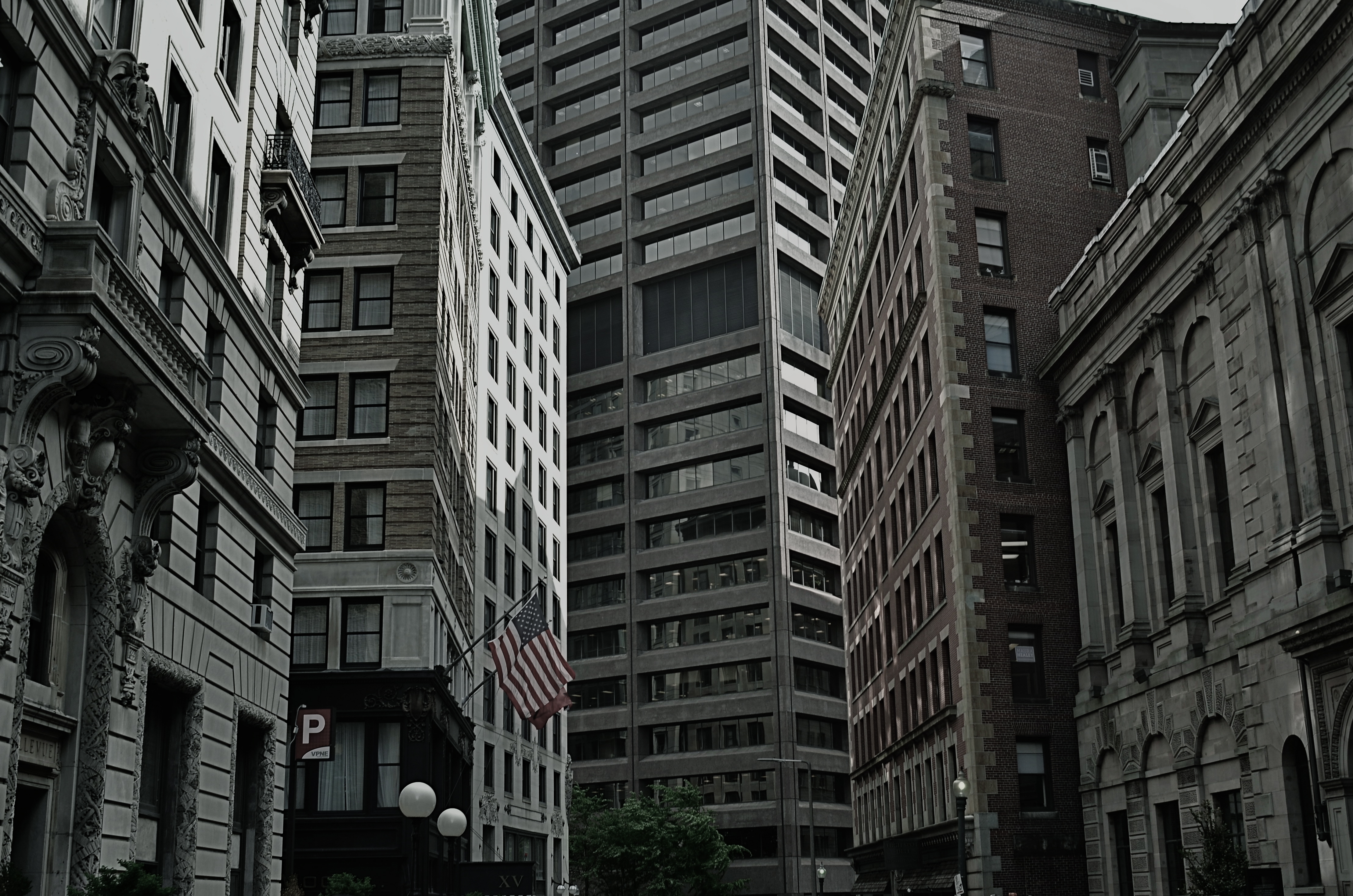
Yes, you could find a more frustrating job than making city maps for Boston streets. But you’d have to look hard….
By MICHAEL PERKINS
WHEN WE THINK OF URBAN BLOCKS, IT’S NATURAL TO THINK of those blocks as regular rectangles, well-regulated, even streets that run at direct parallels or hard right angles to each other. And while there certainly are cities with such mathematically uniform grids, some of the most interesting cities in the world don’t conform to this dreamy ideal in any way. And that means opportunities for photographers.
We’ve all seen street scenes in which the left and right sides of the road vanish directly toward the horizons, like staring down the middle of a railroad bed. But for the sake of dramatic urban images, it’s more fun to seek out the twisty mutants of city design; the s-and-z curves, the sudden zigzags, the trapezoids and triangles which signify confusion to cabbies and pedestrians but which mean good times for photogs. Let’s face it; snapping pictures of orderly things gets old fast. The very nature that makes us idealize “rightness” also makes us want to photograph “wrongness.”
That’s why I love to shoot in towns where the city was laid out with all the logic of the Mad Hatter on speed, those streets that seem barely coherent enough to admit the successful conduct of trade. Cities where locals and visitors alike curse the names of the urban planners, if there ever had been planners, if there ever had been a plan. A grand collision of avenues and alleys that looks like a kid whose teeth are crowding together in a greedy orthodontist’s dream fantasy. In such cities, including Manhattan, Pittsburgh, San Francisco, Boston and many others, “order” is a relative term. There are precious few neat streets vanishing back to infinity, politely lined by cooperative structures queueing up parallel to the curb. And that’s my kind of living, breathing… chaos.
As a mild example, consider the Boston street shown above, on which nearly every building seems slightly askew from every other building, sitting on foundations that jut out at every conceivable angle and plane. It’s a grand, glorious mess, and a much more interesting way to show the contrasting styles that have sprouted in the neighborhood over the centuries. It’s reality that looks like an optical illusion, and I can’t get enough of it.
A straight line may be the shortest distance between two points, but it’s also the least interesting. Go find cities that make no sense, God bless ’em.
WINDOW OF OPPORTUNITY
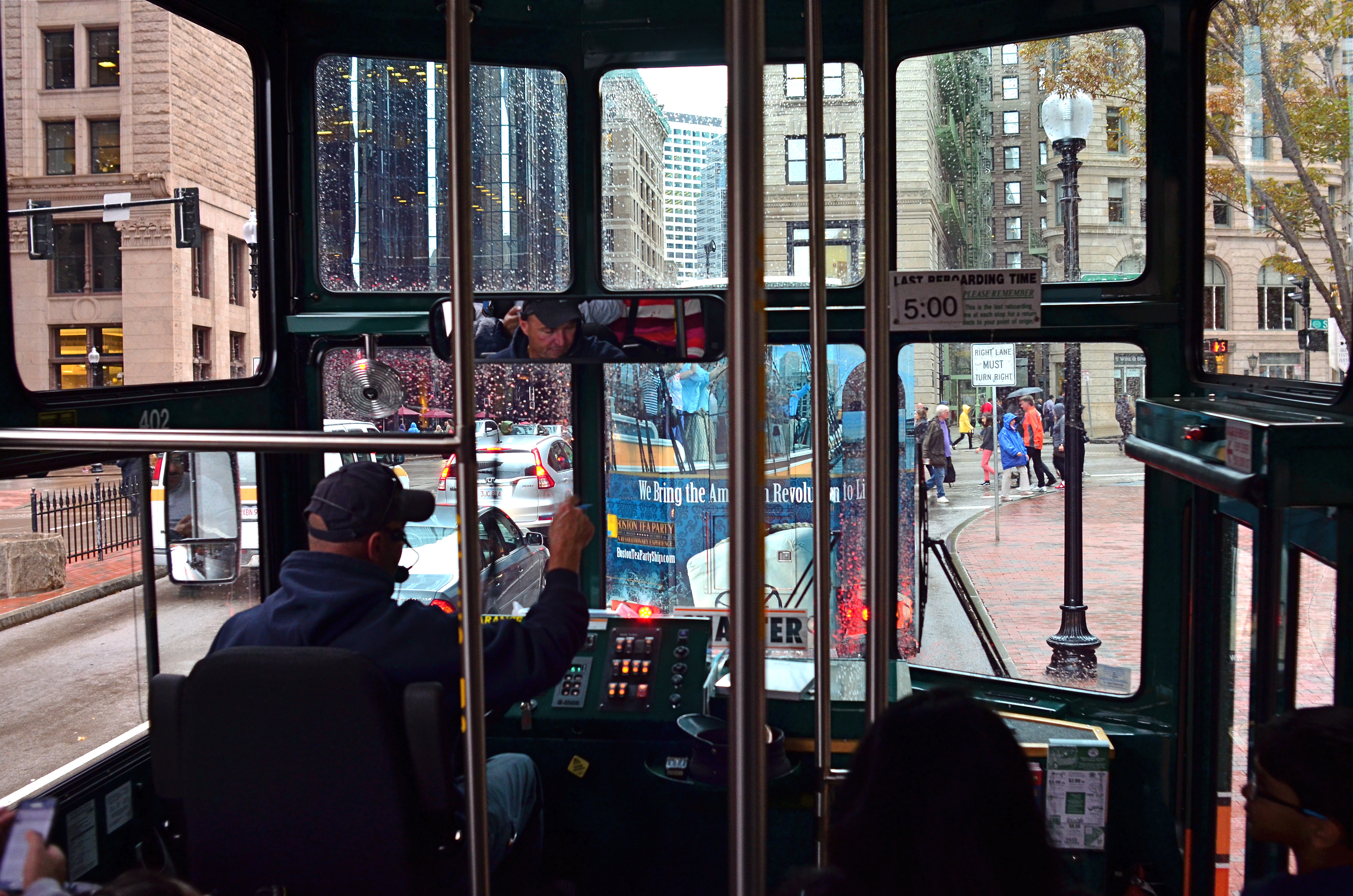
“…the driver on the bus says……” Sometimes a window is part of the story.
By MICHAEL PERKINS
PHOTOGRAPHERS’ FIRST USES OF FILTERS WERE AS THE TWIST-ON TOOLS designed to magnify, nullify or modify color or light at the front end of a lens. In the digital era, filtration is more frequently added after the shutter clicks, via apps or other post-production toys. You make your own choice of whether to add these optical layers as a forethought or a post-script. However, one of the simplest and oldest of filtering options costs no money and little time, and yet continues to shape many a great image: a window.
Early morning + tinted window=moody, right? Gettysburg from the tour bus.
No panes are optically identical, just as the lighting conditions that affect them are likewise completely unique, so the way that they shape pictures are constantly in flux, as are the results. It’s no surprise that the shoot-from-the-hip urban photographers who favor spontaneity over all pay little attention to whether shooting through a window “ruins” or “spoils” an image. Taking an ad-lib approach to all photographic technique, the hip shooters see the reflections and reflections of glass as just another random shaper of the work, and thus as welcome as uneven exposure, cameras that leak light, or cross-processed film: another welcome accidental that might produce something great.
Windows can soften, darken or recolor a scene, rendering something that might have been too strait-laced a little more informal. This quality alone isn’t enough to salvage a truly bad shot, but might add a little needed edge to it. The images seen here were both “what the hell” reactions to being imprisoned on tour buses, the kinds that don’t stop, don’t download their passengers for photo or bathroom breaks, or which are booked because I am tired of walking in the rain.
In the case of the tour driver’s cab, his inside command center and personal view are really part of the story, and may outrank what he’s really viewing. In the side-window shot of an early morning in Gettysburg, Pennsylvania, the tinted glass acted much in the way of a polarizing filter, making the resulting photo much moodier than raw reality would have been.
Which is the point of the exercise. When you feel yourself blocked from taking the picture you thought you wanted, try taking it the way you don’t think you want to. Or just think less.
Wait, what did he just say?
WEIRD SCIENCE
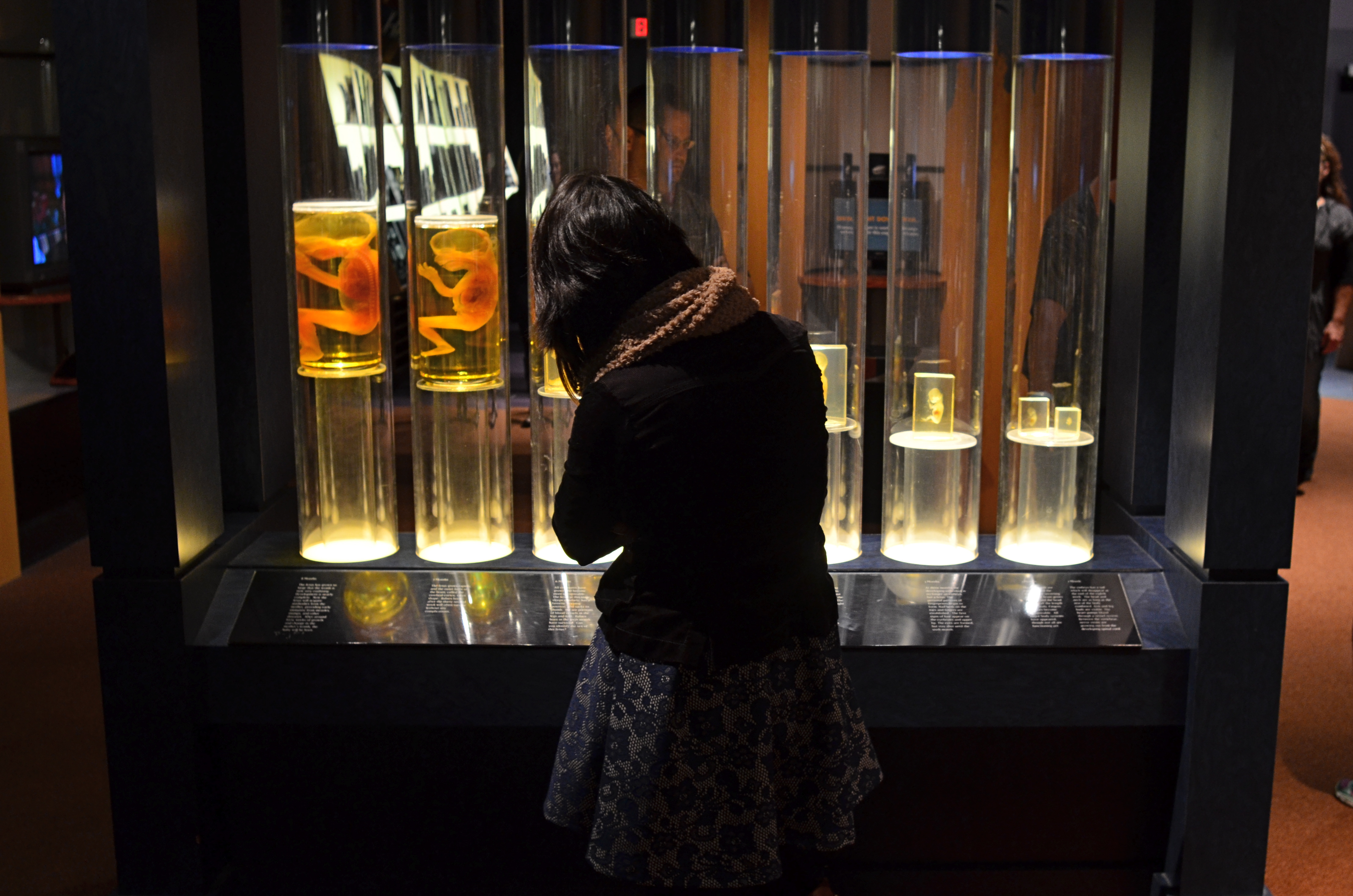
The fetal gestation timeline at Columbus, Ohio’s Center Of Science & Industry. 1/60 sec., f/3.5, ISO 500, 24mm.
By MICHAEL PERKINS
ONE OF THE RITES OF PASSAGE FOR SCHOOL KIDS IN COLUMBUS, OHIO IN THE 1960’s was a field trip to the Center of Science and Industry, or COSI, one of the nation’s first interactive tech museums, mounted before either the terms “interactive” or “hands-on” were common parlance. In those JFK-flavored days of early space exploration and Jetson-gee-whiz futurism, flying cars and picture phones seemed our inevitable legacy, and the Center’s exhibits often veered closer to the World’s Fair than the science fair, its dazzling displays often trumping pure enlightenment. A generation later, the sizzle lingers in the mind a little better than the steak. Something to work on.
Science was presented as something of a magic trick then, a sure and certain answer to all human needs and desires. But to my tween-sized mind, it also retained an air of mystery, something wondrously alien to my daily experience. Few of COSI’s exhibits from the time created more of a sense of wonder in me than an illuminated timeline of fetal gestation, with each crucial stage between embryo and newborn illustrated by a separately preserved specimen of a transitional human that never made it to the delivery room. As fascinating as the display was, it was also a little creepy, somewhat like, if you will, viewing pre-mummies from a colony of visitors from the future.
In a recent visit to the new COSI, now re-located to a larger, brighter HQ across from Columbus’ downtown riverfront, I was both amused and amazed to see that the timeline had been retained in nearly the same way I remembered it from 1964. Having survived to the era of iPhones and DNA mapping, its dim, the strange, amber-glow profiles still had a hypnotic effect on me, housed as they were in a dark, shadowy sector of the museum, sealed within a showcase that distorted the faces of passersby, even as it shrouded their bodies in mystery. For the shot you see here, I liked the strange juxtaposition of the exhibit’s clinical coldness with the form of a young visitor, casually viewing the timeline as if it were no more notable than a collection of butterflies. I shut the exposure down so that the case provided the only light, opened the lens as far as I dared for the right depth of field, and jacked the ISO slightly to compensate for the murky room ambience.
The COSI of the New Frontier years was always a place that could cast science in a distinctly optimistic light. In 2015, I hoped to re-imagine that magic through the insight of an additional fifty years of living. Mood in photography is created as much by what you conceal as by what you reveal, and trying to get that balance right is 90% of the game.
A WHITER SHADE OF PALE
Will energy-efficient street lighting make your neighborhood look like this….
By MICHAEL PERKINS
IN THE FACE OF CHANGE, HUMANS WILL DOGGEDLY DEFEND ALMOST ANYTHING, as long as they’ve grown accustomed to it. At their introduction, we inveighed against the intrusion of the telephone (the end of privacy!) and the automobile (they scare the horses and they’re filthy!), but soon learned to love chatting, well, from our freaking cars, so…
One of the things solid citizens of the late 1800’s most objected to was the slicing of the night by the first network of urban street lamps, which were excoriated in editorials from New York to Paris. An invasion! An insult! Unnatural.
Boy, if they could see us now.
In the name of energy savings and sustainability (both good things, right?), street lights across the country are in the midst of a rapid conversion from several types of fluorescent lamps to LEDs. They last longer, they burn cheaper, they cost less. All to the good, except that the light these new torches deliver is blue, pale, cold, and, in the minds of many, harsh. Even those who champion ecologically righteous causes are squinting at LEDs which strike them as grim, sickly, colorless and (wait for it) unnatural.
Writing in the New York Times in the essay “Ruining That Moody Urban Glow“,
…or this?
novelist Lionel Shriver calls LED light “conducive to dismembering a corpse” and cites studies that claim the fixtures contribute to sleep loss, mood disorders, and, who knows, ingrown toenails. For photography (you knew I’d get here eventually), the new light presents a completely fresh challenge to your camera’s ability to achieve white balance, or an accurate reading of white values according to a given light’s temperature, expressed in degrees Kelvin.
Conventional lights are lower on the Kelvin scale, thus warmer, with more yellow in the mix. LEDs are higher in Kelvin value and register blue-white, muting or mutating colors. At present, both Canon and Nikon have many in-camera settings to balance for a number of sodium-vapor or fluorescents, but have yet to offer options for adjusting for LEDs, even though entire cities have made the switch to what many feel is an ugly, stark source of illumination.
In her Times article, Shriver notes that there are, in fact, subtler types of LEDs, which sacrifice only a bit of energy efficiency and yet emit warmer light, and advocates that citizens go proactive to keep their neighborhoods from looking like the parking lots on interstate truck stops. So take that for what it’s worth. But be aware that more and more of your night shots may, in the near future, have to be adjusted in post-production to resemble a century in which you feel at home.
