THE NON-EVENT EVENT
By MICHAEL PERKINS
EVENT PHOTOGRAPHY IS ONE OF THE MOST FORMALIZED MEANS OF MAKING PICTURES, a pure mission where there is usually only one “official” story being told. A happy wedding. A formal ceremony. A tearful farewell. We expect cameras to be more or less pictorial recorders at certain august moments in our lives, and anyone charged with performing that recording task is usually not expected to also serve up interesting or odd sidebars on human behavior along with the certified images we sent them to get. Event photography is not news, and may not even be persuasive human interest. It is a document, and a rather staged and stiff one at that.
But that’s what’s rewarding about being the non-official photographer at an event. It’s someone else’s job to make sure the crucial toast, the first dance, or the lowering of the casket is captured for posterity. Everyone else with a camera is free to do what photography is really about most of the time. There’s little opportunity for interpretation in the “important” keepsake shots that everyone wants, but there’s all kind of creative wiggle room in the stuff that’s considered unimportant.
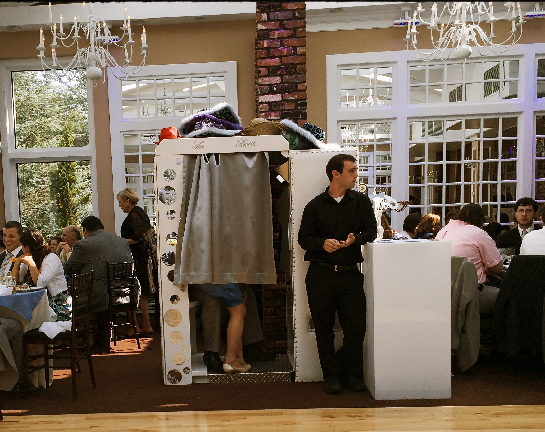
Working The Wedding, 2014
I recently attended a wedding at which every key feature of the proceedings was exhaustively catalogued, and, about two hours in, I wanted to seek out something unguarded, loose, human, if you will. The image seen here of a bored hired man doing standby duty on the photo booth was just what I was seeking. I don’t know if it’s the quaint arrangement of legs and feet inside the booth or his utter look of indifference on his face as he stoically mans his post, but something about the whole thing struck me as far funnier than the groomsmen’s toasts or the sight of yet one more bride getting a faceful of cake.
I was only armed with a smartphone, but the reception hall was flooded with light at midday so the shot was far from a technical stretch. The image you see is pretty much as I took it, except for a faux-Kodachrome filter added to give it a bit of a nostalgic color wash, as well as counteracting the bluish cast of the artificial lighting. I also did some judicious guest-cropping to cut down on distraction.
Taking pictures at someone else’s event is a great gig. No expectations, no “must have” shots, and you don’t even have to care if you got the bride’s good side. Irresponsibility can be relaxing. Especially with an open bar.
LOAD, LOCK, SHOOT
By MICHAEL PERKINS
OUR GRADE SCHOOL HISTORY CLASSES DRUMMED CERTAIN NAMES INTO OUR HEADS AS THE “EXCLUSIVE” CREATORS of many of the wonders of the modern age. We can still bark back many of those names without any prompting, saluting the Edisons, Bells, and Fords of the early part of the 20th century and the Jobses and Gateses of its final years. However, as we grew older, we realized that the births of many of our favorite geegaws (television, for example) can’t be traced to a single auteur. And when it comes to photography, their are too many fathers and mothers in all ends of the medium to even enumerate.
Several tinkerer-wizards do deserve singling out, however, especially when it comes to the mindset that all of us in the present era share that photography ought to be immediate and easy. And, in a very real way, both of these luxuries were born in the mind of a single man, Dean Peterson, who presided over half a dozen revolutions in the technology of picture making, most of his own creation. As an engineer at Eastman Kodak in the early ’60’s, Dean created and developed the Instamatic camera, and, in so doing, changed the world’s attitude toward photography in a way every bit as dramatic as George Eastman’s introduction of cheap roll film in the late 1800’s. Peterson’s new wrinkle: get rid of the roll.
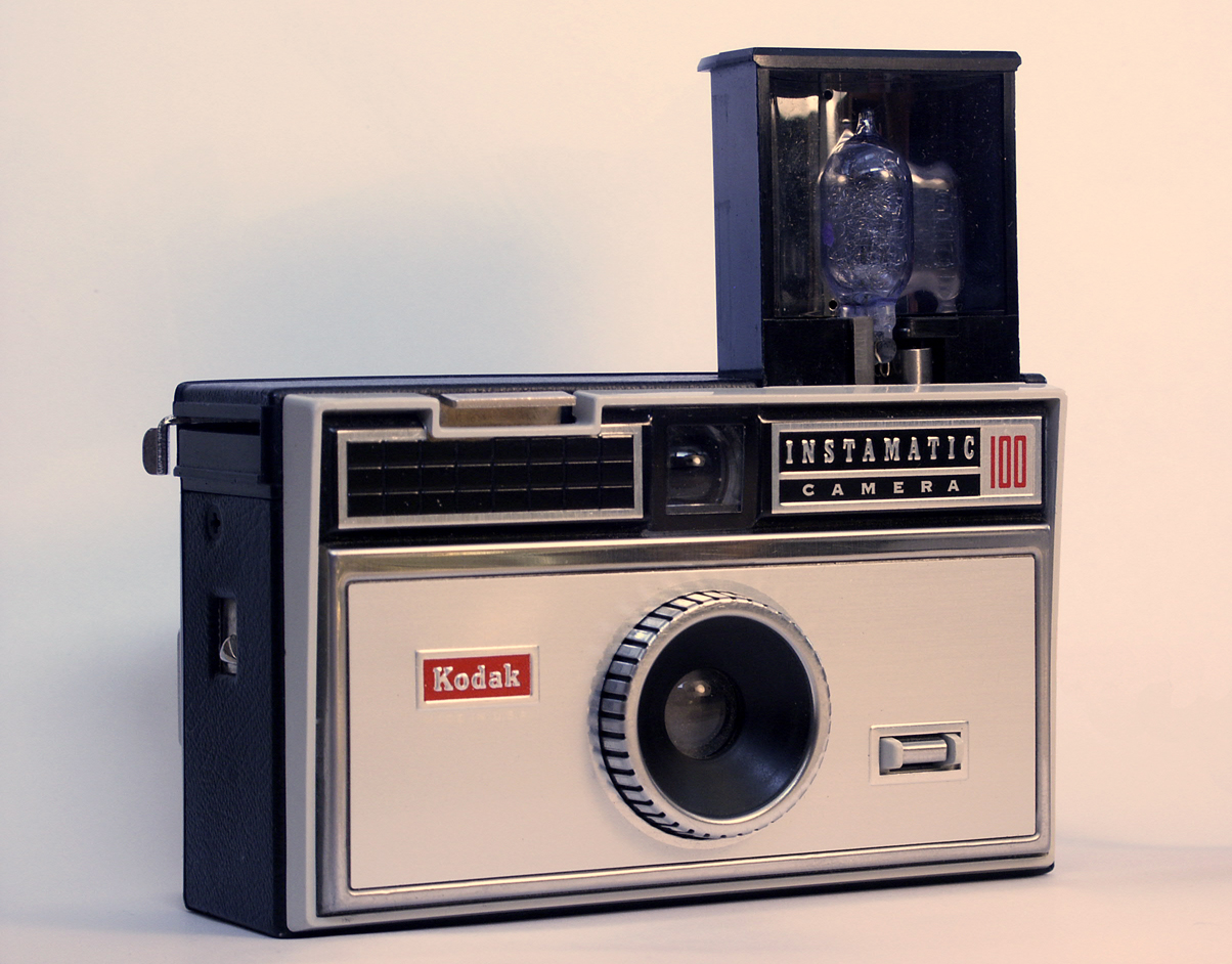
Yeah, you had one. The Kodak Instamatic 100.
Or, more precisely, get rid of loose film’s imprecise process for being loaded into the camera, which frequently ruined either single exposures or entire rolls, depending on one’s fumble-fingered luck. Peterson’s answer was a self-contained drop-in cartridge, pre-loaded with film and sealed against light. Once inside the camera, it was the cartridge itself that largely advanced the film, eliminating unwanted double-exposures and making the engineering cost of the host camera body remarkably cheap. Peterson followed Eastman’s idea of a fixed-focus camera with a pre-set exposure designed for daylight film, and added a small module to fire a single flashbulb with the help of an internal battery. Follow-up models of the Instamatic would move to flashcubes, an internal flash that could operate without bulbs or batteries, a more streamlined “pocket Instamatic” body, and even an upgrade edition that would accept external lenses.
With sales of over 70 million units within ten years, the Instamatic created Kodak’s second 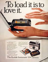 golden age of market supremacy. As for Dean Peterson, he was just warming up. His second-generation insta-cameras, developed at Honeywell in the early ’70’s, incorporated auto-focus, off-the-film metering, auto-advance and built-in electronic flash into the world’s first higher-end point-and-shoots. His later work also included the invention of a 3d film camera for Nimslo, high-speed video units for Kodak, and, just before his death in 2004, early mechanical systems that later contributed to tablet computer design.
Along the way, Peterson made multiple millions for Kodak by amping up the worldwide numbers of amateur photographers, even as he slashed the costs of manufacturing, thereby maximizing the profit in his inventions. As with most forward leaps in photographic development, Dean Peterson’s work eliminated barriers to picture-taking, and when that is accomplished, the number of shooters and the sheer volume of their output rockets ahead the world over. George Eastman’s legendary boast that “you press the button and we do the rest” continues to resonate through our smartphones and iPads, because Dean Peterson, back in 1963, thought, what the heck, it ought to be simpler to load a camera.
SET AND SHOOT
Shooting manually means learning to trust that you can capture what you see. 1/160 sec., f/5.6, ISO 100, 18mm.
By MICHAEL PERKINS
AUTOMODES ON CAMERAS ARE SUPPOSED TO AFFORD THE PHOTOGRAPHER AN ENHANCED SENSE OF COMFORT AND SAFETY, since, you know, you’re protected from your very human errors by the camera’s loving, if soulless, oversight. Guess wrong on a shutter speed? The auto has your back. Blow the aperture? Auto is on the case. And you always get acceptable pictures.
That is, if you can put your brain on automode as well.
Okay, that statement makes the top ten list for most arrogant openings in all of Blogdom, 2014. But I stand by it. I don’t think you should get comfortable with your equipment calling the shots. However, getting comfortable with your equipment’s limits and strengths, and gradually relying on your own experience for consistent results through exploitation of that knowledge….now that’s another thing entirely. It’s the difference between driving cross-country on cruise control and knowing, from years of driving, where in the journey your car can shine, if you drive it intelligently.
Photographers call some hunks of glass their “go-to” lenses, since they know they can always get something solid from them in nearly any situation. And while we all tend to wander around aimlessly for years inside Camera Toyland, picking up this lens, that filter, those extenders, we all, if we shoot enough for a long time, settle back into a basic gear setup that is reliable in fair weather or foul.
This is better than using automodes, because we have chosen the setups and systems that most frequently give us good product, and we have picked up enough wisdom and speed from making thousands of pictures with our favorite gear that we can “set and shoot”, that is, calculate and decide just as quickly as most people do with automodes…..and yet we keep the vital link of human input in the creative chain.
Like most, I have my own “go-to” lens and my own “safe bet” settings. But, just as you save time by not trying to invent the wheel every time you step up, you likewise shouldn’t be averse to greasing an old wheel to make it spin more smoothly.
How about that, I also made the top ten list for unwieldy metaphors.
A good day.
MIDDLEHUES
Surety And Security, 2014. Image made using Nikon’s in-camera “selective color” effect, programmed to highlight blue and gold hues only. Note the bluish undertones that show up in the “white” building.
By MICHAEL PERKINS
I FIND IT AMUSING THAT THERE IS SO MUCH PRISSY FRETTING, in the present photographic age, about the manipulation of images, as if there is, or has ever been, a “pure” photography that comes full-born from the camera like Athena sprang from Zeus’ forehead. This is, of course, nonsense.
There never was a time when photographers simply pressed the button and settled for whatever dropped into their laps by chance. The history of the medium is a clearly traceable timeline of the very interpretive technique and, yes, manipulation that tracks, like this blog, the journey from taking a picture to making one.
It’s not what you apply to an image, it’s whether the application is the entire point of the picture. Does your conception have solid, original value, over which you then impose a supplementary effect or a boost in emphasis? Or are you merely popping apps and pushing buttons in order to disguise the lack of essence in picture, to whitewash a rotten fence if you will?
The original full-color image.
The reason I raise all this again is that an in-camera effect usually called “selective color”, now available on many DSLRs, has reminded me of the first days of color photography, which of course was no color at all, except that which was applied through tinting and painting after a monochrome image had been made. Depending on the individual artisan, the hues in these pictures tended to be either a soft wash of faint pastel or a raging rouge of rosy reds, but, most frequently, only selected parts of the image were colored at all, perhaps an attempt to dramatize particular elements of the composition. It was anything but natural, but, in advance of the development of actual color film, it produced some interesting results.
Jump to today’s cameras and the selective color option. You shoot your original image, select it, then zoom in on parts of it to both locate and choose up to three colors that will be featured in a copy of the image. All other tones will be desaturated, leaving you with a part monochrome, part color version of your original, which remains unchanged in a separate file. The effect, as in the past, can dramatize and isolate key parts of your picture, even giving a strange dimensional feel to the photo, but it can take some practice to get the result that you want.
For example, selecting the red of a single car on a crowded street will also catch the same red in other cars’ tail lights, the corner traffic signal, and a neon sign in a building at the end of the block, so be sure you can live with all of that. Also, in some seemingly “white” buildings, shadows or reflected light (as well as aging impurities in some materials) will show some faint shades of color in this process, so that the blue that you said okay to for the corner mailbox will also pick up slight bluish casts in the marble of the bank next door. In the above image, I also made a second, darker copy of the altered image, then blended the two copies in a tone compressing program, to further accentuate the building textures and contrasts.
Bottom line: there is black and white, there is full color, and there is the uber-cool playland in what you could call the middlehues. It’s not cheating to enhance a good picture. It’s only cheating when you use effects to mask the fact that you didn’t take the picture right in the first place.
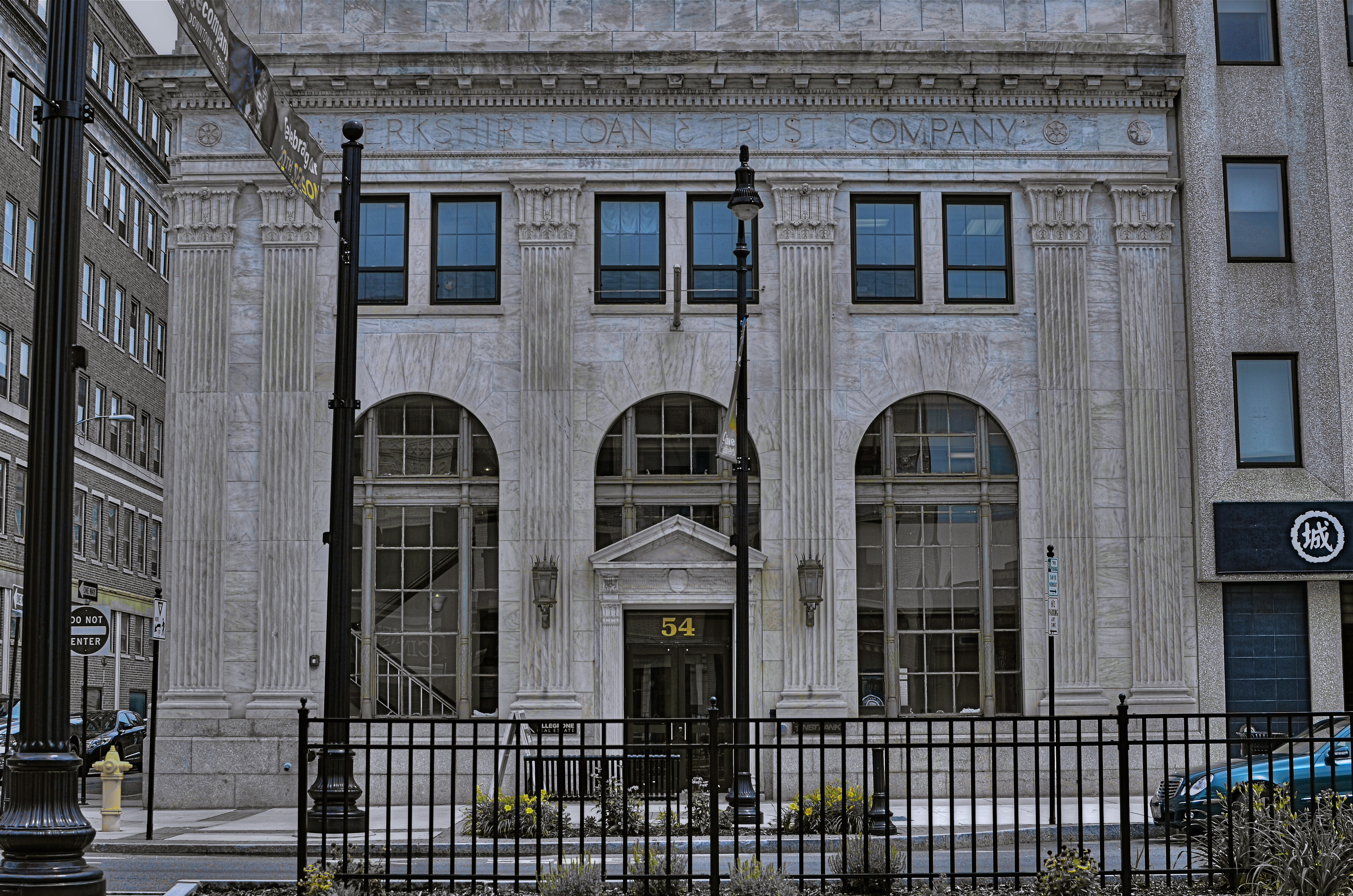
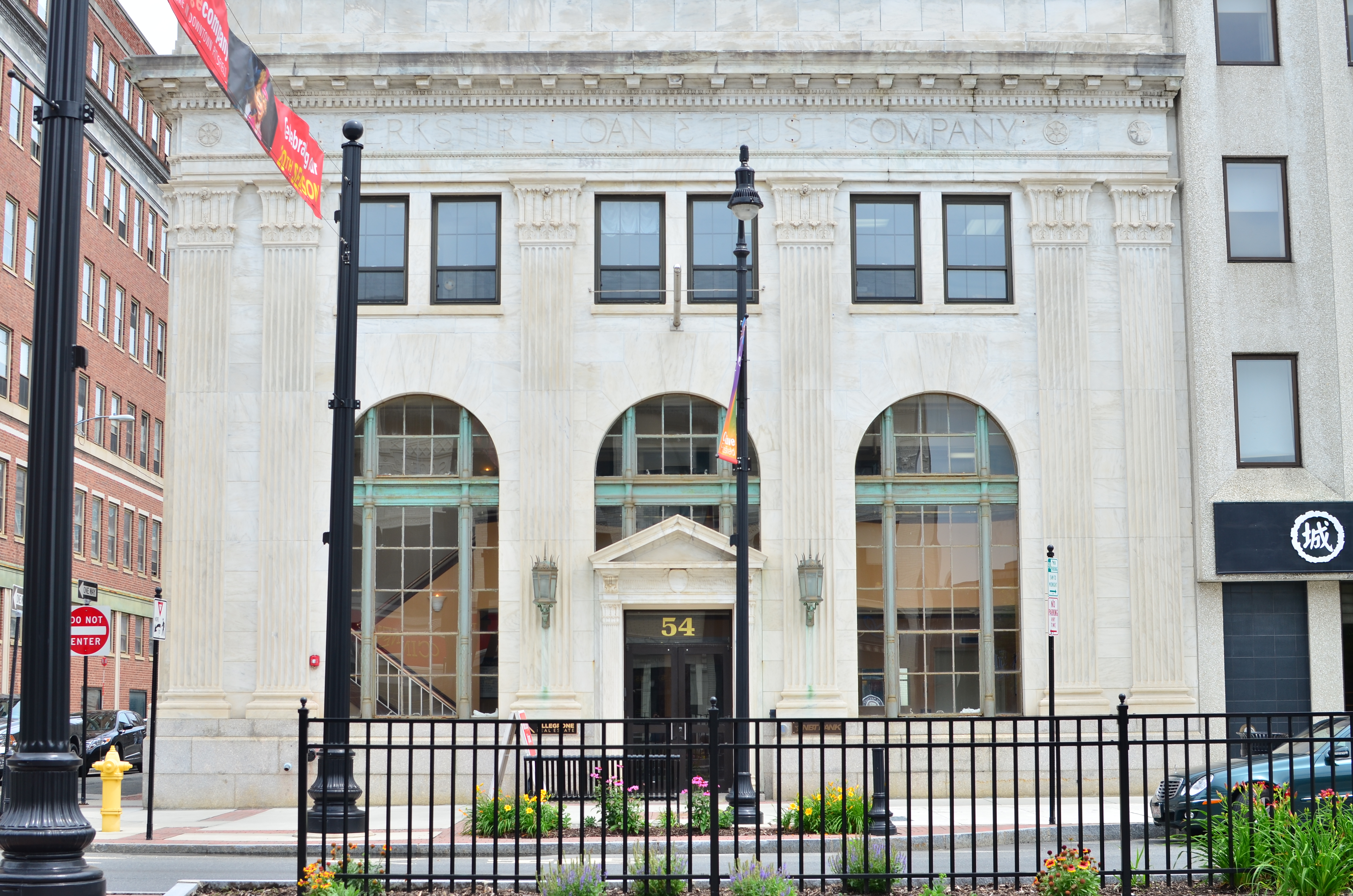
ON THE STRAIGHT AND NARROW
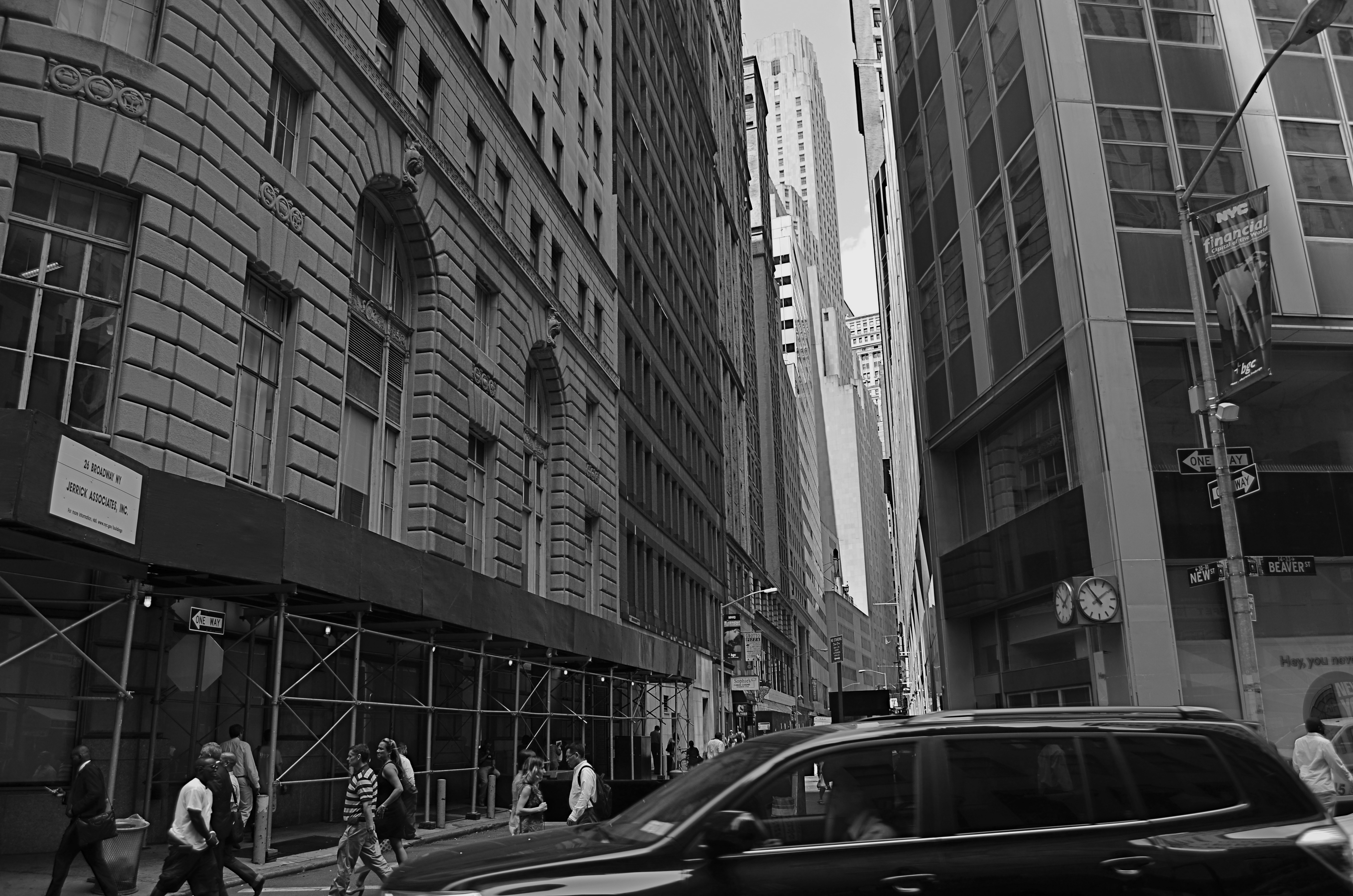
New & Beaver, 2014. 1/200 sec., f/5.6, ISO 100, 18mm.
By MICHAEL PERKINS
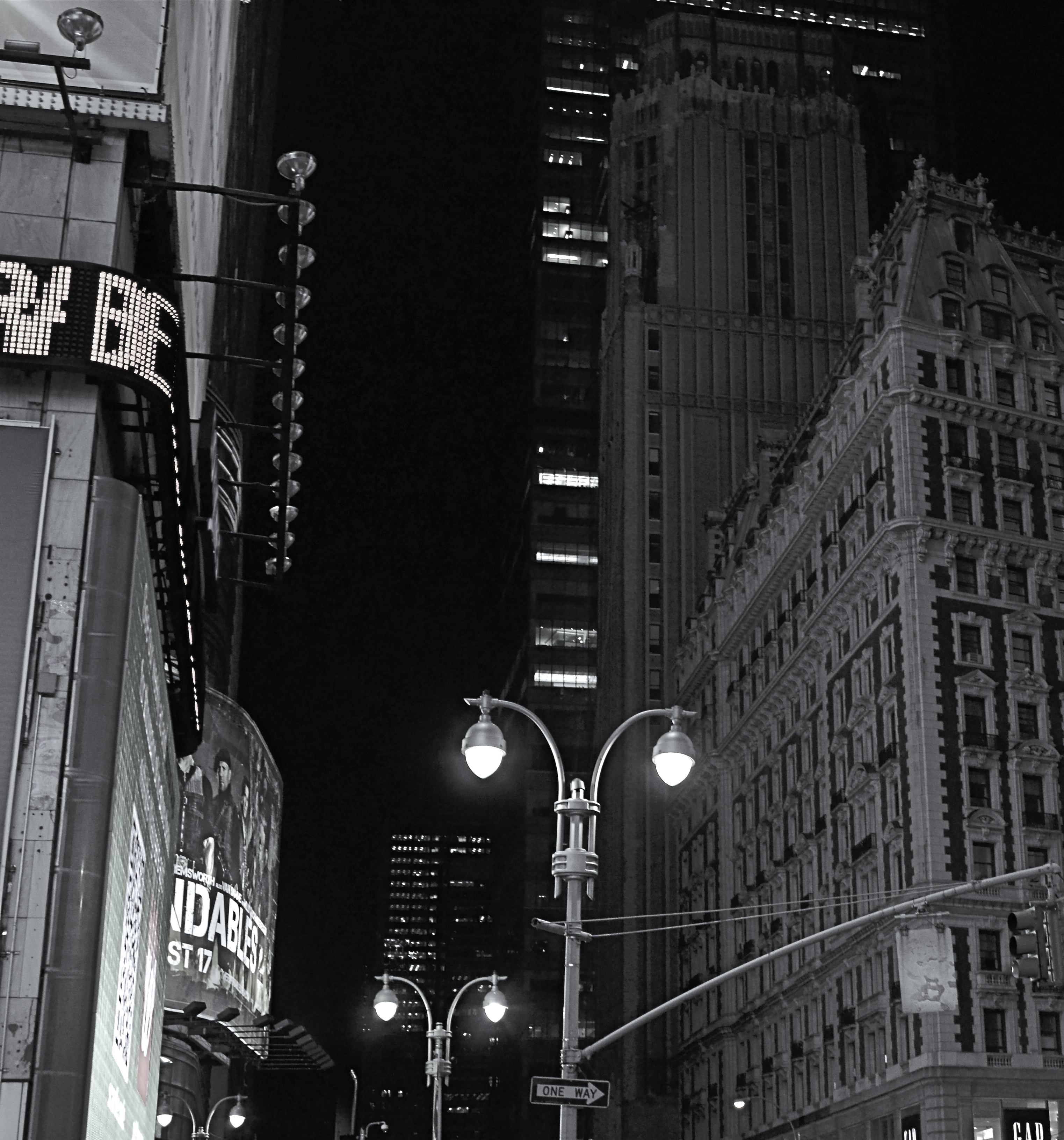
THE NARROW STREETS OF LOWER MANHATTAN WERE NEVER DESIGNED TO ACCOMMODATE the claustrophobic jam of commerce, foot traffic and skyscrapers that have characterized the neighborhood since the early 20th century. I should back that up and acknowledge that, for some locals, the streets of lower Manhattan were never designed,period. New York’s growth has always come in rangy spurts and jolts, much like a gangly adolescent that shoots upward and outward overnight without any apparent plan, and yet, those unruly explosions are also what delight the photographer’s eye and make the city an inexhaustible laboratory for technique.
Shooting down the slits that pass for side streets and alleys in lower Manhattan is enough to make even the most seasoned native feel like he or she is being shut up in a tomb, but I am drawn to going even further, and over-emphasizing the extreme dimensions peculiar to the area. That, for me, means shooting with as wide a lens as I have handy, distortion be damned. Actually, it’s distortion be welcomed, since I think that the horizontal lines of the buildings create a much more dramatic lead-in for the eye as they race far away from the foreground. And since ultra-wide magnify front-to-back distances, the bigness and closeness of the city is jacked into a real exaggeration, but one that serves my purpose.
It helps to crouch down and tilt up when composing the shot, and to make sure that you don’t crop passersby out of the shot, since they will add to the drama even more as indications of scale. I have certainly gone too far more than once and rendered rectangular buildings into futuristic trapezoids, but the aim of each image will dictate what you’re going for. Also, in many of these shots, I decide, after much dithering, to choose monochrome over color, but I always shoot the originals in color, since they respond better to re-contrasting once they’re desaturated.
The magic about Manhattan is that no camera can ever tame her or show all her beauty and/or ugliness. It’s somthing of a fool’s errand to try to take the picture of NYC. Better to take a picture you like and add it to the ongoing story.
THE AGE OF ELEGANCE
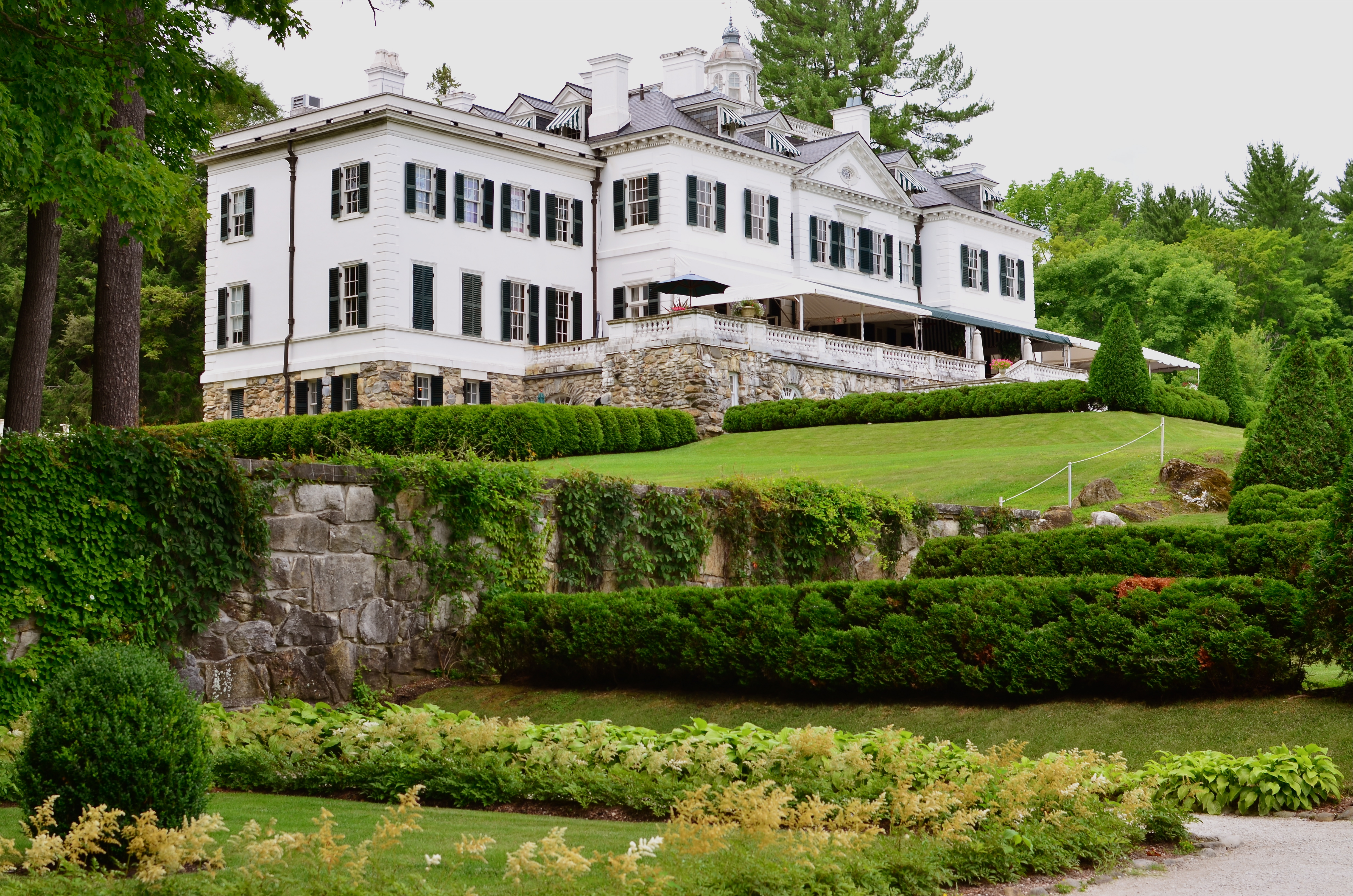
The Mount, Edith Wharton’s Berskshire Estate, now a working museum.
If only we’d stop trying to be happy, we could have a pretty good time.——Edith Wharton
By MICHAEL PERKINS
LONG BEFORE HER NOVELS THE AGE OF INNOCENCE, ETHAN FROME, AND THE HOUSE OF MIRTH made her the most successful writer in America, Edith Wharton (1862-1937) was the nation’s first style consultant, a Victorian Martha Stewart if you will. Her 1897 book, The Decoration Of Houses, was more than a few dainty gardening and housekeeping tips; it was a philosophy for living within space, a kind of bible for combining architecture and aesthetics. Her ideas survive in tangible form today, midst the leafy hills of Lenox Massachusetts, in the Berkshire estate her family knew as “The Mount”.

A world apart.
Wharton only occupied the house from 1902 to 1911, but in that time established it as an elegant salon for guests that included Henry James and other literary luminaries. Although based on several classical styles, the house is a subtle and sleek counter to the cluttered bric-a-brac and scrolled busyness of European design. Even today, the house seems oddly modern, lighter somehow than many of the robber-baron mansions of the period. Many of its original furnishings went with Wharton when she moved to Europe, and have been replicated by restorers, often beautifully. But is in the essential framing and fixtures of the old house that the writer-artist speaks, and that is what led me to do something fairly rare for me, a photo essay, seen at the top of this page in the menu tab Edith Wharton At The Mount.
The images on this special page don’t feature modern signage, tour groups, or contemporary conveniences, as I attempt to present just the basic core of the estate, minus the unavoidable concessions to time. The house features, at present, an appealing terrace cafe, a sunlit gift store, and a restored main kitchen, as part of the conversion of the mansion into a working museum. I made no images of those updates, since they cannot conjure 1902 anymore than a Mazerati can capture the feel of a Stutz-Bearcat. The pictures are made with available light only, and have not been manipulated in any way, with the exception of the final shot of the home as seen from its rear gardens, which is a three-exposure HDR, my attempt to rescue the detail of the grounds on a heavily overcast day.
Take a moment to click the page and enter, if only for a moment, Edith Wharton’s age of elegance.
THE JOURNEY OF BECOMING
By MICHAEL PERKINS
ONCE MAN LEARNED TO SLICE A PATH THROUGH THE DARK WITH ANY KIND OF LIGHT, a romance with mystery began that photographers carry ever forward. Darkness and light can never be absolute, but duel with each other in a million interim stages at night, one never quite yielding to each other. A flickering lamp, a blazing torch, ten thousand LEDs, a lonely match, all shape the darkness and add the power of interpretation to the shaded side of the day. Photographers can only rejoice at the possibilities.
The Late Errand, 2014. 1/40 sec., f/1.8, ISO 640, 35mm.
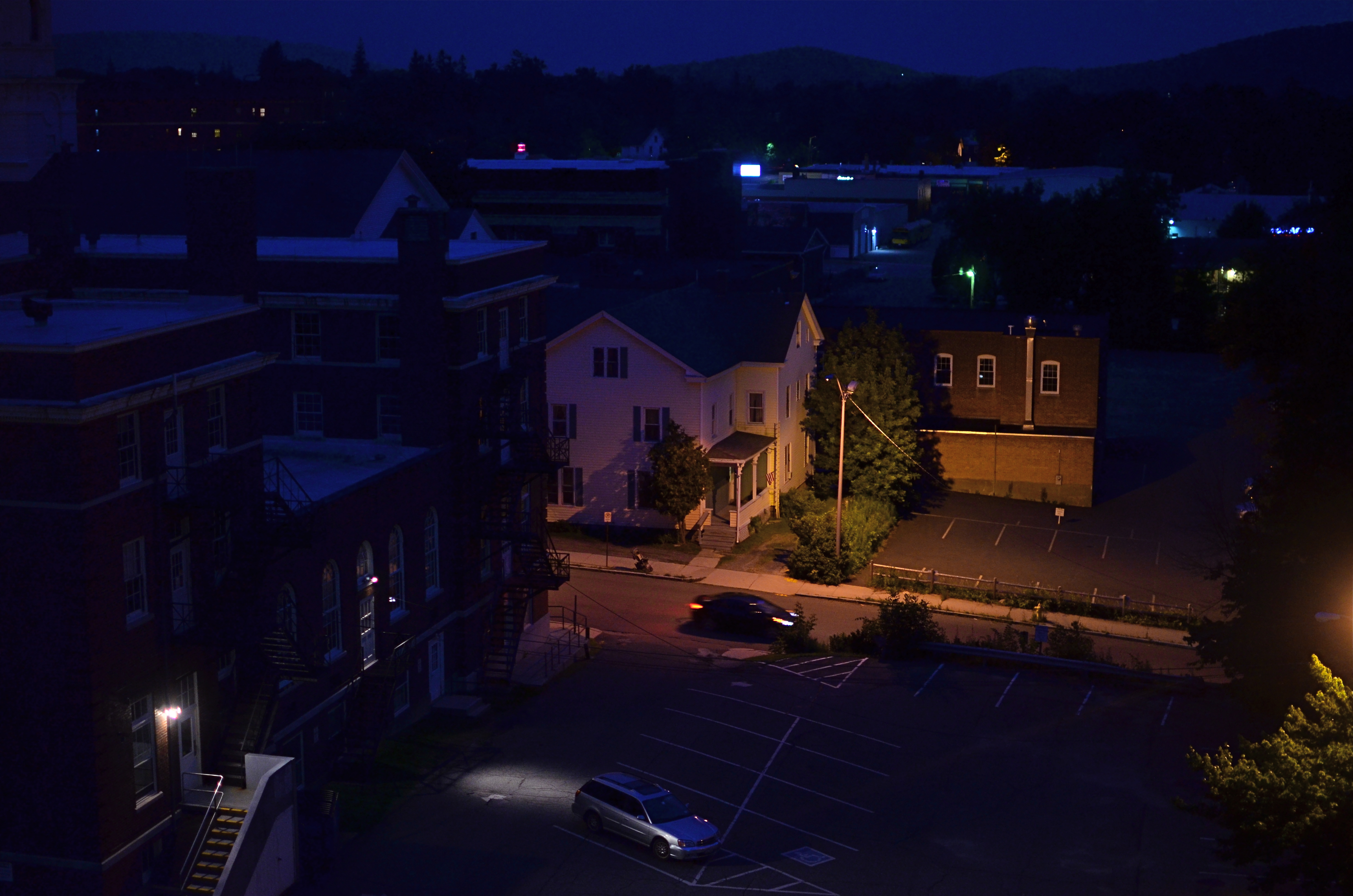
Spending a recent week in a vacation hotel, I fell into my typical habit of taking shots out the window under every kind of light, since, you know, you only think you understand what a view has to offer until you twist and turn it through variation. You’ve never beheld this scene before, so it’s just too easy to take an impression of it at random, leaving behind all other possibilities. The scene from this particular room, a mix of industrial and residential streets in central Pittsfield, Massachusetts, permits the viewer to see the town in the context of the Berkshire mountains, in which it nestles. Daylight, particularly early morning, renders the town as a charming, warm slice of Americana, not inappropriate in a village that is just a few miles away from the studio of painter Norman Rockwell. However, for me, the area whispered something else entirely after nightfall.
I can only judge the above frame by the combination of light and dark that I saw as I snapped it. Is it significant that the house is largely aglow while the municipal building in front of it is submerged in shadow? Is there anything in the way of mood or story that is conveyed by the lit stairs in the foreground, or the headlamps of the moving or parked cars? If the passing driver is subtracted from the frame, does the feel of the image change completely? Does the subtle outline of the mountains at the horizon lend a particular context?
That’s the point: the picture, any picture of these particular elements can only raise, not answer, questions. Only the viewer can supply the back end of the mystery raised by how it was framed or shot. Some things in the frame are on a journey of becoming, but art is not about supplying solutions, just keeping the conversation going. We’re all on our way somewhere. The camera can only ask, “what happens when we turn down this road?.”
That’s enough.
TAKING FLIGHT ONCE MORE
The Aerodrome, 2014. 1/30 sec., f/3.5, ISO 100, 35mm.
By MICHAEL PERKINS
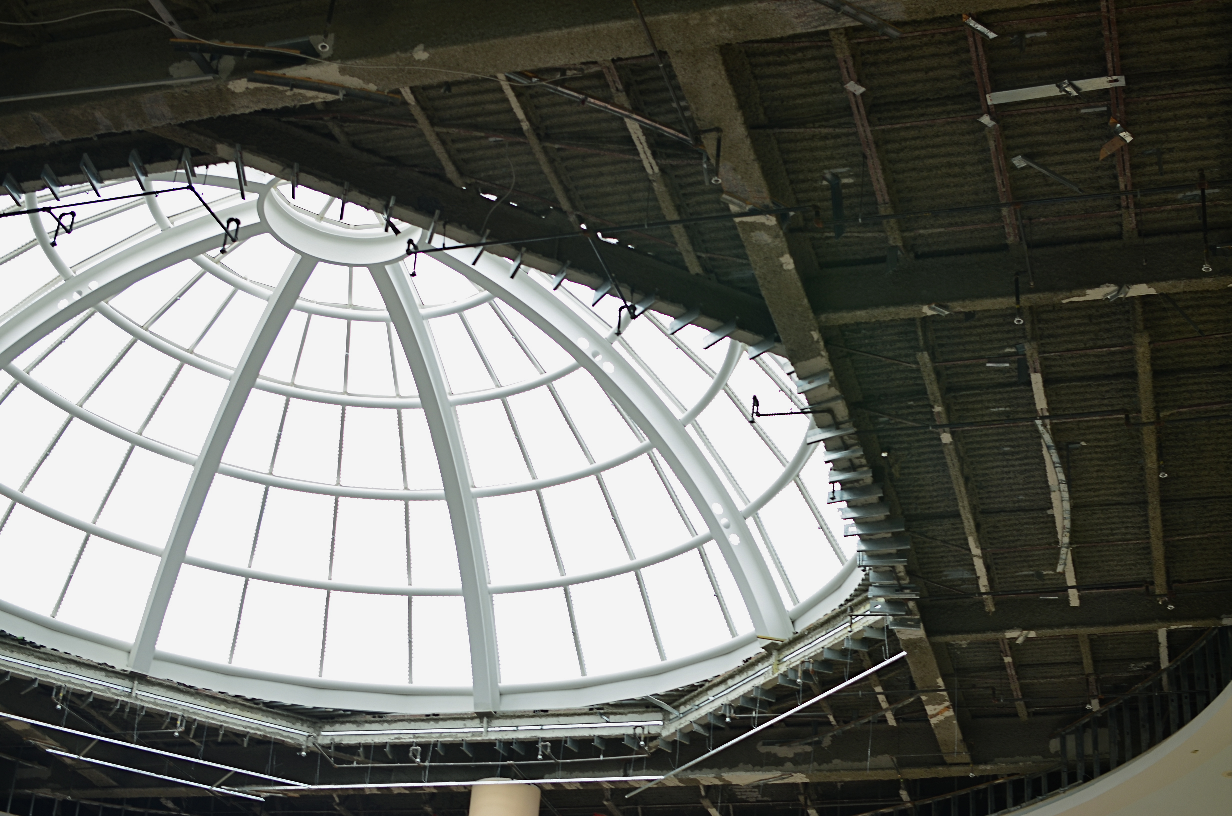
ONE OF THE CHARGES GIVEN TO ALL PHOTOGRAPHERS IS TO MARK THE PASSAGE OF TIME, to chronicle and record, to give testimony to a rapidly vanishing world. Certainly interpretation, fantasy, and other original conceptions are equally important for shooters, but there has been a kind of unspoken responsibility to use the camera to bear witness. This is especially difficult in a world bent on obliterating memory, of dismantling the very sites of history.
Humorist and historian Bill Bryson’s wonderful book, One Summer: America 1927 frames the amazing news stories of its title year around its most singular event, the solo transatlantic flight of Charles A. Lindbergh. A sad coda to the story reveals that nothing whatever remains of Roosevelt Field, the grassy stretch on Long Island from which the Lone Eagle launched himself into immortality, with the exception of a small plaque mounted on the back of an escalator in the mall that bears the field’s name. Last week, hauled along on a shopping trip to the mall with relatives, I made my sad pilgrimage to said plaque, lamenting, as Bryson did, that there is nothing more to photograph of the place where the world changed forever.
Then I got a little gift.
The mall is under extensive renovation as I write this, and much of the first floor ceiling has been stripped back to support beams, electrical systems and structural gridwork. Framed against the bright bargains in the mall shops below, it’s rather ugly, but, seen as a whimsical link to the Air Age, it gave me an idea. All wings of the Roosevelt Field mall feature enormous skylights, and several of them occur smack in the middle of some of the construction areas. Composing a frame with just these two elements, a dark, industrial space and a light, airy radiance, I could almost suggest the inside of a futuristic aerodrome or hangar, a place of bustling energy sweeping up to an exhilarating launch hatch. To get enough detail in this extremely contrasty pairing, and yet not add noise to the darker passages, I stayed at ISO 100, but slowed to 1/30 sec. and a shutter setting of f/3.5. I still had a near-blowout of the skylight, saving just the grid structure, but I was really losing no useful detail I needed beyond blue sky. Easy choice.
Thus, Roosevelt Field, for me, had taken wing again, if only for a moment, in a visual mash-up of Lindbergh, Flash Gordon, Han Solo, and maybe even The Rocketeer. In aviation, the dream’s always been the thing anyway.
And maybe that’s what photography is really for…trapping dreams in a box.
A BIG BOX OF LONELY
Think inside the box. 1/80 sec., f/2.2, ISO 800, 35mm.
By MICHAEL PERKINS
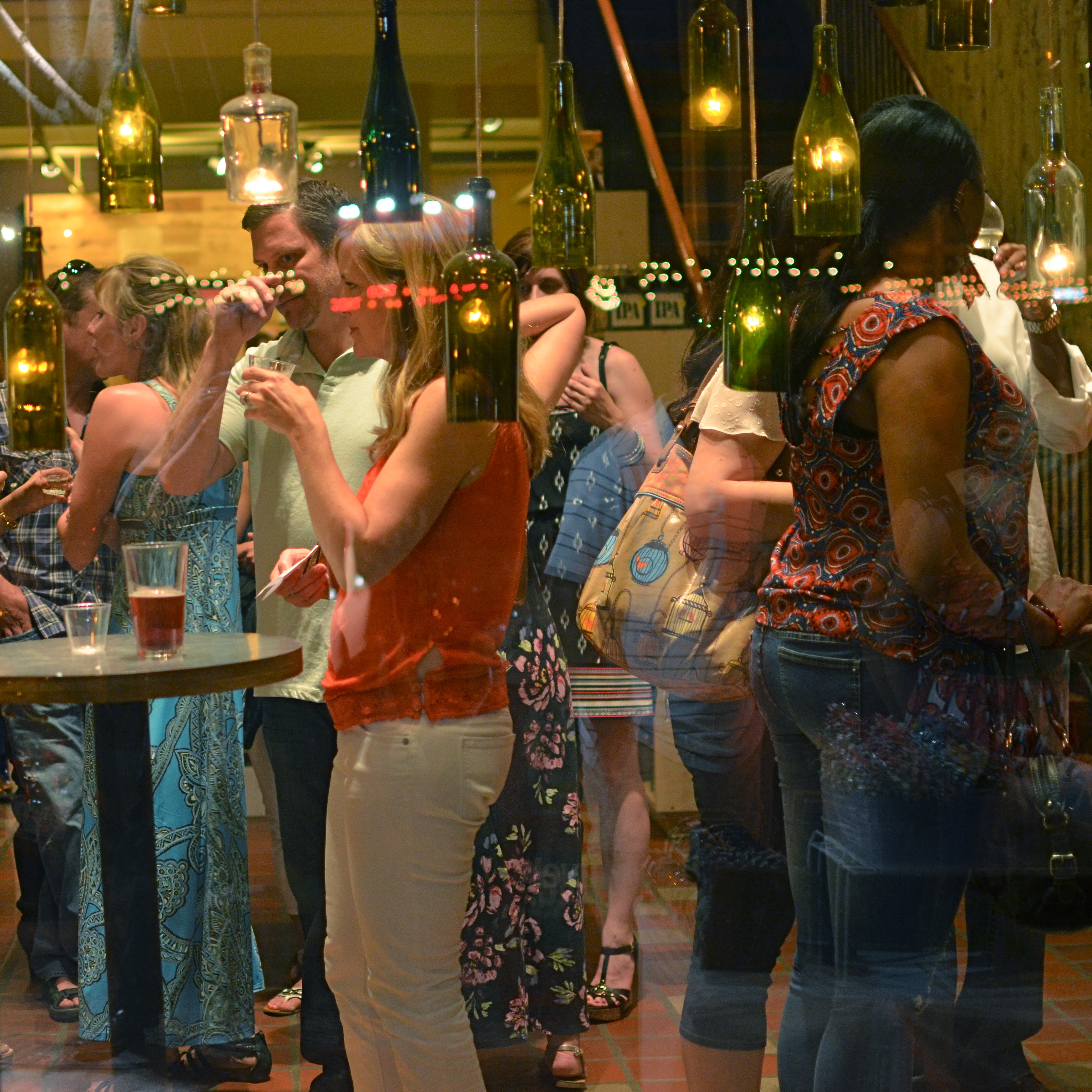
PHOTOGRAPHY CAN GO TWO WAYS ON CONTEXT. It can either seek out surroundings which comment organically on subjects (a lone customer at a largely empty bar, for example) or it can, through composition or editing, artificially create that context (five people in an elevator becomes just two of those people, their locked hands taking up the entire frame). Sometimes, images aren’t about what we see but what we can make someone else seem to see.
Creating your own context isn’t really “cheating” (are we really still using that word?), because you’re not creating a new fact in the photograph, so much as you are slapping a big neon arrow onto said fact and saying, “hey look over here.” Of course, re-contextualizing a shot can lead to deliberate mis-representation of reality in the wrong hands (see propaganda, use of), but, assuming we’re re-directing a viewer’s attention for purely aesthetic reasons (using our powers for good), it can make a single photo speak in vastly different ways depending on where you snip or pare.
In the above situation, I was shooting through the storefront window of a combined art studio and wine bar (yes, I hang with those kind of people), and, given that the neighborhood I was in regularly packed folks in on “gallery hop” nights, the place was pretty jammed. The original full frame showed everything you see here, but also the connecting corridor between the studio and the wine bar which was, although still crowded, a lot less claustrophobic than this edited frame suggests.
And that’s really the point. Urban “hangs” that are so over-attended can give me the feeling of being jammed into a phone booth, like I’m part of some kind of desperately lonely lemming family reunion, so I decided to make that crushed sensation the context of the picture. Cropping down to a square frame improved the balance of the photograph but it also made these people look a little trapped, although oddly indifferent to their condition. The street reflections from the front plane of glass also add to the “boxed in” sensation. It’s a quick way to transform a snap into some kind of commentary, and you can either accept my choice or pass it by. That’s why doing this is fun.
Urban life presents a challenging series of social arrangements, and context in photographs can force a conversation on how that affects us.
ELEMENTARY, MY DEAR NIKON
Let the light decide what makes a photograph. Modem, 2014. 1/30 sec., f/1.8, ISO 800, 35mm.
By MICHAEL PERKINS
PHOTOGRAPHY IS OFTEN DEFINED CLASSICALLY AS “WRITING WITH LIGHT“, but I often wonder if a better definition might be “capitalizing on light opportunities”, since it’s not really what subject matter we shoot but light’s role in shaping it that makes for strong images. We have all seen humble objects transformed, even rendered iconic, based on how a shooter perceives the value of light, then shapes it to his ends. That’s why even simple patterns that consist of little more than light itself can sometimes be enough for a solid photograph.
If you track the history of our art from, say, from the American Civil War through today’s digital domain, you really see a progression from recording to interpreting. If the first generally distributed photographs seen by a mass audience involve, say, the aftermath of Antietam or Gettysburg, and recent images are often composed of simple shapes, then the progression is very easy to track. The essence is this: we began with photography as technology, the answer to a scientific conundrum. How do we stop and fix time in a physical storage device? Once that very basic aim was achieved, photographers went from trying to just get some image (hey, it worked!) to having a greater say in what kind of image they wanted. It was at this point that photography took on the same creative freedom as painting. Brushes, cameras, it doesn’t matter. They are just mediums through which the imagination is channeled.
In interpreting patterns of elementary shapes which appeal on their own merit, photographers are released from the stricture of having to endlessly search for “something to shoot”. Some days there is no magnificent sunrise or eloquent tree readily at hand, but there is always light and its power to refract, scatter, and recombine for effect. It’s often said that photography forced painting into abstraction because it didn’t want to compete with the technically perfect way that the camera could record the world. However, photography also evolved beyond the point where just rendering reality was enough. We moved from being reporters to commentators, if you like. Making that journey in your own work (and at your own pace) is one of the most important step an art, or an artist, can take.
LIGHT DECAY
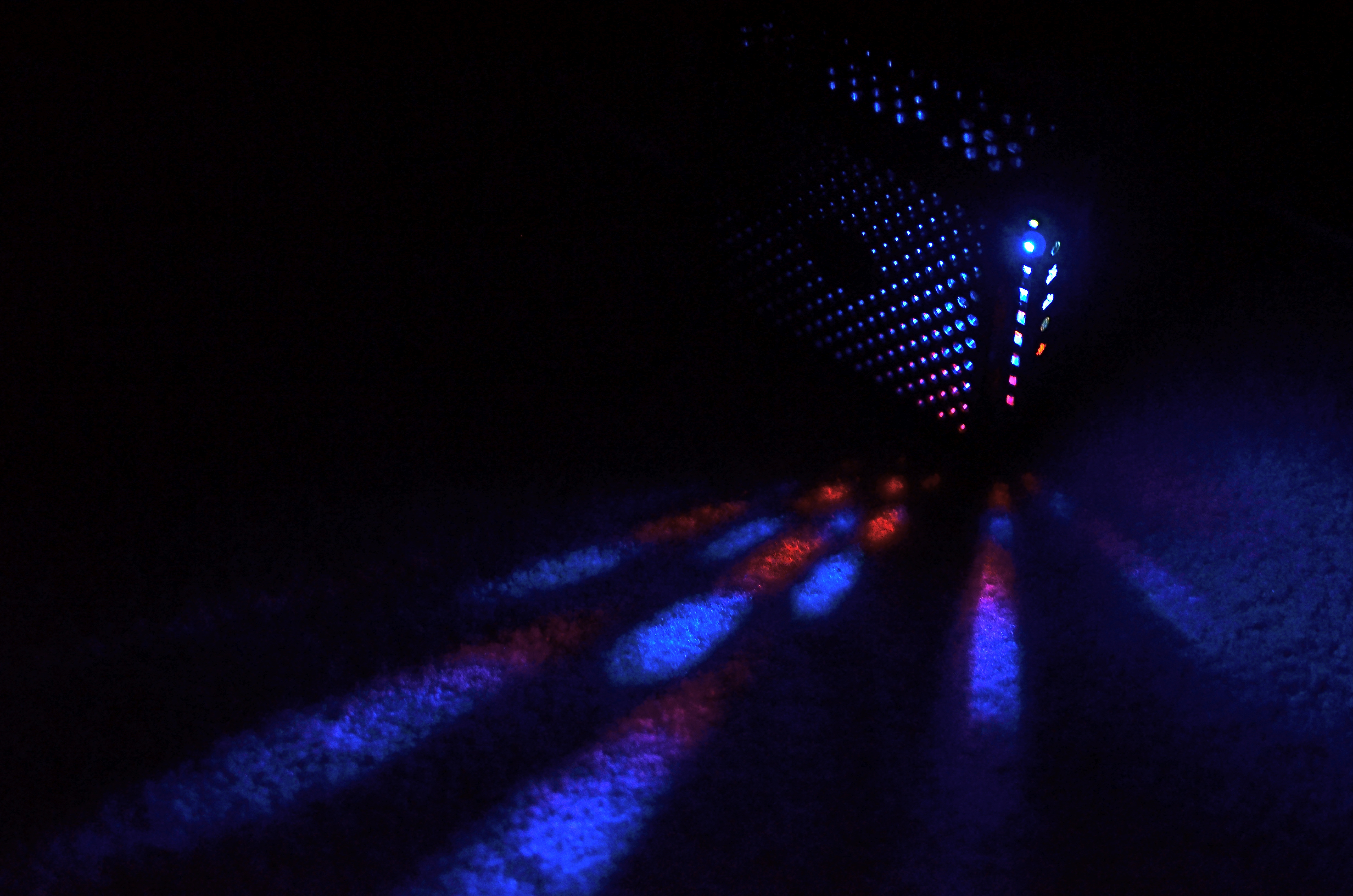
Yeah, it’s “Broadway”, but a little further from the solar flare of its neon overkill.
By MICHAEL PERKINS
WE HAVE PROVEN OURSELVES TO BE A SPECIES THAT HATES TO BE SENT TO BED. Night life being a kind of “second shift” in most of the modern world, we really never lock up our cities for the evening, and that has changed how those cities exist for photographers.
Here’s both the good and bad news: there is plenty of light available after dark in most towns. Good if you want the special mix of neon, tube glow and LED burn that sculpts the contours of most towns post-sundown. Bad if you really want to see cities as special entities defined by shadow, as places where dark is a subtle but aesthetically interesting design element. In many mega-cities, we have really banished the dark, going beyond essential illumination to a bleachingly bright blast of light which renders everything, big and small, in the same insane mutation of color and tone. Again, this is both good and bad, depending on what kind of image you want.
Midtown Manhattan, downtown Atlanta, and anyplace Tokyo are examples of cities that are now a universe away from the partial night available in them just a generation ago. A sense of architectural space beyond the brightest areas of light can only be sensed if you shoot deep and high, framing beyond the most trafficked structures. Sometimes there is a sense of “light decay”, of subtler illumination just a block away or a few stories higher than what’s seen at the busiest intersections. Making images where you can watch the light actually fade and recede adds a little dimension to what would otherwise be a fairly flat feel that overlit streets can generate.
Photography is often a matter of harnessing or collecting extra light when it’s scarce. Turns out that having too much of it is a creative problem in the opposite direction.
MINIMUM SHOW, MAXIMUM SEE

There are only two design elements in this image. Does it really need any more? 1/160 sec., f/4, ISO 100, 24mm.
By MICHAEL PERKINS
LOOK AT THE EARLIEST PHOTOGRAPHIC WORK OF NEARLY ANYONE and you will see a general attempt to frame up a scene and attempt to show, well, everything within range of the camera. It’s a time when we produce our most inclusive panoramas, our most crowded city scenes, our most enormous circus midways. Our pictures may be stories, but, at first, our stories have a bit of a problem getting to the point. We are so inclusive of raw data that every snap of life at the beach becomes a page out of Where’s Waldo? Thus, the very first real talent young photographers show is the ability to trim all that visual fat and get the maximum see for the minimum show.
Of course, when we are mere puppies, it seems counter-intuitive to say that showing less will actually make us see more. Minimalism doesn’t come easily to us, since we are afraid, at first, that we’re leaving something “important” out. Everyone comes to terms with this eventually if they shoot long enough, but we all arrive at the wisdom of it via various journeys. For me, it was my first attempts at still life compositions, which really are the most edited exercises we do. For these kinds of photos, it’s really about knowing what to leave out, or at least when to stop adding. And when a picture works, there is the nagging curiosity as to why….an inquiry which often leads to the conclusion that we used just what we needed, and then stopped.
Sometimes I get a sense of how little I need in a picture while I’m shooting. Many times, though, it comes to me in the editing or cropping process. If I snip something off of a picture and it doesn’t fall apart, I start wondering how much more I can pare away and still say what I’m trying to say. Learning, in recent years, how to compose again for a square frame has really been helpful, too, since it forces you into a pre-determined space limit. You can’t paint any wider than the canvas, if you will. You yourself might find other ways to get to the core balance your story needs. There is no true or single path.
I started the above image in a wide graveyard, then several graves and a tree, then one grave marker and a tree, then just the marker, and finally a portion of the marker. But in what I wound up with, aren’t all the elements I cut away really present for the viewer mentally anyway?
It’s often said, as a generalization, that painters start with nothing and add until they get the picture, while photographers start with everything and strip information away until they see just what they need. I really see a lot of photography that way. Tell the story with as few elements as you can and walk away. Minimum show for maximum see.
Not nearly so counter-intuitive, after all.
NOT WHAT I CAME FOR, BUT…
By MICHAEL PERKINS
ANYONE WHO’S MADE A ROAD TRIP CAN TELL YOU THAT THE DESTINATION IS OFTEN FAR LESS ENJOYABLE THAN THE JOURNEY, a truth that also applies to photography. The best things result from the little surprises at the side of the highway. You’re fixated on your oh-so-holy “plan” and all the wonderful things you’ll see and do in executing it. But photography is an art of opportunity, and to the degree that you embrace that fact, your work will be broader, richer, looser.
This is now a real source of excitement for me. I still go to the trouble of sketching out what I think I’m going to do, but, I’m at least quietly excited to know that, in many cases, the images that will make the keepers pile will happen when I went completely off message. Yes, we are “officially” here today to shoot that big mountain over yonder. But, since the two people I met on the approach path to said mountain are in themselves interesting, the story has now become about them. I may or may not get back to the mountain, and, if I do, I may discover that I really did not have a strong concept in my bagga trix for making anything special out of it, and so it’s nice not to have to write the entire day off to a good walk spoiled.
Specific example: I have written before that I get more usable stuff in the empty spaces and non-exhibit areas of museums than I do from the events within them. This is a great consolation prize these days, especially since an increasingly ardent police state among curators means that no photos can be taken in some pretty key areas. Staying open means that I can at least extract something from the areas no one is supposed to care about.
An average day at the museum, at the end of which this dropped into my lap.
The above image is one such case, since it was literally the final frame I shot on my way out of a museum show. It was irresistible as a pattern piece, caused by a very fleeting moment of sunset light. It would have appealed to me whether I was in a museum or not, but it was the fact that I was willing to go off-script that I got it, no special technical talent or “eye”. Nabbing this shot completely hinged on whether I was willing to go after something I didn’t originally come for. It’s like going to the grocery store for milk, finding they’re out, but discovering that there is also a sale on Bud Light. Things immediately look rosier.
Or at least they will by the third can.
GREAT DAY IN BROOKLYN
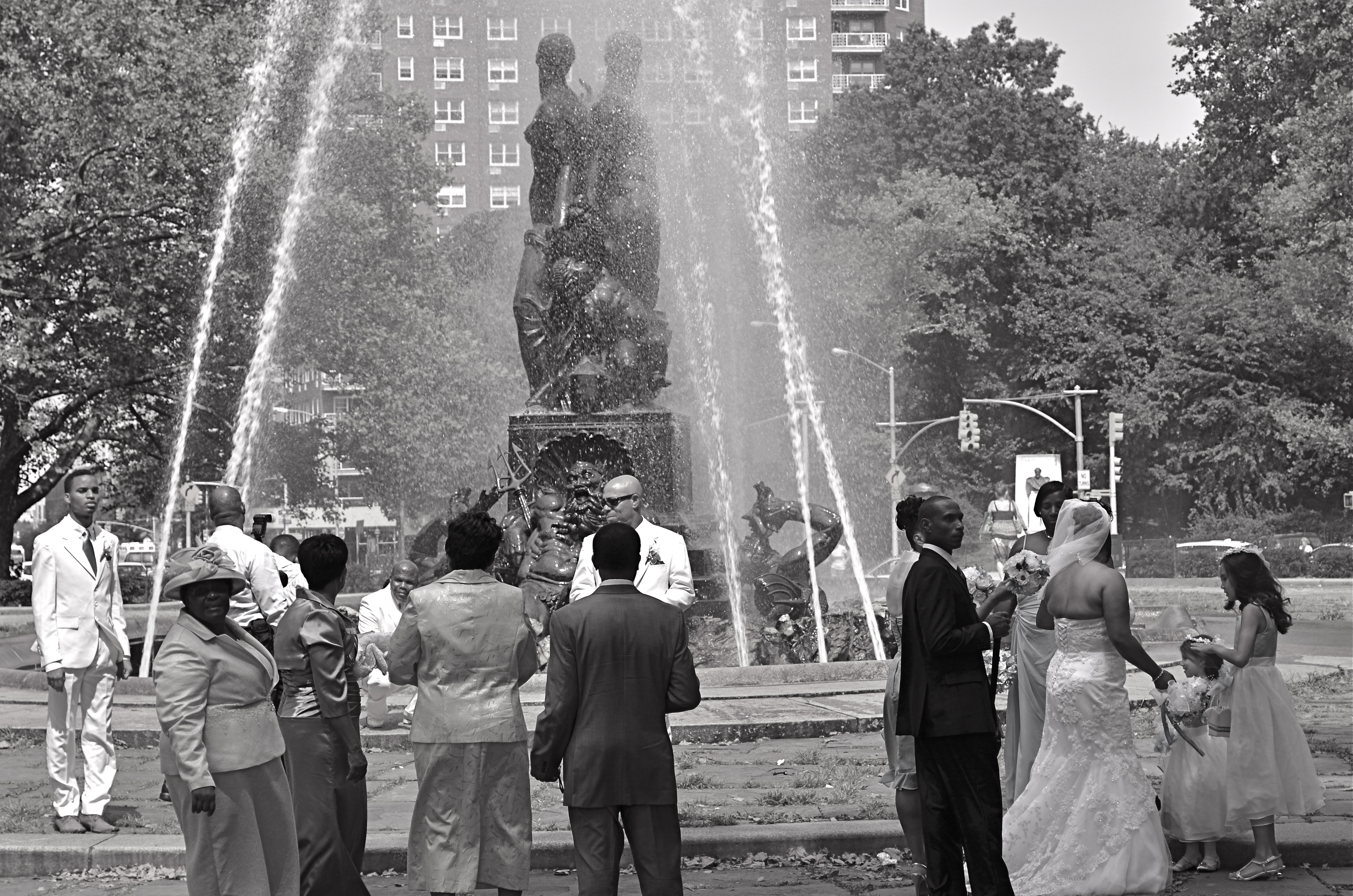
Wedding Party, 2012.
By MICHAEL PERKINS
IT STARTED OFF AS WHAT IS CURRENTLY REFERRED TO AS A FAIL: I was clicking away throughout the park areas in Brooklyn’s Grand Army Plaza, trying to make some kind of epic composition out of the beautiful Bailey Foundation near the war memorial arch. It features several heroic figures standing on the prow of a ship, under which can be seen several mythical denizens of the deep including Neptune himself. It’s a strong piece of sculpture, crowning a plaza that was designed by the great Frederick Law Olmstead, the mastermind behind Manhattan’s Central Park, and I should have been able to do something with it. Something.
Problem with the fountain is the water itself, which, instead of a wonderfully flowing cascade is something between a Jacuzzi shower head and a resort sprinkler system. Its renders the statuary nearly impossible to get in focus, and sends refracted rainbows and hotspots dancing gaily into your lens. Suddenly the impulse of a moment is a day’s work, and, just as I was beginning to check this particular world wonder off my to-do list, in moved the people you see here.
I don’t shoot weddings but the group you see here was, in fact, a shoot of a wedding, something else altogether, since there is a more relaxed dynamic than will ever be present during an actual ceremony. Photographically, rehearsals are more fruitful than actual play performances, and, in that vein, wedding prep holds more pictorial potential, for me, than weddings with a capital W. There is a looser feel, an air of celebration that somehow gets starched out of the final product. Do I stand here? You want me holding the flowers? Shouldn’t the tall people be at the back? Best thing of all, these folks were already taking direction from their “official” photog, so I was the last thing on their mind. There’s no better role at a wedding than that of The Invisible Man.
My glorious fountain had been reduced to a prop, which means the wedding party saw its potential, as I had. The difference is, they gave me what I hadn’t been able to find for myself.
A picture.
SETTING THE CAPTIVES FREE
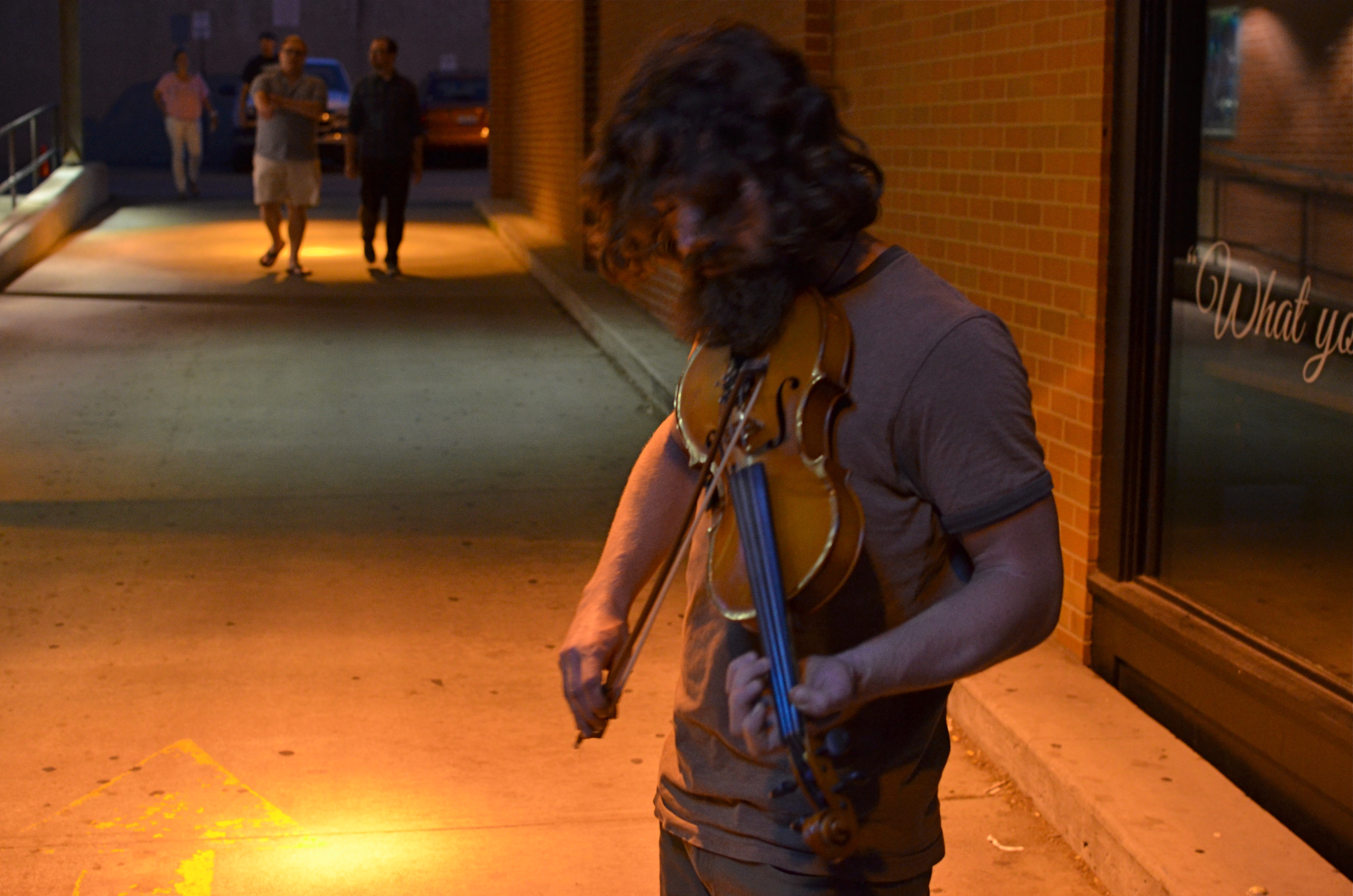
Fiddler, 2014. Too soft? Too dark? True? False? 1/50 sec., f/3.5, ISO 1000, 35mm.
By MICHAEL PERKINS
I’D LIKE TO ERADICATE THE WORD “CAPTURE” FROM MOST PHOTOGRAPHIC CONVERSATIONS. It suggests something stiff or inflexible to me, as if there is only one optimum way to apprehend a moment in an image. Especially in the case of portraits, I don’t think that there can be a single way to render a face, one perfect result that says everything about a person in a scant second of recording. If I didn’t capture something, does that mean my subject “got away” in some way, eluded me, remains hidden? Far from it. I can take thirty exposures of the same face and show you thirty different people. The word has become overused to the point of meaningless.
We are all conditioned to think along certain bias lines to consider a photograph well done or poorly done, and those lines are fairly narrow. We defer to sharpness over softness. We prefer brightly lit to mysteriously dark. We favor naturalistically colored and framed recordings of subjects to interpretations that keep color and composition “codes” fluid, or even reject them outright. It takes a lot of shooting to break out of these strictures, but we need to make this escape if we are to move toward anything approaching a style of our own.
Jerry Schatzberg’s iconic portrait of Bob Dylan from the cover of Blonde On Blonde.
I remember being startled in 1966 when I first saw Jerry Schatzberg’s photograph of Bob Dylan on the cover of the Blonde On Blonde album. How did the editor let this shot through? It’s blurred. It’s a mistake. It doesn’t…..wait, I can’t get that face out of my head. It’s Bob Dylan right now, so right now that he couldn’t be bothered to stand still long enough for a snap. The photo really does (last time I say this) capture something fleeting about the electrical, instantaneous flow of events that Dylan is swept up in. It moves. It breathes. And it’s more significant in view of the fact that there were plenty of pin-sharp frames to choose from in that very same shoot. That means Schatzberg and Dylan picked the softer one on purpose.
There are times when one 10th of a second too slow, one stop too small, is just right for making the magic happen. This is where I would usually mention breaking a few eggs to make an omelette, but for those of you on low-cholesterol diets, let’s just say that n0 rule works all the time, and that there’s more than one way to skin (or capture) a cat.
A PLACE APART
By MICHAEL PERKINS
PHOTOGRAPHERS USUALLY USE FACES AS THE SOLE BAROMETER OF EMOTION. It’s really easy to use a person’s features as the most obvious cues to one’s inner mind. Scowls, smiles, smirks, downcast eyes, sidelong glances,cries of anguish….these are standard tools in depicting someone as either assimilated into the mass of humanity or cast away, separate and alone.
But faces are only one way of showing people as living in a place apart. Symbolically, there is an equally dramatic effect to be achieved by the simple re-contextualizing of that person in space. The arrangement of space near your subject forces the viewer to conclude that he or she is either in harmony with their surroundings or lonely, solitary, sad even, and you do it without showing so much as a raised eyebrow. This is where composition isn’t just a part of the story, but the story itself.
Context is all.
The woman shown here is most likely just walking from point A to point B, with no undercurrent of real tragedy. But once she takes a short cut down an alley, she can be part of a completely different, even imaginary story. Here the two walls isolate her, herding her into a context where she could be lonely, sad, afraid, furtive. She is walking away from us, and that implies a secret. She is “withdrawing” and that implies defeat. She is without a companion, which can symbolize punishment, banishment, exile. From us? From herself? From the world? Once you start to think openly about it, you realize that placing the subject in space lays the foundation for storytelling, a technique that is easy to create, recalibrate, manipulate.
The space around people is a key player in the drama an image can generate. It can mean, well, whatever you need it to mean. People who exist in a place apart become the centerpieces in strong photographs, and the variability of that strength is in your hands.
A LITTLE R/R
By MICHAEL PERKINS
I CAME ACROSS SOME MENTAL BAGGAGE THE OTHER DAY DURING A SHOOT BENEATH AN OLD TRESTLE. The following song by the late Harry Nilsson churned back into my forebrain from a land far away. It wasn’t one of his bigger hits, but it has always struck a chord with me, at least the part of me that likes to make pictures:
When we got married back in 1944
We’d board that Silverliner below Baltimore
Trip to Virginia on a sunny honeymoon
Nobody cares about the railroads anymore
We’d tip the porter for a place of our own
Then send a postcard to your mom and dad back home
Woo-ee, woo-oo-oo-ee, woo-ee
Woo-ee, woo-oo-oo-ee, woo-ee
We had a daughter and you oughtta see her now
She has a boyfriend who looks just like my gal Sal
And when they’re married they won’t need us anymore
They’ll board an aeroplane and fly away from Baltimore
Woo-ee, woo-oo-oo-ee, woo-ee
Nobody cares about the railroads anymore
(lyrics copyright Warner-Chappell Music)
The ghosts are out there. So are the pictures.
All aboard.
7/4/14: A MORE PERFECT UNION

Washington Memorial, 2013. 1/400 sec., f/5.6, ISO 100, 28mm.
By MICHAEL PERKINS
MY FATHER CAN TESTIFY TO MY NATIVE, AND LIFELONG IMPATIENCE. While most kids learned to be told how to “mind”, I had to be taught how to wait. “It’s a process”, he would remark when I fumed about how long something I wanted was taking to come about, “not a product”. I willingly admit that he is much more Zen than I can ever be, infinitely better at the wait-and-see thing. I have developed a little long vision in my later years, but I am still like a lab rat. I keep punching the bar, ’cause I want that bloody biscuit now.
Oddly, photography has taught me a few things about waiting, as has my native optimism about the country of my birth. The Fourth of July is not, however, a day typically spent in quiet contemplation, but in exuberant celebration of how unique our story is in the history of the world. But, for me, Independence Day is for taking measure, walking off the distance on the chain that stretches between What We’ve Done and What We Have Yet To Do. In America, we’re always 3rd and 4, looking for the next first down. We are never, and can never, be finished.
I think I prefer the above image of the Washington Monument, which I took last year during its restoration, to an image of the obelisk without its temporary scaffolding, and it’s because it reminds me that freedom is always being refined, reworked, re-earned. The race goes ever on. Similarly, I love photos of the U.S. Capitol during its construction phase far more than shots of the finished product. The building’s dome teetered between being-ness and nothing-ness all through the Civil War, a visually indelible barometer of the changing fortunes of Washington itself as the battle raged on, often just outside the city limits. Seeing the Washington Monument sheathed in wood carries the same visual weight for me. It’s like we haven’t quite taken it out of the packing crate. There’s a temporary, even endangered quality to the building that should stay with us, at least a little, as we go on with our labors.
America is beautiful. But along the way, the old girl benefits from a nip here and a tuck there. We show we care when we keep trying to make her flawless. When we do that, all the penny fireworks in the world can’t compete with the glow, a torch bright enough to light the world.
It’s a process…not a product.
THE ENVELOPE
By MICHAEL PERKINS
HAVING LIVED IN THE AMERICAN SOUTHWEST FOR OVER FIFTEEN YEARS, I HAVE NEGOTIATED MY OWN TERMS WITH THE BLAZING OVERKILL OF MIDDAY SUNLIGHT, and its resulting impact on photography. If you move to Arizona or New Mexico from calmer climates, you will find yourself quickly constricting into a severe squint from late breakfast to early evening, with your camera likewise shrinking from the sheer overabundance of harsh, white light. If you’re determined to shoot in midday, you will adjust your approach to just about everything in your exposure regimen.
Good news, however: if you prefer to shoot in the so-called “golden hour” just ahead of sunset, you will be rewarded with some of the most picturesque tones you’ve ever had the good luck to work with. As has been exhaustively explained by better minds than mine, sunlight lingers longer in the atmosphere during the pre-sunset period, which, in the southwest, can really last closer to two hours or more. Hues are saturated, warm: shadows are powerful and sharp. And, if that dramatic contrast works to your advantage in color, it really packs a punch in monochrome.
This time of day is what I call “the envelope”, which is to say that objects look completely different in this special light from how they register in any other part of the day, if you can make up your mind as to what to do in a hurry. Changes from minute to minute are fast and stark in their variance. Miss your moment, and you must wait another 24 hours for a re-do.
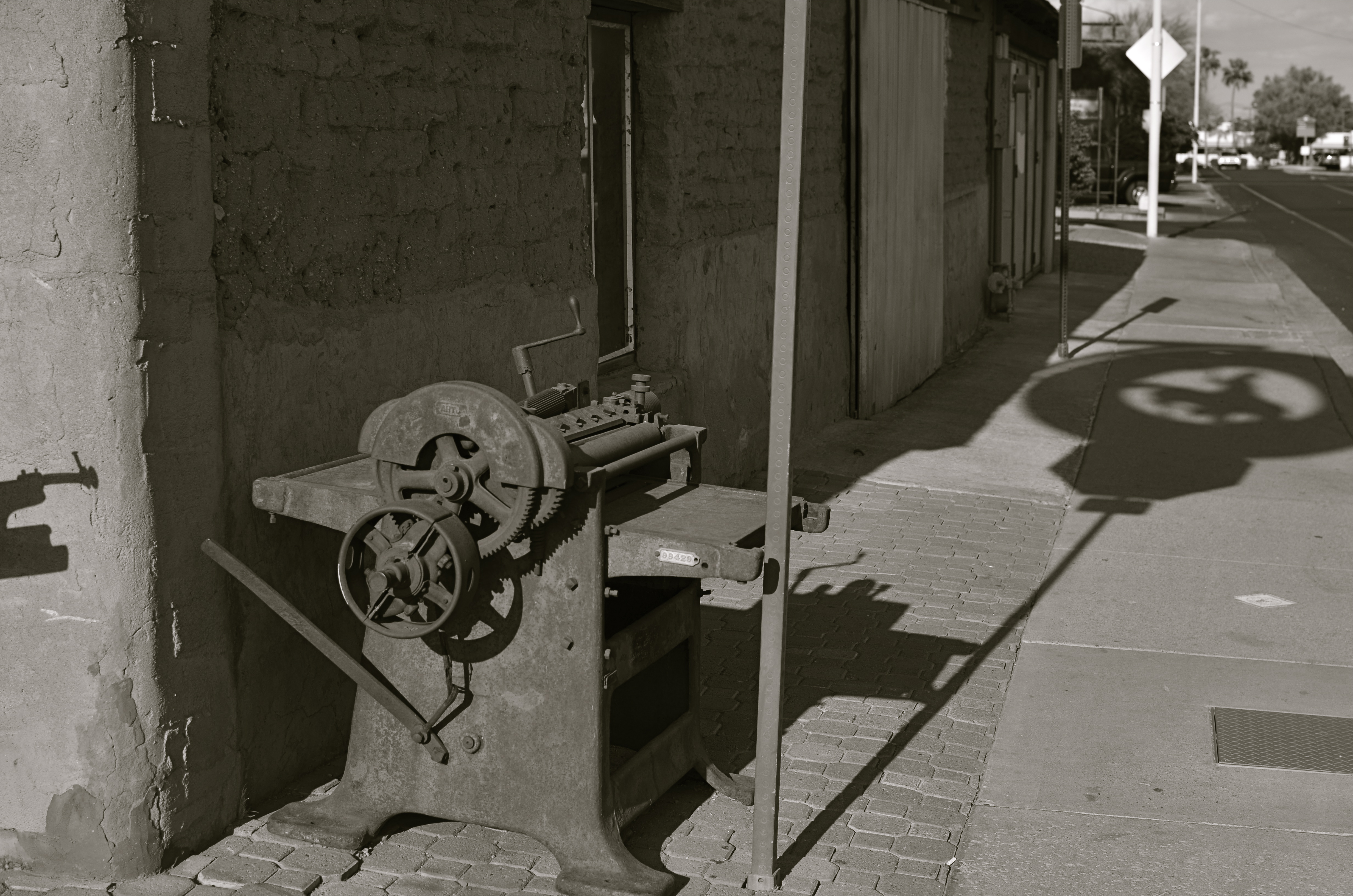
In the west, the best action actually happens after High Noon. Just before sunset in Scottsdale, AZ: 1/500 sec., f/4.5, ISO 100, 35mm.
The long shadow of an unseen sign visible in the above frame lasted about fifteen minutes on the day of the shoot. The sign itself is a metal cutout of a cowboy astride a bucking bronco, the symbol of Scottsdale, Arizona, “the most western town in the USA”. The shadow started as a short patch of black directly in front of the rusted bit of machine gear in the foreground, then elongated to an exaggerated duplicate of the sign, extending halfway down the block and becoming a sharper and more detailed silhouette.
A few minutes later, it grew softer and eventually dissolved as the sun crept closer to the western horizon. There would still be blazing illumination and harsh shadows for some objects, if you went about two stories high or higher, but, generally, sunset was well under way. Caught in time, the shadow became an active design element in the shot, an element strong enough to come through even in black and white.
If you are ever on holiday in the southwest, peek inside “the envelope”. There’s good stuff inside.
INS AND OUTS
By MICHAEL PERKINS
WHEN IT COMES TO DISCUSSIONS ABOUT ART, THE WORD “ABSTRACT” IS PROBABLY THE MOST BATTED-ABOUT LINGUISTIC SHUTTLECOCK OF THE 20TH CENTURY, something we lob at each other across the conversational net as it suits our mood. Whenever we feel we should weigh in on a matter of artistic heft, especially something that doesn’t fit into a conveniently familiar cubbyhole, we drag “abstract” out of the desk drawer, dust it off, and cram it into place somewhere in the argument.
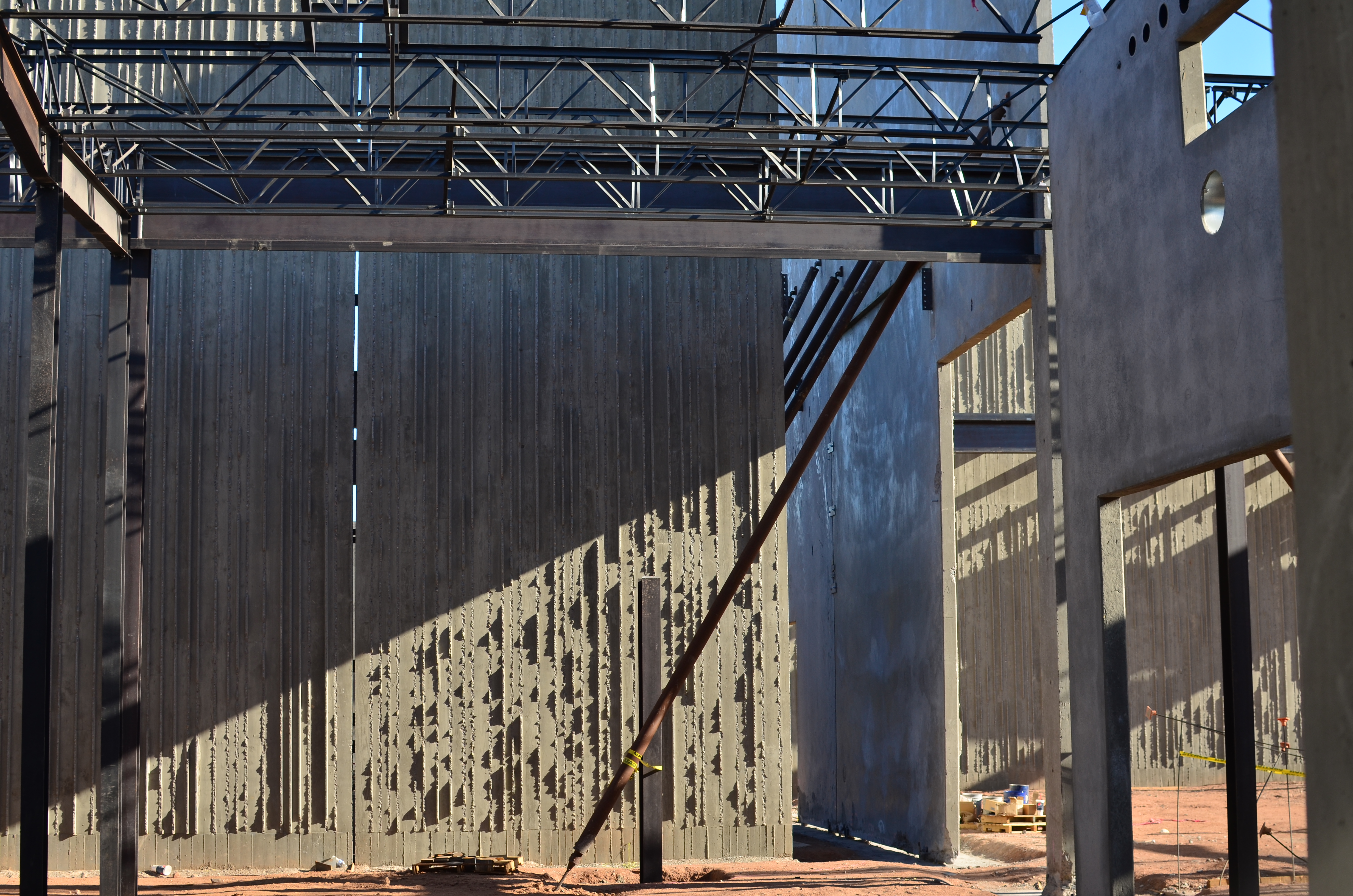
Frames within frames within frames: 1/125 sec., f/5.6, ISO 100, 35mm.
Any talk of architecture, and the photographer’s reaction to it, attracts a lot of stray “abstracts”, since attaching the word seems to settle… something. However, art can never be about settling anything. In fact, it’s about churning things up, starting, rather than resolving, arguments. As pieces of pure design, finished buildings do make a statement of sorts about the architect’s view, at least. But when trolling about town, I am more drawn to incomplete or skeletal frameworks for buildings yet to be. They are simply open to greater interpretation as visual subject matter, since we haven’t, if you like, seen all the architect’s cards yet. The emerging project can, for a time, be anything, depending literally on where you stand or how light shapes the competing angles and contours.
I feel that open or unfinished spaces are really ripe with an infinite number of framings, since a single uncompleted wall gives way so openly to all the other planes and surfaces in the design, a visual diagram that will soon be closed up, sealed off, sequestered from view. And as for the light, there is no place it cannot go, so you can chase the tracking of shadows all day long, as is possible with, say, the Grand Canyon, giving the same composition drastically different flavors in just the space of a few hours.
If the word “abstract” has any meaning at all at this late date, you could say that it speaks to a variation, a reworking of the dimensions of what we consider reality. Beyond that, I need hip waders. However, I believe that emerging buildings represent an opportunity for photographers to add their own vision to the architect’s, however briefly.
Whew. Now let’s all go out get a drink.
