TAKING / BRINGING
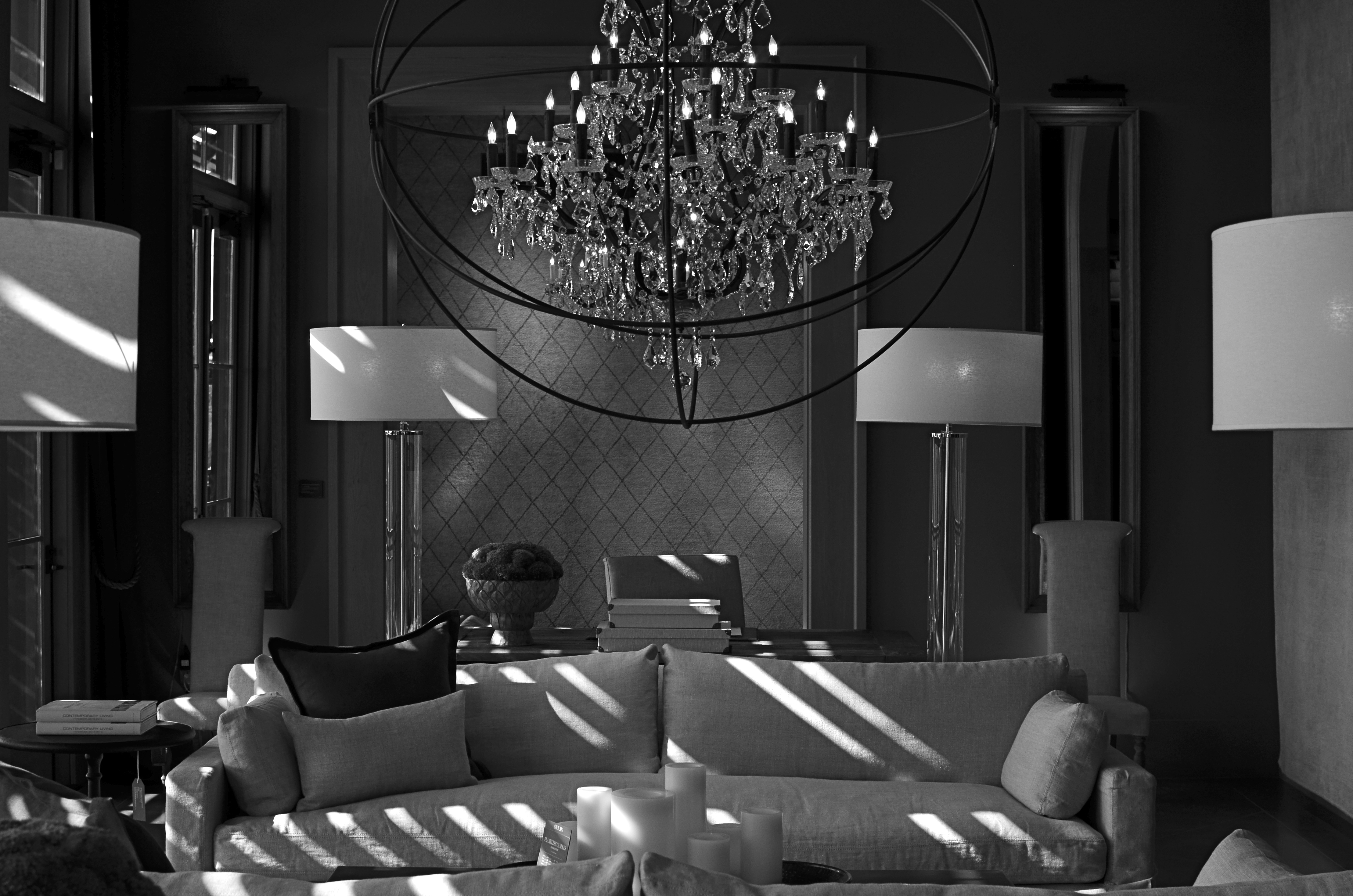
The Room Where Nothing Happens. Or Not. 1/100 sec., f/5.6, ISO 160, 35mm.
By MICHAEL PERKINS
INTELLECTUALLY, I KNOW THAT PHOTOGRAPHS DON’T NECESSARILY HAVE TO BE “ABOUT”, well, anything, but that doesn’t stop the 12-year-old photo newbie deep inside me from trying to produce images with “meaning” (yawn). Some reason to look. A subject. A story line. A deliberate arrangement of things for the purpose of communicating…something. Itchy and twitchy within my artist’s skin as I always am, I am never more out of my element than when I make a picture that is pure composition and form, a picture that has no reason to exist except that I wish it to.
As I get older, I get looser (no G.I. tract jokes about the elderly, please), and thus making what you might call “absolute” images gets easier. I just had to learn to give myself permission to do them. Unlike Atget, Brassai, and half a dozen early pioneering photographers, I don’t have to take pictures to earn my bread, so, if I capture something that no one else “gets” or likes, my children will not starve. Still, the act of making photographs that carry no narrative is far from native to me, and, if I live to be 125, I’ll probably learn to relax and really do something okay by about 93.
The process can be a head-scratcher.
The above image is an “absolute” of sorts, since I have no emotional investment whatever in the subject matter, and have nothing to reveal about it to anyone else. The arbitrary and somewhat sterile symmetry of this room, discovered during a random walk through a furniture store, just struck me, and I still cannot say why. Nor can I explain why it scores more views on Flickr over some of my more emotional work by a margin of roughly 500 to 1. A whole lot of people are seeing something in this frame, but I suspect that they are all experiencing something different. They each are likely taking vastly varied things from it, and maybe they are bringing something to it as well. Who knows what it is? Sense memory, a fondness for form or tone, maybe even a mystery that is vaguely posed and totally unresolved.
“Even though there are recognizable objects making up the arrangement, the result is completely abstract.There isn’t a “human” story to tell here, since this room has never been inhabited by humans, except for wandering browsers. It has no history; nothing wonderful or dreadful ever happened here. In fact, nothing of any kind ever happened here. It has to be form for its own sake; it has no context.
I liked what happened with the very huge amount of soft window light (just out of frame), and I thought it was best to render the room’s already muted tones in monochrome (it wasn’t a big leap). Other than that, it would be stupid to caption or explain anything within it. It is for bringers and takers, bless them, to confer meaning on it, if they can. As I said earlier, it’s always a little scary for me to let go of my overbrain when making a picture.
Then I remember this is supposed to be about feeling as well as thinking.
***Deep breath***
Next.
Follow Michael Perkins on Twitter @MPnormaleye.
Related articles
- First Critique (cohensrphotography.wordpress.com)
HOLLYWOOD NIGHTS
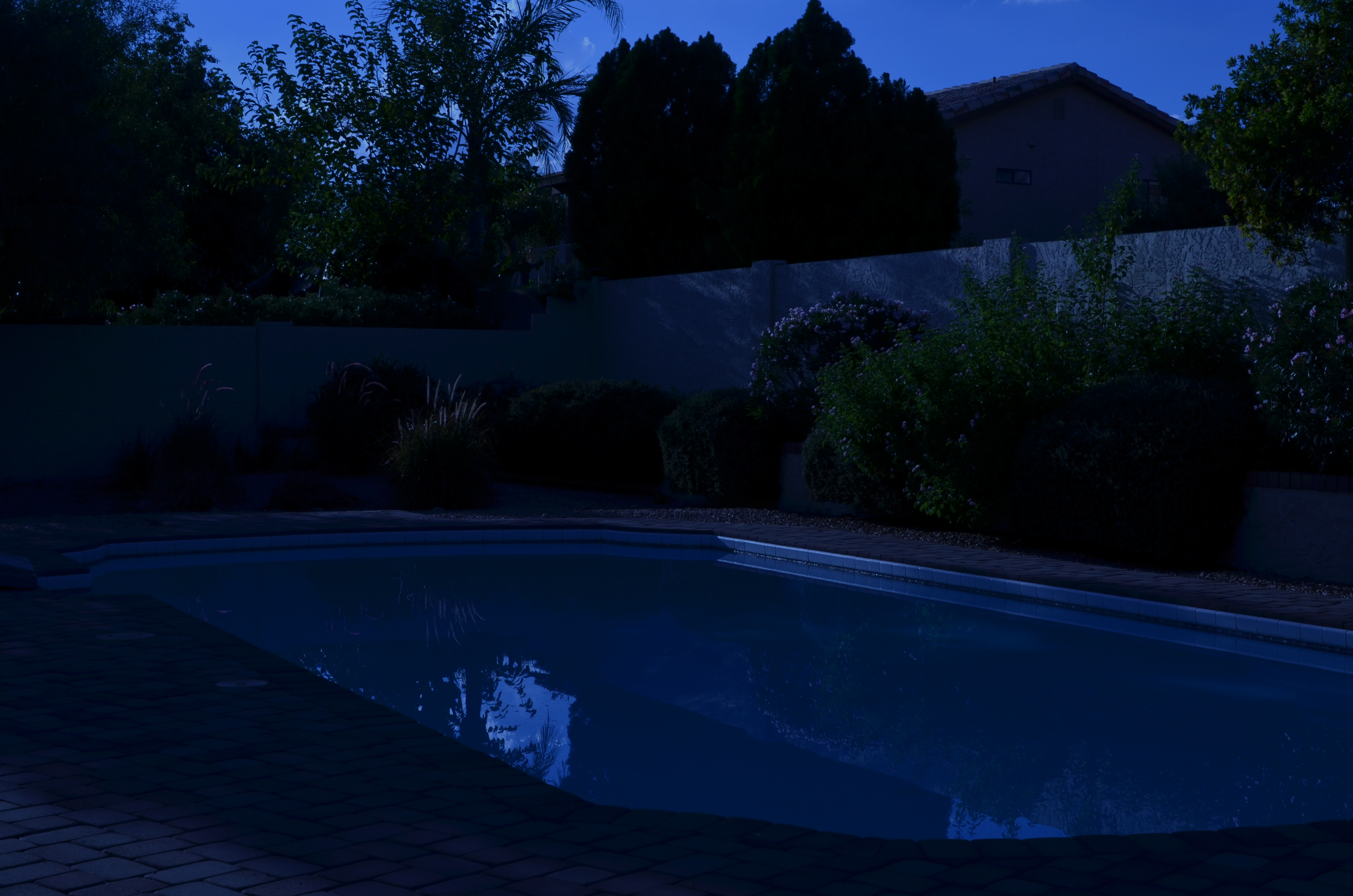
Moonlight night around the poolside, only not really: a “day-for-night” shot taken at 5:17pm. 1/400 sec., f/18, ISO 100, 35mm, using a tungsten white balance.
By MICHAEL PERKINS
TIME LIMITS US IN EVERY PHOTOGRAPHIC SITUATION: LIGHT HEMS US IN EVEN FURTHER. Of course, the history of photography is rife with people who refuse to just accept what time and nature feel like giving them. In fact, that refusal to settle is source of all the artistry. Too bright? Too bland? Wrong time of day? Hey, there’s an app for that. Or, more precisely, a work-around. Recently, I re-acquainted myself with one of the easiest, oldest, and more satisfying of these “cheats”, a solid, simple way to enhance the mood of any exterior image.
And to bend time… a little.

Same scene as above taken just seconds later, but with normal white balancing and settings of 1/250 sec., f/5.6, ISO 100, 35mm.
It’s based on one of Hollywood’s long-standing budget-savers, a technique called day-for-night. For nearly a century, cinematographers have simulated nightfall while shooting in the daytime, simply by manipulating exposure or processing. Many of the movie sequences you see represented as “night” are, in fact, better lit than any “normal” night, unless you’re under a bright, full moon. Day-for-night allows objects to be more discernible than in “real” night because their illumination is actually coming from sunlight, albeit sunlight that’s been processed differently. Shadows are starker and it’s easier to highlight what you want to call attention to. It’s also a romantically warm blue instead of, well, black. It’s not a replication of reality. Like most cinematic effects, it’s a little bit better than real.
If you’re forced to approach your subject hours before sunset, or if you simply want to go for a different “feel” on a shot, this is a great shortcut. Even better, in the digital era, it’s embarrassingly easy to achieve: simple dial up a white balance that you’d normally use indoors to balance incandescent light. Use the popular “light bulb” icon or a tungsten setting. Indoors this actually helps compensate for cold, bluish tones, but, outside, it amps up the blue to a beautiful, warm degree, especially for the sky. Colors like reds and yellows remain, but under an azure hue.
The only other thing to play with is exposure. Shutter-speed wise, head for the high country
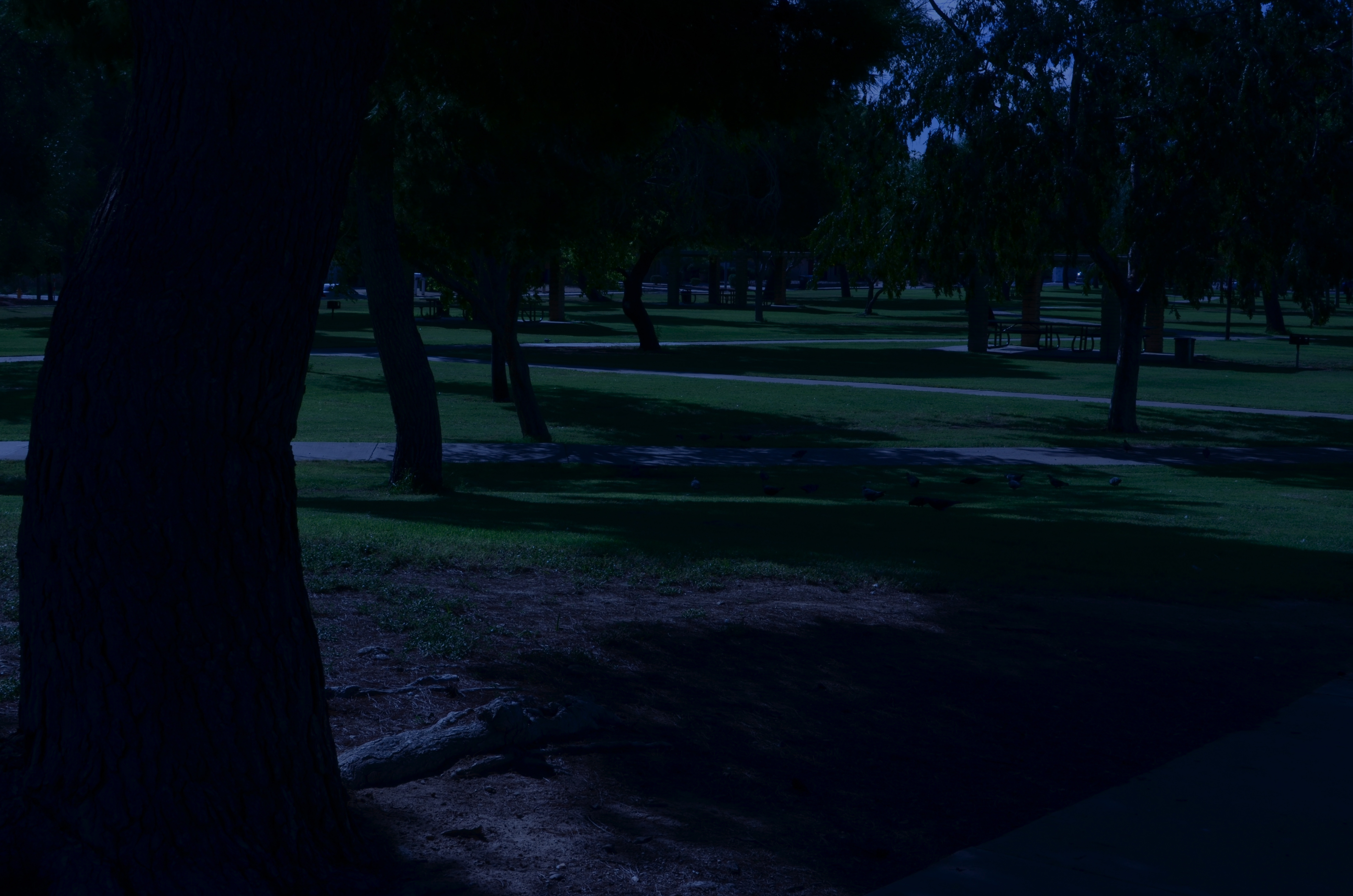
A faux “night” at the park. 1/320 sec., f/20, ISO 100, 35mm.
at anywhere from f/18 to 22, and shorten your exposure time to at least 1/250th of a second or shorter. Here again, digital is your friend, because you can do a lot of trial and error until you get the right mix of shadow and illumination. Hey, you’re Mickey Mouse with the wizard hat on here. Get the look you want. And don’t worry about it being “real”. You checked that coat at the door already, remember?
Added treats: you stay anchored at 100 ISO, so no noise. And, once you get your shot, the magic is almost completely in-camera. Little or no post-tweaking to do. What’s not to like?
I’m not saying that you’ll get a Pulitzer-winning, faux-night shot of the Eiffel Tower, but, if your tour bus is only giving you a quick hop-off to snap said tower at 2 in the afternoon, it might give you a fantasy look that makes up in mood what it lacks in truth.
It ain’t the entire quiver, just one more arrow.
Follow Michael Perkins at Twitter @MPnormaleye.
GRAND BALLET
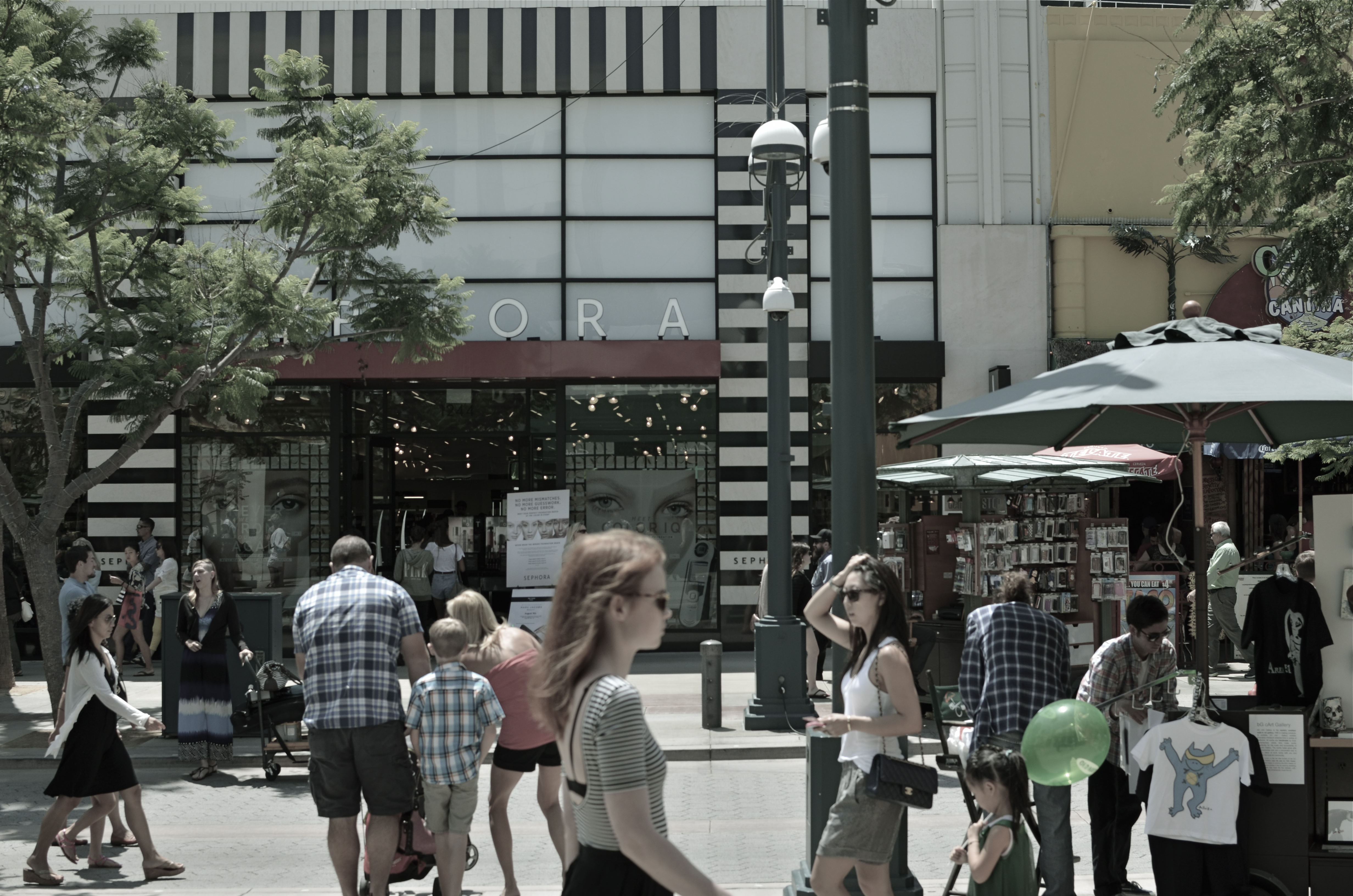
Third Street Promenade, Santa Monica, 2013.
By MICHAEL PERKINS
SOMETIMES THROWING EVERYTHING INTO THE POT MAKES FOR BETTER STEW. Yeah, of course a simple bowl of tomato soup can be elegant, understated. But so can pitching every stray ingredient into the mix and hoping the carrots play nice with the asparagus. Matter of taste depending on one’s mood.
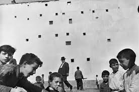
Henri Cartier-Bresson placed his camera at the intersection of “now” and “next”.
So it goes with street photography. Some insist that isolating a single story, a singular face, a tightly framed little drama is the way to go. And that is certainly true much of the time. But so can casting a wide net, framing a grand, interactive ballet of conflicting lives and destinations. It’s like the concentrated, two-man drama of Waiting For Godot versus the teeming crowd scenes of The Ten Commandments. Both vibes come from the street. Just depends on what story we’re telling today.
From the work of Henri Cartier-Bresson, the great street photog of the mid-20th century, I learned to love the seeming randomness of crowds and their competing destinies. HCB was a genius at showing that something wonderful was about to happen, and I love to see him capturing the moment before there even is a moment. His still images fairly beg to be set into motion: you are dying to see how this all comes out. If HCB is new to your eye, I beg you, seek him out. His work is a revelation, a quiet classroom of seeing sense.
I have posted both quiet stories and big loud parades to these pages. Both have their appeal, and both demand a discipline and a selective eye, which means I have a few light years’ worth of learning before me in both areas. That’s the great thing about art. You can’t get done. You can be on the way, but you will not get there. Not if you’re honest with yourself.
For the viewer, myself included, you have to go beyond “snap looking” which is the audience’s equivalent of “snapshooting”. Some images require that you linger, just as some wines are to be sipped instead of guzzled. Slowing down when viewing a frame is the best tribute to whatever pauses the photographer took in creating it in the first place. This picture business is truly a shared project between creator and user.
Gosh, I feel all brotherly and warm-hearted today.
Sort of an urge to be part of the crowd.
Follow Michael Perkins on Twitter @MPnormaleye.
Related articles
- Henri Cartier-Bresson (estone6.wordpress.com)
- The decisive moment (photovide.com)
NOTHING IS REVEALED
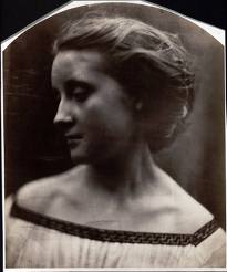
Julia Margaret Cameron, 19th-century self-portrait pioneer, currently on exhibit at the Metropolitan Museum Of Art.
By MICHAEL PERKINS
THE TITLE OF THIS POST IS ONE OF MY FAVORITE LINES IN ALL OF BOB DYLAN’S PRODIGIOUS OUTPUT, coming from The Ballad Of Frankie Lee And Judas Priest, on the John Wesley Harding album. I often pop the phrase into casual conversations where it’s clear that more heat, rather than light, has been generated. Nothing to see here, folks. No new ground has been broken. No fresh truth has been unearthed.
Nothing is revealed.
This phrase came back to me a while back when looking at the raw statistics for Instagram, which indicates that, currently, over 90,000,000 images on the foto-share service currently bear the hashtag “#me”. Call them selfies, call them an epidemic of narcissism, call them banal.
But don’t, for the love of God, call them portraits.
How has it come to this? How can merely pointing a phone camera back at your own punim, and saturating it with distortion and over-amped flash, pass for a telling testament to who you are, what you dream, what you represent in the world?
Of course, the tselfie tsunami does none of these things. It actually puts distance, if not actual barriers, between your real self and the world, by creating some lifeless avatar to ward off true discovery of yourself by, well, anyone. By comparison, even the four-for-a-quarter snaps of antique photo booths are searing documents of truth.
Photography’s evolution is illuminated by the great masters who stepped in front of their own cameras
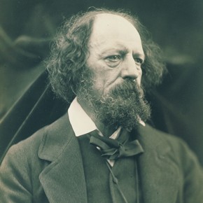
Julia Margaret Cameron, Portrait Of Alfred Lord Tennyson
to try to give testimony, recording innovative, penetrating evidence of who they were. Currently, a show featuring one of the medium’s greatest pioneers in this area, Julia Margaret Cameron, is packing them in at New York’s Metropolitan Museum of Art, and with good reason. Cameron’s attempts to capture herself in not only natural but fantastic settings led the way for interpretive portraitists from Richard Avedon to Annie Liebowitz. Along the way, she learned what to look for, and immortalize, in the faces of others, including Alfred Lord Tennyson, Charles Darwin, Robert Browning, and other bright lights of the 19th century.
Oddly, none of her work was done by crooking her arm 90 degrees back toward her booze-flushed face at a kegger and saying “cheese.”
I’ve written before, in these pages, of the real value of self-portraits as a teaching tool and experimental lab for photographic technique. By contrast, “Selfies” are false faces created to keep the world away, not invite it in. And they remind us, courtesy of Bobby D., of the three worse words of insult that can ever be aimed at any photograph, anywhere:
Nothing is revealed.
Follow Michael Perkins on Twitter @mpnormaleye.
Related articles
- Portraits by Julia Margaret Cameron, One of Photography’s Early Masters, on Display at the Met (muirhousepubs.wordpress.com)
- Julia Margaret Cameron: Pioneer of Modern Glamour Photography? (bigthink.com)
LEAVE THEM WANTING MORE
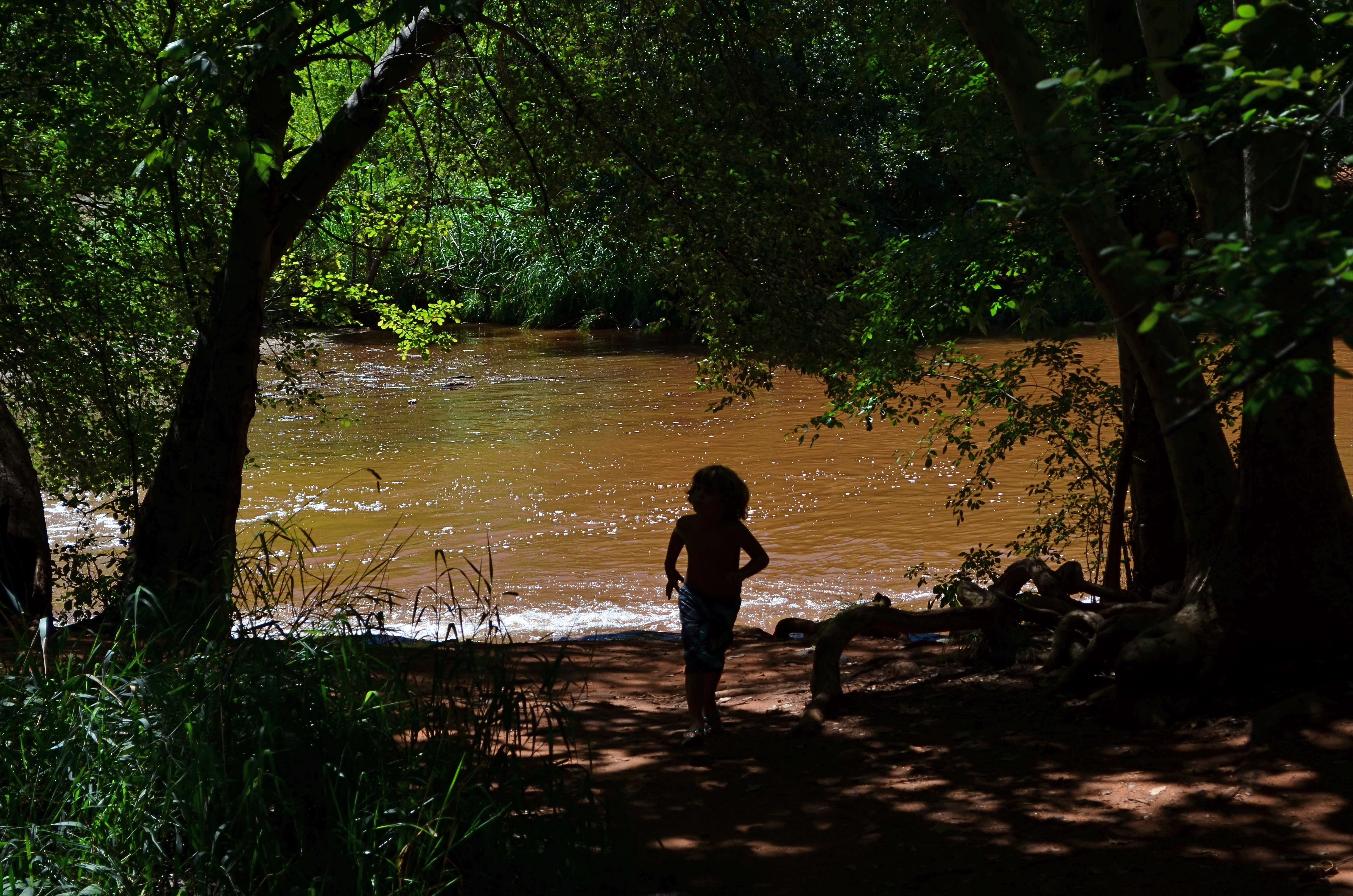
Huck Finn Sneaks Ashore. 1/400 sec., f/8, ISO 100, 55mm.
By MICHAEL PERKINS
PAINTERS INSTINCTIVELY KNOW WHEN IT’S TIME TO REVEAL, AND WHEN IT’S BEST TO CONCEAL. Dark passages or hidden detail within a painting are accepted as part of the storytelling process. That is, what you don’t see can be as valuable a visual element as what you’ve chosen to show. By contrast, many photographers seem to come to this conclusion late , if ever. That is, we’re a little twitchy at not being able to illuminate every corner of our frame, to accurately report all the detail we see.
We try to show everything, and, in so doing, we defeat mystery, denying the viewer his own investigative journey. We insist on making everything obvious. Unlike painters, we don’t trust the darkness. We never “leave them wanting more”.
Fortunately, fate occasionally forces our hand.
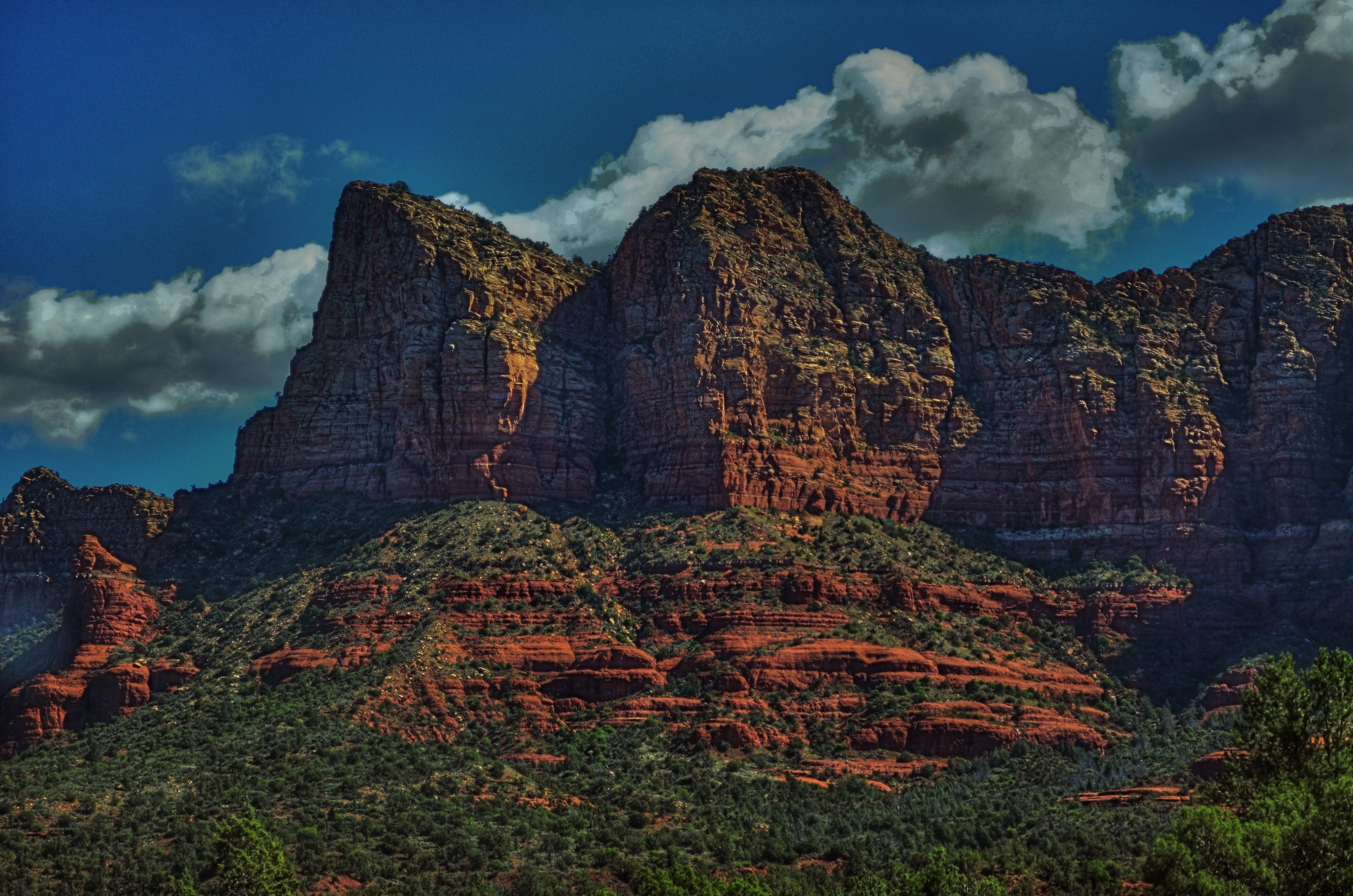
The image at the top of this post started out as an attempt to capture the activity of an entire family that was walking their dog near a break in the dense trees that line the creek at Red Rocks Crossing in Sedona, Arizona. The contrast between the truly dark walking paths beneath the trees and the hyper-lit creek and surrounding hardpan is like night and day. The red rocks and anything near them, especially in the noonday sun, reflect back an intense amount of glare, so if your shots are going to include both shady foliage and sunlit areas, you’re going to have to expose for either one or the other. You might be able to get a wider range of tones by bracketing exposures to be combined later in post-processing, but for a handheld shot of moving people, your choices are limited.
I was trying to come to terms with this “either/or” decision when nearly everyone in the family moved away from the creek and into the dense foliage, leaving only one small boy idling at creekside. Feeling my chance of capturing anything draining away, I exposed for the creek, rendering the boy as a silhouette just as he made a break into the woods to rejoin his family. No chance to show detail in his face or figure: he would just be a dark shape against a backdrop of color. The decision to “make things more complicated” had already been taken away from me.
I had what I had.
Turns out that I could not have said “little boy” any better with twice the options. The picture says what it needs to say and does so quietly. No need to over-explain or over-decorate the thing. Darkness had asserted itself as part of the image, and did a better storytelling job all by itself.
I had much more time to calculate many other shots that day, but few of my “plans” panned out as well as the image where I relinquished control completely.
Hmmm….
Follow Michael Perkins on Twitter #MPnormaleye
Related articles
- Red Rock Love (missfunshine.wordpress.com)
A CHANGE IN PRESCRIPTION
Sedona Bluffs, 2013. HDR can be your best friend when rescuing detail and shadow on subjects like this. But it will make your Aunt Hilda look like the Portrait of Dorian Gray.
By MICHAEL PERKINS
THERE IS AN OLD STORY ABOUT AN IRISHMAN WHO FINDS AND RUBS A MAGIC LAMP. Upon emerging from said lamp, the genie tells the boyo that he can have three wishes. For his first, he asks for an everlasting pint, a beer glass that will endlessly refill every time he drains it, forever. “Try it out”, says the genie, whereupon the lad gulps down several draughts, each one replenished in an instant. “This is grand!” he shouts. “All right, now”, reminds the genie, “what about your other wishes?” “Oh, that’s easy”, says the Irishman, “just give me two more of these.”
High Dynamic Range, or HDR processing is a little like those two unused wishes. You can fall in love with the effect of using it without pausing to see if it makes sense to use it, or see what else is out there on the horizon.
HDR can be the photographic equivalent of a crack habit, especially when you first test-drive it. Rescuing information from shadows, accenting detail to ever-crisper levels, tweaking colors to Peter Max-imums…..it’s all pretty stunning, and, like the 98-pound weakling in the Charles Atlas ads, the drama is best seen in “before and after” comparisons. And then there follows The Great Period Of Overcompensation, that heady phase in which you turn everything you shoot into a psychedelic fever dream. It’s garish, sometimes cartoonish, but eventually you get to a point where you want to throttle back and just use HDR as a tool instead of a magic paint box. It can’t be a style all by itself, but it can amplify your own style, extend your reach. Ground Control To Major Tom….
This blog has always been a discussion of why we do things rather than a tutorial on how to do them. It’s the decisions that we make with technology that matter, more than the technology itself, so we talk about judgements, motivations, intentions. In that vein, I’ve updated the HDR gallery tab of the blog with all new images, in an attempt to chronicle where I am with this process today. I originally intended the galleries to do this….to be a visual track on what I thought important to try in a given period. We are,literally, different photographers every day we wake up, so it’s absurd to think that any technique, approach, or magic wish will work for us equally well forever. The patient still has needs, but he requires a periodic change in prescription.
So settle back with an endless pint and give us a look.
The pictures may not work for you, but, hey, if the beer’s cold, it’s not a total loss.
Follow Michael Perkins on Twitter @Mpnormaleye.
Related articles
- HDR Photography: craze or crazy? (homesandlandofmontreal.wordpress.com)
THE BOOK OF KODAK
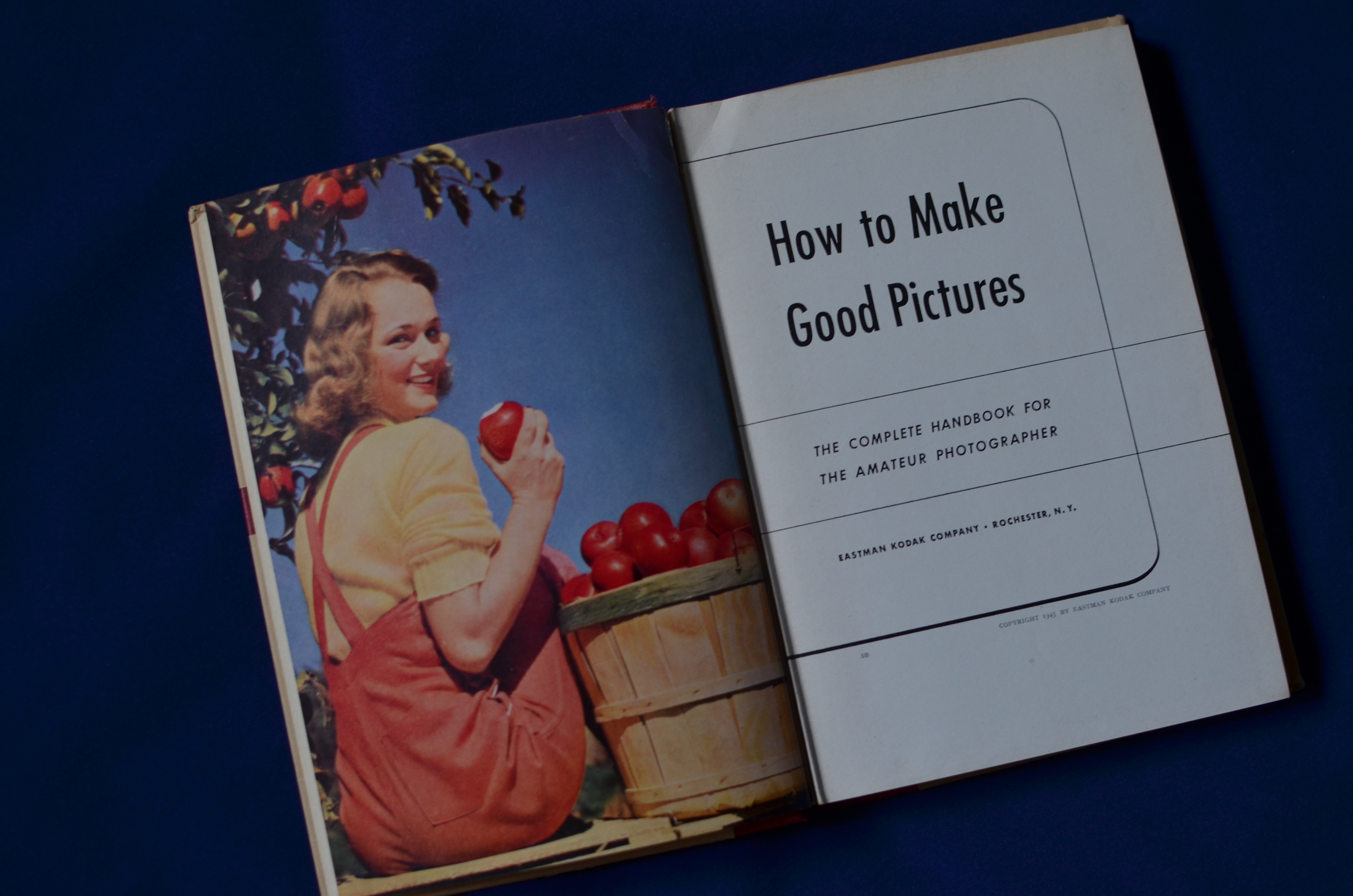
The Long-Distance Runner: The Most Successful Photography Instruction Series In History, Eastman Kodak’s How To Make Good Pictures (28th Edition,1943-47). From the collection of the author.
By MICHAEL PERKINS
KODAK’S SAD AND WOBBLY RE-EMERGENCE FROM BANKRUPTCY, announced this week, finalizes the process of “saving” a famous name, while annihilating the legacy of innovation that made that name great for over a century. Having already said goodbye to Kodachrome, most of its other trademark films, and camera production itself, Kodak will now concentrate on “imaging products”, which, for, most of us, means “printers”. Most of the news coverage of this corporate resurrection will “focus” (sorry) on what the new company stock will be worth, who goes, who stays, and a few scant mentions of the company’s original role as camera producer to the world.
That will leave a significant part of the story untold.
Certainly, George Eastman’s genius for marketing helped develop the first flexible roll films, then ingeniously created a market for them by putting a basic, usable camera in the hands of the Everyman. Nearly everyone has heard the slogan Kodak created to demonstrate how truly effortless its products had made photography: you press the button and we do the rest. But none of that would have guaranteed the company’s growth if Kodak has not also decided to become photography’s first great mass teacher, creating pro-active education programs to guarantee that, not only could Uncle Clem snap a photo easily, he could snap a good photo easily. What had once been a dark art for a select cabal of techno-wizards became, under Kodak’s outreach, something that could anybody could do.
And Kodak was going to show you how to do it.
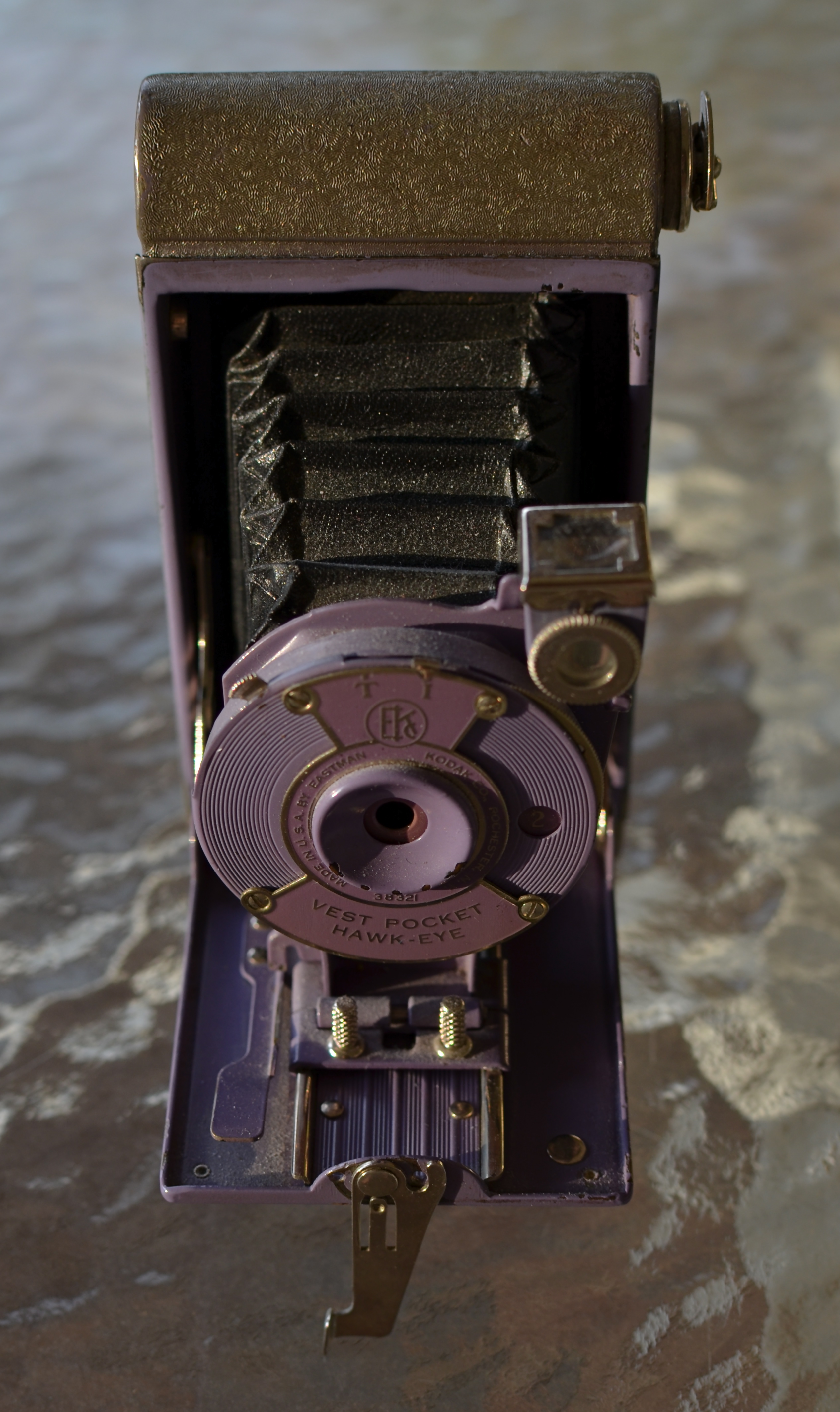
There was a time when this Kodak Vest-Pocket Hawkeye was truly intimidating. How To Make Good Pictures made it your friend.
Beginning before the end of the Victorian era, the company began to publish the first of an endless stream of practical guides on technique and simple theory aimed at the average shutterbug. Starting in 1898 with Picture Taking And Picture Making (115 pages of tips in a cardboard cover for fifty cents!), Eastman Kodak moved to 1905’s The Modern Way In Picture Making, and, finally, to the most successful photo instruction series in history, How To Make Good Pictures, introduced in 1912 and revised continually until finishing up with its 37th edition, in 1995. Over the years the “make” in the title had been changed to “take”, and its 1890’s essays on bromide paper, collodion matte, and ground-glass focusing had evolved, over the decades, to instructions on the use of flash, color, drop-in film cartridges, and “how to tell a picture story” with your Kodacolor slides. Hundreds of printings and millions of sales later, How To Make Good Pictures forged an ironclad link between consumer and company in a way no corporation before or since has done.
To everything there is a season. Kodak’s (now historically) tragic failure to see digital photography as a viable consumer revolution, until it was too late, is a matter of raw record. The company that taught the world to see had a blind spot, a fatal one, and the irony that nearly all of the rest of the industry developed digital technology by applying processes originated (and patented) by Kodak makes the story even sadder.
But, once upon a time, the Eastman Kodak Company not only knew what the future of photography was going to look like, it wrote a handy dandy little book that told everyone how to master that future.
Follow Michael Perkins on Twitter @MPnormaleye
Related articles
- Kodak moments are just a memory as company exits bankruptcy (kansascity.com)
FAREWELL, THING 1 AND THING 2

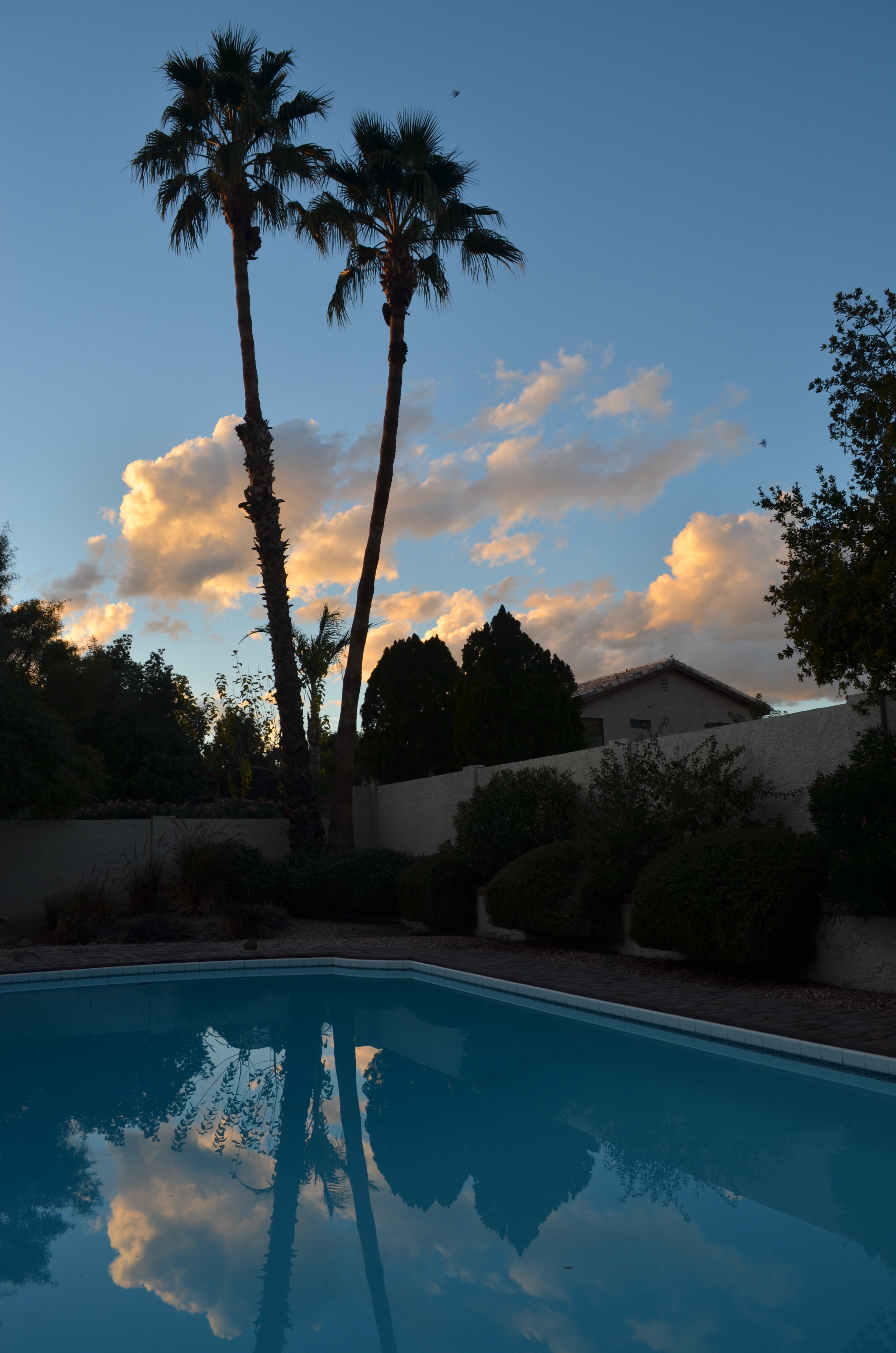
Sunshine Superman: Our landscaper floats with the greatest of ease between our now departed palm trees. 1/400 sec., f/8, ISO 100, 86mm.
By MICHAEL PERKINS
BETTER MINDS THAN MINE have already taken note of the fact that 2013 marks the 100th anniversary of the penning of Joyce Kilmer’s poem Trees, a short bit of cozy verse which is either beloved sentiment or dreadful dreck, depending on which literary camp you pitch your tent in. I would have to confess that I find Kilmer’s ditty too cute by half, sort of the rhyming equivalent of a Thomas Kinkade painting, but, that said, faced with either the specious cause of “progress” or the faith it takes to plant trees, I side with the trees.
Every time.

Sunset Shade: 1/500 sec, f/5.6, ISO 100, 35mm.
This particular better angel of my nature comes from observing
Coral & Azure: 1/100 sec., f/8, ISO 100, 18mm.
my father, to whom a connection between the soil and the soul is palpably real. If he were to assemble his version of The Avengers, he would sub out Whitman, Emerson, Thoreau and St. Francis for Iron Man, Thor, The Hulk, and Cap America. To watch him will twigs to vigorous life, or summon forth roses from wishes over the decades is to truly “get it”. He was Earth Day before Earth Day was cool. He was Rachel Carson in reverse drag.
So I have to pause for just a post’s-worth of mourning at the recent loss of two enormous palm trees from our place in Phoenix. These were not important trees in any grand sense; they afforded no shade, bore no fruit, marked no key battlefield. No children’s swings ever hung from their heights, and, as for sheltering purposes, they were little more than a beak sharpener for the neighborhood’s woodpecker.
Still.
The palms’ annual shower of spring litter had become a sore point between our team and the next neighbor over. What had, at lesser heights, been at least decorative additions to the yard had become, twenty years on, a pain in the astroturf. So down Thing One and Thing Two went, and, with them, one of my favorite visual elements in that part of the property. Going back through the foto files in the depths of the Perk Cave recently, I saw them taking a star turn, again and again, most notably as a skybound workout for our daring landscaper. He was part of the crew that eventually sliced, diced, and hauled them away, and with respect and admiration, his lofty Olympic feat is featured here.
So, even though I will never exactly be the Lorax, and even though I think Kilmer was a hack, I myself seldom see a “poem lovely as a tree”, and I still peer quizzically when its old hunk of skyspace seems deserted somehow.
I suddenly feel like planting something.
Follow Michael Perkins on Twitter @MPnormaleye.
Related articles
- “I think that I shall never see…”: Joyce Kilmer as War Poet (pietistschoolman.com)
THE COLORS OF DREAMS
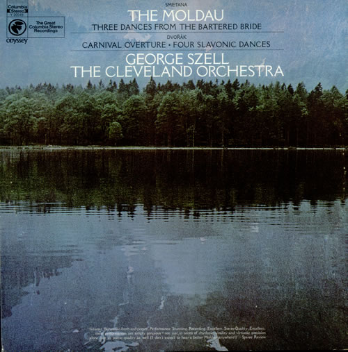
I will never know the name of the stock photographer at Columbia Records who shaped me with this image. But I know his genius.
By MICHAEL PERKINS
ONE OF THE TRICKIER PARTS OF BEING MY AGE is that I have been carrying around certain creative influences inside my skull for so many consecutive decades that their origins often blur. Who said it? Where did I brush up against that angle, that idea? Where did I see it? Book? Movie? Conversation? Who brought me into contact with this treasure? Inspiring mentor? Loving teacher? Teaching lover?
Of course, it can be argued that what you walked through the door to discover matters more than the door itself.
Maybe. But for me, the door and the room it leads to are two halves of one whole.
For most of my life, I have been fascinated by the intentional “un-realing” of color, the hypnotic spell of hues that weren’t “that way in nature”, but, through interpretation, could add drama and impact, even magic to the final version of an image. About a week ago, I was reminded of one important reason why I feel that way.
Researching composer Bedrich Smetana’s gorgeous musical love poem to his homeland, The Moldau, I set eyes on an image that I had not seen for over forty years; the cover photograph for a recording of Moldau by George Szell and the Cleveland Orchestra that I purchased in the 1970’s. My own copy of the original LP is long gone, but I still own a reissue of the performance, music that afforded my teenage self a serenity, a dream quality, a magic that travels within me to this day. In true “multi-media” fashion, I never listened to the original album without its cover within clear sight, its blue-green image of a soft-focus lake and forest quieting my nerves, inducing the music’s spell again and again.
One one level I knew that the colors in the photograph were not “natural” in the strictest sense, but they were nonetheless hypnotic. Through them, I saw Smetana’s homeland, its villagers, its folks rituals, and the beautiful river Vlatava. For me, the picture was the music, and the music was the picture. Energy flowed seamlessly from one conception of beauty to the other.
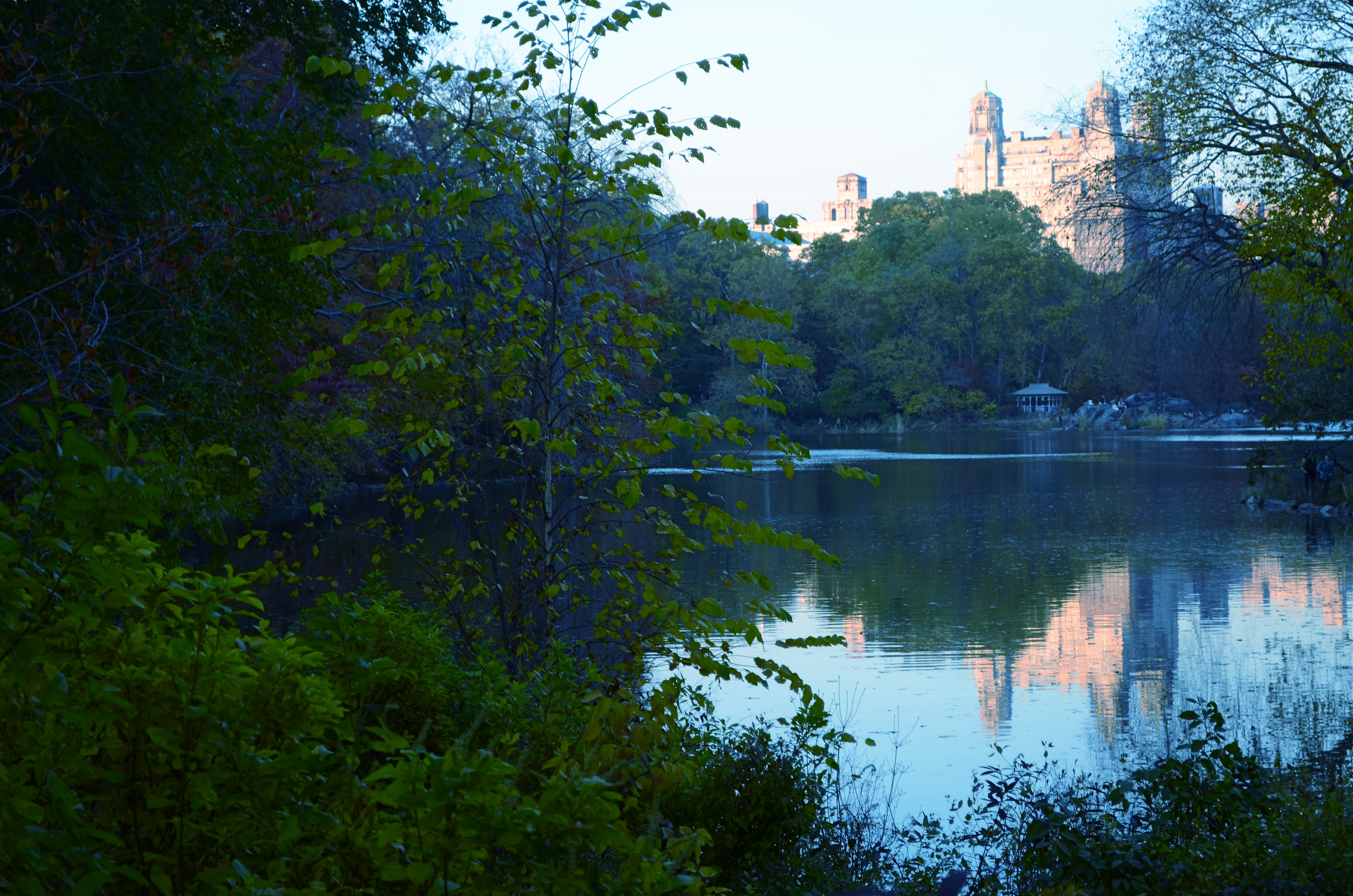
The Lake, Central Park West, NYC., 2011. 1/80 sec., f/5.6, ISO 160, 50mm.
Some of my own work, naturally, strives for this quality, the ability of a photograph to unchain the mind, to allow feelings to flow, to allow color to be abstracted, just like language or music. Some will call it influence, others imitation. I prefer to think of it as respect. And while I will never know the name of the stock photographer whose image was probably slapped onto The Moldau’s album cover as a clerical afterthought, I love it when I see his work leak through my fingers, if only a little.
Shade your dreams however you like.
And let the music surrender its colors.
Follow Michael Perkins on Twitter @MPnormaleye.
THREE STRIKES AND YOU’RE…IN?
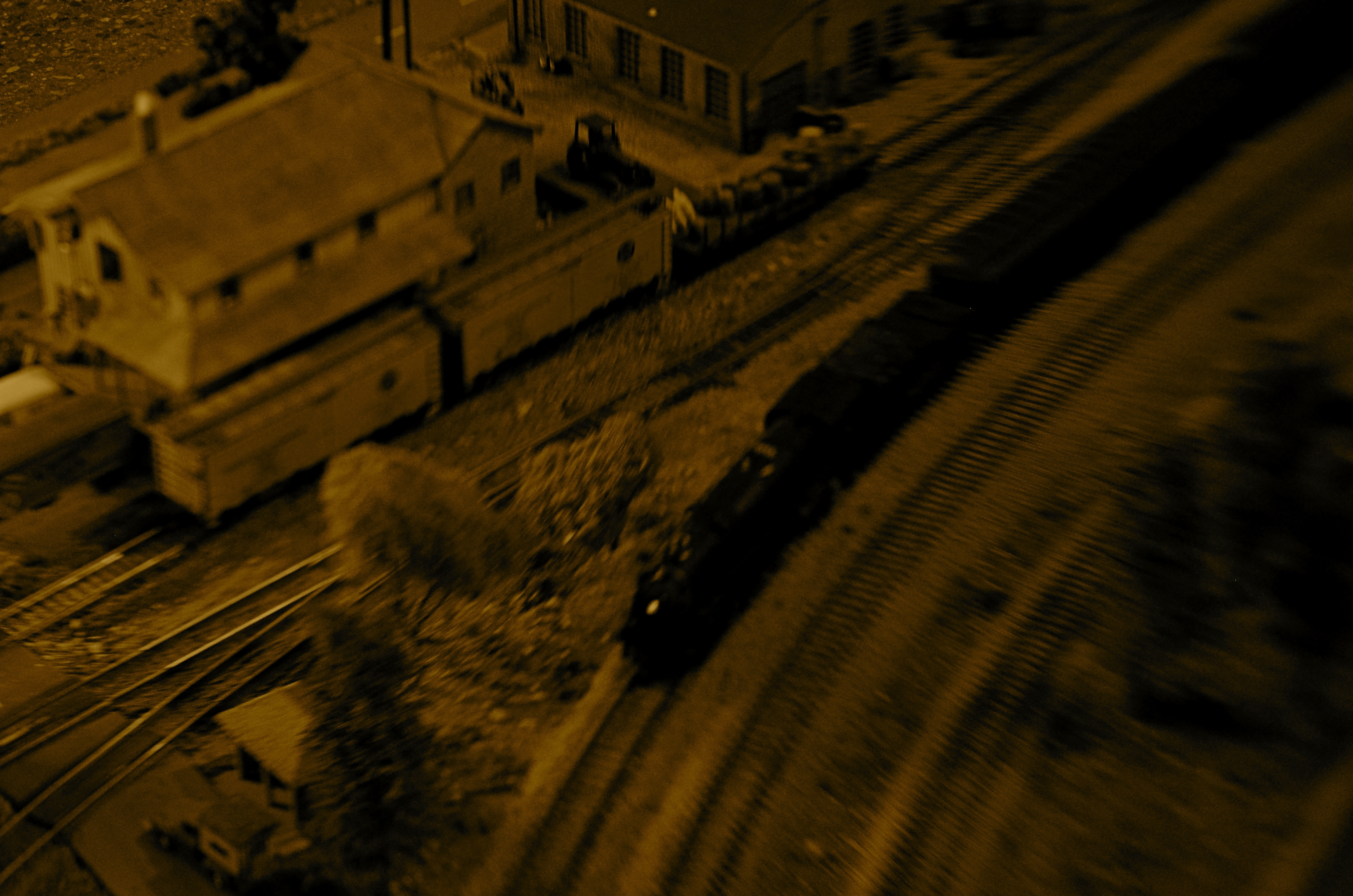
“Wreck Of The Old ’87”. Wreck is right. 1/80 sec., variable depth of field created with a Lensbaby attachment, ISO jacked to 640, 35mm.
By MICHAEL PERKINS
WHEN SORTING MY IMAGES INTO KEEPERS AND CLUNKERS, I ALWAYS SUFFER THE SAME BIAS. Whereas some people might be too eager to find reasons why a picture should be inducted into the former group, I nearly always search for reasons to toss them into the latter one. I always know right away what I’ve failed to achieve in a given frame, and its flaws glow like safety orange in my brain to the point where I not only can’t credit myself for the photo’s stronger elements, I can no longer even see them. I therefore consign many pictures to the rubbish heap, a few of them prematurely.
Usually, however my first call is the right one. I very seldom revisit a picture I initially disliked and find something to redeem it. So it was kind of headline news when I recently “saved” a photo I had originally (and wisely) savaged. Hell, I’m still ambivalent, at best, about it, but I can’t truly classify it as an outright Lost Child anymore.
It came from a random day of practice I had undertaken with a Lensbaby, one of those effects lenses designed to give you the ability to manually throw parts of your image out of sharp focus, in fact to rotate around and create various “sweet spots” of sharpness wherever you want to. I don’t use the thing a lot, since it seems, on some level, damned silly to put defects into your pictures on purpose just to convince yourself you are, ahem, an artiste. But, all work and no play, etc. etc., so I was clicking away inside a dimly lit building at a railway museum in which a huge layout of miniature train dioramas is a regular attraction. I seemed to be going out of my way to create a picture that would normally be “three strikes and you’re out”…..that is:
poorly lit, and loving it
poorly focused, otherwise known as, sure, I meant to do that, and
a half-baked attempt to make something fake appear real.
Only one of the shots sparked my interest at all, purely because it seemed to contain a sort of… mystery. So many dark corners. So many unexplained details. A very disorienting, dreamlike quality that had to have jumped into the camera without any help from me. It looked both hyper-real and utterly false, simultaneously fearsome and fascinating. Again, this all happened in spite of, not because of, any action on my part. I added no post-processing to the shot, except to desaturate it and slather on a layer of sepia. Other than that, I left it in its original sloppy, random state.
And then I decided it was still junk and forgot about it for a few months.
Just why I have, in recent days, tried to rehabilitate my thinking about it is anyone’s guess. Like I sad at the top, I look for reasons to reject my work, not excuse it. This has little to do with modesty. It’s just an admission that control is so much a part of my make-up that I recoil from images where I seem to have absolutely relinquished that control. They scare me a little.
But they thrill me a little too. And, as Vonnegut says, so it goes.
Perhaps the best thing is to maintain the Keepers and Clunkers piles, but add a third, labeled “Not Really Sure”.
Follow Michael Perkins on Twitter @mpnormaleye.
Related articles
- Peering Through a Shaft of Light (johnbee.ca)
SCULPTING WITH SHADOWS
By MICHAEL PERKINS
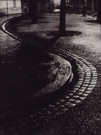
Brassai‘s world came to light at night.
ONE OF THE MIRACLES OF CONTEMPORARY PHOTOGRAPHY is how wonderfully oblivious we can afford to be to many of the mechanics of taking a picture. Whereas, in an earlier era, technical steps 1, 2, 3, 4 ,5, and 6 had to be completed before we could even hit the shutter button, we now routinely hop from “1” to “snap” with no thought of the process in between.
In short, we don’t have to sweat the small stuff, a truth that I was reminded of this week when imitating one of photographer’s earliest masters of night photography, Gyula Halasz, or “Brassai”, a nickname which refers to his hometown in Romania. Starting around 1924, Brassai visually made love to the streets of Paris after dark with the primitive cameras of the early 20th century, sculpting shape from shadow with a patiently laborious process of time exposures and creating ghostly, wonderful chronicles of a vanished world. He evolved over decades into one of the most strikingly romantic street artists of all time, and was one of the first photographers to have a show of his work mounted at New York’s MOMA.
Recently, the amazing photo website UTATA (www.utata.org), a workshop exchange for what it calls “tribal photography”, gave its visitors a chance to take their shot at an homage to half a dozen legendary visual stylists. The assignment asked Utata members to take images in the style of their favorite on the list, Brassai being mine.
In an age of limited lenses and horrifically slow films, Brassai’s exposure times were long and hard to calculate. One of his best tricks was lighting up a cigarette as he opened his lens, then timing the exposure by how long it took for the cig to burn down. He even used butts of different lengths and widths to vary his effect. Denizens of the city’s nightlife, walking through his long shots, often registered as ghosts or blurs, adding to the eerie result in photos of fogbound, rain-soaked cobblestone streets. I set out on my “homage” with a tripod in tow, ready to likewise go for a long exposure. Had my subject been less well-lit, I would have needed to do just that, but, as it turned out, a prime 35mm lens open to f/1.8 and set to an ISO of 500 allowed me to shoot handheld in 1/60 of a second, cranking off ten frames in a fraction of the time Brassai would have needed to make one. I felt grateful and guilty at the same time, until I realized that a purely technical advantage was all I had on the old wizard.
“Faux Brassai”, 2013. Far easier technically, far harder artistically. 1/60 sec., f/1.8, ISO 500, 35mm.
Brassai has shot so many of the iconic images that we have all inherited over the gulf of time that one small list from one small writer cannot contain half of them. I ask you instead to click the video link at the end of this post, and learn of, and from, this man.
Many technical land mines have been removed from our paths over photography’s lifetime, but the principal obstacle remains…the distance between head, hand, and heart. We still need to feel more than record, to interpret, more than just capture.
All other refinements are just tools toward that end.
THANKS TO OUR NEW FOLLOWERS! LOOK FOR THEM AT:
http://www.en.gravatar.com/icetlanture
http://www.en.gravatar.com/aperendu
Related articles
- Wonderful Photos of New York in 1957 by Brassaï (vintag.es)
LEARNING TO LIVE WITH “THE NUMBER”
Will I have any regard for this image in five years? Ten? How about in six months? And why? 1/40 sec., f/9, ISO 100, 50mm.
By MICHAEL PERKINS
IT’S GUARANTEED. OVER OUR LIFETIMES, YOU AND I WILL TAKE REMARKABLE PHOTOGRAPHS.
There just won’t be a lot of them.
And that’s very good news.
Ansel Adams once remarked that “twelve significant photographs in any one year is a good crop”.
That’s right. Twelve.
Now, given the percentage of the massive Adams output that actually turned out to be flat-out amazing, the reverse math for how many “close, but no cigar” frames he shot would be staggering. And humbling. This after all, is a man who “experimented” with color for over thirty years, only to lament, near the end of his life that “I have yet to see–much less produce–a color photograph that fulfills my concepts of the objectives of art.” Bear in mind, also, that this lament is not coming from a hipster Instram-ing artsy close-ups of what he had for lunch.
What does this mean for us? It means that there is a number out there, the figure that enumerates how many flops we will have to be content with in order to get our own, small yield of golden eggs.
Learning to live with that number is the best hope have of getting closer to what we can be.
I can’t measure my work against anyone else’s, since “that way lies madness”. I can only mark how far I am along my journey by the distance between what made me smile today and the stuff I used to be able to look at without suppressing a strong gag reflex. Guess what: the same work that makes me want to gouge out my eyes with soup spoons, in the present, is often the exact same work that made my chest swell with pride, just the day before yesterday.
And that’s the way it should be. If your style is so wonderfully complete that it can’t be further improved on, then smash your camera on the street below and move on to something else that has the potential to either spank your ego or kick your creative butt. We’re not in this to get comfortable.
Ansel Adams one more time:
There is nothing worse than a sharp image of a fuzzy concept.
Yes, huzzah, what he said. Here’s to staying sharp.
And hungry.
And hard to please.
follow Michael Perkins on Twitter @mpnormaleye and on Flickr at

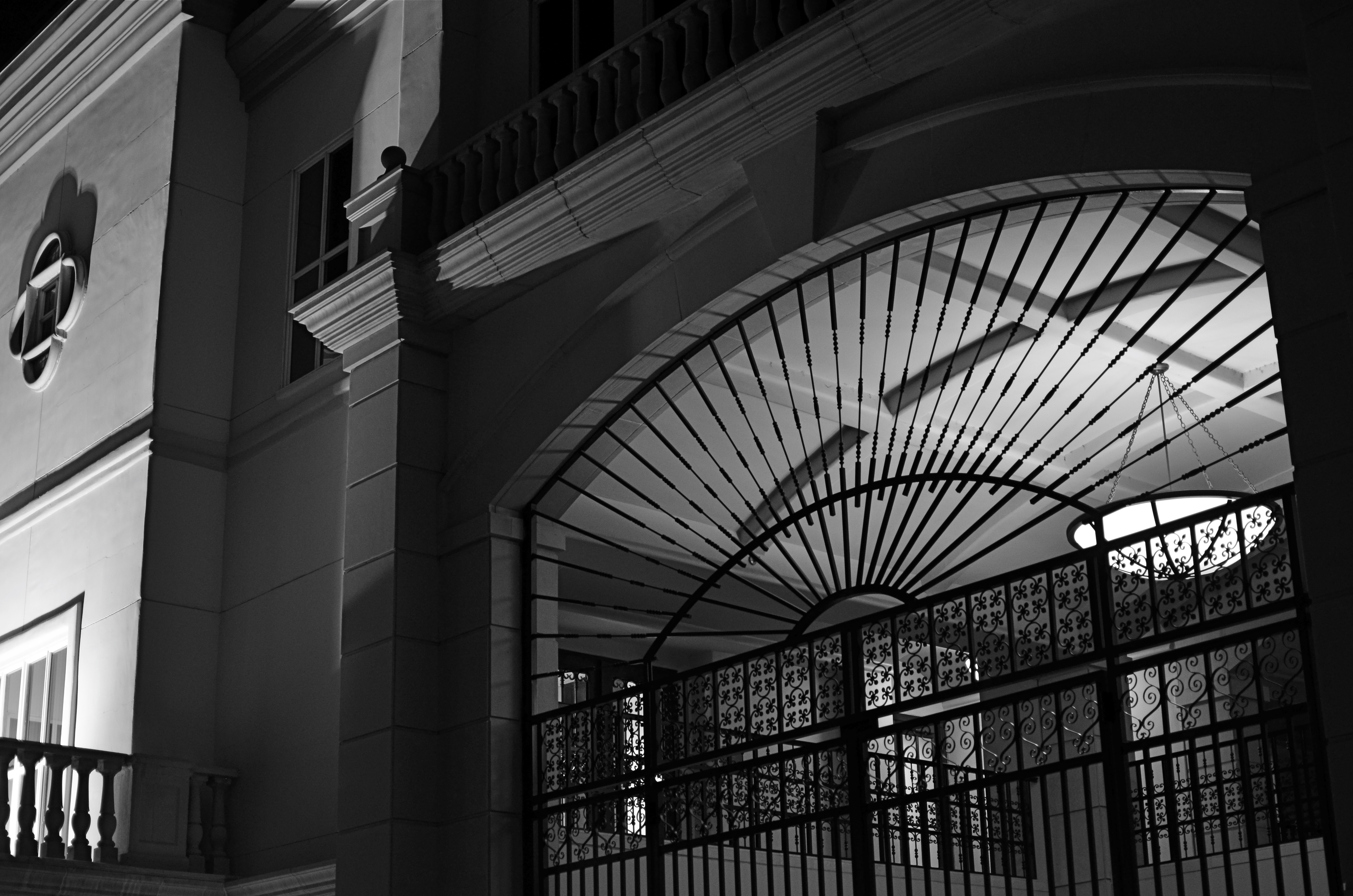
SPLIT INFINITIVES
Consignment Shop, Manhattan. 1/80 sec., f/5.6, ISO 100, 35mm.
By MICHAEL PERKINS
IF YOU’RE OLD ENOUGH TO REMEMBER WHEN USE OF THE WORD “AIN’T” LABELED YOU AS A GRAMMATICAL LOWBROW, you may also recall the snooty disdain reserved for a verbal construction called the split infinitive. A simple infinitive involved following the preposition “to” with an action verb, such as “go”. To split the infinitive, the writer or speaker inserts an adverb between the two words for an extra boost of emphasis. Thus, in the most famous split infinitive ever, Gene Roddenberry invited Star Trek viewers
to boldly go where no man has gone before.
Nice, right? A little extra drama. A slight bending of the rules that delivers the goods.
Photography has a formal “grammar” about composition that also begs for a kind of “split infinitive”. Strictly speaking, compositions are supposed to be simple, clean, uncluttered. A perfect line of visual data from top to bottom, left to right. A picture frame, if you will, an organized way of seeing.
Attractive yes, even desirable, but a must? Nope. Life itself, as we observe it everyday, is far from a series of perfect frames. Lines of sight get broken, fragmented, blocked. Nature and light conspire to take that flawless composition and crash it, refract it, photobomb it until it resembles, well, life. And yet we often try to take pictures that show the very opposite of the sloppy, imprecise nature of things.
We try for “perfection” instead of perfect concepts.
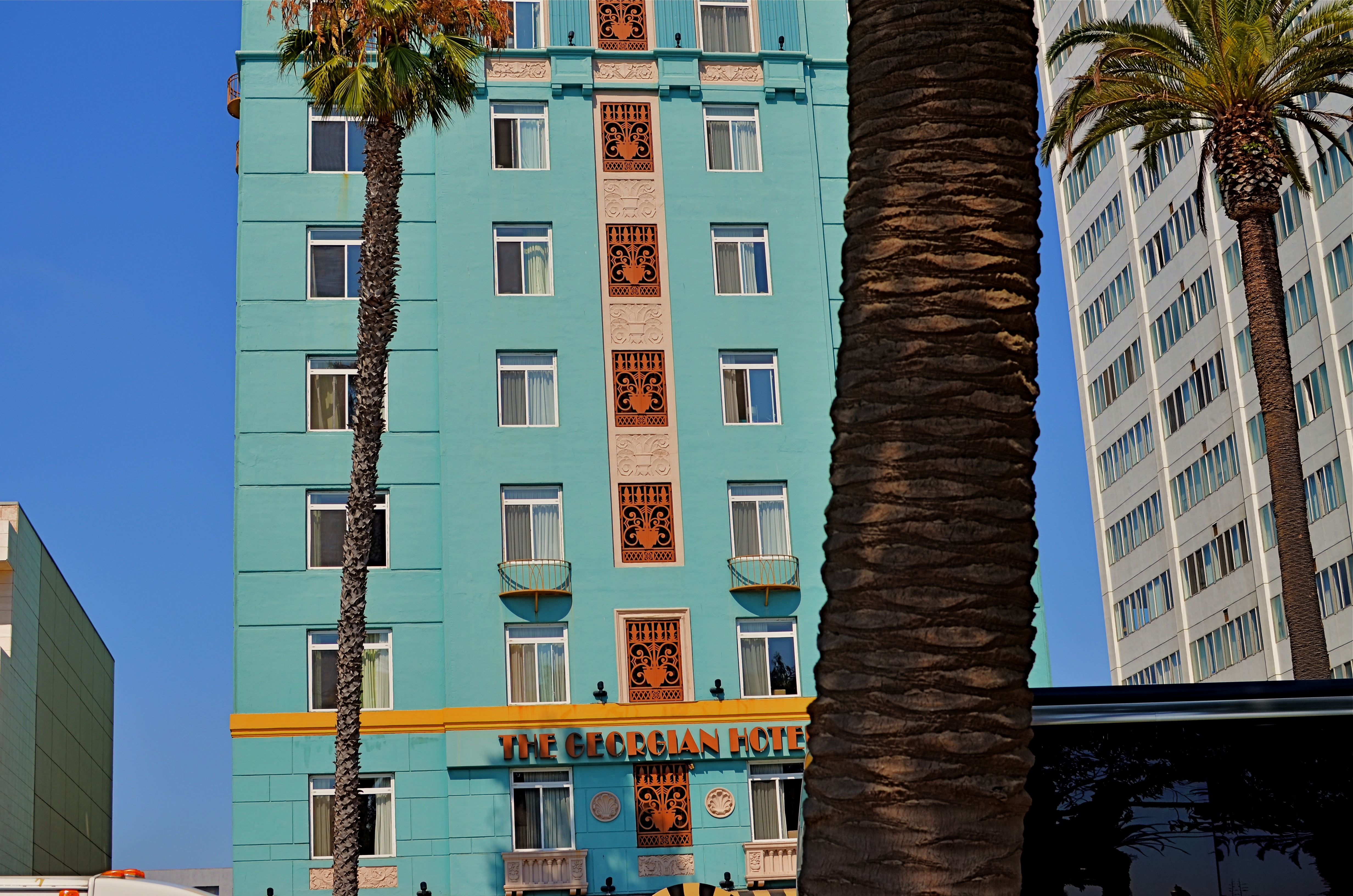
Georgian Hotel, Santa Monica, CA. 1/60 sec., f/5.6, ISO 100, 35mm.
Reviewing images for the last several years, I find that I am taking more compositions on their own terms, with light poles, weird reflections, broken planes of view and shadows all becoming more welcome in my final photos. I still labor to get a clean look when I can. But I also make peace with elements that used to doom a photo to the dustbin.
Street scenes especially can better reflect the visual chaos of busy cities if everything isn’t “just right”. It’s really hard (at least in my case) to tear out the mental hardwiring of a lifetime and take a picture that may be more abstract or cubist than I ever thought I could allow myself to be. Maybe it’s a function of aging, but things seem to be relaxing in my approach. Don’t get me wrong. I’m still Alpha Male enough to want to bring everything in a frame under my unswerving control. I just don’t get blood pressure when circumstances force me to unclench my iron fist once in a while.
It’s a process.
To see, yes, but, in allowing my visual infinitives to be occasionally split, it means learning to differently see.
Follow Michael Perkins on Twitter @mpnormaleye.
Welcome to our newest followers. Check out their mad genius at:
CHASING THE SENSATION
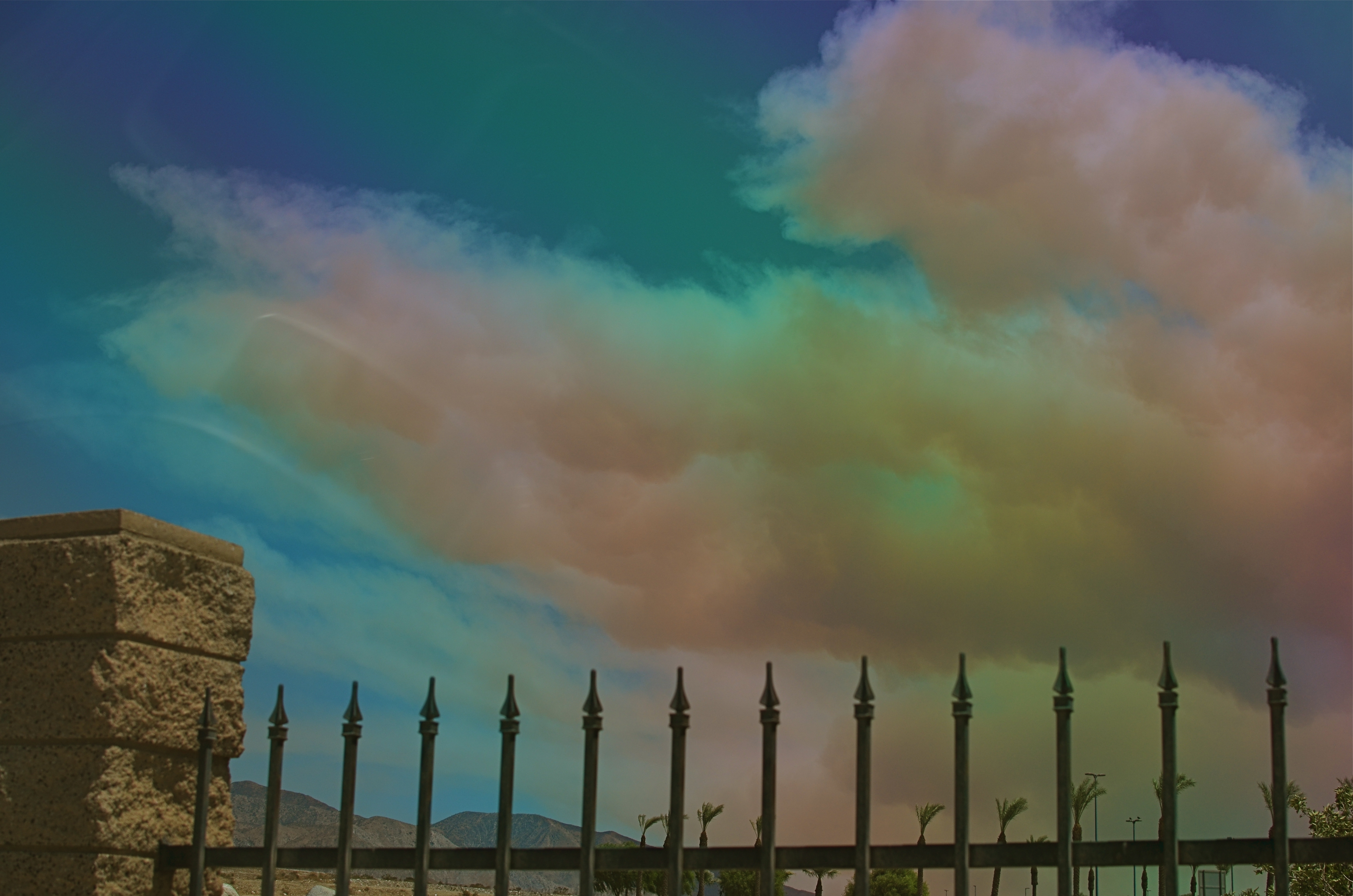
Wildfire, Cabazon, California, August 8, 2013. 1/500 sec., f/5.6, ISO 100, 35mm.
By MICHAEL PERKINS
SHOOTING LARGE SUBJECTS IS OFTEN MORE CHALLENGING THAN CAPTURING STORIES NEAR AT HAND. If you’re doing a tight frame around a bowl of fruit, there may be more than only one story for the shot, but, compared to trying to find the essential visual core of a vast area, it’s not really the stuff of MENSA club meetings. When you’re shooting tight, the message, the central spine of the idea reveals itself fairly quickly. Panning over an immense scene, the story is “out there”, but your editor’s eye will certainly get a more rigorous workout in paring away the unneeded extras.
Important note before we continue: I am not a storm chaser. I lack the mixture of admirable fortitude and creepy bravado that allows people to take truck and gear in hand in an insane game of dodge-ball with a meteorological Godzilla. So, if I am in the position to grab a moment during one of Mother Nature’s more picturesque tantrums, it’s purely a case of being in the right place at the right time. I am not intrepid. To my thinking, the only thing cool about being Indiana Jones is, you get to wear a seriously rockin’ hat.
Thus, the above frame is largely luck, the very casual luck associated with pulling off the road for a rest stop precisely as something is becoming interesting. The cloud you see belongs to a horrible wildfire that tore through more than 20,000 acres in California’s San Jacinto Mountains last Thursday, August 8, 2013. From our westward trek toward Los Angeles on the I-10, most of what we saw of the fire, for nearly 100 miles, was a dense, diffuse haze which more closely resembled Pollution’s Greatest Hits of 1968 than a fire. However, during our leg-stretcher at the wonderful Hadley Fruit & Nut superstore in Cabazon, California, it was finally possible to see a salmon-colored, tightly defined cloud of fire smoke, snaking its way southward across the freeway, billowing to the size of a football stadium over the mountainous terrain near our car.
The cloud was a free, here-you-are gift, the central part of the story, but the shot wasn’t ready. I needed some earthly point of reference to convey its size, and all I had were distant palm trees and fairly featureless terrain. Fortunately, there was a short masonry wall that marked Hadley’s lot from those of its neighbors, and, crouching down a bit, I could bring it into frame as some way to contextualize the cloud monster. The other problem was haze, which was rendering all colors too faintly, given the high position of the sun reading off the smoke. A simple screw-on polarized filter cut the haze and delivered the hues. Click and done.
Back in the car, far away from the Devil Cloud, and on to L.A.
With a lucky frame in the back seat.
And walnuts and raisins in the front.
Follow Michael Perkins on Twitter @MPnormaleye, and view his Flickr photostream at:
OF BIRDS AND BARRIERS
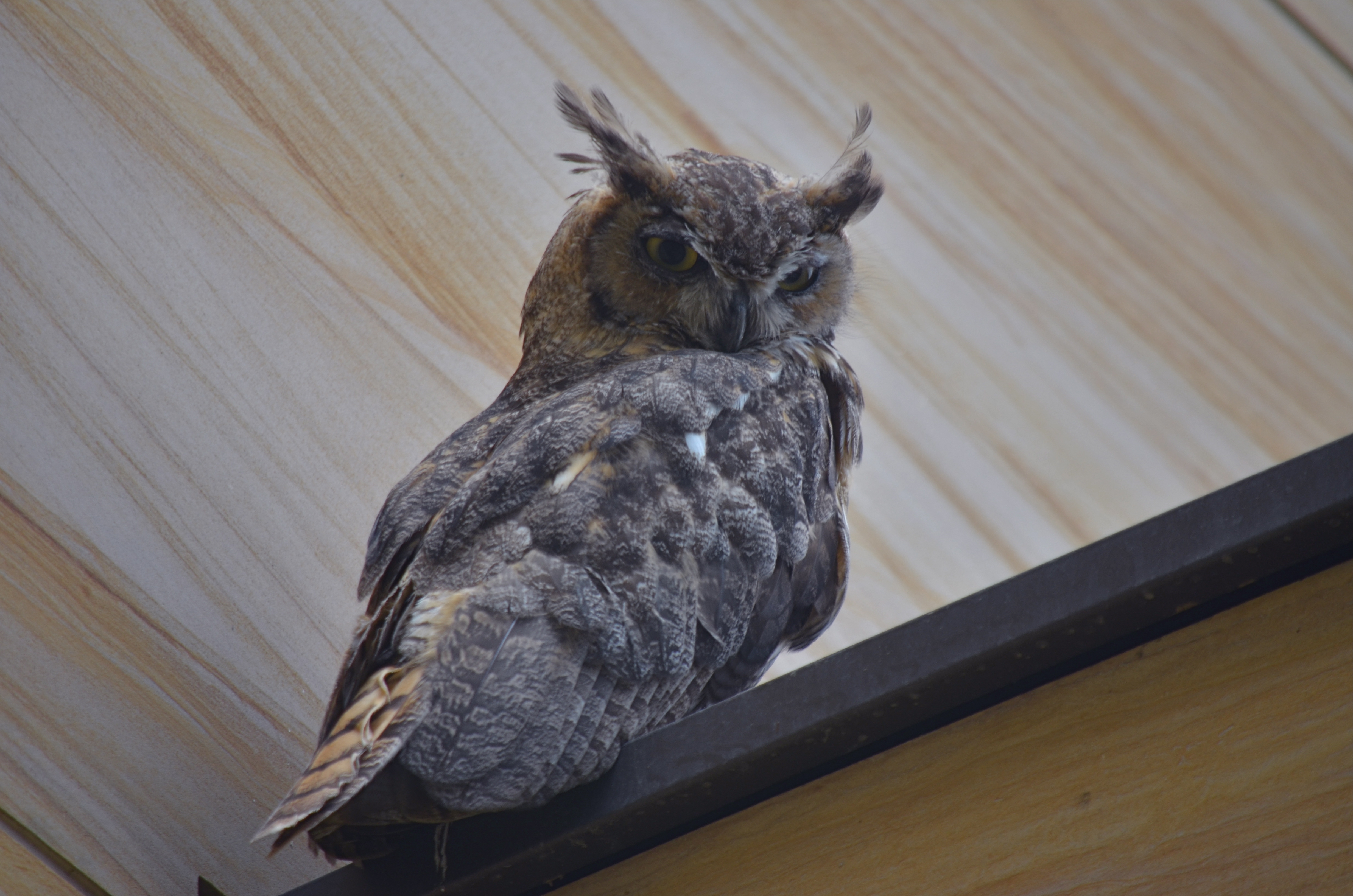
Zoom lenses, while great, price many shooters out of the market for making shots like this. 1/160, f/5.6, ISO 100, 300mm.
By MICHAEL PERKINS
PHOTOGRAPHY IS ART’S GREATEST “DEMOCRATIZER“, a medium that levels the playing field for creative minds as no other medium can. “Everyone gets a shot”, goes the old saying, and, today, more than ever, the generation of images is so available, so cost-effective that almost anyone can play.
Yes, I said almost. Because even as cameras become so integrated into our devices and lives as to be nearly invisible, there is at least one big stump in the road, one major barrier to truly universal access to image-making. That barrier is defined by distance and science.
For those longing to bring the entire world ever closer, zoom lenses and the optics they require still slam a huge NO ADMITTANCE door in front of many shooters, simply because their cost remains beyond the reach of too many photographers. Lenses going beyond around 300mm simply price users out of the market, and so keep their work confined in a way that the work of the rich isn’t.
Look at the metadata listed in the average “year’s best” or “blue ribbon” competitions in National Geographic, Audubon, Black & White, or a score of other photo magazines. Look specifically at the zoom ranges for the best photos of birds, insects and general wildlife. The greatest praise is heaped on images taken with 400, 600, 800mm glass, and rightfully so, as they are often stunning. But the fiscal wall between these superb optics and users of limited funds means that many of those users cannot take those images, and thus cannot compete or contribute in the same way as those who can afford them. For an art that purports to welcome all comers, this is wrong.
The owl image at the top of this post fell into my lap recently, and I was able to take advantage of this handsome fellow’s atypical appearance at a public place with the help of a 300mm lens. But that’s only because (A) he was still only about forty feet away from me, and (B) he is as big as a holiday ham. If he and I had truly been “out in the wild”, he would have been able to effectively enforce his own no pictures today policy, as I would have been optically outflanked. Two options would thus emerge: drop thousands for the next biggest hunk of glass, or take pictures of something else.
I am for anyone being able to take any kind of picture, anywhere, with nothing to limit them except their vision and imagination. Unfortunately, we will need a revolution on the high end of photography, such as that which has happened on the entry level, to make the democracy of the medium universal and complete. We need an “everyman” solution in the spirit of the Kodak, the Polaroid, and the iPhone.
The world of imaging should never be subdivided into haves and have-nots.
follow Michael Perkins on Twitter @mpnormaleye.
SECOND SIGHT, SECOND LIFE
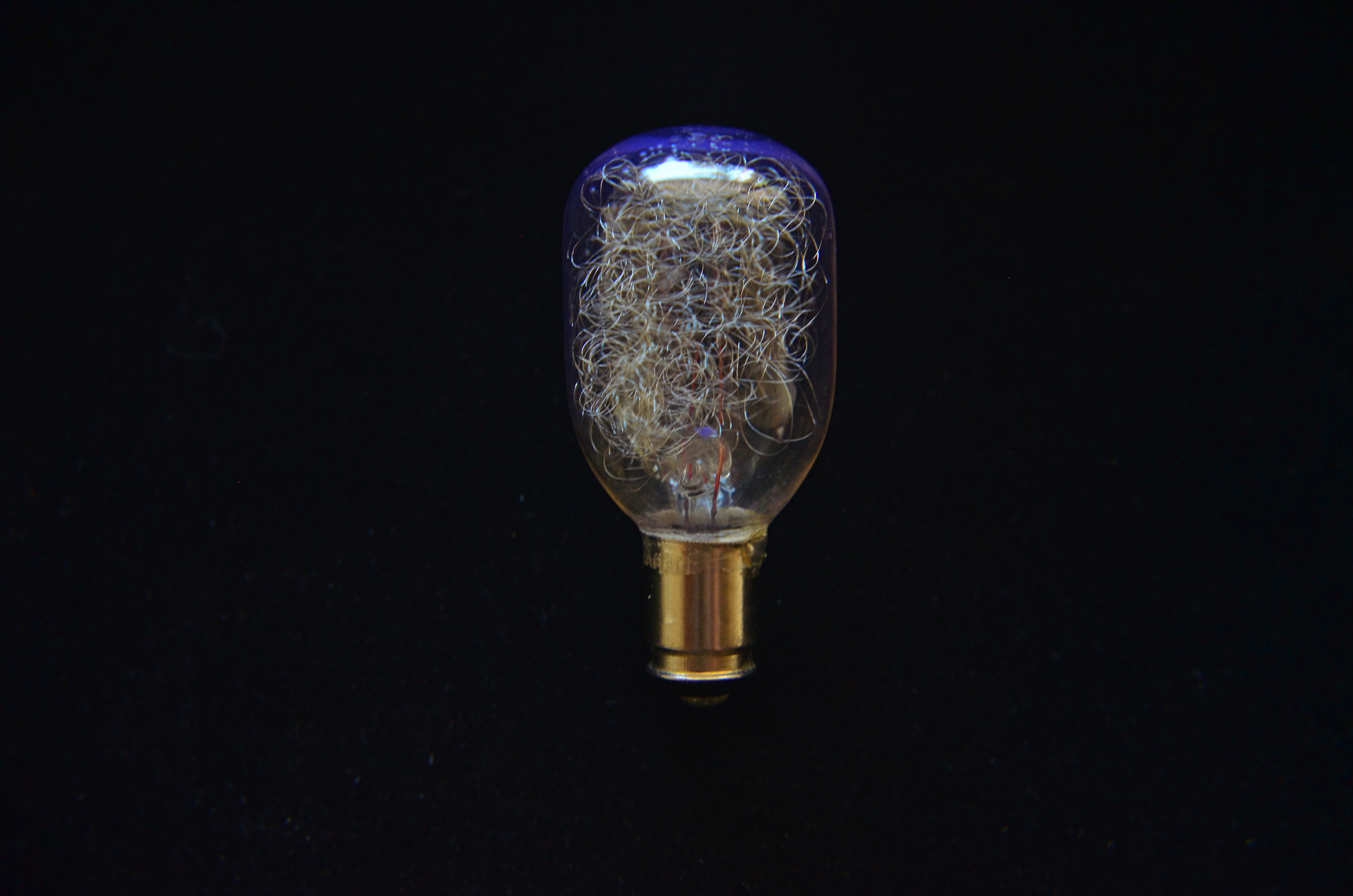
Pragmatically “useless” but visually rich: an obsolete flashbulb glows with window light. 1/80 sec., f/5.6, ISO 640, 35mm.
By MICHAEL PERKINS
A DECADE-AND-A-HALF INTO THE TWENTY-FIRST CENTURY, we are still struggling to visually comprehend the marvels of the twentieth. As consumers, we race from innovation to innovation so amazingly fast that we scarcely apprehend the general use of the things we create, much less the underlying aesthetic of their physical forms. We are awash in the ingenuity of vanishing things, but usually don’t think about them beyond what we expect them to supply to our lives. We “see” what things do rather than seeing their essential design.
As photographers, we need not only engage the world as recorders of “reality” but as deliberate re-visualizers of the familiar. By selecting, magnifying, lighting and composing the ordinary with a fresh eye, we literally re-discover it. Second sight gives second life, especially to objects that have outlasted their original purpose. No longer needed on an everyday basis, they can be enjoyed as pure design.
And that’s exciting for anyone creating an image.
The above shot is ridiculously simple in concept. Who can’t recognize the subject, even though it has fallen out of daily use? But change the context, and it’s a discovery. Its inner snarl of silvery filaments, designed to scatter and diffuse light during a photoflash, can also refract light, break it up into component colors, imparting blue, gold, or red glows to the surrounding bulb structure. Doubling its size through use of “the poor man’s macro”, simple screw-on magnifying diopters ahead of a 35mm lens, allows its delicate inner detail to be seen in a way that its “everyday” use never did. Shooting near a window, backed by a non-reflective texture, allows simple sculpting of the indirect light: move a quarter of an inch this way or that, and you’ve dramatically altered the impact.
The object itself, due to the race of time, is now “useless”, but, for this little tabletop scene, it’s a thing made beautiful, apart from its original purpose. It has become something you can make an image from.
Talk about a “lightbulb moment”….
Follow Michael Perkins on Twitter @mpnormaleye.
Related articles
- “A Sight Into My Photographic Mind” (Perspective) (mrphotosmash.wordpress.com)
CORNERING

Tackle a big subject in parts, and thus re-frame its context. A blend of two bracketed exposures with varied shutter speeds, both f/5.6, ISO 100, 55mm.
By MICHAEL PERKINS
PHOTOGRAPHERS ALL HATE THE TASK OF SHOOTING OVERLY FAMILIAR SUBJECTS. The famous. The iconic. The must-stop, we’ll-be-getting-off-the-bus-for-ten-minutes “sights” that decorate every postcard rack, every gift store shelf, in their respective cities. The Tower, the Ruins, the Once-Mighty Palace, the Legendary Cathedral. Things that have more pictures taken of them by breakfast than you’ll have taken of you in three lifetimes. Scadrillions of snaps, many of them composed for the “classic” orientation, an automatic attempt to live up to the “postcard” shot. It’s dull, but not because there is no fresh drama or grandeur left in a particular locale. It’s dull because we deliberately frame up the subject in almost the same way that is expected of us.
There must be a reason we all fall for this.
Maybe we want everyone back home to like our pictures, to recognize and connect with something that is easy, a pre-sold concept. No tricky exposures, no “arty” approaches. Here’s the Eiffel Tower, Uncle Herb, just like you expected to see it.
Yeah, well…
On a recent walking shoot around D.C.’s National Mall, snapping monument upon monument, I was starting to go snowblind with all the gleaming white marble and bleached alabaster, the perfection of our love affair with our own history. After a few miles of continuous hurrahs for us and everything we stand for, I perversely looked for something flawed….a crack in the sidewalk, a chipped tooth on a presidential bust, something to bring forth at least a little story.
Then I defaulted to an old strategy, and one which at least shakes up the senses. Photograph parts of buildings instead of the full-on official portrait of them. Pick a fragment, a set of light values, a selection of details that render the thing new, if only slightly. Take the revered and venerated thing out of its display case and remove its normal context.
The Lincoln Memorial proved a good choice. The basic shot of the front looked like just a box with pillars. A very, very white box. But shooting a bracket of three exposures of just the upper right corner of the roof , then blending them in an exposure fusion program, revealed two things: the irregular aging and texture of the stone, and the very human bit of history inscribed along the crown: the names of the states, with the years they came into the union below them. All at once something seemed unified, poetic about Abraham Lincoln sitting inside not a temple to himself, but a collection of the states and passions he stitched back together, repaired and restored into a Union.
The building had come back alive for me.
And I didn’t even have to shoot the entire thing.
follow Michael Perkins on Twitter @mpnormaleye.
FEWER TOYS, MORE TOOLS
This is Nikon’s “High-Key” effects mode. It’s a cheap gimmick, and you paid for it, even though (a) it is not High Key and (b) you can easily make this shot yourself. 1/30 sec., f/2.8, ISO 1250, 35mm.
By MICHAEL PERKINS
MANY OF THE “ENHANCEMENTS” OFFERED BY TODAY’S MAJOR PHOTO GEAR MANUFACTURERS ARE, IN FACT, OBSTACLES to learning how to take responsibility for making pictures. The automatic bells and whistles that are being engineered into today’s cameras seems to send the message: you don’t have to think too hard. Push the button and we will provide (and predict) the results.
It may be fabulous for convenience, but it’s lousy news for the experimentation and personal risk which are required for great photography to occur.
We live in a time of short cuts, of single-button solutions for every creative problem. We have modes for that. Low light, too much light, a day at the beach, a day in the snow, a closeup, a landscape? Guaranteed results at the dial-up of an automode. Hey, you’re an artist. No need to obsess about all that techno-whatsis. Your camera will determine the results. Just dial up what you want: it’s all automatic. You need hardly be there.
Does anyone really believe that anything of artistic value can evolve from machines being in charge? When’s the last time a computer created a novel of staggering impact? Who is taking the picture here…..you or your camera?
Fully automatic, aperture priority and shutter priority are all good basic tools, and wonderful work is done in all three modes as well as full manual. But there is a huge leap between these settings and the gaudy, gimmicky “effects” modes that are increasingly larding up cameras with novelty and diversion.
Let’s take a look at some of the prime offenders. Are these toys necessary?
NIGHT VISION: If you want a picture to look like you took it while on combat recon in a forward area of Afghanistan, go for this option. Boosts your ISO up to 25,600 so you can get some image on the sensor, even in utter blackness, loaded with grain and visual muck. And why? Useless.
COLOR SKETCH: Concerts your original image into an “arty” rendering, minus the shadows, attenuating tones, or subtlety. Looks just like a classy artist knocked out a masterpiece with his box of charcoals! Fools no one except perhaps extremely learning-challenged chimps. If you want to be a painter, fine, then do it, but let’s stop calling this an enhancement.
MINIATURE EFFECT. Okay, so you can’t afford a real tilt-shift lens to create the illusion that your aerial shot of Paris is really a toy-sized tabletop model, so let’s take your photo and throw selective parts of it out of focus. That should be good enough. We’ll now allow a five-minute pause here for the exactly two times you’ll ever care about making a picture like this.
SELECTIVE COLOR. De-saturate portions of your original for dramatic effect. This is the opposite of the images of a century ago, when people, before color film, added selective hues to monochrome images…for dramatic effect. Only thing is, drama should already be in the picture before you apply this gimmick, hmm? Like many effects modes, this one tempts you to use it to fix a photo that didn’t tell its story properly in the first place. And yes, I have sinned in this area, sadly.
SILHOUETTE. The camera makes sure your foreground subjects are dark and have no detail. In other words, it takes pictures exactly the way your Aunt Sadie did with her Instamatic in 1963. Oh, but it’s so artistic! Yes, cameras always make great art. All by themselves.
HIGH KEY or LOW KEY. This used to mean lightening or darkening of selected items done by meticulous lighting. Now, in Camera Toyland, it means deliberately under-or-overexposing everything in the frame. See earlier reference to your Aunt Sadie.
As far as what should be built into cameras, I’m sure that you could compose your own wish list of helpful tools that could be available as quick-dial aids. My own list would, for example, include the moving of white balance choices from the screen menus to the mode dial. Point is, for every ready-made effect that you delegate to the camera, you are further delaying the education that can only come from doing things yourself. If you want a happy picture, make one, rather than taking a middling one and then dialing up the insertion of a magical birthday cake in the middle of the shot after the fact.
As point-and-shoots are eventually replaced by smartphones and DSLRs position themselves to remain competitive as least on the high-end portion of the market, there seems to be a real opportunity for a revolution in camera design….away from toys and in favor of tools.
follow Michael Perkins on Twitter @mpnormaleye.
HOLDING BACK

Rainy day dream away: 1/160 sec., f/4.5, ISO 100, 35mm.
By MICHAEL PERKINS
THE MIND WANTS TO PAINT ITS OWN PICTURES, and often responds better to art that veils at least part of its message in mystery. The old vaudeville adage, “always leave them wanting something” is especially applicable in the visual arts, where, often as not, the less you show, the better it connects with the viewing public. It’s precisely because you didn’t show everything that your work may reach deeper into people’s imaginations, which are then invited to “partner” in providing what you merely suggested.
This is why radio created more personal “pictures” than television, why an abstract suggestion of on-screen romance is more erotic than full-on depiction of every physical mechanic of an encounter, and why, occasionally, deciding to hold back, to withhold “full disclosure” can create an image that is more compelling because its audience must help build it.
Given the choice between direct depiction of an object and referential representation of it in a reflection or pool of water, I am tempted to go with the latter, since (as is the stated goal of this blog) it allows me to move from taking a picture to making one. Rendering a picture of a tree is basically a recording function. Framing a small part of it is abstraction, thus an interpretive choice. And, as you see above, showing fragments of the tree in a mosaic of scattered puddles gives the viewer a chance to supply the remainder of the image, or accept the pattern completely on its own merits. Everyone can wade in at a level they find comfortable.
I don’t always get what I’m going for with these kind of images, but I find that making the attempt is one of the only ways I can flex my muscles, and ask more of the viewer.
It’s the kind of partnership that makes everything worthwhile.
(follow Michael Perkins on Twitter @mpnormaleye)
Check out the excellent minds of our newest followers:
http://www.en.gravatar.com/insideoutbacktofront
REVELATION OR RUT?
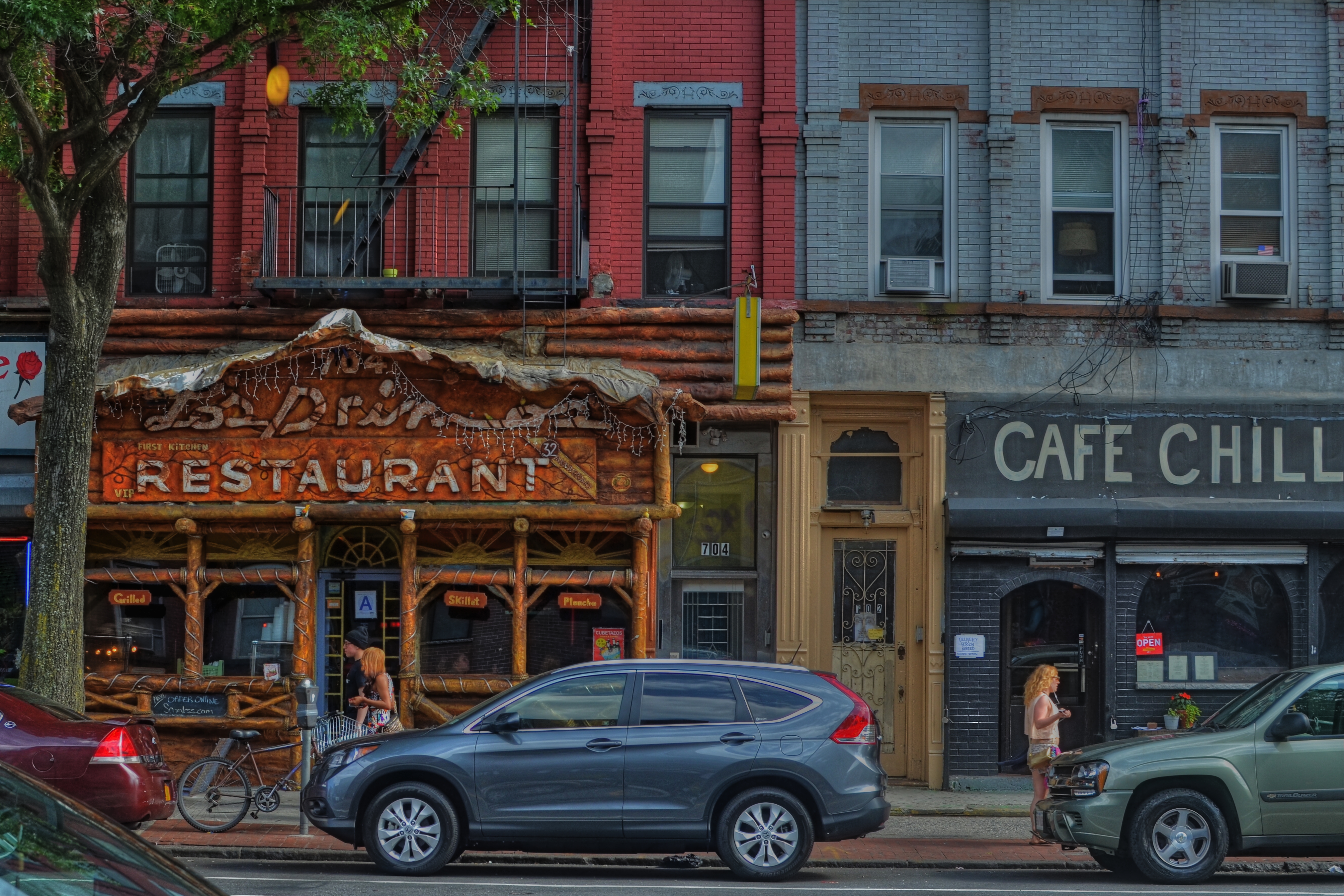
Cafe Chill, Brooklyn, 2013. 1/200 sec., f/5.6, ISO 100, 35mm.
By MICHAEL PERKINS
IT’S OFTEN DIFFICULT FOR PHOTOGRAPHERS, UNDER THE SPELL OF A CONCEPT, TO KNOW WHETHER THEY ARE MARCHING TOWARD SOME LOFTY QUEST or merely walking in circles, their foot (or their brain) nailed to the floor. Fall too deeply in love with a given idea, and you could cling to it, for comfort or habit, long after it has yielded anything remotely creative.
You might be mistaking a rut for revelation.
We’ll all seen it happen. Hell, it’s happened to many of us. You begin to explore a particular story-telling technique. It shows some promise. And so you hang with it a little longer, then a little longer still. One more interpretation of the shot that made you smile. One more variation on the theme.
Maybe it’s abstract grid details on glass towers, taken in monochrome at an odd angle. Maybe it’s time exposures of light trails on a midnight highway. And maybe, as in my own case, it’s a lingering romance with dense, busy neighborhood textures, shot at a respectfully reportorial distance. Straight-on, left to right tapestries of doors, places of business, upstairs/downstairs tenant life, comings and goings. I love them, but I also worry about how long I can contribute something different to them as a means of telling a story.
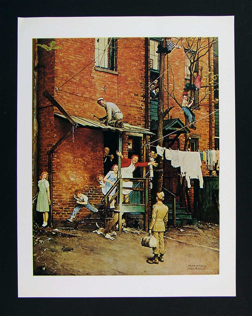
As staged as a Broadway show, Norman Rockwell’s idealized neighborhoods are still alluring in their appeal.
- The bustling tenement neighborhoods of early Norman Rockwell paintings appealed to me, as a child, because the frames were teeming with life: people leaning out of windows, sitting on porches, perching on fire escapes, delivering the morning milk…they were a divine, almost musical chaos. But they were paintings, with all the intentional orchestration of sentiment and nostalgia that comes with that medium. Those images were wonderful, but they were not documents…merely dreams.
That, of course, doesn’t make them any less powerful as an influence on photography.
When I look at a section of an urban block, I try to frame a section of it that tells, in miniature, the life that can be felt all day long as the area’s natural rhythm. There are re-gentrified restaurants, neglected second-floor apartments, new coats of paint on old brick, overgrown trees, stalwart standbys that have been part of the street for ages, young lovers and old duffers. Toss all the ingredients together and you might get an image salad that captures something close to “real”. And then there is the trial-and-error of how much to include, how busy or sparse to portray the subject.
That said, I have explored this theme many times over the years, and worry that I am trying to harvest crops from a fallow field. Have I stayed too long at this particular fair? Are there even any compelling stories left to tell in this approach, or have I just romanticized the idea of the whole thing beyond any artistic merit?
Hopefully, I will know when to strike this kind of image off my “to do” list, as I fear that repetition, even repetition of a valid concept, can lead to laziness….the place where you call “habit” a “style”.
And I don’t want to dwell in that place.
