A RACE OF INCHES
By MICHAEL PERKINS
YOU CAN VIEW THE MAIN FUNCTION OF PHOTOGRAPHY AS TWOFOLD, with the deliberate creation of a vision as one path, and the arresting of time in its motion as the other. In the first case, we plan, conceive and execute at our leisure until the image that is behind our eye emerges on the page. In the second, we are hastening to capture and cage something that is in the act of disappearing. In one instance we compose. In the other, we preserve.
Sometimes the two purposes come together in one picture, although you seldom know it until after the image is made. Take the example below. In the moment, I was struck by the light patterns that bounced across the empty space of an event room at the visitor center for the Brooklyn Botanical Gardens. I wanted to do everything I could, exposure-wise, to dramatize the play of light in this special space. In addition to trying to create an image, however, I was also scurrying to keep a special number of factors from vanishing. I was both creating and preserving.
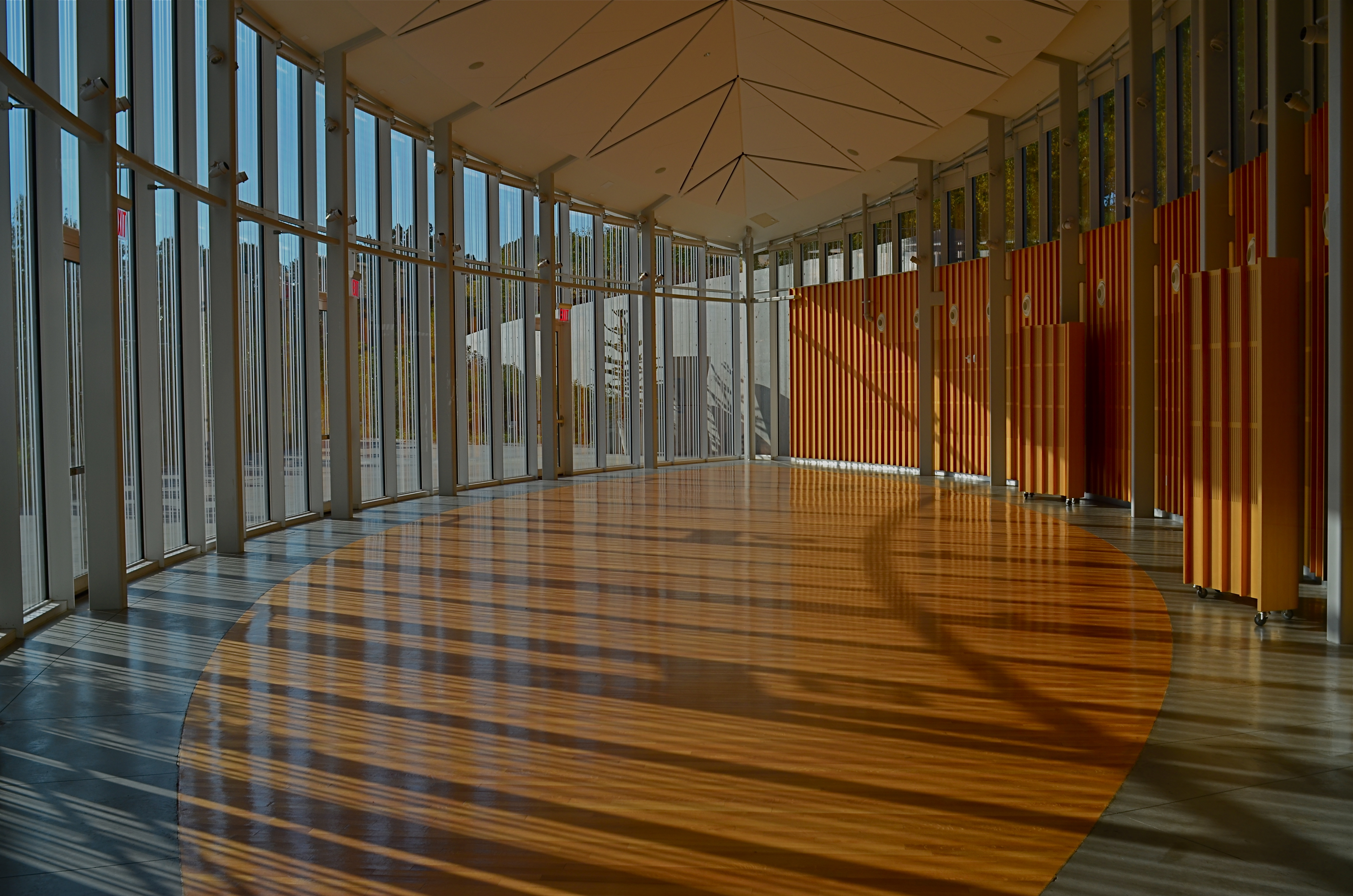
Carpe diem: when the light’s right, be ready to shoot. 1/160 sec., f/5.6, ISO 100, 24mm.
Obviously, the light you see would have had a dramatically different effect had the room been packed with, say, bodies or furniture, so its unobstructed path was one temporary condition. Another fleeting factor was the late afternoon light, which was, in addition to being extremely changeable, also one of the rare moments of pure sun the area had seen during a severely overcast day. It was as if the heavens opened up and angels were singing a song called, “Take The Picture, Already, Dummy”(perhaps you have heard this song yourself). Everything pointed to immediacy.
Full disclosure: getting this shot was not something that stretched me, or demanded exceptional skill. There was not one technically difficult factor in the making of this picture. You yourself have taken pictures like this. They are there and then they’re gone. But, they don’t get collected unless you see how fragile they are, and act in time. It’s not wizardry. It’s just acting on an instinct which, hopefully, gets sharper the longer you are in the game.
I often state one of my only primary commandments for photography as, Always Be Shooting. An important corollary to that rule might be, Always Be Ready To Shoot. Spot the potential in your surroundings quickly. Get used to the fact that many pictures will only dance before you for seconds at a time, flashing like heat lightning, then fading to oblivion. Picture-making is sometimes about casual and careful crafting of an image. And sometimes it’s a race of inches.
And sometimes it’s both.
DON’T EVER ALWAYS DO ANYTHING
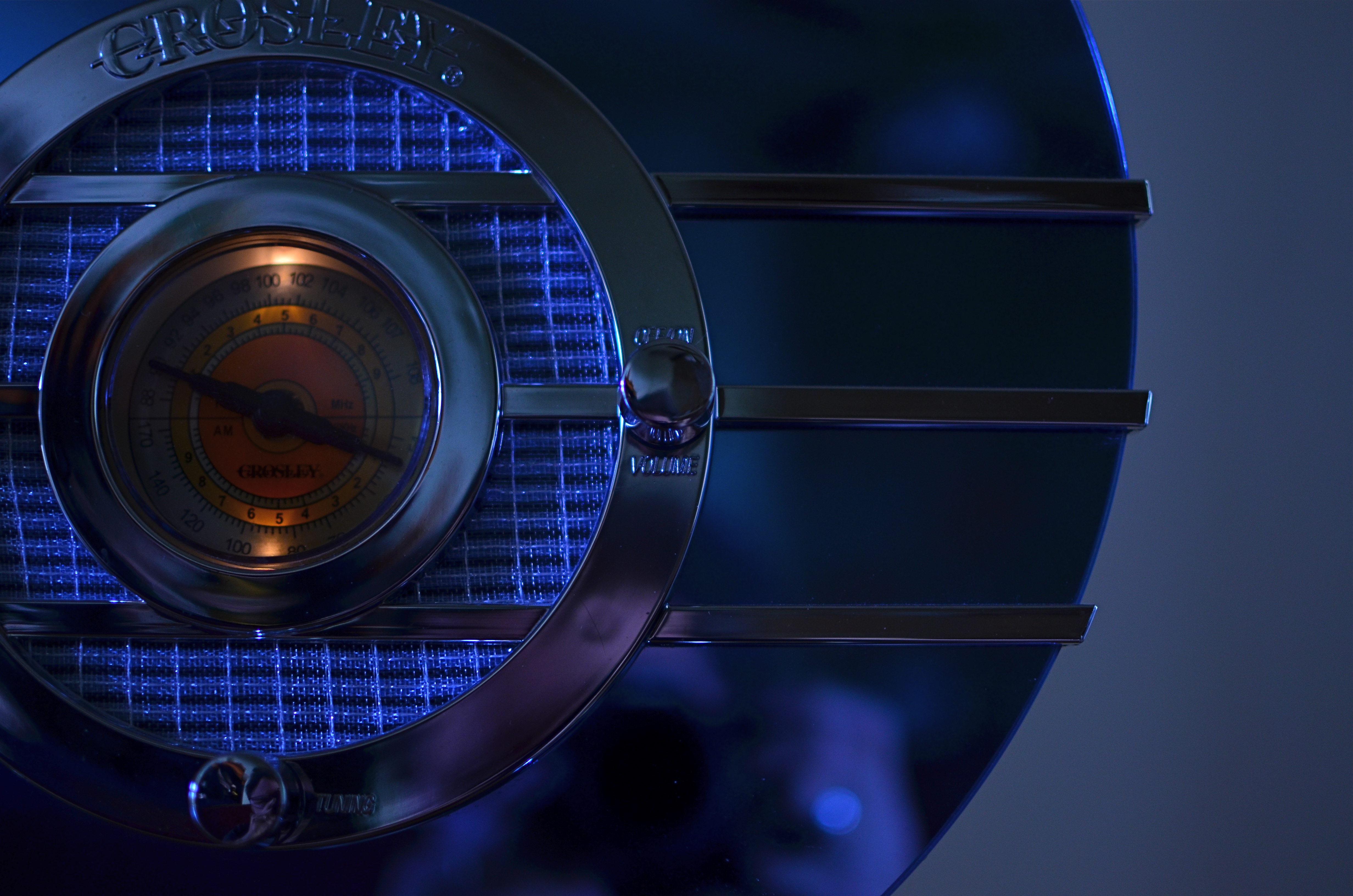
This shot, as the one below, is taken at 1/60 sec,, f/2.2, ISO 250, 35mm. The difference between the two images is the white balance setting.
By MICHAEL PERKINS
IF YOU’VE EVER GLANCED AT THE NORMAL EYE’S HOME PAGE MISSION STATEMENT, you might come away with the impression that I am unilaterally opposed to automodes, those dandy little pre-sets that do their best to predict your needs when making a photo. The truth is that I am against doing anything “all the time”, and thus caution against the universal use of automodes as a way of idiot-proofing your shoots. They can be amazing time-savers, sometimes. They are reliable shortcuts, sometimes. Just like I sometimes like bacon on a burger. There are no universal fixes.
I meet many people who, like myself, prefer to shoot on manual most of the time, eschewing the Auto, Program, Aperture Priority and Shutter Priority modes completely. Oddly, many of these same people almost never take their white balance off its default auto setting, which strikes me as a little odd, since the key to color photography is getting the colors to register as naturally as possible. Auto WB is remarkably good at guessing what whites (and in turn, other hues) ought to look like in a pretty wide variety of situations, but it does make some bad guesses, many of them hard to predict.
A gross-oversimplification of white balance is that it reads the temperature of light from cold to warm. Colder temp light runs bluer. Warmer temp light reads more orange. Auto WB tries to render things as naturally as it can, but your camera also has other customizable WB settings for specific situations, and it’s worth clicking through them to see how easy it is to produce subtle variations.
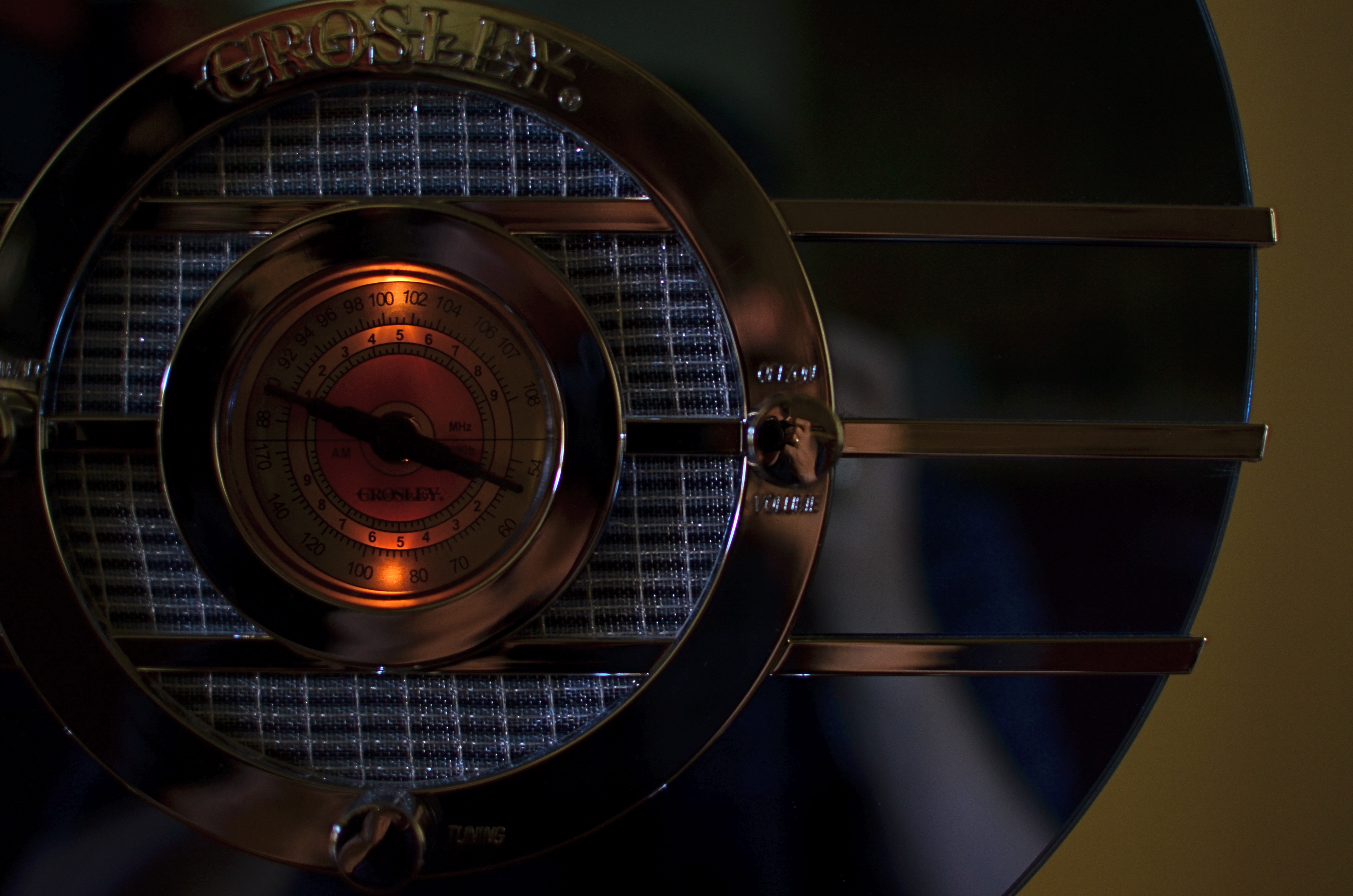
In the picture in the upper left corner, I’m taking a picture indoors, in deep shade, of a reproduction 1930’s Bluebird Sparton radio, a wondrous Art Deco beauty featuring a blue-tinted mirror trimmed in bands of chrome. To emphasize: blue is the dominant color of this item, especially in shade. Shade, being “colder” light, should, in Auto White Balance mode, have registered all that blue just fine, but, in this case, the chrome trim is completely (and unnaturally) painted in the same orange glow. As for the blue values, they’re well, kind of popsicle-y . That’s because, when it’s all said and done, Auto White Balance is your camera’s educated guess, and it sometimes guesses wrong. If you always use it, you will occasionally have to eat a bad picture, unless you take action.
I get blue when I listen to the radio, or when I dial up the appropriate white balance.
For the above image, I want the dial to be nice and orange, but just the dial. To try to get the blues back to normal on the rest of the radio, I switch to the Tungsten white balance setting (symbolized by a light bulb, since they burn, yes, tungsten filaments), something I normally wouldn’t do in either daylight or shade, but hey, this is an experiment anyway, right? To make it even weirder, Tungsten might read neutrally in some kinds of indoor night settings…but it also doesn’t behave the same way in all cases. In this case, I caught a break: the orange in the radio dial registers pretty true and all the metals are back to shades of silver or blue.
Notice how both white balance settings, in this strange case, both performed counter to the way they are supposed to. One misbehaviour created my problem and another misbehaviour solved it. Hey, that’s show business.
Hence the strange but appropriate title of this post. Don’t ever “always” do…anything. If you want the shot you want (huh?) then pull an intervention and make the camera give it to you. Automode in white balance is just as fraught with risk as any other automatic setting. It works great until it doesn’t. Then you have to step in.
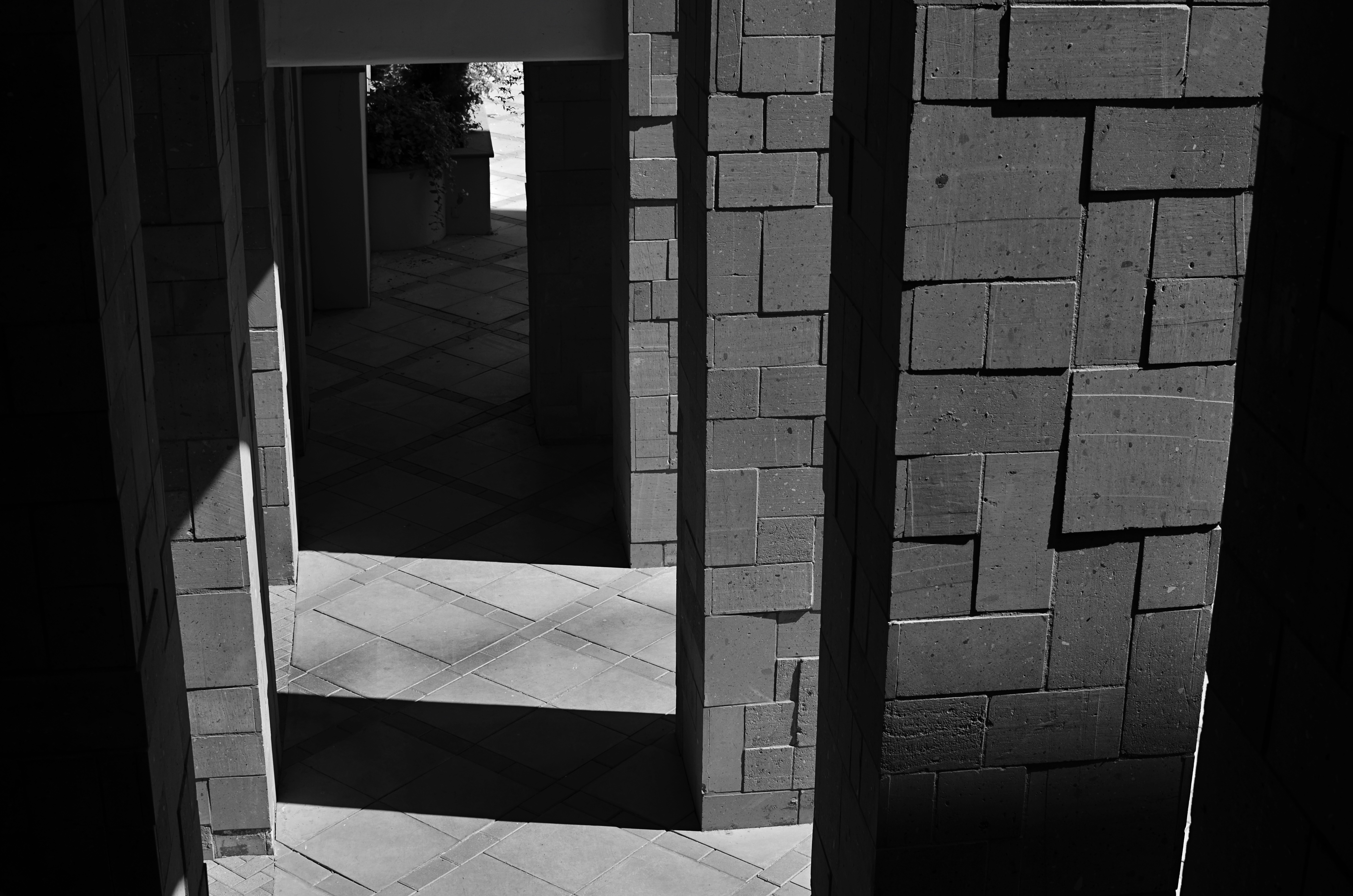
WINDOW OF OPPORTUNITY
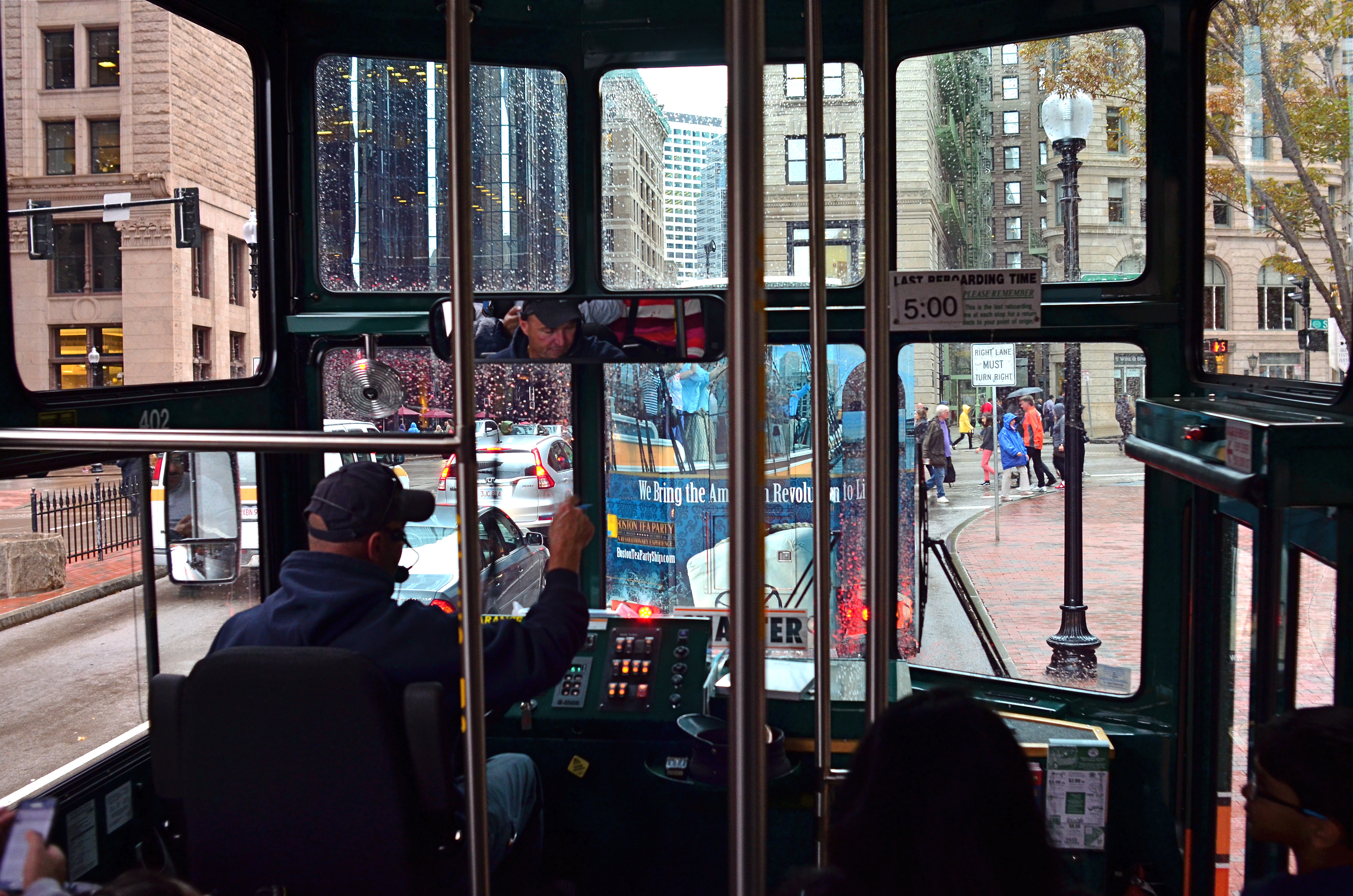
“…the driver on the bus says……” Sometimes a window is part of the story.
By MICHAEL PERKINS
PHOTOGRAPHERS’ FIRST USES OF FILTERS WERE AS THE TWIST-ON TOOLS designed to magnify, nullify or modify color or light at the front end of a lens. In the digital era, filtration is more frequently added after the shutter clicks, via apps or other post-production toys. You make your own choice of whether to add these optical layers as a forethought or a post-script. However, one of the simplest and oldest of filtering options costs no money and little time, and yet continues to shape many a great image: a window.
Early morning + tinted window=moody, right? Gettysburg from the tour bus.
No panes are optically identical, just as the lighting conditions that affect them are likewise completely unique, so the way that they shape pictures are constantly in flux, as are the results. It’s no surprise that the shoot-from-the-hip urban photographers who favor spontaneity over all pay little attention to whether shooting through a window “ruins” or “spoils” an image. Taking an ad-lib approach to all photographic technique, the hip shooters see the reflections and reflections of glass as just another random shaper of the work, and thus as welcome as uneven exposure, cameras that leak light, or cross-processed film: another welcome accidental that might produce something great.
Windows can soften, darken or recolor a scene, rendering something that might have been too strait-laced a little more informal. This quality alone isn’t enough to salvage a truly bad shot, but might add a little needed edge to it. The images seen here were both “what the hell” reactions to being imprisoned on tour buses, the kinds that don’t stop, don’t download their passengers for photo or bathroom breaks, or which are booked because I am tired of walking in the rain.
In the case of the tour driver’s cab, his inside command center and personal view are really part of the story, and may outrank what he’s really viewing. In the side-window shot of an early morning in Gettysburg, Pennsylvania, the tinted glass acted much in the way of a polarizing filter, making the resulting photo much moodier than raw reality would have been.
Which is the point of the exercise. When you feel yourself blocked from taking the picture you thought you wanted, try taking it the way you don’t think you want to. Or just think less.
Wait, what did he just say?
WEIRD SCIENCE
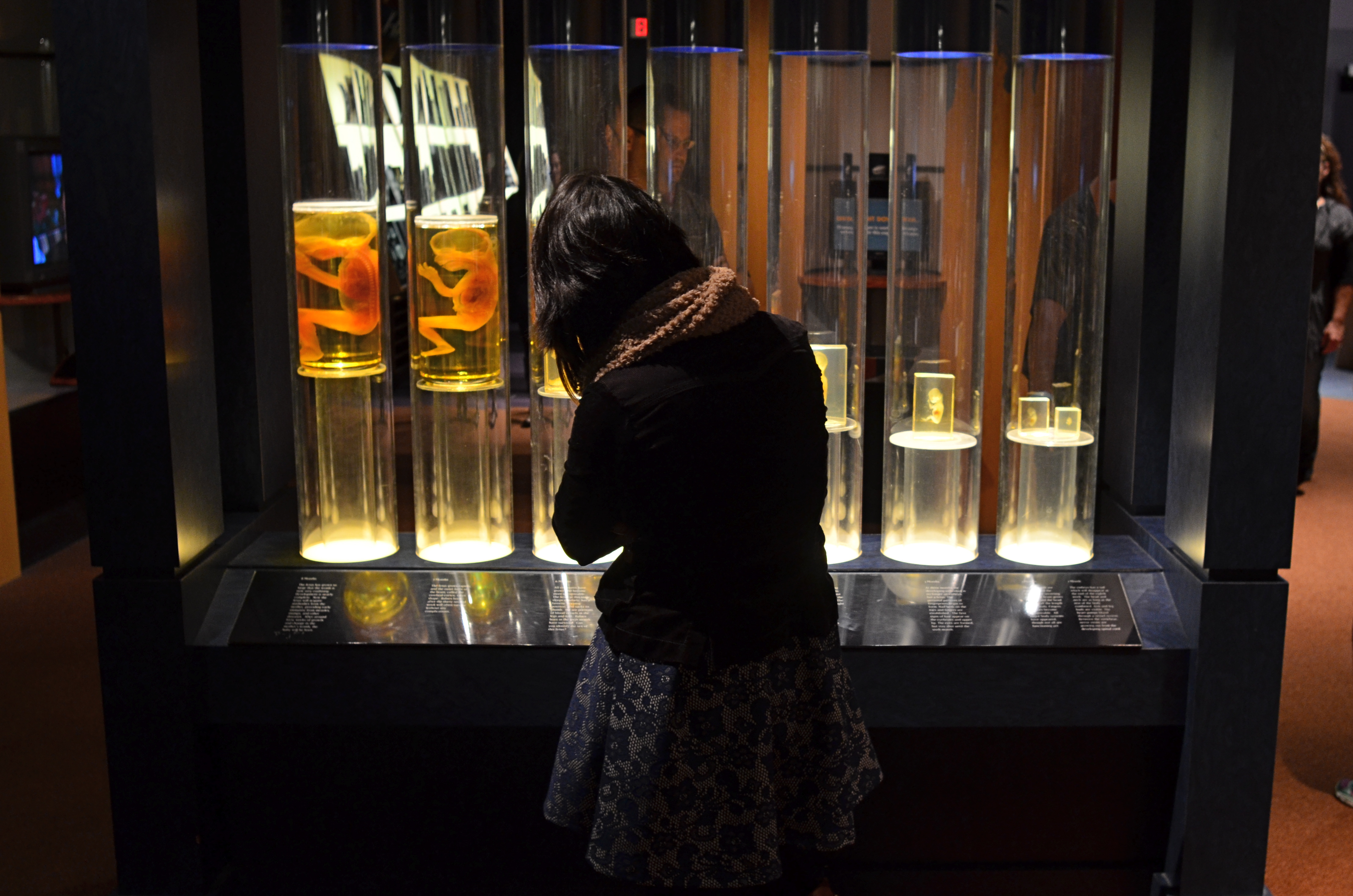
The fetal gestation timeline at Columbus, Ohio’s Center Of Science & Industry. 1/60 sec., f/3.5, ISO 500, 24mm.
By MICHAEL PERKINS
ONE OF THE RITES OF PASSAGE FOR SCHOOL KIDS IN COLUMBUS, OHIO IN THE 1960’s was a field trip to the Center of Science and Industry, or COSI, one of the nation’s first interactive tech museums, mounted before either the terms “interactive” or “hands-on” were common parlance. In those JFK-flavored days of early space exploration and Jetson-gee-whiz futurism, flying cars and picture phones seemed our inevitable legacy, and the Center’s exhibits often veered closer to the World’s Fair than the science fair, its dazzling displays often trumping pure enlightenment. A generation later, the sizzle lingers in the mind a little better than the steak. Something to work on.
Science was presented as something of a magic trick then, a sure and certain answer to all human needs and desires. But to my tween-sized mind, it also retained an air of mystery, something wondrously alien to my daily experience. Few of COSI’s exhibits from the time created more of a sense of wonder in me than an illuminated timeline of fetal gestation, with each crucial stage between embryo and newborn illustrated by a separately preserved specimen of a transitional human that never made it to the delivery room. As fascinating as the display was, it was also a little creepy, somewhat like, if you will, viewing pre-mummies from a colony of visitors from the future.
In a recent visit to the new COSI, now re-located to a larger, brighter HQ across from Columbus’ downtown riverfront, I was both amused and amazed to see that the timeline had been retained in nearly the same way I remembered it from 1964. Having survived to the era of iPhones and DNA mapping, its dim, the strange, amber-glow profiles still had a hypnotic effect on me, housed as they were in a dark, shadowy sector of the museum, sealed within a showcase that distorted the faces of passersby, even as it shrouded their bodies in mystery. For the shot you see here, I liked the strange juxtaposition of the exhibit’s clinical coldness with the form of a young visitor, casually viewing the timeline as if it were no more notable than a collection of butterflies. I shut the exposure down so that the case provided the only light, opened the lens as far as I dared for the right depth of field, and jacked the ISO slightly to compensate for the murky room ambience.
The COSI of the New Frontier years was always a place that could cast science in a distinctly optimistic light. In 2015, I hoped to re-imagine that magic through the insight of an additional fifty years of living. Mood in photography is created as much by what you conceal as by what you reveal, and trying to get that balance right is 90% of the game.
A WHITER SHADE OF PALE
Will energy-efficient street lighting make your neighborhood look like this….
By MICHAEL PERKINS
IN THE FACE OF CHANGE, HUMANS WILL DOGGEDLY DEFEND ALMOST ANYTHING, as long as they’ve grown accustomed to it. At their introduction, we inveighed against the intrusion of the telephone (the end of privacy!) and the automobile (they scare the horses and they’re filthy!), but soon learned to love chatting, well, from our freaking cars, so…
One of the things solid citizens of the late 1800’s most objected to was the slicing of the night by the first network of urban street lamps, which were excoriated in editorials from New York to Paris. An invasion! An insult! Unnatural.
Boy, if they could see us now.
In the name of energy savings and sustainability (both good things, right?), street lights across the country are in the midst of a rapid conversion from several types of fluorescent lamps to LEDs. They last longer, they burn cheaper, they cost less. All to the good, except that the light these new torches deliver is blue, pale, cold, and, in the minds of many, harsh. Even those who champion ecologically righteous causes are squinting at LEDs which strike them as grim, sickly, colorless and (wait for it) unnatural.
Writing in the New York Times in the essay “Ruining That Moody Urban Glow“,
…or this?
novelist Lionel Shriver calls LED light “conducive to dismembering a corpse” and cites studies that claim the fixtures contribute to sleep loss, mood disorders, and, who knows, ingrown toenails. For photography (you knew I’d get here eventually), the new light presents a completely fresh challenge to your camera’s ability to achieve white balance, or an accurate reading of white values according to a given light’s temperature, expressed in degrees Kelvin.
Conventional lights are lower on the Kelvin scale, thus warmer, with more yellow in the mix. LEDs are higher in Kelvin value and register blue-white, muting or mutating colors. At present, both Canon and Nikon have many in-camera settings to balance for a number of sodium-vapor or fluorescents, but have yet to offer options for adjusting for LEDs, even though entire cities have made the switch to what many feel is an ugly, stark source of illumination.
In her Times article, Shriver notes that there are, in fact, subtler types of LEDs, which sacrifice only a bit of energy efficiency and yet emit warmer light, and advocates that citizens go proactive to keep their neighborhoods from looking like the parking lots on interstate truck stops. So take that for what it’s worth. But be aware that more and more of your night shots may, in the near future, have to be adjusted in post-production to resemble a century in which you feel at home.
THE ONLY REAL PRIORITY
By MICHAEL PERKINS
THERE ARE MANY VALUABLE SERVICES OUR CAMERAS WILL RENDER without our consent or participation. Without even considering how many people shoot on full automatic 100% of the time, there are a hundred small calculations that these marvelous devices make to prevent the kind of errors in judgment that used to routinely trip us up, from autofocus and white balance, face detection and contrast control. However, there is a variable percentage of decisions on which we should really take personal action, despite the camera’s best efforts to, in effect, save us from ourselves.
In iffy light situations, for example, several key “semi-auto” modes are truly handy in helping us compensate for grey days or dark corners. One of these is called aperture control, in which you dial in the f-stop you want, based on your preferred depth of field, leaving the camera to set the shutter speed needed to properly expose at that aperture. At first blush, this seems to be a great short cut, and is in fact a neat option for people who are “running and gunning”..shooting lots of frames in a very quick time span. However, what looks like cutting your work in half can also mean cutting the legs off your creativity.
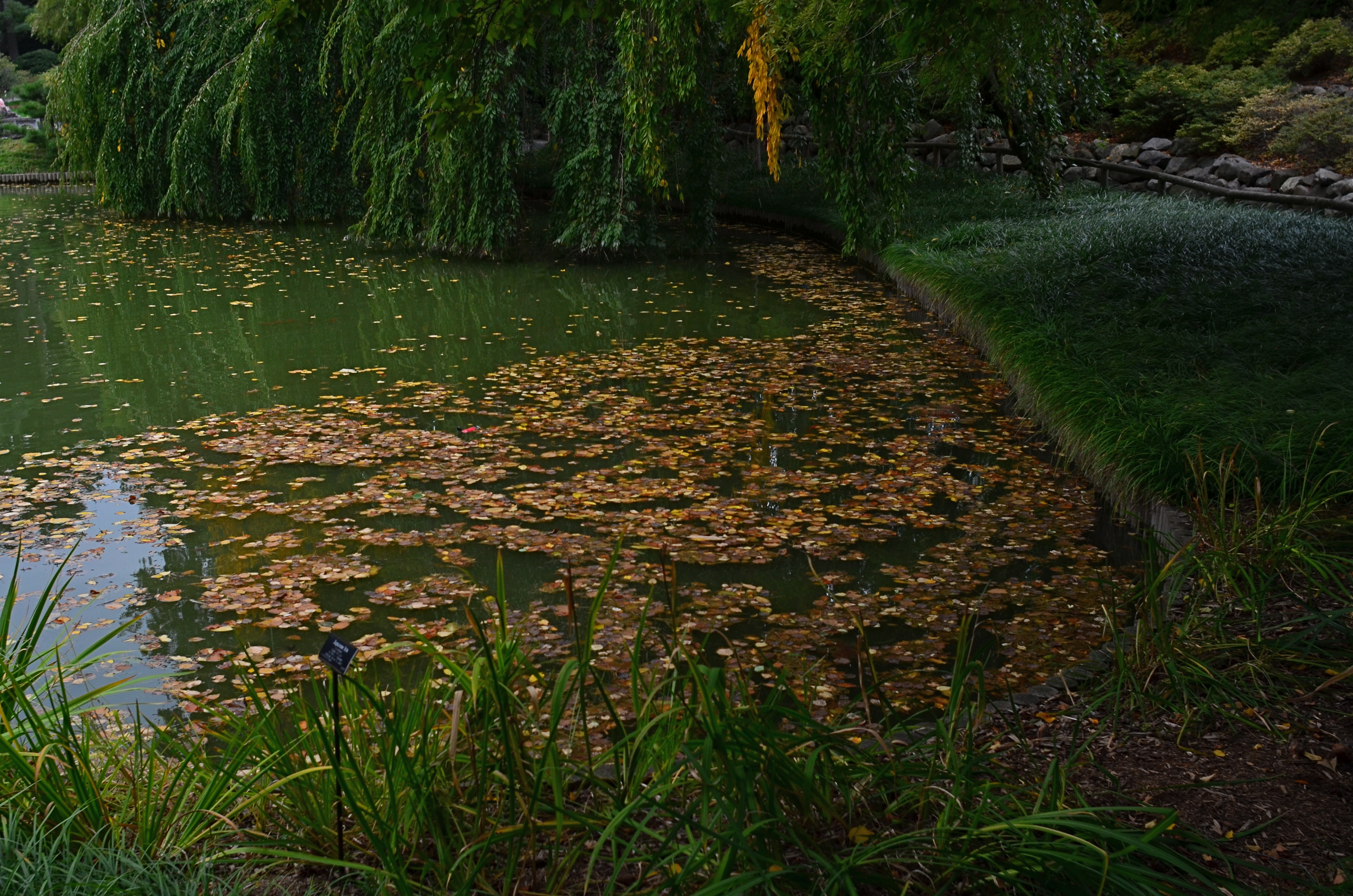
Aperture priority would have worked too hard to make this exposure “balanced”, which was the opposite of what I wanted.
In the above situation, I had a severely overcast day in a lushly green Japanese garden. Without shadows for contrast, I would need colors to be as deep as possible to bring off the mood I was going for, so a slightly underexposed look seemed to be in order. Dialing in f/5.6 as a desired D.O.F. in aperture priority was giving me very slow shutter speeds as the camera tried to give me an ideal exposure. This made a handheld shot a little tougher and gave me way too much high color to suggest anything quiet or moody.
Going to full manual, I dialed in a shutter speed that would render the greens nice and deep, around 1/80, and bumped up the ISO a tad as insurance. It was true that I was shooting a lot at the same f-stop, but not so fast that I would have to surrender fine control by shooting in aperture priority for mere convenience’s sake.
I love some of the protections against my own folly offered by today’s devices, but I just can’t go completely driver-less and feel that I am taking enough responsibility for my results. Hey, if I blow it completely, I can still explain a lousy shot in two simple words.
“…stupid camera…”
STAKES IN THE GROUND
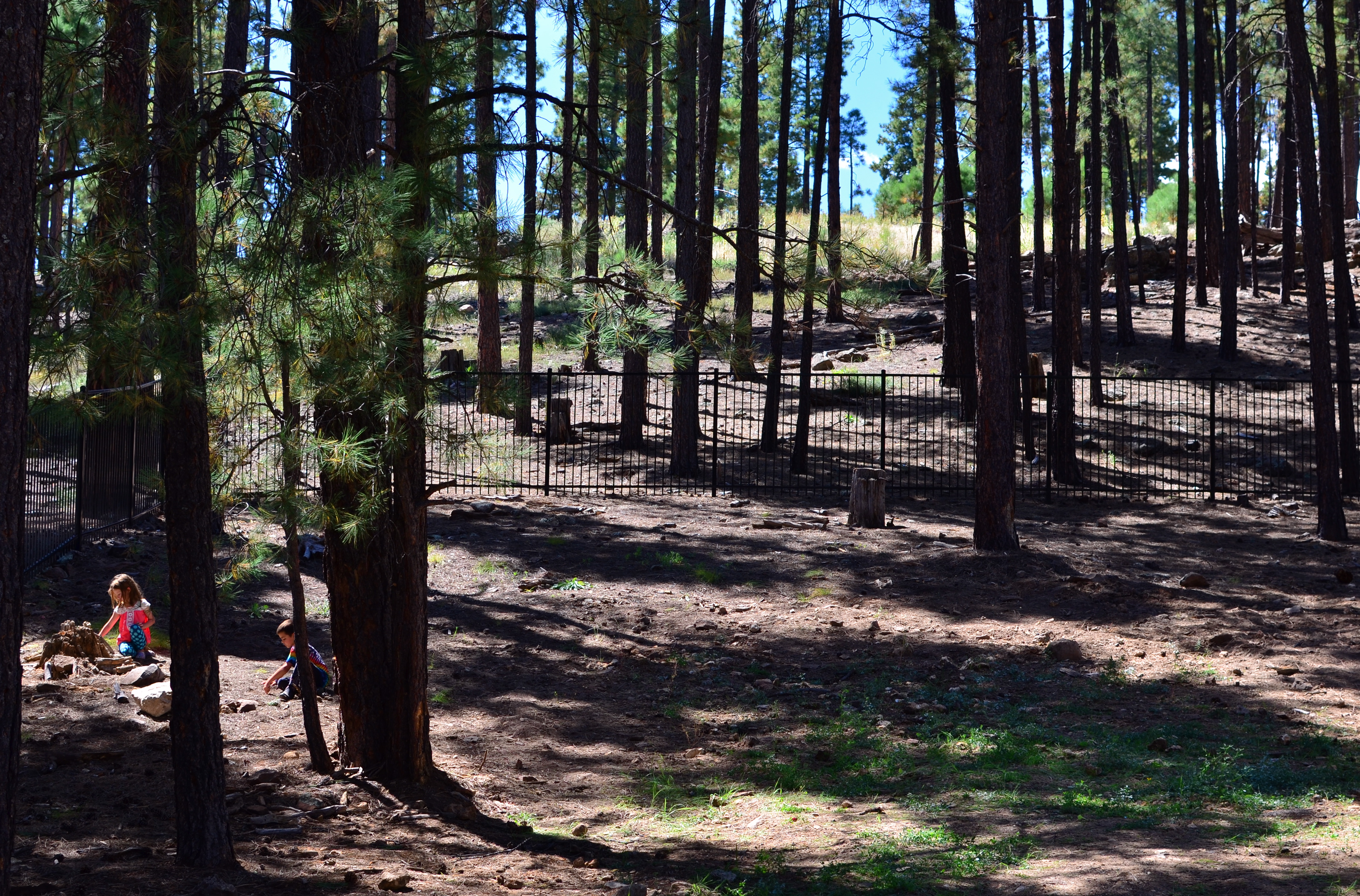
We Seemed To Be The Entire World, 2015. 1/60 sec., f/5.6, ISO 100, 35mm.
By MICHAEL PERKINS
NO DOUBT YOU KNOW WHAT IT FEELS LIKE TO SEE A PICTURE IN YOUR MIND that, for some reason, doesn’t make it into the camera.
It’s maddening. That fumbling few inches between success and failure that cannot always even be sensed during the taking of an image, but which, somehow, is as wide as a river gorge once the picture comes out. Dammit, you saw it. More importantly, you felt it. But something in perhaps a technically perfect photograph fails to engage, and the thing just can’t close the sale.
Going further with the metaphor of salesmanship for a moment, there are pictures which, in a manner of speaking, don’t “ask for the order”. They don’t effectively say, here is the main point of interest. Look here, then there. The best photos are triptychs in that they have a sense of inevitable direction. Your eye senses where to travel with the frame.
In the above forest scene, I nearly failed to provide that impetus because, in my first few shots, I was overly centered on getting the contrasty elements of the picture from fighting each other. Some trees came out like silhouettes. Some parts of the forest floor were way too bright. Somewhere along the line, I had decided that the picture was about solving those purely technical problems. Check those items off, I thought, and you’d have a real nice nature scene, or so it seemed at the time. Only one lucky thing intervened to change my mind and save the picture.
This comes under my general belief that most of the things you need to fix a composition are mere inches away from where you’re already standing. In this case, I moved a bit to the left of several trees and two small children swung into view, both of them representing a dynamic dollop of color in an overly bland palette of shades. Suddenly the picture was about these kids stealing away, inhabiting a quiet, separate world, their size dwarfed by the pines while giving measurable scale to the entire woods. They had found a complete reality away from everyone, and it would be easy to show that. Cropping to have them enter the frame at the bottom left corner helped direct the eye where I needed it to go first. Start here, and then look beyond.
It’s helpful to regularly dissect the pictures that almost had enough story to sell themselves. What stakes could I have pounded into the ground to mark the outline of the idea? Where did I fail to lay out the territory of the story?
It’s all about getting that image from your mind into the camera. That’s everything. That is, ever and always, the problem to be solved.
DON’T MESS WITH MR. IN-BETWEEN
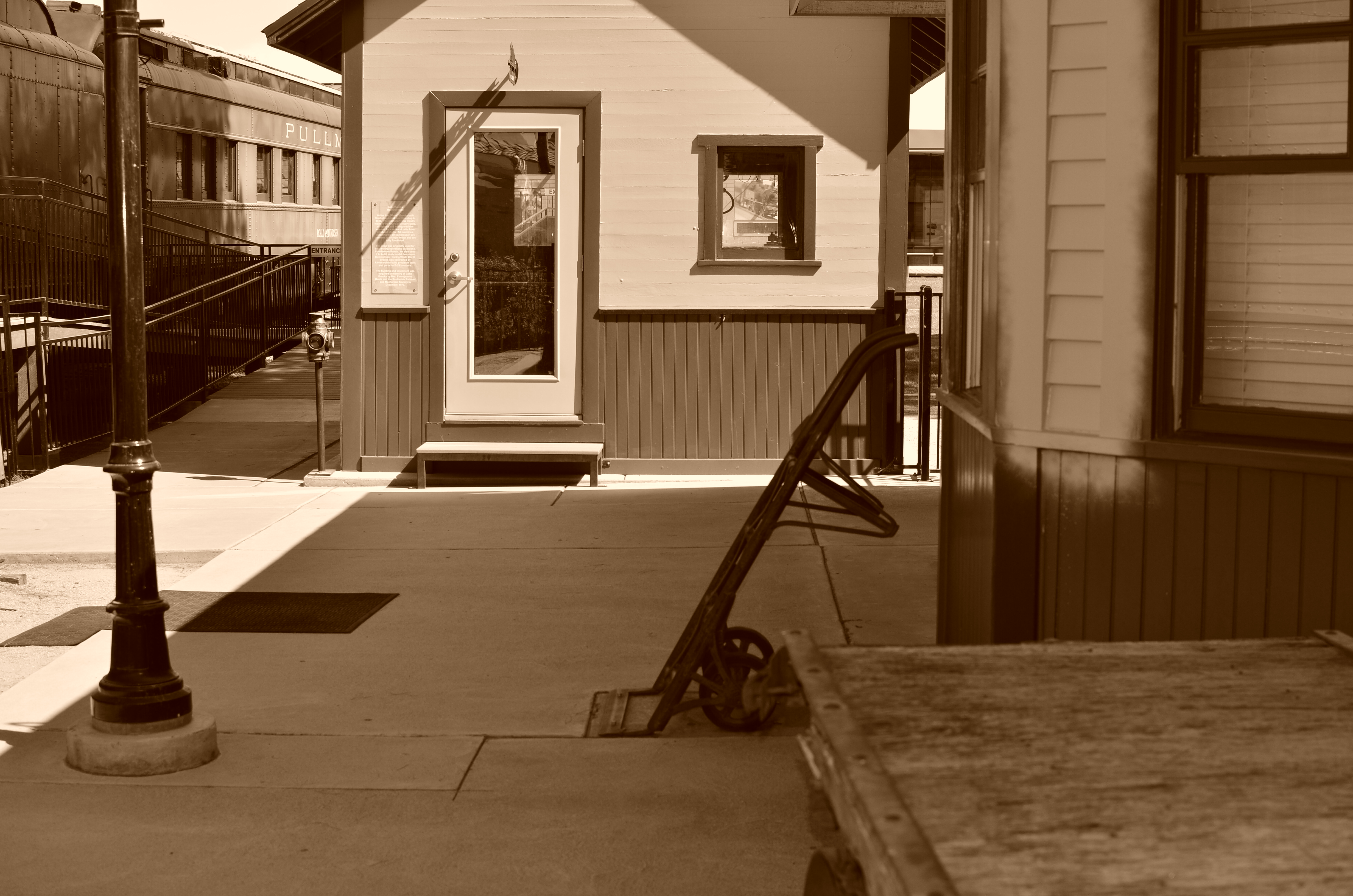
The light on this railroad depot was not as harsh or contrasty as seen here: I merely liked it better that way.
By MICHAEL PERKINS
PHOTOGRAPHY ALWAYS SEEMS TO BE ABOUT TWO THINGS THAT ARE POLAR OPPOSITES. On one hand, we have labored mightily for nearly two hundred years to make our little boxes reproduce as full a representation of the range of tone in nature as possible, to ape the eye to a clinical certainty. On the other hand, we love to distort that reality for specific purposes…..call it abstraction, minimalism, or your own favorite buzz word. We extol the natural look and revere the unnatural in nearly the same breath.
Originally, there wasn’t much in the way of attenuation between light and dark in photographs. Black was blackblackblack and white was whitewhitewhite (yes, I read a lot of e.e. cummings as a child). Better films eventually led to a greater variance in shades and nuances, and pioneering work by Uncle Ansel and other Big Saints produced exhaustive studies on precisely how many shades of grey could be delivered in a carefully crafted photograph. But even as we can now easily produce images with great variances in light and dark, some pictures are still served better by going back to clean, simple boundaries for values.
Hard, high-contrast blacks and whites are killers of texture but they are great modelers of dimension. A cube with stark differences between its light and dark sides takes on the more tangible feel of a solid object occupying space, and that extra degree of dimensionality helps in the success of certain compositions.
The above image was originally far more nuanced than the altered version you see here, but, as a very basic arrangement of shapes in space, I like the picture better without too much midrange value. It helps the faux nostalgia feel of the subject matter as well, even though it might be altogether wrong for a million other subjects. The unscientific answer is, you know it when you see it.
One thing is for sure. Even when we look for the ring of truth in our images, turn out that there’s more than one ring tone. Decide what you need for a specific image. Maximized selection of tools is the most single important part of making a picture.
A GAME OF INCHES
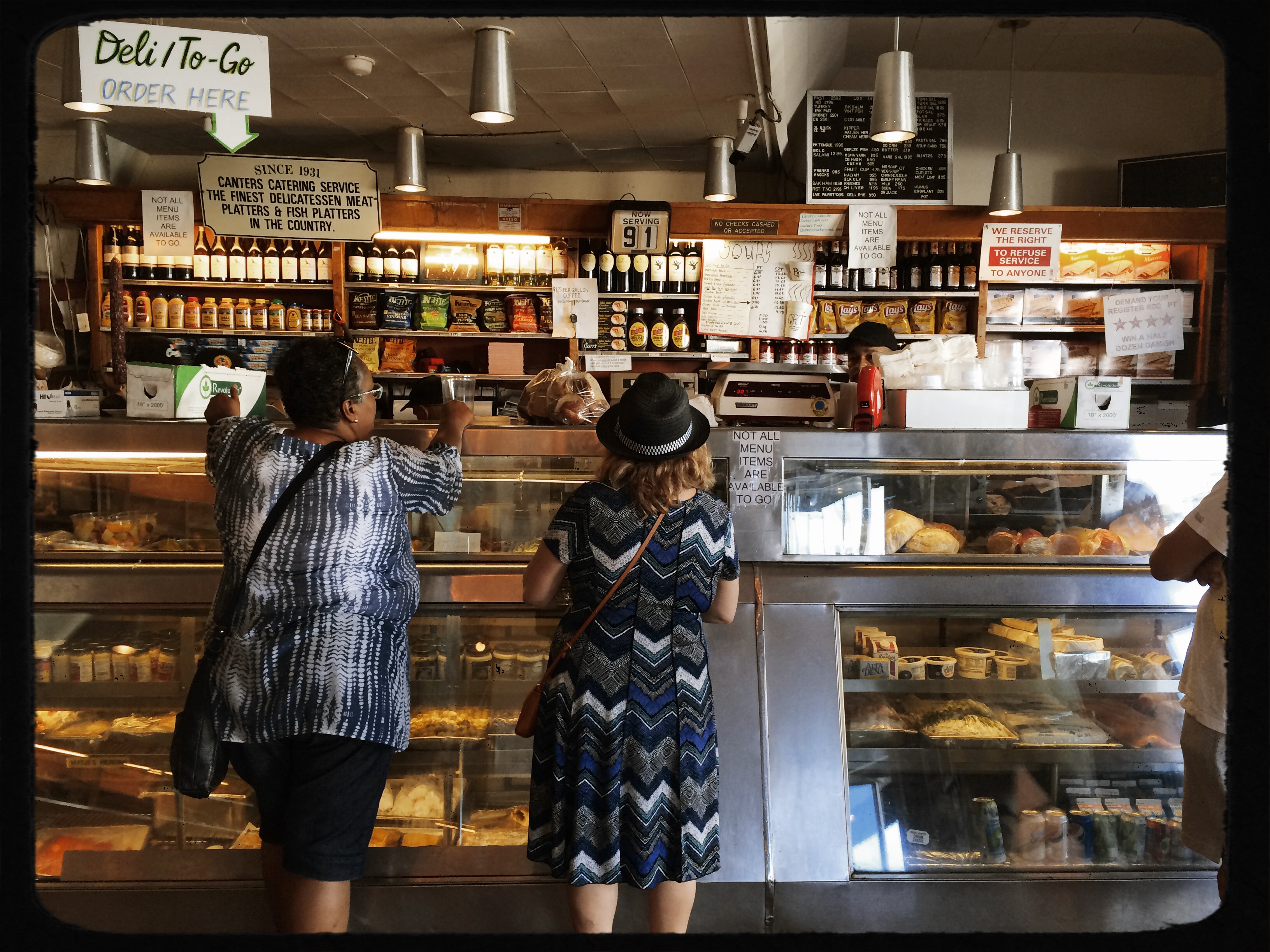
Carry-Out At Canter’s, 2015. One generous hunk of window light can be all you need, even on a cel phone.
By MICHAEL PERKINS
WINDOW LIGHT IS A BOY PHOTOGRAPHER’S BEST FRIEND. The glass usually acts like a diffuser, softening and warming the rays as they enter, making for intimate portrait and street shots. Window light tends to wrap around the objects in its path, adding a look of depth and solidity to furniture and people. It’s also uncomplicated, universally available, and free. And that’s great for cell phone cameras.
At this writing, Apple’s next iPhone will soon up the ante on both resolution and light sensitivity, meaning that more and more shots will be saved that just a few years ago would have been lost, as the mobile wars give us more features, more control, and more decision-making options that recently belonged only to DSLRs and other upper-end product. That will mean that the cameras will perform better with less light than ever before, over-coming a key weakness of early mobiles.
That weakness centered on how the camera would deal with low-light situations, which was to open to its widest aperture and jack up the ISO, often resulting is grungy, smudgy images. Turn too many inches away from prime light (say a generous window in daytime) and, yes, you would get a picture, but, boy, was it ever dirty, the noise destroying the subtle gradation of tones from light to dark and often compromising sharpness. Those days are about to end, and when they do, people will have to seriously ask if they even need to lug traditional imaging gear with them, when Little Big Boy in their back pocket is bringing the “A” game with greater consistency.
As this new age dawns, experiment with single-point window light to see how clean an image it will deliver on a cel phone. Pivot away from the light by a few inches or feet, and compare the quality of the images as you veer deeper into shadow. You will soon know just how far you can push your particular device before the noise starts creeping in, and having that limit in your head will help you assess a scenario and shoot faster, with better results. Camera phones, at least at their present state of development, will only do so much, but you may be surprised at just how high their top end actually is. You need not miss a great shot just because you left your Leica in your other pants. As usual, the answer is, Always Be Shooting.
UP CLOSE AND POISONAL
Gee, this 300mm telephoto shot has it all. Terminal mushiness, hazy washout, crappy contrast. Who could ask for anything more? You could.
By MICHAEL PERKINS
THERE MAY BE A STATISTICAL TABLE SOMEWHERE that breaks down the percentage of photographers who use telephoto lenses consistently versus those who only strap one on for special occasions, but I have never seen one. Of course, I’ve never seen a three-toed sloth either, and I’m sure they exist. Fact is, there are always enough telephoto newbies (or “occasional-bies”) out there to guarantee that many of us make some pretty elemental mistakes with them, and come home with fewer jewels than we hoped for. I should know, since I have produced many such “C-minus” frames, like the image seen above. For a better understanding of everything I did wrong here, read on.
If telephotos just had to deliver magnification, and otherwise worked the same as standard lenses, they wouldn’t produce so many problems. In fact, though, they need to be used in several very different ways. For one thing, zooming in exponentially increases not only the chance of camera shake but the visible results of camera shake. A little bit of tremble at 35mm may go undetected, with little discernible effect on sharpness, while the very same amount of shake at 300mm or above creates a mathematically greater amount of instability, rendering everything soft and mushy.
This means that handheld shots at the longer focal lengths are fundamentally harder to do. Solutions can include faster shutter speeds, but that cuts light at apertures of f/3.5 and smaller, where light is already diminished. You might get around that with a higher ISO, which may not produce acceptable noise on a brightly lit day, but you must experiment to see. If you simply must have longer exposures, you’re pretty much onto a tripod, and, if workable, a cable release or wireless remote to guarantee that even your finger on the shutter doesn’t create a tremor. Remember, you’re talking about very minor amounts of movement, but they’re all magnified many times by the lens.
Some people even believe that a DSLR’s process of swinging its internal mirror out of the way before the shutter fires can create enough vibration to ruin a shot at 400mm or further out. In such case, many cameras allow you to move the mirror a little earlier, so that it’s stopped twitching by the time the shutter opens. Lots of trial and error and home-bred calculus here.
One of the factors fouling many of my own telephoto shots comes from shooting at midday near major cities, adding both glare and pollution to the garbage your lens is trying to see through. Colors get washed out, lines get warped, sharpness goes bye-bye. For this, you might try shooting earlier, taking off your haze filters (’cause they cut light) and seeing if things come out clearer and prettier.
Telephotos are a fabulous tool, but like anything else you park in front of your camera, they introduce their own technical limits and challenges into the mix. Seldom can you get results by just swinging your subject into view and hitting the shutter. Get comfortable with that fact and you will find yourself taking home more keepers per batch.
WITHOUT A LEG TO STAND ON
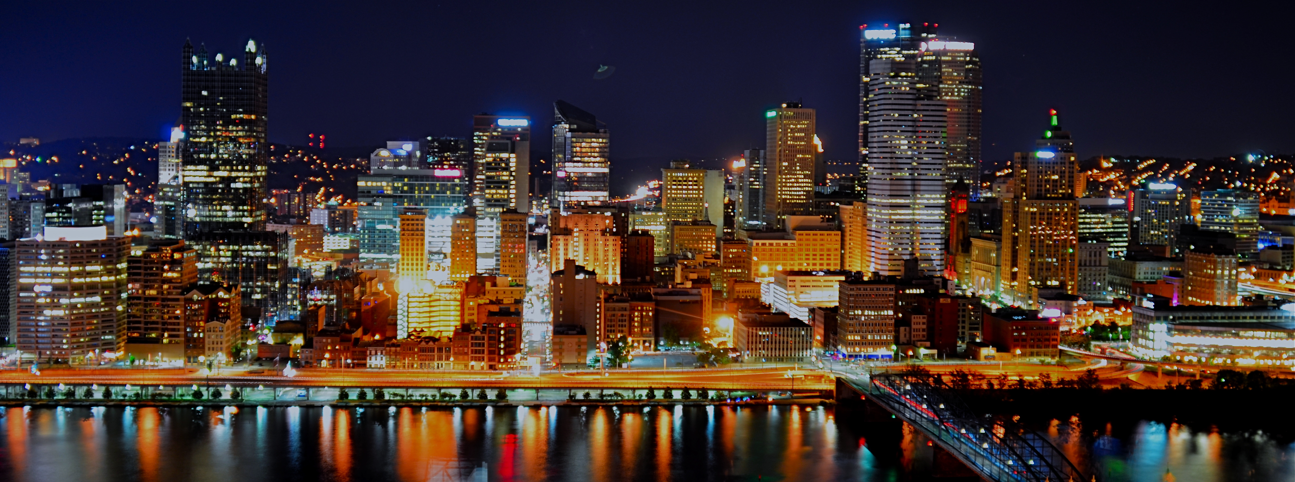
A tripod night exposure that could have been a contender, had I truly been prepared.
By MICHAEL PERKINS
SHOOTING ON A TRIPOD IS OFTEN RECOMMENDED as the way to afford yourself the most stability in a long exposure. After all, few of us are robotic enough to hold a camera stock-still for anything below a third of a second, so it’s a no-brainer to park your camera on something that’s too inhuman to flinch. You can also take amazing stuff hand-held on shorter night exposures, so long as you (a) have a lens that will shoot around f/1.8 or wider and (b) you can live with the noise a higher ISO will engender.
So, yeah, tripods have their place, but they are not the only determinants in the success of a night-time shoot. And those other x-factors can severely compromise your results. There is the stability of the tripod itself, which isn’t a big sweat if you shelled out $900 for a carbon-fiber Gitzo Pan/Tilt GK, but might generate heartburn if you got something closer to a set of metallic popsicle sticks for $29 at Office Max. The shot above was taken using my own modest (cheap) rig atop Mount Washington across from downtown Pittsburgh, and a few of the healthier gusts threatened to take it and me on a quick lap around the riverfront. Some people buy sandbags. Some believe in the power of prayer. Your choice.
Another x-factor for ‘pod shots is the actual weather you’re shooting in, which will, let’s say, shape your enthusiasm for staying out long enough to get the perfect shot. The smaller your aperture, the longer the exposure. The more long exposures you take, the longer you, yourself, are “exposed”…to snow, sleet, and all that other stuff that mailmen laugh at. Again, referencing the above image, I was contending with freezing drizzle and a windbreaker that was way too thin for heroics. Did I cut my session short? i confess that I did.
I could also mention the nagging catcalls of the other people in my party, who wanted me to, in their profound words, “just take the damned picture” so they could partake of (a)a warm bar, (b) a cold beer, (c) a hot waitress. Result: a less than perfect capture of a fairly good skyline. A little over-exposed, washing out the color. A little mushy, since the selfsame over-exposure allowed the building lights to burn in, rendering them glow-y instead of pin sharp. I was able to fix some of the color deficiencies later, but this is not a “greatest hits” image by any stretch.
Tripods can be lifesavers, but you must learn to maximize their effectiveness just like any other piece of camera equipment. If you’re going to go to a buncha trouble to get a shot, the final result should reflect all that effort, quality-wise.
THE FUTURE’S SO BRIGHT, I GOTTA WEAR SHADES
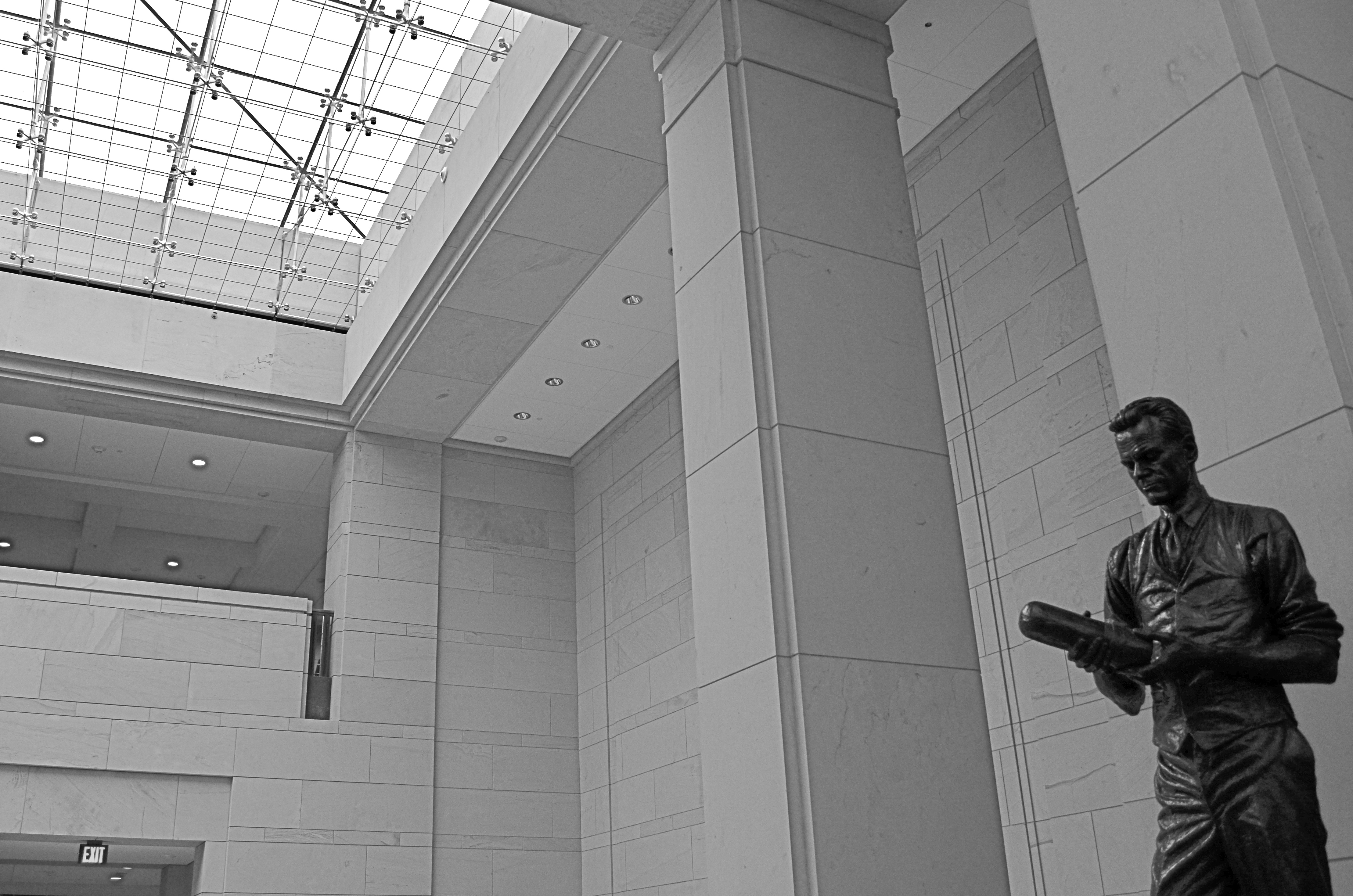
This shot is a snap (sorry) with available light and today’s digital sensors. 1/100 sec., f/5.6, ISO 250, 20mm.
By MICHAEL PERKINS
THERE IS A GLOBAL RACE, ACCELERATING RAPIDLY SINCE THE DAWN OF THE DIGITAL AGE, toward better, faster image sensors in cameras great and small, as we wage the eternal photographic battle against the limits of light. It’s one more reason why this is the best time in the medium’s history to be making pictures.
It’s hard to express what a huge game-changer this is. Film-based photography advanced the science of gathering light in slow fits and starts for more than a century, with even some of the most popular consumer films rated at very slow speeds (Kodachrome) or, if faster, extraordinarily high grain (Tri-X). Suddenly, the world’s shadowy interiors, from stadiums to basements, give up their secrets to even bargain-priced cameras as ISO ratings for sensors climb and noise/grain abatement gets better and better.
The above image, taken inside the U.S. Capitol building in Washington, would have, in film terms, required either a full-open aperture (making a consistent depth of field from front to back tricky), a slow exposure (hard to go handheld when you’re on a tour) or a film rated at 400 or above. Plus luck.
By contrast, in digital, it’s a casual snap. The f/5.6 aperture keeps things sharp from front to back, and the ISO rating of 250 results in noise that’s so low that it’s visually negligible. The statue of television pioneer Philo Farnsworth is dark bronze, and so a little re-contrasting of the image was needed in post-editing to lighten up the deeper details, but again, the noise is so low that it’s really only visible in color. As it happens, I actually like the contrast between the dark statue and the bright room better in monochrome anyway, so everyone wins.
The message here is: push your camera. Given today’s technology, it will give you some amazing things, and the better you understand it the more magic it will produce. We are just on the cusp of a time when we can effectively stow the flash in the closet except in very narrow situations and capture stuff we only used to dream about. Get out there and start swinging for the fences.
YESTERGRUBBING
Remember when the heaviest decision of your day was what flavor syrup you wanted in your Coke?
By MICHAEL PERKINS
I ALWAYS SCRATCH MY HEAD WHEN I SEE AN EATERY sporting a sign that boasts “American Cuisine”, and often have to suppress an urge to step inside such joints to ask the proprietor to explain just what that is. If there is one thing about this sprawling broad nation that can’t be conveniently corralled and branded, it’s the act of eating. Riff through a short stack of Instagrams to see the immense variety of foodstuffs that make people say yum. And as for the places where we decide to stoke up….what they look like, how they serve us, how they feel….well, that’s a never-ending task, and joy, for the everyday photographer.
Eating is, of course, more than mere nourishment for the gut; it’s also a repast for the spirit, and, as such, it’s an ongoing human drama, constantly being shuffled and re-shuffled as we mix, mingle, disperse, adjourn and regroup in everything from white linen temples of taste to gutbucket cafes occupying speck of turf on endless highways. It’s odd that there’s been such an explosion of late in the photographing of food per se, when it’s the places where it’s plated up that hold the real stories. It’s all American, and it’s always a new story.
I particularly love to chronicle the diners and dives that are on the verge of winking out of existence, since they possess a very personalized history, especially when compared with the super-chains and cookie-cutter quick stops. I look for restaurants with “specialities of the house”, with furniture that’s so old that nobody on staff can remember when it wasn’t there. Click. I yearn for signage that calls from the dark vault of collective memory. Bring on the Dad’s Root Beer. Click. I relish places where the dominant light comes through grimy windows that give directly out onto the street. Click. I want to see what you can find to eat at the “last chance for food, next 25 mi.” Click. I listen for stories from ladies who still scratch your order down with a stubby pencil and a makeshift pad. Click. Click. Click.
In America, it’s never just “something to eat”. It’s “something to eat” along with all the non-food side dishes mixed in. And, sure, you might find a whiff of such visual adventure in Denny’s #4,658. Hey, it can happen. But some places serve up a smorgasbord of sensory information piping hot and ready to jump into your camera, and that’s the kind of gourmet trip I seek.
ABSOLUTES
This image isn’t “about” anything except what it suggests as pure light and shape. But that’s enough. 1/250 sec., f/5.6, ISO 100, 35mm.
By MICHAEL PERKINS
THE POPULARLY-HELD VIEW OF THE HISTORY OF PHOTOGRAPHY makes the claim that, just as video killed the radio star, camera killed the canvas. This creaky old story generally floats the idea that painters, unable to compete with the impeccable recording machinery of the shutter, collectively abandoned realistic treatment of subjects and plunged the world into abstraction. It’s a great fairy tale, but a fairy tale nonetheless.
There just is no way that artists can be regimented into uniformly making the same sharp left turn at the same tick of the clock, and the idea of every dauber on the planet getting the same memo that read, alright guys, time to cede all realism to those camera jerks, after which they all started painting women with both eyes on the same side of their nose. As Theo Kojak used to say, “nevva happennnned…”
History is a little more, er, complex. Photography did indeed diddle about for decades trying to get its literal basics right, from better lenses to faster film to various schemes for lighting and effects. But it wasn’t really that long before shooters realized that their medium could both record and interpret reality, that there was, in fact, no such simple thing as “real” in the first place. Once we got hip to the fact that the camera was both truth teller and fantasy machine, photographers entered just as many quirky doors as did our painterly brothers, from dadaism to abstraction, surrealism to minimalism. And we evolved from amateurs gathering the family on the front lawn to dreamers without limit.
I love literal storytelling when a situation dictates that approach, but I also love pure, absolute arrangements of shape and light that have no story whatever to tell. As wonderful as a literal capture of subjects can be, I never shy away from making an image just because I can’t readily verbalize what it’s “about”. All of us have photos that say something to us, and, sometimes, that has to be enough. We aren’t always one thing or the other. Art can show absolutes, but it can’t be one.
There is always one more question to ask, one more stone to turn.
THE FASTEST MAN ALIVE
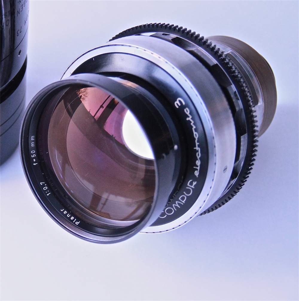
The Mutant: Stanley Kubrick’s unbeatable light sucker, the Zeiss 50mm f/0.7 lens.
By MICHAEL PERKINS
IF THE SUPREME BEING IS CORRECTLY QUOTED, as having proclaimed, at the dawn of time, “Let There Be Light!”, then photographers, since the beginning of their own Creation, have more specifically pleaded, “let there be more light.” Indeed, incredible leaps in imaging technology over the last two centuries have taken us from ten-minute daguerreotype exposures to sharp, bright images snapped in thousandths of a second, and, still, the fight for more light and faster lenses continues unabated.
Between here and there, a few photographers have made their mark by pushing this envelope a little farther than the rest of us. One of them, however, tore that envelope to shreds, and his achievement in this area has never been surpassed, or even matched, by any of his peers.
That man’s name is Stanley Kubrick.
Before he began his directing career in the early 1950’s, Kubrick had years of experience under his belt as the youngest staff photographer for Look magazine, second only to Life as the premier photo-dominant national news weekly. Years before he wielded a Leica IIIf on that job, he had spent his early childhood learning the ins-and-outs of his own Graflex, one of the monster machines that battle-hardened newspaper photogs lugged to crime scenes and fires in dozens of “B” movies (stop the press). By his early ’30’s, Kubrick had amassed a personal collection of lenses and cameras that he would continue to modify and alter for use in his feature films, and by the ’70’s, he was ready to take a giant step attaining a kind of nirvana in the use of available light.

Hey, anyone got a match? The Zeiss delivers Kubrick’s candles-only visions for Barry Lyndon (1975).
As he prepared to adapt William Thackeray’s novel of 19th karmic komeuppance, Barry Lyndon, to the screen in 1974, Kubrick pondered filming the interior scenes of the story’s powdered-wig salons with no lighting whatever beyond that of candle power. Now, we’re not using the term “candle power” to refer to the measurement of light. No, I’m referring here to actual candles, and nothing else. To do so, he would have to have gear that simply did not exist in the gear closets of any major studio, or, in fact, the entire movie industry. To become the fastest man alive, lens-wise, he would have to go shopping at the same place NASA shopped.
Most commercial lenses available at the time opened no wider than around f/1.4, enough to give you and me more than enough light-gathering power for dark times around the house but far too slow to operate on a movie set without a huge battery of kliegs and floods to boost the illumination. However, Kubrick had heard that NASA had developed a lens specifically designed to allow scientists to get sharp images on the dark side of the moon, a Zeiss 50mm with a focal length of …gasp…f/0.7. Zeiss made just ten of these mutants. Six went to Houston. The company kept another one for a rainy day. And the remaining three were gobbled up by Stanley Kubrick.
Taking the aforementioned benchmark of f/1.4 as the 1970’s yardstick for “man, that’s fast”, the ability to open up to f/0.7 represented a quantum leap of at least two-and-a-half stops of extra light (check my math), allowing Kubrick’s film to be, absolutely, the only cinema feature to date to be lit exclusively by ambient light. Of course, it wasn’t all sugar cookies and Kool-Aid, since that also meant working in a range of focus so shallow that only selective parts of actors’ faces were in sharp registration at any given time, giving the players the extra problem of remembering how little their heads could move without screwing up the shot. It was the only thing that could force even more re-takes than Kubrick’s renowned mania for perfection. We’re not talking a fun shoot here.
The resulting, soft, soft, soffffft look of Barry Lyndon is intimate, delicate, and absolutely gorgeous (click the image for a slightly larger version). Practical? Not so much, but for the specific mood of that material, spot on. Critics of the final film either hailed the technique as a new benchmark or sniggered at what they regarded as a showy gimmick. Of course, audiences avoided the film like Jim Carrey fleeing vaccines, so the entire thing remains, for many, a kind of grandiose Guiness-book stunt. Still, while ever-faster lenses and films eventually allowed directors much greater freedom, Uncle Stanley’s claim as fastest gun still merits its place in the hall of frame.
As a strange post-script to the story, several companies have recently boasted that you, too, might rent the same kind of hack-hybrid that Kubrick had fashioned to support the light-sponging Zeiss glass, their ads suggesting that you might secure the needed funding with the sale of several of your more expendable internal organs. Cheap at the price. The Lord got all the light he wanted pretty much on demand. The rest of us have to curse the darkness and, well, light another candle.
MAKING LIGHT OF THE SITUATION
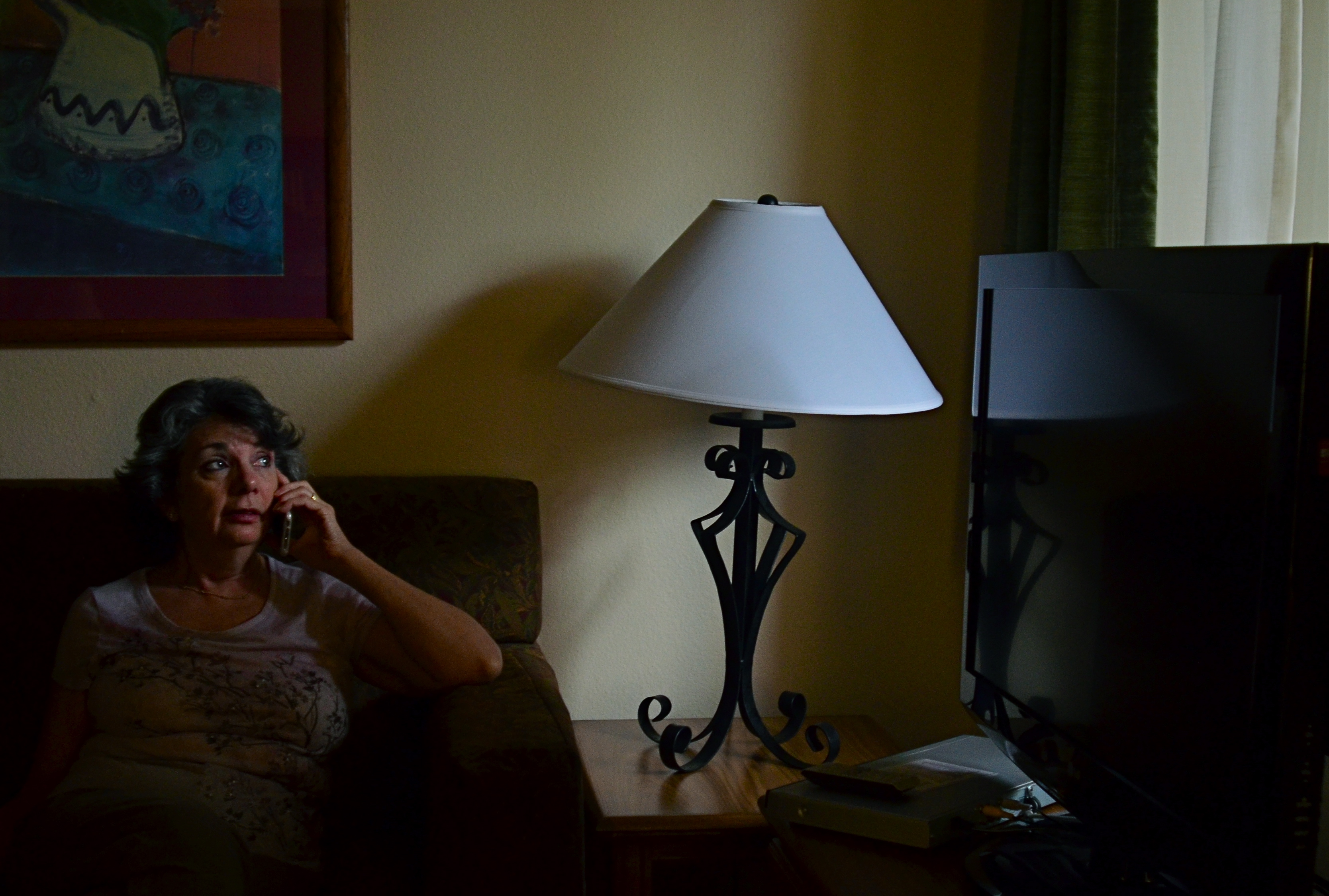
One lady, one source of light, one shot: 1/40 sec., f/1.8, ISO 640, 35mm.
BY MICHAEL PERKINS
IN PORTRAITS, PHOTOGRAPHERS SOMETIMES HAVE TO SUBSTITUTE INTIMACY FOR TECHNICAL PERFECTION. We understandably want to come as near as possible to meticulously modulated light in telling the story of a face, and so we try to ride the line between natural, if inadequate light, and light which is shaped so much that we dull the naturalness of the moment.
It’s a maddening tug of war. If we don’t intervene, we might make an image which is less than flattering, or, worse, unfit for publication. If we nib in too much, we get a result whose beauty can border on the sterile. I find that, more often than not, I lean toward the technically limited side, choosing to err in favor of a studied snapshot rather than a polished studio look. If the face I’m shooting is giving me something real, I worry more about throwing a rock into that perfect pond with extra tinkering.
If my subject is personally close to me, I find it harder, not easier, to direct them, lest the quality I’m seeing in their natural state be replaced by a distancing self-consciousness. It puts me in the strange position of having to wait until the situation all but gifts me with the picture, as adding even one more technical element can endanger the feel of the thing. It’s times like this that I’m jammed nose-up against the limits of my own technical ability, and I feel that a less challenged shooter would preserve the delicacy of the situation and still bring home a better photograph.
In the above frame, the window light is strong enough to saturate the central part of my wife’s face, dumping over three-fourths of her into deep shadow. But it’s a portrait. How much more do I need? Would a second source of light, and the additional detail it would deliver on the left side of her head be more “telling” or merely be brighter? I’m lucky enough in this instance for the angle of the window light to create a little twinkle in her eye, anchoring attention in the right place, but, even at a very wide aperture, I still have to crank ISO so far that the shot is grainy, with noise reduction just making the tones flatter. It’s the old trade-off. I’m getting the feel that I’m after, but I have to take the hit on the technical side.
Then there was the problem that Marian hates to have her picture taken. If she hadn’t been on the phone, she would already have been too aware of me, and then there goes the unguarded quality that I want. I can ask a model to “just give me one more” or earn her hourly rate by waiting while I experiment. With the Mrs., not so much.
Here’s what it comes down to: sometimes, you just have to shoot the damned thing.
OPEN ALL NIGHT
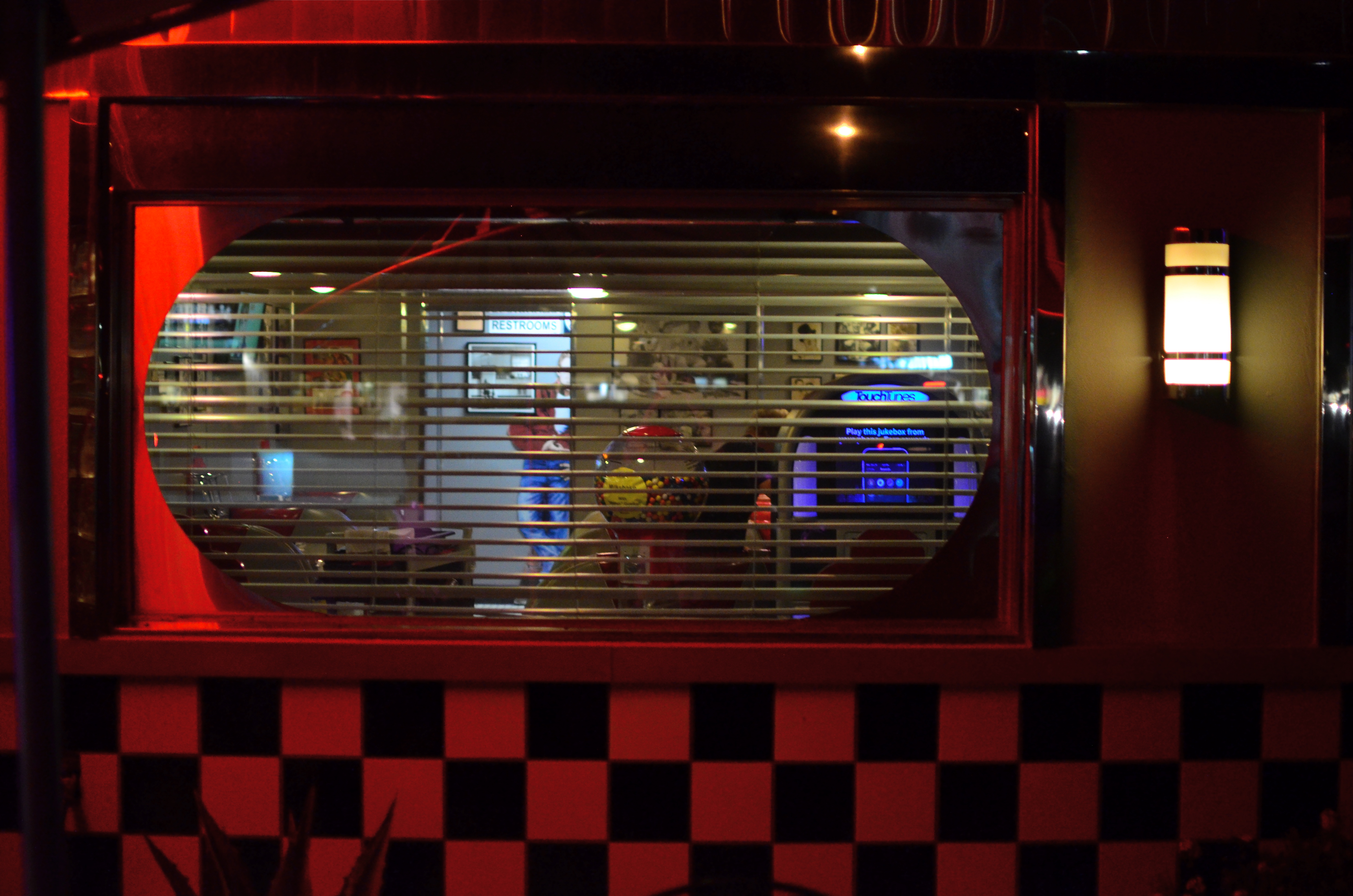
Diner-Vision, 2015.
By MICHAEL PERKINS
WHICHEVER SHIFT YOU WORK, YOU ARE FOREVER A STRANGER TO THOSE who work the other side of the workday. And while the majority of us generally fit into the standard 9 to 5 job template, millions of us have our body clocks regularly flipped upside down, our days cloaked in darkness, our brains awake while the city at large sleeps. That means that at any moment, half of us have little comprehension of how the other half lives. There’s a story in that.
And stories need pictures.
Pictorially speaking there has always been a bit of a black market mindset about the night-time, a nether world for some, a regular hangout for others. And with good reason: photography, in its infancy, had to ply its trade largely in sunlight, avoiding scenes which required either too much time, too much prep, or too much patience with slow recording media. But now we live in a very different world, armed with digital computers that look suspiciously(!) like cameras, but which react to light with an efficiency unseen in the entire history of photography.
Capturing the night is no longer a rare technical achievement, and we are really only at the front end of a steadily rising curve of technical enhancement in the area of light sensitivity, with no end in sight. Finally, darkness is something that uniquely colors and reveals reality instead of cloaking it in mystery. There is no longer an end to the shooting day. The image above is by no means an exceptional one, shot with a prime lens open to f/1.8 and a sensor that can deliver manageably low noise even at ISO 1250. More importantly, it is a handheld snap, shot at 1/30 sec…..all but unthinkable just a dozen years ago.
The new golden age of night photography is already apprehended by the youngest generation of shooters, since many of them can’t recall a time when it was a barrier to their expression. And, for those of us longer of tooth and grayer of beard, there is the sensation of being free to wander into areas which used to be sealed off to us. Sun up, sun down, it’s always time to take a picture.
Suddenly your eye is like a great downtown deli.
We’re open all night folks. We never close.
RAZOR’S EDGE
Sharpness should be achieved in your intial shot by use of contrast and color, not “dialed up” in post-editing. 1/160 sec., f/8, ISO 100, 22mm.
By MICHAEL PERKINS
THE AVAILABILITY OF PHOTO PROCESSING TOOLS, TO ARTIST AND BEGINNER ALIKE, in the digital era, has created a kind of unfortunate slingshot effect, as all suddenly achieved freedoms tend to. Once it became possible for Everyman to tweak images in a way that was once exclusively the province of the professional, there followed a trend toward twisting every dial in the tool box to, let’s be honest, rescue a lot of marginal shots. Raise your hand if you’ve ever tried to glam up a dud. Now raise your hand if you inadvertently made a bad picture worse by slathering on the tech goo.
Welcome to the phenomenon known as over-correction.
It’s human nature, really. Look at Hollywood. Suddenly freed from the confines of the old motion picture production code in the 1960’s, directors, understandably, took a few years to make up for decades of artistic construction by pumping out a nude scene and/or a gore fest in everything from romantic comedies to Pink Panther cartoons. Several seasons of adolescent X-rated frolics later, movies settled down to a new normal. The over-correction gave way to a more mature, even restrained style of film making.
Am I joining the ranks of anti-Photoshop trolls? Not exactly, but I am noting that, as we grow as photographers, we will put more energy into planning the best picture (all energy centered before the snap of the shutter), and less energy into “fixing it in post”. If you shoot long enough and work hard enough, that shift will just happen. More correctly designed in-camera images equals fewer pix that need to be dredged from Dudland.
Look at the simple idea of sharpening. That slithery slider is available to everyone, and we all race after it like a kid chasing the Good Humor truck. And yet, it is a wider range of color and contrast, which we can totally control in the picture-taking process, which will result in more natural sharpness than the Slider Of Joy can even dream of. As a matter of fact, test my argument with your own shots. Increase your control of contrast or color and see if it doesn’t help wean you off the sharpen tool. Or expose your shots more carefully in-camera rather than removing shadows and rolling off highlights later. Or any other experiment. Your goals, your homework.
The point being that more mindful picture-making will eliminate the need for many crutch-like editing tweaks after the fact. And if that also makes you a better shooter overall, isn’t that pretty much the quest?
RETURN OF THE POD PEOPLE
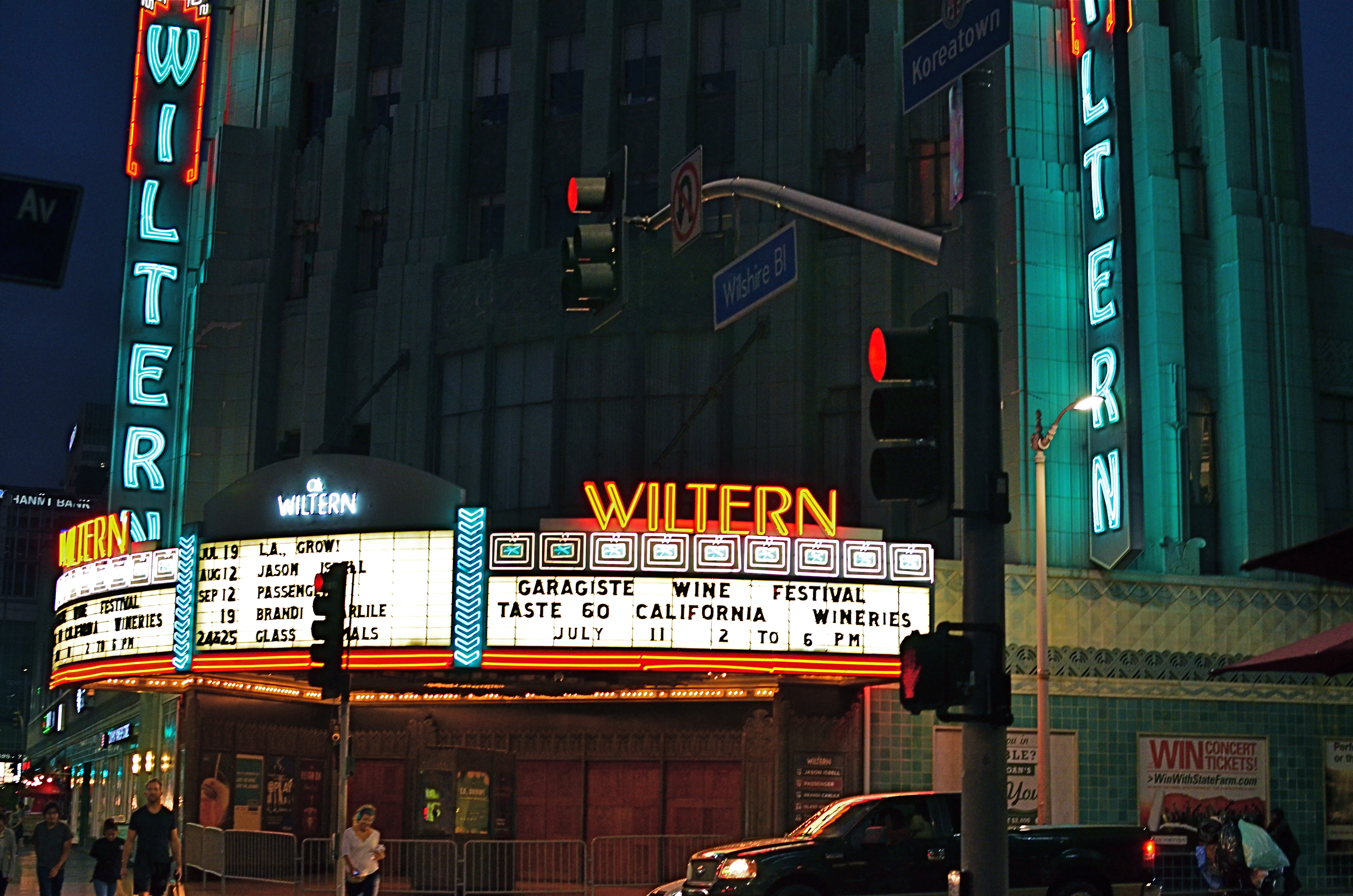
Wiltern On Wilshire, 2015. At f/3.5 and an ISO of 1000, this is an acceptably sharp hand-held exposure. Want the lights to be sharper? Might have to go tripod.
By MICHAEL PERKINS
I HAVE OCCASIONALLY SOUNDED WHAT, I ADMIT, IS A PREMATURE FUNERAL DIRGE for the lowly tripod, that balky, bulky, creaky throwback to the 19th century that continues to linger as an occasional, if fading, tool of the 21st. Part of this stems from the pure aggravation involved in trucking the things around, getting them locked and level, and praying that nothing from a stiff wind to an enraged gopher to a power-tripping mall cop will intervene to undo the entire rickety works. Hey, I’m not a hater, just a very reluctant fan.
One of the reasons I’ve mostly weaned myself from the pod is the ever-evolving speed of lenses and sensors in the digital era. This means scenes with less and less light can be captured with greater sharpness in short, hand-held exposures, albeit with a little more visual noise or grain. You can now shoot on a dark street at night, if your lens opens wide enough to keep your ISO as low as possible and if you can maintain a rock-steady grip on your camera at shutter speeds around 1/20 or so. And, for many cases, the results from this setup will be quite satisfactory.
However, we ain’t just about being satisfied, are we, mmmm?
Problem with a wide exposure and bright highlights (like the theatre marquee in the above shot) is that those elements will burn in and become diffuse, even in fast exposures, especially since your ISO setting is instructing your sensor to suck light like a maniac. As a result, instead of being sharp pinpoints of light, they will often turn soft and globby. If you can live with that, then go in peace and sin no more, my son.
However, if you really need to get those lights as sharp as you see them with your own eye, you might try doing a longer exposure at a smaller aperture, and that can mean dragging the pod down from the attic and doing it old-school. Good news is that you can now crank your ISO back down to minimum, so, yay, no noise atall, atall. You also might pick up some more contrast and detail within bright objects, like the horizontal lines on the above marquee. Bad news is, duh, you’re using a tripod. Hey, is that a mall cop I see running over here?
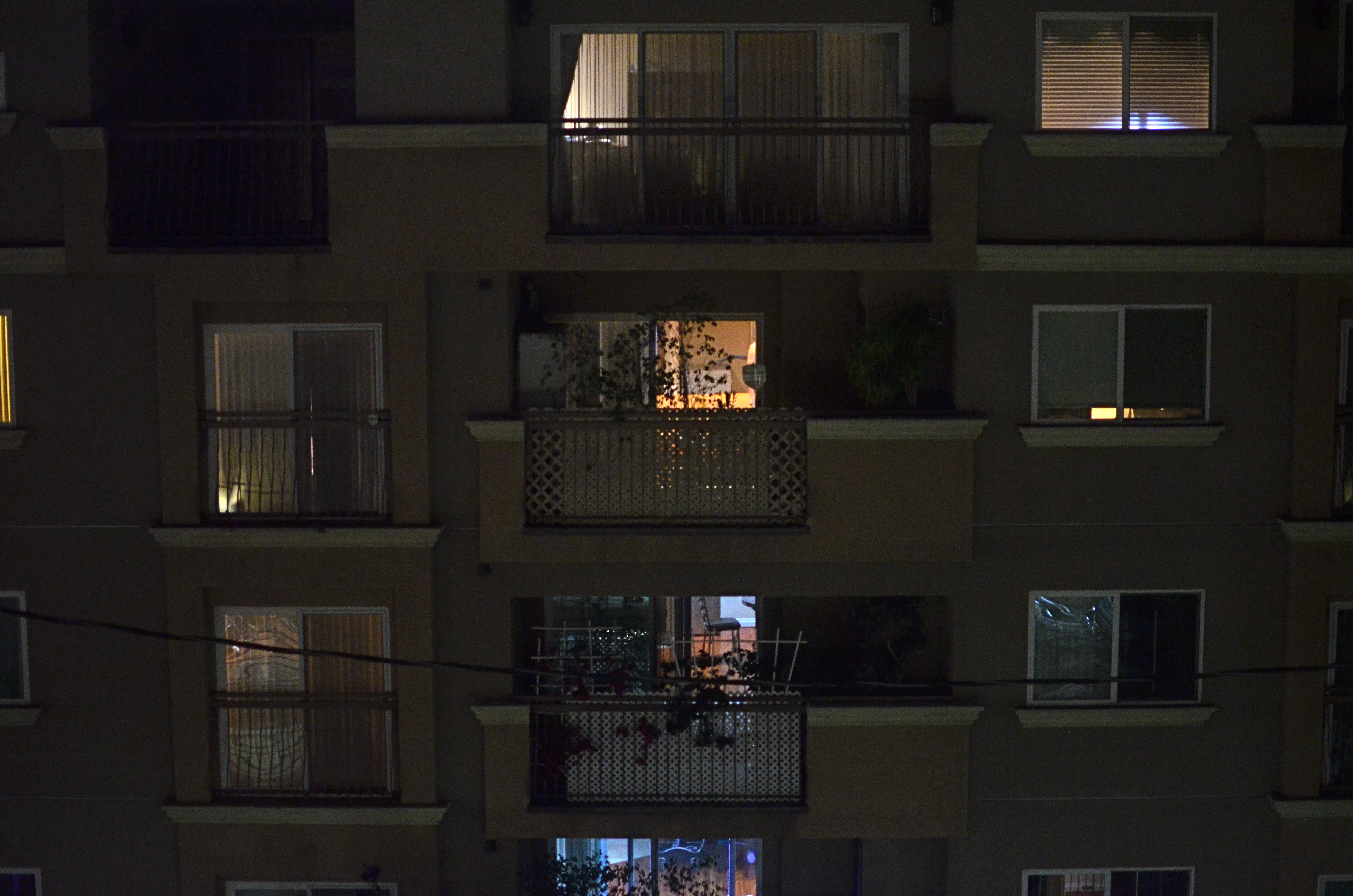
UNKNOWN KNOWNS
1/15 sec., f/1.8, ISO 1000, 35mm.
By MICHAEL PERKINS
ALFRED HITCHCOCK’S CLASSIC REAR WINDOW IS THE ULTIMATE GUILTY PLEASURE, and not just because the Master of Suspense is at the peak of his edge-of-your-seat powers in the telling of its thrilling murder story. No, the massive, full-sized set of James Stewart’s Manhattan neighborhood, with all its apartment-dwellers’ secrets open to the most casual snoop, is the creepy, giddy candy at the center of this cinematic confection. In making it temporarily okay to be, in effect, peeping toms, Hitchcock is making us complicit in his hero’s unsavory curiosity. All these dramas. All these secrets that we have no right in knowing. And, of course, we can’t look away.
Photographing the intersection of living spaces in city settings is far often more subtle than Hitch’s feat of shaving the back wall off an entire community, and that makes for a lot more mystery, most of us beyond solution. Look too little, and a slab of brick is more like a beehive than a collection of stories. Look too deeply, and the truths you unearth can feel stolen, like an invasion done purely for prurient entertainment. What’s most interesting is to imply much but reveal little, and hitting that balance is tough.
I recently killed off the last fifteen minutes of a generally unproductive night of street shooting by gazing out the window of my nondescript hotel at an equally nondescript apartment building across the way. The last vestiges of dusk offered scant details on the outside wall, and the warm yellow hum of electrical light had already begun to flicker on in the various cubicles. I thought of Rear Window and how you could look at the fully visible doings of people, yet still know virtually nothing of their lives. Here the lighting was random, undefined, with little real information on the life throbbing within the individual spaces….the dead opposite of Hitchcock’s deliberate staging.
I couldn’t see a face, a hand, an activity. All I had was the mere suggestion of human presence. What were they reading, watching, wishing, enduring, enjoying, hating? I couldn’t know and I couldn’t show it, but I could show the mystery itself. I could share, if you will, the sensation of not being able to know. And so I made a photograph of that lack of information.
Some photographs are about things, obvious things that you’re able to freeze in time. Other images are about the idea of something, a kind of unsatisfied anticipation. Both kinds of pictures have their own narrative code, and learning how to manage these special languages is great practice for the idea, and the mind back of it.
