BEYOND THE “OWIE”
Even if the people in the picture are not drunk, desperate, or dying, it’s still street photography.
By MICHAEL PERKINS
SINCE THE CAMERA IS, FIRST AND FOREMOST, A RECORDING INSTRUMENT, it has always defaulted to the function of a journalist’s device, a reportorial machine for bearing witness to events. Certainly, it was inevitable that newspapers and magazines would, over time, turn to the camera as a way of marking or defining events, of making a visual document of things. And soon, of course, that simple recording process gave way to overt commentary, to an event being imbued with as much personal bias by a photographer as had always been the case with prose writers. It was possible for the camera to have an opinion.
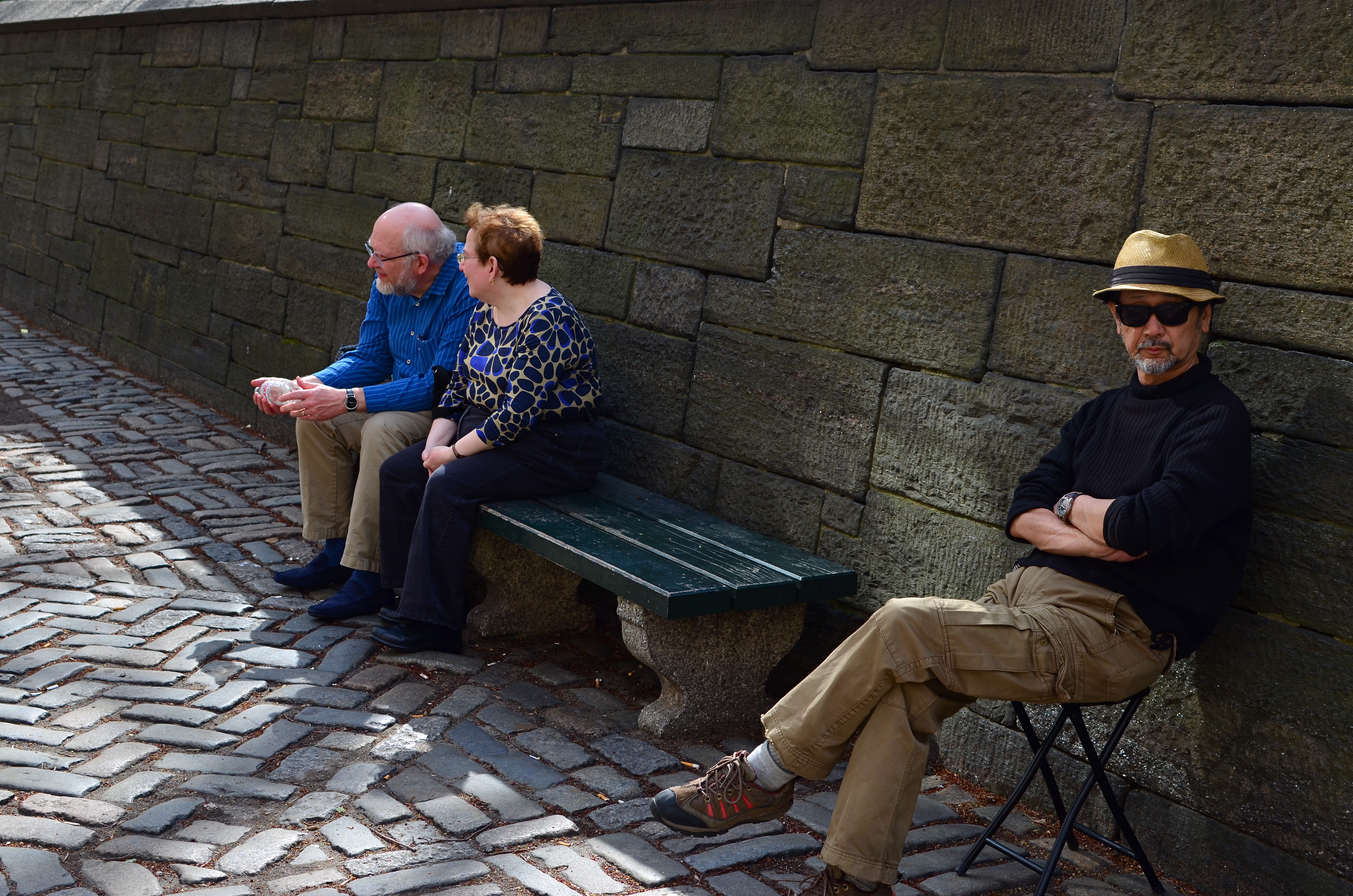
Street photography, which allowed the amateur to stamp his view on what he saw no less than the professional journalist, should, certainly, have developed a judgemental eye toward the tragic, the awful in life. But, as often happens, it has spawned a school of thought in which people who fancy themselves “serious” artists reflect only rotting cities or crying children. This promotes a dishonest view of the world, since, sometimes, as Elton John once wrote, “the boulevard is not that bad.” And that makes our art lopsided. I call it “photographing OWIEs” (Orphans, Winos, Idiots and Eccentrics), and it has become something of a runaway industry.
It’s a popular conceit: only dour poets are “real” poets. Only depressed writers know anything of life. And only photographers who depict abject misery really “get” the human condition. This is flawed thinking, but invariably catches hold in every “authentic” gallery exhibit, every “honest” critical essay, and every other place pretentious humans congregate to celebrate their shared gravitas.
Street photography that reflects hope, or, God spare us, even a modicum of human normalcy should never be discounted or marginalized. Artists are charged with embracing both light and shadow. And certainly, for purely scientific reasons, photographs are impossible without taking both into account.
OH, IT’S HIDEOUS. I LOVE IT.
By MICHAEL PERKINS
THERE MAY BE NO RULES LEFT TO BREAK IN PHOTOGRAPHY, in that everybody is comfortable doing absolutely anything….compositionally, conceptually, technologically…to get the picture they want. Maybe that’s always the way it’s been, seeing as the art of image-making, like the science of breeding apple trees, has always grown faster and stronger through cloning and grafting. Hacks. Improvisations. “Gee-What-If”s.
Shots in the dark.
Not a bad starting point, but either too pretty, or not ugly enough…or something.
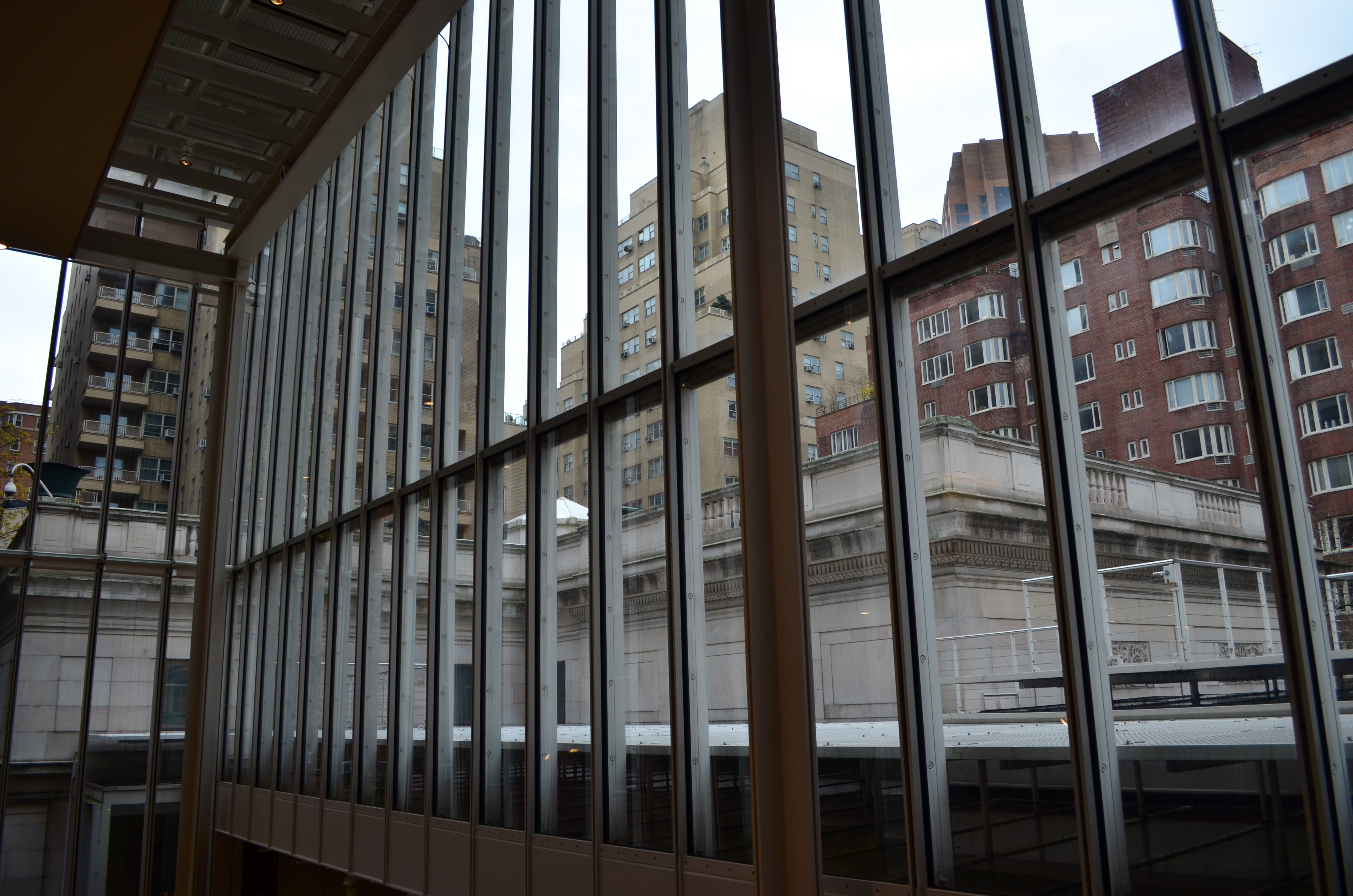
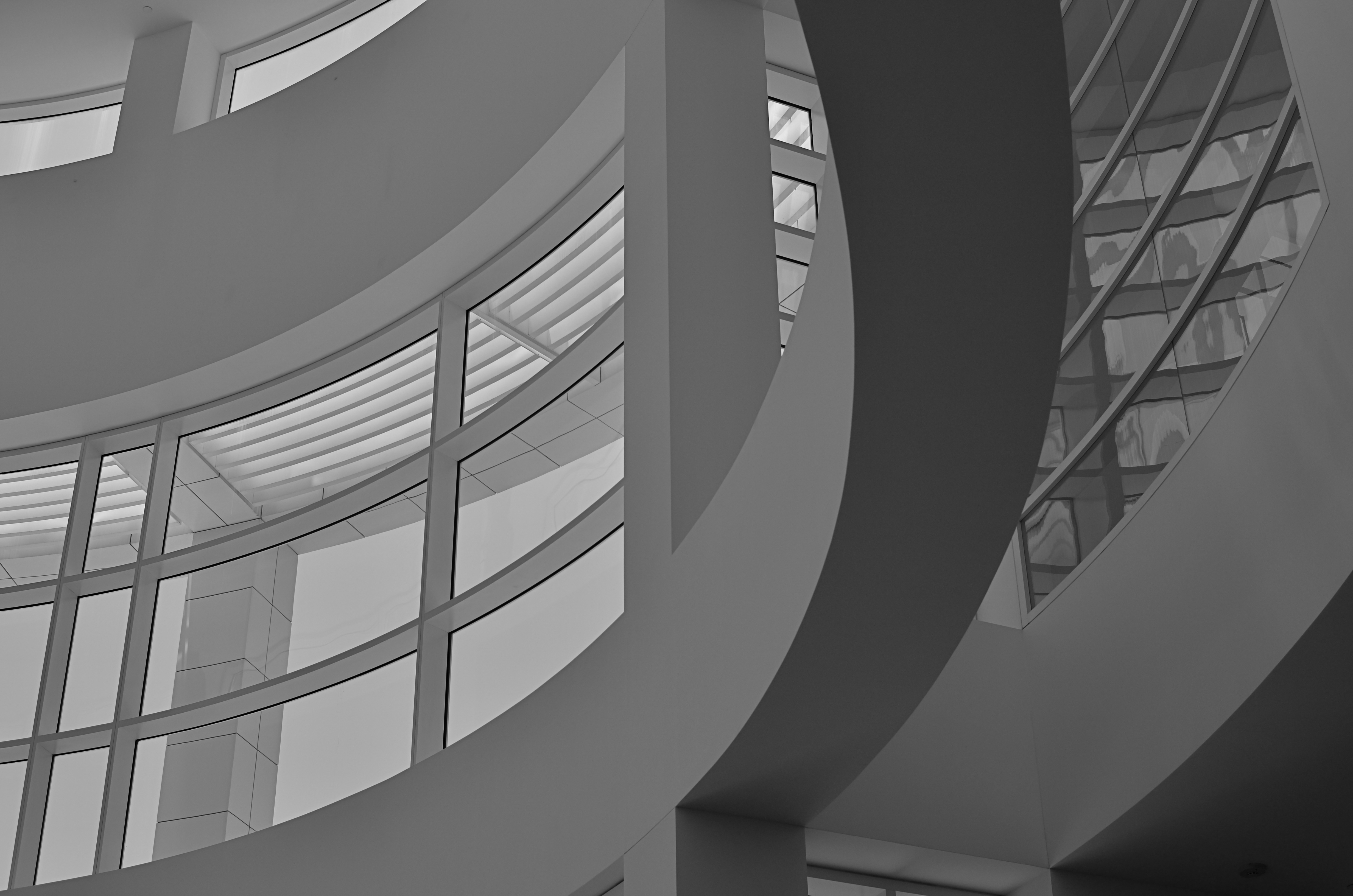
Recently I walked out into the gigantic atrium that connects all of the original buildings of the Morgan Library complex in NYC to get a good look at the surrounding neighborhood of big-shouldered buildings. I was fascinated by the way my wide-angle lens seemed to line up the horizontal grid lines of the atrium with the receding lines of the towers and boxes down the block. Only one thing bothered me about the result: the color, or rather, the measly quality of it.
A rainy day in Manhattan is perhaps the final word on rainy days. Some colors, like the patented screaming yellow of a New York cab, or the loud neon reds of bodegas, are intensified into a romantic wash when the drops start. This view, however, was just a bland mash of near-color. If the neighborhood was going to look dour anyway, I wanted it to be dour-plus-one. Thing is, I made this, ahem, “artistic” decision after I had already traveled 3,000 miles back home. In the words of Rick Perry, whoops.
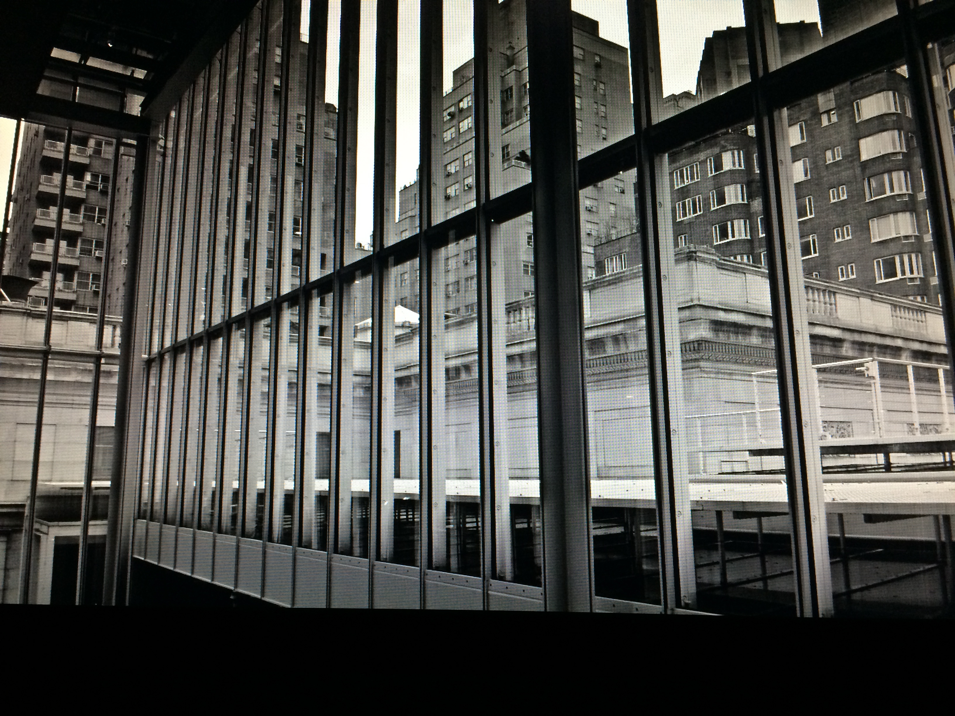
Time to hack my way to freedom. I remembered liking the look of old Agfa AP-X film in a filter on my iPhone, so I filled the screen of my Mac with the bland-o image, shot the screen with the phone, applied the filter, uploaded the result back into the Mac again, and twisted the knobs on the new cheese-grater texture I had gained along the way. At least now it looked like an ugly day….but ugly on my terms. Now I had the kind of rain-soaked grayscale newspaper tones I wanted, and the overall effect helped to better meld the geometry of the atrium and the skyline.
No rules? Sure, there’s still at least one.
Get the shot.
TURN THE PAGE
By MICHAEL PERKINS
I’M VERY ACCUSTOMED TO BEING STOPPED IN MY TRACKS AT A PHOTOGRAPH THAT EVOKES A BYGONE ERA: we’ve all rifled through archives and been astounded by a vintage image that, all by itself, recovers a lost time.
It’s a little more unsettling when you experience that sense of time travel in a photo that you just snapped. That’s what I felt several weeks ago inside the main book trove at the Morgan Library in New York. The library itself is a tumble through the time barrier, recalling a period when robber barons spent millions praising themselves for having made millions. A time of extravagant, even vulgar displays of success, the visual chest-thumping of the Self-Made Man.
The private castles of Morgan, Carnegie, Hearst and other larger-than-life industrialists and bankers now stand as frozen evidence of their energy, ingenuity, and avarice. Most of them have passed into public hands. Many are intact mementos of their creators, available for view by anyone, anywhere. So being able to photograph them is not, in itself, remarkable.
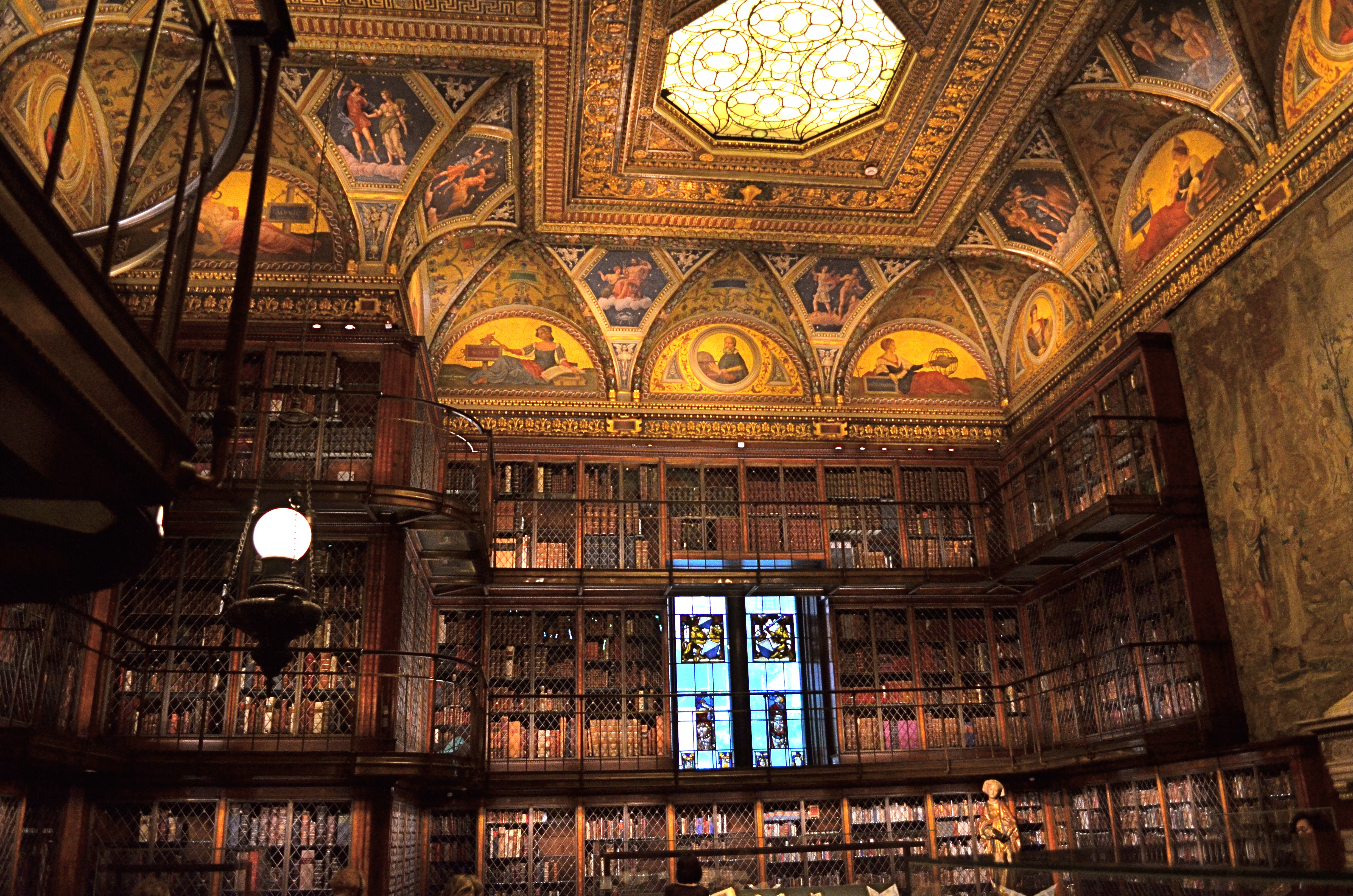
A little light reading for your friendly neighborhood billionaire. Inside the Morgan Library in NYC.
No, it’s my appreciation of the fact that, today,unlike any previous era in photography, it’s possible to take an incredibly detailed, low-light subject like this and accurately render it in a hand-held, non-flash image. This, to a person whose life has spanned several generations of failed attempts at these kinds of subjects, many of them due to technical limits of either cameras, film, or me, is simply amazing. A shot that previously would have required a tripod, long exposures, and a ton of technical tinkering in the darkroom is just there, now, ready for nearly anyone to step up and capture it. Believe me, I don’t dispense a lot of “wows” at my age, over anything. But this kind of freedom, this kind of access, qualifies for one.
This was taken with my basic 18-55mm kit lens, as wide as possible to at least allow me to shoot at f/3.5. I can actually hand-hold fairly steady at even 1/15 sec., but decided to play it safe at 1/40 and boost the ISO to 1000. The skylight and vertical stained-glass panels near the rear are WINOS (“windows in name only”), but that actually might have helped me avoid a blowout and a tougher overall exposure. So, really, thanks for nothing.
On of my favorite Twilight Zone episodes, the one about Burgess Meredith inheriting all the books in the world after a nuclear war, with sufficient leisure to read his life away, was entitled “Time Enough At Last”. For the amazing blessings of the digital age in photography, I would amend that title by one word:
Light Enough…At Last.
A SQUARE DEAL
By MICHAEL PERKINS
Symmetry is key with square compositions.
I WAS AT THE MORGAN LIBRARY IN NEW YORK earlier this week, combining a museum tour with a photo shoot, when I came upon an exhibit which featured one of the earliest Kodak consumer prints, with the image contained inside a circle, rather than the rectangular frames most of us remember. It reminded me that the very formatics of picture-making were, for a long time, dictated by the physical dimensions of either camera or film, and that, suddenly, we are free to make photographs of any proportions we choose, anytime, everytime.
It’s really an amazing liberation, and, as an ironic consequence, some photographers are choosing to return to the framing formats that they used to decry as too limiting, subjecting themselves to the extra discipline of staying within a boundary and adjusting their compositional priorities thusly. This has made for a kind of revival of the square image, and there seem to be some distinct advantages to the trend.
Shooting on the square means calling attention to the center of an image, to using symmetry to your advantage, and to paring your composition to its bare essentials. The negative space used in landscape or portrait modes can still work within a square image, but the subject, and your use of it, must be just right. Squaring off means calling immediate attention to your message, and making it all the stronger, since there’s nowhere else for the eye to go.
Andrew Gibson, writing for the website Digital Photography School, explains the visual appeal of the square:
Using the square format encourages the eye to move around the frame in a circle. This is different from the rectangular frame, where the eye is encouraged to move from side to side (landscape format) or up and down (portrait format). The shape of the frame is a major factor.
It’s odd to think of freeing up your photography by voluntarily working within a more restrictive format. And, unlike the old days of square-only shooting, the effect is largely created “after the click”, by re-composing through creative cropping. But the additional mindfulness can really boost the power of your images.
THE POLAROID EFFECT
BY MICHAEL PERKINS
I’VE BEEN TRYING TO FIND A WAY TO DESCRIBE THE COMBINATION OF HOPE AND ANXIETY THAT ATTENDS MY EVERY USE OF A SMARTPHONE CAMERA. Coming, as do many geezers of my era, from a tradition of full-function, hands-on, manual cameras, I have had a tough time embracing these miraculous devices, simply because of the very intuitive results that delight most other people.
But: it’s a little more complicated than my merely being a control freak or a techno-snob.
What’s always perplexing to me is that I feel that the camera is making far too many choices that it “assumes” I will be fine with, even though, in many cases, I am flat-out amazed at how close the camera delivers the very image I had in mind in the first place. It doesn’t exactly make one feel indispensable to the process of picture-making, but that’s a bug inside my own head and I gotta deal with it.

Stealthy and readily at hand: smartphone cameras keep opportunities from being lost.
I think what I’m feeling, most of the time, is what I call the “Polaroid Effect”. To crowd around family or friends just moments after clicking off a memory with the world’s first true instant film cameras, those bulky bricks of the Mad Men era, was to share a collectively held breath: would it work? Did I get it right? Then as now, many “serious” photographers were reluctant to trust a Polaroid over their Leicas or Rolliflexes. Debate raged over the quality of the color, the impermanence of the prints, the limited lenses, the lack of negatives, and so on. Well, said the experts, any idiot can take a picture with this.
Well, that was the point, wasn’t it? And some of us “idiots” learned, eventually, to take good pictures, and moved on to other cameras, other lenses, better pictures, a better eye. But there was that maddening wait to see if you had lucked out with those square little glimpses of life. The uncertainty of trusting this…machine to get your pictures right.
And yet look at the above image. I asked a lot in this frame, with wild amounts of burning hot sunlight, deep shadows, and every kind of contrast in between just begging for the camera to blow it. It didn’t. I’m actually proud of this picture. I can’t dismiss these devices just because they nudge me out of my comfort zone.
Smartphone cameras truly extend your reach. They go where bulkier cameras don’t go, prevent more moments from being lost, and are in a constantly upward curve of technical improvement. People can and do make astounding pictures with them, and I have to remind myself that the ultimate choice…that of what to shoot, can never be taken away just because the camera I’m holding is engineered to protect me from my own mistakes.
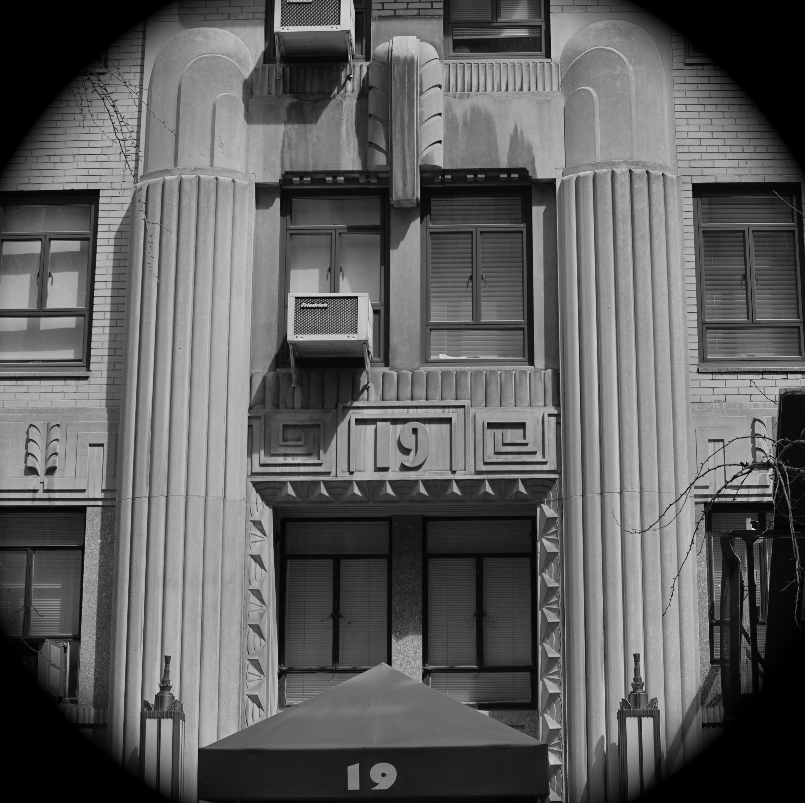
TRY A DIFFERENT DOOR
By MICHAEL PERKINS
PUBLIC PLACES, ESPECIALLY RECREATION SPACES, ARE A REAL STUDY IN IMAGE CONTROL. The world’s playgrounds and theme parks are, of course, in the business of razzle-dazzle, and their marquees, grand courts and official entrances are carefully crafted facades designed to delight. For photographers, that usually means we all take the same pictures of the same Magic Gate or Super Coaster or whatever. Great for convenience: not so great for photography.
I’m not saying that it’s impossible to improvise a different way to frame something new in shooting something overly familiar. But I am saying that sneaking around to the service entrance can have its points, too, offering a flavor of things that are a little funkier, a little less polished, a little less ready for prime time. I recall my dad, who, years ago, dreamed of taking the ultimate “real” shots of the circus, trolling around near some of the lesser-traveled entrances and halls, trying to catch the clowns and acrobats either just before or just after their time in the ring. I still pursue that strategy sometimes.
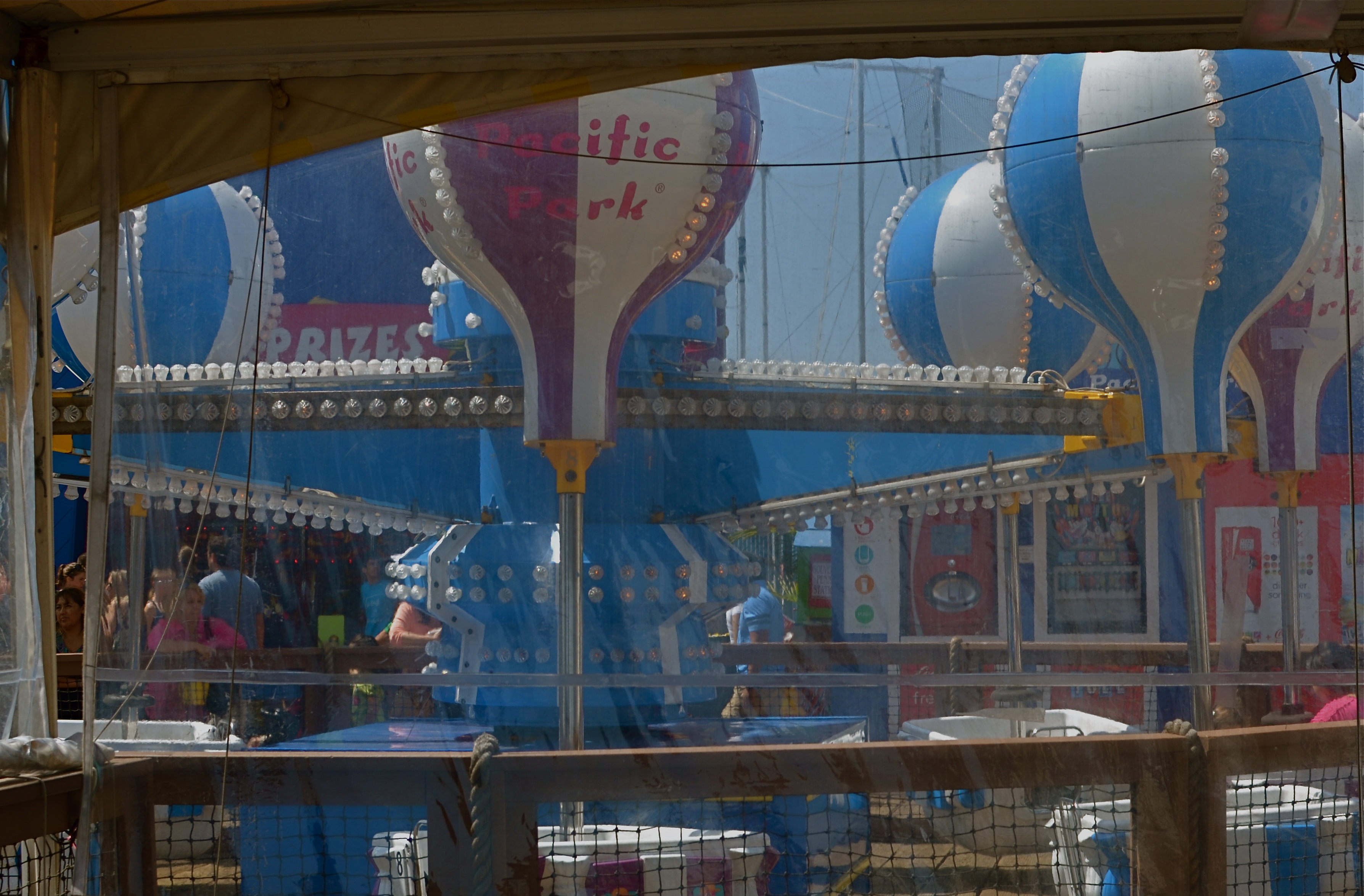
All the fun of the fair, just seen from backstage.
Pacific Park, the amusement center along the boardwalk at the Santa Monica pier, is a predictably colorful, semi-cheesy mix of carny sights and smells. The main foot traffic is straight down the pier to the fishing lookout, but there are alternate ways to get there along the back of the ride and games section. This shot is rather gauzy, as it’s taken through some sun-flecked netting, softening the color (and the appearance of reality) for some gaming areas. I took a lot of standard stuff on this day, but I keep coming back to this frame. It’s not a work of art, by any means, but I like the feeling that I’m not supposed to be there.
Of course, where I’m not supposed to be is, photographically, exactly where I want to be.
You never know when you might spy a clown without his rubber nose.
BREAKING THE BIG RULE
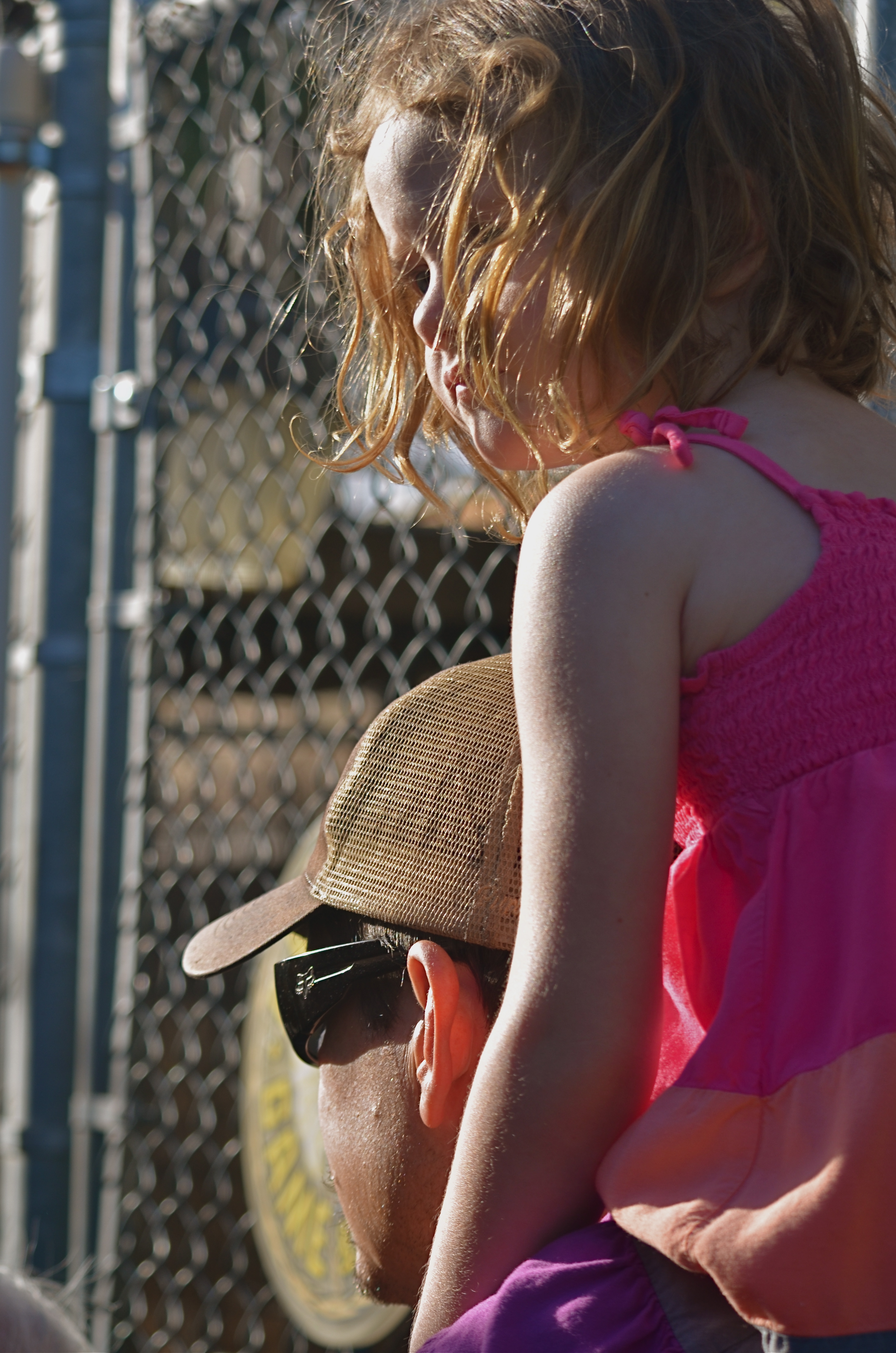
I can’t see this girl’s face. Does it matter? 1/160 sec., f/5.6, ISO 100, 55mm.
By MICHAEL PERKINS
FACES ARE THE PRIMARY REASON THAT PHOTOGRAPHY FIRST “HAPPENED” FOR MOST OF US. Landscapes, the chronicling of history, the measurements of science, the abstract rearrangement of light, no other single subject impacts us on the same visceral level as the human countenance. Its celebrations and tragedies. Its discoveries and secrets. Its timeline of age.
It is in witnessing to faces that we first learn how photography works as an interpretive art. They provide us with the clearest stories, the most direct connection with our emotions and memories. And the standard way to do this is to show the entire face. Both eyes. Nose. Mouth. The works. Right?
But can’t we add both interpretation and a bit of mystery by showing less than a complete face? Would Mona Lisa be more or less intriguing if her eyes were absent from her famous portrait? Would her smile alone convey her mystic quality? Or are her eyes the sole irreplaceable element, and, if so, is her smile superfluous?
Instead of faces as mere remembrances of people, can’t we create something unique in the suggestion of people, of a faint ghost of their total presence” Can’t images convey something beyond a mere record of their features on a certain day and date? Something universal? Something timeless?
It seems that, as soon as we maintain rigidity on a rule….any rule…we are likewise putting a fence around how far we can see. The face is no more sacred than any other visual element we hope to shape.
Let’s not build a cage around it.
FALL-OFF AS LEAD-IN
By MICHAEL PERKINS
USING “LEADING LINES” TO PULL A VIEWER INTO AN IMAGE IS PRETTY MUCH COMPOSITION 101. It’s one of the best and simplest ways to overcome the flat plane of a photograph, to simulate a feeling of depth by framing the picture so the eye is drawn inward from a point along the edge, usually by use of a bold diagonal taking the eye to an imagined horizon or “vanishing point”. Railroad tracks, staircases, the edge of a long wall, the pews in a church. We all take advantage of this basic trick of engagement.
Bright light into subdued light: a natural way to pull your viewer deeper into the picture. 1/100 sec., f/1.8, ISO 650, 35mm.
One thing that can aid this lead-in effect even more is shooting at night. Artificial lighting schemes on many buildings “tell” the eye what the most important and least important features should be…where the designer wants your eye to go. This means that there is at least one angle on many city scenes where the light goes from intense to muted, a transition you can use to seize and direct attention.
This all gives me another chance to preach my gospel about the value of prime lenses in night shots. Primes like the f/1.8 35mm used for this image are so fast, and recent improvements in noiseless ISO boosts so advanced, that you can shoot handheld in many more situations. That means time to shoot more, check more, edit more, get closer to the shot you imagined. This shot is one of a dozen squeezed off in about a minute. The reduction of implementation time here is almost as valuable as the speed of the lens, and, in some cases, the fall-off of light at night can act as a more dramatic lead-in for your shots.
GET THEE TO A LABORATORY

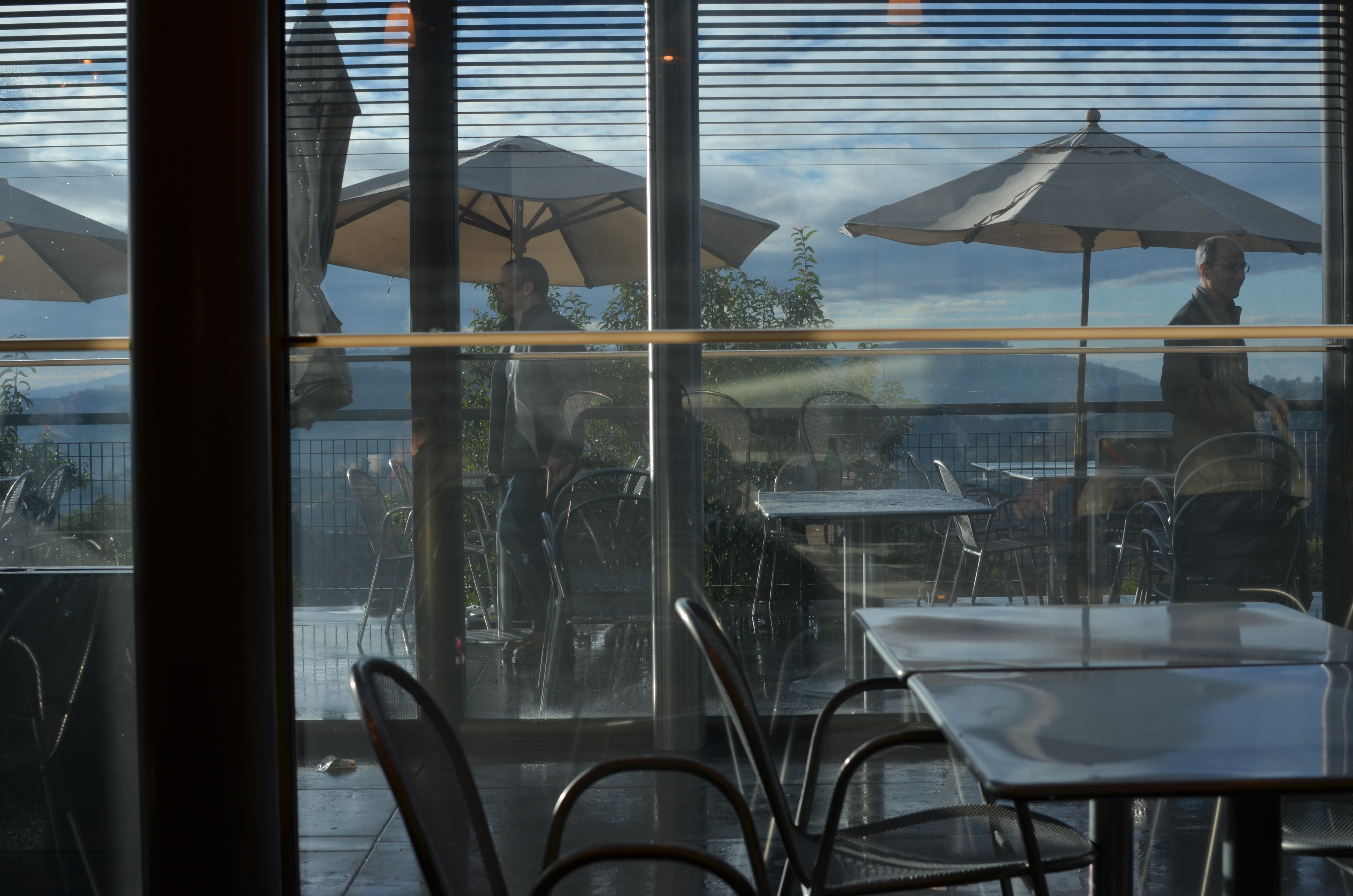
The Visitor Center at Los Angeles’ Getty Museum. 1/1600 sec., f/5.6, ISO 100, 35mm.
by MICHAEL PERKINS
PHOTOGRAPHIC SUBJECT MATTER, ONCE YOU’VE TRAINED YOURSELF TO SPOT IT, is always in ready supply. But, let’s face it: many of these opportunities are one-and-done. No repeats, no returns, no going back for another crack at it. That’s why, once you learn to make pictures out of almost nothing, it’s like being invited to a Carnival Cruise midnight buffet to find something that is truly exploding with possibilities, sites that actually increase in artistic value with repeat visits. I call such places “labs” because they seem to inspire an endless number of new experiments, fresh ways to look at and re-interpret their basic visual data.
My “labs” have usually been outdoor locations, such as Phoenix’ Desert Botanical Gardens or the all-too-obvious Central Park, places where I shoot and re-shoot over the space of many years to test lenses, exposure schemes, techniques, or, in the dim past, different film emulsions. Some places are a mix of interior and exterior and serve purely as arrangements of space, such as the Brooklyn Museum or the Library of Congress, where, regardless of exhibits or displays, the contours and dynamics of light and form are a workshop all in themselves. In fact, some museums are more beautiful than the works they house, as in the case of Guggenheim in NYC and its gorgeous west coast equivalent, The Getty museum in Los Angeles.
No color? No problem. Interior view of the Getty’s visitor center. 1/640 sec., f/5.6. ISO 100, 35mm.
Between the gleaming white, glass-wrapped buildings of this enormous arts campus and its sinuous, sprawling gardens (not to mention its astounding hilltop view), the Getty takes one complete visit just to get yourself visually oriented. Photographically, you will find a million isolated tableaux within its multi-acre layout upon subsequent trips, so there is no end to the opportunities for exploring light, scale, abstraction, and four full seasons of vibrant color. Not a color fan? Fine. The Getty even dazzles in monochrome or muted hues. It’s like Toys ‘R’ Us for photogs.
I truly recommend laying claim to a laboratory of your own, a place that you can never truly be “finished with”. If the place is rich enough in its basic components, your umpteenth trip will be as magical as your first, and you can use that one location as a growth graph for your work. Painters have their muses. Shooter Harry Calahan made a photographic career out of glorifying every aspect of his wife. We all declare our undying love for something.
And it will show in the work.
MINUTE TO MINUTE
Going, Going: Dusk giveth you gifts, but it taketh them away pretty fast, too. 1/40 sec., f/3.5, ISO 200, 18mm.
By MICHAEL PERKINS
VOLUMES HAVE BEEN WRITTEN ABOUT THE WONDROUS PHENOMENON OF “GOLDEN HOUR“, that miraculous daily window of time between late afternoon and early evening when shadows grow long and colors grow deep and rich. And nearly all authors on the subject, whatever their other comments, reiterate the same advice: stay loose and stay ready.
Golden hour light changes so quickly that anything that you are shooting will be vastly different within a few moments, with its own quirky demands for exposure and contrast. Basic rule: if you’re thinking about making a picture of an effect of atmosphere, do it now. This is especially true if you are on foot, all alone in an area, packing only one camera with one lens. Waiting means losing.
The refraction of light through clouds, the angle of the sun as it speeds toward the horizon, the arrangement between glowing bright and super-dark….all these variables are shifting constantly, and you will lose if you snooze. It’s not a time for meditative patience. It’s a time for reactivity.
I start dusk “walkarounds” when all light still looks relatively normal, if a bit richer. It gives me just a little extra time to get a quick look at shots that may, suddenly, evolve into something. Sometimes, as in the frame above, I will like a very contrasty scene, and have to shoot it whether it’s perfect or not. It will not get better, and will almost certainly get worse. As it is, in this shot, I have already lost some detail in the front of the building on the right, and the lighted garden restaurant on the left is a little warmer than I’d like, but the shot will be completely beyond reach in just a few minutes, so in this case, I’m for squeezing off a few variations on what’s in front of me. I’ve been pleasantly surprised more than once after getting back home.
What’s fun about this particular subject is that one half of the frame looks cold, dead, “closed” if you will, while there is life and energy on the left. No real story beyond that, but that can sometimes be enough. Golden hour will often give you transitory goodies, with its more dramatic colors lending a little more heft to things. I can’t see anything about this scene that would be as intriguing in broad daylight, but here, the hues give you a little magic.
Golden hour is a little like shooting basketballs at Chuck E. Cheese. You have less time than you’d like to be accurate, and you may or may not get enough tickets for a round of Skee-Ball.
But hey.
THE TYRANNY OF, LIKE, LIKING
An image which was nobody’s “fave”, but it made my list. 1/50 sec., f/6.3, ISO 100,18mm.
By MICHAEL PERKINS
MY MOTHER WARNED ME FOR MY ENTIRE BOYHOOD THAT, IF I LIVED MY LIFE TO PLEASE OR GARNER THE APPROVAL OF OTHERS, I would spend it “following a little red wagon”. Now, I can’t paint my generation as being populated by the last of the rugged individualists (after all, we have to live down that whole “flower child” business), but, when it comes to current social networking, it seems like that little wagon is indeed speeding along at light speed, with the rest of us slavishly tailgating it in desperate search of one crucial word:
“like”.
Let me state categorically that I view sites like Instagram with an equal measure of hope and dread, since history has yet to rule on whether its billions of filter-soaked snaps advance photography or mire it in mediocrity. That said, I am certain of one two-part truth:
1. Photography is essential to social networking, and
2. Social networking is not essential to photography.
Simply stated, the hungry maw of social media needs an endless resource of fresh meat, with photos as vital a component as text. To keep this torrent of images rolling in, it bestows little training treats on the millions to motivate them to submit their works and keep the machinery oiled. This is what likes, retweets, and faves have become. A gold star on your spelling paper. A little extra beef on your mess kit tray. Good boy, Fido, here’s your “like”.
But here’s the thing. You cannot grow your personal art if you are bending the arc of it purely toward the goal of popular approval. Art is not about getting “likes”. On the contrary, it’s frequently about garnering “hates”, deaf ears, blind eyes, misunderstanding, antipathy, even shunning or banishment. Art needs to make people uncomfortable, to confound and distress. And, just as it is in leaving our personal comfort zones that we stretch as photographers, we need our audiences to leave theirs. Guess what: they will not do that willingly or happily.
If it does it for you, one more or less “like” will not change that. 1/400 sec., f/5.6, ISO 100, 35mm.
History provides easy evidence of this: cough up the names of your ten favorite “legendary” photographers and chances are that most of them were marginalized, despised, or otherwise shunted away during their best years. There is a reason for this.
“Likes” are seductive, but they are merely quantitative, not qualitative. The raw number of people who numbly click “like” on a photo tells you nothing of what they felt was right, or elegant, or beautiful, or awful in an image. Such little emotional check-offs may stoke our need to be seated at the cool kids’ table, but they do zilch to make us better shooters.
To be a great photographer, you cannot afford the luxury of whether anyone else “gets” what you do. Let’s stop settling for photo sites as popularity contests.
They need you. You do not need them.
FRONT TO BACK
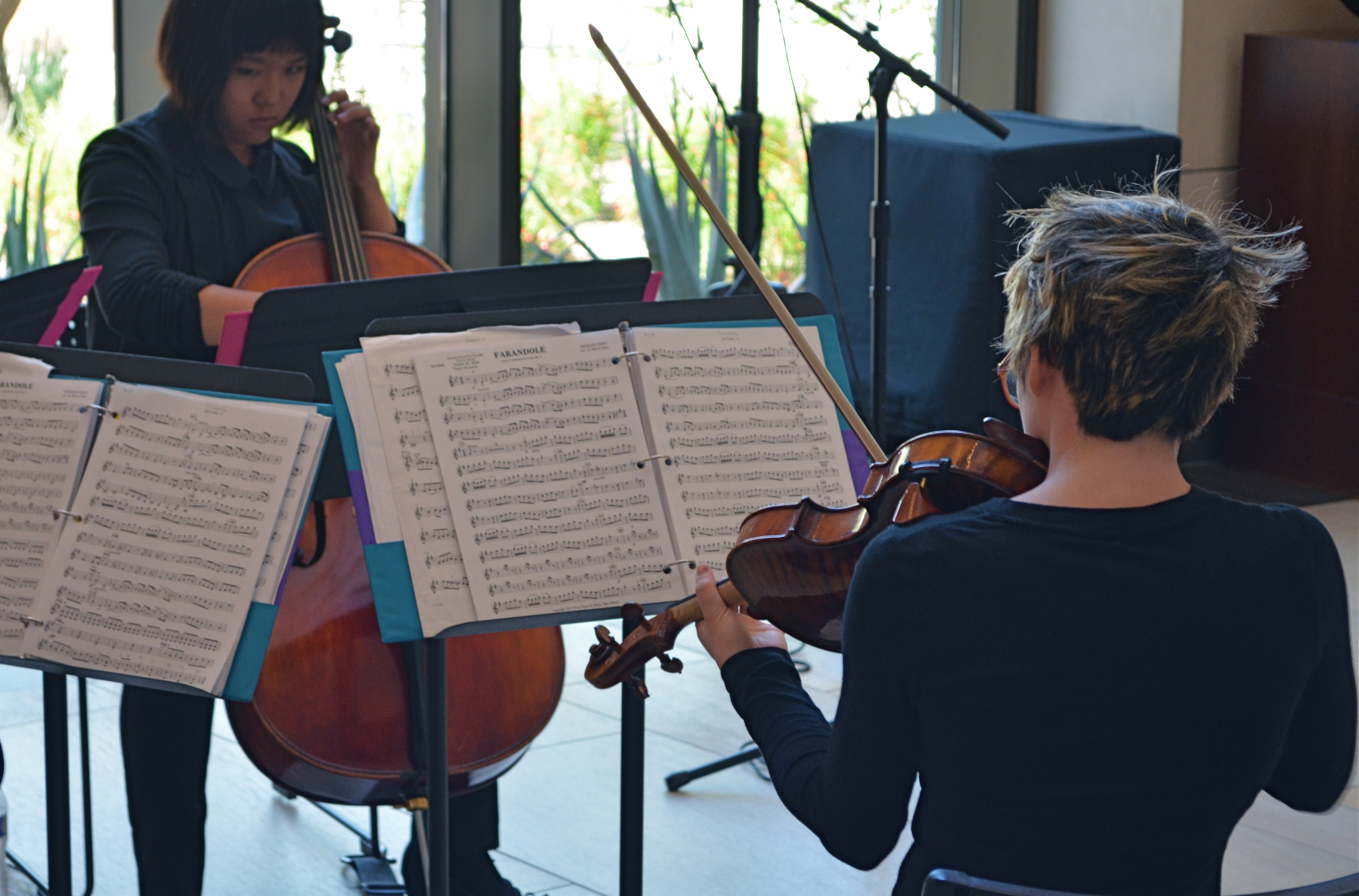
Then Play On: 1/60 sec., f/5.6, ISO 500, 55mm.
By MICHAEL PERKINS
NOT ALL PORTRAITS INVOLVE FACES.
I’ll let that little bit of blasphemy sink in for a moment. After all, the face is supposed to be the key to a persona’s entire identity, and God knows that many a mediocre shot has been saved by a fascinating expression, right? The eyes are the window to the soul, and so on, and so forth, etc., etc.
But is this “face-centric” bias worthy of photographers, who are always re-writing the terms of visual engagement on every conceivable subject? Is there one single way to make a person register in an image? Obviously I don’t believe that, or else I wouldn’t have started this argument, but, beyond my native contrariness, I just am not content with there being a single, approved way of visualizing anything. I’ve seen too much amazing work done from every conceivable standpoint to admit of any limitation, or need for a “rule”, even when it comes to portraiture.
The face is many things, but it’s not the entire body, and even if you capture a shot in which the subject’s face is absent, he or she can be so very present in the feel of the picture. Arms, shoulders, the sinews, the stance, the way a body stands in a frame…all can bear testimony.
I recently stumbled onto an impromptu performance by a young string quartet, and faced the usual problem of not being able to simultaneously do justice to all four members’ faces, to balance the tension and concentration written on all their features in performance. In such situations, you have to make some kind of call: the picture becomes a dynamic tension between the shown and the hidden, just as the music is a push-and-pull between dominant and passive forces. You must decide what will remain unseen, and, sometimes, that’s a face.
As the music evolved, the two ladies seen above were, in different instants, either in charge of, or at the service of, the energy of the moment. For this picture, I saw more strength, more power in the back of the violinist than in the front of the cellist. It was body language, a kind of structural tug between the pair, and I voted for what I could not show fully. As it turned out, the violinist actually has a lovely face, one possessing a stern, disciplined intensity. On another day, her story would have been told very differently.
On this day, however, I was happy to have her turn her back on me.
And turn my own head around a bit.
ART VS. ARTIFACT
By MICHAEL PERKINS
PHOTOGRAPHY HAS NOW ARRIVED AT A TRULY STRANGE PLACE. It’s no big bulletin that modern processing and phone apps now allow us to simulate the various visual defects and flaws we used to summarily reject from our images, deliberately including them in our pictures as design elements. Things to be desired.
Features to make the picture better.
????? Let’s take this out of the realm of photography for a moment to see how truly insane it is.
One of the more ridiculous gimmicks of the digital age in audio (which is, let’s face it, free of the scratch and hiss of analog recordings) was to put both these sources of annoyance and noise back into CDs. Hip-hop has been particularly egregious in the inclusion of crackle and scratches into tracks, as if these effects conferred some kind of authenticity on the results. It’s like a guy who gets a chin scar in a woodshop accident, then tells women at bars that he got it in a knife fight. Fake life, fake cred.
Back to photos, where downloadable apps let you slather on filters that simulate photos which appear damaged, ravaged by time, poorly exposed, marred by light leaks, or ruined as the result of faulty film processing. Now, think about this: we have become the first generation of photographers who think it is creative/profound/cute to make our pictures look bad on purpose, to make images that our predecessors would have (rightly) rejected as marred, imperfect, wrong.
Is this photo anything, or did I just keep dress it up in a funny party hat?
I took this image on a cel phone, then processed it through the app Alt Photo to simulate a daguerreotype. I did it mostly as an experiment, but then, in a moment of weakness, I posted it on image sharing sites where, so far, it has garnered over 5,000+ hits. Here is the problem: I can no longer determine whether my essential image has any merit, or whether its popularity is solely due to the effect. That bothers me. I feel that any attention or approval this photo has achieved has happened, well, dishonestly. I get the fun aspect: I enjoyed it, as a novelty, a lark, but the thought of anyone taking it seriously disturbs me. And I am angry at myself for giving into the temptation to put it out there.
Gimmicks aside, photography means something. Making a picture means something. And technical crutches that draw attention from that process are just cheap card tricks. Distractions. What an interesting problem: as a consequence of our technical cleverness, we are now locked in an eternal struggle between art and artifact.
SHARED JOURNEYS
By MICHAEL PERKINS
THERE CAN’T BE A SINGLE PHOTOGRAPHIC ARTIFACT ELOQUENT ENOUGH to speak to all the human experiences of a mass migration, so any attempt of mine or others to sum up the journey of the Irish in even a series of images will be doomed to, if not failure, the absence of many voices. Those who prayed and went unheard. Those who leaped only to vanish into the air. Those who had their souls and stomachs starved to make freedom more than an abstraction. Those who kept faith and those who lost their way.
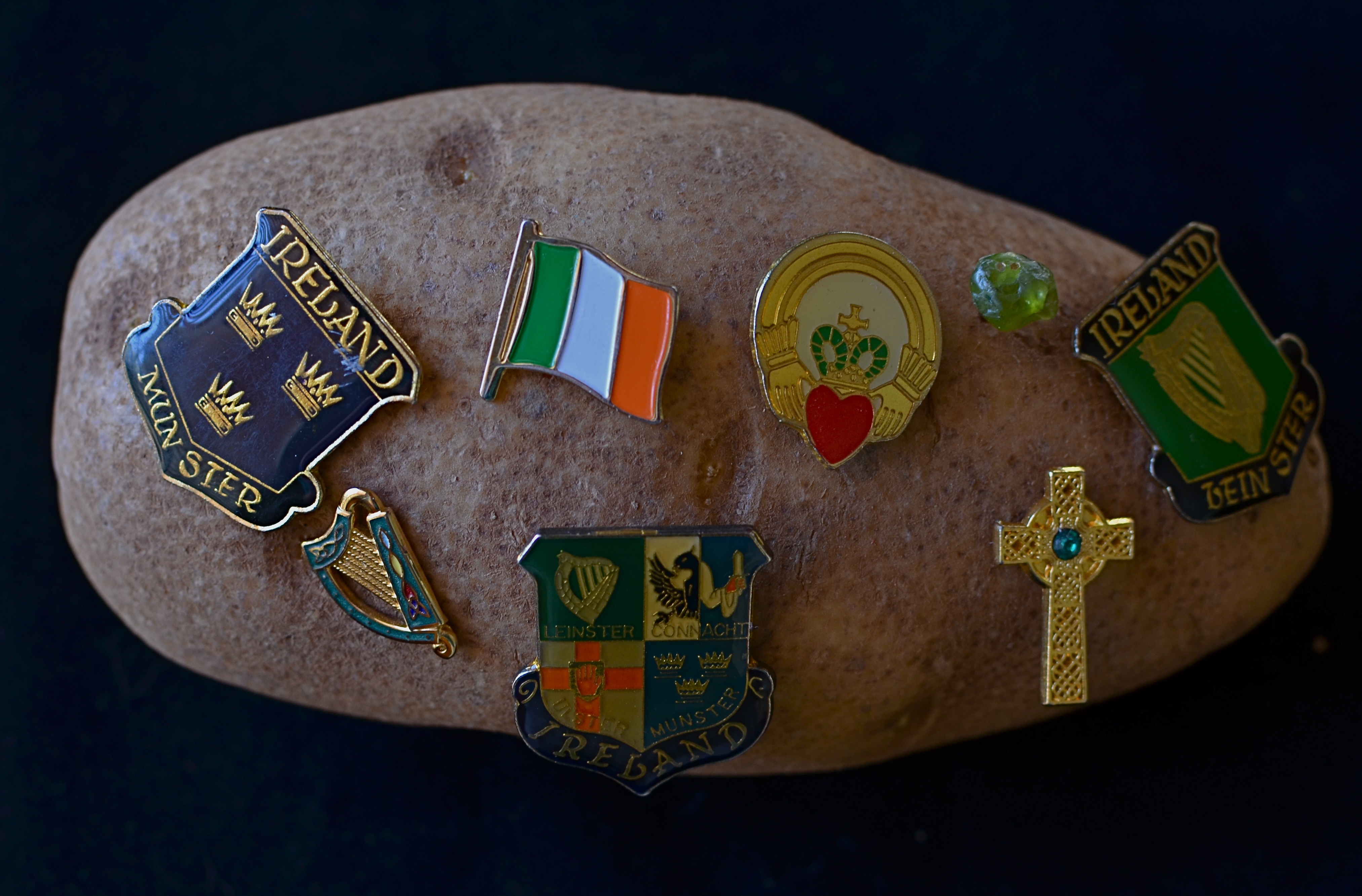
Rooted: 1/50 sec., f/5, ISO 200, 35mm.
America continues, on this St. Patrick’s Day, to struggle with the issue of who is welcome and who is “the other”, so the trek of the Irish from despised newcomers to an interwoven thread in the national fabric should be seen as a template. See, we should be saying to the newcomers, it can be done. You can arrive to jeers, survive through your tears, thrive in your cheers. Wait and work for justice. Take your place in line, or better yet, insist on a place in line, a voice in the conversation. The country will come around. It always has.
For the Irish, arrival in America begins in a time of gauzy memory and oral histories, then blends into the first era of the photograph and its miraculous power to freeze time. And when all the emerald Budweiser flowing on this day has long since washed away, the Irish diaspora will still echo in the collective images of those who first crossed, those who said an impossible, final farewell to everything in the hope of everything else, and those who stepped before a camera.
In some families the histories are blurred, fragmented. In some attics and scrapbooks, the faces are missing. The recent American love affair with geneology has triggered a search for the phantoms within families, the notes absent from the song, and this has coaxed some of the images out of the shadows. So that’s what she looked like, we say. Oh, you have his eyes. We still have that hat up in the attic. I never knew. I never dreamed.
One thing that can help, in all families, whatever their journeys to this place, is to bear witness with cameras. To save the faces, to fix them in time. To research and uncover. Another is to recall what it felt like to be “the other”, and to extend a hand to those who presently bear that painful label.
So, today, my thanks to the O’Neills, Doodys, McCourts, Sweeneys and others who got me here. Due to the ravages of time, I may not have the luxury of holding your faces in my hand.
But nothing can erase your voices from my heart.
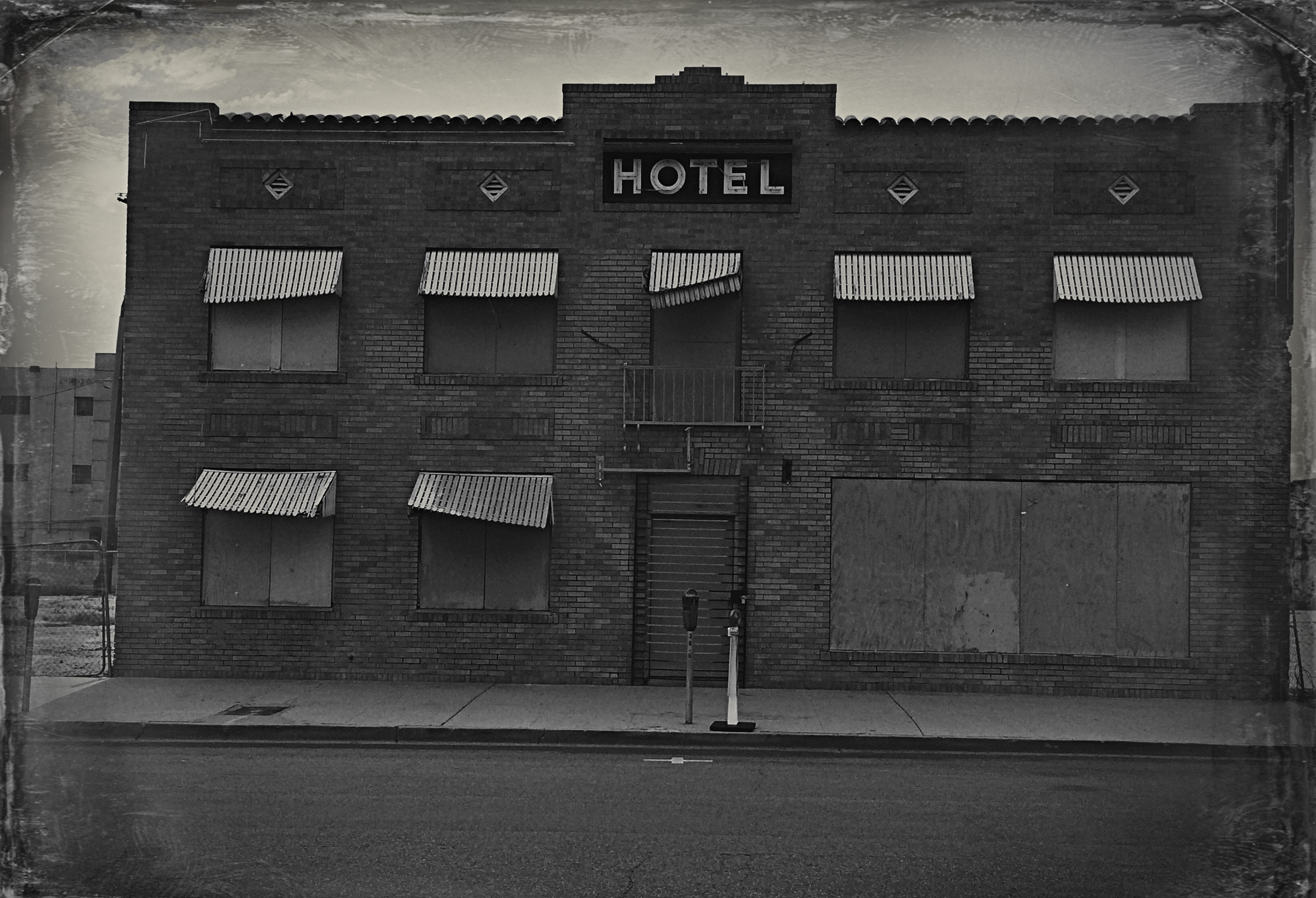
HOW DARE HUE
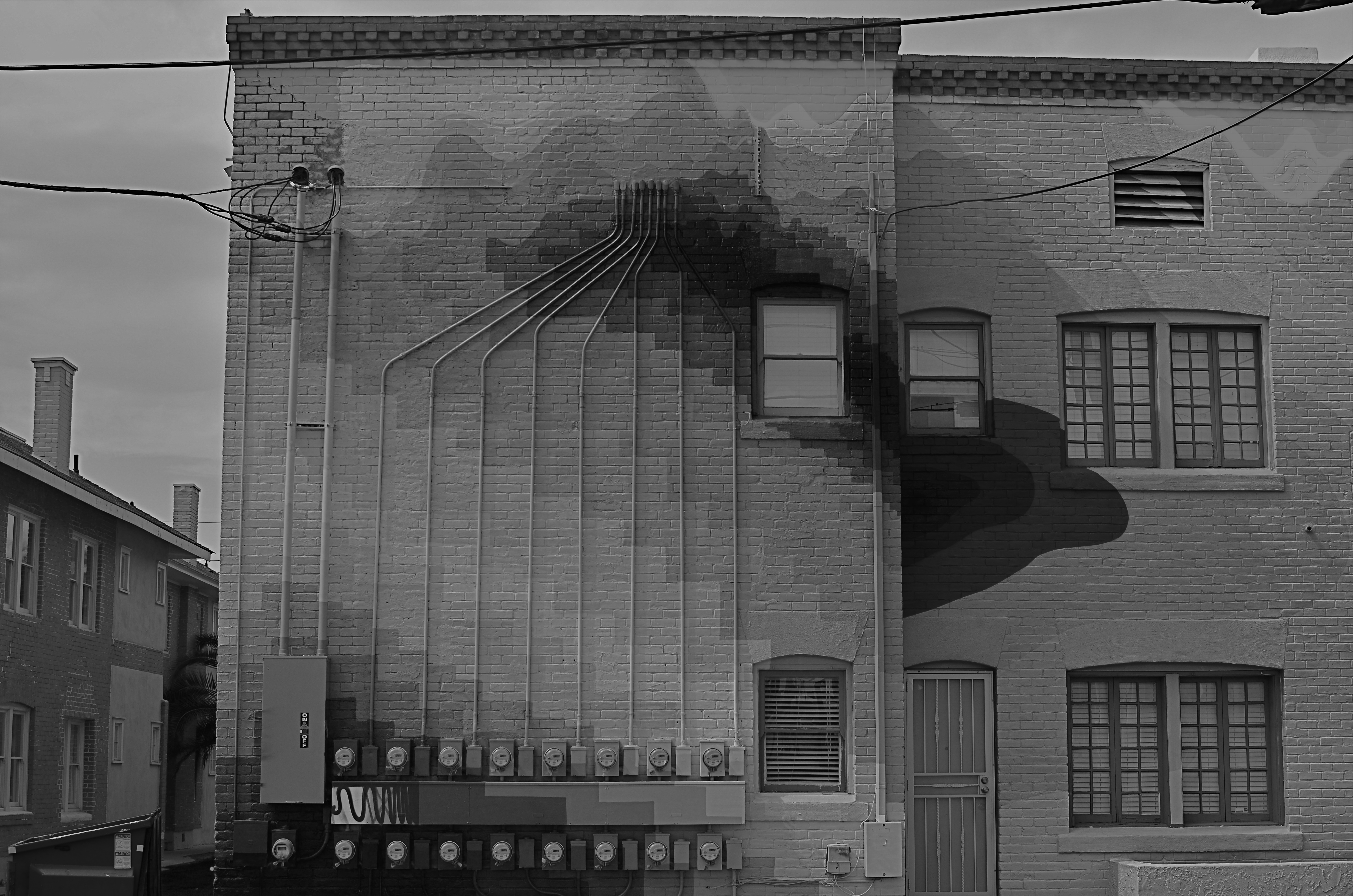
Terminus, 2014. 1/250 sec., f/5.6, ISO 100, 35mm. Desaturated copy.
By MICHAEL PERKINS
IT’S TRULY AMAZING TO CONSIDER THAT, AS RECENTLY AS THE LATE 1940’s, many serious photographers were, at best, indifferent to color, and at worst, antagonistic toward its use in their work. And we’re talking Edward Weston, Ansel Adams and many other big-shoulders guys, who regarded color with the same anxiety that movie producer experienced when silent segued to sound. We’re talking substantial blood pressure issues here.
Part of the problem was that black and white, since it was not a technical representation of the full range of hues in nature, was already assumed to be an interpretation, not a recording, of life. The terms between the artist and the audience were clear: what you are seeing is not real: it is our artistic comment on real. Color was thought, by contrast, to be “merely” real, that is to say limiting, since an apple must always be red and a blueberry must always be blue. In other words, for certain shooters, the party was over.
The color original. A little too Peter Max-y.
There were also technical arguments against color, or at least the look of color as seen in the printing processes of the early 20th century. Mass-appeal magazines like Look, Life, and National Geographic had made, in the view of their readers, massive strides in the fidelity of the color they put on newsstands. For Adams, these advances were baby steps, and pathetic ones at that, leading him and others to keep their color assignments to a bare minimum. In Adams’ case in particular, color jobs paid the bills that financed the black and white work he thought to be more important, so, if Kodak came calling, he reluctantly returned their calls. He then castigated his own color work as “aesthetically inconsequential but technically remarkable.”
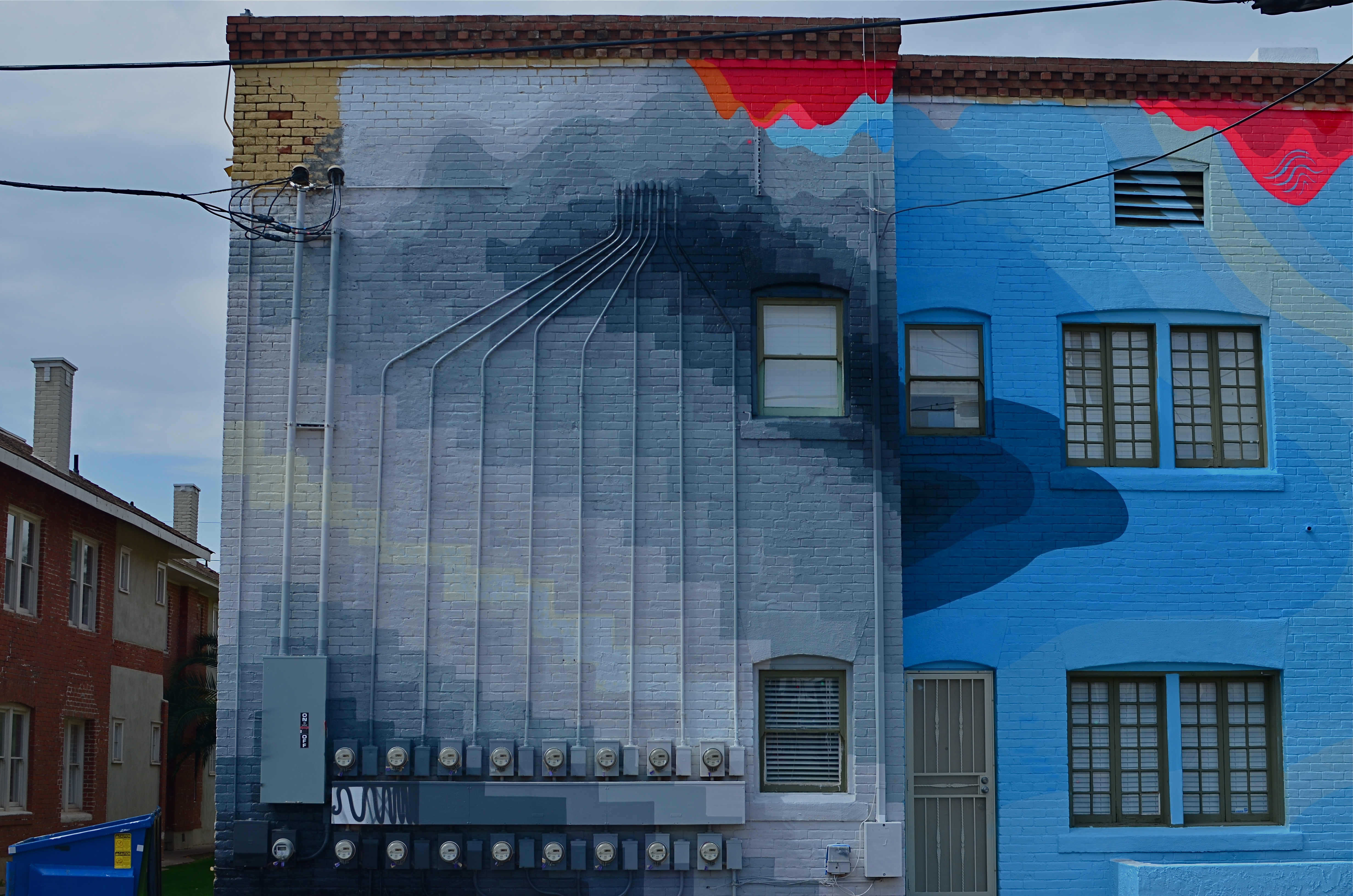
Look where we are today, making color/not color choices in the moment, without changing films in mid-stream, deciding to convert or de-saturate shots in camera, in post processing, or even further down the road, based on our evolving view of our own work.
There are times when I still prefer monochrome as more “trustworthy” to convey a story with a bit more grit or to focus attention on textures instead of hues. In the above shot, I decided that the spare old building and its spidery network of power meters simply had more impact without the pretty colors from its creative makeover. However, one of my color frames was stronger compositionally than the black and white, so I desaturated it after the fact. Fortunately, I had shot with a polarizing filter, so at least the tonal range survived the transition.
The miracle of now is that we can make such microscopic tweaks in our original intention right on the spot. And that’s good, since, when it comes to color, nothing is ever black and white (sorry).
SOME OF MY BEST FRIENDS ARE (NOT) PHOTOGRAPHERS
Beyond reality: the mood lighting of magazine illustrator par excellence Maxfield Parrish.
By MICHAEL PERKINS
THERE WAS A BRIEF MOMENT, WHEN PHOTOGRAPHY WAS A NOVELTY, when it was thought to be in some kind of winner-take-all death match with painting. That fake war lasted but a moment, and the two arts have fed (and fed upon) each other to varying degrees ever since. Both painting and photography have passed through phases where they were consciously or unconsciously emulating each other, and I dare say that all photographers have at least a few painter’s genes in their DNA. The two traditions just have too much to offer to live apart.
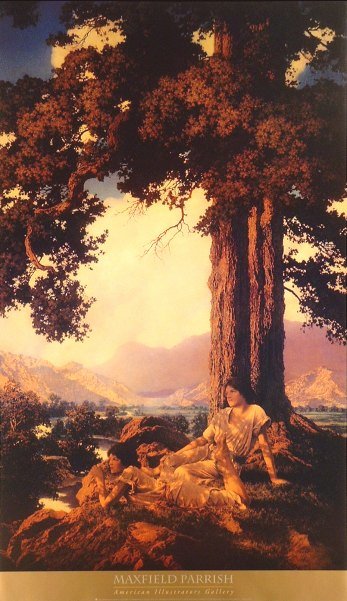
One of my favorite examples of “light sculpting”, the artistic manipulation of illumination for maximum mood, came to me not from a photographer, but from one of the finest illustrators of the early twentieth century. Maxfield Parrish (1870-1966) began his career as a painter/illustrator for fanciful fiction from Mother Goose to The Arabian Nights. Then, as color processes for periodicals became more sophisticated after 1900, he seamlessly morphed into one of the era’s premier magazine artists, working mostly for ad agencies, and most famously for his series of magnificently warm light fantasies for Edison Mazda light bulbs.
Parrish’s Mazda ads are dazzling arrangements of pastel blues, golden earth tones, dusky oranges, and hot yellows, all punched up to their most electrically fantastic limits. Years before photographers began to write about “golden hours” as the prime source of natural light, Parrish was showing us what nature seldom could, somehow making his inventions seem a genuine part of that nature. The stuff is mesmerizing. See more of his best at: http://www.parrish.artpassions.net/
During a recent trip to the high walking paths that crown Griffith Park in Los Angeles, I saw the trees and hills, at near sunset, form the perfect radiated glow of one of Parrish’s dusks. Timing was crucial: I was almost too late to catch the full effect, as shadows were lengthening and the overhanging tree near my cliffside lookout were beginning to get too shadowy. I hoped tha,t by stepping back just beyond the effective range of my on-board flash, I could fill in the front of the fence, allowing the light to decay and darken as it went back toward the tree. Too close and it would be a total blowout. Too far back, and everything near at hand would be too dark to complement the color of the sky and the hills.

Faux-Parrish with a little help from fill flash. 1/160 sec., f/5.6, ISO 100, 35mm.
After a few quick adjustments, I had popped enough color back into the foreground to make a nice authentic fake. For a moment, I was on one of Parrish’s mountain vistas, lacking only the goddesses and vestal virgins to make the scene complete. You’d think that, this close to Hollywood, you could get Central Casting to send over a few extras. In togas.
Next time.
BALLET OF HORROR
By MICHAEL PERKINS
THERE USED TO BE A MOVEMENT IN FINE ARTS CALLED THE “ASHCAN SCHOOL”, WHICH SOUGHT TO SHOW POWER AND BEAUTY in banal or even repellent urban realities. It posed a question that continues to stoke debate within photography to this day: how much should art engage with things that are horrible? Is the creative act vital when it shows us ugliness? More importantly, is it vital because it shows us these things? And, if we choose to depict beauty to the exclusion of the ugly, is our art somehow less authentic?
The whole matter may come down to whether you see photography as a constructed interpretation of the world, kind of a visual poem, or as a sort of journalism. Of course, the medium has been shown to be wide enough for either approach, and perhaps the best work comes from struggling to straddle both camps. A world of gumdrops and lollipops can be just as pretentious and empty as a world constructed exclusively of the grisly, and I think each image has to be defined or justified as a separate case. That said, finding a ying/yang balance between both views within a single image is rare.
Falling, as I did, under the influence of landscape photographers at a really early age, I have had to learn to search for a kind of rough ballet in things that I find disturbing. I’m not saying that it’s hampered my work: far from it. Look at it another way: as a missionary, you can plant crops and build hospitals for your village, but you still have to address the area’s cholera and dysentery. It’s just a part of its life.
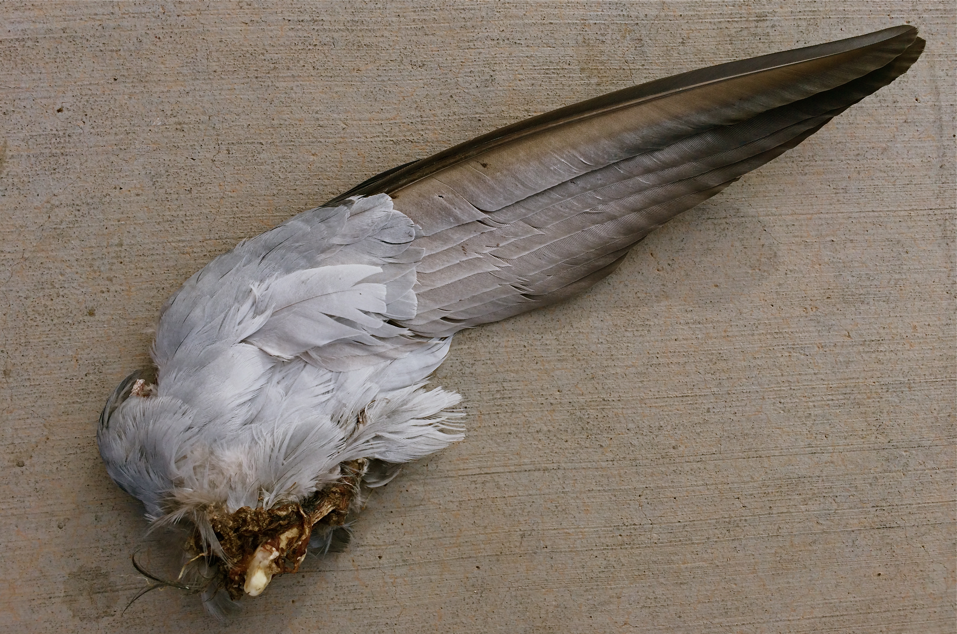
Death On The Wing: 1/900 sec., f/2.2, ISO 32, 4.12mm
The image above was pretty much placed right in my path the other day as I walked to enter an urban drugstore, and, as horrified as I was by the likely origin of this savage souvenir, I had to also acknowledge it as a Darwinian study of beauty and design. The virtually intact nature of the wing, contrasted with the brutal evidence of its detachment from its owner, made for an unusual transition from poetry to chaos within a single image. Many might ask, how could you make that picture? And it’s a hard question to answer. Another question that would be just as difficult to answer: how could I not?
Certainly, I won’t be entering this in Audubon magazine’s annual photo contest: it’s also no one’s idea of cutest kitty or beautiful baby. But it is one of the most unique combinations of sensation I have ever seen, and I did not want to forget it, nightmares and all. Because we live, and take pictures in, the world at large.
Not just the world we want.
DESTROY IT TO SAVE IT
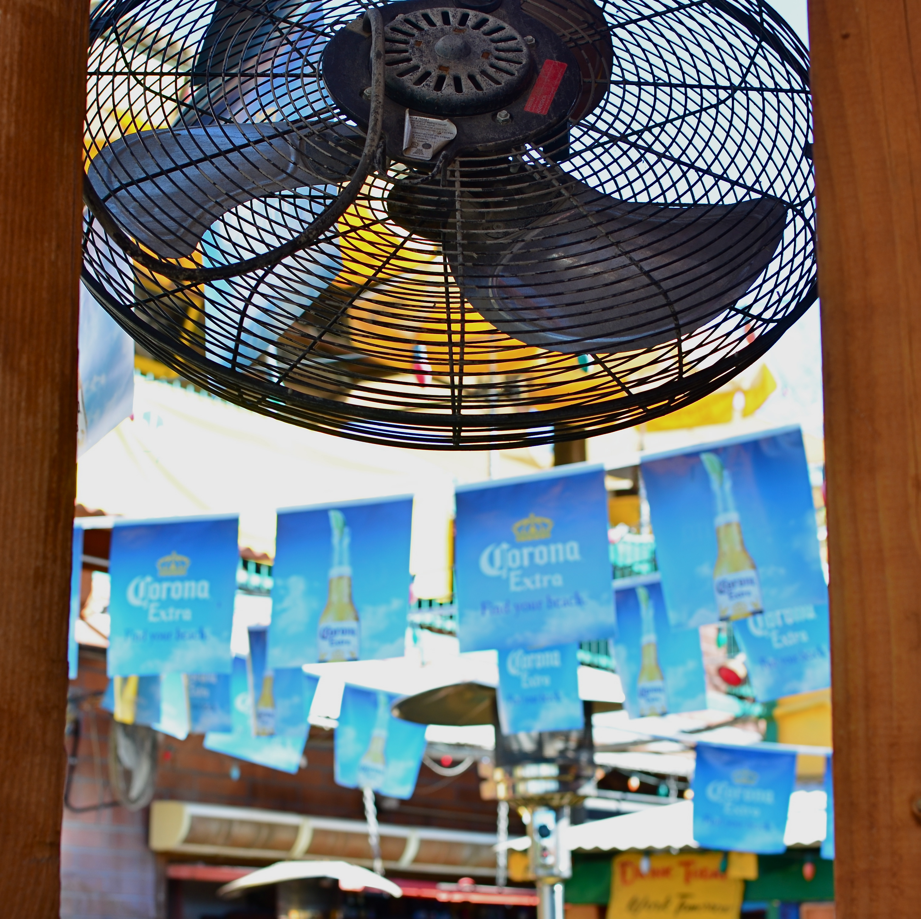
Fan photo: 1/80 sec., ISO 100, 35mm.
By MICHAEL PERKINS
THERE ARE TIMES WHEN THE RAW VISUAL FLOOD OF INTENSE COLOR IS THE MOST INTOXICATING DRUG ON THE PLANET, at least for photographers. Sometimes you are so overcome with what’s possible from a loud riot of hues that you just assume you are going to be able to extract a coherent image from it. It happens the most, I find, with large, sprawling events: festivals, open restaurants, street fairs, carnivals, anywhere your eyeballs just go into overload. Of course there must be a great picture in all this, you promise yourself.
And there may be. But some days you just can’t find it in the sheer “Where’s Waldo”-ness of the moment. Instead, you often wind up with a grand collection of clutter and no obvious clues as to where your viewer should direct his gaze. The technical term for this is “a mess”.
I stepped in a great one the other day. It’s a local college-crowd bar in Scottsdale, Arizona, where 99% of the customers sit outside on makeshift benches, shielded from the desert sun by garish Corona umbrellas, warmed by patio heaters, and flanked by loud pennants, strings of aerial lightbulbs and neon booze ads. The place radiates fun, and, even during the daylight hours before it opens, it just screams party. The pictures should take themselves, right?
Well, maybe it would have been better if they had. As in, “leave me out of it”. As in, “someone get me a machete so I can hack away half of this junk and maybe find an image.” Try as I might, I just could not frame a simple shot: there was just too much stuff to give me a clean win in any frame. In desperation, I shot through a window to make a large cooling fan a foreground feature against some bright pennants, and accidentally did what I should have done first. I set the shot so quickly that the autofocus locked on the fan, blurring everything else in the background into abstract color. It worked. The idea of a party place had survived, but in destroying my original plan as to how to shoot it, I had saved it, sorta.
I have since gone back to the conventional shots I was trying to make, and they are still a vibrant, colorful mess. There are big opportunities in big, colorful scenes where showing “everything in sight” actually works. When it doesn’t, you gotta be satisfied with the little stories. We’re supposed to be interpreters, so let’s interpret already.
POST No. 200: LET’S SEE WHAT HAPPENS
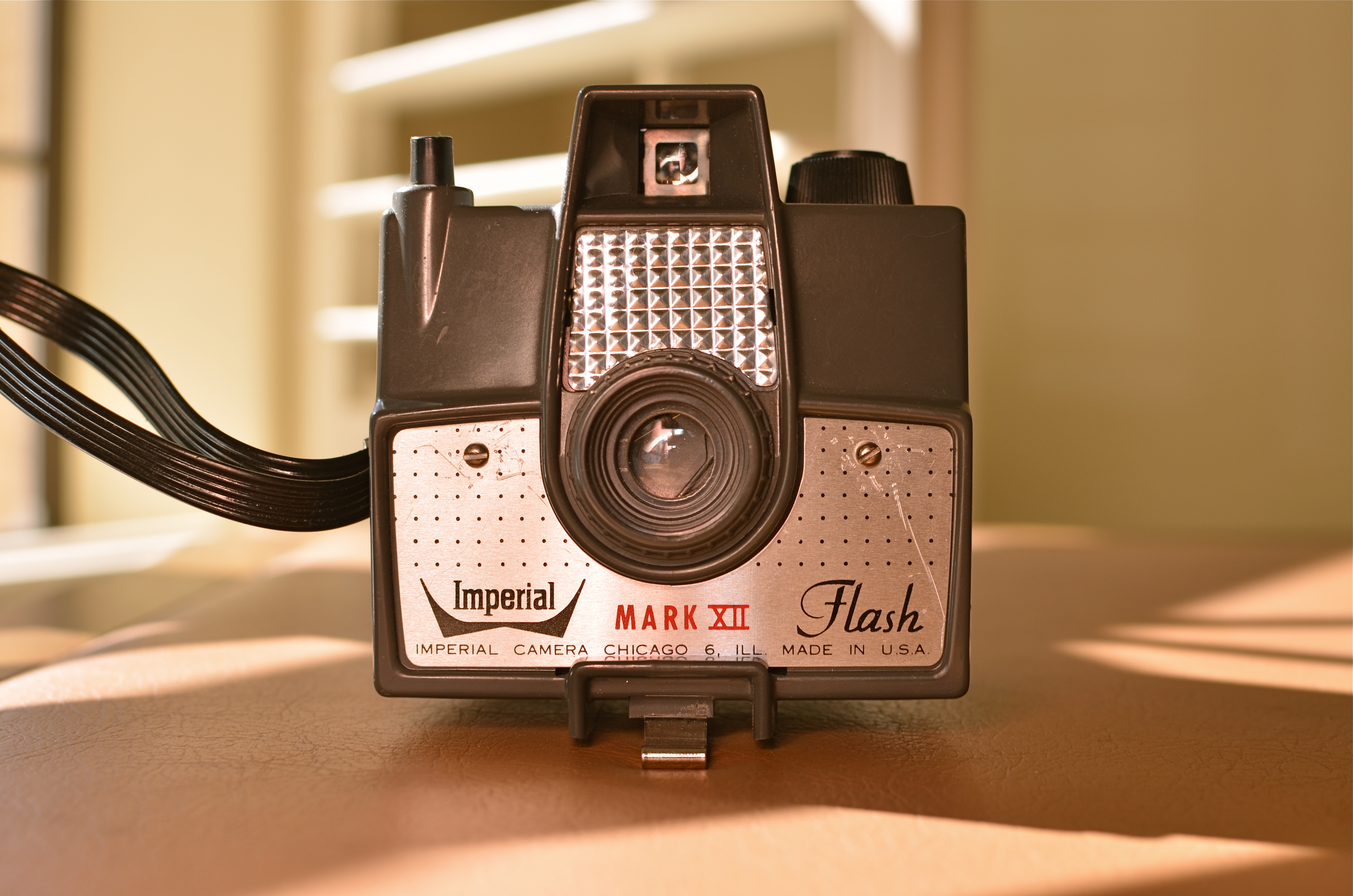
Let There Be (A Way To Catch) Light: The Imperial Mark XII, my first camera. 1/200 sec., f/5.6, ISO 125, 35mm.
By MICHAEL PERKINS
TIME, AT MY LOCATION IN LIFE, NOW PROCEEDS LIKE A CRUISE MISSILE, OR FASTER. Some days the signposts are zipping by so quickly that I seem to be inside a blender going full tilt puree.
I began THE NORMAL EYE as a kind of “let’s see what happens” project in 2012. Back at the starting line, 200 posts ago today, I wondered if I could even get to 200 words. Then a lucky accident occurred. Photography, which, over a lifetime has been an unfailing miracle of discovery for me, willed that passion onto my pages. Maybe it’s the kind of writing that is available to me, to all of us, as a unique feature of the present world. Maybe I had to live this long to become a chronicler for my eye and the soul that stands behind it.
As a broadcaster, I made my living for over thirty years writing advertising copy, news features, presentations, columns and tutorial material, but always for someone else, always to other agendas beyond my own. But, even while I was working for everyone else but myself, photography served as one of the very few constants in my life, and one of its principal sources of joy. Happy problem: I feel like I need another whole life to try to realize what I can now visualize. If I have any regret, it is that I learn everything the hard way, the slow way, experientially. If I could conceptualize the finer points of the art of imaging without running it personally through my own fingers, I would. It would save time, a premium item at any age, but beyond price from where I stand now.
When I first began clicking away as a kid with a kamera, I knew nothing but that I wanted to make pictures. I was divinely unaware of how truly ignorant I was and keen for the fray. My father, being a graphic artist, subscribed to Life magazine when it was still the premier photo newsmagazine in the world, tearing out the images in every issue and organizing them into a morgue file. There was the world in our garage, alphabetized as a ready reference on any subject. Want to know how to draw a giraffe? Look in the G folder.
But something else was happening as well. I was getting a crash course from the leading photographers on the planet as to how to see, how to show what you saw, how to make others see. I had my own version of the twelve apostles in the works of Alfred Eisenstadt, Gordon Parks, Larry Burrows, Richard Avedon, Otto Karsh, Margaret Bourke-White, and a half dozen others. Inside this special Bible I studied chapters and verses from the books of Aperture, F-stop, Exposure, Tri-Pan X, Graphlex. Praise the Lord and pass the polarizing filter.
As photographers, we all know that our favorite picture is the one we haven’t taken yet, since therein lies the potential for everything. I have to approach this blog the same way. Your input and my impatience have both fueled the fun and the fury of THE NORMAL EYE, and I hope to continue the affair as far as it will take us. I can’t focus for infinity, since I don’t know how far away that is. But, with your help, I can definitely manage 200 words at a time.
Thanks for coming here.
“EFFECT” VS. “EFFECTIVE”

Panoramic shots like this are no longer a three-day lab project, but an in-camera click. But what is being said in the picture?
By MICHAEL PERKINS
THERE ISN’T ANYTHING EMPTIER THAN THE PERFECT EXECUTION OF A FLAWED IDEA. And in the present effects-drenched photographic arena, where nearly any texture, color, or conception can be at least technically realized, we need, always, to be making one crucial distinction: separating what we can do from what we should do.
The basic “fixes” which come natively loaded in even the most basic cameras (filters, effects, nostalgic slathers of antique colors) suggest a broad palette of choices for the photographer looking to extend his reach through what is basically an instantaneous short cut. Fine and dandy, so far. Who, after all, wants to labor for hours to augment a shot with a particular look if that effect can be achieved at the touch of a button? Certainly no one gets into photography anymore with the understanding that they will also have to act as a chemist, and creativity need not be the exclusive playground of the scientifically elite. We all agree that the aim of photography always has and always should be the placing of all tools in as many hands as possible, etc., etc.
But waita seccint. Did I say the world tool? ……(will the recorder read that last part back….?……”placing of all tools in as many…”)… yep, tool. Ya see, that word has meaning. It does not mean an end unto itself. A fake fisheye doth not a picture make. Nor doth a quickie panorama app, a cheesy sepia filter, nor (let’s face it) the snotty habit of saying “doth”. These things are supposed to supplement the creative moment, not be a substitute for it. They are aids, not “fixes”.
This comes back to the earlier point. Of course we can simulate,imitate, or re-create certain visual conditions. But what are we actually saying in the picture? Did we use the effect to put a firm period at the end of a strong sentence, or did we use it as a smoke bomb to allow us to exit the stage before the audience gets wise to the fakery?
One of the original objections to photography, as stated by painters, was that we were handing off the actual act of visual artistry to a (gasp!) machine. A little hysterical, to be sure, but a concern is still worth addressing.
There is a soul in that machine, to be sure.
But only if we supply it.
