SOMETIMES THE MAGIC WORKS…
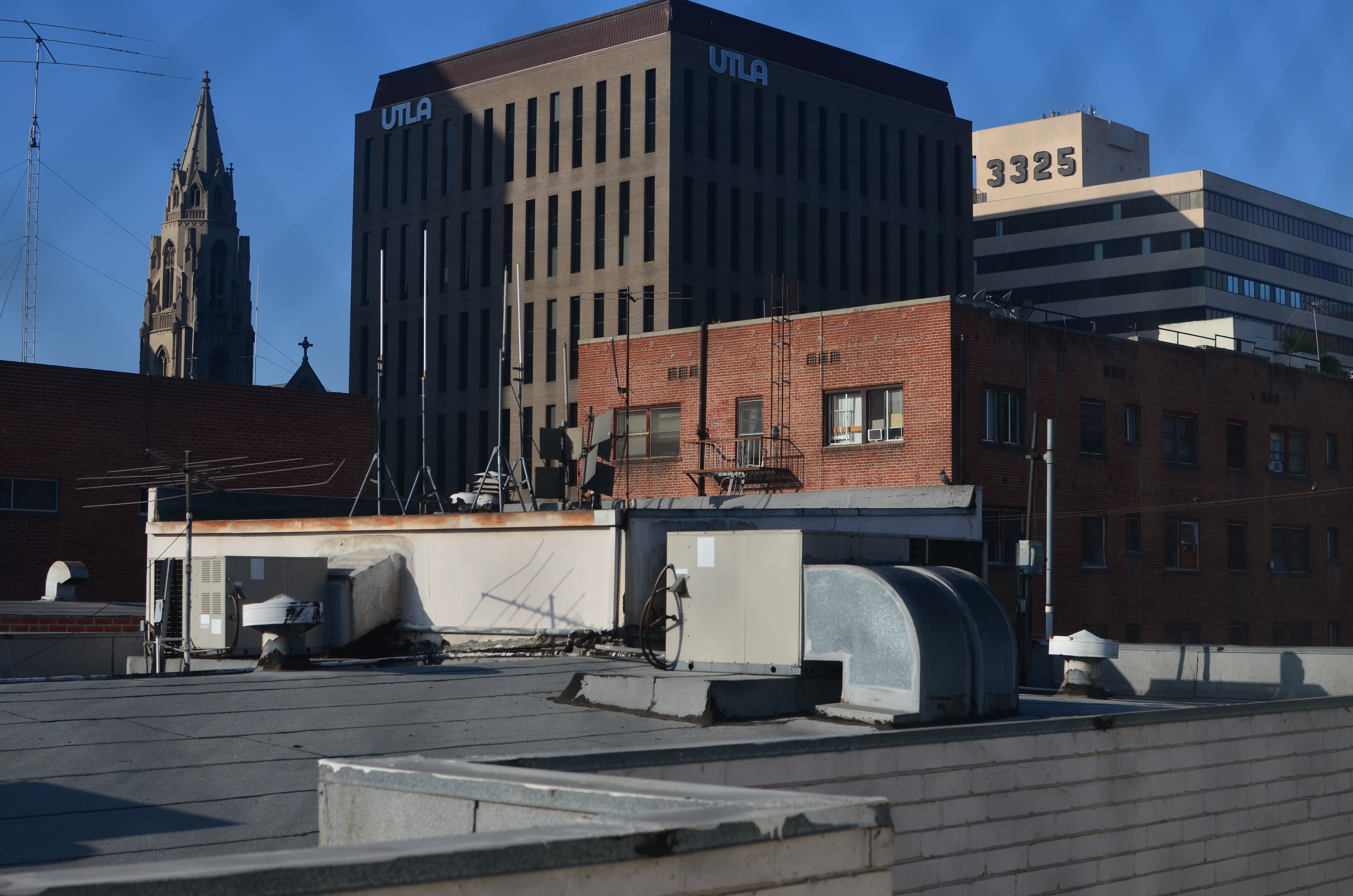
Early morning in L.A., shot through a hotel wind with a polarizing filter up front of the lens.
By MICHAEL PERKINS
THE DIGITAL ERA IN PHOTOGRAPHY HAS SMASHED DOWN THE DOORS TO WHAT WAS ONCE A FAIRLY EXCLUSIVE CLUBHOUSE, a select brotherhood (or sisterhood) of wizards who held all the secrets of their special science. The wizzes got great results and created “art. The rest of us slobs just took snapshots.
Today, the emphasis in photographic method has shifted from understand, study and do, to do, understand and, maybe study. We are now a nation of confident what-the-hellers. Try it, and if it don’t work, try something else. In some ways, this is a shift away from intellect and toward instinct. We are all either a little less technically aware of why the magic works, or completely indifferent to the underlying processes at work. You can all huddle together and decide whether this is a good thing.
Which, by way of introduction, is a way of saying that sometimes you do something that flies in the face of science or sense and it still works out. To illustrate, let us consider the humble polarizing filter, which, for me, is more important than many of the lenses I attach it to. It richens colors, cuts reflections, and eliminates the washed-out look of shots taken in intense daylight sun, as well as taming the squinty haze caused by smog. Or, if you want the Cliff’s Notes version, it makes skies blue again.
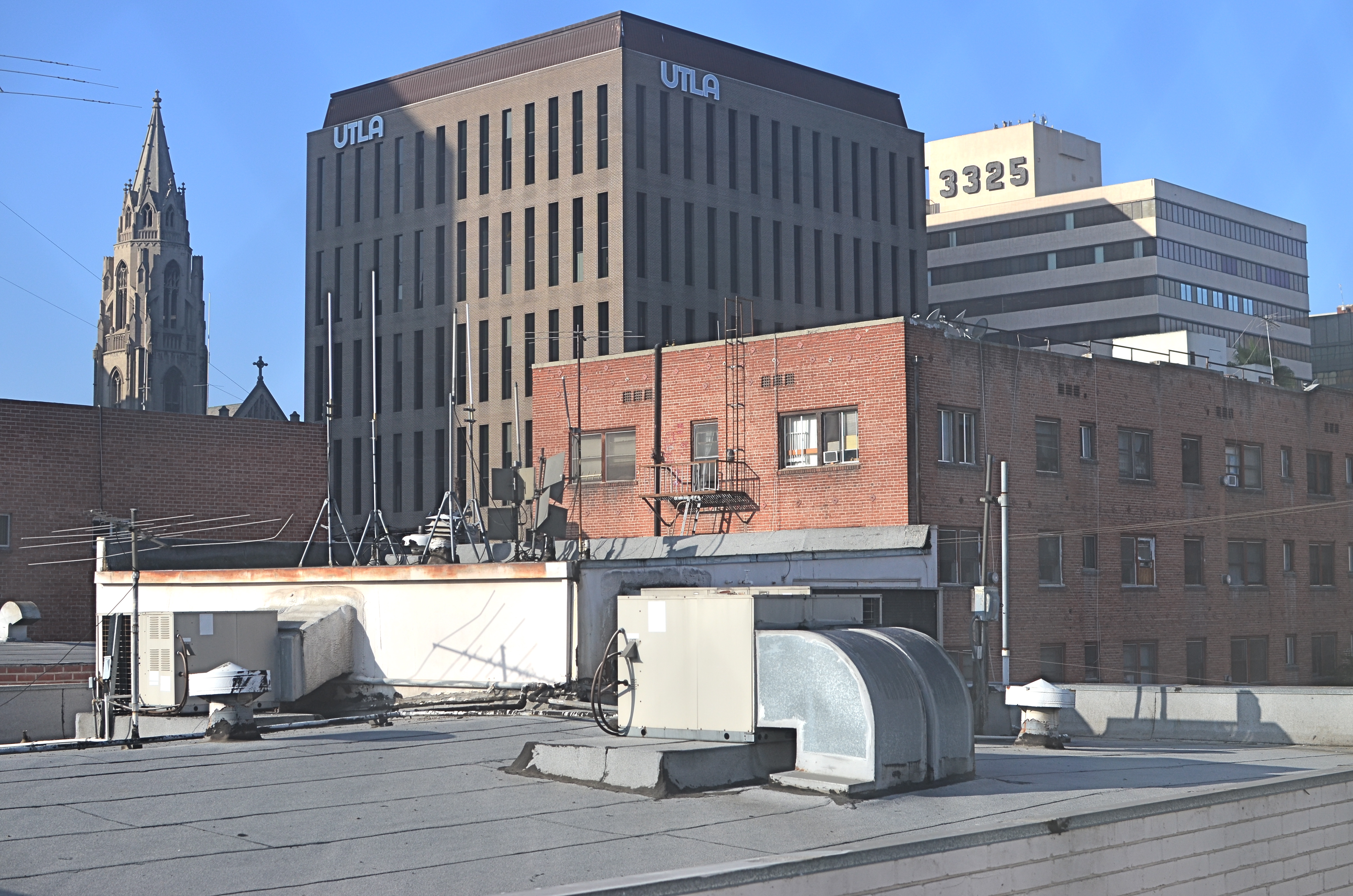
Without the filter, also through the window. Haze City.
Now there is a “proper” way to get top results with a polarizer. Make an “L” with your index finger and thumb, finger pointing straight up. UP in this example is the position of the sun overhead, and your thumb, about 90 degrees opposed to your finger, roughly represents your camera’s lens. The closer to 90 degrees that “L” is, the more effective the filter will be in reducing glare and boosting color. Experts will tell you that using a polarizer any other way will deliver either small or no results. That’s it. Gospel truth, science over superstition, settled argument.
That’s why I can’t explain the two pictures in this post, taken just after sunrise, both with and without the filter. In the first, seen at left, Los Angeles’ morning haze is severe, robbing the rooftop image of contrast and impact. In the second, shown above, the sky is blue, the colors are intense and shadows are really, well, shadows. But consider: not only is the sun too low in the sky for the filter’s accepted math to work, I am standing inside a hotel room, and yet the filter still does its duty, and all is right with the world. If I had followed and obeyed package directions, this shot should not have worked. That means if I were to pre-empt myself, defaulting to what is scientific and “provable”, and ignoring my instinct, I would not even have tried this image. The takeaway: perhaps I need to preserve just enough of the ignorant noobie I once was, and let him take the wheel sometimes, even if the grown-up in me says it can’t be done.
The yin and yang wrestling match between intellect and instinct is essential to photography. Too much science and you get sterility. Too much gut and you get garbage. As usual,the correct answer is provided by what you are visualizing. Here. Now. This moment.
AS THE WORLD TURNS
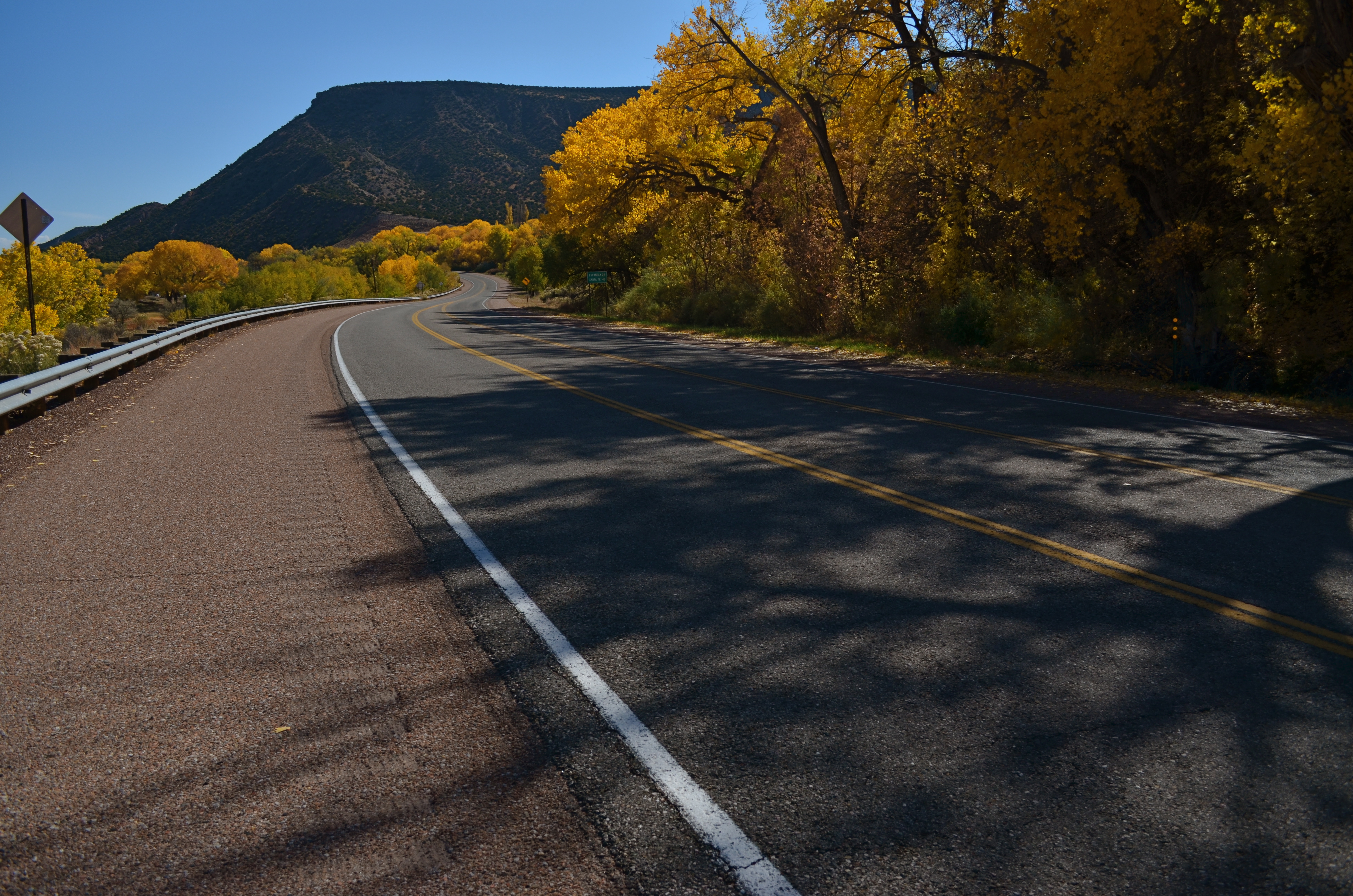
Abiquiu, New Mexico, 2013. The southwest U.S. does autumn on the soft pedal.
By MICHAEL PERKINS
—-That country where it is always turning late in the year. That country where the hills are fog and the rivers are mist; where noons go quickly, dusks and twilights linger, and midnights stay. That country composed in the main of cellars, sub-cellars, coal-bins, closets, attics, and pantries faced away from the sun. That country whose people are autumn people, thinking only autumn thoughts. Whose people passing at night on the empty walks sound like rain.—–Ray Bradbury
AUTUMN IS SNEAKY IN THE SOUTHWEST. Much of the low desert regions may never betray the transformation that is rotating the color wheel in most of the rest of the world, and then, suddenly, there is the shock of red, the blaze of orange, the yellow of golden apples. Many of our trees do not shed, and there are parts of Arizona, California and New Mexico where you could snap a landscape and challenge anyone to guess in which month it was taken. But, as I say, there are surprises.
There are fruits that fall and go back to the earth. There are strange and alien breeds of gourd popping up as invaders at farmers’ markets. And with these visitations come remembrance, and the chance for the camera to recall all the unrealized dreams, misty dawns, evening cold snaps and afternoons of quiet contemplation that accompanies fall so hypnotically in the rest of the country. We here in the southwest have our autumn reverie doled out in small spoonfuls, but it penetrates just the same. The shadows grow longer. The memory uncorks its vintages. The world turns, and there is that slow rhythm of life winding down.
I only long for my midwestern roots but briefly each year. I can still feel the earth turning when some inner clock tells me it’s time. Sometimes I can’t look out my window and find evidence of what my atoms know to be true. And sometimes I get a moment to steal.
That’s what cameras are for. To remind us how to be, at least in glimpses, autumn people.
THE LAST PIECE OF THE PUZZLE
By “available light”, I mean any $%#@ light that’s available. —-Joe McNally, world-renowned master photographer, author of The Moment It Clicks
By MICHAEL PERKINS
ONE OF THE EASIEST THINGS ABOUT ANALYZING THOSE OF OUR SHOTS THAT FAIL is that there is usually a single, crucial element that was missing in the final effort….one tiny little hobnail, without which the entire image simply couldn’t hold together. In a portrait, it could be a wayward turn of face or hint of a smile; in a landscape it could be one element too many, moving the picture from “charming” to “busy”. The secret to greater success, then, must lie in pre-visualizing a photograph to as great a degree as possible, in knowing in advance how many puzzle pieces must click into place to make the result work.
I recently attended an outdoor dance recital, during which I knew photography would be prohibited. I had just resigned myself to spend the night as a mere spectator, and was settling onto my lawn seat when some pre-show stretching exercises by the dancing company presented me with an opportunity. The available natural light in the sky had been wonderfully golden just minutes before, but, by the time the troupe took the stage and started into their poses and positions, it had grown pretty anemic. And then a stage hand gave me back that missing “puzzle piece”.
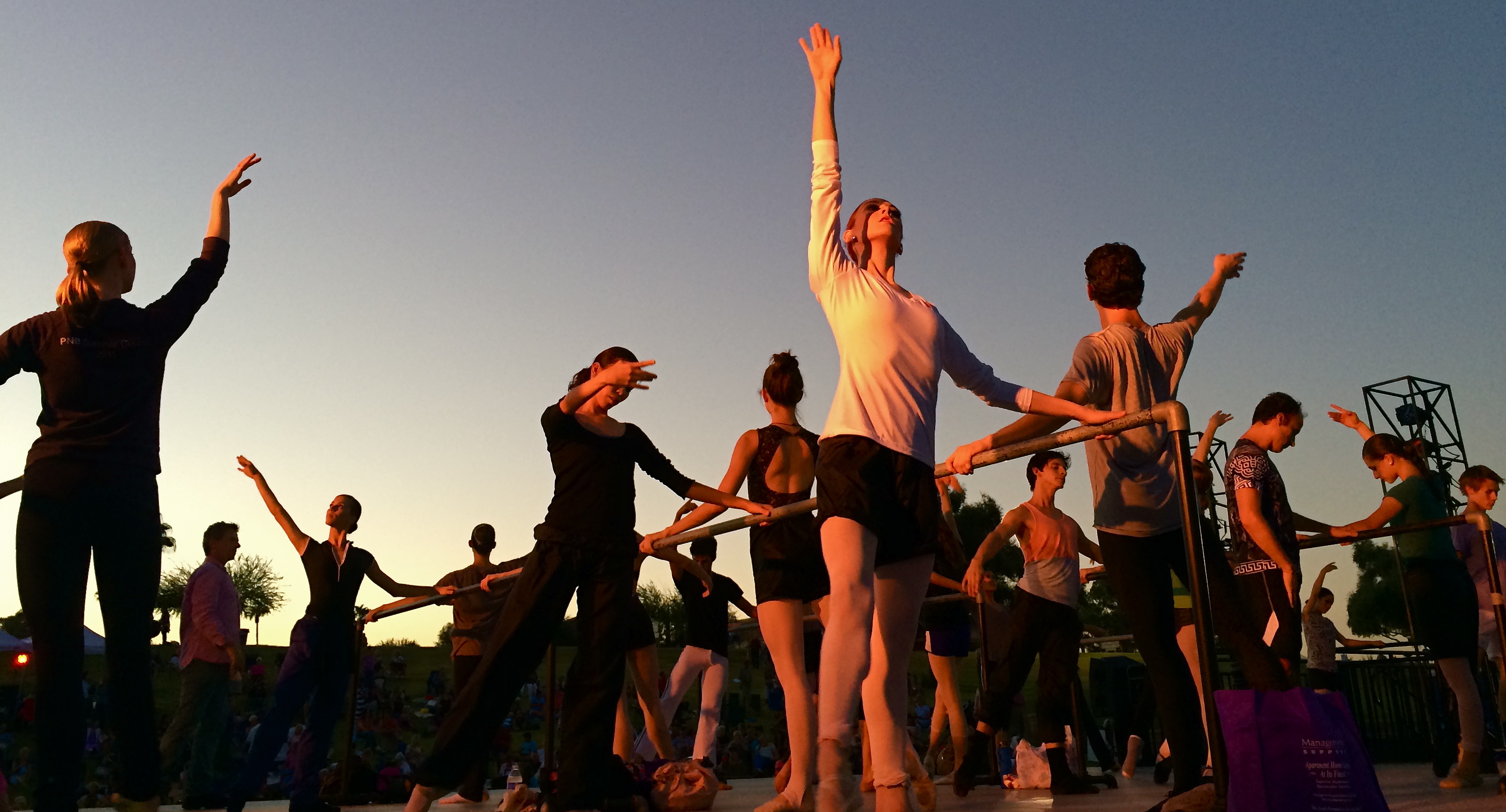
Positions, Please, 2014. One light source at dusk, courtesy of a light tech rehearsing with the rehearsers.
Climbing the gridwork at the right side of the stage, the techie was turning various lights on and off, trying them with gels, arcing them this way or that, devising various ways to illuminate the dancers as their director ran them through their paces. I decided to get off my blanket and hike down to the back edge of the stage, then wait for “my light” to come around in the rotation. Eventually, the stage hand turned on a combination that nearly replicated the golden light that I no longer was getting from the sky. It was single-point light, wrapping around the bodies of some dancers, making a few of them glow brilliantly, and leaving some other swaddled in shadow, reducing them to near-silhouettes.
For a moment, I had everything I needed, more than would be available for the entire rest of the evening. Now the physical elegance of the ballet cast was matched by the temporary drama of the faux-sunset coming from stage left. I moved in as closely as I could and started clicking away. I was shooting at something of an upward slant, so a little sky cropping was needed in the final shots, but, for about thirty seconds, someone else had given me the perfect key light, the missing puzzle piece. If I could find that stage hand, I’d buy her a few rounds. The win really couldn’t have happened without her.
AS DIFFERENT AS DAY AND NIGHT
By MICHAEL PERKINS
PHOTOGRAPHY OFTEN PRESENTS ITSELF AS A SUDDEN, REACTIVE OPPORTUNITY, a moment in time where certain light and compositional conditions seem ripe for either recording or interpreting. In such cases there may be little chance to ponder the best way to visualize the subject at hand, and so we snap up the visualization that’s presented in the moment. It’s the kind of use-it-or-lose-it bargain we’re all acquainted with. Sometimes it yields something amazing. Other times we do the best with what we’re handed, and it looks like it.
Having the option to shape light as we like takes time and deliberate planning, as anyone who has done any kind of studio set-up will attest. The stronger your conception to start with, the better chance you have of devising a light strategy for making that idea real. That’s why I regard light painting, which I’ve written about here several times, as a great exercise in building your image’s visual identity in stages. You slow down and make the photograph evolve, working upwards from absolute darkness.
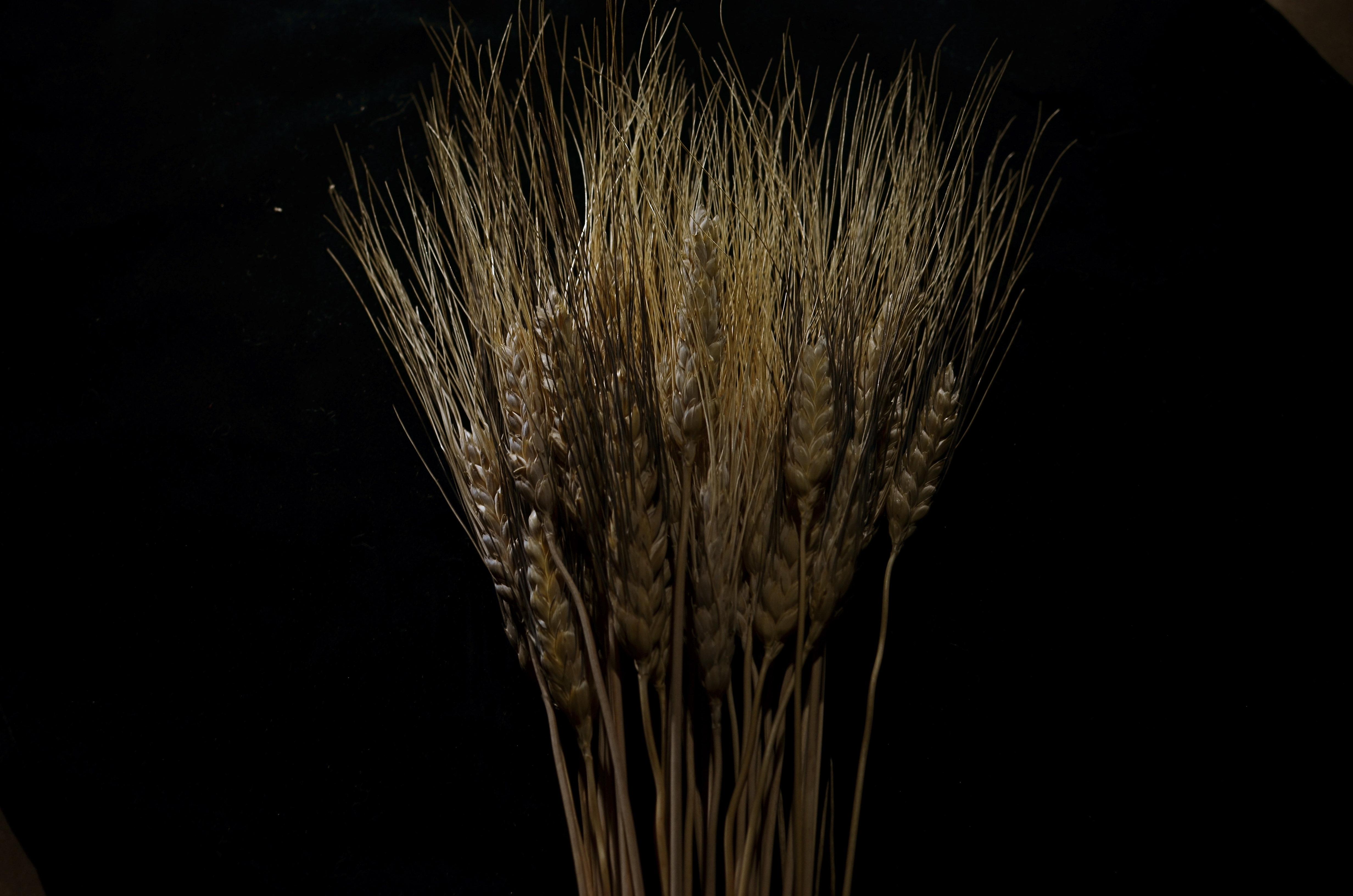
Shock-Top, 2014. Light-painted with a hand-held LED over the course of a six-second exposure, at f/5.6, ISO 100, 35mm.
To refresh, light painting refers to the selective handheld illumination of subjects for a particular look or effect. The path that your flashlight or LED takes across your subject’s contours during a tripod-mounted time exposure can vary dramatically, based on your moving your light source either right or left, arcing up or down, flickering it, or using it as a constant source. Light painting is different from the conditions of, say, a product shoot, where the idea is to supply enough light to make the image appear “normal” in a daytime orientation. Painting with light is a bit like wielding a magic wand, in that you can produce an endless number of looks as you develop your own concept of what the final image should project in terms of mood. It isn’t shooting in a “realistic” manner, which is why the best light painters can render subjects super-real, un-real, abstract or combinations of all three. Fact is, the most amazing paint-lit photos often completely violate the normal paths of natural light. And that’s fine.
In light painting, I believe that total darkness in the space surrounding your central subject is as important a compositional tool as how your subject itself is arranged. As a strong contrast, it calls immediate and total attention to what you choose to illuminate. I also think that the grain, texture and dimensional quality of the subject can be drastically changed by altering which parts of it are lit, as in the shock of wheat seen here. In daylight, half of the plant’s detail can be lost in a kind of brown neutrality, but, when light painted, its filaments, blossoms and staffs all relate boldly to each other in fresh ways; the language of light and shadow has been re-ordered. Pictorially, it becomes a more complex object. It’s actually freed from the restraints of looking “real” or “normal”.
Developed beyond its initial novelty, light painting isn’t an effect or a gimmick. It’s another technique for shaping light, which is really our aim anytime we take off our lens caps.
DESTINATION VS. JOURNEY
By MICHAEL PERKINS
I HAVE A WANDERING EYE. Not due to muscular weakness or marital infidelity, but to a malady particular to long-time photographers. After decades of shoots big and little, I find that I am looking for pictures nearly everywhere, so much so that, what appears to many normal people to be formless space or unappealing detail might be shaping up in my mind as My Next Project. The non-obvious sings out ever louder to me as I age, and may find its way into my pictures more often than the Celebrated Scenic Wonder, the Historically Important Site or the Big Lights In The Sky that attract 99% of the photo traffic in any given locality. Part of this has to do with having been disappointed in the past by the Giant Whatsis or whatever the key area attraction is, while being delightfully surprised by little things that, for me, deserve to be seen, re-seen, or testified to.
This makes me a lousy traveling companion at times, since I may be fixated on something merely “on the way” to what everyone else wants to see. Let’s say we’re headed to the Great Falls. Now who wants to photograph the small gravel path that leads to the road that leads to the Great Falls? Well, me. As a consequence, the sentences I hear most often, in these cases, are variations on “are you coming?“, “what are you looking at?” or, “Oh my God, are you stopping again????”.
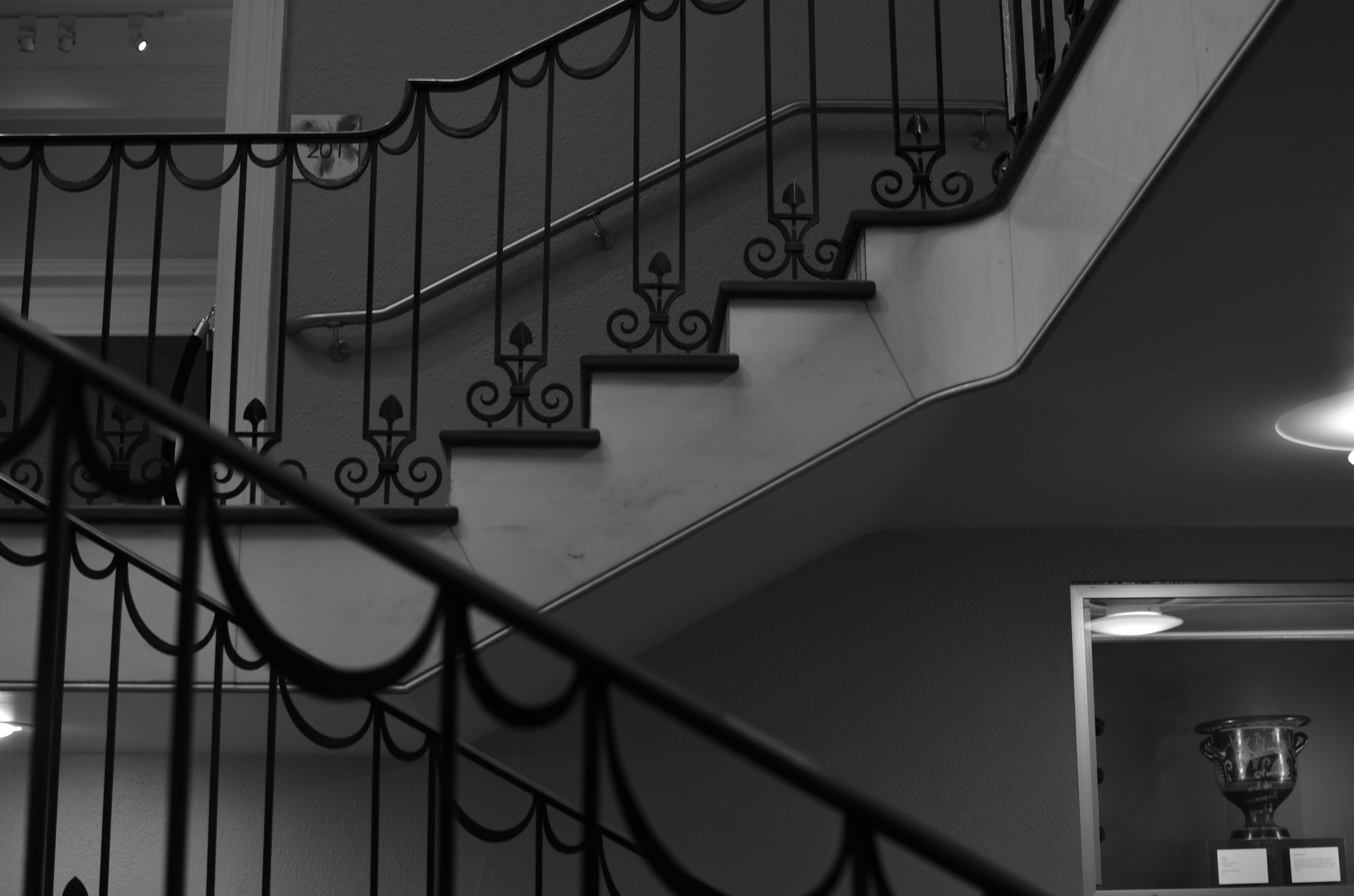
The Landing, 2014. 1/40 sec., f/3.5, ISO 320, 35mm.
Thing is, some of my favorite shots are on staircases, in hallways, around a blind corner, or the Part Of The Building Where No One Ever Goes. Photography is sometimes about destination but more often about journey. That’s what accounts for the staircase above image. It’s a little-traveled part of a museum that I had never been in, but was my escape the from gift shop that held my wife mesmerized. I began to wonder and wander, and before long I was in the land of Sir, We Don’t Allow The Public Back Here. Oddly, it’s easier to plead ignorance of anything at my age, plus no one wants to pick on an old man, so I mutter a few distracted “Oh, ‘scuse me”s and, occasionally, walk away with something I care about. Bonus: I never have any problem shooting as much as I want of such subjects, because, you know, they’re not “important”, so it’s not like queueing up to be the 7,000th person of the day doing their take on the Eiffel Tower.
Now, this is not a foolproof process. Believe me, I can take these lesser subjects and make them twice as boring as a tourist snap of a major attraction, but sometimes….
And when you hit that “sometimes”, dear friends, that’s what makes us raise a glass in the lobby bar later in the day.
SAME SHIFT, DIFFERENT DAY
By MICHAEL PERKINS
PHOTOGRAPHS OF PERFORMANCES ARE PERHAPS MY FAVORITE STUDIES OF THE HUMAN FACE. None of the self-conscious artifice or hesitant reticence of the standard portrait shoot are present when a player, be it a violinist or pianist, is fully inside the trance of creation. Call it rapture, call it focus, but something almost holy illuminates the features when people sing or play. All the awareness of their face as a mask melts away, as all mental energy surges to the task at hand. Their faces become some other thing, and I can’t resist trying to preserve that.
I recently had a chance to shoot two performances at the same part of the same museum about
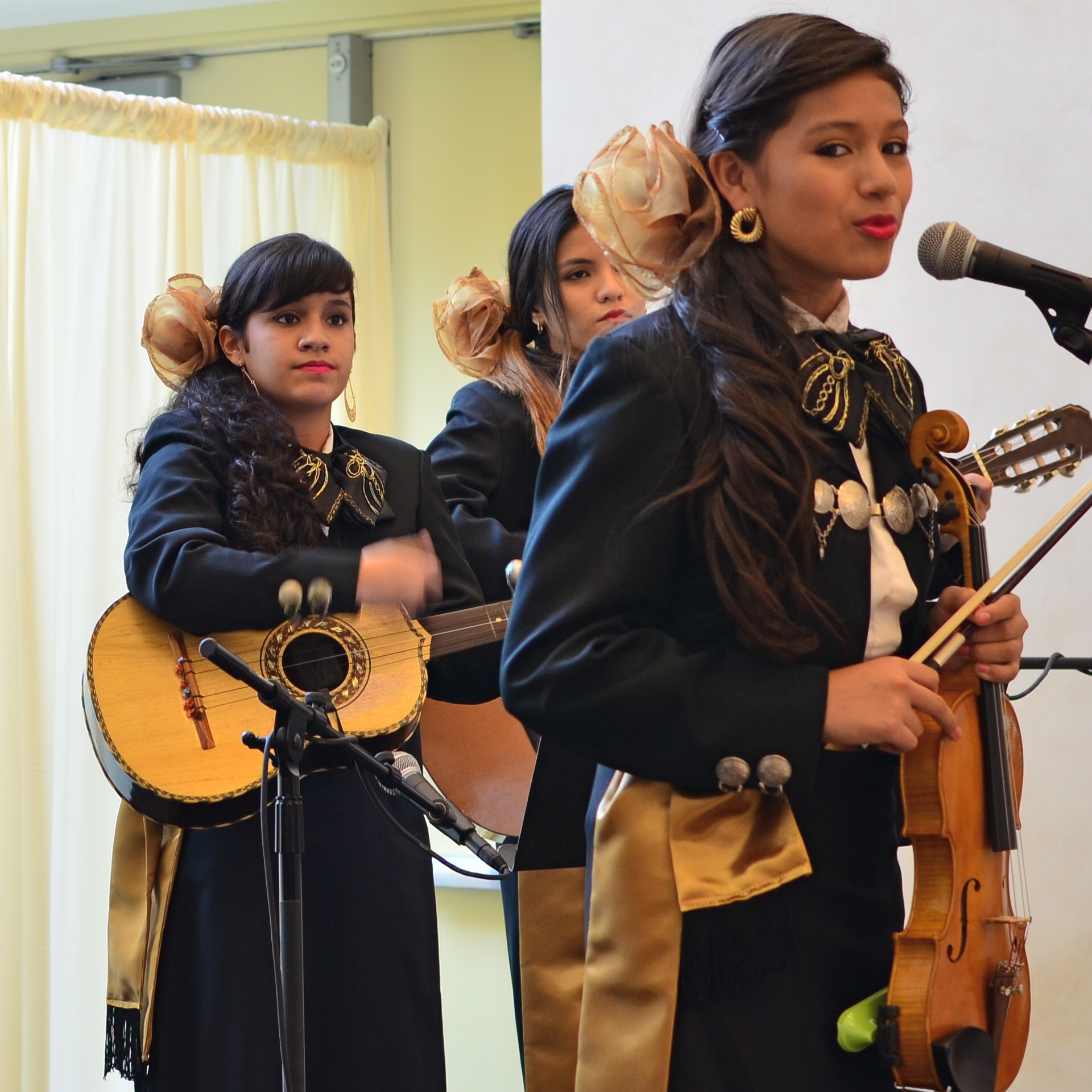
Shot with a 35mm prime lens and cropped. 1/50 sec., f/3.5, ISO 250, 35mm.
ten weeks apart. The first set of images were like walking barefoot through roses; everything worked. The second occasion, just a few days ago, was, by comparison, work, and frustrating work at that. The time of day for both sessions was the same, with mid-morning light entering the hall through cream-color curtains and softening everything to an appealing haze. My distance from the stage was also nearly the same on both days. What created the difference in my results, then, was my choice of lens, pure and simple. All of my “luck” came because the first lens was perfect for the task. All of my muttered oaths at the second occasion were due to how wrong my choice had been.
In the first case, exemplified by the mariachi band in the image at right, I used a 35mm prime, which
is simple, sharp and fast enough, at f/1.8 on the wide-open end, to give me enough light in nearly any situation. In the more recent shoot, I used a 300mm zoom, about the most opposite approach you could try. The lens cannot get any wider open than f/4.5, and shuts down all the way to f/5.6 when fully zoomed in, so, right off the bat, you’re starving yourself for light, especially in a room where most of it is behind the performers. I decided to try the 300 out of pure perverse curiosity, and from a sense of “what can I lose?”, which is a blessing, since, when the results don’t matter, you can try something, just to see what happens.
Well, I saw.
The light reduction with the 300 was more severe than I’d anticipated. Oh, sure, I could get really tight framings on the performers, but I was going to have to either slow my shutter speed to under 1/60 or jack the ISO up to undesirably high noise level, or, as it turns out, both. The contrast between light and dark was the first thing to take the hit, as tone registered in a muddy middle range with the zoom versus the sharply defined values I had gotten with the 35.
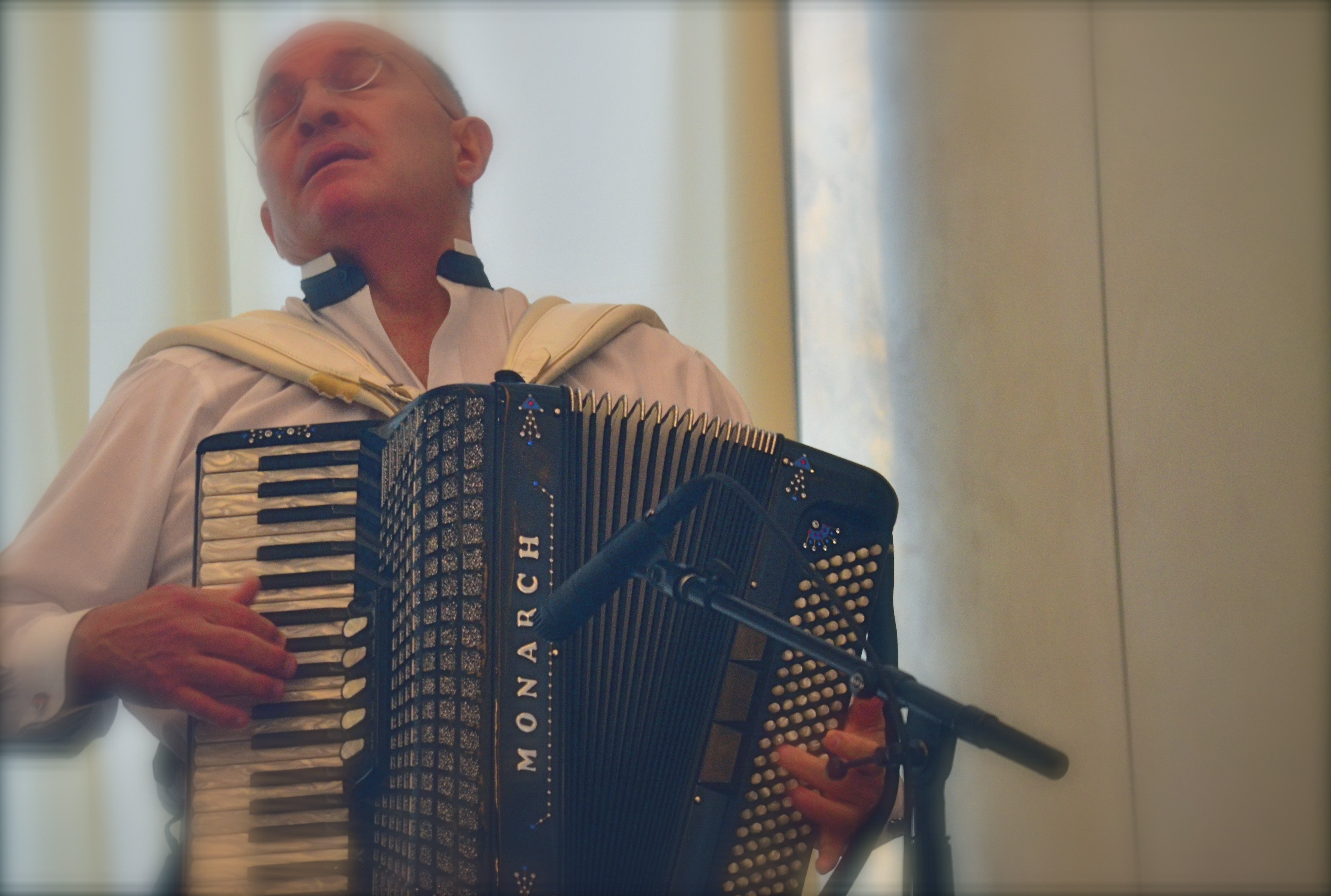
Same time of day, same room, but using a 300mm zoom. Haze added. 1/60 sec., f/5, ISO 1000, 180mm.
Then there was the overall softness of the 300, due largely to the small amount of camera shake on my part, which, in a zoom, is magnified several times over. In both cases, I got usable images, but whereas with the 35mm prime I had a kind of embarrassment of riches, the object with the zoom shoot was to salvage something and slave away like mad to do so.
I could easily have taken wider framed shots with the 35 (since it can’t zoom), then cropped them for tightness later, as I had on the first day. Instead, I got a lot of really tight shots of musicians that needed serious intervention to make them acceptable. But I want to emphasize that this is what experimentation is for. You put your hand on the hot stove, yell “OWWW!” and refrain from touching the hot stove in future. At the end of the second shoot, I had lost no money, no business, and very little time. That’s education on the cheap.
I don’t mind wearing the dunce cap every once in a while, if I know that, eventually, I’m going to end up in a fedora.
GIVE IT YOUR WORST SHOT

Are you going to say that Robert Capa’s picture of the D-day invasion would speak any more eloquently if it were razor-sharp? I didn’t think so.
By MICHAEL PERKINS
THE EARLY YEARNING OF PHOTOGRAPHERS TO MASTER OR EXCEED THE TECHNICAL LIMITS OF THEIR MEDIUM led, in the 1800’s, to a search for visual “perfection”. For rendering tones accurately. For capturing details faithfully. And, above all, for tight, sharp focus. This all made perfect sense in an era when films were so slow that people sitting for portraits had to have steel rods running up the backs of their necks to help them endure three-minute exposures. Now, mere mechanical perfection long since having become possible in photography, it’s time to think of what works in a picture first, and what grade we get on our technical “report card” second.
This means that we need no longer reject a shot on technical grounds alone, so long as it succeeds on some other platform, especially an emotional one. Further, we have to review and even re-review images, by ourselves as well as others, that we think “failed” in one way or another, and ask ourself for a new definition of what “failure” means. Did the less-than-tack-sharp focus interfere with the overall story? Did the underexposed sections of the frame detract from the messaging of what was more conventionally lit? Look to the left. at Robert Capa’s iconic image of the D-Day invasion at Normandy. He was just a little busy dodging German snipers to fuss with pinpoint focusing, but I believe that the world jury has pretty much ruled on the value of this “failed” photo. So look inward at the process you use to evaluate your own work. Give it your worst shot, if you will, and see what you think now, today.
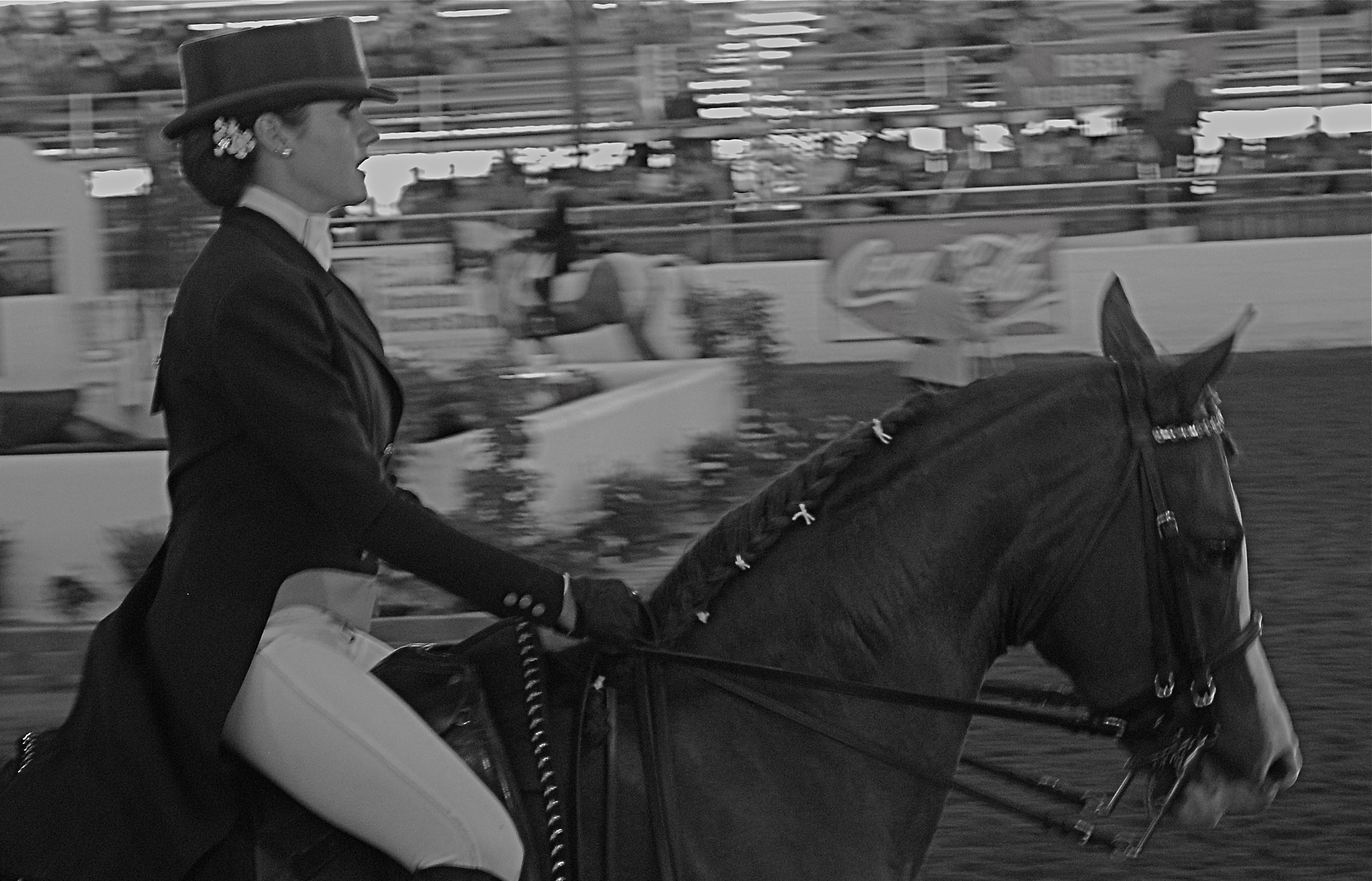
The Last Burst, 2008. 1/80 sec., f/5.6, ISO 800, 50mm.
The above image came from a largely frustrating day a few years back at a horse show in which I spent all my effort trying to freeze the action of the riders, assuming that doing so would deliver some kind of kinetic drama. I may have been right to think along these lines, but doing so made me automatically reject a few shots that, in retrospect, I no longer think of as total failures. The equestrienne in this frame looks as eager, even as exhausted as her mount, and the slight blur in both of them that I originally rejected now seems to work for me. There is a greater blur of the surrounding arena, which is fine, since it’s merely a contextual setting for the foreground figures, but I now have to wonder if I would like the picture better (given that it’s supposed to be suggestive of speed) if the foreground were completely sharp. I’m no longer so sure.
I think that all images have to stand or fall on what they accomplish, regardless of discipline or intention.We only kid ourselves into equating technical perfection with aesthetic success. Sometimes they walk into the room hand in hand. Other times they arrive in separate cars.
SHOW, DON’T TALK
Got a feeling inside (can’t explain)
It’s a certain kind (can’t explain)
I feel hot and cold (can’t explain)
Yeah, down in my soul, yeah (can’t explain)—–Pete Townshend
By MICHAEL PERKINS
PHOTOGRAPHY NEEDS MORE ARTISTS AND FEWER ART CRITICS. Period, full stop.
When it comes to imaging, those who can, do, and those who can’t, curate shows. Or pontificate on things they had no hand in creating. It’s just human nature. Some of us build skyscrapers and some of us are “sidewalk superintendents”, peering through the security fencing to cluck our tongues in scorn, because, you know, those guys aren’t doing it right.
Even wonderful pioneers in “appreciation” like the late John Szarkowski, one of the first curators of photography at the New York Museum of Modern Art , and a tireless fighter for the elevation of photography to a fine art, often tossed up bilious bowlfuls of word salad when remarking on the work of a given shooter. As essays his remarks were entertaining. As explanations of the art, they were redundant.
What is this photograph “saying”? Well, that’s for you to decide, isn’t it?
This human need to explain things is vital if you’re trying to untie the knotted language of a peace treaty or complete a chemical equation, but it just adds lead boots to the appreciation of photography, which is to be seen, not read about (sassy talk for a blogger, no? Oh, well). No amount of captioning (even by the artist) can redeem a badly conceived photograph or make it speak more clearly. It all begins to sound like so many alibis, so many “here’s what I was going for” footnotes. Photography is visual and visceral. If you reached somebody, the title of the image could be “Study #245” and it still works. If not, you can append the biggest explanatory screed since the Warren Report and it’s still a lousy photo.
I’m not saying that all context is wrong in regard to a photo. Certainly, in these pages, we talk about motivation and intention all the time. However, such tracts can never be used to do the actual job of communicating that the picture is supposed to be doing. Asked once about the mechanics of his humor, Lenny Bruce spoke volumes by replying,” I just do it, that’s all.” I often worry that we use captioning to push a viewer one way or another, to suggest that he/she react a certain way, or interpret what we’ve done along a preferred track. That is the picture’s task, and if we fail at that, then the rest is noise.
REVENGE OF THE ZOO
By MICHAEL PERKINS
PURISTS IN THE ANIMAL PHOTOGRAPHY GAME OFTEN DISPARAGE IMAGES OF BEASTIES SHOT AT ZOOS, citing that they are taken under “controlled conditions”, and therefore somewhat less authentic than those taken while you are hip-deep in ooze, consumed by insects, or scratching any number of unscratchable itches. Editors won’t even consider publishing pics snapped at the local livestock lockup, as if the animals depicted in these photos somehow surrendered their union cards and are crossing a picket line to work as furry scabs .
This is all rubbish of course, part of the “artier-than-thou” virus which afflicts too great a percentage of photo mavens across the medium. As such, it can be dismissed for the prissy claptrap that it is. Strangely, the real truth about photographing animals in a zoo is that the conditions are anything but controlled.
We’ve all been there: negotiating focuses through wire mesh, dealing with a mine field of wildly contrasting light, and, in some dense living environments, just locating the ring-tailed hibiscus or blue-snouted croucher. Coming away with anything can take the patience of Job and his whole orchestra.Then there’s the problem of composing around the most dangerous visual obstacle, a genus known as Infantis Terribilis, or Other People’s Kids. Oh, the horror.Their bared teeth. Their merciless aspect. Their Dipping-Dots-smeared shirts. Brrr…
In short, to consider it “easy” to take pictures of animals in a zoo is to assert that it’s a cinch to get the shrink wrap off a DVD in less than an afternoon….simply not supported by the facts on the ground.
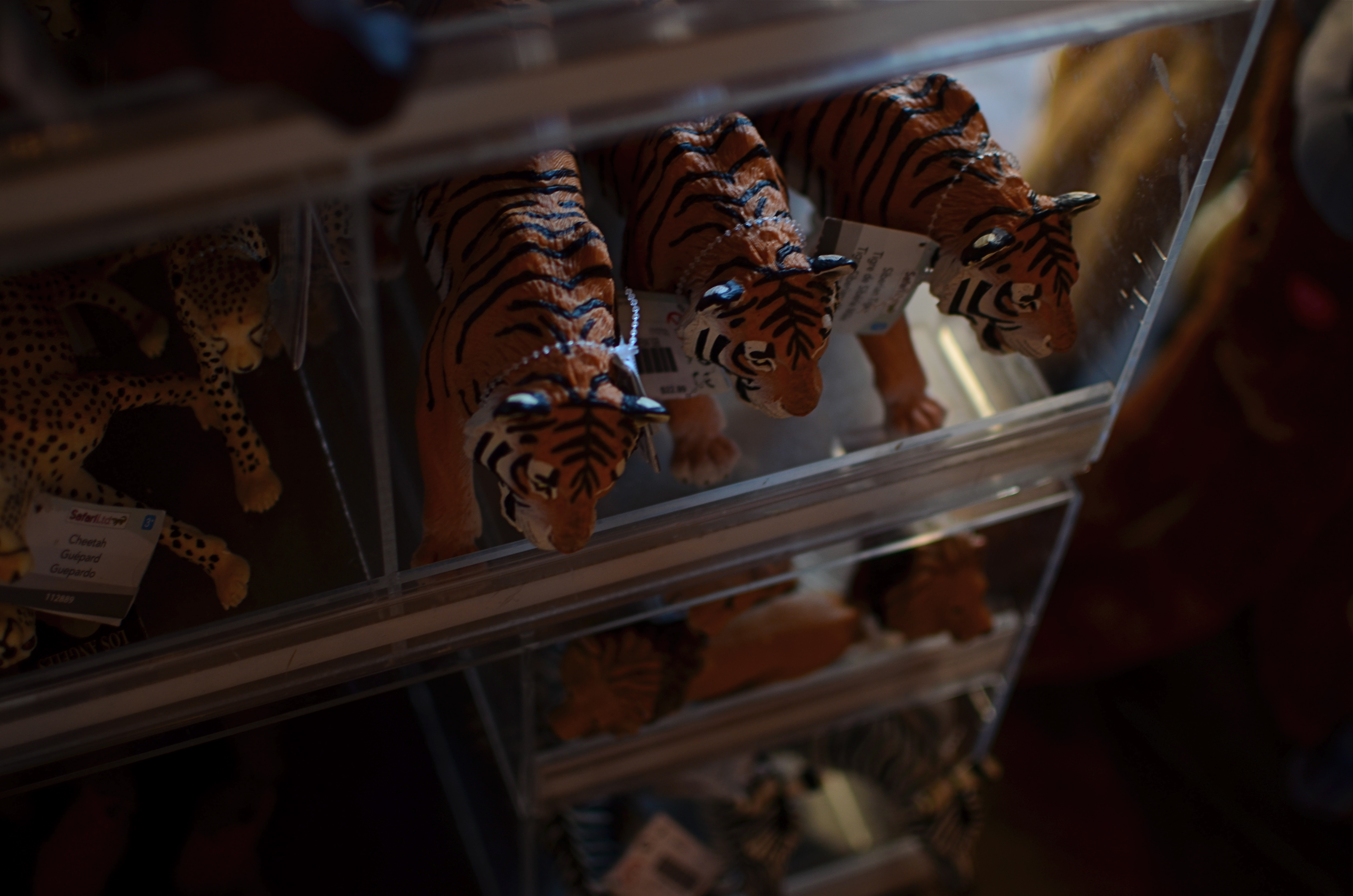
Captured live in the gift shop: 1/40 sec., f/2. ISO 100, 35mm.
So, no, if you must take your camera to a zoo, shoot your kids instead of trying to coax the kotamundi out of whatever burrow he’s…burrowed into. Better yet, shoot fake animals. Make the tasteless trinkets, overpriced souvies and toys into still lifes. They won’t hide, you can control the lighting, and, thanks to the consistent uniformity of mold injected plastic, they’re all really cute. Hey, better to come home with something you can recognize rather than trying to convince your friends that the bleary, smeary blotch in front of them is really a crown-breasted, Eastern New Jersey echidna.
Any of those Dipping Dots left?
SET AND SHOOT
Shooting manually means learning to trust that you can capture what you see. 1/160 sec., f/5.6, ISO 100, 18mm.
By MICHAEL PERKINS
AUTOMODES ON CAMERAS ARE SUPPOSED TO AFFORD THE PHOTOGRAPHER AN ENHANCED SENSE OF COMFORT AND SAFETY, since, you know, you’re protected from your very human errors by the camera’s loving, if soulless, oversight. Guess wrong on a shutter speed? The auto has your back. Blow the aperture? Auto is on the case. And you always get acceptable pictures.
That is, if you can put your brain on automode as well.
Okay, that statement makes the top ten list for most arrogant openings in all of Blogdom, 2014. But I stand by it. I don’t think you should get comfortable with your equipment calling the shots. However, getting comfortable with your equipment’s limits and strengths, and gradually relying on your own experience for consistent results through exploitation of that knowledge….now that’s another thing entirely. It’s the difference between driving cross-country on cruise control and knowing, from years of driving, where in the journey your car can shine, if you drive it intelligently.
Photographers call some hunks of glass their “go-to” lenses, since they know they can always get something solid from them in nearly any situation. And while we all tend to wander around aimlessly for years inside Camera Toyland, picking up this lens, that filter, those extenders, we all, if we shoot enough for a long time, settle back into a basic gear setup that is reliable in fair weather or foul.
This is better than using automodes, because we have chosen the setups and systems that most frequently give us good product, and we have picked up enough wisdom and speed from making thousands of pictures with our favorite gear that we can “set and shoot”, that is, calculate and decide just as quickly as most people do with automodes…..and yet we keep the vital link of human input in the creative chain.
Like most, I have my own “go-to” lens and my own “safe bet” settings. But, just as you save time by not trying to invent the wheel every time you step up, you likewise shouldn’t be averse to greasing an old wheel to make it spin more smoothly.
How about that, I also made the top ten list for unwieldy metaphors.
A good day.
THE AGE OF ELEGANCE
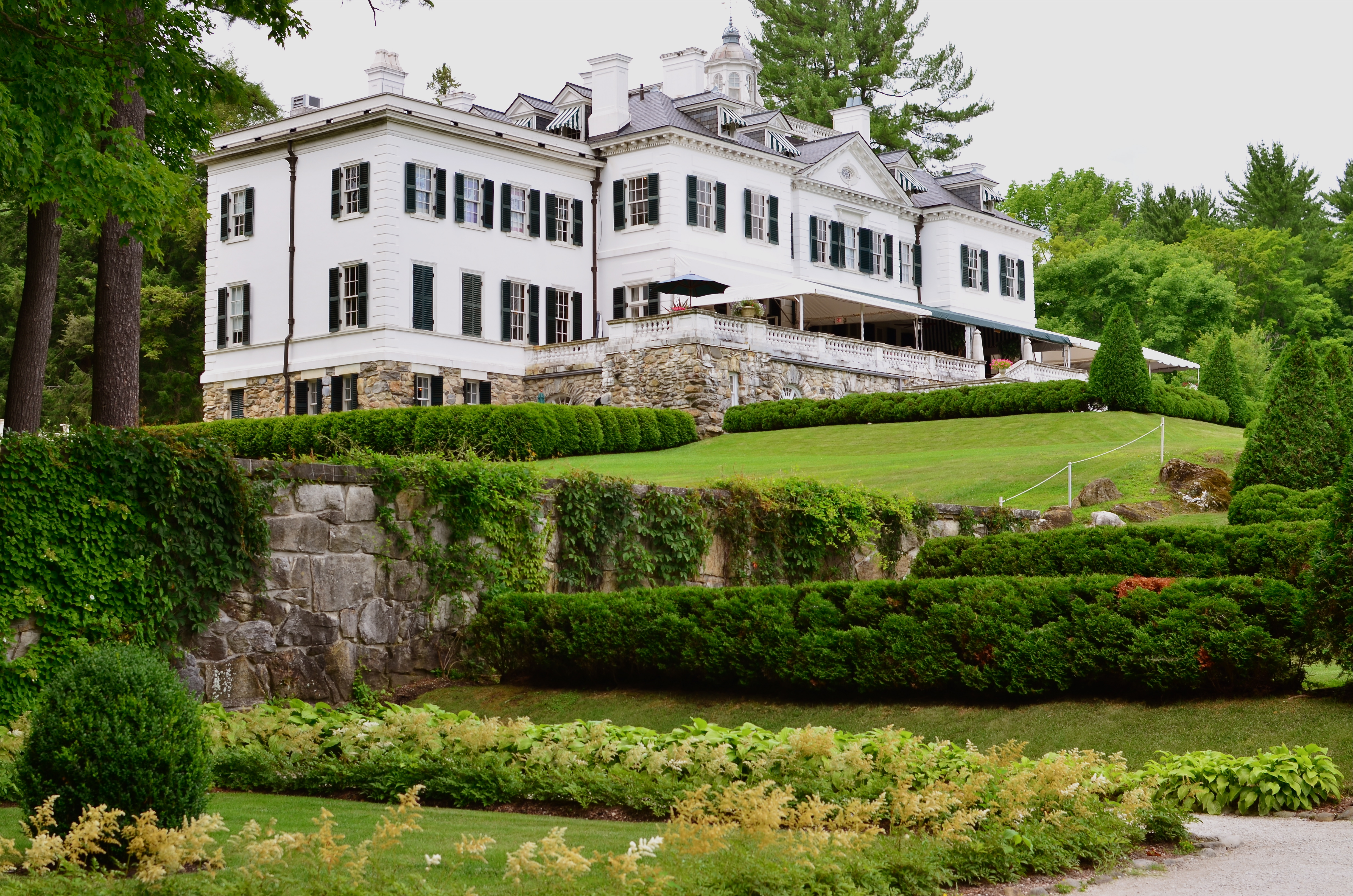
The Mount, Edith Wharton’s Berskshire Estate, now a working museum.
If only we’d stop trying to be happy, we could have a pretty good time.——Edith Wharton
By MICHAEL PERKINS
LONG BEFORE HER NOVELS THE AGE OF INNOCENCE, ETHAN FROME, AND THE HOUSE OF MIRTH made her the most successful writer in America, Edith Wharton (1862-1937) was the nation’s first style consultant, a Victorian Martha Stewart if you will. Her 1897 book, The Decoration Of Houses, was more than a few dainty gardening and housekeeping tips; it was a philosophy for living within space, a kind of bible for combining architecture and aesthetics. Her ideas survive in tangible form today, midst the leafy hills of Lenox Massachusetts, in the Berkshire estate her family knew as “The Mount”.

A world apart.
Wharton only occupied the house from 1902 to 1911, but in that time established it as an elegant salon for guests that included Henry James and other literary luminaries. Although based on several classical styles, the house is a subtle and sleek counter to the cluttered bric-a-brac and scrolled busyness of European design. Even today, the house seems oddly modern, lighter somehow than many of the robber-baron mansions of the period. Many of its original furnishings went with Wharton when she moved to Europe, and have been replicated by restorers, often beautifully. But is in the essential framing and fixtures of the old house that the writer-artist speaks, and that is what led me to do something fairly rare for me, a photo essay, seen at the top of this page in the menu tab Edith Wharton At The Mount.
The images on this special page don’t feature modern signage, tour groups, or contemporary conveniences, as I attempt to present just the basic core of the estate, minus the unavoidable concessions to time. The house features, at present, an appealing terrace cafe, a sunlit gift store, and a restored main kitchen, as part of the conversion of the mansion into a working museum. I made no images of those updates, since they cannot conjure 1902 anymore than a Mazerati can capture the feel of a Stutz-Bearcat. The pictures are made with available light only, and have not been manipulated in any way, with the exception of the final shot of the home as seen from its rear gardens, which is a three-exposure HDR, my attempt to rescue the detail of the grounds on a heavily overcast day.
Take a moment to click the page and enter, if only for a moment, Edith Wharton’s age of elegance.
TAKING FLIGHT ONCE MORE
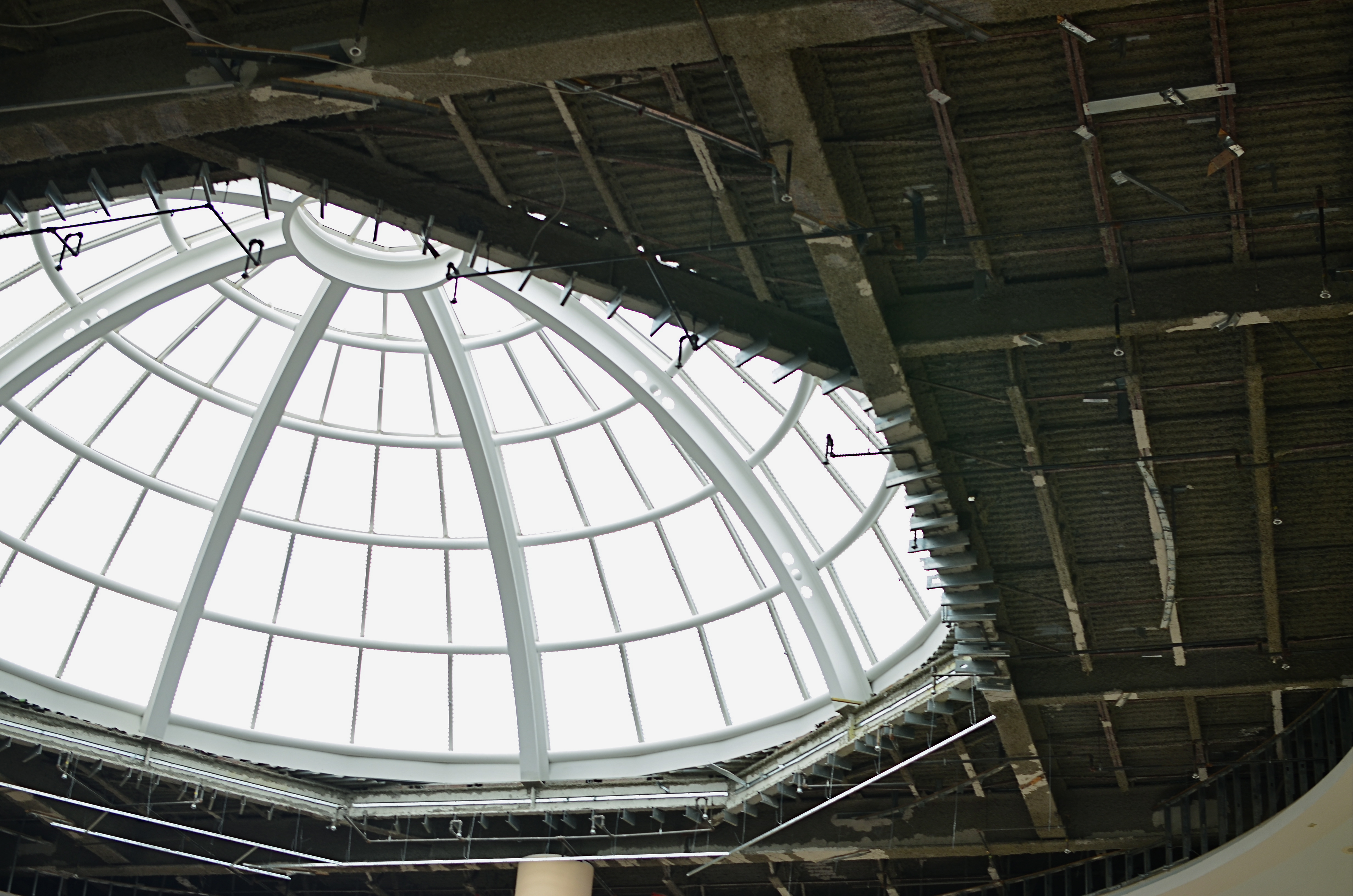
The Aerodrome, 2014. 1/30 sec., f/3.5, ISO 100, 35mm.
By MICHAEL PERKINS
ONE OF THE CHARGES GIVEN TO ALL PHOTOGRAPHERS IS TO MARK THE PASSAGE OF TIME, to chronicle and record, to give testimony to a rapidly vanishing world. Certainly interpretation, fantasy, and other original conceptions are equally important for shooters, but there has been a kind of unspoken responsibility to use the camera to bear witness. This is especially difficult in a world bent on obliterating memory, of dismantling the very sites of history.
Humorist and historian Bill Bryson’s wonderful book, One Summer: America 1927 frames the amazing news stories of its title year around its most singular event, the solo transatlantic flight of Charles A. Lindbergh. A sad coda to the story reveals that nothing whatever remains of Roosevelt Field, the grassy stretch on Long Island from which the Lone Eagle launched himself into immortality, with the exception of a small plaque mounted on the back of an escalator in the mall that bears the field’s name. Last week, hauled along on a shopping trip to the mall with relatives, I made my sad pilgrimage to said plaque, lamenting, as Bryson did, that there is nothing more to photograph of the place where the world changed forever.
Then I got a little gift.
The mall is under extensive renovation as I write this, and much of the first floor ceiling has been stripped back to support beams, electrical systems and structural gridwork. Framed against the bright bargains in the mall shops below, it’s rather ugly, but, seen as a whimsical link to the Air Age, it gave me an idea. All wings of the Roosevelt Field mall feature enormous skylights, and several of them occur smack in the middle of some of the construction areas. Composing a frame with just these two elements, a dark, industrial space and a light, airy radiance, I could almost suggest the inside of a futuristic aerodrome or hangar, a place of bustling energy sweeping up to an exhilarating launch hatch. To get enough detail in this extremely contrasty pairing, and yet not add noise to the darker passages, I stayed at ISO 100, but slowed to 1/30 sec. and a shutter setting of f/3.5. I still had a near-blowout of the skylight, saving just the grid structure, but I was really losing no useful detail I needed beyond blue sky. Easy choice.
Thus, Roosevelt Field, for me, had taken wing again, if only for a moment, in a visual mash-up of Lindbergh, Flash Gordon, Han Solo, and maybe even The Rocketeer. In aviation, the dream’s always been the thing anyway.
And maybe that’s what photography is really for…trapping dreams in a box.
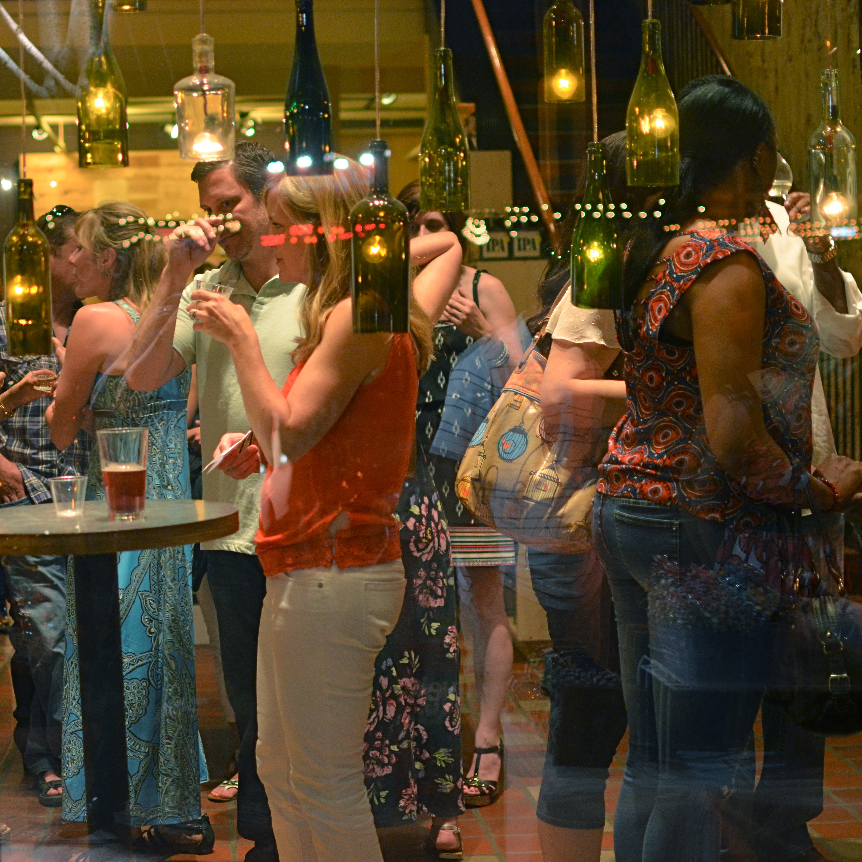
A BIG BOX OF LONELY
Think inside the box. 1/80 sec., f/2.2, ISO 800, 35mm.
By MICHAEL PERKINS
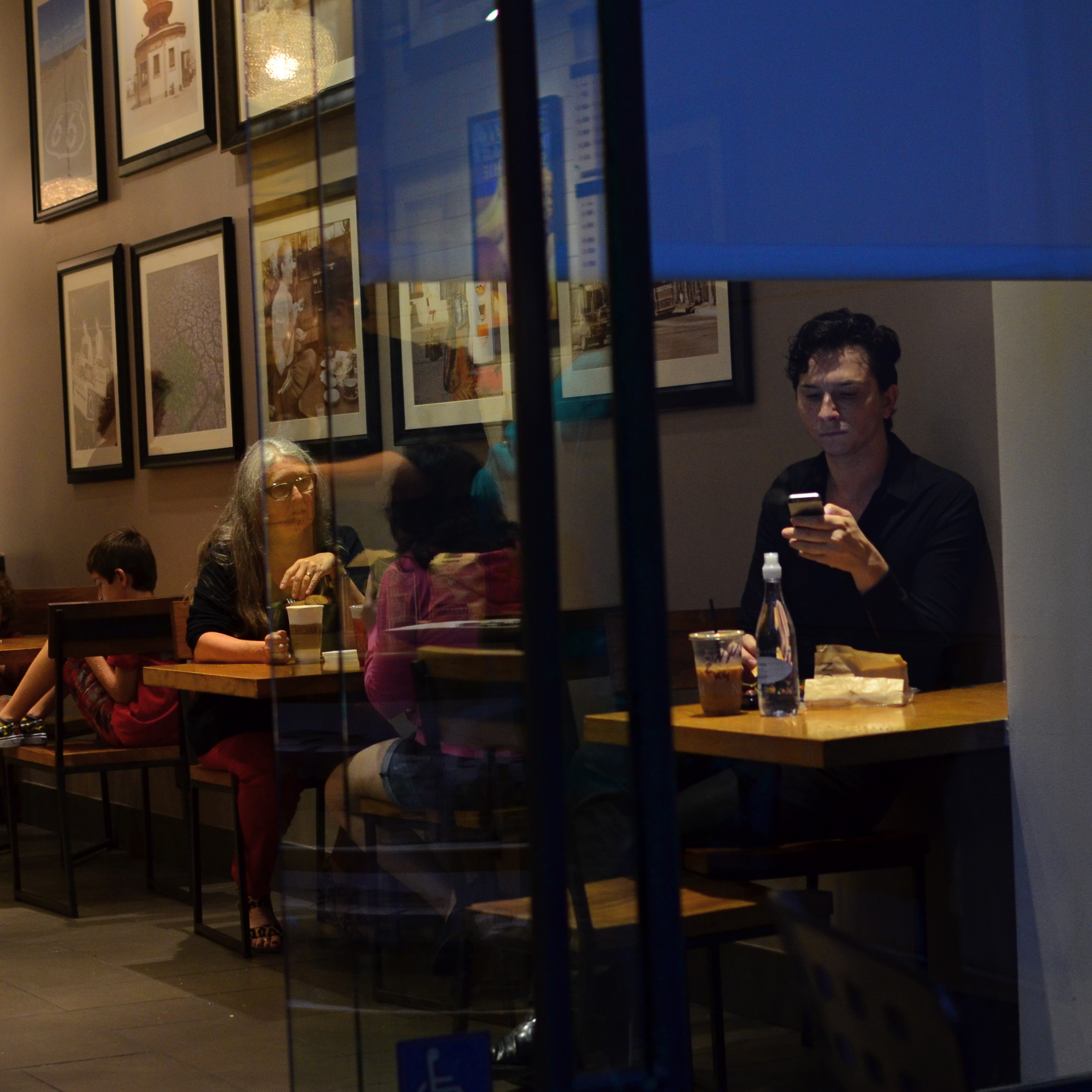
PHOTOGRAPHY CAN GO TWO WAYS ON CONTEXT. It can either seek out surroundings which comment organically on subjects (a lone customer at a largely empty bar, for example) or it can, through composition or editing, artificially create that context (five people in an elevator becomes just two of those people, their locked hands taking up the entire frame). Sometimes, images aren’t about what we see but what we can make someone else seem to see.
Creating your own context isn’t really “cheating” (are we really still using that word?), because you’re not creating a new fact in the photograph, so much as you are slapping a big neon arrow onto said fact and saying, “hey look over here.” Of course, re-contextualizing a shot can lead to deliberate mis-representation of reality in the wrong hands (see propaganda, use of), but, assuming we’re re-directing a viewer’s attention for purely aesthetic reasons (using our powers for good), it can make a single photo speak in vastly different ways depending on where you snip or pare.
In the above situation, I was shooting through the storefront window of a combined art studio and wine bar (yes, I hang with those kind of people), and, given that the neighborhood I was in regularly packed folks in on “gallery hop” nights, the place was pretty jammed. The original full frame showed everything you see here, but also the connecting corridor between the studio and the wine bar which was, although still crowded, a lot less claustrophobic than this edited frame suggests.
And that’s really the point. Urban “hangs” that are so over-attended can give me the feeling of being jammed into a phone booth, like I’m part of some kind of desperately lonely lemming family reunion, so I decided to make that crushed sensation the context of the picture. Cropping down to a square frame improved the balance of the photograph but it also made these people look a little trapped, although oddly indifferent to their condition. The street reflections from the front plane of glass also add to the “boxed in” sensation. It’s a quick way to transform a snap into some kind of commentary, and you can either accept my choice or pass it by. That’s why doing this is fun.
Urban life presents a challenging series of social arrangements, and context in photographs can force a conversation on how that affects us.
ELEMENTARY, MY DEAR NIKON
Let the light decide what makes a photograph. Modem, 2014. 1/30 sec., f/1.8, ISO 800, 35mm.
By MICHAEL PERKINS
PHOTOGRAPHY IS OFTEN DEFINED CLASSICALLY AS “WRITING WITH LIGHT“, but I often wonder if a better definition might be “capitalizing on light opportunities”, since it’s not really what subject matter we shoot but light’s role in shaping it that makes for strong images. We have all seen humble objects transformed, even rendered iconic, based on how a shooter perceives the value of light, then shapes it to his ends. That’s why even simple patterns that consist of little more than light itself can sometimes be enough for a solid photograph.
If you track the history of our art from, say, from the American Civil War through today’s digital domain, you really see a progression from recording to interpreting. If the first generally distributed photographs seen by a mass audience involve, say, the aftermath of Antietam or Gettysburg, and recent images are often composed of simple shapes, then the progression is very easy to track. The essence is this: we began with photography as technology, the answer to a scientific conundrum. How do we stop and fix time in a physical storage device? Once that very basic aim was achieved, photographers went from trying to just get some image (hey, it worked!) to having a greater say in what kind of image they wanted. It was at this point that photography took on the same creative freedom as painting. Brushes, cameras, it doesn’t matter. They are just mediums through which the imagination is channeled.
In interpreting patterns of elementary shapes which appeal on their own merit, photographers are released from the stricture of having to endlessly search for “something to shoot”. Some days there is no magnificent sunrise or eloquent tree readily at hand, but there is always light and its power to refract, scatter, and recombine for effect. It’s often said that photography forced painting into abstraction because it didn’t want to compete with the technically perfect way that the camera could record the world. However, photography also evolved beyond the point where just rendering reality was enough. We moved from being reporters to commentators, if you like. Making that journey in your own work (and at your own pace) is one of the most important step an art, or an artist, can take.
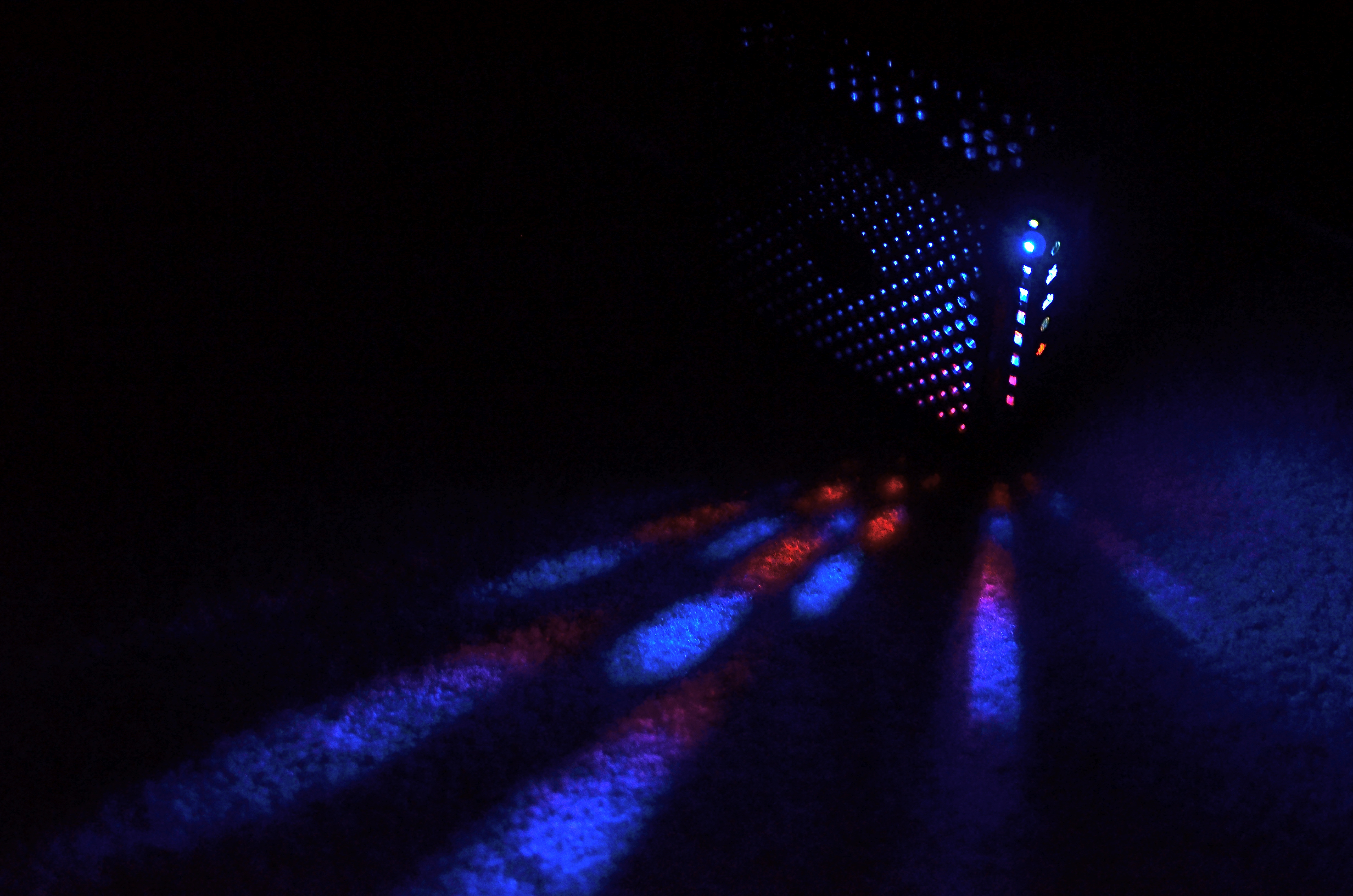
LIGHT DECAY
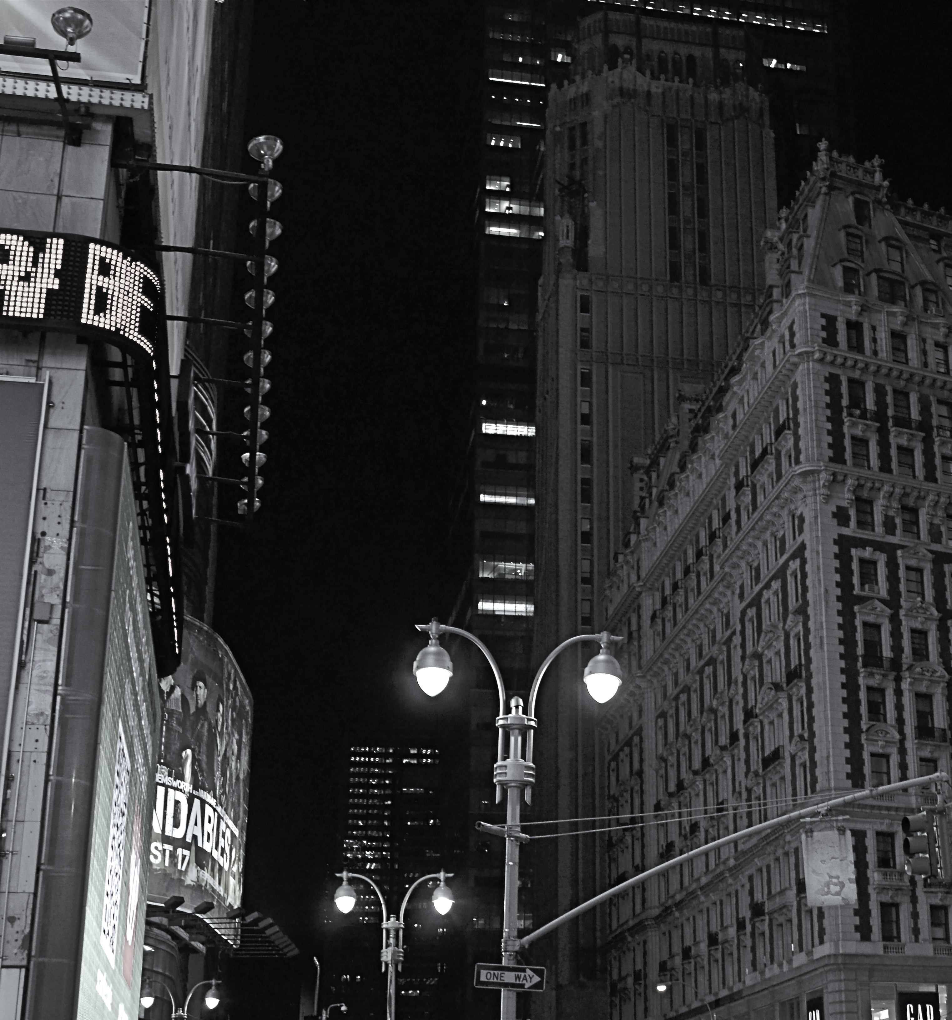
Yeah, it’s “Broadway”, but a little further from the solar flare of its neon overkill.
By MICHAEL PERKINS
WE HAVE PROVEN OURSELVES TO BE A SPECIES THAT HATES TO BE SENT TO BED. Night life being a kind of “second shift” in most of the modern world, we really never lock up our cities for the evening, and that has changed how those cities exist for photographers.
Here’s both the good and bad news: there is plenty of light available after dark in most towns. Good if you want the special mix of neon, tube glow and LED burn that sculpts the contours of most towns post-sundown. Bad if you really want to see cities as special entities defined by shadow, as places where dark is a subtle but aesthetically interesting design element. In many mega-cities, we have really banished the dark, going beyond essential illumination to a bleachingly bright blast of light which renders everything, big and small, in the same insane mutation of color and tone. Again, this is both good and bad, depending on what kind of image you want.
Midtown Manhattan, downtown Atlanta, and anyplace Tokyo are examples of cities that are now a universe away from the partial night available in them just a generation ago. A sense of architectural space beyond the brightest areas of light can only be sensed if you shoot deep and high, framing beyond the most trafficked structures. Sometimes there is a sense of “light decay”, of subtler illumination just a block away or a few stories higher than what’s seen at the busiest intersections. Making images where you can watch the light actually fade and recede adds a little dimension to what would otherwise be a fairly flat feel that overlit streets can generate.
Photography is often a matter of harnessing or collecting extra light when it’s scarce. Turns out that having too much of it is a creative problem in the opposite direction.
NOT WHAT I CAME FOR, BUT…
By MICHAEL PERKINS
ANYONE WHO’S MADE A ROAD TRIP CAN TELL YOU THAT THE DESTINATION IS OFTEN FAR LESS ENJOYABLE THAN THE JOURNEY, a truth that also applies to photography. The best things result from the little surprises at the side of the highway. You’re fixated on your oh-so-holy “plan” and all the wonderful things you’ll see and do in executing it. But photography is an art of opportunity, and to the degree that you embrace that fact, your work will be broader, richer, looser.
This is now a real source of excitement for me. I still go to the trouble of sketching out what I think I’m going to do, but, I’m at least quietly excited to know that, in many cases, the images that will make the keepers pile will happen when I went completely off message. Yes, we are “officially” here today to shoot that big mountain over yonder. But, since the two people I met on the approach path to said mountain are in themselves interesting, the story has now become about them. I may or may not get back to the mountain, and, if I do, I may discover that I really did not have a strong concept in my bagga trix for making anything special out of it, and so it’s nice not to have to write the entire day off to a good walk spoiled.
Specific example: I have written before that I get more usable stuff in the empty spaces and non-exhibit areas of museums than I do from the events within them. This is a great consolation prize these days, especially since an increasingly ardent police state among curators means that no photos can be taken in some pretty key areas. Staying open means that I can at least extract something from the areas no one is supposed to care about.
An average day at the museum, at the end of which this dropped into my lap.
The above image is one such case, since it was literally the final frame I shot on my way out of a museum show. It was irresistible as a pattern piece, caused by a very fleeting moment of sunset light. It would have appealed to me whether I was in a museum or not, but it was the fact that I was willing to go off-script that I got it, no special technical talent or “eye”. Nabbing this shot completely hinged on whether I was willing to go after something I didn’t originally come for. It’s like going to the grocery store for milk, finding they’re out, but discovering that there is also a sale on Bud Light. Things immediately look rosier.
Or at least they will by the third can.
SETTING THE CAPTIVES FREE
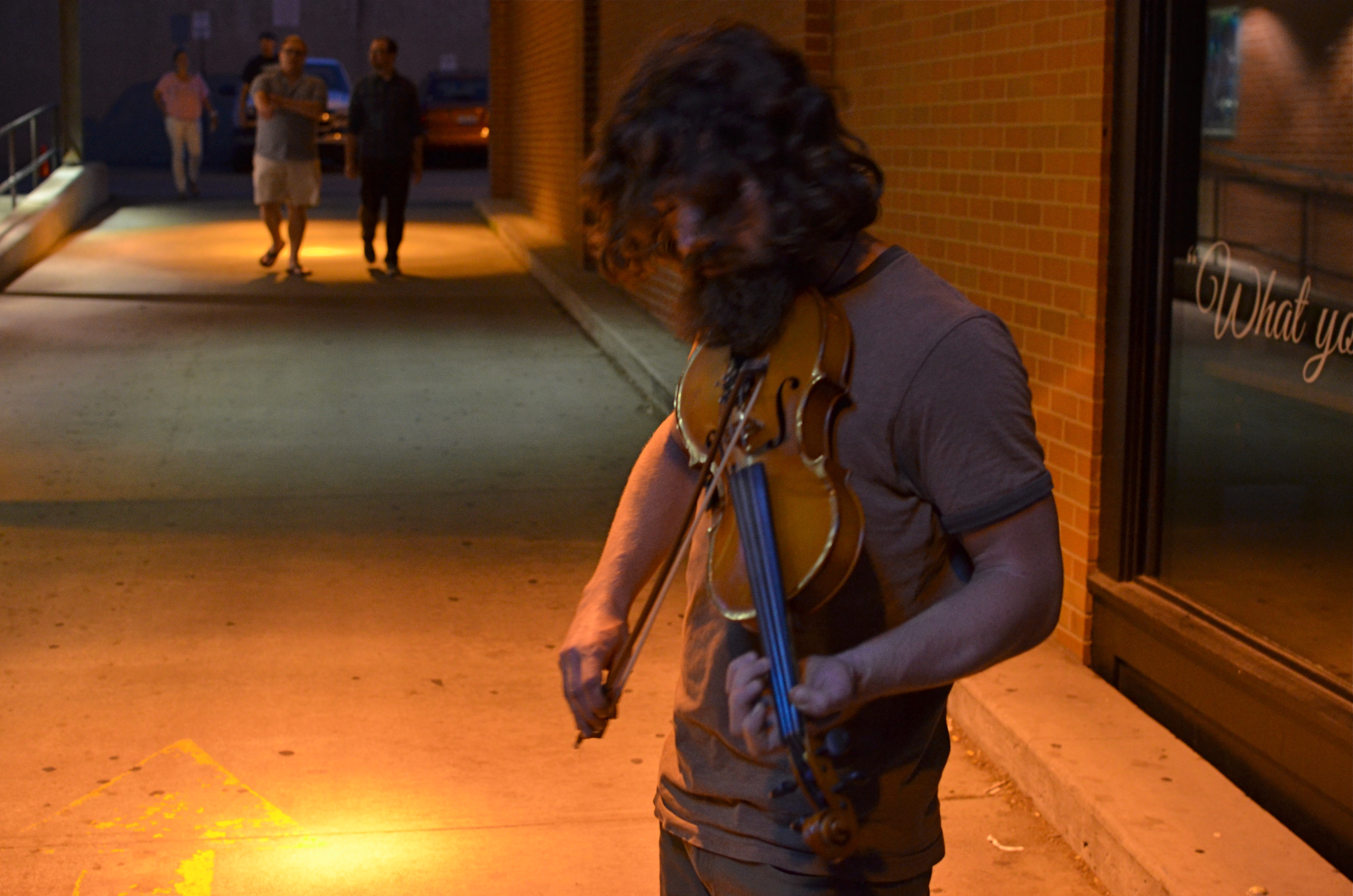
Fiddler, 2014. Too soft? Too dark? True? False? 1/50 sec., f/3.5, ISO 1000, 35mm.
By MICHAEL PERKINS
I’D LIKE TO ERADICATE THE WORD “CAPTURE” FROM MOST PHOTOGRAPHIC CONVERSATIONS. It suggests something stiff or inflexible to me, as if there is only one optimum way to apprehend a moment in an image. Especially in the case of portraits, I don’t think that there can be a single way to render a face, one perfect result that says everything about a person in a scant second of recording. If I didn’t capture something, does that mean my subject “got away” in some way, eluded me, remains hidden? Far from it. I can take thirty exposures of the same face and show you thirty different people. The word has become overused to the point of meaningless.
We are all conditioned to think along certain bias lines to consider a photograph well done or poorly done, and those lines are fairly narrow. We defer to sharpness over softness. We prefer brightly lit to mysteriously dark. We favor naturalistically colored and framed recordings of subjects to interpretations that keep color and composition “codes” fluid, or even reject them outright. It takes a lot of shooting to break out of these strictures, but we need to make this escape if we are to move toward anything approaching a style of our own.
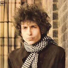
Jerry Schatzberg’s iconic portrait of Bob Dylan from the cover of Blonde On Blonde.
I remember being startled in 1966 when I first saw Jerry Schatzberg’s photograph of Bob Dylan on the cover of the Blonde On Blonde album. How did the editor let this shot through? It’s blurred. It’s a mistake. It doesn’t…..wait, I can’t get that face out of my head. It’s Bob Dylan right now, so right now that he couldn’t be bothered to stand still long enough for a snap. The photo really does (last time I say this) capture something fleeting about the electrical, instantaneous flow of events that Dylan is swept up in. It moves. It breathes. And it’s more significant in view of the fact that there were plenty of pin-sharp frames to choose from in that very same shoot. That means Schatzberg and Dylan picked the softer one on purpose.
There are times when one 10th of a second too slow, one stop too small, is just right for making the magic happen. This is where I would usually mention breaking a few eggs to make an omelette, but for those of you on low-cholesterol diets, let’s just say that n0 rule works all the time, and that there’s more than one way to skin (or capture) a cat.
A PLACE APART
By MICHAEL PERKINS
PHOTOGRAPHERS USUALLY USE FACES AS THE SOLE BAROMETER OF EMOTION. It’s really easy to use a person’s features as the most obvious cues to one’s inner mind. Scowls, smiles, smirks, downcast eyes, sidelong glances,cries of anguish….these are standard tools in depicting someone as either assimilated into the mass of humanity or cast away, separate and alone.
But faces are only one way of showing people as living in a place apart. Symbolically, there is an equally dramatic effect to be achieved by the simple re-contextualizing of that person in space. The arrangement of space near your subject forces the viewer to conclude that he or she is either in harmony with their surroundings or lonely, solitary, sad even, and you do it without showing so much as a raised eyebrow. This is where composition isn’t just a part of the story, but the story itself.
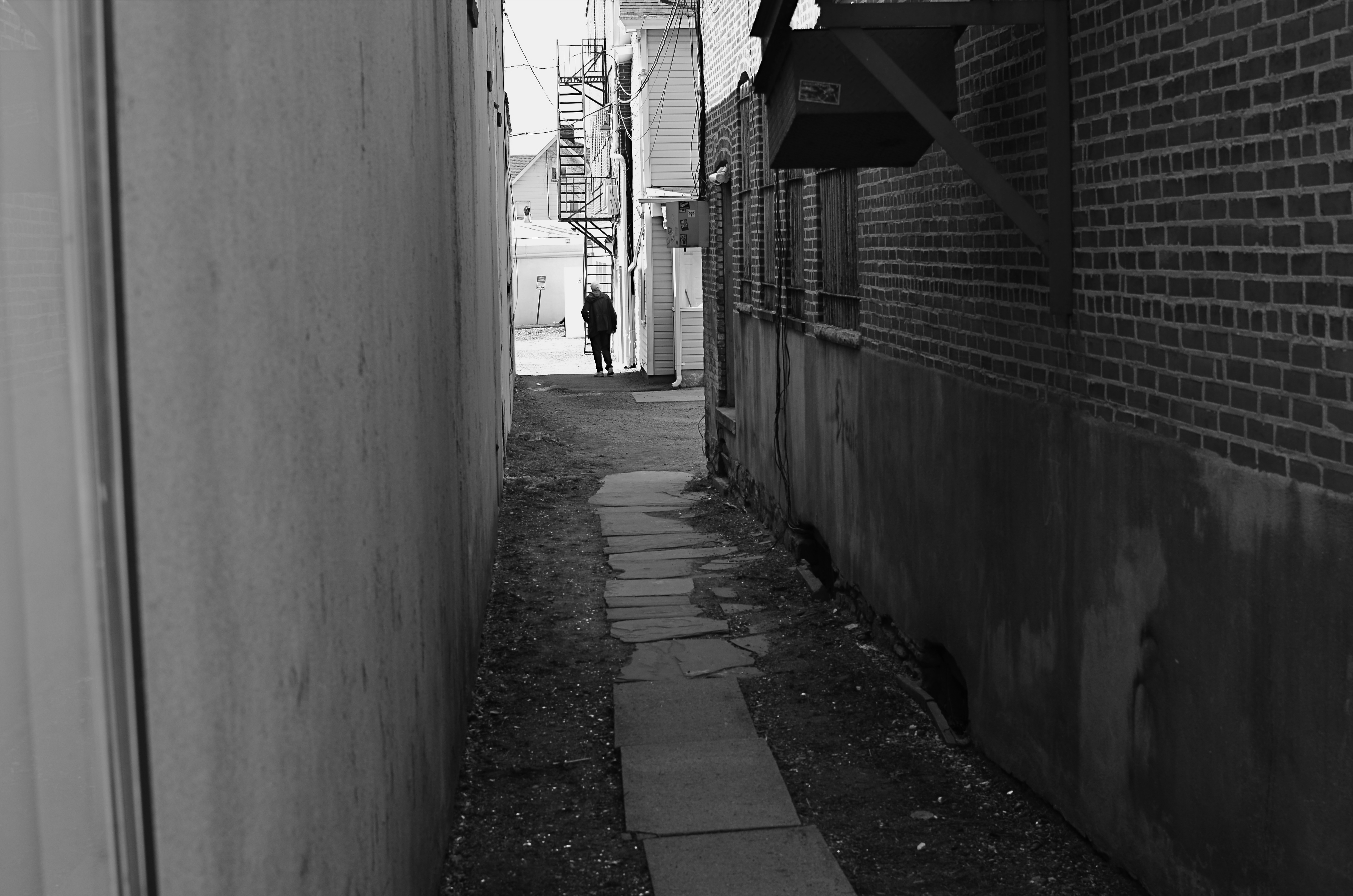
Context is all.
The woman shown here is most likely just walking from point A to point B, with no undercurrent of real tragedy. But once she takes a short cut down an alley, she can be part of a completely different, even imaginary story. Here the two walls isolate her, herding her into a context where she could be lonely, sad, afraid, furtive. She is walking away from us, and that implies a secret. She is “withdrawing” and that implies defeat. She is without a companion, which can symbolize punishment, banishment, exile. From us? From herself? From the world? Once you start to think openly about it, you realize that placing the subject in space lays the foundation for storytelling, a technique that is easy to create, recalibrate, manipulate.
The space around people is a key player in the drama an image can generate. It can mean, well, whatever you need it to mean. People who exist in a place apart become the centerpieces in strong photographs, and the variability of that strength is in your hands.
THE ENVELOPE
By MICHAEL PERKINS
HAVING LIVED IN THE AMERICAN SOUTHWEST FOR OVER FIFTEEN YEARS, I HAVE NEGOTIATED MY OWN TERMS WITH THE BLAZING OVERKILL OF MIDDAY SUNLIGHT, and its resulting impact on photography. If you move to Arizona or New Mexico from calmer climates, you will find yourself quickly constricting into a severe squint from late breakfast to early evening, with your camera likewise shrinking from the sheer overabundance of harsh, white light. If you’re determined to shoot in midday, you will adjust your approach to just about everything in your exposure regimen.
Good news, however: if you prefer to shoot in the so-called “golden hour” just ahead of sunset, you will be rewarded with some of the most picturesque tones you’ve ever had the good luck to work with. As has been exhaustively explained by better minds than mine, sunlight lingers longer in the atmosphere during the pre-sunset period, which, in the southwest, can really last closer to two hours or more. Hues are saturated, warm: shadows are powerful and sharp. And, if that dramatic contrast works to your advantage in color, it really packs a punch in monochrome.
This time of day is what I call “the envelope”, which is to say that objects look completely different in this special light from how they register in any other part of the day, if you can make up your mind as to what to do in a hurry. Changes from minute to minute are fast and stark in their variance. Miss your moment, and you must wait another 24 hours for a re-do.
In the west, the best action actually happens after High Noon. Just before sunset in Scottsdale, AZ: 1/500 sec., f/4.5, ISO 100, 35mm.
The long shadow of an unseen sign visible in the above frame lasted about fifteen minutes on the day of the shoot. The sign itself is a metal cutout of a cowboy astride a bucking bronco, the symbol of Scottsdale, Arizona, “the most western town in the USA”. The shadow started as a short patch of black directly in front of the rusted bit of machine gear in the foreground, then elongated to an exaggerated duplicate of the sign, extending halfway down the block and becoming a sharper and more detailed silhouette.
A few minutes later, it grew softer and eventually dissolved as the sun crept closer to the western horizon. There would still be blazing illumination and harsh shadows for some objects, if you went about two stories high or higher, but, generally, sunset was well under way. Caught in time, the shadow became an active design element in the shot, an element strong enough to come through even in black and white.
If you are ever on holiday in the southwest, peek inside “the envelope”. There’s good stuff inside.
INS AND OUTS
By MICHAEL PERKINS
WHEN IT COMES TO DISCUSSIONS ABOUT ART, THE WORD “ABSTRACT” IS PROBABLY THE MOST BATTED-ABOUT LINGUISTIC SHUTTLECOCK OF THE 20TH CENTURY, something we lob at each other across the conversational net as it suits our mood. Whenever we feel we should weigh in on a matter of artistic heft, especially something that doesn’t fit into a conveniently familiar cubbyhole, we drag “abstract” out of the desk drawer, dust it off, and cram it into place somewhere in the argument.
Frames within frames within frames: 1/125 sec., f/5.6, ISO 100, 35mm.
Any talk of architecture, and the photographer’s reaction to it, attracts a lot of stray “abstracts”, since attaching the word seems to settle… something. However, art can never be about settling anything. In fact, it’s about churning things up, starting, rather than resolving, arguments. As pieces of pure design, finished buildings do make a statement of sorts about the architect’s view, at least. But when trolling about town, I am more drawn to incomplete or skeletal frameworks for buildings yet to be. They are simply open to greater interpretation as visual subject matter, since we haven’t, if you like, seen all the architect’s cards yet. The emerging project can, for a time, be anything, depending literally on where you stand or how light shapes the competing angles and contours.
I feel that open or unfinished spaces are really ripe with an infinite number of framings, since a single uncompleted wall gives way so openly to all the other planes and surfaces in the design, a visual diagram that will soon be closed up, sealed off, sequestered from view. And as for the light, there is no place it cannot go, so you can chase the tracking of shadows all day long, as is possible with, say, the Grand Canyon, giving the same composition drastically different flavors in just the space of a few hours.
If the word “abstract” has any meaning at all at this late date, you could say that it speaks to a variation, a reworking of the dimensions of what we consider reality. Beyond that, I need hip waders. However, I believe that emerging buildings represent an opportunity for photographers to add their own vision to the architect’s, however briefly.
Whew. Now let’s all go out get a drink.
