BREAKING THE BOX
The picture shown here was spoiled by tilting the camera sidewise. The whole scene seems to be “running downhill”. Unless you are trying for an unusual effect, hold the camera level. – How To Make Good Pictures, c) 1943 The Eastman Kodak Company
By MICHAEL PERKINS
ONE OF THE CARDINAL RULES OF PHOTOGRAPHIC COMPOSITION IS THE MAINTENANCE OF A PAINTER’S VIEW OF THE WORLD, and it needs to be abandoned as irrelevant to picture-making in the current era. I’m talking about one of the Photography 101 rules we all inherited from the medium’s 19th-century beginnings, which is the unyielding reverence for “the box” as a framing device.
You know the admonition, and can recite it out of a million amateur guides: the parameters of your photo must be a dead parallel line top and bottom and two perfectly perpendicular verticals for the left and right sides. Call it the “out the window” orientation or the painter’s frame, or perhaps the “God’s in his heaven, all’s right with the world” concept of a perfect clockwork universe. Whatever the term, this unbending admonition became common to every amateur book on photographic instruction since forever. Tilting was bad. Bending the frame or composing within an abstracted version of it was really bad. Calling attention to the frame instead of letting it remain invisible was amateurish.
I’ll tell you what’s bad: doing everything the same way, forever, and expecting to grow as a photographer, or as an anything.
Framing in photography sets the visual grammar of an image. It lays out the rules of engagement as much as anything that’s contained within it. It can be an artistic statement all in itself, and needs to be thought of as a deliberate choice, no less than camera settings or subject matter. The square or rectangle is not a mathematical commandment. Like every other element of making images, it needs to justify itself for the picture at hand. What is right for this instance?
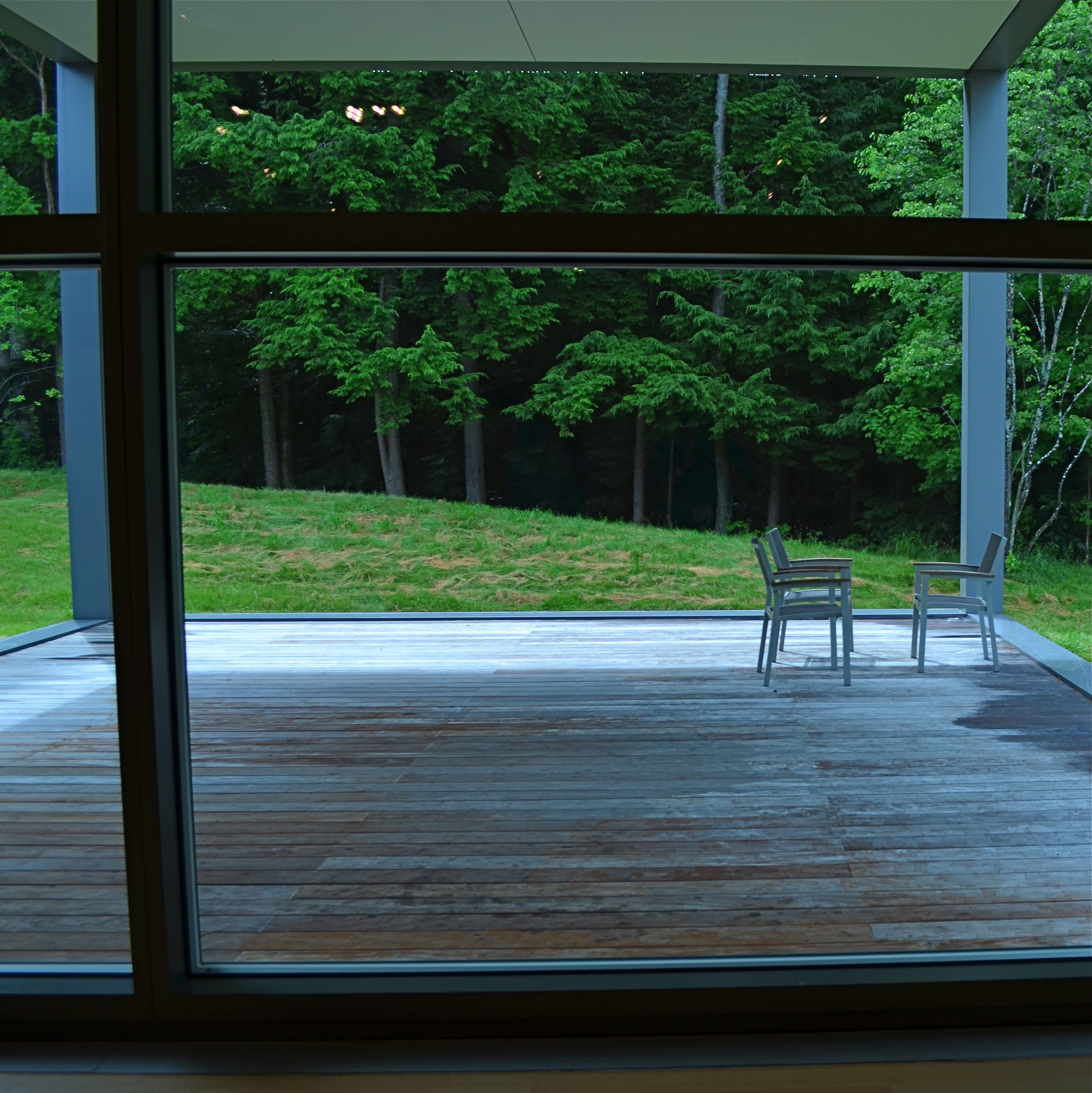
Would this image have worked better inside a completely standardized framing?
The image seen here is a very calm and unchallenging composition. I liked the small number of elements presented by the stark little porch and the rich but mysterious patch of forest. But in both the shooting and the cropping, I decided to subtly re-jigger the frame to include structural parts of the porch and the window through which I shot the scene, throwing off the perfect geometry of vertical and horizontal, resulting in a look that is a little off-kilter. I tried looking at the shot without any of these parts, and the picture looked too pat, too passive, whereas creating an imperfect square with them gave the photograph just a little edge. Not a slam-you-over-the- head effect, just a slight bit of visual punctuation.
Call it the difference between a colon and semi-colon.
As for the Eastman Kodak Company’s caution that you should maintain the standard frame unless you “are trying for an unusual effect”, well, aren’t you doing that every time you step up to bat?
If not, what’s the point?
ROAD FOOD
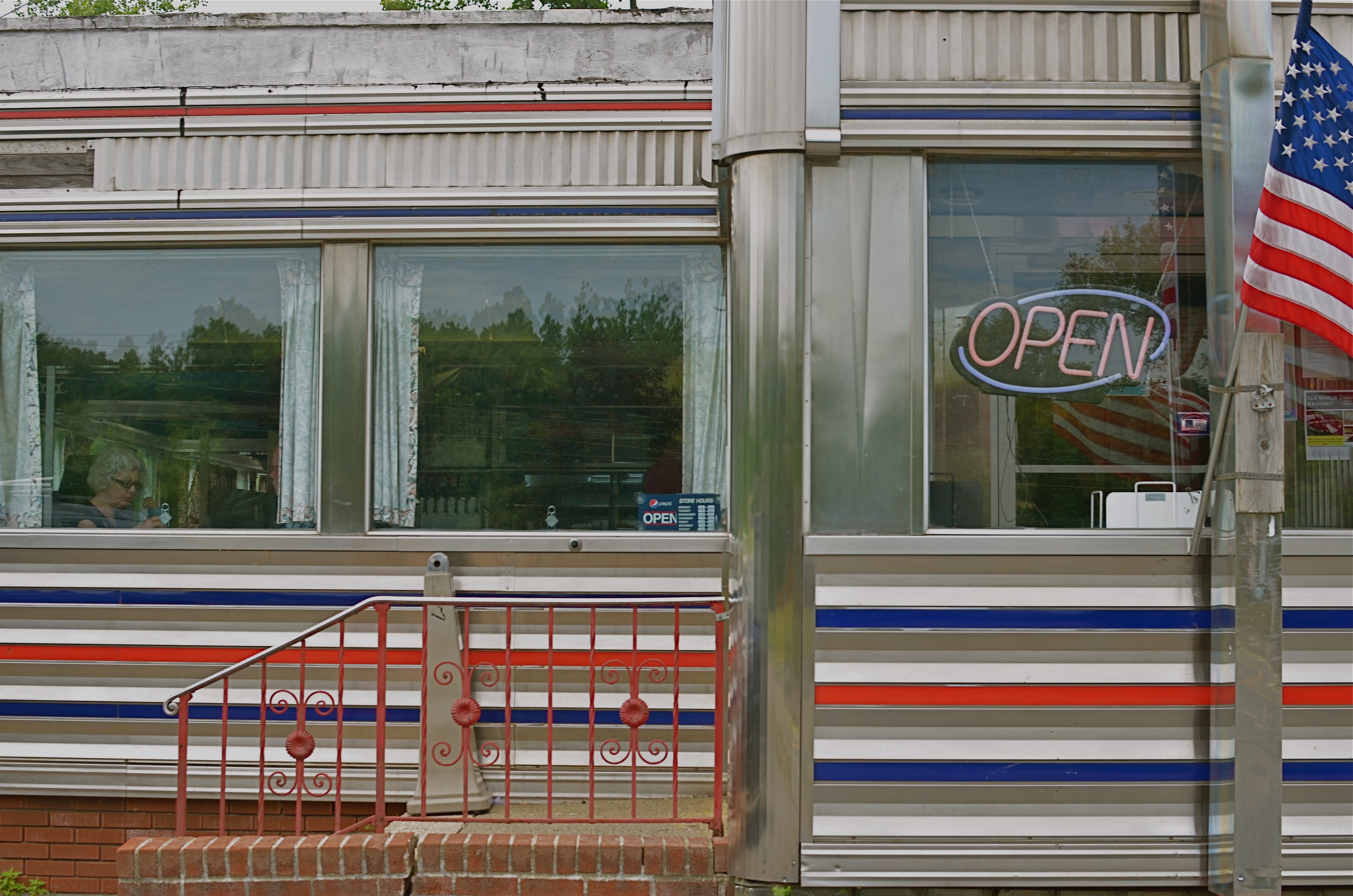
West Taghkanic Diner, Ancram New York, 2014. 1/60 sec., f/5.6, ISO 100, 35mm.
By MICHAEL PERKINS
Truck Driver: Give me some more of this poison you call coffee.
Waitress: I notice you’re on your third cup…
Truck Driver: I like your sugar.
They Drive By Night, Warner Brothers, 1940
AMERICANS CERTAINLY DID NOT INVENT THE IDEA OF STOPPING OFF FOR CHOW “ON THE WAY” TO WHEREVER. The roadside taverns and eateries that dot the globe in the spaces between village and town are the stuff of worldwide legend. Call it the “ye olde inn” tradition. However, in the 20th century, we Yanks did our bit in contributing to the romance of road food. Hey, you’re motoring across the country in your new Ford/Buick/Merrie Oldsmobile anyway, so you need some kind of, let’s call it grub infrastructure, laid out along the route.
Mind you, these won’t be the same restaurants where Grandma and the kids tuck in of a Sunday supper. We leave the linens to the landed gentry: simply paper napkins here, bub. The best “joints” actually resemble trailers more than restaurants, with the menu ranging from non-poisonous to “not bad”, but not much wider. Diners and dives don’t pull down Michelin stars and Zagat raves. But they do shape our traveling, and photographic, experiences. And now that we’re beyond the first great Golden Age of Motoring (maybe the only one, come to think of it), photo-documenting these decaying munch museums is a must.
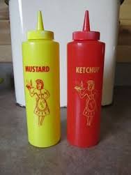
Hey, doll, any more at home like you?
I love the curvy chrome and Deco streamlining that forms the shell of many joints. I love them even more in their present state of slow disintegration,when the streamlining isn’t too straight, the chrome gives off an apologetic, latter-day patina, and all the angles don’t quite square up. My photographer’s eye likes these temples of makeshift cuisine because they are cheap and cheesy. They’re vulgar and obvious in their blinky, half-dead neon, kitschy colors and over-ripe graphics, and as Sinatra used to sing, that’s America to me. Love it.
Some of my favorite joints are far more dinosaur than diner, but, when you can squeeze off a frame or two of their fading glory, and amble inside for a five dollar cheeseburger deluxe, heck, boyo, that’s a combo plate you can’t even get at the Ritz. And if I could ever find the dazzling dame who modeled for the drawing of a waitress on the side of all those millions of ketchup squeeze bottles, that would be love at first sight.
Talk about your latter-day Mona Lisa. With fries.
CLEAN-UP ON AISLE FIVE
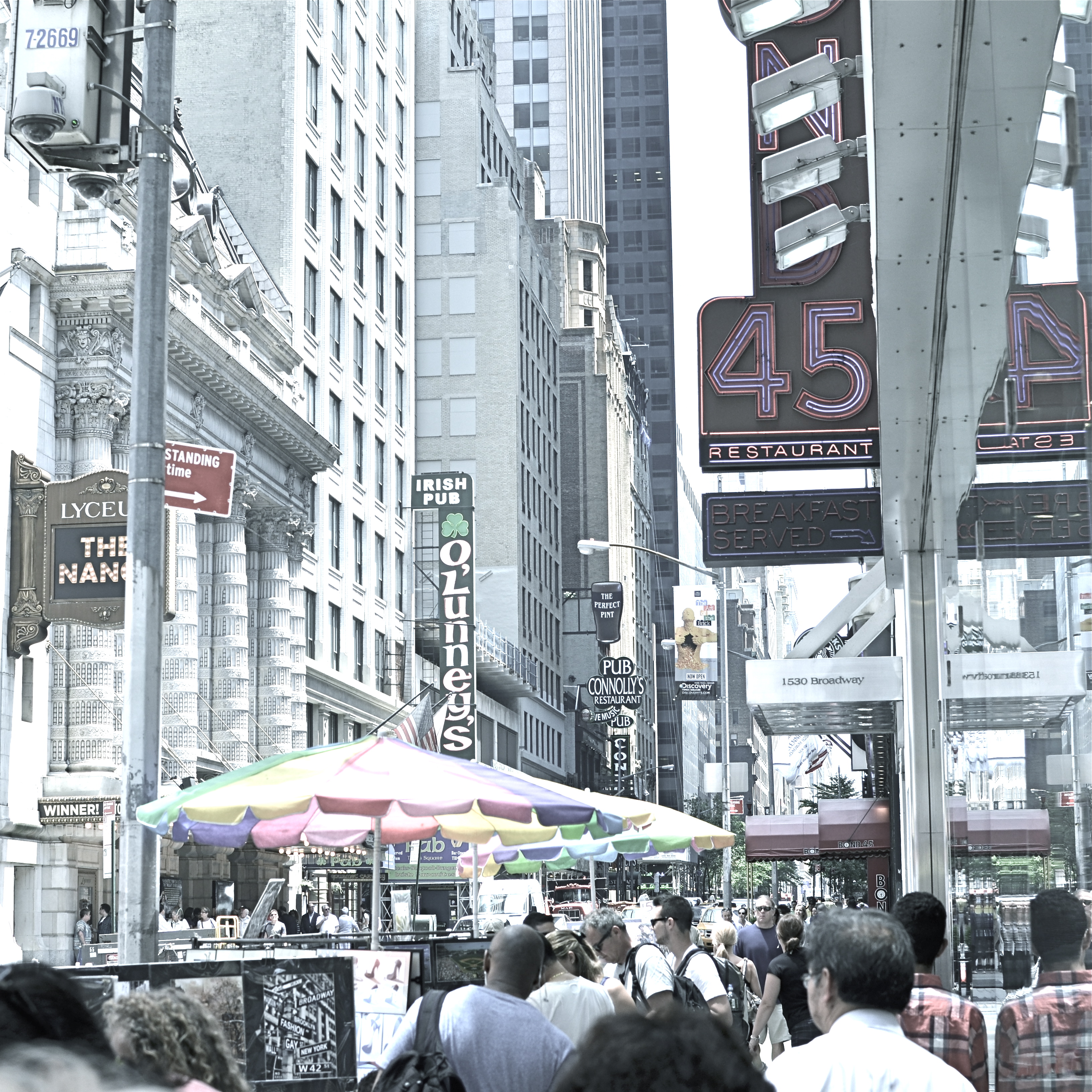
A post-processed “color compromise” of the image below. 1/320 sec., f/5.6, ISO 100, 35mm.
By MICHAEL PERKINS
TAKE ENOUGH PHOTOGRAPHS AND YOU WILL DEVELOP YOUR OWN SENSE OF “SIMPLICITY”. That is, you will arrive at your own judgement about how basic or complex a composition you need in a given situation. Some photographers are remarkable in their ability to create images that contain a mad amount of visual information. Some busy city scenes or intricate landscapes benefit wonderfully from an explosion of detail. Other shooters render their best stories by reducing elements to a bare minimum. And of course, most of us make pictures somewhere in the vast valley between those approaches.
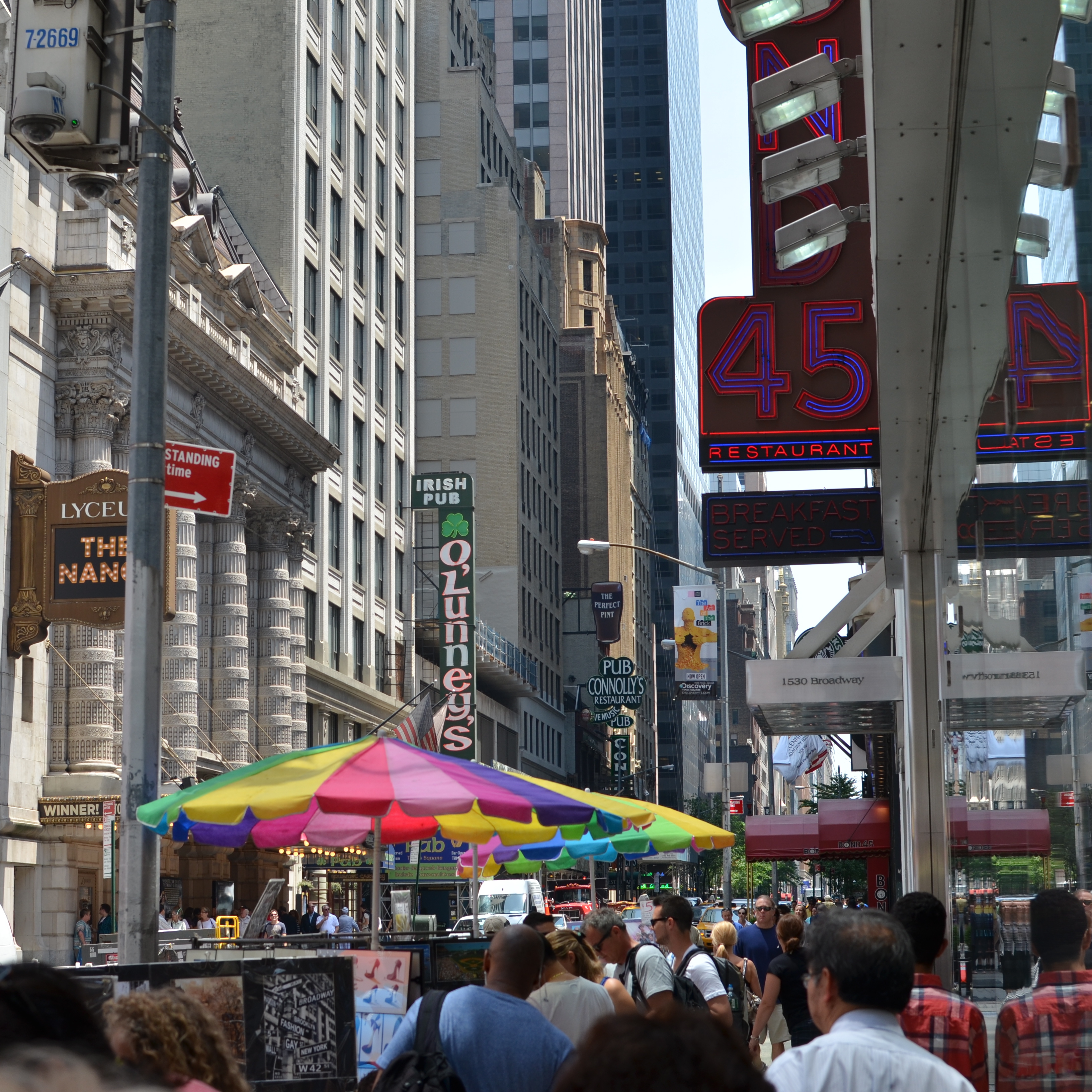
Before the fiddling ensued.
I’m pretty accustomed to thinking of overly-busy pictures as consisting of a specific kind of “clutter”, usually defined as cramming too many objects or people into a composition. But I occasionally find that color can be a cluttering element, and that some very visually dense photos can be rendered less so by simply turning down hues, rather than rooting them out completely. Recently I’ve been taking some of the pictures that seem a little too “overpopulated” with info and taking them through what a two-step process I call a color compromise (patent not applied for).
First step involves desaturating the picture completely, while also turning the contrast way down, amping up the exposure and damn near banishing any shadows. This almost results in a bleached-out pencil drawing effect and emphasizes detail like crazy. Step two involves the slow re-introduction of color until only selected parts of the image render any hues at all, and making sure that the color that is visible barely, barely registers.
The final image can actually be a clearer “read” for your eyes than either the garish colored original or a complete b&w. Objects will stand out from each other a little more distinctly, and there will be an enhanced sensation of depth. It also suggests a time-travel feel, as if age has baked out the color. A little of this washed-out jeans look goes a long way, however, and this whole exercise is just to see if you can make the picture communicate a little better by allowing it to speak more quietly.
Compare the processed photo at the top, taken in the heart of the visually noisy Broadway district, with its fairly busy color original and see if any of this works for you. I completely stipulate that I may just be bending over backwards to try to salvage a negligible photo. But I do think that color should be a part of the discussion when we fault an image for being cluttered.
REDUCTION OF TERMS
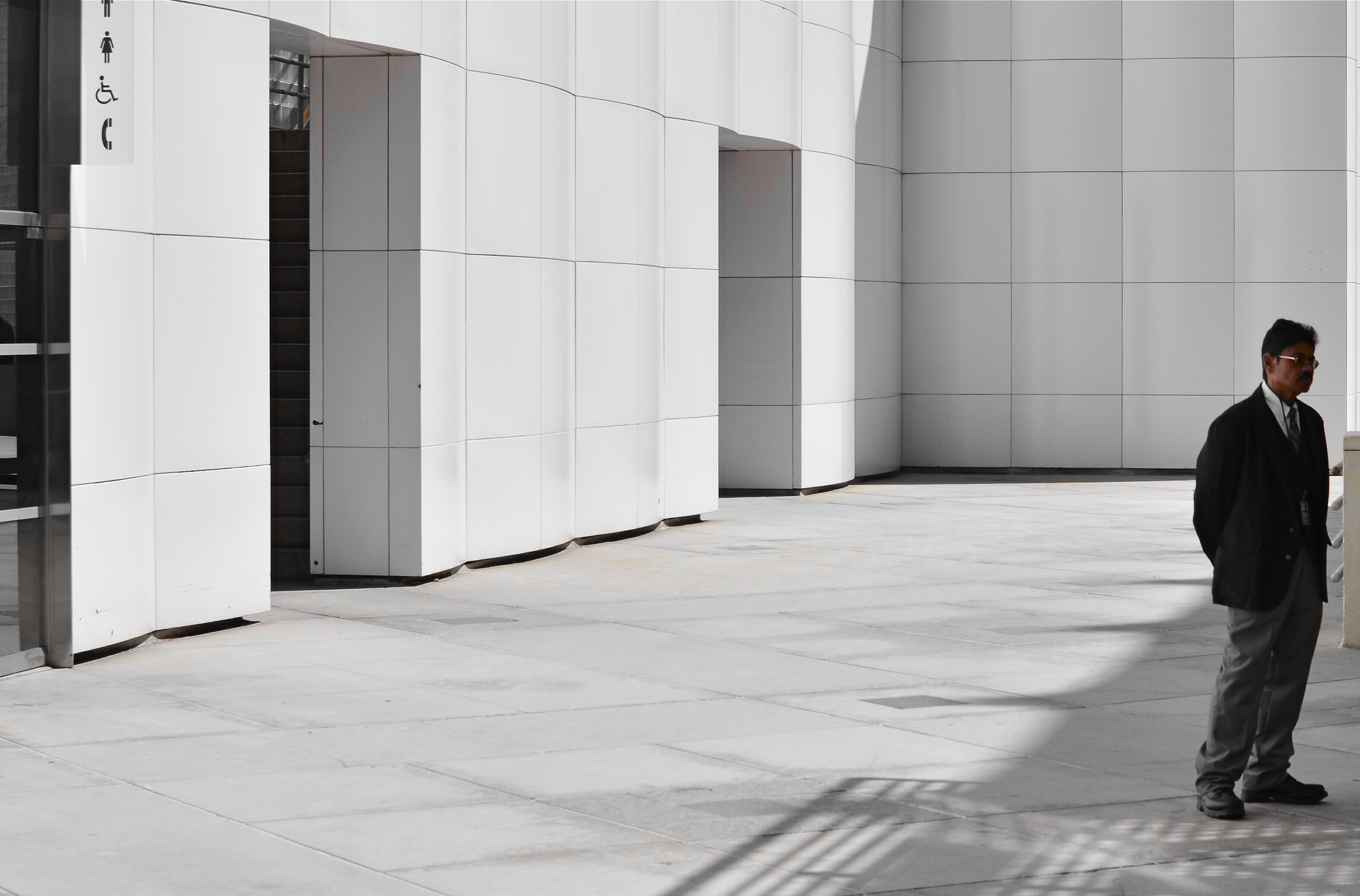
1/320 sec., f/5.6, ISO 100, 35mm.
By MICHAEL PERKINS
To me, photography is an art of observation. It’s about finding something interesting in an ordinary place. I’ve found it has little to do with the things you see, and everything to do with the way you see them. —Elliott Erwitt
ISOLATION IS A TRULY IRONIC CONDITION OF THE HUMAN ANIMAL. The strange thought that, for most of our lives, we are both awash in a sea of other people and totally alone is one of nature’s most profound paradoxes. Photography shows people in both of these conditions, and shooters must choose what illuminates a person’s story best—-his place among others or his seeming banishment from them. Sometimes both truths are in the same frame, and then you must, as Elliott Erwitt says, alter the way you see in favor of one or the other.
In the case of both of the images posted here, the person who “solely” occupies the frames was originally a stray element within a larger context, with the pictures framed, at first, to include nearby persons or crowds. On further examination, however, one or two compositional elements in each of the pictures convinced me, in both the case of the museum guard and the hurried gallery guest, that they could “hold” the pictures they were in without any other human presence in view, and so I created their isolation, something that was not their natural condition at the time.
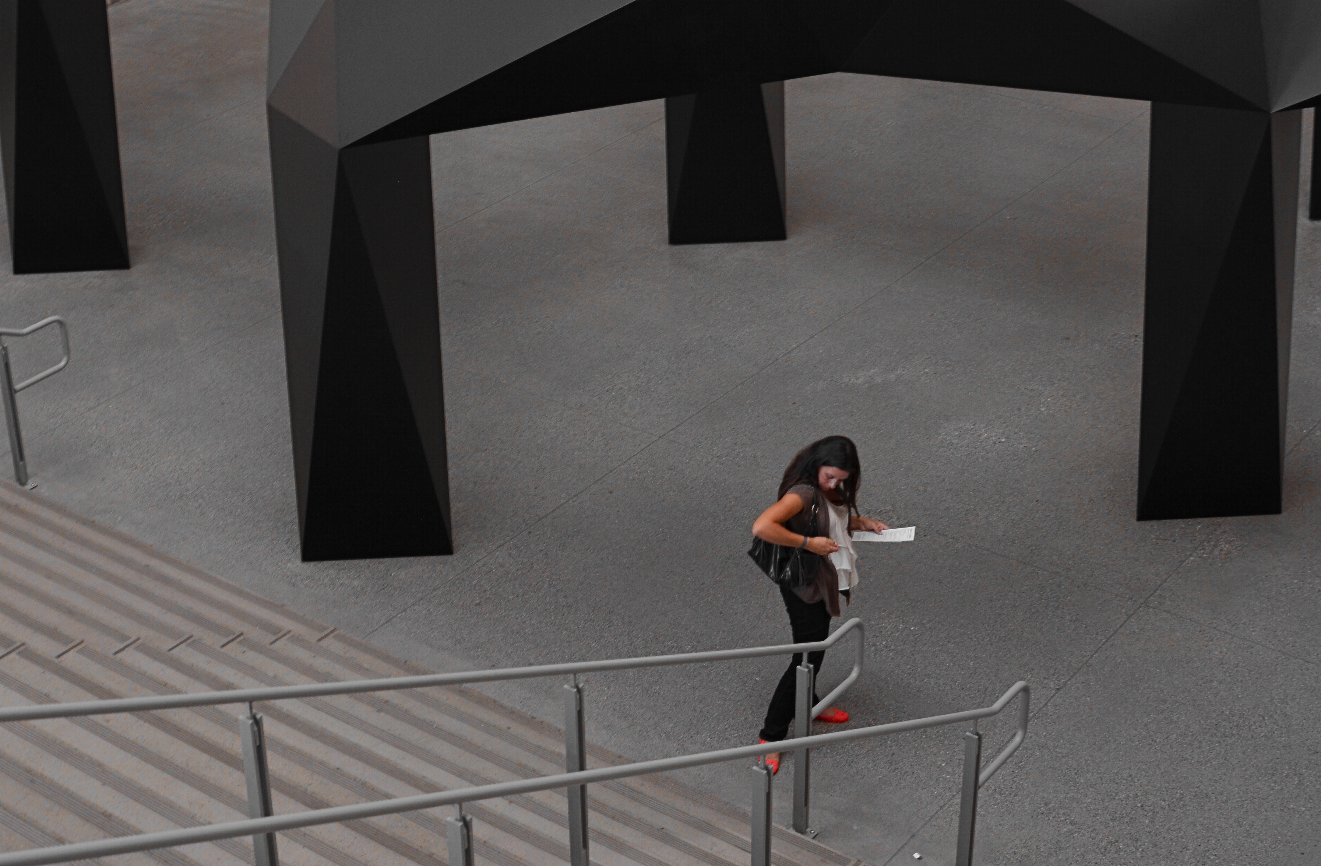
I further “isolated” these two subjects by desaturating everything in the frame except their flesh tones. 1/10 sec., f/5.6, ISO 320, 35mm.
Part of this process is my ongoing curiosity in how far I can go in paring away extra visual information before the story impact of a photograph is amplified to its highest power. I’m sure you have all worked with many original images that are just too balky and talky, that are really “made” in the cropping process. To be sure, sometimes you’re just peeling away the rotten outer parts of an apple to reveal…..a rotten core! Other times, however, you are privileged to peel away just enough petals to render the rose at its best, and, with images of people, that can mean getting rid of almost all the people in the picture you began with.
In both these cases, I liked these people to be shown as if they were in command of small little universes of their own. Does that make the photographs sad? Lonely? Dignified? Tranquil? Yes to all these and anything else you can bring to it, because if cropping is the second part of the picture-making process, then seeing if your instinct “proofs out” with viewers is the final and most crucial part. I’m using every process I can to convey to you what I saw, or what I believe is worth seeing. It’s a collaborative process, and sometimes, I’m sure, I don’t hold up my part of the bargain. And still we press on.
Isolation is more than a human condition or a symptom of our times: it’s a compositional tool, a reduction of the equation of scene-making to its simplest, and hopefully truest, terms.
ANATOMY OF A BOTCH
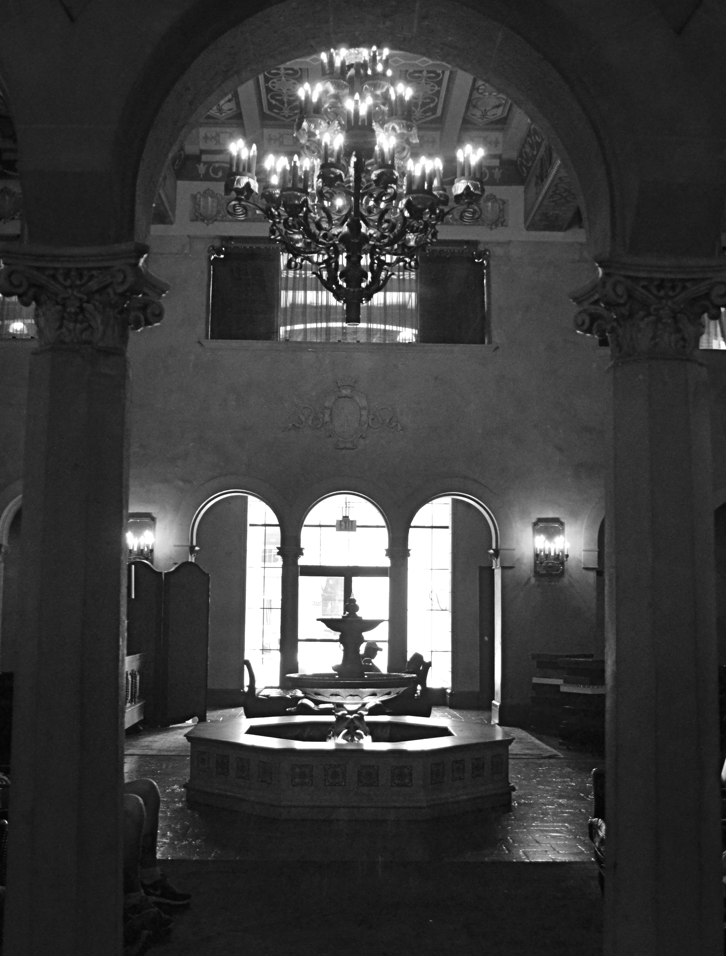
This murky mess is barely tolerable in monochrome. 1/25 sec., f/3.5, ISO 1250, 18mm.
By MICHAEL PERKINS
THERE SHOULD BE A MIRROR-IMAGE, “NEGATIVE” COOKBOOK FOR EVERY REGULAR ONE PUBLISHED, since there are recipes for inedible failures, just as surely as there are ones for gustatory delights. It might be genuinely instructive to read an article called How To Turn A Would-Be Apple Pie Into A Shapeless Heap Of Glop or You, Too Can Make Barbecue Ribs Look Like The Aftermath Of A Cremation. So too, in photography, I believe I could easily pen an essay called How To Take Pictures That Make It Seem That You Never Touched A Camera Before.
In fact…..
In recent days, I’ve been giving myself an extra welt or two with the flagellation belt in horrified reaction to a shoot that I just flat-out blew.It was a walk through a classic hotel lobby, a real “someday” destination for myself that I finally got to visit and wanted eagerly to photograph. Thing is, none of that desire made it into the frames. Nor did any sense of drama, art, composition, or the basics of even seeing. It’s rare that you crank off as many shots as I did on a subject and wind up with a big steaming pile of nothing to show for it, but in this case, I seem to have been all thumbs, including ten extra ones where my toes should be.
So, if I were to write a negative recipe for a shoot, it would certainly contain a few vital tips:
First, make sure you know nothing about the subject you’re shooting. I mean, why would you waste your valuable time learning about the layout or history of a place when you can just aimlessly wander around and whale away? Maybe you’ll get lucky. Yeah, that’s what makes great photographs, luck.
Enjoy the delightful surprise of discovering that there is less light inside your location than inside the fourth basement of a coal mine. Feel free to lean upon your camera to supply what you don’t have, i.e., a tripod or a brain. Crank up the ISO and make sure that you get something on the sensor, even if it’s goo and grit. And shoot near any windows you have, since blowouts look so artsy contrasted with pitch blackness.
Resist the urge to have any plan or blueprint for your shooting. Hey, you’re an artist. The brilliance will just flow as you sweep your camera around. Be spontaneous. Or clueless. Or maybe you can’t tell the difference.
Stir vigorously and for an insane length of time with a photo processing program, trying to manipulate your way to a useful image. You won’t get there, but life is a journey, right? Even when you’re hopelessly lost in a deep dark forest.
************************
You could say that I’m being too Catholic about this, and I would counter that I’m not being Catholic enough.
Until I do penance.
Gotta go back someday and do it right.
And make something that really cooks.
WHAT IS HIP?
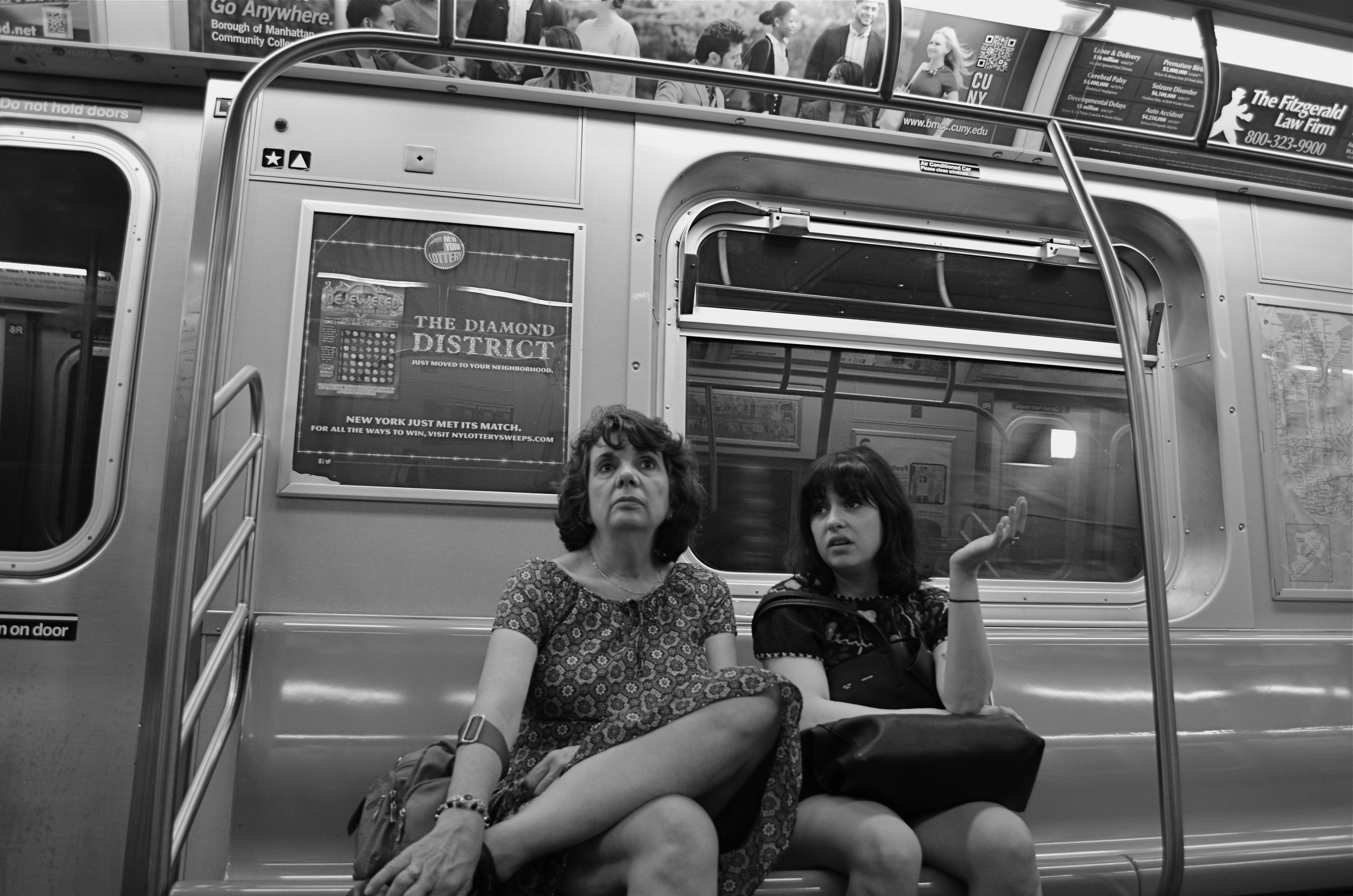
Shooting “from the hip” can be an urban photographer’s secret weapon. 1/40 sec., f/3.5, ISO 500, 18mm.
By MICHAEL PERKINS
WHEN FACED WITH A COMPLETELY DIFFERENT APPROACH TO OUR PHOTOGRAPHY, the crabbier among us are liable to utter one of two responses. Both sound negative, but one could be positive:
Response #1: “I’d never do that!” (Emphatically negative. Discussion over. You will not persuade me.)
Response #2:”Why would I want to do that???” (Possibly as close-minded as response #1, but the person could be asking a legitimate question, as in, ‘show me the benefit in doing it your way, because I can’t imagine a single reason why I should change’.)
When first reading about the street photography technique of “shooting from the hip”, I was a definite response #2. Wasn’t going to slam the door on trying it, but failed to see what I would get out of it. The phrase means just what you’d think it does, referring to people with obvious cameras who do “street” work, shooting with the camera hanging at waist level, never bringing the viewfinder up to their eye. Subjects don’t cringe or lock up because you don’t “seem” to be taking a picture, and thus your images of them are far more unguarded and natural.
Now, suggesting this to a person who has never even owned a camera that didn’t have a viewfinder is a little like asking him to try to take pictures from the inside of a burlap sack. Kinda makes my inner control freak throw a bratrum (a brat tantrum). Think of it from my point of view. If I shoot manually all the time (I do) and if I need my viewfinder like Linus needs his blanket (cause, hey, I’m a tortured and insecure artist), then squeezing off a shot without even knowing if it’s in frame is, to say the least, counter-intuitive (French for “nuts”).
So there you have your honestly expressed Response #2.
Some things that finally made it worth at least trying:
It don’t cost nothin’.
I can practice taking pictures that I don’t care about. I wouldn’t be shooting these things or people even with total control, so what’s to lose?
Did I mention it don’t cost nothin’?
Shooters beware: clicking from the hip is far from easy to master. Get ready to take lots of photos that look like they came from your Urban Outfitter Soviet Union-era Plastic Toy Hipsta Camera. You want rakish tilt? You got it. You like edgy, iffy focus? It’s a given. In other words, you’ll spend a lotta time going through your day’s work like the Joker evaluating Vicki Vale’s portfolio (….”crap….crap….crap….” ). But you might eventually snag a jewel, and it feels so deliciously evil to procure truly candid shots that you may develop an addiction to the affliction. Observe a few basics: shoot as wide as you can, cause 35s, 50s and other primes won’t give you enough scope in composition at close range: go with as fast a shutter speed as the light will allow (in low light, compromise on the ISO): if possible, shoot f/5.6 or smaller: and, finally,learn how to pre-squeeze the autofocus and listen for its quiet little zzzz, then tilt the camera just far enough up to make sure everyone has a head, and go.
At worst, it forces you to re-evaluate the way you “see” a shot, since you have no choice but to accept what the camera could see. At best, you might see fewer bared fangs from people snarling, “hey is that a $&@*! camera?” inches from your nose. And that’s a good thing.
SET AND SHOOT
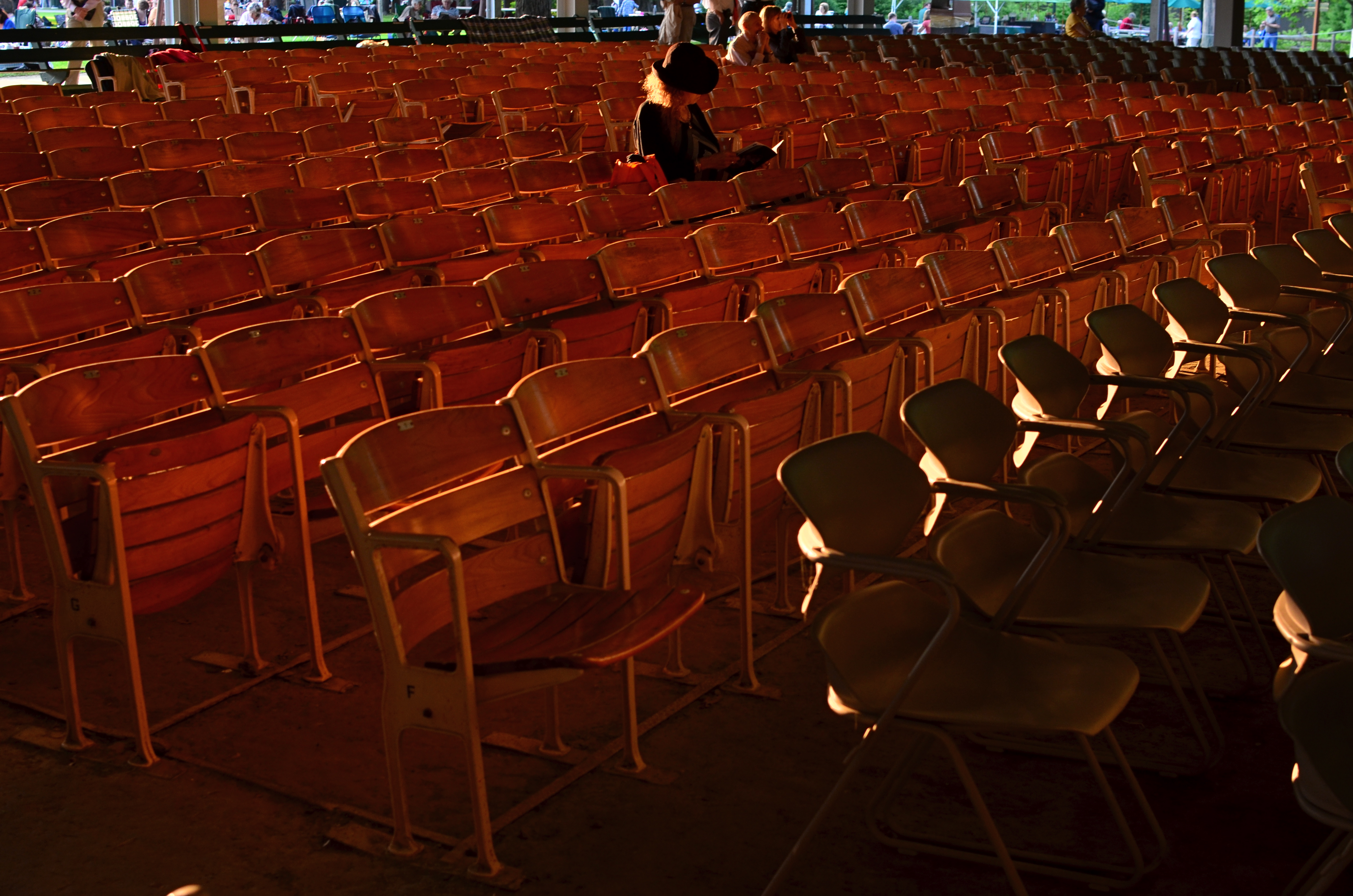
Shooting manually means learning to trust that you can capture what you see. 1/160 sec., f/5.6, ISO 100, 18mm.
By MICHAEL PERKINS
AUTOMODES ON CAMERAS ARE SUPPOSED TO AFFORD THE PHOTOGRAPHER AN ENHANCED SENSE OF COMFORT AND SAFETY, since, you know, you’re protected from your very human errors by the camera’s loving, if soulless, oversight. Guess wrong on a shutter speed? The auto has your back. Blow the aperture? Auto is on the case. And you always get acceptable pictures.
That is, if you can put your brain on automode as well.
Okay, that statement makes the top ten list for most arrogant openings in all of Blogdom, 2014. But I stand by it. I don’t think you should get comfortable with your equipment calling the shots. However, getting comfortable with your equipment’s limits and strengths, and gradually relying on your own experience for consistent results through exploitation of that knowledge….now that’s another thing entirely. It’s the difference between driving cross-country on cruise control and knowing, from years of driving, where in the journey your car can shine, if you drive it intelligently.
Photographers call some hunks of glass their “go-to” lenses, since they know they can always get something solid from them in nearly any situation. And while we all tend to wander around aimlessly for years inside Camera Toyland, picking up this lens, that filter, those extenders, we all, if we shoot enough for a long time, settle back into a basic gear setup that is reliable in fair weather or foul.
This is better than using automodes, because we have chosen the setups and systems that most frequently give us good product, and we have picked up enough wisdom and speed from making thousands of pictures with our favorite gear that we can “set and shoot”, that is, calculate and decide just as quickly as most people do with automodes…..and yet we keep the vital link of human input in the creative chain.
Like most, I have my own “go-to” lens and my own “safe bet” settings. But, just as you save time by not trying to invent the wheel every time you step up, you likewise shouldn’t be averse to greasing an old wheel to make it spin more smoothly.
How about that, I also made the top ten list for unwieldy metaphors.
A good day.
ON THE STRAIGHT AND NARROW
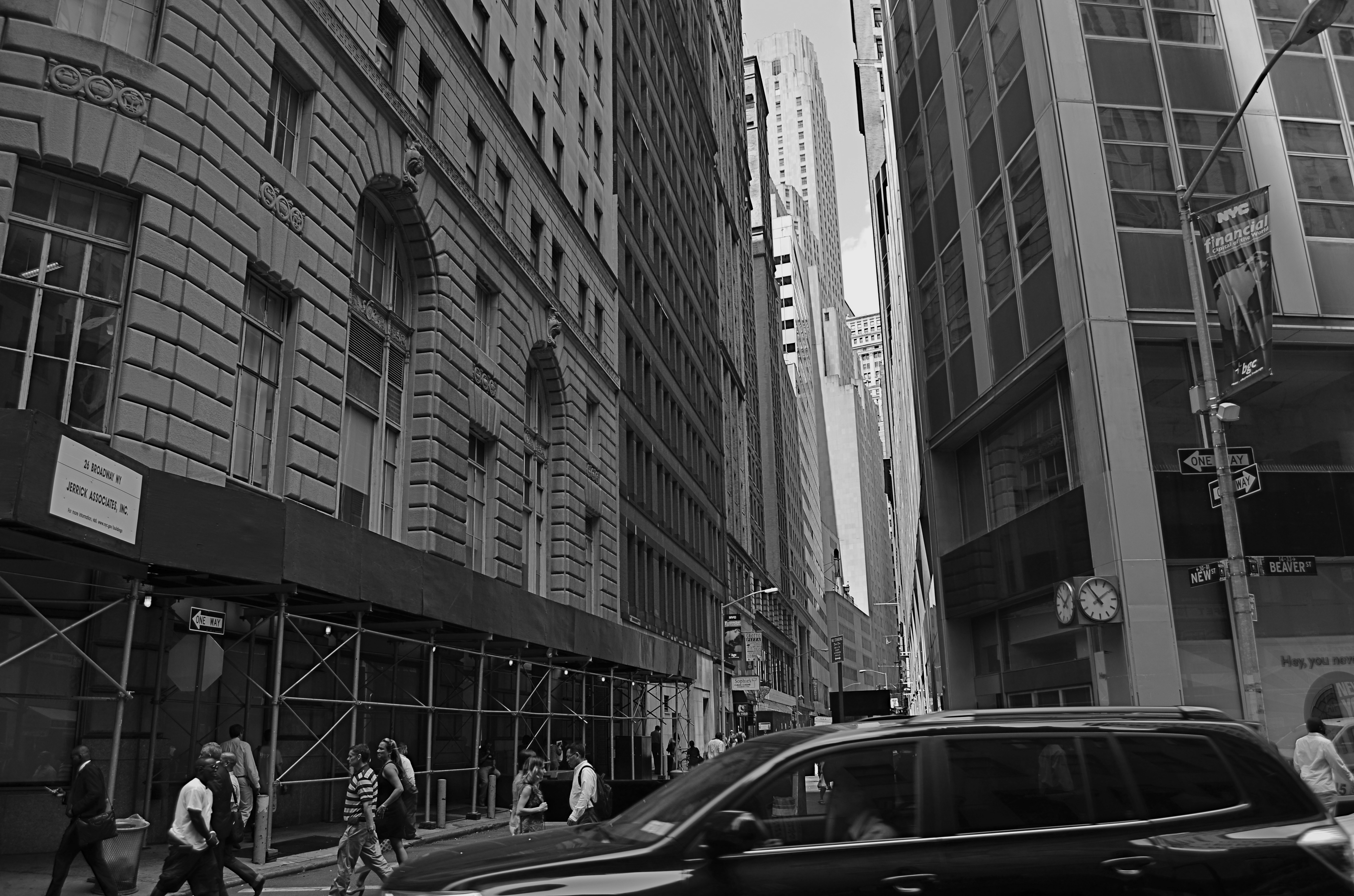
New & Beaver, 2014. 1/200 sec., f/5.6, ISO 100, 18mm.
By MICHAEL PERKINS
THE NARROW STREETS OF LOWER MANHATTAN WERE NEVER DESIGNED TO ACCOMMODATE the claustrophobic jam of commerce, foot traffic and skyscrapers that have characterized the neighborhood since the early 20th century. I should back that up and acknowledge that, for some locals, the streets of lower Manhattan were never designed,period. New York’s growth has always come in rangy spurts and jolts, much like a gangly adolescent that shoots upward and outward overnight without any apparent plan, and yet, those unruly explosions are also what delight the photographer’s eye and make the city an inexhaustible laboratory for technique.
Shooting down the slits that pass for side streets and alleys in lower Manhattan is enough to make even the most seasoned native feel like he or she is being shut up in a tomb, but I am drawn to going even further, and over-emphasizing the extreme dimensions peculiar to the area. That, for me, means shooting with as wide a lens as I have handy, distortion be damned. Actually, it’s distortion be welcomed, since I think that the horizontal lines of the buildings create a much more dramatic lead-in for the eye as they race far away from the foreground. And since ultra-wide magnify front-to-back distances, the bigness and closeness of the city is jacked into a real exaggeration, but one that serves my purpose.
It helps to crouch down and tilt up when composing the shot, and to make sure that you don’t crop passersby out of the shot, since they will add to the drama even more as indications of scale. I have certainly gone too far more than once and rendered rectangular buildings into futuristic trapezoids, but the aim of each image will dictate what you’re going for. Also, in many of these shots, I decide, after much dithering, to choose monochrome over color, but I always shoot the originals in color, since they respond better to re-contrasting once they’re desaturated.
The magic about Manhattan is that no camera can ever tame her or show all her beauty and/or ugliness. It’s somthing of a fool’s errand to try to take the picture of NYC. Better to take a picture you like and add it to the ongoing story.
TAKING FLIGHT ONCE MORE
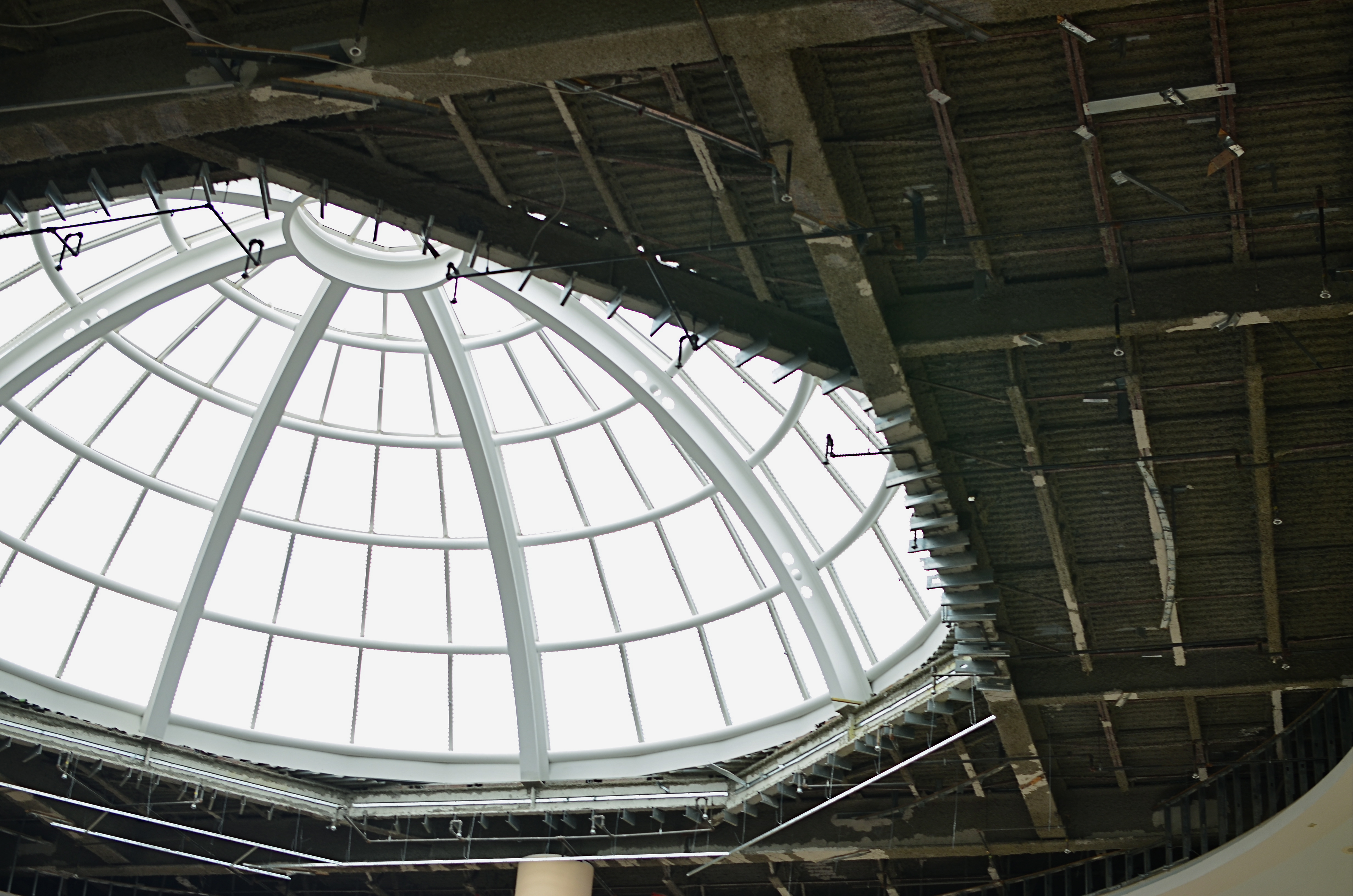
The Aerodrome, 2014. 1/30 sec., f/3.5, ISO 100, 35mm.
By MICHAEL PERKINS
ONE OF THE CHARGES GIVEN TO ALL PHOTOGRAPHERS IS TO MARK THE PASSAGE OF TIME, to chronicle and record, to give testimony to a rapidly vanishing world. Certainly interpretation, fantasy, and other original conceptions are equally important for shooters, but there has been a kind of unspoken responsibility to use the camera to bear witness. This is especially difficult in a world bent on obliterating memory, of dismantling the very sites of history.
Humorist and historian Bill Bryson’s wonderful book, One Summer: America 1927 frames the amazing news stories of its title year around its most singular event, the solo transatlantic flight of Charles A. Lindbergh. A sad coda to the story reveals that nothing whatever remains of Roosevelt Field, the grassy stretch on Long Island from which the Lone Eagle launched himself into immortality, with the exception of a small plaque mounted on the back of an escalator in the mall that bears the field’s name. Last week, hauled along on a shopping trip to the mall with relatives, I made my sad pilgrimage to said plaque, lamenting, as Bryson did, that there is nothing more to photograph of the place where the world changed forever.
Then I got a little gift.
The mall is under extensive renovation as I write this, and much of the first floor ceiling has been stripped back to support beams, electrical systems and structural gridwork. Framed against the bright bargains in the mall shops below, it’s rather ugly, but, seen as a whimsical link to the Air Age, it gave me an idea. All wings of the Roosevelt Field mall feature enormous skylights, and several of them occur smack in the middle of some of the construction areas. Composing a frame with just these two elements, a dark, industrial space and a light, airy radiance, I could almost suggest the inside of a futuristic aerodrome or hangar, a place of bustling energy sweeping up to an exhilarating launch hatch. To get enough detail in this extremely contrasty pairing, and yet not add noise to the darker passages, I stayed at ISO 100, but slowed to 1/30 sec. and a shutter setting of f/3.5. I still had a near-blowout of the skylight, saving just the grid structure, but I was really losing no useful detail I needed beyond blue sky. Easy choice.
Thus, Roosevelt Field, for me, had taken wing again, if only for a moment, in a visual mash-up of Lindbergh, Flash Gordon, Han Solo, and maybe even The Rocketeer. In aviation, the dream’s always been the thing anyway.
And maybe that’s what photography is really for…trapping dreams in a box.
A BIG BOX OF LONELY
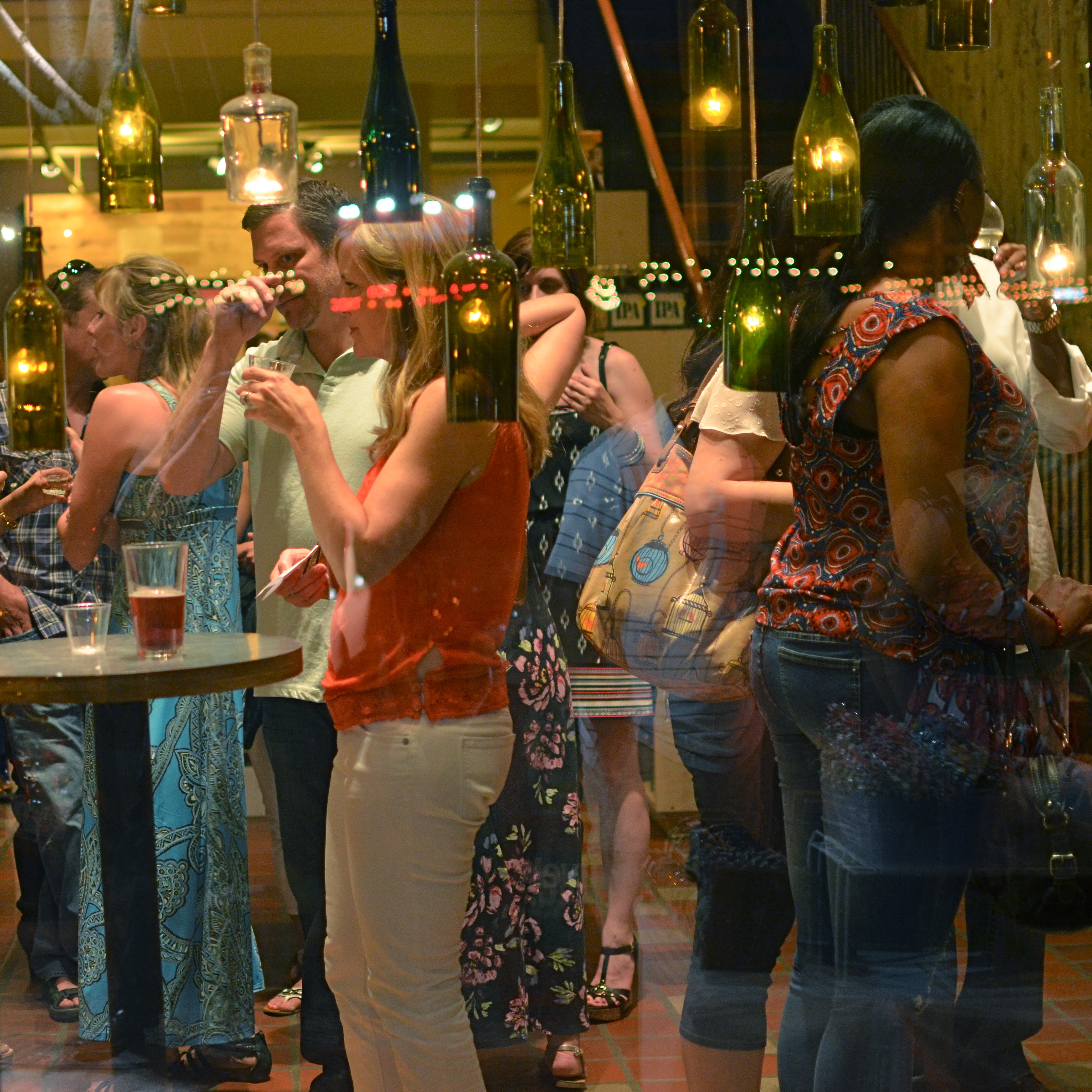
Think inside the box. 1/80 sec., f/2.2, ISO 800, 35mm.
By MICHAEL PERKINS
PHOTOGRAPHY CAN GO TWO WAYS ON CONTEXT. It can either seek out surroundings which comment organically on subjects (a lone customer at a largely empty bar, for example) or it can, through composition or editing, artificially create that context (five people in an elevator becomes just two of those people, their locked hands taking up the entire frame). Sometimes, images aren’t about what we see but what we can make someone else seem to see.
Creating your own context isn’t really “cheating” (are we really still using that word?), because you’re not creating a new fact in the photograph, so much as you are slapping a big neon arrow onto said fact and saying, “hey look over here.” Of course, re-contextualizing a shot can lead to deliberate mis-representation of reality in the wrong hands (see propaganda, use of), but, assuming we’re re-directing a viewer’s attention for purely aesthetic reasons (using our powers for good), it can make a single photo speak in vastly different ways depending on where you snip or pare.
In the above situation, I was shooting through the storefront window of a combined art studio and wine bar (yes, I hang with those kind of people), and, given that the neighborhood I was in regularly packed folks in on “gallery hop” nights, the place was pretty jammed. The original full frame showed everything you see here, but also the connecting corridor between the studio and the wine bar which was, although still crowded, a lot less claustrophobic than this edited frame suggests.
And that’s really the point. Urban “hangs” that are so over-attended can give me the feeling of being jammed into a phone booth, like I’m part of some kind of desperately lonely lemming family reunion, so I decided to make that crushed sensation the context of the picture. Cropping down to a square frame improved the balance of the photograph but it also made these people look a little trapped, although oddly indifferent to their condition. The street reflections from the front plane of glass also add to the “boxed in” sensation. It’s a quick way to transform a snap into some kind of commentary, and you can either accept my choice or pass it by. That’s why doing this is fun.
Urban life presents a challenging series of social arrangements, and context in photographs can force a conversation on how that affects us.
ELEMENTARY, MY DEAR NIKON
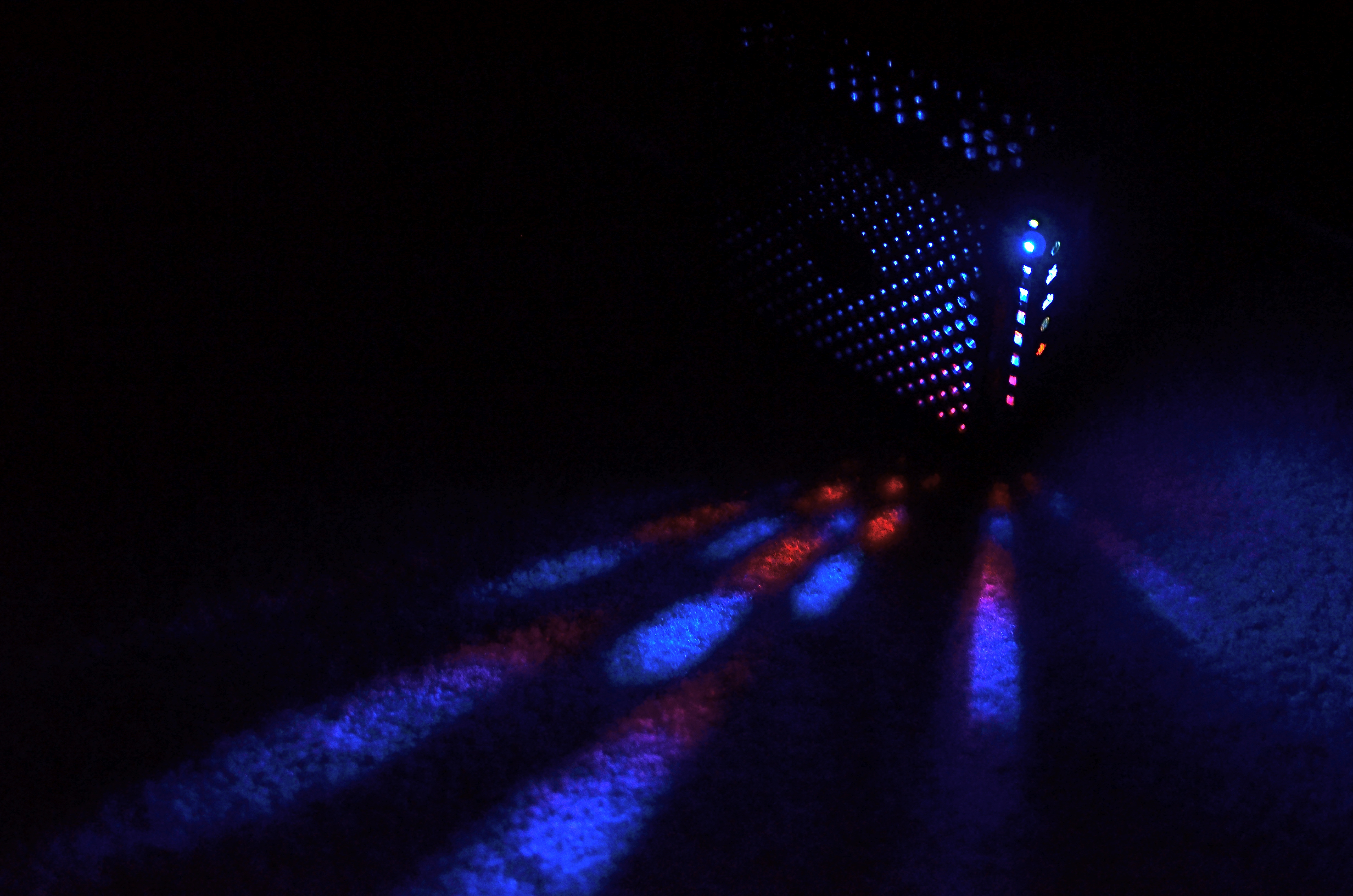
Let the light decide what makes a photograph. Modem, 2014. 1/30 sec., f/1.8, ISO 800, 35mm.
By MICHAEL PERKINS
PHOTOGRAPHY IS OFTEN DEFINED CLASSICALLY AS “WRITING WITH LIGHT“, but I often wonder if a better definition might be “capitalizing on light opportunities”, since it’s not really what subject matter we shoot but light’s role in shaping it that makes for strong images. We have all seen humble objects transformed, even rendered iconic, based on how a shooter perceives the value of light, then shapes it to his ends. That’s why even simple patterns that consist of little more than light itself can sometimes be enough for a solid photograph.
If you track the history of our art from, say, from the American Civil War through today’s digital domain, you really see a progression from recording to interpreting. If the first generally distributed photographs seen by a mass audience involve, say, the aftermath of Antietam or Gettysburg, and recent images are often composed of simple shapes, then the progression is very easy to track. The essence is this: we began with photography as technology, the answer to a scientific conundrum. How do we stop and fix time in a physical storage device? Once that very basic aim was achieved, photographers went from trying to just get some image (hey, it worked!) to having a greater say in what kind of image they wanted. It was at this point that photography took on the same creative freedom as painting. Brushes, cameras, it doesn’t matter. They are just mediums through which the imagination is channeled.
In interpreting patterns of elementary shapes which appeal on their own merit, photographers are released from the stricture of having to endlessly search for “something to shoot”. Some days there is no magnificent sunrise or eloquent tree readily at hand, but there is always light and its power to refract, scatter, and recombine for effect. It’s often said that photography forced painting into abstraction because it didn’t want to compete with the technically perfect way that the camera could record the world. However, photography also evolved beyond the point where just rendering reality was enough. We moved from being reporters to commentators, if you like. Making that journey in your own work (and at your own pace) is one of the most important step an art, or an artist, can take.
MINIMUM SHOW, MAXIMUM SEE
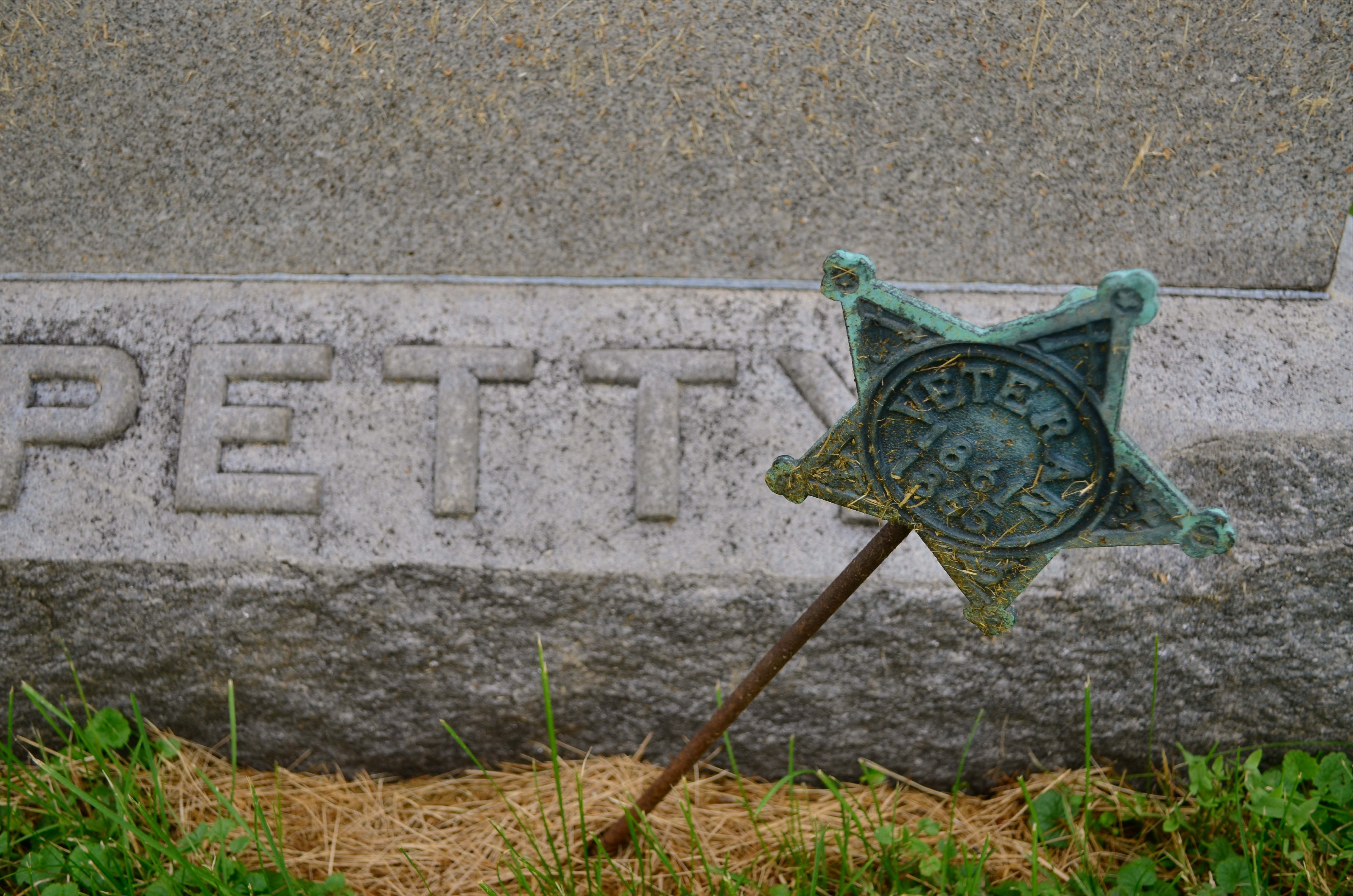
There are only two design elements in this image. Does it really need any more? 1/160 sec., f/4, ISO 100, 24mm.
By MICHAEL PERKINS
LOOK AT THE EARLIEST PHOTOGRAPHIC WORK OF NEARLY ANYONE and you will see a general attempt to frame up a scene and attempt to show, well, everything within range of the camera. It’s a time when we produce our most inclusive panoramas, our most crowded city scenes, our most enormous circus midways. Our pictures may be stories, but, at first, our stories have a bit of a problem getting to the point. We are so inclusive of raw data that every snap of life at the beach becomes a page out of Where’s Waldo? Thus, the very first real talent young photographers show is the ability to trim all that visual fat and get the maximum see for the minimum show.
Of course, when we are mere puppies, it seems counter-intuitive to say that showing less will actually make us see more. Minimalism doesn’t come easily to us, since we are afraid, at first, that we’re leaving something “important” out. Everyone comes to terms with this eventually if they shoot long enough, but we all arrive at the wisdom of it via various journeys. For me, it was my first attempts at still life compositions, which really are the most edited exercises we do. For these kinds of photos, it’s really about knowing what to leave out, or at least when to stop adding. And when a picture works, there is the nagging curiosity as to why….an inquiry which often leads to the conclusion that we used just what we needed, and then stopped.
Sometimes I get a sense of how little I need in a picture while I’m shooting. Many times, though, it comes to me in the editing or cropping process. If I snip something off of a picture and it doesn’t fall apart, I start wondering how much more I can pare away and still say what I’m trying to say. Learning, in recent years, how to compose again for a square frame has really been helpful, too, since it forces you into a pre-determined space limit. You can’t paint any wider than the canvas, if you will. You yourself might find other ways to get to the core balance your story needs. There is no true or single path.
I started the above image in a wide graveyard, then several graves and a tree, then one grave marker and a tree, then just the marker, and finally a portion of the marker. But in what I wound up with, aren’t all the elements I cut away really present for the viewer mentally anyway?
It’s often said, as a generalization, that painters start with nothing and add until they get the picture, while photographers start with everything and strip information away until they see just what they need. I really see a lot of photography that way. Tell the story with as few elements as you can and walk away. Minimum show for maximum see.
Not nearly so counter-intuitive, after all.
NOT WHAT I CAME FOR, BUT…
By MICHAEL PERKINS
ANYONE WHO’S MADE A ROAD TRIP CAN TELL YOU THAT THE DESTINATION IS OFTEN FAR LESS ENJOYABLE THAN THE JOURNEY, a truth that also applies to photography. The best things result from the little surprises at the side of the highway. You’re fixated on your oh-so-holy “plan” and all the wonderful things you’ll see and do in executing it. But photography is an art of opportunity, and to the degree that you embrace that fact, your work will be broader, richer, looser.
This is now a real source of excitement for me. I still go to the trouble of sketching out what I think I’m going to do, but, I’m at least quietly excited to know that, in many cases, the images that will make the keepers pile will happen when I went completely off message. Yes, we are “officially” here today to shoot that big mountain over yonder. But, since the two people I met on the approach path to said mountain are in themselves interesting, the story has now become about them. I may or may not get back to the mountain, and, if I do, I may discover that I really did not have a strong concept in my bagga trix for making anything special out of it, and so it’s nice not to have to write the entire day off to a good walk spoiled.
Specific example: I have written before that I get more usable stuff in the empty spaces and non-exhibit areas of museums than I do from the events within them. This is a great consolation prize these days, especially since an increasingly ardent police state among curators means that no photos can be taken in some pretty key areas. Staying open means that I can at least extract something from the areas no one is supposed to care about.
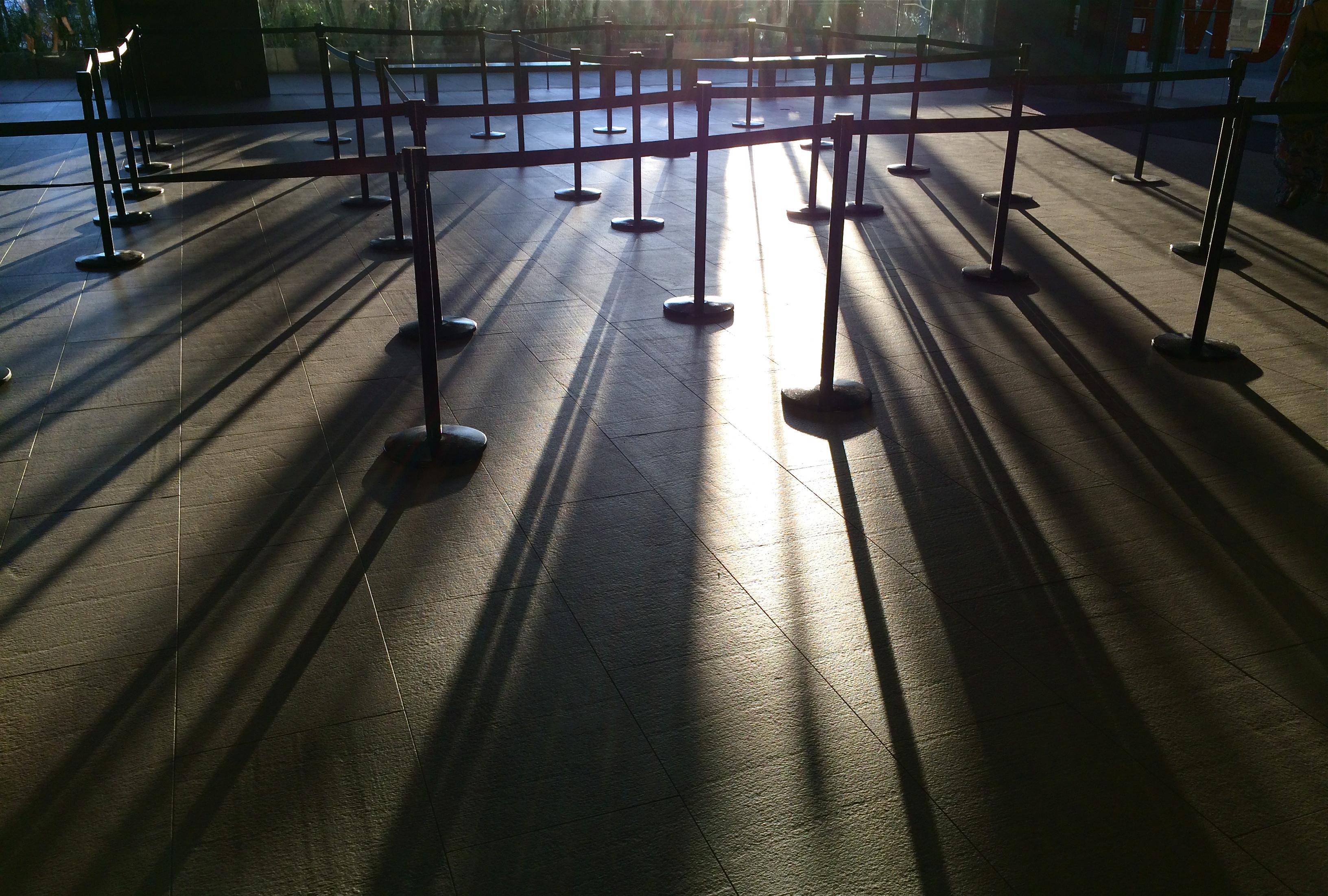
An average day at the museum, at the end of which this dropped into my lap.
The above image is one such case, since it was literally the final frame I shot on my way out of a museum show. It was irresistible as a pattern piece, caused by a very fleeting moment of sunset light. It would have appealed to me whether I was in a museum or not, but it was the fact that I was willing to go off-script that I got it, no special technical talent or “eye”. Nabbing this shot completely hinged on whether I was willing to go after something I didn’t originally come for. It’s like going to the grocery store for milk, finding they’re out, but discovering that there is also a sale on Bud Light. Things immediately look rosier.
Or at least they will by the third can.
SETTING THE CAPTIVES FREE
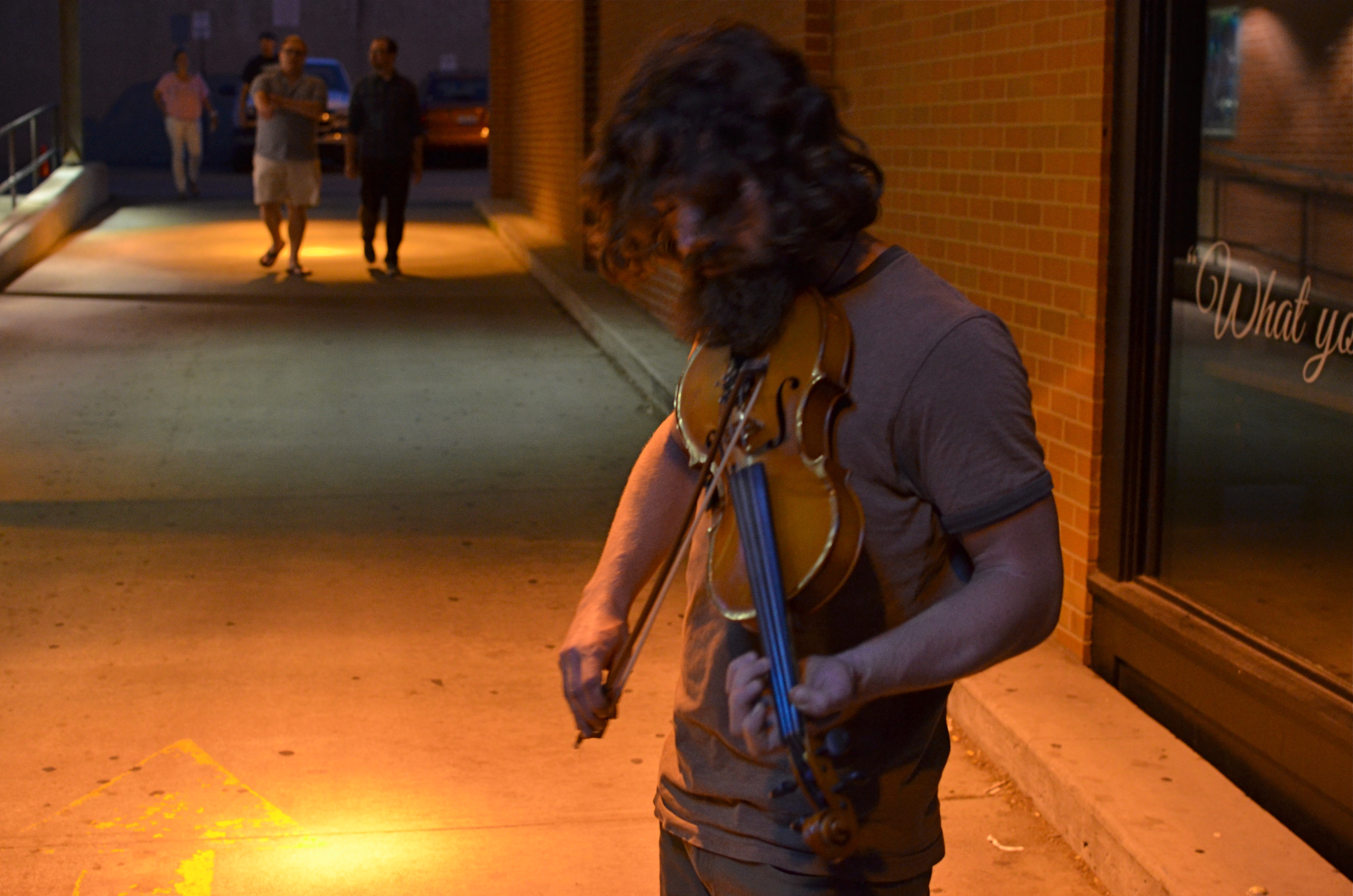
Fiddler, 2014. Too soft? Too dark? True? False? 1/50 sec., f/3.5, ISO 1000, 35mm.
By MICHAEL PERKINS
I’D LIKE TO ERADICATE THE WORD “CAPTURE” FROM MOST PHOTOGRAPHIC CONVERSATIONS. It suggests something stiff or inflexible to me, as if there is only one optimum way to apprehend a moment in an image. Especially in the case of portraits, I don’t think that there can be a single way to render a face, one perfect result that says everything about a person in a scant second of recording. If I didn’t capture something, does that mean my subject “got away” in some way, eluded me, remains hidden? Far from it. I can take thirty exposures of the same face and show you thirty different people. The word has become overused to the point of meaningless.
We are all conditioned to think along certain bias lines to consider a photograph well done or poorly done, and those lines are fairly narrow. We defer to sharpness over softness. We prefer brightly lit to mysteriously dark. We favor naturalistically colored and framed recordings of subjects to interpretations that keep color and composition “codes” fluid, or even reject them outright. It takes a lot of shooting to break out of these strictures, but we need to make this escape if we are to move toward anything approaching a style of our own.
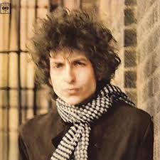
Jerry Schatzberg’s iconic portrait of Bob Dylan from the cover of Blonde On Blonde.
I remember being startled in 1966 when I first saw Jerry Schatzberg’s photograph of Bob Dylan on the cover of the Blonde On Blonde album. How did the editor let this shot through? It’s blurred. It’s a mistake. It doesn’t…..wait, I can’t get that face out of my head. It’s Bob Dylan right now, so right now that he couldn’t be bothered to stand still long enough for a snap. The photo really does (last time I say this) capture something fleeting about the electrical, instantaneous flow of events that Dylan is swept up in. It moves. It breathes. And it’s more significant in view of the fact that there were plenty of pin-sharp frames to choose from in that very same shoot. That means Schatzberg and Dylan picked the softer one on purpose.
There are times when one 10th of a second too slow, one stop too small, is just right for making the magic happen. This is where I would usually mention breaking a few eggs to make an omelette, but for those of you on low-cholesterol diets, let’s just say that n0 rule works all the time, and that there’s more than one way to skin (or capture) a cat.
A PLACE APART
By MICHAEL PERKINS
PHOTOGRAPHERS USUALLY USE FACES AS THE SOLE BAROMETER OF EMOTION. It’s really easy to use a person’s features as the most obvious cues to one’s inner mind. Scowls, smiles, smirks, downcast eyes, sidelong glances,cries of anguish….these are standard tools in depicting someone as either assimilated into the mass of humanity or cast away, separate and alone.
But faces are only one way of showing people as living in a place apart. Symbolically, there is an equally dramatic effect to be achieved by the simple re-contextualizing of that person in space. The arrangement of space near your subject forces the viewer to conclude that he or she is either in harmony with their surroundings or lonely, solitary, sad even, and you do it without showing so much as a raised eyebrow. This is where composition isn’t just a part of the story, but the story itself.
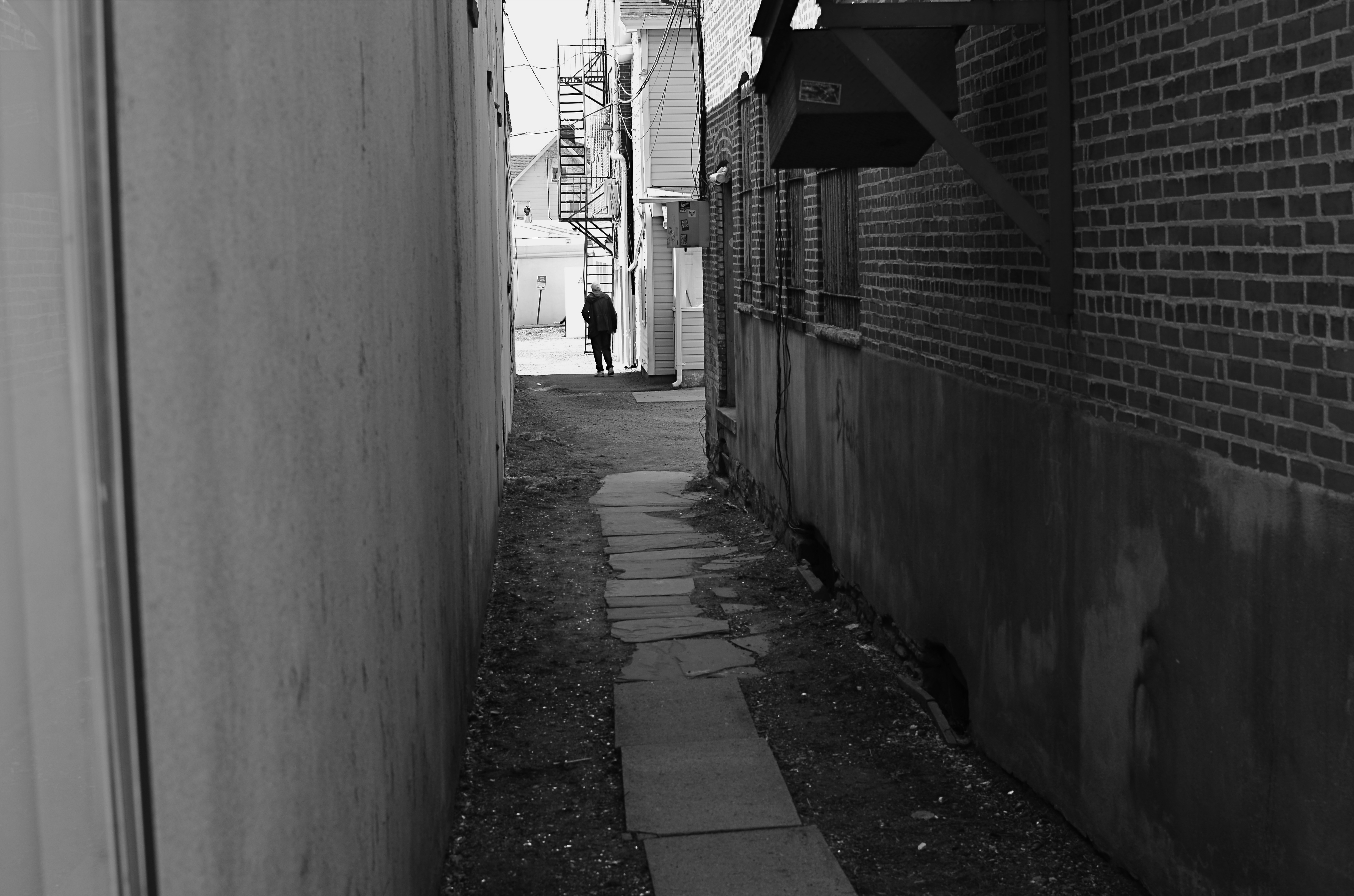
Context is all.
The woman shown here is most likely just walking from point A to point B, with no undercurrent of real tragedy. But once she takes a short cut down an alley, she can be part of a completely different, even imaginary story. Here the two walls isolate her, herding her into a context where she could be lonely, sad, afraid, furtive. She is walking away from us, and that implies a secret. She is “withdrawing” and that implies defeat. She is without a companion, which can symbolize punishment, banishment, exile. From us? From herself? From the world? Once you start to think openly about it, you realize that placing the subject in space lays the foundation for storytelling, a technique that is easy to create, recalibrate, manipulate.
The space around people is a key player in the drama an image can generate. It can mean, well, whatever you need it to mean. People who exist in a place apart become the centerpieces in strong photographs, and the variability of that strength is in your hands.
THE ENVELOPE
By MICHAEL PERKINS
HAVING LIVED IN THE AMERICAN SOUTHWEST FOR OVER FIFTEEN YEARS, I HAVE NEGOTIATED MY OWN TERMS WITH THE BLAZING OVERKILL OF MIDDAY SUNLIGHT, and its resulting impact on photography. If you move to Arizona or New Mexico from calmer climates, you will find yourself quickly constricting into a severe squint from late breakfast to early evening, with your camera likewise shrinking from the sheer overabundance of harsh, white light. If you’re determined to shoot in midday, you will adjust your approach to just about everything in your exposure regimen.
Good news, however: if you prefer to shoot in the so-called “golden hour” just ahead of sunset, you will be rewarded with some of the most picturesque tones you’ve ever had the good luck to work with. As has been exhaustively explained by better minds than mine, sunlight lingers longer in the atmosphere during the pre-sunset period, which, in the southwest, can really last closer to two hours or more. Hues are saturated, warm: shadows are powerful and sharp. And, if that dramatic contrast works to your advantage in color, it really packs a punch in monochrome.
This time of day is what I call “the envelope”, which is to say that objects look completely different in this special light from how they register in any other part of the day, if you can make up your mind as to what to do in a hurry. Changes from minute to minute are fast and stark in their variance. Miss your moment, and you must wait another 24 hours for a re-do.
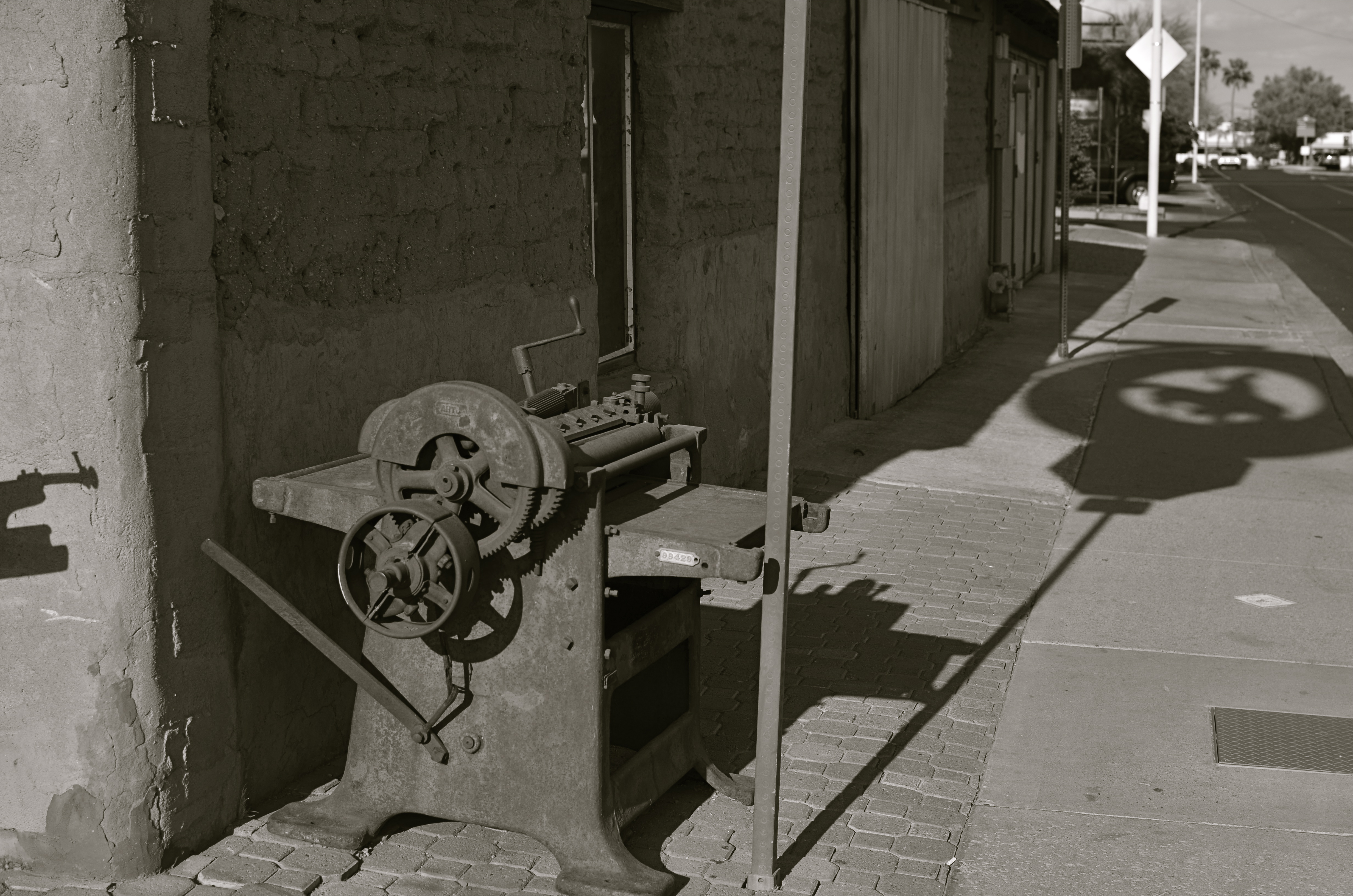
In the west, the best action actually happens after High Noon. Just before sunset in Scottsdale, AZ: 1/500 sec., f/4.5, ISO 100, 35mm.
The long shadow of an unseen sign visible in the above frame lasted about fifteen minutes on the day of the shoot. The sign itself is a metal cutout of a cowboy astride a bucking bronco, the symbol of Scottsdale, Arizona, “the most western town in the USA”. The shadow started as a short patch of black directly in front of the rusted bit of machine gear in the foreground, then elongated to an exaggerated duplicate of the sign, extending halfway down the block and becoming a sharper and more detailed silhouette.
A few minutes later, it grew softer and eventually dissolved as the sun crept closer to the western horizon. There would still be blazing illumination and harsh shadows for some objects, if you went about two stories high or higher, but, generally, sunset was well under way. Caught in time, the shadow became an active design element in the shot, an element strong enough to come through even in black and white.
If you are ever on holiday in the southwest, peek inside “the envelope”. There’s good stuff inside.
INS AND OUTS
By MICHAEL PERKINS
WHEN IT COMES TO DISCUSSIONS ABOUT ART, THE WORD “ABSTRACT” IS PROBABLY THE MOST BATTED-ABOUT LINGUISTIC SHUTTLECOCK OF THE 20TH CENTURY, something we lob at each other across the conversational net as it suits our mood. Whenever we feel we should weigh in on a matter of artistic heft, especially something that doesn’t fit into a conveniently familiar cubbyhole, we drag “abstract” out of the desk drawer, dust it off, and cram it into place somewhere in the argument.
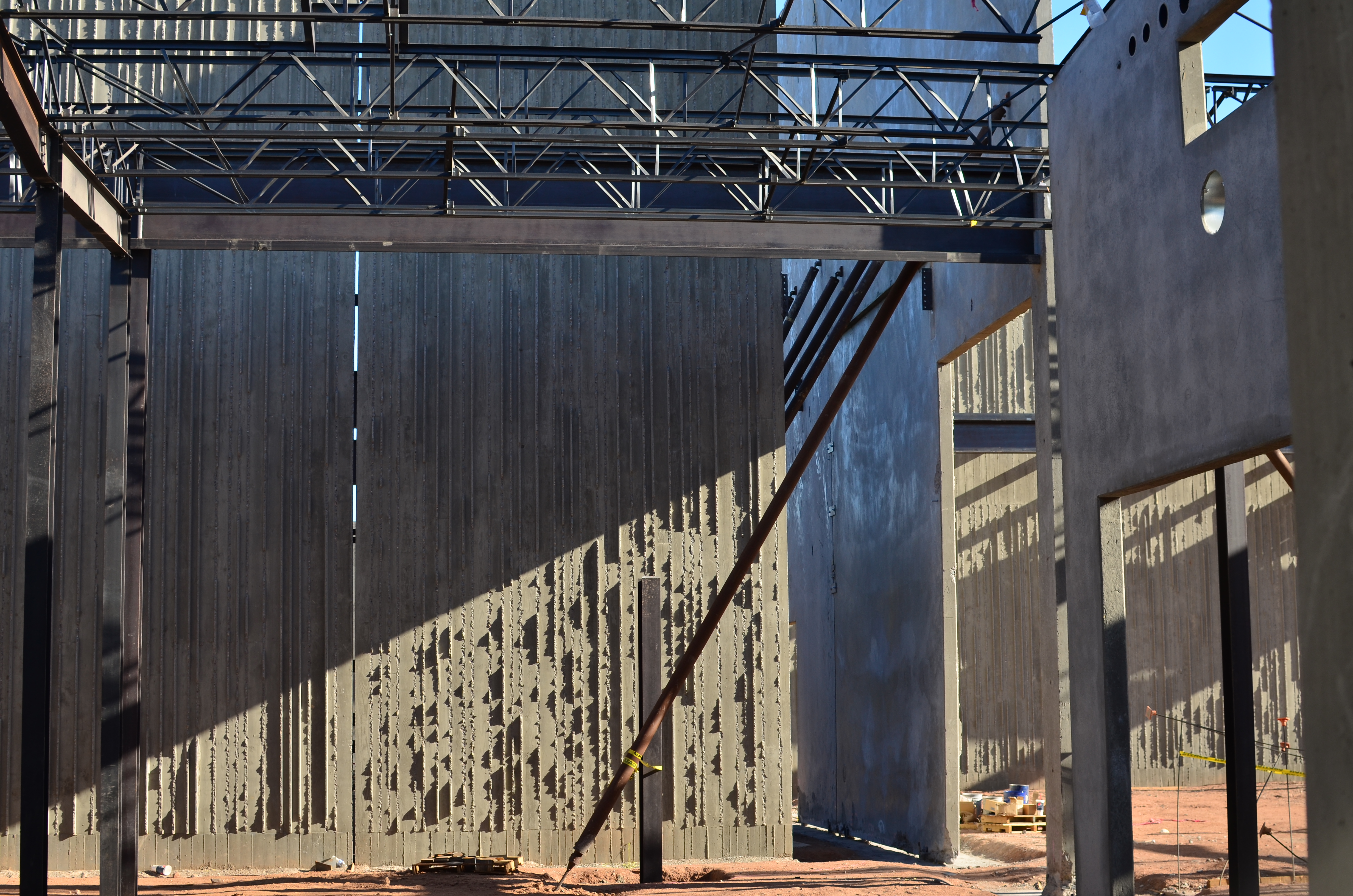
Frames within frames within frames: 1/125 sec., f/5.6, ISO 100, 35mm.
Any talk of architecture, and the photographer’s reaction to it, attracts a lot of stray “abstracts”, since attaching the word seems to settle… something. However, art can never be about settling anything. In fact, it’s about churning things up, starting, rather than resolving, arguments. As pieces of pure design, finished buildings do make a statement of sorts about the architect’s view, at least. But when trolling about town, I am more drawn to incomplete or skeletal frameworks for buildings yet to be. They are simply open to greater interpretation as visual subject matter, since we haven’t, if you like, seen all the architect’s cards yet. The emerging project can, for a time, be anything, depending literally on where you stand or how light shapes the competing angles and contours.
I feel that open or unfinished spaces are really ripe with an infinite number of framings, since a single uncompleted wall gives way so openly to all the other planes and surfaces in the design, a visual diagram that will soon be closed up, sealed off, sequestered from view. And as for the light, there is no place it cannot go, so you can chase the tracking of shadows all day long, as is possible with, say, the Grand Canyon, giving the same composition drastically different flavors in just the space of a few hours.
If the word “abstract” has any meaning at all at this late date, you could say that it speaks to a variation, a reworking of the dimensions of what we consider reality. Beyond that, I need hip waders. However, I believe that emerging buildings represent an opportunity for photographers to add their own vision to the architect’s, however briefly.
Whew. Now let’s all go out get a drink.
THE UNSEEN GEOMETRY
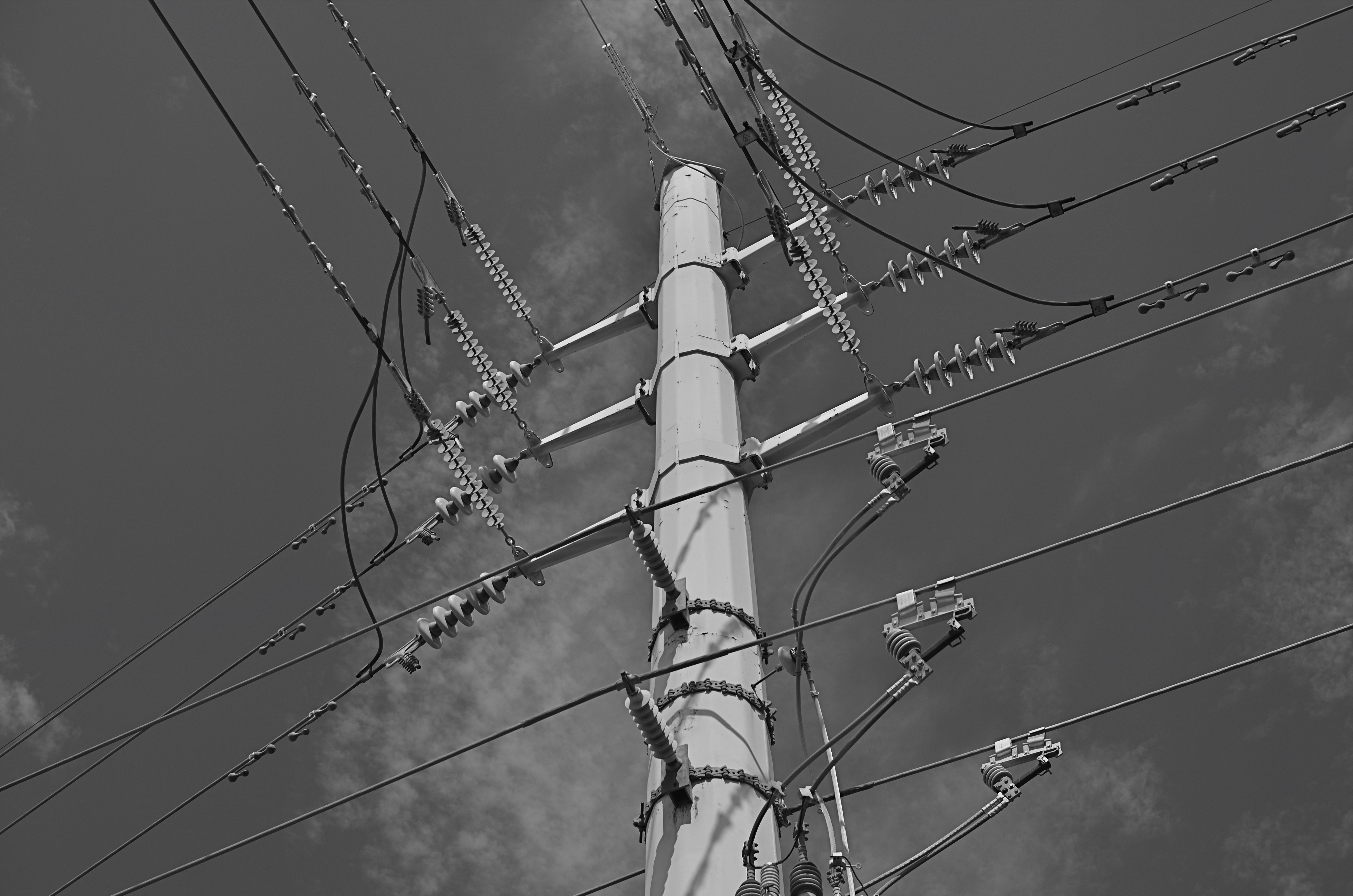
Overhead and out of sight. 1/400 sec., f/5.6, ISO 100, 35mm.
By MICHAEL PERKINS
THERE ARE MANY PHOTO SITES THAT SUGGEST SHOOTS CALLED “WALKABOUTS“, informal outings intended to force photographers to shoot whatever comes to hand with as fresh an eye as possible. Some walkabouts are severe, in that they are confined to the hyper-familiar surroundings of your own local neighborhood; others are about dropping yourself into a completely random location and making images out of either the nothing of the area or the something of what you can train yourself to see.
Walks can startle you or bore you to tears (both on some days), but they will sharpen your approach to picture-making, since what you do is far more important than what you’re pointing to. And the discipline is sound: you can’t hardly miss taking shots of cute cats or July 4 fireworks, but neither will you learn very much that is new. Forcing yourself to abandon flashier or more obvious subjects teaches you to imbue anything with meaning or impact, a skill which is, over a lifetime, beyond price.
One of the things I try to keep in mind is how much of our everyday environment is designed to be “invisible”, or at least harder to see. Urban infrastructure is all around us, but its fixtures and connections tend to be what I call the unseen geometry, networks of service and connectivity to which we simply pay no attention, thus rendering them unseeable even to our photographer’s eye. And yet infrastructure has its own visual grammar, giving up patterns, even poetry when placed into a context of pure design.
The above power tower, located in a neighborhood which, trust me, is not brimming with beauty, gave me the look of an aerial superhighway, given the sheer intricacy of its connective grid. The daylight on the day I was shooting softened and prettied the rig to too great a degree, so I shot it in monochrome and applied a polarizing filter to make the tower pop a little bit from the sky behind it. A little contrast adjustment and a few experimental framing to increase the drama of the capture angle, and I was just about where I wanted to be.
I had to look up beyond eye (and street) level to recognize that something strong, even eloquent was just inches away from me. But that’s what a walkabout is for. Unseen geometry, untold stories.
HOW MUCH IS TOO MUCH?
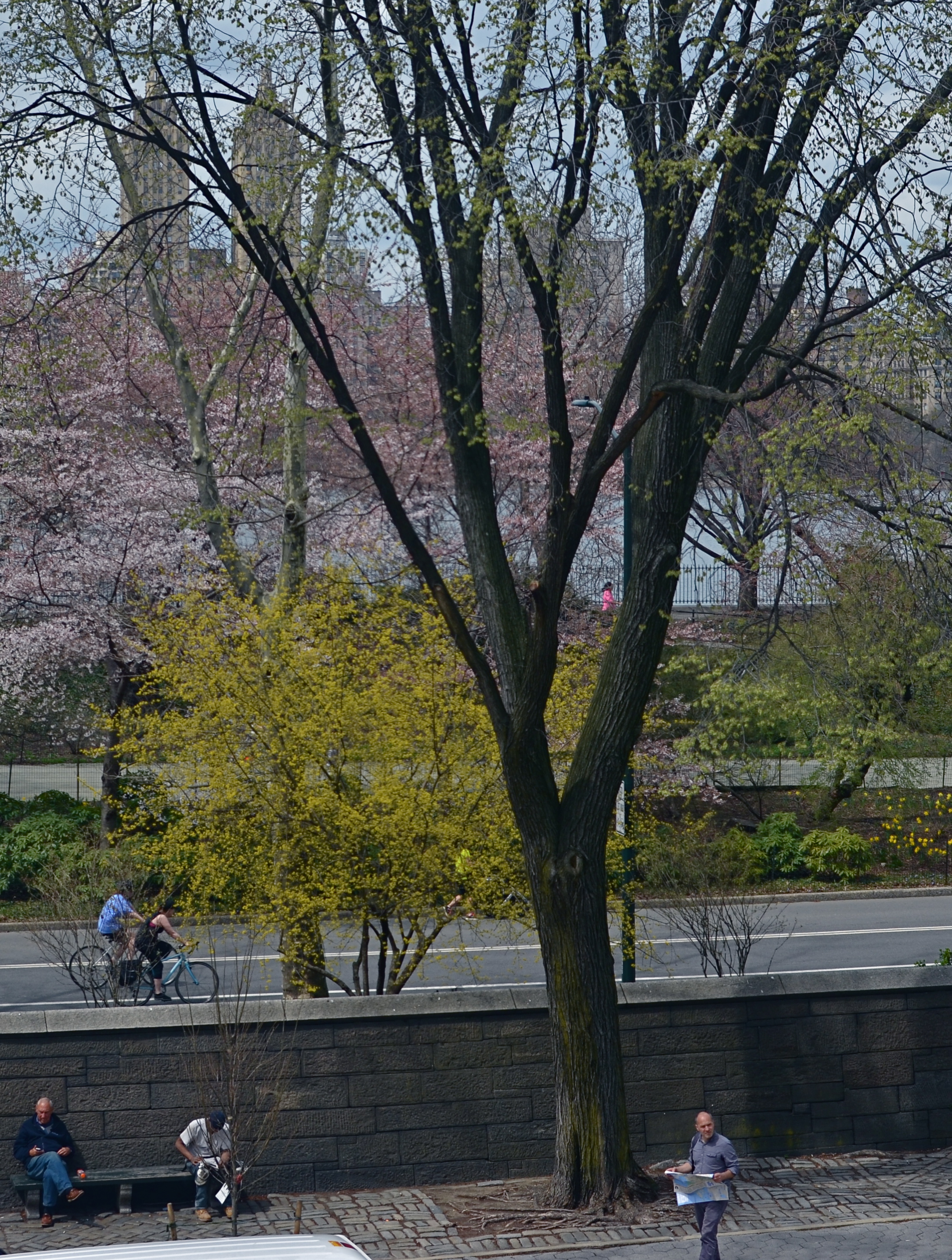
Lots going on here. Too much?
By MICHAEL PERKINS
THESE DAYS IT SEEMS TO TAKE LESS TIME TO SNAP A PHOTOGRAPH THAN IT DOES TO DECIDE WHETHER IT HAS ANY MERIT. Photography is still largely about momentary judgements, and so it stands to reason that some are more well-conceived than others. There’s a strong temptation to boast that “I meant to do that, of course” when the result is a good one, and to mount an elaborate alibi when the thing crashes and burns, but, even given that very human tendency, some pictures stubbornly linger between keeper and krap, inhabiting a nether region in which you can’t absolutely pronounce them either success or failure.
The image at left is one such. It was part of a day spent in New York’s Central Park, and for most of the shots taken on that session, I can safely determine which ones “worked”. This one, however, continues to defy a clear call either way. Depending on which day I view it, it’s either a slice-of-life capture that shows the density of urban life or a visual mess with about four layers too much glop going on. I wish there were an empirical standard for things like photographs, but…..wait, I really don’t wish that at all. I like the fact that none of us is truly certain what makes a picture resonate. If there were such a standard for excellence, photography could be reduced to a craft, like batik or knitting. But it can never be. The only “mission” for a photographer, however fuzzy, is to convey a feeling. Some viewers will feel like a circuit has been completed between themselves and the artist. But even if they don’t, the quest is worthwhile, and goes ever on.
I have played with this photo endlessly, converting it to monochrome, trying to enhance detail in selective parts of it, faking a tilt-shift focus, and I finally present it here exactly as I shot it. I am gently closer to liking it than at first, but I feel like this one will be a problem child for years to come. Maybe I’m full of farm compost and it is simply a train wreck. Maybe it’s “sincere but just misunderstood”. I’m okay either way. I can accept it for a near miss, since it becomes a reference point for trying the same thing with better success somewhere down the road.
And, if it’s actually good, well, of course, I meant to do that.
THE MOST FROM THE LEAST
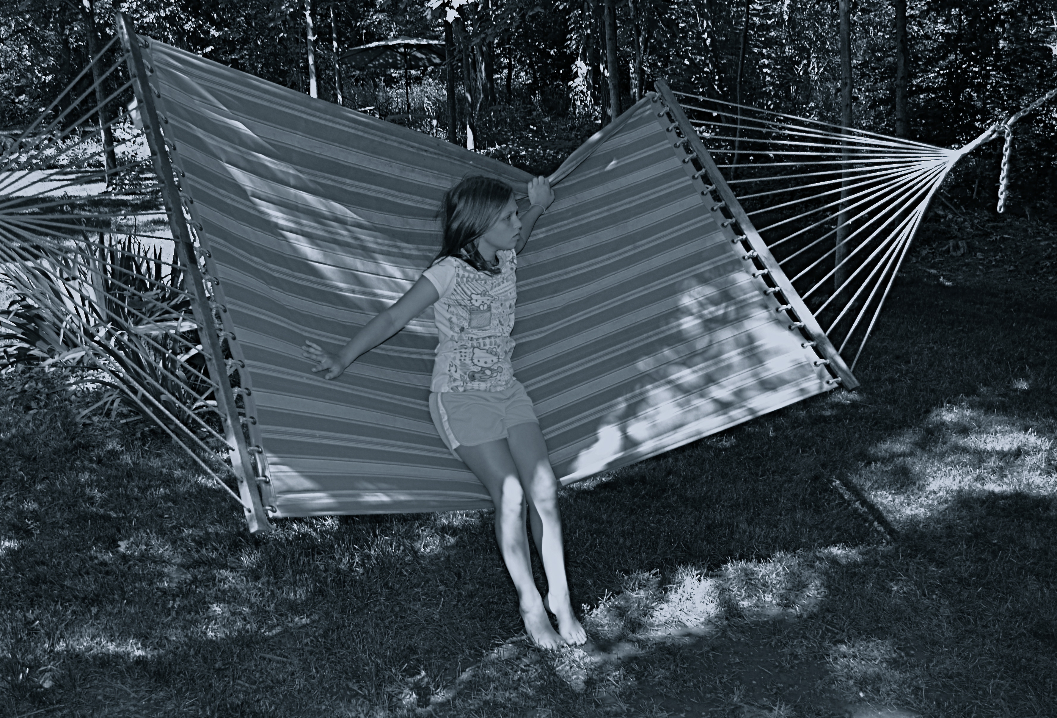
Reaching a comfort zone with your equipment means fewer barriers between you and the picture you want to get. 1/80 sec., f/4.5, ISO 100, 18mm.
By MICHAEL PERKINS
PHOTOGRAPHY IS ONLY PARTLY ABOUT TAKING AND VIEWING IMAGES. Truly, one of the most instructive (and humbling) elements of becoming a photographer is listening to the recitation of other photographers’ sins, something for which the internet era is particularly well suited. The web will deliver as many confessions, sermons, warnings and Monday-morning quarterbacks as you can gobble at a sitting, and, for some reason, these tales of creative woe resonate more strongly with me than tales of success. I like to read a good “how I did it” tutorial on a great picture, but I love, love, love to read a lurid “how I totally blew it” post-mortem. Gives me hope that I’m not the only lame-o lumbering around in the darkness.
One of the richest gold fields of confession for shooters are entries about how they got seduced into buying mounds of photographic toys in the hope that the next bit of gear would be the decisive moment that insured greatness. We have all (sing it with me, brothers and sisters!) succumbed to the lure of the lens, the attachment, the bracket, the golden Willy Wonka ticket that would transform us overnight from hack to hero. It might have been the shiny logo on the Nikon. It might have been the seductive curve on the flash unit. Whatever the particular Apple to our private Eden was, we believed it belonged in our kit bags, no less than plasma in a medic’s satchel. And, all too often, it turned out to be about as valuable as water wings on a whale. He who dies with the most toys probably has perished from exhaustion from having to haul them all around from shot to shot, feeding the aftermarket’s bottom line instead of nourishing his art.
My favorite photographers have always been those who have delivered the most from the least: street poet Henri Cartier-Bresson with his simple Leica, news hound Weegee with his Speed Graphic perpetually locked to f/16 and a shutter speed of 1/200. Of course, shooters who use only essential equipment are going to appeal to my working-class bias, since peeling off the green for a treasure house of toys was never in the cards for me, anyway. If I had been the youthful ward of Bruce Wayne, perhaps I would have viewed the whole thing differently, but we are who we are.
I truly believe that the more equipment you have to master, the less possible true mastery of any one part of that mound of gizmos becomes. And as I grow gray, I seem to be trying to do even more and more with less and less. I’m not quite to the point of out-and-out minimalism, but I do proceed under the principle that the feel of the shot outranks every other technical consideration, and some dark patches or soft edges can be sacrificed if my eye’s heart was in the right place.
Of course, I haven’t checked the mail today. The new B&H catalogue might be in there, in which case, cancel my appointments for the rest of the week.
Sigh.

