EXTENDING THE INVITATION
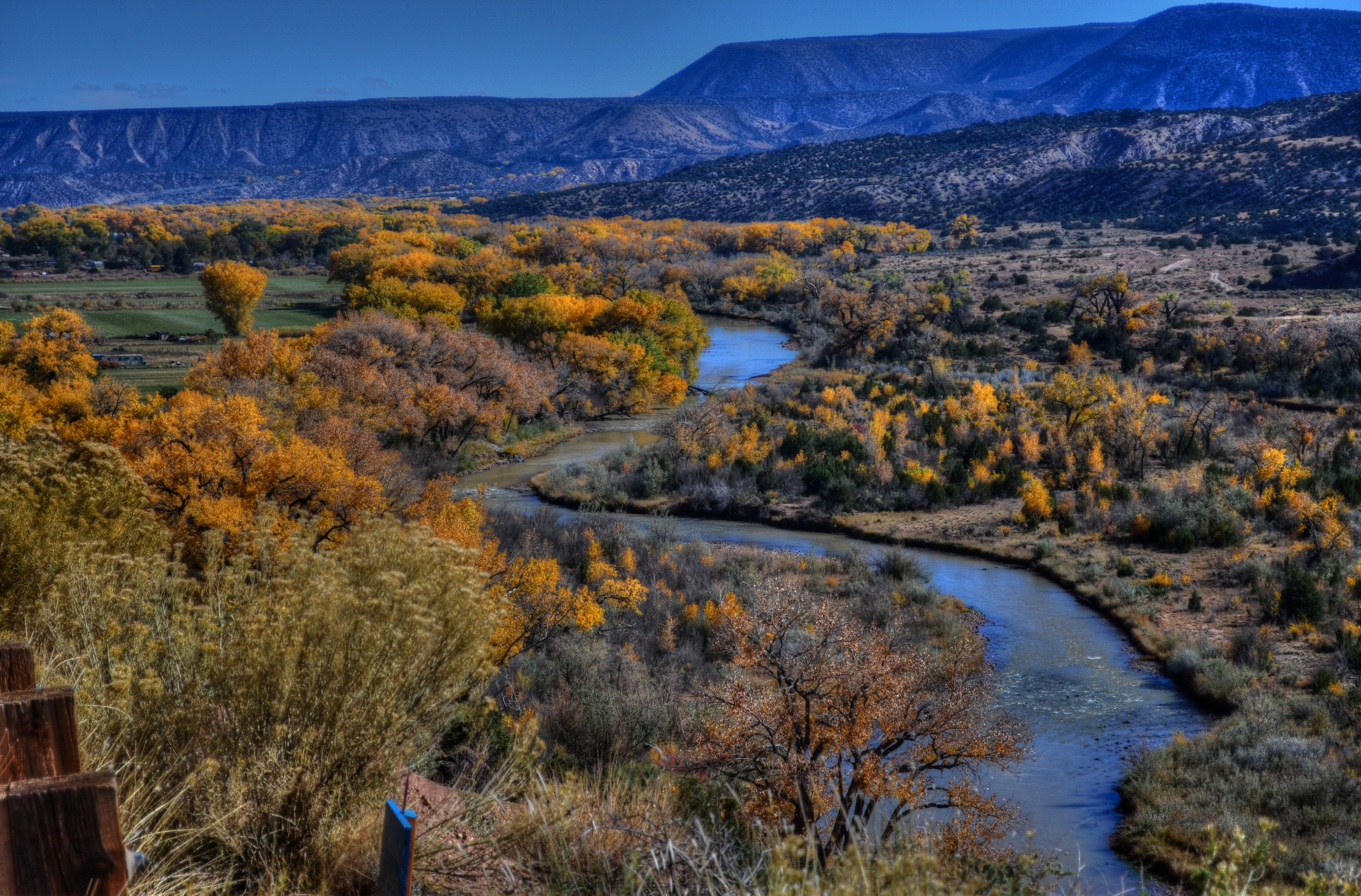
Sinuous, 2013. The river’s journey takes it, and your eyes, back “into” the picture.
By MICHAEL PERKINS
PHOTOGRAPHY AND PAINTING, DESPITE ENGAGING THEIR AUDIENCES IN VERY DIFFERENT WAYS, have retained one common aim over the centuries, at least when it comes to pictorial or scenic subjects. Both the photo and the canvas arrange their visual information on a two-dimensional surface, and both seek to draw the viewer’s eye into a depth that is largely illusionary. The cameraman and the painter both contrive to create the illusion that the distance from front to back in their works is as real as the distance from side to side.
In terms of simulating depth, some photographs benefit from both shadow and light, which alternatively “model” the information in an image, making it seem to “pop” in some faux-dimensional sense. But the best and simplest trick of composition is what we popularly term the “leading line”, information that trails from the front of the picture and pulls the viewer’s attention to an inevitable destination somewhere deeper back in the scene.
Putting a picture together this way ought to be the most automatic of instincts in the composition of a photograph, but it still is formally taught, as if it were less than obvious. In fact, it just means extending an invitation to someone to join you “in” the photograph.

Minutes Away, 2012. The girders give you a stick-straight diagonal from journey to destination.
Trails, paths, railroad tracks, lines of trees or phone poles….these are all examples of information that can start at one side of a photo and track diagonally to the “back” of the image, making the eye experience a kind of gravity, tugging it toward the place you want their gaze to end up. It is also the easiest way to force attention to a central subject of interest, sort of like inserting a big neon arrow into the frame, glowing with the words over here.
Leading lines are a landscape’s best friend, as well, since the best landscapes are arranged so that the focal point of the story is streamlined and obvious. Anyone who has ever shown too much in a landscape will tell you that what fails in the composition is that it allows the viewer to wander around the place wondering what the point of the picture is. The use of a powerful leading line gives the illusion of depth and corrals the eyes of your audience to the exact spot you need them to be for full effect.
Composition is the most democratic of photographic skills. It’s easy, it’s free, and anyone from a point-and-shooter to a Leica addict can use it effectively. Bottom line: there are great things happening in your pictures. Invite the people inside.
THE ABCs OF A.B.S.
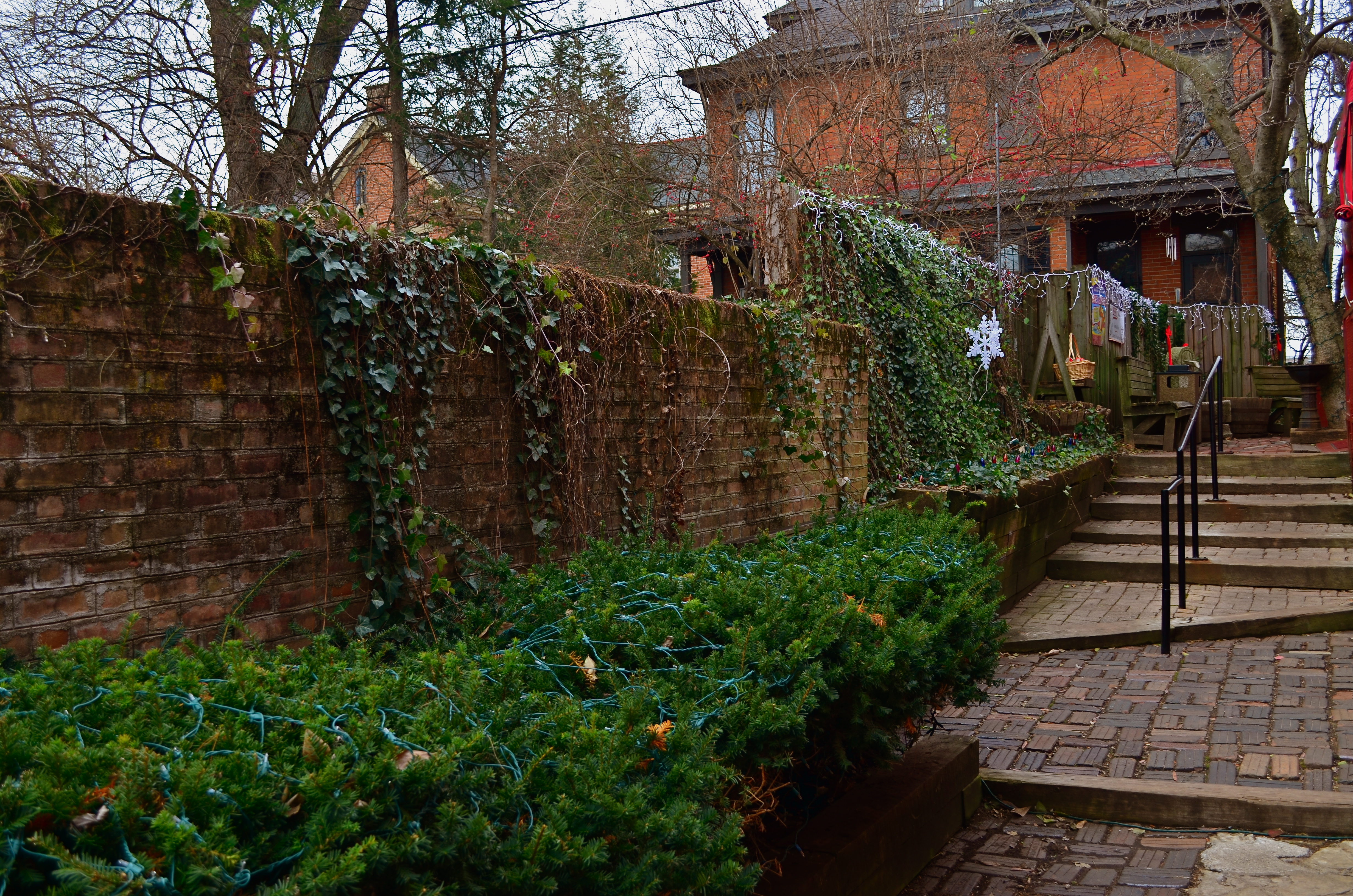
Book Loft Alley, 2014.
By MICHAEL PERKINS
THIS IS THE TIME OF YEAR, IN THE DAYS OF FILM, WHEN THE EASTMAN KODAK COMPANY used to see a predictable surge in their annual sales, all tied to our ties to our loved ones. Each holiday season, the world’s biggest manufacturer of film reminded us that cameras were not only a great gift idea, they were the most important thing to be found under our respective Christmas trees. Their tremendously successful “Open Me First” ad campaign said it all: we couldn’t begin to truly experience all that family-centric holiday joy without a Kodak camera on hand to capture every giggle of surprise. The message was: shoot a lot of film. And if that doesn’t perfectly capture the perfect season, shoot more.
Ironically, it was the near death of film that finally freed us up from the single biggest constraint on our photographic freedom, that being the constraint of cost. Digital media, and the ease and ubiquity of cameras of all price points finally have freed the non-pros and the non-rich, making the admonition Always Be Shooting much more irresistibly urgent. We can afford miscalculations. We can afford do-overs. We can fix our worst mistakes without converting a hall bathroom into Dad’s Wide, Weird World Of Chemicals. We can gradually develop a concept over many “takes”, and we can salvage more of those visions. We can win more often.
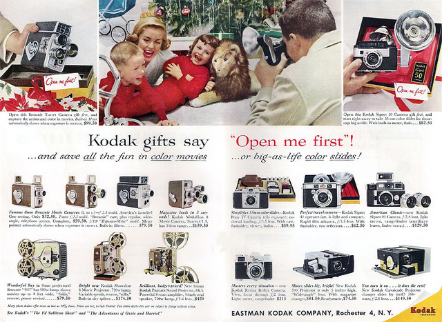
Kodak taught us that “real” holiday memories only began after their cameras were unwrapped.
The great photographer Ernest Haas once exhorted his students to “look for the ‘a-ha’ moment”, which meant not to be content with the first, or even the fifth framing of an idea in your viewfinder (okay, display screen). Asked in a lecture what the best wide-angle lens was, he quipped “two steps backward”, meaning that your best solution to a so-called technical problem is actually within yourself. Change your view, and change the outcome. The shot at the top of this post, as one example, only came at the end of ten other attempts at the same scene, all shot within a few minutes’ time. In the days of film, I would have had to settle for a much earlier version. I simply wouldn’t have kept clicking long enough to realize what I wanted from the subject.
Always Be Shooting doesn’t mean just clicking away madly, hoping that a jewel will magically emerge from a random batch of frames. It means keeping yourself in seeking mode long enough for ideas to emerge, then shooting beyond that to get those ideas right. Film made it possible to all of us to dream of capturing great memories. But it is the end of film that makes it possible for us to refine more of those memories before all those fleeting smiles have a chance to fade out of our reach.
PRESERVING THE PERCEPTION
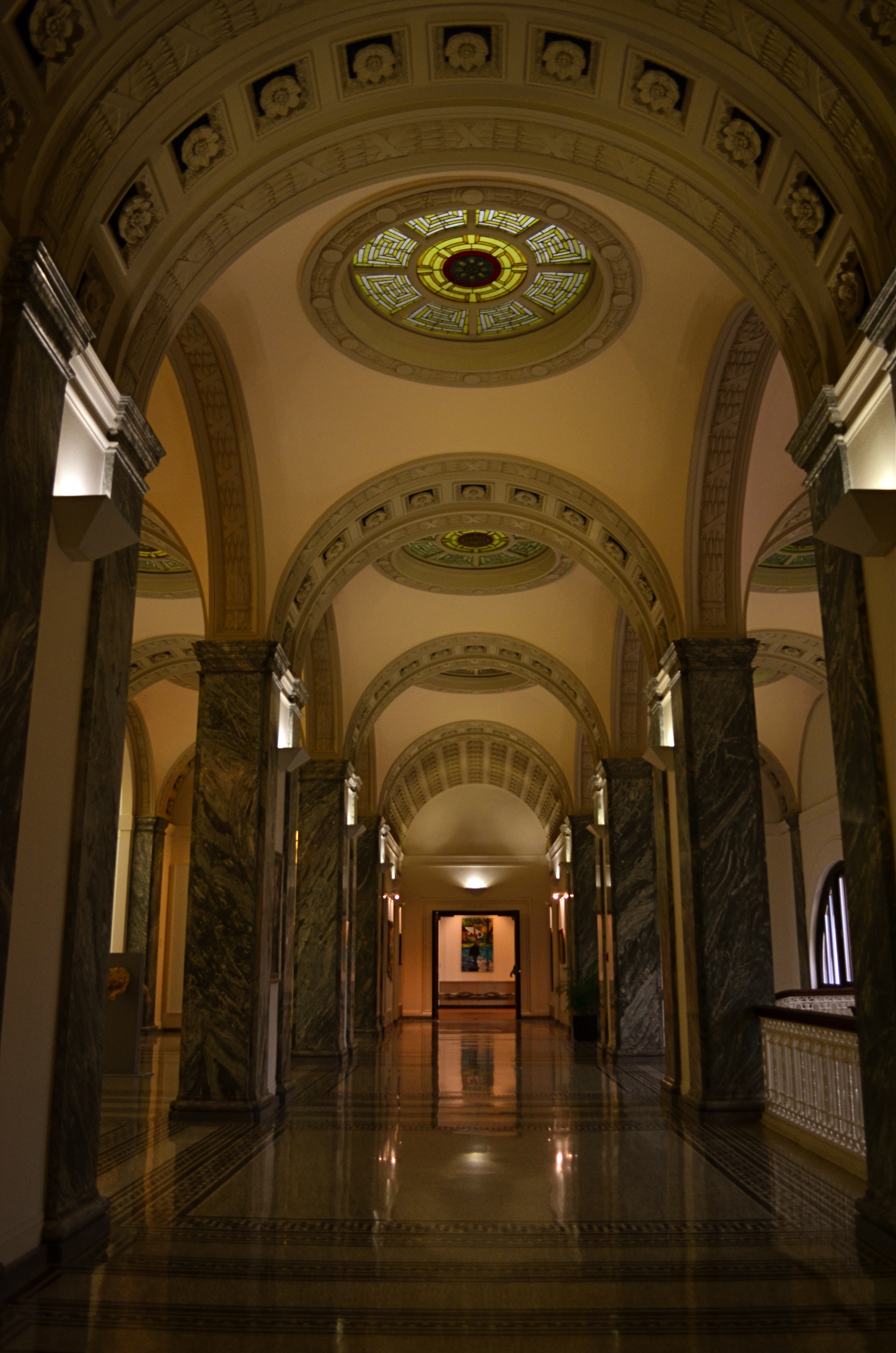
Your memory tells you that this space is more like a “library” than a “drug store”, unless you live in a much nicer neighborhood than mine.
By MICHAEL PERKINS
THERE IS AN OLD ADVERTISING MAXIM that the first person to introduce a product to market becomes the “face” of all versions of that product forever, no matter who else enters as a competitor. Under this thinking, all soda generically becomes a Coke; all facial tissues are Kleenexes: and no matter who made your office copier, you use it to make…Xeroxes. The first way we encounter something often becomes the way we “see” it, maybe forever.
Photography is shorthand for what takes much longer to explain verbally, and sometimes the first way we visually present something “sticks” in our head, becoming the default image that “means” that thing. Architecture seems to send that signal with certain businesses, certainly. When I give you Doric columns and gargoyles, you are a lot likelier to think courthouse than doghouse. If I show you panes of reflective glass, large open spaces and stark light fixtures, you might sift through your memory for art gallery sooner than you would for hardware store. It’s just the mind’s convenient filing system for quickly identifying previous files, and it can be a great tool for your photography as well.
As a shooter, you can sell the idea of a type of space based on what your viewer expects it to look like, and that could mean that you shoot an understated or even tightly composed, partial view of it, secure in the knowledge that people’s collective memory will provide any missing data. Being sensitive to what the universally accepted icons of a thing are means you can abbreviate or abstract its presentation without worrying about losing impact.
Photography can be at its most effective when you can say more and more with less and less. You just have to know how much to pare away and still preserve the perception.
QUICK, NOBODY POSE
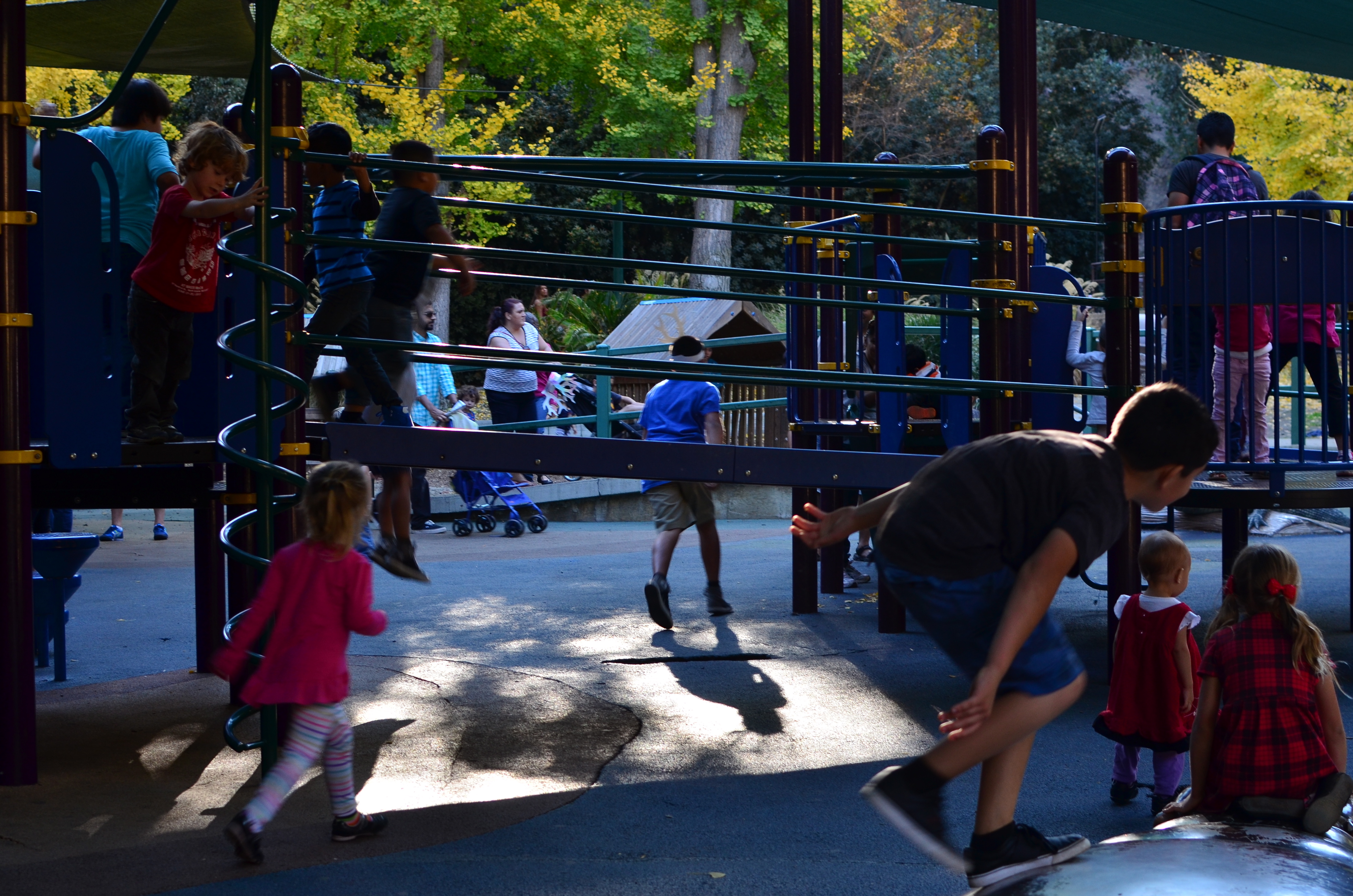
Even at the Los Angeles Zoo, the most interesting animals are on the opposite side of the bars. 1/80 sec., f/4, ISO 200, 35mm.
By MICHAEL PERKINS
FOR PHOTOGRAPHERS, HARNESSING THE NATURAL ENERGY OF A CHILD is a little like flying a kite during a thunderstorm was for Ben Franklin. You might tap into a miraculous force of nature, but what are you going to do with it? Of course, there’s big money in artificially arranging light and props for formalized (or rather, idealized) portraits of kids. It’s a specialty art with specific rules and systems, and for proud parents, it’s a steady market. We all want our urchins “promoted” to angel status, albeit briefly. However, in terms of photographic gold, you can’t, for my money, beat the controlled chaos of children at play. It’s street photography with an overlay of comedy and wonder.
However, attempting to extract a miracle while watching kids be kids is like trying to capture either sports or combat, in that it has a completely different dynamic from second to second, so much so that you should be prepared to shoot a lot, shifting your focus and framing on the fly, since the center of the action will shift rapidly. I don’t necessarily believe that there is one decisive moment which will explain all aspects of childhood since the creation of the world, but I do think that some moments have a better balance between sizes, shapes, and story elements than others, although you will be shooting instinctively for much of the time, separating the wheat from the chaff later upon review of the results.
As with the aforementioned combat and sports categories, the spirit that is caught in a shot supersedes technical perfection. I’m not saying you should throw sharpness or composition to the wind, but I think the immediacy of some images trumps the controlled environment of the studio or a formal sitting. Some artifacts of blur, inconsistent lighting, or imprecise composition can be overlooked if the overall effect of the shot is truthful, visceral. The very nature of candid photography renders all arbitrary rules rather useless. The results justify themselves regardless of their raggedness, whereas a technically flawless shot that is also bloodless can never be justified on any grounds.
Work the moment; trust it to develop naturally; hitch a ride on the wave of the instantaneous.
FADE TO (ALMOST) BLACK
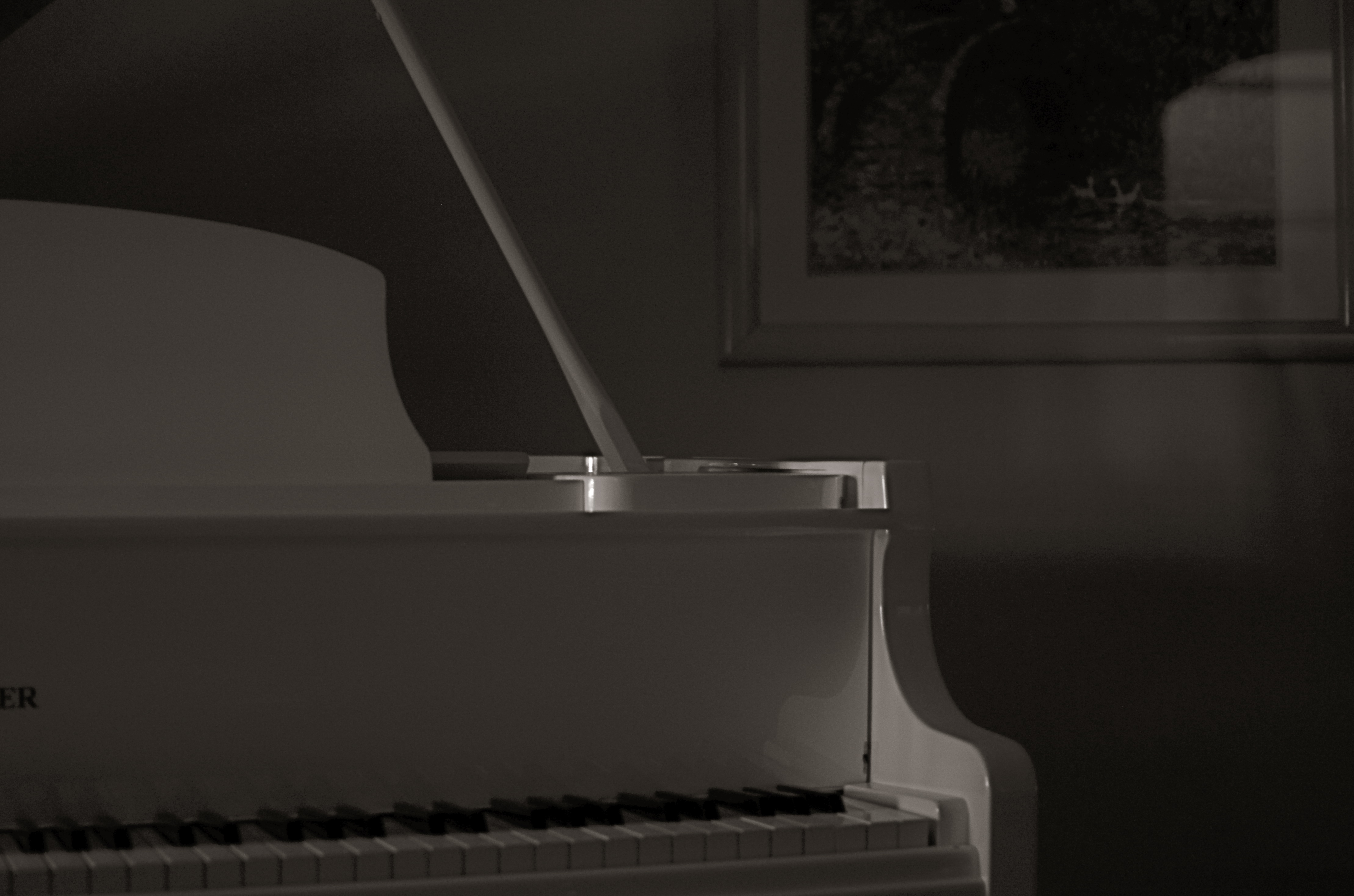
Sometimes a change in the technical approach to a shot is the only way to freshen an old subject. 1/40 sec., f/1.8, ISO 250, 35mm.
By MICHAEL PERKINS
I KNOW MANY PHOTOGRAPHERS WHO SUBJECT THEMSELVES TO THE DELICIOUS TORTURE, known to authors everywhere,as “publish or perish”, or, in visual terms, the tyranny of shooting something every single day of their lives. There are lots of theories afloat as to whether this artificially imposed discipline speeds one’s development, or somehow pumps their imagination into the bulky heft of an overworked bicep. You must decide, o seekers of truth, what merit any of this has. I myself have tried to maintain this kind of terrifying homework assignment, and during some periods I actually manage it, for a while at least. But there are roadblocks, and one of the chief barriers to doing shot-a-day photography is subject matter, or rather the lack of it.
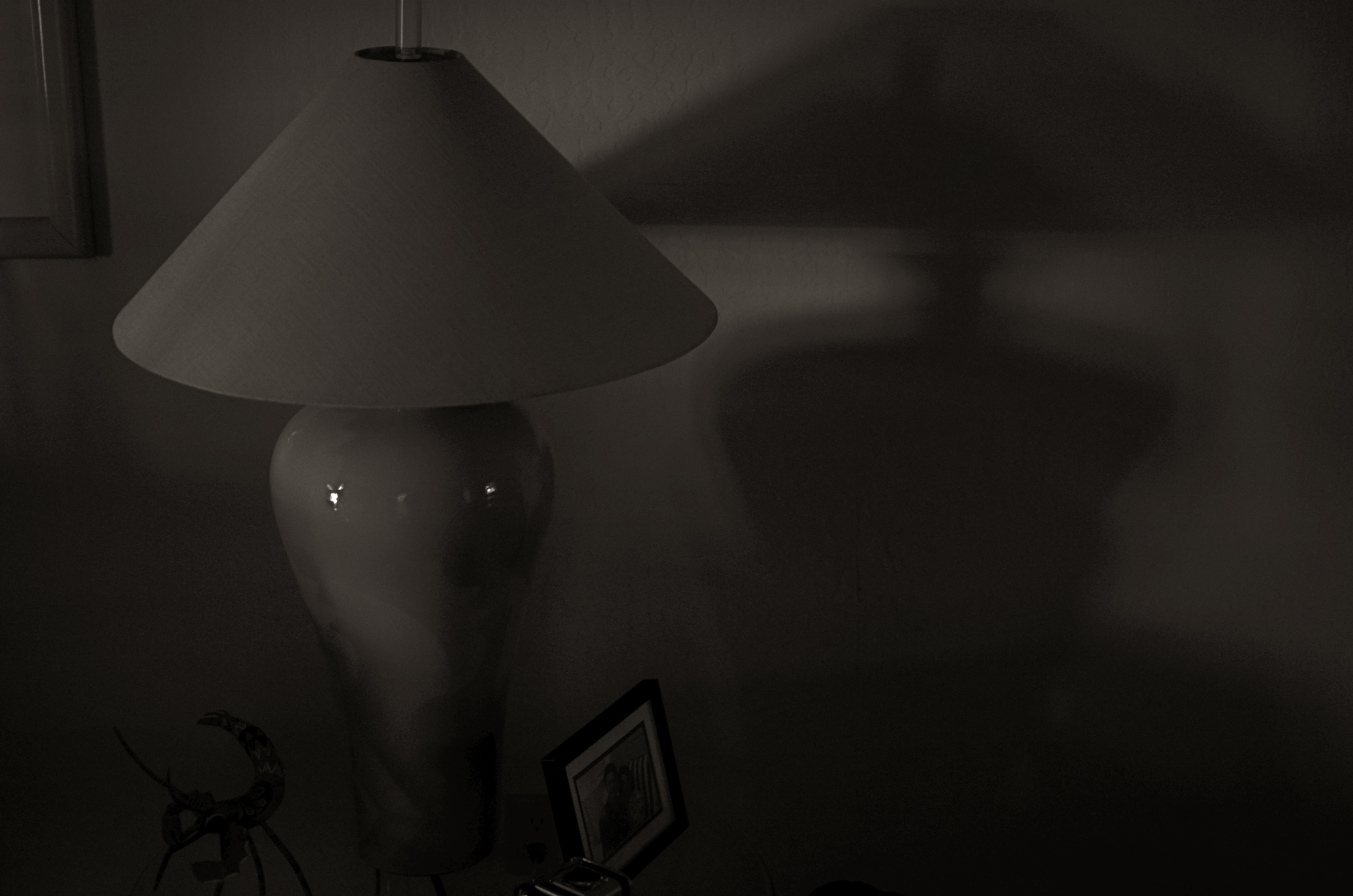
I’ve shot in this space for years, and therein lies the challenge. 1/40 sec., f/2.2, ISO 250, 35mm.
Let’s face it: even if you live one canyon away from the most breathtaking view on earth or walk the streets of the mightiest metropolis, you will occasionally look upon your immediate environs as a bad rerun of Gilligan’s Island, something you just can’t bear to look at without having a wastebasket handy. Familiarity breeds contempt for some subjects that you’ve visited and re-visited, and so, for me, the only way to re-mix old material is to re-imagine my technical approach to it. This is still a poor substitute for a truly fresh challenge, but it can teach you a lot about interpretation, which has transformed more than a few mundane subjects for me over a lifetime of shuttering (and shuddering).
As an example, a corner of my living room has been one of the most trampled-over crime scenes of my photographic life. The louvered shades which flank my piano can create, over the course of a day, almost any kind of light, allowing me to use the space for quick table-top macros, abstract arrangements of shadows, or still lifes of furnishings. And yet, on rainy /boring days, I still turn to this corner of the house to try something new with the admittedly over-worked material. Lately I have under-exposed compositions in black and white, coming as near a total blackout as I can to try to reduce any objects to fundamental arrangements of light and shadow. In fact, damn near the entire frame is shadow, something which works better in monochrome. Color simply prettifies things too much, inviting the wrong kind of distracted eye wandering in areas of the shot that I don’t think of as essential.
I crank the aperture wide open (or nearly) to keep a narrow depth of field, which renders most of the image pretty soft. I pinch down the window light until there is almost no illumination on anything, and allow the ISO to float around at least 250. I get a filmic, grainy, gauzy look which is really just shapes and light. It’s very minimalistic, but it allows me to milk something fresh out of objects that I’ve really over-photographed. If you believe that context is everything, then taking a new technical approach to an old subject can, in fact, create new context. Fading almost to black is one thing to try when you’re stuck in the house on a rainy day.
Especially if there’s nothing on TV except Gilligan.
THE GEOMETRY OF VIEW
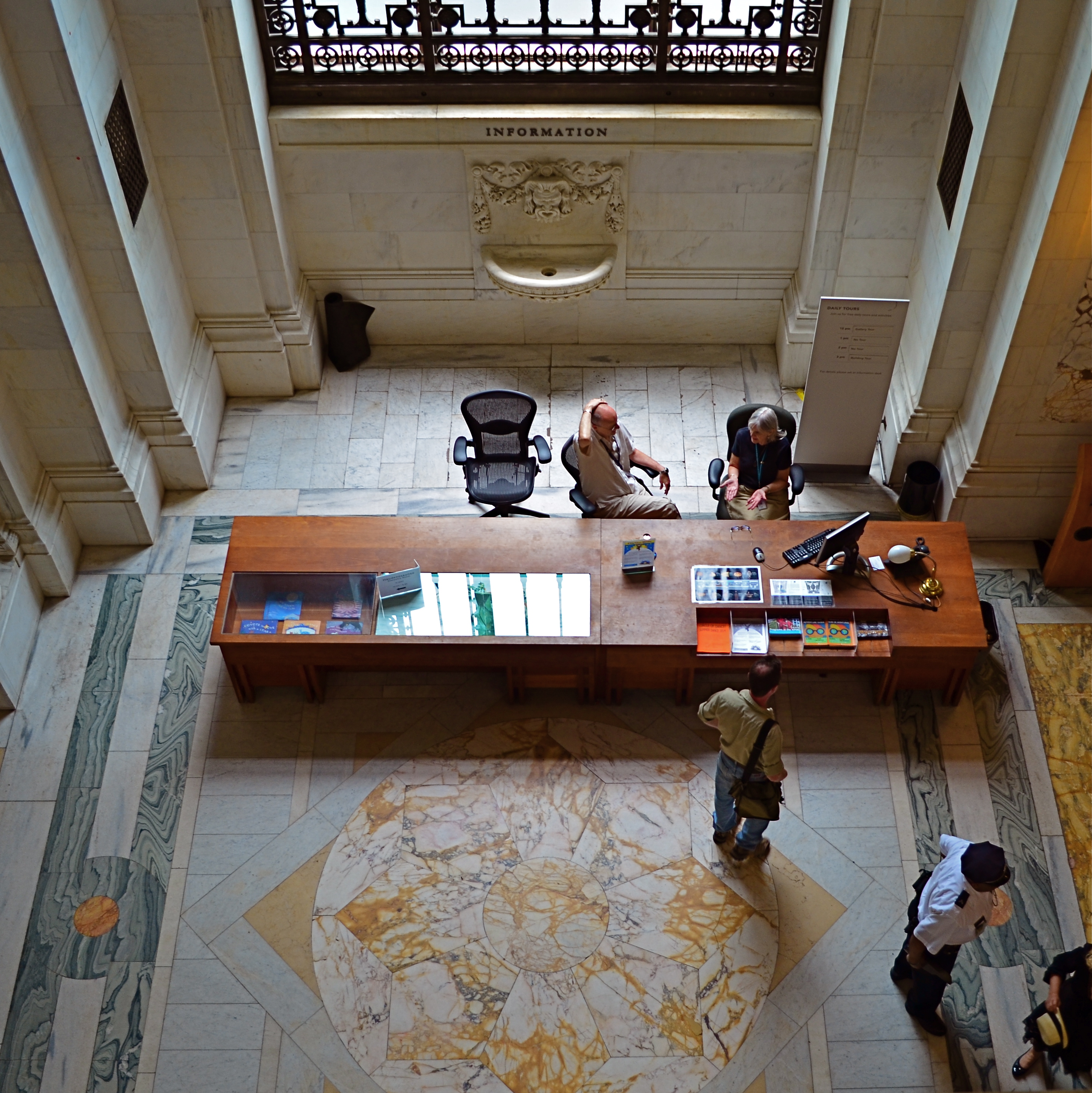
Information, Please, 2014. 1/60 sec., f/3.5, ISO 160, 18mm.
By MICHAEL PERKINS
ONE OF THE BEST WAYS TO APPREHEND THE OVERALL DESIGN OF A SPACE, be it a midtown skyscraper or a suburban cathedral, is to see it the way the designer originally envisioned it; as a logical arrangement of spaces and shapes. Sometimes, viewing the layout of floors, lobbies, or courtyards from the top-down, or “bird’s-eye” view of the original design sketches is especially helpful, since it takes our eye far enough away from a thing to appreciate its overall conception. It’s also not a bad thing for a photographer to do when trying to capture common spaces in a new way. Move your camera, change your view, change the outcome of your images.
The overarching vision for a place can be lost at ground, or “worker bee” level, in the horizontal plane along which we walk and arrange our viewpoint. Processing our understanding of architecture laterally can only take us so far, but it almost seems too simple to suggest that we shift that processing just by changing where we stand. And yet you will invariably learn something compositionally different just by forcing yourself to visualize your subjects from another vantage point.
I’m not suggesting that the only way to shake up your way of seeing big things is to climb to the top floor and look down. Or descend to the basement and look up, for that matter. Sometimes it just means shooting a familiar thing from a fresh angle that effectively renders it unfamiliar, and therefore reinvents it to your eye. It can happen with a different lens, a change in the weather, a different time of day. The important thing is that we always ask ourselves, almost as a reflex, whether we have explored every conceivable way to interpret a given space.
Each fresh view of something re-orders its geometry in some way, and we have to resist the temptation to make much the same photographs of a thing that everyone else with a camera has always done. We’re not in the postcard business, so we’re not supposed to be in the business of assuring people with safe depictions of things, either. Photography is about developing a vision, then ripping it up, taping it back together out-of-order, shredding that, and assembling it anew, again and again. In a visual medium, any other approach will just make us lazy and make our art flat and dull.
WHEN TEXTURE IS THE TALE
By MICHAEL PERKINS
THOSE WHO BELIEVE THAT SUBJECT MATTER IS KING IN PHOTOGRAPHY ARE FACED OFF in an endless tennis match with those who believe that only impressions, not subjects, are the heart of the art. Go away for fifty or sixty years and they are still volleying: WAP! a photograph without an objective is a waste of time! WAP! who needs an object to tell a story? Emotional impact is everything! And so on. Pick your side, pick your battle, the argument isn’t going anywhere.
Thing is, my assertion is that you don’t actually have to choose a side. Just let the assignment at hand dictate whether subject or interpretation is your objective. There are times when the object itself provides the story, from a venerable cathedral to an eloquently silent forest. And there are times when mere color, light patterns, or texture are more than enough to tell your tale.

Set Your Face Like Flint, 2014. Shot wide at 18mm, cropped to square format. 1/100 sec., f/5.6, ISO 100.
I find, for example, that texture is one of my best friends when it comes to conveying a number of important things. The passage and impact of time. The feel and contour of materials, as well as the endless combinations and patterns they achieve through aging and weathering. A way to completely redefine an object by getting close enough to value its component parts instead of viewing it as a whole. This is especially true as I try to refine my approach to images of buildings. I find that breaking the overall structure into smaller, more manageable sections helps to amplify texture, to make it louder and prouder than it might be if a larger scene just included the entire building among other visual elements. Change the distance from your story and you change the story itself.
This Massachusetts barn has tons of character whether seen near or far, but if I frame it to eliminate anything but the raw feel of the wood, it demands attention in a completely different way. It asks for re-evaluation.Contrast the rough-sawn wood with the hard red of the windows,and, again, you’ve boosted the effect of the coarser texture. Opposing textures create a kind of rudimentary tug-of-war in a picture, and the more stark the contrasts, the more dramatic the impact.
Traditional, subject-driven story telling will dictate that you show the entire barn, maybe with surrounding trees and a rolling hill or two. Abstracting it a little in terms of color, distance and texture just tell the story in a distinct way. Your camera, your choice.
THE PICTURES I HATE MOST
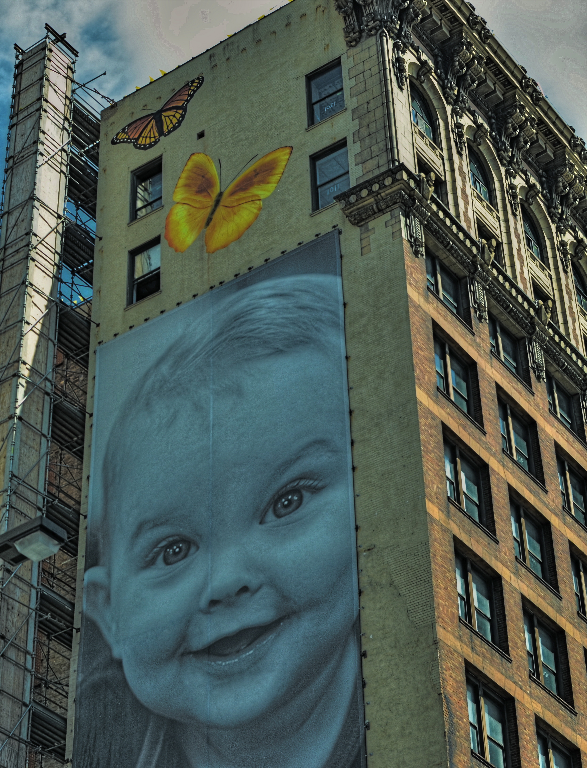
Even the pictures you attempt that come up short can teach you more than the ones you never make.
By MICHAEL PERKINS
IN MY CHILDHOOD, I FIRST HEARD THE BIBLICAL PARABLE OF THE SHEPHERD who, upon finding that one of his flock of one hundred sheep had gone missing, forsook the other ninety-nine to undertake a desperate search for the single lost lamb. It was, certainly, a touching story, with its image of a father who would mourn over the loss of even the most wayward of his flock. And, although it didn’t occur to me at the time, it also came to serve as an early model for my idea of a photographer.
It’s not really that big a stretch. Like the shepherd, shooters always mourn the loss of the one that got away, or in terms of photographs, the shot that was never made. The one angle we forgot to foresee, the light we failed to read, the fleeting truth we neglected to capture. For sure, the photos you attempted and botched really do smart, a lot. A lot a lot. However, there is no pain like the emotional toothache caused by the shots that, for whatever reason, you never even tried to make. These aren’t “lost” images, since they never actually existed, but that doesn’t mean that their absence is any less poignant. One great recent examination of why we fail to shoot is found in a recent collection of essays by Will Steacy called Photographs Not Taken. Check out a capsule review of it here.
I lament the pictures I never made far more than the ones I have attempted and whiffed, since in most cases the contexts that surrounded those non-existent pics are, themselves, no longer, whether we’re talking about missed sunrises or final visits with loved ones. To be sure, re-dos are often off the table even for many of the pictures we did take, but, for some human reason, we mourn more intensely the ones that might have been. Worse yet, even failed images have some teaching value, whereas you learn zilch from the dances that you sat out.
This forum has never been about merely posting my greatest hits for the world to drool over. That is scrapbooking, and serves no purpose. Any honest examination of why we make images has to pause to grieve about failed chances, to sniffle a bit over the things we aimed at and missed. It sometimes has to be about pictures that I hate, and the ones I hate most are the ones I had neither the vision nor the nerve to create.
UNDER-PERFORMING
By MICHAEL PERKINS
DURING THE GOLDEN AGE OF SLIDE FILM, I KNEW PLENTY OF PHOTOGRAPHERS who feared the unforgiving quality of the medium. The way that, with the educated guessing involved in many exposures, it was all or nothing. Prints. coming from a negative, could be created and re-created almost endlessly, but reversal film was, with few exceptions, a lot harder to massage. The processed slide was, for most shooters, the end of the argument. You either nailed it or….
Slide shooters became a kind of breed apart, since we had to work harder to coax good results out of our chosen medium. Slide film was, for the most part, a lot slower than daylight print film, so that, on some days, merely framing a shot in shade meant you could reduce your subject to a Dutch painting, mood-wise. A few of us played to that bias as well, deliberately under-lighting shots to boost color or isolate key subjects in the frame….making them “pop.” Others created strange effects by cross-processing, giving the lab instructions that ran counter to the recommended developing for a given film. And a lot of us became self-taught illumination geeks in a desperate attempt to get enough light to the film, causing our families to recoil at the approach of our monstrous flashguns. Their retinas died for our sins.
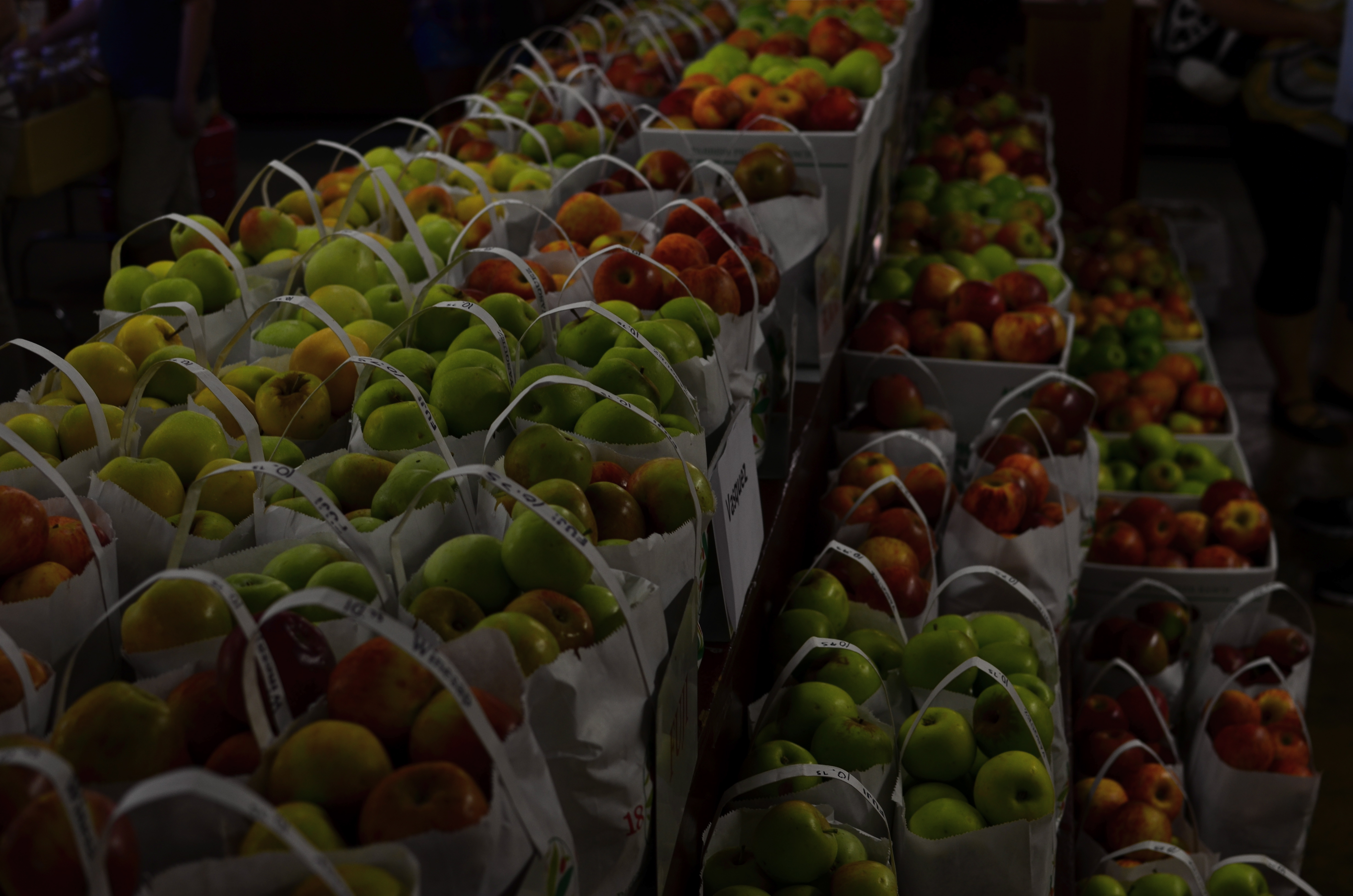
Yield, 2014. 1/30 sec., f/4, ISO 100, 35mm.
Now we’re at a place where the camera is really the film, and that film can be made immediately, accurately responsive to nearly any lighting situation. Digital sensors have all but eliminated the need for spot flashes at all, and, as for rendering mood, if you can visualize it, you can pretty much shoot it. At a recent visit to an apple orchard gift shop (hey, it’s autumn!) I came upon an immense table of green and red apple varieties arranged in ready-to-buy bags. The light in the place was pretty meager to start with, but there was still enough of it to over-crowd the shot with background clutter….jars of jams, counters of candies, jugs of cider, peeps, etc. I wanted the warm colors of the apples to carry the entire image, so I started to think like a slide photographer and deliberately under-exposed the shot. That didn’t mean shutting down the aperture beyond f/4, since the place was fairly dark already, but merely leaving my ISO at its lowest setting, thereby telling the sensor not to suck in any additional light. I didn’t have much depth of field, but the somewhat gauzy quality at the rear and sides actually added to the warm nostalgia of the shot, so I kept it.
Again, digital makes it possible to try a lot of approaches to a task within the space of a few minutes, while the moment is there to be seized. You don’t have to physically consume film, shooting twenty frames with different settings and bearing the cost of processing them all in the hope that “the one” is in there somewhere. Cause and effect are compressed into a shorter, workable space, and success increases. To an old slide man, this is salvation of the first order. Now we manipulate the medium instead of the other way around. Man.
RAMPING UP
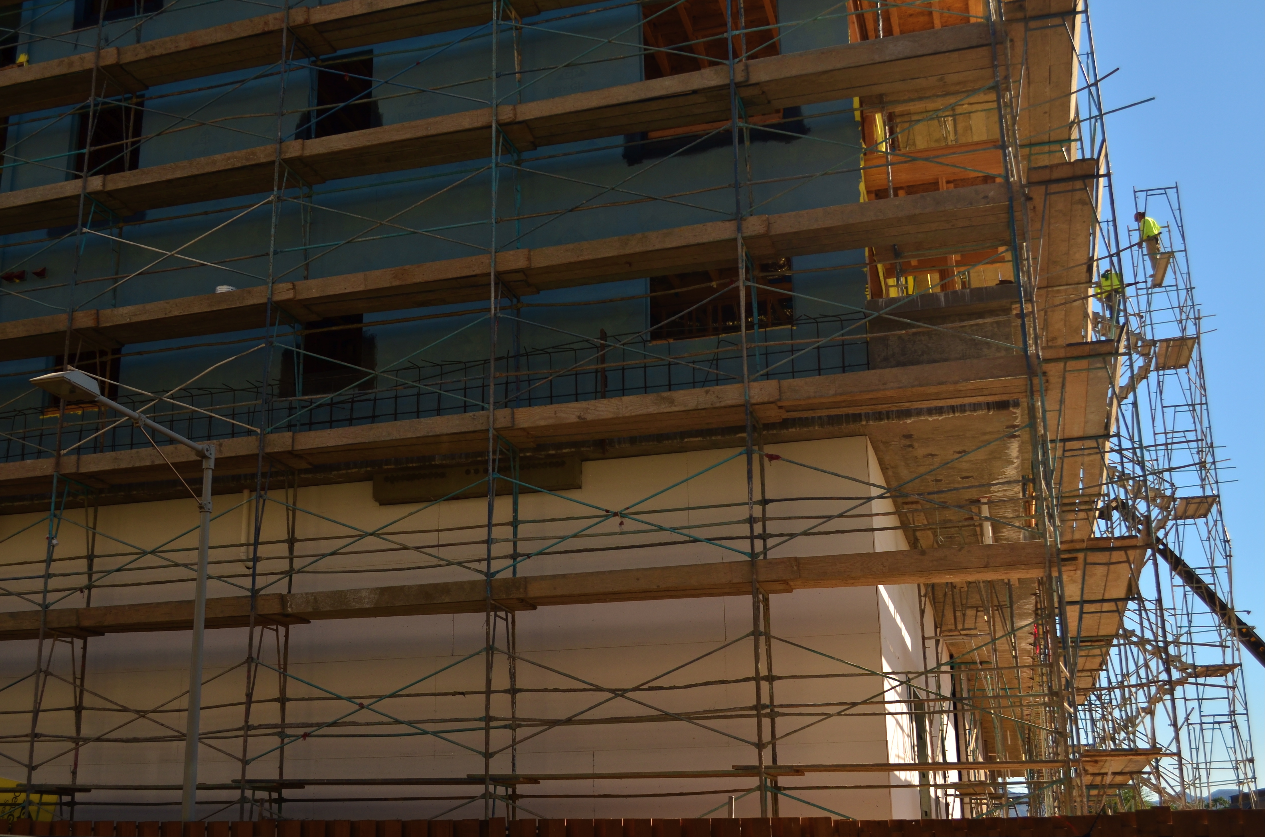
The North Face, 2014. 1/250 sec., f/5.6, ISO 100, 24mm.
By MICHAEL PERKINS
IN THE IMAGINARY PHOTOGRAPHY BOOKSHELF OF MY MIND THERE ARE HUNDREDS OF VOLUMES that speak of nothing else except the exquisite light of early morning, the so-called “golden hour” in which a certain rich warmth bathes all. You’ve read endless articles and posts on this as well, so nothing I can cite about the science or aesthetic aspects of it can add much. However, I think that there is a secondary benefit to shooting early in the day, and it speaks to human rhythm, a factor which creates opportunities for imaging every bit as vital as the quality of available light.
Cities and communities don’t jolt awake in one surge: they gently creep into life, with streets gradually taking on the staging that will define that day. The first signs could be the winking on of lights, or the slow, quiet shuffle of the first shift of cleaners, washers, trimmers and delivery workers. First light brings the photographer a special relationship with the world, as he/she has a very private audience with all the gears that will soon whirr and buzz into the overall noise of the day. You are witness to a different heartbeat of life, and the quieter pace informs your shooting choices, seeping into you in small increments like a light morning dew. You are almost literally forced to move slower, to think more deliberately, and that state always makes for better picture making.
Some atmospheres, like libraries or churches, retain this feel throughout the entire day, imposing a mood of silence (or at least contemplation) that is also conducive to a better thought process for photography, but in most settings, as the day wears on, the magic wears off. Early day is a distinctly different day from the one you’ll experience after 9am. It isn’t merely about light, and, once you learn to re-tune your inner radio for it, you can find yourself going back for more.
This is no mere poetic dreaminess. The more nuances you experience as a living, breathing human, the more you have to pour into your photography. Live fuller and you’ll shoot better. That’s why learning about technical things is no guarantee that you’ll ever do anything with a camera beyond a certain clinical “okay-ness”. On the other hand, we see dreamers who are a solid C+ on the tech stuff deliver A++ images because their soul is part of the workflow.
DON’T TAKE THAT TONE WITH ME
By MICHAEL PERKINS
I BELIEVE THAT THE SINGLE BIGGEST REASON FOR THE FAILURE OF A PHOTOGRAPHIC COMPOSITION may all boil down to the same problem. I call it “over-sampling”, or, more simply, the presence of too much visual information in a frame. It can be as simple as including too many trees in a landscape or framing to include crowded sky clutter in an urban scene, but it’s not always how many objects are crowded into an image. It can be something as basic as asking the eye to figure out where to look. And sometimes, the very fact that a picture is in color can diminish its ability to clearly say, here: look here.
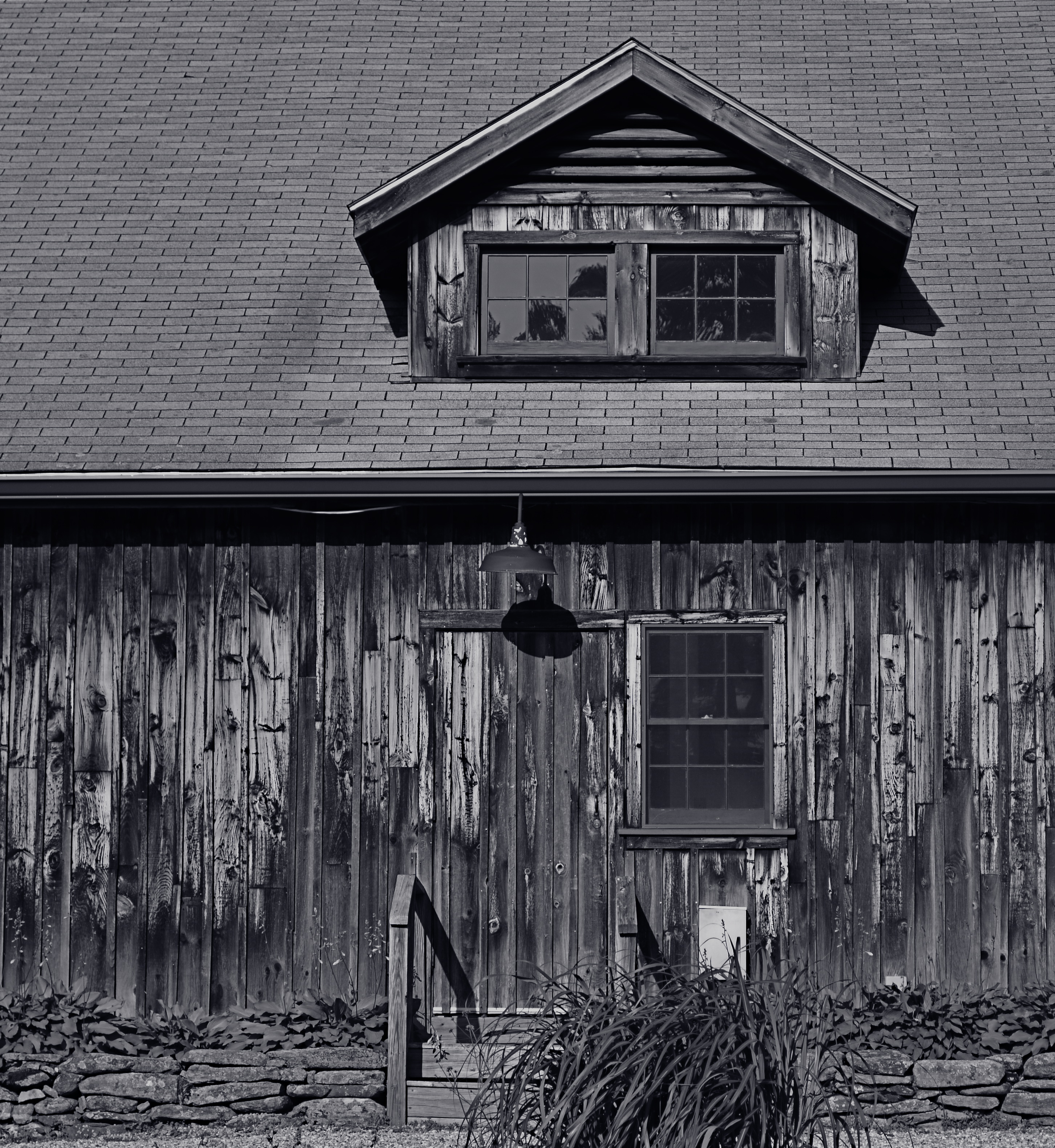
Color would have added nothing to this image. In fact, it would have detracted from its impact. 1/400 sec., f/5.6. ISO 100, 55mm.
Great photographs have their own gravitational pull and center. They draw people in and direct their gaze to specific places. This tends to be a single focus, because, the more there is to see in an image, the greater the tendency is in the viewer to wander around in it, to blunt the impact of the picture as the eye looks for a central nexus of interest. In my own experience, I find that the use of color in a photograph is justified by whether it helps keep things simple, creates readable signposts that lead the eye to the principal message of the image. Color, just like the objects in a frame, can explode with a ton of separate messages that defeat the main message, sending the viewer all over the place, trying to decode all that vivid information. Color itself can become clutter.
Sometimes the focus of an image is not an object, i.e., a building or a face, but an overall feel that is more emotionally immediate within a narrow range of blacks and greys. The kind of black and white makes a huge difference as well, and anyone who has spent a lot of time processing monochrome images knows that there is no one true black, no pure, simple white. As to actual shooting procedure, I will be so certain that only B&W will work for a given subject that I make the master shot itself in mono, but, more frequently, I shoot in color first and make a dupe file for comparison. This is another amazing advantage of digital imaging; you simply have more choices.
One of the by-products of color photography‘s adoption into mass culture through magazines and faster films in the mid-20th century was, for many people, a near-total abandonment of monochrome as somehow “limited” compared to those glorious, saturated Kodachromian hues. Thing is, both color and black and white have to be vetted before being used in a photograph. There can’t be a general rule about one being more “lifelike” or “natural”, as if that has anything to do with photography. Tools either justify their use or they don’t. You don’t drive a screw with a hammer.
CAUSE AND EFFECT

Sun Pennants, 2014. 1/400 sec., f/5.6. ISO 100, 35mm.
By MICHAEL PERKINS
THERE’S NOTHING WORSE THAN COMING HOME FROM A SHOOT realizing that you only went halfway on things. Maybe there was another way to light her face. Did I take a wide enough bracket of exposures on that sunset? Maybe I should have framed the doorway two different ways, with and without the shadow.
And so on. Frequently, after cranking off a few lucky frames, we’re like kids walking home from confession, feeling fine and pure at first, and then remembering, “D’OH! I forgot to tell Father about the time I sassed my teacher!”
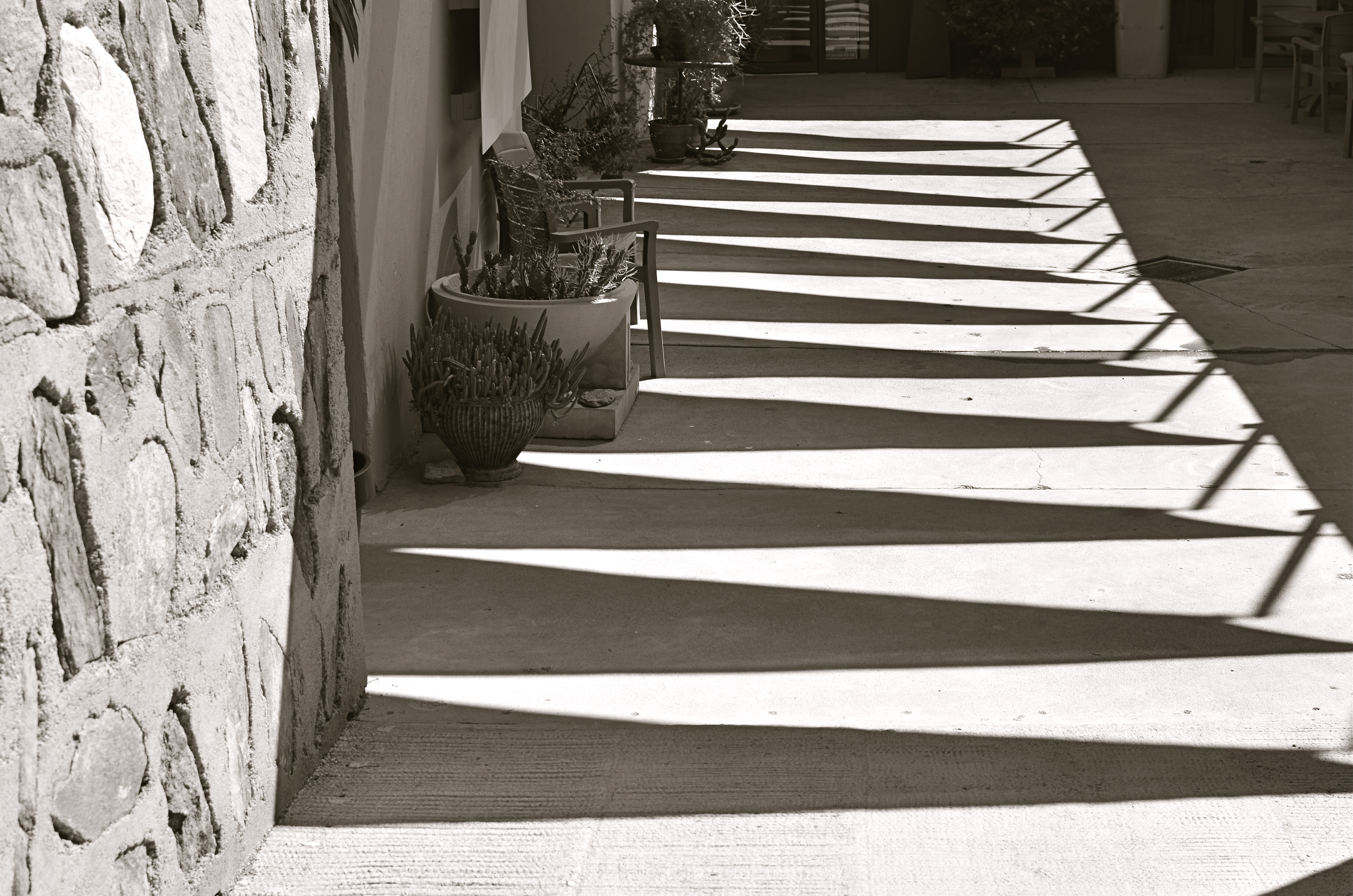
Gridlight, 2014. 1/200 sec., f/5.6, ISO 100, 35mm.
Too Catholic? (And downright boring on the sins, by the way..but, hey) Point is, there is always one more way to visualize nearly everything you care enough about to make a picture of. For one thing, we are always shooting either the cause or the effect of things. The great facial reaction and the surprise that induces it. The deep pool of rain and the portentous sky that sent it. The force that’s released in an explosion and the origin of that force. When we’re there, when the magic of whatever we came to see is happening, right here, right now, we need to think up, down, sideways for pictures of all of it, or as many as we can capture within our power….’cause once you’re home, safe and dry, it’s all different. The story perishes like a soap bubble. Shoot while you’re there. Shoot for all the story is worth.
It can be simple things. I saw the above image at one of the lesser outbuildings at Taliesin West, Frank Lloyd Wright’s legendary teaching compound in Scottsdale, Arizona. An abstract pattern made from over-hanging strips of canvas,used as makeshift shade on a path. But when I reversed my angle and shot the sidewalk instead of the sky, I saw the effect of that cause, and it appealed to me too (see left). One composition favored color, while the other seemed to dictate black & white, but they both could serve my purpose in different ways. Click and click.
It bears remembering that the only picture that is guaranteed to be a failure is the one you didn’t take. Flip things around. Re-imagine the order, the role of things. Go for one more version of what’s “important”.
Hey, you’re there anyway.…..
AS DIFFERENT AS DAY AND NIGHT
By MICHAEL PERKINS
PHOTOGRAPHY OFTEN PRESENTS ITSELF AS A SUDDEN, REACTIVE OPPORTUNITY, a moment in time where certain light and compositional conditions seem ripe for either recording or interpreting. In such cases there may be little chance to ponder the best way to visualize the subject at hand, and so we snap up the visualization that’s presented in the moment. It’s the kind of use-it-or-lose-it bargain we’re all acquainted with. Sometimes it yields something amazing. Other times we do the best with what we’re handed, and it looks like it.
Having the option to shape light as we like takes time and deliberate planning, as anyone who has done any kind of studio set-up will attest. The stronger your conception to start with, the better chance you have of devising a light strategy for making that idea real. That’s why I regard light painting, which I’ve written about here several times, as a great exercise in building your image’s visual identity in stages. You slow down and make the photograph evolve, working upwards from absolute darkness.
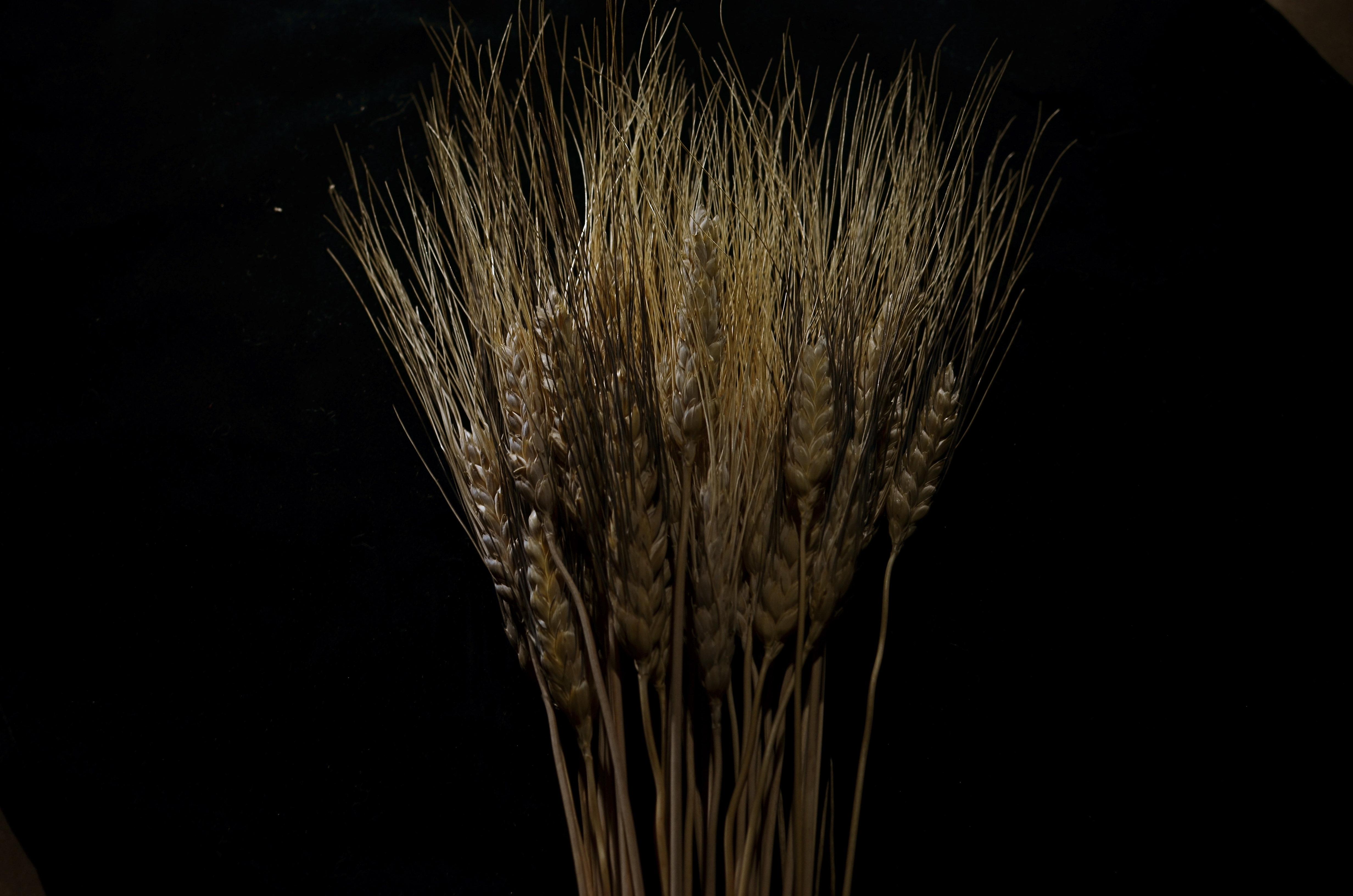
Shock-Top, 2014. Light-painted with a hand-held LED over the course of a six-second exposure, at f/5.6, ISO 100, 35mm.
To refresh, light painting refers to the selective handheld illumination of subjects for a particular look or effect. The path that your flashlight or LED takes across your subject’s contours during a tripod-mounted time exposure can vary dramatically, based on your moving your light source either right or left, arcing up or down, flickering it, or using it as a constant source. Light painting is different from the conditions of, say, a product shoot, where the idea is to supply enough light to make the image appear “normal” in a daytime orientation. Painting with light is a bit like wielding a magic wand, in that you can produce an endless number of looks as you develop your own concept of what the final image should project in terms of mood. It isn’t shooting in a “realistic” manner, which is why the best light painters can render subjects super-real, un-real, abstract or combinations of all three. Fact is, the most amazing paint-lit photos often completely violate the normal paths of natural light. And that’s fine.
In light painting, I believe that total darkness in the space surrounding your central subject is as important a compositional tool as how your subject itself is arranged. As a strong contrast, it calls immediate and total attention to what you choose to illuminate. I also think that the grain, texture and dimensional quality of the subject can be drastically changed by altering which parts of it are lit, as in the shock of wheat seen here. In daylight, half of the plant’s detail can be lost in a kind of brown neutrality, but, when light painted, its filaments, blossoms and staffs all relate boldly to each other in fresh ways; the language of light and shadow has been re-ordered. Pictorially, it becomes a more complex object. It’s actually freed from the restraints of looking “real” or “normal”.
Developed beyond its initial novelty, light painting isn’t an effect or a gimmick. It’s another technique for shaping light, which is really our aim anytime we take off our lens caps.
THE EYES (DON’T NECESSARILY) HAVE IT
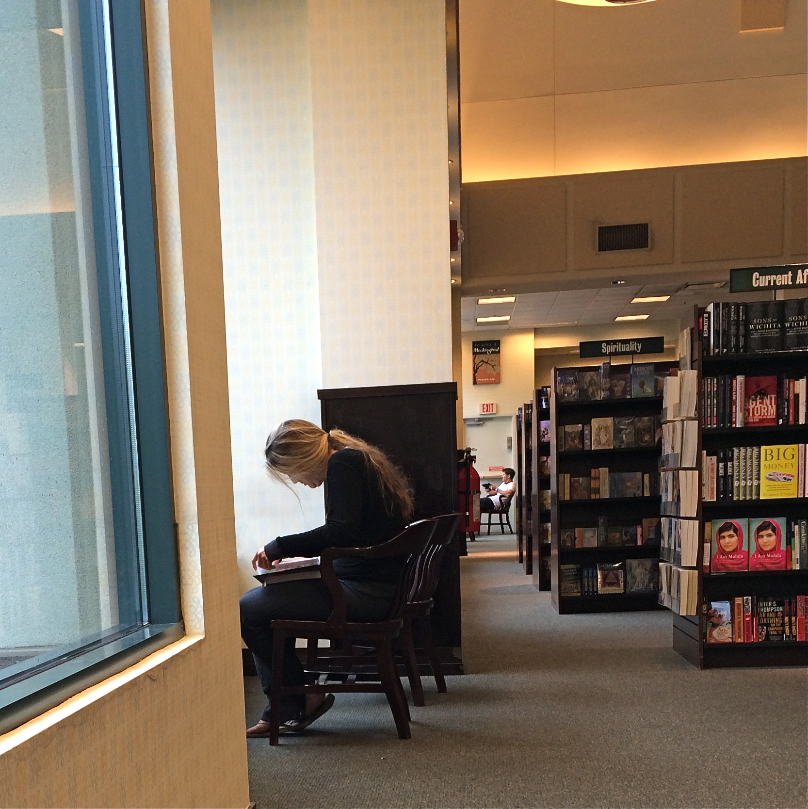
Reverie, 2014.
By MICHAEL PERKINS
A QUICK GOOGLING OF THE PHOTOGRAPHIC UNIVERSE THESE DAYS will turn up a number of sites dedicated to “faceless portraits”, if there can, strictly speaking, be such a thing (and I believe there can). In a recent post entitled Private, Not Impersonal, I explored the phenomenon in which photographers, absent the features that most easily chronicle their subjects’ personalities, imply them, merely through body language, composition, or lighting. At the time I wrote the post, I was unaware how widespread the practice of faceless portraits had become. In fact, it’s something of a rage. Hmm. The very thought that, even by accident, I could be aligned with something hip, is, by turns, both terrifying and hilarious.
Thing is, photographs, as the famous curator John Szarkowki remarked, both conceal and reveal, and there is nothing about the full depiction of a human face that guarantees that you’re learning or knowing anything about the subject in frame. We are all to practiced at maintaining our respective masks for many portraits to be taken, ha ha, at face value. Cast your eye back through history and you will find dozens of compelling portraits, from Edward Steichen’s silhouettes of Rodin to Annie Leibovitz’ blurred dance photos of Diane Keaton, that preserve some precious element of humanity that a formal, face-on sitting cannot deliver. Call it mystery, for lack of a more precise word.
In the above frame, the subject whose face I myself never even saw gave me something wonderfully human, about reading in particular, but about enchantment in general. She is furiously busy discovering another world, a world the rest of us can only guess at, seeping up from her book. Her entire body is an inventory of emotional textures…of relaxation, attentiveness, of both being in the present and so completely someplace else. Framing her to include the negative spaces of the window, the carpet and the wider bookstore isolate her further from us, but not in a negative way. She wants to be apart; she is on a journey.
My “girl with the flaxen hair” was unaware of me, and I shot furtively and quickly to make sure I didn’t break the spell she was under. It was the least I could do in gratitude for a chance to witness her adventure. Looking back, I think she provided more than enough magic without revealing a single fragment of her face. Seeing is selecting, and I had been given all I needed to do both.
Click and be gone.
PENCIL LINE, INK LINE
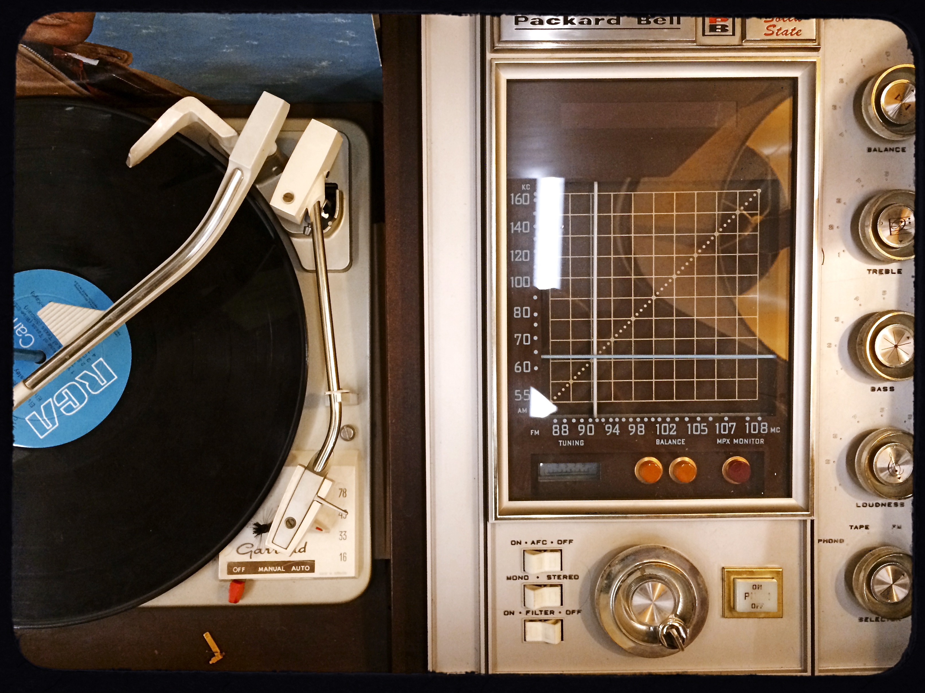
True Stereophonic Reproduction, 2014. Shot on the fly with an iPhone at my favorite junk store.
By MICHAEL PERKINS
MY FATHER, AS A GRAPHIC ARTIST, USED TO WARN ME ABOUT COMMITTING MYSELF TOO EARLY. Not in terms of personal relationships, but as it applied to the act of drawing. “Always lay down all your potential pencil lines first”, he advised, “and then decide which ones you want to ink.” The message was that flexibility was as valuable a drafting tool as your 2H pencil or your Rapidograph pen, that delaying your final vision often helped you eliminate the earlier drafts and their respective weaknesses. I still value that advice, as it has a current corollary in the making of my photographs, largely as a consequence of the smartphone revolution.
Once phones began packing cameras that could actually deliver an image better than a Crayola shmear on a wet cocktail napkin, photographers who still chiefly relied on their traditional cameras suddenly had the luxury of a kind of optical “sketch pad”; that is, an easy way to pre-visualize a composition with a basic machine that you could use for a study, a dress rehearsal for a more precise re-imagining with a more advanced device. For many of us, the larger display area of a phone can often “make the sale” for a shot in a more compelling way than the smaller monitor on our grown-up camera, and, at the very least, we can judge how a photo will “play” less conspicuously than by lugging about more visually obvious hardware. It’s a fast way to gather a lot of preliminary ideas, especially in locales where you’re free to come back later for the serious shoot.
I especially like trolling through vintage stores, trying to find antique items that, in themselves, make for impromptu still-life subjects. Sometimes, to be honest, I go home with a pocket full of puckey. Sometimes, I decide to go back and do a more thorough shoot of the same subject. And sometimes, as in the above image, I decide that I can live with an original “sketch” with just a little post-tweaking. The exercise does one important thing, in that it reminds you to always be shooting, or at least always thinking about shooting.
I know people who have completely stopped even carrying DSLRs and other, more substantial gear in their everyday shooting, and, while I can’t quite get there yet, I get the idea on many levels. Hey, use a fine stylus, a sharp crayon, or a charred stick, dealer’s choice. Just get the sketch.
GO OUT AND COME BACK IN AGAIN
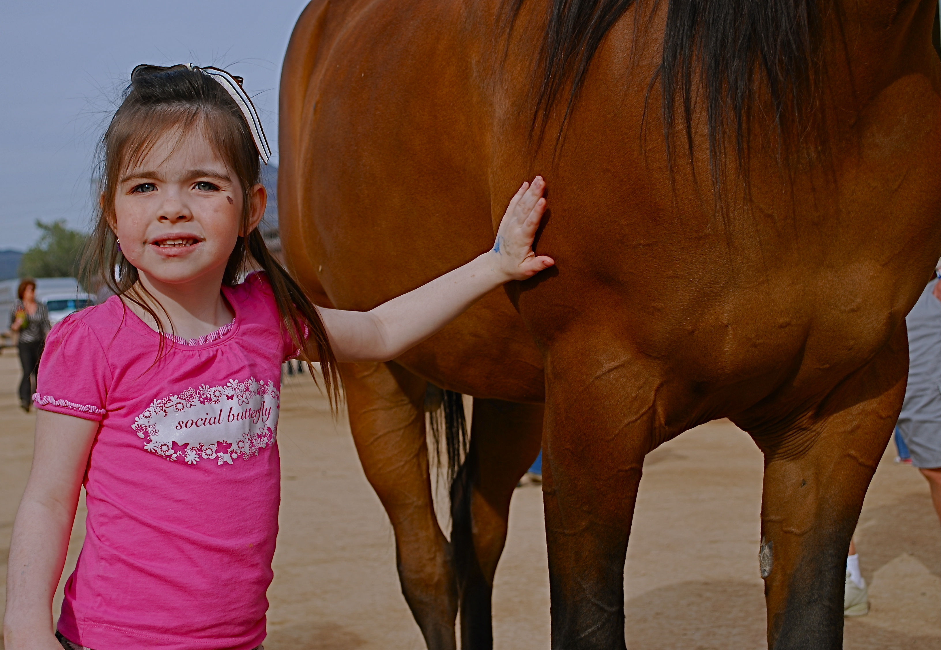
Thought the cute kid would be what this picture was “about”. Guess I was wrong.
By MICHAEL PERKINS
SEPARATING ONE’S IMAGES INTO “HIT” AND “MISS” PILES is always painful, since it’s kind of like telling some of your kids that they will be power hitters in Little League while their siblings should take up…well, macrame. But self-editing, over time, is nearly as important as shooting, and the mindfulness of asking “what was I thinking” is the useful corollary to “what do I want to do next?” That don’t make it smart any less, but at least you understand the pain.
Usually I hurl photos into the “miss” box for purely technical reasons, which means that I should have known what to do and just blew it upon execution. I’m more exacting nowadays, because present-era camera make it tougher to absolutely boot a shot, although I have striven to stay ahead of the curve and make lousy pictures even in the face of rapidly advancing technology. People who think they’ve idiot-proofed their gear have never met this idiot, I boast. It’s a point of pride.
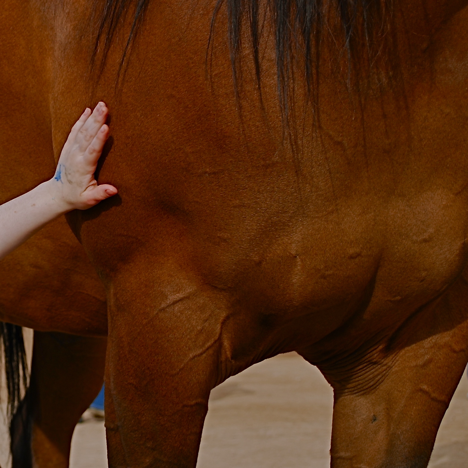
Cropping the image got to the main impact point lurking within.
Occasionally, though, you review a shot that was okay exposure-wise, but completely got the narrative wrong. Sometimes you can recompose the shot and redress this problem, and sometimes you’re just sealed out of the airlock with no oxygen. That’s the breaks. In the original image at the top of this page is a candid of a little girl next to a horse that I thought would be charming. Cute kid, nice horsie, you get the picture. Problem is, I never really captured her essence in any of the photos I shot (trust me) and I framed so tight that I was only showing the horse’s body. First verdict on this one: thanks for playing our game, sorry to see you go, here are some lovely parting gifts.
However, as a rainy day project, the photo suddenly presented a different way for me to go. It wasn’t that I had shown too little of the horse; it was that I had shown too much of both the horse and the child. The central part of the image, taken by itself, had a narrative power that the larger frame lacked. To crop so that just a part of the girl’s small arm connected with the strong, muscular torso of the horse magnified his power by contrasting it with her fragility. I wasn’t losing the horse’s face, since it hadn’t been in the original, and losing the girl’s face actually improved the impact of the image by reducing her to an abstraction, to a symbol of innocence, gentleness, but above all, contact. We could deduce that the horse and the girl were friends. We didn’t need to see it reflected in their features.
Sometimes an image we are ready to reject is hiding a more concentrated fragment that saves the entire thing, if we are unafraid to pare away what we once saw as “essential”. It’s the go-out-and-come-back-in-again school of thought. It’s at least a seeing exercise, and you gotta flex them eye and brain muscles at every opportunity.
DESTINATION VS. JOURNEY
By MICHAEL PERKINS
I HAVE A WANDERING EYE. Not due to muscular weakness or marital infidelity, but to a malady particular to long-time photographers. After decades of shoots big and little, I find that I am looking for pictures nearly everywhere, so much so that, what appears to many normal people to be formless space or unappealing detail might be shaping up in my mind as My Next Project. The non-obvious sings out ever louder to me as I age, and may find its way into my pictures more often than the Celebrated Scenic Wonder, the Historically Important Site or the Big Lights In The Sky that attract 99% of the photo traffic in any given locality. Part of this has to do with having been disappointed in the past by the Giant Whatsis or whatever the key area attraction is, while being delightfully surprised by little things that, for me, deserve to be seen, re-seen, or testified to.
This makes me a lousy traveling companion at times, since I may be fixated on something merely “on the way” to what everyone else wants to see. Let’s say we’re headed to the Great Falls. Now who wants to photograph the small gravel path that leads to the road that leads to the Great Falls? Well, me. As a consequence, the sentences I hear most often, in these cases, are variations on “are you coming?“, “what are you looking at?” or, “Oh my God, are you stopping again????”.
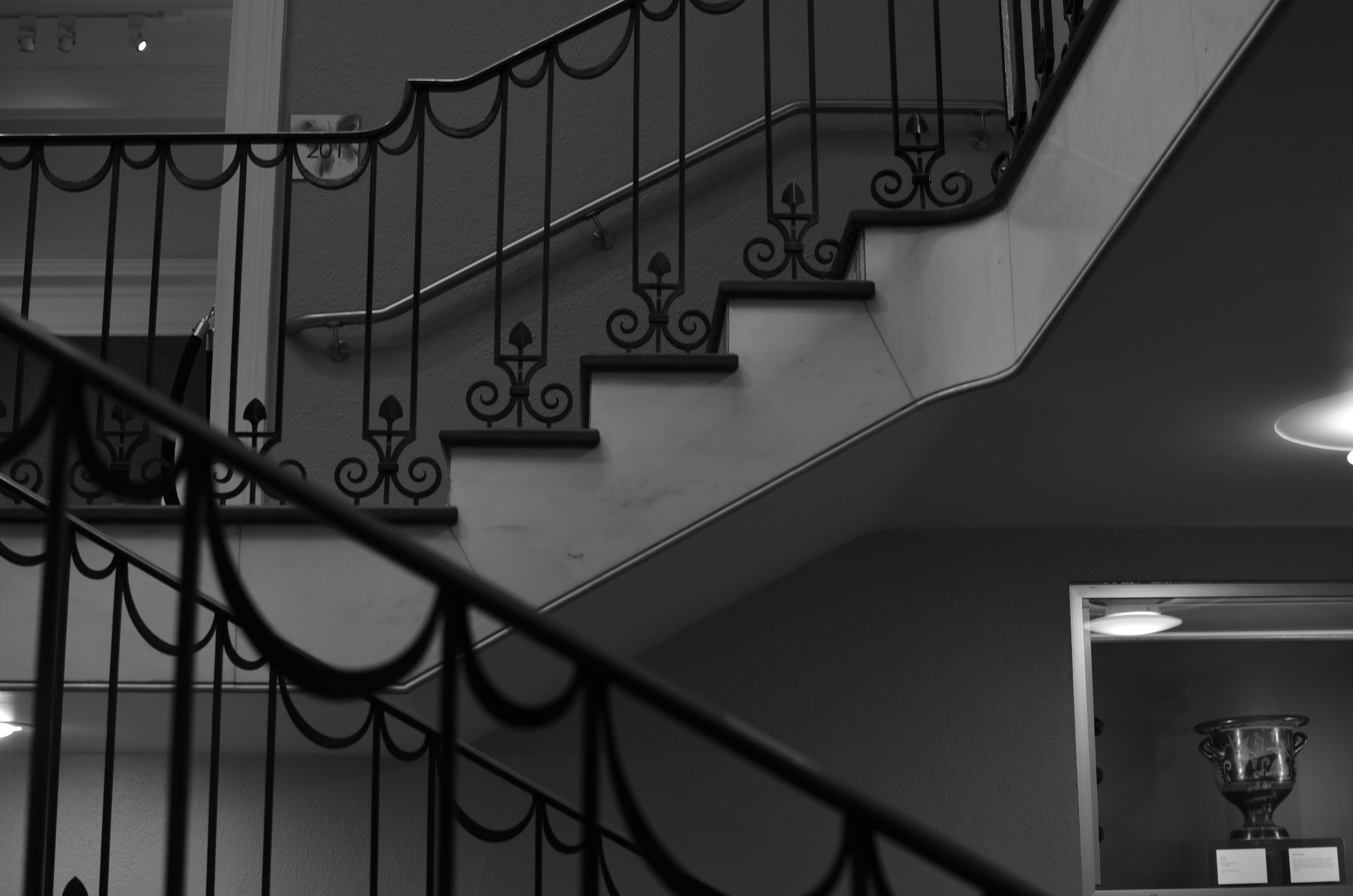
The Landing, 2014. 1/40 sec., f/3.5, ISO 320, 35mm.
Thing is, some of my favorite shots are on staircases, in hallways, around a blind corner, or the Part Of The Building Where No One Ever Goes. Photography is sometimes about destination but more often about journey. That’s what accounts for the staircase above image. It’s a little-traveled part of a museum that I had never been in, but was my escape the from gift shop that held my wife mesmerized. I began to wonder and wander, and before long I was in the land of Sir, We Don’t Allow The Public Back Here. Oddly, it’s easier to plead ignorance of anything at my age, plus no one wants to pick on an old man, so I mutter a few distracted “Oh, ‘scuse me”s and, occasionally, walk away with something I care about. Bonus: I never have any problem shooting as much as I want of such subjects, because, you know, they’re not “important”, so it’s not like queueing up to be the 7,000th person of the day doing their take on the Eiffel Tower.
Now, this is not a foolproof process. Believe me, I can take these lesser subjects and make them twice as boring as a tourist snap of a major attraction, but sometimes….
And when you hit that “sometimes”, dear friends, that’s what makes us raise a glass in the lobby bar later in the day.
SAME SHIFT, DIFFERENT DAY
By MICHAEL PERKINS
PHOTOGRAPHS OF PERFORMANCES ARE PERHAPS MY FAVORITE STUDIES OF THE HUMAN FACE. None of the self-conscious artifice or hesitant reticence of the standard portrait shoot are present when a player, be it a violinist or pianist, is fully inside the trance of creation. Call it rapture, call it focus, but something almost holy illuminates the features when people sing or play. All the awareness of their face as a mask melts away, as all mental energy surges to the task at hand. Their faces become some other thing, and I can’t resist trying to preserve that.
I recently had a chance to shoot two performances at the same part of the same museum about
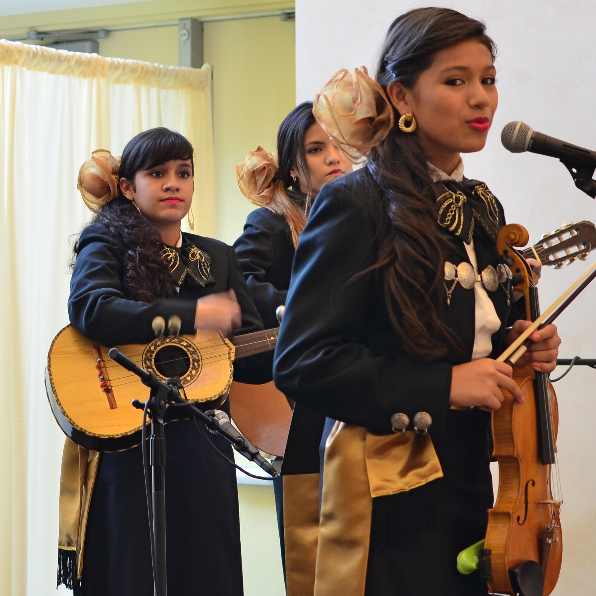
Shot with a 35mm prime lens and cropped. 1/50 sec., f/3.5, ISO 250, 35mm.
ten weeks apart. The first set of images were like walking barefoot through roses; everything worked. The second occasion, just a few days ago, was, by comparison, work, and frustrating work at that. The time of day for both sessions was the same, with mid-morning light entering the hall through cream-color curtains and softening everything to an appealing haze. My distance from the stage was also nearly the same on both days. What created the difference in my results, then, was my choice of lens, pure and simple. All of my “luck” came because the first lens was perfect for the task. All of my muttered oaths at the second occasion were due to how wrong my choice had been.
In the first case, exemplified by the mariachi band in the image at right, I used a 35mm prime, which
is simple, sharp and fast enough, at f/1.8 on the wide-open end, to give me enough light in nearly any situation. In the more recent shoot, I used a 300mm zoom, about the most opposite approach you could try. The lens cannot get any wider open than f/4.5, and shuts down all the way to f/5.6 when fully zoomed in, so, right off the bat, you’re starving yourself for light, especially in a room where most of it is behind the performers. I decided to try the 300 out of pure perverse curiosity, and from a sense of “what can I lose?”, which is a blessing, since, when the results don’t matter, you can try something, just to see what happens.
Well, I saw.
The light reduction with the 300 was more severe than I’d anticipated. Oh, sure, I could get really tight framings on the performers, but I was going to have to either slow my shutter speed to under 1/60 or jack the ISO up to undesirably high noise level, or, as it turns out, both. The contrast between light and dark was the first thing to take the hit, as tone registered in a muddy middle range with the zoom versus the sharply defined values I had gotten with the 35.
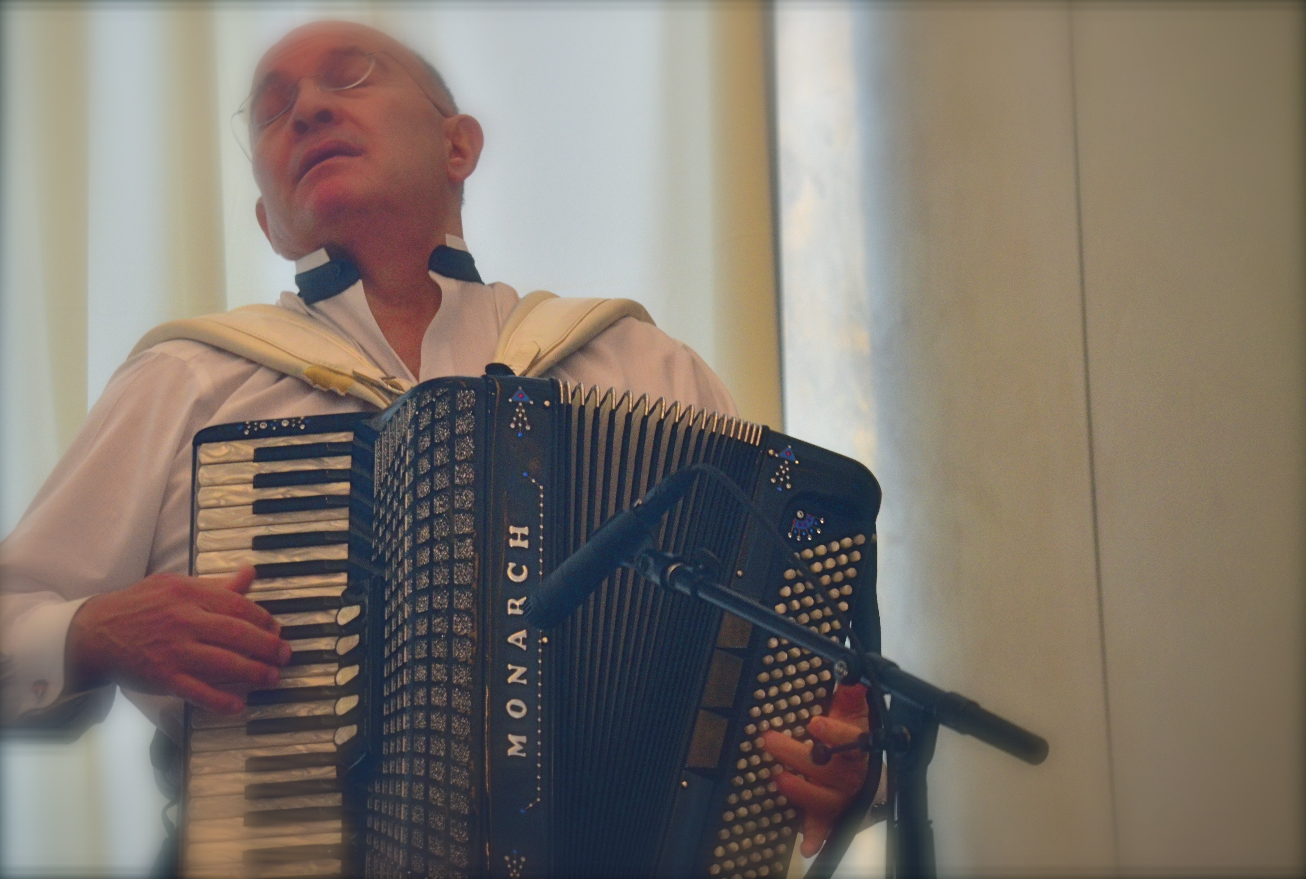
Same time of day, same room, but using a 300mm zoom. Haze added. 1/60 sec., f/5, ISO 1000, 180mm.
Then there was the overall softness of the 300, due largely to the small amount of camera shake on my part, which, in a zoom, is magnified several times over. In both cases, I got usable images, but whereas with the 35mm prime I had a kind of embarrassment of riches, the object with the zoom shoot was to salvage something and slave away like mad to do so.
I could easily have taken wider framed shots with the 35 (since it can’t zoom), then cropped them for tightness later, as I had on the first day. Instead, I got a lot of really tight shots of musicians that needed serious intervention to make them acceptable. But I want to emphasize that this is what experimentation is for. You put your hand on the hot stove, yell “OWWW!” and refrain from touching the hot stove in future. At the end of the second shoot, I had lost no money, no business, and very little time. That’s education on the cheap.
I don’t mind wearing the dunce cap every once in a while, if I know that, eventually, I’m going to end up in a fedora.
PRIVATE, NOT IMPERSONAL
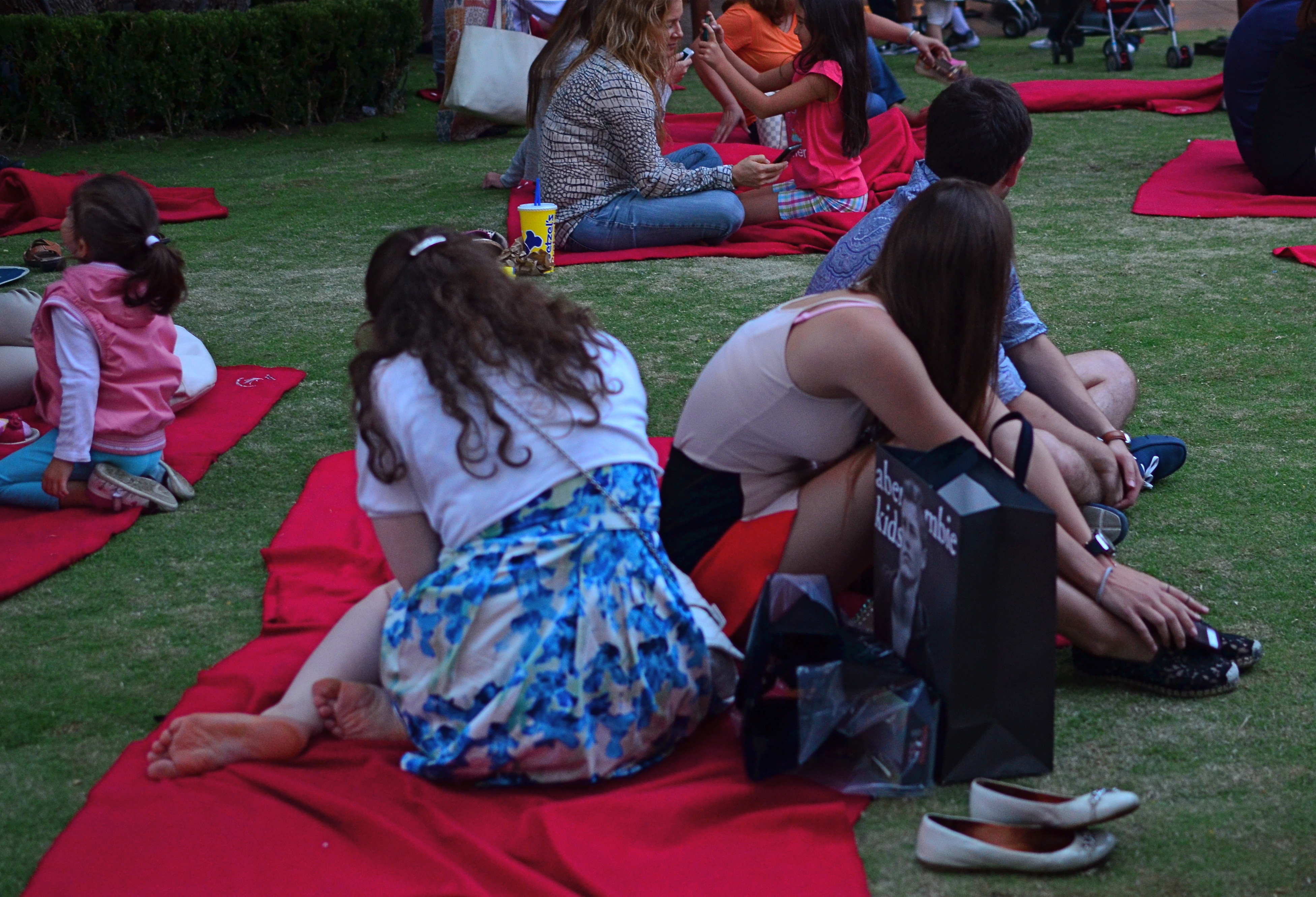
Dusk Concert, 2014. 1/40 sec., f/2.8, ISO 500, 35mm.
By MICHAEL PERKINS
PORTRAITURE IS RATHER NARROWLY DEFINED BY MOST PHOTOGRAPHERS as an interpretation of a person’s face, the place wherein we believe that most of his/her humanity resides. The wry smile. The upturned eyebrow. The sparkling eye. It’s all there in the features, or so we seem to profess by valuing the face over nearly all other physical features.We stipulate that there are notable exceptions where the body carries most of the message, as in crowd scenes, sports action, or combat shots. But for the most part, we let the face hold the floor (and believe me, after a few misspent nights, my face has held the floor plenty of times).
It’s interesting, however, in an age where privacy has become a premiere issue, and in which the camera’s eye never blinks, that we don’t explore the narrative power of bodies as much as we do faces. The body, after all, carries out the intentions of the mind no less than does the face. It executes the physical action that the mind intends, and so creates a space that reveals that intention. Just like a face. And yet, we have a decidedly pro-face bias in our portraiture, to the point that a portrait that does not include a face is thought by some not to be a portrait at all.

Side By Side, 2014. 1/160 sec., f/5.6, ISO 100, 55mm.
But let’s keep the discussion, and our minds, open, shall we? I love to work with random crowds, and I like nothing better than to immortalizing emotions in a nice face-freeze. However, I strongly maintain that, absent those obvious visual “cues”, a body can carry a storyline all by itself, even enhance the charm or mystery involved in trying to penetrate the personality of our subjects.
Consider for a moment how many amazing nude studies you’ve seen where the subject’s face is completely, even deliberately obscured. Does the resulting image lack in power, or does the power traditionally residing in the face just transfer to the rest of the composition?
Portraits (I insist on calling them that) that are more “private” for being faceless are no more “impersonal” than if the subject was flashing the traditional “cheese!” and beaming their personality directly into the lens.
Photography is not about always getting the vantage point that we want, but maximizing the one we have at hand. And sometimes, taking away a face also strips away a mask. But beyond that, why not actually court mystery, allow ourselves to trust our audiences to supply mentally what we reserve visually?
Ask yourself: what does a photograph of understatement look like?
REVENGE OF THE ZOO
By MICHAEL PERKINS
PURISTS IN THE ANIMAL PHOTOGRAPHY GAME OFTEN DISPARAGE IMAGES OF BEASTIES SHOT AT ZOOS, citing that they are taken under “controlled conditions”, and therefore somewhat less authentic than those taken while you are hip-deep in ooze, consumed by insects, or scratching any number of unscratchable itches. Editors won’t even consider publishing pics snapped at the local livestock lockup, as if the animals depicted in these photos somehow surrendered their union cards and are crossing a picket line to work as furry scabs .
This is all rubbish of course, part of the “artier-than-thou” virus which afflicts too great a percentage of photo mavens across the medium. As such, it can be dismissed for the prissy claptrap that it is. Strangely, the real truth about photographing animals in a zoo is that the conditions are anything but controlled.
We’ve all been there: negotiating focuses through wire mesh, dealing with a mine field of wildly contrasting light, and, in some dense living environments, just locating the ring-tailed hibiscus or blue-snouted croucher. Coming away with anything can take the patience of Job and his whole orchestra.Then there’s the problem of composing around the most dangerous visual obstacle, a genus known as Infantis Terribilis, or Other People’s Kids. Oh, the horror.Their bared teeth. Their merciless aspect. Their Dipping-Dots-smeared shirts. Brrr…
In short, to consider it “easy” to take pictures of animals in a zoo is to assert that it’s a cinch to get the shrink wrap off a DVD in less than an afternoon….simply not supported by the facts on the ground.
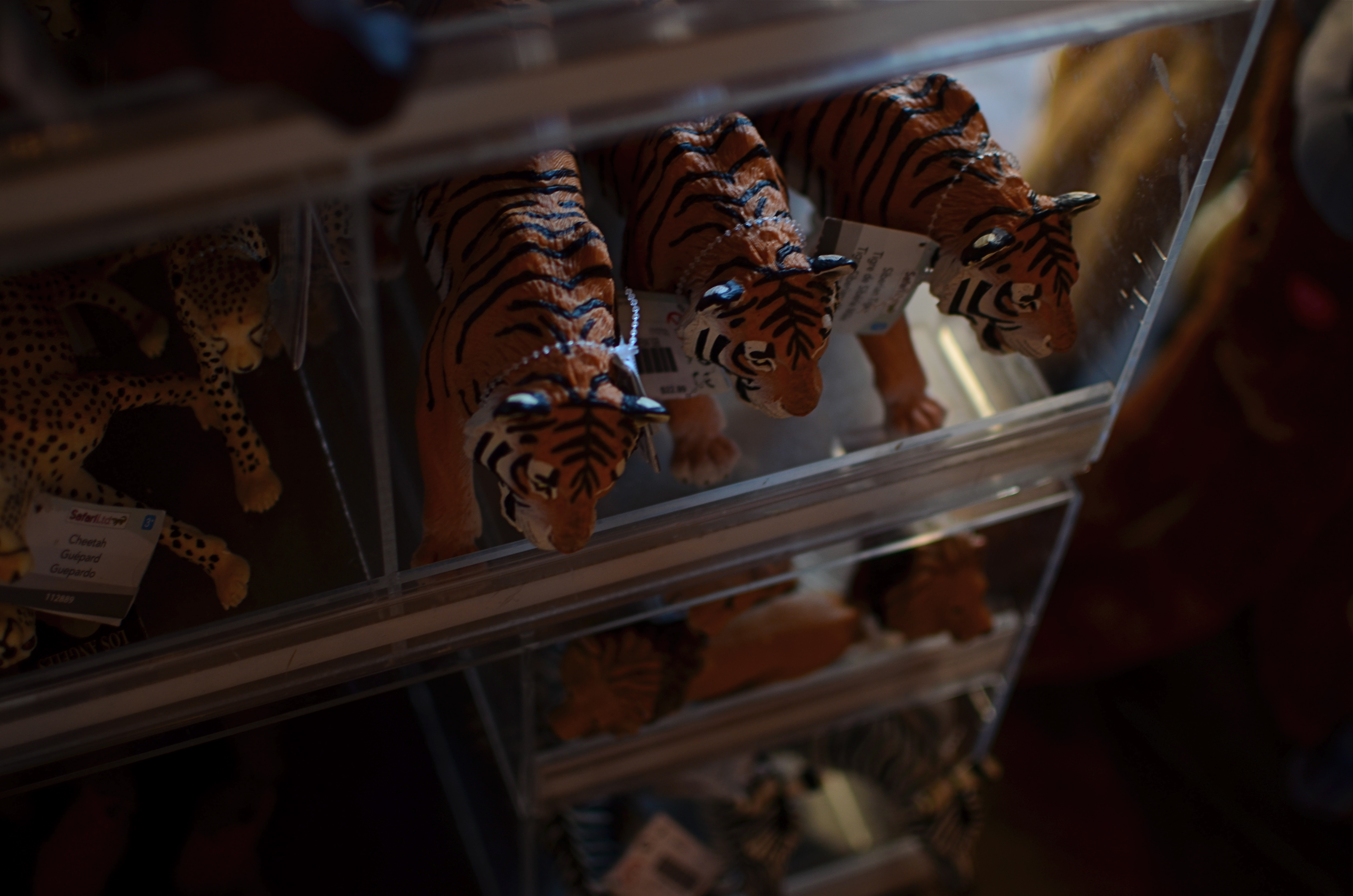
Captured live in the gift shop: 1/40 sec., f/2. ISO 100, 35mm.
So, no, if you must take your camera to a zoo, shoot your kids instead of trying to coax the kotamundi out of whatever burrow he’s…burrowed into. Better yet, shoot fake animals. Make the tasteless trinkets, overpriced souvies and toys into still lifes. They won’t hide, you can control the lighting, and, thanks to the consistent uniformity of mold injected plastic, they’re all really cute. Hey, better to come home with something you can recognize rather than trying to convince your friends that the bleary, smeary blotch in front of them is really a crown-breasted, Eastern New Jersey echidna.
Any of those Dipping Dots left?

