THE THIRD CHANNEL
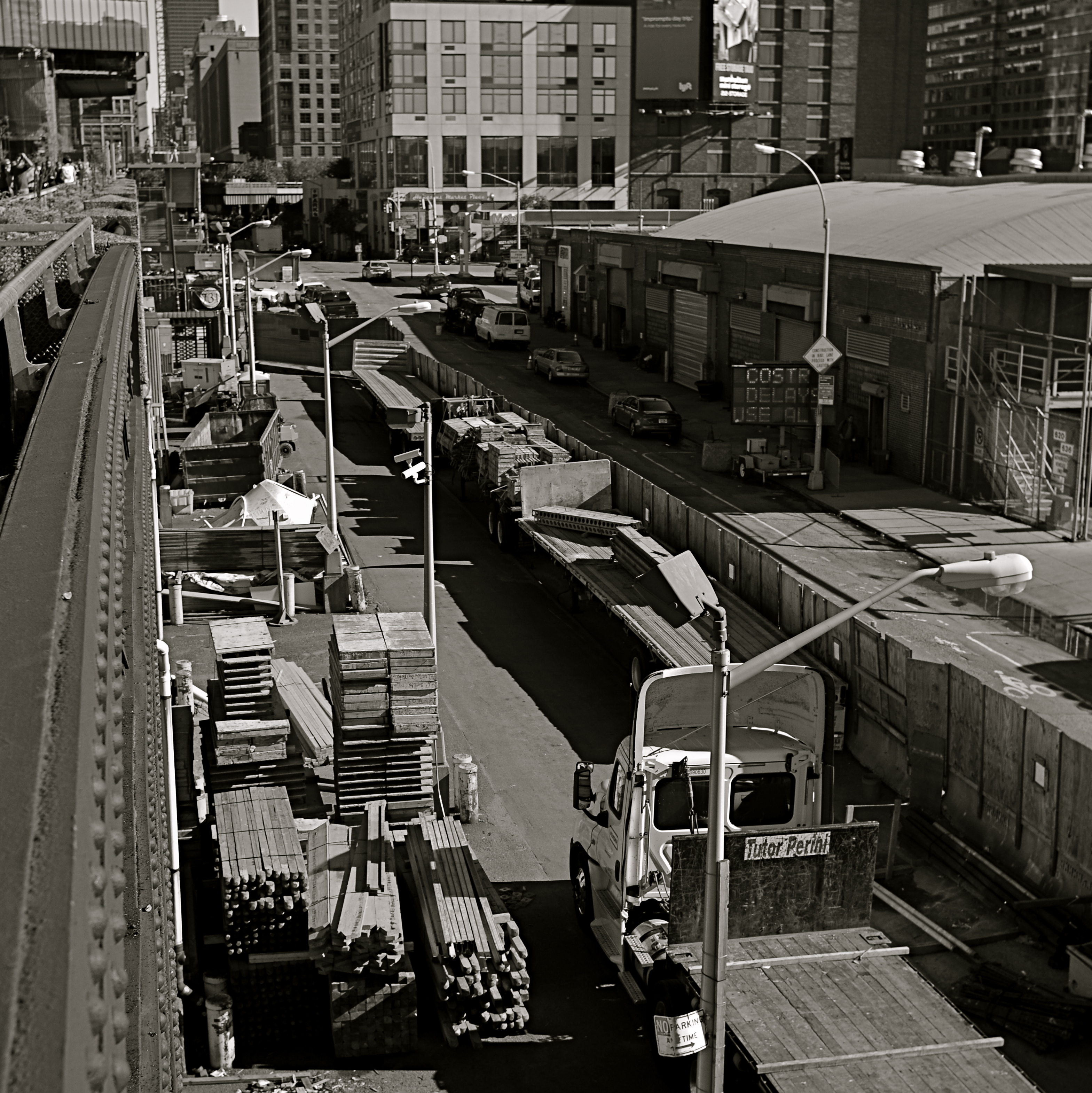
In a square framing, this warehouse district seems self-contained, isolated from the greater city around it.
By MICHAEL PERKINS
OVER THE HISTORY OF PHOTOGRAPHY, OUR CHOICES OF HOW TO PRESENT A PICTURE has changed as well as the means by which we shoot it. Certainly in the film era, sizes and formats shifted from square to landscape to portrait, and those shapes were reflected in the dimensions of the final prints or slides. You know, shoot it wide, print it wide. Somewhere between the waning days of prints and the first waves of pixels, however, the square nearly winked out for a while, and, with it, a particular way of composing a shot. Luckily, it’s back in full force.
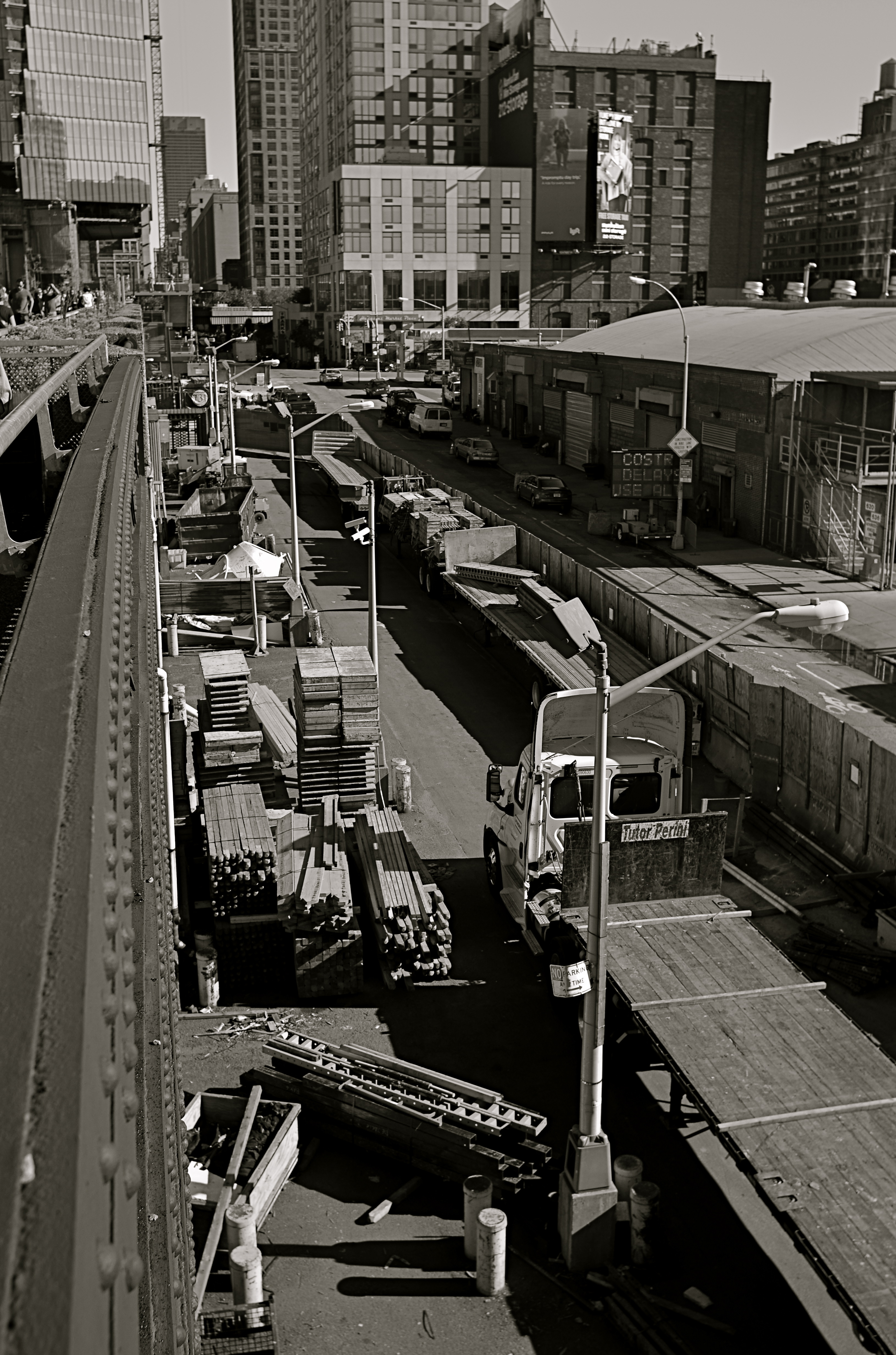
In the portrait-oriented original, extra buildings and street space dilute the impact of the cropped square.
It’s had help. Instagram and some retro-film cameras forced the square upon a new generation of shooters, and nearly all phones and phone apps readily offer it as a framing or editing choice. Strangely, manufacturers of DSLRs and other high-end cameras offer no option for shooting in square format, although they all include square cropping in their in-camera re-touch menus. This means that many photographers have to dream square but shoot otherwise, mentally composing the eventual square framing of their subjects in the moment, or even discovering, in edit sessions, that there is a decent square image inside their larger ones just waiting to be let out.
I have recently looked to deliberately edit in favor of the square, since I think that the format forces a kind of compact, centralized story-telling that might be diluted or weakened by wider or longer compositions. Looking at my initial landscape or portrait images, I ask myself if the entire force of the picture could be amped by squaring it off. Sometimes you think a shot calls for one orientation or the other, when the third channel of the square is actually a better tool. Hey, you can’t know everything at the moment of snap.
I do wish that DSLRs would routinely offer the chance to initially shoot in square, just as cheap hipster film cameras and phones already do. Not having every possible tool at your disposal seems wrong, somehow, and, with all the other gimmicks that are offered in higher-end cameras, from fake star twinkles to faux pencil-sketch effects, the inclusion of a third framing orientation just makes sense.
RUN WHAT YA BRUNG
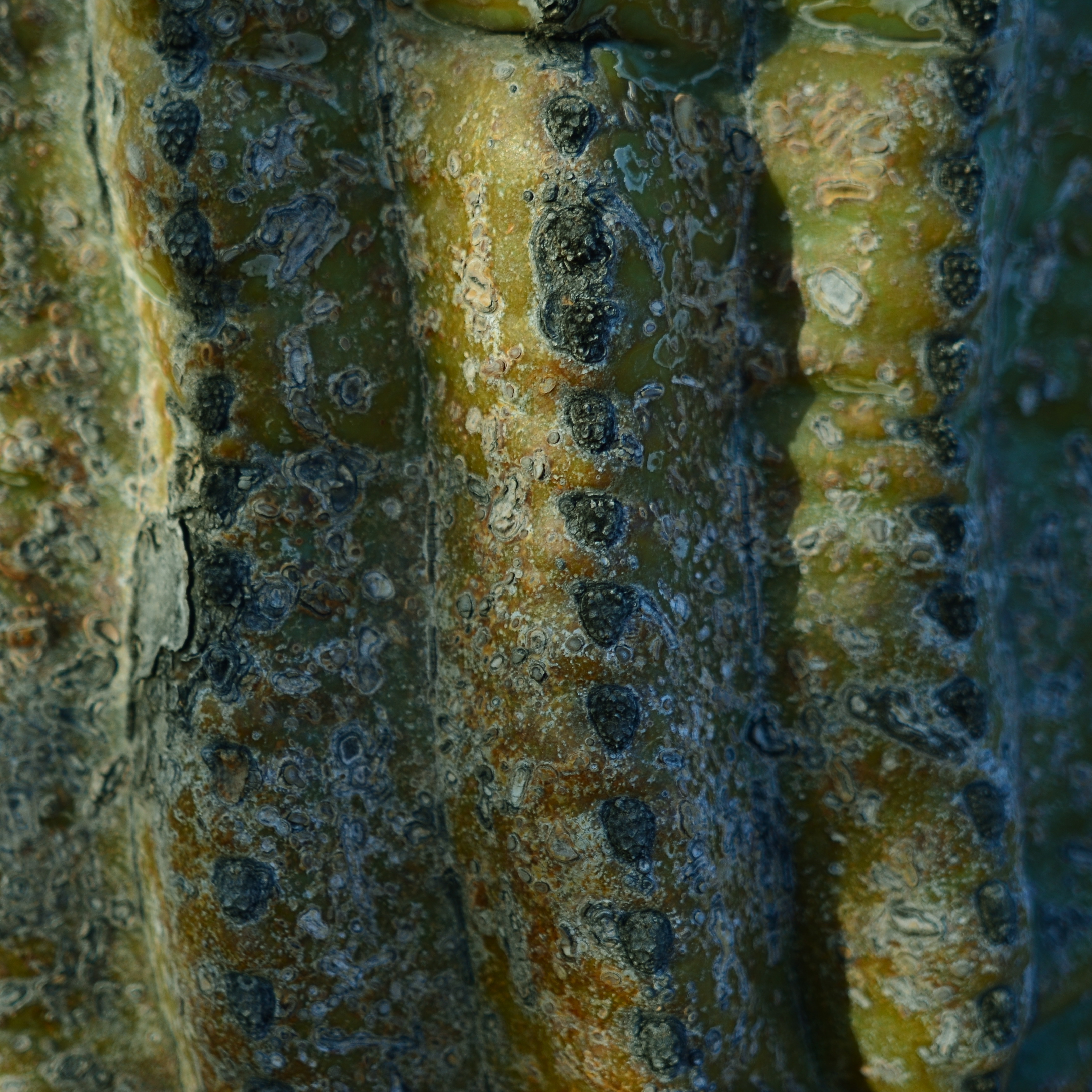
Didn’t bring a close-up or macro lens on this shoot, so had to ask my 24mm wide-angle to do double duty. And it could.
By MICHAEL PERKINS
NORMALEYE PHOTOGRAPHIC PARADOX No.346: You have to think hard about your equipment when you’re not shooting so that you don’t have to give much thought when you are.
Reacting “in the moment” to a photographic situation is often lauded as the highest state of human existence, and, indeed, the ability to see, and do, on the spot, can yield amazing results. But, in that marvelous inspirational instant, the smallest item on your checklist should be dithering about your gear. What it will do. What it can’t do. What you don’t know how to make it do. These are ruminations you run through when there’s no picture making going on.
Simply, the more you know about what you’ve taken to a shoot, the less creative energy will be drained off worrying about how to use it once you get there. You will get to the point where, for a given day’s subject matter, you take the wide lens, of course, or the macro lens, of course, or the portrait lens, of course. You’ll anticipate the majority of situations you’ll be in, and, unless you like driving yourself crazy, you’ll likely select one lens that will just about do it all. But whatever lens you select, you will want to know how much farther you can push it, as well. You know what you generally need it to do, but can it, in a tight spot, do a decent job outside its specialty? The answer is, probably yes.
One of my favorite lenses for landscape work is my ancient Nikkor 24mm f/2.8 prime. Nice and wide for most outdoors subjects, pretty fast for the close and dark stuff, and sharp as cheddar cheese in my most used apertures, especially the middle range, like around f/5.6. Can it do macro work, when I swing my attention from distant mountains to detail on a nearby cactus? Well, yes, within reason.
The minimum near-focus distance for this lens is about ten inches, more than close enough to fill a frame with the trunk of the saguaro with a little spare space to the right and left. I shoot in big files, so even with a post-op crop I preserve lots of resolution, and bang, the wide-angle does a respectable job as a faux macro.
I grew up around amateur race arenas which invited people to haul any old hunk of automotive junk to the track, to be run in so-called “run what ya brung” events. I personally hate to haul my entire optical array out on a project, swapping out glass for every new situation. I’d much rather save my neck and shoulder by calculating ahead of time which lens will do most of what I want, but be able to stand-in for some other lens in special situations. There are usually work-arounds and hidden tricks in even the most limited lenses. You just have to seek them out.
Run what ya brung.
FACE TIME
The resurrected World Trade Center, as seen at eye (rather than “craning neck”) level. 1/125 sec., f/5.6, ISO 100, 24mm.
By MICHAEL PERKINS
I AM OFTEN ASKED WHY ARCHITECTURE FIGURES SO STRONGLY in my photography, and I can only really put part of my answer into words. That’s what the pictures are for. I imagine that the question itself is an expression of a kind of disappointment that my work doesn’t focus as much on faces, as if the best kind of pictures are “people pictures”, with every other imaging category trailing far behind. But I reject that notion, and contend that, in studying buildings, I am also studying the people who make them.
Buildings can be read just as easily as a smile or a frown. Some of them are grimaces. Some of them are grins. Some of them show weary resignation, despair, joy. Architecture is, after all, the work of the human hand and heart, a creative interpretation of space. To make a statement? To answer a need? The furrowed brows of older towers gives way to the sunny snicker of newborn skyscrapers. And all of it is readable.
In photography, we are revealing a story, a viewpoint, or an origin in everything we point at. Some buildings, as in the case of the first newly rebuilt World Trade Center (seen above), are so famous that it’s a struggle to see any new stories in them, as the most familiar narratives blot the others out of view. Others spend their entire lives in obscurity, so any image of them is a surprise. And always, there are the background issues. Who made it? What was meant for it, or by it? What world gave birth to this idea, these designs, those aims?
Photography is about both revelation and concealment. Buildings, as one of the only things we leave behind to mark our having passed this way, are testaments. Read their faces. No less than a birthday snapshot, theirs is a human interest story.
S.O.O.C….and S.O.W.H.A.T.
By MICHAEL PERKINS
IF YOU REGULARLY POST IMAGES TO PHOTO SHARING SITES, you will no doubt have come upon groups or albums labeled S.O.O.C., or Straight Out Of The Camera, pictures that purport to have transitioned seamlessly from shutter click to social post without being further touched by human hands. The fact that such a designation even exists says something about how we see the creative process, or what we deem as “pure” about it.
The raw math of photography dictates that only a micro-percentage of your total work will actually come fully formed from your camera, emerging, as Athena did, intact from the forehead of Zeus. Rather, the majority of what we shoot is re-shot, re-thought, shaped, edited, and re-combined before we put a gold frame around it, which only makes sense. Photography is a process, not just a recording product. We grow into a better understanding of our best shots no less than our worst ones. That means that clinging to “straight out of the camera” as some kind of badge of excellence or ideal is counter-intuitive to the idea of photography as an organic art.

Yes, this shot delivered almost everything I was aiming at, but that don’t mean it’s “Straight Out Of The Camera.” Read on….
More simply, any so-called “perfect” pictures we create in the moment are a mixture of luck as well as talent, of chance as well as design. To slap a collective S.O.O.C. label on all such fortunate convergences of cosmic fortune is to think of that “flawlessness” as an end unto itself. Does the fact that you didn’t further mold an image after shooting it render it better, more authentic somehow, than one which was later manipulated or massaged? What gets the gold star, the best complete realization of a picture, regardless of the number of intermediate steps, or the bragging rights associated with blind luck? Case in point: in the above image, I did, indeed, get nearly everything I wanted out of the picture, but it was also the 15th frame I shot of the subject before I was even partly satisfied, so how “straight out” is that??
And what of the photographs that are less than “perfect” (according to whom?) from a technical standpoint? Can’t an underexposed or ill-focused shot contain real impact? Aren’t there a number of “balanced” exposures that are also as dull as dishwater? Moreover, can’t a shot be improved in its power after being re-interpreted in processing? The straight-out-of-the-camera designation is either meaningless, or sends completely the wrong message. Creativity seldom moves in a straight line, and almost never comes fully realized in its first form. Photography’s aim should never be to aim for an easy lay-up from mid-court, and labels that suggest that lucky is the same as eloquent do the art a disservice.
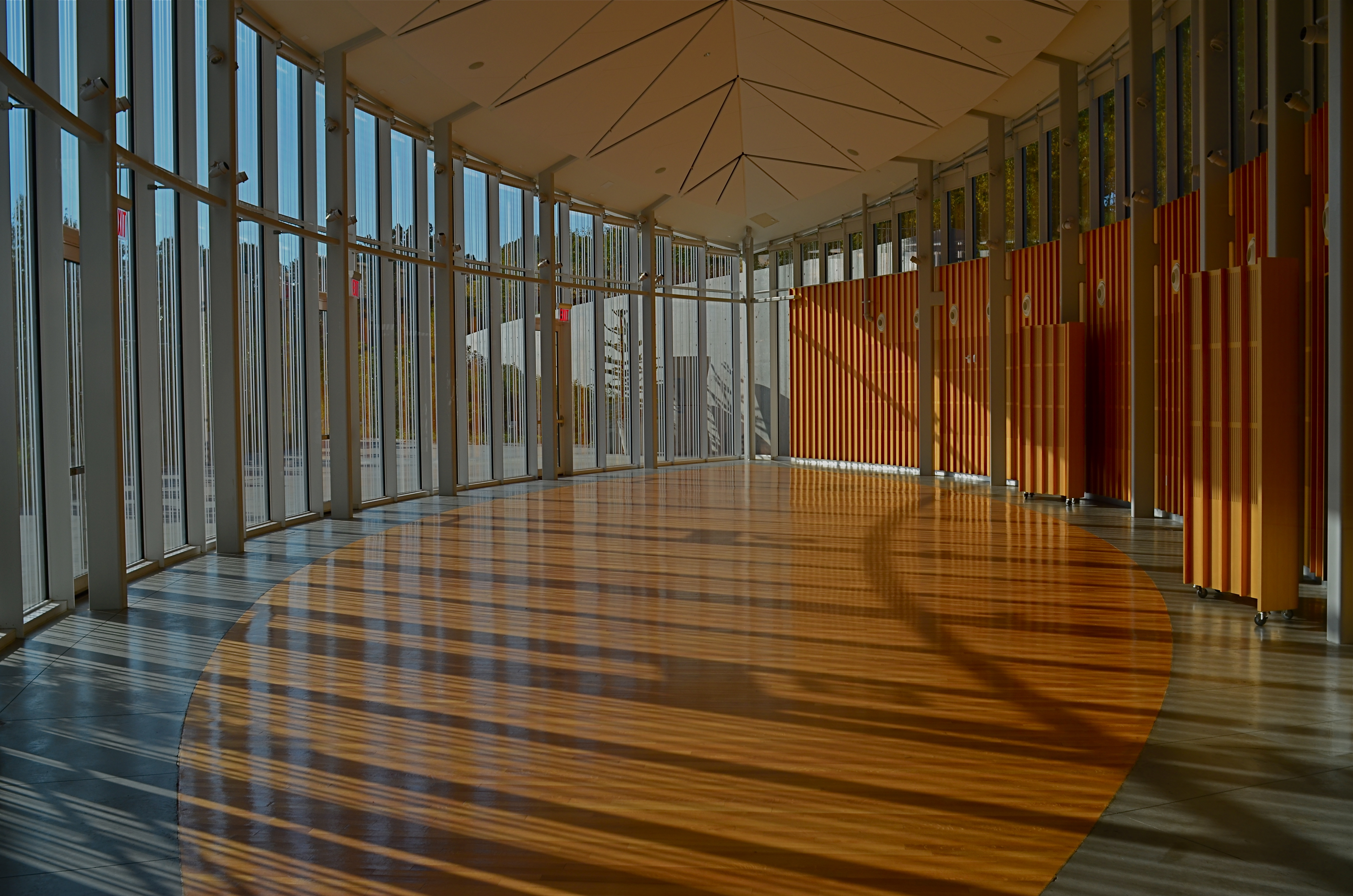
WIDE, WIDE WORLD(S)
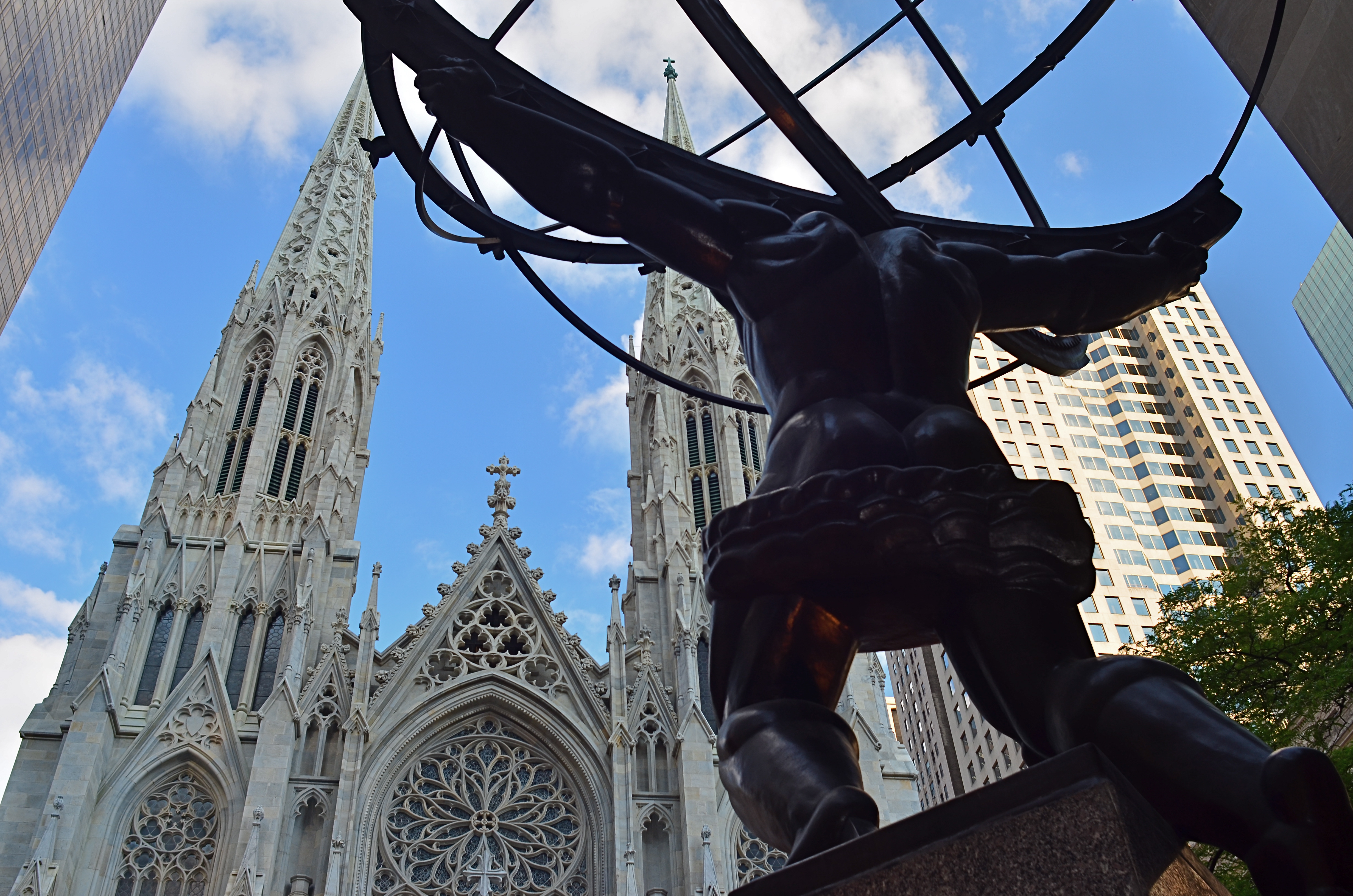
Shooting from a low crouch with a 24mm ultra-wide jacked up the natural drama of this shot to a greater, almost excessive degree.
By MICHAEL PERKINS
ULTRA-WIDE LENSES HAVE ALMOST BECOME AN UNAVOIDABLE CLICHE for people shooting in the streets of large cities, both for the great things they allow and the uber-excesses that they enable. There is, of course, a real practical benefit in being able to create an amped-up sensation of front-to-back space or side-to-side expanse while you yourself are limited in where you can stand or move. For example, if your back is crimped against a building, so that you can’t dolly backward, having the lens provide the extra width you need is great. If you’re pointing up for emphasis, the lens’ distortion of straight lines can be dramatically abstract, depending on the look you’re going for. All to the good.
Of course, depending on your selection of angle, you can get things so bendy and bizarre that you can induce motion sickness in your viewing audience, with towers and spires inclining sideways as if they about to topple to the street. Again, you have to decide what look you want: it’s not just about tilting the frame until you can “get everything in”. That’s shoveling, not shooting.
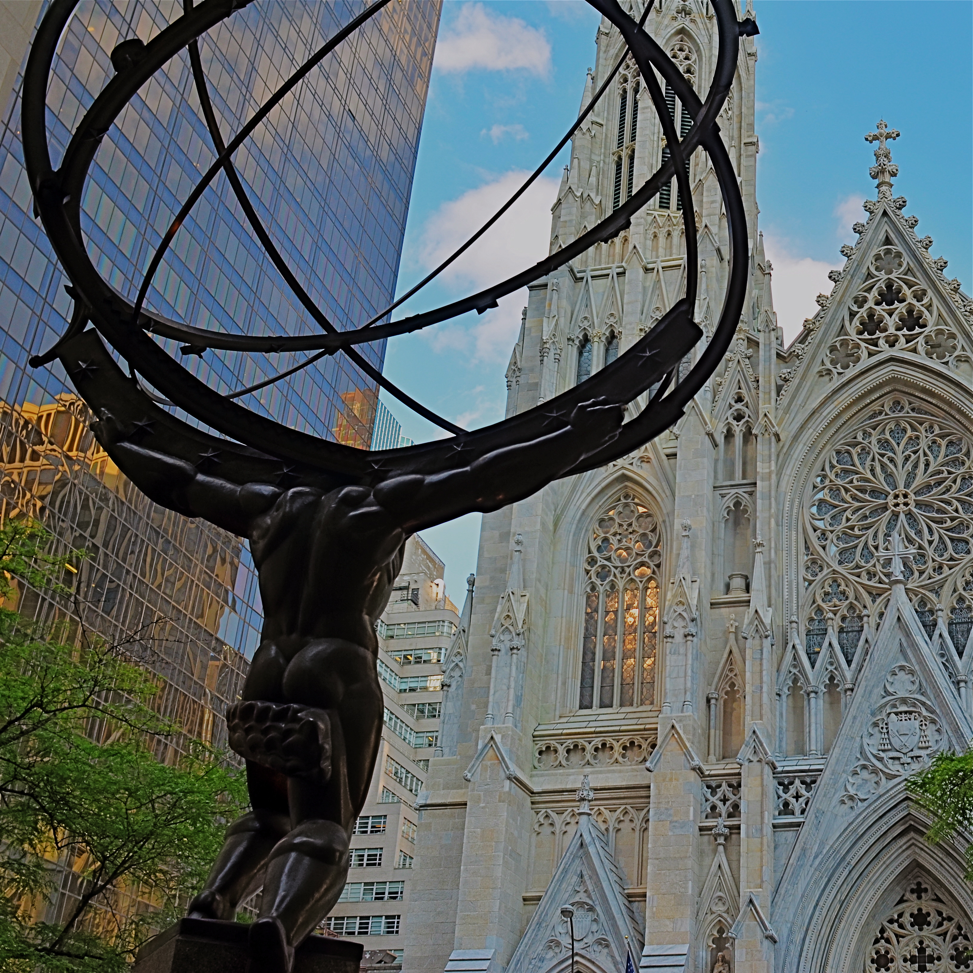
Just inches away from the framing of the earlier shot, same 24mm lens. What’s different is the shooting angle.
The thing to remember about ultra-wides in the city is how little re-framing it takes to get both the drama you want and at least a semblance of normal proportions and angles. As with almost every other situation, the salvation is in shooting a lot of coverage of a subject. Attack it from all angles and sides. You can’t know in the moment exactly what will work best…you’re working too quickly in a crowded, active environment. So walk around, attack it from all sides, and sort out the keepers later.
In the shot at the top of the page, I was interested in shooting Paul Manship’s magnificent “Atlas” sculpture, located along the Fifth Avenue edge of Rockefeller Center, from the rear, to accentuate the amazing musculature of the figure and get him in the same frame as the front of St. Patrick’s Cathedral. Now, there’s already plenty of drama in the statue’s pose as is, but in the first photo, I angled the lens further upward to get an even bigger arc of action. In the lower image, I simply changed the up-down angle of the same 24mm lens I was using to get angles that were a bit more normal. Two different effects, just inches away from each other in approach and angle, but markedly different in result. Which one’s the keeper? Not my argument and not my problem. However, if I don’t shoot both images, I don’t get to make the choice.
Once more, the advantage of digital is pronounced. You can now shoot everything you think you might need. We’re not counting “roll” exposures in our heads any more. We can’t “run out of film”, so click away. Shoot it all while you’ve got it in front of you and throw everything you know how to try at the problem at hand. The bad pictures will speed the arrival of the good ones.
LAUNCH DAY
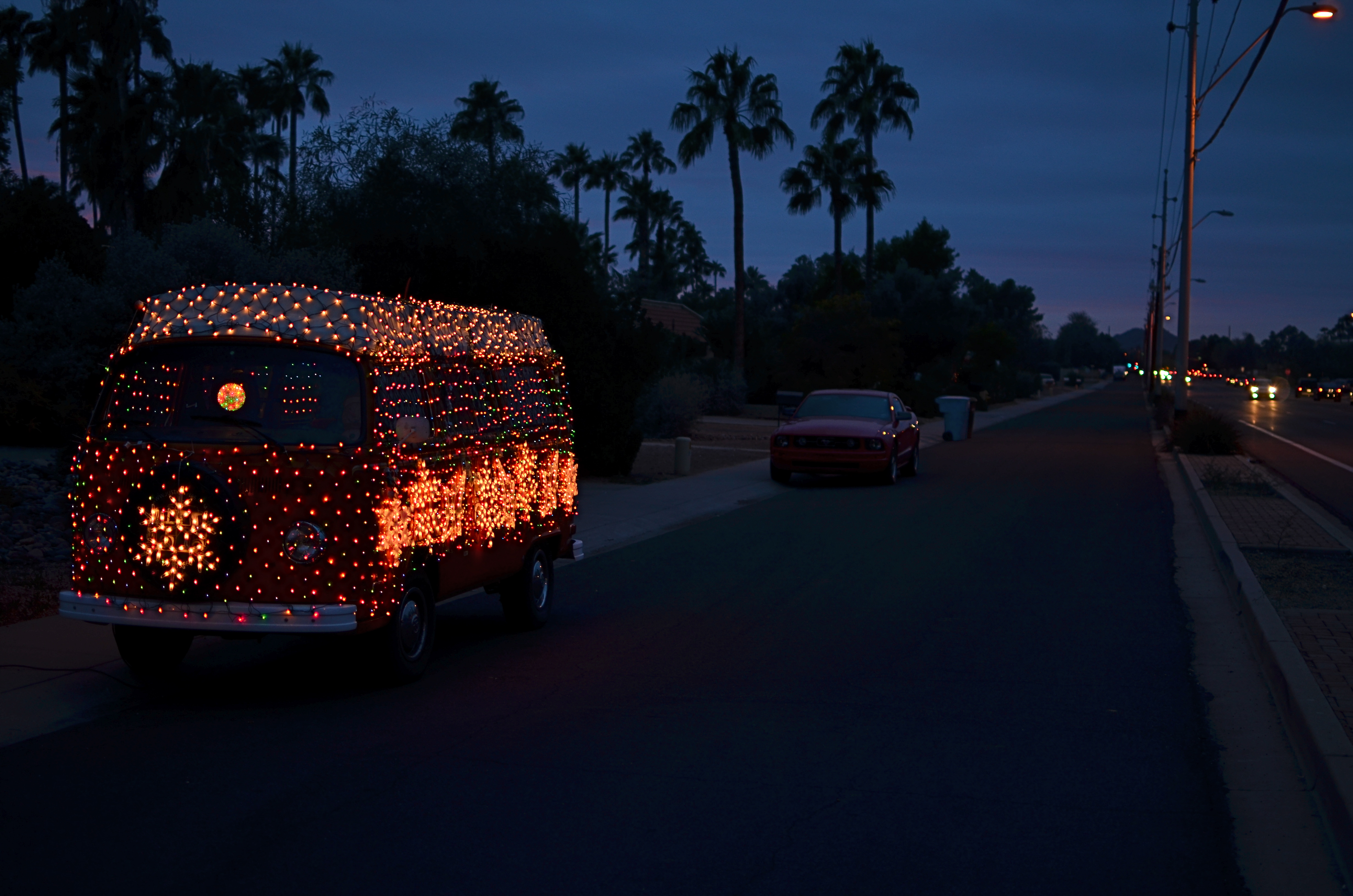
The journey of a million photos begins with a single snap. Phoenix, Arizona, December 22, 2015.
By MICHAEL PERKINS
GIVEN THAT FAMILY HOLIDAYS ARE THE MOST OBVIOUS AND LONG-STANDING of motivations for capturing images, it would probably be safe to guess that Christmas Day has launched more photographers, over the decades, than any other single date on the calendar. Not that we ever had much choice.
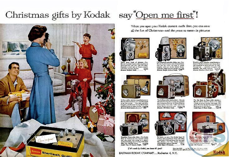
As the world’s first super-sized photo gear supplier, the Eastman Kodak Company had barely tiptoed into the 20th century when it began to craft ad campaigns that tied the Happiest of Days with the Best Way To Make Memories. Print ads encouraged families not to merely experience holiday joy but to freeze-frame it with a camera. Don’t have one yet? What a great gift idea! See our full-color flyer…
Mom looks pretty put-together for five in the morning. Great shot of the matching pajamas..and guns.. for the kids.
About a year ago, I began an annual tradition in December posts of The Normal Eye by showcasing color magazine ads from Kodak’s longest-running promotion, the “Open Me First” campaign of the 1950’s and ’60’s, which put forth the idea that the good times can’t really start unless (a) you’ve received a Kodak camera for Christmas, and (b) loaded it and used it to chronicle all the other “ordinary” presents as they’re unwrapped. The ads always gave you an additional nudge by showing Dad or Mom snapping away as the kids tore into their loot, along with a mini-catalogue photomontage of Kodak’s latest year-end offerings. Remember slides and movies? Heck, remember prints?
This year, I’m also linking to one of the company’s most heartwarming TV ads of the period, entitled “Turn Around”. Watch it here, and, I warn you, keep the Kleenex close. You’ll need it.
My first camera was also a Christmas gift, and while that doesn’t count as a legitimate “birth of a great photographer” origin story, it did serve as launch day on a habit that has never ceased to thrill, surprise, and challenge me. Without that first little 620 box camera, I might be filling the pages of this blog with thrilling stories of Marlins I Reeled In Off The Keys or Great Wood-carvers I Have Known. As it turns out, I’m pretty happy right here.
Merry Christmas.
THE GENTLE WELCOME
By MICHAEL PERKINS
But soft! What light through yonder window breaks? —Shakespeare
OKAY. AS IT TURNS OUT, IN THE ABOVE LINE, ROMEO WAS ACTUALLY RHAPSODIZING about his main squeeze, rather than ideal photographic conditions. Still, I often think of the quote when a sudden shaft of gold explodes from behind a cloud or a sunset lengthens shadows, just so. I have lots of But, soft! moments as a photographer, since light is the first shaper of the image, the one element that defines the terms of engagement.
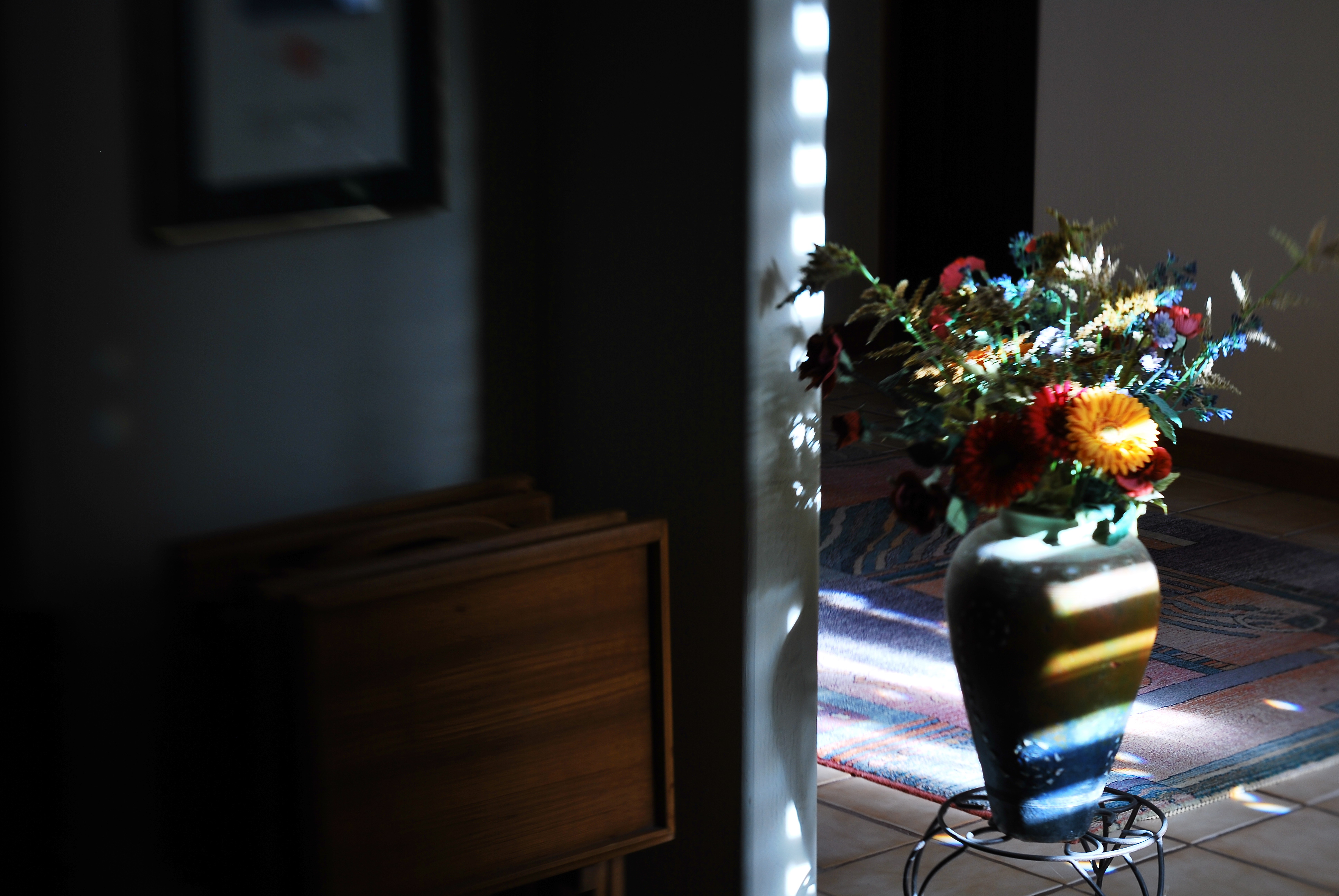
Selective focus on the cheap: image made with the economical Lensbaby Spark lens. 1/40 sec., f/5.6, ISO 100, 50mm.
After light, for me, comes focus. Where it hits, where it peaks, where it falls off, and how all these aspects shape a composition. Soft or selective focus especially seems more intimate to me, a gentle welcome to share something special between picture and viewer. In recent years, focus has become almost as fine-tune-able as light itself, with the introduction of new, affordable alternatives to expensive “tilt-shift” lenses, which allow the selective blurring of elements within the frame. For example, the revolutionary Lensbaby products are now helping shooters make their own choices on where the focal “sweet spot” should occur in a picture, and at a fraction of the cost of a true tilt-shift. It’s a fiscal shortcut that makes it possible for almost anyone to learn how to create this effect.
Focus on the Lensbaby Spark is achieved by squeezing the lens bellows until focus registers wherever you want to place it.
Some Lensbabies can run to several hundred dollars and have precise systems for dialing in the part of a photograph that will, through sharp focus, attract optimum attention to a subject, gently blurring the image on all sides around that point. However, for those with steady fingers and shallow pockets, the company’s gateway drug, coming in at around $90, is the Lensbaby Spark, a springy bellows lens that snaps onto your DSLR in place of a regular lens and can be compressed around the edges to place the focal sweet spot wherever you want it.
The Spark takes more muscle control and practice than the more mechanical Lensbaby models, but it’s a thrifty way to see if this kind of imaging is for you. Just squeeze the fixed f/5.6, 50mm lens until the image is sharp at the place you want it, and snap. Some DSLRs allow the Spark to be used on aperture priority, but for most of us, it’s manual all the way, with a lot of trial-and-error until you develop a feel for the process. The company also sells several insert cups so that you can choose different apertures. Pop one f-stop out, pop another one in.
For those of you who like to custom-sculpt focus and light, the gauzy, intimate effect of the Lensbaby will in fact be a gentle welcome. Finally, it’s one more component that could be either toy or tool. Your shots, your choice.
YESTER-ESSENTIALS
By MICHAEL PERKINS
ONE OF THE MOST REMARKABLE POP CULTURE TRENDS OF THE PAST FEW YEARS has been the improbable reemergence of the vinyl LP, inching its way back onto shelves in edgy fashion boutiques and chain stores alike along with an entire battery of support materials: preeners, cleaners, racks, boxes, even the iconic hippie fruit crate, along with a new generation of high-and-low tech turntables and speakers. It’s fun to watch the emotional re-run that people of, ahem, a certain age will experience as we recall a world that used to be divided into Side One and Side Two.
However, we’ re missing out on a very important part of all that lore. The humble 45 rpm record.
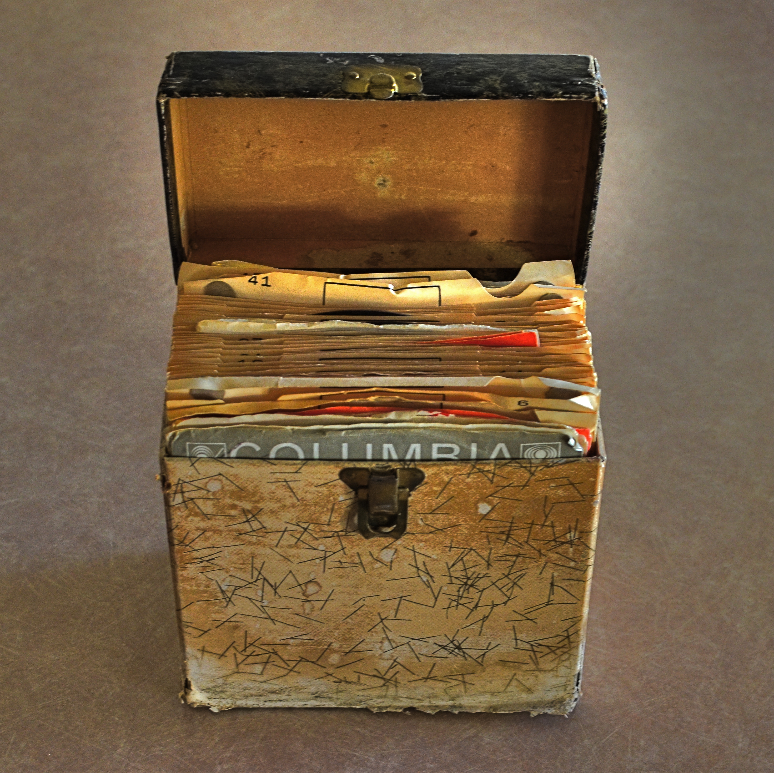
Party On, Garth: A pseudo-HDR made with two copies of the same starter exposure, blended in Photomatix.
Singles were the dominant format for record sales from the beginning of rock to the mid-’70’s, with marketing of pop tunes aimed squarely at the middle bulge of the Baby Boom, a flood of teens armed with disposable cash but consuming their music mostly two songs (A-side, B-side), or about a dollar’s worth, at a time. Eventually, a new crop of college students embraced the LP for its long-form story-telling potential, graduating from singles like Love Me Do to albums like Sergeant Pepper.
Photographically, the remains of all those singles-fed slumber parties and sock hops tell a strong story in the tattered textures of kid’s objects that, like action figures and train sets, were loved to death and treasured all the more because of their imperfections. In the above 45 carrier (party in a box!), half the visual story is told in the wear and tear that is hard-wired into analog. The battered box sings a song all its own.
For this shot, I took a single exposure, side-lit with bright but soft window light, then made a dupe of it, one copy tweaked to near-underexposure, the other to uber-brightness. The two were then made into a fake HDR in Photomatix, which is, above all, a great detail enhancer. Since the shot was done at f/5.6, the whole box is sharp, giving the software plenty to chew on. A few minor changes in contrast to amp up the differences in color along the faded box pattern, and presto, the golden age of Rock ‘n’ Roll.
Photography is about recording change, halting decay in its tracks for a moment….preservation, if you will. The new flawless vinyl reissues of our old faves possess the sound of yesterday, but they can’t tell us a thing about how it all looked.
And that’s where you, the guy with the camera, come in.
SO, THAT HAPPENED
Another year older and deeper in depth.
By MICHAEL PERKINS
MOST YEAR-END ROUND-UP LISTS, from rosters of hot-selling New York Times books to summaries of the most binge-worthy tv titles, tend, in our marketing-based society, to be “best-of’s”, rankings of what’s hot and what (since it didn’t make the list) is not. I’m certainly not immune to these sales-skewed tabulations, but, in strictly artistic terms, there should also be lists that are more like “most representative of” rather than “best”.
There’s a very human reason for this distinction. Creative people are often fonder of the their personal also-rans than their personal bests. We cherish the effort, as much as, if not more than, the race results. He who came in first and he who gave it the best go are often two different people (or two different works of art), and our hearts go out (especially in the case of our own work) to the stuff that shows our growth rather than our success.
And that’s where I find my head at the end of this photographic year.
Up top of the screen, starting today, there’s a tab for a new gallery page called Fifteen for 15. Now, quickly, guess how many pictures there are in it. Then guess what year they came from. Yeah, I’m really that dull. The images therein aren’t necessarily my technical best, perhaps not even the pictures that work the best for you as an audience. But they do comprise a pretty fair sampling of every direction in which I was attempting to stretch during the year, and maybe that’s more important than a mere brag-sheet of home runs.
I used to think my goal was to develop a style that didn’t, ha ha, look like a style (oh, these artists!) . Now, I actually want to try to create a chronicle of everywhere that I stepped outside my comfort zone, since that’s where both the spectacular wins and the astounding misses reside. And if I can finish out a given calendar year and point to at least a baker’s dozen of shots that show me at least trying to color outside the lines, I’ll call that year a success. With lists, “Best-Of’s” are great for the ego. However, “Representative-Of’s” may be better for the soul.
So, that happened.
WHEN TOY BECOMES TOOL
It’s possible to get a truly steady wide-angle image from iPhone’s in-camera pano tool. But it takes some real work, and not a little luck.
By MICHAEL PERKINS
EVERY TECHNICAL ADVANCEMENT IN THE HISTORY OF PHOTOGRAPHY has been a double-edge sword, creating either novel gimmickry or a wider array of serious technique, depending on who’s playing the game. The most popular tools available to the widest number of users, from fisheye lenses to phone app filters, illustrate this point again and again. Some people pick up these new features, play with them for a bit, then abandon them forever, while others use them as a way to expand their approach to visualizing an image.
I have written here before about iPhone’s in-camera panoramic tool, which I expect was originally included as a family-friendly option, perfect for making sure that everyone on the Little League team or the family reunion could be captured in one frame, the app instantly stitching a series of narrower photos taken in real time during a left-to-right pan. And, while it can certainly serve in that snapshot-y task, it creates its own set of technical problems. Nonetheless, I have become convinced, over the last few years, that it can lend additional ooomph to serious image making if (a) one is extremely selective in what is shot with it, and (b) the built-in shortcomings of the app can be worked around in the moment.
When people move through your iPhone pano panning sweep, they get kind of “scissored away”.
As with any other technical toy/tool, the results depend on how well you understand the strengths and weaknesses of iPhone’s pano app and plan your shots. Since you pan by pivoting your body (as if it’s the hub of a wheel), you can’t maintain the same distance from your entire subject as you move the camera left to right. That means that the center of that pivot, or what’s dead ahead of you, will tend to distort outward, like the center of a fisheye shot. Depending on what’s at the middle of your shot and how far you are from it, this can give you some unwanted funhouse results.
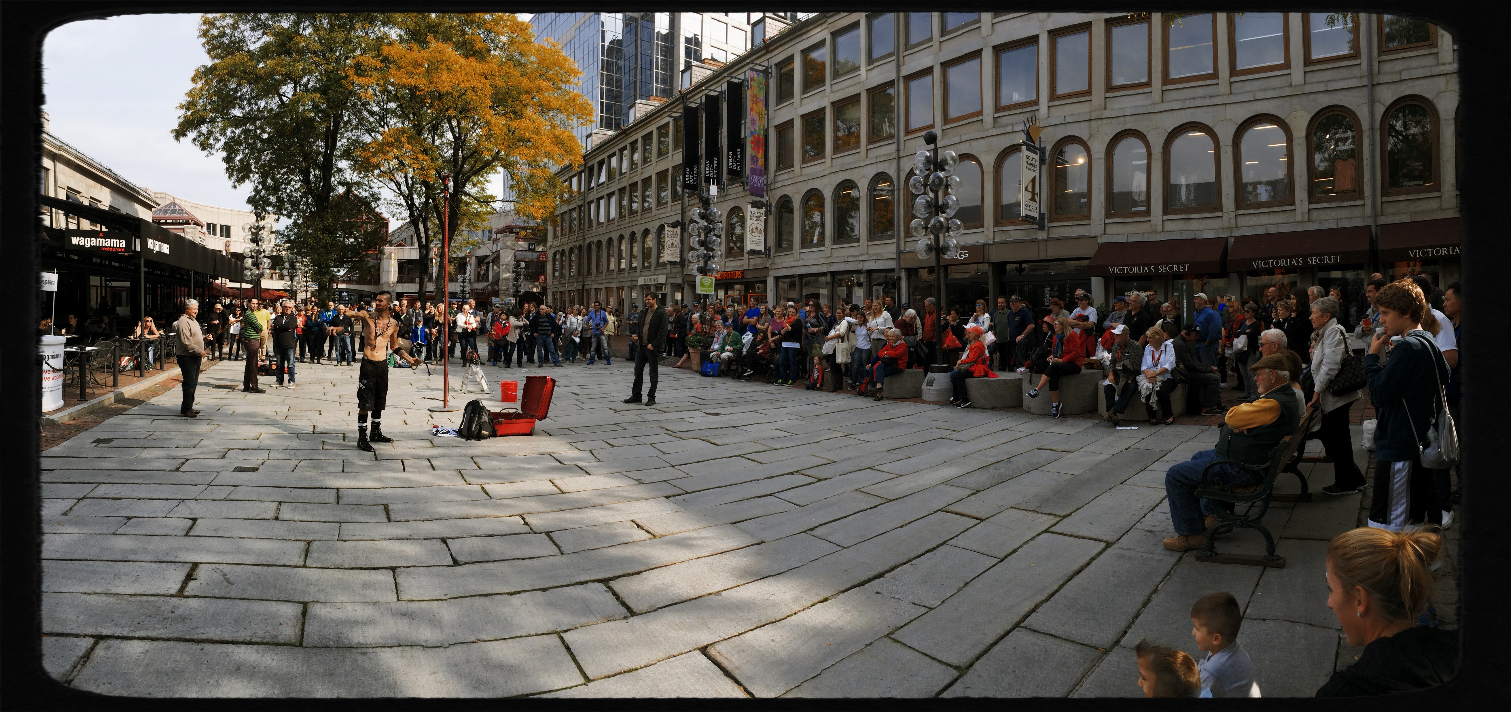
Also, in what is odd for a tool that’s designed to take pictures of lots of people, using the iPhone pano app to shoot a live, moving crowd is truly hit-or-miss. If a person moves through your picture as you are panning in the same space they occupy, they may be recorded as a slice or a piece of themselves, being caught partly in some of the picture’s vertical “tiles” but absent from the ones directly adjacent to it, causing them to register as a disembodied leg or a slivered torso floating in the air (see left).
In the shot at the top of this page, I was lucky that the street magician at left was standing still during the time I panned across him (once I’ve recorded his part of the frame, he can do what he likes, since the lens no longer “sees” that part of the picture). Likewise the crowd, enthralled by his performance, was remaining pretty static as I completed the pan across their part of the frame. The result has all the story-telling power of an ultra-wide shot, and, because of the composition, actually uses the fisheye-ish bulge to make the segmented pavement appear to be radiating outward from the performer.
And of course there is the subject itself, which has to benefit from all that left-right arrangement of information if you want to avoid just taking the picture for the sake of the effect alone. And there we have the balance between toy and tool that every photographer hopes to strike. Toys get cast aside once boredom sets in. Tools stay around and add to your work in very real ways.
THE LAST OF MANY GOODBYES
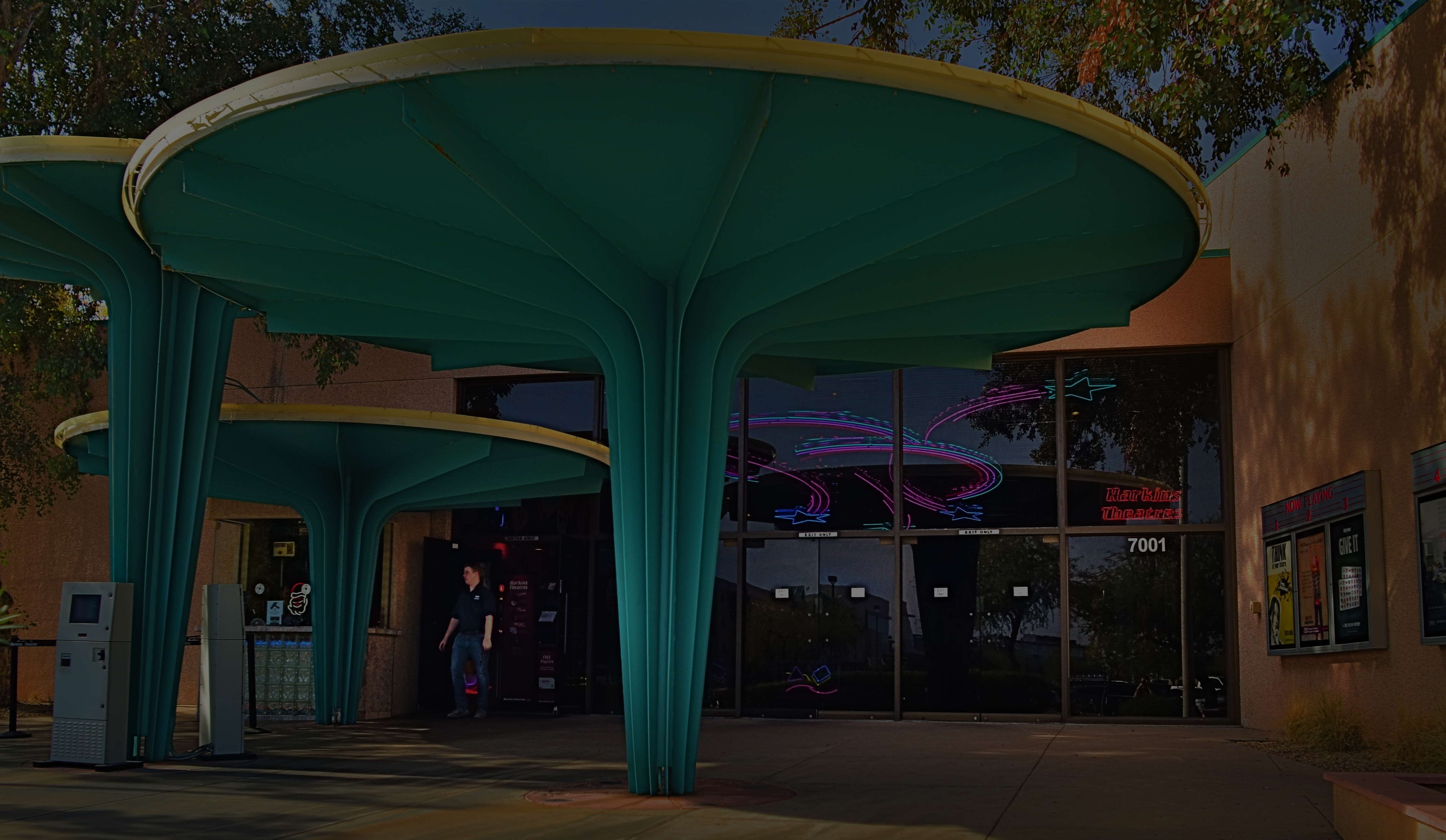
Scottsdale, Arizona’s gorgeous little art-house complex, the Camelview Theatre, on the afternoon of its final day, December 10, 2015.
By MICHAEL PERKINS
ON THE SPOCK SIDE OF OUR BRAINS, OF COURSE WE KNOW that there is nothing particularly magical about buildings per se. Stone and steel cannot, after all, generate memory or experience; they merely house the people who do. Still and all, the loss of certain edifices engenders a purely emotional response in us, perhaps because special things can no longer happen there, and the physical proof that any of it happened at all is being rendered, at least physically, into dust. That puts us in the realm of dreams, and that’s where great photographs are born.
When a place that is special to us is about to wink out of existence, everyone who used that place stamps it with their own stories. We went to school here. This is where I proposed to your mother. The bandstand was here, along this wall. So personal a process is this that our farewell photographs of these places can take on as many different flavors as the number of people who walked their halls. And, as a result, it’s often interesting to compare the final snaps of important places as filtered through the disparate experiences of all who come to reflect, and click, in the shadow of the wrecking ball.
I have attended many an opening at theatres, but I always make a point to attend their closings. Not the end of a certain film or engagement, but the final curtain on the theatres themselves. How best to see their final acts? As a quiet, gentle sunsetting, as with the above image of Scottsdale, Arizona’s Camelview theatre, shuttering in deference to a bigger, newer version of itself at the end of 2015? Or, in the colorful confusion of the venue’s final night, with crowds of well-wishers, local dignitaries and well-wishers crowding into the final screening?
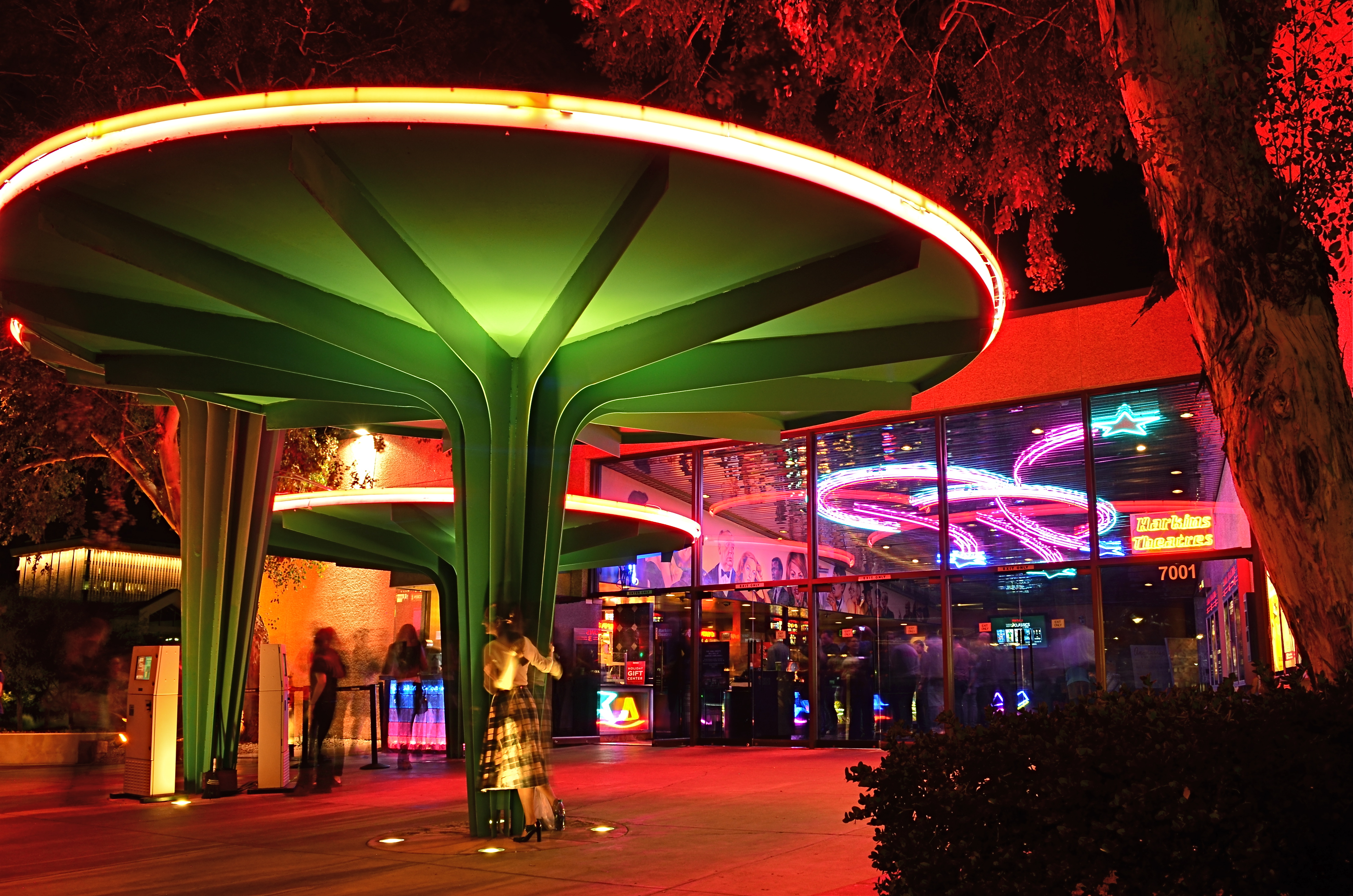
Later that same day: the Camelview’s last neon-lit night of glamour.
Each view projects my own feelings onto the resulting images, whether it be a golden dusk or a frenetic, neon-drenched, tomorrow-we-die send-off, complete with champagne and cheers. The introspective daytime shot has no teeming crowds or fanfare. The night, with its ghostly guest blurs (a result of the longer exposure) features people who are as fleeting as the theatre’s own finite run. Both are real, and neither is real. But they are both mine.
Buildings vanish. Styles change. Neighborhoods evolve. And photographic goodbyes to all these processes are never as simple as a one-size-fits-all souvenir snap. People, and memories, are too customized for that. As with movies themselves, there is always more than one way to get to the final fadeout.
LOOKING FOR AN OPENING
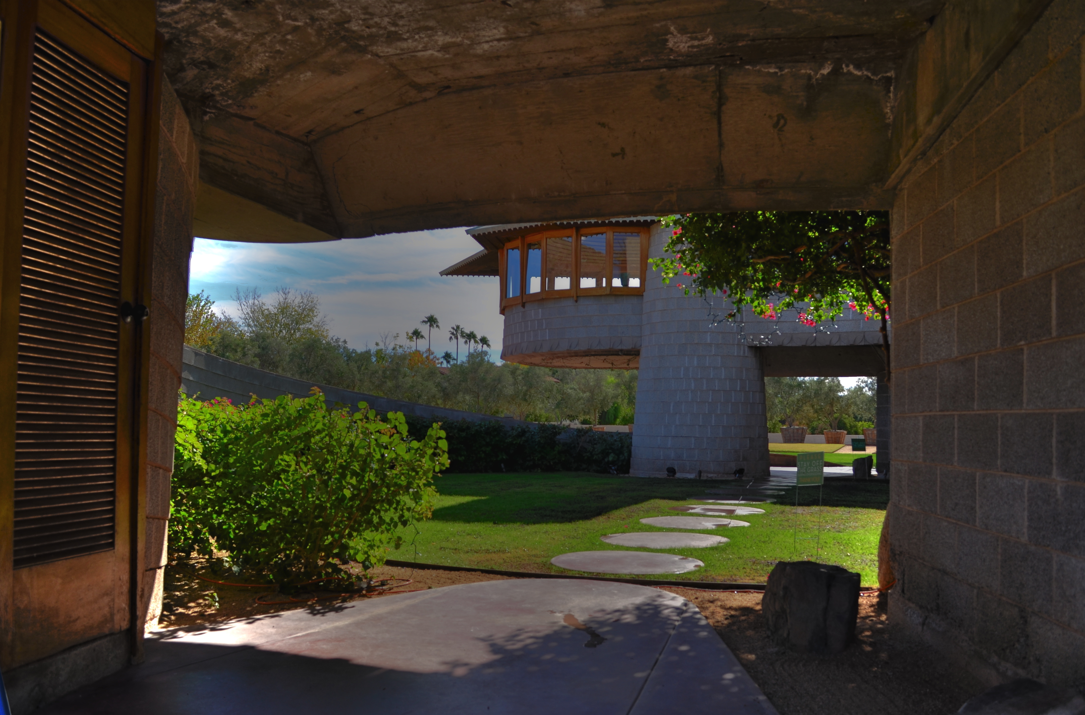
Entering a Frank Lloyd Wright home is like unwrapping a birthday present. The concrete walk ends in a circular ramp that rises to the left and around the David Wright house to create this wonderful open space.
By MICHAEL PERKINS
IF A HOME CAN BE SAID TO BE AN EVENT, then a door is the engraved invitation that bids you to witness that event. When you think about it, a door is the most crucial part of a house’s design, certainly its most deliberately provocative. It advertises and defines what lies within. It’s a grand tease to a mystery, the last barrier before you invade someone’s most personal space. It’s no wonder that entrances to places are among the most photographed objects on the planet. The subject is as inexhaustibly varied as the people who construct these lovely masks.
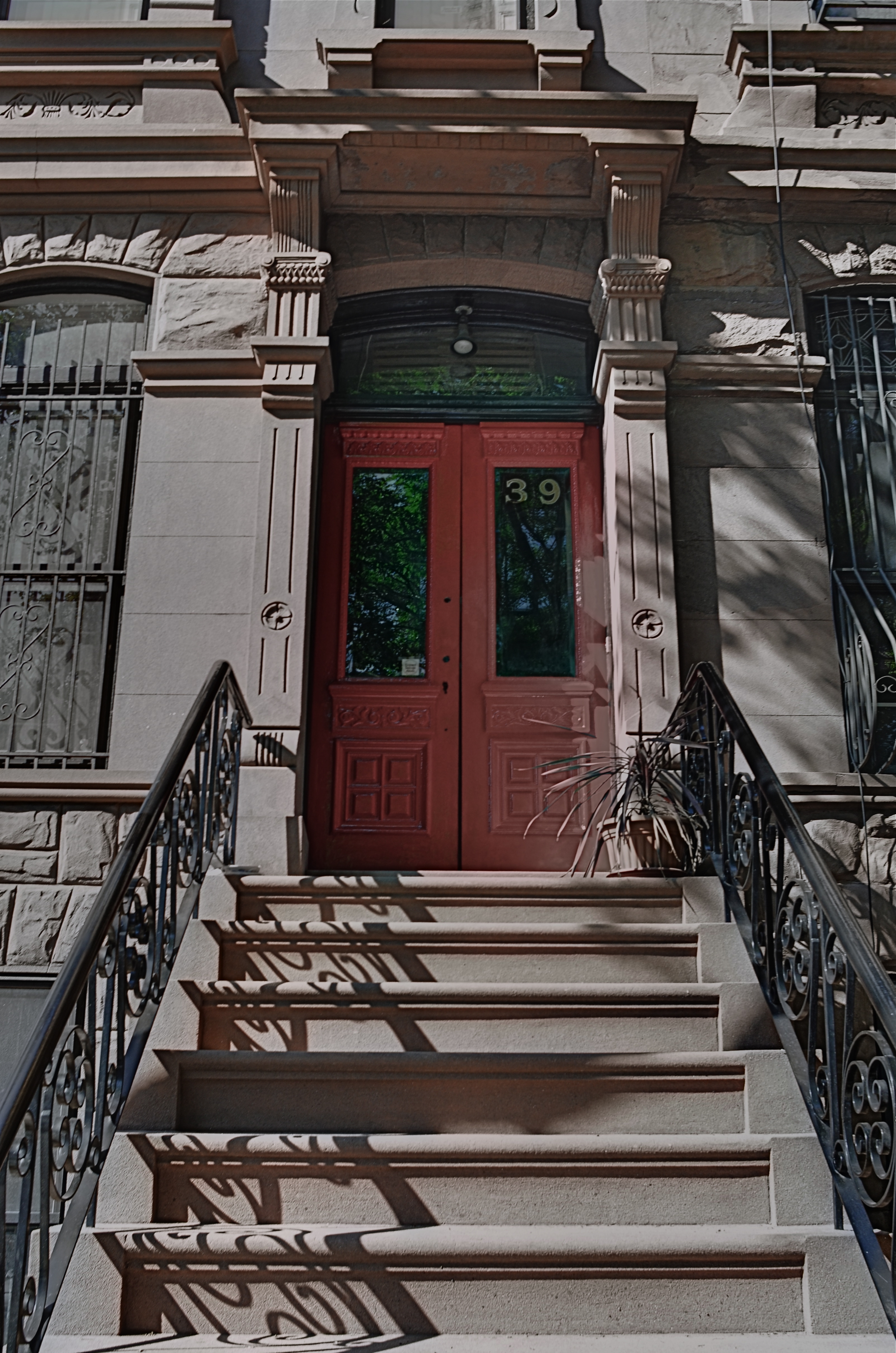
Doors are the first story tellers in a house.
Frank Lloyd Wright did more than create drama as you entered one of his houses; he actually enlisted you in generating your own wonder. Often the great man made you a little squirmy as you prepared to come inside, compressing door heights and widths to slightly uncomfortable dimensions. Pausing for a moment, you could almost feel like Alice after she ate the wrong cake, as if you might never be able to wriggle through the door frame.
Shortly after this ordeal, however, Wright would let the full dimensions of the inner house open suddenly and dramatically, as he does in the image above, taken at the home that he designed for his son David in Phoenix, Arizona. After ducking your head, you step into a court that has…no ceiling…since it ends in a ramp that both climbs around and supports a house that encircles you, creating an intimate courtyard that is both confined and limitless.
Doors make statements, almost boasts, about the wonder that lies just inches beyond them, and, like all generators of mystery, they are often most interesting when the question is never answered. Doors we never see beyond are often the most intriguing, like a woman behind a veil. When I invade a new neighborhood, my camera’s eye goes to doors before anything else. Sometimes the spaces they conceal don’t live up to the hype, but doors, these stage productions at the front of grand and humble abodes alike, offer something tantalizing to the eye.
EYE ON THE BALL
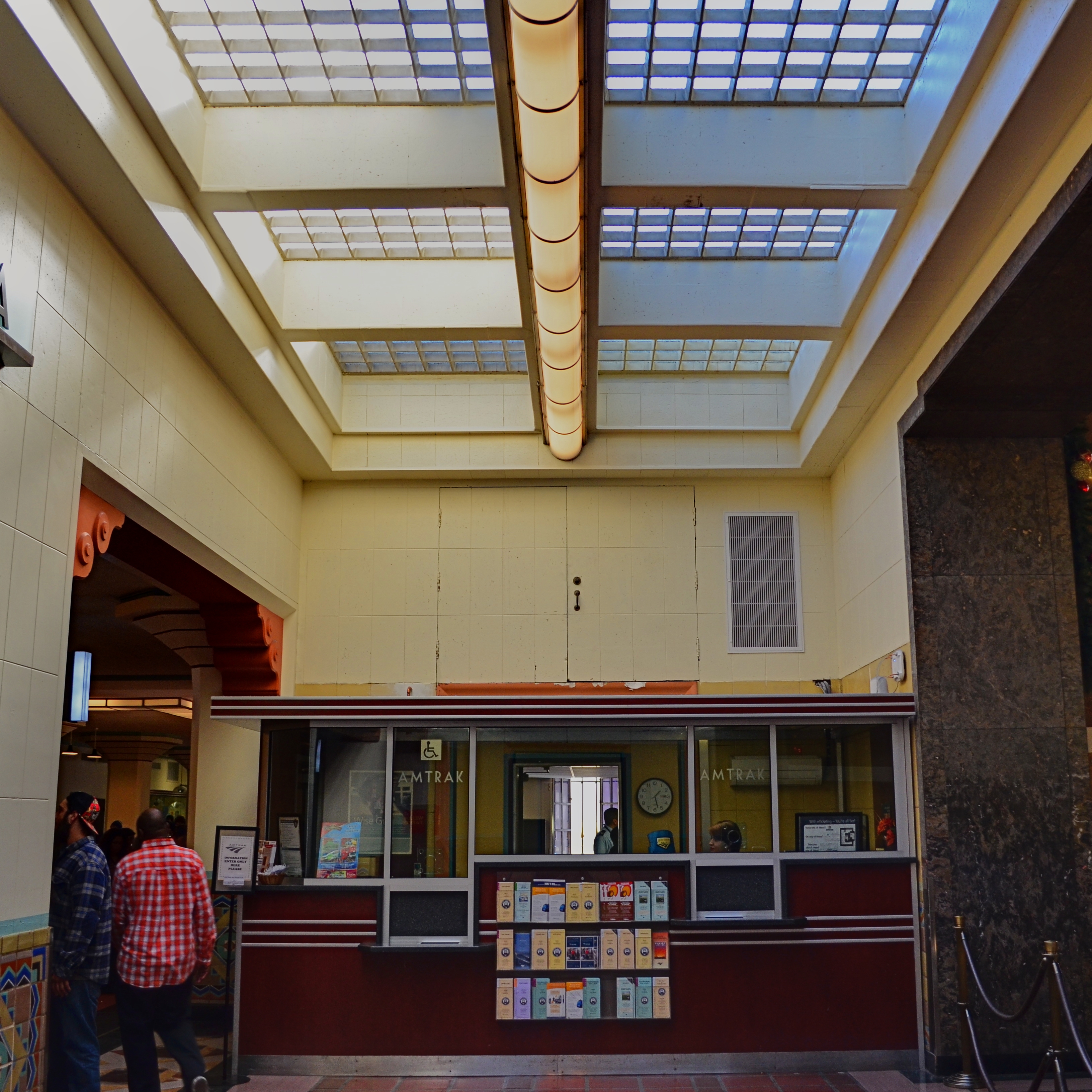
The two passersby mar what might have been an ideal composition. If I’d just reshot without them…
By MICHAEL PERKINS
I CAN STILL HEAR MY LITTLE LEAGUE COACH’S VOICE, cured into a coarse hum by too many years of Lucky Strikes, hitting me in the back of my skull as I stood shakily in the batter’s box. If he had told me once, he had told me a thousand times: don’t try to hit every ball that comes across the plate. You swing like a rusty gate, he would tease me, or don’t eat their garbage. The main message, and one that I only intermittently received: wait for your pitch.
On those rare occasions when I didn’t fish wildly in the air for every single thing that sailed in from the mound, I took great encouragement from his voice saying, good eye. Strangely, I had earned praise for essentially doing nothing, but, hey, I’d take it.
Coach sometimes comes to mind when I view the results of some of my hastier photographic decisions.
There is, for photogs, a very real translation of “wait for your pitch”, and it’s more important in the digital era because it’s such an easy rule to adhere to. Simply, you must keep shooting long enough to get the frame you saw in your mind. There can be no, “I’ve already taken a lot of frames”, or “they’re waiting for me to finish up” or “maybe today’s not my day for this shot.” First of all, it’s your picture. If you want it, take it. Secondly, there is no such thing as “a lot of frames”. There is only enough frames. If clicking one more, hell, ten more, will get you your shot, then do it. There is no phantom film counter warning you that you only have four more Kodachrome exposures left.
I am preaching this particular commandment all too loudly today because I am kicking myself for not living up to it recently. In the top frame, I got every element of a quaint old Amtrak ticket window that appealed to me, including the patterned skylight, the bored agent, the square arrangement of the Deco-ish counter space, and the left and right details of an old archway and a marble wall. Everything except the intrusive passersby on the left. They are sadly out-of-sync with the time-feel of the rest of the shot, and, had I not felt that I had nailed the general exposure and feel of the image, I might have waited for them to move out of frame, and gotten everything I wanted.
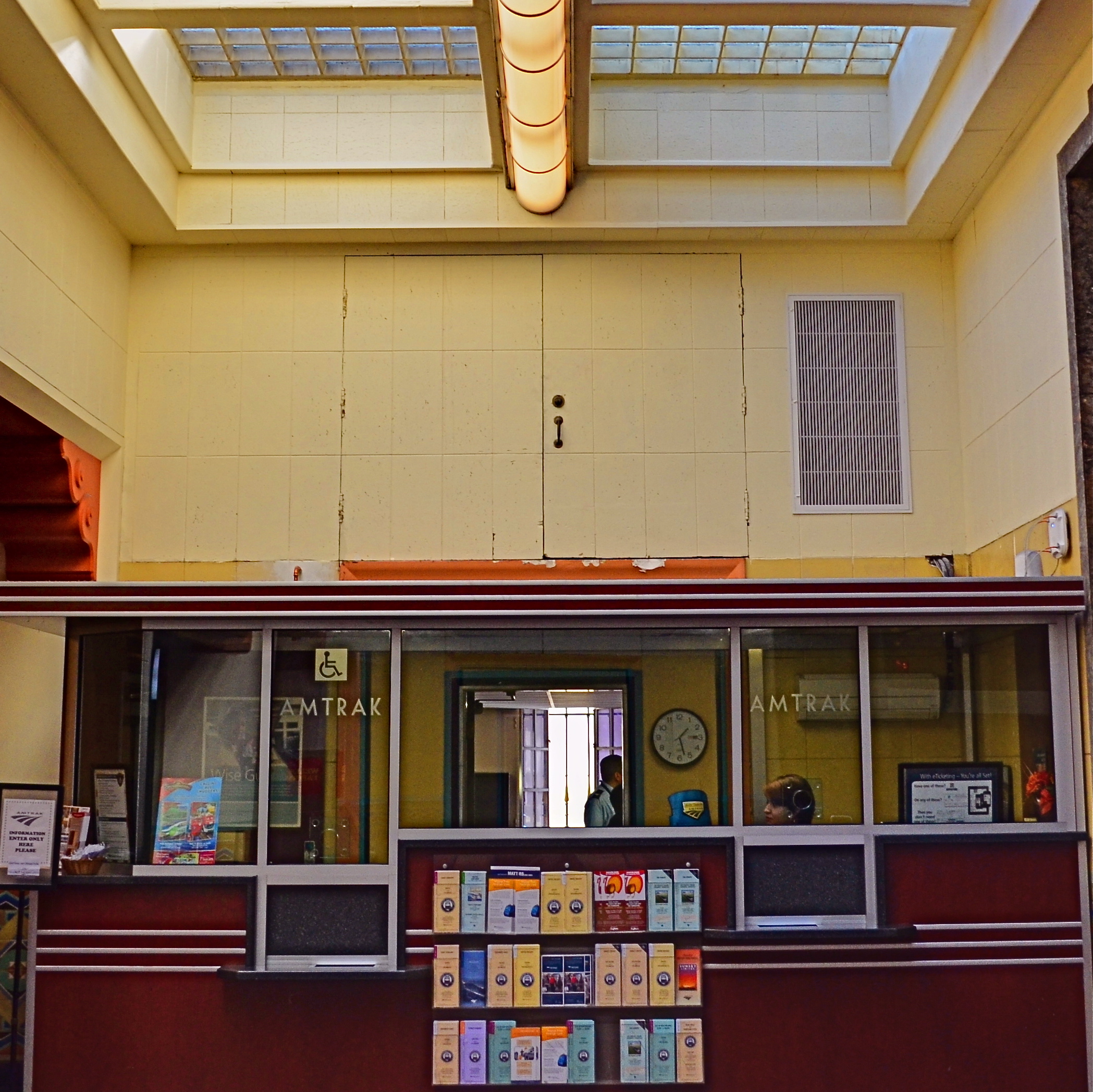
The price of impatience: the “salvaged” version of the above shot.
But I didn’t. I settled for “close enough”, and moved on to the next subject. Later, in post-production, I could certainly crop my squatters out, but at the cost of the overall composition. I now had to make do with what was left. I managed to reframe for another square shot that included nearly all the same elements. But it was “nearly”, not “all”. And “all” is what I could have had if I hadn’t tried to swing at the wrong ball. You can’t make a good shot out of a bad shot, and when an opportunity is gone, there isn’t a piece of software in the world that can make a miracle out of what’s not in your camera.
Wait for your pitch.
THE BEST KIND OF SECOND-GUESSING

You don’t need a dedicated macro lens to shoot this image. Just maximize the average glass that you have. 1/100 sec., f/2.8, ISO 100, 35mm.
By MICHAEL PERKINS
I TRY MY BEST TO ANTICIPATE EXACTLY WHAT KINDS OF SHOTS I will be taking in a given photo situation. This helps minimize the delay and hassle of changing gear in the field by heading out with a single lens that will do most of what I want. It saves me lugging along every hunk of glass I own on a project (trying vainly to be ready for anything), and makes me far more familiar with the real limits of whatever lens I decide will be my primary go-to for the day. Not a perfect plan…still, a loose plan is better than totally trusting to instinct or luck.
You can, of course, plan too generally and accidentally limit yourself. For example, on a day in which you’re to shoot a ton of landscapes, it’s easy to assume you’ll want an ultra-wide lens to capture those vast vistas. However, if something amazing appears on a far horizon and you can’t zoom any closer than, say, 55mm, you’ve suddenly got the wrong lens. Moreover, if your day takes you inside a dark cave, and your ultra-wide can’t shoot any faster than f/3.5, you’re likewise hamstrung to some degree.
In the above image, I decided, as I often do, to spend the entire day with a 35mm prime, a lens which affords me more latitude in more situations than any other glass I own. Of course, I can’t zoom with that lens, so I have to be reasonably sure that anything I want to shoot with it can be framed by simply walking closer or farther away. The 35 can open up to f/1.8, so it’s great in the shade, or where I want a shallow depth of field, and that can make it a viable, if modest, close-up lens…not true macro, but a good tool for selective subjects just a short distance away (in this case, about five feet). Also, shooting with the biggest image file setting available allowed me to crop away up to 75% of my original, as I did here, and still maintain good resolution. However, is the 35 of any value if I suddenly spy a bald eagle on the wing 300 yards away? Not so much.
But it’s not about finding a universal, one-lens-fits-all solution. It is about anticipating. The most valuable habit you can develop before every sustained shoot is to mentally rehearse (a) what kind of situations you’re likely to encounter and (b) what you want to be able to do about it. That sounds absurdly simple, but it really is about taking as many obstacles out of your own path before they even appear as obstacles. In other words, practice getting out of your own way.
THOSE WHO STAND AND WAIT
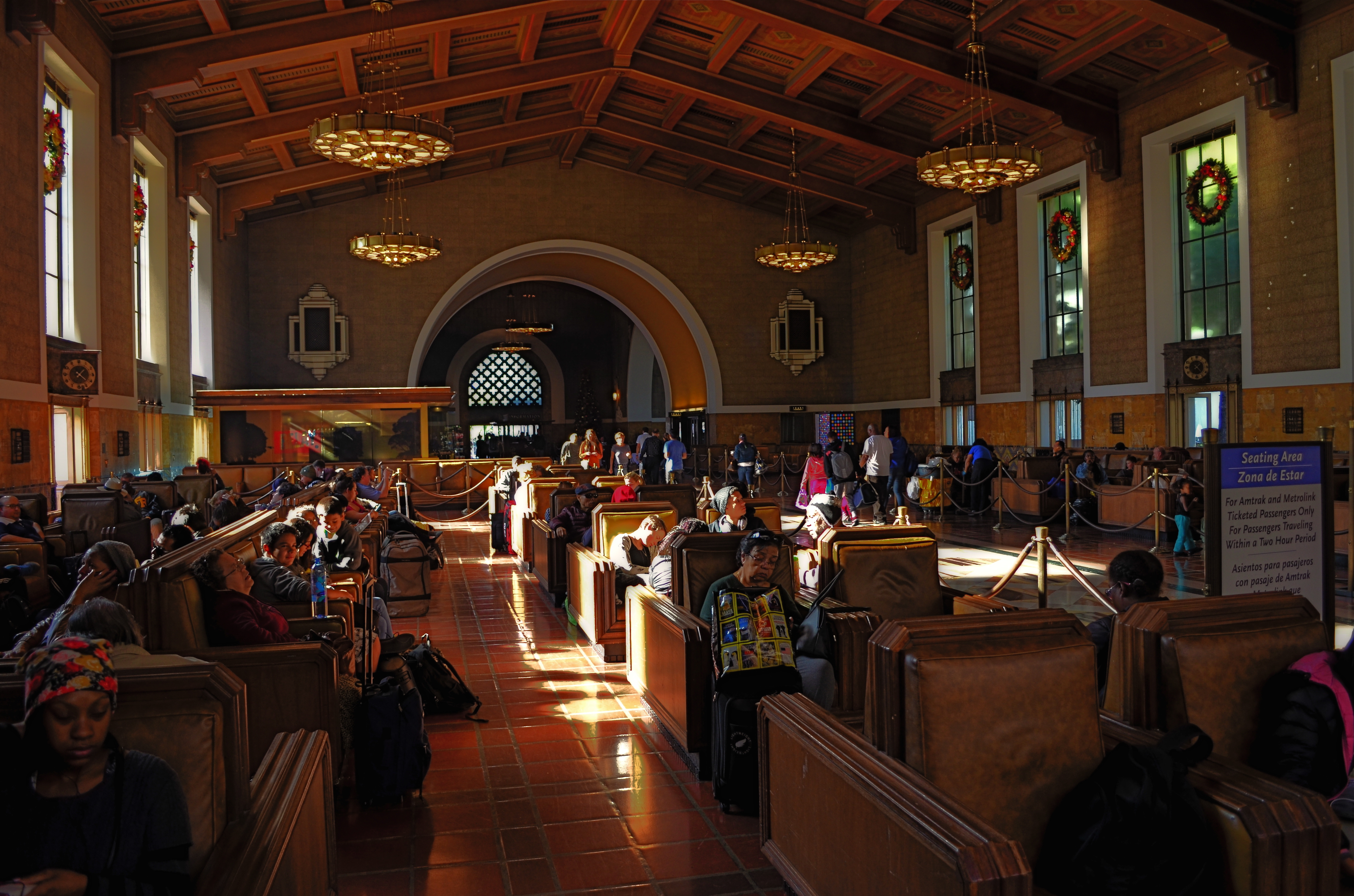
Please Listen For Announcements, 2015. The iconic waiting room at Los Angeles’ Union Station terminal.
By MICHAEL PERKINS
SHOW ME A HOLIDAY SEASON AND I’LL SHOW YOU PEOPLE WAITING FOR SOMETHING TO HAPPEN. They form lines for special orders, last-minute items, a kid’s brief audience with Santa. They hope to bump someone on a flight, beat someone out of a bargain, talk someone into a discount, refund or exchange. But mostly, they wait.
For as many festive holiday subjects that dance before the photographer’s eye, there are many more scenarios in which nothing much happens but..the waiting. And, while this seemingly endless hanging-out never offers images that define joy or wonder, they are fodder to the street shooter within us, the guy looking for stories. Stories of tired feet. Tales of people who can’t get a connecting flight ’til tomorrow at the earliest. Sagas of mislaid plans and misbegotten presents. Folklore of folks who are lost, lonely, disappointed, and down. In short, all of us, at various times.
Transit points are often among the most poignant during the season, with legions of faces that plead, what’ll I get for her? How will I get all the way down this list? How soon can I get home? Your best bet? Hang at the train stations, the port authorities, the airports, and hear the plaintive strains of I’ll Be Home For Christmas sung in the key of ‘as if’. Seek out those aches, that weariness, the many false starts and stumbling finishes of the holidays. And keep your camera ready, hungry for whatever visions dance in your head.
JUST OUT OF SIGHT
By MICHAEL PERKINS
PART OF THE EVOLUTION OF A PHOTOGRAPHER’S EYE is the imparting of new importance to things we have forgotten to see, those everyday objects that line or border our rituals and our daily to-and-froms, but which gradually are rendered invisible because our gaze is focused elsewhere. We fix upon the subway train that we have to catch, but miss the miniature tales buried in brick, steel, rust, entrances and exits. We’ve been down this street a million times, and always pause to peer in the window of, in order, the bakery, the newsstand, the Chinese take-out joint. Across the same street are a dry cleaner, a watch repair shop, and a storefront cathedral. We have never seen them.
Photography involves extracting stories where others see a blank slate, but that means first training ourselves to constantly re-see the things we believe we “know”, only to find that there are stunning revelations mere inches away from those known things. It’s the hardest habit to cultivate, this revealing of new layers in what we assume is the familiar. And yet it’s really the fresh blood that rejuvenates our art when it’s gone anemic.
One trick I try more often than I used to is to pause, after entering a building, to look back at the other side of that entrance…in other words, the view I would see facing me if I were using that entrance as an exit. It’s a very simply thing, but frequently there’s something fresh that presents itself, in something I believed I knew all about.
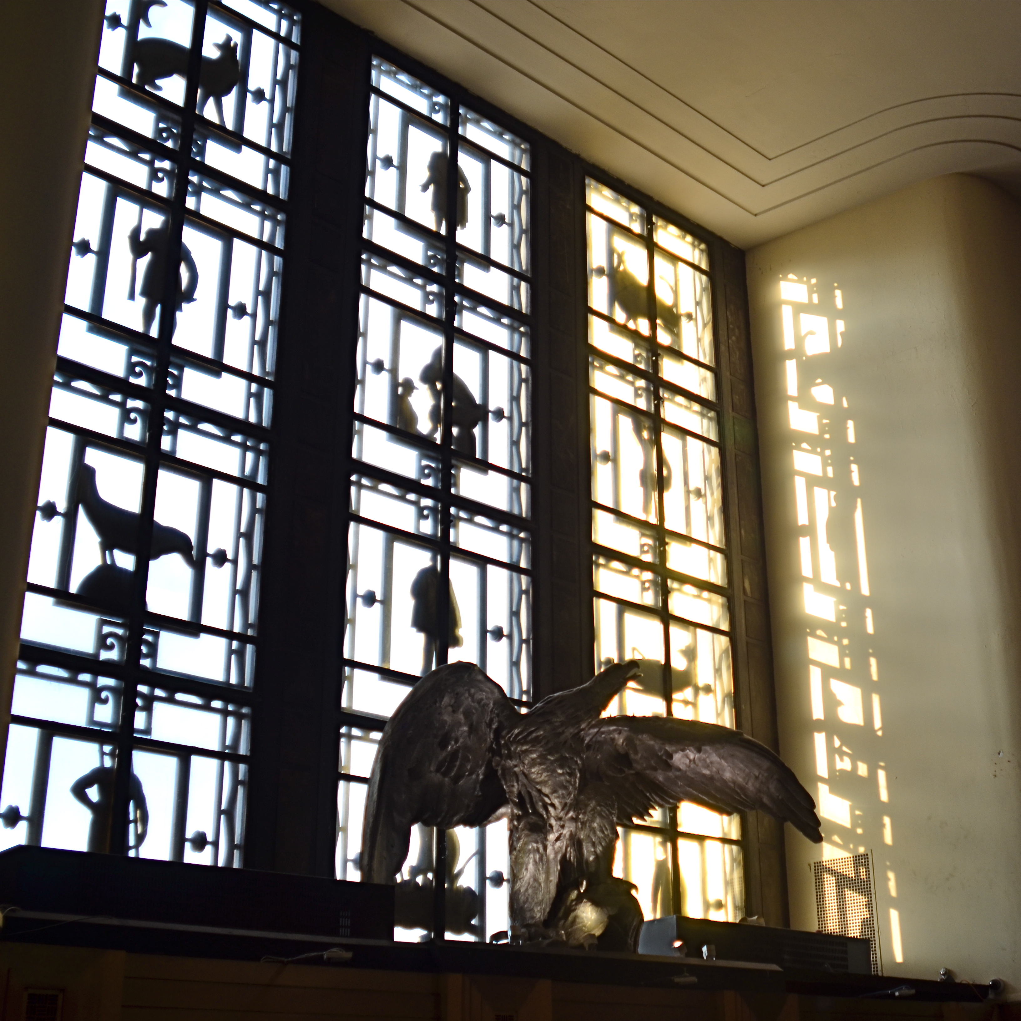
Flights of fancy, right under our wing….ah, nose.
The above image comes from such an exercise. It’s taken just inside the main entrance to the Brooklyn Public Library, which, as you can see, has a great Art Deco grille of storybook characters over the door. But that’s just as you walk in. Pay equal attention when you’re walking out, and you see a strange bird looming over the entrance (now your exit). But not just any bird. It is, in fact, a rescued statue which once graced the main lobby of the long-departed Brooklyn Eagle newspaper, out of its old context as a symbol of high-flying journalism, but now a reminder of one of the city’s best voices. Best of all, the late afternoon sun projects the silhouettes of the storybook grille onto the eagle and the adjacent wall in an unearthly display of shadow. It’s worth looking back at. Or I could say I am always looking forward to looking back at it.
When looking for something new to photograph, seek out the places in which you’ve seen it all. You’ll never be happier to be proven wrong.
A WONDROUS MESS
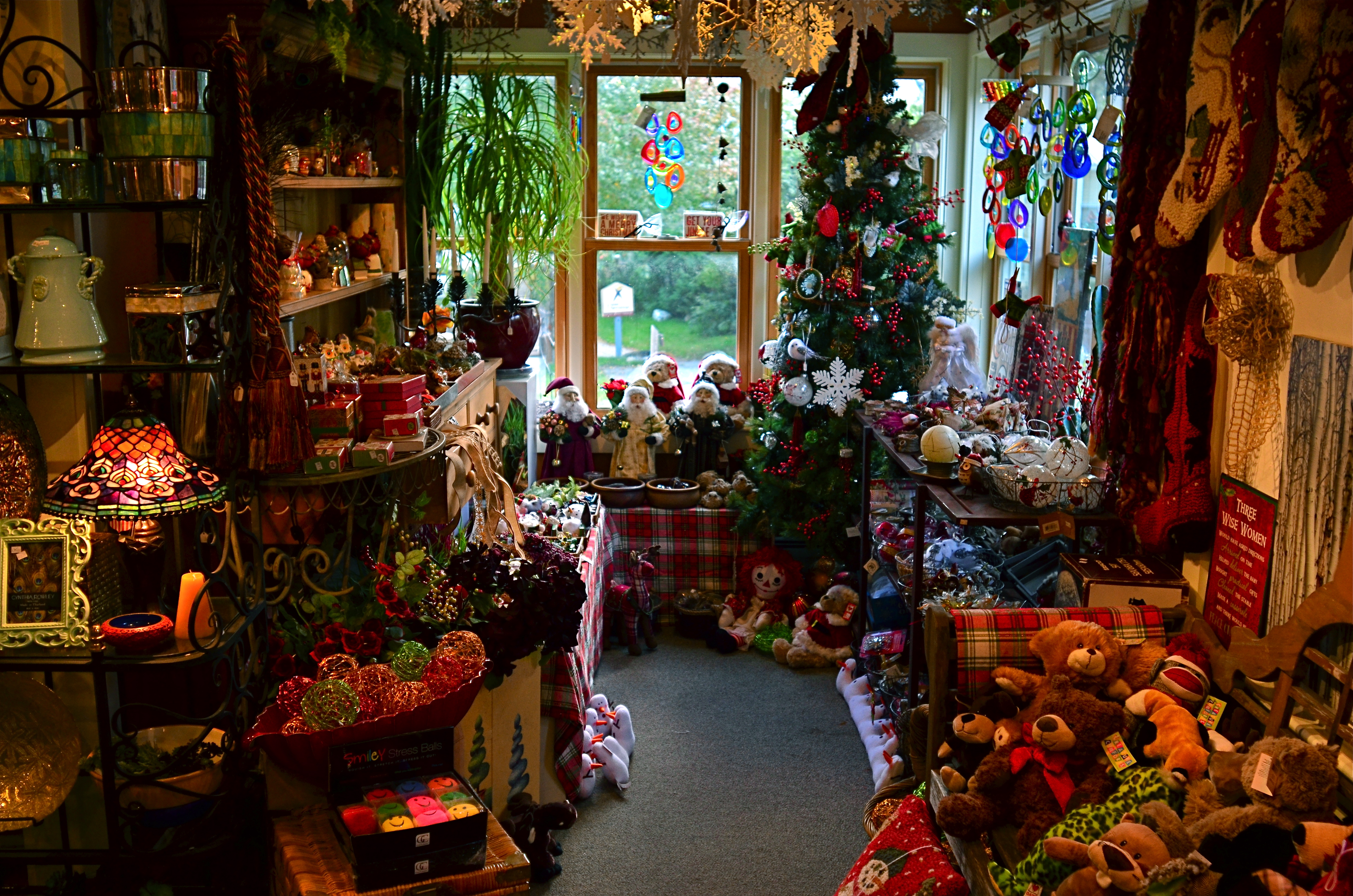
Too busy? Well, when it comes to seasonal shots, it’s a lot harder to say.
By MICHAEL PERKINS
Consulting the rules of composition before taking a photograph is like consulting the laws of gravity before going for a walk.
Edward Weston
PHOTOGRAPHERS LOVE TO COMPILE LISTS OF LAWS that must be obeyed to ensure the capture of great images. Bookshelves are jammed to fracturing with the collected works of wizards large and small who contend that all of this art stuff is really about craft, or adherence to techniques that are the equivalent of Einstein’s law. And, of course, with every fresh generation, a new slew of shooters come sneering along to deride this starched and stuffy discipline. All that matters, these young turks snigger, is my grand vision.
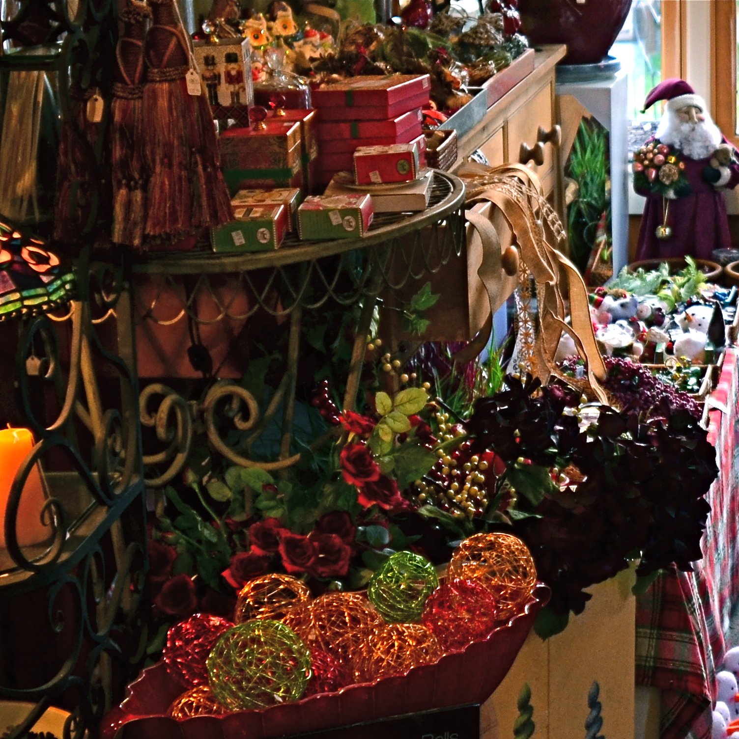
Worlds within worlds: many vast holiday scenes can be “subdivided with cropping.
Let me again re-state the obvious, which is that both viewpoints are correct and/or totally wrong. And since Mr. Weston has introduced the subject of composition, let us consider the special task of seasonal photos, specifically, arrangements of yuletide objects. The classic rule on still-life shots is that less is more, that it’s better to perfectly light and expose three pieces of fruit than whole baskets of the stuff. Meanwhile the festive, instinctual artist concedes that many holiday scenes are mad with detail and crammed with more, more, more…..and that’s okay.
The unique thing about Christmas decor is that in many cases, you not creating the compositions, but merely reacting to someone else’s creations…in nativity scenes, churches, and especially in retail environments. Obviously your local department store doesn’t adhere to the admonition “keep it simple”; quite the opposite. Seasonal trim in most stores is served up not by the spoonful but by the truckload. Anything less than overkill seems skimpy to many yuletide decorators, and so, if you favor basic subject matter, you’re either going to have to mount your own arrangements or selectively zoom and crop the more congested scenes. If, however, you already subscribe to the idea that more is better, then life gets easy fast.
Holidays come layered in much that is intensely personal, and that makes clean compositional judgements about “how much” or “how little” tricky at best. Just get the feelings right and let your regular rules relax into guidelines.
A RACE OF INCHES
By MICHAEL PERKINS
YOU CAN VIEW THE MAIN FUNCTION OF PHOTOGRAPHY AS TWOFOLD, with the deliberate creation of a vision as one path, and the arresting of time in its motion as the other. In the first case, we plan, conceive and execute at our leisure until the image that is behind our eye emerges on the page. In the second, we are hastening to capture and cage something that is in the act of disappearing. In one instance we compose. In the other, we preserve.
Sometimes the two purposes come together in one picture, although you seldom know it until after the image is made. Take the example below. In the moment, I was struck by the light patterns that bounced across the empty space of an event room at the visitor center for the Brooklyn Botanical Gardens. I wanted to do everything I could, exposure-wise, to dramatize the play of light in this special space. In addition to trying to create an image, however, I was also scurrying to keep a special number of factors from vanishing. I was both creating and preserving.
Carpe diem: when the light’s right, be ready to shoot. 1/160 sec., f/5.6, ISO 100, 24mm.
Obviously, the light you see would have had a dramatically different effect had the room been packed with, say, bodies or furniture, so its unobstructed path was one temporary condition. Another fleeting factor was the late afternoon light, which was, in addition to being extremely changeable, also one of the rare moments of pure sun the area had seen during a severely overcast day. It was as if the heavens opened up and angels were singing a song called, “Take The Picture, Already, Dummy”(perhaps you have heard this song yourself). Everything pointed to immediacy.
Full disclosure: getting this shot was not something that stretched me, or demanded exceptional skill. There was not one technically difficult factor in the making of this picture. You yourself have taken pictures like this. They are there and then they’re gone. But, they don’t get collected unless you see how fragile they are, and act in time. It’s not wizardry. It’s just acting on an instinct which, hopefully, gets sharper the longer you are in the game.
I often state one of my only primary commandments for photography as, Always Be Shooting. An important corollary to that rule might be, Always Be Ready To Shoot. Spot the potential in your surroundings quickly. Get used to the fact that many pictures will only dance before you for seconds at a time, flashing like heat lightning, then fading to oblivion. Picture-making is sometimes about casual and careful crafting of an image. And sometimes it’s a race of inches.
And sometimes it’s both.
DON’T EVER ALWAYS DO ANYTHING
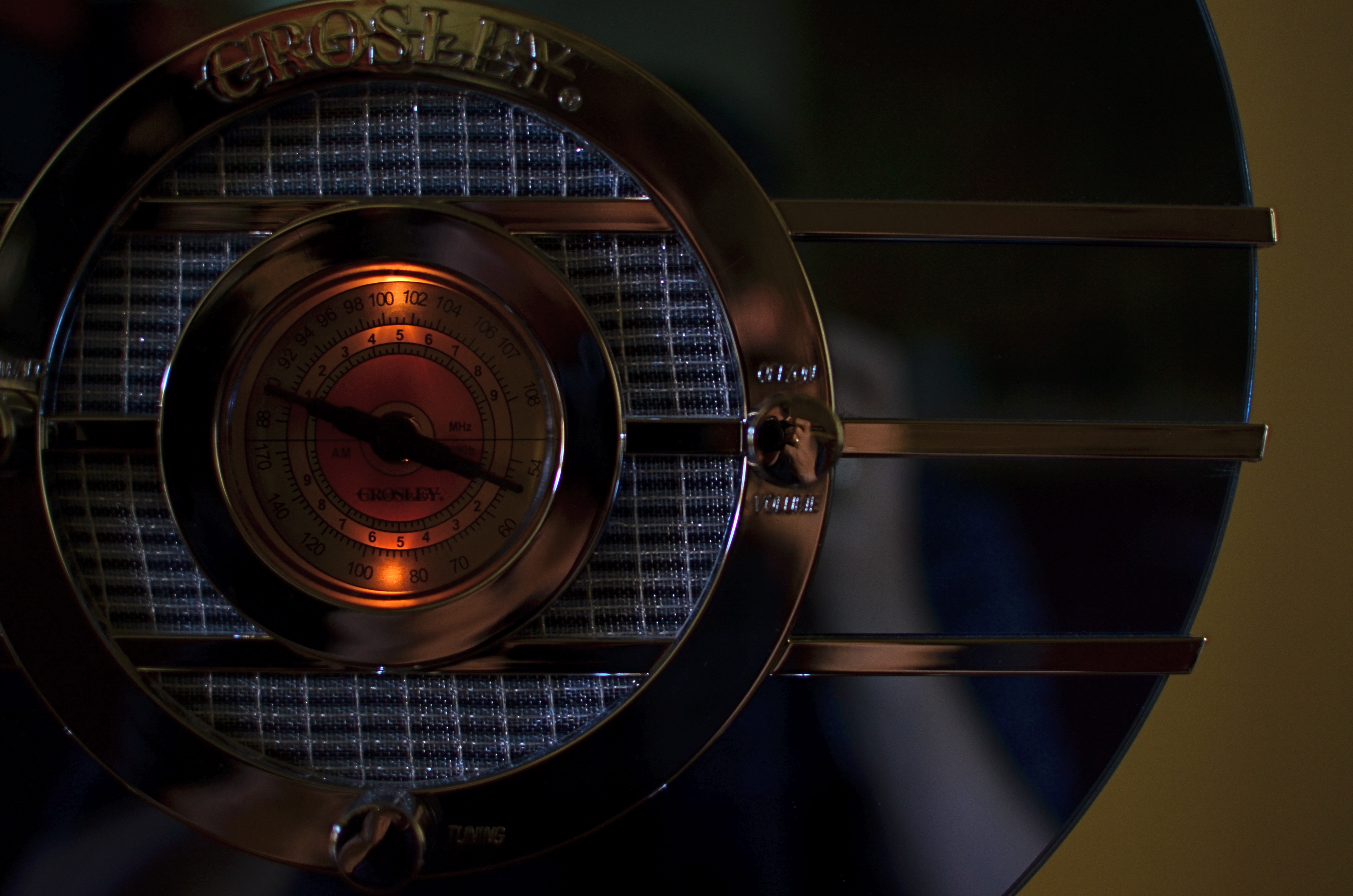
This shot, as the one below, is taken at 1/60 sec,, f/2.2, ISO 250, 35mm. The difference between the two images is the white balance setting.
By MICHAEL PERKINS
IF YOU’VE EVER GLANCED AT THE NORMAL EYE’S HOME PAGE MISSION STATEMENT, you might come away with the impression that I am unilaterally opposed to automodes, those dandy little pre-sets that do their best to predict your needs when making a photo. The truth is that I am against doing anything “all the time”, and thus caution against the universal use of automodes as a way of idiot-proofing your shoots. They can be amazing time-savers, sometimes. They are reliable shortcuts, sometimes. Just like I sometimes like bacon on a burger. There are no universal fixes.
I meet many people who, like myself, prefer to shoot on manual most of the time, eschewing the Auto, Program, Aperture Priority and Shutter Priority modes completely. Oddly, many of these same people almost never take their white balance off its default auto setting, which strikes me as a little odd, since the key to color photography is getting the colors to register as naturally as possible. Auto WB is remarkably good at guessing what whites (and in turn, other hues) ought to look like in a pretty wide variety of situations, but it does make some bad guesses, many of them hard to predict.
A gross-oversimplification of white balance is that it reads the temperature of light from cold to warm. Colder temp light runs bluer. Warmer temp light reads more orange. Auto WB tries to render things as naturally as it can, but your camera also has other customizable WB settings for specific situations, and it’s worth clicking through them to see how easy it is to produce subtle variations.
In the picture in the upper left corner, I’m taking a picture indoors, in deep shade, of a reproduction 1930’s Bluebird Sparton radio, a wondrous Art Deco beauty featuring a blue-tinted mirror trimmed in bands of chrome. To emphasize: blue is the dominant color of this item, especially in shade. Shade, being “colder” light, should, in Auto White Balance mode, have registered all that blue just fine, but, in this case, the chrome trim is completely (and unnaturally) painted in the same orange glow. As for the blue values, they’re well, kind of popsicle-y . That’s because, when it’s all said and done, Auto White Balance is your camera’s educated guess, and it sometimes guesses wrong. If you always use it, you will occasionally have to eat a bad picture, unless you take action.
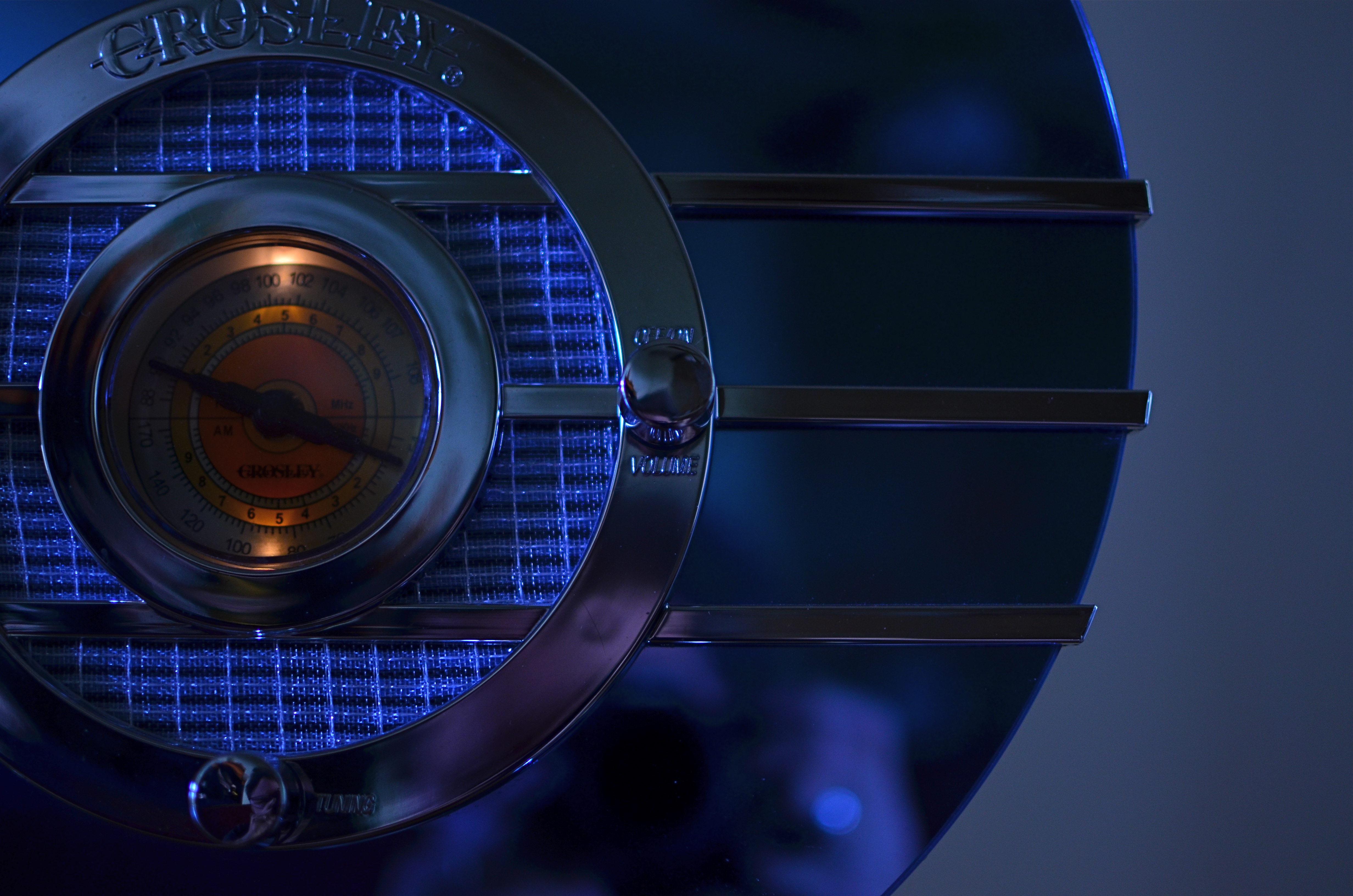
I get blue when I listen to the radio, or when I dial up the appropriate white balance.
For the above image, I want the dial to be nice and orange, but just the dial. To try to get the blues back to normal on the rest of the radio, I switch to the Tungsten white balance setting (symbolized by a light bulb, since they burn, yes, tungsten filaments), something I normally wouldn’t do in either daylight or shade, but hey, this is an experiment anyway, right? To make it even weirder, Tungsten might read neutrally in some kinds of indoor night settings…but it also doesn’t behave the same way in all cases. In this case, I caught a break: the orange in the radio dial registers pretty true and all the metals are back to shades of silver or blue.
Notice how both white balance settings, in this strange case, both performed counter to the way they are supposed to. One misbehaviour created my problem and another misbehaviour solved it. Hey, that’s show business.
Hence the strange but appropriate title of this post. Don’t ever “always” do…anything. If you want the shot you want (huh?) then pull an intervention and make the camera give it to you. Automode in white balance is just as fraught with risk as any other automatic setting. It works great until it doesn’t. Then you have to step in.
CASTING
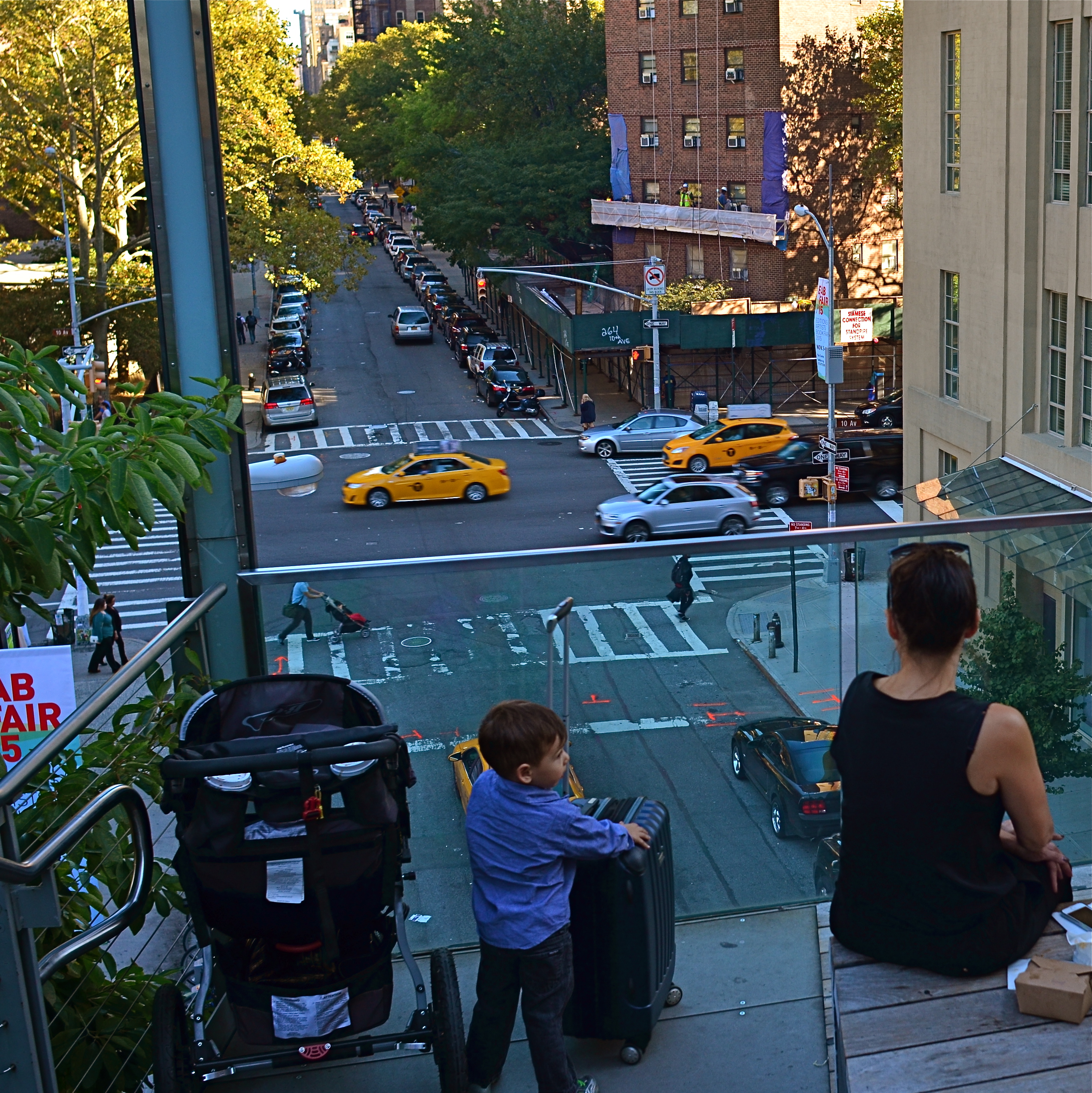
Do the woman and the child constitute a “family” in the narrative of this image?
By MICHAEL PERKINS
MORE COMPOSITIONS IN PHOTOGRAPHY ARE CRAFTED AFTER THE SNAP than naturally spring forward, fully formed, out of the camera. Frame as carefully as you may, you often find that something needs to change to help your image’s story fully emerge. This usually means taking something away, cleaning things up…and that means cropping. I think it’s fair to say that, more often than not, we start with pictures that contain too much and carve out the core picture that deserves to survive, to be pushed to the front.
Sometimes a proportionate tightening is all that a picture needs, so that a large, busy rectangle becomes a streamlined, smaller rectangle. This can clear away extraneous objects like phone poles, wires, extra buildings, any distracting junk that pulls the eye away from the important stuff. But it isn’t always things: it can also be people, surplus bodies which, like extraneous elements of any kind, change the narrative, or keep it from connecting. Think of the picture as a theatrical production and yourself as the casting director. Anyone on the set who doesn’t move the story forward is not playing a part that we need. See the girl at the office for your check, so long.
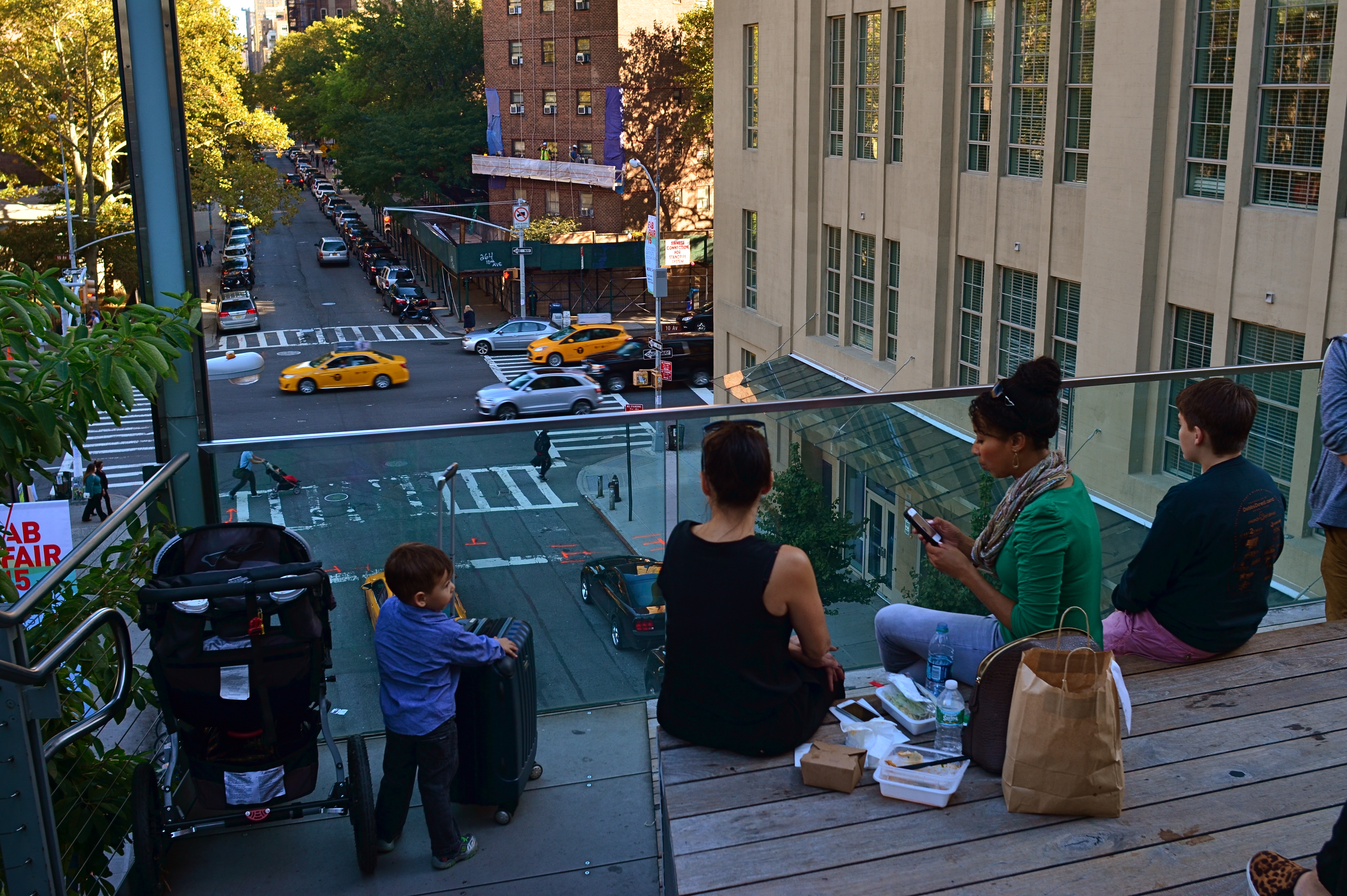
Does the removal of the extra people compromise or complete the photo’s story?
In the picture above, the cropping seems to create the story of a mother and her children taking in the view from New York’s Highline Park onto a city street below. In the original shot, seen at left, she seems less like a mother and more like just another bystander. The crop has suggested a relationship or a role for her. The woman to her right (in the original), unlike the “mother” figure, is not acting as our surrogate, seemingly looking with us at the scene. She is on her cel phone, and therefore registers as more detached than her neighbor, whose face, since it’s invisible to us, could contain anything we want it to. To the right of the cel user, we see additional people who don’t subtract from the picture, but also don’t add anything. They are extras that we, the director, have decided we don’t need to cast.
Also, structurally speaking, the “mother” is arranged so that the diagonal line from the foreground building to her right seems to proceed into the picture from around the area of her right shoulder, so that she sort of anchors the leading line and sends your eye along it to the street below. None of this, mind you, was obvious in the shooting of the original shot, which is not terrible as a composition, only compromised by the inclusion of information that simply doesn’t advance the logic of the picture. I only use it as an example of how I was able to question the “casting” of the original frame and make a conscious decision to cut away things that slowed everything down.
If you can tell a story with two people better than you can with four or five, ask yourself if you really need them. Cropping isn’t an admission that you made a bad photograph. It’s confirmation that your first draft is worth taking to a second one.
