FAILING TO SEE THE BIG PICTURE
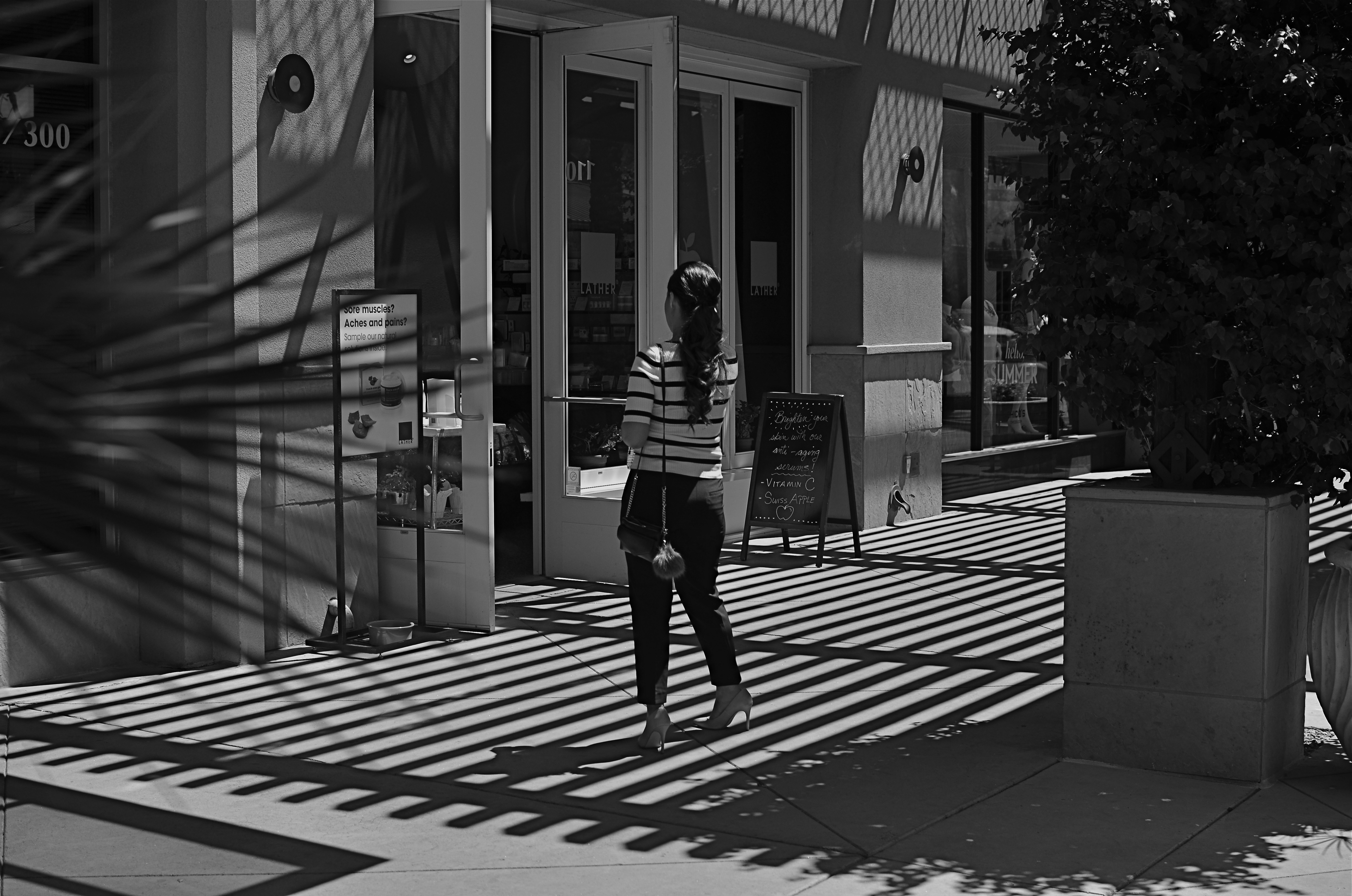
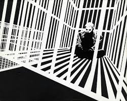
This image lingered in the “maybe” pile for a while. Then I started to see how much of it was expendable (see below).
By MICHAEL PERKINS
IT’S ENTIRELY POSSIBLE THAT MANY A WORKABLE PHOTOGRAPH HAS ONLY BEEN RENDERED SO BECAUSE OF SHEER BOREDOM. Face it: there are bound to be days when nothing fresh is flowing from one’s fingers, when, through lack of anything else to do, you find yourself revisiting shots that you 1) originally ignored, 2) originally rejected, or 3) were totally confounded by. Poring over yester-images can occasionally reveal something salvageable, either through processing or cropping, just as they can more often lead one to want to seal them up behind a wall. Even so, editing is a kind of retro-fitted variation on composition, and sometimes coming back around to a picture that was in conceptual limbo can yield a surprise or two.
I’m not suggesting that, if you stare long enough at an image, a little golden easter egg will routinely emerge from it. No, this is where luck, accident, and willpower usually converge to sometimes produce…..a hot mess, and nothing more. But leaving a picture for a while and returning to it makes you see with the eye of the outsider, and that can potentially prove valuable.
In the above shot, taken a few months go, I had all this wonderful gridded shadow texture presenting itself, shading what was otherwise a very ordinary stretch of sidewalk. A thought emerged that the stripes in the woman’s short might make an interesting contrast with the pattern of the shadows, but, after cranking off a frame or two, I abandoned the idea, just as I abandoned the shot, upon first review.
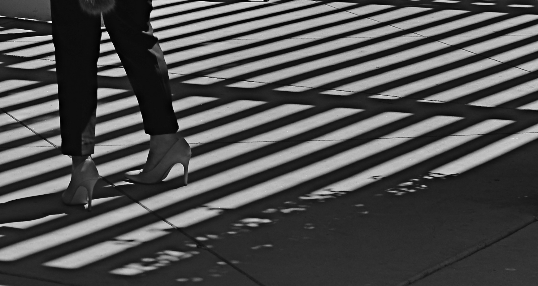
Several big bites of the scissors later…
Months later, I decided to try to re-frame the shot to create a composition of one force against another…..in this case, the verticality of the lady’s legs against the diagonal slant of the shadows. That meant paring about two-thirds of the image away. Originally I had cropped it to a square with her lower torso at dead center, but there seemed to be no directional flow, so I cropped again, this time to a shorter, wider frame with the woman’s form reduced to the lower half of her legs and re-positioned to the leftward edge of the picture. Creating this imbalance in the composition, which plays to the human habit of reading from left to right along horizontal lines, seemed to give her a sense of leaving the shadows behind her, kind of in her wake if you will. At least a little sense of movement had been introduced.
I felt that now, I had the tug of forces I had been seeking in contrasting her blouse to the opposing grid in the master shot. I’m still not sure whether this image qualifies as having been “rescued”, but it’s a lot less busy, and actually directs the eye in a specific way. It will never be a masterpiece, but with the second sight of latter-day editing, you can at least have a second swipe at making something happen.
SALVAGING THE FEEL
By MICHAEL PERKINS
EVEN IF YOU ARE IN THE HABIT OF PACKING A CAMERA ALONG WHEREVER YOU GO, you can only predict some of the conditions you might encounter in a given shooting situation. If you’ve guessed well, you can be ready (depending on how much gear you have with you) for about 75% of the shots you may want to take. What’s left, make no mistake, is a mixture of guesswork and luck, the kinds of shots where you adapt on the fly.
Night shots employ a completely different set of skills from daylight shots. What looks mysterious and romantic to your eye may be a mushy muddle to your camera, and that forces a lot of sudden sorting-out of your choices. On the night of the above shot, taken along the shoreline in Ventura, California, I had not planned on shooting anything at all after nightfall. I loved the deeper blues of the sky as they played just before sundown, and I was especially enjoying watching local kids playing against the darkening surf. Following a few dozen clicks up and down the beach, I walked back inland a block or so to join my wife and some friends at a nearby restaurant, considering myself done for the day.
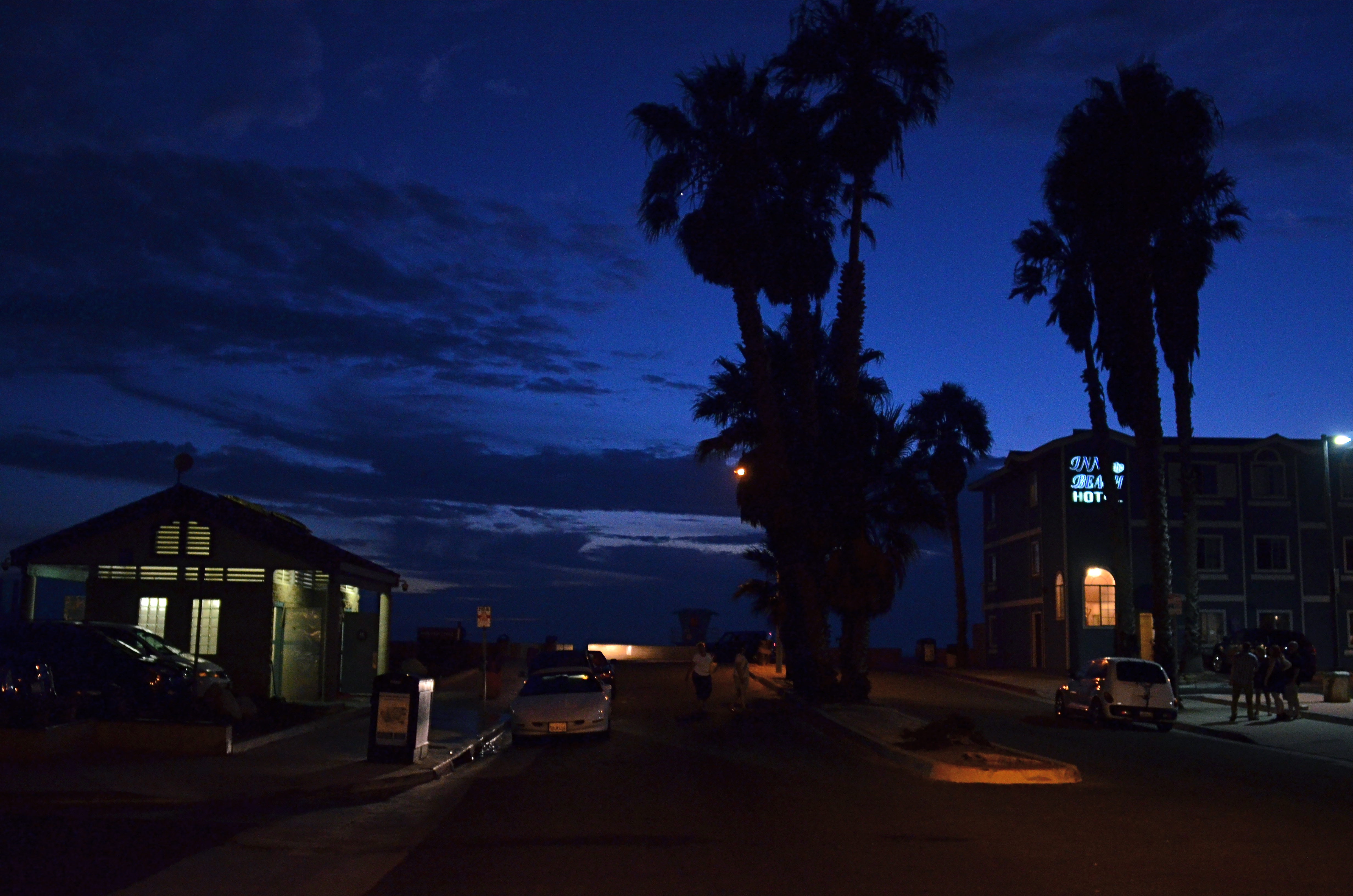
Here Comes The Night (2015). 1/40 sec., f/2.8, ISO 1600, 24mm.
That all changed after dessert, when we walked back onto the street that led down to the shore. I had a 24mm prime lens with me, which had been perfect for the wide-angle coastline stuff, but could also shoot wide open to f/2.8….fairly fast. As the night colors were already deepening, however, I realized that 2.8 was still going to mean shooting as slow a shutter speed as I could hand-hold and jacking the ISO up to a level that I normally tend to avoid. Those were the basic facts on the ground: now it was time to weigh the trade-offs.
Local traffic was swift enough for me to know that, even though I could hand-hold a shutter as slow as 1/15, there would be more than enough soft detail in a shot taken at f/2.8 without risking even more blurring from cars and walkers, so I settled at 1/40 and allowed the ISO to go to 1600 rather than lose the shot entirely.
Obviously, a tripod-mounted time exposure would have delivered a much crisper, more detailed shot, especially at f/11 or above, but I had what I had. And if you’re stuck with the somewhat mushier texture of a wide aperture, you have to determine where you envision the real impact of the image you’re planning. Is it in the fine-tuned detail or the overall atmosphere? There will be times when just salvaging the feel outweighs sharpness as a consideration, and, for me, this was one of those times.
CUT YOUR LOSSES
By MICHAEL PERKINS
ANYONE WHO’S SLOGGED THROUGH MORE A FEW OF THESE DISPATCHES knows all too well that I am a passionate preacher for shooting images completely on manual, not because it’s a more “pure” form of photography (and thus deserving of nobility and praise), but because I prefer to exercise as much personal control as possible. This, again, is not a quality judgement, since amazing pictures are made every day with the use of either complete or partial automodes. I just feel that I, personally, learn more by trying more, and manual settings place so much direct pressure on me to innovate and experiment that even my gross failures serve as education.
Sometimes. And other times they’re well, just gross.
The mode known in Nikon as Aperture Priority (“Av” on Canons) is the only semi-auto mode I use with any regularity, and always because I make an educated guess, before going on a shoot, about what conditions will likely prevail. AP allows you to manually dial in your aperture on those occasions when you want a uniform depth of field in everything you’re shooting, with your camera metering light on the fly and providing the shutter speed you need for a correct exposure. AP tend to be a rare bird for me because, in many cases, I am not shooting so fast that I can’t pause at least a few seconds between frames to dial in every exposure factor. However, there are cases when the technology gives you a decided edge.
Landscapes, especially in rapidly variable weather, call upon the shooter to react to conditions that could last, at best, for only seconds at a time. When skies are crystal clear and you have ample time to set up a shot, then, by all means, rely on your own experience shooting on full manual. If, however, you are moving and shooting quickly from dark to medium to extreme light and back again, then you might consider AP as a way to cut your reaction time in half. At this point, full manual may be costing you shots rather than making them better.
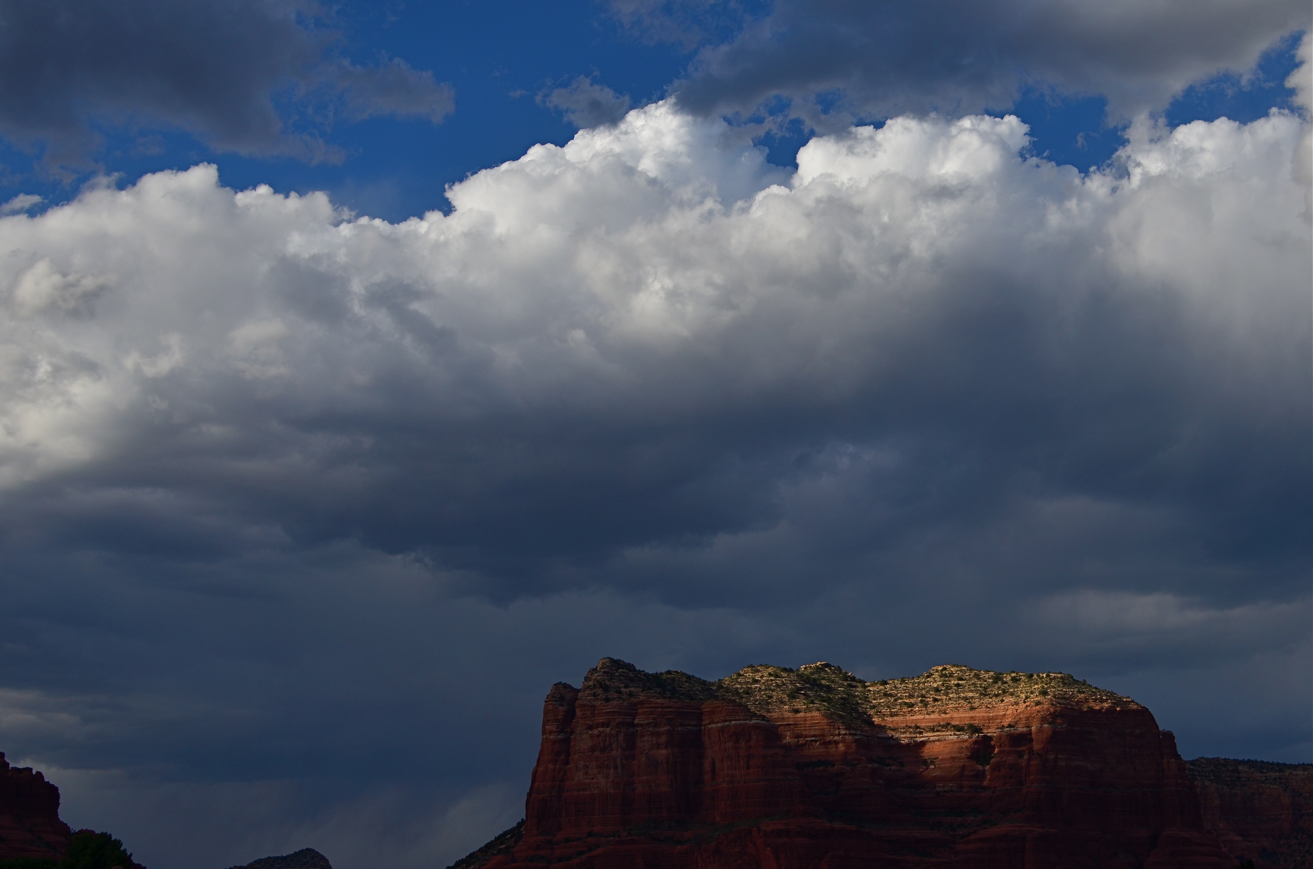
Last Embers (2016), taken on Nikon’s Aperture Priority setting. 1/640 sec., f/6.3, ISO 100, 35mm.
On the day the above image was taken, the town of Sedona, a miraculous array of red-tinged mountains in northern Arizona, was colored variously by a swiftly shifting broken cloud cover. One moment, the crest of a butte might take on a crimson glow, then be swallowed in shadow just moments later, with the gulch next door temporary hyper-lit in the same fashion. The clouds over Sedona were also backed by a decent headwind, shortening the stretches between scene changes even more. Moreover, the sunlight added a ton of contrast to the clouds themselves, making the sky a more attractive compositional component, with typically indistinct shapes rendered more sharply (because contrast is sharpness, right?).
As a result, the combination of light you see in this shot lasted exactly fifteen seconds, so, if I had paused to shoot a couple of trial frames on manual, just to try to nail the lighting, I likely would have missed this moment completely. Again, at this point, assist modes ain’t a compromise; they’re strategy.
The best practice is to anticipate, as much as possible, where you’ll be shooting and what the “game on the ground” is likely to be. Fashion shooters, journalists and other pros swear by Aperture Priority as insurance against lost shots. You may almost certainly find that to be true for some situations yourself . But the name of the game is Get The Picture, so, at the end of the day, the mode that makes you smile is the “right” mode. And don’t let nobody tell you no differnt.
THE FLAWED CHILD or the fine art of self-photobombing
By MICHAEL PERKINS
WORKING WITH TIME EXPOSURES IS A LITTLE LIKE THE EXPERIENCE PILOT TRAINEES GET the first time they are aboard a weightlessness simulator. You know that you’re outside the general rules of “reality”, and yet some kind of natural law is still in force. That is, as much fun as it is floating like a feather around the cabin, it still hurts if you slam your head into the ceiling. It’s just that, under normal circumstances, you wouldn’t be close enough to the ceiling to have to think about smacking into it.
Yeah, time exposures are like that.
Most of what we intuitively “know” about photo-making is based on a concept of exposure time that is pretty close to “instantaneous”, so we tend not to plan for what can occur when the shutter is stuck open for extended periods. Even a few seconds can introduce a very different relationship between light and dark, as well as the various non-stationary factors like wind, people, traffic, etc., that can create artifacts as they walk through our work area.
A kind of weird calculus, borne of trial and error, comes into play. For example, we know that cars rolling through a time exposure may be moving too quickly to be seen in the final picture, while their headlights will leave a glowing trail. We know that people walking into the shot at the correct speed can vanish to complete invisibility or register as smeary ghosts. It all has to be measured against how long you need for your camera to be sponging up light, and how standard, onwardly moving reality interacts with that process.
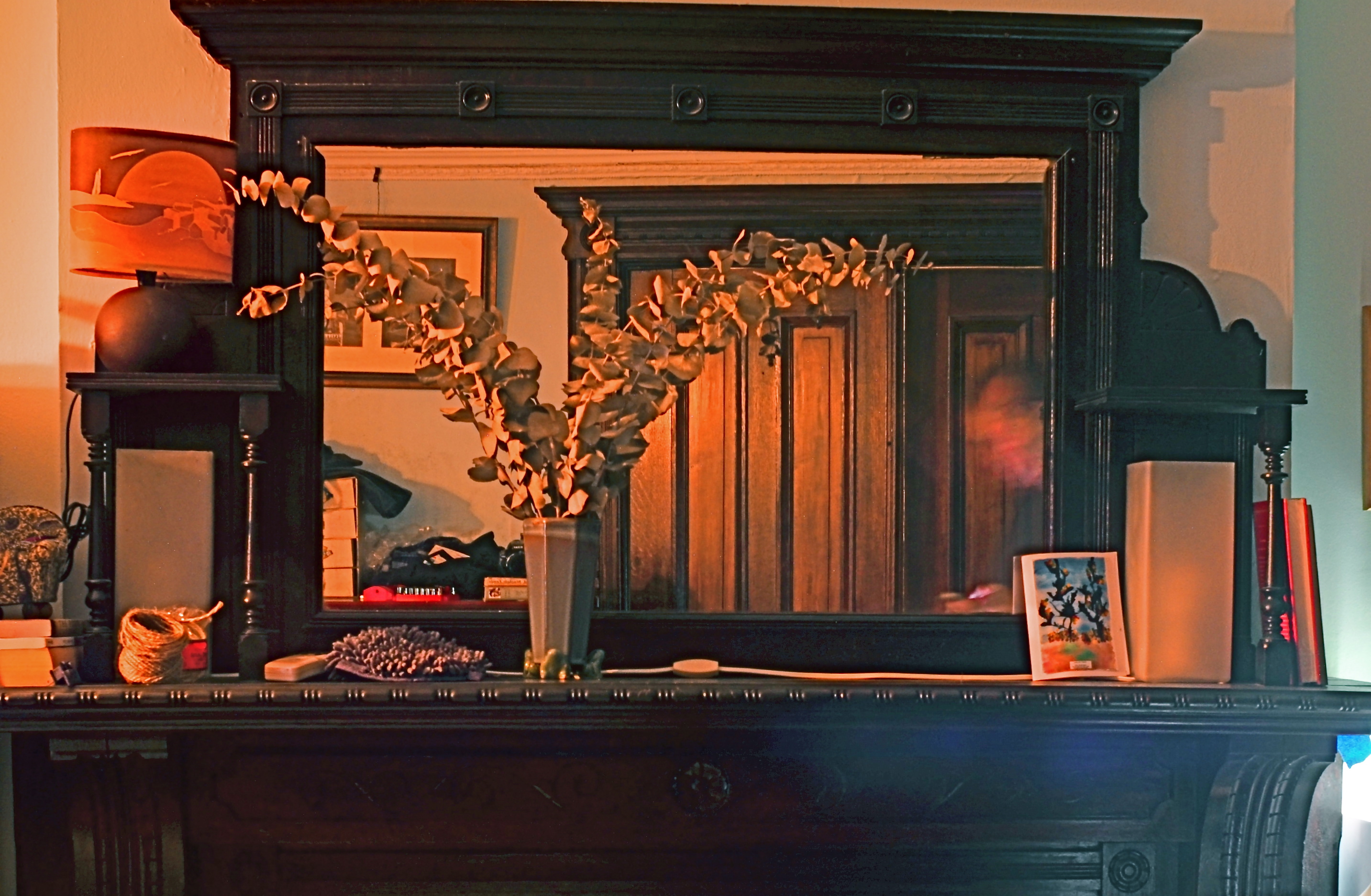
Monu-mantel (2016): A 36-second time exposure with an unscheduled guest appearance (inside the mirror’s right lower frame) by your humble author.
Recently I tried a layered still-life in the darkest room since, well, since darkness, and I knew that I would have to open for a long time. In trying to take a frame that included both a crowded, mirrored mantel in front of me, and the bureau and pictures from behind me that were reflected in the mirror, I balanced my camera on said bureau (you can see it to the left of the vase) and started experimenting with exposure times. Half a dozen or so tries later, I thought I’d nailed the magic number, but, in counting out the time in my head, I got distracted and walked partway into the shot, lingering just long enough to be recorded as the lighter sheen on the right front of the mantle and the facial smear in the right side of the mirror.
Again, we’re back in the weightlessness simulator. Different rules apply here in Oz, Dorothy. So, this picture is forever in the category of How To Get Out Of Your Own Way…..one of those flawed photographic children, that, while not quite flawed enough to merit being sent to military school, will also never be the favored kid, either. Joys of parenthood and all that.
ADDITION BY SUBTRACTION
By MICHAEL PERKINS
PHOTOGRAPHIC COMPOSITION IS A CONSCIOUS PRIORITIZING OF EVERYTHING WITHIN A PICTURE’S FRAME, a ruthless process of demanding that everything inside that square justify its presence there. When we refer to the power of an image, we are really talking about the sumtotal of all the decisions that were made, beforehand, of what to include or lose in that image. Without that deliberate act of selection, the camera merely records everything it’s pointed at. It cannot distinguish between something essential and something extraneous. Only the human eye, synched to the human mind, can provide the camera with that context.
Many of our earliest photographs certainly contain the things we deem important to the picture, but they also tend to include much too much additional information that actually dilutes the impact of what we’re trying to show. In one of my own first photos, taken when I was about twelve, you can see my best friend standing on his porch…absolutely…..along with the entire right side of his house, the yard next door, and a smeary car driving by. Of course, my brain, viewing the result, knew to head right for his bright and smiling face, ignoring everything else that wasn’t important: however, I unfairly expected everyone else, looking at all the auxiliary junk in the frame, to guess at what I wanted them to zero in on.

Heritage, 2016.
Jump forward fifty years or so, to my present reality. I actively edit and re-edit shots before they’re snapped, trying to pare away as much as I can in pictures until only the basic storytelling components remain….that is, until there is nothing to distract the eye from the tale I’m attempting to tell. The above image represents the steps of this process. It began as a picture of a worn kitchen chair in a kitchen, then the upper half of the chair near part of a window in the kitchen, and then, as you see above, only part of the upper slats of the chair with almost no identifiable space around them. That’s because my priorities changed.
At first, I thought the entire kitchen could sell the idea of the worn, battered chair. Then I found myself looking at the sink, the floor, the window, and…oh, yeah, the chair. Less than riveting. So I re-framed for just the top half of the chair, but my eye was still wandering out the window, and there still wasn’t enough visible testimony to the 30,000 meals that the chair had presided over. So I came in tighter, tight enough to read the scratches and discolorations on just a part of the chair’s back rest. They were eloquent enough, all by themselves, to convey what I wanted, without the rest of the chair or anything else in the room to serve as competition. So, in this example, it took me about five trial frames to teach myself where the picture was.
And that’s the point, although I still muff the landing more often than I stick it (and probably always will). To get stronger compositions, you have to ask every element in the picture, “so what do you think you’re doing here?” And anyone who doesn’t have a good answer….off to the principal’s office.
A MATTER OF DEGREE
By MICHAEL PERKINS
NIGHT CREATES SUCH A DRASTICALLY DIFFERENT FLAVOR in anyone’s photography that some shooters, romantically attracted to its unique look, have made night-time their exclusive domain. Night is also the toughest time of day to render properly, and a zone wherein one’s interpretation of “reality” varies wildly. From the earliest days of the photographic medium, the hours after sunset were, first and foremost, a technical minefield, filled with pitfalls and perils.
Today, fast lenses and the higher ISO that can be dialed up pretty much at will mean fewer tripod shots, more hand-held shots, and thus a much bigger yield of often stunning night-time images. Even modest cameras are evolving so quickly that it’s getting hard to remember a time when we couldn’t shoot pretty much whatever we desired.
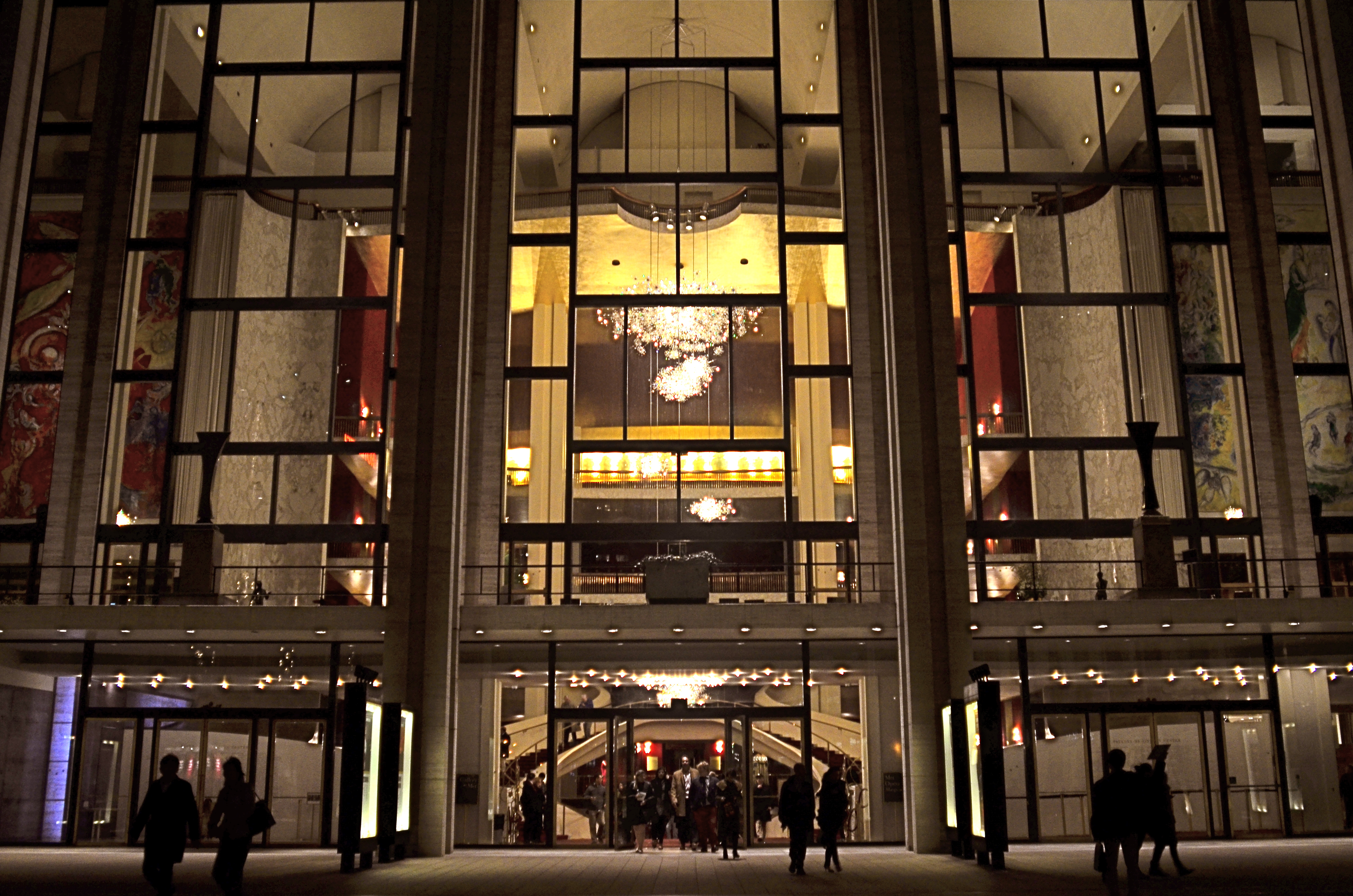
Lincoln Center, 2016
In many night settings, the contrast between bright and dark objects is dramatically multiplied. That means that getting proper exposure still has to be calculated based on widely varying elements within the frame. The night I took this image at New York’s Lincoln Center, I shot the various performance buildings on the “campus” in every compositional combination and setting possible, using a Nikon f/2.8 24mm prime lens. I framed the theatres at right angles to each other, by themselves, juxtaposed with neighboring skyscrapers, with and without the center’s fountain plaza, from medium distances to the lobby, tight distances to the lobby, and so on. In one “almost” calculation, I shot at f/8 and about 1/80 sec. at 1500 ISO, didn’t like how grungy it looked, then cranked the lens wide open to f/2.8, used as slow an exposure as I could execute hand-held (about 1/20 sec.), and backed off the ISO to about 400. That’s the combo you see above.
Normally, an aperture like f/2.8 produces a very shallow depth of field, which is generally bad for distant subjects. However, if you are focused to infinity, and your subject is, say, forty feet away, the image starts to get a little sharper at about twenty feet out, and is pretty sharp by forty. One sharpness caveat: if you use a slow exposure, as I chose to, and you’re also boosting your ISO, the electrical lights in your image will begin to go soft and globby fairly quickly…to “burn in” to some degree. You can see this in my image in the lobby chandelier, which registers as a velvety glow instead of a sharp grouping of individual bulbs. As an alternative, if you have time to experiment, you can amp up the up the ISO a little more, speed up your shutter, and perhaps render the lights a little sharper. This depends greatly on how many wives you have standing nearby, asking, “can we please just walk to the subway now?” It’s also not the only solution possible. Fiddle with it and see what works for you.
Also, if you are lucky enough to be shooting on a tripod, then you can shoot at minimal ISO, an aperture of f/11 or narrower, and as long an exposure as you desire. But the above guidelines are offered for someone shooting hand-held, and in a moderate hurry. I use very fast prime lenses to give me the sharpest focus and the most light latitude possible in the greatest number of situations, assuming that I won’t be allowed to mount a pod, even if I wanted to take one to the theatre (I don’t). So, as always, you have to decide a little ahead of time what you might be shooting, what the reality on the ground will be, and what you’ll need in the way of toys to bring home a goodie. Night is a very different animal, but trying to tame it is surprising and fun.
I’M LOOKING THROUGH YOU
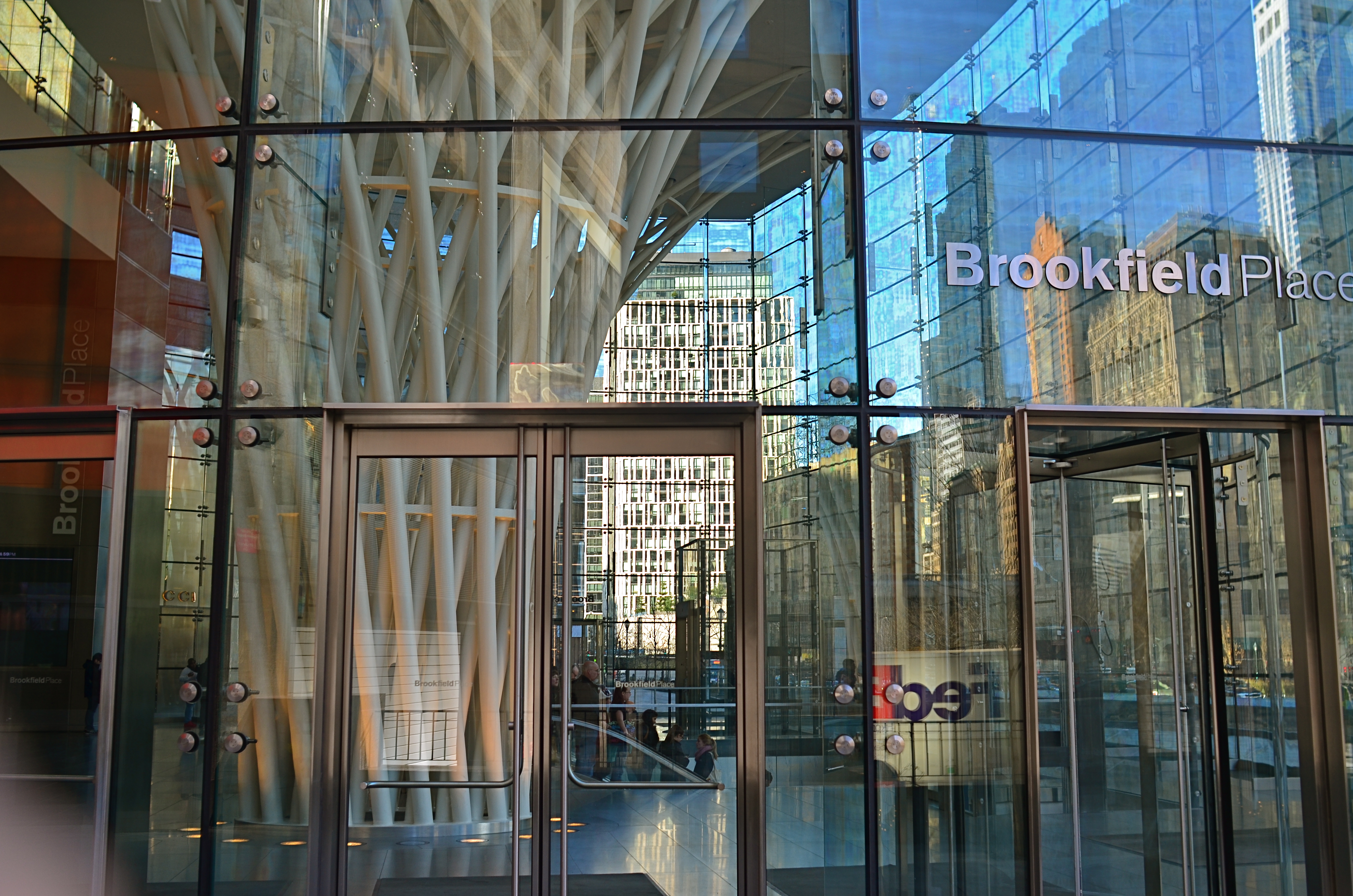
Brookfield Breaklight, 2016.
By MICHAEL PERKINS
ANYONE WHO REGULARLY PHOTOGRAPHS GLASS SURFACES realizes that the process is a kind of shot-to-shot negotiation, depending on how you want the material to react and shape your subject. There is really no absolute “look” for glass, as it has the ability to both aid and block the view of anything it’s around, in front of, or near. Viewed in different conditions and angles, it can speed the impact of an image, or foil it outright.
I love shooting in urban environments, where the use of glass has shifted dramatically in recent decades. Buildings that were 90% brick or masonry just fifty years ago might be predominantly wrapped in glass today, demonstrably tilting the ratios of available light and also changing what I call the “see-through” factor…the amount of atmosphere outside a building can be observed from inside it. This presents opportunities galore of not only what can be shown but also how abstracted glass’ treatment of reflection can serve a composition.
Against the advice of many an online pundit, I keep circular polarizing filters permanently attached to the front of all my lenses so that I can modify reflections and enhance color richness at my whim. These same pundits claim that leaving the filter attached when it’s not “needed” will cost you up to two stops of light and degrade the overall image quality. I reject both these arguments based on my own experience. The filters only produce a true polarizing effect if they are either at the right viewing angle vis-a-vis the overhead sun, or if they are rotated to maximize the filtering effect. If they don’t meet either of these conditions, the filters produce no change whatever.
Even assuming that the filter might be costing you some light, if you’ve been shooting completely on manual for any amount of time, you can quickly compute any adjustments you’ll need without seriously cramping your style. Get yourself a nice fast lens capable of opening to f/1.8 or wider and you can even avoid jacking up your ISO and taking on more image noise. Buy prime lenses (only one focal length), like a 35mm, and you’ll also get better sharpness than a variable focal length lens like an 18-55mm, which are optically more complex and thus generally less crisp.
In the above image, which is a view through a glass vestibule in lower Manhattan, I wanted to incorporate the reflections of buildings behind me, see from side-to-side in the lobby to highlight selected internal features, and see details of the structures across the street from the front of the box, with all color values registering at just about the same degree of strength. A polarizer does this like nothing else. You just rotate the filter until the blend of tones works.
Some pictures are “about” the subject matter, while others are “about” what light does to that subject, according to the photographer’s vision. Polarizers are cheap and effective ways to tell your camera how much light to allow on a particular surface, giving you final say over what version of “reality” you prefer. And that’s where the fun begins.
ESCAPING THE DARKNESS
By MICHAEL PERKINS
TO A PHOTOGRAPHER, THE ENTIRE WORLD IS PRETTY MUCH A “PUBLIC PLACE“, or, more properly, his own personal work space. However, that dreamy viewpoint is not shared by the world at large, and shooters who try to harvest their shots in museums, theatres, office lobbies and other popular gathering points are finding, more and more, that they are about as welcome as a case of shingles unless they are (a) quick (b) unobtrusive and (c) polite to the point of fawning.
It’s not hard to understand why.
First, some of the excess paraphernalia that photogs pack can strike curators and security personnel as hazardous, if not downright dangerous. This view is reflected in the growing number of attractions that have, of late, prohibited the use of selfie sticks. That one I kinda get. Photographers have also taken a hit in the number of places that will permit flash of any kind, and tripods and monopods are nearly always forbidden. The real determinant in why public spaces are less inclined to play ball with photographers, however, is that they simply don’t have to. More patrons than ever rely solely on cel phones, which, in turn, have become more sensitive to low-light situations, making for shorter exposures with fewer add-ons, a technical leap that ensures that everyone will come away with at least some kind of picture. If you need a longer exposure at lower ISO (hence less noise), you still need traditional, higher-end gear, but those numbers are shrinking so much that the gatekeepers can be a lot more restrictive overall.
In many dark spaces I simply can’t find a place to stabilize my camera long enough to take an extended exposure. And, with ‘pods off the table as an option, you’re down to benches, ledges, or other precarious surfaces, and, with them, the paranoid hovering of a mother eagle guarding her eggs to steer foot traffic away from her “nest”. A remote shutter release helps, but the whole project can raise the blood pressure a bit. At least with tripods, passersby can see a set space to steer themselves clear of. A crazy man waving his arms, not so much.
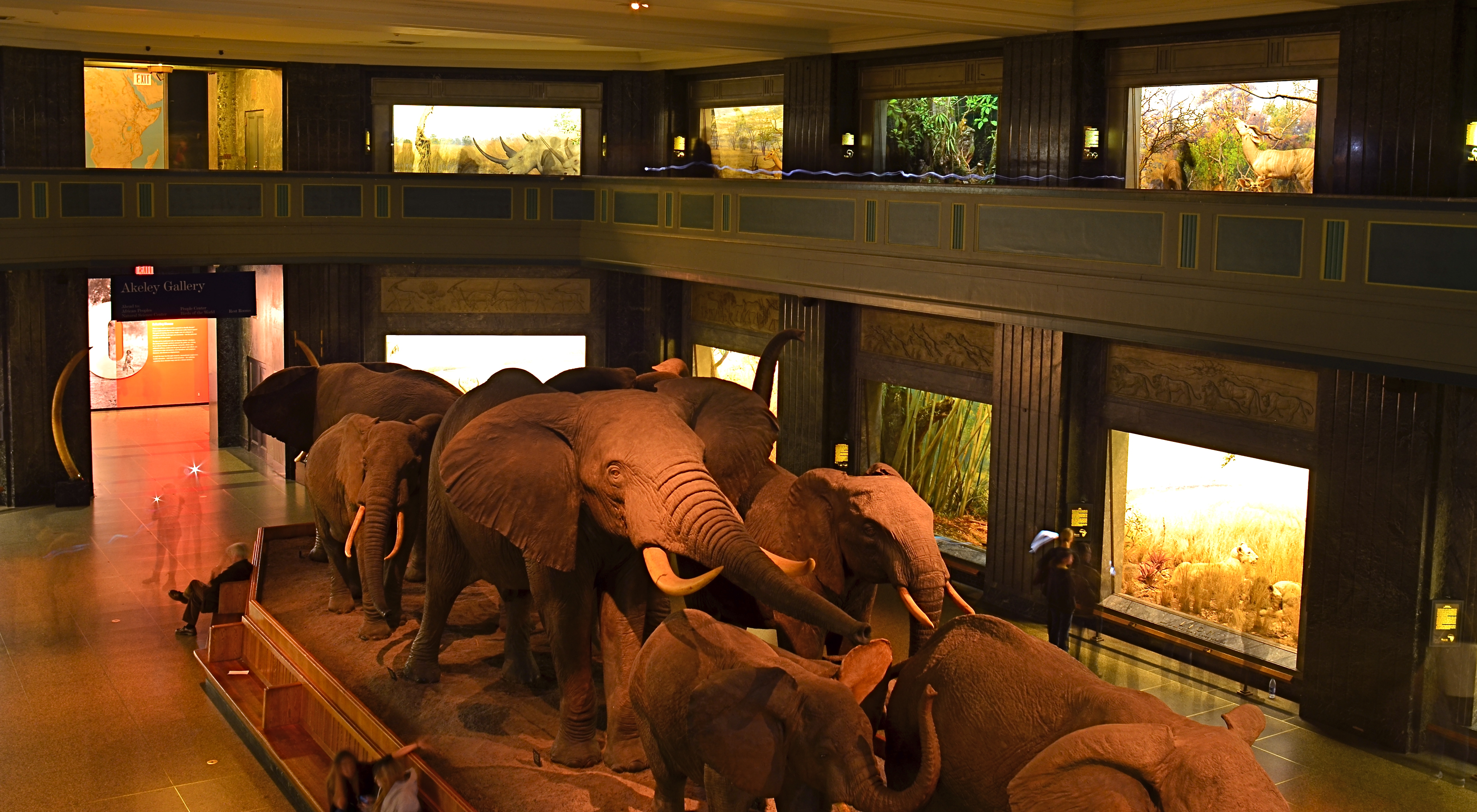
Herd On The Street, 2016. A twenty-five second exposure at f/8, ISO 100, 24mm, from a camera teetering on a museum railing.
The above image was taken in one of the most light-deprived sectors of the New York Museum Of Natural History, with only soft illumination in the side showcases to redeem the pitch-black gloom. No flash would even begin to fill this enormous space, even if it were permitted, and the hall is always crowded, so resting my camera on a narrow rail, twenty-plus feet above the main floor, and going for a long exposure, is the only way for an acceptable degree of detail to emerge from the murk. My wife, who is known for nerves of steel, had to excuse herself and go elsewhere as I was setting up the shot. I couldn’t blame her.
Three or four anxious framings later, I got a workable exposure. As occurs with time exposures, people walking through the scene at a reasonable speed are rendered nearly invisible. The persons near the back of the elephant herd stood still long enough to take a flash snapshot, so their flash burst and some smudgy shadows of their bodies can be seen, as can the trailing LED light that someone else on the upper deck apparently was walking with in the upper right corner. But for this kind of shot, in these modern times, such artifacts are part of the new normal.
UNKNOWN KNOWNS

Everyone is visible, yet no one is known. Faceless crowds serve as shapes and props in a composition.
By MICHAEL PERKINS
WE OFTEN WRITE IN THESE PAGES ABOUT PHOTOGRAPHY’S UNIQUE ABILITY to either reveal or conceal, and how we toggle between these two approaches, given the task at hand. Photographic images were originally recorded by using science to harness light, to increase its ability to illuminate life’s enveloping darkness, just as Edison did with the incandescent bulb. And in their attempt to master a completely new artistic medium, early photographers were constantly pushing that dark/light barrier, devising faster films and flash technology to show detail in the darkest, dimmest corners of life.
And when that battle was won, an amazing thing happened.
Photographers realized that completely escaping the dark also meant running away from mystery, from the subtlety of suggestion, from the unanswered questions residing within their pictures’ shadows. And from the earliest days of the 20th century, they began to selectively take away visual information, just as painters always had, teasing the imagination with what could not be seen.
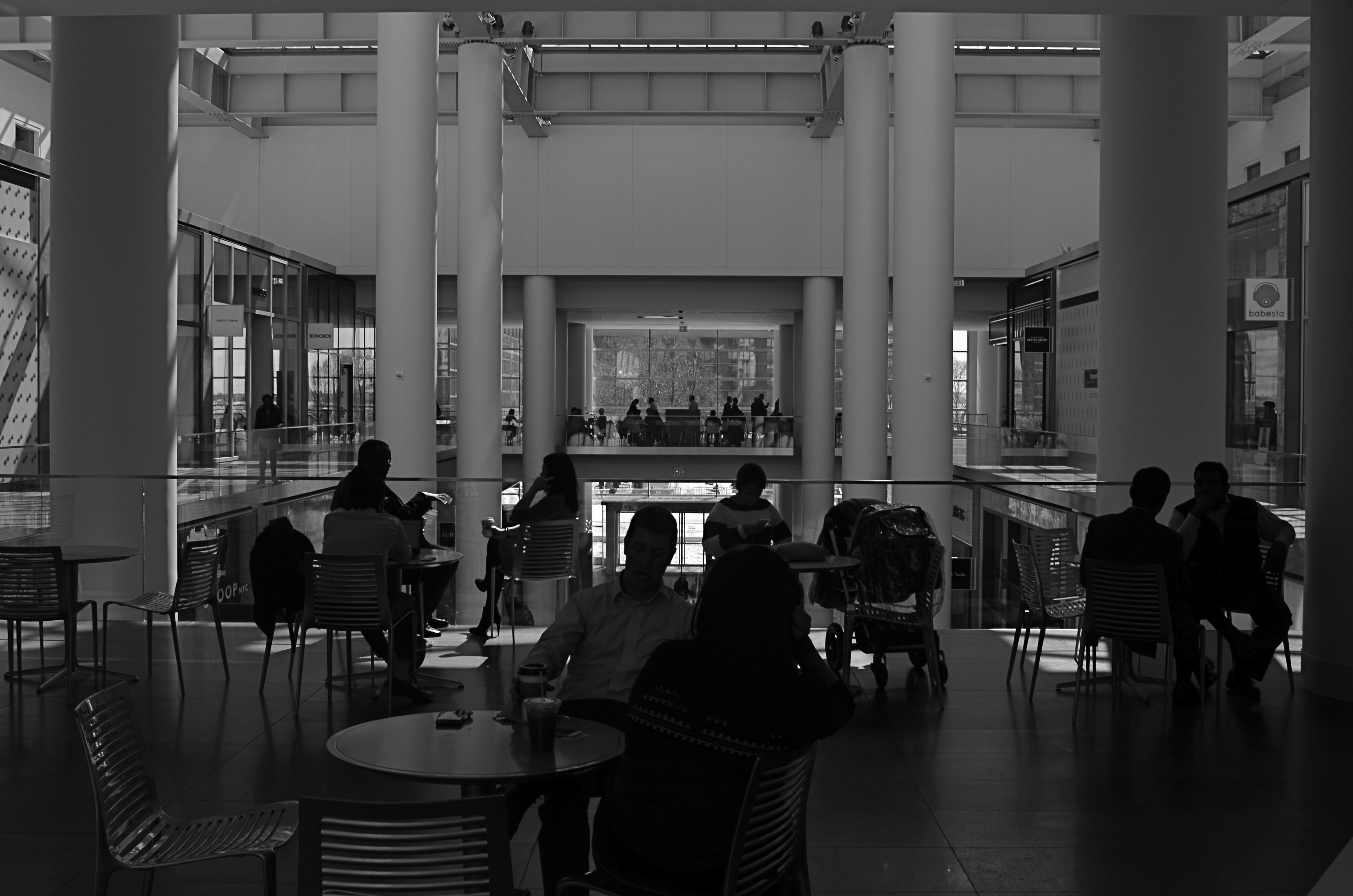
Friendly chats or shadowy conspiracies? Your choice.
City scenes which feature individual faces in crowds opt for the drama (or boredom) written in the face of the everyday man. Their scowls at the noonday rush. Their worry at the train station. Their motives. But for an urban photographer, sometimes using shadow to swallow up facial details means being free to arrange people as objects, revealing no more about their inner dreams and drives than any other prop in an overall composition. This can be fun to play with, as some of the most unknowable people can reside in images taken in bright, public spaces. We see them, but we can’t know them.
Experimenting with the show it/hide it balance between people and their surroundings takes our photography beyond mere documentation, which is the first part of the journey from taking pictures to making them. Once we move from simple recording into interpretation, all the chains are off, and our images can really begin to breathe.
DEM DARN DONT’S
By MICHAEL PERKINS
THE GLIB REMARK THAT YOU HAVE TO LEARN ALL THE RULES IN LIFE BEFORE YOU CAN BREAK THEM is maddeningly true, at least for me. Early on in my foto-fiddling, I was eager to commit all the world’s accumulated photographic do’s and don’ts to memory, like a biblical scholar nailing scripture passages, and shooting as if to enshrine those stone-written truths in art. I used words like always and never to describe how to make pictures in a given situation. I kept the faith.
And then, when I suddenly didn’t, my stuff stopped being pictures and started being photographs. Absolutes of technique are good starting places but they usually aren’t the best places to stick and stay for life. And at this point in my personal trek (seventh-inning stretch), I feel the shadow of all those do’s and don’ts swirling about like little guardian angels, but I worry first and foremost about what makes a given image work.
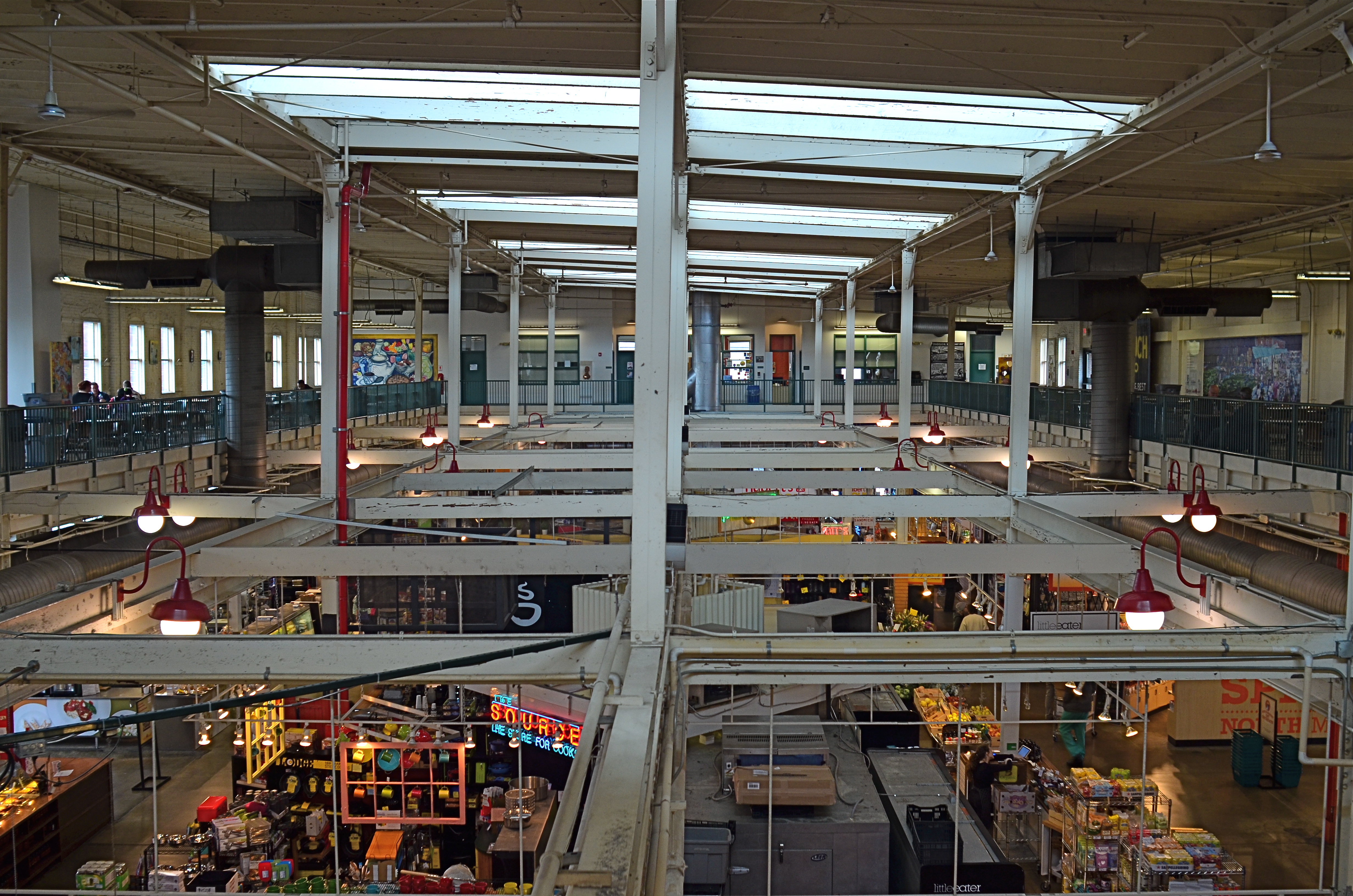
North Market, 2016. Straight out of the camera at 1/40 sec., f/5.6, ISO 200, 24mm.
You no doubt have many pictures you’ve made which you simply like, despite the fact that they flaut, or even fracture, the rules. The above image, shot earlier this week at a multi-floor urban marketplace/eatery, struck me for two reasons. First, because of how many basic rules of “proper” composition it clearly violates; and secondly, just how much I don’t care, because I like what it does. To illustrate my point, I’ve provided citations from an article titled Principles Of Composition to cite specific ways that the photo is, well, wrong.
Have A Strong point of interest. Well, there isn’t any particular one, is there? Lots of conflicting stuff going on, but that’s the natural rhythm of this place. It’s a beehive. One man’s clutter is another man’s full “pulse of life”, and all that.
Don’t place the horizon line, or any strong vertical or horizontal lines, right in the middle of a picture. And make sure the lines aren’t tilted. Okay, well, since there is a distinct difference between the “level-ness” of the crossbeams over the lower floor and the slanted lines of the skylight above, there really isn’t a way to make the entire picture adhere to the same horizontal plane. However, the off-kilter sagginess of the old building actually lends it a little charm , unless I’m just drunk.
Keep compositions simple, avoiding busy backgrounds that distract from your subject. Granted, there are about five different sub-pictures I could have made into separate framings within this larger one, but that would defeat the object of overall bustle and sprawl that I experienced looking out over the entire scene. Sure, some compositions get so busy that they look like a page out of Where’s Waldo?, but certain chaotic scenes, from Grand Central Terminal to Picadilly, actually reward longer, deeper viewing.
Place a subject slightly off-center rather than in the middle of a photo. Yeah, well, that’s where that “strong point of interest” rule might have helped. Sorry.
Do these deviations mean the image was wrong, or wrong for certain circumstances? Every viewer has to call that one as he sees it. Me, I am glad I decided to shoot this scene largely as I found it. It needed to work with natural light, it needed to be shot wide and deep, and it needed to show a lot of dispirate activity. Done done and done. I heard all the rules in my head and chose the road not taken.
Or taken. I forget which.
THE EYE OF MEMORY
By MICHAEL PERKINS
PHOTOGRAPHY DEALS IN FEELINGS, those inexact sensations of the heart that we try to capture or evoke in our visual messaging. Some subjects, such as war or celebration, convey emotions with such immediacy that we are really only acting as recorders, with the associative power of our minds providing much of the detail. Pictures of loss or celebration, such as the aftermath of a disaster or the birth of a new life, can be fairly simple to convey. What you see is what the thing is. For subtler regions of the brain, however, photos must use, if you will, a different vocabulary.
Newbie photographers are trained, to a a great degree, to seek the sharp image, to master focus as a technical “must”, but, as we vary the kinds of messages we want to convey, we change our attitudes about not only sharpness but most of the other “musts” on the beginner’s list. We learn that we should always do a certain thing….except when we shouldn’t. It’s worth remembering that some of the most compelling photos ever published were, according to someone’s standard, “flawed” in some way.
De-saturated color, soft focus. Items dealing with feelings, especially memory. are better served with less “realism”.
News shooters have long since learned that the emotional immediacy of a picture, along with its raw “news value”, outweighs mere technical precision by a country mile. The rules get bent or broken because, in their most perfect application, they may actually dull the impact of a given image. Thus, many a journalist has a Pulitzer on his wall for a picture that a beginner might regard as “wrong”. And the same goes for any picture we may want to make where an emotion simply must be conjured. Mere visual accuracy can and will be sacrificed to make the picture ring true.
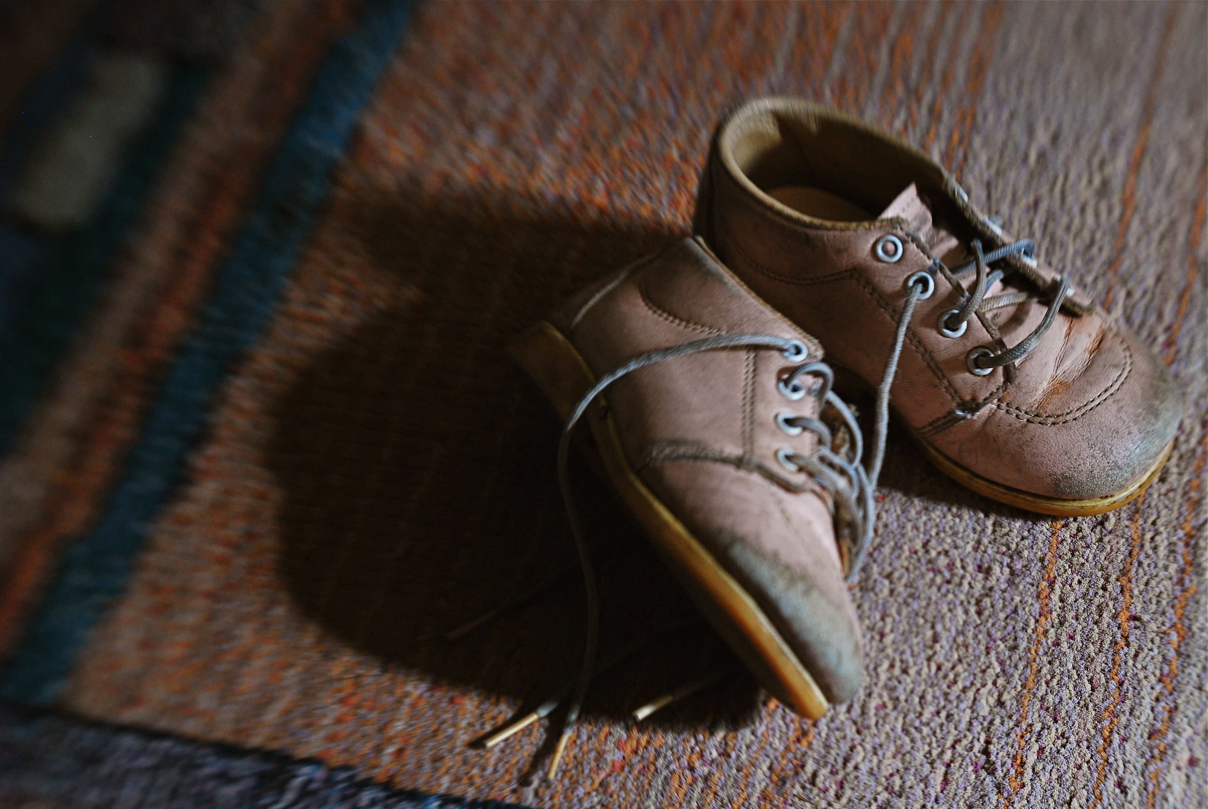
Asa personal example, I find that images that plumb the mysteries of memory often must stray from the arbitrary standards of so-called “realism”. When you work in the realms of recall, nostalgia, regret, or simply fond remembrance, a certain fluid attitude toward the niceties of sharpness and exposure may actually sell the idea better. Memory is day-dreaming, after all, and, in a dream, as Alice found in Wonderland, things look a bit…off. Dimension, delineation, depth…all these properties, and more, morph with the needs of the desired image. “Real” sells some things superbly. Emotion, however, as earlier stated, demands a language of its own.
The baby shoes shown in the image above are shot in uneven sharpness to suggest the gauzy nature of the memories they may evoke. Likewise the color is a bit washed-out, almost pastel, since a full, vibrant range of hues may seem less dreamy, more rooted in reportorial reality…which we don’t want for a picture like this. Rule-breaking ensues simply because nothing, no rule, no standard, is as important as making the picture work. If it doesn’t speak to the viewer, then the fact that it’s technically superb means nothing.
As Mr. Ellington sez, it don’t mean a thing if it ain’t got that swing.
A TRICK OF THE LIGHT
By MICHAEL PERKINS
PHOTOGRAPHERS WHO TRACK THE SUN AS IT TRAVELS EAST TO WEST over the vast expanse of the Grand Canyon have made amazing images of the way light changes contours, shadows, even the sensation of depth and scale over the course of a single day. Such hour-by-hour portfolios present pictures which are less about the subject matter and more about how light shapes that subject. And the same tracking exercise is possible in canyons of another sort, the vertical jungles we call cities.
Buildings in urban settings reveal more in pictures than their own particular physical shapes and designs: they also have visual artifacts tattooed onto them from their neighbors, which block, warp and reflect light patterns in their direction. Thus the most architecturally drab tower can become hypnotic when bathed in patterns of shadows shaped by the tower next door. And that means that those seeking abstract images may find that ordinary parts of the city can be rendered extraordinary by light’s odd bounces. Additionally, the fact that many of these light effects are fleeting, visible, in some cases, only for minutes each day, presents both a challenge and an adventure for the photographer.
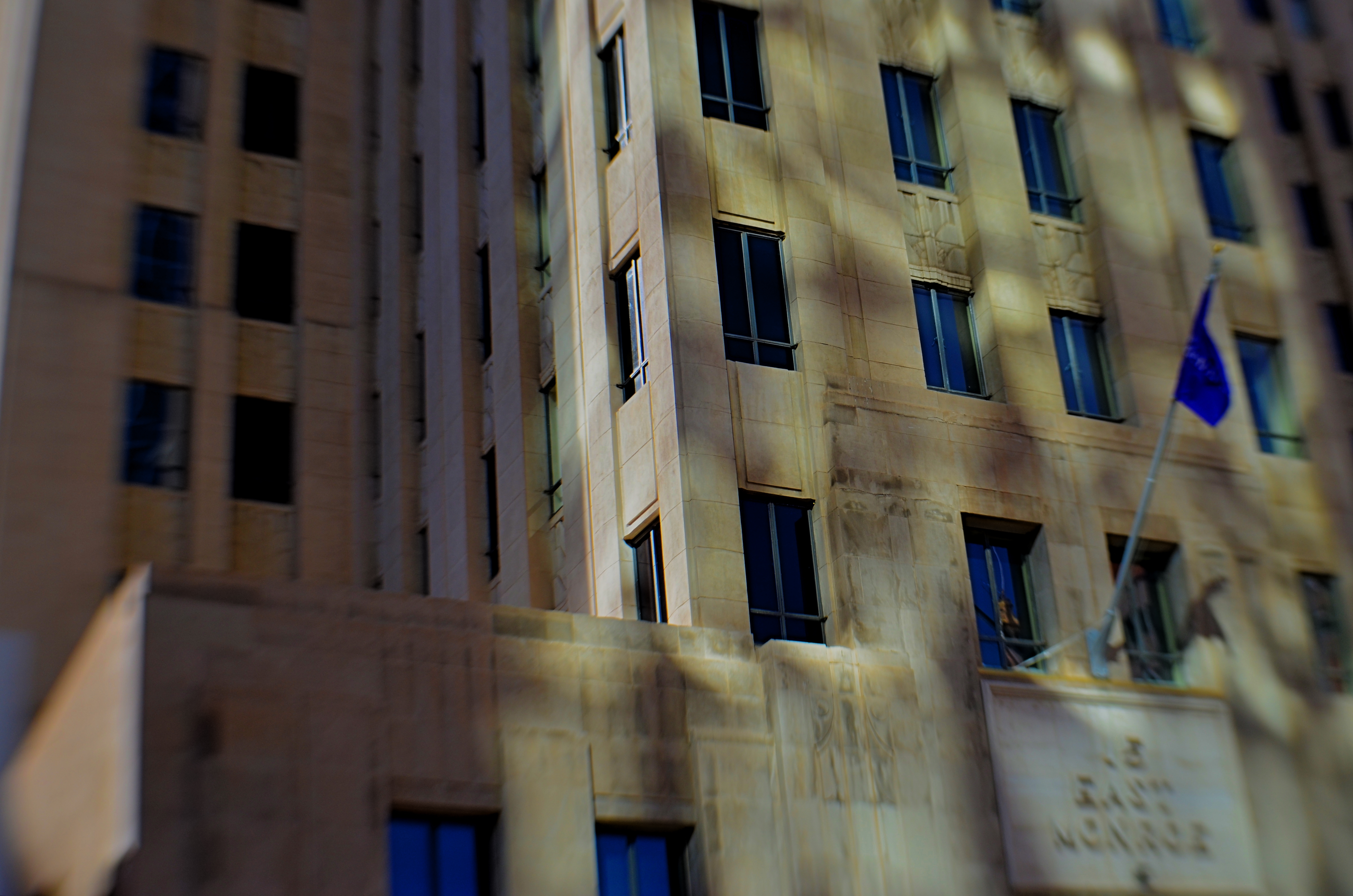
Fifteen East Monroe, 2016.
In the shot above, a gorgeous Art Deco building in downtown Phoenix, Arizona benefits from a light effect that has only been possible for the last forty years of its existence. Erected in the late 1930’s, the northern face of 15 East Monroe Street would not, at its opening, have been dappled with the shadow patterns seen here. No, it took a soul-less glass box from the ’70’s, located across the street, to bounce patterns of reflected light onto the building as you see it here, and only for about two hours a day between late morning and noon.
During that window, 15 East Monroe displays a wonderfully checkered mix of reflected illumination on its golden terra-cotta exterior. I first observed the patterns ten years ago, and have been going back for occasional looks ever since. The trick, in this image, was to keep the texture of the building from looking too sharp, since the effect itself is somewhat dreamy, and works better if the overall photo of the building is also a little soft. I used a selective focus lens (sharp at the middle, softer toward the edges) to give the overall building a gauzy look, and let the picture really be about the light effect, rather than any specific part of the building. Even at this point, I am imagining about a half-dozen other ways to accomplish this, but this image can at least serve as an initial study, a guideline for what may, eventually, be my final word on the subject.
Photography, clinically defined, is the art of writing with light. Sometimes, regardless of the object in our viewfinder, what light does to things is, by itself, enough for an interesting picture. It takes some restraint to let the light be the subject, and to let the picture, in its most basic form, breathe.
LATE-BURNING CANDLES
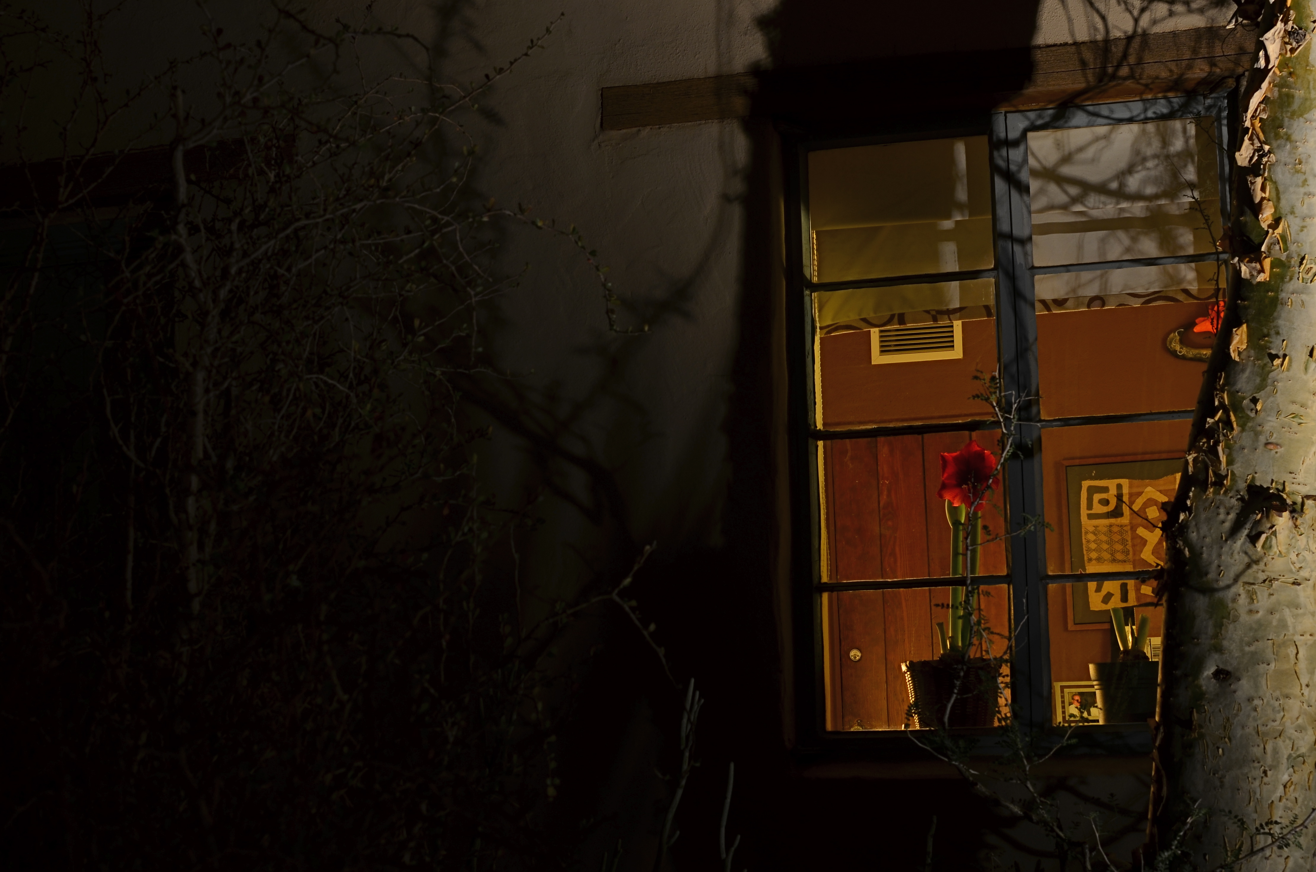
Night Bloom, 2016. 8 sec., f/8, ISO 100, 35mm.
By MICHAEL PERKINS
DAYTIME PHOTOGRAPHS OF BUILDING EXTERIORS present the interior contents of apartments, stores and offices in a very muted fashion. Glare, sunlight, and plain old dirty glass, along with the limited scope of some camera sensors, render inside space in a somewhat flattened manner. Fortunately, night shots of the same spaces reveal something completely different, hints of the lives of the people who have locked up and headed home for the evening.
Like a picture framed in a black matte or displayed on a bed of velvet, night images of building interiors, taken from outside those buildings, benefit from that contrasty “punching up” between dark and light. More to the point is how people decide to stage their work space when they clock out. Do they leave a single lamp on to illuminate their desk? Is the room largely dark, but partially painted with ambient light from the cleaning person down the hall? Are certain displays, logos, personal effects altered by the overall reduction in illumination? And, for the photographer, does something different emerge in the feel of the room that seems invisible by day?
I recently walked around a large museum campus, taking medium-distance time exposures of several buildings whose exterior lighting scheme seemed altered at night, when I saw the office window you see above. The overall scheme of light in the room was warm. The gorgeous amaryllis plant arching over someone’s desk not only worked that slightly orange room light, but was made especially seductive with the deepening of its own colors. Here was a workspace where someone drew rest, beauty, and solace from the inclusion of just one extra humanizing item. And, after dark, it glowed like a coal to passersby. I had to have it, at least inside my camera.
I’m not saying that all peeks through all windows yield treasures to the photographer’s eye. But the sheer volume of visual information on a city street during the day is cut by half after sundown, and occasionally, you find a late-burning candle that has spent the daylight hours hiding in plain sight.
PICTURES WITH A LEG (OR LEGS) TO STAND ON
By MICHAEL PERKINS
YOU HAVE SEEN THEM A MILLION TIMES. Those brave souls who, despite multiple trips to Failed Fotoland, optimistically point their cel cameras at distant and dark objects, hoping their puny on-board flashes will illuminate cavernous concert halls, banish shadows from vast cathedrals, or, God bless them, turn the night sky into a luminous planetarium. They have faith, these people. But they don’t often take home the prize.
Immense, dark masses of subject matter, from mountain sides to moody urban streets, simply cannot be uniformly exposed with a sudden lucky burst of on-camera flash. The only way to gather enough light to get a usable exposure of such things is to leave your shutter open long enough to let more light soak in. Think dribble instead of flood. Time exposures are remarkably effective in “burning in” an image slowly, but they have their own science and technique, and they must be patiently practiced. They are the dead opposite of a quick fix, but they are worth the trouble.
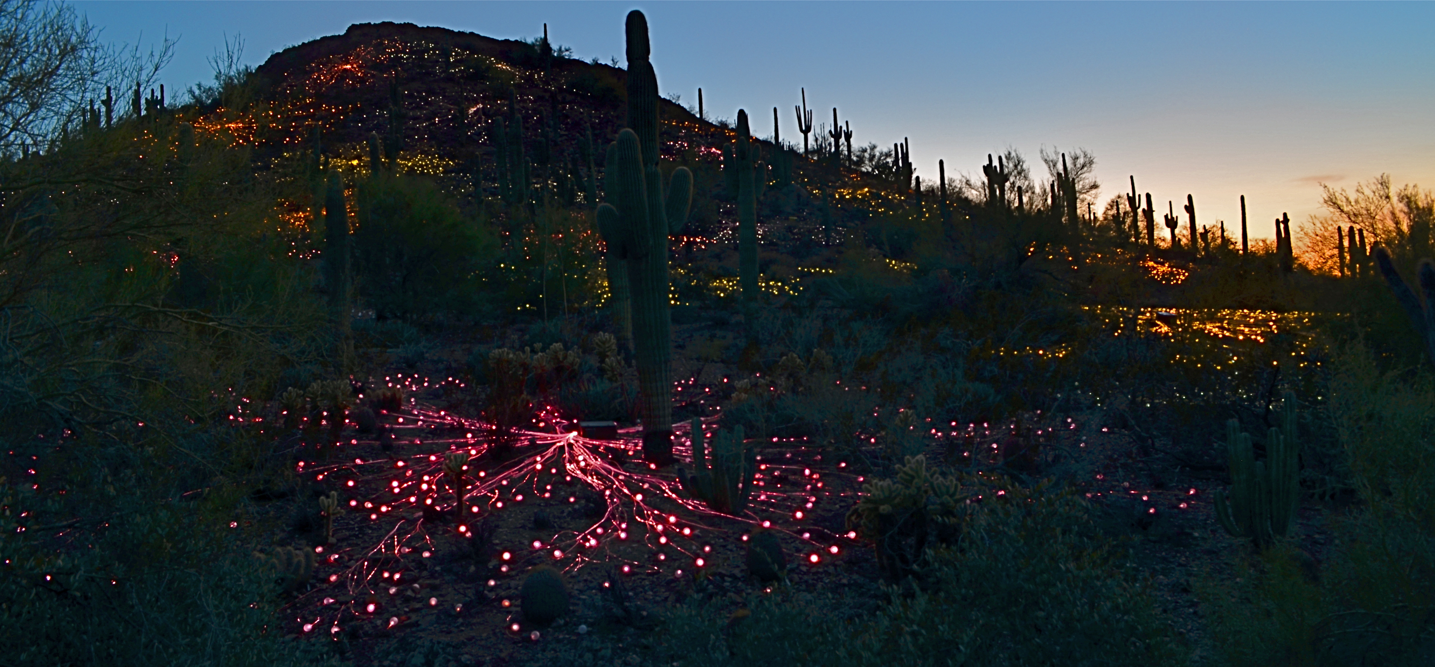
Ember Mountain, 2016. Two separate time exposures nearly a half-hour apart, blended in Photomatix’ “Exposure Fusion” mode.
With today’s editing software, it’s easier than ever to customize even your best time exposures, combining several shots taken over a given time sequence to arrive at a satisfying balance of elements. In the above picture, I wanted to show the colorful “Field Of Light” installation created by artist Bruce Munro for Phoenix’ Desert Botanical Garden, which blankets a desert hillside with over 30,000 globes of color-shifting light. I set up my tripod about a half-hour before local sunset and took exposures five minutes apart until about forty minutes into the onset of evening.
From that broad sequence, I selected two frames; one taken before dark, in which the underlying detail of the hill (desert plants, rocks, etc.) could still be seen, and one taken just after the sky had gone dark to the naked eye, but blue to the camera. I then composited the shots in Photomatix’ “exposure fusion” mode, which is a bit like stacking two backlit slides and gradually changing how much of each can bleed into the other. My object was to get both a blue, but not black, twilight sky and at least some detail from the natural terrain. Neither individual shot could achieve all of this alone, however, given the ease of doing an exposure fusion in nearly any kind of photo software these days, it was a snap to grab the best elements of both frames.
Epilogue: during the fairly long stretch of time I was standing behind my tripod, I counted over two dozen separate visitors who boldly stepped up, aimed their cellphones, cranked off a quick flash, and loped away, muttering something like, “well, that didn’t work.” Some shots are like low-lying fruit, and some have to be coaxed out of the camera. Knowing which is which, ahead of time, makes for happier results.
IT’S ALL WRONG BUT IT’S ALL RIGHT
I decided in the moment to go soft with this nature scene. Maybe I overdid it. Maybe it’s okay. Or not.
By MICHAEL PERKINS
ONE OF THE ONLY CONSTANTS OVER THE HISTORY OF PHOTOGRAPHY has been the flood tide of tutorial materials covering every aspect of exposure, composition, and light. The development of the early science of capturing images in the 19th century was accompanied, from the first, by a staggering load of “how to” literature, as the practice moved quickly from the tinkering of rich hobbyists to one of the most democratic of all the art forms. In little more than a generation, photography went from a wizard’s trick to a series of simple steps that nearly anyone could be taught.
In calling these pages the “photoshooter’s journey from taking to making”, we have made, with The Normal Eye, a deliberate choice not to add to the mountainous load of technical instruction that continues to be available in a variety of classroom settings, but to emphasize why we make photographs. This is not to say that we don’t refer to the so-called “rules” that govern the basics of creating an image, but that we believe the motives, the visions behind our attempts are even more important than just checking items off a list of techniques in the name of doing something “right”. There are many technically adept pictures which fail to engage on an emotional or aesthetic level, so the mission of The Normal Eye, then, is to start discussions on the “other stuff”, those indefinable things that make a picture “work” for our hearts and minds.
The idea of what a “good picture” is, has, over time, drifted far and wide, from photographs that mimic reality, to those that distort and fracture it, to images that are both a comment and a comment on a comment. It’s like any other long-term relationship: complicated. Like everyone else, I occasionally produce what I call a “fence-sitter” photo like the one above, which I can both excuse and condemn at the same time.
In raw technical terms, I have obviously violated a key rule with the abject softness of the image…..unless……unless it can be said to work within the context of the other things I was seeking in this subject. I was trying to stretch the envelope on how soft I could make the mix of dark foliage and hazy water in the scene, and, while I may have gone a bit too far, I still like some of what that near-blur contributes to the saturated color and lower exposure, the overall quiet tone I was trying for. Still, as of this moment, I’m still not sure whether this one is a hit or a miss. It might be on the way to something, but I just can’t say.
But that’s what the journey is about. It can’t be confined to mere technical criteria. You have to make the picture speak in your own language.
THE EVENTUALITY OF ABOUT
“Something’s going to happen. Something….wonderful!” —Astronaut David Bowman, “2010: The Year We Make Contact”
By MICHAEL PERKINS
PHOTOGRAPHY’S FIRST FUNCTION WAS AS A RECORDING MEDIUM, as a way to arrest time in its flight, to freeze select seconds of it. As evidence. As reference points. We were here. This happened. Soon, however, the natural expansion that art demands generated images of the things that happened before our direct experience. Ruins. Monuments. Cathedrals. Finally, the photograph began to speculate forwards. To anticipate, even guess, about what might be about to happen. That is the photography of the potential, the imminent. It’s rather ghostly. Indefinite. And all in the eyes of the creator and the beholder.
Is something about to happen? Does this place, this kind of light, truly portend something? Can a picture said to be ripe with the possibility of emerging events? I think they can, but these bits of pre-history are harder to sense than those we capture in the mere recording or retrieval functions of photography. In this case, we are not just witnesses or detectives, but seers. Of course, we may be wrong. Something may not happen as we seem to see it at present. History may not be made here. Perhaps no one will ever say or do anything extraordinary on this spot. The image of the possibility, then, becomes a kind of creative fiction, a pictorial what-if. And that places photos in the same arena as sci-fi, mysticism, poetry. If other arts can paint worlds that might be, why can’t a picture?

The Boardroom, 2016.
I don’t know why the meeting room shown here, which was being prepared for a conference later in the day, struck me. It might have been the somber color scheme, or the subdued light. It may have been the grand emptiness of it all; a room designed to be packed with people, sitting there, waiting for them to animate it. I just know that it was enough to slow my trek through a resort hotel long enough to try to show that potential. For what? A moment of high corporate drama? The end of someone’s career, the launch pad for a bold new idea? The meeting that might redraw the map of human destiny? Or nothing?
Ah, but what actually happens after the photo is taken is mere reality, and never to be matched or compared with the strong sense of eventuality that can linger in an atmosphere before something occurs. These kind of images are not, after all, witnesses to anything, but visions of the possible. And that is the essence of photography, where even a medium invented to record reality can ofttimes transcend it.
TERMS OF ENGAGEMENT
A very soft color cel phone original becomes a stark “box”, suggested solely by a pattern of black and white bands.
By MICHAEL PERKINS
ABSTRACT COMPOSITIONS AREN’T MERELY A DIFFERENT WAY OF PHOTOGRAPHING A SUBJECT: they are, in many cases, the subject itself. Arrangements of shape, shadow and contrast can be powerful enough to carry the weight of a picture all by themselves, or at least be an abbreviated, less-is-more way of suggesting objects or people. And in terms of pure impact, it’s no surprise that photographers who, just a generation ago, might have worked exclusively in color, are making a bold return to black and white. For abstract compositions, it’s often the difference between a whisper and a shout.
Cartoonist Frank Miller sculpts solid space out of a mix of black and white rays.
I find it interesting that the medium of comics, which has long been defined by its bold, even brutal use of color, is also experiencing a black & white resurgence in recent years, with such masters as Frank Miller (Batman: The Dark Knight Returns) rendering amazing stuff in the most starkly monochromatic terms. Likewise, the army of apps in mobile photography has reminded young shooters of the immediacy, the power of monochrome, allowing them to simulate the grain and grit of classic b&w films from Tri-X to Kodalith, even as a post-production tweak of a color original.
You know in the moment whether you’ve captured a conventional subject that sells the image, or whether some arrangement of forms suggestive of that subject is enough. In the above shot, reducing the mild color tonal patterns of a color original to bare-boned, hard blacks and loud whites creates the feel of a shaded door frame..a solid, dimensional space. The box-like enclosure that envelops the door is all there, but implied, rather than shown. As a color shot, the image is too quiet, too…gentle. In monochrome, it’s harder, but it also communicates faster, without being slowed down by the prettiness of the browns and golds that dominated the initial shot.
There are two ways to perfect a composition; building it up in layers from nothing into a “just-enough” something, or stripping out excess in a crowded mash-up of elements until you arrive at a place where you can’t trim any further without losing the essence of the picture. Black and white isn’t just the absence of color: it’s a deliberate choice, the selection of a specific tool for a specific impact.
YESTER-ESSENTIALS
By MICHAEL PERKINS
ONE OF THE MOST REMARKABLE POP CULTURE TRENDS OF THE PAST FEW YEARS has been the improbable reemergence of the vinyl LP, inching its way back onto shelves in edgy fashion boutiques and chain stores alike along with an entire battery of support materials: preeners, cleaners, racks, boxes, even the iconic hippie fruit crate, along with a new generation of high-and-low tech turntables and speakers. It’s fun to watch the emotional re-run that people of, ahem, a certain age will experience as we recall a world that used to be divided into Side One and Side Two.
However, we’ re missing out on a very important part of all that lore. The humble 45 rpm record.
Party On, Garth: A pseudo-HDR made with two copies of the same starter exposure, blended in Photomatix.
Singles were the dominant format for record sales from the beginning of rock to the mid-’70’s, with marketing of pop tunes aimed squarely at the middle bulge of the Baby Boom, a flood of teens armed with disposable cash but consuming their music mostly two songs (A-side, B-side), or about a dollar’s worth, at a time. Eventually, a new crop of college students embraced the LP for its long-form story-telling potential, graduating from singles like Love Me Do to albums like Sergeant Pepper.
Photographically, the remains of all those singles-fed slumber parties and sock hops tell a strong story in the tattered textures of kid’s objects that, like action figures and train sets, were loved to death and treasured all the more because of their imperfections. In the above 45 carrier (party in a box!), half the visual story is told in the wear and tear that is hard-wired into analog. The battered box sings a song all its own.
For this shot, I took a single exposure, side-lit with bright but soft window light, then made a dupe of it, one copy tweaked to near-underexposure, the other to uber-brightness. The two were then made into a fake HDR in Photomatix, which is, above all, a great detail enhancer. Since the shot was done at f/5.6, the whole box is sharp, giving the software plenty to chew on. A few minor changes in contrast to amp up the differences in color along the faded box pattern, and presto, the golden age of Rock ‘n’ Roll.
Photography is about recording change, halting decay in its tracks for a moment….preservation, if you will. The new flawless vinyl reissues of our old faves possess the sound of yesterday, but they can’t tell us a thing about how it all looked.
And that’s where you, the guy with the camera, come in.
THE LAST OF MANY GOODBYES
Scottsdale, Arizona’s gorgeous little art-house complex, the Camelview Theatre, on the afternoon of its final day, December 10, 2015.
By MICHAEL PERKINS
ON THE SPOCK SIDE OF OUR BRAINS, OF COURSE WE KNOW that there is nothing particularly magical about buildings per se. Stone and steel cannot, after all, generate memory or experience; they merely house the people who do. Still and all, the loss of certain edifices engenders a purely emotional response in us, perhaps because special things can no longer happen there, and the physical proof that any of it happened at all is being rendered, at least physically, into dust. That puts us in the realm of dreams, and that’s where great photographs are born.
When a place that is special to us is about to wink out of existence, everyone who used that place stamps it with their own stories. We went to school here. This is where I proposed to your mother. The bandstand was here, along this wall. So personal a process is this that our farewell photographs of these places can take on as many different flavors as the number of people who walked their halls. And, as a result, it’s often interesting to compare the final snaps of important places as filtered through the disparate experiences of all who come to reflect, and click, in the shadow of the wrecking ball.
I have attended many an opening at theatres, but I always make a point to attend their closings. Not the end of a certain film or engagement, but the final curtain on the theatres themselves. How best to see their final acts? As a quiet, gentle sunsetting, as with the above image of Scottsdale, Arizona’s Camelview theatre, shuttering in deference to a bigger, newer version of itself at the end of 2015? Or, in the colorful confusion of the venue’s final night, with crowds of well-wishers, local dignitaries and well-wishers crowding into the final screening?
Later that same day: the Camelview’s last neon-lit night of glamour.
Each view projects my own feelings onto the resulting images, whether it be a golden dusk or a frenetic, neon-drenched, tomorrow-we-die send-off, complete with champagne and cheers. The introspective daytime shot has no teeming crowds or fanfare. The night, with its ghostly guest blurs (a result of the longer exposure) features people who are as fleeting as the theatre’s own finite run. Both are real, and neither is real. But they are both mine.
Buildings vanish. Styles change. Neighborhoods evolve. And photographic goodbyes to all these processes are never as simple as a one-size-fits-all souvenir snap. People, and memories, are too customized for that. As with movies themselves, there is always more than one way to get to the final fadeout.

ALL THAT REMAINS
By MICHAEL PERKINS
THE HISTORY OF PHOTOGRAPHY IS ALSO THE HISTORY OF A STRANGELY INTIMATE DANCE WITH DEATH, a fascination with its look, its effects, its ability to transform both man and materials, mood and matter. From the first images of combat in the mid-nineteenth century to today’s Instagram chronicles of turmoil and trauma, we have tried to testify about how the world changes when we, or others like us, pass out of existence. The process is a constant rug-of-war between intimacy and publicity, between the glare of public destruction and the privacy of inner oblivion. And the pictures that result are arguments, quarrels with ourselves, which can never truly be settled.
There seems to have been a shift over the past few decades in how we grieve, or at least in the visual vocabulary of that grief that we choose to put on display. The quiet graveside memorials of eras past seems to have been supplanted by increasingly public vigils. We cry our tears in front of each other now, and the creation of instantaneous, group-generated shrines has become a bizarre kind of performance art, as visible as graffiti, and as personal as each man’s ending. Whether it takes the form of mountains of teddy bears stacked around an accident site or candle-lit collages of mementos offering mute testimony from well-meaning strangers, mourning is now something we experience globally, tribally. John Donne’s 1624 sentiment that “every man’s death diminishes me” seems, in the present day, eerily prescient.
Flags, plaques, praise, prizes. Does all this add up to a life?
I recently drove past an improvised memorial for a deceased high school student. I knew nothing of his life beyond what his friends decided to collect to mark its passing. And so, visually, I was presented with a puzzle. What specific articles can be used to symbolize a life? Conversely, what should be excluded? How does an object that says something for one person presume to speak for he who has been silenced?
I made the shot you see here in as plain and reportorial a fashion as I could, shooting it head-on, in the manner of Walker Evan’s iconic images of signs and posters from the 1930’s. The only interpretive factor here, really, is the light in which I chose to shoot, deciding that sunset would help boost texture in the shot, and, incidentally, serve as a kind of metaphor. Make of that what you will.
Some pictures don’t need people in them to speak loudly for them. Today’s collectively assembled registries of loss are, in themselves, interpretive statements, not unlike paintings, editorials, or eulogies. Acknowledging them in pictures seems less like invasion and more like reportage, since they are clearly designed to be seen, to bear witness. The fact that they are anonymous makes them intriguing. The fact that they are so intensely personal makes them photographically essential.
Share this:
June 26, 2016 | Categories: Americana, Available Light, Composition, Conception, Documentary | Tags: Commentary, editorial photography, photojournalism, popular culture, trends | Leave a comment