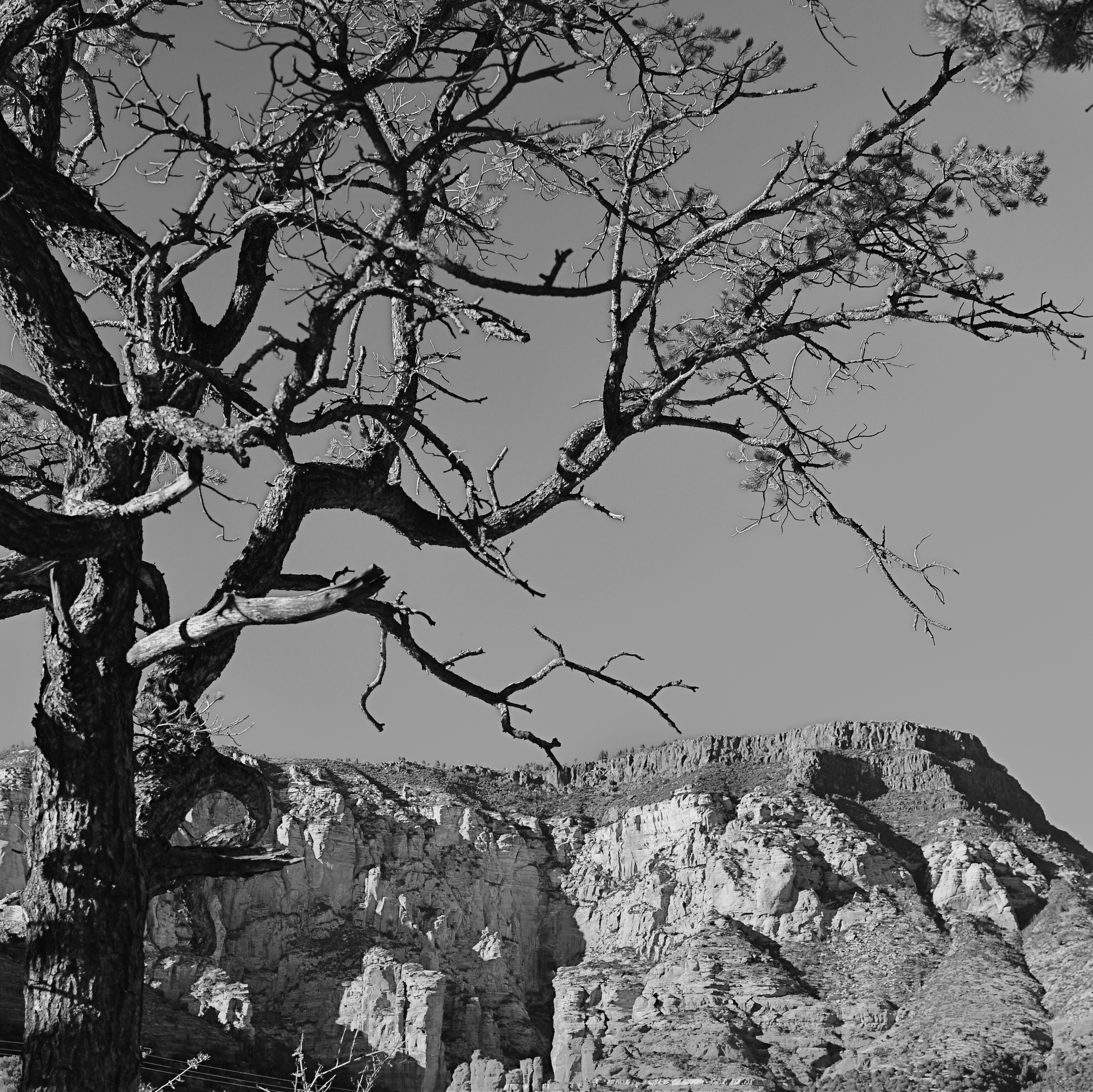
GOING NEGATIVE
Negative space is your best friend when trying to establish scale.
By MICHAEL PERKINS
I got plenty of nothin’, and nothin’s plenty for me. —Ira Gershwin, Porgy and Bess
I BELIEVE THAT MANY PHOTOGRAPHS ARE IMPROVED BY THE SIMPLEST OF MATH OPERATIONS: addition and subtraction. Look at nearly any image you’ve created that “worked” and you can see that there is not one more thing in the image than there needs to be. Something told you to either supply or eliminate elements in the composition until the impact of the picture was maximized. Realizing the reverse effect is pretty easy as well, although not as much fun. If there is one tree too many or one object too few in the frame, you can sense the imbalance in your near-miss pictures. And man, does that hurt.
 We used to refer to open areas of a picture as “blank” space, and were often talked out of using it at all by various A-B-C composition tutorials that told us that large expanses of sky could kill a good landscape. Today, we refer to this unused real estate as “negative” space, but we are now more inclined to see it as well, a positive thing. The take-home from this is, simply, that no technique should be universally ruled out, or ruled in, for every image. Truth is, there are times when not filling the frame with stuff, or selectively making use of negative space boosts the wattage of what you’re trying to say.
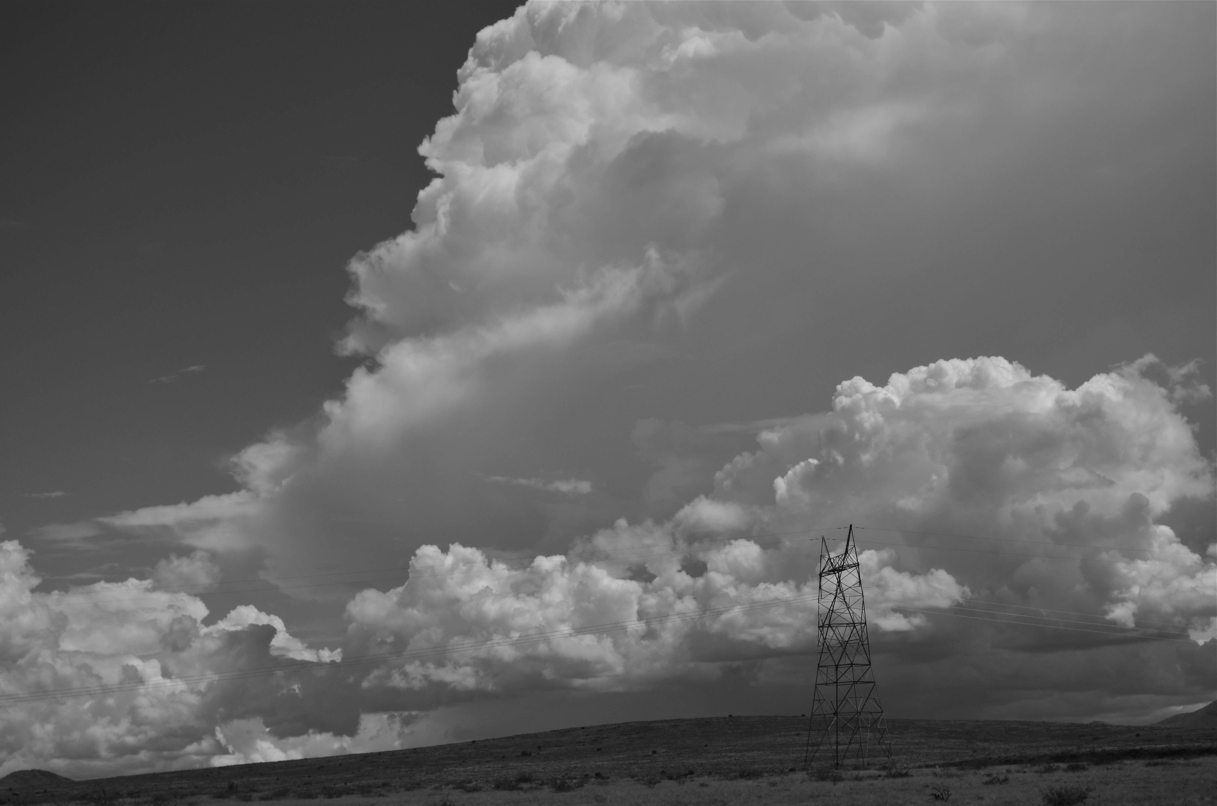
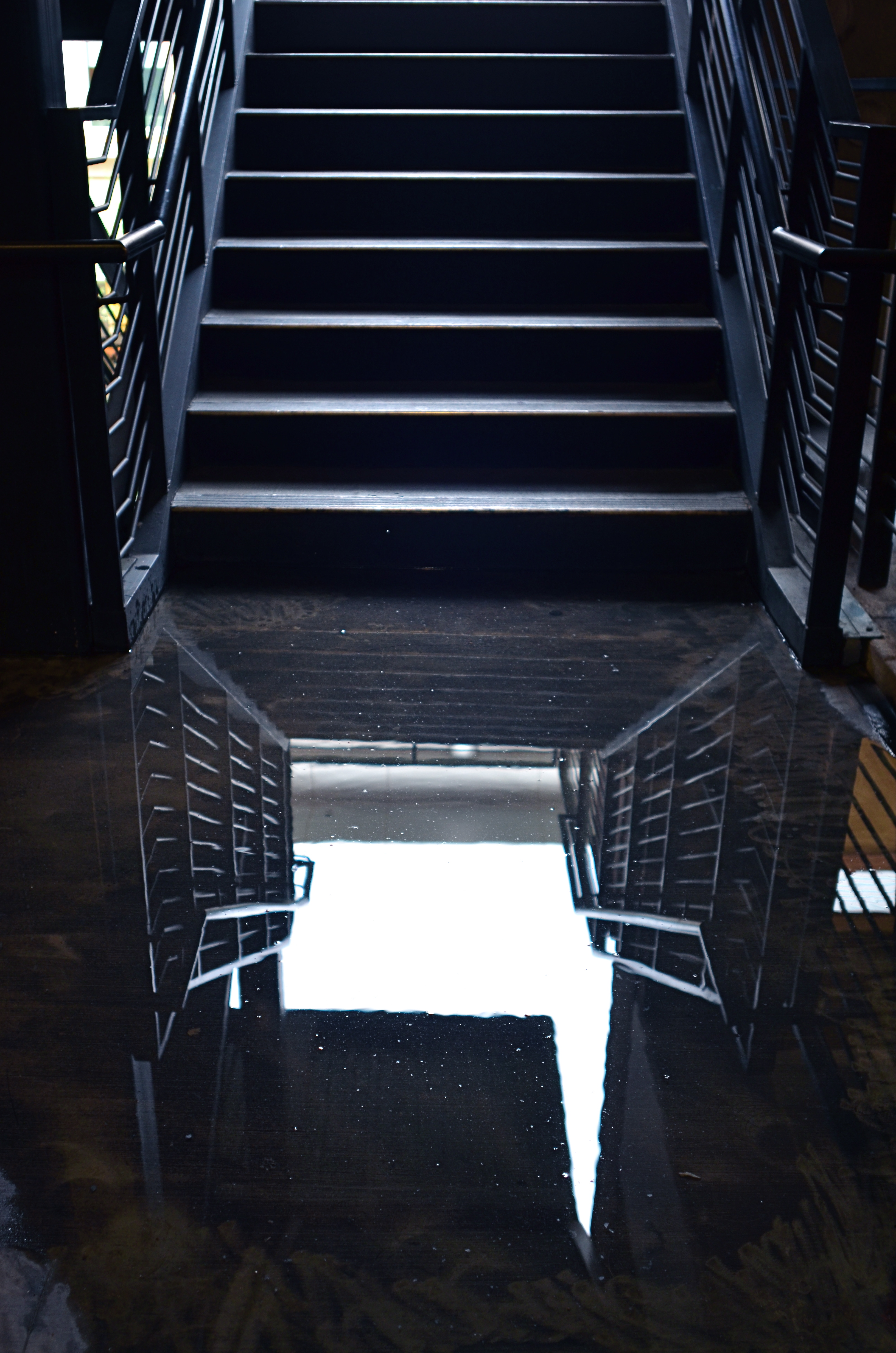
Instead of “negative” space, I prefer the term “secondary space”, since what you’re really doing is mapping your pictures into zones of the things that should be of primary interest and those that should complement those things without competing with them. Landscapes are the easiest way to demonstrate this. In the image at left, I wanted to accentuate the distance between the foreground tree and the background mountain. Framing the two elements to merely overlap gave no sense of space, and, in color, actually made the photo busy and hard to read. There seemed to be no primary object in the frame. Composing so that some sky intervened to the right of the tree and the top of the mountain re-established the sense of distance and kept the textures of both objects from fighting with each other.
Secondary space need not be empty. It can take the form of a texture, be it a body of water, cloud formations, a flooring pattern, or a stone wall. The idea is to use the space to support, but never upstage the primary space. Sometimes what you need to complete an image is nothing. You just have to stick the nothing in the right place.
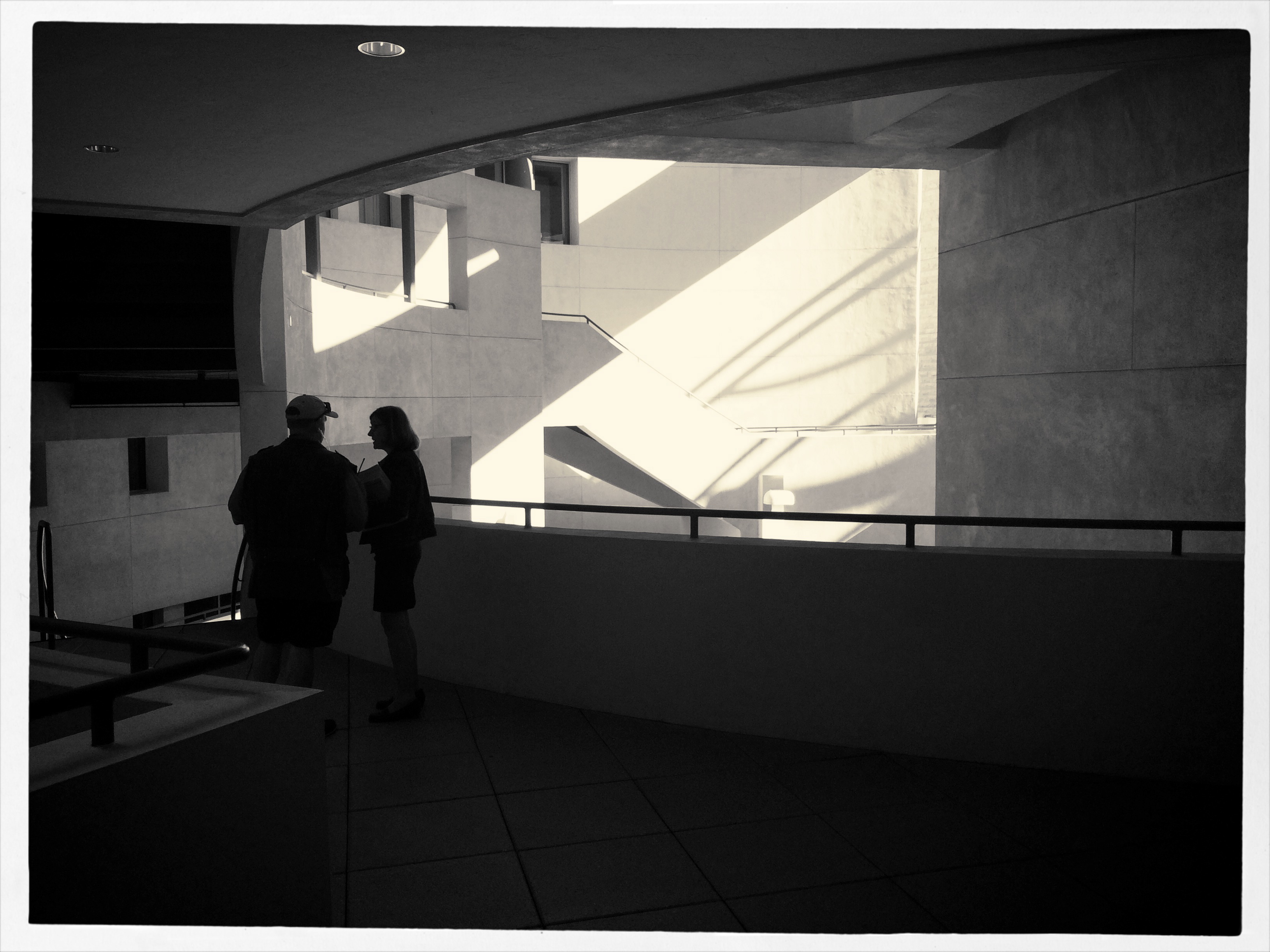
CHOOSE THE INCONVENIENT

The more of your hand that’s in a picture, the better it will be.
By MICHAEL PERKINS
MARKETING BEING WHAT IT IS, CAMERA MANUFACTURERS HAVE LONG TOLD US THEY ARE DOING ONE THING FOR US when they are actually doing something very different. Since the first furry, day-long exposures of the 1800’s gave us a taste of what an entirely new medium could do in the way of chronicling the world, we have been promised that, over succeeding generations of technical development, taking a picture would get easier. In fact, this is a little inaccurate, as what the wizards have mostly done is to make taking a picture faster.
If this sounds like I’m splitting a sub-atomic-sized hair, hear me out. Many of the refinements in camera design over the last century and a half have, of course, improved the sharpness of lenses, the absorbance quotient of recording media, and enhanced design. However, the lion’s share of reboots have been to require fewer steps in framing and shooting, through increasing auto-delegating of many functions to smarter and smarter cameras. But, what we basically gain by this process is speed. It certainly takes much less time to shoot and get an acceptable result as the years roll by. “Well”, you may well ask, “doesn’t that mean the whole process is also easier?”
Tricky question, as it turns out.
In that you can take technically better images with less effort the further we roll along, then yes, it’s “easier”. But the same speed which is part of the “easy” process also means that we spend less time planning a picture, seeing it in our minds and creating it with deliberate action…cause, you know, the camera will do it. This means that it’s also easy to miss things, to fail to visualize the best way to take a shot versus the most expedient way. Slowing down by adding steps into the creation of a photograph means taking back control, so it is, if you will, “harder”, but, with practice of the total process of photographing, the ease, and even the speed all comes back anyway.
I wanted the name of this blog to contain a subtitle about journeying from taking to making images because that is the trek that most photographers eventually set out on. We begin to wonder what it would be like to be more completely in charge of what kind of pictures we wind up with, even if it’s only to take a series of baby steps. It does take more time to take the process into your own hands. But it’s not that hard. Auto-settings save you time, but they may not save your shot. Choosing the inconvenient isn’t ignoring technology. It’s making it work your will with your pictures.
BACKING OFF, BACKING AWAY

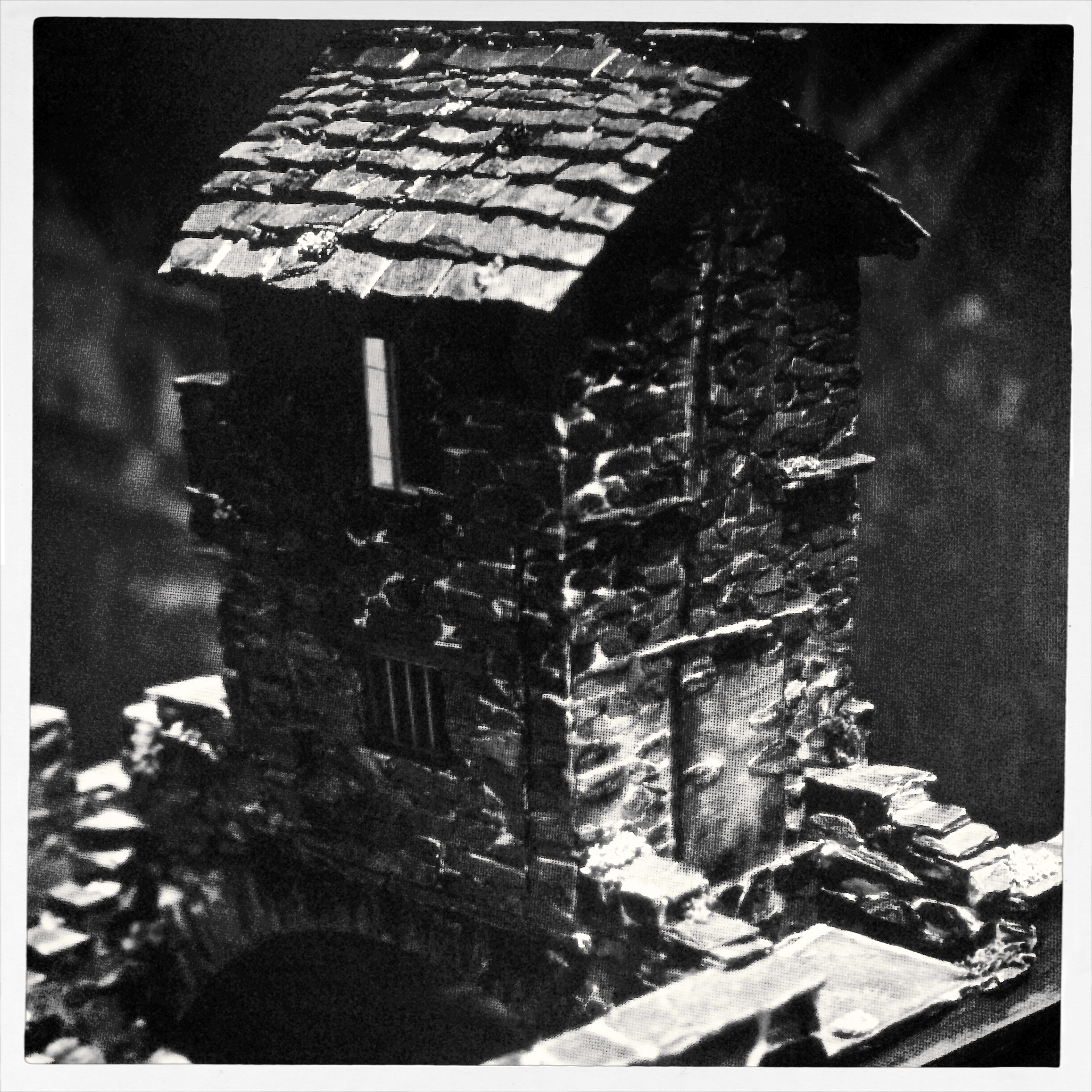
An early case of HDR madness on your humble author’s part. Yeah, nothing in nature looks like this. Ever.
By MICHAEL PERKINS
YOU MAY HAVE HEARD THE JOKE ABOUT THE COUNTRY PARSON WHO WAS IN THE HABIT of writing, in the margins of his sermon script, “Argument weak here. Scream like hell.” If he were a man of the camera instead of a man of the cloth, this instruction might have read, “photograph ineffective here. Over-cook everything.”
Choose your favorite post-editing workflow and chances are that you, or someone like you, have tried to rescue an indifferent image by pouring a few gallons of digital gravy over it, hoping to turn flank steak into filet. And you probably have your own personal folder of shame for the results of such attempts. Mine would fill up a small bookshelf. In the Library of Congress.
One of the hallmarks of the early digital age seems to be an affection for over-saturated color, as if we had had quite enough of natural tones, thank you, and were desperate to return to the earliest days of photographic color, when everything was played on the loud pedal. It’s kind of perverse, but it seems like, as soon as photographers outdistance an old technical barrier, they seem to get nostalgic for it and try to revive it. Why resuscitate daguerreotypes, pinhole cameras, high grain slow films, etc. Irony? Curiosity? Novelty? Who knows?
Whatever the motivation, the result has been a cornucopia of mobile apps that aim for an unnatural distortion of color values (spend ten minutes on Instagram for as many samples as you want) and the lo-fi or lomography movement toward cheap plastic toy cameras that can’t help but deliver hyped up hues (again, Instagram). There are also a number of HDR programs which tend to tempt people beyond their endurance when it comes to electrifying color even in an image’s shadows, making everyday like a day-glo version of your uncle’s golf togs and resulting in some pretty hideous excess (and yet, alas, such was I. See left).
What’s the new normal? Again, can’t tell you. It’s pretty certain, though, that we love cranking the color up to 11, whether it serves the photo or not. Backing off and backing away on the hue-mongous overkill takes real discipline. The amped-up image is fascinating in some kind of moth-to-the-flame way, but eventually it becomes like any other excess, in that it stifles, rather than frees, your art. No effect is so miraculous as to work in every situation. Eventually, it’s about what you’re seeing and saying.
SIMPLIFY, SIMPLIFY
Apertures, 2015
By MICHAEL PERKINS
COLOR PHOTOGRAPHY WAS NOT UNIVERSALLY WELCOMED at its initial introduction, and was even actively avoided for the most part by the likes of Ansel Adams and Edward Weston, who mistrusted the technology of early color reproduction as garish, unnatural. While the amateur world largely lauded color as more “real”, Ansel & co. countered, between clenched teeth, “that ain’t the point”. Their argument: black and white was an artistic interpretation of reality, not a reproduction of it, whereas color was erroneously assumed by the public to be a more accurate record, even though it also suffered from its own biases and excesses. Some of the early masters never really came to be at peace with color, although they shot in it, and did foresee a time when photographers would choose it over b&w not for novelty’s sake, but because of what a particular project demanded.
I sometimes begin planning a shot in color, only to find that it provides too many choices for the eye. That is to say, all tones will register as distinctly different from each other, and this may make for too much information, blocking the clarity of the photo’s design. The result may be beautiful, but it may also diminish the impact of the final picture. In these cases, it’s worthwhile to at least work up a monochrome vision of my shot to see if it communicates more directly.
In a situation like the above pattern of shades and light shafts, color gives you brilliant blues and off-whites for the darks and lights, and a real hodge-podge of hues in all the crannies of the metal grids. However, rather than de-saturate the color to make b&w, I found it better to shoot the master image in black and white, using a red filter and a polarizer to maximize contrast, forcing all the dark and light shades into two hard-line general values. This forces the design to be the primary attention-getter, eliminating the distraction inherent in a full raft of colors. That is, if the deepening composition of gridwork is the main message of the photo, then it makes sense to get the color out of the way of that story and see if it helps.
In the end, Uncle Ansel had it all psyched out:
When I’m ready to make a photograph, I think I quite obviously see in my mind’s eye something that is not literally there in the true meaning of the word. I’m interested in something which is built up from within, rather than just extracted from without.
Yeah, what he said.
UN-BECOMING WALDO

There are many ways this photo could be improved. Sticking my face in front of the mountain isn’t one of them.
By MICHAEL PERKINS
YOU CAN’T SAY IT’S JUST UNCOOL PEOPLE ANYMORE. In recent days (this being April 1st as you read this, and no joke), both the Coachella and Lollapalooza festivals have joined the growing ranks of public attractions that have decided to prohibit the use of the selfie stick, that telescoping extender wand that stretches the human ego beyond all endurance. Now, the only proofs you will have that your wonderful personage graced a certain locale on a certain day will be (1) memory (2) the enjoyment of the moment, at the moment, and (3) all the other standard-issue, stretch-your-arm selfies you intend on inflicting on mass media in much the way that polluters truck their waste loads way out of town to dump them at remote sites.
If you infer that I am less than suicidal at this news, you infer mos’ correctly. Although you are technically taking a photograph when you use one of these annoying fishrods, you are certainly generating nothing of visual value. You are merely creating a disruptive warp in the travel-time continuum, crowbarring yourself into scenes to…what?….render them more relevant, since you decided to drop your divine butt into them like some kind of Where’s Waldo tribute? Suddenly, it’s not look at this beautiful cathedral. It’s now look at me in front of this beautiful cathedral. Instead of isn’t this an inspiring sunset, we get look at how inspired I was by this sunset.
Please.
I suppose, in the desperate cyber-playdate that social media has become, it was inevitable that the standard selfie, already the online equivalent of roadside litter, would have to metastasize into something even more self-absorbed, and so, on the seventh day, they created the stick, and they said, be fruitful and multiply. Only, you see, a line has been crossed. Your love affair with yourself is now prodding me in the butt, blocking my view, and annoying my mother (and believe me, no one wants that). In other words, your favorite social plaything (you) has become anti-social. And boring.
There is an amazing tradition, among photographers great and small, in the self-portrait. But put some study into it, rather than having it be a reflexive tic whenever you become bored with the rest of us. Approach it with some intent, some technique, or at least more forethought than it takes to flex one knuckle of your index finger. Of the loss of all thinks stick-like at concerts, Jacqueline Verdier, CEO of Selfie on a Stick, said the festivals were going too far and that the sticks can be used safely. “I think it’s really doing a bit of disservice to the attendees,” Verdier said. “They’re not going to be able to capture the same memories.”
Yeah, Jackie, true that. And they (and we) can do one helluva lot better in the memory department if we’ll just stretch our brains a bit. So go convert your product to a line of premium backscratchers.
Then you’ll at least be performing a public service.
YOUR FLASH AIN’T NOTHIN’ BUT TRASH
Learning to make the maximum use of light means you can leave your flash off more often. 1/60 f/5.6, ISO 100, 18mm.
By MICHAEL PERKINS
PHOTOGRAPHY HAS NEVER SUCCESSFULLY ADDRESSED ITS BIGGEST, AND MOST LONG-STANDING WEAKNESS, that of providing natural illumination in all shooting situations. Worse, it has generated tons of tweaks and workarounds to compensate for this weakness, instead of solving the central problem. As a result, we have limped our way through nearly two centuries of devices and processes designed to create momentary fake lighting…the lame legacy of flash.
Instead of finding recording media that absorbs and spreads light adequately, from salt paper prints to roll film to pixels, we have invented one torchy crutch after another, each adding expense, bulk and even greater uncertainty to our results. The ignition of aluminum powder may have given way to pop-ups with red-eye protection, but the essential error in our thinking persists. We don’t need better flash: we need cameras good enough for there to be no flash.
Flash is like a bratty kid in a restaurant. He won’t sit up straight, spits his chewed broccoli back into his napkin, splashes water on everyone, talks with his mouth full, and eats his dessert first. And his mother dresses him funny. And yet we can’t rub this punk out, no matter how we try.
Testify: a recent B&H Photo catalogue boasts eight pages of flash equipment, most of it aftermarket gear designed to muffle, bounce,, amplify, soften or re-direct flashes that are too harsh, too faint, too in-line with the “optical axis”, or otherwise inefficient. Many manufacturers of DSLRs practically admit that their on-camera units are too limited for custom lighting, selling you their costly, brand-related off-camera units, cables, transmitters and widgets. Ca-ching. Photographically speaking, this is like telling you that the house on which you just took a 30-year mortgage is really a dump, but the place down the street is divine.
It was decades before film was fast enough to be used in more than a few specific situations, so flash. It’s still too expensive for most people to get lenses that are speedy enough to keep from blasting bleachingly hard light in people’s faces, so flash. And, sadly, many of us still believe that popping that little beast up in a 50,000-seat concert hall will magically help us counter the 300,000 square feet of darkness between us and the stage, so…flash.
Digital image sensors might eventually evolve sufficiently for different parts of them to register light individually, eliminating the need for extra bursts of artificial light, and our own best practices in the use of natural light can all but eliminate the need to pop up the pop-up. But we are farther away than we should be from a flashless world. It’s not that we don’t all know that the way we currently use it is idiotic. But for now, we have to keep promising that bratty kid that if he takes just one more bite of spinach, we’ll get him ice cream. Jeez.
THE FLOATING 50

From Lobby To Terrace, 2015. A near 50% crop from the original, seen below at left.
By MICHAEL PERKINS
YOU CANNOT BECOME A GREAT PHOTOGRAPHER WITHOUT BEING YOUR OWN BEST EDITOR, no matter how brilliant or instinctual your shooter’s eye may be. Art is both addition and subtraction, and the image frame is about both inclusion and exclusion. You get your viewers’ attention by knowing what to show. You hold that attention, and burn your images into their minds, by learning what to pare away.
I’ve written several variations on this theme, so the best way to restate it is in the voice of the truly visionary godfather of street photography, Henri Cartier-Bresson. Ironically, this master of in-camera composition (he is reputed never to have cropped a single shot after it was taken) was nonetheless remarkably aware of what most of us must do to improve an image through post-editing:
This recognition, in real life, of a rhythm of surfaces, lines, and values is for me the essence of photography; composition should be a constant of preoccupation, being a simultaneous coalition – an organic coordination of visual elements. We must avoid snapping away, shooting quickly and without thought, overloading ourselves with unnecessary images that clutter our memory and diminish the clarity of the whole.
Insert whatever is French for “Amen” here.

The original. It’s easy to see what needs to be cut out of this one.
I often find that up to 50% of some of my original shots can later be excised without doing any harm to the core of the photograph, and that, in many cases, actually improving them. Does that mean that my original concept was wrong? Not so much, although there are times when that’s absolutely true. The daunting thing is that the 50% floats around. Sometimes you need to cut the fat in the edges: other times the dead center of the shot is flabby. Sometimes the 50 is aggregate, with 25% trimmed from two different areas of the overall composition.
On occasion, as with the above picture (see the original off to the left), the entire bottom half of the shot drags down the top. In the cropped shot, the long lateral line between indoors and outdoors is much more unbroken, making for a more “readable” shot from left to right. The disappearance of the dark furniture at the bottom of the master shot creates no problems, and actually solves a few. Do a disciplined search of the nobler near-misses in your own work and see how many floating 50’s you discover. Freeing your shots of the things that “clutter our memory and diminish the clarity of the whole” is humbling, but it’s also a revelation.
NAIL YOUR FOOT TO THE FLOOR
I shot this on a day when I was forcing myself to master a manual f/2.8 lens wide open, and thus shoot all day in only that aperture. That made depth-of-field tricky.
By MICHAEL PERKINS
PHOTOGRAPHY PLACES YOU IN PLENTY OF SITUATIONS WHERE YOU ARE, TO SOME DEGREE, OUT OF CONTROL. From light conditions to the technical limits of your gear to erratic weather, we have all experienced that sinking feeling that accompanies the realization that, to a great extent, we are not in the driver’s seat. Gotta wait til the sun’s up. Gotta wait for the flash to recycle. Gotta cool my heels til these people get out of the frame. Gotta getta bigger bottle of Tums.
So why, given the frequent cases in which we naturally run off the rails, would I recommend that you deliberately hobble yourself, in effect putting barriers in your own way when shooting images? Because, quite simply, failure is a better teacher than success, and you never forget the lessons gained by having to work around a disadvantage. Not only am I encouraging you to flirt with failure, I’m suggesting that there are even perfect days on which to do it…that is, the many days when there is “nothing to shoot”.
It’s really practical, when you think of it. Go out shooting on a day when the subject matter is boring, a day on which you could hardly be expected to bring back a great picture. Then nail your foot to the floor in some way, and bring back a great picture anyway. Pick an aperture and shoot everything with it, without fail (as in the picture at left). Select a shutter speed and make it work for you in every kind of light. Act as if you only have one lens and make every shot for a day with that one hunk of glass. Confine your snaps to the use of a feature or effect you don’t use or understand. Compose every shot from the same distance. The exercise matters less than the discipline. Don’t give yourself a break. Don’t cheat.
In short, shoot stuff you hate and make pictures that don’t matter, except in one respect: you utilized all of your ingenuity in making them. This redeems days that would otherwise be lost, since your shoot-or-die practice sessions make you readier when the shots really do count.
It’s not a lot different from when you were a newbie a primitive camera on which all the settings were fixed and you had zero input beyond framing and clicking. With “doesn’t matter” shooting, you’re just providing the strictures yourself, and maneuvering around all the shortcomings you’ve created. You are, in fact, involving yourself deeper in the creative process. And that’s great. Because someday there will be something to shoot, and when there is, a greater number of your blown photos are already behind you.
BIG LITTLE WORLDS
You and Scooby and Shaggy meet us at the old dark house: one of the many great exhibits at Tucson’s Mini-Time Machine Museum of Miniatures.
By MICHAEL PERKINS
EVER SINCE GULLIVER GOT HIMSELF HOG-TIED BY LEGIONS OF LILLIPUTIANS, we have been fascinated with the contrast between the VERY BIG and the VERY..small. The history of photography is pretty peppered with its share of dinky dioramas, miniature models and teensy-weensy mockups and the cool pictures they inspire. On the silver screen, still photography’s stepchild, the motion picture, launched the careers of thousands of miniaturists in its first half century, genius modelers who could create Tokyo on a tabletop, then have a guy in a rubber Godzilla suit reduce it to splinters.
In another vein, kidlings that were 3-D fans also got their tiny on during the decades that the makers of View-Master told fairy tales in stereo, not with animation cels, but with their own separate miniature studios at the company’s HQ in Portland, doing so-close-you-can-touch-it takes on everything from Donald Duck to the Wizard of Oz. And photographically, the idea was always the same: make this look like the real thing.
Oddly, in recent years, there’s been a bit of a double-reverse going on with miniatures with the creation of optics like the Lensbaby, a low-fi version of a tilt-shift lens that throws selective parts of the frame out of focus, allowing you, according to Lensbaby fans, to take a normal street scene and “make it look like a miniature model”. At this point we leave Photography class and walk down the hall to Irony 101, in which we learn that it’s cool to make something real look fake. Seriously.
I always feel like a sneak trying to make a fake thing look real, and now, it seems, I’m off the hook, since it’s not about the fakery but how cool we all agree we are in doing it (okay, I need to think about that one for a bit). In the meantime, consider a visit to one of the world’s most amazing collection of all things small and awesome at the Mini-Time Machine Museum of Miniatures in Tucson, Arizona. This place makes a large impression, one little object at a time. Photograph away to your heart’s content (no flash), and make the fakes look real, or fanciful, if you’re in the cool kids group. Either way, it’s big fun (that was the last one, I swear).
GRADUATING, GRADUALLY
 By MICHAEL PERKINS
THE DEVELOPMENTAL NATURE OF PHOTOGRAPHY is not unlike that seen in many other crafts that eventually lead to art. Built in layers at a measured pace over years, the photographer’s eye deepens, broadens, becomes both intellectual and instinctual. It is a process, one that some would argue is never complete, and is similar to the way a sculptor’s grip on the chisel goes from brute strength to brain wave, or the halting young painter, over time, converts brush strokes to master strokes.
However, this process is subverted by contemporary culture’s addiction to things…new things, shiny things, latest things. When photography meets consumerism, acquisition, not mastery, becomes the prime objective. How can you take today’s pictures with yesterday’s camera? This new toy, this fresh gadget, changes everything. Adapt, or die a thousand uncool deaths.
This is flawed thinking, but it sweeps many of us up in the frenzy to constantly replace all our gear, placing our faith in the mechanics, rather than the aesthetics, of making pictures. Advertising is about artificially engineering need. If you can be made to have disdain for your old stuff, the people who make new stuff will never run out of customers. It’s just that simple. Fact is, there are many people who presently own perfectly adequate cameras, and, based on where they are as photographers, they do not need to go to the next big thing, since they have not mastered what they presently use. Here is the truth: changing cameras because you have outgrown your current one is the only time such change makes any artistic sense.
Now, I’m not saying that you should “settle” if your camera is so limited that it’s holding you back. There are some gauzy-eyed fantasists out there that love to rhapsodize on how you can make glorious pictures with crappy cameras, and, while I applaud their enthusiasm, I question their sanity. Romantic notions aside, crap usually begets crap. Get a box adequate to your needs. But make sure that it is also proportionate to your ability and involvement. I have seen more newbies over-purchase monstrous mega-machines that they either under-utilize by 90% or which terrify them so much that they lie rotting in drawers (the cameras, not the customers) after a few months of frustration and failure.
Find the camera that defines what kind of photographer you are right now, and pull every ounce of creativity out of it until you know that you need something else in order to grow. Trying to shoot masterpieces with junk usually doesn’t work, but sinking your hopes into a $2,000 thoroughbred that you’re going to use like a point-and-shoot may actually be worse.
AND FEATURING LINDA ON LENS
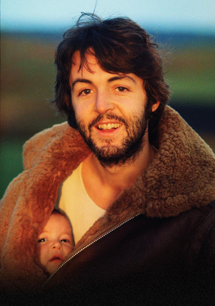
Even if you don’t know her work, you know her work. Linda McCartney’s classic portrait of her husband and a friend made album art history in 1970.
By MICHAEL PERKINS
ONCE LINDA EASTMAN BECAME LINDA McCARTNEY, the world ignorantly chose to define her as rock’n’roll arm candy basking in the reflected sun of her globally famous husband. In fact, however, by the time she chose to rock a family, she had already created a self that would outlast her role as a reluctant musician and perennial target of every wise-ass disk jockey from London to New York. She did it with a remarkable, natural eye for composition and the untrained instinct to know where to click, and when. While her bandmates wielded electric axes to give voice to their muses, Linda wailed with a Hasselblad.
By the time she became a Mrs. Beatle, Linda had already become the first great photographer in rock history, pioneering an intimate, direct style that humanized its bright lights and consigned the formal portraits of the record label’s in-house shooters to the dustbin. It is work that, finally, in recent years, has been allowed to glow as the star trove that it is, eclipsing her much-derided designations as Yoko With A Tambourine, A Pig With Wings, or whatever other lame tag the hacks in the rock press felt like hanging on her. Recent showings of her work in America, Europe, even South Korea continue to celebrate her instinctual knack for showing the human inside the star. And none of it was by the book.
She didn’t ignore the rules; she simply didn’t know they existed. She never had a formal studio, shopping for backgrounds and locales on the fly. She never used flash, ever, believing that it was bulky and off-putting. She attended exactly one class on photography, was told she had talent, and never went back for lesson two. She gave away original negatives of her top shots to friends, finding herself with nothing to sell to publishers except the “shoves”, lesser takes which, somehow, were still better than what everyone else was doing with this crazy longhair music.
What kind of photographer was this? Linda never posed people, forgot to re-calculate the ASA (ISO) settings when switching from color to black and white, sent the magazines blurred concert shots. And despite her never joining the ranks of the camera-ly cultured, the true souls of the Rolling Stones, The Doors, The Yardbirds, Jimi, Janis, Dylan, and, most notably, the Beatles shone forth in her grainy frames. Linda Eastman McCartney captured the dawning genius in them all, before the crank-up of the hype machines, before the twilight of the vultures, before rock careened from the summer of love to the winter of our discontent.
After Paul, the images were family candids, and yet the vision shone forth, most famously in her shot of baby Mary peeking out of her Beatle daddy’s jacket on a morning stroll, the rear-cover photo for the McCartney album in 1970. From that point on, the farm and the fam were everything, the road and the tour bus, not so much. She chose to settle for being Mrs. Paul, the girl who couldn’t sing but who hitched a ride on one of the biggest pop rockets of the ’70s. Decades later, what her eye saw way back then seems inevitable, her work the official chronicle of so many moments that mattered. Linda left us in 1998, but she left us that eye. It is a smiling eye, an innocent one, and one which was magnificently focused on the stuff of dreams.
DISTINCTION WITHOUT A DIFFERENCE
Professional standing doesn’t deliver great photos any more than gadgets and gizmos do.
By MICHAEL PERKINS
PHOTOGRAPHY IS ONLY PARTLY ABOUT A STRING OF TECHNICAL DEVELOPMENTS AND BREAKTHROUGHS. It is also the chronicle of what those advances have done to democratize the art, moving it from the domain of rich tinkerers and elites to an arena in which nearly anyone can participate and compete. From the first box camera to Instagram, it is about breaking down barriers. This is not something that is open to debate. It just is.
That’s why it’s time to re-think the words professional and amateur as they apply to the making of images. This is the kind of topic where everybody tends to throw down passionately on one side or the other, with few straddlers or fence-sitters.
Those shooters whose toil is literally their bread and butter are, understandably, a little resentful of the newbie whose low-fi snap of a trending topic tops a million likes on Twitter, all without said snapper’s having mastered the technical ten commandments of exposure or composition. And those whose work is honest, earnest and sincere, yet formally uncertified, hate being thought of as less Authentic, Genuine, or Real simply because no one has printed their output in the approved channels of accepted craft, be it magazines like Nat Geo or the cover of the New York Times.
Okay, I get it. From your personal perspective, you don’t get no respect. But you know what? Get over yourself.
Do we really need to trot out the names of those who never got paid a penny for their work, mostly because their entire output consisted of inane selfies or dramatic lo-fi still lifes of their latest latte? Is it helpful to point out the people within the “official” photographic brotherhood whose work is lazy or derivative? Nope. It is beyond pointless for the two sides to get into an endless loop of So’s Your Mom.
So let’s go another way.
The words professional and amateur are, increasingly, distinctions without difference, at least as ways to attest to the quality of the end product: the photograph. When you pick up a magazine featuring a compelling image, do you ever, ever ask yourself whether it was taken by someone who got paid for it, or do you, in fact, either react to it or ignore it based on its power, its emotional impact, the curiosity and daring of the shooter? The fact is, photography has, from day one, been moved forward by both hobbyist and expert, and, in today’s world, the only thing that makes a shot “professional” is the talent and passion with which it’s been rendered. Anything else is just jaw music.
IF HUE GO AWAY
By MICHAEL PERKINS
IT SEEMS UNGRACIOUS FOR A PHOTOGRAPHER TO COMPLAIN ABOUT AN OVER-ABUNDANCE OF LIGHT, since that’s basically the currency we trade in. More typically we gripe about not being able to bring enough of the stuff into a shot. I mean, the entire history of the medium is one big let-there-be-more-light prayer. But that’s not to say that light can’t create annoyance when you’re in a place where there is glorious, radiant illumination of….acres of nothing.
I’m not talking about sunlight on endless expanses of starched plain. I refer here to subject matter that is so uninteresting that, even though a bumptious bounty of light is drenching everything in sight, there is nothing to make a photograph of. Nothing that compels, inspires, jars or even registers. I recently made my annual return to a festival that, due to my frequent farming of it over the years, has now bottomed out visually. There is nothing left to say about it, although all that “nothing” is stunningly lit at this time of year.
The light patterns seen here were warm and inviting in color. That’s not what I wanted.
In fact, it’s only by shooting just abstracted shapes, shades and rays, rather than recognizable subjects, that I was able to create any composition even worth staying awake for, and then only by using extremely sharp contrast and eliminating color completely. To me, the only thing more pointless than lousy subject matter is beautiful looking lousy subject matter, saturated in golden hues, but signifying nothing. Kinda the George Hamilton of photos.
So the plan became, simply, to turn my back on the bright balloons, food booths, passing parade of people and spring scenery that, in earlier years, I would have been happy to capture, and instead render arrangements without any narrative meaning, just whatever impact could be seen using light as nearly the lone element. In the above picture, I did relent in keeping the silhouetted couple in the final picture, so that it’s not as “cold” as originally conceived, but otherwise it’s a pretty stark image. Photography without light is impossible, but we also have to refuse to take light “as is” from time to time, to do our best to orchestrate it, much as we would vary shadings with pencil or crayon. We know that the camera loves light, but it’s still our job to tell it where, and how, to look.
SQUARE STORIES

Overhang, 2015.
By MICHAEL PERKINS
BETTER PHOTO HISTORIANS THAN ME WOULD BE ABLE to pinpoint the precise moment in time when the landscape-sized image first eclipsed the square image for most photo shooters. I’d tackle the search myself, but it’s late, and I’m about a martini and a half too far into relax mode, so there it is. But, regardless of the exact instant it first began to wane, the square is back, and bigger than ever, its refreshed use as a distinct mode of composition greeted like a revelation, rather than a return. Cool beans.
The unilateral quadrangle (I get wordy when I drink) managed to barely survive on the periphery of photography, even as the square-centric Polaroid print nearly wobbled out of existence, then came back, as hipsters in the lo-fi movement revived the use of instant print cameras. Then cel phones began offering a pre-selectable square setting for their cameras, and that became a thing. But the biggest boost for the square’s comeback came with a thing called Instagram. You may have heard about this quaint little app. I understand the developers made a few bucks on it.
Still, we are pretty universally conditioned to envision pictures in either “landscape” or (flip this up on its side) “portrait” modes, so much so that director Wes Anderson garnered as much press for his use of the old anamorphic aspect ratio in The Grand Budapest Hotel as he did for the movie’s content. Strangely, the square-format photograph is, upon its return, a bit of a retro novelty.
Composing a shot in roughly 1/3 less space than a landscape frame is a challenge, simply because we have fallen out of the habit for a few decades, but it does have a certain elegance. Lately, I have tried to use the square to effectively tell stories that I traditionally saw in vast or wide scenarios. Construction projects are one such case, in that they seem to call for wide angles and far reaching vistas, what we might call scope. The above image is my attempt to express most of what goes into a building project in what some would call cramped quarters. The main story elements, that is, the action, the range of tone, the compositional depth, are all present, but confined within the quadrangle. Of course, with a DSLR, I can’t start with a square, but I can envision where in the shot the best square is, and crop to it in post-processing.
Composing for a given dimension is a discipline, and, as such, it is valuable as a practice tool, since photographers should always be visualizing every possible way to get their story told. The square may be a prison. But it also may be an answer. The end result is what matters most.
NEW WINE FROM OLD BOTTLES

Wide-angle on a budget, and in a time warp: a mid-70’s manual 24mm Nikkor prime up front of my Nikon D5100.
By MICHAEL PERKINS
MANY OF US WHO BEGAN THEIR LOVE FOR PHOTOGRAPHY IN THE DAYS OF FILM have never really made a total switch to digital. It just never was necessary to make that drastic a “clean break” with the past. Far from it: through the tools and techniques that we utilized in the analog world, we still carry forth viewpoints and habits that act as foundations for the work we produce in pixels. Photography was not “re-invented” by digital in the way that transportation was when we moved from horse to car. It was refined, adding a new chapter, not an entire book.
Digital is merely the latest in a historical line of ever-evolving recording media, from daguerreotypes to salted paper to glass plates to roll film. The principles of what makes a good picture, plus or minus some philosophical fashion from time to time, have not changed. That means that tons of toys from the analog world still have years of life left in them, especially lenses.
Call it a “reverse hack” mentality, call it sentiment, but some shooters are reluctant to send all their various hunks of aged camera glass to the ashcan simply because they were originally paired with analog bodies. Photography is expensive enough without having to start from scratch with all-new components every time a hot new product hits the market, and many of us look for workarounds that involve giving a second life to old lenses. New wine from old bottles.
Some product lines actually engineer backwards-compatibility into their lenses. Nikon was the first and best company to spearhead this particular brain flash, making lenses for over forty years that can be pressed into service with the latest Nikon body off the production line. In my own case, I have finally landed a Nikon 24mm f/2.8 prime, not from current catalogues, but from the happy land of Refurbia. It’s a 1970’s-era gem that is sharp, simple, and mine-all-mine, for a fifth of the cost of the latest version of the same optic.
My new/old 24 gives me a wide-angle that’s a full stop more light-thirsty than the most current kit lenses in that focal length, and is also small, light, and quick, even as a manual focus lens. And it can be argued that the build quality is better as well. Photography is about results, not hardware, so how you get to the finish line is your business. And yet, sometimes, I must admit that shooting new pictures with legendary lenses feels like photography, as an art, is building on, and not erasing, history.
PHOTOSHOP THE MOMENT
By MICHAEL PERKINS
IT’S BEYOND POINTLESS TO PREACH OF “PURITY” when it comes to photographic technique, although the argument springs up whenever the idea of manipulation comes up. It’s not even a new squabble. No sooner had science given the world a way to record reality with a machine than artists began tweaking, twisting, and torturing effects out of the camera that could only be done by deliberate intervention. So much for reality. In fact, photography’s first half-century boasts a rainbow of spectacular effects, undertaken precisely to undermine or improve upon the real world.
No, it’s about a century and a half too late to worry about whether people will alter their photographs and high time we explored what kind of manipulations are best for the overall impact of an image. I personally prefer to “photoshop the moment”, or to calculate what I need in a picture during the taking of it. I truly feel that, in most post-shutter tweaking, you lose an intangible something that might have made real magic if factored into the same-time making of the picture. The best thing about planning is, it gets easier to get better effects from simpler things, things that seem to work better for the picture if you design them into the shot rather than adding them later.

Fill flash helped rescue the tones in this lush arched gate.
Take the ridiculously obvious tweak done in the above picture. 90% of the final photo here is in the composition of the shot, framing the entrance of this wonderful old house in the arch of its outer gate. The sunlight is perfect for the back two-thirds of the picture, but, given the position of the sun in late afternoon on that particular street, my first shot tended to render the arched topiary very dark, nearly a silhouette. Thing is, I really wanted the entire image to have a kind of fairy tale quality. I needed an intervention.
Easy fix. I walked back a few steps to make sure that my flash was just powerful enough to pop a hot green into the arch, yet too faint to illuminate anything else. As a result, the color you see here is not goosed up after the fact. I exposed for the house in the background and the fill flash made the foreground hues as bright as the stuff in back. Again, as planning goes, thus wasn’t the D-Day invasion. I just needed to make one simple change to solve my problem, and the fact that I did it during the original making of the picture made me feel like I was in charge of the project to a greater degree.
DON’T LIKE, LOOK
Looking at photographs is no less a skill than producing them.
By MICHAEL PERKINS
I RECENTLY OVERHEARD A CONVERSATION BETWEEN TWO YOUNG WOMEN which involved the viewing of one woman’s phone images, which she was sharing with her friend. Perhaps “sharing” is too generous a term, as the review of pictures, rendered with a cross-telephone swipe between each one, took approximately ten seconds, punctuated by the following remarks:
“That’s cool..”
“THAT‘s cool…”
“That one’s REALLY cool…send it to me, willya?”
“Love it…”
“Oh, too cute…”
“Totally cool…”
The present age’s crushing overload of sensory information, including the billions of photographs snapped each day, has turned us into a nation of glimpsers. We sense images only fleetingly as they zoom past our window, each new one obliterating the one which preceded it, each one awaiting its own turn to be eclipsed by something newer, cooler, cuter. While the operative word for those viewing the world’s first photographs might have been: look. Now that word is simply: next.
Whatever, dude. We don’t even care whether someone has examined, considered, or absorbed our photographs, as long as they issue a perfunctory, agreeable grunt of some sort between each one or reflexively (and meaninglessly) twitch a “like” click in the appropriate box. The sheer volume of things to be reviewed, and, God spare us, ruled on in some way has turned us into a race of card shufflers. There, we promise. We’ve processed your output and pronounced most of it passable.
Gee, thanks a lot. Thanks for nothing.
The ability to churn out photographs like potato chips certainly provides more opportunities for more people to produce something great. However, if our view of those scads of potential masterpieces is akin to watching bicycle spokes whiz by, then we cannot meet the photographer’s vision with any appreciative seeing of our own. Certainly, some photographs are not worthy of large audiences, but we also have become lousy audiences for the pictures that do deserve to be lingered over, thought about, treasured.
Do a favor for the people in your lives that take photographs. “Like” them a lot less. Look at them a lot more. There is no rush, except the one in your head. Appreciating beauty, or wonder, or art is not a homework assignment, to be tossed off on the way to the next, new thing. Give the pictures time to talk to you. Give yourself back the ear to hear.
Slow the bloody hell down.
MAGICAL ORPHANS
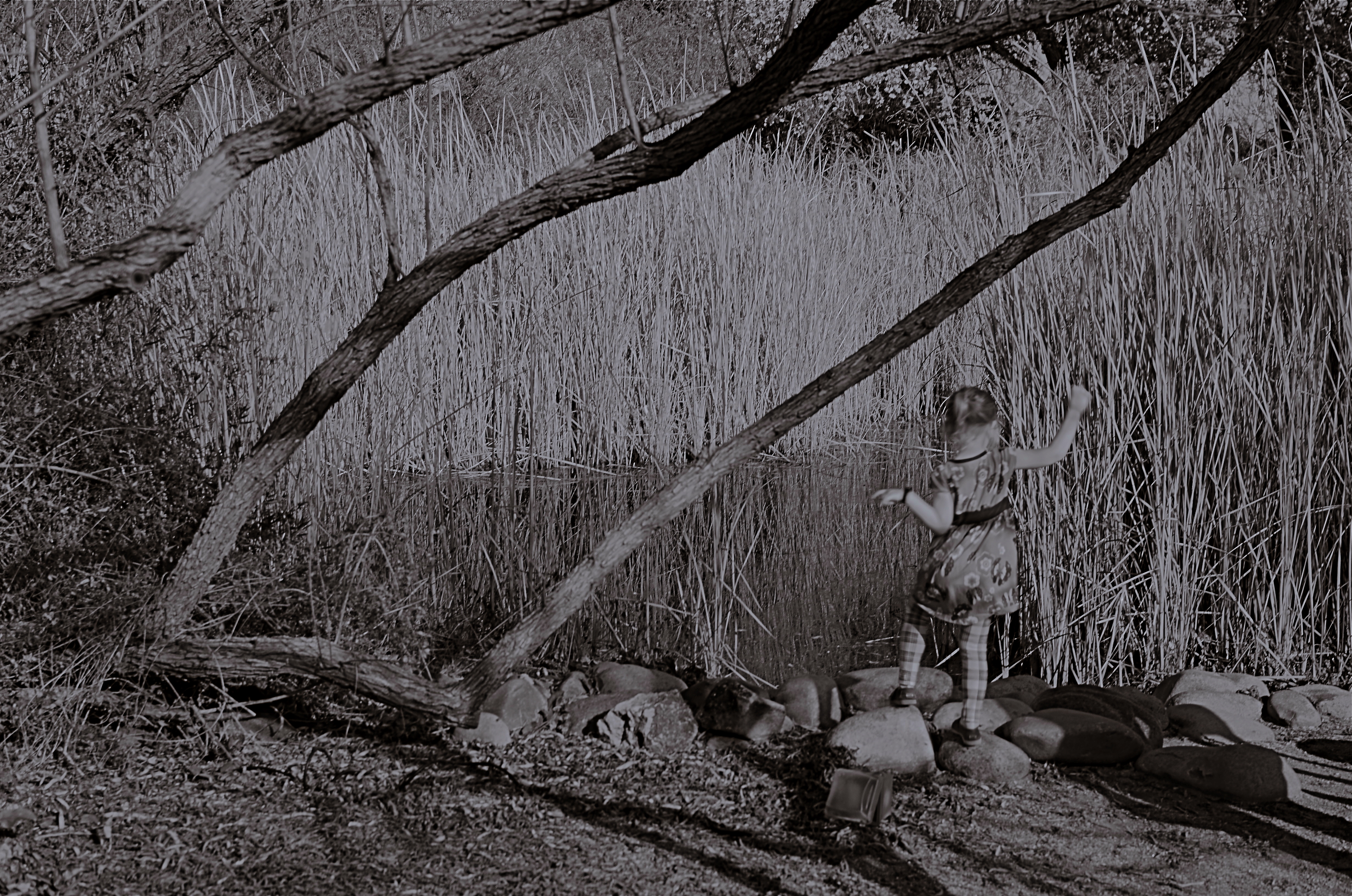
She Of The Reedy River, 2015.
By MICHAEL PERKINS
WE HAVE ALL EXPERIENCED THE SHOCK OF SEEING OURSELVES IN A CERTAIN KIND OF PHOTOGRAPH, a strange combination of framing, light or even history that makes us actually ask, “who is that?? before realizing the truth. Of course we always know, intellectually, that a photo is not an actual visual record of events but an abstraction, and still we find ourselves emotionally shocked when it’s capable of rendering very familiar things as mysteries. That odd gulf between what we know, and what we can get an image to show, is always exciting, and, occasionally, confounding.
Every once in a while, what comes out in a picture is so jarringly distant from what I envisioned that I want to doubt that I was even involved in capturing it. Such photographs are magical orphans, in that they are neither successes nor failures, neither correct or wrong, just…..some other thing. My first reaction to many of these kinds of shots is to toss them into the “reject” pile, as every photo editor before 1960 might have, but there are times when they will not be silenced, and I find myself giving them several additional looks, sometimes unable to make any final decision about them at all.
The above shot was taken on a day when I was really shooting for effect, as I was using both a polarizing filter to cut glare and a red 25 filter to render severe contrast in black and white. The scene was a reedy brook that I had shot plenty of times at Phoenix’ Desert Botanical Garden, but the shot was not planned in any way. As a matter of fact, I made the image in about a moment and a half, trying to snap just the shoreline before a boisterous little girl could get away from her parents and run into the frame. That’s all the forethought that went into it.
With all the extreme filtration up front of the lens, I was shooting slow, at about 1/30 of a second, and, eager to get to the pond, the child was just too fast for me. Not fast enough to be a total blur, but fast enough for my lens to render her softly, strangely. And since every element in a picture talks to every other element, the rendering of the reeds, which was rather murky, added even more strangeness to the little girl, her face forever turned away, her intent or presence destined to remain a secret.
I might like this picture, but I worry that wanting to like it is making me see something in it that isn’t there. Am I trying to wish some special quality into a simple botched shot, acting as a sort of self-indulgent curator in search of “art”?
Can’t tell. Too soon.
Check with me in another five years or so.
(DON’T) WATCH THIS SPACE
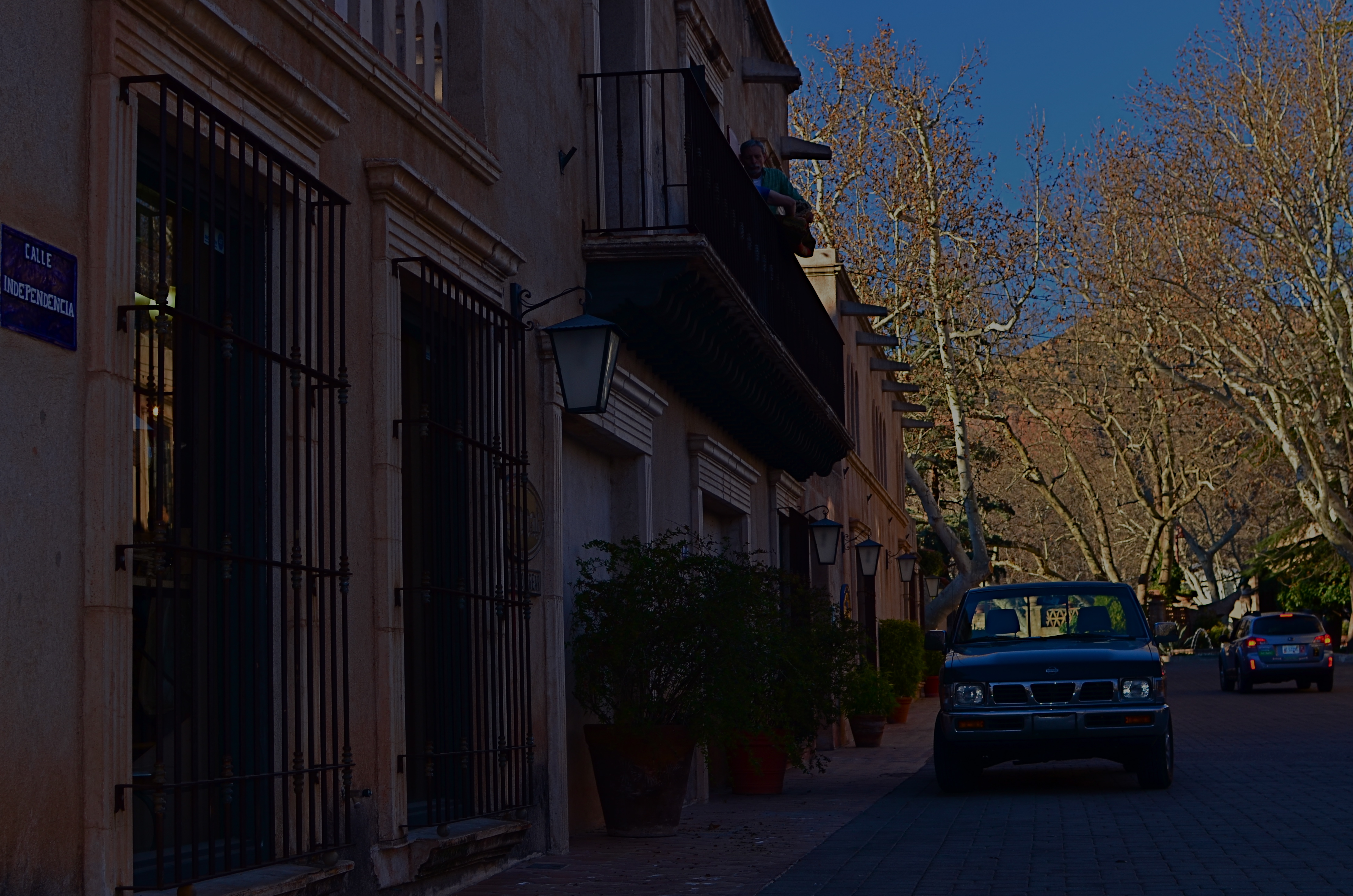
Calle Independencia, 2015.
By MICHAEL PERKINS
CALL IT “EYE-HERDING”, if you will, the art of channeling the viewer’s attention to specific parts of the photographic frame. It’s the first thing we learn about composition, and we address it with a variety of techniques, from depth-of-field to color manipulation to one of my favorites, the prioritizing of light. Light values in any image do have a hierarchy, from loud to soft, prominent to subordinate. Very few photos with uniform tone across the frame achieve maximum impact. You need to orchestrate and capitalize on contrast, telling your viewers, in effect, don’t watch this space. Watch this other space instead.
In many cases, the best natural ebb and flow of light will be there already, in which case you simply go click, thank the photo gods, and head home for a cold one. In fact, it may be that “ready to eat” quality that lured you to stop and shoot the thing in the first place. In many other cases, you must take the light values you have and make the case for your picture by tweaking them about a bit.
I have written before of the Hollywood fakery known as “day for night”, in which cinematographers played around with either exposure or processing on shots made in daylight to simulate night…a budgetary shortcut which is still used today. It can be done fairly easily with still images as well with a variety of approaches, and sometimes it can help you accentuate a light value that adds better balance to your shots.
The image at the top of this page was made in late afternoon, with pretty full sun hitting nearly everything in the frame. There was some slightly darker tone to the walls in the street, but nothing as deep as you see here. Thing is, I wanted a sunset “feel” without actually waiting around for sunset, so I deepened the overall color and simulated a lower exposure. As a result, the sky, cliffs and dogwood trees at the far end of the shot got an extra richness, and the shop walls receded into deeper values, thus calling extra attention to the “opening” at the horizon line. The shot also benefits from a strong front-to-back diagonal leading line. I liked the original shot, but with just a small change, I was asking the viewer to look here a little more effectively.
Light is a compositional element no less important than what it illuminates. Change light and you change where people’s eyes enter the picture, as well as where they eventually land.
FREEZING GOODBYE

1/125 sec., f/5.6, ISO 100, 35mm.
By MICHAEL PERKINS
PHOTOGRAPHERS HAVE A CERTAIN LOVE FOR LIVING AT THE EXTREMES, in seeing how far we can stretch the limits of light, or at least our ability to harness it. It’s strange: we have plenty of the stuff available to us during the meat of the day, but it’s where night and day perform a kind of “changing of the guard” where we really like to go stealing those renegade rays of near-dark and almost-bright. We love to go trapping along the seams of light, chronicling the nether territory where night and day get spliced together.
Lately I seem to have been lucky enough to do what I call “chasing” light, standing in deep shadow as the last rays of gold fade just ahead of me. There’s an expectant quality to it, a preciousness. Suddenly it’s undeniable that something unique is dying, that another measure of our mortality is about to be checked off the list, to be irretrievably gone. It’s only the promise of another day that makes this bearable…that, and our small attempts to, if you will, freeze the goodbye.

1/125 sec., f/5.6, ISO 100, 35mm.
The contrast between light and shadow at this time of day is profound, and it’s easy to either blow out the highlights or lose a ton of narrative detail in the darkness, or both. There is also incredible minute-to-minute change in the balance between dark and light, making every frame you take a kind of all-or-nothing proposition. Seconds after you’ve tried a picture, you’re actually now after a completely different picture, and so the wonderful shoot-adjust-reshoot cycle made possible by digital is an even more amazing tool.
There are amazing opportunities for image-making in both pure day and pure night. But treat yourself to the nether world between the two, and freeze a goodbye or two, if you can.
It’s wondrous out here on the borderline.
