NO ORIGIN
 By MICHAEL PERKINS
WE ALL REMEMBER ONE OF OUR FIRST VIEWS OF THE MICROSCOPIC WORLD, the intricate latticework of an enlarged snowflake crystal, in all its startling elegance. My own initial glimpse came during the projection of a well-worn 16mm film on a cinder-block wall in a small elementary-school science classroom. From that point forward, I could never hear certain words…design, order, mathematics, or, later on, Bach, without also seeing that snowflake in my mind. Funnily enough, the only thing that didn’t conjure up that delicate crystal were the words snow, snowfall, or snowflake. In some way, the enlarged pattern had become something apart unto itself, a separate thing with no origin, no pre-assigned purpose or definition. It was just a pure visual experience, devoid of context, complete and distinct.
I still experience that thrill when using a camera to remove the context from everyday objects, forcing them to be considered free of “backstory” or familiarity. I love it when people react to a photograph of light patterns that just “are”, without bringing to it the need to have the thing explained or placed in any particular setting. The easiest way to do this is through magnification, since many things we consider commonplace are, when isolated and amplified, ripe with details and patterns, that, at normal size, are essentially invisible to us. Another way to do it is to take away the things that the subject is normally seen as part of, or adjacent to. Again, magnification does much of this for us, allowing us to frame a single gear inside a machine or zone in on one connection in larger universes of function.
However this viewpoint is obtained, it can be very freeing because you are suddenly working with little more than the effect of light itself. You arrive at a place where a photographic image needn’t be about anything, where you’re working in simple absolutes of shape and composition. At the same time, you’re also conferring that freedom on your viewers, since they are also released from the prison of literalism. They can admire, even love, a pure composition for no relatable reason, just as we all did with our old stencil kits and Spirographs.
This all takes us full circle to our earliest days, and one of the first experiences any of us had as designers. Remember being told to fold a piece of construction paper in half, then half again, then half again? Recall being invited to randomly cut away chunks from the perimeter of that square, any way we wanted? Remember the wonder of unfolding it to see our cuts mirrored, doubled, cubed into a stunning design?
Remember what the teacher said when we unveiled our masterpieces?
Oh, look, class, she said, you’ve made a snowflake.
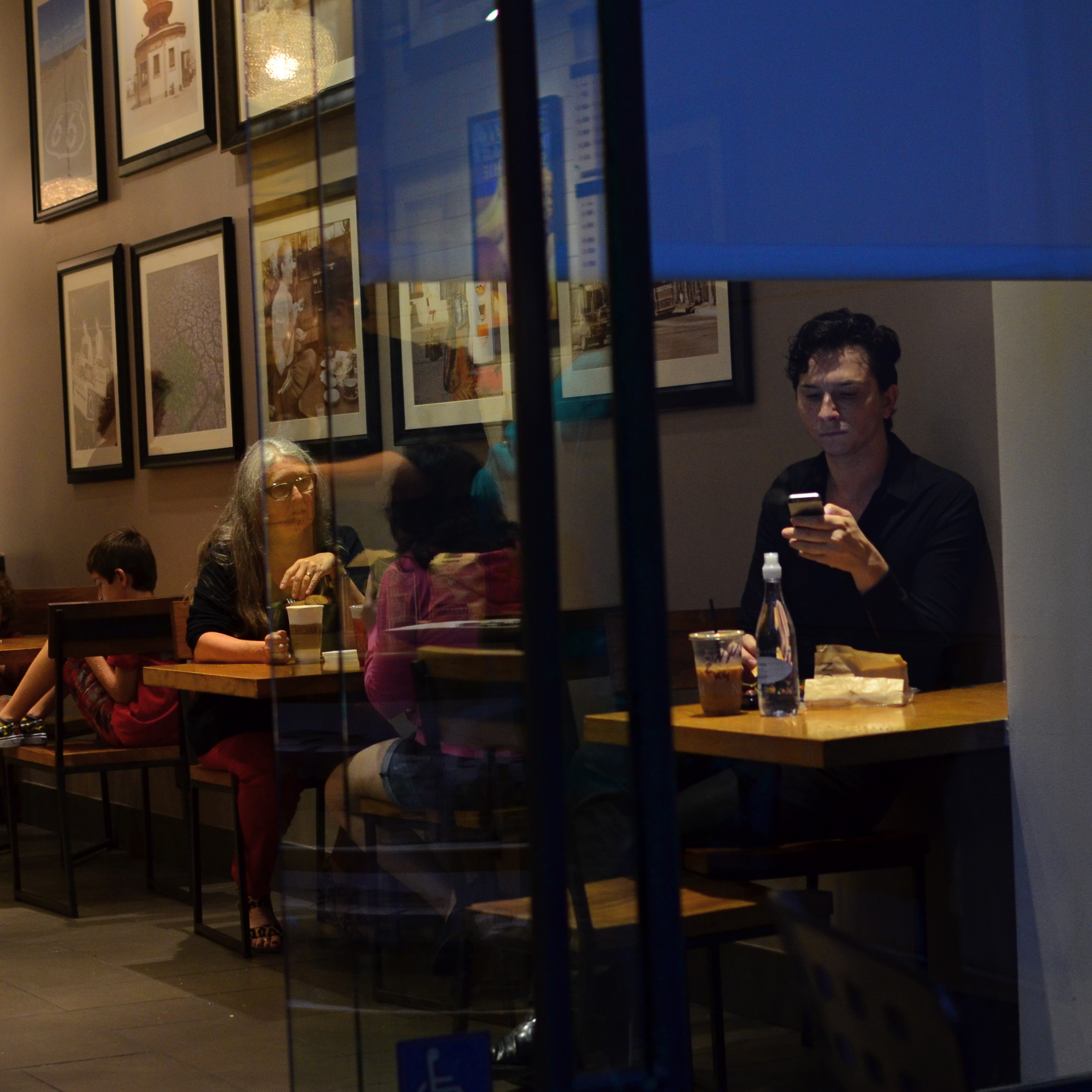
DON’T TAKE THAT TONE WITH ME
By MICHAEL PERKINS
I BELIEVE THAT THE SINGLE BIGGEST REASON FOR THE FAILURE OF A PHOTOGRAPHIC COMPOSITION may all boil down to the same problem. I call it “over-sampling”, or, more simply, the presence of too much visual information in a frame. It can be as simple as including too many trees in a landscape or framing to include crowded sky clutter in an urban scene, but it’s not always how many objects are crowded into an image. It can be something as basic as asking the eye to figure out where to look. And sometimes, the very fact that a picture is in color can diminish its ability to clearly say, here: look here.
Color would have added nothing to this image. In fact, it would have detracted from its impact. 1/400 sec., f/5.6. ISO 100, 55mm.
Great photographs have their own gravitational pull and center. They draw people in and direct their gaze to specific places. This tends to be a single focus, because, the more there is to see in an image, the greater the tendency is in the viewer to wander around in it, to blunt the impact of the picture as the eye looks for a central nexus of interest. In my own experience, I find that the use of color in a photograph is justified by whether it helps keep things simple, creates readable signposts that lead the eye to the principal message of the image. Color, just like the objects in a frame, can explode with a ton of separate messages that defeat the main message, sending the viewer all over the place, trying to decode all that vivid information. Color itself can become clutter.
Sometimes the focus of an image is not an object, i.e., a building or a face, but an overall feel that is more emotionally immediate within a narrow range of blacks and greys. The kind of black and white makes a huge difference as well, and anyone who has spent a lot of time processing monochrome images knows that there is no one true black, no pure, simple white. As to actual shooting procedure, I will be so certain that only B&W will work for a given subject that I make the master shot itself in mono, but, more frequently, I shoot in color first and make a dupe file for comparison. This is another amazing advantage of digital imaging; you simply have more choices.
One of the by-products of color photography‘s adoption into mass culture through magazines and faster films in the mid-20th century was, for many people, a near-total abandonment of monochrome as somehow “limited” compared to those glorious, saturated Kodachromian hues. Thing is, both color and black and white have to be vetted before being used in a photograph. There can’t be a general rule about one being more “lifelike” or “natural”, as if that has anything to do with photography. Tools either justify their use or they don’t. You don’t drive a screw with a hammer.
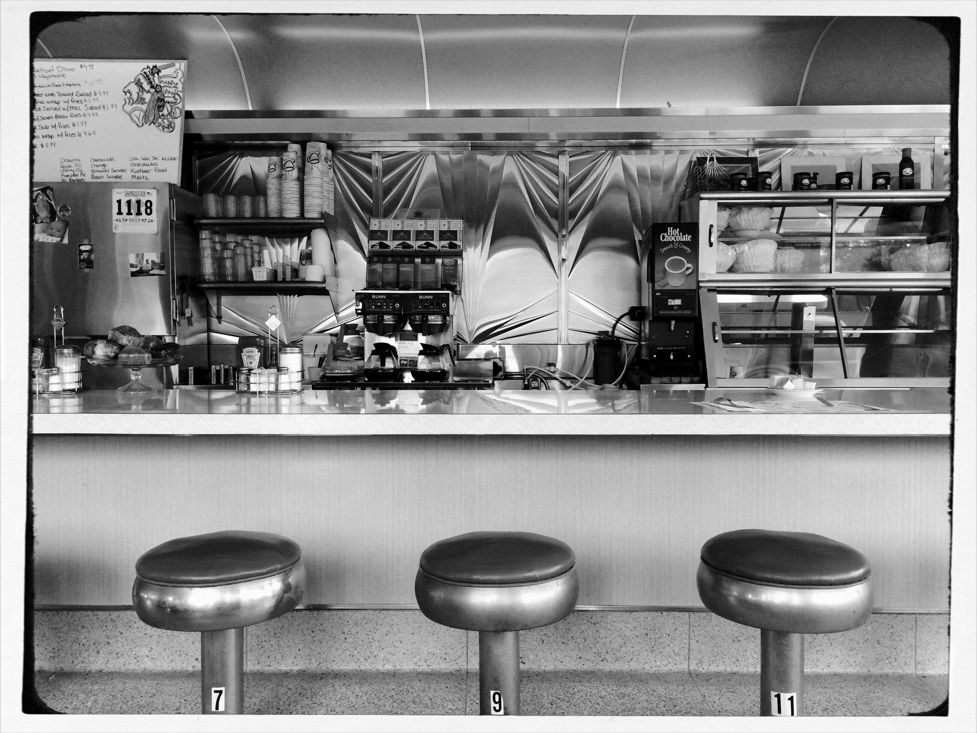
FISHING FRIDAYS?
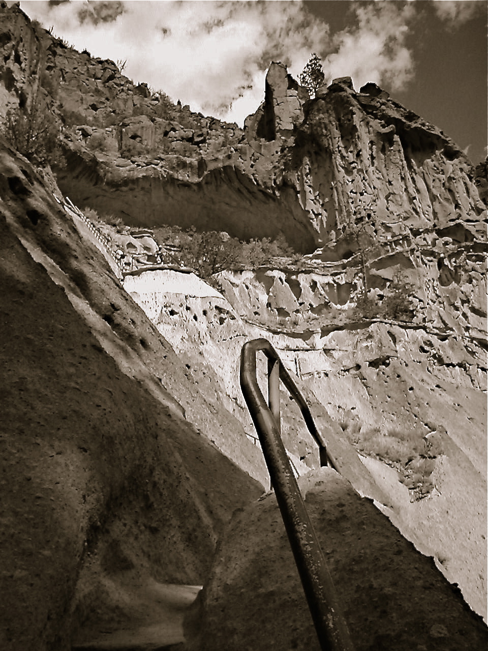
Bandolier National Monument, New Mexico, nearly ten years and four cameras ago. Did the shot achieve everything I was seeking? Hardly. Still, it emerges now as a qualified success rather than an outright dud.
By MICHAEL PERKINS
I HAVE NEVER PARTICIPATED IN THE STRANGE NEW RITUAL known as “Throwback Thursday”, the terminally adorable craze involving the online resurrection of antique photos of oneself or friends, the purpose of which is apparently to celebrate our poor tonsorial and wardrobe choices of bygone days. I keep most historic depictions of myself under lock and key for a reason, and making myself look retroactively more idiotic than I am already, well, someone needs to explain to me where the “fun” part comes in. Just because I was once stupid enough to sport a shag cut doesn’t mean a record of that sad choice constitutes entertainment in the interweb age.
As a photographer, however, I can certainly see the wisdom of re-evaluating the images themselves, meaning how they were shot, or whether, under the microscopes of time and wisdom, they deserve to be aesthetically exonerated. Humane anglers have always practiced the “throw the small ones back” rule when fishing, the idea being that, given a chance, a minnow might grow into a respectable catch, and I think it’s normal to revisit old photos from time to time, as a record of one’s growth. I would even argue that a “Fishing Friday” each week would be good for the needful habit of self-editing, or just learning to see, no less than spending one’s Thursdays with painful reminders that hot pants really aren’t a fashion statement.
Yes, I am an aging crank. And yes, I do believe, as Yogi Berra once said, that nostalgia ain’t what it used to be. But I also believe in learning from one’s photographic mistakes, and reviewing old prints and slides actually does give you a pretty reliable timeline on your development. As a matter of fact, I am on record as believing that failures are far more instructive than successes when it comes to photography. You study and ache and cogitate over failures, whereas you seldom question a success at all. Coming up short just nags at you more, and the surprising thing about latter-day re-examinations of your photographic work is that you will also find things that actually worked, shots that, for some reason, you originally rejected.
Recently, the Metropolitan Art Museum mounted a show of Garry Winogrand’s amazing street work drawn from the hundreds of thousands of images that he shot but never processed or saw within his own lifetime. His is an extreme case, but, even at our end of the craft, we generate so many photos over a lifetime that we are constantly challenged to have a true sense of what we did even last year, much less decades ago. When we “throw back” to images of our dear departed dog blowing out his birthday candles, we should also shovel into the past for the instructive, potentially revelatory work that might be lurking in other shoeboxes. It’s free education.
60 SECONDS TO HAPPINESS
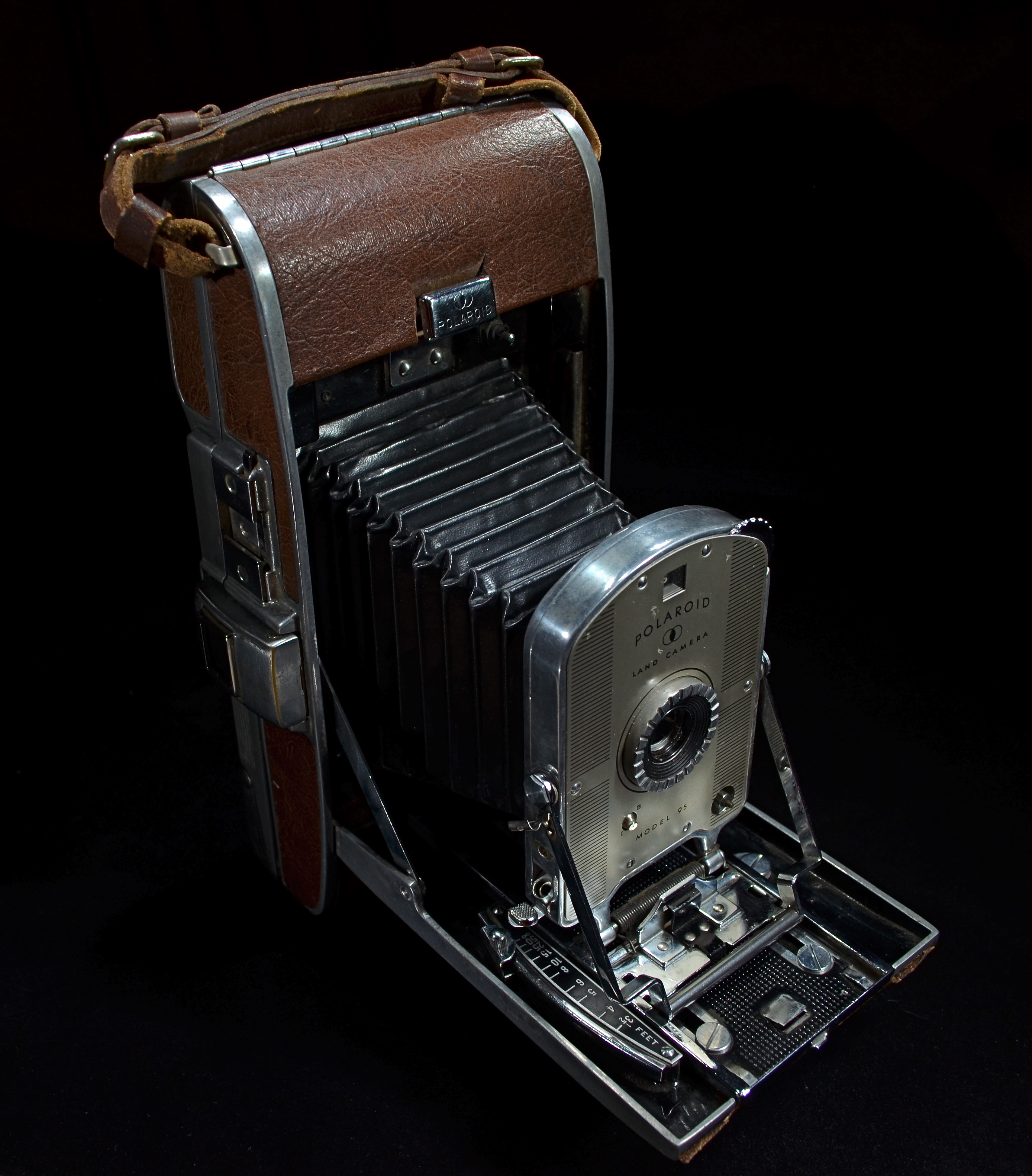
The first of its kind: A model 95 Polaroid Land Camera, circa 1948. Light-painted in darkness for a 15 second exposure at f/5.6, ISO 100, 18mm.
By MICHAEL PERKINS
I REMEMBER, YEARS AGO, HEARING A COMMERCIAL FROM AN OLD RADIO SERIAL IN WHICH THE SPONSOR, Ovaltine, rhapsodized about the show’s latest mail-in “premium”, a genuine Captain Midnight Shake-Up Mug, which, according to the ad copy, was made of “exciting, new PLASTIC!!” It struck me, as a child of the ’50’s, that there actually had been a time when plastic was both exciting and new. The “latest thing” in an age which was bursting with latest things, an unparalleled era of innovation and miracle. Silly Putty. Rocket Ships. Television.
And your photographs….delivered in just one minute.
The introduction of the Polaroid Land Camera, Model 95, in 1948 was one of those “exciting, new plastic” moments. Developed by inventor Edward Land, the device was, amazingly, both camera and portable darkroom. Something mystical began to happen just after you snapped the shutter, an invisible, gremlins-in-the-machine process that accomplished the development of the image right in the camera. Open the back of the thing 60 seconds later, peel away the positive from the negative (a layer of developing gel lay in-between the them) and, sonofagun,you had a picture. Black and White only. Fragile, too, because you immediately had to dab it with a stick of smelly goo designed to keep the picture from browning and fading, a procedure which created the worldwide habit of fanning the picture back and forth to speed up the drying process (sing it with me: shake it like a Polaroid). And then you got ready for company. Lots of it.
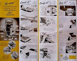
Original Polaroid User’s Flyer. Easy, right?
When you brought a Model 95 (unofficially dubbed the “Speedliner”) to a party, you didn’t just walk in the door. You arrived, surrounded by an aura of fascination and wonder. You found yourself at the center of a curious throng who oohed and ahhed, asked endlessly how the damn thing worked, and remarked that boy, you must be rich. Your arrival was also obvious due to the sheer bulk of the thing. Weighing in at over a pound and measuring 10 x 5 x 8″, it featured a bellows system of focusing. Electronic shutters and compact plastic bodies would come later. The 95 was made of steel and leatherette, and was half the size of a Speed Graphic, the universal “press” cameras seen at news events. Convenient it wasn’t.
But if anything about those optimistic post-war boom years defined “community”, it was the Polaroid, with its ability to stun entire rooms of people to silent awe. The pictures that came out were, somehow, more “our” pictures. We were around for their “birth” like a roomful of attentive midwives. Today, over 75 years after its creation, the Polaroid corporation has been humbled by time, and yet still retains a powerful grip on the human heart. Unlike Kodak, which is now a hollowed out gourd of its former self, Polaroid in 2014 now makes a new line of instant cameras, pumping out pics for the hipsters who shop for irony on the shelves of Urban Outfitters. Eight photos’ worth of film will run you about $29.95 and someone besides Polaroid makes it, but it’s still a gas to gather around when the baby comes out.
So, a toast to all things “new” and “exciting”. But I’ll have to use a regular glass.
For some reason, I can’t seem to locate my Captain Midnight Shake-Up Mug.
CAUSE AND EFFECT

Sun Pennants, 2014. 1/400 sec., f/5.6. ISO 100, 35mm.
By MICHAEL PERKINS
THERE’S NOTHING WORSE THAN COMING HOME FROM A SHOOT realizing that you only went halfway on things. Maybe there was another way to light her face. Did I take a wide enough bracket of exposures on that sunset? Maybe I should have framed the doorway two different ways, with and without the shadow.
And so on. Frequently, after cranking off a few lucky frames, we’re like kids walking home from confession, feeling fine and pure at first, and then remembering, “D’OH! I forgot to tell Father about the time I sassed my teacher!”
Gridlight, 2014. 1/200 sec., f/5.6, ISO 100, 35mm.
Too Catholic? (And downright boring on the sins, by the way..but, hey) Point is, there is always one more way to visualize nearly everything you care enough about to make a picture of. For one thing, we are always shooting either the cause or the effect of things. The great facial reaction and the surprise that induces it. The deep pool of rain and the portentous sky that sent it. The force that’s released in an explosion and the origin of that force. When we’re there, when the magic of whatever we came to see is happening, right here, right now, we need to think up, down, sideways for pictures of all of it, or as many as we can capture within our power….’cause once you’re home, safe and dry, it’s all different. The story perishes like a soap bubble. Shoot while you’re there. Shoot for all the story is worth.
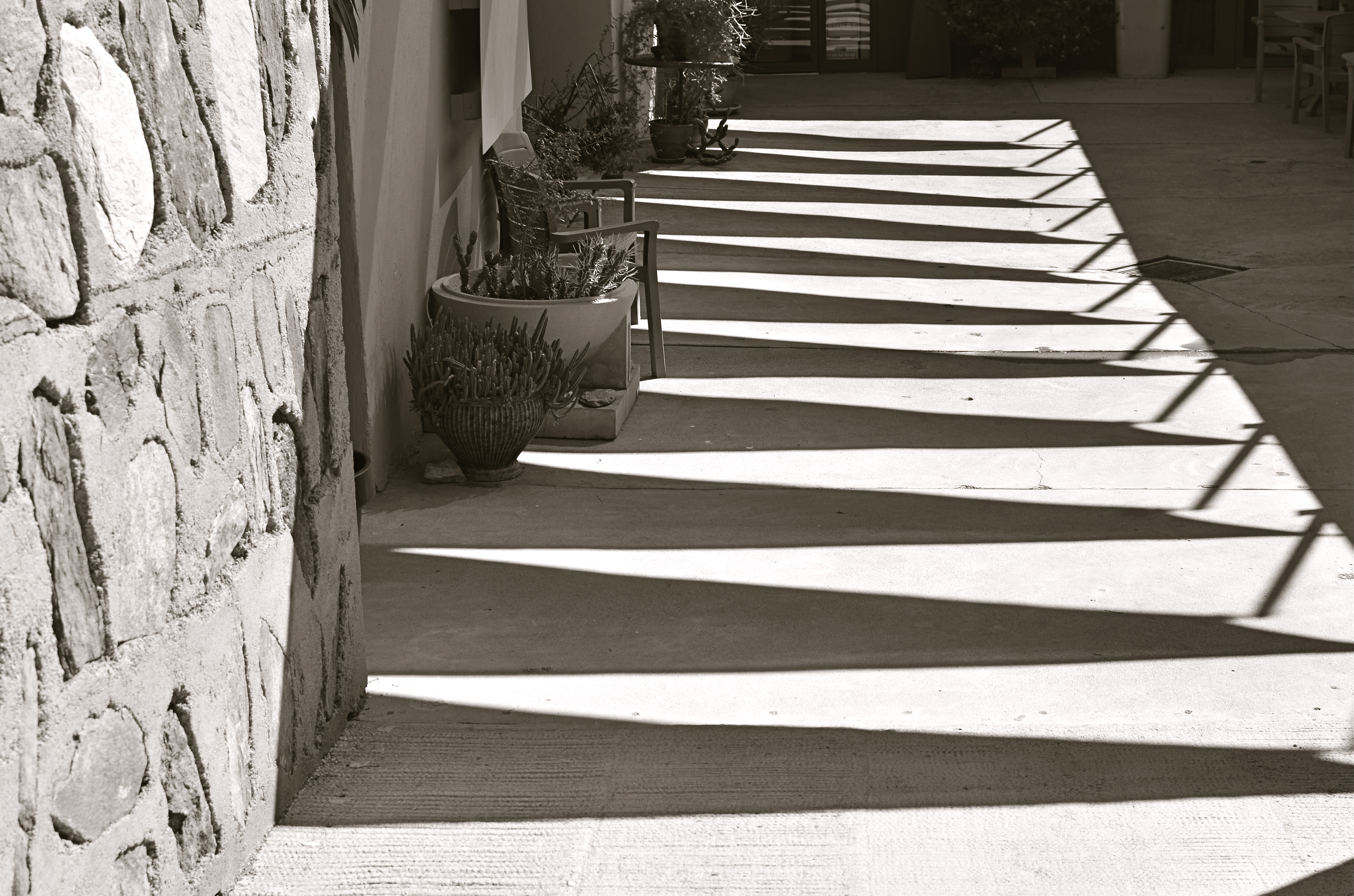
It can be simple things. I saw the above image at one of the lesser outbuildings at Taliesin West, Frank Lloyd Wright’s legendary teaching compound in Scottsdale, Arizona. An abstract pattern made from over-hanging strips of canvas,used as makeshift shade on a path. But when I reversed my angle and shot the sidewalk instead of the sky, I saw the effect of that cause, and it appealed to me too (see left). One composition favored color, while the other seemed to dictate black & white, but they both could serve my purpose in different ways. Click and click.
It bears remembering that the only picture that is guaranteed to be a failure is the one you didn’t take. Flip things around. Re-imagine the order, the role of things. Go for one more version of what’s “important”.
Hey, you’re there anyway.…..
NORMALEYE GALLERY UPDATE: HOME, HOME ON THE “RANGE”

A two-exposure HDR image with more emphasis on content than processing.
By MICHAEL PERKINS
HISTORY BUFFS WHO HAVE EXHAUSTIVELY RESEARCHED THE HELLISH ANIMOSITY OF THE AMERICAN CIVIL WAR, a conflict which sowed seeds of resentment that bear bitter fruit to this very day, may have some small grasp of the vitriolic divide between those who espouse High Dynamic Range (HDR) photography and those who believe its practitioners are in league with Beelzebub. Pro-HDR factions believe those who resist this magical art should be forced to declare themselves Amish on the spot, while the opposite camp believes that all cameras that shoot HDR should be pulverized and used as landfill in Hades. We’re talking irreconcilable differences here.
When HDR first came to my attention, I welcomed it, as many others did, as a way to get around a long-standing problem in exposure….how to modulate between blackout and whiteout in extremely contrasty situations in which a single exposure would either blow out the sky through the window or bury the corners of an interior in blackness. My first attempts with it were exciting, as I tried to shoot frames bracketed across a three or five shot range of exposures, then smooth out the drastic differences between light and dark in the final image. The idea of using HDR for a sci-fi look or a painterly effect never appealed to me. I was really trying to use it to make my pictures replicate more closely the adjustment between light and dark that the eye makes instantaneously.
Over the last five years, however, as I review images I’ve made with HDR software. First, I use the program less with each passing year, and second, I no longer use it to retrieve “lost” tones in dark or light areas of an image. The program I have used since day one, Photomatix, has two main choices, Detail Enhancement and Tonal Compression, and, at first, I worked almost exclusively with the former. For wood grain, stone texture, botanical detail and cloud contrast, it’s remarkably effective. However, it’s also easy to produce images which are too dark overall, and accentuate noise in the individual images. Overcook it even a little and it looks like a finger painting done with hot lava. It thus actually works against the original “looks more like reality” objective.
On the other hand, producing the blended image in the Tonal Compression mode retains most of the sharp detail you get in Detail Enhancement without the gooey consistency. It has fewer attenuating controls, but as I go along, I find I am using it more because it simply calls less attention to itself. In either mode, I have made a conscious effort to throttle the heck back and under-process as much as I can. I’m just getting sick of shots that announce “hey, here comes an HDR photo!” two blocks ahead of its arrival.
I’m also in the middle of a back-to-basics phase based on getting things right, in-camera, in a single frame, and learning to be more accepting of dark and light patches rather than artificially mixed goose-ups of rebalanced tones. Anyway, as of this posting, I’ve taken down the original selection of images that was in the HDR gallery tab at the top of this page and loaded in a new batch that, while certainly not a “final” word on anything, shows, I think, that I’m still wrestling with the problem of how best to use this technology. Give them a look if you can, and let me know your thoughts on the use of HDR in your own work. We all have to figure out our own way to be home, home on “the range”.
THE LAST PIECE OF THE PUZZLE
By “available light”, I mean any $%#@ light that’s available. —-Joe McNally, world-renowned master photographer, author of The Moment It Clicks
By MICHAEL PERKINS
ONE OF THE EASIEST THINGS ABOUT ANALYZING THOSE OF OUR SHOTS THAT FAIL is that there is usually a single, crucial element that was missing in the final effort….one tiny little hobnail, without which the entire image simply couldn’t hold together. In a portrait, it could be a wayward turn of face or hint of a smile; in a landscape it could be one element too many, moving the picture from “charming” to “busy”. The secret to greater success, then, must lie in pre-visualizing a photograph to as great a degree as possible, in knowing in advance how many puzzle pieces must click into place to make the result work.
I recently attended an outdoor dance recital, during which I knew photography would be prohibited. I had just resigned myself to spend the night as a mere spectator, and was settling onto my lawn seat when some pre-show stretching exercises by the dancing company presented me with an opportunity. The available natural light in the sky had been wonderfully golden just minutes before, but, by the time the troupe took the stage and started into their poses and positions, it had grown pretty anemic. And then a stage hand gave me back that missing “puzzle piece”.
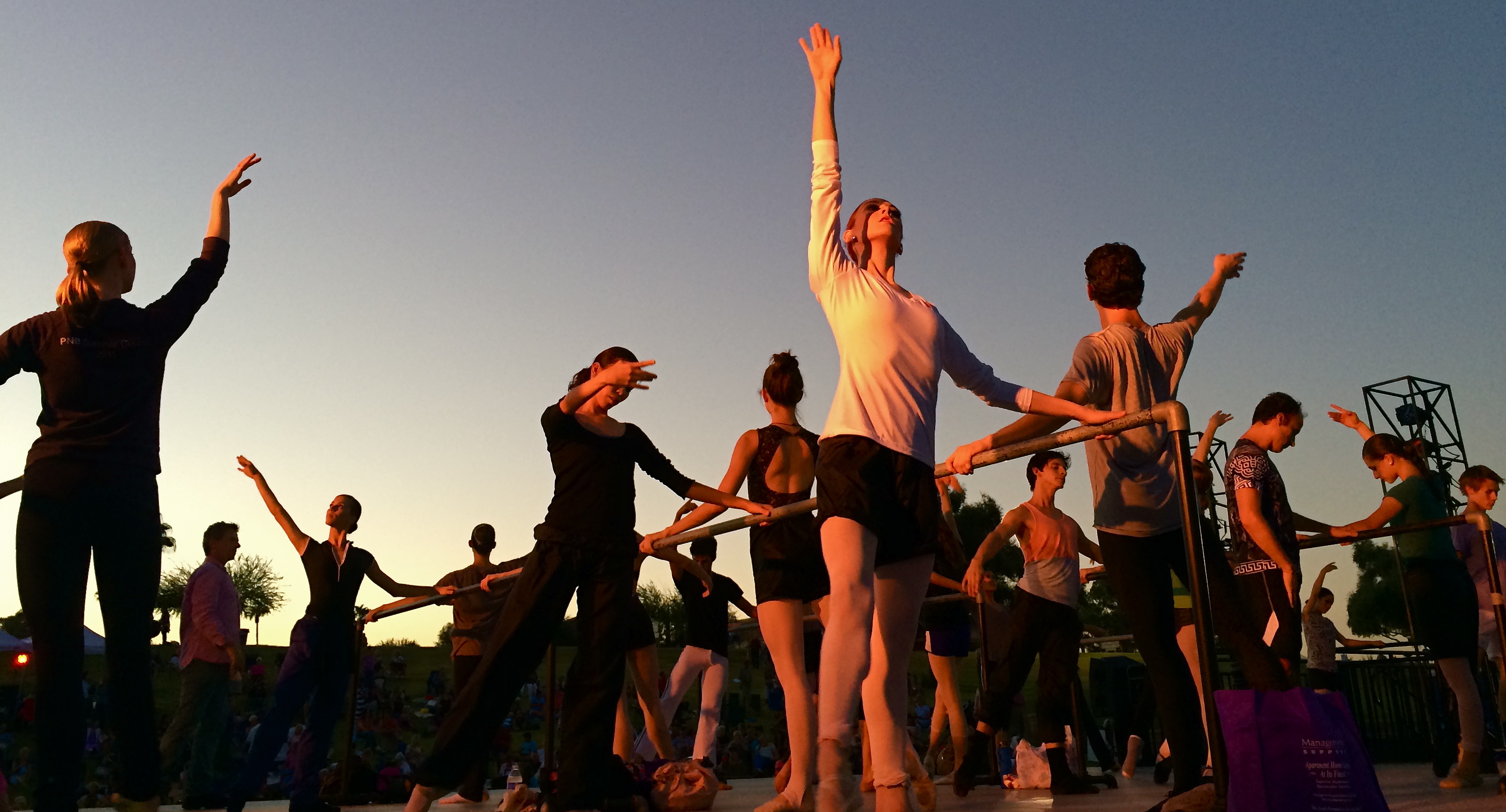
Positions, Please, 2014. One light source at dusk, courtesy of a light tech rehearsing with the rehearsers.
Climbing the gridwork at the right side of the stage, the techie was turning various lights on and off, trying them with gels, arcing them this way or that, devising various ways to illuminate the dancers as their director ran them through their paces. I decided to get off my blanket and hike down to the back edge of the stage, then wait for “my light” to come around in the rotation. Eventually, the stage hand turned on a combination that nearly replicated the golden light that I no longer was getting from the sky. It was single-point light, wrapping around the bodies of some dancers, making a few of them glow brilliantly, and leaving some other swaddled in shadow, reducing them to near-silhouettes.
For a moment, I had everything I needed, more than would be available for the entire rest of the evening. Now the physical elegance of the ballet cast was matched by the temporary drama of the faux-sunset coming from stage left. I moved in as closely as I could and started clicking away. I was shooting at something of an upward slant, so a little sky cropping was needed in the final shots, but, for about thirty seconds, someone else had given me the perfect key light, the missing puzzle piece. If I could find that stage hand, I’d buy her a few rounds. The win really couldn’t have happened without her.
AS DIFFERENT AS DAY AND NIGHT
By MICHAEL PERKINS
PHOTOGRAPHY OFTEN PRESENTS ITSELF AS A SUDDEN, REACTIVE OPPORTUNITY, a moment in time where certain light and compositional conditions seem ripe for either recording or interpreting. In such cases there may be little chance to ponder the best way to visualize the subject at hand, and so we snap up the visualization that’s presented in the moment. It’s the kind of use-it-or-lose-it bargain we’re all acquainted with. Sometimes it yields something amazing. Other times we do the best with what we’re handed, and it looks like it.
Having the option to shape light as we like takes time and deliberate planning, as anyone who has done any kind of studio set-up will attest. The stronger your conception to start with, the better chance you have of devising a light strategy for making that idea real. That’s why I regard light painting, which I’ve written about here several times, as a great exercise in building your image’s visual identity in stages. You slow down and make the photograph evolve, working upwards from absolute darkness.
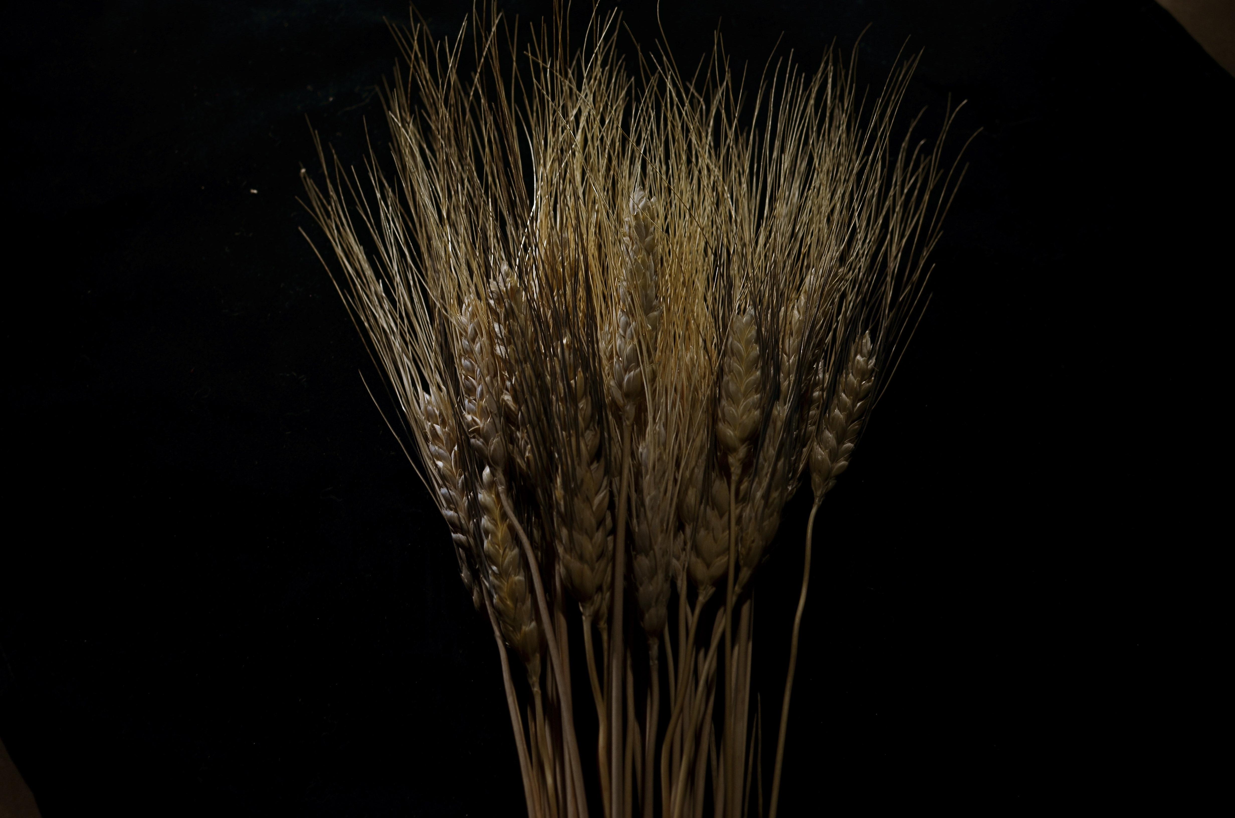
Shock-Top, 2014. Light-painted with a hand-held LED over the course of a six-second exposure, at f/5.6, ISO 100, 35mm.
To refresh, light painting refers to the selective handheld illumination of subjects for a particular look or effect. The path that your flashlight or LED takes across your subject’s contours during a tripod-mounted time exposure can vary dramatically, based on your moving your light source either right or left, arcing up or down, flickering it, or using it as a constant source. Light painting is different from the conditions of, say, a product shoot, where the idea is to supply enough light to make the image appear “normal” in a daytime orientation. Painting with light is a bit like wielding a magic wand, in that you can produce an endless number of looks as you develop your own concept of what the final image should project in terms of mood. It isn’t shooting in a “realistic” manner, which is why the best light painters can render subjects super-real, un-real, abstract or combinations of all three. Fact is, the most amazing paint-lit photos often completely violate the normal paths of natural light. And that’s fine.
In light painting, I believe that total darkness in the space surrounding your central subject is as important a compositional tool as how your subject itself is arranged. As a strong contrast, it calls immediate and total attention to what you choose to illuminate. I also think that the grain, texture and dimensional quality of the subject can be drastically changed by altering which parts of it are lit, as in the shock of wheat seen here. In daylight, half of the plant’s detail can be lost in a kind of brown neutrality, but, when light painted, its filaments, blossoms and staffs all relate boldly to each other in fresh ways; the language of light and shadow has been re-ordered. Pictorially, it becomes a more complex object. It’s actually freed from the restraints of looking “real” or “normal”.
Developed beyond its initial novelty, light painting isn’t an effect or a gimmick. It’s another technique for shaping light, which is really our aim anytime we take off our lens caps.
EYE ON THE STARS
Is this an image of hope or despair? Depends on how it’s conceived and executed.
By MICHAEL PERKINS
Two men looked out from prison bars; one saw mud, and the other saw stars.–proverb attributed to Dale Carnegie
PHOTOGRAPHY WAS ONLY SEVERAL DECADES OLD WHEN IT WAS FIRST PRESSED INTO SERVICE to chronicle the world’s great comings and goings. The 19th century’s primitive print technology delayed the arrival of news photographs in the popular press for a while, but, once rotogravures and other methods caught up with the camera, the dizzying daily mix of wars, crimes, fancies and foibles that we call news began to be “illustrated” by photos, and we have never looked back since. If photography has a mission in the world, we came to believe, it is to use its unblinking eye to catch humanity in the act of behaving, well, like humanity. That reportorial bent, born in the 1800’s, still places a similar burden, by extension, on all photographers. We are supposed to Reveal The Facts, Get At The Truth, and Bear Witness.
So-called “street photography” has its roots in the works of crusading pioneers like Jacob Riis, the reporter turned photographer whose stark depiction of Manhattan slum life in the book How The Other Half Lives moved fellow reformers like Teddy Roosevelt to take action against that city’s brutal poverty. All these decades later, we place a certain trust in images that show the seamier or harsher side of life. Even those of us who aren’t officially campaigning to make the world a better place click off millions of “real” images of gritty cities, abandoned people, or hopeless conditions. We tend to regard these images as more authentic than the ones we create of things that poetic, or beautiful.
But this is a flawed viewpoint. We can, if we choose, look through the bars and see only the mud. But that doesn’t mean that marveling at the stars is any less important, or that beholding the beautiful is somehow a frivolous or non-serious pursuit. In fact, we need beauty to keep our souls from being crushed and rendering ourselves useless to do anything noble or good. Beauty is a template, a blueprint for the fulfillment of life, and we can’t even measure how far we’ve wandered toward the mud unless we know the distance we are from the stars.
Photography is “for” beauty, just as it is “for” everything else in human experience. We can, and should, be moved by cracked windows and wrecked alleys, to be sure, but it is our knowledge of the lark and the mountain that remind us why ugliness offends us. The fuller we are as humans, the better we are as photographers.
Don’t ignore the mud. That would be stupid. But keep your eyes, both yours and your camera’s, on the stars as well.
WHAT SIZE STORY?

iPhone 6 debut at Apple Store in Scottsdale, Arizona, September 19, 2014. Sometimes the story is “the crowd…”
By MICHAEL PERKINS
IN THE EARLY 1950’s, AS TELEVISION FIRST BLINKED INTO LIFE ACROSS AMERICA, storytelling in film began to divide into two very clearly defined camps. In theatres, desperate to retain some of the rats who were deserting their sinking ships to bathe in cathode rays at home, movie studios went for stories that were too big to be contained by the little screen, and almost too big for theatres. You remember the wider-than-thou days of Cinemascope, VistaVision, Todd-Ao, Cinerama and Super-Panavision, as well as the red-green cardboard glasses of 3-D’s first big surge, and the eye-poking wonders of House Of Wax, Creature From The Black Lagoon and Bwana Devil. Theatres were Smell-O-Vision, True Stereophonic Reproduction and bright choruses of Let’s Go Out To The Lobby sung by dancing hot dogs and gaily tripping soda cups. Theatres was Big.
The other stories, the TV stories, were small, intimate, personal, compact enough to cram into our 9-inch Philcos. Tight two-shots of actors’ heads and cardboard sets in live studios. It was Playhouse 90 and Sylvania Theatre and The Hallmark Hall Of Fame. Minus the 3,000 Roman extras and chariot races, we got Marty, Requiem For A Heavyweight, and On The Waterfront. Little stories of “nobodies” with big impact. Life, zoomed in.
…but, within that crowd, there are “little” stories.
For photographers, pro or no, many stories can be told either in wide-angle or tight shot. Overall effect or personal impact. You can write your own book on whether the entire building ablaze is more compelling than the little girl on the sidewalk hoping her dog got out all right. Immense loads of dead trees have been expended to explore, in print, where the framing should happen in a story to produce shock, awe or a quick smile. I like to shoot everything every way I can think of, especially if the event readily presents more than one angle to me.
The release of the new iPhone 6, which dropped worldwide today, is a big story, of course, but it consists of a lot of little ones strung together. Walk the line of the faithful waiting to show their golden Wonka ticket to gain admission to the Church of Steve and you see a cross-section of humankind represented in the ranks. Big things do that to us; rallies, riots, parties, flashmobs, funerals….the big story happens once a lot of little stories cluster in to comprise it.
Simply pick the story you like.
Remember, just like the phone, they come in two sizes.
THE EYES (DON’T NECESSARILY) HAVE IT

Reverie, 2014.
By MICHAEL PERKINS
A QUICK GOOGLING OF THE PHOTOGRAPHIC UNIVERSE THESE DAYS will turn up a number of sites dedicated to “faceless portraits”, if there can, strictly speaking, be such a thing (and I believe there can). In a recent post entitled Private, Not Impersonal, I explored the phenomenon in which photographers, absent the features that most easily chronicle their subjects’ personalities, imply them, merely through body language, composition, or lighting. At the time I wrote the post, I was unaware how widespread the practice of faceless portraits had become. In fact, it’s something of a rage. Hmm. The very thought that, even by accident, I could be aligned with something hip, is, by turns, both terrifying and hilarious.
Thing is, photographs, as the famous curator John Szarkowki remarked, both conceal and reveal, and there is nothing about the full depiction of a human face that guarantees that you’re learning or knowing anything about the subject in frame. We are all to practiced at maintaining our respective masks for many portraits to be taken, ha ha, at face value. Cast your eye back through history and you will find dozens of compelling portraits, from Edward Steichen’s silhouettes of Rodin to Annie Leibovitz’ blurred dance photos of Diane Keaton, that preserve some precious element of humanity that a formal, face-on sitting cannot deliver. Call it mystery, for lack of a more precise word.
In the above frame, the subject whose face I myself never even saw gave me something wonderfully human, about reading in particular, but about enchantment in general. She is furiously busy discovering another world, a world the rest of us can only guess at, seeping up from her book. Her entire body is an inventory of emotional textures…of relaxation, attentiveness, of both being in the present and so completely someplace else. Framing her to include the negative spaces of the window, the carpet and the wider bookstore isolate her further from us, but not in a negative way. She wants to be apart; she is on a journey.
My “girl with the flaxen hair” was unaware of me, and I shot furtively and quickly to make sure I didn’t break the spell she was under. It was the least I could do in gratitude for a chance to witness her adventure. Looking back, I think she provided more than enough magic without revealing a single fragment of her face. Seeing is selecting, and I had been given all I needed to do both.
Click and be gone.
PENCIL LINE, INK LINE
True Stereophonic Reproduction, 2014. Shot on the fly with an iPhone at my favorite junk store.
By MICHAEL PERKINS
MY FATHER, AS A GRAPHIC ARTIST, USED TO WARN ME ABOUT COMMITTING MYSELF TOO EARLY. Not in terms of personal relationships, but as it applied to the act of drawing. “Always lay down all your potential pencil lines first”, he advised, “and then decide which ones you want to ink.” The message was that flexibility was as valuable a drafting tool as your 2H pencil or your Rapidograph pen, that delaying your final vision often helped you eliminate the earlier drafts and their respective weaknesses. I still value that advice, as it has a current corollary in the making of my photographs, largely as a consequence of the smartphone revolution.
Once phones began packing cameras that could actually deliver an image better than a Crayola shmear on a wet cocktail napkin, photographers who still chiefly relied on their traditional cameras suddenly had the luxury of a kind of optical “sketch pad”; that is, an easy way to pre-visualize a composition with a basic machine that you could use for a study, a dress rehearsal for a more precise re-imagining with a more advanced device. For many of us, the larger display area of a phone can often “make the sale” for a shot in a more compelling way than the smaller monitor on our grown-up camera, and, at the very least, we can judge how a photo will “play” less conspicuously than by lugging about more visually obvious hardware. It’s a fast way to gather a lot of preliminary ideas, especially in locales where you’re free to come back later for the serious shoot.
I especially like trolling through vintage stores, trying to find antique items that, in themselves, make for impromptu still-life subjects. Sometimes, to be honest, I go home with a pocket full of puckey. Sometimes, I decide to go back and do a more thorough shoot of the same subject. And sometimes, as in the above image, I decide that I can live with an original “sketch” with just a little post-tweaking. The exercise does one important thing, in that it reminds you to always be shooting, or at least always thinking about shooting.
I know people who have completely stopped even carrying DSLRs and other, more substantial gear in their everyday shooting, and, while I can’t quite get there yet, I get the idea on many levels. Hey, use a fine stylus, a sharp crayon, or a charred stick, dealer’s choice. Just get the sketch.
GO OUT AND COME BACK IN AGAIN
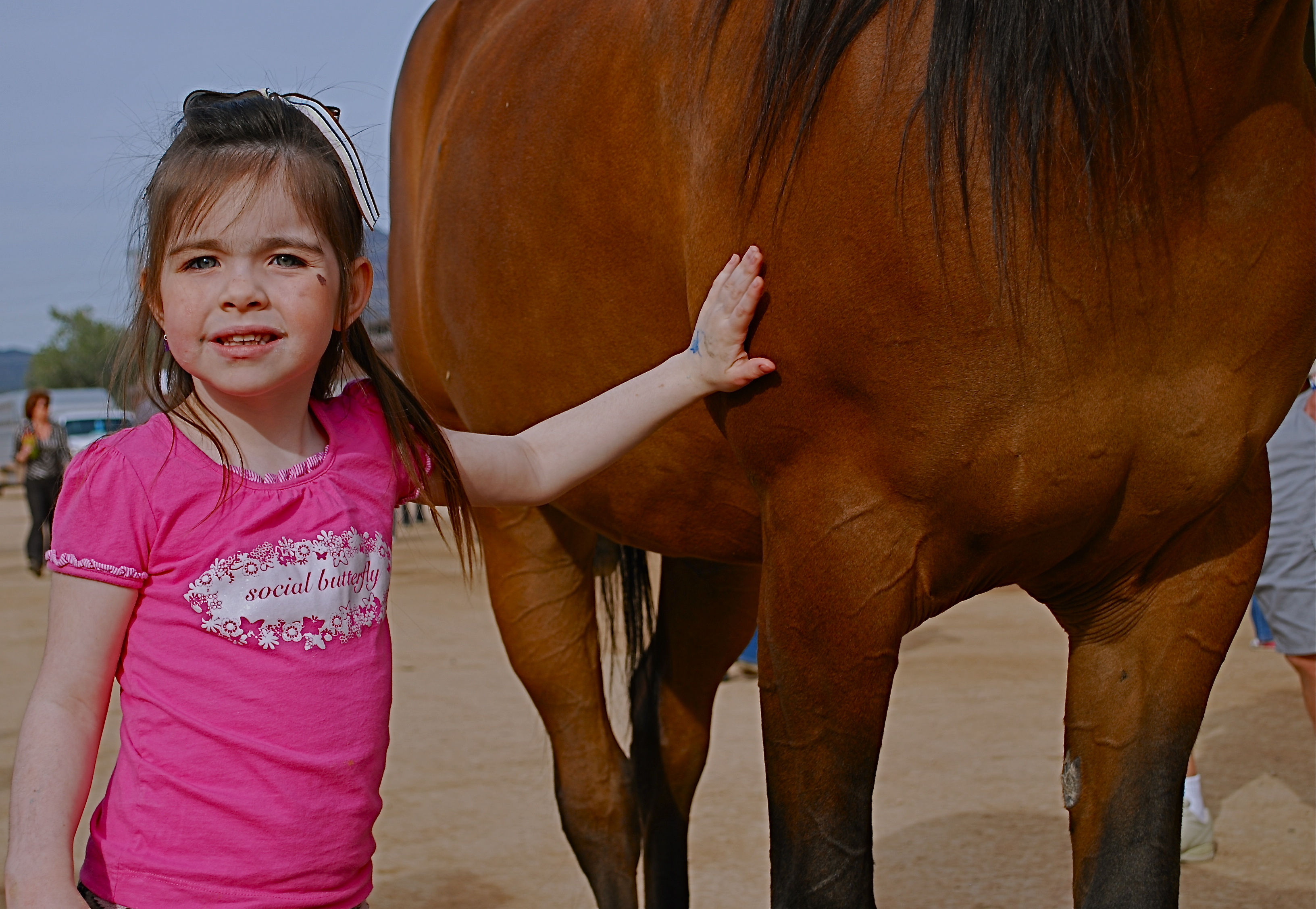
Thought the cute kid would be what this picture was “about”. Guess I was wrong.
By MICHAEL PERKINS
SEPARATING ONE’S IMAGES INTO “HIT” AND “MISS” PILES is always painful, since it’s kind of like telling some of your kids that they will be power hitters in Little League while their siblings should take up…well, macrame. But self-editing, over time, is nearly as important as shooting, and the mindfulness of asking “what was I thinking” is the useful corollary to “what do I want to do next?” That don’t make it smart any less, but at least you understand the pain.
Usually I hurl photos into the “miss” box for purely technical reasons, which means that I should have known what to do and just blew it upon execution. I’m more exacting nowadays, because present-era camera make it tougher to absolutely boot a shot, although I have striven to stay ahead of the curve and make lousy pictures even in the face of rapidly advancing technology. People who think they’ve idiot-proofed their gear have never met this idiot, I boast. It’s a point of pride.
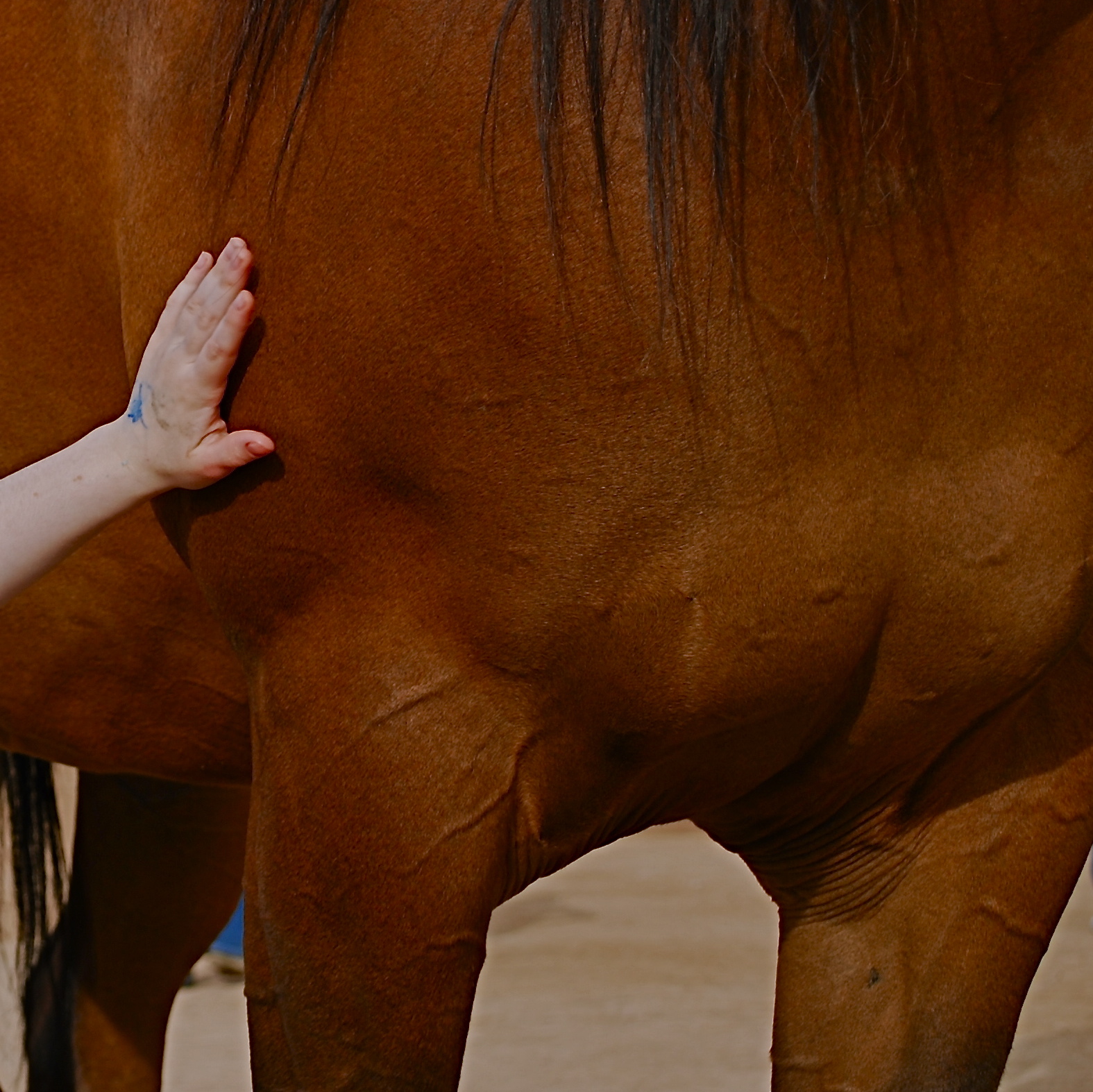
Cropping the image got to the main impact point lurking within.
Occasionally, though, you review a shot that was okay exposure-wise, but completely got the narrative wrong. Sometimes you can recompose the shot and redress this problem, and sometimes you’re just sealed out of the airlock with no oxygen. That’s the breaks. In the original image at the top of this page is a candid of a little girl next to a horse that I thought would be charming. Cute kid, nice horsie, you get the picture. Problem is, I never really captured her essence in any of the photos I shot (trust me) and I framed so tight that I was only showing the horse’s body. First verdict on this one: thanks for playing our game, sorry to see you go, here are some lovely parting gifts.
However, as a rainy day project, the photo suddenly presented a different way for me to go. It wasn’t that I had shown too little of the horse; it was that I had shown too much of both the horse and the child. The central part of the image, taken by itself, had a narrative power that the larger frame lacked. To crop so that just a part of the girl’s small arm connected with the strong, muscular torso of the horse magnified his power by contrasting it with her fragility. I wasn’t losing the horse’s face, since it hadn’t been in the original, and losing the girl’s face actually improved the impact of the image by reducing her to an abstraction, to a symbol of innocence, gentleness, but above all, contact. We could deduce that the horse and the girl were friends. We didn’t need to see it reflected in their features.
Sometimes an image we are ready to reject is hiding a more concentrated fragment that saves the entire thing, if we are unafraid to pare away what we once saw as “essential”. It’s the go-out-and-come-back-in-again school of thought. It’s at least a seeing exercise, and you gotta flex them eye and brain muscles at every opportunity.
WORK DIGITAL, THINK ANALOG
By MICHAEL PERKINS
I’M BIG ON CELEBRATING THE FACT THAT DIGITAL TECHNOLOGY HAS REMOVED THE LAST FEW BARRIERS to photography being truly democratic. Just as the introduction of the Kodak Brownie in 1900 moved picture-making out of the salons of the privileged few and into the hands of John Q. Everyman, digital has been another quantum leap toward a level playing field, putting cameras almost literally into everyone’s hand. This, as with all mass movements, has both its pluses and minuses.
Digital photography has actually improved one democracy (everyone can afford to shoot) and created a second one (everyone can afford to fix what they shoot). For nearly the entire film era, processing after the shutter click was, for many of us, a luxury item. For initial developing, we defaulted to the guy at the regional Kodak plant or the corner Rexall. True hobbyists and professionals wielded most of the tools available for drastic makeovers of images, with most of us merely accepting what we got. Our near misses simply went into the loss column, while others‘ near misses could sometimes be revamped into acceptable, even exceptional photos. The titans of the photographic world (Ansel Adams and others) were renowned for their ability to creatively manipulate negatives into prints of rare art. Most of the rest of us clutched our Instamatics tightly and hoped for the best.
Shoot as if you’ll have to live with the results forever, with no “fixing it later”. 1/320 sec., f/8, ISO 100, 35mm.
Unfortunately, digital has over-corrected a bit in giving Everyman the chance to salvage more shots. Instead of developing habits that are, say, 75% good shooting and 25% good processing, we have instead veered toward the opposite, with more time than ever spent “fixing” shots that were ill-conceived in the first place. Moreover, many of these fixes, mounted on apps, are general, one-click options that deny us the finely tuned control that a good film era darkroom rat would have acquired. We have gained access to the information highway, but we still drive like teenagers. We are all over the road.
I see more professionals advocating a return,not to the format of film, but the shooting discipline of film. How differently would we shoot, for example, if it were still true that we wouldn’t have a lot of options for fixing our shots later? What strategies would develop if we had to make or break our shots in the camera, without any opportunity for tweaking them thereafter? Most importantly, which of our images could stand alone as straight out of the camera executions, as products of real, hard-earned skill rather than the comfort in knowing we could probably crop, resize, re-color or repair almost anything?
Now, I am not suggesting we all go back to making our furniture out of pine logs. I am not the last guy in town to trade in my horse for a Model A. I merely think that we need to re-introduce self-reliance into the picture-making process, to shoot as if it’s all on us, as if no Tech Avenger will ride to the rescue if we blow the shot in-camera. In fact, I am arguing for what I always argue for….personal responsibility for getting the shot right in the moment. Frame it, conceive it, expose it right the first time. It teaches us better habits, it increases our actual knowledge of what we’re doing, and it speeds our advancement as nothing else can.
Digital is a fabulous box of paints. Now we need to re-learn how to hold the brush.
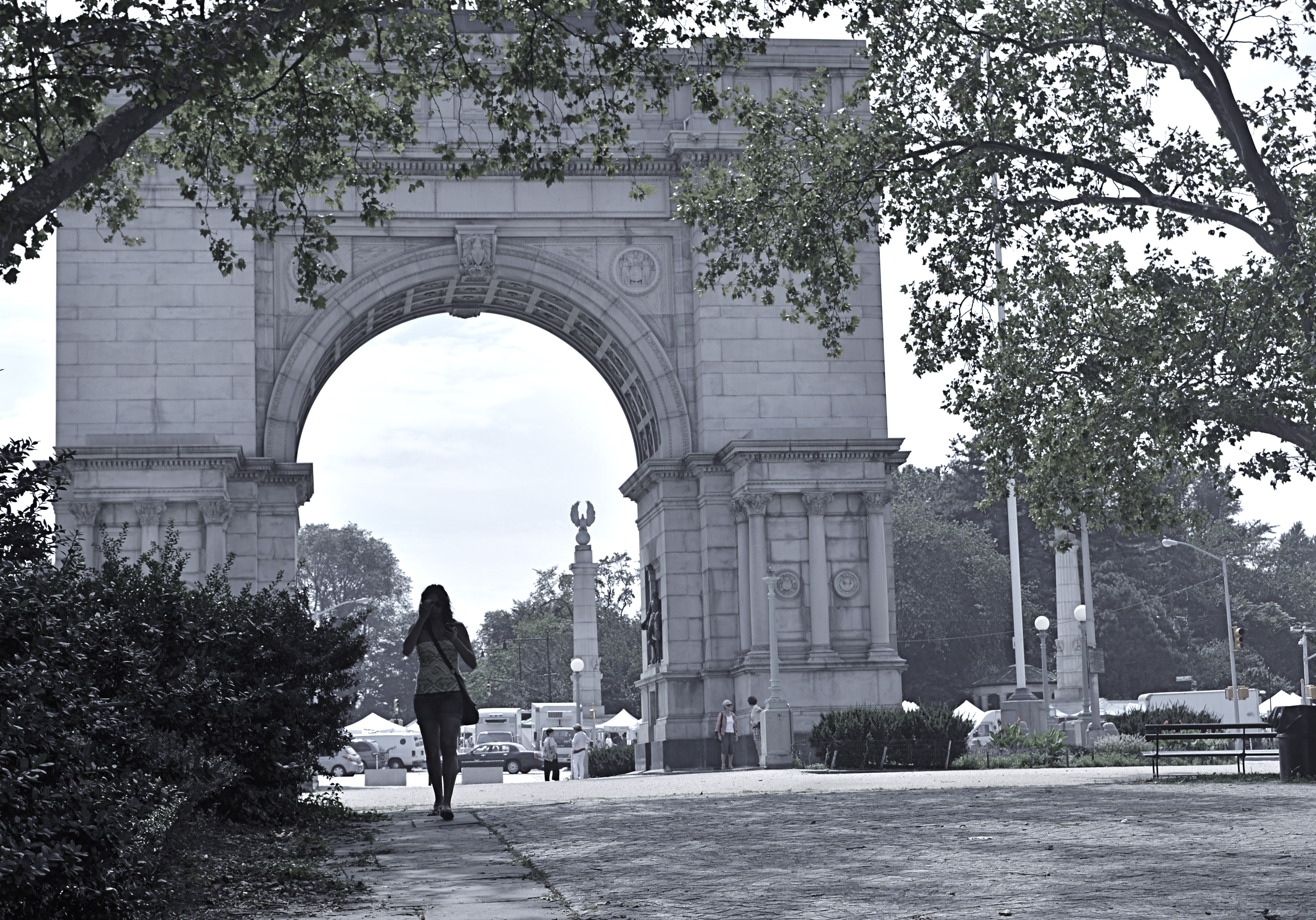
DESTINATION VS. JOURNEY
By MICHAEL PERKINS
I HAVE A WANDERING EYE. Not due to muscular weakness or marital infidelity, but to a malady particular to long-time photographers. After decades of shoots big and little, I find that I am looking for pictures nearly everywhere, so much so that, what appears to many normal people to be formless space or unappealing detail might be shaping up in my mind as My Next Project. The non-obvious sings out ever louder to me as I age, and may find its way into my pictures more often than the Celebrated Scenic Wonder, the Historically Important Site or the Big Lights In The Sky that attract 99% of the photo traffic in any given locality. Part of this has to do with having been disappointed in the past by the Giant Whatsis or whatever the key area attraction is, while being delightfully surprised by little things that, for me, deserve to be seen, re-seen, or testified to.
This makes me a lousy traveling companion at times, since I may be fixated on something merely “on the way” to what everyone else wants to see. Let’s say we’re headed to the Great Falls. Now who wants to photograph the small gravel path that leads to the road that leads to the Great Falls? Well, me. As a consequence, the sentences I hear most often, in these cases, are variations on “are you coming?“, “what are you looking at?” or, “Oh my God, are you stopping again????”.
The Landing, 2014. 1/40 sec., f/3.5, ISO 320, 35mm.
Thing is, some of my favorite shots are on staircases, in hallways, around a blind corner, or the Part Of The Building Where No One Ever Goes. Photography is sometimes about destination but more often about journey. That’s what accounts for the staircase above image. It’s a little-traveled part of a museum that I had never been in, but was my escape the from gift shop that held my wife mesmerized. I began to wonder and wander, and before long I was in the land of Sir, We Don’t Allow The Public Back Here. Oddly, it’s easier to plead ignorance of anything at my age, plus no one wants to pick on an old man, so I mutter a few distracted “Oh, ‘scuse me”s and, occasionally, walk away with something I care about. Bonus: I never have any problem shooting as much as I want of such subjects, because, you know, they’re not “important”, so it’s not like queueing up to be the 7,000th person of the day doing their take on the Eiffel Tower.
Now, this is not a foolproof process. Believe me, I can take these lesser subjects and make them twice as boring as a tourist snap of a major attraction, but sometimes….
And when you hit that “sometimes”, dear friends, that’s what makes us raise a glass in the lobby bar later in the day.
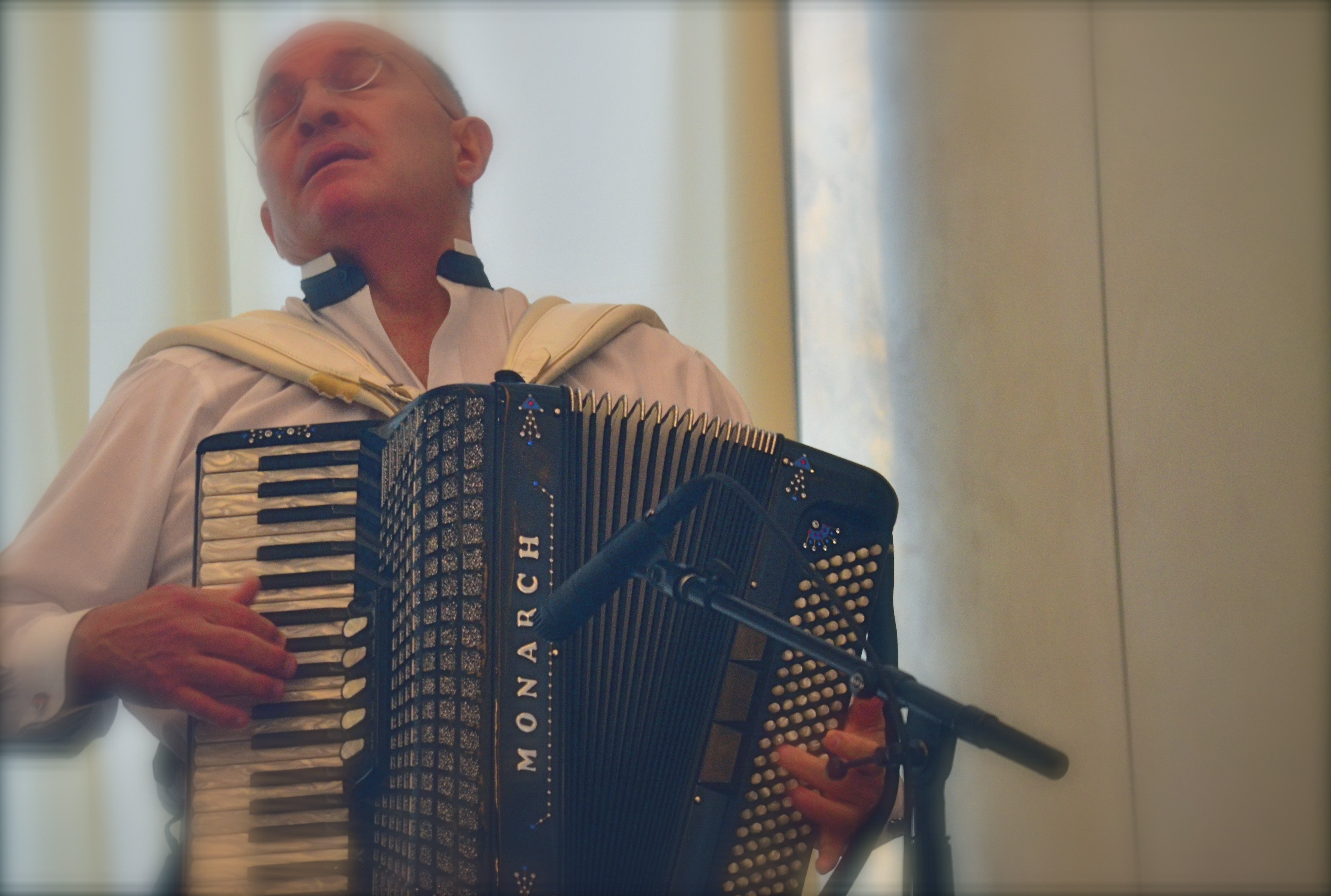
SAME SHIFT, DIFFERENT DAY
By MICHAEL PERKINS
PHOTOGRAPHS OF PERFORMANCES ARE PERHAPS MY FAVORITE STUDIES OF THE HUMAN FACE. None of the self-conscious artifice or hesitant reticence of the standard portrait shoot are present when a player, be it a violinist or pianist, is fully inside the trance of creation. Call it rapture, call it focus, but something almost holy illuminates the features when people sing or play. All the awareness of their face as a mask melts away, as all mental energy surges to the task at hand. Their faces become some other thing, and I can’t resist trying to preserve that.
I recently had a chance to shoot two performances at the same part of the same museum about

Shot with a 35mm prime lens and cropped. 1/50 sec., f/3.5, ISO 250, 35mm.
ten weeks apart. The first set of images were like walking barefoot through roses; everything worked. The second occasion, just a few days ago, was, by comparison, work, and frustrating work at that. The time of day for both sessions was the same, with mid-morning light entering the hall through cream-color curtains and softening everything to an appealing haze. My distance from the stage was also nearly the same on both days. What created the difference in my results, then, was my choice of lens, pure and simple. All of my “luck” came because the first lens was perfect for the task. All of my muttered oaths at the second occasion were due to how wrong my choice had been.
In the first case, exemplified by the mariachi band in the image at right, I used a 35mm prime, which
is simple, sharp and fast enough, at f/1.8 on the wide-open end, to give me enough light in nearly any situation. In the more recent shoot, I used a 300mm zoom, about the most opposite approach you could try. The lens cannot get any wider open than f/4.5, and shuts down all the way to f/5.6 when fully zoomed in, so, right off the bat, you’re starving yourself for light, especially in a room where most of it is behind the performers. I decided to try the 300 out of pure perverse curiosity, and from a sense of “what can I lose?”, which is a blessing, since, when the results don’t matter, you can try something, just to see what happens.
Well, I saw.
The light reduction with the 300 was more severe than I’d anticipated. Oh, sure, I could get really tight framings on the performers, but I was going to have to either slow my shutter speed to under 1/60 or jack the ISO up to undesirably high noise level, or, as it turns out, both. The contrast between light and dark was the first thing to take the hit, as tone registered in a muddy middle range with the zoom versus the sharply defined values I had gotten with the 35.
Same time of day, same room, but using a 300mm zoom. Haze added. 1/60 sec., f/5, ISO 1000, 180mm.
Then there was the overall softness of the 300, due largely to the small amount of camera shake on my part, which, in a zoom, is magnified several times over. In both cases, I got usable images, but whereas with the 35mm prime I had a kind of embarrassment of riches, the object with the zoom shoot was to salvage something and slave away like mad to do so.
I could easily have taken wider framed shots with the 35 (since it can’t zoom), then cropped them for tightness later, as I had on the first day. Instead, I got a lot of really tight shots of musicians that needed serious intervention to make them acceptable. But I want to emphasize that this is what experimentation is for. You put your hand on the hot stove, yell “OWWW!” and refrain from touching the hot stove in future. At the end of the second shoot, I had lost no money, no business, and very little time. That’s education on the cheap.
I don’t mind wearing the dunce cap every once in a while, if I know that, eventually, I’m going to end up in a fedora.
I’M INTO METAL, MAN
A cel image processed through an app designed to simulate Pantatonic-X black & white film.
By MICHAEL PERKINS
WHEN I SAY THAT CURRENT DAY SHOOTERS ARE NOT HALF THE PHOTOGRAPHERS THAT THE OLD MASTERS WERE, that is not intended as an insult, but a simple bit of math. Given the fact that pioneers in the imaging game had to be equal parts artist and chemist, we only apply 50% of the effort these valiant visionaries did in negotiating the interactions of salts, albumens, bromides and other lab ingredients in an effort to even bring an image forth, much less do so with control. The technology that we employ today, and the speed and convenience with which we sling it around, should give us pause. The artistic mission of photography remains the same. It’s just that we don’t have to suffer as much for said art.
One of the marvelous processes from those years that still dazzles even the contemporary eye is the platinum print, so called because a platinum coating actually sits as a layer atop the developing papers, creating a print that contains a greater tonal range than any other monochrome process, including hints of gold, brown and red.Even better, what Kodachrome turned out to be for the archival permanence of color photography, platinum is for monochromatic images. It looks like a million bucks and will never degrade within the average person’s lifetime, or their great-grand kids’, neither. If you are over fifty and ever sat for a “serious” studio portrait, chances are you were immortalized in platinum. Literally speaking, you’re into metal, man.
Never for the timid (or the impecunious), platinum printing has largely faded (sorry) from the photographic scene along with the filmic science that birthed it, but, as with so many other “looks” in the digital era, things that were once merely processing are now content as well.
Same image as above, but processed through AltPhoto’s faux-platinum filter.
From where we stand, we can rifle through 200 years of processes and selectively decide to evoke an era or a mood a single picture at a time, just because we want to evoke a different time or place in our common cultural consciousness. We do this at our whim, unlike the people who actually devised the processes, who were stuck with them until they had (a) better knowledge of how to do things, (b) more money (c) both.
The digital apps that simulate the platinum print are gaining some popularity, as people apply instant alternate “mixes” of their cel phone shots, including up to a dozen different ways to envision a shot in monochrome. Those who appreciate the fine science in the original lab smarts required to create these looks in the film era claim that too little control resides in the user for a true one-to-one, film-t0-digital equivalency in any of these apps, but I have found that platinum creates a distinct, extra tool for monochrome fans, even if I experience guilt at not accruing the years of schooling it would have taken to do the process the “real way”. Anyway, above you will find a comparison between a basic mono rendering of an iPhone shot and a simulated platinum look, both cooked up in an app called AltPhoto. You may have a pref and you may not. That’s what makes horse races.
PRIVATE, NOT IMPERSONAL
Dusk Concert, 2014. 1/40 sec., f/2.8, ISO 500, 35mm.
By MICHAEL PERKINS
PORTRAITURE IS RATHER NARROWLY DEFINED BY MOST PHOTOGRAPHERS as an interpretation of a person’s face, the place wherein we believe that most of his/her humanity resides. The wry smile. The upturned eyebrow. The sparkling eye. It’s all there in the features, or so we seem to profess by valuing the face over nearly all other physical features.We stipulate that there are notable exceptions where the body carries most of the message, as in crowd scenes, sports action, or combat shots. But for the most part, we let the face hold the floor (and believe me, after a few misspent nights, my face has held the floor plenty of times).
It’s interesting, however, in an age where privacy has become a premiere issue, and in which the camera’s eye never blinks, that we don’t explore the narrative power of bodies as much as we do faces. The body, after all, carries out the intentions of the mind no less than does the face. It executes the physical action that the mind intends, and so creates a space that reveals that intention. Just like a face. And yet, we have a decidedly pro-face bias in our portraiture, to the point that a portrait that does not include a face is thought by some not to be a portrait at all.

Side By Side, 2014. 1/160 sec., f/5.6, ISO 100, 55mm.
But let’s keep the discussion, and our minds, open, shall we? I love to work with random crowds, and I like nothing better than to immortalizing emotions in a nice face-freeze. However, I strongly maintain that, absent those obvious visual “cues”, a body can carry a storyline all by itself, even enhance the charm or mystery involved in trying to penetrate the personality of our subjects.
Consider for a moment how many amazing nude studies you’ve seen where the subject’s face is completely, even deliberately obscured. Does the resulting image lack in power, or does the power traditionally residing in the face just transfer to the rest of the composition?
Portraits (I insist on calling them that) that are more “private” for being faceless are no more “impersonal” than if the subject was flashing the traditional “cheese!” and beaming their personality directly into the lens.
Photography is not about always getting the vantage point that we want, but maximizing the one we have at hand. And sometimes, taking away a face also strips away a mask. But beyond that, why not actually court mystery, allow ourselves to trust our audiences to supply mentally what we reserve visually?
Ask yourself: what does a photograph of understatement look like?
GIVE IT YOUR WORST SHOT

Are you going to say that Robert Capa’s picture of the D-day invasion would speak any more eloquently if it were razor-sharp? I didn’t think so.
By MICHAEL PERKINS
THE EARLY YEARNING OF PHOTOGRAPHERS TO MASTER OR EXCEED THE TECHNICAL LIMITS OF THEIR MEDIUM led, in the 1800’s, to a search for visual “perfection”. For rendering tones accurately. For capturing details faithfully. And, above all, for tight, sharp focus. This all made perfect sense in an era when films were so slow that people sitting for portraits had to have steel rods running up the backs of their necks to help them endure three-minute exposures. Now, mere mechanical perfection long since having become possible in photography, it’s time to think of what works in a picture first, and what grade we get on our technical “report card” second.
This means that we need no longer reject a shot on technical grounds alone, so long as it succeeds on some other platform, especially an emotional one. Further, we have to review and even re-review images, by ourselves as well as others, that we think “failed” in one way or another, and ask ourself for a new definition of what “failure” means. Did the less-than-tack-sharp focus interfere with the overall story? Did the underexposed sections of the frame detract from the messaging of what was more conventionally lit? Look to the left. at Robert Capa’s iconic image of the D-Day invasion at Normandy. He was just a little busy dodging German snipers to fuss with pinpoint focusing, but I believe that the world jury has pretty much ruled on the value of this “failed” photo. So look inward at the process you use to evaluate your own work. Give it your worst shot, if you will, and see what you think now, today.
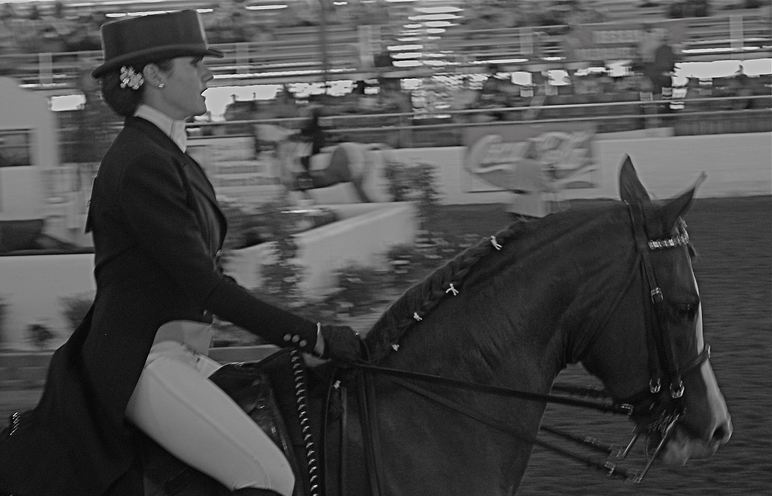
The Last Burst, 2008. 1/80 sec., f/5.6, ISO 800, 50mm.
The above image came from a largely frustrating day a few years back at a horse show in which I spent all my effort trying to freeze the action of the riders, assuming that doing so would deliver some kind of kinetic drama. I may have been right to think along these lines, but doing so made me automatically reject a few shots that, in retrospect, I no longer think of as total failures. The equestrienne in this frame looks as eager, even as exhausted as her mount, and the slight blur in both of them that I originally rejected now seems to work for me. There is a greater blur of the surrounding arena, which is fine, since it’s merely a contextual setting for the foreground figures, but I now have to wonder if I would like the picture better (given that it’s supposed to be suggestive of speed) if the foreground were completely sharp. I’m no longer so sure.
I think that all images have to stand or fall on what they accomplish, regardless of discipline or intention.We only kid ourselves into equating technical perfection with aesthetic success. Sometimes they walk into the room hand in hand. Other times they arrive in separate cars.
SHOW, DON’T TALK
Got a feeling inside (can’t explain)
It’s a certain kind (can’t explain)
I feel hot and cold (can’t explain)
Yeah, down in my soul, yeah (can’t explain)—–Pete Townshend
By MICHAEL PERKINS
PHOTOGRAPHY NEEDS MORE ARTISTS AND FEWER ART CRITICS. Period, full stop.
When it comes to imaging, those who can, do, and those who can’t, curate shows. Or pontificate on things they had no hand in creating. It’s just human nature. Some of us build skyscrapers and some of us are “sidewalk superintendents”, peering through the security fencing to cluck our tongues in scorn, because, you know, those guys aren’t doing it right.
Even wonderful pioneers in “appreciation” like the late John Szarkowski, one of the first curators of photography at the New York Museum of Modern Art , and a tireless fighter for the elevation of photography to a fine art, often tossed up bilious bowlfuls of word salad when remarking on the work of a given shooter. As essays his remarks were entertaining. As explanations of the art, they were redundant.
What is this photograph “saying”? Well, that’s for you to decide, isn’t it?
This human need to explain things is vital if you’re trying to untie the knotted language of a peace treaty or complete a chemical equation, but it just adds lead boots to the appreciation of photography, which is to be seen, not read about (sassy talk for a blogger, no? Oh, well). No amount of captioning (even by the artist) can redeem a badly conceived photograph or make it speak more clearly. It all begins to sound like so many alibis, so many “here’s what I was going for” footnotes. Photography is visual and visceral. If you reached somebody, the title of the image could be “Study #245” and it still works. If not, you can append the biggest explanatory screed since the Warren Report and it’s still a lousy photo.
I’m not saying that all context is wrong in regard to a photo. Certainly, in these pages, we talk about motivation and intention all the time. However, such tracts can never be used to do the actual job of communicating that the picture is supposed to be doing. Asked once about the mechanics of his humor, Lenny Bruce spoke volumes by replying,” I just do it, that’s all.” I often worry that we use captioning to push a viewer one way or another, to suggest that he/she react a certain way, or interpret what we’ve done along a preferred track. That is the picture’s task, and if we fail at that, then the rest is noise.
