A GAME OF INCHES
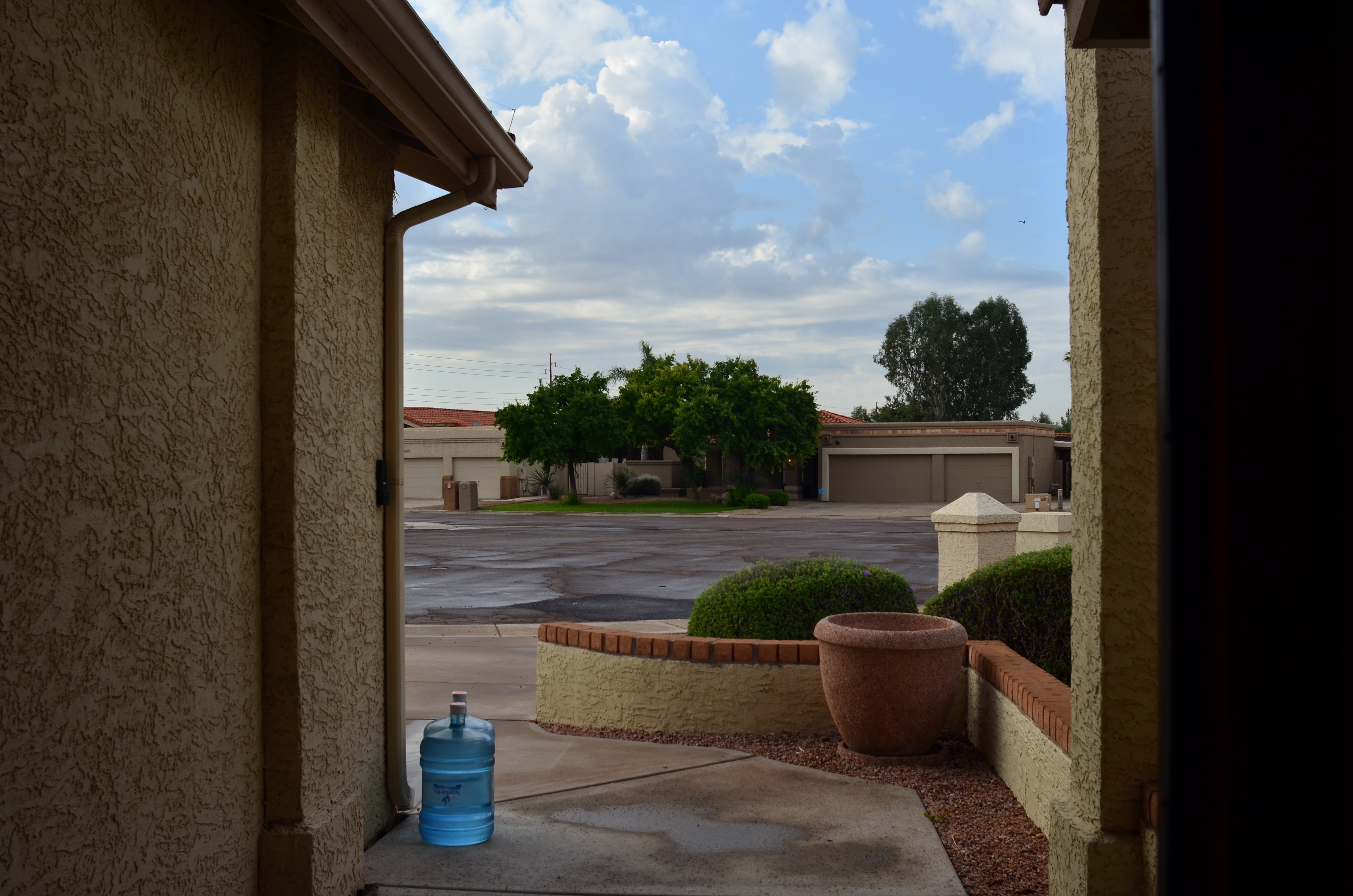
An okay idea for a picture, but, as it turned out, merely okay. 1/200 sec., f/5.6, ISO 100, 24mm.
By MICHAEL PERKINS
PHOTOGRAPHERS PROGRESS FROM WHAT I CALL SNAPSHOT MENTALITY TO “CONTACT SHEET” MENTALITY as we move from eager beginners to seasoned shooters. Many of the transitional behaviors are familiar: we actually learn what our cameras can do, we begin to pre-visualize shots, we avoid 9 out of the 10 most common errors, etc. However, one of the vestiges of snapshot mentality that lingers a while is the tendency to “settle”, to be, in effect, grateful that our snap resulted in any kind of a shot, then moving too quickly on to the next subject. It’s a little like marrying the first boy that ever asked you out, and it can prevent your hanging around long enough to go beyond getting “a” shot to land “the” shot.
In snapshot mentality, we’re grateful we got anything. Oh, good, it came out. In contact sheet mentality, we look for as many ways to visualize something as possible, like the film guys who shot ten rolls to get three pictures, seeing all their possibilities laid side-by-side on a contact sheet. The film guys stood in the batter’s box long enough to make a home run out one of all those pitched balls. With the snapshot guy, however, it’s make-or-break on a single take. I don’t like the odds. My corollary to the adage always be shooting would be always shoot more.
All of which is to plead with you to please, please over-shoot, especially with dynamic light conditions that can change dramatically from second to second. In the shot at the top, I was contending with speedily rolling overcast, the kind of sun-clouds-sun rotation that happens when a brief rain shower rolls through. My story was simply: it’s early morning and it just rained. This first shot got these basics across, and, if I were thinking like a snapshot photographer, I would have rejoiced that I nailed the composition and quit while I was ahead. However, something told me to wait, and sure enough, a brighter patch of sunshine, just a minute later, gave me a color boost that popped the page much more effectively. Same settings, same composition. The one variable: the patience to play what is, for shooters, a game of inches. A small difference. But a difference, nonetheless.
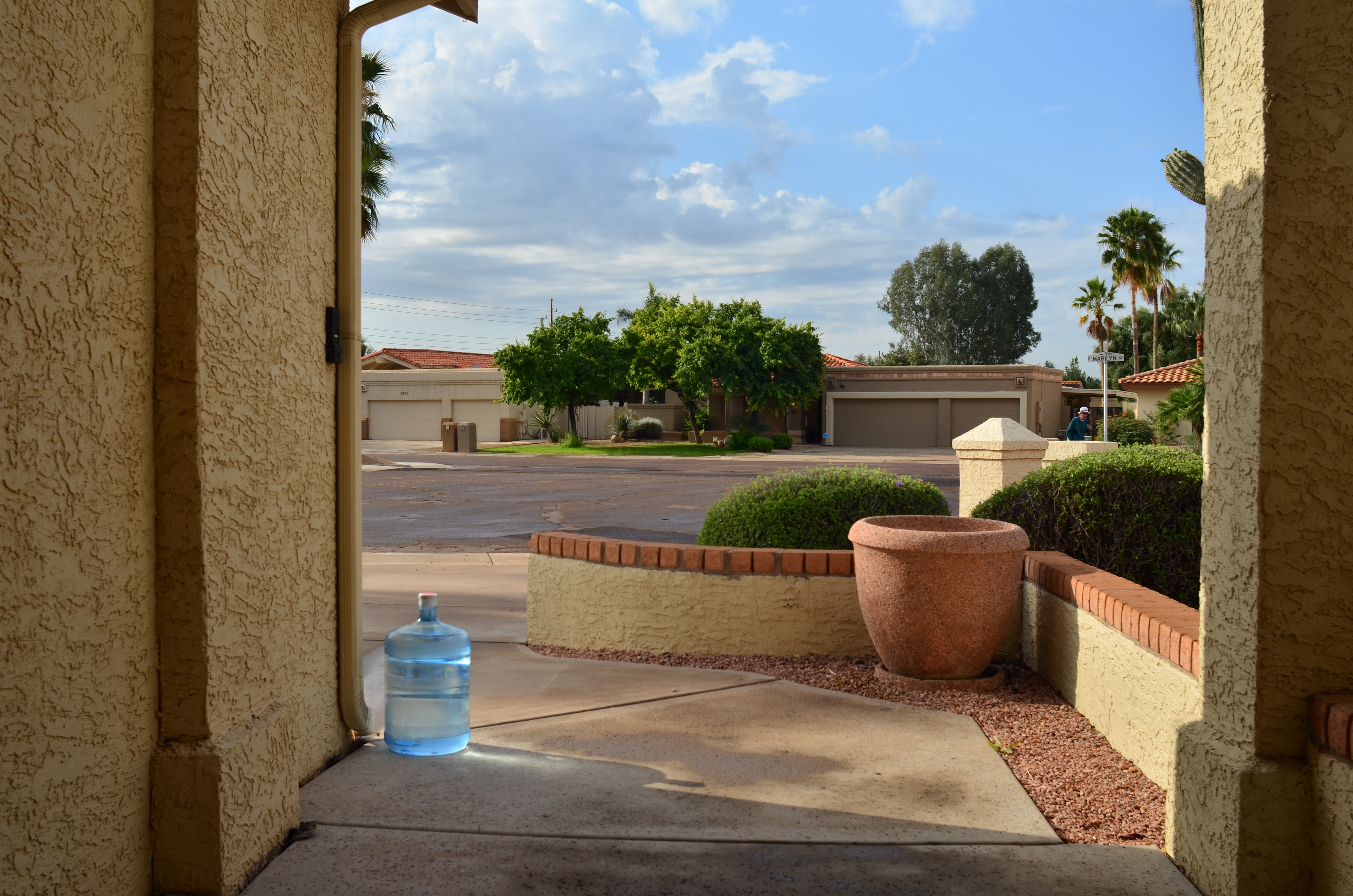
And that’s what these little blurbs are. Not examples of groundbreaking art, just illustrations of the different ways to approach a problem. Digital shooting is cheap shooting, nearly free most of the time. Shouldn’t we, then, give ourselves at least as many editing choices as film guys who shot rolls of “maybes” at great expense, in search of their “yeses”? Hmm?
THE ABCs OF TMI
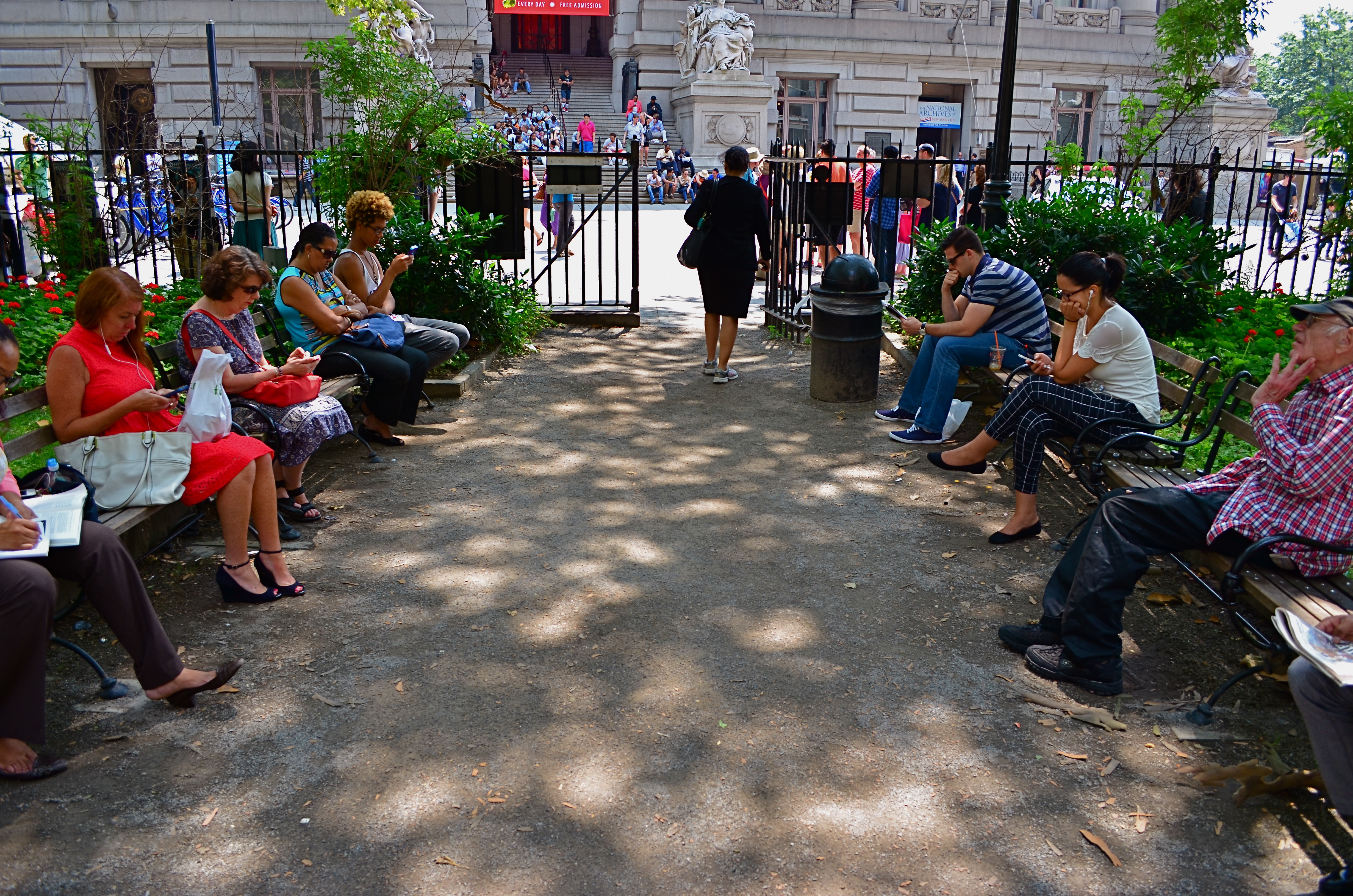
This street shot from a park in lower Manhattan is not ready for prime time, but it might get there with creative cropping.
By MICHAEL PERKINS
FOR ME, ONE OF THE GREATEST ANCILLARY BENEFITS of doing historical research has been the privilege of poring over old files of newspaper and magazine photographs, in many cases viewing original, pre-publication master shots. It’s truly an exercise in reading between the “lines”, those hurried slashes of white grease pencil applied by editors as cropping instructions on shots that were too big, too busy, too slow in getting to the point. In many cases, you realize that, while the photographer may have taken the picture, it was the editor who found the picture.
Of course, no amount of cutting can improve a shot if there is not already a core story hiding within it. You can pare away the skin and seed of an apple, but some apples prove themselves rotten through and through. It’s the same with a photograph. However, if you teach yourself how to spot what, within a frame, is fighting with the central strength of a photo, it becomes obvious where to wield your scissors.
In the master shot image at top, the symmetry of the left and right groups of park visitors is blunted in its effect by the unneeded information along the top and bottom thirds of the frame. The shot is not really about the museum in the distance nor the ground in front of the benches. They just don’t help the flow of the picture, so losing them seems like the easiest way to boost the overall composition.
Now the shot is essentially a wide-angle, and, absent the earlier distractions, a kind of horseshoe curve emerges, tying the two benches together. You might even think of it as an arch shape, with the walking woman at the top acting as a keystone. She now draws attention first to the center, then around the curve, so that getting people to see what I am seeing becomes a lot easier. Finally, there is still a very loud distraction from the color in the shot, so a black-and-white remix keeps the reds and louder colors from “showing off” and lessening the impact of the story. The final result is still no masterpiece, but it does demonstrate that there was a very different picture hiding within the master shot, one that was certainly worth going after.
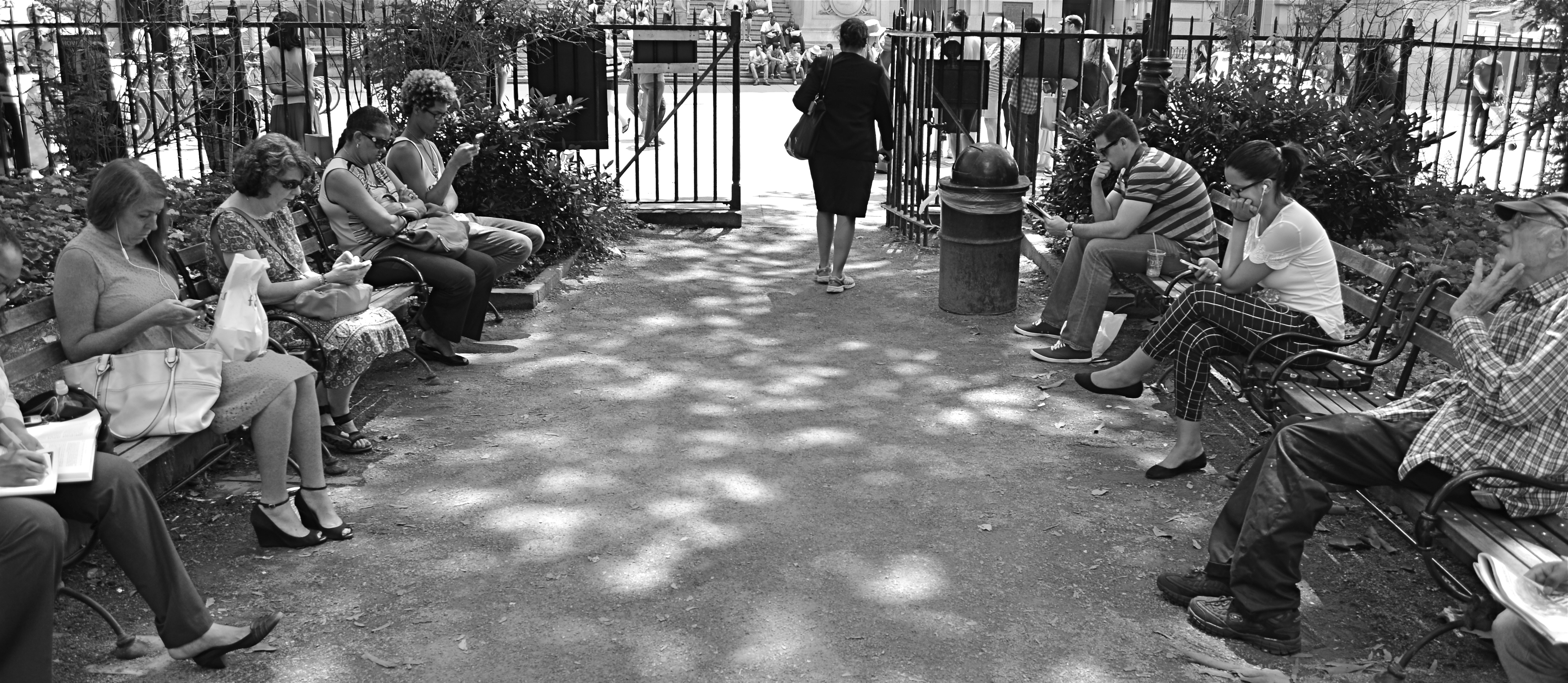
The “after” version, minus the color and some high-and-low-end visual distractions.
One of the downsides of being an amateur shooter is not reaping the benefit of a ruthless photo editor. However, learning to spot the weaknesses in potentially effective shots can be learned, most importantly the “ruthless” part. If you believe in an image, you won’t shy away from trimming its fingernails a bit to give it a chance to shine.
LESS STILL, MORE LIFE

Good enough to eat or time to get a vase?
By MICHAEL PERKINS
PHOTOGRAPHIC HISTORIANS WILL PROBABLY CRINGE AT MY OVER-SIMPLIFICATION, but I tend to believe that still-life compositions were originally popular to shooters because they solved a technical problem. At the dawn of the imaging art, recording media, from salted paper to glass plates, were so abysmally slow that exposure times stretched, in some cases, to nearly an hour. This meant that subject matter with any kinetic quality, from evolving landscapes to a baby’s face, were rendered poorly compared to inanimate objects. Still lifes were not so much about the beauty and color of fruit and cheese on a plate as they were about practicing…learning how to harness light and deliver a desired effect.
As film and lenses both sped up, a still life could be chosen purely on its aesthetic appeal, but the emphasis was still on generating a “realistic” image…an imitation of life. The 20th century cured both photography and painting of that narrow view, and now a still life, at least to me, offers the chance to transform mundane material, to force the viewer to re-imagine it. You can do this with various processes and approaches, but the main appeal to me is the chance to toss the object out of its native context and allow it to be anything…or nothing.
In the image at left, the home-grown vegetables, seen in their most natural state, actually have become alien to our pre-packaged notions of nutrition. They don’t even look like what arrives at many “organic” markets, much less the estranged end-product from Green Giant or Freshlike. And so we are nearly able to see these vegetables as something else. Weeds? Flowers? Decay? Design? Photographing them in our own way, we are free to assign nearly any quality to them. They might, for example, be suggestive of a floral bouquet, a far cry from the edibles we think we know. Still life compositions can startle when they are less “still” and more “life”, but we have to get away from our subjects and approach them around their blind side.
As always, it’s not what we see, but how.
THE TAKEAWAY
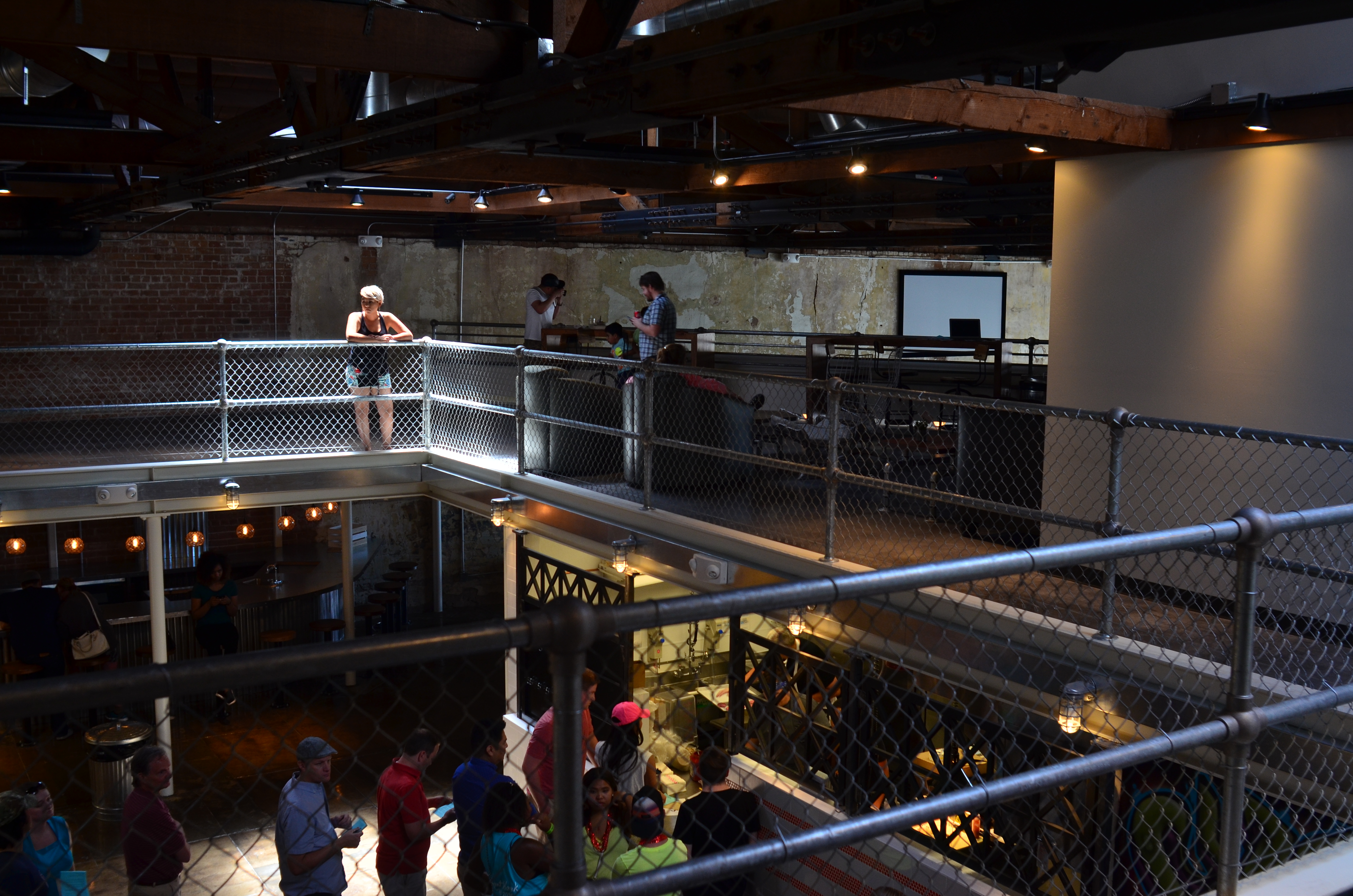
The girl bathed in ceiling light is a nice start, but this picture needs some help to get where it’s going.
By MICHAEL PERKINS
IT IS SAID THAT THE GODDESS ATHENA WAS BORN, FULLY GROWN AND ARMORED, out of the forehead of Zeus. Other than being the only case where a man experienced anything that approached labor pain, the story always reminds me that ideas rarely arrive in their final form, especially in photography. If Athena had a Leica, she probably could have taken perfect shots without needing to compose or plan. We mere mortals are forced to either (a) report to hate-crazed photo editors, or (b) learn how to crop.
Many shots are created in stages, and there’s no shame in the game, since our original conception undergoes many phases from the first spark to something we’d actually hang on a wall. Creation itself is a process, which is why photographers should actually embrace the stages their work will pass through. The more thought that is applied to making an image, the better chance that the best way of doing something will reveal itself. Of course, it can also reveal the fact that there is nothing really to work with, in which case, hey, the bar should be open now, let’s go lick our wounds.
The original shot shown above is not yet a good photograph, but a good beginning for a 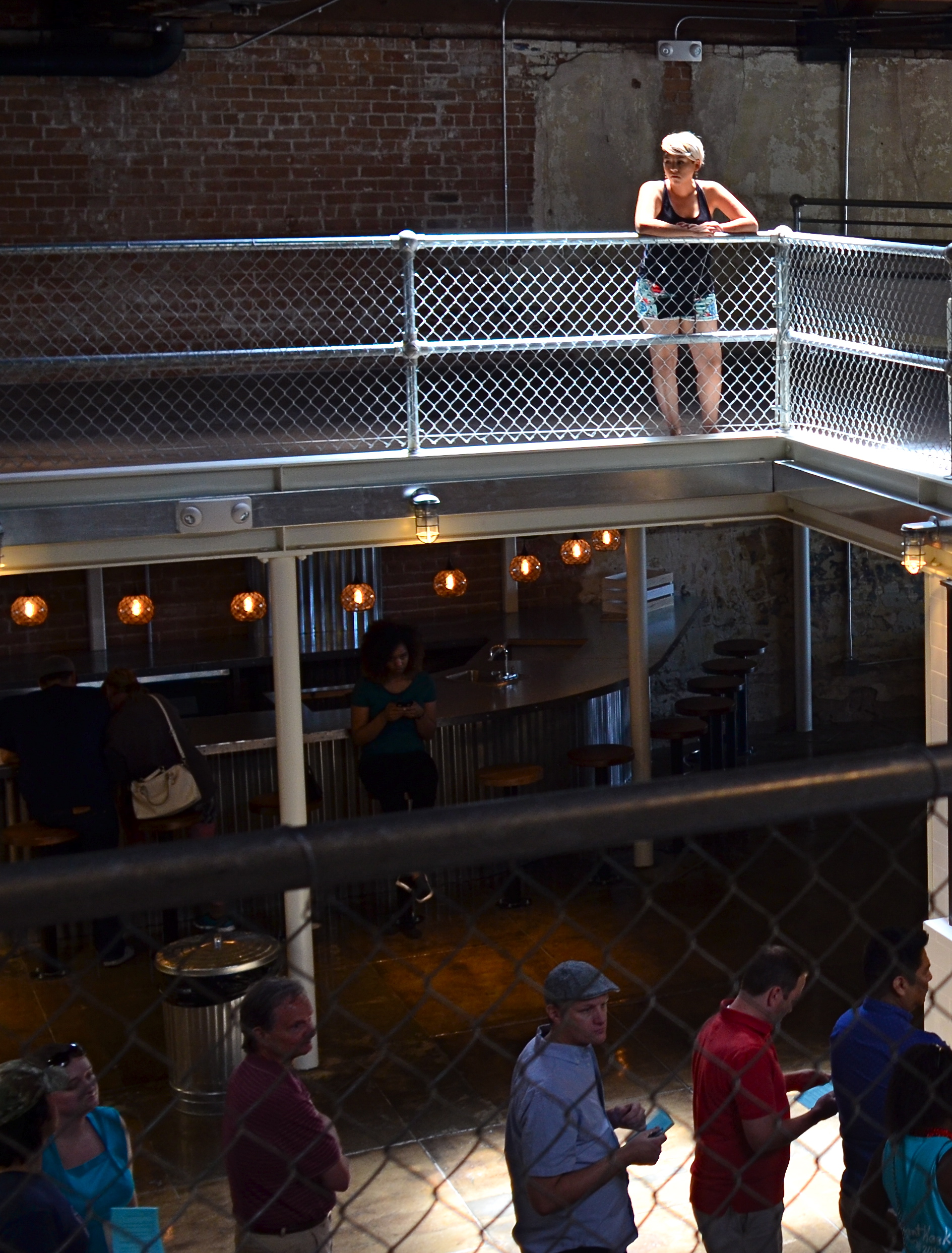 photograph. The lady bathed in light seems certainly to have been pre-selected to be the focal point of the picture, but there are way too many competing elements around her, robbing her of the prominence she deserves in the final frame. So let’s get after it.
First, none of the information on the left side of the frame makes it any clearer that she’s alone or that she’s on the second floor of the building. We can make that plain with half the acreage, so snip. Similarly, the guys in shadow to her right aren’t part of the story we are crafting for her. If she’s isolated, let’s make her isolated and be unmistakable about it. She’s “apart” already from the sea of people below her. She’s geographically and physically separated from them, but the extra guys make the argument weaker, so, snip, away they go.
Finally, the entire upper-floor/lower-floor line of sight will be accentuated if we crop for a portrait orientation and move the frame so she is on the upper-right-hand corner of it. It forces the eye to discover the story of the picture vertically, so snip and we’re done.
So, at the end, we did not make any changes via processing, only the old scissors. Taking things away, not adding them on, actually made the picture work better. Fate gave me the girl and the wonderful light she was bathed in, but there was work to do. She didn’t arrive, ready to party, like Athena, but she’s a little closer to goddess status after some adjustment.
GOING NEGATIVE
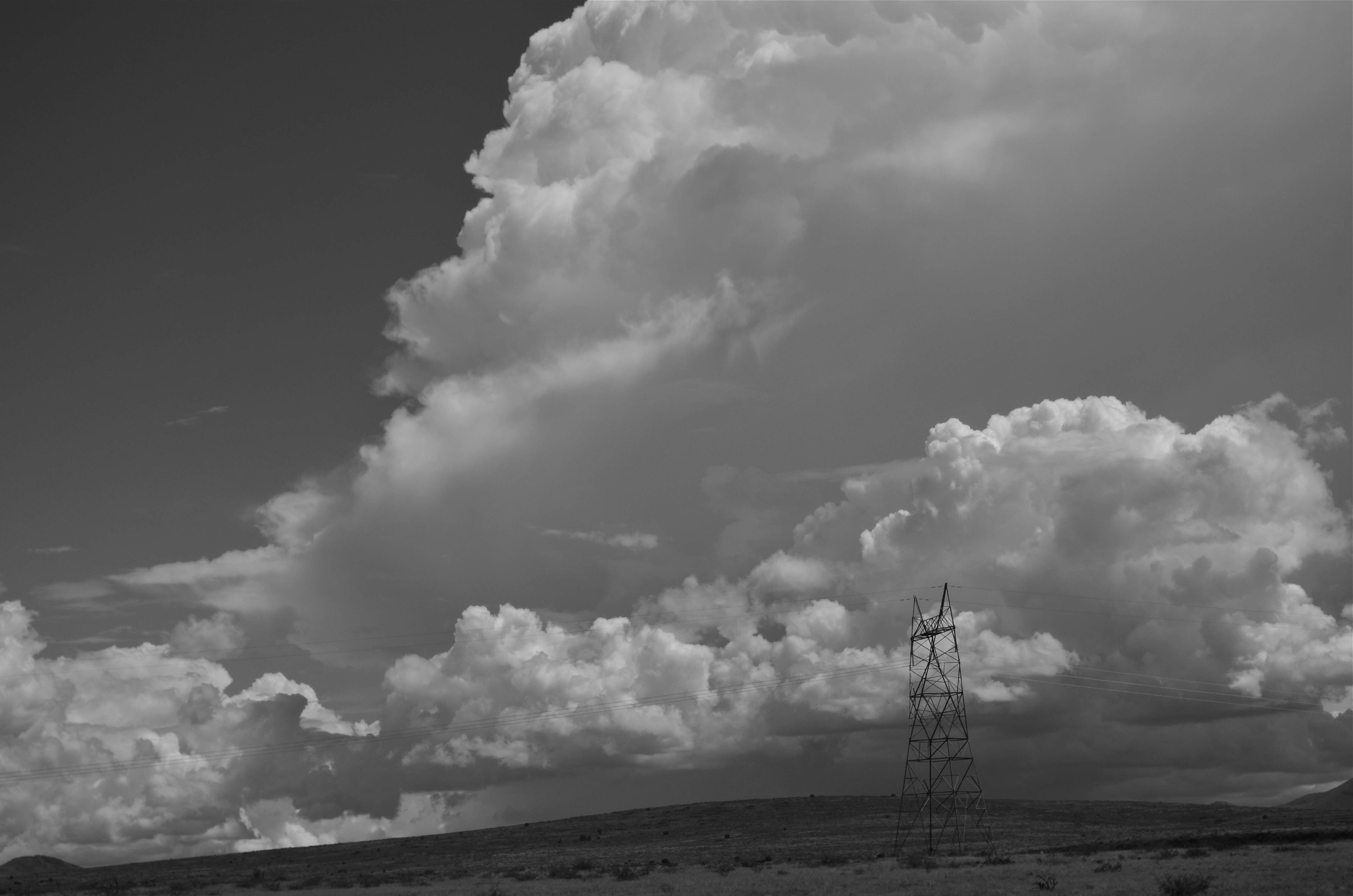
Negative space is your best friend when trying to establish scale.
By MICHAEL PERKINS
I got plenty of nothin’, and nothin’s plenty for me. —Ira Gershwin, Porgy and Bess
I BELIEVE THAT MANY PHOTOGRAPHS ARE IMPROVED BY THE SIMPLEST OF MATH OPERATIONS: addition and subtraction. Look at nearly any image you’ve created that “worked” and you can see that there is not one more thing in the image than there needs to be. Something told you to either supply or eliminate elements in the composition until the impact of the picture was maximized. Realizing the reverse effect is pretty easy as well, although not as much fun. If there is one tree too many or one object too few in the frame, you can sense the imbalance in your near-miss pictures. And man, does that hurt.
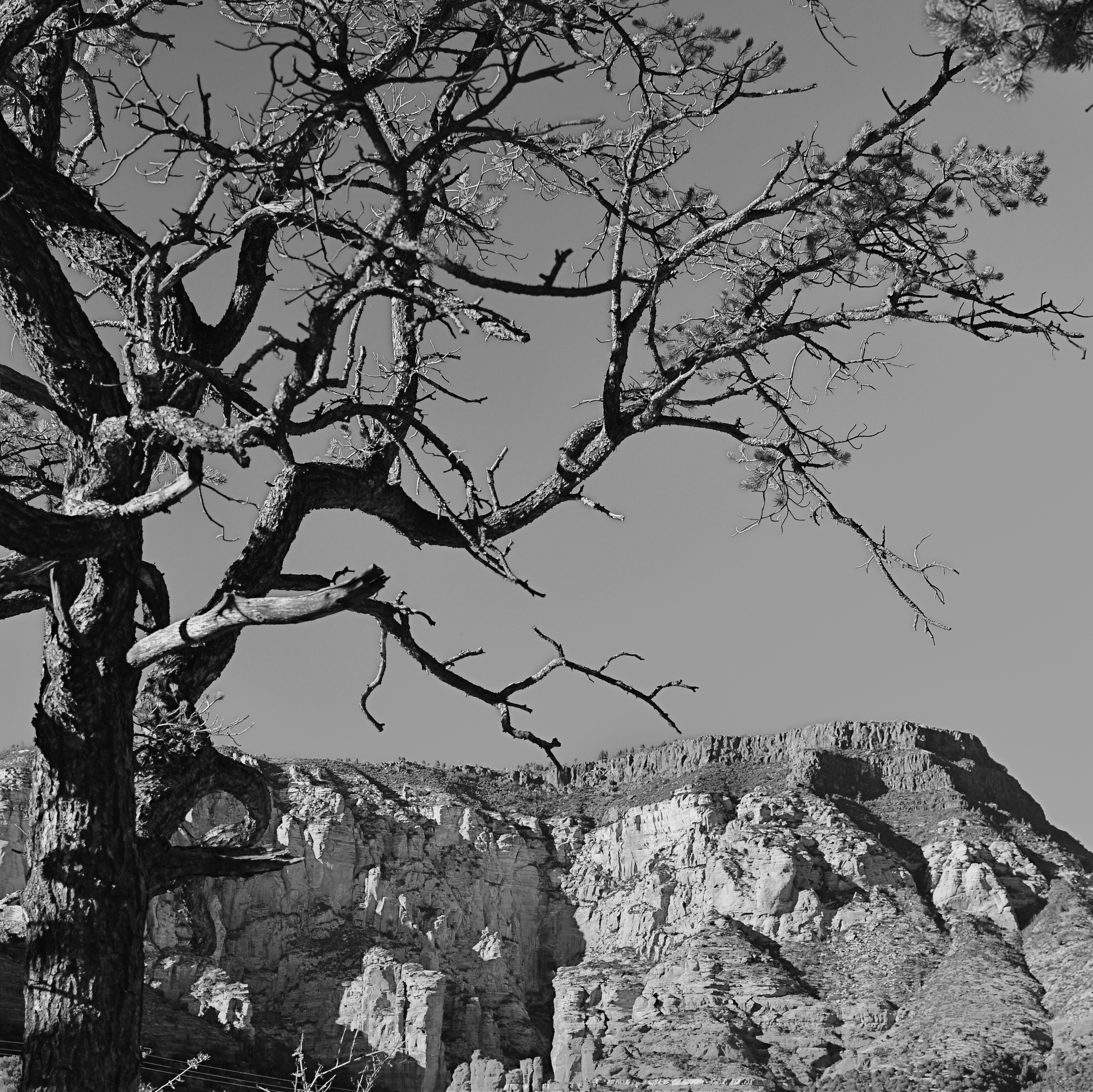 We used to refer to open areas of a picture as “blank” space, and were often talked out of using it at all by various A-B-C composition tutorials that told us that large expanses of sky could kill a good landscape. Today, we refer to this unused real estate as “negative” space, but we are now more inclined to see it as well, a positive thing. The take-home from this is, simply, that no technique should be universally ruled out, or ruled in, for every image. Truth is, there are times when not filling the frame with stuff, or selectively making use of negative space boosts the wattage of what you’re trying to say.
Instead of “negative” space, I prefer the term “secondary space”, since what you’re really doing is mapping your pictures into zones of the things that should be of primary interest and those that should complement those things without competing with them. Landscapes are the easiest way to demonstrate this. In the image at left, I wanted to accentuate the distance between the foreground tree and the background mountain. Framing the two elements to merely overlap gave no sense of space, and, in color, actually made the photo busy and hard to read. There seemed to be no primary object in the frame. Composing so that some sky intervened to the right of the tree and the top of the mountain re-established the sense of distance and kept the textures of both objects from fighting with each other.
Secondary space need not be empty. It can take the form of a texture, be it a body of water, cloud formations, a flooring pattern, or a stone wall. The idea is to use the space to support, but never upstage the primary space. Sometimes what you need to complete an image is nothing. You just have to stick the nothing in the right place.
THE FLOATING 50
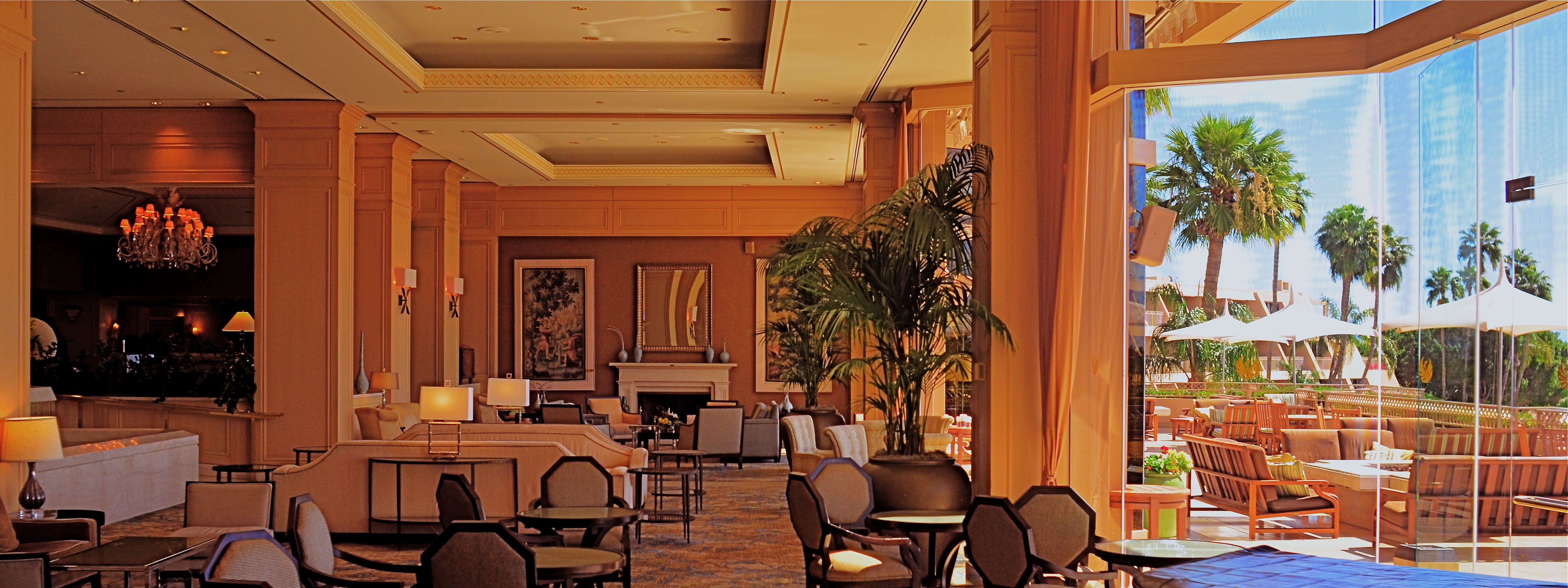
From Lobby To Terrace, 2015. A near 50% crop from the original, seen below at left.
By MICHAEL PERKINS
YOU CANNOT BECOME A GREAT PHOTOGRAPHER WITHOUT BEING YOUR OWN BEST EDITOR, no matter how brilliant or instinctual your shooter’s eye may be. Art is both addition and subtraction, and the image frame is about both inclusion and exclusion. You get your viewers’ attention by knowing what to show. You hold that attention, and burn your images into their minds, by learning what to pare away.
I’ve written several variations on this theme, so the best way to restate it is in the voice of the truly visionary godfather of street photography, Henri Cartier-Bresson. Ironically, this master of in-camera composition (he is reputed never to have cropped a single shot after it was taken) was nonetheless remarkably aware of what most of us must do to improve an image through post-editing:
This recognition, in real life, of a rhythm of surfaces, lines, and values is for me the essence of photography; composition should be a constant of preoccupation, being a simultaneous coalition – an organic coordination of visual elements. We must avoid snapping away, shooting quickly and without thought, overloading ourselves with unnecessary images that clutter our memory and diminish the clarity of the whole.
Insert whatever is French for “Amen” here.
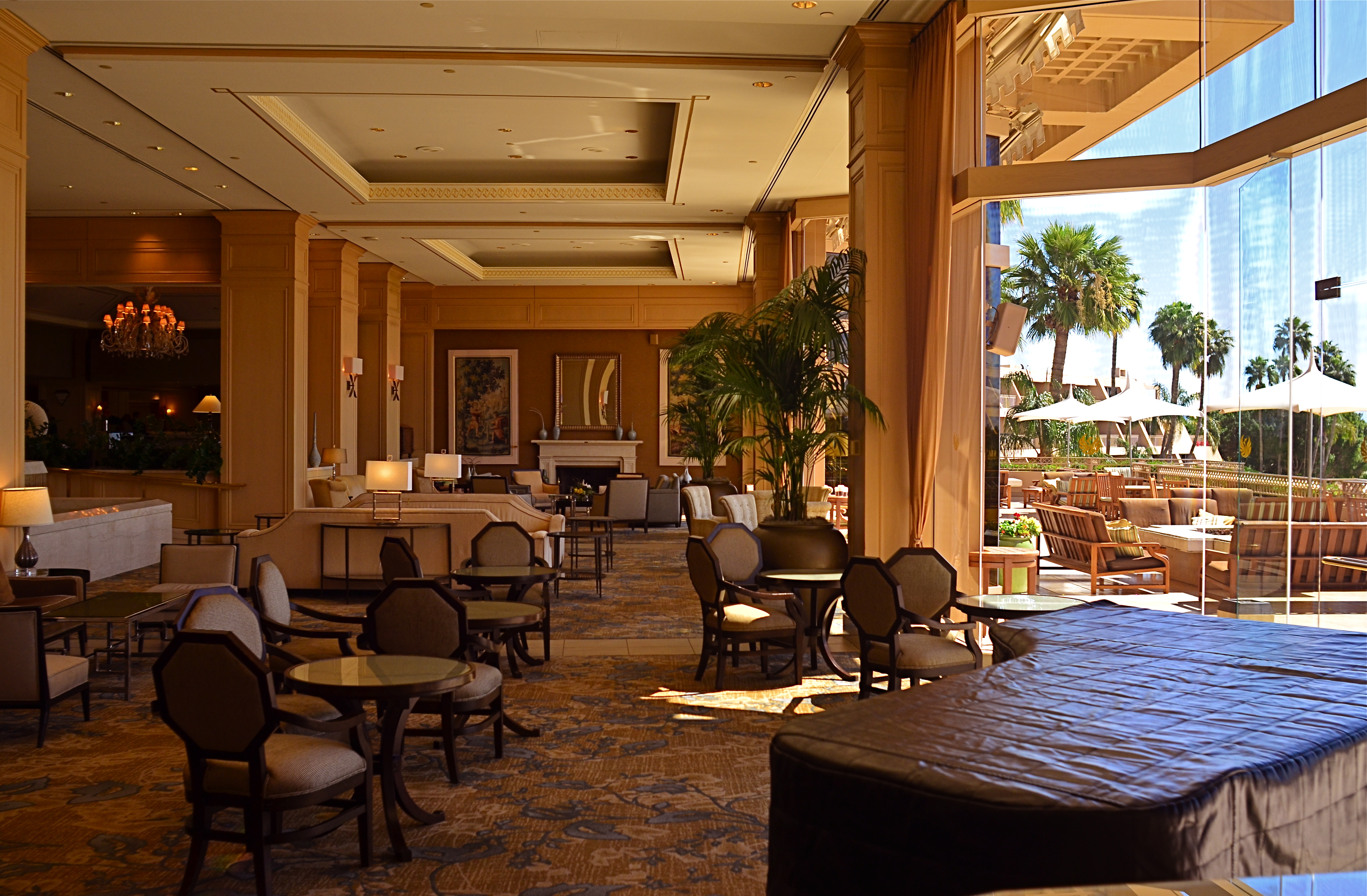
The original. It’s easy to see what needs to be cut out of this one.
I often find that up to 50% of some of my original shots can later be excised without doing any harm to the core of the photograph, and that, in many cases, actually improving them. Does that mean that my original concept was wrong? Not so much, although there are times when that’s absolutely true. The daunting thing is that the 50% floats around. Sometimes you need to cut the fat in the edges: other times the dead center of the shot is flabby. Sometimes the 50 is aggregate, with 25% trimmed from two different areas of the overall composition.
On occasion, as with the above picture (see the original off to the left), the entire bottom half of the shot drags down the top. In the cropped shot, the long lateral line between indoors and outdoors is much more unbroken, making for a more “readable” shot from left to right. The disappearance of the dark furniture at the bottom of the master shot creates no problems, and actually solves a few. Do a disciplined search of the nobler near-misses in your own work and see how many floating 50’s you discover. Freeing your shots of the things that “clutter our memory and diminish the clarity of the whole” is humbling, but it’s also a revelation.
IF HUE GO AWAY
By MICHAEL PERKINS
IT SEEMS UNGRACIOUS FOR A PHOTOGRAPHER TO COMPLAIN ABOUT AN OVER-ABUNDANCE OF LIGHT, since that’s basically the currency we trade in. More typically we gripe about not being able to bring enough of the stuff into a shot. I mean, the entire history of the medium is one big let-there-be-more-light prayer. But that’s not to say that light can’t create annoyance when you’re in a place where there is glorious, radiant illumination of….acres of nothing.
I’m not talking about sunlight on endless expanses of starched plain. I refer here to subject matter that is so uninteresting that, even though a bumptious bounty of light is drenching everything in sight, there is nothing to make a photograph of. Nothing that compels, inspires, jars or even registers. I recently made my annual return to a festival that, due to my frequent farming of it over the years, has now bottomed out visually. There is nothing left to say about it, although all that “nothing” is stunningly lit at this time of year.
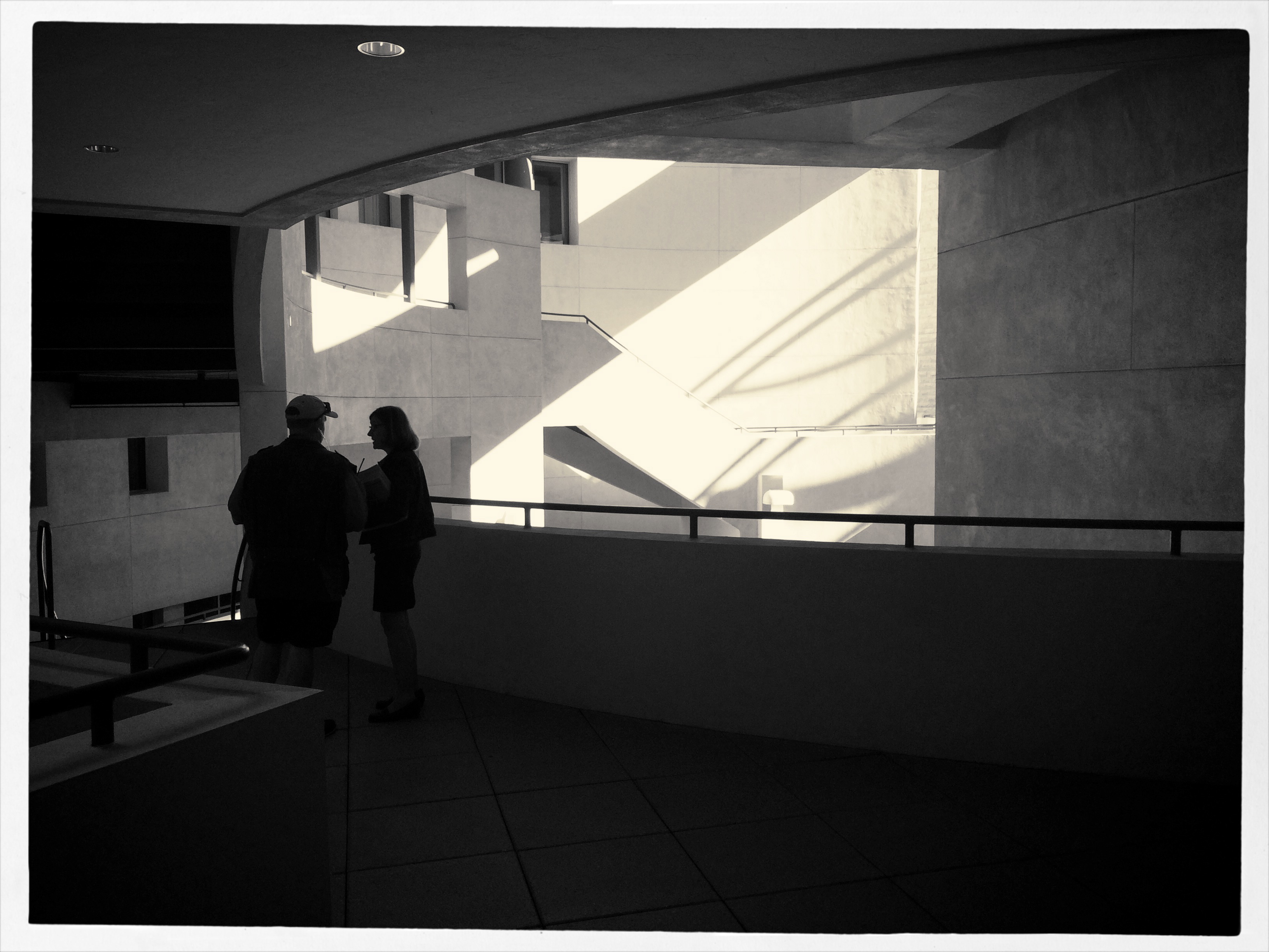
The light patterns seen here were warm and inviting in color. That’s not what I wanted.
In fact, it’s only by shooting just abstracted shapes, shades and rays, rather than recognizable subjects, that I was able to create any composition even worth staying awake for, and then only by using extremely sharp contrast and eliminating color completely. To me, the only thing more pointless than lousy subject matter is beautiful looking lousy subject matter, saturated in golden hues, but signifying nothing. Kinda the George Hamilton of photos.
So the plan became, simply, to turn my back on the bright balloons, food booths, passing parade of people and spring scenery that, in earlier years, I would have been happy to capture, and instead render arrangements without any narrative meaning, just whatever impact could be seen using light as nearly the lone element. In the above picture, I did relent in keeping the silhouetted couple in the final picture, so that it’s not as “cold” as originally conceived, but otherwise it’s a pretty stark image. Photography without light is impossible, but we also have to refuse to take light “as is” from time to time, to do our best to orchestrate it, much as we would vary shadings with pencil or crayon. We know that the camera loves light, but it’s still our job to tell it where, and how, to look.
SQUARE STORIES
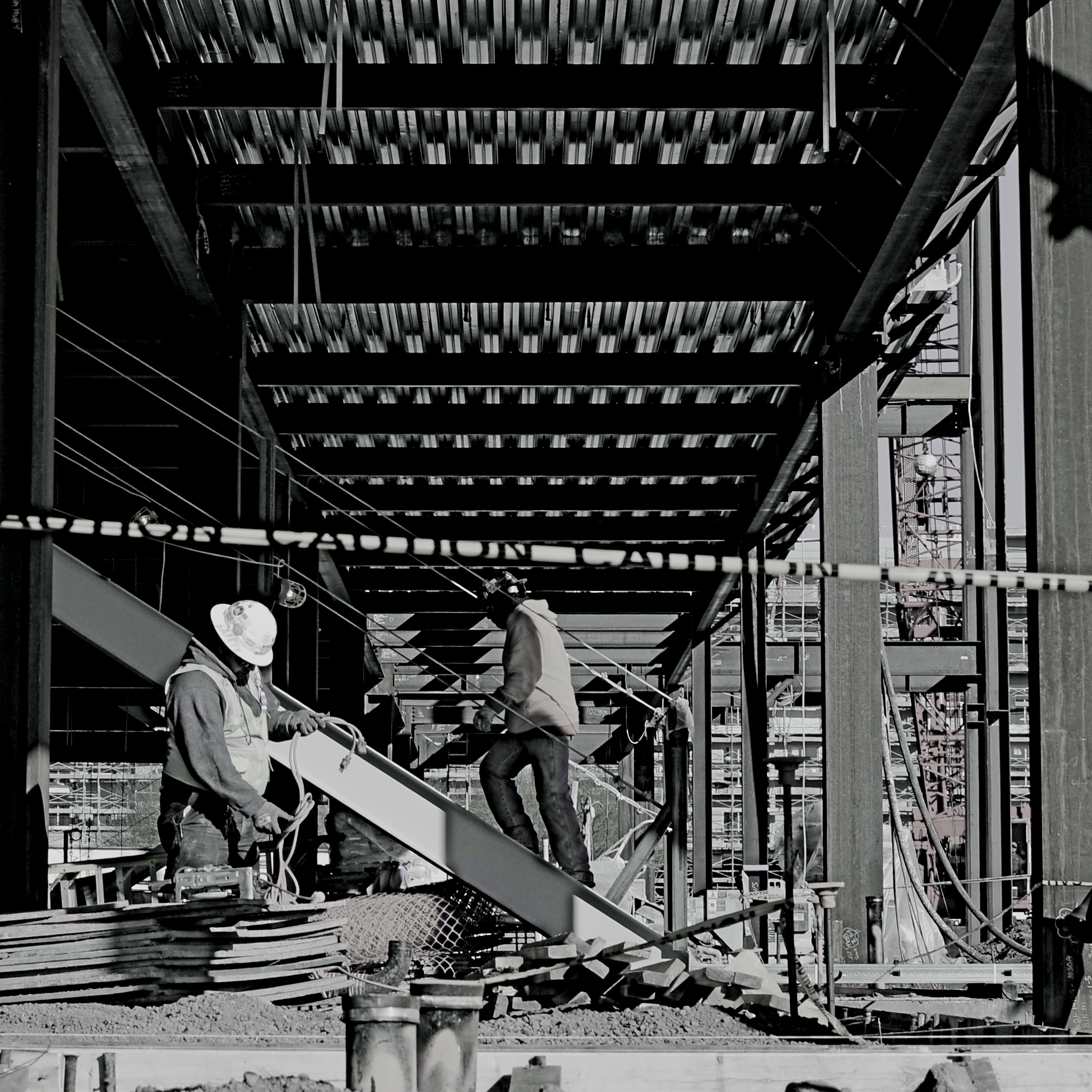
Overhang, 2015.
By MICHAEL PERKINS
BETTER PHOTO HISTORIANS THAN ME WOULD BE ABLE to pinpoint the precise moment in time when the landscape-sized image first eclipsed the square image for most photo shooters. I’d tackle the search myself, but it’s late, and I’m about a martini and a half too far into relax mode, so there it is. But, regardless of the exact instant it first began to wane, the square is back, and bigger than ever, its refreshed use as a distinct mode of composition greeted like a revelation, rather than a return. Cool beans.
The unilateral quadrangle (I get wordy when I drink) managed to barely survive on the periphery of photography, even as the square-centric Polaroid print nearly wobbled out of existence, then came back, as hipsters in the lo-fi movement revived the use of instant print cameras. Then cel phones began offering a pre-selectable square setting for their cameras, and that became a thing. But the biggest boost for the square’s comeback came with a thing called Instagram. You may have heard about this quaint little app. I understand the developers made a few bucks on it.
Still, we are pretty universally conditioned to envision pictures in either “landscape” or (flip this up on its side) “portrait” modes, so much so that director Wes Anderson garnered as much press for his use of the old anamorphic aspect ratio in The Grand Budapest Hotel as he did for the movie’s content. Strangely, the square-format photograph is, upon its return, a bit of a retro novelty.
Composing a shot in roughly 1/3 less space than a landscape frame is a challenge, simply because we have fallen out of the habit for a few decades, but it does have a certain elegance. Lately, I have tried to use the square to effectively tell stories that I traditionally saw in vast or wide scenarios. Construction projects are one such case, in that they seem to call for wide angles and far reaching vistas, what we might call scope. The above image is my attempt to express most of what goes into a building project in what some would call cramped quarters. The main story elements, that is, the action, the range of tone, the compositional depth, are all present, but confined within the quadrangle. Of course, with a DSLR, I can’t start with a square, but I can envision where in the shot the best square is, and crop to it in post-processing.
Composing for a given dimension is a discipline, and, as such, it is valuable as a practice tool, since photographers should always be visualizing every possible way to get their story told. The square may be a prison. But it also may be an answer. The end result is what matters most.
MORE THAN FOOD
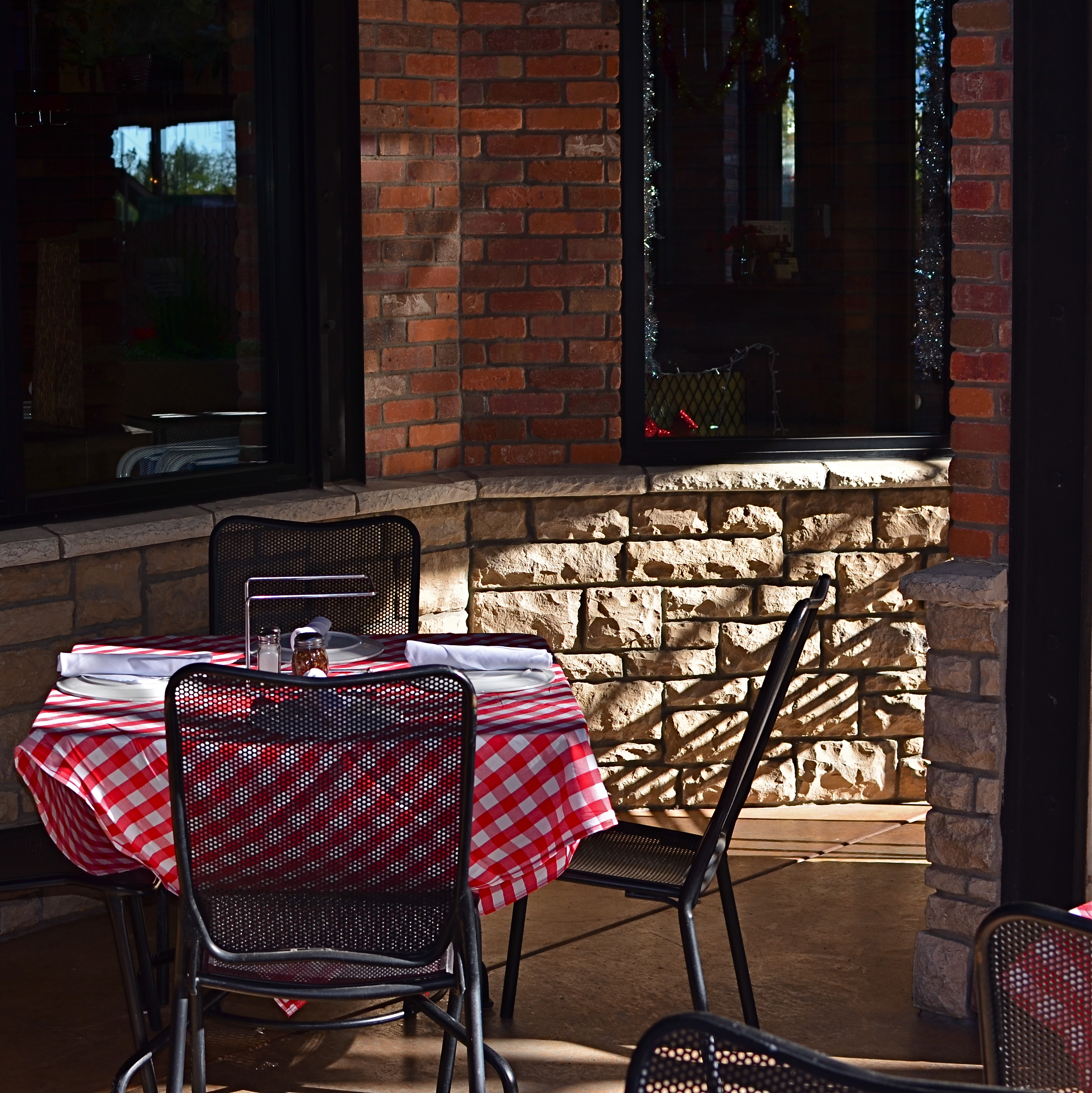
Pre-open, 2015.
By MICHAEL PERKINS
YOU COULD ARGUE ALL DAY ABOUT WHETHER PUBLIC SPACES POSSESS MORE VISUAL POTENTIAL when they are full or when they are dead empty, and, depending on your photographic approach, both arguments would be correct. In other words, instead of a hard-and-fast truth, you have multiple truths, depending on which space is shot by which photographer under such-and-such circumstances. Hey, if ya want a vague premise, I’m your boy.
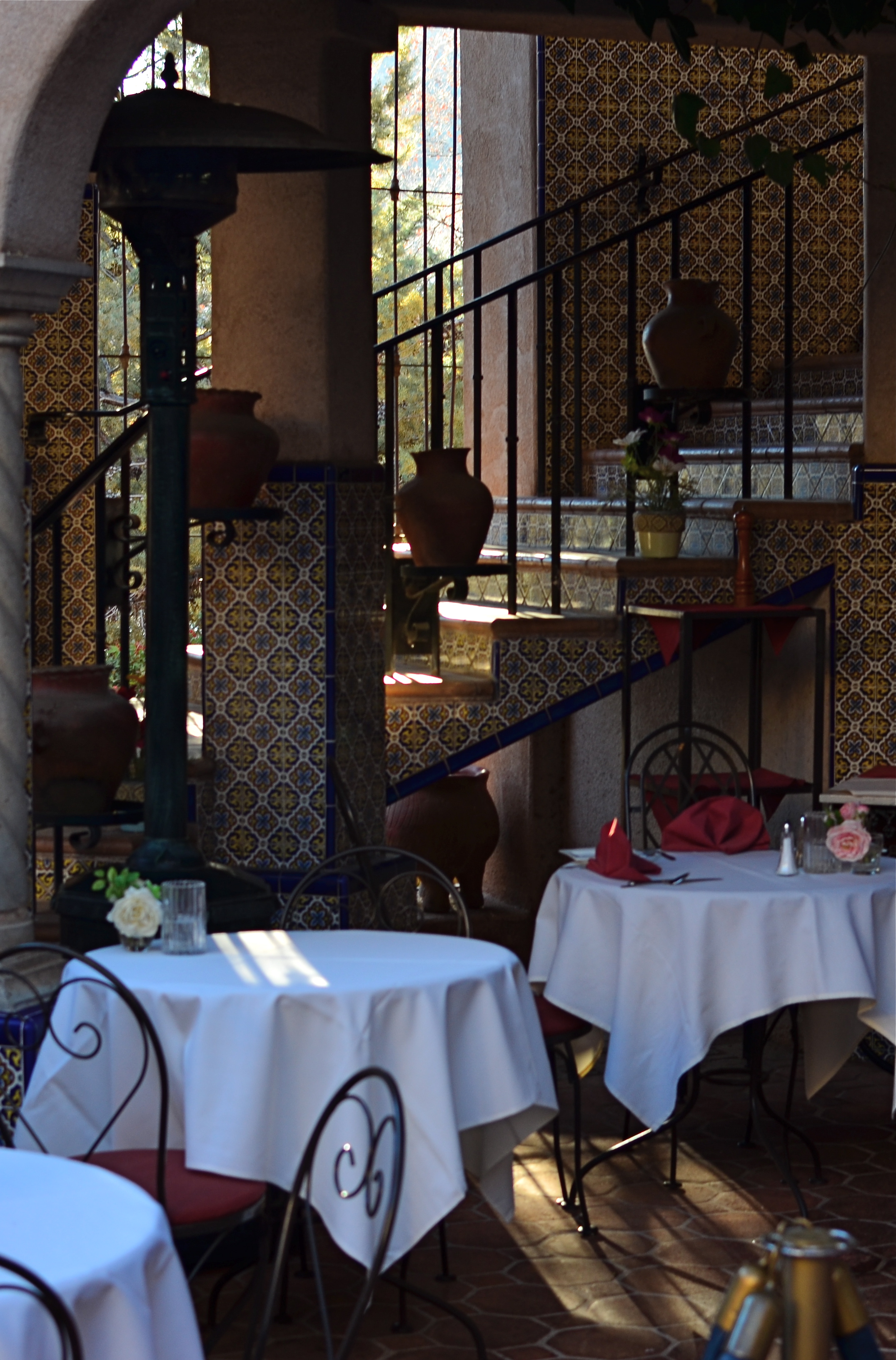
Plaza Cafe, 2015.
Plazas, train platforms, museums, places of worship, restaurants, sports arenas…..all the places where people convene in big mobs have all produced stunning images taken when said places contain no people at all. After hours, before opening, last call, snow days…there are endless reasons why people don’t go to places, and the unfilled space created by their absence is a separate kind of compositional challenge.
I have stated in previous posts on this forum that, for me, museums are tremendous sources of negative space, and yet positive possibilities,when devoid of crowds. Maybe it’s when people are about to be somewhere, when something is nearly ready to happen, that public places possess a certain, well, suspense. Whatever the phenomenon, I feel it, and will always squeeze off a few shots while the moment lasts.
Similarly, eateries are both potentially joyful and potentially lonely, and that kind of uncertainty excites me as a photographer. But you may be on the opposite side of the discussion. I can certainly understand that some would see a bunch of empty tables and chairs as depressing, unmistakably desolate. But I think it depends on the photograph, and I think it always will. There are many images of two people seated together at a cafe who are, sadly, miles apart due to their estrangement, and there are an equal number of pics of a hall just before celebrants from a wedding stream in. As with so much in photography, feeling comes both from what you did and didn’t show.
SHADOWS AS STAGERS
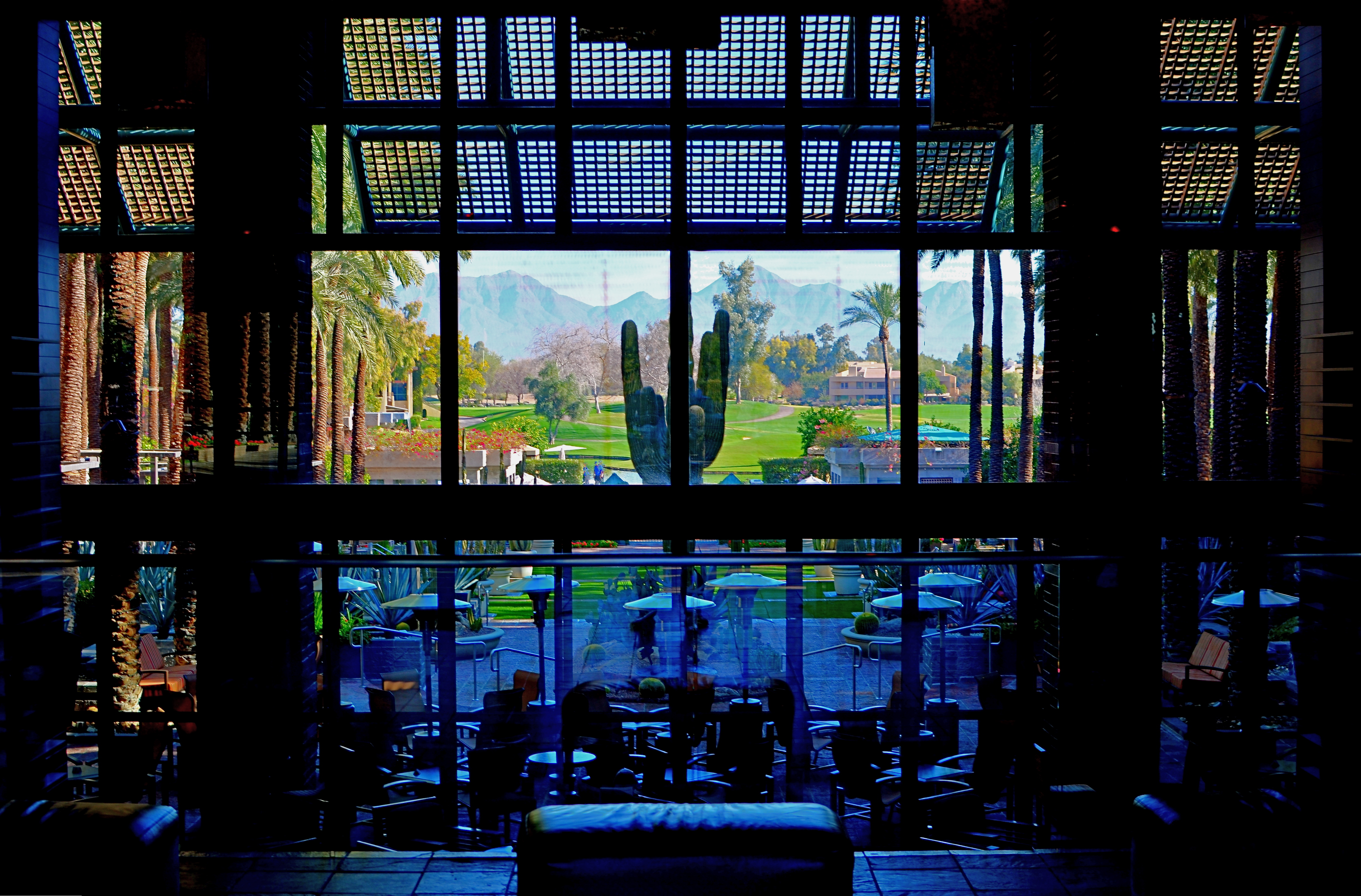
The idea of this image is to highlight what lies beyond the window framing, not the objects in front of it. Lighting should serve that end.
By MICHAEL PERKINS
THOSE WHO ADHERE TO THE CLASSIC “RULE OF THIRDS” system of composition often suggest that you imagine your frame with a nine-space grid super-imposed over it, the better to help you place your subject in the greatest place of visual interest. This place is usually at the intersection of several of these grid lines, and, whether or not you strictly adhere to the “thirds” system, it’s useful to compose your shots purposefully, and the grid does give you a kind of subliminal habit of doing just that.
Sometimes, however, I find that the invisible grid can be rendered briefly visible to become a real part of your composition. That is to say, framing through silhouetted patterns can add a little dimension to an otherwise flat image. Leaving some foreground elements deliberately underlit is kind of a double win, in that it eliminates detail that might read as clutter, and helps hem in the parts of the background items you want to most highlight.
These days, with HDR and other facile post-production fixes multiplying like rabbits on Viagra, the trend has been to recover as much detail from darker elements as possible. However, this effect of everything being magically “lit” at one even level can be a little jarring since it clearly runs counter to the way we truly see. It’s great for novel or fantasy shots, but the good old-fashioned silhouette is the most elemental way to add the perception of depth to a scene as well as steering attention wherever you need it. Shadows can set the stage for certain images in a dramatic fashion.
Cheap. Fast. Easy. Repeat.
COME EARLY / STAY LATE

Gainey Ranch, Phoenix, 2015. 1/320 sec., f/5.6, ISO 100, 35mm.
By MICHAEL PERKINS
PUBLIC SPACES OFTEN LOSE THEIR POWER AS GRAND DESIGNS once they actually are occupied by the public. If you have ever leafed through books of architectural renderings, the original drawings for squares, plazas, office buildings or other mass gathering places, the elegance of their patterns is apparent in a way that they cease to be, once they are teeming with commuters or customers.
This doesn’t mean that humans “spoil” the art of architecture, however, the overlay of drama and tension created by the presence of huge hordes of people definitely distracts from an appreciation of the beauty that is so clean and clear in a place’s sketch phase. Photographically, people as design objects tend to steal the scene, if you will, making public settings less dramatic in some ways. That’s why I like to make images of such locales when they are essentially empty, since it forces the eye to see design as the dominant story in the picture. I suppose that I’m channeling the great designers and illustrators that influenced me as a young would-be comic book artist. It’s a matter of emphasis. While other kids worked on rendering their superheroes’ muscles and capes correctly, I wanted to draw Metropolis right.
I recently began driving to various mega-resorts in the Phoenix, Arizona area to capture scenes in either early morning or late afternoon. Some are grand in their ambition, and more than a few are plain over-the-top vulgar, but sometimes I find that just working with the buildings and landscaping as a designer might have originally imagined them can be surprising. Taking places which were meant to accommodate large gatherings of people, then extracting said people, forces the eye to align itself with the original designer’s idea without compromise. Try it, and you may also find that coming early or staying late at a public area gives you a different photographic perspective on a site. At any rate, it’s another exercise in re-seeing, or forcing yourself to visualize a familiar thing eccentrically.
THE CENTER HOLDS
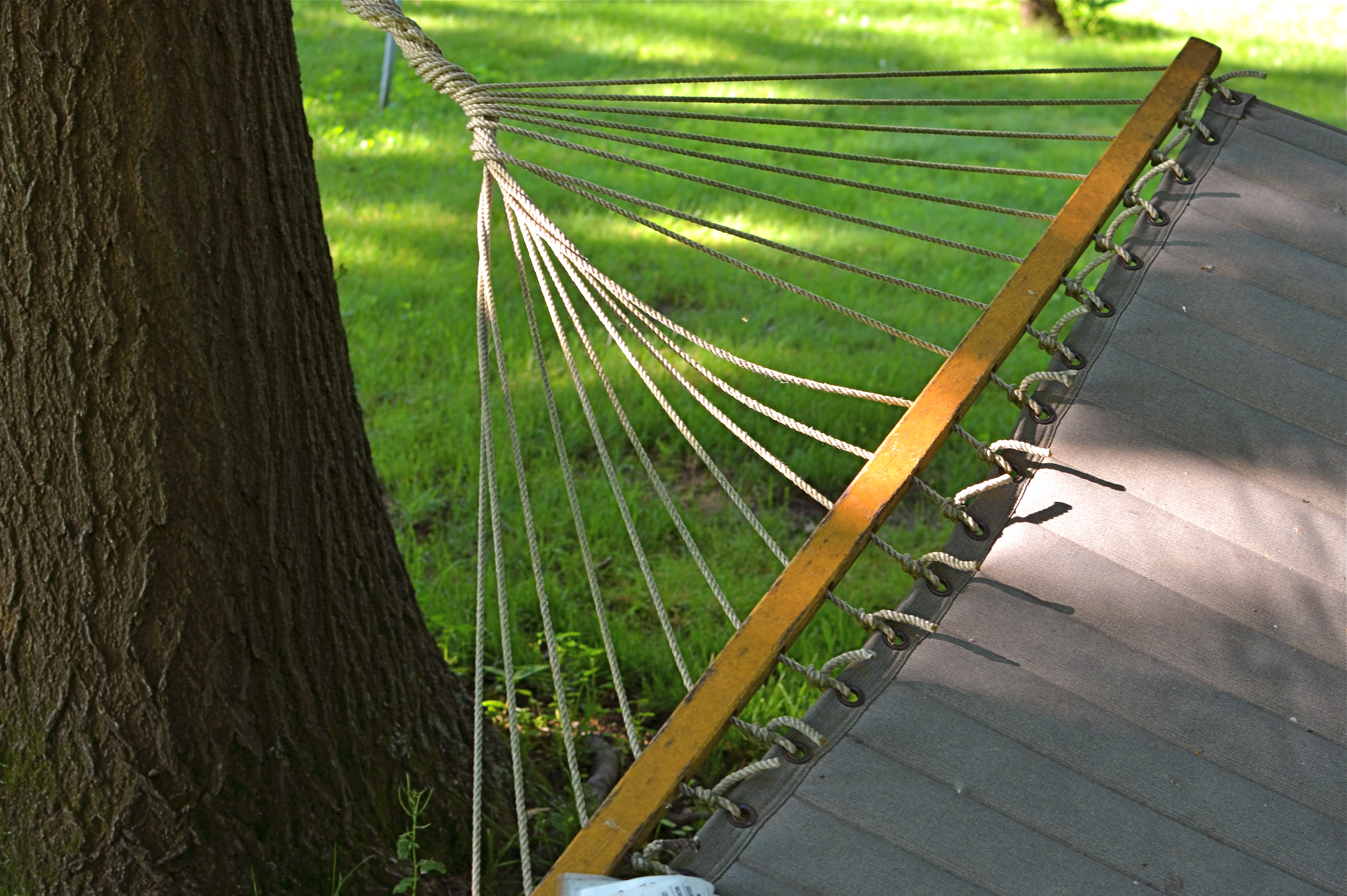
Do you need either the entire tree or the entire hammock to sell the idea in this picture?
By MICHAEL PERKINS
ONE OF THE MOST FASCINATING PARTS OF THE LEGEND of Henri Cartier-Bresson, the artist who is the world’s model for street photography, is the oft-repeated story that he never cropped a shot over the many decades of his remarkable career. Thus the man who originated the phrase “the decisive moment” to indicate that there was but one ideal instant to capture something perfectly in the camera is also credited with creating flawless on-the-spot compositions, image after image, year after year. Yeah, well….
I love HCB, and I personally can’t find a single one of his images that I could improve upon, no matter where I was to wield my magic scissors. But just as the writer in me believes that great novels aren’t written, but re-written, I believe that many great photo compositions emerge after much additional consideration, long after the shutter snaps. It’s not that one shouldn’t strive to get things as perfect as possible in the moment. In fact, there is overwhelming evidence that many photographers do exactly that, nearly all the time.
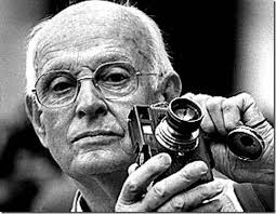
The Maestro.
It’s that “nearly”, however, that describes most photos, something which might be converted to “definitely” in the cropping process. In fact, I am starting to feel that the very first thing to be done with a picture in post-production is to just start paring away, only stopping when the center of the idea has been reached. It’s gut-wrenching, since we usually fall in love with our pictures at first sight (and in their first versions). But even if God decided to make one of us, say Cartier-Bresson, the messenger of his divine eye, he certainly didn’t make that trait as common as, say, green eyes or freckles. For most of us, most of the time, we need to eliminate everything that diverts the eye anywhere but where the main message is. As an example, the hammock image above is the result of cutting away nearly 2/3 of the original photograph.
There are a few times when an image comes full-born out of the camera, all muscle and no fat. However, in the digital age, re-thinking one’s realization of a concept is easier than it’s ever been, and there is no downside to doing so. If there is a narrative ground-zero to your photo, don’t worry. The center will hold.
FRAGMENTS AND SHARDS
By MICHAEL PERKINS
GLASS SURFACES REPRESENT A SERIES OF CHOICES FOR PHOTOGRAPHERS, an endless variety of effects based on the fact that they are both windows and mirrors, bouncing, amplifying or channeling light no less than any other subject in your frame. No two shooters approach the use (or avoidance) of glass as a compositional component in quite the same way. To some, it’s a barrier that they have to get past to present a clear view of their subject. To others, its fragments and shards of angle and light are part of the picture, adding their own commentary or irony.
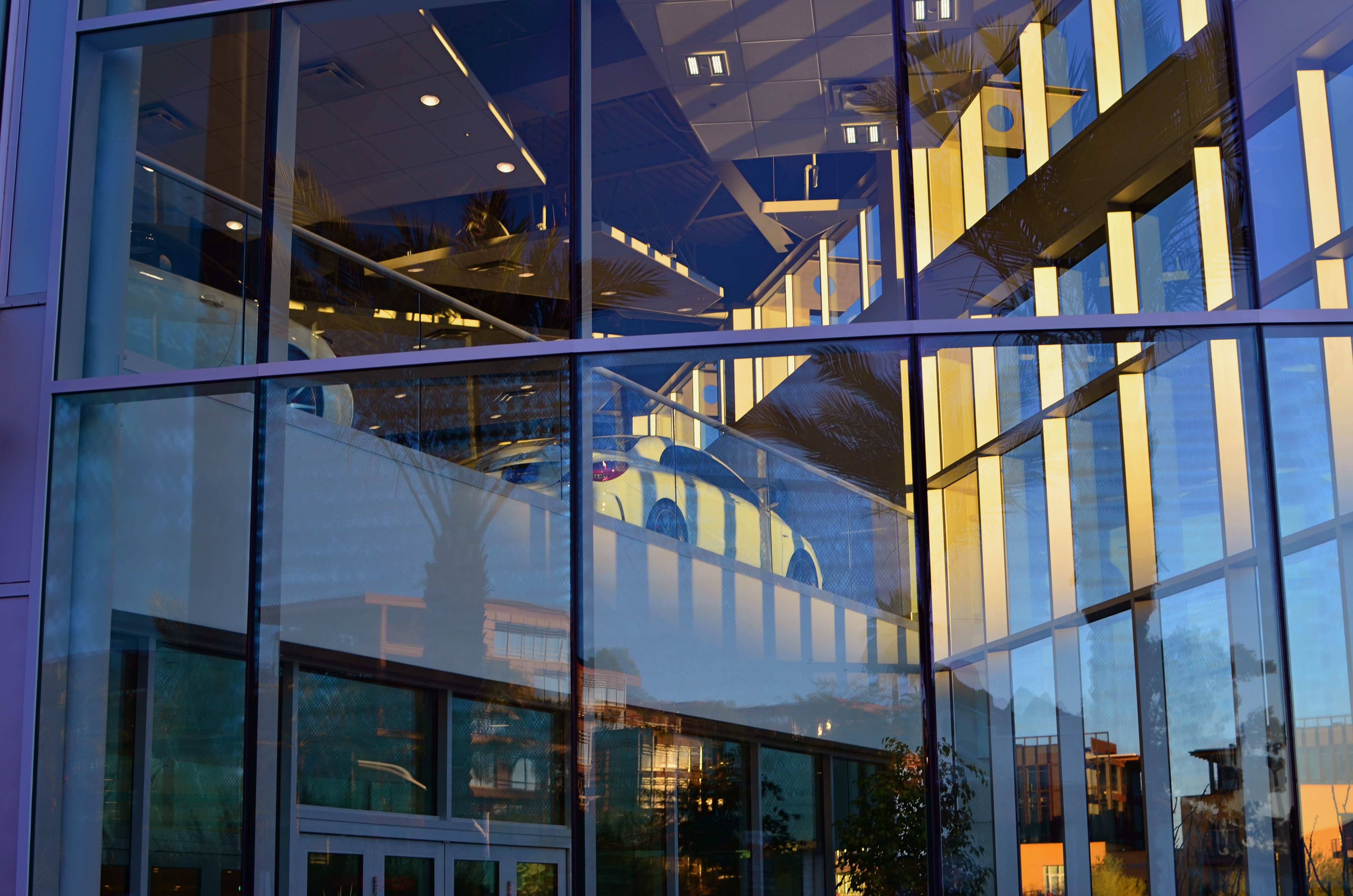
That’s The Way The Light Benz, 2015. 1/50 sec., f/5.6, ISO 100, 35mm.
I usually judge glass’ value in a photograph by two basic qualifiers: context and structure. First, context: suppose you are focused on something that lies just beyond a storefront window. What visual information is outside the scope of the viewer, say something over your shoulder or across the street, that might provide additional impact or context if reflected in the glass that is in direct view? It goes without saying that all reflections are not equal, so automatically factoring them into your photo may add dimension, or merely clutter things up.
The other qualifier is the structure of the glass itself. How does the glass break up, distort, or re-color light within an enclosure? In the above image, for example, I was fascinated by the complex patterns of glass in an auto showroom, especially in the way it reassigned hues once the sun began to set. I had a lot of golden light fighting for dominance with the darker colors of the lit surfaces within the building, making for a kind of cubist effect. No color was trustworthy or natural , and yet everything could be rendered “as is” and regarded by the eye as “real”. The glass was part of the composition, in this instance, and at this precise moment. Midday or morning light would render a completely different effect, perhaps an unwelcome one.
Great artists from Eugene Atget to Robert Frank have created compelling images using glass as a kind character actor in their shots. It’s an easy way to deepen the impact of your shots. Let the shards and fragments act like tiles to assemble your own mosaics.
LOOK DEEP INTO MY EYES
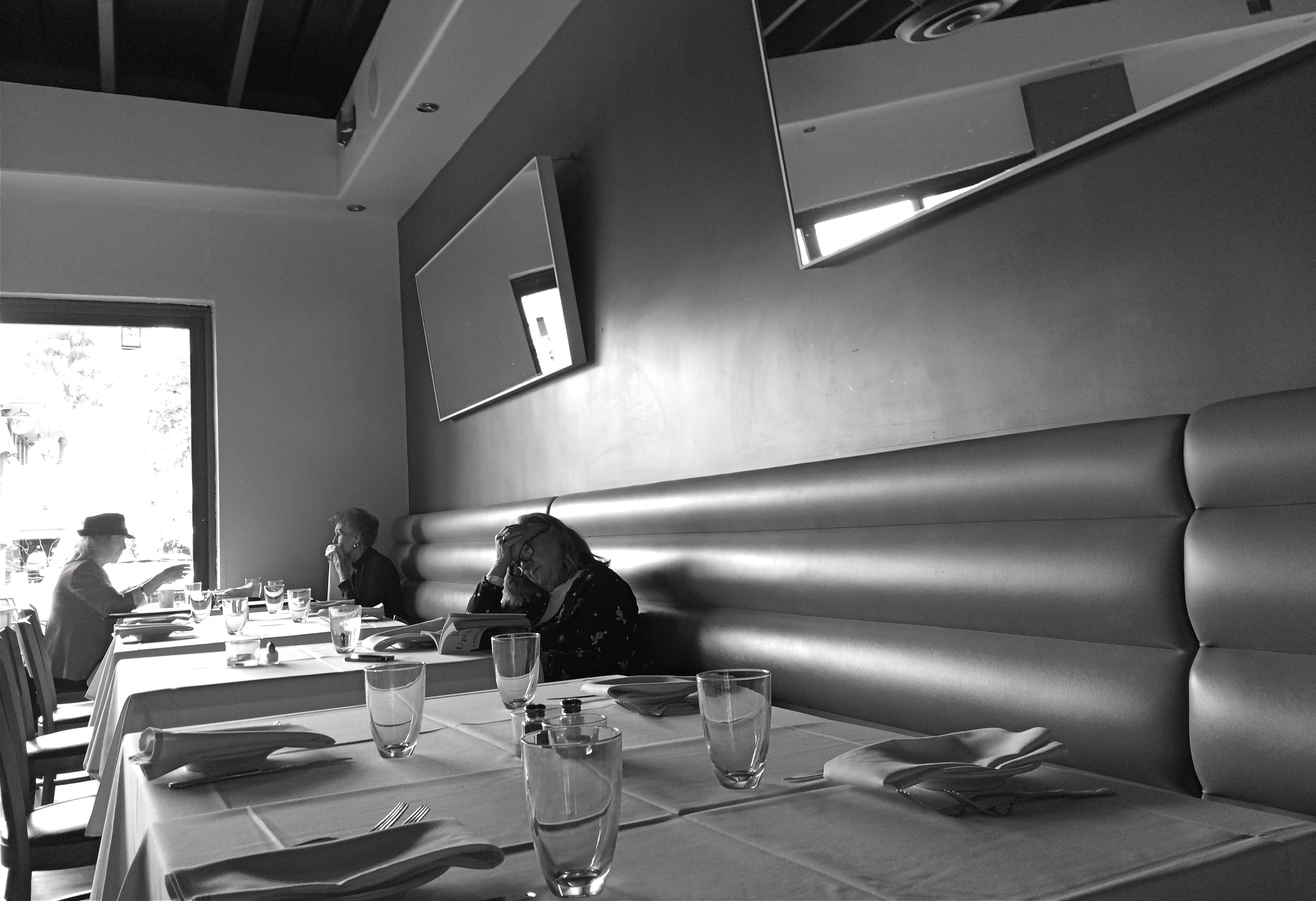
Literature For Lunch, 2016
By MICHAEL PERKINS
3-D PHOTOGRAPHY SEEMS DOOMED TO FOREVER RESIDE ON THE PERIPHERY OF THE MEDIUM AT LARGE, a part of the art that is regarded with mild derision, a card trick, a circus illusion. My own experience in it, from simple stereoscopic point-and-shoots to high-end pro-sumer devices like the Realist or View-Master cameras, has met with a lot of frustration at the unavoidable technical barriers that keep it from being a truly sharable kind of photography. It’s rife with specialized viewers, odd goggles, and cumbrous projection systems. It calls attention to effect to the detriment of content. It is the performing seal of photography.
That said, the learning curve needed to compose for stereo effect is equally valuable for overall “flat” composition, since you must always be mindful of building layers of information from front to back, the better to draw your viewer’s eye deep into your subject. Some will meet this challenge with a simple selective depth of field, as if to say: only pay attention to the stuff that is sharp. The front/back/sides don’t matter…I’ll tell you where to look. Others decide to arrange the front-to-back space all in the same focus, forcing the eye to travel in a straight line. Depends on what you need to say.
DSLRs allow you to elect for the former strategy, while iPhone photography, at least at this point in history, pretty much forces you to adopt the latter. You just don’t have the fine control needed for selective focus in a smartphone, any more than you have a choice shutter speed or how wide you shoot. With few exceptions, the iPhone and its cousins are marvelously adroit point-and-shoots, so your composition options lie chiefly in how you frame things up. Quickly.
This “think fast” mentality works to your benefit in the stealthier parts of street photography. The quicker you click, the harder it is to be detected, which means fewer “hey, what are you doing” issues with reluctant subjects. Even so, you have to be composing consciously if you want to establish a strong line to maximize the illusion of depth. It means deciding where the main drama in a shot resides and composing in reference to it. In the above shot, the woman lost in her John Updike novel is the main interest, but the steep diagonal of the wall leads you to her, then, as a second stage, to the lighter pair of friends in back. Framed in this manner, depth can be accentuated.
There are happy accidents and there are random luck-outs in photography, to be sure, but to create a particular sensation in your pictures, you must craft them. In advance. On purpose.
THE REVISION DRAFT
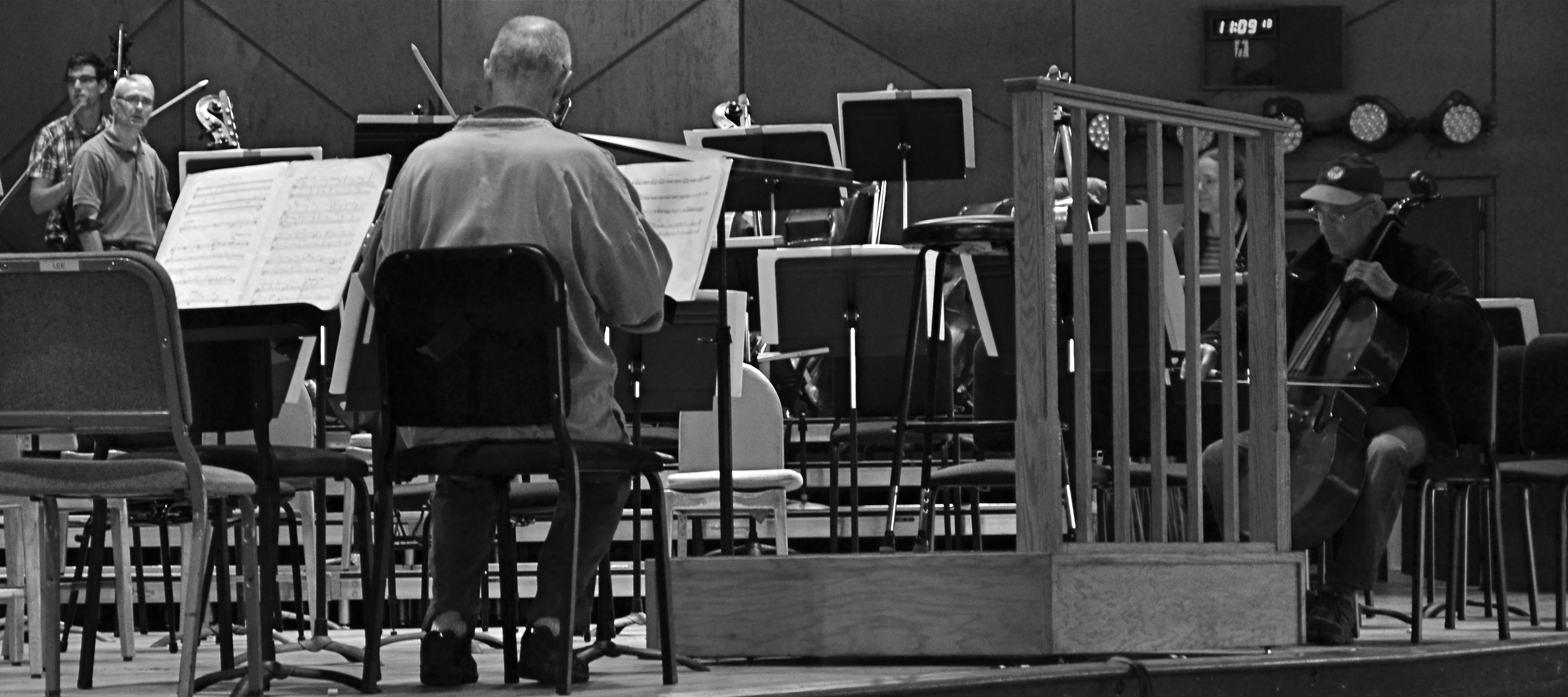
Reducing is remixing: this Tanglewood rehearsal photo was at least 2/3rds bigger in the original, but a severe crop highlights a relationship between these players that the bigger image buried.
By MICHAEL PERKINS
HERE’S A SENTENCE YOU’RE NOT GOING TO HEAR ANYWHERE ELSE THIS WEEK: Being a club DJ can actually give you a fresh viewpoint on your photography.
I’ll let that sink in.
I know what you you’re thinkin’: did he drink six shots or only five? But I’m kind of sober, and rather serious. In a club setting, the mix is often more important than the song, or, more correctly, it allows the song to have an infinite number of alternative lives, depending on what you do with the turntables. Record companies recognized this in the heyday of disco, remixing hit tracks for more thump and bump, longer edits, brass overdubs, etc. As time went on, DJs interspersed their own random elements in the moment to create their own signature blends.
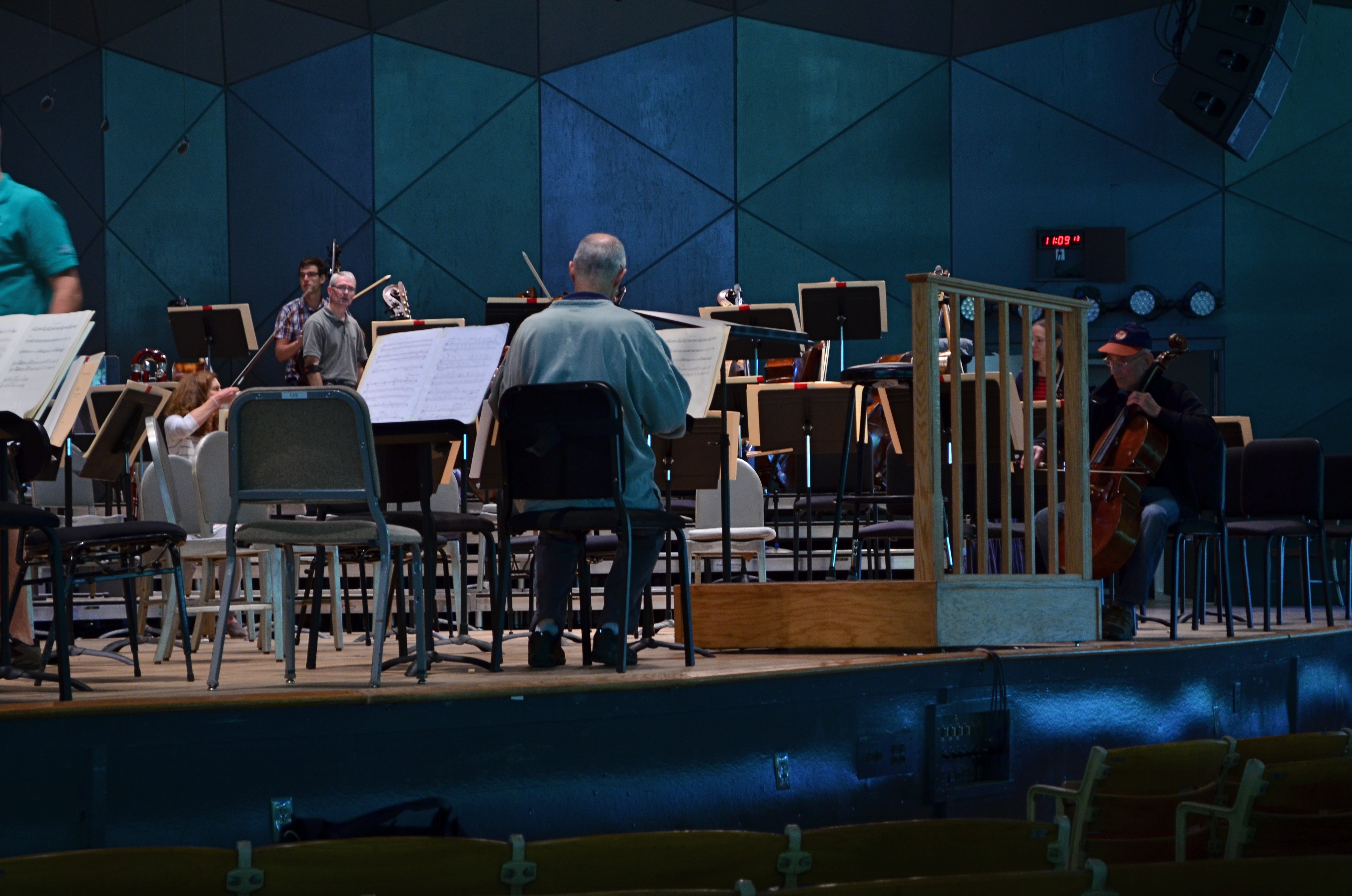
The original.
So what does this have to do with photography? Pretty much everything. In the digital era, post-production software is nearly half of some shooters’ workflow. So much emphasis is placed on what you can fix after the shutter is clicked that, for many, actually planning and taking the picture is the least important part of the process. Let’s lay aside the fact that I personally believe that this can get out of hand…..the point is, by allowing yourself the flexibility to revisit and remix a photo many times over its lifetime means you are not limiting yourself to one interpretation of what you originally created.
However, don’t keep merely to a reprocessing of the exposure or tone elements in the picture, that is, boosting color, adding filters, converting to monochrome. Think of compositional space as a remix element as well. Did you need all the real estate taken up in the original picture? Would that landscape shot work more effectively in portrait or square format? Did you originally include information in the frame that just adds clutter, sending your viewer’s eye wandering around aimlessly? In short, does your first reading of the “idea” of the picture still seem valid?
See the “after” picture at the top of the page and its “before” equivalent to the left. Did the picture gain or lose from the changes?
Another musical musing: George Gershwin personally played Rhapsody In Blue like a snappy jazz piece, not the stately symphonic standard that’s re-created by most modern performers. Does one rendition sound better or worse? Who knows? Who cares? What matters is that the process reveals different traits within the core music with every new mix. Your photographs will benefit in the same way. Just trust yourself to tinker.
YOU’RE GREAT, NOW MOVE, WILLYA?
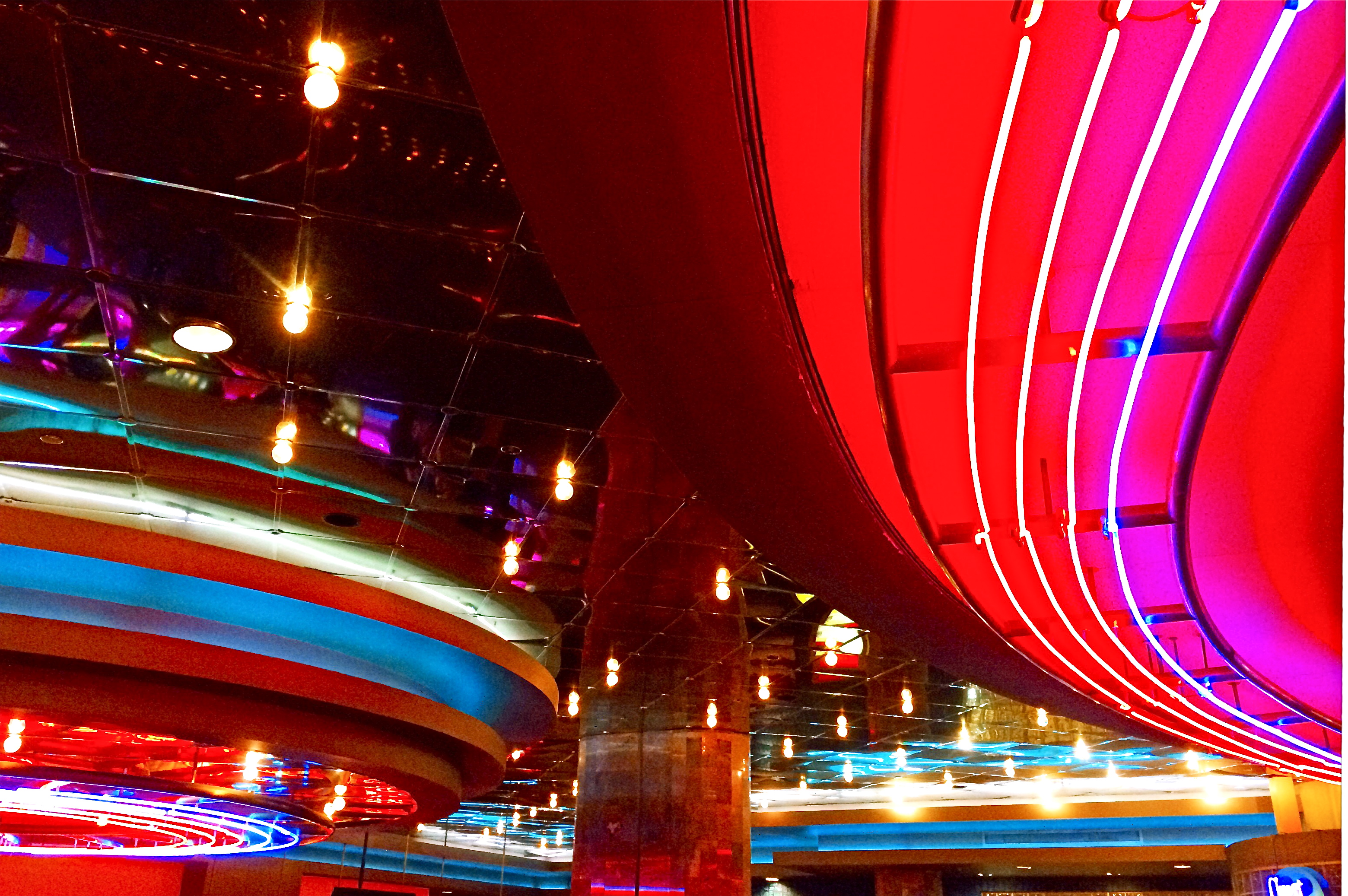
Marquee Marks, 2015. Do I need people in this to suggest urban life?
By MICHAEL PERKINS
ONE OF MY FAVORITE SONGS FROM THE ’40’s, especially when it emanates from the ruby lips of a smoking blonde in a Jessica Rabbit-type evening gown, conveys its entire message in its title: Told Ya I Love Ya, Now Get Out! The hilarious lyrics speak of a woman who acknowledges that, yeah, you’re an okay guy, but don’t get needy. No strings on me, baby. I’ll call you when I want you, doll. Until then, be a pal and take a powder.
I sometimes think of that song when looking for street images. Yes, I’m aware that the entire sweep of human drama is out there, just ripe for the picking. The highs. The lows. Thrill of victory and agony of de feet. But. I always feel as if I’m cheating the world out of all that emotional sturm und drang if I want to make images without, you know, all them people. It’s not that I’m anti-social. It’s just that compelling stuff is happening out there that occasionally only gets compromised or cluttered with humans in the frame.
Scott Kelby, the world’s biggest-selling author of photographic tutorials, spends about a dozen pages in his recent book Photo Recipes showing how to optimize travel photos by either composing around visitors or just waiting until they go away. I don’t know Scott, but his author pic always looks sunny and welcoming, as if he really loves his fellow man. And if he feels it’s cool to occasionally go far from the madding crowd, who am I to argue? There are also dozens of web how-to’s on how to, well, clean up the streets in your favorite neighborhood. All of these people are also, I am sure, decent and loving individuals.
There is some rationality to all this, apart from my basic Scrooginess. Photographically, some absolutes of abstraction or pure design just achieve their objective without using people as props. Another thing to consider is that people establish the scale of things. If you don’t want that scale, or if showing it limits the power of the image, then why have a guy strolling past the main point of interest just to make the picture “human” or, God help us, “approachable”?
Faces can create amazing stories, imparting the marvelous process of being human to complete scenes in unforgettable ways. And, sometimes, a guy walking through your shot is just a guy walking through your shot. Appreciate him. Accommodate him. And always greet him warmly:
Told ya I love ya. Now get out.
EVERYTHING IN ITS PLACE. OR NOT.
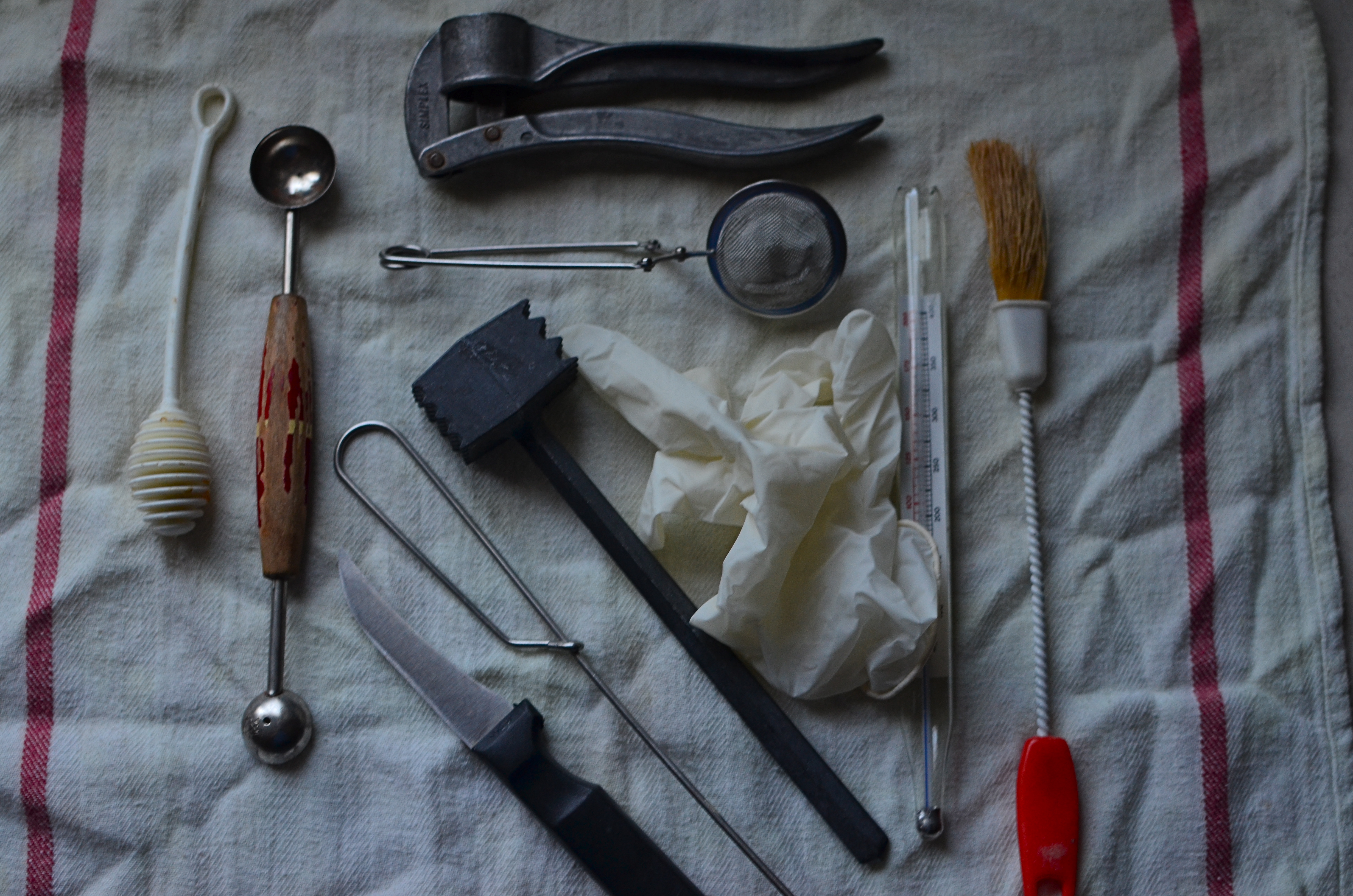
The Instrument Tray, 2015. Surgical equipment or foodie fantasy?
By MICHAEL PERKINS
PART OF THIS BUSINESS OF PHOTOGRAPHY is rifling through the accumulated habits and techniques of a still young art form and trying to not regard any of it as holy law. Relatively speaking, measured against the sprawling annals of painting and sculpture, photography has been on the planet for about a minute and a half, so it’s still not even in its adolescence. Hardly the amount of tradition that designates rules as “essential” or “unbreakable”.
This comes to mind a lot whenever I put together what I call “arrangements” but which others might refer to as “still lifes”. I get into a definition problem in referring to just any combination of inanimate things as a “still life”, since I tend to associate that term with a collection of items that suggest, you, know, a life caught in a “still”……some activity that is suggested just by looking at the objects associated with that activity.
It’s pretty obvious stuff: put together a duck decoy, a hunter’s cap, and a shotgun, and you can almost smell the marshlands where the mallards run. Shove a rubber ball, a doll and a set of blocks up against each other, and it’s “a day in the life of a child”. You don’t show the thrill of a baseball game; instead you suggest it with an antique bubble gum card, a torn stadium ticket, and a weathered ball. It’s Photography 101. When all else fails, throw three pieces of fruit in a bowl and park them next to a hunk of cheese. Inspirational.

Ho bloody hum.
By contrast, I don’t really think of what I assemble in a shot to be suggestive of a narrative in the traditional way. In fact, I have more fun shoving things up together which fight each other a little bit in terms of “why are these objects all here?” I’d rather ask the viewer to supply his/her own idea of what it’s all about instead of doing a Norman Rockwell number that leads them to an obvious association. In fact, every time I take a “typical” still life, I feel like I am making the props, instead of the photograph, supply the needed interest. It feels like set decoration.
In the above image, just as an example, I decided, for my own weird purposes, to do an alternate take on the typical surgical instrument tray, only using kitchen implements. In taking a look at the medical tools of just a century ago, many of them appear as if they are intended to peel or core instead of heal, anyway, and, similarly, some of the gimmicks in your kitchen drawer look as if they could inflict real pain. Strange? Probably. But, hey, I’m old, my mind wanders, and I’m sick of almost everything on TV. Except for that bit with Lucy and Ethel in the candy factory. Now that’s entertainment.
But I digress. Thing is,”still life” is too restrictive a term (or discipline) for lots of arrangements that you might find fascinating. Just pile stuff up and see what happens. Now, if you’ll excuse me, this composition I’ve been working on with the baby grand piano is nearly complete.
If I can just get my hands on two quarts of motor oil and a kumquat.
THE CHOICE
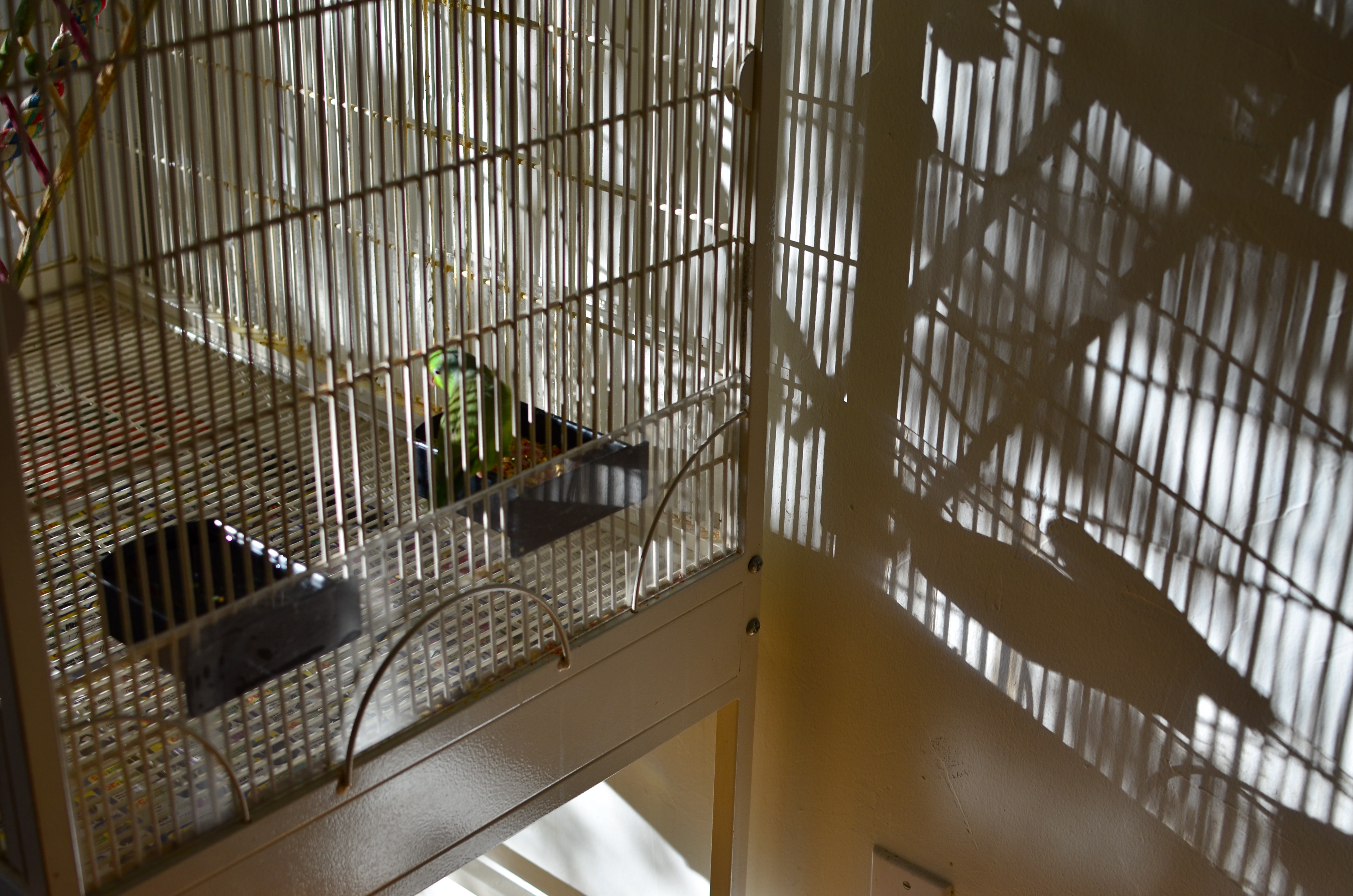
Does the structure of your photography protect you, or contain you?
By MICHAEL PERKINS
ANYONE WHO REGULARLY VISITS THESE PAGES already knows that I advocate of doing as much of your photography in as personal and direct a way as possible. While I am completely astonished by the number of convenience items and automatic settings offered to the casual photographer in today’s cameras, I believe that many of these same features can also delay the process by which people take true hands-on control of their image-making. I regard anything that gets in between the shooter and the shutter as a potential distraction, even a drag on one’s evolution.
Tools are not technique. Here are two parallel truths of photography: (1) some people with every gizmo in the toy store take lousy pictures. (2) some people with no technical options whatsoever create pictures that stun the world.
From my view, you can either subscribe to the statement, “I can’t believe what this camera can do!” or to one which says, “I wonder what I can make my camera do for me!” The very controls built into cameras to make things convenient for newcomers are the first things that must be abandoned once you are ready to move beyond newcomer status. At some point, you learn that there is no way any camera can ever contain enough magic buttons to give you uniformly excellent results without your active participation. You simply cannot engineer a device that will always deliver perfection and perpetually protect you from your own human limits.
Innovators never innovate by surrounding themselves with the comfortable and the familiar. For photographers, that means making decisions with your pictures and living with the uneven results in the name of self-improvement. This is a challenge because manufacturers seductively argue that such decisions can be made painlessly by the camera acting alone. But guess what. If you don’t actively care about your photos, no one else will either. There may not be anything technically wrong with your camera’s “choices”. But they are not your choices, and eventually, you will want more. The structure that at first made you feel safe will, in time, start to feel more like a cage.
Tools are not technique.
THE DAY THE UNIVERSE CHANGED
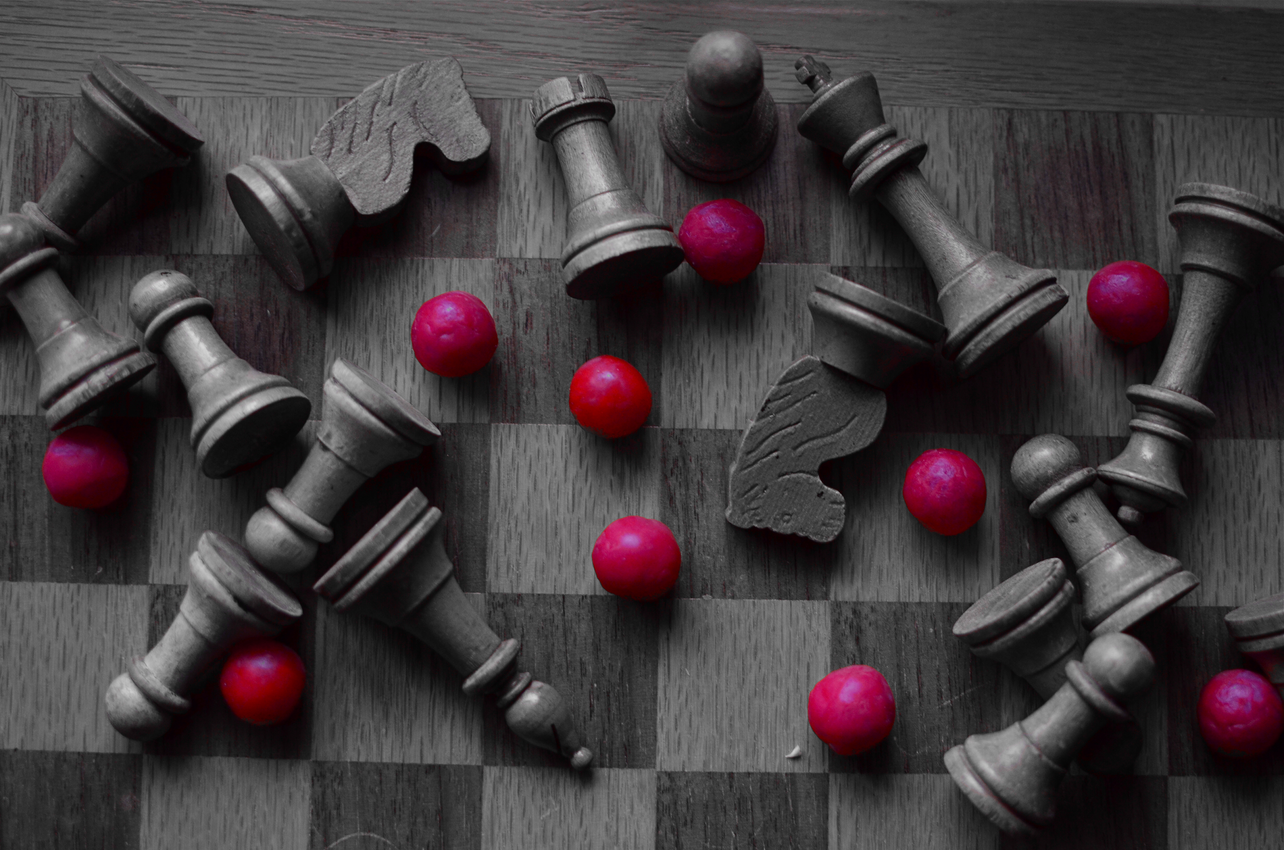
Outgunned, 2015. 1/30 sec., f/2.8, ISO 400, 35mm. Copy of color original desaturated with Nikon’s “selective color” in-camera touch-up option.
By MICHAEL PERKINS
IT WAS NEARLY A GENERATION AGO that Professor James Burke was the most admired media “explainer” of history and culture on both sides of the Atlantic, largely as a result of video adaptations of his hit books Connections and The Day The Universe Changed. Burke, trained at Jesus College in Oxford, was spectacularly talented at showing the interlocking linkages of events and human development, demonstrating the way they meshed together to act endlessly upon history, like gears locked in one large rotation. The result for viewers on PBS and the BBC was better than an ah, ha moment. It was more like an of course moment. Oh, yes, I see now. Of course.
In Universe especially, he examined the specific moments when everything we “knew” was altered forever. For example, we all “knew” the earth was flat, until we knew the exact opposite. We all “knew” that the sun rotated around the Earth, right up until that belief was turned on its ear. Our ideas of truth have always been like Phoenix birds, flaming out of existence only to rise, reconfigured, out of their own ashes. Burke sifted the ashes and set our imaginations ablaze.
As photographers, we have amazing opportunities to depict these transformative moments. In the 1800’s, the nation’s industrial sprawl across the continent was frozen in time with photo essays on the dams, highways, railroads and settlements that were rendering one reality moot while promising another. In the early 1900’s we made images of the shift between eras as the horrors of World War One rendered the Victorian world, along with our innocence, obsolete.
I love exploring these instants of transformation by way of still-life compositions that represent change, the juncture of was and will be. Like the above arrangement, in which some kind of abstract artillery seems to have un-horsed the quaint army of a chess set, I am interested in staging worlds that are about to go out of fashion. Sometimes it takes the form of a loving portrait of bygone technology, such as a preciously irrelevant old camera. Other times you have to create a miniature of the universe you are about to warp out of shape. Either way, it makes for an amazing exercise in re-visualizing the familiar, and reminds us, as Professor Burke did so well, that truth is both more, and less, than we know.
HAPPY OLD YEAR
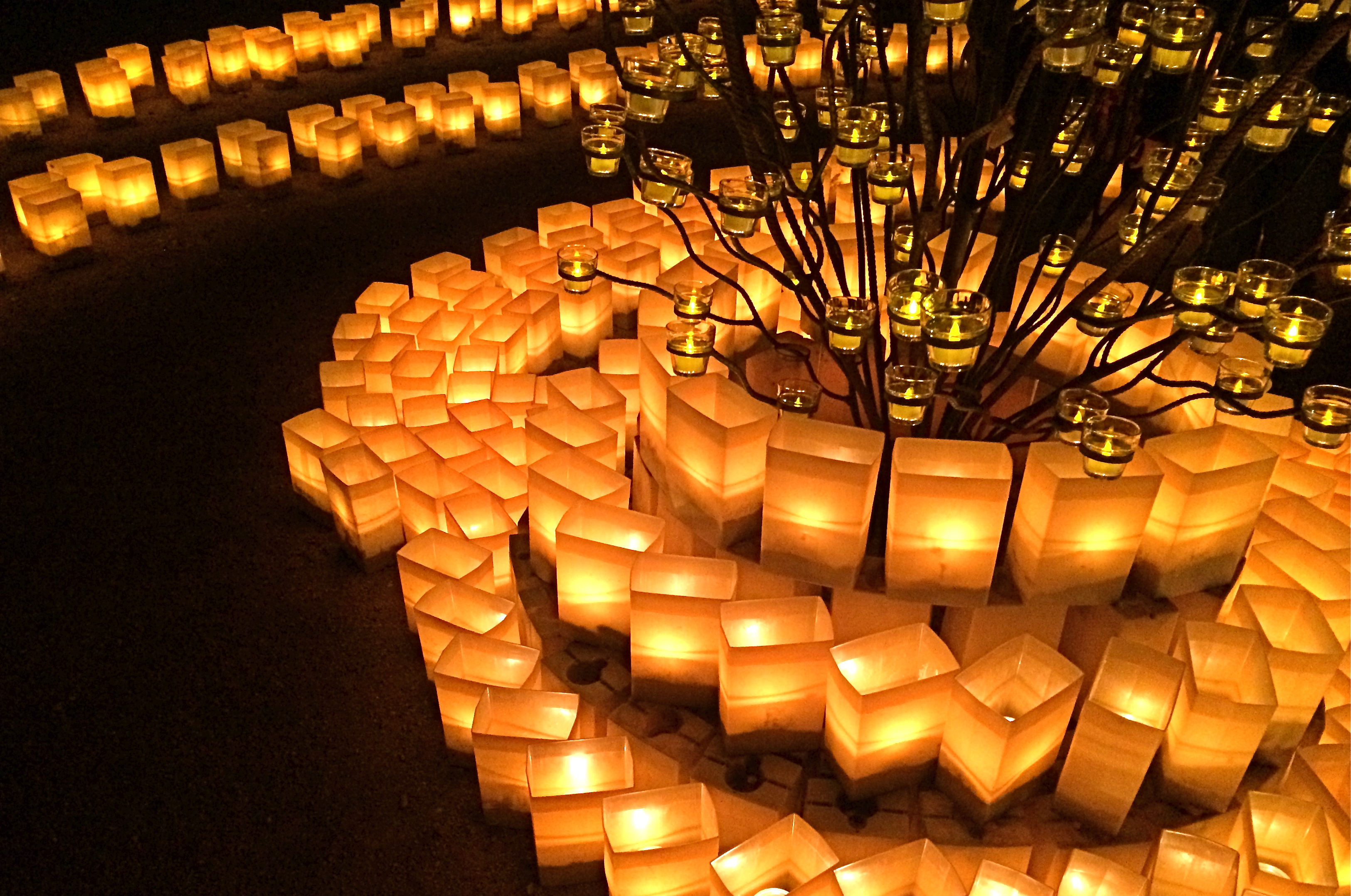
2014. Another year spent chasing the light.
By MICHAEL PERKINS
The White Rabbit put on his spectacles. ‘Where shall I begin, please your Majesty?’ he asked. ‘Begin at the beginning,’ the King said gravely, ‘and go on till you come to the end: then stop.’
IN A SIMPLER WORLD, THE KING OF HEARTS, quoted above in Lewis Carroll’s Alice’s Adventures in Wonderland, would be perfectly correct. All things being equal, the beginning would be the best place to begin. But, in photography, as in all of life, we are always coming upon a series of beginnings. Learning an art is like making a lap in Monopoly. Just when we think we are approaching our destination, we pass “Go” again, and find that one man’s finish line is another man’s starting gate. Photography is all about re-defining where we are and where we need to be. We always begin, and we never finish.
As 2014 comes to an intersection (I can’t really say ‘a close’ after all that, can I?), it’s normal to review what might be either constant, or changed, about one’s approach to making pictures. That, after all, is the stated aim of this blog, making The Normal Eye more about journey than destination. And so, all I can do in reviewing the last twelve months of opportunities or accidents is to try to identify the areas of photography that most define me at this particular juncture, and to reflect on the work that best represents those areas. This is not to say I’ve gained mastery, but rather that I’m gaining on it. If my legs hold out, I may get there yet. But don’t count on it.
The number twelve has become, then, the structure for the blog page we launch today, called (how does he think of these things?) 12 for 14. You’ll notice it as the newest gallery tab at the top of the screen. There is nothing magical about the number by itself, but I think forcing myself to edit, then edit again, until the thousands of images taken this year are winnowed down to some kind of essence is a useful, if ego-bruising, exercise. I just wanted to have one picture for each facet of photography that I find essentially important, at least in my own work, so twelve it is.
Light painting, landscape, HDR, mobile, natural light, mixed focus, portraiture, abstract composition, all these and others show up as repeating motifs in what I love in others’ images, and what I seek in my own. They are products of both random opportunity and obsessive design, divine accident and carefully executed planning. Some are narrative, others are “absolute” in that they have no formalized storytelling function. In other words, they are a year in the life of just another person who hopes to harness light, perfect his vision, and occasionally snag something magical.
So here we are at the finish line, er, the starting gate, or….well, on to the next picture. Happy New Year.

