EAT ALL YOU TAKE
By MICHAEL PERKINS
IF YOU’VE EVER RELIED ON UNCLE SAM FOR YOUR THREE SQUARES A DAY (thanks for your service), you know that, at least in the military, waste is worse than gluttony. Got a man-sized appetite? Great. Go back for seconds. Or thirds. But the taxpayers paid for that creamed chipped beef on toast, so if you put it on your plate, you’d better also put it down your gullet. Take All You Want, but Eat All You Take.
Same with composing a street photo. God knows that often you’re up to your armpits in sensory overload. Bright lights, big city, busy intersections, a visual smorgasbord (don’t write posts when you’re hungry!) of input. Sure, you can stick it all in your image, but, in the same way that a shavetail recruit shoves mashed potatoes and ham and ice cream sky-high on his tray….you’d better eat it all. Just showing a chaotic jumble of elements is not “reportage”, nor is it particularly inspiring. You’re on the street to tell a story. If your story is merely “gee, it’s really crowded here today”, you probably need to hone your narrative skills, and it might be smart to start carving stuff out of the composition to, let us say, let it breathe a little.
Shoot all you want. Use all you shoot.
Hollywood Boulevard is a place where absurd levels of street theatre are as normal as fire hydrants and stop lights. It’s in a perpetual state of over-the-top, so much so that it’s damned near impossible, amidst the mimes, acrobats, dancers and show biz mutants, for anyone to draw more than a distracted nanosecond of attention to themselves. Taking photos of this non-stop ballet of weird between jaded tourists and frantic performers can easily become the visual equivalent of the buck private’s overloaded dinner tray. A mess, with all the gravies, juices and seasonings of the city running together.
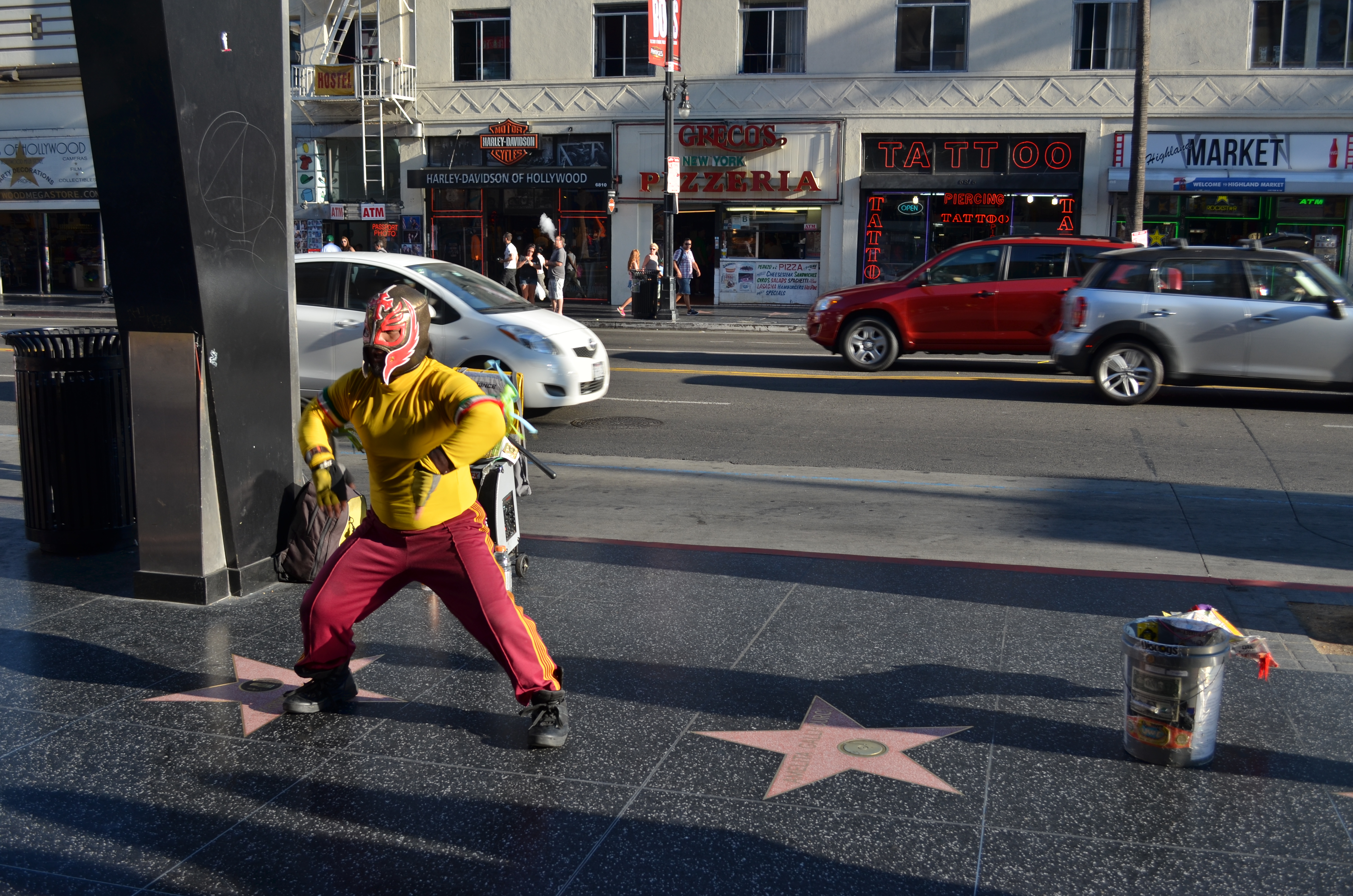
Hollywood Swinging, freestyle: 1/125 sec., f/5.6, ISO 100, 24mm.
Or you could try the dead opposite. One Sunday afternoon near sunset, I was lucky enough to see this wondrous fellow, creating his own mix of lucha libre and hip-hop in front of his own sad little stereo, working in isolation just across the street from the most heavily trafficked sites in that part of Hollywood. After shooting a few frames that showed him from several angles, I decided that his performance was story enough, all by itself. I didn’t need to show the thrilled reaction of passersby, or frame the shot to include popular destinations like the Chinese theatre or the teeming souvenir shops that scream so loudly up and down the block. Simply, including all that other glitter and glitz would have robbed our friend of his moment in the sun. I just liked him better as king of the block.
Full disclosure: had I not committed a lifetime of over-crowding flubs in my own images, I probably wouldn’t have felt compelled to write this post at all. But part of this enterprise is taking my lumps when I go off the rails, and doing penance is the first step to healing, blah blah blah…
Which is all to say, some photos need side dishes. Sometimes, however, you just want the meat and potatoes.
Again, never write when you’re hungry.
REVENGE OF THE ZOO
By MICHAEL PERKINS
PURISTS IN THE ANIMAL PHOTOGRAPHY GAME OFTEN DISPARAGE IMAGES OF BEASTIES SHOT AT ZOOS, citing that they are taken under “controlled conditions”, and therefore somewhat less authentic than those taken while you are hip-deep in ooze, consumed by insects, or scratching any number of unscratchable itches. Editors won’t even consider publishing pics snapped at the local livestock lockup, as if the animals depicted in these photos somehow surrendered their union cards and are crossing a picket line to work as furry scabs .
This is all rubbish of course, part of the “artier-than-thou” virus which afflicts too great a percentage of photo mavens across the medium. As such, it can be dismissed for the prissy claptrap that it is. Strangely, the real truth about photographing animals in a zoo is that the conditions are anything but controlled.
We’ve all been there: negotiating focuses through wire mesh, dealing with a mine field of wildly contrasting light, and, in some dense living environments, just locating the ring-tailed hibiscus or blue-snouted croucher. Coming away with anything can take the patience of Job and his whole orchestra.Then there’s the problem of composing around the most dangerous visual obstacle, a genus known as Infantis Terribilis, or Other People’s Kids. Oh, the horror.Their bared teeth. Their merciless aspect. Their Dipping-Dots-smeared shirts. Brrr…
In short, to consider it “easy” to take pictures of animals in a zoo is to assert that it’s a cinch to get the shrink wrap off a DVD in less than an afternoon….simply not supported by the facts on the ground.
Captured live in the gift shop: 1/40 sec., f/2. ISO 100, 35mm.
So, no, if you must take your camera to a zoo, shoot your kids instead of trying to coax the kotamundi out of whatever burrow he’s…burrowed into. Better yet, shoot fake animals. Make the tasteless trinkets, overpriced souvies and toys into still lifes. They won’t hide, you can control the lighting, and, thanks to the consistent uniformity of mold injected plastic, they’re all really cute. Hey, better to come home with something you can recognize rather than trying to convince your friends that the bleary, smeary blotch in front of them is really a crown-breasted, Eastern New Jersey echidna.
Any of those Dipping Dots left?
BREAKING THE BOX
The picture shown here was spoiled by tilting the camera sidewise. The whole scene seems to be “running downhill”. Unless you are trying for an unusual effect, hold the camera level. – How To Make Good Pictures, c) 1943 The Eastman Kodak Company
By MICHAEL PERKINS
ONE OF THE CARDINAL RULES OF PHOTOGRAPHIC COMPOSITION IS THE MAINTENANCE OF A PAINTER’S VIEW OF THE WORLD, and it needs to be abandoned as irrelevant to picture-making in the current era. I’m talking about one of the Photography 101 rules we all inherited from the medium’s 19th-century beginnings, which is the unyielding reverence for “the box” as a framing device.
You know the admonition, and can recite it out of a million amateur guides: the parameters of your photo must be a dead parallel line top and bottom and two perfectly perpendicular verticals for the left and right sides. Call it the “out the window” orientation or the painter’s frame, or perhaps the “God’s in his heaven, all’s right with the world” concept of a perfect clockwork universe. Whatever the term, this unbending admonition became common to every amateur book on photographic instruction since forever. Tilting was bad. Bending the frame or composing within an abstracted version of it was really bad. Calling attention to the frame instead of letting it remain invisible was amateurish.
I’ll tell you what’s bad: doing everything the same way, forever, and expecting to grow as a photographer, or as an anything.
Framing in photography sets the visual grammar of an image. It lays out the rules of engagement as much as anything that’s contained within it. It can be an artistic statement all in itself, and needs to be thought of as a deliberate choice, no less than camera settings or subject matter. The square or rectangle is not a mathematical commandment. Like every other element of making images, it needs to justify itself for the picture at hand. What is right for this instance?
Would this image have worked better inside a completely standardized framing?
The image seen here is a very calm and unchallenging composition. I liked the small number of elements presented by the stark little porch and the rich but mysterious patch of forest. But in both the shooting and the cropping, I decided to subtly re-jigger the frame to include structural parts of the porch and the window through which I shot the scene, throwing off the perfect geometry of vertical and horizontal, resulting in a look that is a little off-kilter. I tried looking at the shot without any of these parts, and the picture looked too pat, too passive, whereas creating an imperfect square with them gave the photograph just a little edge. Not a slam-you-over-the- head effect, just a slight bit of visual punctuation.
Call it the difference between a colon and semi-colon.
As for the Eastman Kodak Company’s caution that you should maintain the standard frame unless you “are trying for an unusual effect”, well, aren’t you doing that every time you step up to bat?
If not, what’s the point?
ROAD FOOD
West Taghkanic Diner, Ancram New York, 2014. 1/60 sec., f/5.6, ISO 100, 35mm.
By MICHAEL PERKINS
Truck Driver: Give me some more of this poison you call coffee.
Waitress: I notice you’re on your third cup…
Truck Driver: I like your sugar.
They Drive By Night, Warner Brothers, 1940
AMERICANS CERTAINLY DID NOT INVENT THE IDEA OF STOPPING OFF FOR CHOW “ON THE WAY” TO WHEREVER. The roadside taverns and eateries that dot the globe in the spaces between village and town are the stuff of worldwide legend. Call it the “ye olde inn” tradition. However, in the 20th century, we Yanks did our bit in contributing to the romance of road food. Hey, you’re motoring across the country in your new Ford/Buick/Merrie Oldsmobile anyway, so you need some kind of, let’s call it grub infrastructure, laid out along the route.
Mind you, these won’t be the same restaurants where Grandma and the kids tuck in of a Sunday supper. We leave the linens to the landed gentry: simply paper napkins here, bub. The best “joints” actually resemble trailers more than restaurants, with the menu ranging from non-poisonous to “not bad”, but not much wider. Diners and dives don’t pull down Michelin stars and Zagat raves. But they do shape our traveling, and photographic, experiences. And now that we’re beyond the first great Golden Age of Motoring (maybe the only one, come to think of it), photo-documenting these decaying munch museums is a must.
Hey, doll, any more at home like you?
I love the curvy chrome and Deco streamlining that forms the shell of many joints. I love them even more in their present state of slow disintegration,when the streamlining isn’t too straight, the chrome gives off an apologetic, latter-day patina, and all the angles don’t quite square up. My photographer’s eye likes these temples of makeshift cuisine because they are cheap and cheesy. They’re vulgar and obvious in their blinky, half-dead neon, kitschy colors and over-ripe graphics, and as Sinatra used to sing, that’s America to me. Love it.
Some of my favorite joints are far more dinosaur than diner, but, when you can squeeze off a frame or two of their fading glory, and amble inside for a five dollar cheeseburger deluxe, heck, boyo, that’s a combo plate you can’t even get at the Ritz. And if I could ever find the dazzling dame who modeled for the drawing of a waitress on the side of all those millions of ketchup squeeze bottles, that would be love at first sight.
Talk about your latter-day Mona Lisa. With fries.
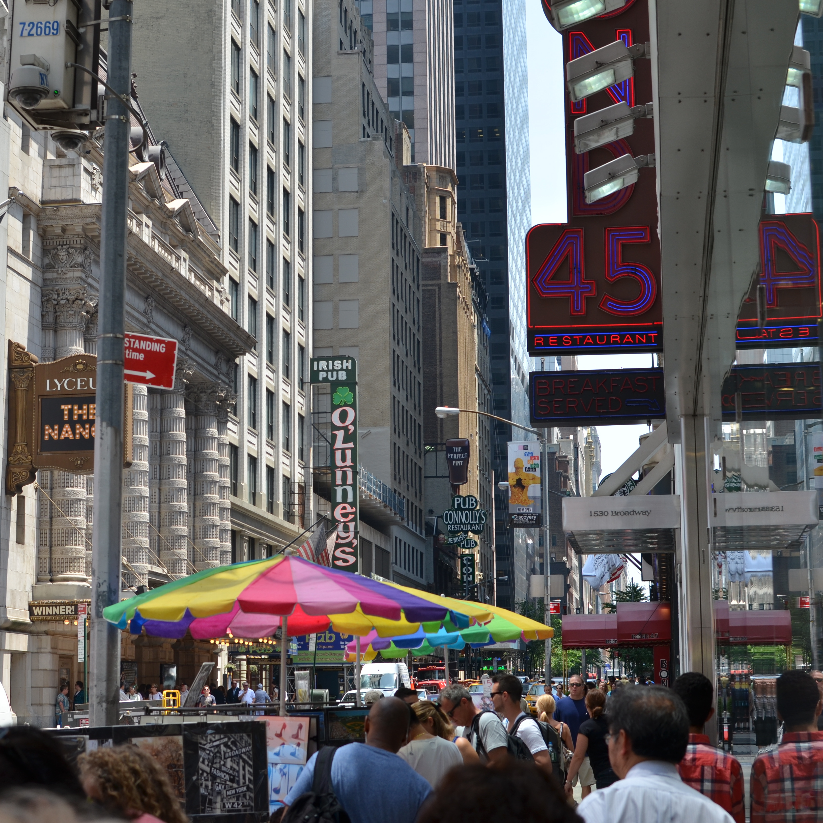
CLEAN-UP ON AISLE FIVE
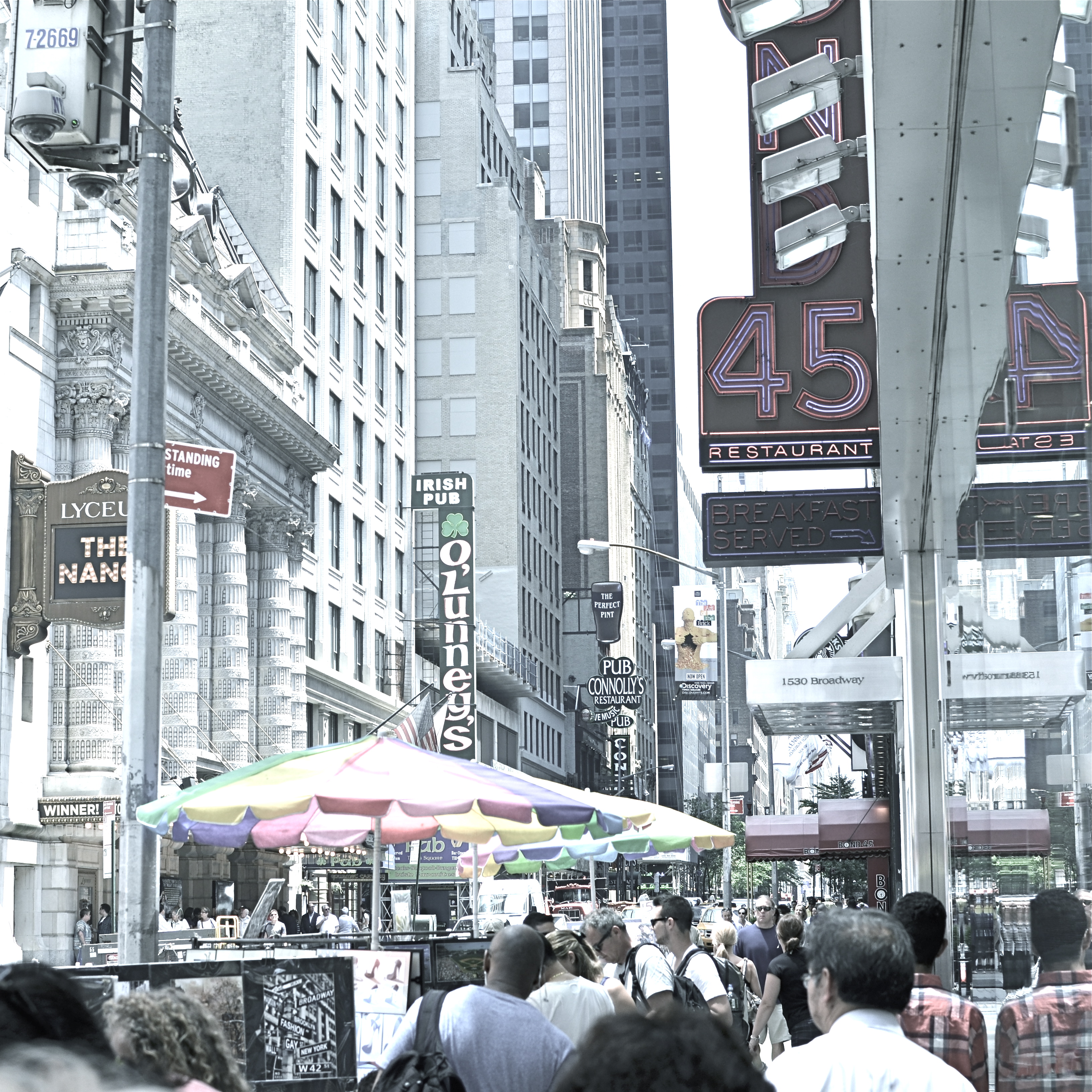
A post-processed “color compromise” of the image below. 1/320 sec., f/5.6, ISO 100, 35mm.
By MICHAEL PERKINS
TAKE ENOUGH PHOTOGRAPHS AND YOU WILL DEVELOP YOUR OWN SENSE OF “SIMPLICITY”. That is, you will arrive at your own judgement about how basic or complex a composition you need in a given situation. Some photographers are remarkable in their ability to create images that contain a mad amount of visual information. Some busy city scenes or intricate landscapes benefit wonderfully from an explosion of detail. Other shooters render their best stories by reducing elements to a bare minimum. And of course, most of us make pictures somewhere in the vast valley between those approaches.
Before the fiddling ensued.
I’m pretty accustomed to thinking of overly-busy pictures as consisting of a specific kind of “clutter”, usually defined as cramming too many objects or people into a composition. But I occasionally find that color can be a cluttering element, and that some very visually dense photos can be rendered less so by simply turning down hues, rather than rooting them out completely. Recently I’ve been taking some of the pictures that seem a little too “overpopulated” with info and taking them through what a two-step process I call a color compromise (patent not applied for).
First step involves desaturating the picture completely, while also turning the contrast way down, amping up the exposure and damn near banishing any shadows. This almost results in a bleached-out pencil drawing effect and emphasizes detail like crazy. Step two involves the slow re-introduction of color until only selected parts of the image render any hues at all, and making sure that the color that is visible barely, barely registers.
The final image can actually be a clearer “read” for your eyes than either the garish colored original or a complete b&w. Objects will stand out from each other a little more distinctly, and there will be an enhanced sensation of depth. It also suggests a time-travel feel, as if age has baked out the color. A little of this washed-out jeans look goes a long way, however, and this whole exercise is just to see if you can make the picture communicate a little better by allowing it to speak more quietly.
Compare the processed photo at the top, taken in the heart of the visually noisy Broadway district, with its fairly busy color original and see if any of this works for you. I completely stipulate that I may just be bending over backwards to try to salvage a negligible photo. But I do think that color should be a part of the discussion when we fault an image for being cluttered.
REDUCTION OF TERMS
1/320 sec., f/5.6, ISO 100, 35mm.
By MICHAEL PERKINS
To me, photography is an art of observation. It’s about finding something interesting in an ordinary place. I’ve found it has little to do with the things you see, and everything to do with the way you see them. —Elliott Erwitt
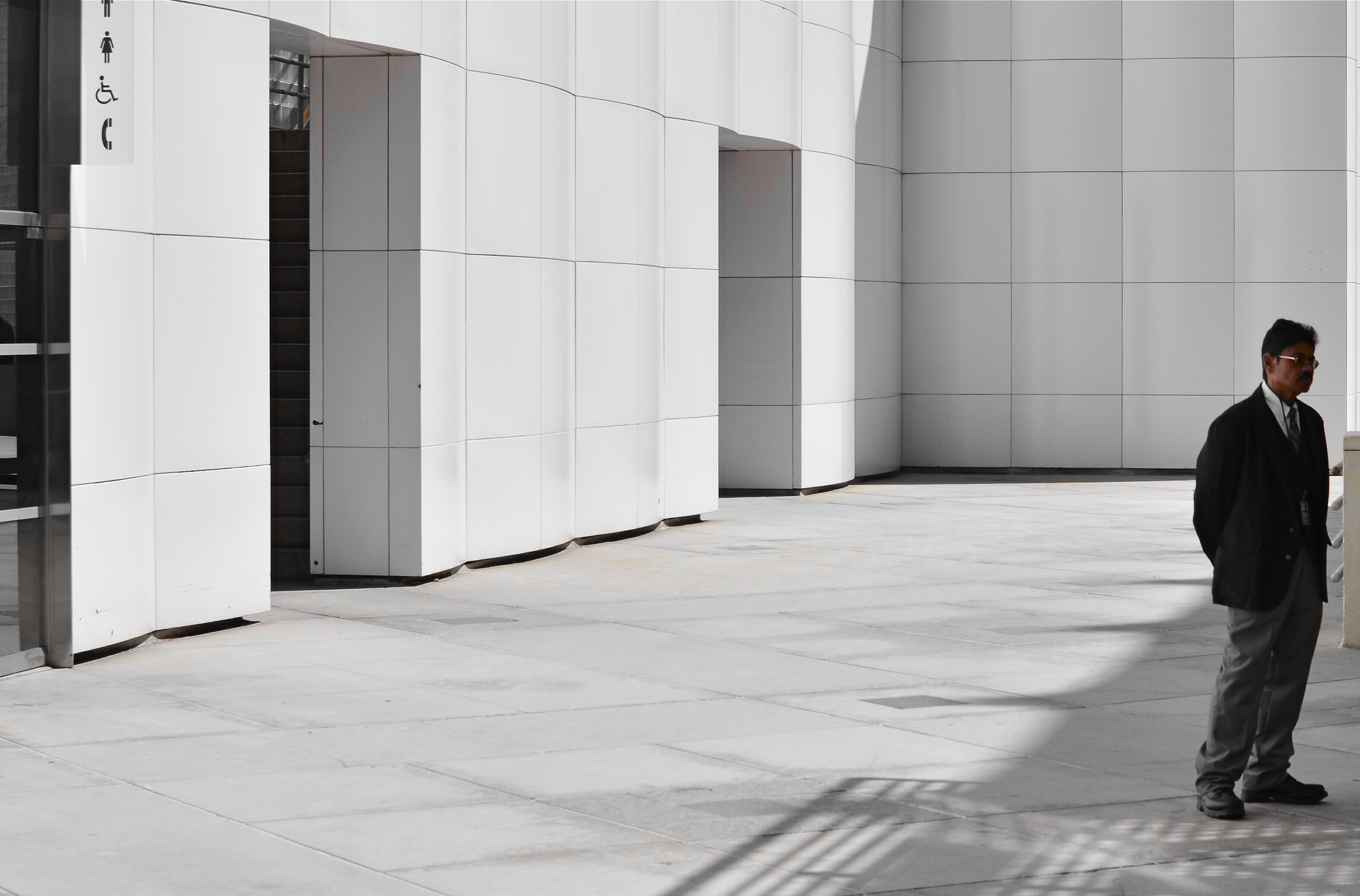
ISOLATION IS A TRULY IRONIC CONDITION OF THE HUMAN ANIMAL. The strange thought that, for most of our lives, we are both awash in a sea of other people and totally alone is one of nature’s most profound paradoxes. Photography shows people in both of these conditions, and shooters must choose what illuminates a person’s story best—-his place among others or his seeming banishment from them. Sometimes both truths are in the same frame, and then you must, as Elliott Erwitt says, alter the way you see in favor of one or the other.
In the case of both of the images posted here, the person who “solely” occupies the frames was originally a stray element within a larger context, with the pictures framed, at first, to include nearby persons or crowds. On further examination, however, one or two compositional elements in each of the pictures convinced me, in both the case of the museum guard and the hurried gallery guest, that they could “hold” the pictures they were in without any other human presence in view, and so I created their isolation, something that was not their natural condition at the time.
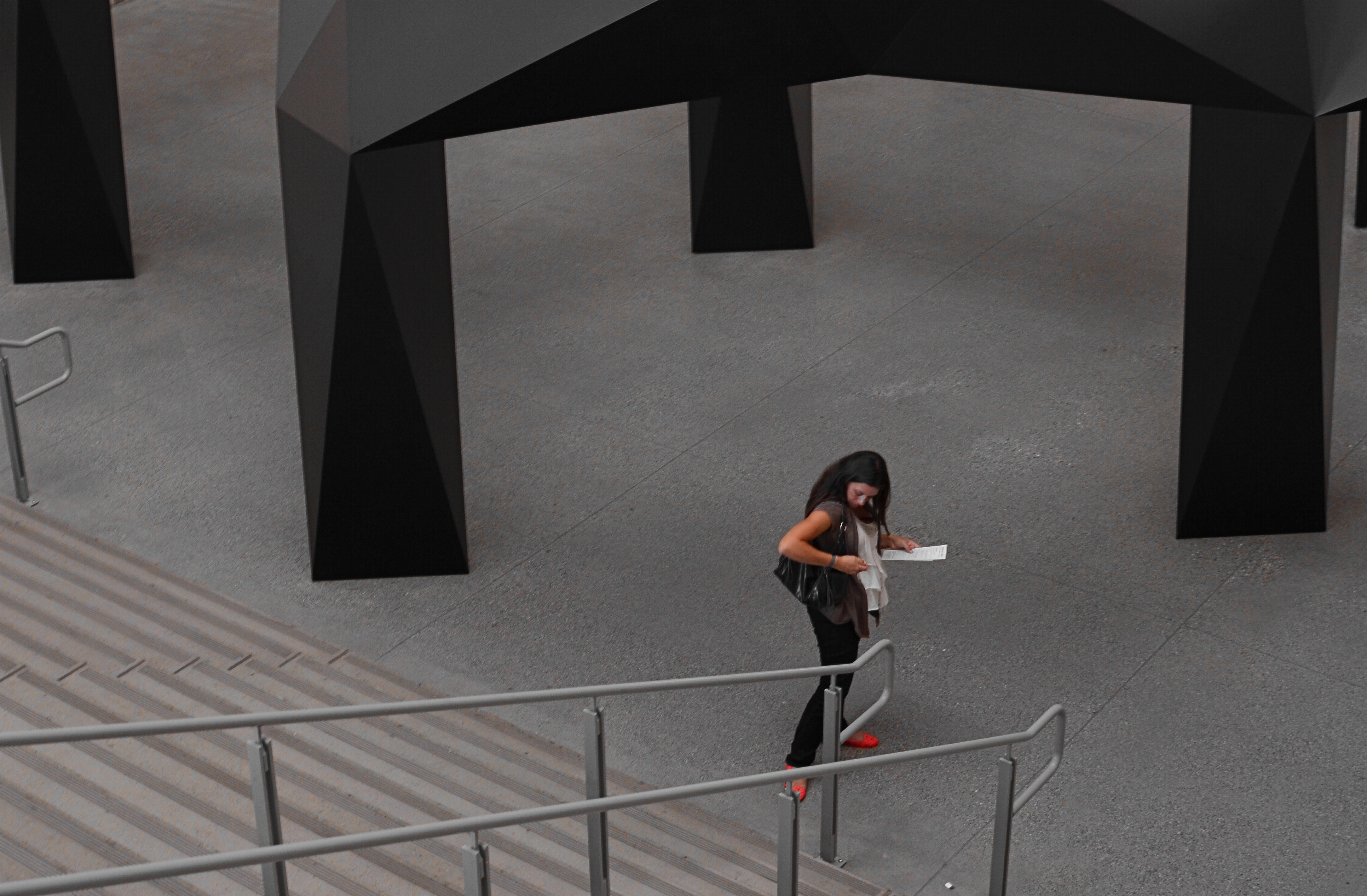
I further “isolated” these two subjects by desaturating everything in the frame except their flesh tones. 1/10 sec., f/5.6, ISO 320, 35mm.
Part of this process is my ongoing curiosity in how far I can go in paring away extra visual information before the story impact of a photograph is amplified to its highest power. I’m sure you have all worked with many original images that are just too balky and talky, that are really “made” in the cropping process. To be sure, sometimes you’re just peeling away the rotten outer parts of an apple to reveal…..a rotten core! Other times, however, you are privileged to peel away just enough petals to render the rose at its best, and, with images of people, that can mean getting rid of almost all the people in the picture you began with.
In both these cases, I liked these people to be shown as if they were in command of small little universes of their own. Does that make the photographs sad? Lonely? Dignified? Tranquil? Yes to all these and anything else you can bring to it, because if cropping is the second part of the picture-making process, then seeing if your instinct “proofs out” with viewers is the final and most crucial part. I’m using every process I can to convey to you what I saw, or what I believe is worth seeing. It’s a collaborative process, and sometimes, I’m sure, I don’t hold up my part of the bargain. And still we press on.
Isolation is more than a human condition or a symptom of our times: it’s a compositional tool, a reduction of the equation of scene-making to its simplest, and hopefully truest, terms.
ANATOMY OF A BOTCH
This murky mess is barely tolerable in monochrome. 1/25 sec., f/3.5, ISO 1250, 18mm.
By MICHAEL PERKINS
THERE SHOULD BE A MIRROR-IMAGE, “NEGATIVE” COOKBOOK FOR EVERY REGULAR ONE PUBLISHED, since there are recipes for inedible failures, just as surely as there are ones for gustatory delights. It might be genuinely instructive to read an article called How To Turn A Would-Be Apple Pie Into A Shapeless Heap Of Glop or You, Too Can Make Barbecue Ribs Look Like The Aftermath Of A Cremation. So too, in photography, I believe I could easily pen an essay called How To Take Pictures That Make It Seem That You Never Touched A Camera Before.
In fact…..
In recent days, I’ve been giving myself an extra welt or two with the flagellation belt in horrified reaction to a shoot that I just flat-out blew.It was a walk through a classic hotel lobby, a real “someday” destination for myself that I finally got to visit and wanted eagerly to photograph. Thing is, none of that desire made it into the frames. Nor did any sense of drama, art, composition, or the basics of even seeing. It’s rare that you crank off as many shots as I did on a subject and wind up with a big steaming pile of nothing to show for it, but in this case, I seem to have been all thumbs, including ten extra ones where my toes should be.
So, if I were to write a negative recipe for a shoot, it would certainly contain a few vital tips:
First, make sure you know nothing about the subject you’re shooting. I mean, why would you waste your valuable time learning about the layout or history of a place when you can just aimlessly wander around and whale away? Maybe you’ll get lucky. Yeah, that’s what makes great photographs, luck.
Enjoy the delightful surprise of discovering that there is less light inside your location than inside the fourth basement of a coal mine. Feel free to lean upon your camera to supply what you don’t have, i.e., a tripod or a brain. Crank up the ISO and make sure that you get something on the sensor, even if it’s goo and grit. And shoot near any windows you have, since blowouts look so artsy contrasted with pitch blackness.
Resist the urge to have any plan or blueprint for your shooting. Hey, you’re an artist. The brilliance will just flow as you sweep your camera around. Be spontaneous. Or clueless. Or maybe you can’t tell the difference.
Stir vigorously and for an insane length of time with a photo processing program, trying to manipulate your way to a useful image. You won’t get there, but life is a journey, right? Even when you’re hopelessly lost in a deep dark forest.
************************
You could say that I’m being too Catholic about this, and I would counter that I’m not being Catholic enough.
Until I do penance.
Gotta go back someday and do it right.
And make something that really cooks.
REAL PHONIES
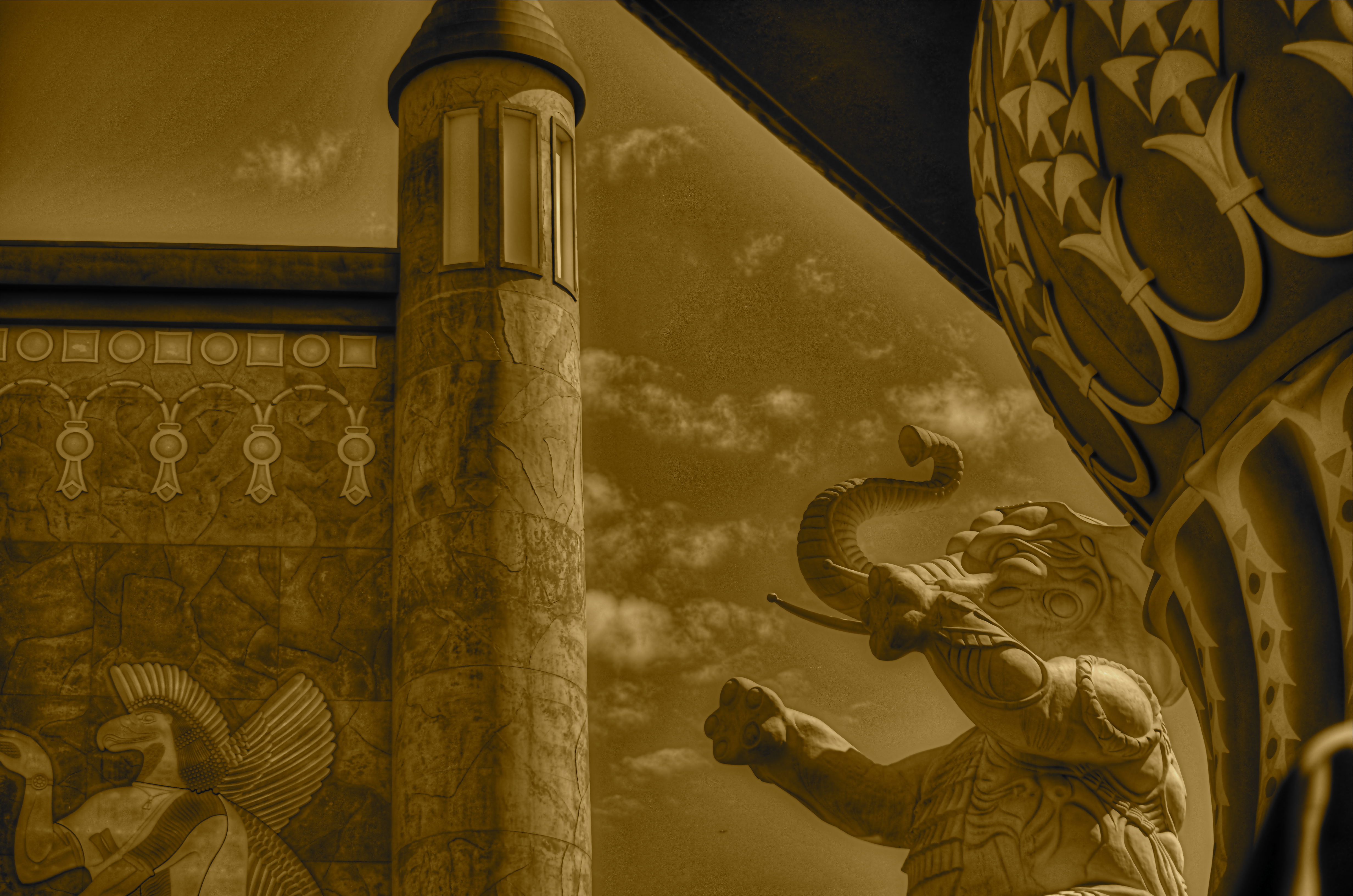
Reality check: a retail mall in Hollywood, doubling as a tribute to D.W. Griffith’s Intolerance. huh?
By MICHAEL PERKINS
“You’re wrong. She is a phony. But on the other hand you’re right. She isn’t a phony because she’s a real phony. She believes all this crap she believes.”
—Truman Capote, Breakfast At Tiffany’s
THE ABOVE REFERENCE TO MISS HOLLY GOLIGHTLY, she of the powder room mad money, also applies very neatly to Hollywood, California. The official kingdom of fakery has been in the business of fabricating fantasy for so long, it actually treats its hokum as holy writ. Legends and lore become facts of life, at least our collective emotional life. Dorothy’s ruby slippers (even though they were originally silver) draw more attention than actual footwear from actual persons. Wax figures of imaginary characters are viewed by more people than will ever examine the real remains of wooly mammoths at the La Brea Tar Pits. And, when it comes to the starstruck mini-Vegas that is the nexus of Hollywood Boulevard and Highland Avenue, even a fake of a fake seems like a history lesson.

The gang’s all here: Griffith’s original 1916 Babylon set for Intolerance.
Hollywood and Highland is one grand, loud, crude note of Americana, from its out-of-work actors sweating away in Wookie suits in front of the Chinese theatre to its cheesy Oscar paperweights at the souvie shops. This small stretch of carnival, high-caloric garbage chow, and surreal retail is a version of a version, a recreation of a creation, a “real phony” rendition of cinema, defined by its resurrection of the great gate of Babylon, which anchors a multi-level mall adjacent to the Dolby Theatre, the place where all those genuine cheesy paperweights are given each year. The gate and the two enormous white elephants that flank it are a partial replica of D.W. Griffith’s enormous set for the fourth portion of his silent 1916 epic Intolerance. The full set had eight elephants, an enormous flight of descending stairs, two side wings, and a crowd that may have originally inspired the term “cast of thousands”. That’s how they did ’em back in the day, folks. No matte paintings, no CGI, no greenscreen. We gotta build Babylon on the back set, boys, and we only got a week to do it, so let’s get cracking.
The original set, which stood at Hollywood and Sunset, was, by 1919, a crumbling eyesore and, in the city’s opinion, a fire hazard. Griffith, who lost his shirt on Intolerance, didn’t have the money to demolish it himself, and eventually it fell into sufficient disrepair to make knocking it down more cost-effective. Hey, who knew that it might make a great backdrop for a Fossil store 2/3 of a century later? But Hollywood never balks at the task of making a fake of a fake, so the Highland Center’s ponderous pachyderms overlook throngs of visitors who wouldn’t know D.W. Griffith from Merv Griffin from Gryffindor, and the world spins on.
Photographing this strange monument is problematic since nearly all of it is crawling with people at any given moment. Forget about the fact that you’re trying to take a fake image of a fake version of a fake set. Just getting the thing framed up is an all-day walkabout. So, at the end of my quest, what did I do to immortalize this wondrous imposter? Took an HDR to ramp up an artificial sense of wear and tear, and slapped on some sepia tone.
But it’s okay, because I’m a real phony. I believe all the crap I believe.
Hooray for Hollywood.
WHAT IS HIP?
Shooting “from the hip” can be an urban photographer’s secret weapon. 1/40 sec., f/3.5, ISO 500, 18mm.
By MICHAEL PERKINS
WHEN FACED WITH A COMPLETELY DIFFERENT APPROACH TO OUR PHOTOGRAPHY, the crabbier among us are liable to utter one of two responses. Both sound negative, but one could be positive:
Response #1: “I’d never do that!” (Emphatically negative. Discussion over. You will not persuade me.)
Response #2:”Why would I want to do that???” (Possibly as close-minded as response #1, but the person could be asking a legitimate question, as in, ‘show me the benefit in doing it your way, because I can’t imagine a single reason why I should change’.)
When first reading about the street photography technique of “shooting from the hip”, I was a definite response #2. Wasn’t going to slam the door on trying it, but failed to see what I would get out of it. The phrase means just what you’d think it does, referring to people with obvious cameras who do “street” work, shooting with the camera hanging at waist level, never bringing the viewfinder up to their eye. Subjects don’t cringe or lock up because you don’t “seem” to be taking a picture, and thus your images of them are far more unguarded and natural.
Now, suggesting this to a person who has never even owned a camera that didn’t have a viewfinder is a little like asking him to try to take pictures from the inside of a burlap sack. Kinda makes my inner control freak throw a bratrum (a brat tantrum). Think of it from my point of view. If I shoot manually all the time (I do) and if I need my viewfinder like Linus needs his blanket (cause, hey, I’m a tortured and insecure artist), then squeezing off a shot without even knowing if it’s in frame is, to say the least, counter-intuitive (French for “nuts”).
So there you have your honestly expressed Response #2.
Some things that finally made it worth at least trying:
It don’t cost nothin’.
I can practice taking pictures that I don’t care about. I wouldn’t be shooting these things or people even with total control, so what’s to lose?
Did I mention it don’t cost nothin’?
Shooters beware: clicking from the hip is far from easy to master. Get ready to take lots of photos that look like they came from your Urban Outfitter Soviet Union-era Plastic Toy Hipsta Camera. You want rakish tilt? You got it. You like edgy, iffy focus? It’s a given. In other words, you’ll spend a lotta time going through your day’s work like the Joker evaluating Vicki Vale’s portfolio (….”crap….crap….crap….” ). But you might eventually snag a jewel, and it feels so deliciously evil to procure truly candid shots that you may develop an addiction to the affliction. Observe a few basics: shoot as wide as you can, cause 35s, 50s and other primes won’t give you enough scope in composition at close range: go with as fast a shutter speed as the light will allow (in low light, compromise on the ISO): if possible, shoot f/5.6 or smaller: and, finally,learn how to pre-squeeze the autofocus and listen for its quiet little zzzz, then tilt the camera just far enough up to make sure everyone has a head, and go.
At worst, it forces you to re-evaluate the way you “see” a shot, since you have no choice but to accept what the camera could see. At best, you might see fewer bared fangs from people snarling, “hey is that a $&@*! camera?” inches from your nose. And that’s a good thing.
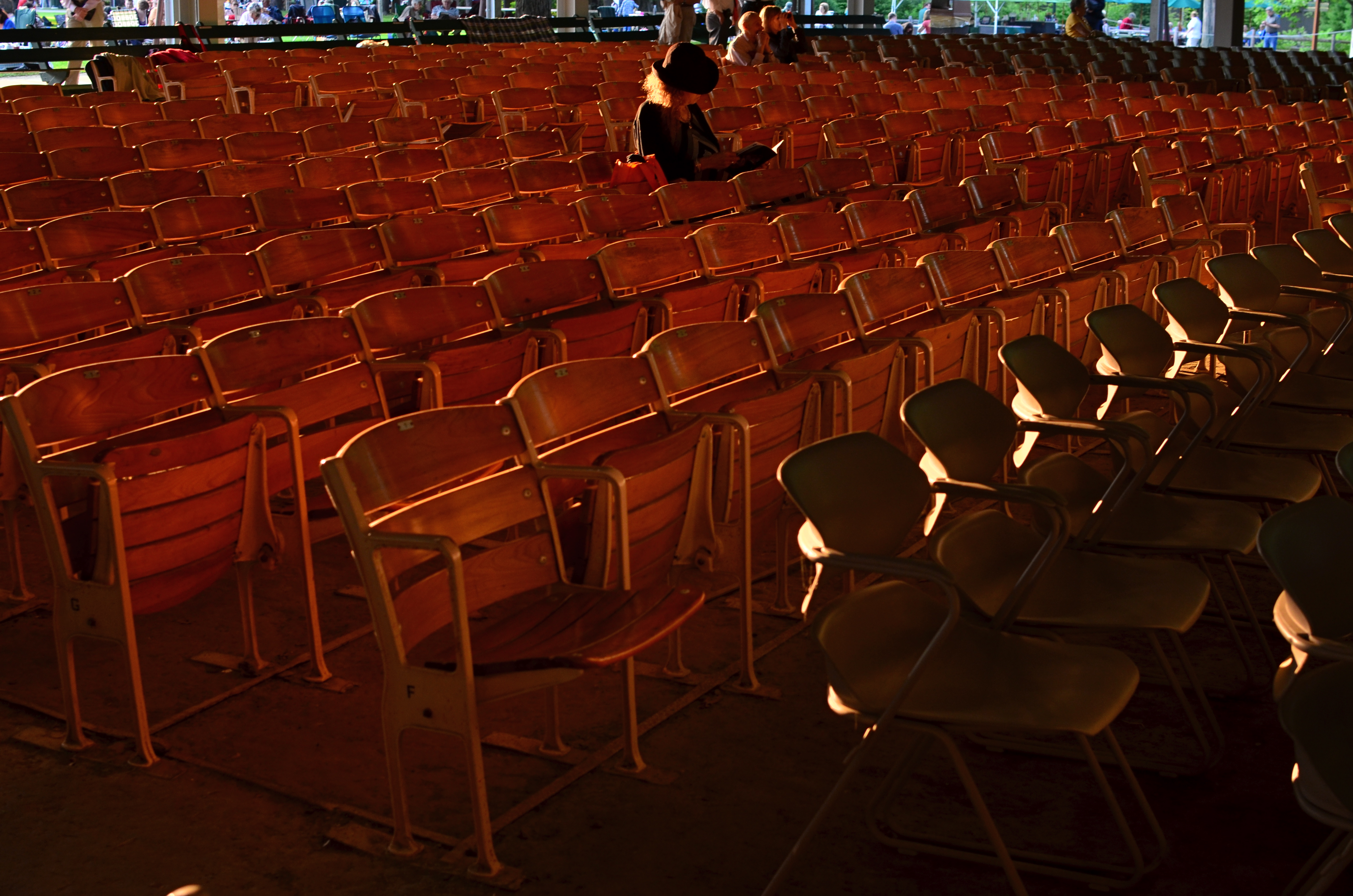
THE JOY OF BEING UNIMPORTANT
By MICHAEL PERKINS
I HAVE AT LEAST TWO WOMEN IN MY LIFE WHO WORRY if I am sufficiently entertained whenever I am borne along on their ventures into various holy lands of retail. Am I waiting too long? Am I bored at being brought along? Would I like to go somewhere else and rejoin them later at an appointed time and place?
Answers: No to questions 1, 2 and 3…so long as I have my hands on a camera.
I can’t tell you how many forays into shoe emporiums, peeks into vintage stores and rambles through ready-to-wear shops have provided me with photographic material, mainly because no one would miss me if I were to disappear for a bit, or for several days. And, as I catalogue some of the best pickings I’ve plucked from these random wanderings, I find that many of them were made possible by the simple question, “do you mind amusing yourself while I try this on?” Ah, to have no authority or mission! To let everything pale in importance when compared to the eager search for pictures! To be of so little importance that you are let off the leash.
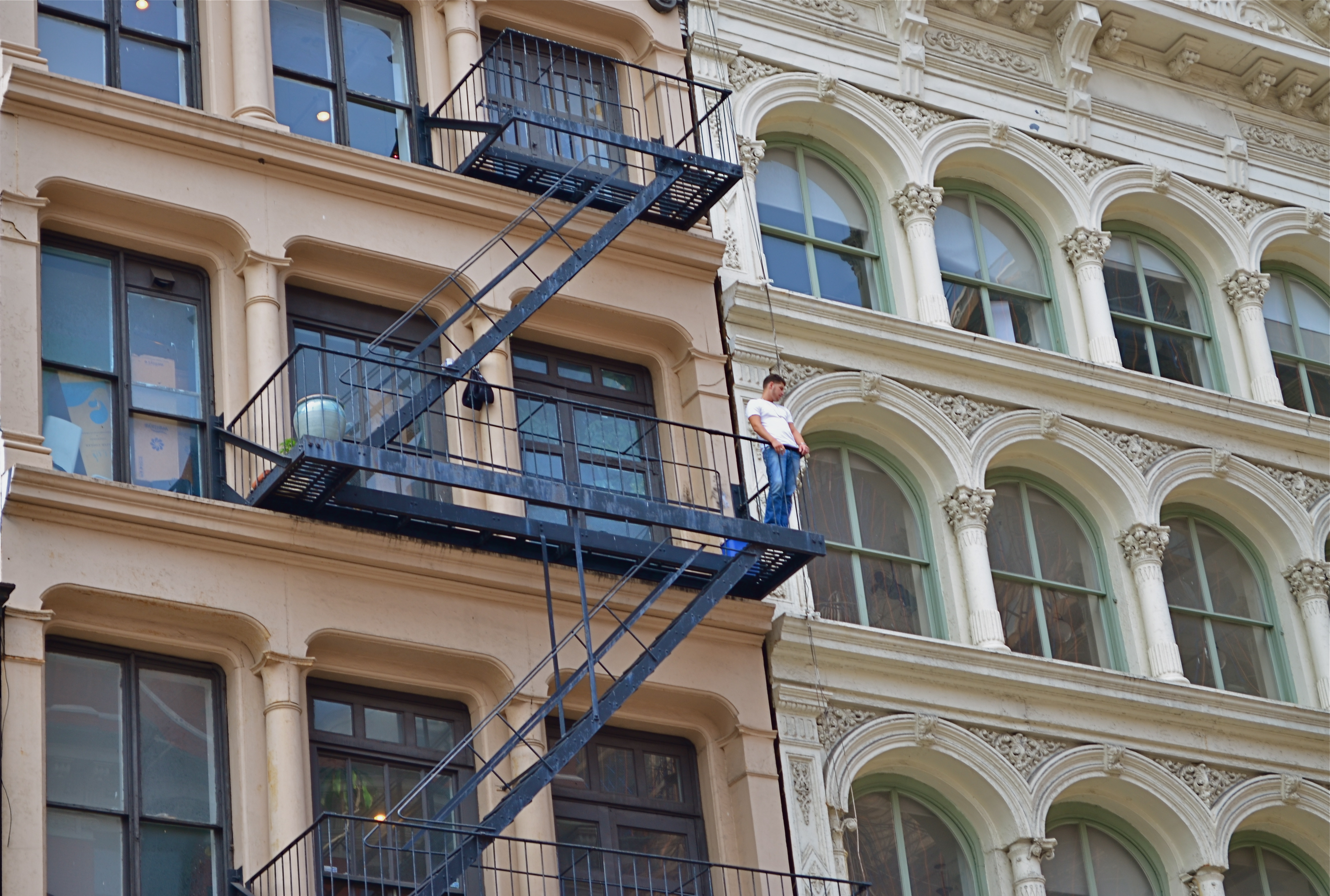
The above image happened because I was walking with my wife on the lower east side of Manhattan but merely as physical accompaniment. She was looking for an address. I was looking for, well, anything, including this young man taking his cig break several stories above the sidewalk. He was nicely positioned between two periods of architecture and centered in the urban zigzag of a fire escape. Had I been on an errand of my own, chances are I would have passed him by. As I was very busy doing nothing at all, I saw him.
Of course, there will be times when gadding about is only gadding about, when you can’t bring one scintilla of wisdom to a scene, when the light miracles don’t reveal themselves. Those are the times when you wish you had pursued that great career as a paper boy, been promoted to head busboy, or ascended to the lofty office of assistant deacon. I’m telling you: shake off that doubt, and celebrate the glorious blessing of being left alone…to imagine, to dream, to leave the nest, to fail, to reach, to be.
Photography is about breaking off with the familiar, with the easy. It’s also having the luck to break off from the pack.
THE NON-EVENT EVENT
By MICHAEL PERKINS
EVENT PHOTOGRAPHY IS ONE OF THE MOST FORMALIZED MEANS OF MAKING PICTURES, a pure mission where there is usually only one “official” story being told. A happy wedding. A formal ceremony. A tearful farewell. We expect cameras to be more or less pictorial recorders at certain august moments in our lives, and anyone charged with performing that recording task is usually not expected to also serve up interesting or odd sidebars on human behavior along with the certified images we sent them to get. Event photography is not news, and may not even be persuasive human interest. It is a document, and a rather staged and stiff one at that.
But that’s what’s rewarding about being the non-official photographer at an event. It’s someone else’s job to make sure the crucial toast, the first dance, or the lowering of the casket is captured for posterity. Everyone else with a camera is free to do what photography is really about most of the time. There’s little opportunity for interpretation in the “important” keepsake shots that everyone wants, but there’s all kind of creative wiggle room in the stuff that’s considered unimportant.
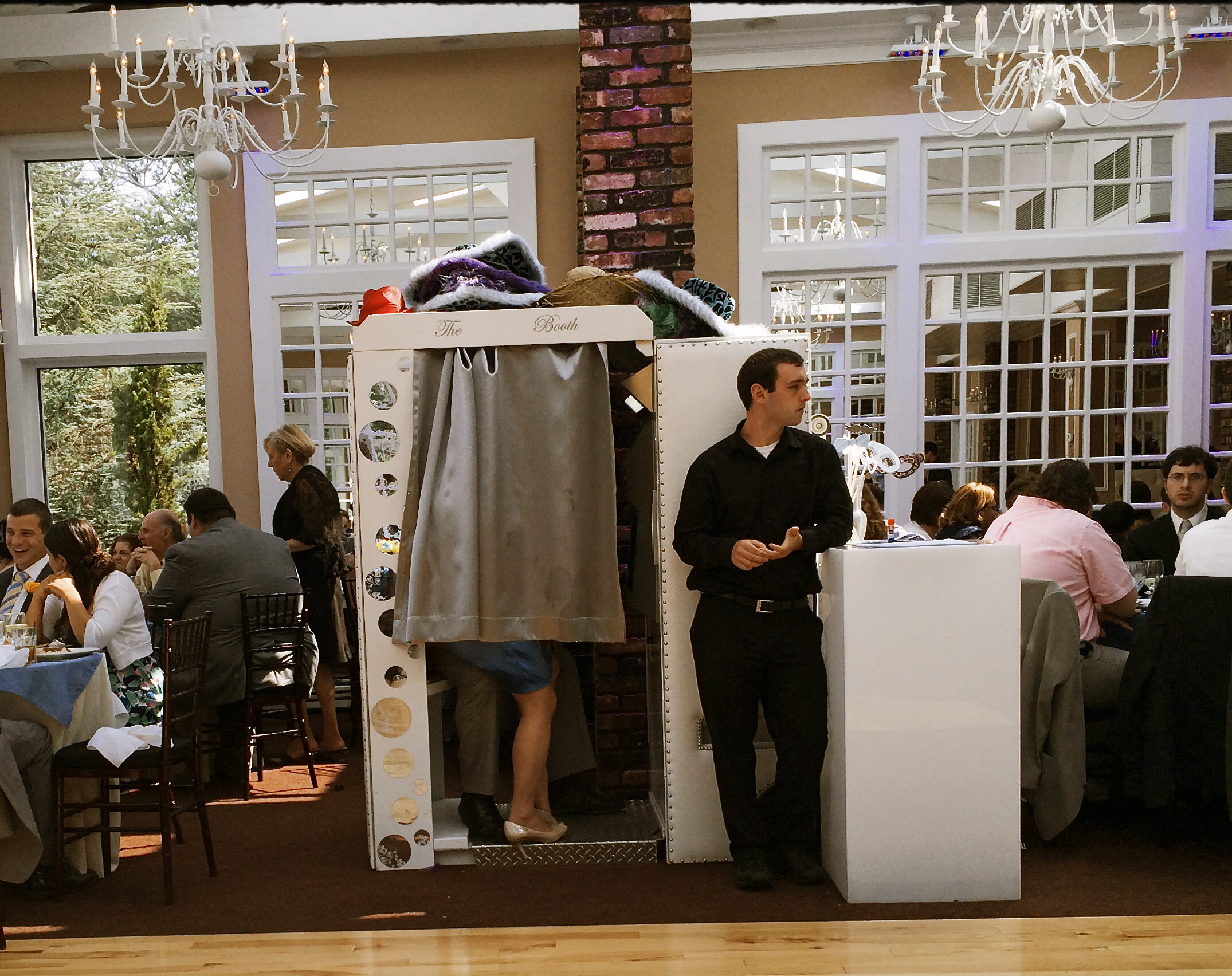
Working The Wedding, 2014
I recently attended a wedding at which every key feature of the proceedings was exhaustively catalogued, and, about two hours in, I wanted to seek out something unguarded, loose, human, if you will. The image seen here of a bored hired man doing standby duty on the photo booth was just what I was seeking. I don’t know if it’s the quaint arrangement of legs and feet inside the booth or his utter look of indifference on his face as he stoically mans his post, but something about the whole thing struck me as far funnier than the groomsmen’s toasts or the sight of yet one more bride getting a faceful of cake.
I was only armed with a smartphone, but the reception hall was flooded with light at midday so the shot was far from a technical stretch. The image you see is pretty much as I took it, except for a faux-Kodachrome filter added to give it a bit of a nostalgic color wash, as well as counteracting the bluish cast of the artificial lighting. I also did some judicious guest-cropping to cut down on distraction.
Taking pictures at someone else’s event is a great gig. No expectations, no “must have” shots, and you don’t even have to care if you got the bride’s good side. Irresponsibility can be relaxing. Especially with an open bar.
LOAD, LOCK, SHOOT
By MICHAEL PERKINS
OUR GRADE SCHOOL HISTORY CLASSES DRUMMED CERTAIN NAMES INTO OUR HEADS AS THE “EXCLUSIVE” CREATORS of many of the wonders of the modern age. We can still bark back many of those names without any prompting, saluting the Edisons, Bells, and Fords of the early part of the 20th century and the Jobses and Gateses of its final years. However, as we grew older, we realized that the births of many of our favorite geegaws (television, for example) can’t be traced to a single auteur. And when it comes to photography, their are too many fathers and mothers in all ends of the medium to even enumerate.
Several tinkerer-wizards do deserve singling out, however, especially when it comes to the mindset that all of us in the present era share that photography ought to be immediate and easy. And, in a very real way, both of these luxuries were born in the mind of a single man, Dean Peterson, who presided over half a dozen revolutions in the technology of picture making, most of his own creation. As an engineer at Eastman Kodak in the early ’60’s, Dean created and developed the Instamatic camera, and, in so doing, changed the world’s attitude toward photography in a way every bit as dramatic as George Eastman’s introduction of cheap roll film in the late 1800’s. Peterson’s new wrinkle: get rid of the roll.
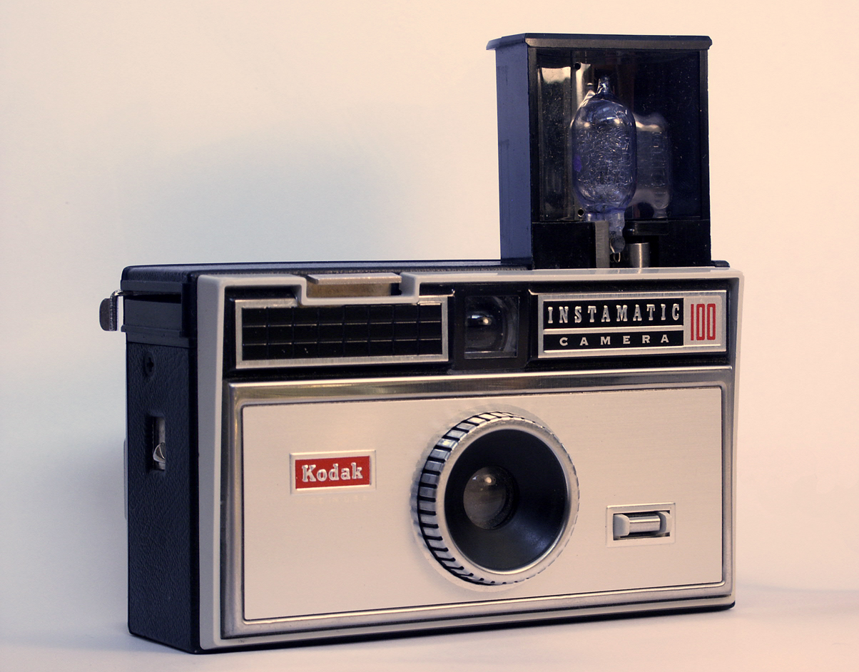
Yeah, you had one. The Kodak Instamatic 100.
Or, more precisely, get rid of loose film’s imprecise process for being loaded into the camera, which frequently ruined either single exposures or entire rolls, depending on one’s fumble-fingered luck. Peterson’s answer was a self-contained drop-in cartridge, pre-loaded with film and sealed against light. Once inside the camera, it was the cartridge itself that largely advanced the film, eliminating unwanted double-exposures and making the engineering cost of the host camera body remarkably cheap. Peterson followed Eastman’s idea of a fixed-focus camera with a pre-set exposure designed for daylight film, and added a small module to fire a single flashbulb with the help of an internal battery. Follow-up models of the Instamatic would move to flashcubes, an internal flash that could operate without bulbs or batteries, a more streamlined “pocket Instamatic” body, and even an upgrade edition that would accept external lenses.
With sales of over 70 million units within ten years, the Instamatic created Kodak’s second 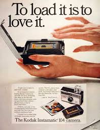 golden age of market supremacy. As for Dean Peterson, he was just warming up. His second-generation insta-cameras, developed at Honeywell in the early ’70’s, incorporated auto-focus, off-the-film metering, auto-advance and built-in electronic flash into the world’s first higher-end point-and-shoots. His later work also included the invention of a 3d film camera for Nimslo, high-speed video units for Kodak, and, just before his death in 2004, early mechanical systems that later contributed to tablet computer design.
Along the way, Peterson made multiple millions for Kodak by amping up the worldwide numbers of amateur photographers, even as he slashed the costs of manufacturing, thereby maximizing the profit in his inventions. As with most forward leaps in photographic development, Dean Peterson’s work eliminated barriers to picture-taking, and when that is accomplished, the number of shooters and the sheer volume of their output rockets ahead the world over. George Eastman’s legendary boast that “you press the button and we do the rest” continues to resonate through our smartphones and iPads, because Dean Peterson, back in 1963, thought, what the heck, it ought to be simpler to load a camera.
SET AND SHOOT
Shooting manually means learning to trust that you can capture what you see. 1/160 sec., f/5.6, ISO 100, 18mm.
By MICHAEL PERKINS
AUTOMODES ON CAMERAS ARE SUPPOSED TO AFFORD THE PHOTOGRAPHER AN ENHANCED SENSE OF COMFORT AND SAFETY, since, you know, you’re protected from your very human errors by the camera’s loving, if soulless, oversight. Guess wrong on a shutter speed? The auto has your back. Blow the aperture? Auto is on the case. And you always get acceptable pictures.
That is, if you can put your brain on automode as well.
Okay, that statement makes the top ten list for most arrogant openings in all of Blogdom, 2014. But I stand by it. I don’t think you should get comfortable with your equipment calling the shots. However, getting comfortable with your equipment’s limits and strengths, and gradually relying on your own experience for consistent results through exploitation of that knowledge….now that’s another thing entirely. It’s the difference between driving cross-country on cruise control and knowing, from years of driving, where in the journey your car can shine, if you drive it intelligently.
Photographers call some hunks of glass their “go-to” lenses, since they know they can always get something solid from them in nearly any situation. And while we all tend to wander around aimlessly for years inside Camera Toyland, picking up this lens, that filter, those extenders, we all, if we shoot enough for a long time, settle back into a basic gear setup that is reliable in fair weather or foul.
This is better than using automodes, because we have chosen the setups and systems that most frequently give us good product, and we have picked up enough wisdom and speed from making thousands of pictures with our favorite gear that we can “set and shoot”, that is, calculate and decide just as quickly as most people do with automodes…..and yet we keep the vital link of human input in the creative chain.
Like most, I have my own “go-to” lens and my own “safe bet” settings. But, just as you save time by not trying to invent the wheel every time you step up, you likewise shouldn’t be averse to greasing an old wheel to make it spin more smoothly.
How about that, I also made the top ten list for unwieldy metaphors.
A good day.
MIDDLEHUES
Surety And Security, 2014. Image made using Nikon’s in-camera “selective color” effect, programmed to highlight blue and gold hues only. Note the bluish undertones that show up in the “white” building.
By MICHAEL PERKINS
I FIND IT AMUSING THAT THERE IS SO MUCH PRISSY FRETTING, in the present photographic age, about the manipulation of images, as if there is, or has ever been, a “pure” photography that comes full-born from the camera like Athena sprang from Zeus’ forehead. This is, of course, nonsense.
There never was a time when photographers simply pressed the button and settled for whatever dropped into their laps by chance. The history of the medium is a clearly traceable timeline of the very interpretive technique and, yes, manipulation that tracks, like this blog, the journey from taking a picture to making one.
It’s not what you apply to an image, it’s whether the application is the entire point of the picture. Does your conception have solid, original value, over which you then impose a supplementary effect or a boost in emphasis? Or are you merely popping apps and pushing buttons in order to disguise the lack of essence in picture, to whitewash a rotten fence if you will?
The original full-color image.
The reason I raise all this again is that an in-camera effect usually called “selective color”, now available on many DSLRs, has reminded me of the first days of color photography, which of course was no color at all, except that which was applied through tinting and painting after a monochrome image had been made. Depending on the individual artisan, the hues in these pictures tended to be either a soft wash of faint pastel or a raging rouge of rosy reds, but, most frequently, only selected parts of the image were colored at all, perhaps an attempt to dramatize particular elements of the composition. It was anything but natural, but, in advance of the development of actual color film, it produced some interesting results.
Jump to today’s cameras and the selective color option. You shoot your original image, select it, then zoom in on parts of it to both locate and choose up to three colors that will be featured in a copy of the image. All other tones will be desaturated, leaving you with a part monochrome, part color version of your original, which remains unchanged in a separate file. The effect, as in the past, can dramatize and isolate key parts of your picture, even giving a strange dimensional feel to the photo, but it can take some practice to get the result that you want.
For example, selecting the red of a single car on a crowded street will also catch the same red in other cars’ tail lights, the corner traffic signal, and a neon sign in a building at the end of the block, so be sure you can live with all of that. Also, in some seemingly “white” buildings, shadows or reflected light (as well as aging impurities in some materials) will show some faint shades of color in this process, so that the blue that you said okay to for the corner mailbox will also pick up slight bluish casts in the marble of the bank next door. In the above image, I also made a second, darker copy of the altered image, then blended the two copies in a tone compressing program, to further accentuate the building textures and contrasts.
Bottom line: there is black and white, there is full color, and there is the uber-cool playland in what you could call the middlehues. It’s not cheating to enhance a good picture. It’s only cheating when you use effects to mask the fact that you didn’t take the picture right in the first place.
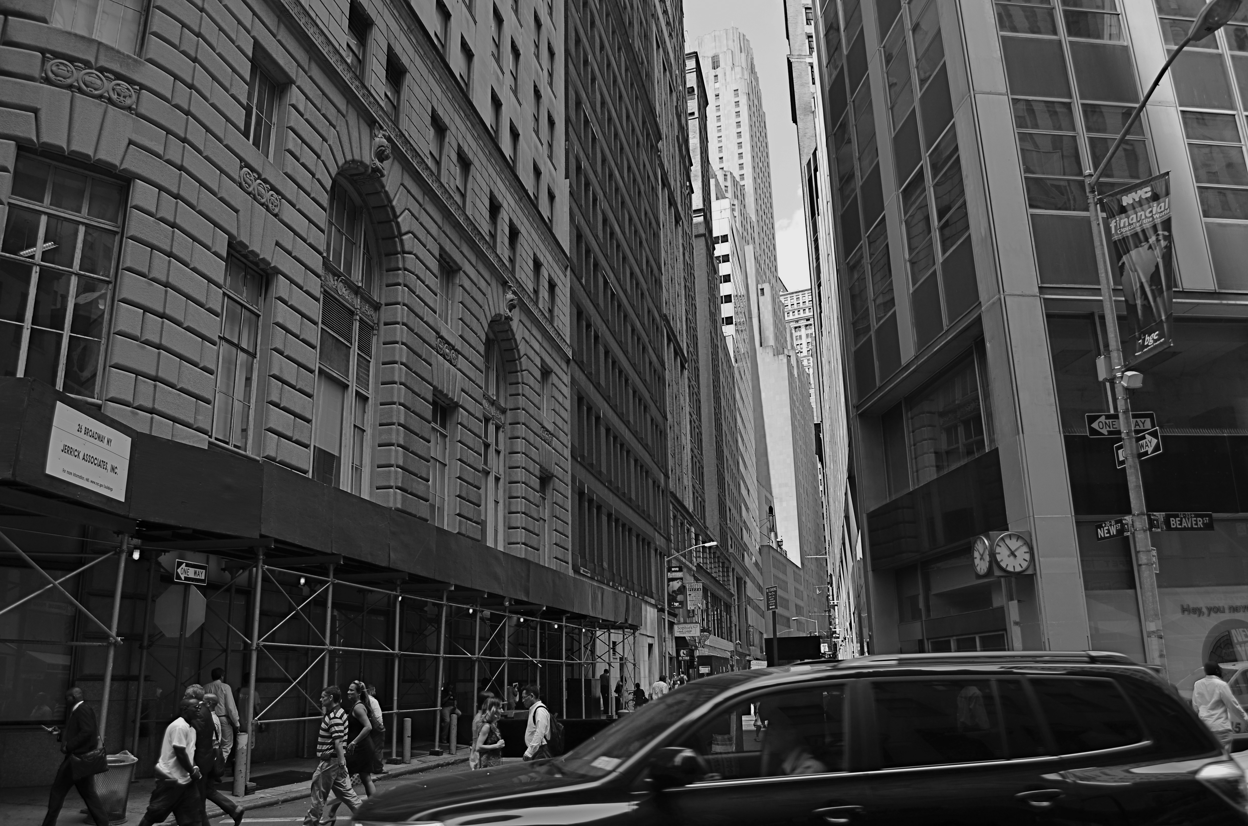
ON THE STRAIGHT AND NARROW
New & Beaver, 2014. 1/200 sec., f/5.6, ISO 100, 18mm.
By MICHAEL PERKINS
THE NARROW STREETS OF LOWER MANHATTAN WERE NEVER DESIGNED TO ACCOMMODATE the claustrophobic jam of commerce, foot traffic and skyscrapers that have characterized the neighborhood since the early 20th century. I should back that up and acknowledge that, for some locals, the streets of lower Manhattan were never designed,period. New York’s growth has always come in rangy spurts and jolts, much like a gangly adolescent that shoots upward and outward overnight without any apparent plan, and yet, those unruly explosions are also what delight the photographer’s eye and make the city an inexhaustible laboratory for technique.
Shooting down the slits that pass for side streets and alleys in lower Manhattan is enough to make even the most seasoned native feel like he or she is being shut up in a tomb, but I am drawn to going even further, and over-emphasizing the extreme dimensions peculiar to the area. That, for me, means shooting with as wide a lens as I have handy, distortion be damned. Actually, it’s distortion be welcomed, since I think that the horizontal lines of the buildings create a much more dramatic lead-in for the eye as they race far away from the foreground. And since ultra-wide magnify front-to-back distances, the bigness and closeness of the city is jacked into a real exaggeration, but one that serves my purpose.
It helps to crouch down and tilt up when composing the shot, and to make sure that you don’t crop passersby out of the shot, since they will add to the drama even more as indications of scale. I have certainly gone too far more than once and rendered rectangular buildings into futuristic trapezoids, but the aim of each image will dictate what you’re going for. Also, in many of these shots, I decide, after much dithering, to choose monochrome over color, but I always shoot the originals in color, since they respond better to re-contrasting once they’re desaturated.
The magic about Manhattan is that no camera can ever tame her or show all her beauty and/or ugliness. It’s somthing of a fool’s errand to try to take the picture of NYC. Better to take a picture you like and add it to the ongoing story.
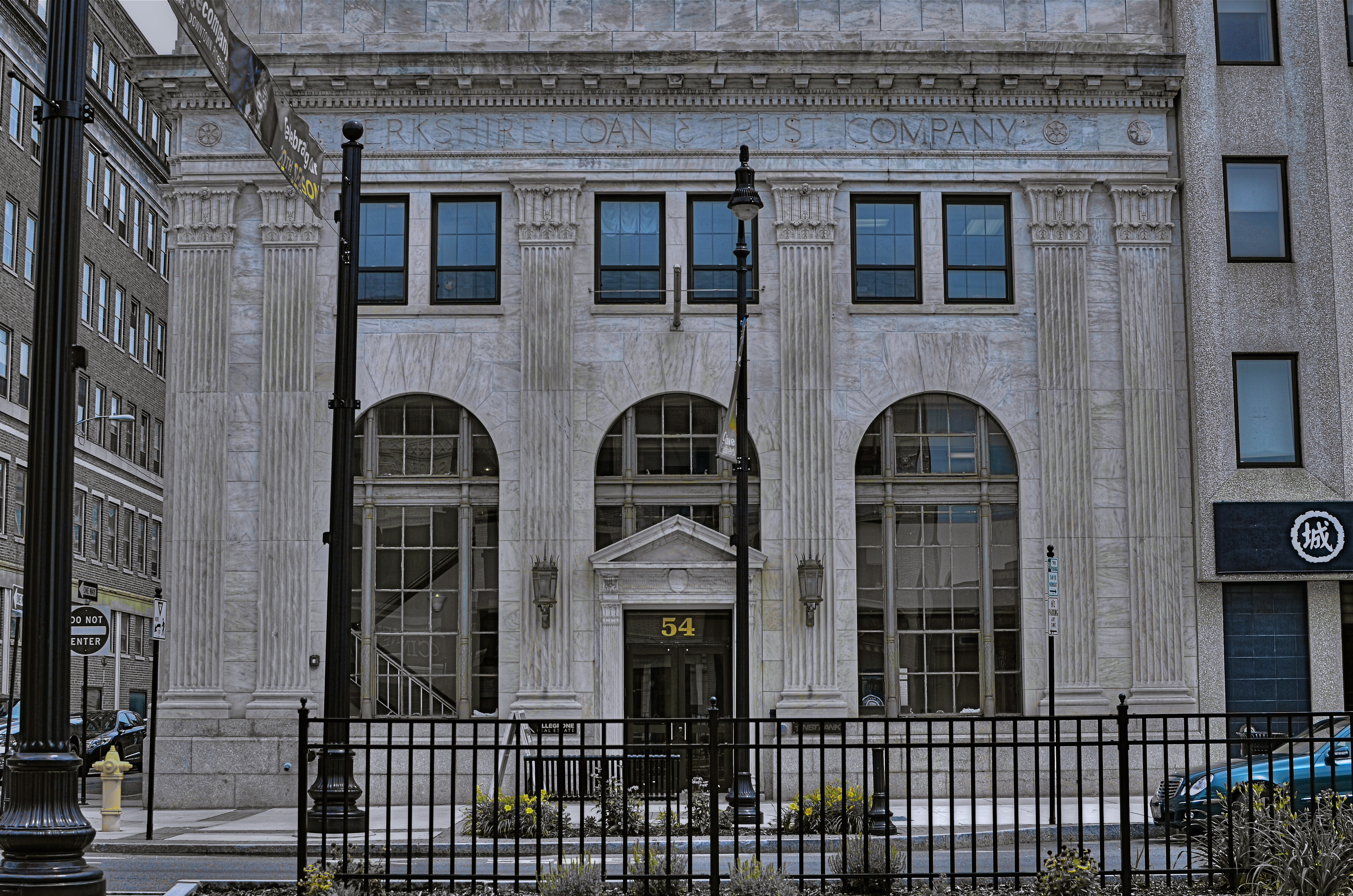
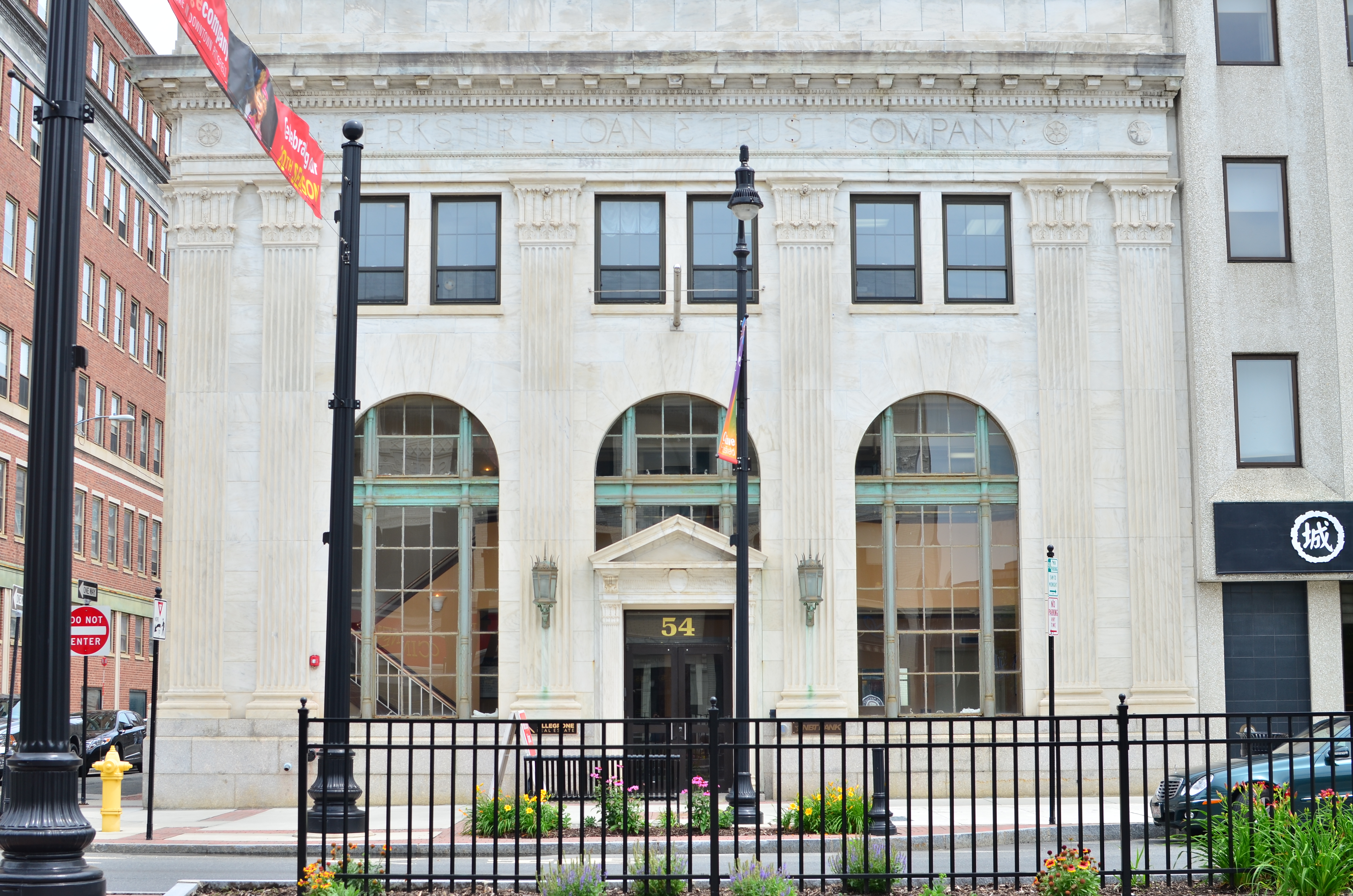
THE AGE OF ELEGANCE
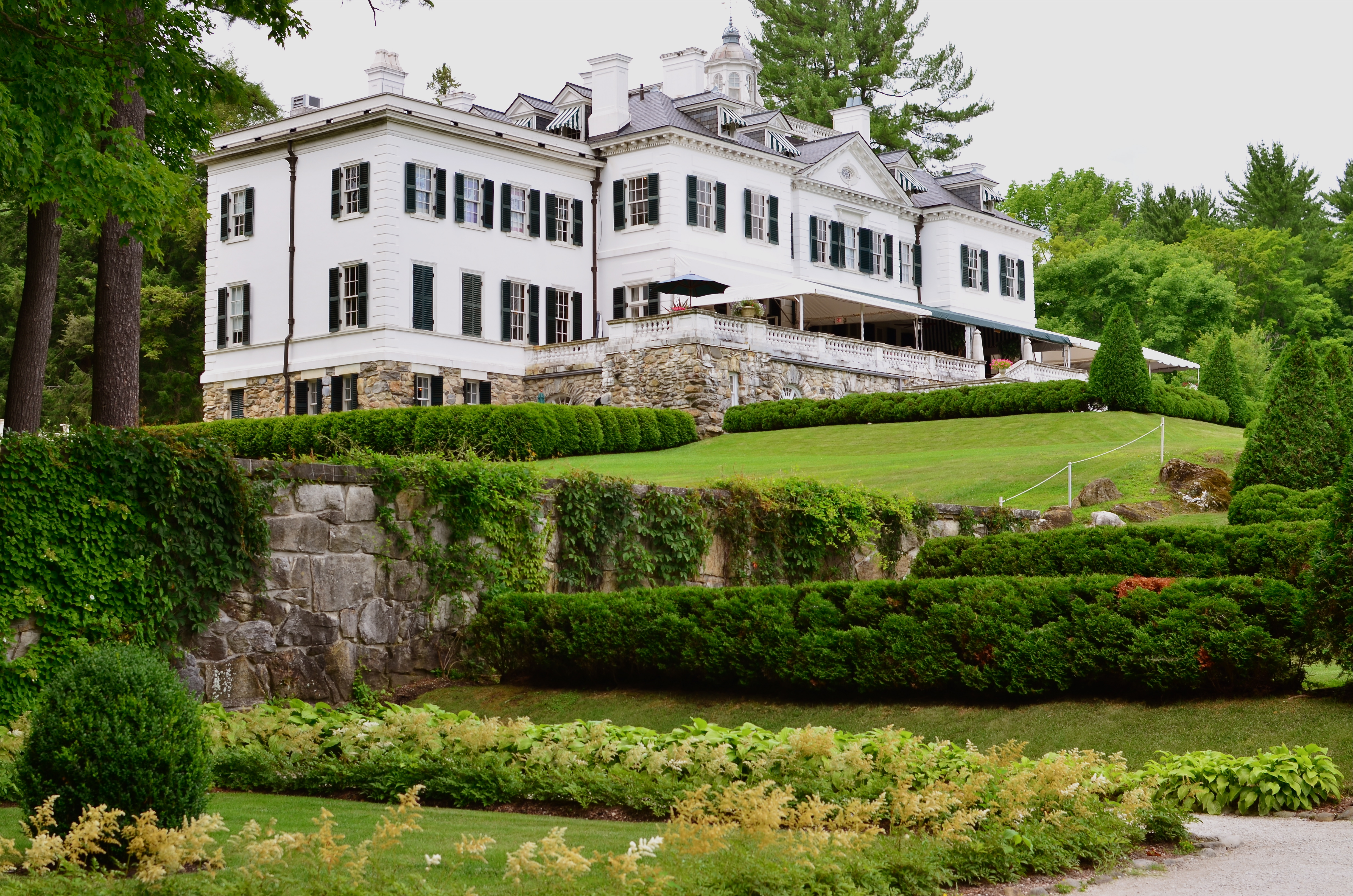
The Mount, Edith Wharton’s Berskshire Estate, now a working museum.
If only we’d stop trying to be happy, we could have a pretty good time.——Edith Wharton
By MICHAEL PERKINS
LONG BEFORE HER NOVELS THE AGE OF INNOCENCE, ETHAN FROME, AND THE HOUSE OF MIRTH made her the most successful writer in America, Edith Wharton (1862-1937) was the nation’s first style consultant, a Victorian Martha Stewart if you will. Her 1897 book, The Decoration Of Houses, was more than a few dainty gardening and housekeeping tips; it was a philosophy for living within space, a kind of bible for combining architecture and aesthetics. Her ideas survive in tangible form today, midst the leafy hills of Lenox Massachusetts, in the Berkshire estate her family knew as “The Mount”.

A world apart.
Wharton only occupied the house from 1902 to 1911, but in that time established it as an elegant salon for guests that included Henry James and other literary luminaries. Although based on several classical styles, the house is a subtle and sleek counter to the cluttered bric-a-brac and scrolled busyness of European design. Even today, the house seems oddly modern, lighter somehow than many of the robber-baron mansions of the period. Many of its original furnishings went with Wharton when she moved to Europe, and have been replicated by restorers, often beautifully. But is in the essential framing and fixtures of the old house that the writer-artist speaks, and that is what led me to do something fairly rare for me, a photo essay, seen at the top of this page in the menu tab Edith Wharton At The Mount.
The images on this special page don’t feature modern signage, tour groups, or contemporary conveniences, as I attempt to present just the basic core of the estate, minus the unavoidable concessions to time. The house features, at present, an appealing terrace cafe, a sunlit gift store, and a restored main kitchen, as part of the conversion of the mansion into a working museum. I made no images of those updates, since they cannot conjure 1902 anymore than a Mazerati can capture the feel of a Stutz-Bearcat. The pictures are made with available light only, and have not been manipulated in any way, with the exception of the final shot of the home as seen from its rear gardens, which is a three-exposure HDR, my attempt to rescue the detail of the grounds on a heavily overcast day.
Take a moment to click the page and enter, if only for a moment, Edith Wharton’s age of elegance.
THE JOURNEY OF BECOMING
By MICHAEL PERKINS
ONCE MAN LEARNED TO SLICE A PATH THROUGH THE DARK WITH ANY KIND OF LIGHT, a romance with mystery began that photographers carry ever forward. Darkness and light can never be absolute, but duel with each other in a million interim stages at night, one never quite yielding to each other. A flickering lamp, a blazing torch, ten thousand LEDs, a lonely match, all shape the darkness and add the power of interpretation to the shaded side of the day. Photographers can only rejoice at the possibilities.
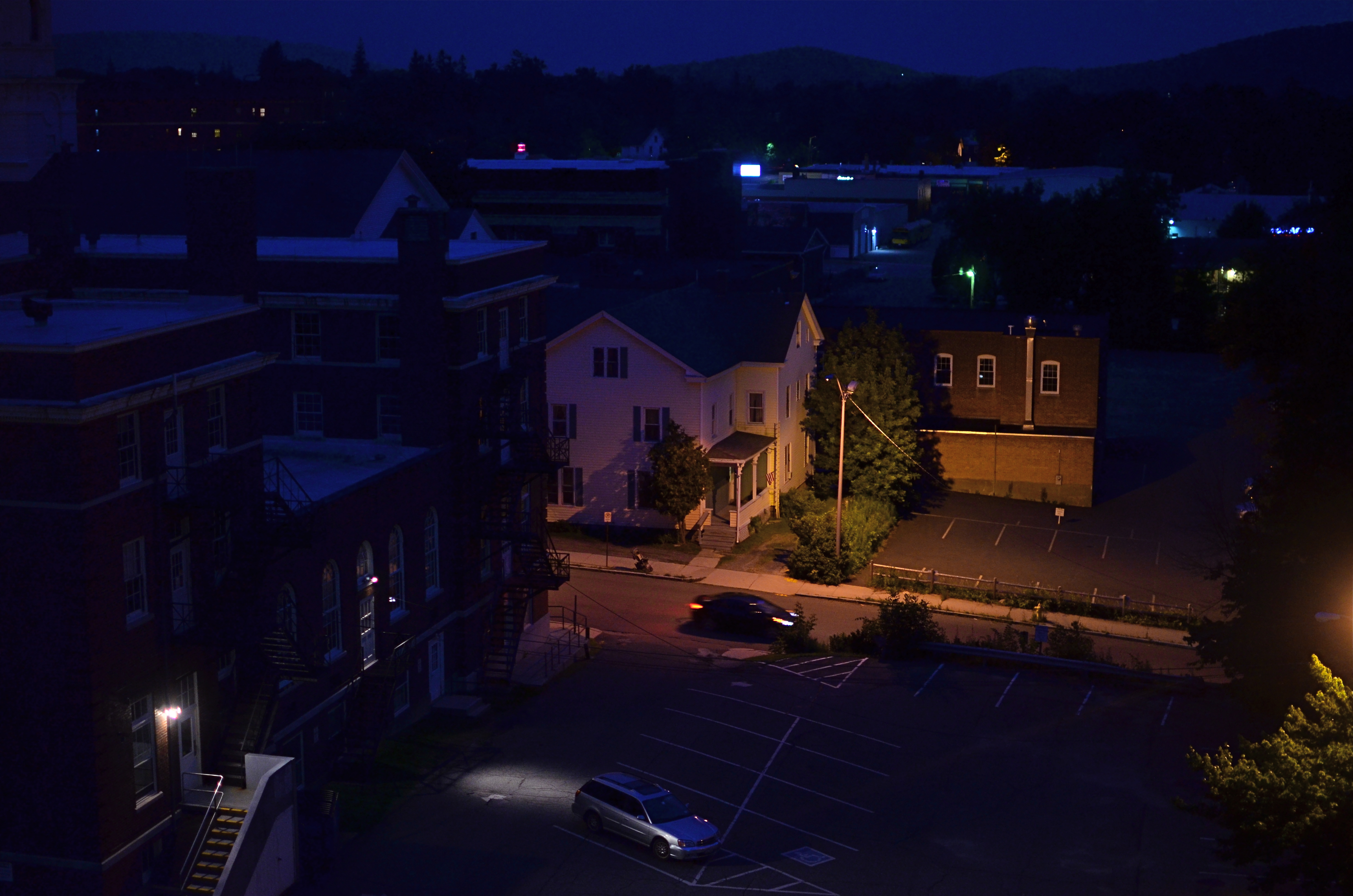
The Late Errand, 2014. 1/40 sec., f/1.8, ISO 640, 35mm.
Spending a recent week in a vacation hotel, I fell into my typical habit of taking shots out the window under every kind of light, since, you know, you only think you understand what a view has to offer until you twist and turn it through variation. You’ve never beheld this scene before, so it’s just too easy to take an impression of it at random, leaving behind all other possibilities. The scene from this particular room, a mix of industrial and residential streets in central Pittsfield, Massachusetts, permits the viewer to see the town in the context of the Berkshire mountains, in which it nestles. Daylight, particularly early morning, renders the town as a charming, warm slice of Americana, not inappropriate in a village that is just a few miles away from the studio of painter Norman Rockwell. However, for me, the area whispered something else entirely after nightfall.
I can only judge the above frame by the combination of light and dark that I saw as I snapped it. Is it significant that the house is largely aglow while the municipal building in front of it is submerged in shadow? Is there anything in the way of mood or story that is conveyed by the lit stairs in the foreground, or the headlamps of the moving or parked cars? If the passing driver is subtracted from the frame, does the feel of the image change completely? Does the subtle outline of the mountains at the horizon lend a particular context?
That’s the point: the picture, any picture of these particular elements can only raise, not answer, questions. Only the viewer can supply the back end of the mystery raised by how it was framed or shot. Some things in the frame are on a journey of becoming, but art is not about supplying solutions, just keeping the conversation going. We’re all on our way somewhere. The camera can only ask, “what happens when we turn down this road?.”
That’s enough.
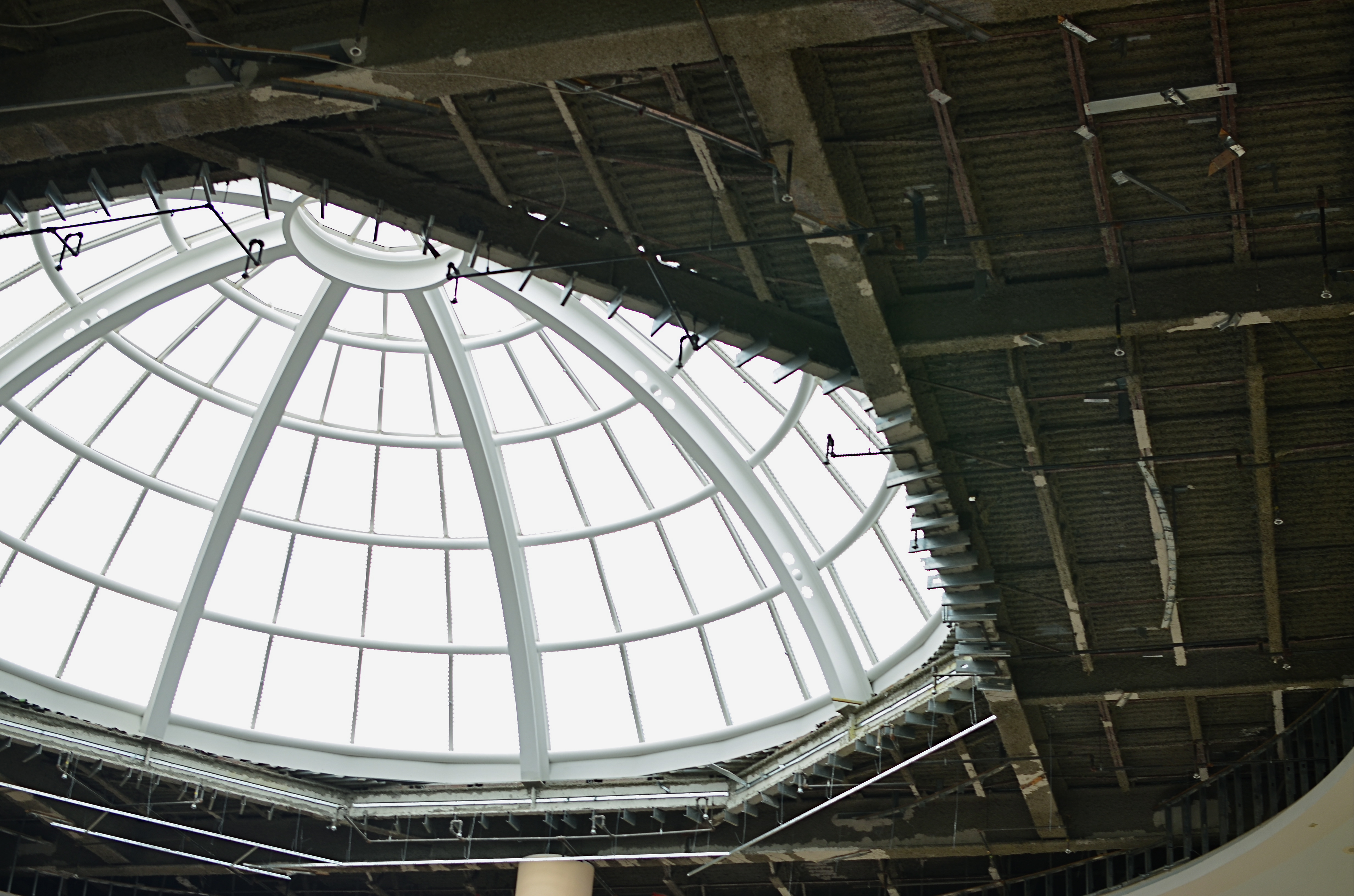
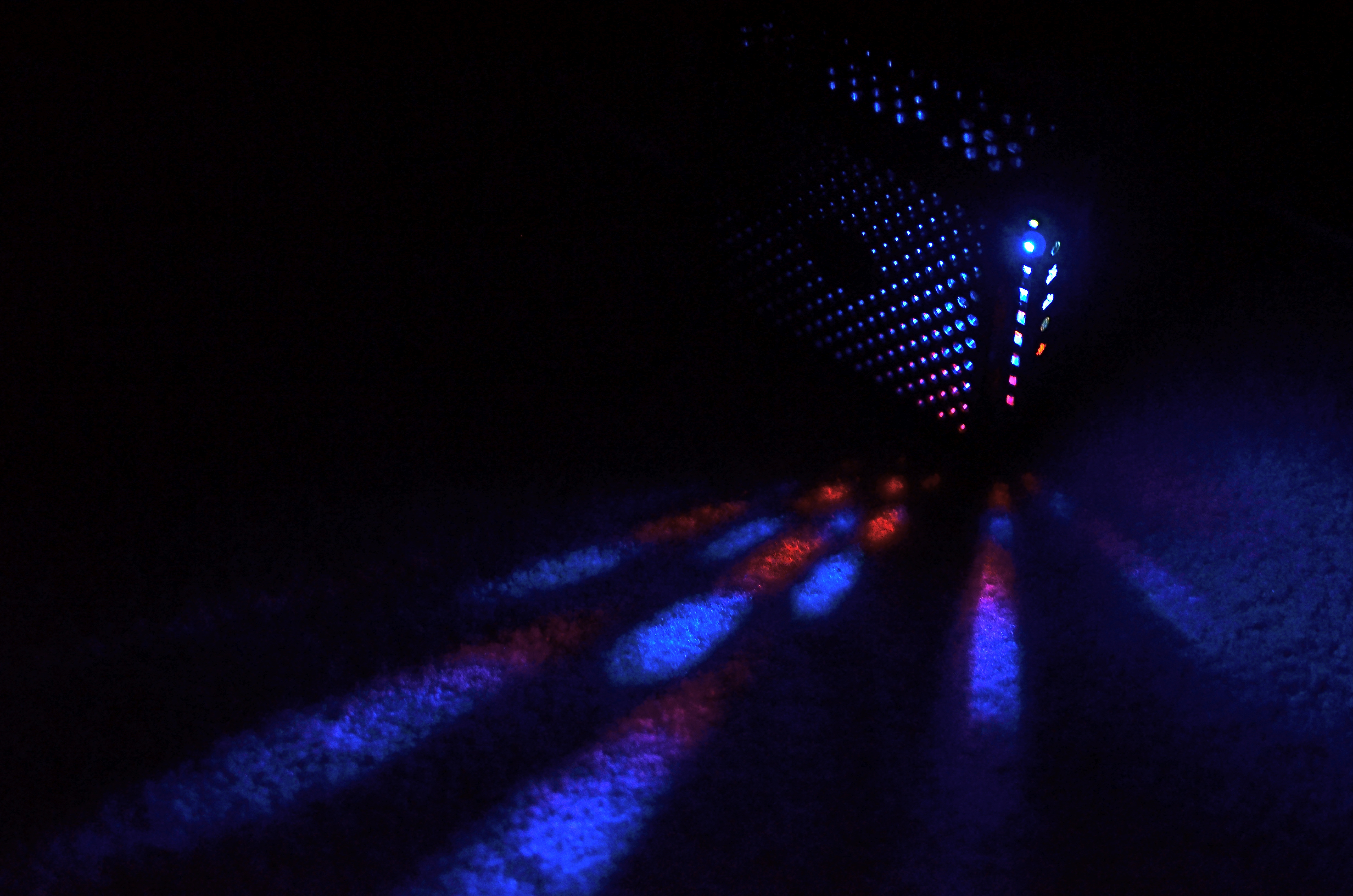
TAKING FLIGHT ONCE MORE
The Aerodrome, 2014. 1/30 sec., f/3.5, ISO 100, 35mm.
By MICHAEL PERKINS
ONE OF THE CHARGES GIVEN TO ALL PHOTOGRAPHERS IS TO MARK THE PASSAGE OF TIME, to chronicle and record, to give testimony to a rapidly vanishing world. Certainly interpretation, fantasy, and other original conceptions are equally important for shooters, but there has been a kind of unspoken responsibility to use the camera to bear witness. This is especially difficult in a world bent on obliterating memory, of dismantling the very sites of history.
Humorist and historian Bill Bryson’s wonderful book, One Summer: America 1927 frames the amazing news stories of its title year around its most singular event, the solo transatlantic flight of Charles A. Lindbergh. A sad coda to the story reveals that nothing whatever remains of Roosevelt Field, the grassy stretch on Long Island from which the Lone Eagle launched himself into immortality, with the exception of a small plaque mounted on the back of an escalator in the mall that bears the field’s name. Last week, hauled along on a shopping trip to the mall with relatives, I made my sad pilgrimage to said plaque, lamenting, as Bryson did, that there is nothing more to photograph of the place where the world changed forever.
Then I got a little gift.
The mall is under extensive renovation as I write this, and much of the first floor ceiling has been stripped back to support beams, electrical systems and structural gridwork. Framed against the bright bargains in the mall shops below, it’s rather ugly, but, seen as a whimsical link to the Air Age, it gave me an idea. All wings of the Roosevelt Field mall feature enormous skylights, and several of them occur smack in the middle of some of the construction areas. Composing a frame with just these two elements, a dark, industrial space and a light, airy radiance, I could almost suggest the inside of a futuristic aerodrome or hangar, a place of bustling energy sweeping up to an exhilarating launch hatch. To get enough detail in this extremely contrasty pairing, and yet not add noise to the darker passages, I stayed at ISO 100, but slowed to 1/30 sec. and a shutter setting of f/3.5. I still had a near-blowout of the skylight, saving just the grid structure, but I was really losing no useful detail I needed beyond blue sky. Easy choice.
Thus, Roosevelt Field, for me, had taken wing again, if only for a moment, in a visual mash-up of Lindbergh, Flash Gordon, Han Solo, and maybe even The Rocketeer. In aviation, the dream’s always been the thing anyway.
And maybe that’s what photography is really for…trapping dreams in a box.
A BIG BOX OF LONELY
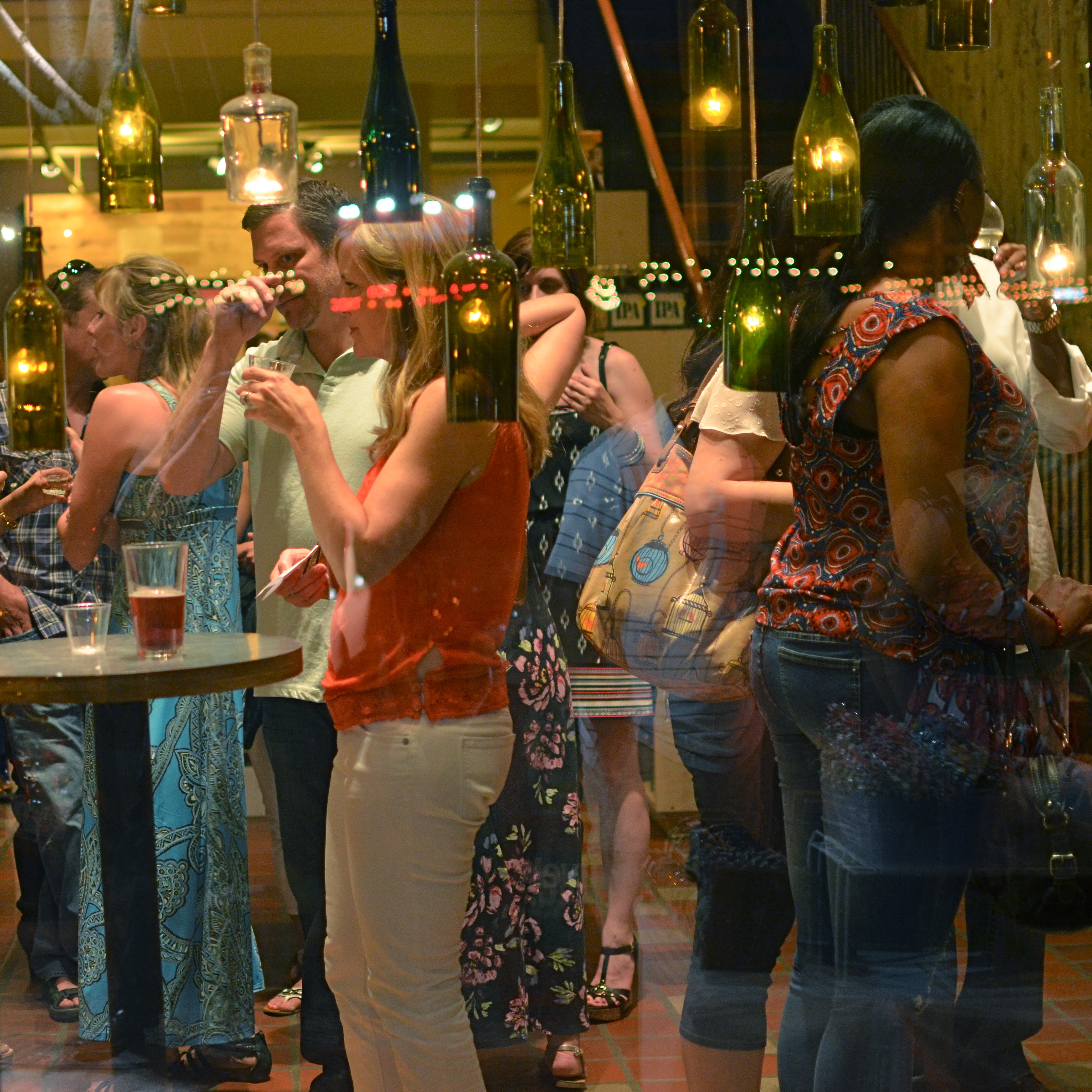
Think inside the box. 1/80 sec., f/2.2, ISO 800, 35mm.
By MICHAEL PERKINS
PHOTOGRAPHY CAN GO TWO WAYS ON CONTEXT. It can either seek out surroundings which comment organically on subjects (a lone customer at a largely empty bar, for example) or it can, through composition or editing, artificially create that context (five people in an elevator becomes just two of those people, their locked hands taking up the entire frame). Sometimes, images aren’t about what we see but what we can make someone else seem to see.
Creating your own context isn’t really “cheating” (are we really still using that word?), because you’re not creating a new fact in the photograph, so much as you are slapping a big neon arrow onto said fact and saying, “hey look over here.” Of course, re-contextualizing a shot can lead to deliberate mis-representation of reality in the wrong hands (see propaganda, use of), but, assuming we’re re-directing a viewer’s attention for purely aesthetic reasons (using our powers for good), it can make a single photo speak in vastly different ways depending on where you snip or pare.
In the above situation, I was shooting through the storefront window of a combined art studio and wine bar (yes, I hang with those kind of people), and, given that the neighborhood I was in regularly packed folks in on “gallery hop” nights, the place was pretty jammed. The original full frame showed everything you see here, but also the connecting corridor between the studio and the wine bar which was, although still crowded, a lot less claustrophobic than this edited frame suggests.
And that’s really the point. Urban “hangs” that are so over-attended can give me the feeling of being jammed into a phone booth, like I’m part of some kind of desperately lonely lemming family reunion, so I decided to make that crushed sensation the context of the picture. Cropping down to a square frame improved the balance of the photograph but it also made these people look a little trapped, although oddly indifferent to their condition. The street reflections from the front plane of glass also add to the “boxed in” sensation. It’s a quick way to transform a snap into some kind of commentary, and you can either accept my choice or pass it by. That’s why doing this is fun.
Urban life presents a challenging series of social arrangements, and context in photographs can force a conversation on how that affects us.
ELEMENTARY, MY DEAR NIKON
Let the light decide what makes a photograph. Modem, 2014. 1/30 sec., f/1.8, ISO 800, 35mm.
By MICHAEL PERKINS
PHOTOGRAPHY IS OFTEN DEFINED CLASSICALLY AS “WRITING WITH LIGHT“, but I often wonder if a better definition might be “capitalizing on light opportunities”, since it’s not really what subject matter we shoot but light’s role in shaping it that makes for strong images. We have all seen humble objects transformed, even rendered iconic, based on how a shooter perceives the value of light, then shapes it to his ends. That’s why even simple patterns that consist of little more than light itself can sometimes be enough for a solid photograph.
If you track the history of our art from, say, from the American Civil War through today’s digital domain, you really see a progression from recording to interpreting. If the first generally distributed photographs seen by a mass audience involve, say, the aftermath of Antietam or Gettysburg, and recent images are often composed of simple shapes, then the progression is very easy to track. The essence is this: we began with photography as technology, the answer to a scientific conundrum. How do we stop and fix time in a physical storage device? Once that very basic aim was achieved, photographers went from trying to just get some image (hey, it worked!) to having a greater say in what kind of image they wanted. It was at this point that photography took on the same creative freedom as painting. Brushes, cameras, it doesn’t matter. They are just mediums through which the imagination is channeled.
In interpreting patterns of elementary shapes which appeal on their own merit, photographers are released from the stricture of having to endlessly search for “something to shoot”. Some days there is no magnificent sunrise or eloquent tree readily at hand, but there is always light and its power to refract, scatter, and recombine for effect. It’s often said that photography forced painting into abstraction because it didn’t want to compete with the technically perfect way that the camera could record the world. However, photography also evolved beyond the point where just rendering reality was enough. We moved from being reporters to commentators, if you like. Making that journey in your own work (and at your own pace) is one of the most important step an art, or an artist, can take.
