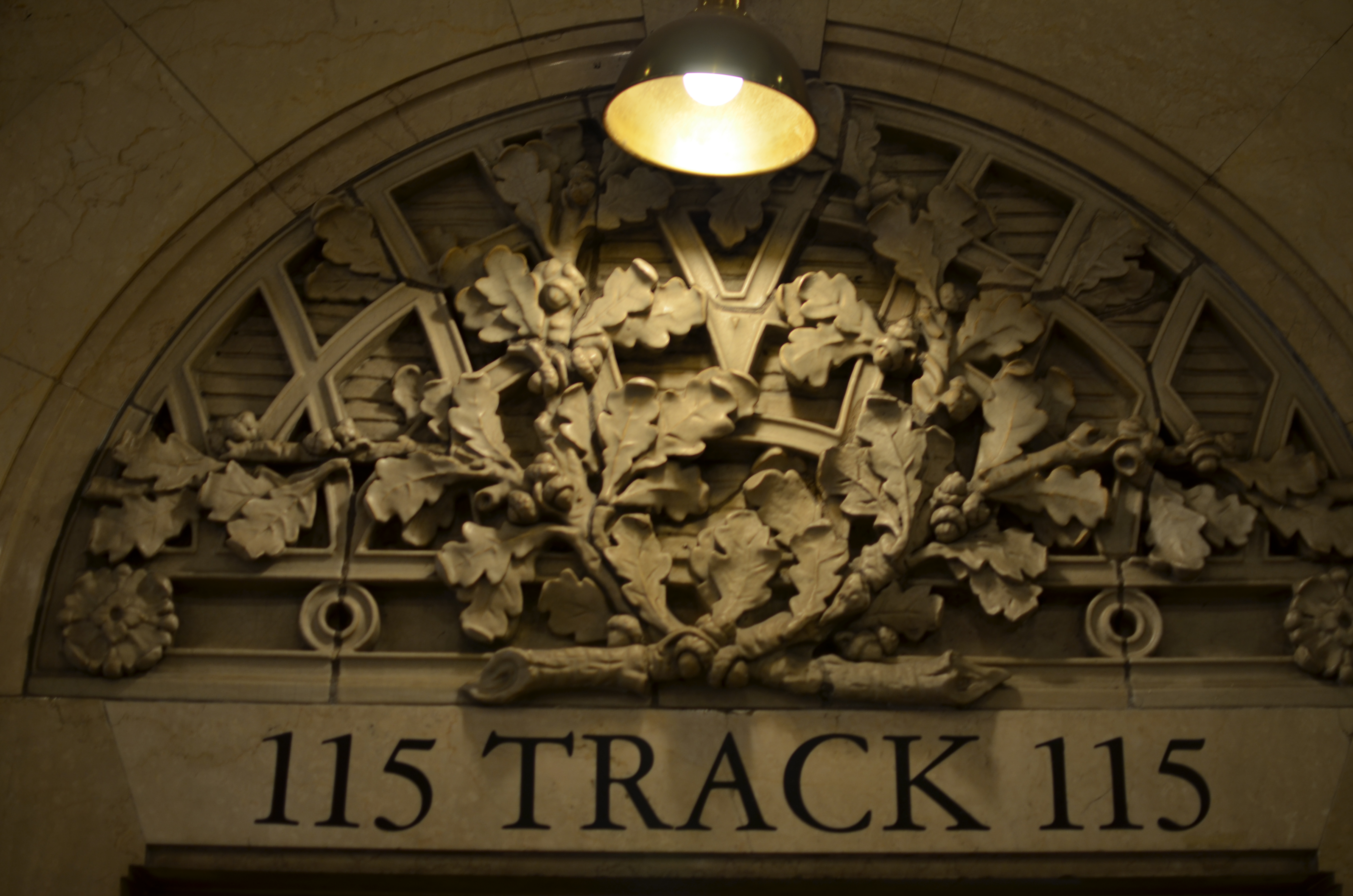
TAKING FLIGHT ONCE MORE
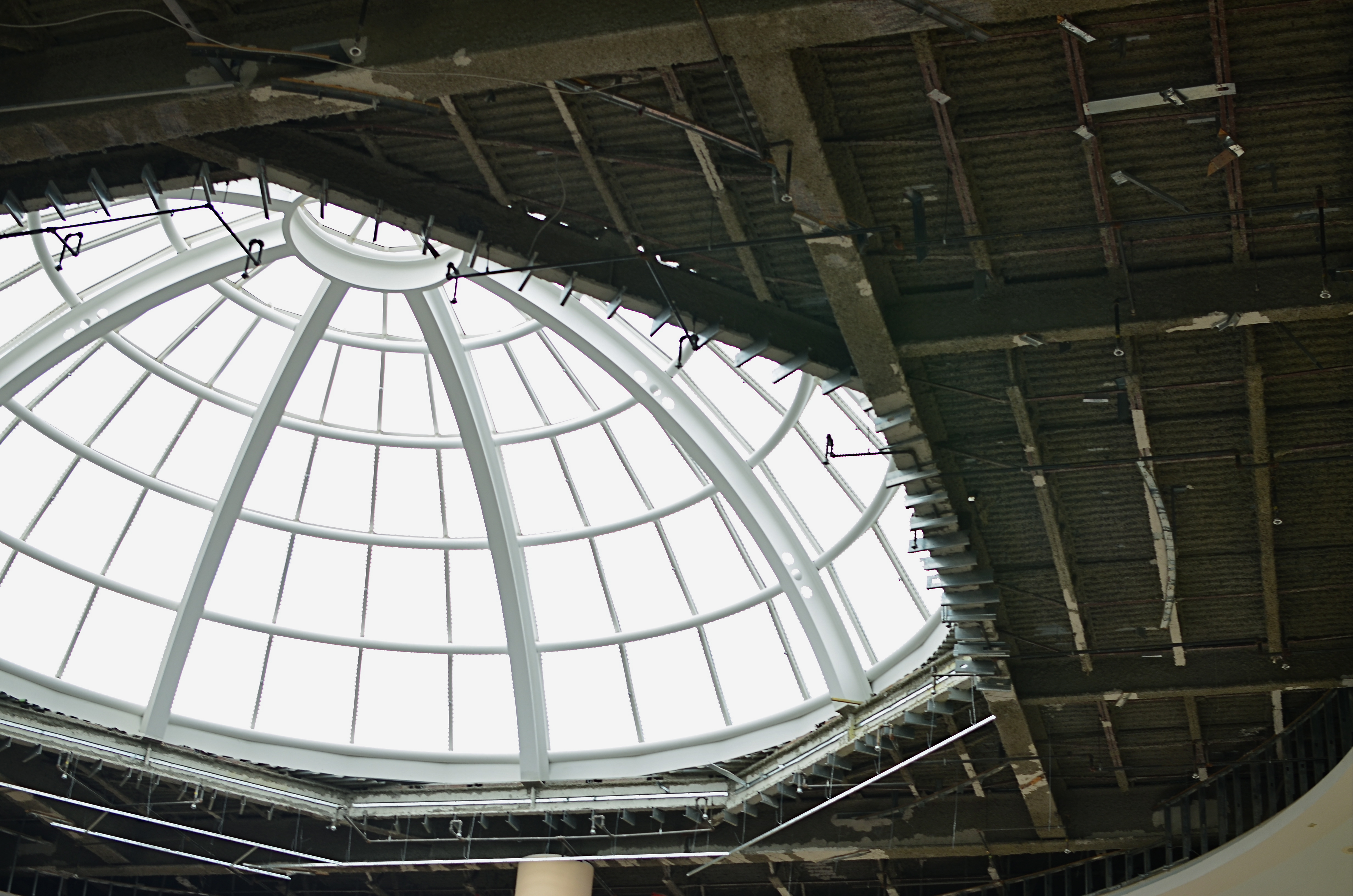
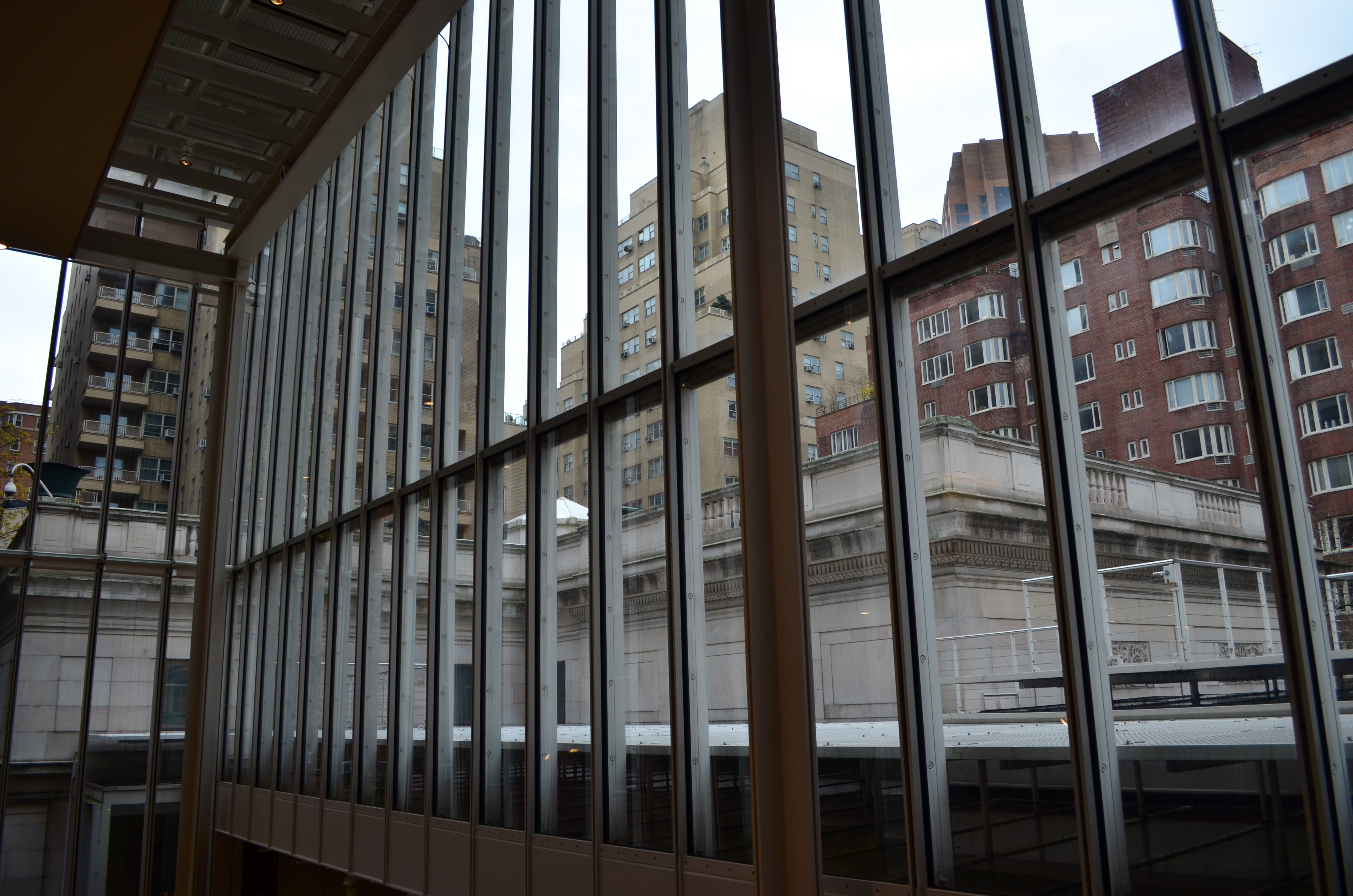
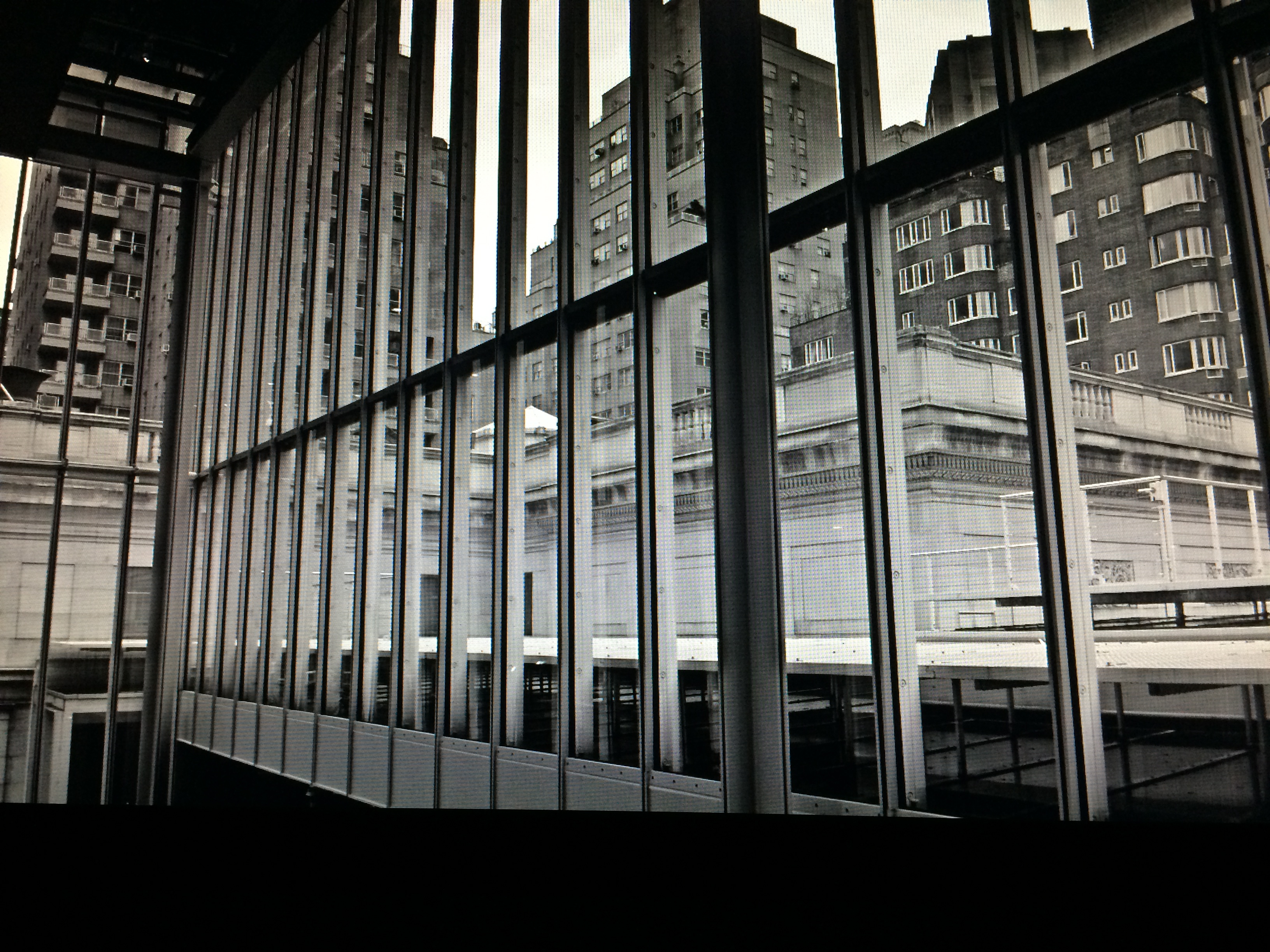
The Aerodrome, 2014. 1/30 sec., f/3.5, ISO 100, 35mm.
By MICHAEL PERKINS
ONE OF THE CHARGES GIVEN TO ALL PHOTOGRAPHERS IS TO MARK THE PASSAGE OF TIME, to chronicle and record, to give testimony to a rapidly vanishing world. Certainly interpretation, fantasy, and other original conceptions are equally important for shooters, but there has been a kind of unspoken responsibility to use the camera to bear witness. This is especially difficult in a world bent on obliterating memory, of dismantling the very sites of history.
Humorist and historian Bill Bryson’s wonderful book, One Summer: America 1927 frames the amazing news stories of its title year around its most singular event, the solo transatlantic flight of Charles A. Lindbergh. A sad coda to the story reveals that nothing whatever remains of Roosevelt Field, the grassy stretch on Long Island from which the Lone Eagle launched himself into immortality, with the exception of a small plaque mounted on the back of an escalator in the mall that bears the field’s name. Last week, hauled along on a shopping trip to the mall with relatives, I made my sad pilgrimage to said plaque, lamenting, as Bryson did, that there is nothing more to photograph of the place where the world changed forever.
Then I got a little gift.
The mall is under extensive renovation as I write this, and much of the first floor ceiling has been stripped back to support beams, electrical systems and structural gridwork. Framed against the bright bargains in the mall shops below, it’s rather ugly, but, seen as a whimsical link to the Air Age, it gave me an idea. All wings of the Roosevelt Field mall feature enormous skylights, and several of them occur smack in the middle of some of the construction areas. Composing a frame with just these two elements, a dark, industrial space and a light, airy radiance, I could almost suggest the inside of a futuristic aerodrome or hangar, a place of bustling energy sweeping up to an exhilarating launch hatch. To get enough detail in this extremely contrasty pairing, and yet not add noise to the darker passages, I stayed at ISO 100, but slowed to 1/30 sec. and a shutter setting of f/3.5. I still had a near-blowout of the skylight, saving just the grid structure, but I was really losing no useful detail I needed beyond blue sky. Easy choice.
Thus, Roosevelt Field, for me, had taken wing again, if only for a moment, in a visual mash-up of Lindbergh, Flash Gordon, Han Solo, and maybe even The Rocketeer. In aviation, the dream’s always been the thing anyway.
And maybe that’s what photography is really for…trapping dreams in a box.
7/4/14: A MORE PERFECT UNION
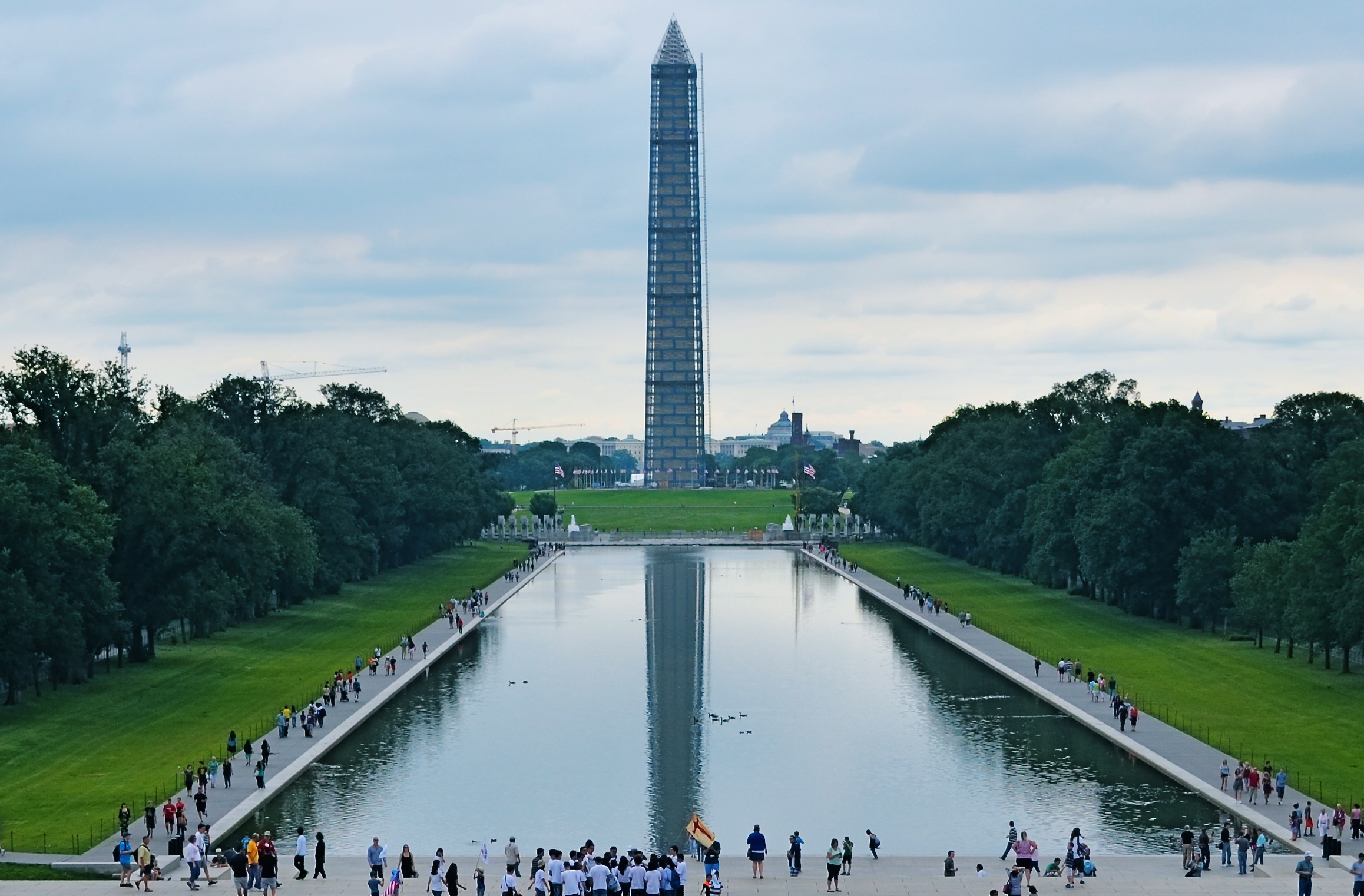
Washington Memorial, 2013. 1/400 sec., f/5.6, ISO 100, 28mm.
By MICHAEL PERKINS
MY FATHER CAN TESTIFY TO MY NATIVE, AND LIFELONG IMPATIENCE. While most kids learned to be told how to “mind”, I had to be taught how to wait. “It’s a process”, he would remark when I fumed about how long something I wanted was taking to come about, “not a product”. I willingly admit that he is much more Zen than I can ever be, infinitely better at the wait-and-see thing. I have developed a little long vision in my later years, but I am still like a lab rat. I keep punching the bar, ’cause I want that bloody biscuit now.
Oddly, photography has taught me a few things about waiting, as has my native optimism about the country of my birth. The Fourth of July is not, however, a day typically spent in quiet contemplation, but in exuberant celebration of how unique our story is in the history of the world. But, for me, Independence Day is for taking measure, walking off the distance on the chain that stretches between What We’ve Done and What We Have Yet To Do. In America, we’re always 3rd and 4, looking for the next first down. We are never, and can never, be finished.
I think I prefer the above image of the Washington Monument, which I took last year during its restoration, to an image of the obelisk without its temporary scaffolding, and it’s because it reminds me that freedom is always being refined, reworked, re-earned. The race goes ever on. Similarly, I love photos of the U.S. Capitol during its construction phase far more than shots of the finished product. The building’s dome teetered between being-ness and nothing-ness all through the Civil War, a visually indelible barometer of the changing fortunes of Washington itself as the battle raged on, often just outside the city limits. Seeing the Washington Monument sheathed in wood carries the same visual weight for me. It’s like we haven’t quite taken it out of the packing crate. There’s a temporary, even endangered quality to the building that should stay with us, at least a little, as we go on with our labors.
America is beautiful. But along the way, the old girl benefits from a nip here and a tuck there. We show we care when we keep trying to make her flawless. When we do that, all the penny fireworks in the world can’t compete with the glow, a torch bright enough to light the world.
It’s a process…not a product.
INS AND OUTS
By MICHAEL PERKINS
WHEN IT COMES TO DISCUSSIONS ABOUT ART, THE WORD “ABSTRACT” IS PROBABLY THE MOST BATTED-ABOUT LINGUISTIC SHUTTLECOCK OF THE 20TH CENTURY, something we lob at each other across the conversational net as it suits our mood. Whenever we feel we should weigh in on a matter of artistic heft, especially something that doesn’t fit into a conveniently familiar cubbyhole, we drag “abstract” out of the desk drawer, dust it off, and cram it into place somewhere in the argument.
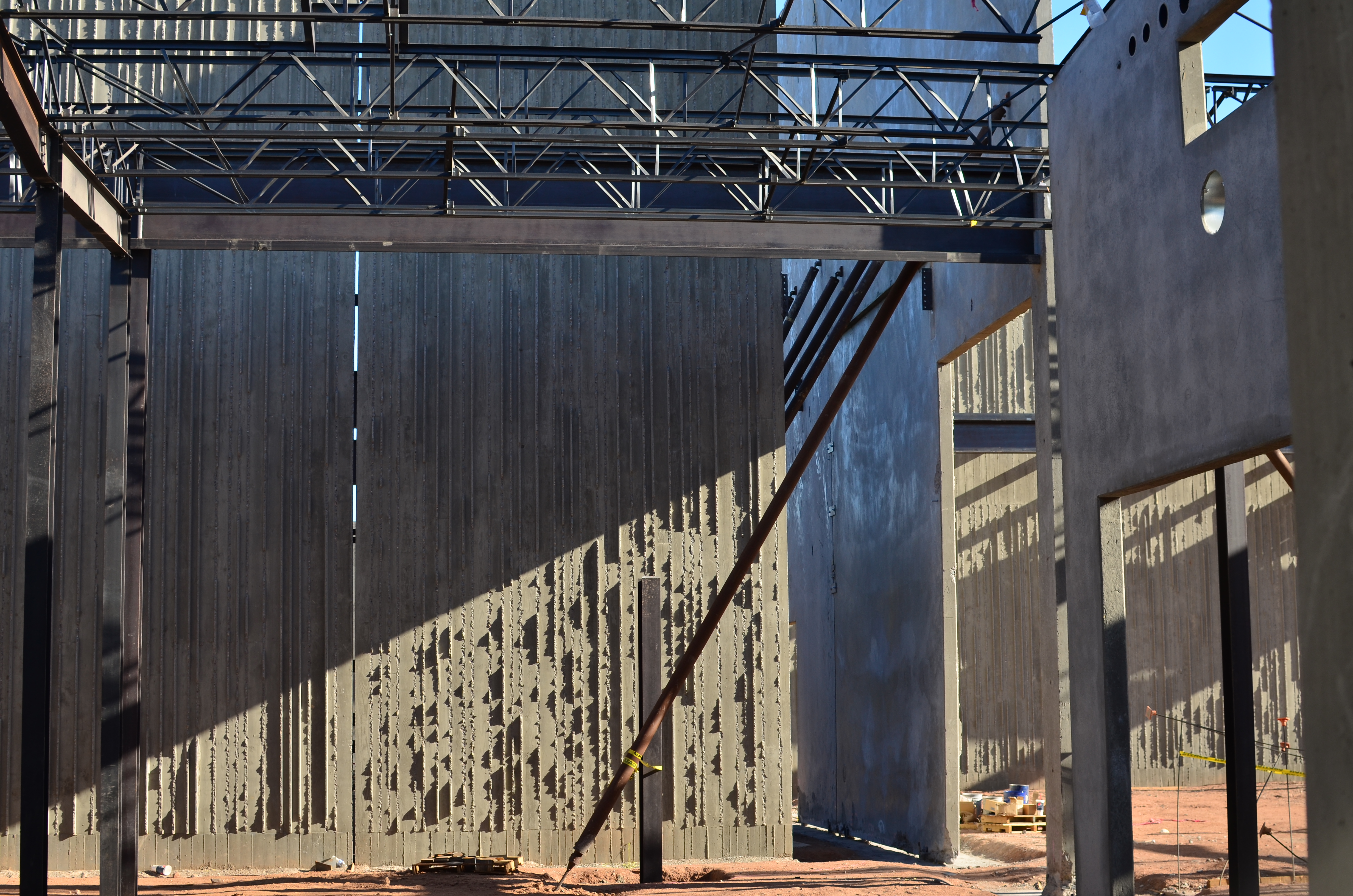
Frames within frames within frames: 1/125 sec., f/5.6, ISO 100, 35mm.
Any talk of architecture, and the photographer’s reaction to it, attracts a lot of stray “abstracts”, since attaching the word seems to settle… something. However, art can never be about settling anything. In fact, it’s about churning things up, starting, rather than resolving, arguments. As pieces of pure design, finished buildings do make a statement of sorts about the architect’s view, at least. But when trolling about town, I am more drawn to incomplete or skeletal frameworks for buildings yet to be. They are simply open to greater interpretation as visual subject matter, since we haven’t, if you like, seen all the architect’s cards yet. The emerging project can, for a time, be anything, depending literally on where you stand or how light shapes the competing angles and contours.
I feel that open or unfinished spaces are really ripe with an infinite number of framings, since a single uncompleted wall gives way so openly to all the other planes and surfaces in the design, a visual diagram that will soon be closed up, sealed off, sequestered from view. And as for the light, there is no place it cannot go, so you can chase the tracking of shadows all day long, as is possible with, say, the Grand Canyon, giving the same composition drastically different flavors in just the space of a few hours.
If the word “abstract” has any meaning at all at this late date, you could say that it speaks to a variation, a reworking of the dimensions of what we consider reality. Beyond that, I need hip waders. However, I believe that emerging buildings represent an opportunity for photographers to add their own vision to the architect’s, however briefly.
Whew. Now let’s all go out get a drink.
ON THE NOSE (AND OFF)
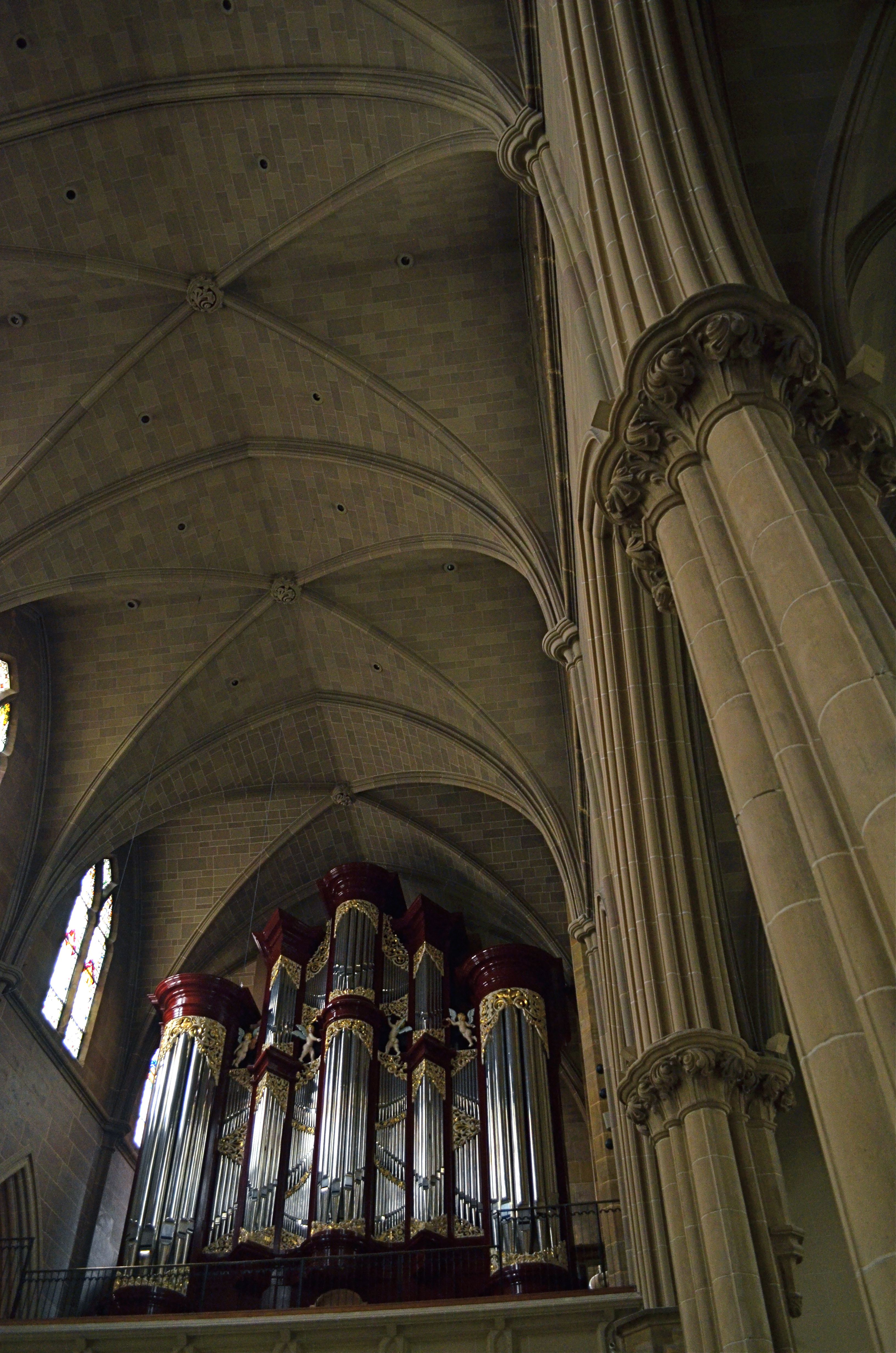
I had originally shot the organ loft at Columbus, Ohio’s St. Joseph Cathedral in a centered, “straight on” composition. I like this variation a little better. 1/40 sec., f/3.5, ISO 1000, 18mm.
By MICHAEL PERKINS
AMONG THE GROUPS INVITING FLICKR USERS TO POST PHOTOGRAPHS OF A CERTAIN THEME OR TYPE, there is a group called, “This Should Be A Postcard”, apparently composed of images that are so iconically average that they resemble mass-produced tourist views of scenic locales. The name of this group puzzles me. I mean, if you called it, “Perfectly Ordinary, Non-Offensive and Safe Pictures of Over-Visited Places”, people would write you off as a troll, but I’d at least give you points for accuracy. It’s hard to understand why any art would aspire to look like something that is almost deliberately artless.
And still, it is perceived as a compliment to one’s work to be told that it “looks just like a postcard”, and, I swear, when I hear that remark about one of my own images, my first reaction is to wipe said image from the face of the earth, since that phrase means that it is (a)average, (b) unambitious), (c) unimaginative, or (d) a mere act of “recording”. Look, here’s the famous place. It looks just like you expect it to, taken from the angle that you’re accustomed to, lit, composed and executed according to a pre-existing conception of what it’s “supposed” to be. How nice.
And how unlike anything photography is supposed to be about.
This conditioning we all have to render the “official” view of well-known subjects can only lead to mediocrity and risk aversion. After all, a postcard is tasteful, perfect, symmetrical, orderly. And eventually, dull. Thankfully, the infusion of millions of new photographers into the mainstream in recent years holds the potential cure for this bent. The young will simply not hold the same things (or ways to view them) in any particular awe, and so they won’t even want to create a postcard, or anyone else’s version of one. They will shudder at the very thought of being “on the nose”.
I rail against the postcard because, over a lifetime, I have so shamelessly aspired to it, and have only been able to let go of the fantasy after becoming disappointed with myself, then unwilling to keep recycling the same approach to subject matter even one more time. For me, it was a way of gradually growing past the really formalized methods I had as a child. And it’s not magic.Even a slight variation in approach to “big” subjects, as in the above image, can stamp at least a part of yourself onto the results, and so, it’s a good thing to get the official shot out of the way early on in a shoot, then try every other approach you can think of. Chances are, your keeper will be in one of the non-traditional approaches.
Postcards say of a location, wish you were here. Photographs, made by you personally, point to your mind and say, “consider being here.”
RESTORING THE INVISIBLE
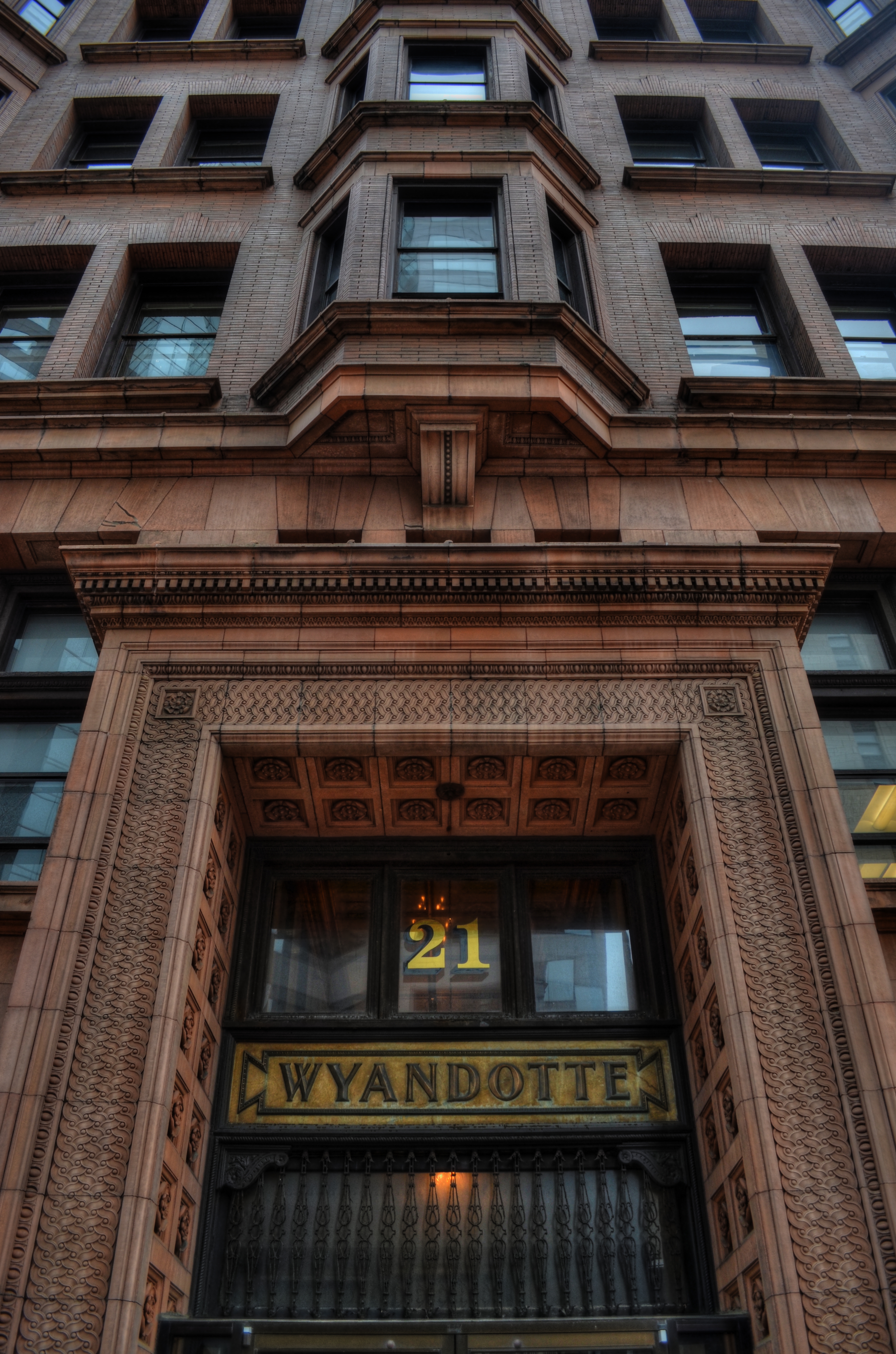
as[e The Wyandotte Building (1897), Columbus, Ohio’s first true skyscaper, seen here in a three-exposure HDR composite.
PHOTOGRAPHY IS ONE OF THE BEST RESPONSES TO THE DIZZYING SPEED OF CONTEMPORARY EXISTENCE. It is, in fact, because of a photograph’s ability to isolate time, to force our sustained view of fleeting things, that image-making is valuable as a seeing device that counteracts the mad rush of our “real time” lives. Looking into a picture lets us deal with very specific slices of time, to slowly take the measure of things that, although part of our overall sensory experience, are rendered invisible in the blur of our living.
I find that, once a compelling picture has been made of something that is familiar but unnoticed, the ability to see the design and detail of life is restored in the viewing of that thing. Frequently, in making an image of something that we are too busy to notice, the thing takes on a startlingly new aspect. That’s why I so doggedly pursue architectural subjects, in the effort to make us regard how much of our motives and ideals are captured in buildings. They stand as x-rays into our minds, revealing not only what we wanted in creating them, but what we actually created as they were realized.
In writing a book, several years ago, about a prominent midwestern skyscraper*, I was struck by how very personal these objects were…to the magnates who commissioned them, to the architects who brought them forth, and to the people in their native cities who took a kind of ownership of them. In short, the best of them were anything but mere objects of stone and steel. They imparted a personality to their surroundings.
The building pictured here, Columbus, Ohio’s 1897 Wyandotte Building, was designed by Daniel Burnham, the genius architect who spearheaded the birth of the modern steel skeleton skyscraper, heading up Chicago’s “new school” of architecture and overseeing the creation of the famous “White City” exposition of 1893. It is a magnificent montage of his ideals and vision for a burgeoning new kind of American city. As something thousand walk past every day, it is rendered strangely “invisible”, but a photograph can compensate for our haste, allowing us the luxury of contemplation.
As photographers, we can bring a particularly keen kind of witnessing to the buildings that make up our environment, no less than if we were to document the carvings and decorative design on an Egyptian sarcophagus. Architectural photography can help us extract the magic, the aims of a society, and experimenting with various methods for rendering their texture and impact can lead to some of the most powerful imagery created within a camera.
*Leveque: The First Complete Story Of Columbus’ Greatest Skyscraper, Michael A. Perkins, 2004. Available in standard print and Kindle editions through Amazon and other online bookstores.
FIGHTING TO FORGET
By MICHAEL PERKINS
STORIES OF “THE LAND THAT TIME FORGOT” COMPRISE ONE OF THE MOST RELIABLE TROPES IN ALL OF FICTION. The romantic notion of stumbling upon places that have been sequestered away from the mad forward crunch of “progress” is flat-out irresistible, since it holds out the hope that we can re-connect with things we have lost, from perspective to innocence. It moves units at the book store. It sells tickets at the box office. And it provides photographers with their most delicate treasures.
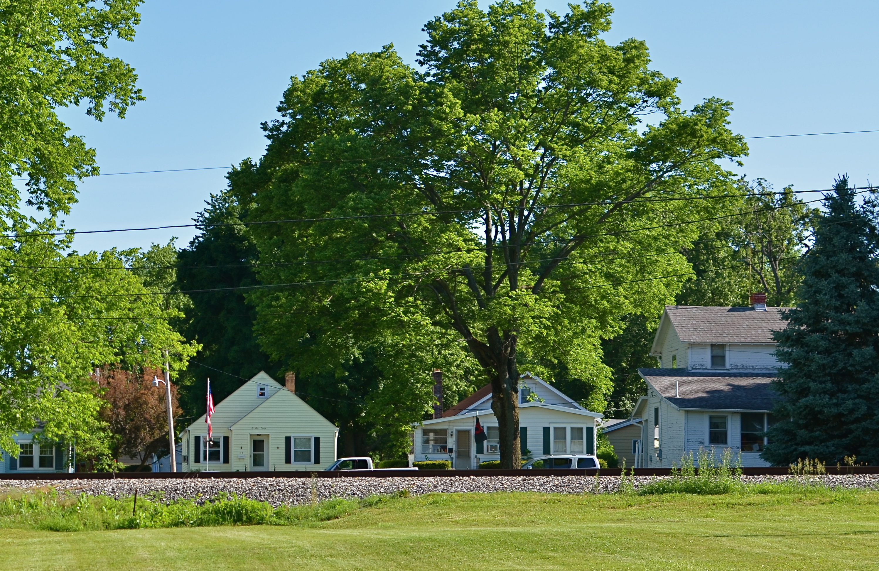
Trackside, 2014. 1/250 sec., f/5.6, ISO 100, 35mm.
Whether our lost land is a village in some hidden valley or a hamlet within the vast prairie of middle America, we romanticize the idea that some places can be frozen in amber, protected from us and all that we create. Sadly, finding places that have been allowed to remain at the margins, that have been left alone by developers and magnates, is getting to be a greater rarity than ever before. Small towns can be wholly separate universes, sealed off from the silliness that has engulfed most of us, but just finding one which has been lucky enough to aspire to “forgotten” status is increasingly rare.
That’s why it’s so wonderful when you take the wrong road, and make the right turn.
The above stretch of sunlit houses, parallel to their tiny town’s main railroad spur, shows, in miniature, a place where order is simple but unwavering. Colors are basic. Lines are straight. This is a town where school board meetings are still held at the local Carnegie library, where the town’s single diner’s customers are on a first name basis with each other. A place where the flag is taken down and folded each night outside the courthouse. A village that wears its age like an elder’s furrowed brow with quietude, serenity.
There are plenty of malls, chain burger joints, car dealerships and business plazas within several miles of here. But they are not of here. They keep their distance and mind their manners. The freeway won’t be barreling through here anytime soon. There’s time yet.
Time for one more picture, as simple as I know how to make it.
A memento of a world fighting to forget.
THE FULLNESS OF EMPTY
1/125 sec., f/5.6, ISO 100, 35mm.
By MICHAEL PERKINS SCIENCE TELLS US THAT SOME HUSBANDS HEAR THE QUESTION, “DID YOU TAKE THE TRASH OUT?” more often than any other phrase over the course of their married life. If you are an intrepid road warrior, you may hear more of something like “do you know where you’re going?” or “why don’t you just stop and ask for directions?”. If you’re a less than optimum companion, the most frequently heard statement might be along the lines of “and just where have you been?”. For me, at least when I have a camera in my hands, it’s always been “why don’t you ever take pictures of people?”
Why, indeed.
Of course, I contend that, if you were to take a random sample of any 100 of my photographs, there would be a fair representation of the human animal within that swatch of work. Not 85% percent, certainly, but you wouldn’t think you were watching snapshots from I Am Legend. However, I can’t deny that I have always seen stories in empty spaces or building faces, stories that may or may not resonate with everyone. It’s a definite bias, but it’s one of the closest things to a style or a vision that I have.
I think that absent people, as measured in their after-echoes in the places where they have been, speak quite clearly, and I am not alone in this view. Putting a person that I don’t even know into an image, just to demonstrate scope or scale, can be, to me, more dehumanizing than taking a picture without a person in it. My people-less photos don’t strike me as lonely, and I don’t feel that there is anything “missing” in such compositions. I can see these folks even when they are not there, and, if I do my job, so can those who view the results later.
1/50 sec., f/3.5, ISO 650, 18mm.
Are such photographs “sad”, or merely a commentary on the transitory nature of things? Can’t you photograph a house where someone no longer lives and conjure an essence of the energy that once dwelt within those walls? Can’t a grave marker evoke a person as well as a wallet photo of them in happier times? I ask myself these questions, along with other crucial queries like, “what time is the game on?” or, “what do you have to do to get a beer in this place?” Some answers come quicker than others.
I can’t account for what amounts to “sad” or “lonely” when someone else looks at a picture. I try to take responsibility for the pictures I make, but people, while a key part of each photographic decision, sometimes do not need to serve as the decisive visual component in them. The moment will dictate. So, my answer to one of life’s most persistent questions is a polite, “why, dear, I do take pictures of people.”
Just not always.
OH, IT’S HIDEOUS. I LOVE IT.
By MICHAEL PERKINS
THERE MAY BE NO RULES LEFT TO BREAK IN PHOTOGRAPHY, in that everybody is comfortable doing absolutely anything….compositionally, conceptually, technologically…to get the picture they want. Maybe that’s always the way it’s been, seeing as the art of image-making, like the science of breeding apple trees, has always grown faster and stronger through cloning and grafting. Hacks. Improvisations. “Gee-What-If”s.
Shots in the dark.
Not a bad starting point, but either too pretty, or not ugly enough…or something.
Recently I walked out into the gigantic atrium that connects all of the original buildings of the Morgan Library complex in NYC to get a good look at the surrounding neighborhood of big-shouldered buildings. I was fascinated by the way my wide-angle lens seemed to line up the horizontal grid lines of the atrium with the receding lines of the towers and boxes down the block. Only one thing bothered me about the result: the color, or rather, the measly quality of it.
A rainy day in Manhattan is perhaps the final word on rainy days. Some colors, like the patented screaming yellow of a New York cab, or the loud neon reds of bodegas, are intensified into a romantic wash when the drops start. This view, however, was just a bland mash of near-color. If the neighborhood was going to look dour anyway, I wanted it to be dour-plus-one. Thing is, I made this, ahem, “artistic” decision after I had already traveled 3,000 miles back home. In the words of Rick Perry, whoops.
Time to hack my way to freedom. I remembered liking the look of old Agfa AP-X film in a filter on my iPhone, so I filled the screen of my Mac with the bland-o image, shot the screen with the phone, applied the filter, uploaded the result back into the Mac again, and twisted the knobs on the new cheese-grater texture I had gained along the way. At least now it looked like an ugly day….but ugly on my terms. Now I had the kind of rain-soaked grayscale newspaper tones I wanted, and the overall effect helped to better meld the geometry of the atrium and the skyline.
No rules? Sure, there’s still at least one.
Get the shot.
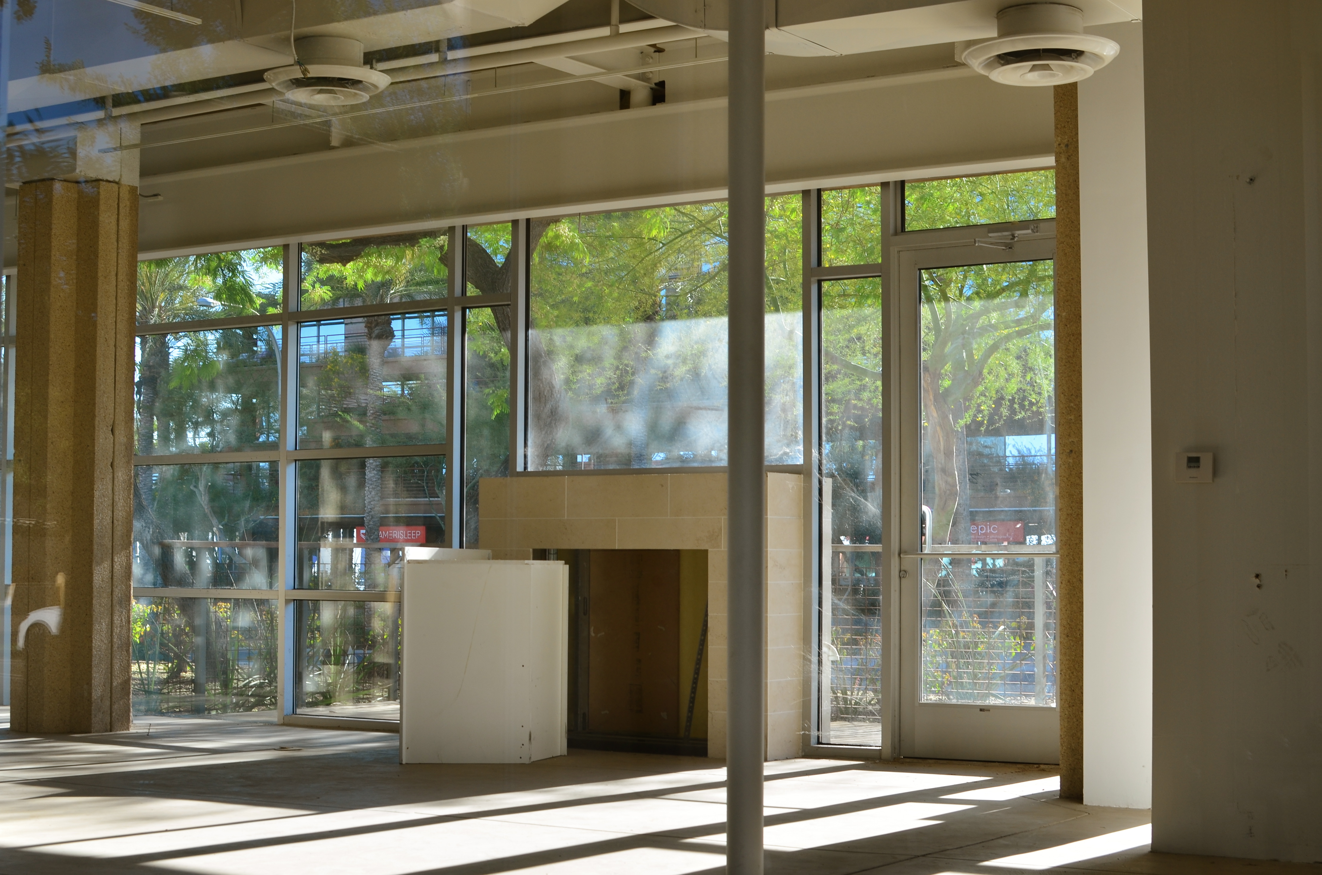
GET THEE TO A LABORATORY
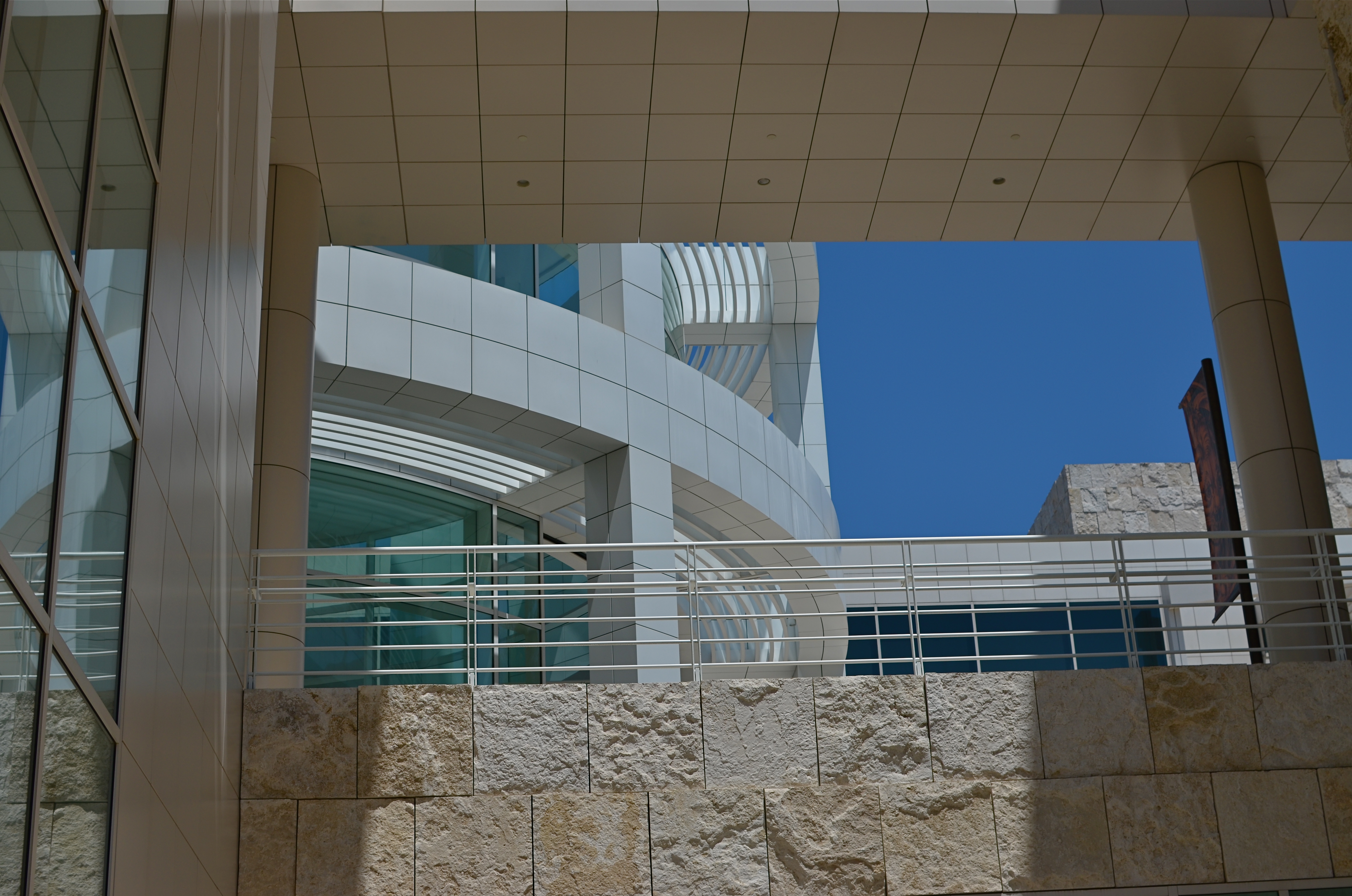
The Visitor Center at Los Angeles’ Getty Museum. 1/1600 sec., f/5.6, ISO 100, 35mm.
by MICHAEL PERKINS
PHOTOGRAPHIC SUBJECT MATTER, ONCE YOU’VE TRAINED YOURSELF TO SPOT IT, is always in ready supply. But, let’s face it: many of these opportunities are one-and-done. No repeats, no returns, no going back for another crack at it. That’s why, once you learn to make pictures out of almost nothing, it’s like being invited to a Carnival Cruise midnight buffet to find something that is truly exploding with possibilities, sites that actually increase in artistic value with repeat visits. I call such places “labs” because they seem to inspire an endless number of new experiments, fresh ways to look at and re-interpret their basic visual data.
My “labs” have usually been outdoor locations, such as Phoenix’ Desert Botanical Gardens or the all-too-obvious Central Park, places where I shoot and re-shoot over the space of many years to test lenses, exposure schemes, techniques, or, in the dim past, different film emulsions. Some places are a mix of interior and exterior and serve purely as arrangements of space, such as the Brooklyn Museum or the Library of Congress, where, regardless of exhibits or displays, the contours and dynamics of light and form are a workshop all in themselves. In fact, some museums are more beautiful than the works they house, as in the case of Guggenheim in NYC and its gorgeous west coast equivalent, The Getty museum in Los Angeles.
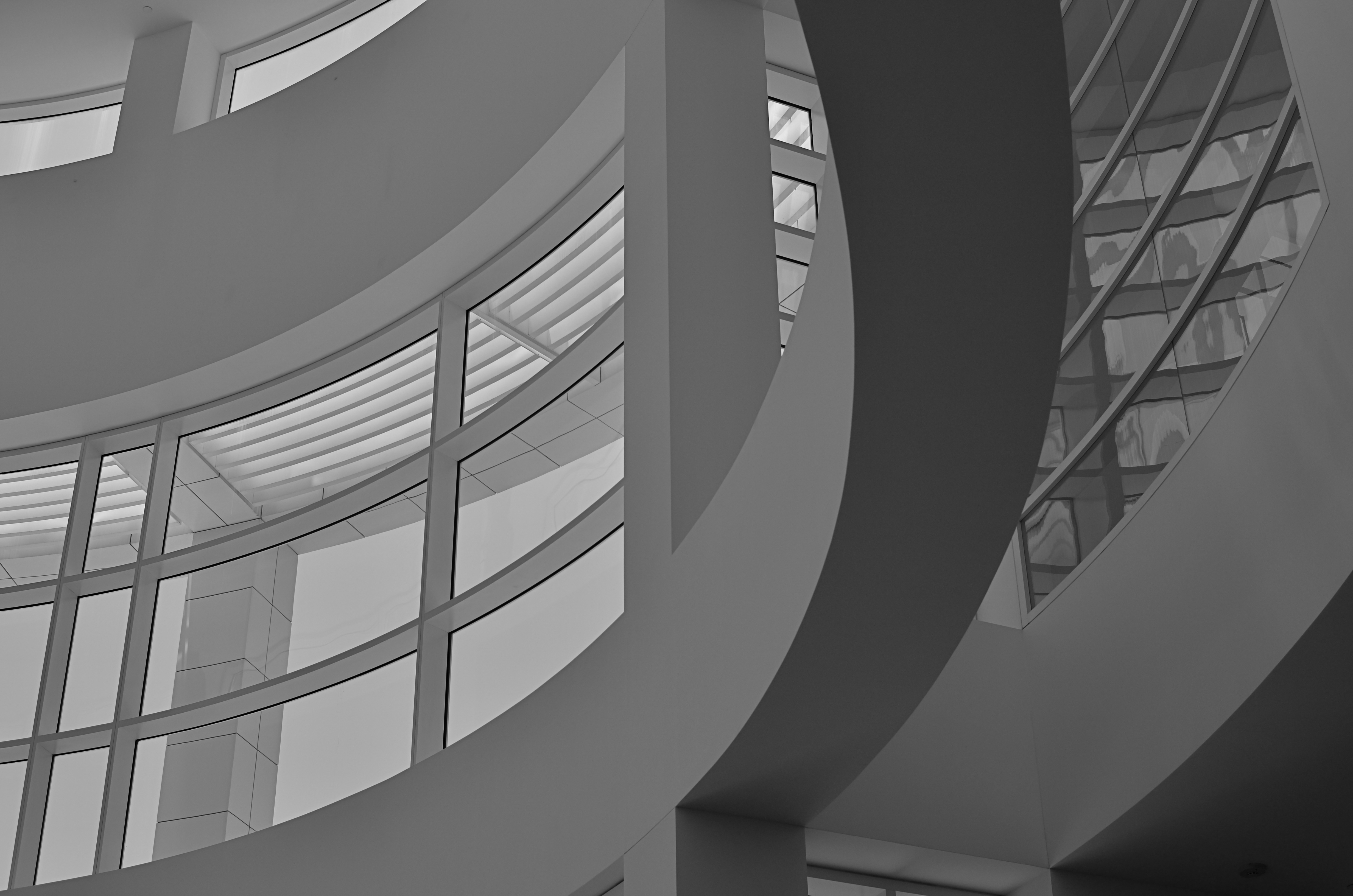
No color? No problem. Interior view of the Getty’s visitor center. 1/640 sec., f/5.6. ISO 100, 35mm.
Between the gleaming white, glass-wrapped buildings of this enormous arts campus and its sinuous, sprawling gardens (not to mention its astounding hilltop view), the Getty takes one complete visit just to get yourself visually oriented. Photographically, you will find a million isolated tableaux within its multi-acre layout upon subsequent trips, so there is no end to the opportunities for exploring light, scale, abstraction, and four full seasons of vibrant color. Not a color fan? Fine. The Getty even dazzles in monochrome or muted hues. It’s like Toys ‘R’ Us for photogs.
I truly recommend laying claim to a laboratory of your own, a place that you can never truly be “finished with”. If the place is rich enough in its basic components, your umpteenth trip will be as magical as your first, and you can use that one location as a growth graph for your work. Painters have their muses. Shooter Harry Calahan made a photographic career out of glorifying every aspect of his wife. We all declare our undying love for something.
And it will show in the work.
THEY HAD FACES THEN
Happy Shining Houses: Two copies of the same image, balanced in Photomatix’ Tone Compression algorithm.1/1000 sec., f/5.6, ISO 100, 35mm
By MICHAEL PERKINS
ONE OF THE MOST HORRIBLE CONSEQUENCES OF SUBURBAN SPRAWL, beyond the obscene commercial eye pollution, the devastation of open space, and the friendless isolation, is the absolute soulless-ness of the places we inhabit. The nowheres that we live in are everywhere. Wherever you go, there you are. Move three miles and the cycle has repeated. Same Shell stations, same Wal-Marts, same banal patterns.
The title of a classic book on the passing of the star era of Hollywood could also be the story of the end of the great American house: They Had Faces Then.
I believe that the best old houses possess no less a living spirit than the people who live inside them. As a photographer, I seek out mish-mosh neighborhoods, residential blocks that organically grew over decades without a “master plan” or overseeing developer. Phoenix, Arizona is singular because, within its limits, there are, God knows, endless acres of some of the most self-effacing herdblocks created by the errant hand of man, but also some of the best pre-WWII neighborhoods, divine zones where houses were allowed to sprout, erupt, and just happen regardless of architectural period, style, or standard. It is the wild west realized in stucco.
When I find these clutches of houses, I don’t just shoot them, I idealize them, bathing the skies above them in azure Kodachrome warmth, amping up the earth tones of their exteriors, emphasizing their charming symmetries. Out here in the Easy-Bake oven of the desert, that usually means a little post-production tweaking with contrasts and colors, but I work to keep the homes looking as little like fantasies and as much like objects of desire as I can.
One great tool I have found for this is Photmatix, the HDR software program. However, instead of taking multiple exposures and blending them into an HDR, I take one fairly balanced exposure, dupe it, darken one frame, lighten the other, and process the final in the Tone Compression program. It gives you an image that is somewhat better than reality, but without the Game of Thrones fantasy overkill of HDR.
Photography is partly about finding something to shoot, and partly about finding the best way to render what you saw (or what you visualized). And sometimes it’s all about revealing faces.
DESTROY IT TO SAVE IT
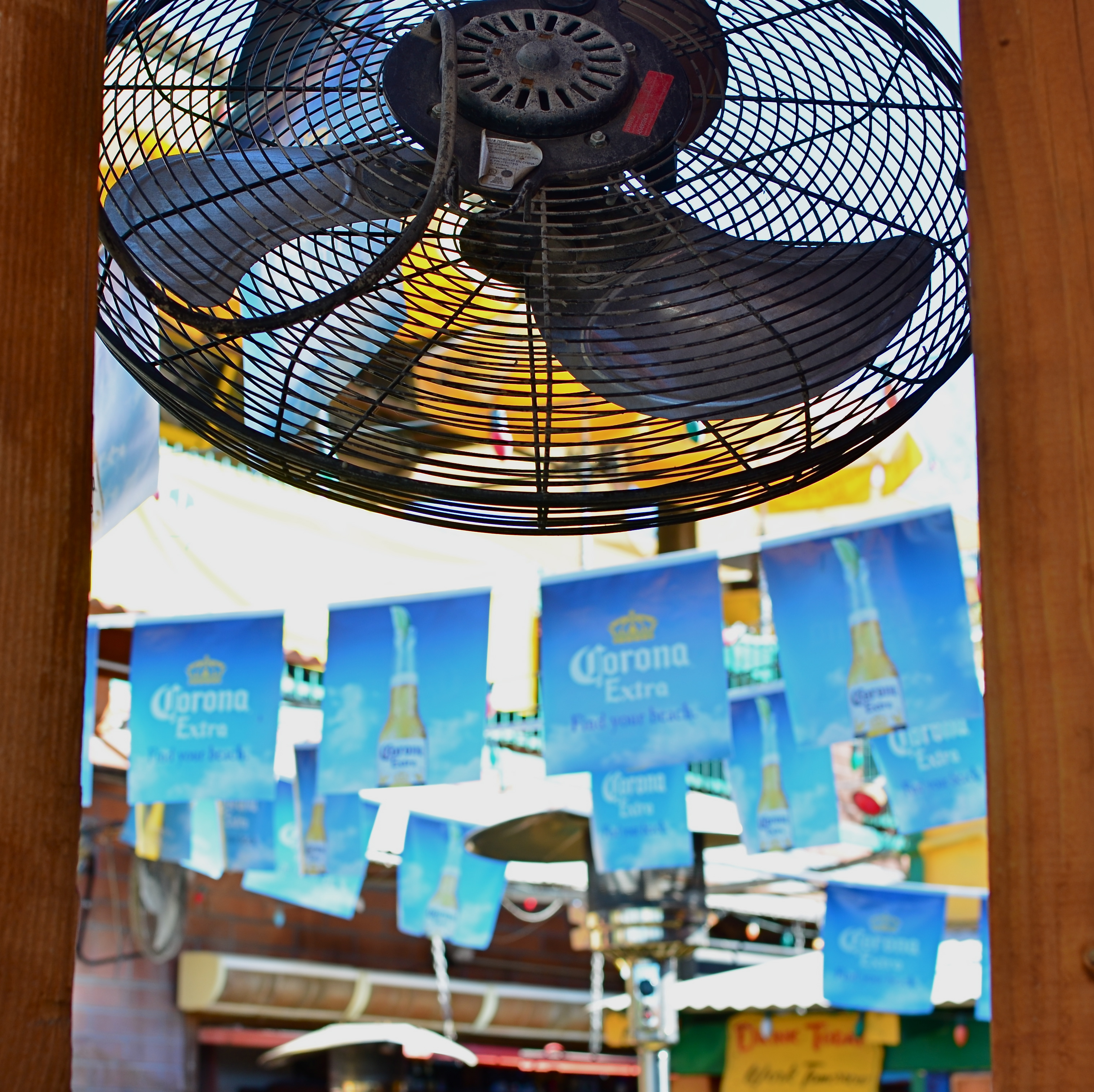
Fan photo: 1/80 sec., ISO 100, 35mm.
By MICHAEL PERKINS
THERE ARE TIMES WHEN THE RAW VISUAL FLOOD OF INTENSE COLOR IS THE MOST INTOXICATING DRUG ON THE PLANET, at least for photographers. Sometimes you are so overcome with what’s possible from a loud riot of hues that you just assume you are going to be able to extract a coherent image from it. It happens the most, I find, with large, sprawling events: festivals, open restaurants, street fairs, carnivals, anywhere your eyeballs just go into overload. Of course there must be a great picture in all this, you promise yourself.
And there may be. But some days you just can’t find it in the sheer “Where’s Waldo”-ness of the moment. Instead, you often wind up with a grand collection of clutter and no obvious clues as to where your viewer should direct his gaze. The technical term for this is “a mess”.
I stepped in a great one the other day. It’s a local college-crowd bar in Scottsdale, Arizona, where 99% of the customers sit outside on makeshift benches, shielded from the desert sun by garish Corona umbrellas, warmed by patio heaters, and flanked by loud pennants, strings of aerial lightbulbs and neon booze ads. The place radiates fun, and, even during the daylight hours before it opens, it just screams party. The pictures should take themselves, right?
Well, maybe it would have been better if they had. As in, “leave me out of it”. As in, “someone get me a machete so I can hack away half of this junk and maybe find an image.” Try as I might, I just could not frame a simple shot: there was just too much stuff to give me a clean win in any frame. In desperation, I shot through a window to make a large cooling fan a foreground feature against some bright pennants, and accidentally did what I should have done first. I set the shot so quickly that the autofocus locked on the fan, blurring everything else in the background into abstract color. It worked. The idea of a party place had survived, but in destroying my original plan as to how to shoot it, I had saved it, sorta.
I have since gone back to the conventional shots I was trying to make, and they are still a vibrant, colorful mess. There are big opportunities in big, colorful scenes where showing “everything in sight” actually works. When it doesn’t, you gotta be satisfied with the little stories. We’re supposed to be interpreters, so let’s interpret already.
MAGNIFICENT RUIN

Clay pre-firings and molds for bronze bells at Paolo Soleri’s COSANTI studios in Paradise Valley, Arizona. 1/20 sec., f/5.6, ISO 100, 35mm.
by MICHAEL PERKINS
IN 1956, ARCHITECT PAOLO SOLERI BEGAN THE FIRST MINIATURE DEMONSTRATION OF WHAT WOULD BECOME HIS LIFE’S WORK, an experimental, self-contained, sustainable community he called Cosanti. Erecting a humble home just miles from his teacher Frank Lloyd Wright’s compound at Taliesin West, in what was then the wide-open desert town of Paradise Valley, Arizona, he started sand-casting enormous concrete domes to serve as the initial building blocks of a new kind of ecological architecture. And, over the next half-century, even as Soleri would call Paradise Valley his home, he would construct bigger versions of his dream city, now renamed Arcosanti, on a vast patch of desert between Phoenix and Flagstaff.
The project, which at his death in 2013 was still unrealized, was funded over the years by the sales of Soleri’s custom fired bronze and clay wind bells, which became prized by Arizona visitors from all over the world. At present, his early dwellings still stand, as do the twisting, psychedelic paths and concrete arches that house his smelting forges, his kilns, the Cosanti visitor center, and a strange spirit of both wonder and dashed dreams. It is a magnificent ruin, a mad and irresistible mixture of textures for photographers.
One of COSANTI’s bizarre dwellings, scattered amongst the compound’s forges and kilns. 1/400 sec., f/5.6, ISO 100, 35mm.
Name the kind of light…….brilliant sun, partial shade, catacomb-like shadows, and you’ve got it. Name the material, from wood to stone to concrete to stained glass, and it’s there. The terrain of the place, even though it’s now surrounded by multi-million dollar mansions, still bears the lunar look of a far-flung outpost. It’s Frank Lloyd Wright in The Shire. It’s Fred Flintstone meets Dune. It continues to be a bell factory, and a working architectural foundation. And it’s one of my favorite playgrounds for testing lenses, flexing my muscles, trying stuff. It always acts as a reboot on my frozen brain muscles, a place to un-stall myself.
Here’s to mad dreamers, and the contagion of their dreams.
CROP YOUR WAY TO SUCCESS
By MICHAEL PERKINS
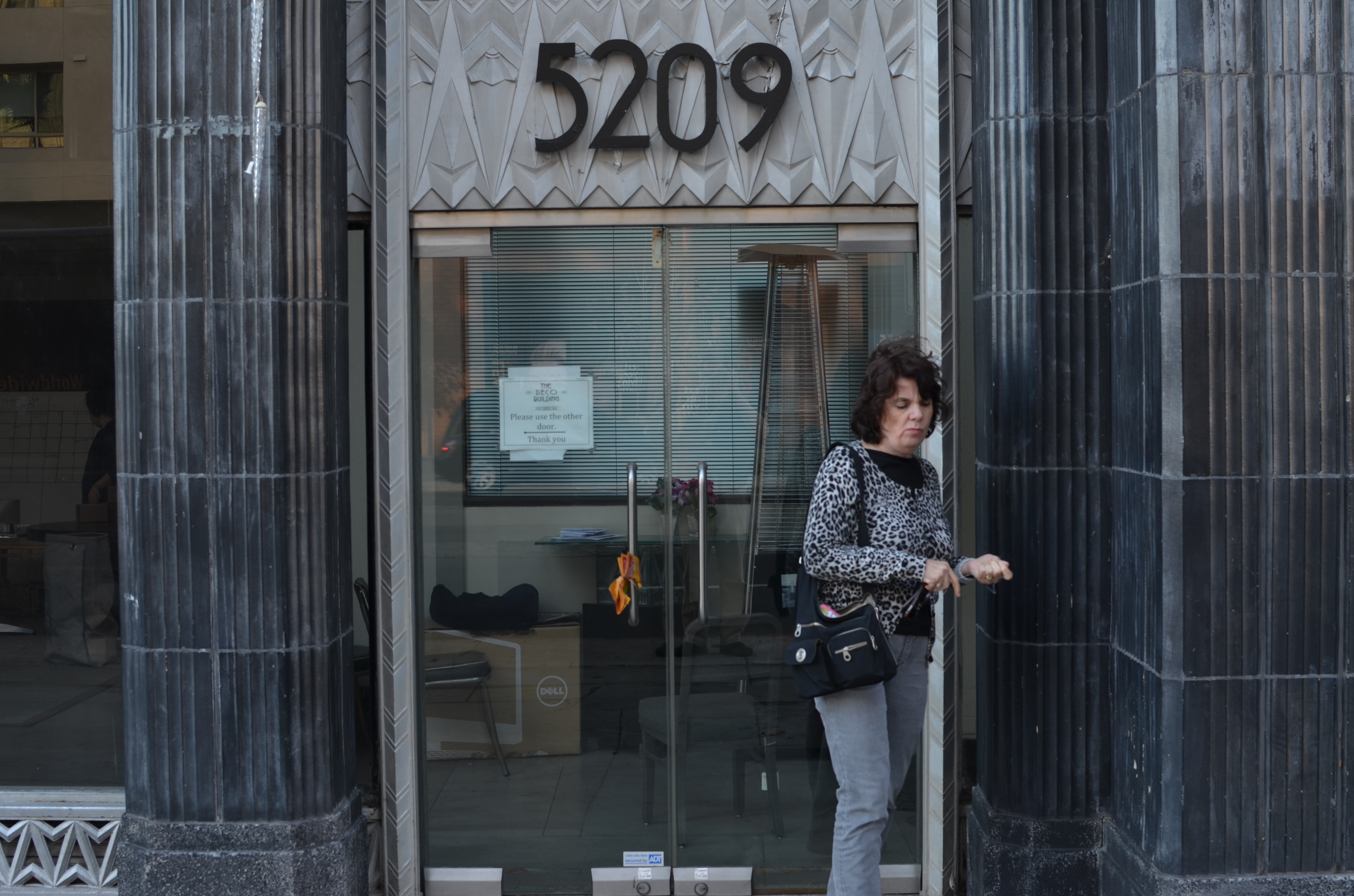
Whoops, I wasn’t ready. 1/100 sec., f/5.6, ISO 100, 35mm.
THOSE OF US WHO HAVE LOGGED SOME TIME IN THE WAITING ROOMS OF PEDIATRICIANS can recall struggling through the “Hidden Pictures” page of Highlights For Children magazine. I would love to tell you that I always found 100% of cartoonist John Gee’s camoflaged squiggles by the time the receptionist invited me into the examining room. But I would be lying.
That said, there are many times when, as photographers, we play the same game with our images, especially the ones in the “doesn’t work” pile. Loving at least the idea behind what we were originally after, we pore over every pixel in the frame, repeating the vain mantra there must be a picture in here somewhere. Often, the photo simply returns to the Hall of Shame despite our best efforts to redeem it. Sometimes, the crop tool is your unexpected best friend.
I recently looked at a failed candid of my wife outside one of my favorite buildings in Los Angeles, the “Deco” Building (real name) at the corner of La Brea and Wilshire near the museum district. A combination of wind and facial expression had spoiled the quickie portrait, but the address panel over Marian’s head contained something I could use if I re-purposed the picture.
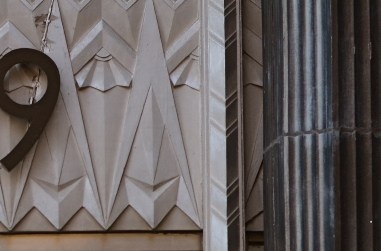
I gave the above shot a severe haircut and wound up with this. Hmm, maybe this was all the picture I needed in the first place.
In the space of a few inches of the building’s entrance was a miniature representation of the best features of the entire building; its wild pattern of chevrons and zigzags. I had already done a master shot of about 90% of the front of the place, but a study of its details started to sound appealing. Cropping away more than 2/3rds of the original shot reduced the sharpness a little, but since I always shoot at the highest file size possible, I just squeaked by.
For a moment, I found that I had redeemed all those failed sessions with Highlights.
Watch out, New York Times crossword. You’re next.
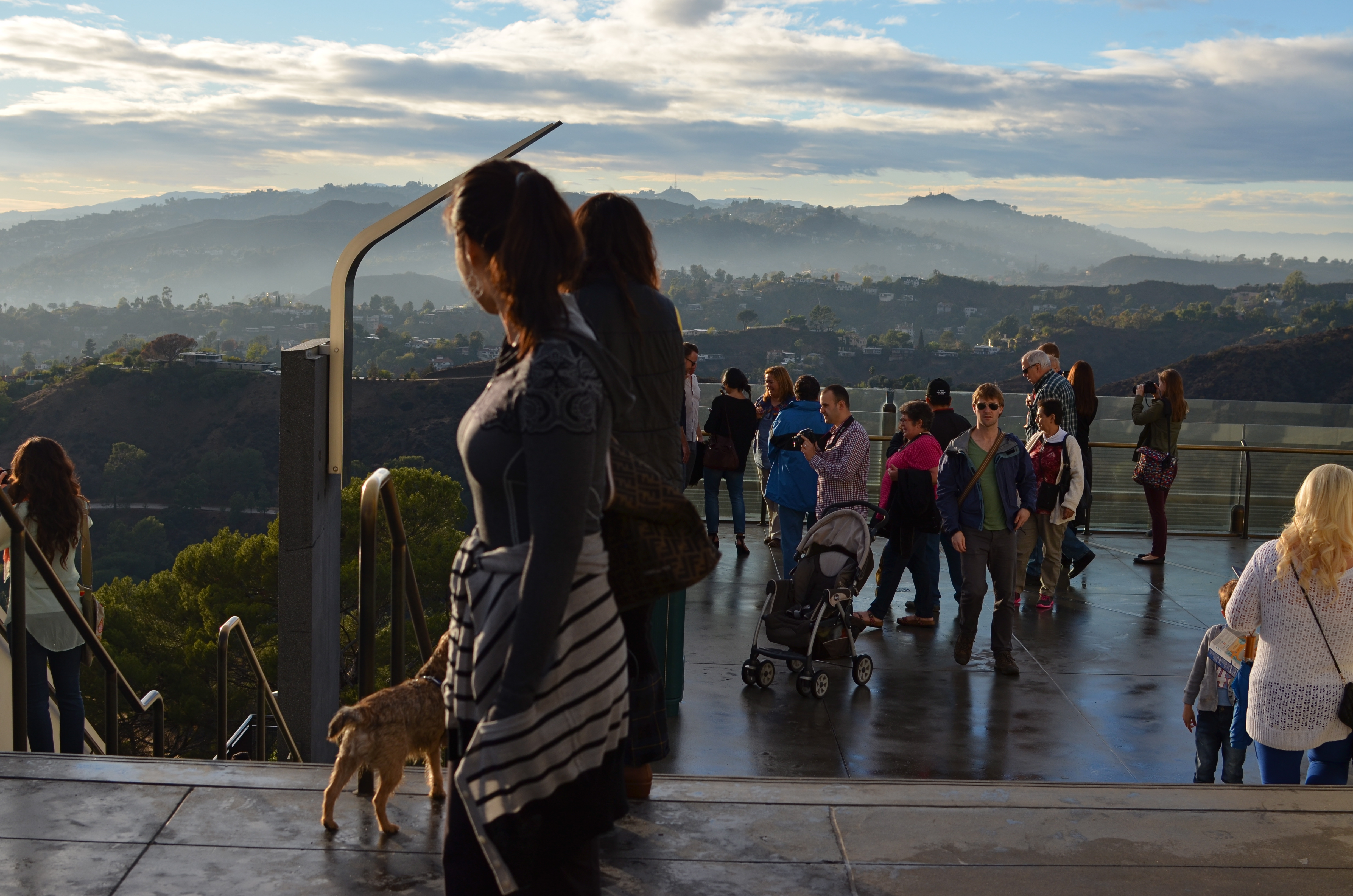
CHANGE OF PLAN
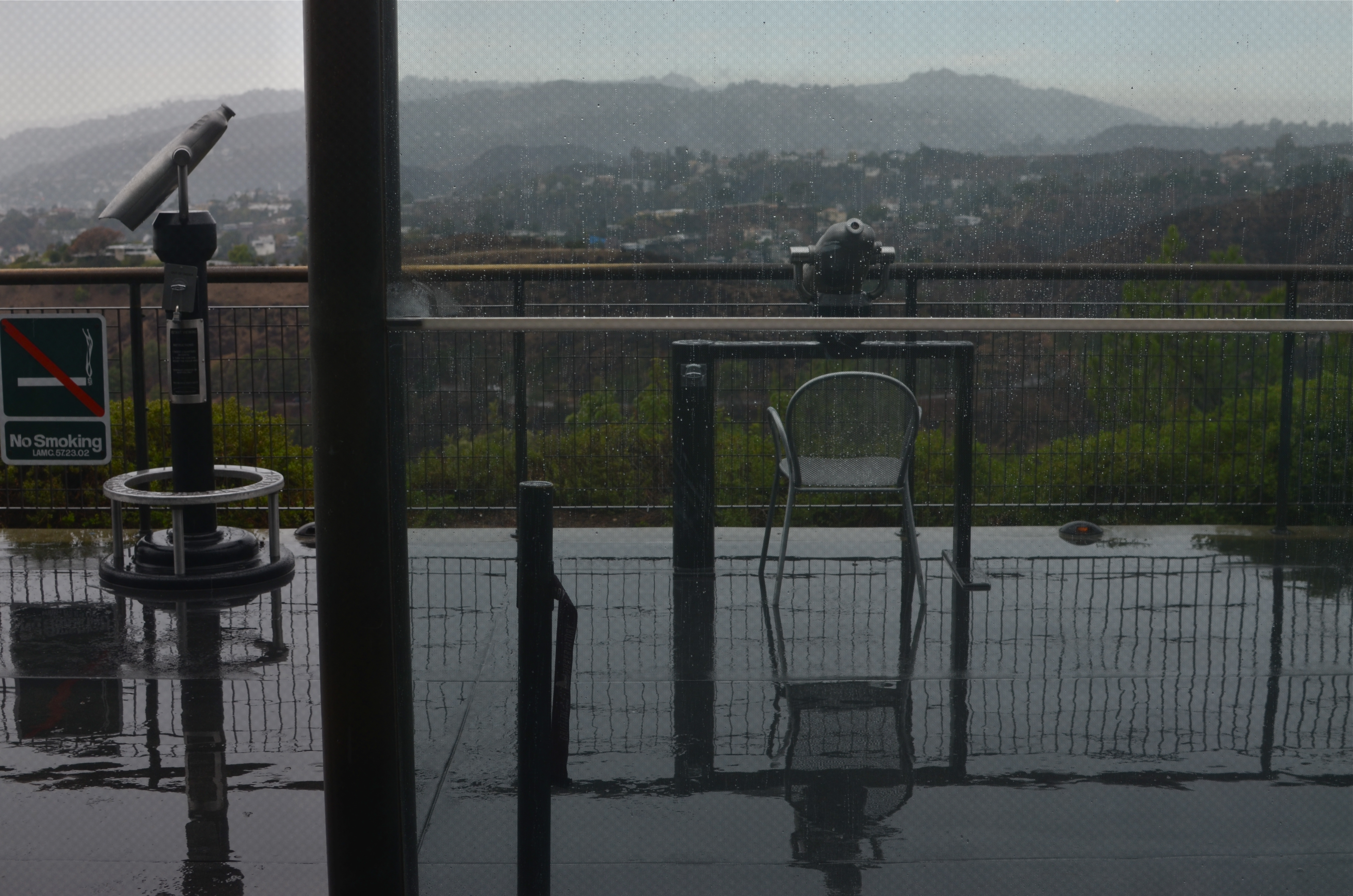
Rainy day, dream away. Griffith Observatory under early overcast, 11/29/13. 1/160, f/5.6, ISO 100, 35mm.
by MICHAEL PERKINS
VISUAL WONDERS, IN EVERY HOUR AND SEASON, ARE THE COMMON CURRENCY OF CALIFORNIA’S GRIFFITH OBSERVATORY. The setting for this marvelous facility, a breathtaking overlook of downtown Los Angeles, the Hollywood Hills, and the Pacific Ocean, will evoke a gasp from the most jaded traveler, and can frequently upstage the scientific wonders contained within its gleaming white Deco skin.
And when the light above the site’s vast expanse of sky fully asserts itself, that, photographically, trumps everything. For, at that moment, it doesn’t matter what you originally came to capture.
You’re going to want to be all about that light.
Upon my most recent visit to Griffith, the sky was dulled by a thick overcast and drenched by a slate-grey rain that had steadily dripped over the site since dawn. The walkways and common decks were nearly deserted throughout the day, chasing the park’s visitors inside since the opening of doors at noon. By around 3pm, a slow shift began, with stray shafts of sun beginning to seek fissures in the weakening cloud cover. Minute by minute, the dull puddles outside the telescope housing began to gleam; shadows tried to assert themselves beneath the umbrellas ringing the exterior of the cafeteria; the letters on the Hollywood sign started to warm like white embers; and people of all ages ventured slowly to the outside walkways.
The moment the light broke, Griffith’s common areas after the rain,11/29/13. 1/640 sec., f/5.6 (this image), f/6.3 (lower image), ISO 100, 35mm.
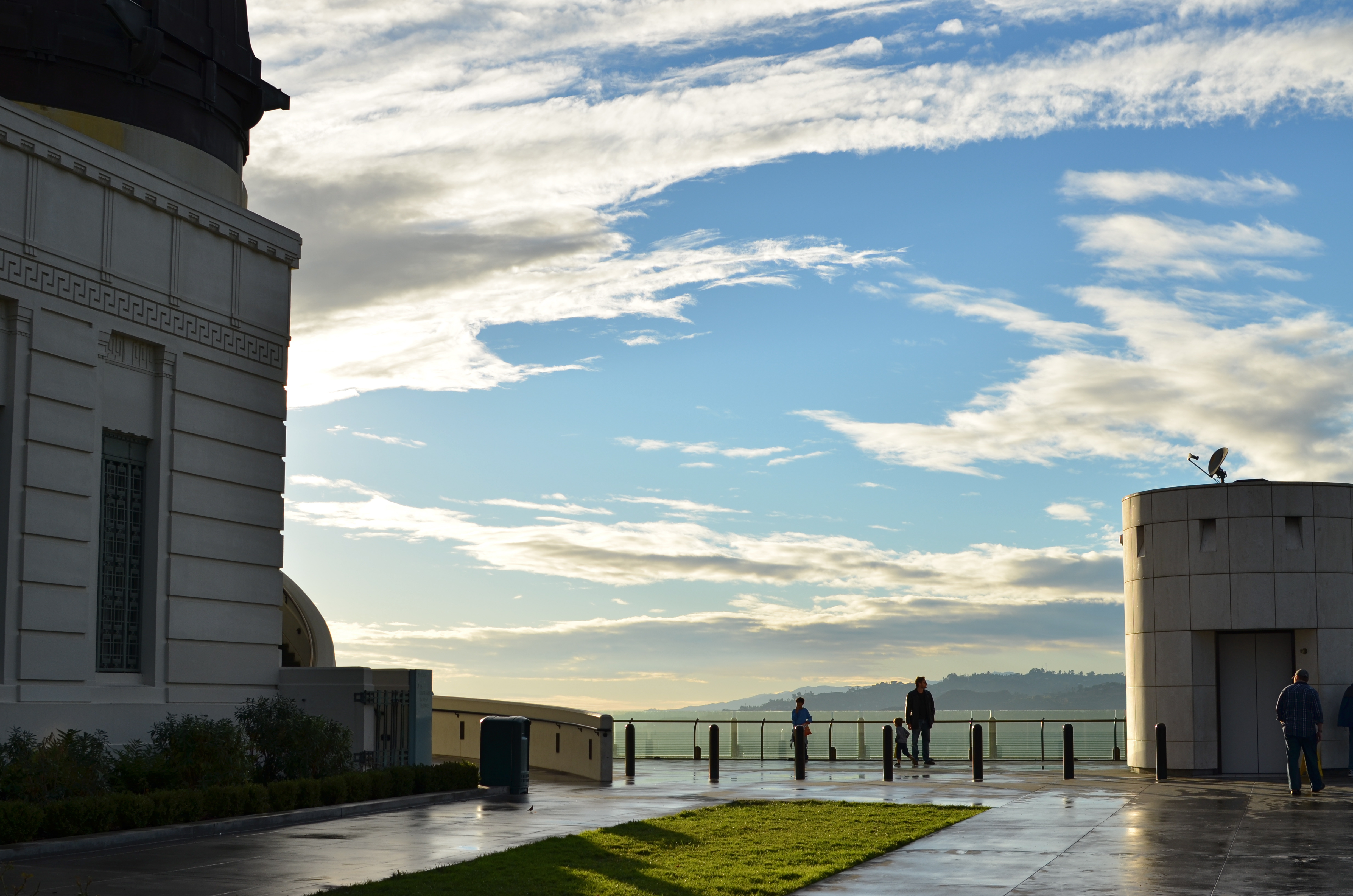
By just after 5 in the afternoon, the pattern had moved into a new category altogether. As the overcast began to break and scatter, creating one diffuser of the remaining sunlight, the fading day applied its own atmospheric softening. The combination of these two filtrations created an electric glow of light that flickered between white hot and warm, bathing the surrounding hillsides with explosive pastels and sharp contrasts. For photographers along the park site, the light had undoubtably become THE STORY. Yes the buildings are pretty, yes the view is marvelous. But look what the light is doing.
Like everyone else, I knew I was living moment-to-moment in a temporary, irresistible miracle. The rhythm became click-and-hope, click-and-pray.
And smiles for souvenirs, emblazoned on the faces of a hundred newly-minted Gene Kellys.
“Siiingin’ in the rainnnn…”
Related articles
CORNERING
Tackle a big subject in parts, and thus re-frame its context. A blend of two bracketed exposures with varied shutter speeds, both f/5.6, ISO 100, 55mm.
By MICHAEL PERKINS
PHOTOGRAPHERS ALL HATE THE TASK OF SHOOTING OVERLY FAMILIAR SUBJECTS. The famous. The iconic. The must-stop, we’ll-be-getting-off-the-bus-for-ten-minutes “sights” that decorate every postcard rack, every gift store shelf, in their respective cities. The Tower, the Ruins, the Once-Mighty Palace, the Legendary Cathedral. Things that have more pictures taken of them by breakfast than you’ll have taken of you in three lifetimes. Scadrillions of snaps, many of them composed for the “classic” orientation, an automatic attempt to live up to the “postcard” shot. It’s dull, but not because there is no fresh drama or grandeur left in a particular locale. It’s dull because we deliberately frame up the subject in almost the same way that is expected of us.
There must be a reason we all fall for this.
Maybe we want everyone back home to like our pictures, to recognize and connect with something that is easy, a pre-sold concept. No tricky exposures, no “arty” approaches. Here’s the Eiffel Tower, Uncle Herb, just like you expected to see it.
Yeah, well…
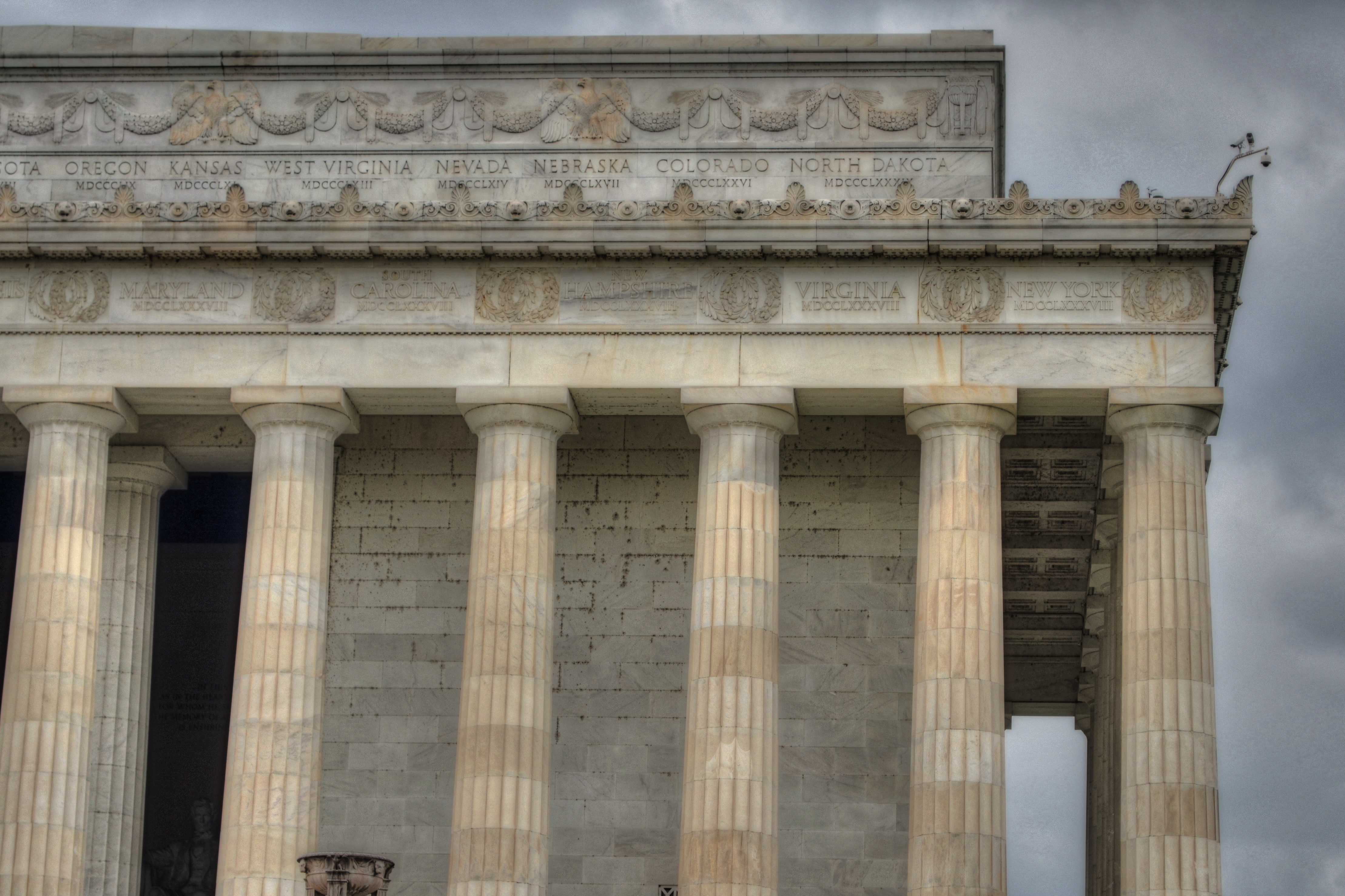
On a recent walking shoot around D.C.’s National Mall, snapping monument upon monument, I was starting to go snowblind with all the gleaming white marble and bleached alabaster, the perfection of our love affair with our own history. After a few miles of continuous hurrahs for us and everything we stand for, I perversely looked for something flawed….a crack in the sidewalk, a chipped tooth on a presidential bust, something to bring forth at least a little story.
Then I defaulted to an old strategy, and one which at least shakes up the senses. Photograph parts of buildings instead of the full-on official portrait of them. Pick a fragment, a set of light values, a selection of details that render the thing new, if only slightly. Take the revered and venerated thing out of its display case and remove its normal context.
The Lincoln Memorial proved a good choice. The basic shot of the front looked like just a box with pillars. A very, very white box. But shooting a bracket of three exposures of just the upper right corner of the roof , then blending them in an exposure fusion program, revealed two things: the irregular aging and texture of the stone, and the very human bit of history inscribed along the crown: the names of the states, with the years they came into the union below them. All at once something seemed unified, poetic about Abraham Lincoln sitting inside not a temple to himself, but a collection of the states and passions he stitched back together, repaired and restored into a Union.
The building had come back alive for me.
And I didn’t even have to shoot the entire thing.
follow Michael Perkins on Twitter @mpnormaleye.
REVELATION OR RUT?
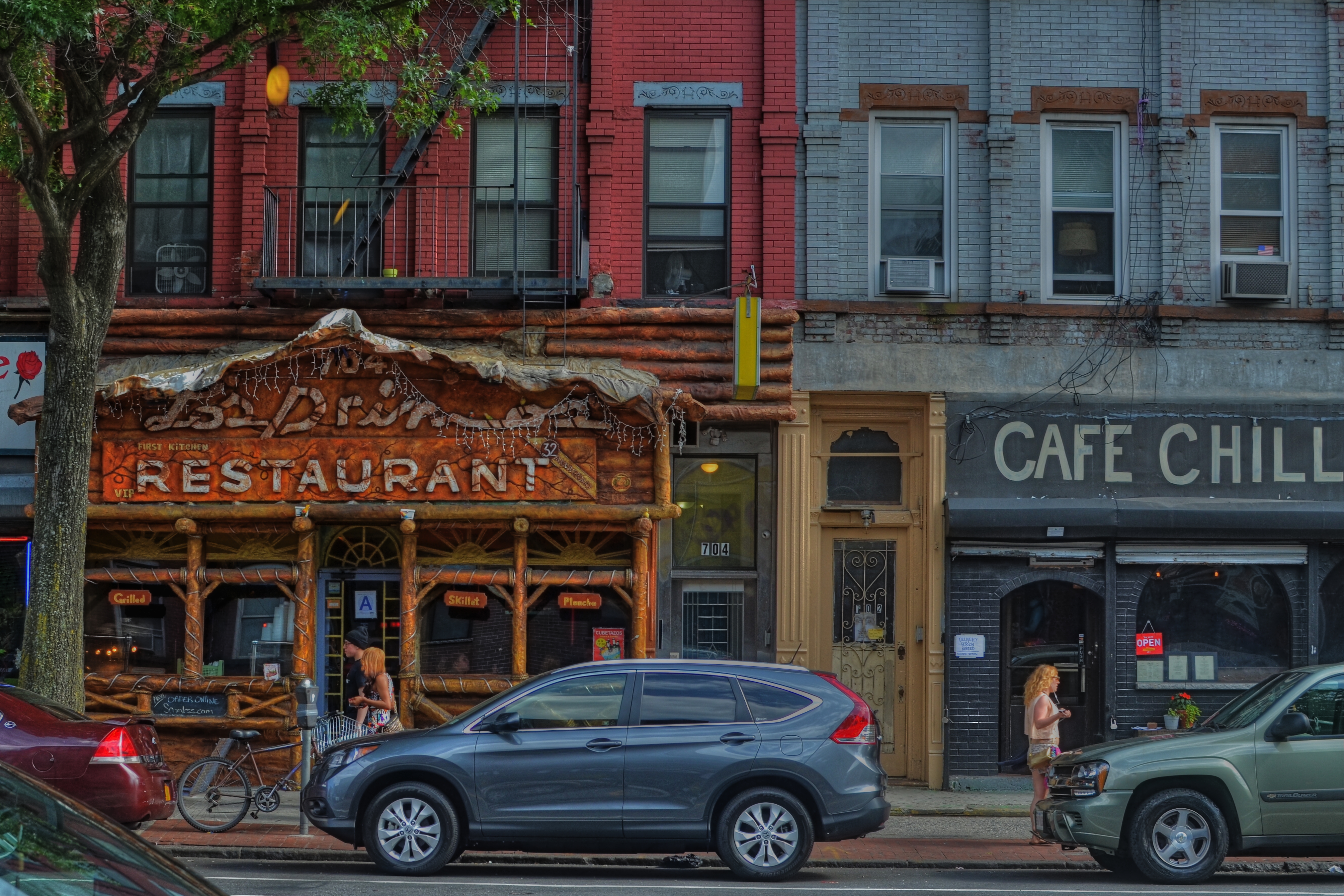
Cafe Chill, Brooklyn, 2013. 1/200 sec., f/5.6, ISO 100, 35mm.
By MICHAEL PERKINS
IT’S OFTEN DIFFICULT FOR PHOTOGRAPHERS, UNDER THE SPELL OF A CONCEPT, TO KNOW WHETHER THEY ARE MARCHING TOWARD SOME LOFTY QUEST or merely walking in circles, their foot (or their brain) nailed to the floor. Fall too deeply in love with a given idea, and you could cling to it, for comfort or habit, long after it has yielded anything remotely creative.
You might be mistaking a rut for revelation.
We’ll all seen it happen. Hell, it’s happened to many of us. You begin to explore a particular story-telling technique. It shows some promise. And so you hang with it a little longer, then a little longer still. One more interpretation of the shot that made you smile. One more variation on the theme.
Maybe it’s abstract grid details on glass towers, taken in monochrome at an odd angle. Maybe it’s time exposures of light trails on a midnight highway. And maybe, as in my own case, it’s a lingering romance with dense, busy neighborhood textures, shot at a respectfully reportorial distance. Straight-on, left to right tapestries of doors, places of business, upstairs/downstairs tenant life, comings and goings. I love them, but I also worry about how long I can contribute something different to them as a means of telling a story.
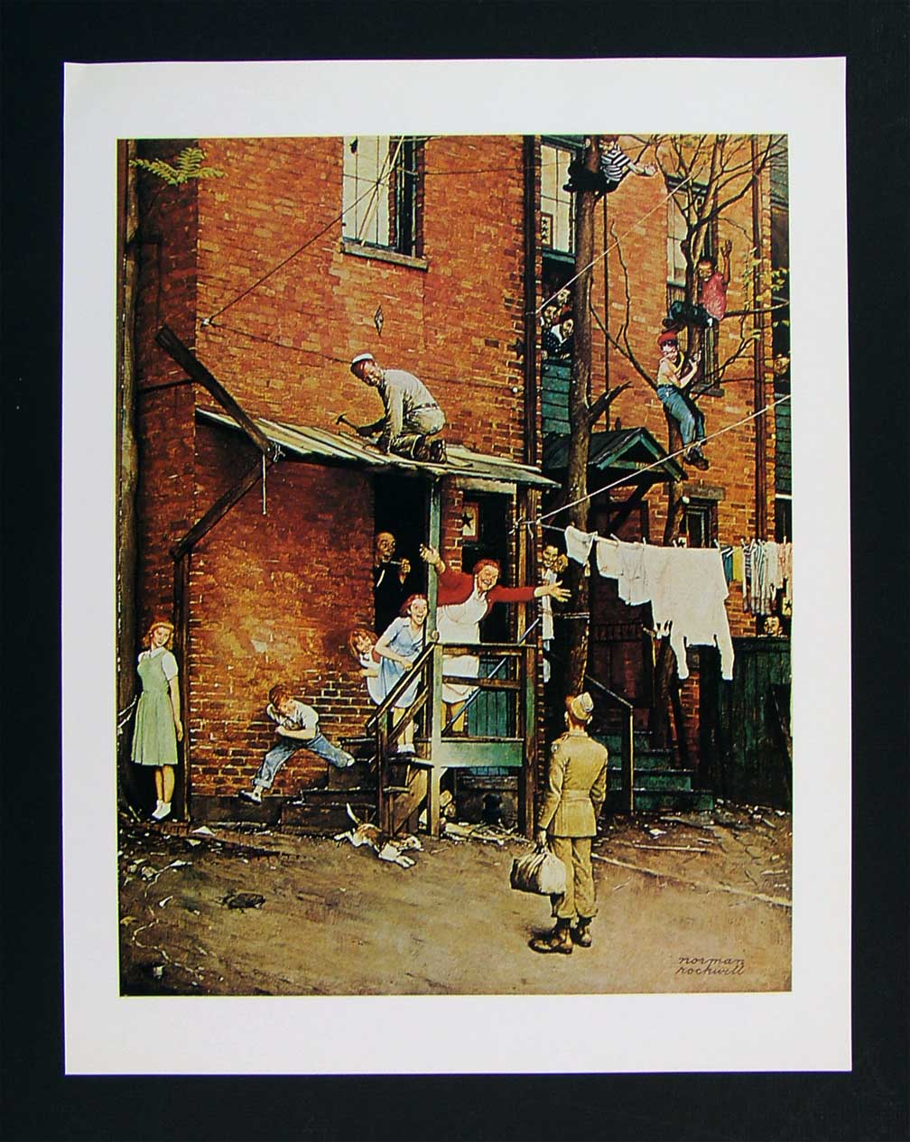
As staged as a Broadway show, Norman Rockwell’s idealized neighborhoods are still alluring in their appeal.
- The bustling tenement neighborhoods of early Norman Rockwell paintings appealed to me, as a child, because the frames were teeming with life: people leaning out of windows, sitting on porches, perching on fire escapes, delivering the morning milk…they were a divine, almost musical chaos. But they were paintings, with all the intentional orchestration of sentiment and nostalgia that comes with that medium. Those images were wonderful, but they were not documents…merely dreams.
That, of course, doesn’t make them any less powerful as an influence on photography.
When I look at a section of an urban block, I try to frame a section of it that tells, in miniature, the life that can be felt all day long as the area’s natural rhythm. There are re-gentrified restaurants, neglected second-floor apartments, new coats of paint on old brick, overgrown trees, stalwart standbys that have been part of the street for ages, young lovers and old duffers. Toss all the ingredients together and you might get an image salad that captures something close to “real”. And then there is the trial-and-error of how much to include, how busy or sparse to portray the subject.
That said, I have explored this theme many times over the years, and worry that I am trying to harvest crops from a fallow field. Have I stayed too long at this particular fair? Are there even any compelling stories left to tell in this approach, or have I just romanticized the idea of the whole thing beyond any artistic merit?
Hopefully, I will know when to strike this kind of image off my “to do” list, as I fear that repetition, even repetition of a valid concept, can lead to laziness….the place where you call “habit” a “style”.
And I don’t want to dwell in that place.
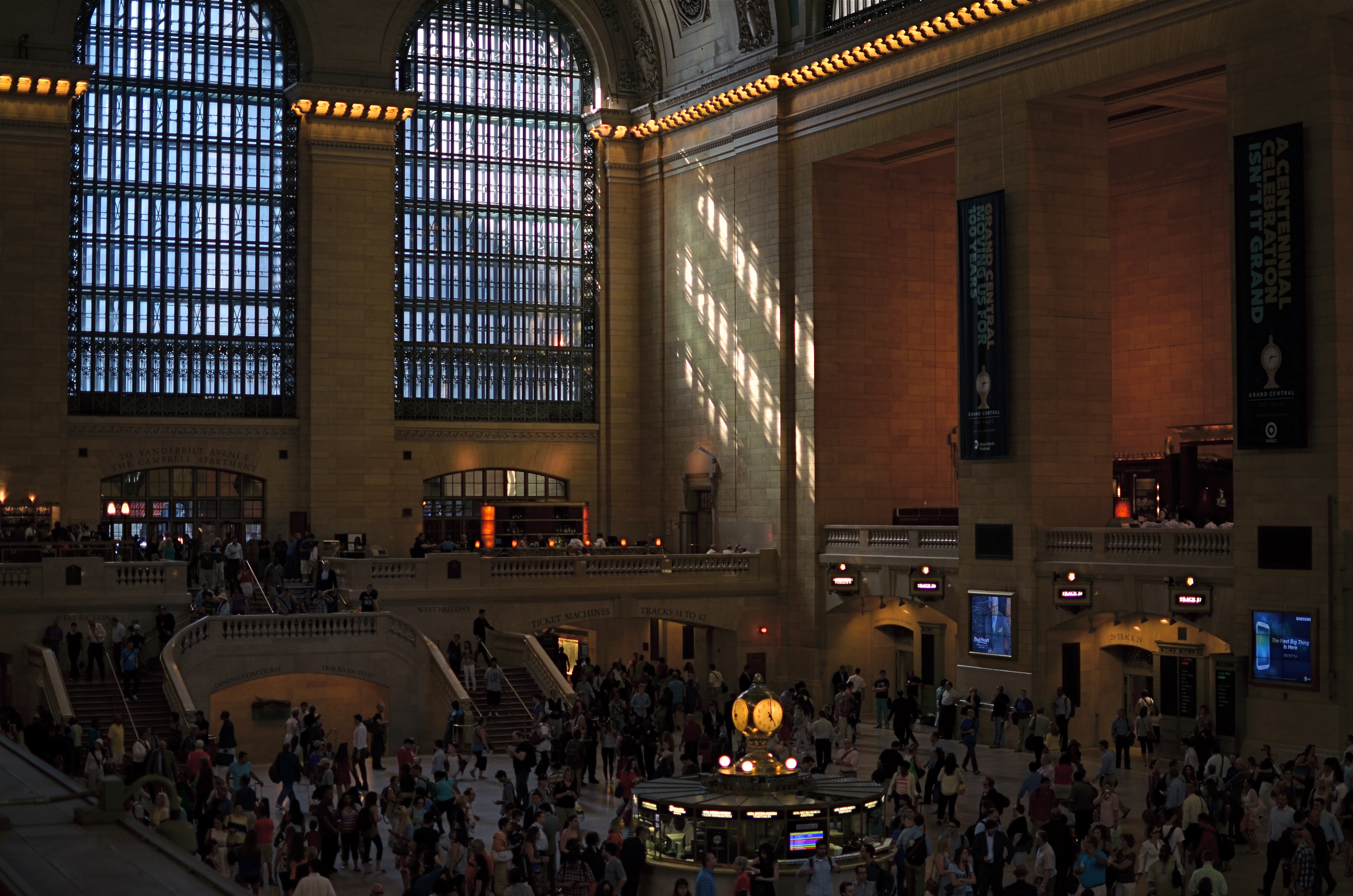
STILL GRAND, STILL CENTRAL
Grand Central Terminal, New York City. 2:11PM, June 21, 2013.
By MICHAEL PERKINS
AMERICA’S ROMANCE WITH RAIL TRAVEL MAY NOW JUST BE A SORT OF CASUAL ACQUAINTANCE (hey, we can still be friends), but the temple which sparked much of the old love between man and train still throbs with life. At 100, Grand Central Terminal (don’t, they beg, call it a station) still delights the eye of even a jaded New Yorker with the sheer scale of its vision. Over 750,000 people per day file through its platforms, shops and restaurants, and, of course, its commuter connections.
As to the era when the terminal truly connected the entire nation, the inevitability of the building as a final destination was never better captured than in the opening for the old network radio series named for it:
As a bullet seeks its target, shining rails in every part of our great country are aimed at GRAND CENTRAL STATION, heart of the nation’s greatest city.
Drawn by the magnetic forces of the fantastic metropolis, day and night, great trains rush toward the Hudson River…..sweep down its eastern bank for one hundred and forty-three miles…..flash briefly by the long, red row of tenement houses south of 125th street…..dive with a roar in to the two and one-half mile tunnel that burrows beneath the glittering swank of Park Avenue…and then…..GRAND CENTRAL STATION!!!!
Details, details.
Shooting the terminal is a bit of an alluring trap, since we all want the wider-than-wide, one-shot glama-panorama that takes in every window, skylight, side stall, commuter, ceiling detail and kiosk. The trap is in becoming so wedded to that shot that we forget about all the smaller dramas and details that would be lost within those gigantic, where’s-waldo mega-frames. On my latest trip there, I had been avoiding the usual wide-angle mania that is all too easy to surrender to, in shooting New York, traveling with only a 35mm prime lens and forcing myself to shoot smaller, more intimate subjects. Primes have normal, human-eye proportions, rather than the distorted stretch of a wide-angle, and cannot zoom. Therefore, shooting inside Grand Central meant:
I couldn’t even dream of getting everything in a single shot, meaning a select part of the story had to be chosen over a “master shot”.
I would have a lens that’s incredibly fast and sharp, so I could take advantage of the terminal’s vast interior (275 ft. long, 120 ft. wide, 125 ft. high) a space that is still largely illuminated by east-west natural light.
When I arrived, the golden glow of mid-afternoon was gently warming its way through the 75-ft-high arched windows on the terminal’s west side. I avoided shooting toward the east, since it currently features large “1-0-0” anniversary numerals in the three windows, plus the new Apple store, both of which I regard as barriers to visual enjoyment of the building. Go time: I settled on 1/200 second, ISO 160, wide open at f/1.8 (sharp to infinity since I was shooting from the diagonal opposite of my subject…we’re talking looong distance) and I kept one of about twenty frames.
Lenses, no less than subjects, are about decisions. You choose one thing and un-choose all other options.
And let the sun shine through.
For more history on the terminal, check out this article, courtesy of Gotham magazine:
http://gotham-magazine.com/living/articles/centennial-secrets-of-grand-central-terminal
COMMANDER-IN-GRIEF
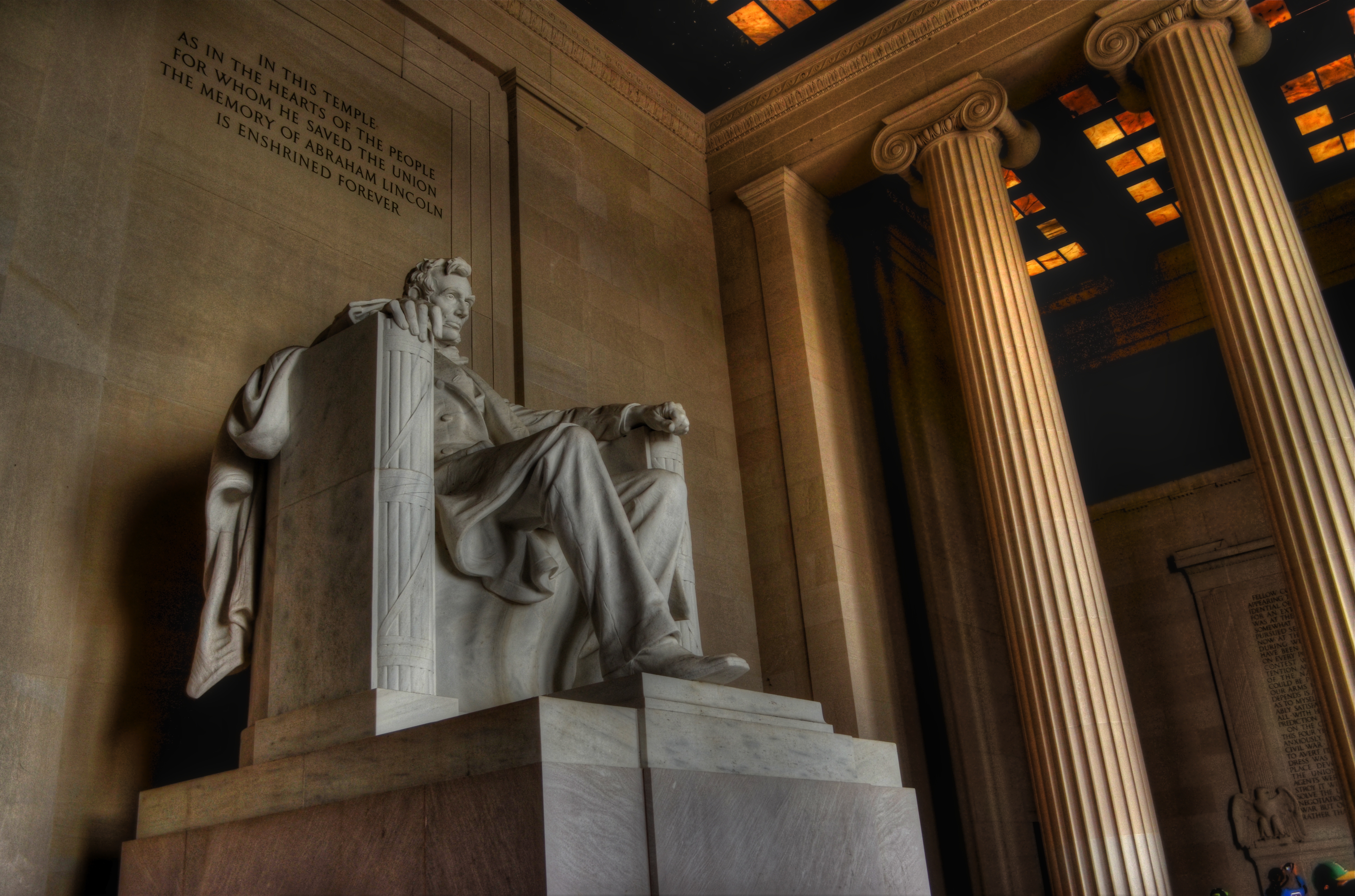
Mr. Lincoln’s vigil continues. See below for details on the making of this image.
By MICHAEL PERKINS
MANY OF THOSE WHO TRAVEL TO WASHINGTON, D.C.’s VARIOUS MONUMENTS each year generally strike me as visitors, while those who throng to the memorial honoring Abraham Lincoln seem more like pilgrims. Scanning the faces of the children and adults who ascend the slow steps to the simple rectangular chamber that contains Daniel Chester French‘s statue of the 16th president, I see that this part of the trip is somehow more important to many, more fraught with a sense of moment, than the other places one may have occasion to view along the National Mall. This is, of course, simply my subjective opinion. However, it seems that this ought to be true, that, even more than Jefferson, Washington or any other single person attendant to the creation of the republic, Lincoln, and the extraordinary nature of his service, should require an extra few seconds of silent awe, and, if you’re a person of faith, maybe a prayer.
This week, one hundred and fifty years ago, the gruesome and horrific savagery of the Civil War filled three whole days with blood, blunder, sacrifice, tragedy, and finally, a glimmer of hope, as the battle of Gettysburg incised a scar across every heart in America. Lincoln’s remarks at the subsequent dedication of the battlefield placed him in the position of official pallbearer for all our sorrows, truly our Commander-In-Grief. Perhaps it’s our awareness of the weight, the loneliness, the dark desolation of that role that makes visitors to the Lincoln Memorial a little more humble, a little quieter and deeper of spirit. Moreover, for photographers, you want more of that statue than a quick snap of visiting school children. You want to get something as right as you can. You want to capture that quiet, that isolation, Lincoln’s ability to act as a national blotter of sadness. And then there is the quiet resolve, the emergence from grief, the way he led us up out of the grave and toward the re-purposing of America.
The statue is a simple object, and making something more eloquent than it is by itself is daunting.
The interior of the monument is actually lit better at night than in the daytime, when there is a sharp fall-off of light from the statue to the pillars and colored glass skylights to its right and left. You can crank up the ISO to retrieve additional detail in these darker areas, but you risk the addition of grainy noise. In turn, you can smooth out the noise later, but, in so doing, you’ll also smear away the beautiful grain in the statue itself.
In my own case, I decided to take three bracketed exposures, all f/5.6, , nice and wide at 20mm, low noise at ISO 100, with shutter speeds of 1/50, 1/100, and 1/200. In blending the three later in Photomatix’ Detail Enhancement mode, I found that the 1/200 exposure had too little information in it, so a composite of the three shots would have rendered the darkest areas as a kind of black mayonnaise, so I did the blend with only two exposures. Stone being the main materials in the subject, I could jack up the HDR intensity fairly high to accentuate textures, and, for a more uniform look across the frame, I gently nudged the color temperature toward the brown/amber end, although the statue itself is typically a gleaming white. The overall look is somewhat more subdued than “reality”, but a little warmer and quieter.
Abraham Lincoln was charged with maintaining a grim and faithful vigil at America’s bedside, in a way that no president before or since has had to do. Given events of the time, it was in no way certain that the patient would pull through. That we are here to celebrate his victory is a modern miracle, and the space his spirit occupies at the Lincoln Memorial is something photographers hunger to snatch away for their own.
What we try to capture is as elusive as a shadow, but we need to own something of it. The commander-in-grief’s legacy demands it.
Follow Michael Perkins on Twitter @mpnormaleye.
Related articles
- Other Proposed Designs for the Lincoln Memorial (ghostsofdc.org)
- Lincoln Memorial Under Construction (ghostsofdc.org)
BLUE ON THIRD AVENUE
The cyanotype option in Nikon’s monochrome posting menu makes this in-camera conversion from color easy. 1/80 sec., f/5.6, ISO 160, 18mm.
By MICHAEL PERKINS
COLOR IS LIKE ANY OTHER COMPONENT IN LIGHT COLLECTION AND ARRANGEMENT, which is, really, what we are doing. Seen as a tool instead of an absolute, it’s easy to see that it’s only appropriate for some photographs. Since the explosion of color imaging for the masses seen in the coming of Kodachrome and other early consumer films in the 1930’s, the average snapper has hardly looked back. Family shots, landscapes, still life arrangements….full color or go home, right?
Well….
Oddly, professional shooters of the early 20th century were reluctant to commit to the new multi-hued media, fearing that, for some novelty-oriented photographers, the message would be the color, instead of the color aiding in the conveying of the message. Even old Ansel Adams once said of magazine editors, that, when in doubt, they “just make it red”, indicating that he thought color could become a gimmick, the same way we often regard 3-d.
In the digital age, by comparison, the color/no color decision is almost always an afterthought. There are no special chemicals, films or paper to invest in before the shutter clicks, and plenty of ways to render a color shot colorless after the fact. And now, even the post-processing steps involved in creating a monochrome image need not include an investment in Photoshop or other software. For the average shooter, monochrome post-processing is in-camera, at the touch of a button. Straight B/W and sepia and even what I call the “third avenue”, the blue duotone or cyanotype, as I’ve used above.Do such quickie options worsen the risk of gimmick-for-gimmick’s sake more than ever? As Governor Palin would say, “you betcha”. Google “over-indulgence”, or just about half of every Instagram ever taken, as evidence.
Hundreds of technical breakthroughs later, it still comes down to the original image itself. If it was conceived properly, color won’t lessen it. If it was a bad idea to start with, monochrome won’t deliver the mood or the tone changes needed to redeem it. Imagine the right image, then select the best way to deliver the message. Having quick fixes in-camera aren’t, initially, a guarantee of anything but the convenient ability to view alternatives. In the photo above, my subject was just too warm, too pretty in natural color. I thought the building itself evoked a certain starkness, a cold, sterile kind of architecture, that cyanotype could deliver far better. The shadows are also a bit more mysteriously rendered.
At bottom, the shot is just a study, since I will be using it to take far more crucial pictures of far more intriguing subjects. But the in-camera fix allows you to analyze on the fly. And, since I got into this racket to shoot pictures, and not to be a chemist, I occasionally like a fast thumbs-up, thumbs-down verdict on something I’ve decided to try in the moment.
Giving yourself the blues can be a good thing.
(follow Michael Perkins on Twitter @ mpnormaleye)
Related articles
- Toning my Cyanotype with Haritaki (altlab2011.wordpress.com)
- Beyond Color (piaffephotos.wordpress.com)
PRETTY/UGLY
By MICHAEL PERKINS
LEGEND HAS IT THAT ORSON WELLES, STAYING FOR A WHILE AS A GUEST AT PETER BOGDANOVICH’S HOME AROUND 1970, convinced him that the small Texas town he wanted to portray in the bleak drama The Last Picture Show would be “too charming” if shot in color. Bogdanovich went with the starkly toned palette of black and white, and you know the rest. Eight Oscar nominations, two wins, and an honored slot in cinema history.
Bogdanovich made an artistic decision to make something “uglier” in order to make it “real”.
For me, this idea has always been like swimming against the current, since, as a kid, I was influenced initially by scenic photographers, then, somewhat later, photojournalists, who seek a completely different end product. I tend to default to the idea of making things look pretty. Even today, me knowing the impact of recording things as they are, warts and all, is one thing, while me, deliberately manipulating an image in order to change or amplify its darker elements is a stretch. It’s not something I instinctively bend toward.
Hideous or wondrous, depending on how you see it. A deliberately “over-cooked” HDR from three exposures, all taken at f/11 for maximum detail, and ISO 100 with a 50mm prime lens.
Still, some stories are told in capture and others are revealed in processing, and while photography is interpretation as well as mere recording, I like to take a crack at changing the context of a picture, to make its parts add up to something drastically different. A few years ago, the parking garage near my job looked out at a massive construction project. My parking slot was situated such that I was about three floors up in the air, peering through the open wall of the garage to easily take in a panoramic view of the entire length of the new building’s emerging structure. I soon got into the habit of getting to work about fifteen minutes early so I could hop out and snap whatever activity I could catch.
The finished building eventually smoothed into something acceptably serviceable, if bland, but, with its raw skeleton mounting day by day, an immense feeling of grim, awful power was climbing out of that place. It couldn’t be seen in color, especially not in the benign, golden light of early morning. This thing was appearing to my eye as a sinewy, dark life force, inevitable, dreadful……an impression I would have to achieve through a complete reworking of tone and texture. I decided to use High Dynamic Range processing, not to merely rescue detail lost in highly contrasted nooks, but to intensify every grain, granule and hobnail of the building, to render it in a surreal, slightly hellish aspect. To make it “ugly” on purpose…..or, more exactly, to my purpose.
Playing at changing the emotional feel of a picture isn’t native to me, so I am always grateful when this part of my brain rouses from sleep and demands to be exercised. The persistent (and false) notion of photography since its inception is that it shows the world as it is, a lie which is debunked with every willful act of picture-taking. No less than painting, the photo image is both document and statement, truth and distortion.
It never has to settle for being mere reality, nor could it claim to be.
And that is its seductive pull.
