THE TAKEAWAY
The girl bathed in ceiling light is a nice start, but this picture needs some help to get where it’s going.
By MICHAEL PERKINS
IT IS SAID THAT THE GODDESS ATHENA WAS BORN, FULLY GROWN AND ARMORED, out of the forehead of Zeus. Other than being the only case where a man experienced anything that approached labor pain, the story always reminds me that ideas rarely arrive in their final form, especially in photography. If Athena had a Leica, she probably could have taken perfect shots without needing to compose or plan. We mere mortals are forced to either (a) report to hate-crazed photo editors, or (b) learn how to crop.
Many shots are created in stages, and there’s no shame in the game, since our original conception undergoes many phases from the first spark to something we’d actually hang on a wall. Creation itself is a process, which is why photographers should actually embrace the stages their work will pass through. The more thought that is applied to making an image, the better chance that the best way of doing something will reveal itself. Of course, it can also reveal the fact that there is nothing really to work with, in which case, hey, the bar should be open now, let’s go lick our wounds.
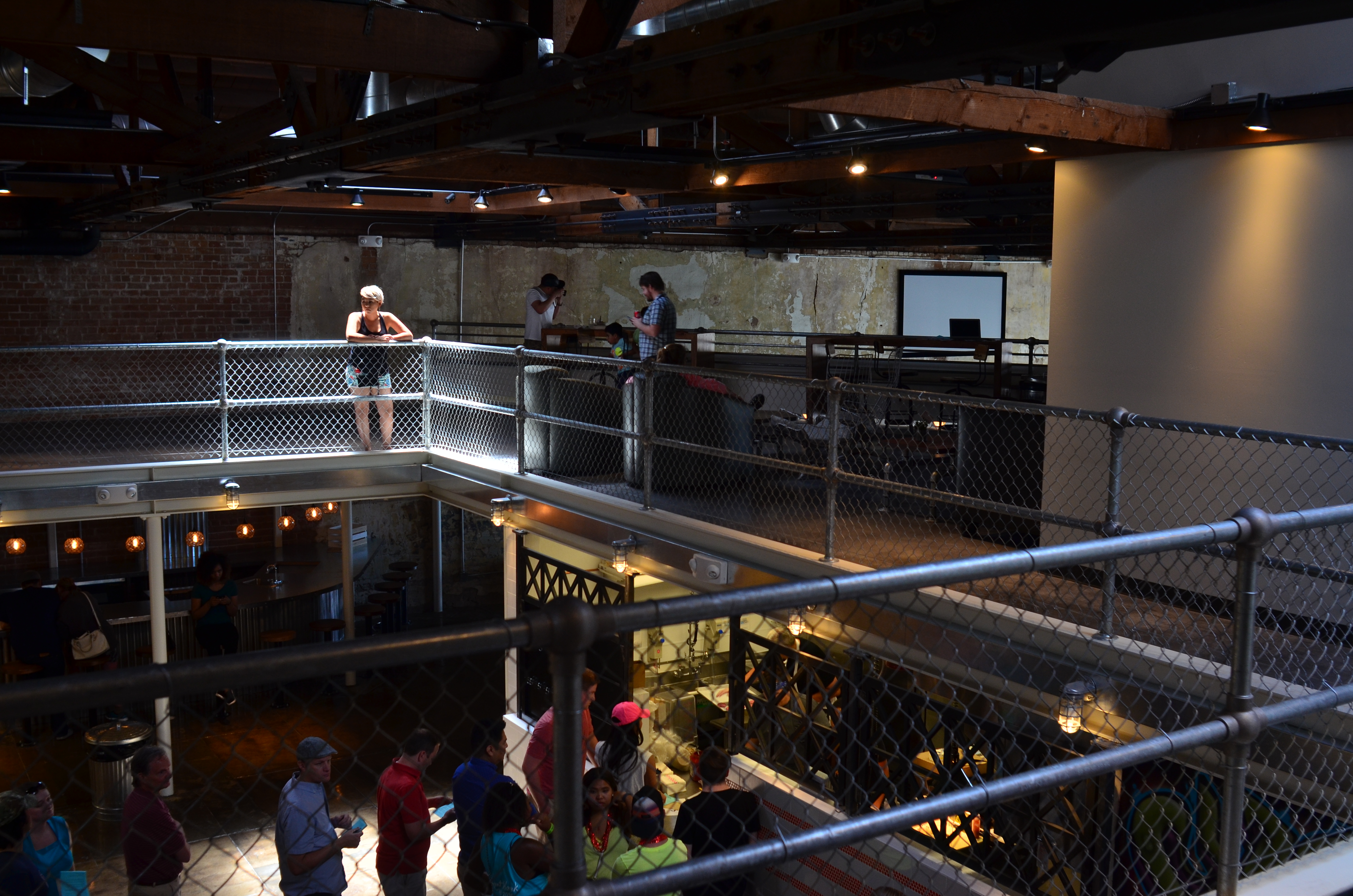
The original shot shown above is not yet a good photograph, but a good beginning for a 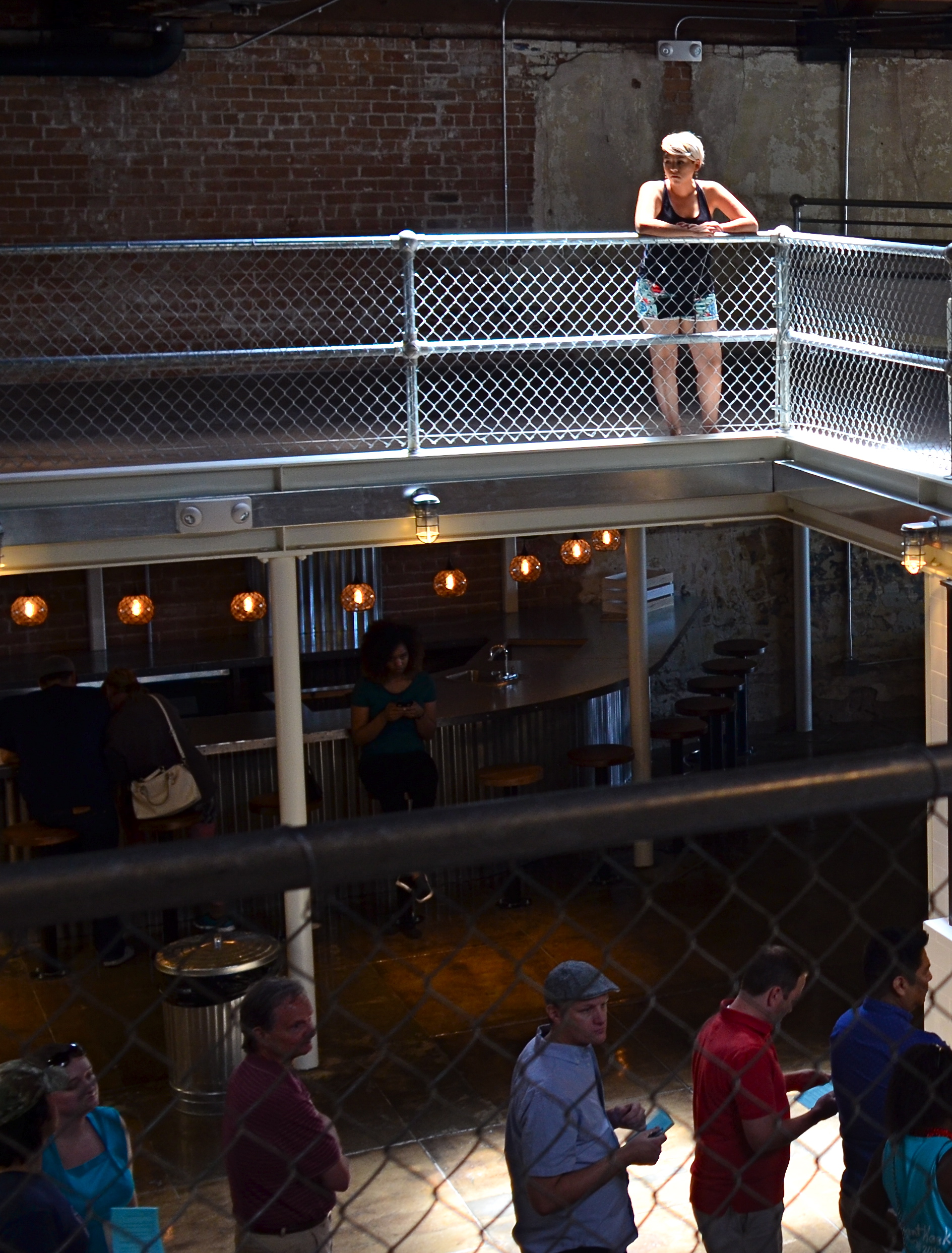 photograph. The lady bathed in light seems certainly to have been pre-selected to be the focal point of the picture, but there are way too many competing elements around her, robbing her of the prominence she deserves in the final frame. So let’s get after it.
First, none of the information on the left side of the frame makes it any clearer that she’s alone or that she’s on the second floor of the building. We can make that plain with half the acreage, so snip. Similarly, the guys in shadow to her right aren’t part of the story we are crafting for her. If she’s isolated, let’s make her isolated and be unmistakable about it. She’s “apart” already from the sea of people below her. She’s geographically and physically separated from them, but the extra guys make the argument weaker, so, snip, away they go.
Finally, the entire upper-floor/lower-floor line of sight will be accentuated if we crop for a portrait orientation and move the frame so she is on the upper-right-hand corner of it. It forces the eye to discover the story of the picture vertically, so snip and we’re done.
So, at the end, we did not make any changes via processing, only the old scissors. Taking things away, not adding them on, actually made the picture work better. Fate gave me the girl and the wonderful light she was bathed in, but there was work to do. She didn’t arrive, ready to party, like Athena, but she’s a little closer to goddess status after some adjustment.
BACKING OFF, BACKING AWAY
An early case of HDR madness on your humble author’s part. Yeah, nothing in nature looks like this. Ever.
By MICHAEL PERKINS
YOU MAY HAVE HEARD THE JOKE ABOUT THE COUNTRY PARSON WHO WAS IN THE HABIT of writing, in the margins of his sermon script, “Argument weak here. Scream like hell.” If he were a man of the camera instead of a man of the cloth, this instruction might have read, “photograph ineffective here. Over-cook everything.”
Choose your favorite post-editing workflow and chances are that you, or someone like you, have tried to rescue an indifferent image by pouring a few gallons of digital gravy over it, hoping to turn flank steak into filet. And you probably have your own personal folder of shame for the results of such attempts. Mine would fill up a small bookshelf. In the Library of Congress.
One of the hallmarks of the early digital age seems to be an affection for over-saturated color, as if we had had quite enough of natural tones, thank you, and were desperate to return to the earliest days of photographic color, when everything was played on the loud pedal. It’s kind of perverse, but it seems like, as soon as photographers outdistance an old technical barrier, they seem to get nostalgic for it and try to revive it. Why resuscitate daguerreotypes, pinhole cameras, high grain slow films, etc. Irony? Curiosity? Novelty? Who knows?
Whatever the motivation, the result has been a cornucopia of mobile apps that aim for an unnatural distortion of color values (spend ten minutes on Instagram for as many samples as you want) and the lo-fi or lomography movement toward cheap plastic toy cameras that can’t help but deliver hyped up hues (again, Instagram). There are also a number of HDR programs which tend to tempt people beyond their endurance when it comes to electrifying color even in an image’s shadows, making everyday like a day-glo version of your uncle’s golf togs and resulting in some pretty hideous excess (and yet, alas, such was I. See left).
What’s the new normal? Again, can’t tell you. It’s pretty certain, though, that we love cranking the color up to 11, whether it serves the photo or not. Backing off and backing away on the hue-mongous overkill takes real discipline. The amped-up image is fascinating in some kind of moth-to-the-flame way, but eventually it becomes like any other excess, in that it stifles, rather than frees, your art. No effect is so miraculous as to work in every situation. Eventually, it’s about what you’re seeing and saying.
THE FLOATING 50
From Lobby To Terrace, 2015. A near 50% crop from the original, seen below at left.
By MICHAEL PERKINS
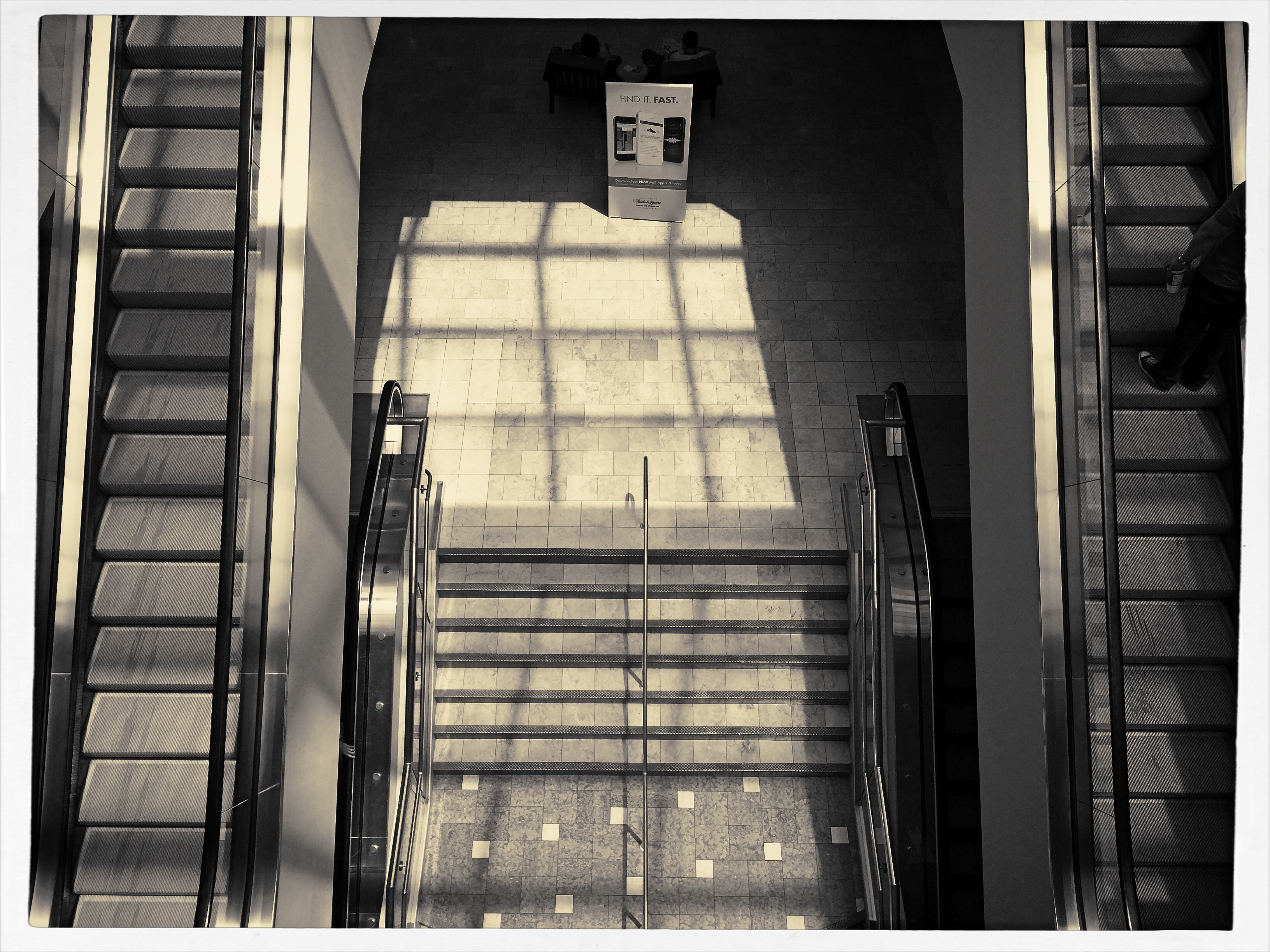
YOU CANNOT BECOME A GREAT PHOTOGRAPHER WITHOUT BEING YOUR OWN BEST EDITOR, no matter how brilliant or instinctual your shooter’s eye may be. Art is both addition and subtraction, and the image frame is about both inclusion and exclusion. You get your viewers’ attention by knowing what to show. You hold that attention, and burn your images into their minds, by learning what to pare away.
I’ve written several variations on this theme, so the best way to restate it is in the voice of the truly visionary godfather of street photography, Henri Cartier-Bresson. Ironically, this master of in-camera composition (he is reputed never to have cropped a single shot after it was taken) was nonetheless remarkably aware of what most of us must do to improve an image through post-editing:
This recognition, in real life, of a rhythm of surfaces, lines, and values is for me the essence of photography; composition should be a constant of preoccupation, being a simultaneous coalition – an organic coordination of visual elements. We must avoid snapping away, shooting quickly and without thought, overloading ourselves with unnecessary images that clutter our memory and diminish the clarity of the whole.
Insert whatever is French for “Amen” here.

The original. It’s easy to see what needs to be cut out of this one.
I often find that up to 50% of some of my original shots can later be excised without doing any harm to the core of the photograph, and that, in many cases, actually improving them. Does that mean that my original concept was wrong? Not so much, although there are times when that’s absolutely true. The daunting thing is that the 50% floats around. Sometimes you need to cut the fat in the edges: other times the dead center of the shot is flabby. Sometimes the 50 is aggregate, with 25% trimmed from two different areas of the overall composition.
On occasion, as with the above picture (see the original off to the left), the entire bottom half of the shot drags down the top. In the cropped shot, the long lateral line between indoors and outdoors is much more unbroken, making for a more “readable” shot from left to right. The disappearance of the dark furniture at the bottom of the master shot creates no problems, and actually solves a few. Do a disciplined search of the nobler near-misses in your own work and see how many floating 50’s you discover. Freeing your shots of the things that “clutter our memory and diminish the clarity of the whole” is humbling, but it’s also a revelation.
(DON’T) WATCH THIS SPACE
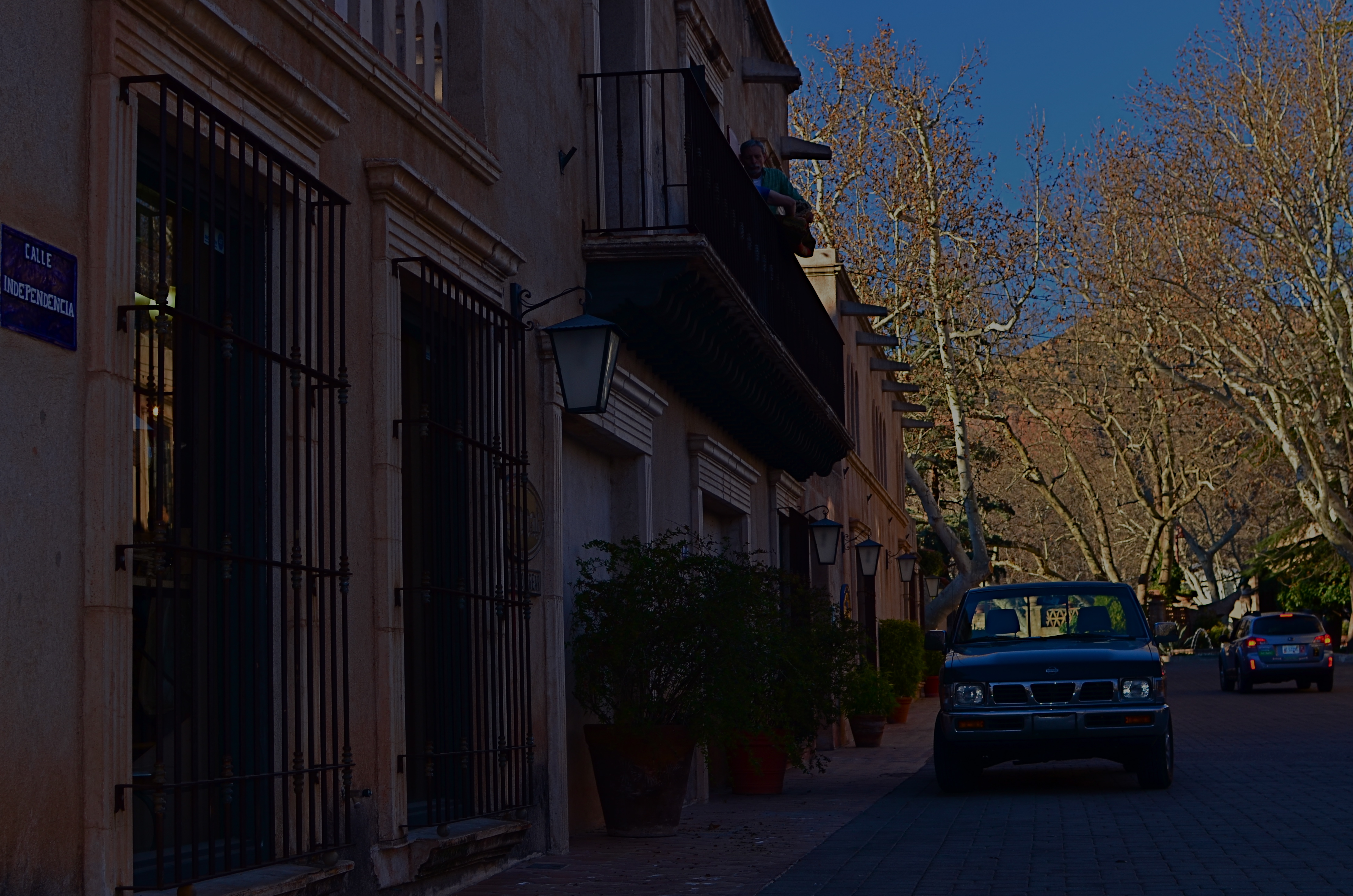
Calle Independencia, 2015.
By MICHAEL PERKINS
CALL IT “EYE-HERDING”, if you will, the art of channeling the viewer’s attention to specific parts of the photographic frame. It’s the first thing we learn about composition, and we address it with a variety of techniques, from depth-of-field to color manipulation to one of my favorites, the prioritizing of light. Light values in any image do have a hierarchy, from loud to soft, prominent to subordinate. Very few photos with uniform tone across the frame achieve maximum impact. You need to orchestrate and capitalize on contrast, telling your viewers, in effect, don’t watch this space. Watch this other space instead.
In many cases, the best natural ebb and flow of light will be there already, in which case you simply go click, thank the photo gods, and head home for a cold one. In fact, it may be that “ready to eat” quality that lured you to stop and shoot the thing in the first place. In many other cases, you must take the light values you have and make the case for your picture by tweaking them about a bit.
I have written before of the Hollywood fakery known as “day for night”, in which cinematographers played around with either exposure or processing on shots made in daylight to simulate night…a budgetary shortcut which is still used today. It can be done fairly easily with still images as well with a variety of approaches, and sometimes it can help you accentuate a light value that adds better balance to your shots.
The image at the top of this page was made in late afternoon, with pretty full sun hitting nearly everything in the frame. There was some slightly darker tone to the walls in the street, but nothing as deep as you see here. Thing is, I wanted a sunset “feel” without actually waiting around for sunset, so I deepened the overall color and simulated a lower exposure. As a result, the sky, cliffs and dogwood trees at the far end of the shot got an extra richness, and the shop walls receded into deeper values, thus calling extra attention to the “opening” at the horizon line. The shot also benefits from a strong front-to-back diagonal leading line. I liked the original shot, but with just a small change, I was asking the viewer to look here a little more effectively.
Light is a compositional element no less important than what it illuminates. Change light and you change where people’s eyes enter the picture, as well as where they eventually land.
DOCUMENTARY OR DRAMA?
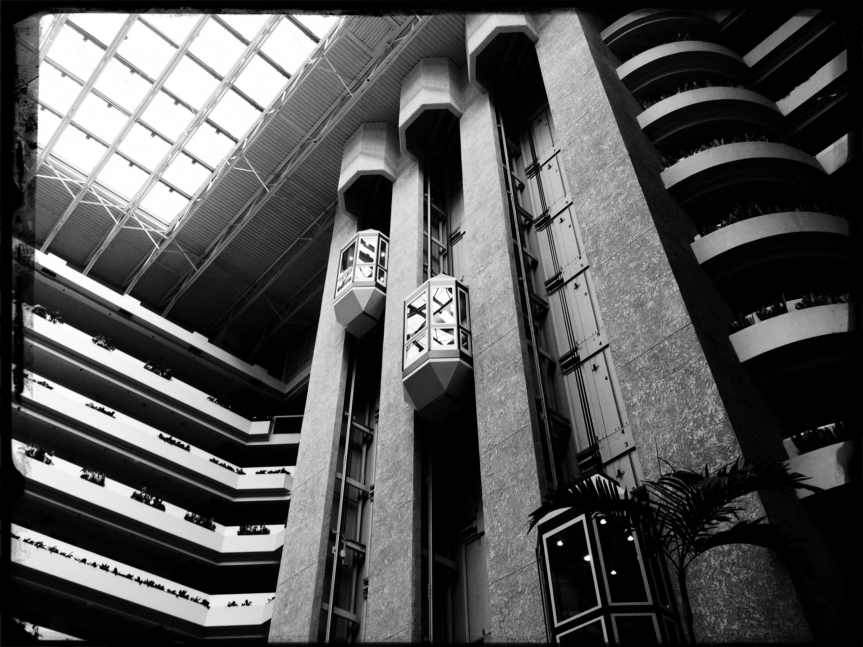
Creative use of contrast and texture can amp up interest in a shot that is overly pretty.
By MICHAEL PERKINS
I RECENTLY HEARD AN INTERESTING CRITIQUE OF A DRAMATIC CONTENDER for Best Film in the 2015 Oscar race. The critic in question complained that the film in question (Boyhood) was too realistic, too inclusive of banal, everyday events, and thus devoid of the dynamics that storytellers use to create entertainment. His bottom line: give us reality, sure, but, as the Brits say, with the boring bits left out.
If you’re a photographer, this argument rings resoundingly true. Shooters regularly choose between the factual documentation of a scene and a deliberate abstraction of it for dramatic effect. We all know that, beyond the technical achievement of exposure, some things that are real are also crashingly dull. Either they are subjects that have been photographed into meaninglessness (your Eiffel Towers, your Niagara Fallses) or they possess no storytelling magic when reproduced faithfully. That’s what processing is for, and, in the hands of a reliable narrator, photographs that remix reality can become so compelling that the results transcend reality, giving it additional emotive power.
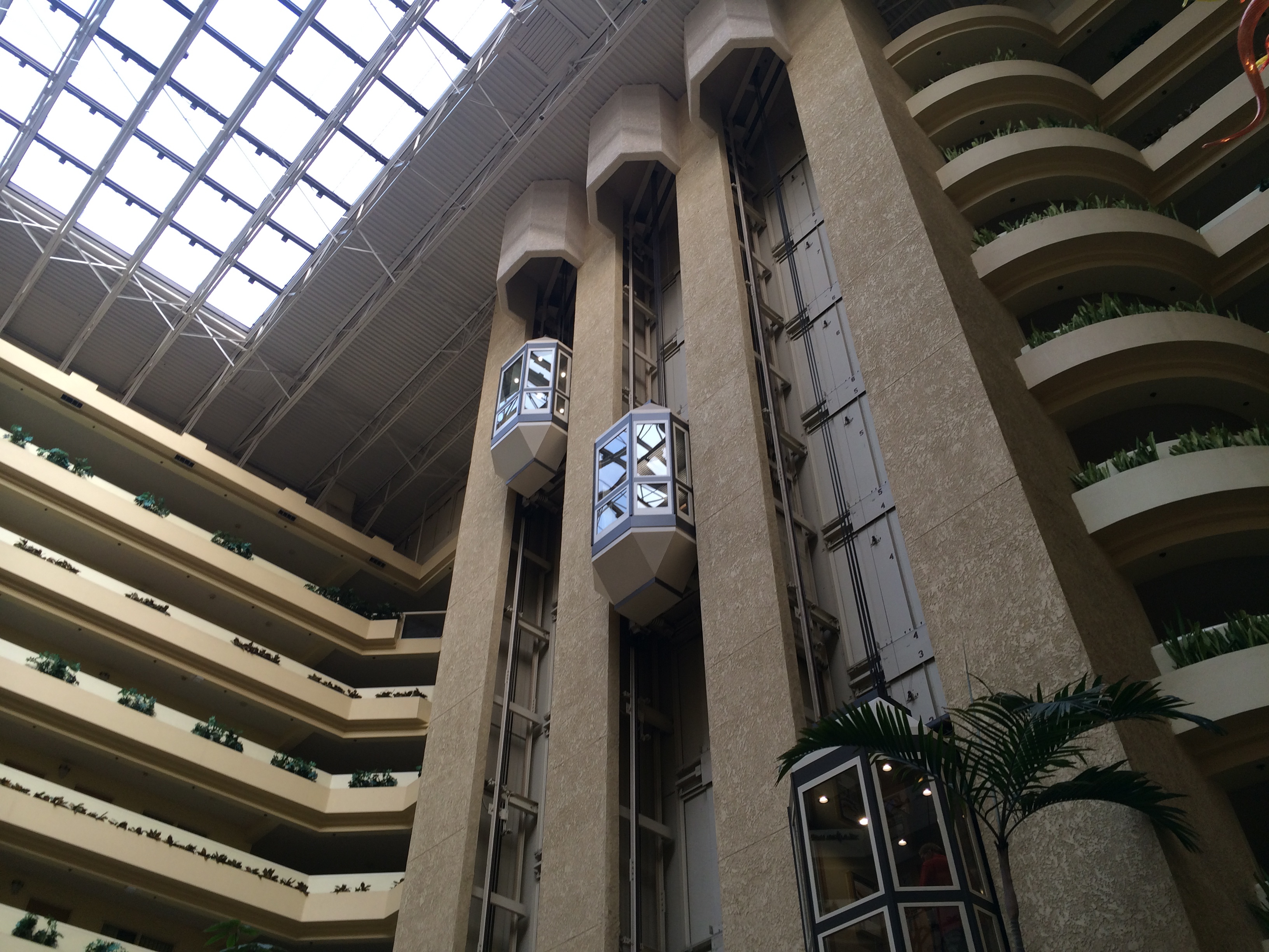
The original. Workable composition, but hampered by its realism.
This is why colors are garish in The Wizard Of Oz, why blurred shots can convey action better than “frozen” shots, and why cropping often delivers a bigger punch and more visual focus than can be seen in busier compositions. Drama is subject matter plus the invented contexts of color, contrast, and texture. It is the reassignment of values. Most importantly, it is a booster shot for subjects whose natural values under-deliver. It is not “cheating”, it is “realizing”, and digital technology offers a photographer more choices, more avenues for interpretation than at any other time in photo history.
The photo at left was taken in a vast hotel atrium which has a lot going for it in terms of scope and sweep, but which loses some punch in its natural colors. There is also a bit too much visible detail in the shot for a really dramatic effect. Processing the color with some additional grain and grit, losing some detail in shadow, and amping the overall contrast help to boost the potential in the architecture to produce the shot you see at the top of this post. Mere documentation of some subjects can produce pretty but flaccid photos. Selectively re-prioritizing some tones and textures can create drama, and additional opportunity for engagement, in your images.
DETAILS, DETAILS
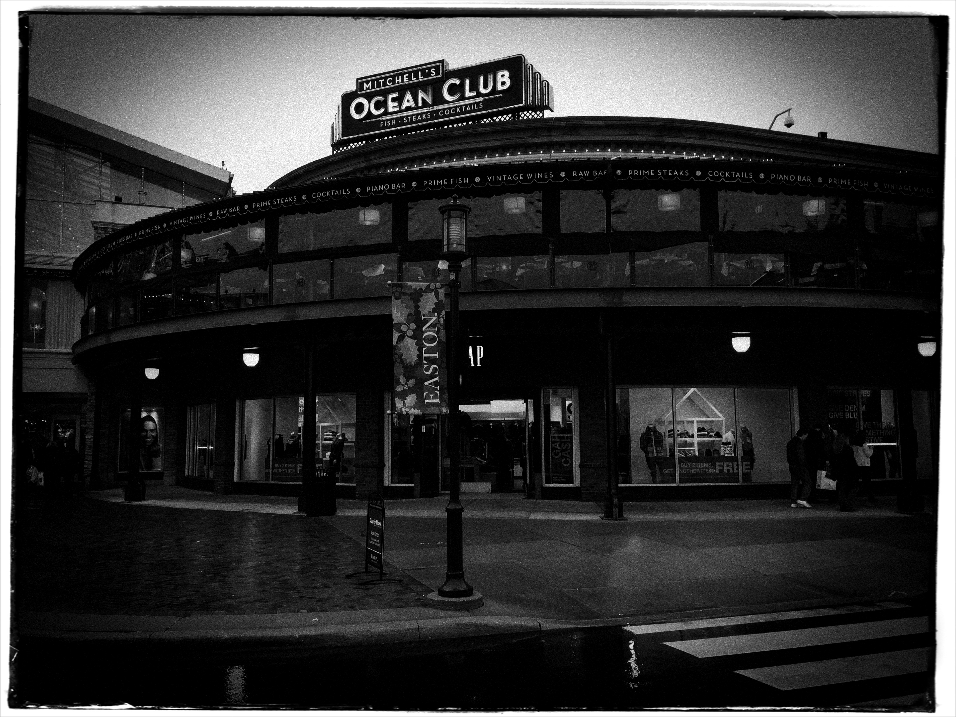
Moody, but still a bit too tidy. Black and white by itself wasn’t enough to create the atmosphere I wanted.
By MICHAEL PERKINS
EVEN THOUGH MOST GREAT PHOTOGRAPHERS PROCLAIM that any “rules” in their medium exist only to be broken, it’s often tough to chuck out regulations that have served you well over a lifetime of work. Once you get used to producing decent images through the repetition of habit, it takes extra nerve to take yourself outside your comfort zone, even if it means adding impact to your shots. You tend not to think of rules as arbitrary or confining, but as structural pillars that keep the roof from falling in.
That’s why it’s a good exercise to force yourself to do something that you feel is a bad fit for your style, lest your approach to everything go from being solid to, well, fossilized. If you hate black and white, make yourself shoot only monochrome for a week. If you feel cramped by square framing, make yourself work exclusively in that compositional format, as if your camera were incapable of landscape or portrait orientations. In my own case, I have to pry my brain away from an instinctual reliance on pinsharp focus, something which part of me fears will lead to chaos in my images. However, as I occasionally force myself to admit, sharp ain’t everything, and there may even be some times when it will kill, or at least dull, a picture.
Sharpness just where it’s needed, and nowhere else.
With post-processing such an instantaneous, cheap, and largely effortless option these days, there really isn’t any reason to not at least try various modes of partial focus just to see where it will lead. Take what you believe will work in terms of the original shot, and experiment with alternate ways of interpreting what you started with.
In the shot at the top of this post, I tried to create mood in a uniquely shaped fish house with monochrome and a dour exposure on a nearly colorless day. Thing is, the image carried too much detail to be effectively atmospheric. The place still looked like a fairly new, fairly spiffy eatery located in an open-air shopping district. I wanted it to look like a worn, weathered joint, a marginal hangout that haunted the wharf that its seafood theme and design suggested. I needed to add more mood and mystery to it, and merely shooting in black & white wasn’t going to get me there, so I ran the shot through an app that created a tilt-shift focus effect, localizing the sharpness to the rooftop sign only and letting the rest of the structure melt into murk.
It shouldn’t be hard to skate around a rule in search of an image that comes closer to what you see in your mind, and yet it can require a leap of faith. Hard to say why trying new things spikes the blood pressure. We’re not heart surgeons, after all, and no one dies if we make a mistake.Anyway, you are never more than one click away from your next best picture.
THE REVISION DRAFT
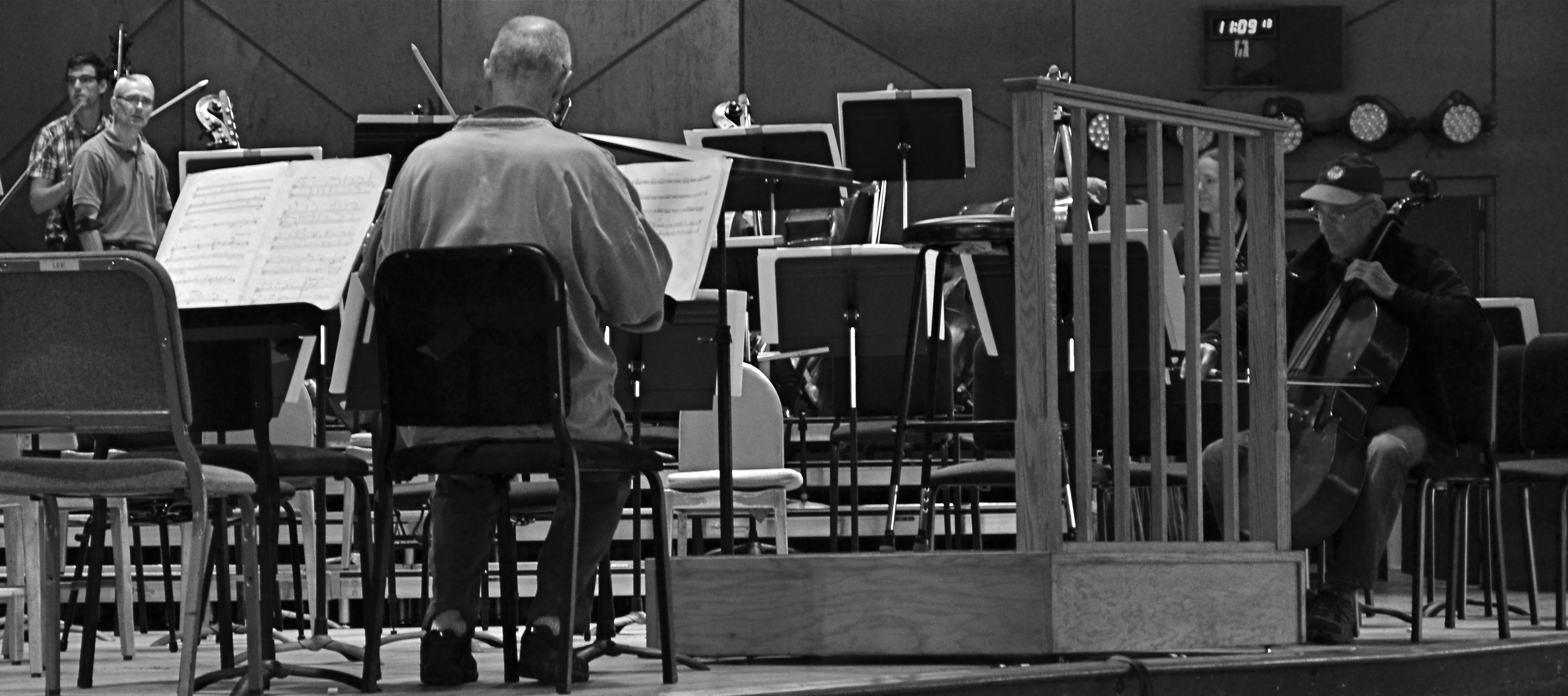
Reducing is remixing: this Tanglewood rehearsal photo was at least 2/3rds bigger in the original, but a severe crop highlights a relationship between these players that the bigger image buried.
By MICHAEL PERKINS
HERE’S A SENTENCE YOU’RE NOT GOING TO HEAR ANYWHERE ELSE THIS WEEK: Being a club DJ can actually give you a fresh viewpoint on your photography.
I’ll let that sink in.
I know what you you’re thinkin’: did he drink six shots or only five? But I’m kind of sober, and rather serious. In a club setting, the mix is often more important than the song, or, more correctly, it allows the song to have an infinite number of alternative lives, depending on what you do with the turntables. Record companies recognized this in the heyday of disco, remixing hit tracks for more thump and bump, longer edits, brass overdubs, etc. As time went on, DJs interspersed their own random elements in the moment to create their own signature blends.
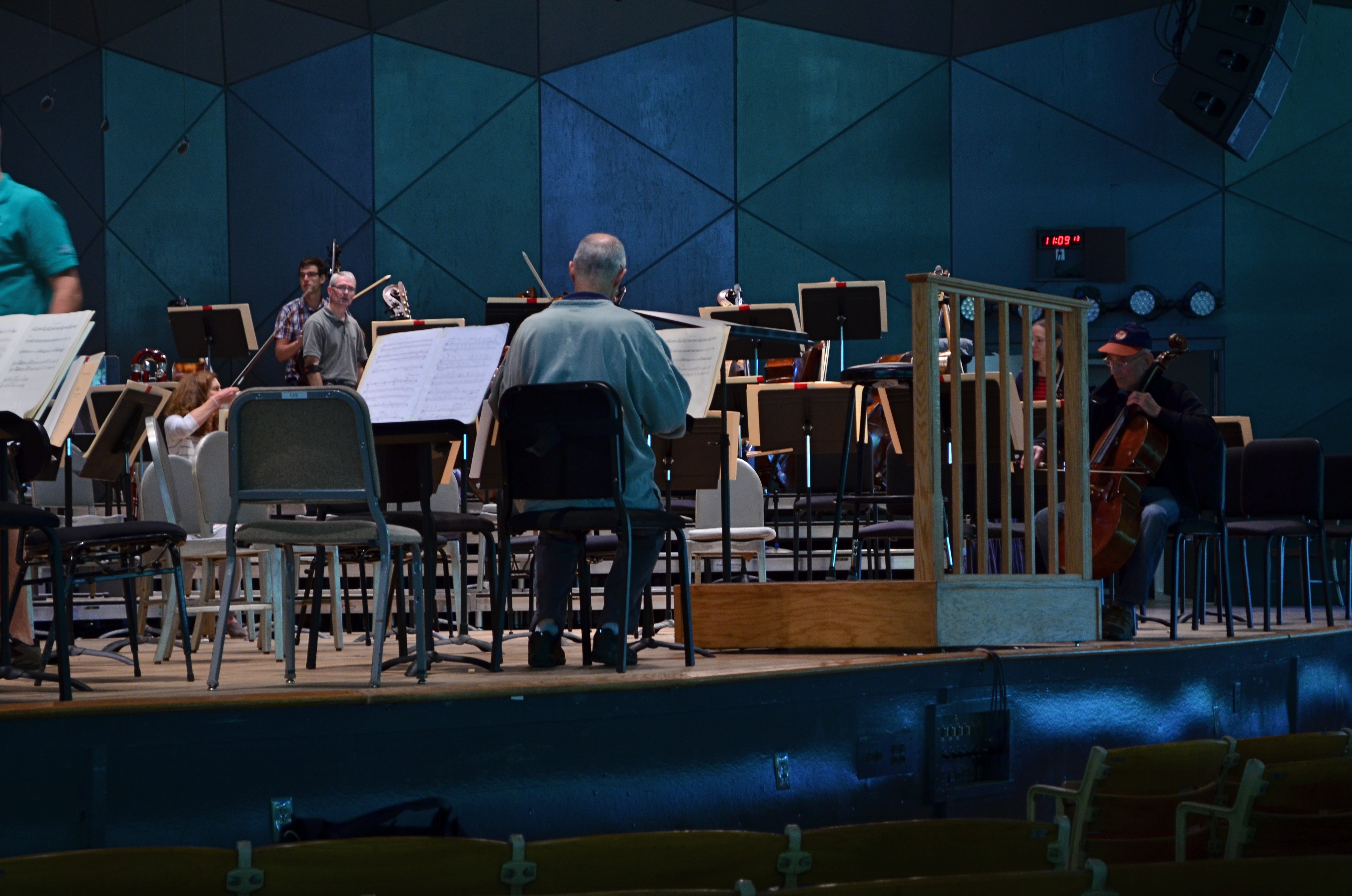
The original.
So what does this have to do with photography? Pretty much everything. In the digital era, post-production software is nearly half of some shooters’ workflow. So much emphasis is placed on what you can fix after the shutter is clicked that, for many, actually planning and taking the picture is the least important part of the process. Let’s lay aside the fact that I personally believe that this can get out of hand…..the point is, by allowing yourself the flexibility to revisit and remix a photo many times over its lifetime means you are not limiting yourself to one interpretation of what you originally created.
However, don’t keep merely to a reprocessing of the exposure or tone elements in the picture, that is, boosting color, adding filters, converting to monochrome. Think of compositional space as a remix element as well. Did you need all the real estate taken up in the original picture? Would that landscape shot work more effectively in portrait or square format? Did you originally include information in the frame that just adds clutter, sending your viewer’s eye wandering around aimlessly? In short, does your first reading of the “idea” of the picture still seem valid?
See the “after” picture at the top of the page and its “before” equivalent to the left. Did the picture gain or lose from the changes?
Another musical musing: George Gershwin personally played Rhapsody In Blue like a snappy jazz piece, not the stately symphonic standard that’s re-created by most modern performers. Does one rendition sound better or worse? Who knows? Who cares? What matters is that the process reveals different traits within the core music with every new mix. Your photographs will benefit in the same way. Just trust yourself to tinker.
APP-Y HOLIDAYS

You can convert a color shot through the “old Kodachrome” filter on the AltPhoto app…..
By MICHAEL PERKINS
THE HOLIDAY SEASON MAY OFTEN SEEM TO HAVE “OFFICIAL” COLORS, (red, green, etc.) but its unofficial colors reside primarily, and gloriously, in memory. Given how many iterations of photography span most of our lives, our minds tend to twist and tweak colors into highly individualized chromatic channels. Are your most treasured moments in ’50’s Black and White? ’60’s Kodachrome? In the time-tinted magentas of snaps from the 70’s? In blue-green Super 8 Ektachrome or expired Lomo film? Or do you dream in Photoshop?
This is personal stuff, very personal. It seems like we ought to agree universally on the “correct” colors of the season, but, given that our most precious holiday moments are preserved on various archival media, it might be our memory of seeing these events “played back” that is stronger than our actual remembrance of them. As Paul Simon says, everything looks worse in black and white, or in this case, what really happened pales in comparison to our print, Polaroid, movie and slide souvenirs.
..or you can whip up this warm platinum print simulation.
This means that there are a million subliminal color “cues” that trigger memory, and not all of them come from “correctly” exposed images. Color is mood, and seasonal pictures can benefit greatly from the astounding range of processing tools suddenly available to everyone. Not all photographs benefit from apps and digital darkroom massages, for sure, but their use is perhaps more seductive, in this mental mid-point between reality and memory than at other times of the year. Fantasy is in play here, after all, and fantasy has no “right” hue. Dreams are too vast a realm to be confined to the basics, so ’tis the season to dip into a wider paintbox.
Memory needs room to breathe, and the photographs that help them fully fill their lungs become the gifts that keep on giving.
YOU ARE PHOTOSHOP
By MICHAEL PERKINS
EVER SINCE THE ARRIVAL OF THE DIGITAL DARKROOM and its attendant legion of post-production fixes, the world of photography has been pretty evenly divided into “befores” and “afters”, those who prefer to do most of their picture making in-camera and those who prefer to “fix” things after the shutter clicks. Most amateur photography, in the film era, was heavily weighted in favor of the “befores”, since a lot of traditional touch-up technology was economically beyond the reach of many. In the Photoshop era, however, the economic barrier to post-production was shattered, resulting in a more even balance between the two philosophies.
Shoot your black and white images as black and white images, not color shots drained of hue after the fact.
I really see this quarrel as very sharply defined when it comes to black and white photography, with many shooters making most, if not all of their monochromes from shots that were originally color, then desaturated or otherwise manipulated as an afterthought. I prefer to shoot b&ws in-camera, however, for the very simple reason that it gets you thinking in black and white terms, from lighting to composition. It also allows you to benefit from digital’s immediate feedback/playback strengths to shape your shot in the moment. If you’ve worked in mono for a while, and especially if you’ve ever shot on b&w film stock, you are used to seeing the 50 shades of gray that subtly shape the power of an image. More importantly, you realize that black and white is much more than color with the hues sucked out. It’s not a novelty or a gimmick, but a distinct way of seeing.
When you conceive a shot in color, you are shooting according to what serves color well. That means that not all color shots will translate well into grayscale. Fans of the old Superman tv show will recall that, during the series’ early b&w days, George Reeves’ uniform had to be made in various shades of brown so it would “read” correctly in monochrome to viewers who “knew” the suit was red and blue. Cameramen had to plan what would happen when one set of values was used to suggest another. Tones that give a certain punch to an image may look absolutely dead flat if you simply desaturate for mock-mono from a color shot. And, anyway, there are plenty of ways to pre-program many cameras to adjust the contrast and intensity of a b&w master image, as well as the use of filters (polarizers for instance) that do 90% of the tasks you’d typically try to achieve in Photoshop anyway.
The mid-point compromise would seem to be to take both color and black and white shots of your subjects in-camera, allowing you the option of custom processing at least one image afterward. However, knowing what tonal impact you want before you click the shutter is just easier, and usually more productive. Do your shooting with purpose, on purpose. Making a b&w “version” of a color shot after the fact will likely bake up as half a loaf.
UNDER-PERFORMING
By MICHAEL PERKINS
DURING THE GOLDEN AGE OF SLIDE FILM, I KNEW PLENTY OF PHOTOGRAPHERS who feared the unforgiving quality of the medium. The way that, with the educated guessing involved in many exposures, it was all or nothing. Prints. coming from a negative, could be created and re-created almost endlessly, but reversal film was, with few exceptions, a lot harder to massage. The processed slide was, for most shooters, the end of the argument. You either nailed it or….
Slide shooters became a kind of breed apart, since we had to work harder to coax good results out of our chosen medium. Slide film was, for the most part, a lot slower than daylight print film, so that, on some days, merely framing a shot in shade meant you could reduce your subject to a Dutch painting, mood-wise. A few of us played to that bias as well, deliberately under-lighting shots to boost color or isolate key subjects in the frame….making them “pop.” Others created strange effects by cross-processing, giving the lab instructions that ran counter to the recommended developing for a given film. And a lot of us became self-taught illumination geeks in a desperate attempt to get enough light to the film, causing our families to recoil at the approach of our monstrous flashguns. Their retinas died for our sins.
Yield, 2014. 1/30 sec., f/4, ISO 100, 35mm.
Now we’re at a place where the camera is really the film, and that film can be made immediately, accurately responsive to nearly any lighting situation. Digital sensors have all but eliminated the need for spot flashes at all, and, as for rendering mood, if you can visualize it, you can pretty much shoot it. At a recent visit to an apple orchard gift shop (hey, it’s autumn!) I came upon an immense table of green and red apple varieties arranged in ready-to-buy bags. The light in the place was pretty meager to start with, but there was still enough of it to over-crowd the shot with background clutter….jars of jams, counters of candies, jugs of cider, peeps, etc. I wanted the warm colors of the apples to carry the entire image, so I started to think like a slide photographer and deliberately under-exposed the shot. That didn’t mean shutting down the aperture beyond f/4, since the place was fairly dark already, but merely leaving my ISO at its lowest setting, thereby telling the sensor not to suck in any additional light. I didn’t have much depth of field, but the somewhat gauzy quality at the rear and sides actually added to the warm nostalgia of the shot, so I kept it.
Again, digital makes it possible to try a lot of approaches to a task within the space of a few minutes, while the moment is there to be seized. You don’t have to physically consume film, shooting twenty frames with different settings and bearing the cost of processing them all in the hope that “the one” is in there somewhere. Cause and effect are compressed into a shorter, workable space, and success increases. To an old slide man, this is salvation of the first order. Now we manipulate the medium instead of the other way around. Man.
NORMALEYE GALLERY UPDATE: HOME, HOME ON THE “RANGE”
A two-exposure HDR image with more emphasis on content than processing.
By MICHAEL PERKINS
HISTORY BUFFS WHO HAVE EXHAUSTIVELY RESEARCHED THE HELLISH ANIMOSITY OF THE AMERICAN CIVIL WAR, a conflict which sowed seeds of resentment that bear bitter fruit to this very day, may have some small grasp of the vitriolic divide between those who espouse High Dynamic Range (HDR) photography and those who believe its practitioners are in league with Beelzebub. Pro-HDR factions believe those who resist this magical art should be forced to declare themselves Amish on the spot, while the opposite camp believes that all cameras that shoot HDR should be pulverized and used as landfill in Hades. We’re talking irreconcilable differences here.
When HDR first came to my attention, I welcomed it, as many others did, as a way to get around a long-standing problem in exposure….how to modulate between blackout and whiteout in extremely contrasty situations in which a single exposure would either blow out the sky through the window or bury the corners of an interior in blackness. My first attempts with it were exciting, as I tried to shoot frames bracketed across a three or five shot range of exposures, then smooth out the drastic differences between light and dark in the final image. The idea of using HDR for a sci-fi look or a painterly effect never appealed to me. I was really trying to use it to make my pictures replicate more closely the adjustment between light and dark that the eye makes instantaneously.
Over the last five years, however, as I review images I’ve made with HDR software. First, I use the program less with each passing year, and second, I no longer use it to retrieve “lost” tones in dark or light areas of an image. The program I have used since day one, Photomatix, has two main choices, Detail Enhancement and Tonal Compression, and, at first, I worked almost exclusively with the former. For wood grain, stone texture, botanical detail and cloud contrast, it’s remarkably effective. However, it’s also easy to produce images which are too dark overall, and accentuate noise in the individual images. Overcook it even a little and it looks like a finger painting done with hot lava. It thus actually works against the original “looks more like reality” objective.
On the other hand, producing the blended image in the Tonal Compression mode retains most of the sharp detail you get in Detail Enhancement without the gooey consistency. It has fewer attenuating controls, but as I go along, I find I am using it more because it simply calls less attention to itself. In either mode, I have made a conscious effort to throttle the heck back and under-process as much as I can. I’m just getting sick of shots that announce “hey, here comes an HDR photo!” two blocks ahead of its arrival.
I’m also in the middle of a back-to-basics phase based on getting things right, in-camera, in a single frame, and learning to be more accepting of dark and light patches rather than artificially mixed goose-ups of rebalanced tones. Anyway, as of this posting, I’ve taken down the original selection of images that was in the HDR gallery tab at the top of this page and loaded in a new batch that, while certainly not a “final” word on anything, shows, I think, that I’m still wrestling with the problem of how best to use this technology. Give them a look if you can, and let me know your thoughts on the use of HDR in your own work. We all have to figure out our own way to be home, home on “the range”.
WORK DIGITAL, THINK ANALOG
By MICHAEL PERKINS
I’M BIG ON CELEBRATING THE FACT THAT DIGITAL TECHNOLOGY HAS REMOVED THE LAST FEW BARRIERS to photography being truly democratic. Just as the introduction of the Kodak Brownie in 1900 moved picture-making out of the salons of the privileged few and into the hands of John Q. Everyman, digital has been another quantum leap toward a level playing field, putting cameras almost literally into everyone’s hand. This, as with all mass movements, has both its pluses and minuses.
Digital photography has actually improved one democracy (everyone can afford to shoot) and created a second one (everyone can afford to fix what they shoot). For nearly the entire film era, processing after the shutter click was, for many of us, a luxury item. For initial developing, we defaulted to the guy at the regional Kodak plant or the corner Rexall. True hobbyists and professionals wielded most of the tools available for drastic makeovers of images, with most of us merely accepting what we got. Our near misses simply went into the loss column, while others‘ near misses could sometimes be revamped into acceptable, even exceptional photos. The titans of the photographic world (Ansel Adams and others) were renowned for their ability to creatively manipulate negatives into prints of rare art. Most of the rest of us clutched our Instamatics tightly and hoped for the best.
Shoot as if you’ll have to live with the results forever, with no “fixing it later”. 1/320 sec., f/8, ISO 100, 35mm.
Unfortunately, digital has over-corrected a bit in giving Everyman the chance to salvage more shots. Instead of developing habits that are, say, 75% good shooting and 25% good processing, we have instead veered toward the opposite, with more time than ever spent “fixing” shots that were ill-conceived in the first place. Moreover, many of these fixes, mounted on apps, are general, one-click options that deny us the finely tuned control that a good film era darkroom rat would have acquired. We have gained access to the information highway, but we still drive like teenagers. We are all over the road.
I see more professionals advocating a return,not to the format of film, but the shooting discipline of film. How differently would we shoot, for example, if it were still true that we wouldn’t have a lot of options for fixing our shots later? What strategies would develop if we had to make or break our shots in the camera, without any opportunity for tweaking them thereafter? Most importantly, which of our images could stand alone as straight out of the camera executions, as products of real, hard-earned skill rather than the comfort in knowing we could probably crop, resize, re-color or repair almost anything?
Now, I am not suggesting we all go back to making our furniture out of pine logs. I am not the last guy in town to trade in my horse for a Model A. I merely think that we need to re-introduce self-reliance into the picture-making process, to shoot as if it’s all on us, as if no Tech Avenger will ride to the rescue if we blow the shot in-camera. In fact, I am arguing for what I always argue for….personal responsibility for getting the shot right in the moment. Frame it, conceive it, expose it right the first time. It teaches us better habits, it increases our actual knowledge of what we’re doing, and it speeds our advancement as nothing else can.
Digital is a fabulous box of paints. Now we need to re-learn how to hold the brush.
I’M INTO METAL, MAN
A cel image processed through an app designed to simulate Pantatonic-X black & white film.
By MICHAEL PERKINS
WHEN I SAY THAT CURRENT DAY SHOOTERS ARE NOT HALF THE PHOTOGRAPHERS THAT THE OLD MASTERS WERE, that is not intended as an insult, but a simple bit of math. Given the fact that pioneers in the imaging game had to be equal parts artist and chemist, we only apply 50% of the effort these valiant visionaries did in negotiating the interactions of salts, albumens, bromides and other lab ingredients in an effort to even bring an image forth, much less do so with control. The technology that we employ today, and the speed and convenience with which we sling it around, should give us pause. The artistic mission of photography remains the same. It’s just that we don’t have to suffer as much for said art.
One of the marvelous processes from those years that still dazzles even the contemporary eye is the platinum print, so called because a platinum coating actually sits as a layer atop the developing papers, creating a print that contains a greater tonal range than any other monochrome process, including hints of gold, brown and red.Even better, what Kodachrome turned out to be for the archival permanence of color photography, platinum is for monochromatic images. It looks like a million bucks and will never degrade within the average person’s lifetime, or their great-grand kids’, neither. If you are over fifty and ever sat for a “serious” studio portrait, chances are you were immortalized in platinum. Literally speaking, you’re into metal, man.
Never for the timid (or the impecunious), platinum printing has largely faded (sorry) from the photographic scene along with the filmic science that birthed it, but, as with so many other “looks” in the digital era, things that were once merely processing are now content as well.
Same image as above, but processed through AltPhoto’s faux-platinum filter.
From where we stand, we can rifle through 200 years of processes and selectively decide to evoke an era or a mood a single picture at a time, just because we want to evoke a different time or place in our common cultural consciousness. We do this at our whim, unlike the people who actually devised the processes, who were stuck with them until they had (a) better knowledge of how to do things, (b) more money (c) both.
The digital apps that simulate the platinum print are gaining some popularity, as people apply instant alternate “mixes” of their cel phone shots, including up to a dozen different ways to envision a shot in monochrome. Those who appreciate the fine science in the original lab smarts required to create these looks in the film era claim that too little control resides in the user for a true one-to-one, film-t0-digital equivalency in any of these apps, but I have found that platinum creates a distinct, extra tool for monochrome fans, even if I experience guilt at not accruing the years of schooling it would have taken to do the process the “real way”. Anyway, above you will find a comparison between a basic mono rendering of an iPhone shot and a simulated platinum look, both cooked up in an app called AltPhoto. You may have a pref and you may not. That’s what makes horse races.
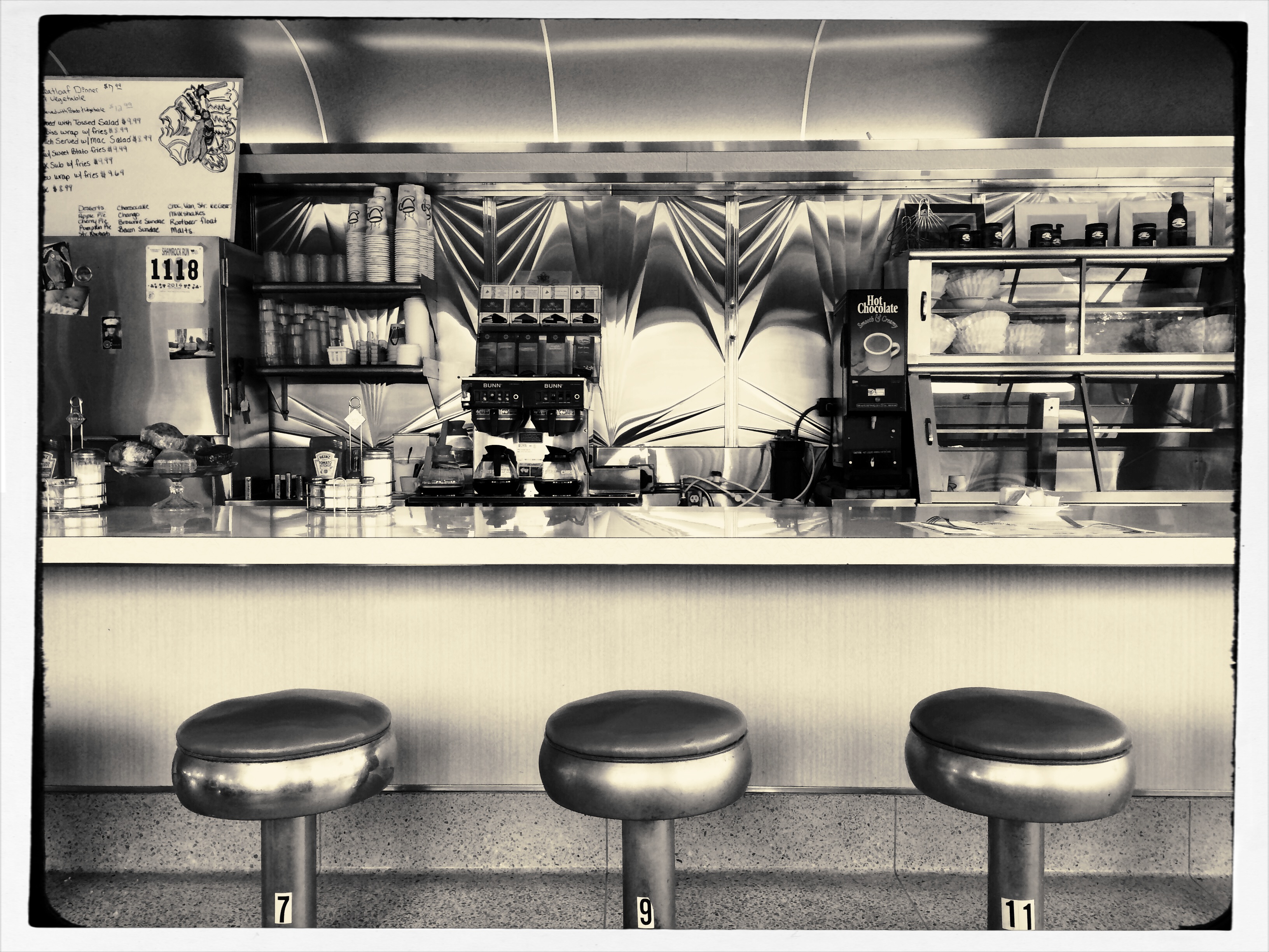
CLEAN-UP ON AISLE FIVE
A post-processed “color compromise” of the image below. 1/320 sec., f/5.6, ISO 100, 35mm.
By MICHAEL PERKINS
TAKE ENOUGH PHOTOGRAPHS AND YOU WILL DEVELOP YOUR OWN SENSE OF “SIMPLICITY”. That is, you will arrive at your own judgement about how basic or complex a composition you need in a given situation. Some photographers are remarkable in their ability to create images that contain a mad amount of visual information. Some busy city scenes or intricate landscapes benefit wonderfully from an explosion of detail. Other shooters render their best stories by reducing elements to a bare minimum. And of course, most of us make pictures somewhere in the vast valley between those approaches.
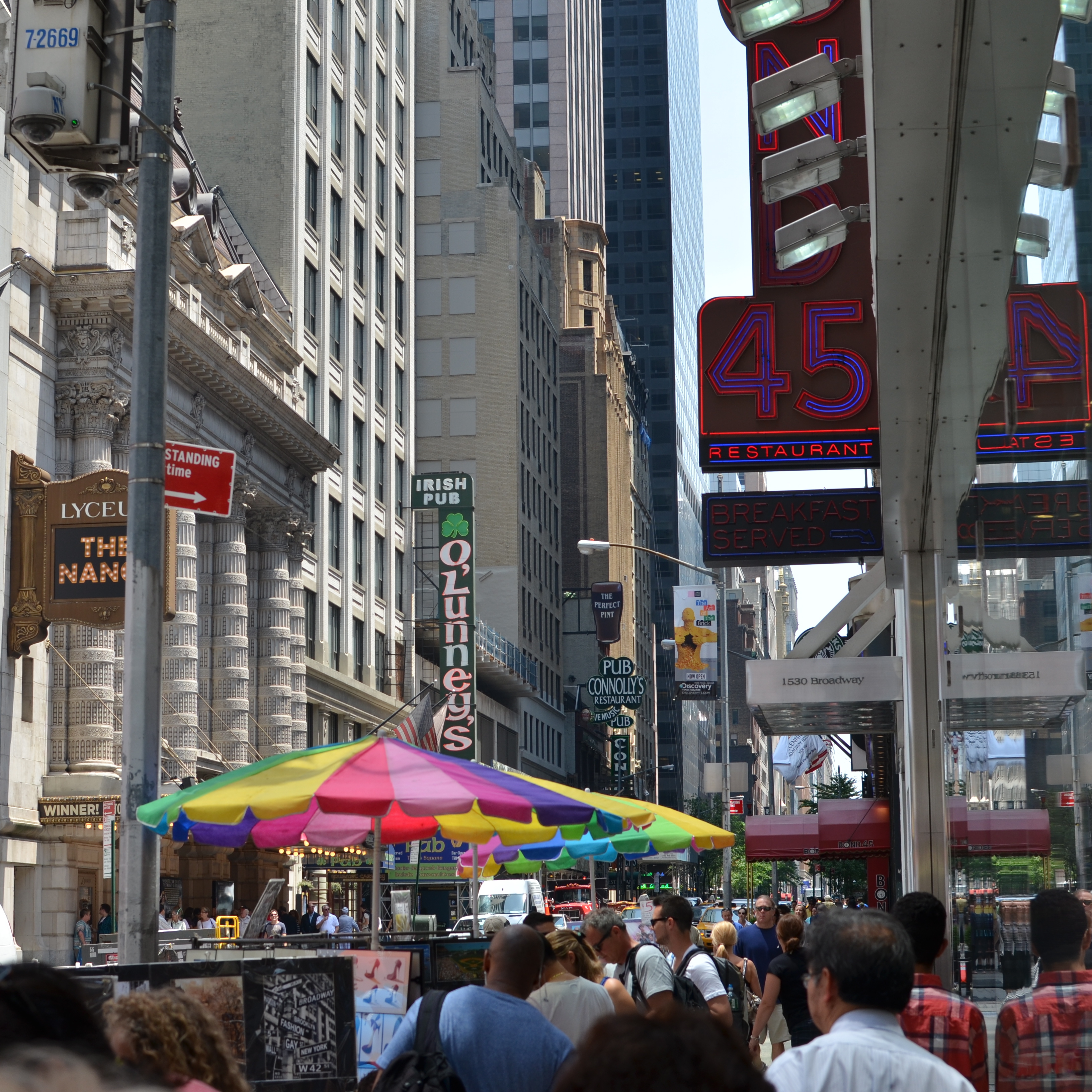
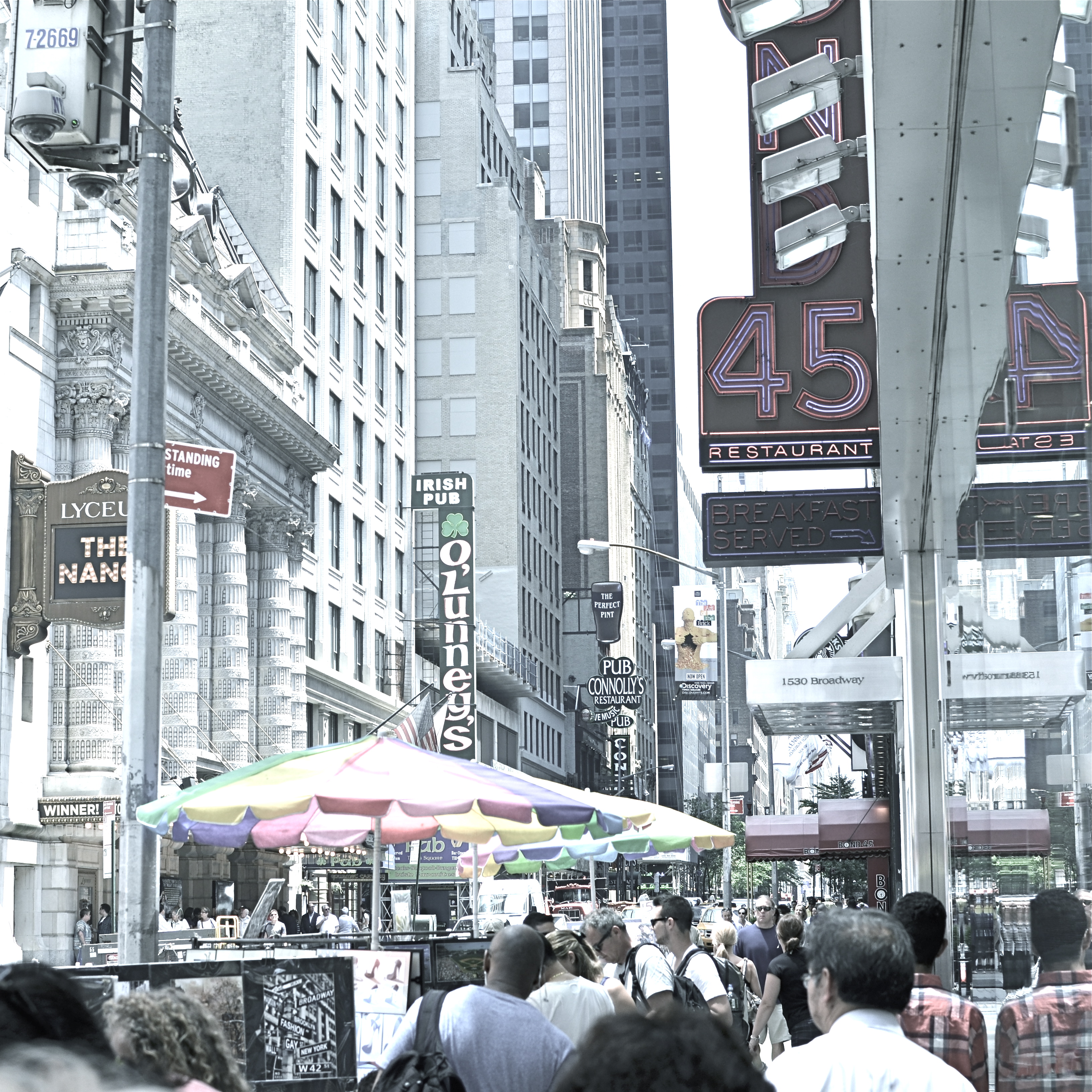
Before the fiddling ensued.
I’m pretty accustomed to thinking of overly-busy pictures as consisting of a specific kind of “clutter”, usually defined as cramming too many objects or people into a composition. But I occasionally find that color can be a cluttering element, and that some very visually dense photos can be rendered less so by simply turning down hues, rather than rooting them out completely. Recently I’ve been taking some of the pictures that seem a little too “overpopulated” with info and taking them through what a two-step process I call a color compromise (patent not applied for).
First step involves desaturating the picture completely, while also turning the contrast way down, amping up the exposure and damn near banishing any shadows. This almost results in a bleached-out pencil drawing effect and emphasizes detail like crazy. Step two involves the slow re-introduction of color until only selected parts of the image render any hues at all, and making sure that the color that is visible barely, barely registers.
The final image can actually be a clearer “read” for your eyes than either the garish colored original or a complete b&w. Objects will stand out from each other a little more distinctly, and there will be an enhanced sensation of depth. It also suggests a time-travel feel, as if age has baked out the color. A little of this washed-out jeans look goes a long way, however, and this whole exercise is just to see if you can make the picture communicate a little better by allowing it to speak more quietly.
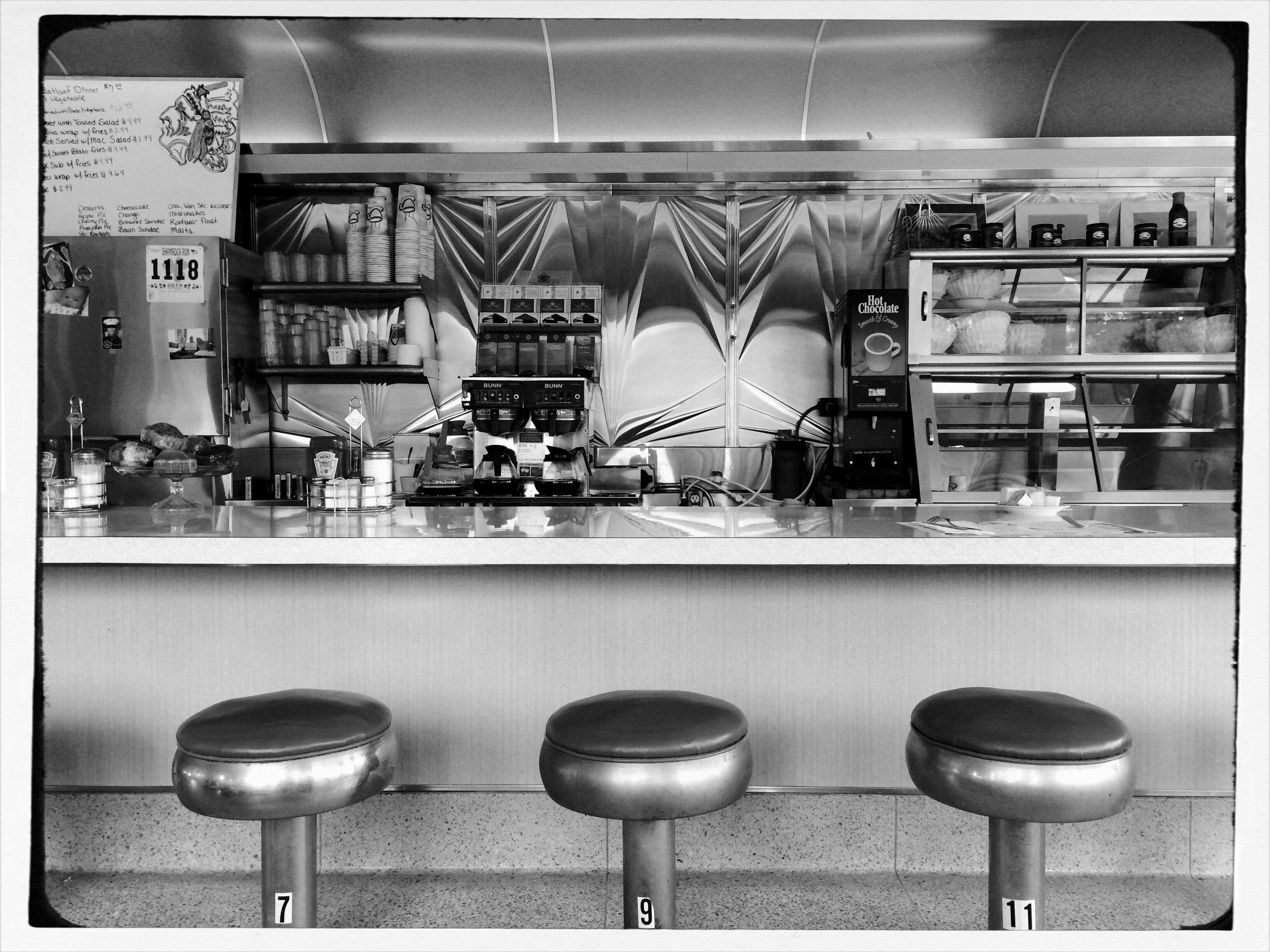
Compare the processed photo at the top, taken in the heart of the visually noisy Broadway district, with its fairly busy color original and see if any of this works for you. I completely stipulate that I may just be bending over backwards to try to salvage a negligible photo. But I do think that color should be a part of the discussion when we fault an image for being cluttered.
REAL PHONIES
Reality check: a retail mall in Hollywood, doubling as a tribute to D.W. Griffith’s Intolerance. huh?
By MICHAEL PERKINS
“You’re wrong. She is a phony. But on the other hand you’re right. She isn’t a phony because she’s a real phony. She believes all this crap she believes.”
—Truman Capote, Breakfast At Tiffany’s
THE ABOVE REFERENCE TO MISS HOLLY GOLIGHTLY, she of the powder room mad money, also applies very neatly to Hollywood, California. The official kingdom of fakery has been in the business of fabricating fantasy for so long, it actually treats its hokum as holy writ. Legends and lore become facts of life, at least our collective emotional life. Dorothy’s ruby slippers (even though they were originally silver) draw more attention than actual footwear from actual persons. Wax figures of imaginary characters are viewed by more people than will ever examine the real remains of wooly mammoths at the La Brea Tar Pits. And, when it comes to the starstruck mini-Vegas that is the nexus of Hollywood Boulevard and Highland Avenue, even a fake of a fake seems like a history lesson.

The gang’s all here: Griffith’s original 1916 Babylon set for Intolerance.
Hollywood and Highland is one grand, loud, crude note of Americana, from its out-of-work actors sweating away in Wookie suits in front of the Chinese theatre to its cheesy Oscar paperweights at the souvie shops. This small stretch of carnival, high-caloric garbage chow, and surreal retail is a version of a version, a recreation of a creation, a “real phony” rendition of cinema, defined by its resurrection of the great gate of Babylon, which anchors a multi-level mall adjacent to the Dolby Theatre, the place where all those genuine cheesy paperweights are given each year. The gate and the two enormous white elephants that flank it are a partial replica of D.W. Griffith’s enormous set for the fourth portion of his silent 1916 epic Intolerance. The full set had eight elephants, an enormous flight of descending stairs, two side wings, and a crowd that may have originally inspired the term “cast of thousands”. That’s how they did ’em back in the day, folks. No matte paintings, no CGI, no greenscreen. We gotta build Babylon on the back set, boys, and we only got a week to do it, so let’s get cracking.
The original set, which stood at Hollywood and Sunset, was, by 1919, a crumbling eyesore and, in the city’s opinion, a fire hazard. Griffith, who lost his shirt on Intolerance, didn’t have the money to demolish it himself, and eventually it fell into sufficient disrepair to make knocking it down more cost-effective. Hey, who knew that it might make a great backdrop for a Fossil store 2/3 of a century later? But Hollywood never balks at the task of making a fake of a fake, so the Highland Center’s ponderous pachyderms overlook throngs of visitors who wouldn’t know D.W. Griffith from Merv Griffin from Gryffindor, and the world spins on.
Photographing this strange monument is problematic since nearly all of it is crawling with people at any given moment. Forget about the fact that you’re trying to take a fake image of a fake version of a fake set. Just getting the thing framed up is an all-day walkabout. So, at the end of my quest, what did I do to immortalize this wondrous imposter? Took an HDR to ramp up an artificial sense of wear and tear, and slapped on some sepia tone.
But it’s okay, because I’m a real phony. I believe all the crap I believe.
Hooray for Hollywood.
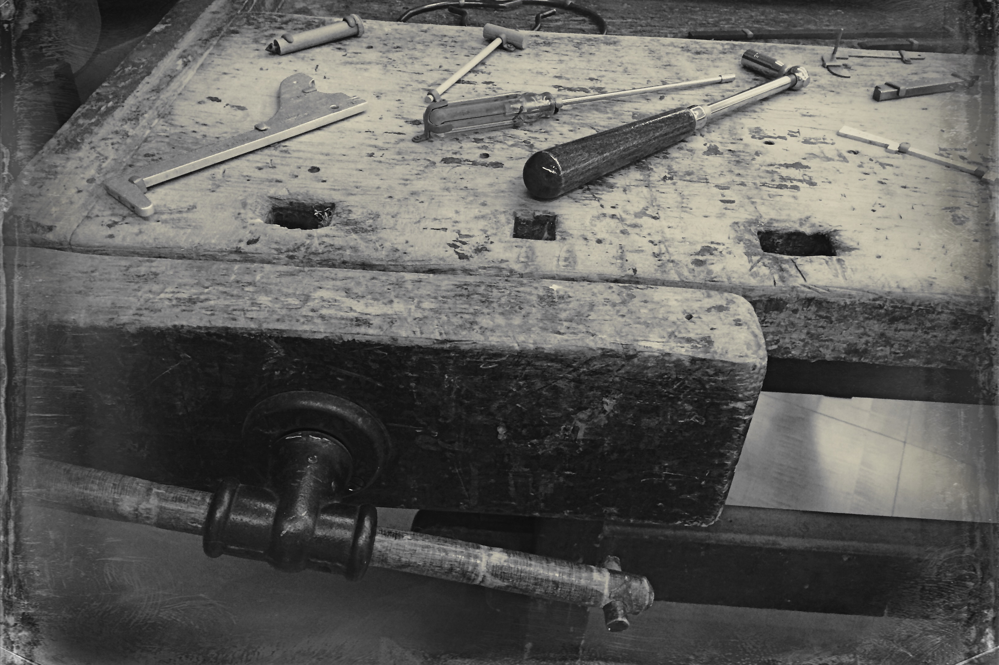
RELATIONSHIPS
By MICHAEL PERKINS
DIGITAL PHOTOGRAPHY DOESN’T TRULY MAKE ARTISTIC CHOICES “POSSIBLE”. Those decisions were always available in the medium, albeit at some cost of materials, time and work. You could always get nearly any effect from film, providing you were willing to invest the sweat in wringing it out of the tools at hand. Instead, digital processes make choices easier to act upon, and, for people who have made the transition from a lifetime of film-based analog shooting to digital, the leap to light speed on the trip from desire to result is especially mind-ripping.
This speed of implementation makes real-time differences when considering whether a shot will have its best impact in color or b&w. Even standard DSLRs and compacts have in-camera modes that allow you to immediately shoot and compare alternate versions of a subject, and, with the expanding universe of apps available to the smartphone shooter, you can instantly crank out half a dozen or more readings of the kind of color or the type of monochrome you’re looking for. This is especially important in black & white, where the range of tones and contrast values can make or break a picture.
Black and white was the right choice here, but a decision about the kind of black and white was also crucial.
By basically simulating the subtle changes that a film processor could have made in the gradations between the various intensities of either black or white, apps allow you to make incremental judgments of how the values in the image work or don’t work to produce the “statement” you’re looking for. Best thing about this is the best overall thing about digital: how quickly you can act on your impulse, then check, adjust, and act again. The above image lacked impact in the color original. The old workbench simply came off too warm and charming. I was looking for something that matched the grit and wear of the weathered wood, and I was able to shop for about three different grades of monochrome before settling on what you see here. Most days, this is a game of inches.
The sheer number of images that you will be able to salvage while the scene is still in front of you, and the light is still how you want it…. that’s an amazing freedom, and no generation of photographers before ours has enjoyed anything like it before.
The take-home of all this is that you should not only shoot a lot but shoot a lot of variations on what you choose to shoot. And remember, every shot that you “blow” is one shot closer to the higher average of excellent work that will only come after thousands of failures. Best to speed up the clock and get past them while you’re still young.
THROUGH THE LOOKING GLASS
By MICHAEL PERKINS
PHOTOGRAPHY IS THE LATEST THING.
PHOTOGRAPHY IS OBSOLETE.
PHOTOGRAPHY IS DEAD.
PHOTOGRAPHY IS JUST BEING BORN.
All these statements are true.
Art cannot hide from the world, nor can it sequester itself away from change. There cannot be one “final” or “permanent” way to create a painting, one lasting method for bringing forth a face from a block of marble, one eternal way to capture and shape light. It’s more than obvious that, like most arts, photography has been in a constant state of metamorphosis since its inception, something which should comfort those for whom things seem to be, at present, “moving too fast”. Comfort, however, is not in the offing for many of us.
The sense that nothing is “permanent” anymore in the making of pictures is especially keen in recent years, since the shift from film-based imaging to digital has been such a convulsive and comprehensive break with the past. But, even though we’ve been using film for over a hundred years, the kind of film we use has always been in transition. We feel a little less solid right now because the technical means for photography are changing on a much more fundamental level. And we’re just getting started.
Shooting and processing this image in the film era would have been the work of hours, maybe days. With an iPhone app, I have it within two minutes.
The explosion of the post-processing photo app, itself a product of the ongoing evolution of the telephone, is changing the terms of engagement for everyone who takes pictures. Everyone. Okay, you don’t have a smartphone and don’t want one. I get it. That doesn’t change the fact that the essential means for capturing and shaping an image is shifting into overdrive. More than ever before, anyone can take a picture…..anywhere, anytime, instantly, and under damn near any circumstances. The walls of experience, privilege, and access between pro and amateur are dissolving faster than Splenda in a non-fat latte. Techniques which used to be the exclusive domain of the learned, the elite, are now available to the peasantry. There are no more secrets. The Bastille has fallen.
Apps are leading all this, making any kind of effect, tint, re-focus, re-balance and re-do feasible for anyone. The tsunami of new images flooding into the internet on any given day is the output of people whose vision can now be acted upon, without exhaustive expense, without years of slaving in a newspaper bullpen, without decades of chemical-stained fingers and dingy diligence in darkrooms. If you don’t have a good eye for what makes a good picture, then that one factor can keep you from greatness. But access to tools is no longer, and can never again be, a disqualifier.
Apps are already raising the question of whether bulkier cameras with costly lenses are even needed, and the next step is for apps to answer that question with shortcuts that will, at the very least, render whole classes of cameras superfluous, and, eventually, remove all but the most basic functions of traditional lenses themselves. Custom-made “glass” is one of the remaining barriers to complete photographic democracy: it costs too much and requires too steep a learning curve for today’s ADD universe. It will have to go.
And here’s where you decide whether, in your own case, that’s a positive or negative thing. The bad news is, everything is changing. The good news is, everything is changing.
You pays your money and you takes your choice.
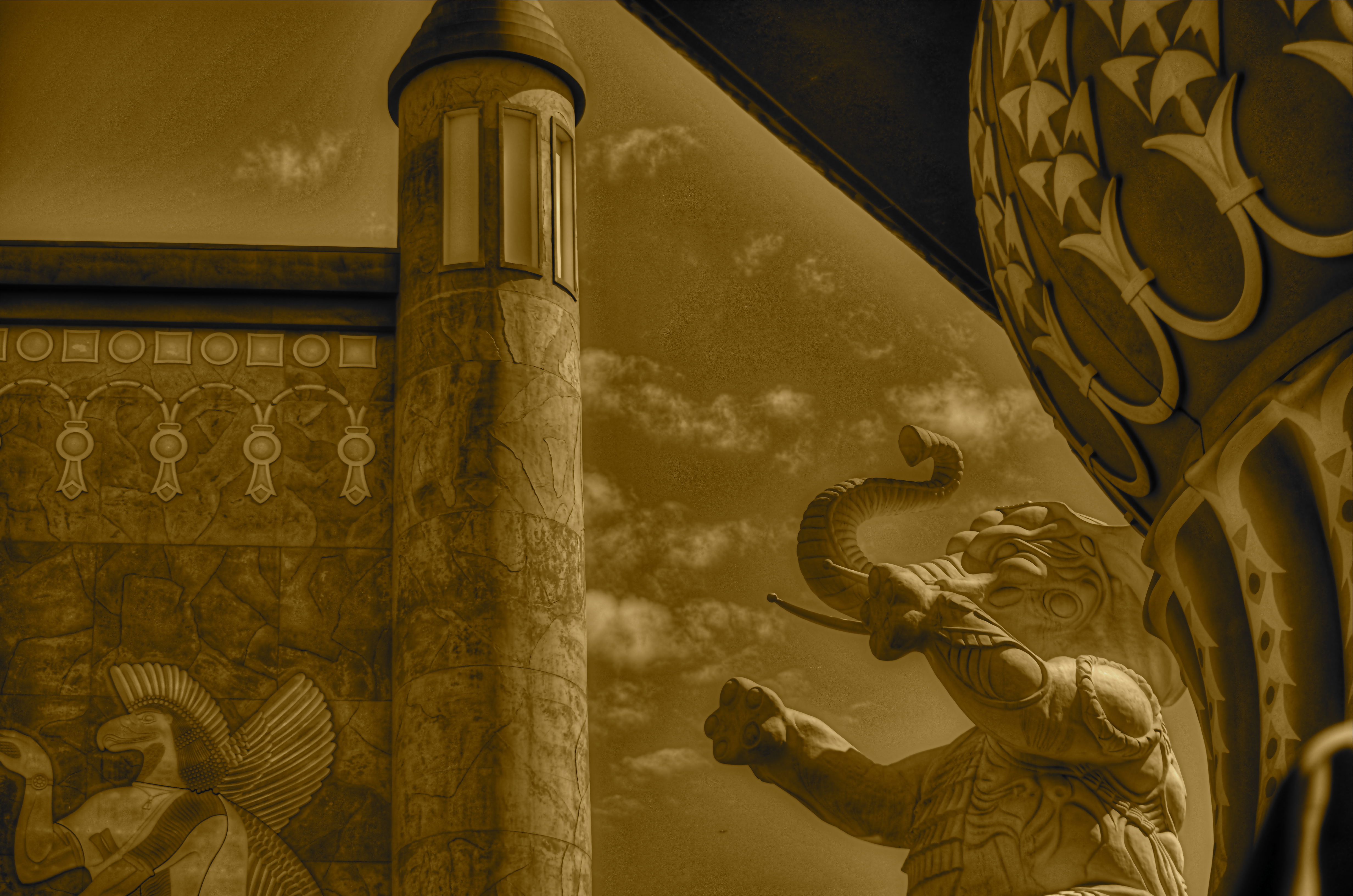
THE TORQUOISE TIME TRAVELER
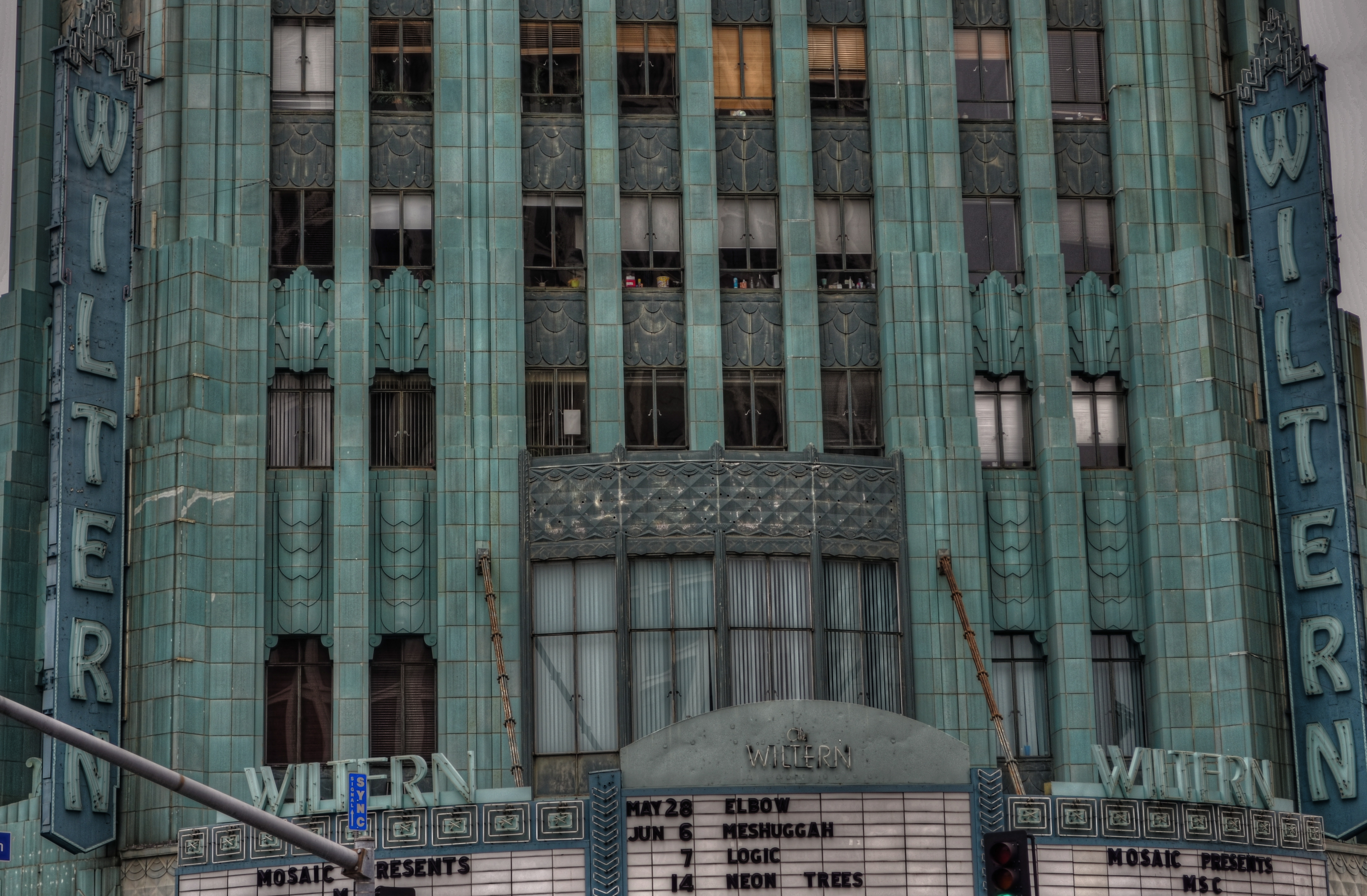
The wondrous Wiltern Theatre in Los Angeles. A three-exposure HDR to amplify time’s toll on the building’s exterior.
by MICHAEL PERKINS
SHE HAS WITHSTOOD THE GREAT DEPRESSION, A WORLD WAR, DECADES OF ECONOMIC UPS & DOWNS, and half a dozen owners (some visionaries and some bums), and still, the sleek green/blue terra-cotta wedge that is the Wiltern Theatre is one of the most arresting sights in midtown Los Angeles. From her 83-year old perch at the intersection of Western Avenue and Wilshire Boulevard, the jewel in the lower half of the old Pelissier building still commands attention, and, for lovers of live music, a kind of creaky respect. The old girl isn’t what she used to be, but she is still standing, as the same house that once hosted film premieres in the days of Cagney and Bogart now hosts alternative and edge, with pride.
And she still makes a pretty picture, lined face and all.
Opened in 1931 as a combination vaudeville house and flagship for Warner Brothers’ national chain of film theatres, The Warner Western, as it was originally named, folded up within a few years, re-opening in mid-Depression L.A. as the Wiltern (for Wilshire and Western) operating virtually non-stop until about 1956. As a vintage movie house, it had been equipped with one of the most elegant pipe organs in town, and enthusiasts of the instrument built a small following for the place for a while with recitals featuring the instrument. By the 1970’s, however, economies for larger-than-life flicker palaces were at an all-time low, and the Wiltern’s owners tried twice themselves to apply for permission to blow her down. Preservationists got mad, then got busy.

The Wiltern’s ticket kiosk sits under a plaster canopy of Deco sunrays. 1/40 sec., f/3.5, ISO 100, 18mm.
Restoration began in the 1980’s on the Pelissier building in general, but the Wiltern, with its ornate plaster reliefs and murals, had been so neglected over the years that its turnaround was slower. It was finally reborn in 1985 as a live performance theatre, losing some seat room but newly able to stage everything from brain-blaster garage rock to Broadway road productions and ballet.
I shot the Wiltern with three HDR frame, all f/5.6, with exposure times of 1/60, 1/100. and 1/160, and blended the final image in Photomatix to really show the wear and tear on the exterior. HDR is great for amplifying every flaw in building materials, as well as highlighting the uneven color that is an artifact of time and weather. I wanted to show the theatre as a stubborn survivor rather than a flawless fantasy, and the process also helped call attention to the building’s French Deco zigzags and chevrons. For an extra angle, I also made some studies of the glorious sunburst plaster ceiling over the outside ticket kiosk. It was great to meet the old girl at last, and on her own terms.
THE (LATENT) BLUES
A dawn exposure takes on the look of early evening.
By MICHAEL PERKINS
WE HAVE CONTROL OVER NEARLY EVERY PART OF THE PHOTOGRAPHIC PROCESS BUT… ACCESS. We can learn to master aperture, exposure, composition, and many other basics of picture making, but we can’t help the fact that we are typically at our shooting location for one time of day only.
Whatever “right now” may be….morning, afternoon, evening….it usually includes one distinct period in the day: the pier at sunset, the garden at break of dawn. Unless we have arranged to spend an extended stretch of time on a shoot, say, chasing the sun and shadows across a daylong period from one location at the Grand Canyon or some such, we don’t tend to spend all day in one place. That means we get but one aspect of a place…however it’s lit, whoever is standing about, whatever temporal events are native to that time of day.
The original morning exposure.
Many locations that are easily shot by day are either unavailable or technically more complex after sundown. That’s why the so-called “day for night” effect appeals to me. As I had written sometime back, the name comes from the practice Hollywood has used for over a hundred years to save time and ensure even exposure by shooting in daylight and either processing or compensating in the camera to make the scene approximate early night.
In the case of the image you see up top, I have created an illusion of night through the re-contrasting and color re-assignment of a shot that I originally made as a simple daylight exposure. In such cases, the mood of the image is completely changed, since the light cues which tell us whether something is bright or mysterious are deliberately subverted. Light is the single largest determinant of mood, and, when you twist it around, it reconfigures the way you read an image. I call these faux-night remakes “latent blues”, as they generally look the way the sky photographs just after sunset.
This effect is certainly not designed to help me avoid doing true night-time exposures, but it can amplify the effect of images that were essentially solid but in need of a little atmospheric boost. Just because you can’t hang around ’til midnight, you shouldn’t have to do without a little midnight mood.
OH, IT’S HIDEOUS. I LOVE IT.
By MICHAEL PERKINS
THERE MAY BE NO RULES LEFT TO BREAK IN PHOTOGRAPHY, in that everybody is comfortable doing absolutely anything….compositionally, conceptually, technologically…to get the picture they want. Maybe that’s always the way it’s been, seeing as the art of image-making, like the science of breeding apple trees, has always grown faster and stronger through cloning and grafting. Hacks. Improvisations. “Gee-What-If”s.
Shots in the dark.
Not a bad starting point, but either too pretty, or not ugly enough…or something.
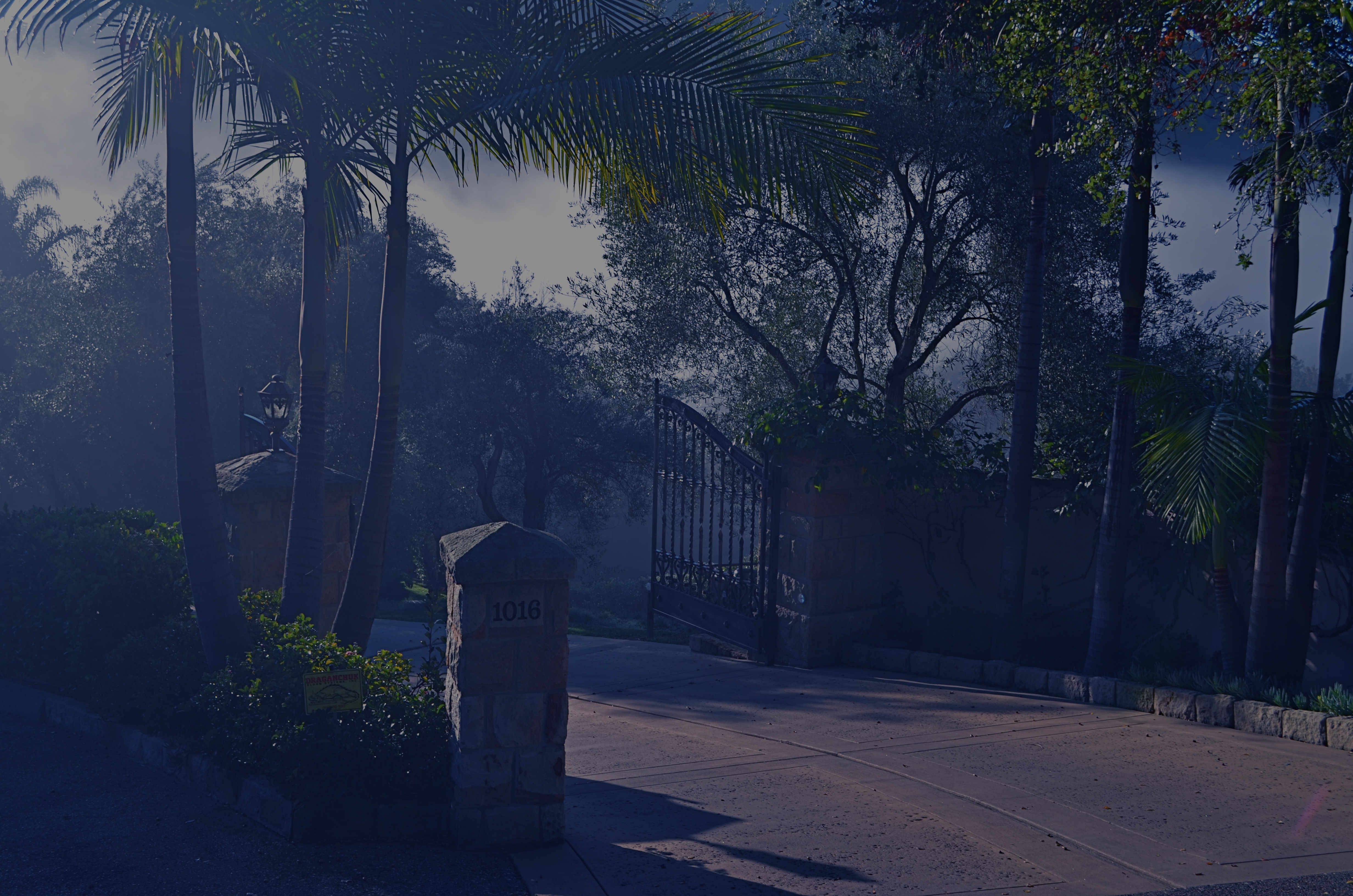
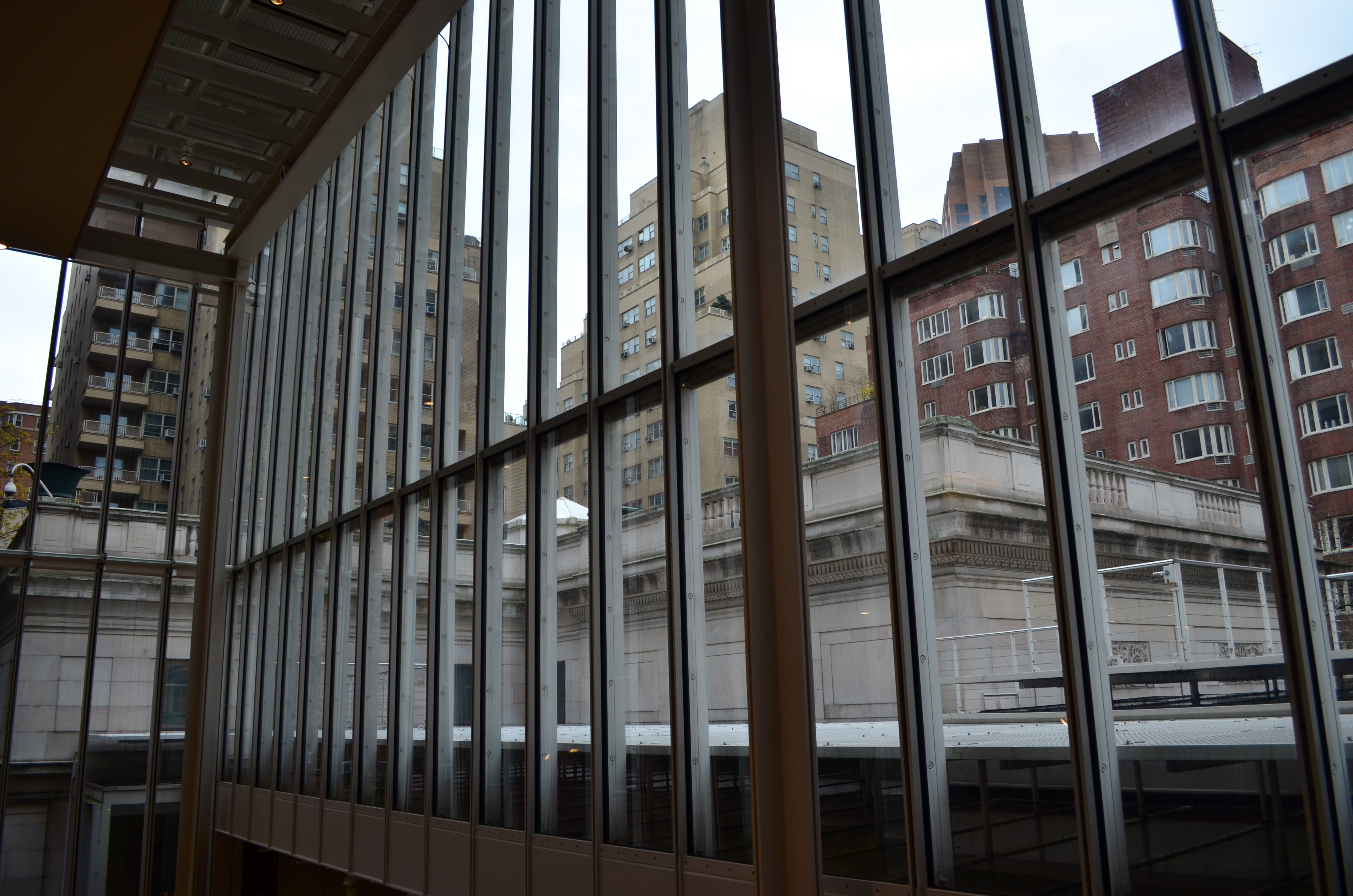
Recently I walked out into the gigantic atrium that connects all of the original buildings of the Morgan Library complex in NYC to get a good look at the surrounding neighborhood of big-shouldered buildings. I was fascinated by the way my wide-angle lens seemed to line up the horizontal grid lines of the atrium with the receding lines of the towers and boxes down the block. Only one thing bothered me about the result: the color, or rather, the measly quality of it.
A rainy day in Manhattan is perhaps the final word on rainy days. Some colors, like the patented screaming yellow of a New York cab, or the loud neon reds of bodegas, are intensified into a romantic wash when the drops start. This view, however, was just a bland mash of near-color. If the neighborhood was going to look dour anyway, I wanted it to be dour-plus-one. Thing is, I made this, ahem, “artistic” decision after I had already traveled 3,000 miles back home. In the words of Rick Perry, whoops.
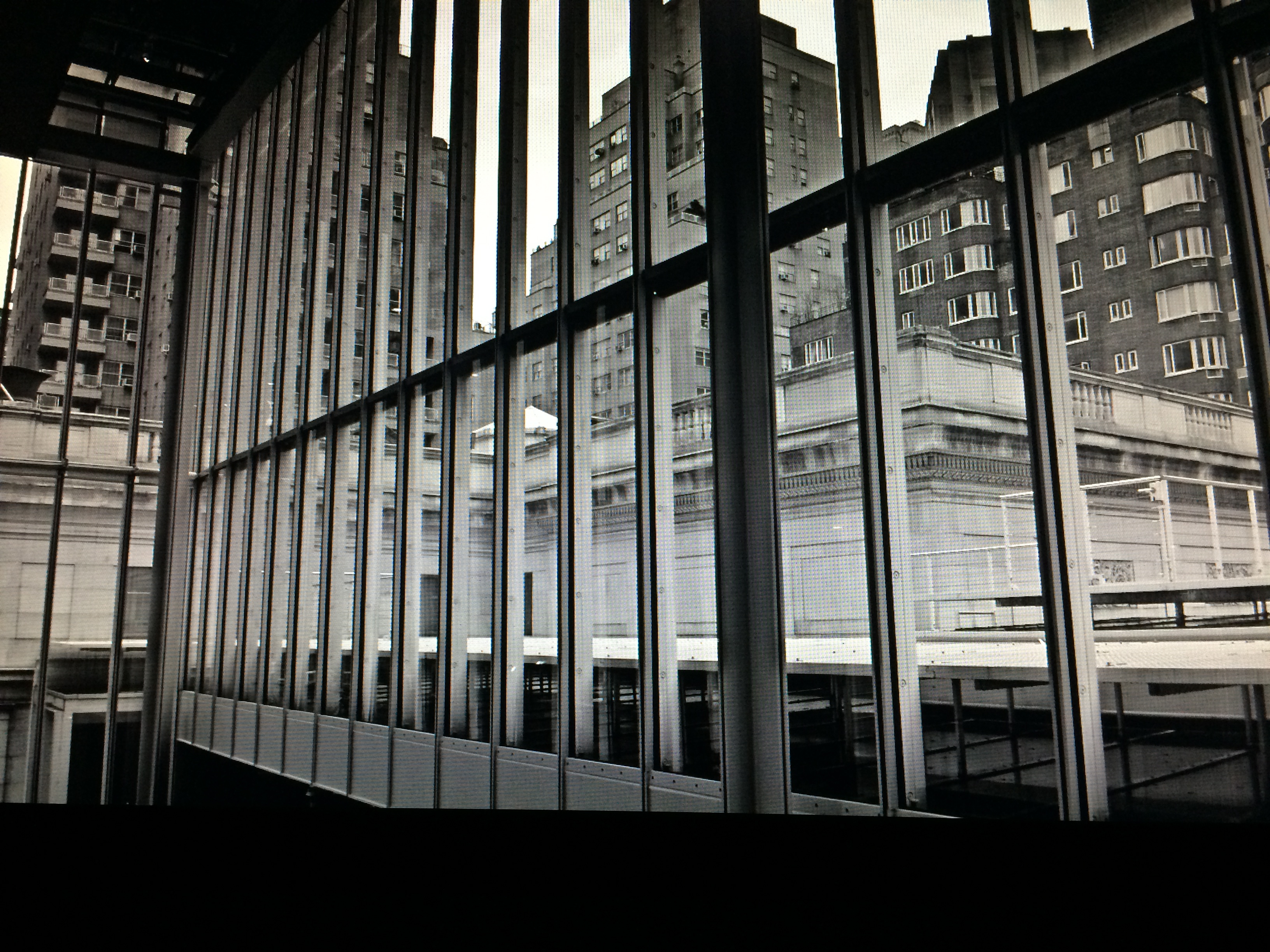
Time to hack my way to freedom. I remembered liking the look of old Agfa AP-X film in a filter on my iPhone, so I filled the screen of my Mac with the bland-o image, shot the screen with the phone, applied the filter, uploaded the result back into the Mac again, and twisted the knobs on the new cheese-grater texture I had gained along the way. At least now it looked like an ugly day….but ugly on my terms. Now I had the kind of rain-soaked grayscale newspaper tones I wanted, and the overall effect helped to better meld the geometry of the atrium and the skyline.
No rules? Sure, there’s still at least one.
Get the shot.
